Now that everything is set up and the fundamentals have been covered, we can get to the good stuff by starting to build the application and seeing some real results! As the application is going to consist of a single page driven by Oracle JET modules, we will be setting up the structure of this single page by extending the existing template and themes we have already scaffolded in previous chapters.
We will also introduce several components, as well as CSS flexbox, which is used for structuring containers and elements of the page in a manner that is responsive. JET provides a collection of CSS classes out of the box to implement responsive layouts, and throughout this chapter, we will look at the most common ones and apply some of them to the application.
By the end of the chapter, you will have built the foundations of the application and used the following components:
ojInputText
ojListView
ojAvatar
ojTabBar
ojModel
ojCollection
ojBindText
Flexbox
There was once a time when web development was a lot simpler, as the number of different devices and screen sizes were limited. With the introduction of smartphones in 2007, and the wave of different screen sizes that followed, a shift began toward the responsive web.
Initially, web sites started offering a “mobile” version of a web site that was often limited in functionality and was still not suited to several different sized devices. Making web sites responsive was more intrusive, as it often involved completely redesigning and rewriting a web site with different designs for different “breakpoints.”
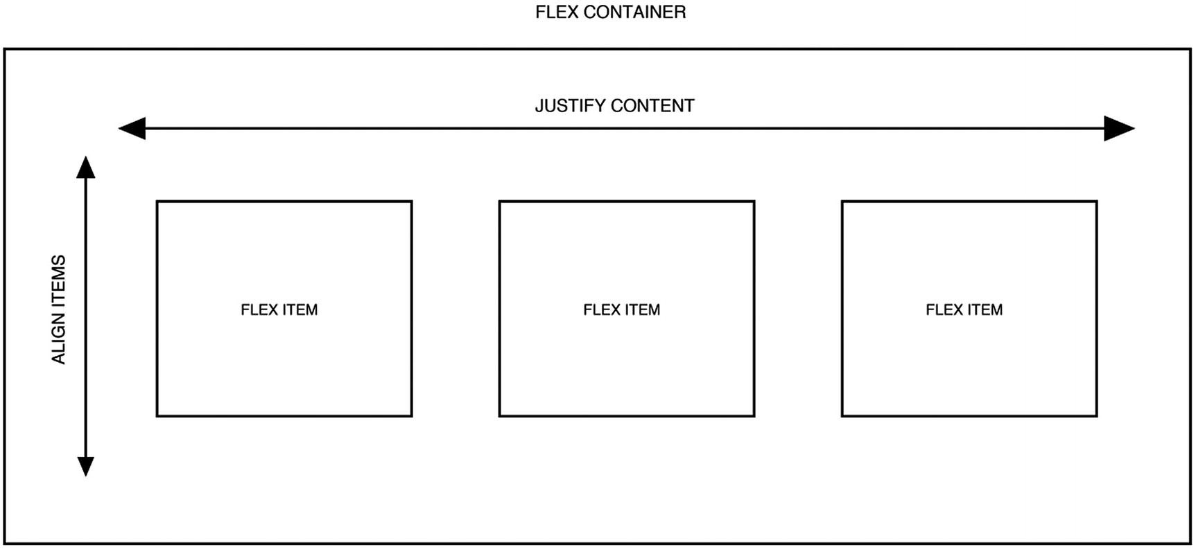
CSS3 introduced a new layout mode (an alternative to floats and positioning) called flexbox, which is an easy and responsive method of arranging elements on a page. To use flexbox, you simply have to specify the CSS attribute display: flex on the container elements, and any elements within the container (also called flex items) will automatically align into separate columns. Figure 6-1 illustrates the structure of a flexbox container with three flex items.
Figure 6-1
Flex container with flex items
The Flex Attribute
Once the flex container has been set up, the elements inside the container (the flex items) can have a flex property set against them. The flex property is a combination (or shorthand) of the flex-grow, flex-shrink, and flex-basis properties. These three properties are responsible for determining how much space flex items should be taking up within the container.
The three properties do the following:
flex-grow: Number value that specifies how much the item will grow relative to the rest of the children within the container
flex-shrink: Number value that specifies how much the item will shrink relative to the rest of the children within the container
flex-basis: The length of the item; can be auto, inherit or a number followed by a length unit
The default values for the flex attribute are 0, 1, auto. This means that flex-grow is set to 0; flex-shrink is set to 1; and the basis is auto.
I recommend you look at this excellent web site: http://the-echoplex.net/flexyboxes. The site is a really useful tool when trying to work out how flex works and a great reference to come back to in the future when building new flex layouts.
Alongside the flex attribute, there are also several other attributes you can use with flexboxes. The following sections describe a few of these other attributes that will be useful and most commonly used within JET.
align-items
The align-items attribute aligns items vertically within a flexbox. This attribute has the following options:
center: Positions the children in the center of the container
flex-start: Positions the children at the beginning (top) of the container
flex-end: Positions the children at the end (bottom) of the container
baseline: Positions the children so that the baselines align
stretch(default): The children stretch to fill the container.
justify-content
justify-content will position the flex items horizontally. If you struggle trying to remember the difference between align and justify, try to remember that justify positions flex items in the same way that the justify positioning works within Microsoft Word. The attribute has the following options:
center: Positions the flex items in the center of the container
flex-start(default): Positions the flex items at the beginning (left) of the container
flex-end: Positions the flex items at the end (right) of the container
space-between: Spreads the flex items evenly across the width of the container
space-around: Spreads the flex items evenly across the width of the container, but with space around the edges of the items
flex-direction
When setting a container to flex, the default direction is row, meaning the children will display side by side horizontally. Using the flex-direction attribute, you can change the default direction of the children to any of the following values:
row(default): Positions the children next to each other horizontally
row-reverse: Positions the children next to each other horizontally, but in reverse order
column: Positions the children under each other vertically, as a column
column-reverse: Positions the children under each other vertically, as a column, but in reverse order
When changing the flex direction, you will also change the axis, and as a result, the align-items and justify-content attributes will inverse their default behavior.
flex-wrap
The flex-wrap attribute specifies whether the flex items remain in the same row, and overflow once there are too many, or whether they wrap onto the next line. The attribute has three values:
nowrap(default): Items will not wrap.
wrap: Items will wrap, if needed, in relation to the direction set by the flex-direction attribute.
wrap-reverse: Items will wrap, if needed, in reverse order.
Flex Within Oracle JET
It is not necessary to create CSS classes and use the flex attributes outlined earlier in this chapter when using JET, as the toolkit includes classes to help with implementing flex layouts. Having these classes available helps to cut down on the amount of custom CSS needed and declutters the SASS partials.
The toolkit classes also have responsive prefixes, to target different screen sizes. The responsive prefixes are as follows:
Small (sm): Range of 0–767px
Medium (md): Range of 768px–1023px
Large (lg): Range of 1024px–1280px
Extra large (xl): 1281px +
Print (print): Layout for when a browser’s print option is used
Media queries, which are a common web development technique introduced in CSS3 for responsive development, always target the minimal value and above. Similarly, any class ending in sm will cover all screen sizes. However, if you also apply classes using the md and lg sizes to an element, the media queries will kick in to override the sm settings when screens reach those larger sizes.
The most commonly used classes available from the offset in JET are:
oj-flex: Sets the display attribute to flex, the flex-wrap property to wrap, and adds padding to the children
oj-[size]-[cols]: Specifies the number of columns an element will occupy, which can be between 1 and 12. For example, using oj-sm-2 and oj-md-3 on an element would result in the element occupying two columns within the small range and switching to three columns in the medium range.
oj-[size]-justify-content-[value]: Specifies the horizontal position of the container’s children, using the same values outlined previously: center, flex-start, flex-end, space-between, and space-around
oj-[size]-align-items-[value]: Specifies the vertical position of the container’s children, using the same values outlined previously: center, flex-start, flex-end, baseline, and stretch
oj-[size]-flex-direction-column: Switches the default direction from row to column
oj-[size]-padding-[multiplier]-[edge]: Responsive margin and padding classes. For example, oj-sm-padding-2x-end would add a 2x padding to the end of the element.
I have covered some of the more common flex classes, and there are a lot more than can be used for more advanced layouts. A full guide to the available classes is available within the Oracle JET documentation and is useful as a reference. Here’s a direct link to that documentation: www.oracle.com/webfolder/technetwork/jet/jsdocs/FlexLayout.html.
Setting Up the Application Structure
Time to dive into creating the structure of the page. Start by opening the application directory and rename the dashboard module files to ticket-desk. Make sure that you have renamed both the ViewModel file (src/js/viewModels/dashboard.js) and the View file (src/js/views/dashboard.html).
As the dashboard module name has changed, you must also update the router within the appController.js file. Open appController and change the reference to the dashboard within the router configuration to ticket-desk instead, so that it looks like the following:
Ensure that your application is serving with the mosTheme. As a reminder on how to do this, run the following command from the application directory:
ojet serve --theme=mosTheme
Now we will be using flexbox to create the page containers. First, open the ticket-desk.html file and replace the contents with the following code. The markup will form the base container structure that will eventually contain all the application components and modules. It is split into three columns for the left and nine columns for the right. (There can be up to a maximum of 12 columns in an Oracle JET flexbox.)
<div class="oj-flex">
<!-- Left Column Start-->
<div class="oj-sm-3">
Ticket List goes here
</div>
<!-- Left Column End-->
<!-- Right Column Start-->
<div class="oj-sm-9">
Ticket Content goes here
</div>
<!-- Right Column End -->
</div>
If you apply a background color to the surrounding divs, you will notice that there is a padding surrounding the whole of your content. To have a full-width application, we need to remove this padding by opening src/index.html and removing the class attribute from the ojModule component that sits between the header and the footer. The ojModule should then look like the following:
Let’s move on to including the first component into the application. We are going to use the ojList component, which is an HTML list with advanced features, such as selection control.
There are few attributes on this component to consider. We have assigned the class oj-sm-12 so that it spans the full width of its parent. The selection-mode attribute has been set to single, as we want one selection to be made at a time. There are two other options for the selection-mode attribute. These are 'multiple' (to allow multiple item selection) or 'none' (to disable selection altogether). We also want an item to always be selected, so the selection-required attribute is true.
The item.renderer attribute is used to specify the template to be used for each one of the list items. To create the template, include the following directly underneath the list view component:
The template is applied to each row within the ticket list, and the values associated with each row can be accessed by their attribute key. As an example, title is an attribute that comes back from the API for each ticket and contains the ticket title.
For the date value, we are calling a function that formats the date and passing in the dateCreated attribute to the function. A formatted date will be returned once we set up the function within the next section.
Creating the List ViewModel
The ViewModel for the ticket desk must be set up to support the data being used by the Oracle JET list component within the View.
Open the file src/js/viewModels/ticket-desk.js and remove the contents that were created when the application was scaffolded. Once removed, the first section we want to add in is the define block. We must include some extra libraries within this define block, to load in the components we will be using within the module. These extra components are
ojs/ojlistview: For loading the list component
ojs/ojinputtext: For loading the inputText component we will be using later in the chapter
ojs/ojcollectiontabledatasource: For loading the collection table data source, which is the object that encapsulates our data into a format accepted by the list view
ojs/ojarraytabledatasource: Loads the array table data source module. It will be used for the tab bar implementation later in the chapter.
ojs/ojmodel: For loading the model API, which will be used within the list collection
ojs/ojvalidation-datetime: For loading the validation library that we will be using to convert the date into the right format for the UI
With the extra modules added, the define block and ViewModel function should look like the example below.
define(['ojs/ojcore',
'knockout',
'jquery',
'ojs/ojlistview',
'ojs/ojinputtext',
'ojs/ojcollectiontabledatasource',
'ojs/ojarraytabledatasource',
'ojs/ojmodel',
'ojs/ojvalidation-datetime'],
function(oj, ko, $) {
function TicketDeskViewModel() {
var self = this;
}
return TicketDeskViewModel;
}
);
Now we need to declare variables and set up the model and collection. Within the TicketDeskViewModel function, create ticketListDataSource as an observable, to ensure any changes to the data will automatically update its dependencies.
/* Variables */
self.ticketListDataSource = ko.observable();
Next, create a model object by extending the oj.Model function to pass in an idAttribute of 'id' when the model is declared. The idAttribute will be the unique identifier and reference for each model item.
When creating a collection, it is possible to specify several attributes. In this case, we want to specify the URL end point that will be used to retrieve the ticket list data. The model can also be assigned to the collection, using the 'model' attribute.
/* List View Collection and Model */
var ticketModelItem = oj.Model.extend({
idAttribute: 'id'
});
var ticketListCollection = new oj.Collection(null, {
url: "http://localhost:8080/tickets",
model: ticketModelItem
});
Assign the collection to the ticketListDataSource observable, so that the component within the view is populated with the collection data. The CollectionTableDataSource formats the collection into a format suitable to be used with the ojListView component.
Finally, create a small utility function for formatting the date within the list. This utility function uses the Oracle JET converter factory to format a date into a specified pattern.
/* Utils */
self.formatDate = function (date){
var formatDate = oj.Validation.converterFactory(oj.ConverterFactory.CONVERTER_TYPE_DATETIME)
.createConverter(
{
'pattern': 'dd/MM/yyyy'
}
);
return formatDate.format(date)
}
Make sure that the mock server is running. As a reminder on how to run this, the command is as follows:
mockserver -m=mocks -p=8080
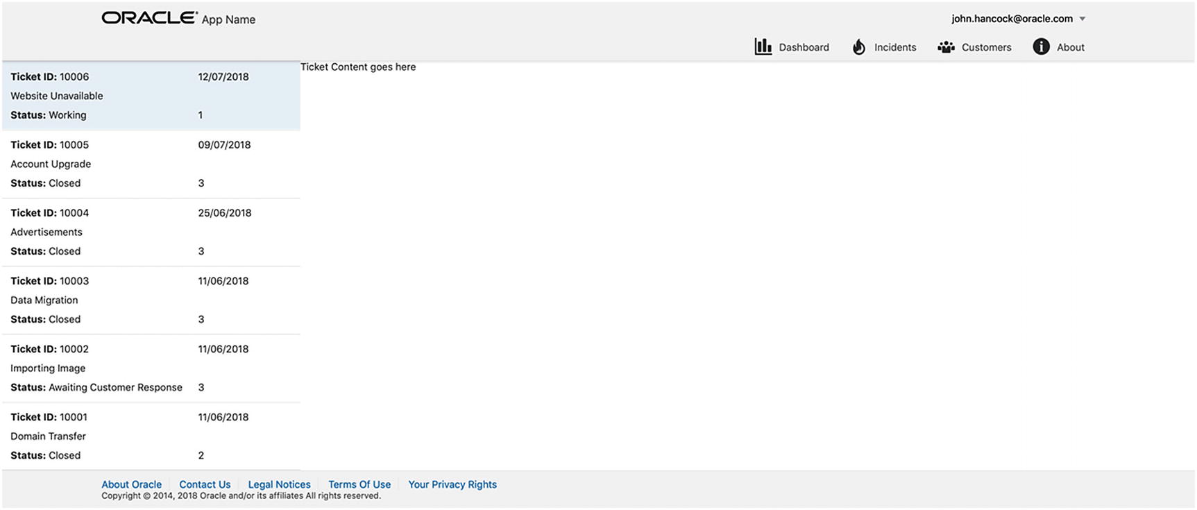
All being well, you should see a similar screen to that in Figure 6-2, which looks basic at the moment, but a lot is going on. We are retrieving data from an API and loading it into a working Oracle JET List View component that uses a template renderer. Through a very small amount of coding, we have achieved a good amount of functionality already!
Figure 6-2
Ticket list
Adding a Search Placeholder
Just above the list view component include the following code, which will be used later on to implement the search functionality:
To help users multitask and have multiple tickets open at a time, we will use a component called ojTabBar. Tabs can be extremely useful on applications that have a lot of information on one screen, or where it is useful to have dynamic content displayed.
The tab bar component accepts a number of different attributes, the most notable of which are:
contextmenu: References the ojMenu component nested within the ojTabBar component, which provides a contextual menu for when a user right-clicks a tab. The context menu will have the option to remove a tab.
selection: Binds to an observable that will hold the currently selected tab item
edge: Specifies the location of the tab bar (start, end, top, or bottom)
data: Binds to an observable that will hold the data to populate the tab bar component
item.renderer: Like a list view, the tab bar can have a template for each tab item.
on-oj-remove: Will call a function when a tab has been removed by the user
To include the variables and functions that sit behind the tab bar, open the ticket desk ViewModel and start by adding the following variables:
self.selectedTabItem = ko.observable("settings");
Next, include an array of sample data for the tab component (this will be replaced as we progress) and assign the data to the tabBarDataSource observable.
/* Tab Component */
self.tabData = ko.observableArray([{
name: 'Settings',
id: 'settings'
},
{
name: 'Tools',
id: 'tools'
},
{
name: 'Base',
id: 'base'
},
{
name: 'Environment',
disabled: 'true',
id: 'environment'
},
{
name: 'Security',
id: 'security'
}]);
self.tabBarDataSource = new oj.ArrayTableDataSource(self.tabData, { idAttribute: 'id' });
Finally, we are going to include some functions for handling the deletion of tab items, provided by the cookbook example.
self.deleteTab = function (id) {
var hnavlist = document.getElementById('ticket-tab-bar'),
items = self.tabData();
for (var i = 0; i < items.length; i++) {
if (items[i].id === id) {
self.tabData.splice(i, 1);
oj.Context.getContext(hnavlist)
.getBusyContext()
.whenReady()
.then(function () {
hnavlist.focus();
});
break;
}
}
};
self.onTabRemove = function (event) {
self.deleteTab(event.detail.key);
event.preventDefault();
event.stopPropagation();
};
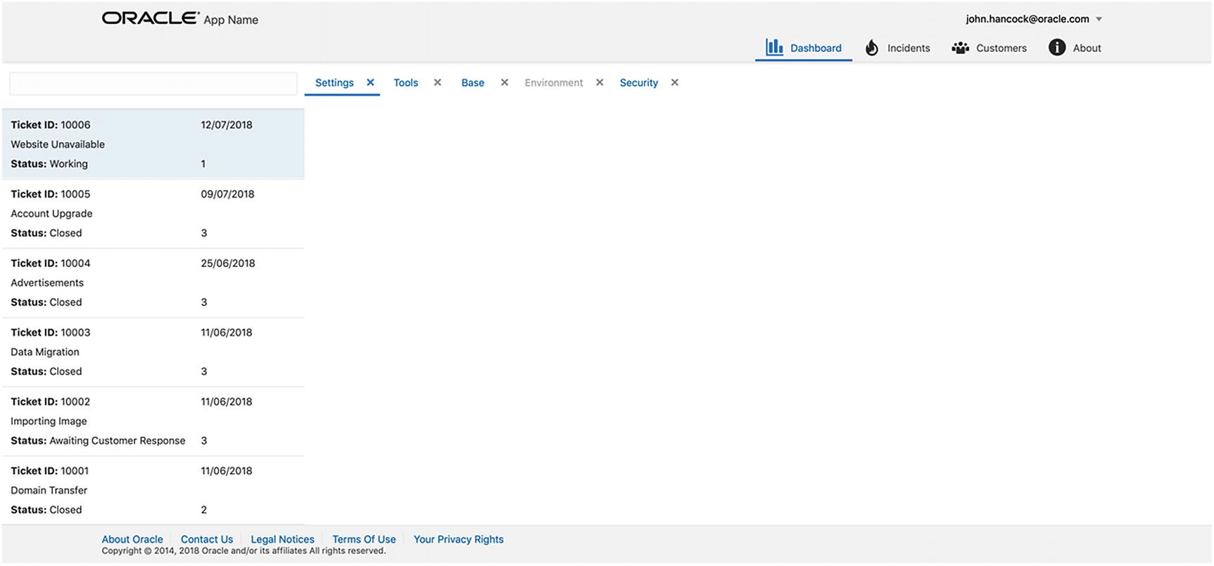
Currently, the tab functionality is driven by the cookbook example, and the tab items, as shown in Figure 6-3, are just placeholders. We will be extending the tab functionality to our use case later in the book.
Figure 6-3
Oracle JET tab bar
Welcome Message and Avatar
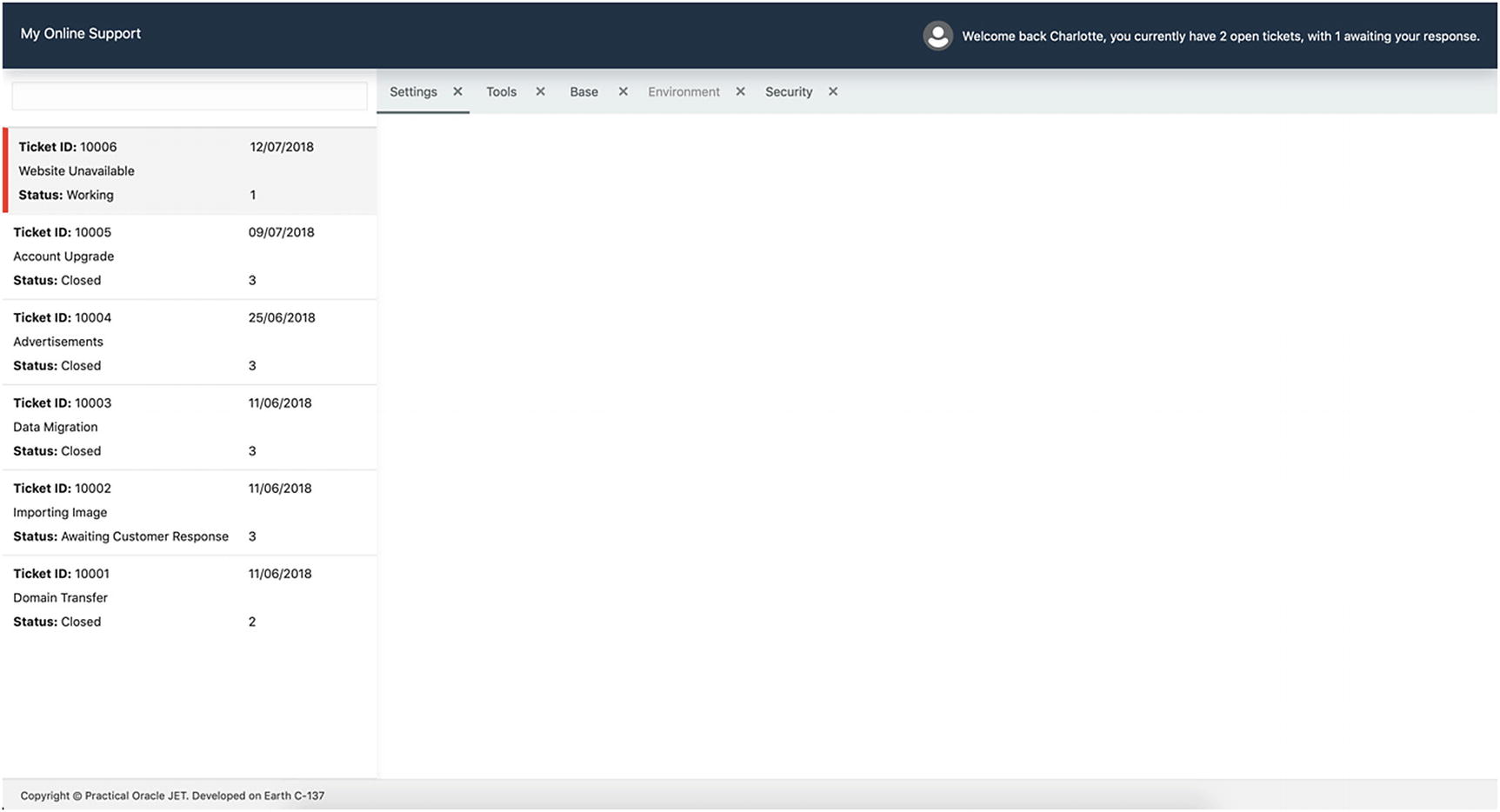
At the top right of the screen we are going to add an avatar component, plus a welcome message with some information regarding a user’s tickets. As we are developing the application within a single page, we will not require a top-level navigation at this stage, so we will be removing the menu bar.
To implement the avatar and welcome message, open index.html and replace the entire oj-flex-bar-end div and the navigation div that follows it with the following:
Welcome back Charlotte, you currently have 2 open tickets, with 1 awaiting your response.
</span>
</div>
</div>
To load the avatar component, we must define it within the appController. Open the appController.js file and add the ojs/ojavatar module into the end of the define block. The header should now look similar to that in Figure 6-4.
Figure 6-4
Welcome message and Oracle JET avatar component
Theming
Now that we have the functionality in place, we can make a couple of simple changes to make the application look more refined. The following sections describe several refinements that you’ll find useful when creating your own JET applications.
Header Padding
Open src/index.html and on the header element, add the oj-sm-padding-2x-vertical class. Then remove the oj-web-applayout-max-width class from the first child div of the header element. This will increase the width of the header and add a small padding either side of it.
Removal of Oracle Logo
Still within the index.html file, remove the reference to the demo Oracle logo, which will be a span element with the class demo-oracle-icon. Then open src/js/appController.js and change the appName observable to My Online Support.
Setting List Container Height
To ensure that the height of the scrollable list view is correct, and that the height resizes for different screens, a dynamic height must be specified by using viewport height (vh). We can subtract the height of the header and footer areas to give us a dynamic height for the list view.
Create a SASS partial called containers within the base directory (themes/mosTheme/web/base/_containers.scss) and add the following class into it:
.list-view-container {
height: calc(100vh - 175px);
}
Then import the SASS partial within your mosTheme.scss, so that it should now look like the following:
// Custom imports
@import "base/vars";
@import "base/body",
"base/containers";
Finally, wrap the ticket list view in a new div with the classes oj-flex and list-view-container, and then you should be able to resize the height of the browser window and see the height of the list container adjust accordingly. The wrapping div should look like the following:
<div class="oj-flex list-view-container">
</div>
Adding Color
To give the application its own feel, we can define some colors as variables and then use them to color various areas of the system. To do this first declare some new color variables within the vars.scss file. Replace the existing contents of the vars.scss with the following:
$brand-color: #2C3E50;
$accent-color: #E74C3C;
$neutral-color: #ECF0F1;
$base-white-color: #ffffff;
If you are already serving the application, it may break when it tries to recompile. This is because the variable that we declared earlier in Chapter 5 ($font-color) will no longer exist and cause the compiler to fail when looking for it. Don’t worry, open the body partial and replace the contents with the following:
h1,h2, h3 {
color: $brand-color;
}
.oj-web-applayout-header {
background-color: $brand-color;
box-shadow: 0 8px 16px 0 rgba($brand-color, 0.2);
}
.oj-web-applayout-header-title {
color: $base-white-color;
}
.oj-web-applayout-footer {
min-height:0;
}
header {
span {
color: $base-white-color;
}
.oj-hover {
background-color:transparent !important;
}
}
Finally, open _mosTheme.web.settings.scss, find $brandColor, and uncomment the variable. Replace the hex code with the following:
$brandColor: #788585 !default;
You may now have to serve the application again if it stopped earlier in this section.
Further Container Classes
To add further color and some shadowing to the containers, include the following classes within the containers partial:
.left-column-container {
box-shadow: 0 8px 12px 0 $neutral-color;
}
.tabbar-container {
background-color:$neutral-color;
}
Then apply the left-column-container class to the div that surrounds the entire left column, and the tabbar-container class to the div that surrounds the tab bar. Be careful not to apply the tabbar-container to the whole right-hand container.
Component Styling
Oracle JET components come with CSS classes already applied to them. When inspecting the ojTabBar, you will notice that each of the items within the tab bar have a class of oj-tabbar-item, as shown in Figure 6-5.
Figure 6-5
Tab bar items
We can target these classes when necessary and add custom styling onto the Oracle JET components. Create a new directory within mosTheme/web called components. This new directory will be used to create partials that are needed for any component-specific styling.
First, create a partial for the tab bar component, called _tabs.scss, and use the following class, which will add a padding to the tab so that the text looks more central within the tab bar:
.oj-tabbar-item {
padding-bottom: 10px;
}
Create another partial in the components folder named _list-view.scss and add the following:
.oj-listview-element {
.oj-selected {
border-left: 6px solid $accent-color;
}
}
Make sure that you import the two new partials in the mosTheme.scss file. When you view the application, you should be able to see a red left border when selecting an item in the list view.
Footer
Within the index.html file, replace the footer element with the following:
You may also remove the footerLinks references from the appController.js file, as these are no longer needed.
Summary
By following all the steps outlined within this chapter you should have an Oracle JET application that looks similar to Figure 6-6. You should have an understanding of how CSS flex works and how it can be implemented quickly and easily, using the out-of-the-box classes that JET provides. You will also have built your first JET layout in flex and included several components, as well as hooking up the list component to the JET Common Model and retrieving data from a mock server.