
ZEN AND VAJRAYANA
In the beginning, slides were slides. I mean, they were real, physical slides. They really did slide. And they were projected through a slide projector. They were mostly pictures or illustrations. There was almost no text: all the text was spoken out loud by the presenter from notes or memory. You were not able to send those slides via e-mail. They were expensive and took a long time to produce. These were Slides 1.0. Then came “foils,” which were projected transparencies. They were much easier to write on, so speakers began putting brief outlines of what they wanted to say on them: more text and fewer graphics. Then PowerPoint came along and changed everything. Slides became electronic, cheap, and very quick to make. However, manipulating graphics was still very time-consuming and required advanced technical skills. So we ended up with mostly text slides, maybe some charts and occasional clip art. It was a disaster.
People started to complain. Seth Godin in his e-book Really Bad PowerPoint called the prevailing style a “dismal failure.” Edward Tufte, a Yale professor of statistics and one of the most influential figures in the field of visual communication, questioned whether we should be using PowerPoint at all. Gene Zelazny, Director of Visual Communications for McKinsey & Co., in his books Say It with Charts and Say It with Presentations, made a call for simplifying business communication. Nobody, including the majority of McKinsey & Co. consultants, seemed to listen.
Figure 5-2 shows what I find to be a more or less typical slide from a modern corporate presentation: cryptic, overloaded with text and data, and almost impossible to interpret. I know, I know, it could be much worse. It could also be much better. Things have changed over the last couple of years thanks to Garr Reynolds and many other great presenters practicing “the Zen approach,” the path of minimalistic slides. Their slides look more like Figure 5-3. These slides are clear and concise; most of the time they have only one picture and/or only one sentence, quite like Slides 1.0, surprisingly.
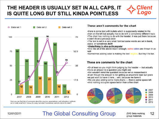
FIGURE 5-2: The Vajrayana slide.
A lot of marketers adopted the Zen approach, but overall it was not very well received in corporate environment. From what I see, many large corporations still prefer a completely different approach that I call Vajrayana presentation.
NOTE Vajrayana is a very complex system of Buddhist thought and practices, which in a way is in a direct opposition to Zen. Zen is essential Buddhism; there are very few texts and methods that you have to learn. Vajrayana, on the other hand, is like a Buddhist supermarket, offering an innumerable amount of different practices, teachings, texts, and so on.
This approach can be summed up in the following sentences: “I will put everything I have on the slide because I might need it. Also, my boss told me to put everything in five slides, maximum. So I will squeeze everything I have in five slides. Sure it will be a bit messy, but I have a five-slide limit.”
It is still a mystery to me why people estimate their presentations using slides as units of measurement. I guess it's a legacy from reports, when you had certain expectations about how much text can one fit onto a single page. But slides are so much more free-form than reports! Why do we keep counting presentation length in slides? I once decided to count the number of slides in Steve Jobs' talks. It turns out his rate is approximately three slides per minute, which means that in 15 minutes he would show 45 slides. Isn't it too much? When I ask it like this it does sound a lot, doesn't it? However, it doesn't look like too much when he actually presents it. Time is the limit, not the number of slides.
![]() Measure your presentation by time, not by number of slides.
Measure your presentation by time, not by number of slides.
It is argued that the Zen presentation works well with live presentations but doesn't work as well when you put your slides on the Web or send them through e-mail. This is a very important difference, but it's not about Zen at all. Yes, it is true that if you put Zen slides from your talk on the Web, people may hardly able to make sense of them. But again, this is not a presentation problem; this is an expectations problem. When I put my slides on the Web for the audience, I include a disclaimer that these slides were not designed to be viewed without a speaker. This solves the expectations problem.
PRESENTATIONS WITHOUT PRESENTERS
There are many Zen presentations that work perfectly well without a speaker. Consider Garr Reynolds' Brain Rules presentation (http://goo.gl/ecqSo), Scott Schwertly's Meet Henry (http://goo.gl/zIoZ4), and—hey!—Death by PowerPoint! “Why don't you make all your presentations like Death by PowerPoint?” I am sometimes asked. “It works both with and without the speaker!” No it doesn't! Do you know how many times I presented Death by PowerPoint live? None. Zero times. Never. I was never asked! And, if fact, what's the point? If it's all very clear without me (and it is), do I really need to say anything?
Providing Choice
Andrew Abela in his book, Advanced Presentations by Design, suggested that there are two separate environments and thus two separate presentation styles:
- Ballroom style: intended to “inform, impress, or entertain” with hundreds of people sitting in the audience
- Conference room style: intended to “engage, persuade, and drive action” among maybe 10 or fewer people
I disagree. First of all, I don't think that the goals are any different for these two types of presentations. I don't believe that “inform, impress, or entertain” are worthy goals for any presentation. You can drive action in a ballroom quite the same way you do in a conference room. I think there's another important distinction that differentiates Zen presentations from Vajrayana presentations. It is called choice.
Zen presentations are about controlling choices available to the audience. They are about guiding the audience's attention towards an outcome that is sought by the speaker and (hopefully) beneficial for the audience as well. Vajrayana presentations let the audience's attention roam. The words “controlling choice” might sound manipulative or patronizing; however, an important distinction should be made here. In presentations there are two types of choice: one is about the process and the other is about the substance.
- An example of decision about the process is: “Should I listen to the speaker or just read the slides?” The speaker should guide the audience's attention. I don't believe anyone would think that leaving the audience in doubt here is a good idea. This would just create confusion without achieving anything.
- An example of decision about the substance is: “Should we invest or divest?” This decision lies solely with the audience. But the speaker must leave no doubt about his or her intentions and preferences. Also, the speaker should try to limit the available number of choices because this vastly increases the odds of any choice to be made at all. We often think that more choices are better but that's not always the case. Barry Schwartz, a professor of social theory and social action at Swarthmore College argues in his bestselling book The Paradox of Choice that although no choice is bad, having too much choice causes indecisiveness. Our cognitive abilities are limited and putting excessive strain on them is a bad idea.
WHAT DO YOU WANT THEM TO SEE?—DECISIONS ABOUT FORM
As far as form is concerned, I don't think you should be leaving your audience any choice.
“I have lots of information on my slides so if somebody finds me boring, they can just read my slides,” one participant actually told me at one of my workshops. Whoa, what a great excuse to be boring! By adding a noisy background, this person is creating a powerful distraction, which diminishes his effectiveness as a presenter. There should be no choice about where to look. You direct the audience's attention. You can focus them on slides or on yourself, but you have to focus them somewhere. Your job as a presenter is to manipulate people's attention. During every second of your speech, your audience should be absolutely sure where you want them to look.
![]() If you need a laser pointer to show your audience where to look on every other slide, that's a clue that your slides are overloaded.
If you need a laser pointer to show your audience where to look on every other slide, that's a clue that your slides are overloaded.
Some people say that the focus should be on a presenter and that the slides are in the background supporting the presenter; they are just the prop and not the act. However, there are numerous examples that prove otherwise. If you watch presentations by Larry Lessig (http://goo.gl/kY7nO) or Dick Hardt (http://goo.gl/BJBDR), what you see is mostly slides; the speaker just provides commentary. In many other excellent presentations you won't see a speaker, just the slides. Why? Because there's a lot of effort put into creating those slides. They convey much more information and with great emotion; they clearly outweigh the speaker. This is perfectly fine! After all, the goal is to have the impact and not to show yourself off. So, this is about the form. What about the content?
DO YOU WANT THEM TO THINK?—DECISIONS ABOUT SUBSTANCE
Denying people any choice sounds oppressive. However, if you have a solution to a problem and you want to implement it, or if you have a product to sell, your audience has few choices to begin with. It's either buy the product or don't. Notice that these choices aren't very creative either. You don't want them to come up with a funny third option. Also, you mostly want them to buy! Granted, you don't want to sell the wrong project to the wrong client (this can have disastrous consequences). However, for the most part, you want to sell your product or idea. That is why all your slides should be doing one and only one thing—selling.
But what if it's not a sales presentation? In business consulting, there are roughly four stages in a project:
- Formulate the questions
- Acquire the data
- Analyze the data
- Present the findings
What's the biggest problem with Vajrayana presentations? People don't do stage three properly. They don't have any interesting findings to present. So they hide behind the cloud of data in hope that nobody will notice. This is not a presentation problem; this is a management problem. They either didn't do the job, or the job was pointless to begin with. These people are not presenting their ideas; they are not trying to convince the audience of anything. They don't have any strong opinion on the subject.
Instead, they just show their slides so the audience can have a good look and draw their own conclusions based on the data. This is perfectly fine as long as it matches expectations of the audience. Sometimes data is the main result of your work. For instance, one of my clients works for a polling agency, and guess what: She's expected to provide poll results. But most of the time, this approach doesn't match the audience's expectations: People expect to see “a presentation.” If you don't properly analyze the data, I don't think you can call it a presentation. You have nothing to present. Call it a meeting, or a discussion. Call your slides “fact sheets”; this is what they are.
The point is that it is very hard to design focused slides if you don't have any focus in the first place. So, the biggest difference between the Vajrayana presentation and the Zen presentation is that with the Zen presentation approach, you are forced to have a strong opinion—something many people are deeply uncomfortable with. Of course, sometimes having strong opinions is not in your job description.
DO THEY WANT TO THINK?
Sometimes people come to your presentations expecting to think hard. Sometimes they are in a fairly critical mood, and they want you to provide a lot of data to support your judgment. This typically happens if the audience is:
- A client: This especially applies to complex technology or consulting projects. They want to know what they are paying for. Some people believe that there's no point in hiring consultants you don't trust in the first place; others believe that trust is something that should be earned. Some clients demand lots of data—not to really make sense of it, but to have it “just in case.”
- Your boss: Again, some bosses are comfortable with their subordinates making independent decisions; they just want to know what the decision is and the general rationale. Some bosses are ready to scrutinize and demand lots of explanations.
- Members of the scientific community: It seems that a scientific presentation is deemed credible if you have a complex diagram on every other slide. Doug Zonker's Chicken Chicken Chicken(http://goo.gl/aGzpw) is a great satire on this whole genre. Granted, cognitive limits for scientists are probably not the same as cognitive limits for line managers (although some line managers might disagree). But I still think most presenters at scientific conferences overstretch it.
Sometimes you need to have a lot of data in your presentation, but even so, don't dwell on it! Your data is not your presentation. Data is just a way to prove your point. The good news is that if you do have a point, if you know what you want to say, there are many great ways to present your data beautifully and without overloading the audience. I will talk about them in the next chapter.