
When version 1.0 of the .NET platform was released, programmers who needed to build graphical desktop applications made use of two APIs named Windows Forms and GDI+, packaged up primarily in the System.Windows.Forms.dll and System.Drawing.dll assemblies. While Windows Forms and GDI+ are still viable APIs for building traditional desktop GUIs, Microsoft shipped an alternative GUI desktop API named Windows Presentation Foundation (WPF) beginning with the release of .NET 3.0. WPF and Windows Forms joined the .NET Core family with the release of .NET Core 3.0.
This initial WPF chapter begins by examining the motivation behind this new GUI framework, which will help you see the differences between the Windows Forms/GDI+ and WPF programming models. Next, you will come to know the role of several important classes, including Application, Window, ContentControl, Control, UIElement, and FrameworkElement.
This chapter will then introduce you to an XML-based grammar named Extensible Application Markup Language (XAML ; pronounced “zammel”). Here, you will learn the syntax and semantics of XAML (including attached property syntax and the role of type converters and markup extensions).
This chapter wraps up by investigating the integrated WPF designers of Visual Studio by building your first WPF application. During this time, you will learn to intercept keyboard and mouse activities, define application-wide data, and perform other common WPF tasks.
The Motivation Behind WPF
Over the years, Microsoft has created numerous graphical user interface toolkits (raw C/C++/Windows API development, VB6, MFC, etc.) to build desktop executables. Each of these APIs provided a code base to represent the basic aspects of a GUI application, including main windows, dialog boxes, controls, menu systems, etc. With the initial release of the .NET platform, the Windows Forms API quickly became the preferred model for UI development, given its simple yet powerful object model.
Pre-WPF Solutions to Desired Functionalities
Desired Functionality | Technology |
|---|---|
Building windows with controls | Windows Forms |
2D graphics support | GDI+ (System.Drawing.dll) |
3D graphics support | DirectX APIs |
Support for streaming video | Windows Media Player APIs |
Support for flow-style documents | Programmatic manipulation of PDF files |
As you can see, a Windows Forms developer must pull in types from several unrelated APIs and object models. While it is true that making use of these diverse APIs might look similar syntactically (it is just C# code, after all), you might also agree that each technology requires a radically different mindset. For example, the skills required to create a 3D rendered animation using DirectX are completely different from those used to bind data to a grid. To be sure, it is difficult for a Windows Forms programmer to master the diverse nature of each API.
Unifying Diverse APIs
.NET 3.0+ Solutions to Desired Functionalities
Desired Functionality | Technology |
|---|---|
Building forms with controls | WPF |
2D graphics support | WPF |
3D graphics support | WPF |
Support for streaming video | WPF |
Support for flow-style documents | WPF |
The obvious benefit here is that .NET programmers now have a single, symmetrical API for all common GUI desktop programming needs. After you become comfortable with the functionality of the key WPF assemblies and the grammar of XAML, you will be amazed how quickly you can create sophisticated UIs.
Providing a Separation of Concerns via XAML
Perhaps one of the most compelling benefits is that WPF provides a way to cleanly separate the look and feel of a GUI application from the programming logic that drives it. Using XAML, it is possible to define the UI of an application via XML markup. This markup (ideally generated using tools such as Microsoft Visual Studio or Blend for Visual Studio) can then be connected to a related C# code file to provide the guts of the program’s functionality.
XAML is not limited to WPF applications. Any application can use XAML to describe a tree of .NET objects, even if they have nothing to do with a visible user interface.
As you dig into WPF, you might be surprised how much flexibility this “desktop markup” provides. XAML allows you to define not only simple UI elements (buttons, grids, list boxes, etc.) in markup but also interactive 2D and 3D graphics, animations, data-binding logic, and multimedia functionality (such as video playback).
XAML also makes it easy to customize how a control should render its visual appearance. For example, defining a circular button control that animates your company logo requires just a few lines of markup. As shown in Chapter 27, WPF controls can be modified through styles and templates, which allow you to change the overall look and feel of an application with minimum fuss and bother. Unlike Windows Forms development, the only compelling reason to build a custom WPF control from the ground up is if you need to change the behaviors of a control (e.g., add custom methods, properties, or events; subclass an existing control to override virtual members). If you simply need to change the look and feel of a control (again, such as a circular animated button), you can do so entirely through markup.
Providing an Optimized Rendering Model
GUI toolkits such as Windows Forms, MFC, or VB6 performed all graphical rendering requests (including the rendering of UI elements such as buttons and list boxes) using a low-level, C-based API (GDI), which has been part of the Windows OS for years. GDI provides adequate performance for typical business applications or simple graphical programs; however, if a UI application needed to tap into high-performance graphics, DirectX was required.
The WPF programming model is quite different, in that GDI is not used when rendering graphical data. All rendering operations (e.g., 2D graphics, 3D graphics, animations, control rendering, etc.) now make use of the DirectX API. The first obvious benefit is that your WPF applications will automatically take advantage of hardware and software optimizations. As well, WPF applications can tap into rich graphical services (blur effects, anti-aliasing, transparency, etc.) without the complexity of programming directly against the DirectX API.
Although WPF does push all rendering requests to the DirectX layer, I don’t want to suggest that a WPF application will perform as fast as building an application using unmanaged C++ and DirectX directly. Although significant performance advances have been made in WPF with every release, if you are intending to build a desktop application that requires the fastest possible execution speed (such as a 3D video game), unmanaged C++ and DirectX are still the best approach.
Simplifying Complex UI Programming
Multiple layout managers (far more than Windows Forms) to provide extremely flexible control over the placement and repositioning of content.
Use of an enhanced data-binding engine to bind content to UI elements in a variety of ways.
A built-in style engine, which allows you to define “themes” for a WPF application.
Use of vector graphics, which allows content to be automatically resized to fit the size and resolution of the screen hosting the application.
Support for 2D and 3D graphics, animations, and video and audio playback.
A rich typography API, such as support for XML Paper Specification (XPS) documents, fixed documents (WYSIWYG), flow documents, and document annotations (e.g., a Sticky Notes API).
Support for interoperating with legacy GUI models (e.g., Windows Forms, ActiveX, and Win32 HWNDs). For example, you can incorporate custom Windows Forms controls into a WPF application and vice versa.
Now that you have some idea of what WPF brings to the table, let’s look at the various types of applications that can be created using this API. Many of these features will be explored in detail in the chapters to come.
Investigating the WPF Assemblies
Core WPF Assemblies
Assembly | Meaning in Life |
|---|---|
PresentationCore | This assembly defines numerous namespaces that constitute the foundation of the WPF GUI layer. For example, this assembly contains support for the WPF Ink API, animation primitives, and numerous graphical rendering types. |
PresentationFramework | This assembly contains a majority of the WPF controls, the Application and Window classes, support for interactive 2D graphics, and numerous types used in data binding. |
System.Xaml.dll | This assembly provides namespaces that allow you to program against a XAML document at runtime. By and large, this library is useful only if you are authoring WPF support tools or need absolute control over XAML at runtime. |
WindowsBase.dll | This assembly defines types that constitute the infrastructure of the WPF API, including those representing WPF threading types, security types, various type converters, and support for dependency properties and routed events (described in Chapter 27). |
Core WPF Namespaces
Namespace | Meaning in Life |
|---|---|
System.Windows | This is the root namespace of WPF. Here, you will find core classes (such as Application and Window) that are required by any WPF desktop project. |
System.Windows.Controls | This contains all the expected WPF widgets, including types to build menu systems, tooltips, and numerous layout managers. |
System.Windows.Data | This contains types to work with the WPF data-binding engine, as well as support for data-binding templates. |
System.Windows.Documents | This contains types to work with the documents API, which allows you to integrate PDF-style functionality into your WPF applications, via the XML Paper Specification (XPS) protocol. |
System.Windows.Ink | This provides support for the Ink API, which allows you to capture input from a stylus or mouse, respond to input gestures, and so forth. This is useful for Tablet PC programming; however, any WPF can make use of this API. |
System.Windows.Markup | This namespace defines several types that allow XAML markup (and the equivalent binary format, BAML) to be parsed and processed programmatically. |
System.Windows.Media | This is the root namespace to several media-centric namespaces. Within these namespaces you will find types to work with animations, 3D rendering, text rendering, and other multimedia primitives. |
System.Windows.Navigation | This namespace provides types to account for the navigation logic employed by XAML browser applications (XBAPs) as well as standard desktop applications that require a navigational page model. |
System.Windows.Shapes | This defines classes that allow you to render interactive 2D graphics that automatically respond to mouse input. |
To begin your journey into the WPF programming model, you will examine two members of the System.Windows namespace that are commonplace to any traditional desktop development effort: Application and Window.
If you have created desktop UIs using the Windows Forms API, be aware that the System.Windows.Forms.* and System.Drawing.* assemblies are not related to WPF. These libraries represent the original .NET GUI toolkit, Windows Forms/GDI+.
The Role of the Application Class
Key Properties of the Application Type
Property | Meaning in Life |
|---|---|
Current | This static property allows you to gain access to the running Application object from anywhere in your code. This can be helpful when a window or dialog box needs to gain access to the Application object that created it, typically to access application-wide variables and functionality. |
MainWindow | This property allows you to programmatically get or set the main window of the application. |
Properties | This property allows you to establish and obtain data that is accessible throughout all aspects of a WPF application (windows, dialog boxes, etc.). |
StartupUri | This property gets or sets a URI that specifies a window or page to open automatically when the application starts. |
Windows | This property returns a WindowCollection type, which provides access to each window created from the thread that created the Application object. This can be helpful when you want to iterate over each open window of an application and alter its state (such as minimizing all windows). |
Constructing an Application Class
Within the Startup handler, you will most often process any incoming command-line arguments and launch the main window of the program. The Exit handler, as you would expect, is where you can author any necessary shutdown logic for the program (e.g., save user preferences, write to the Windows registry).
The Main() method of a WPF application must be attributed with the [STAThread] attribute, which ensures any legacy COM objects used by your application are thread-safe. If you do not annotate Main() in this way, you will encounter a runtime exception. Even with the introduction of top-level statements in C# 9.0, you will still want to use the more traditional Main() method in your WPF applications. In fact, the Main() method is autogenerated for you.
Enumerating the Windows Collection
You will build some WPF applications shortly, but until then, let’s check out the core functionality of the Window type and learn about a number of important WPF base classes in the process.
The Role of the Window Class
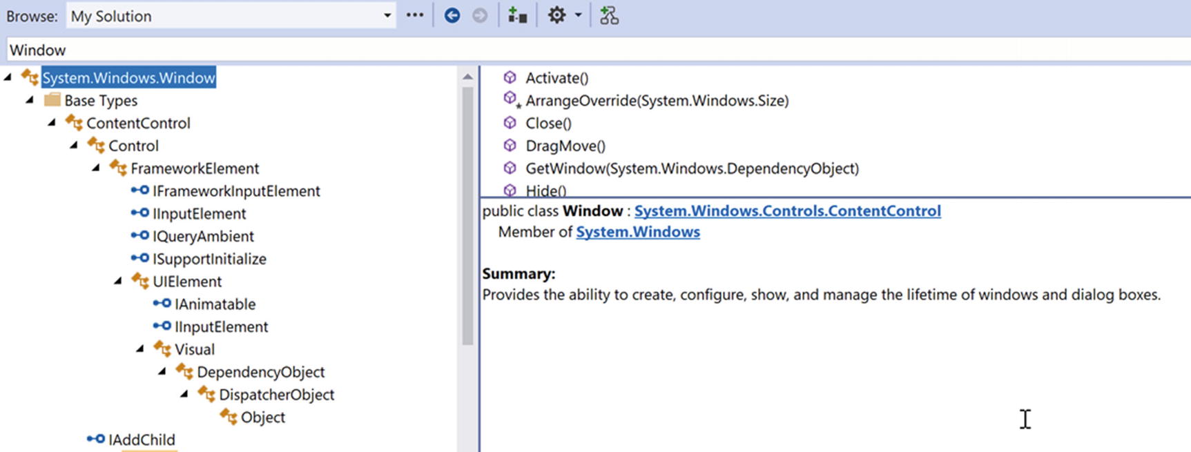
The hierarchy of the Window class
You will come to understand the functionality provided by many of these base classes as you progress through this chapter and the chapters to come. However, to whet your appetite, the following sections present a breakdown of the functionality provided by each base class (consult the .NET 5 documentation for full details).
The Role of System.Windows.Controls.ContentControl
The direct parent of Window is ContentControl, which is quite possibly the most enticing of all WPF classes. This base class provides derived types with the ability to host a single piece of content, which, simply put, refers to the visual data placed within the interior of the control’s surface area via the Content property. The WPF content model makes it quite simple to customize the basic look and feel of a content control.
The Content property can also be set in C# code, which allows you to change the interior of a control at runtime.
However, content can be almost anything. For example, let’s say you want to have a “button” that has something more interesting than a simple string, perhaps a custom graphic and a blurb of text. In other UI frameworks such as Windows Forms, you would be required to build a custom control, which could entail quite a bit of code and a whole new class to maintain. With the WPF content model, there is no need to do so.
Do be aware that not every WPF element derives from ContentControl and, therefore, not all controls support this unique content model (however, most do). As well, some WPF controls add a few refinements to the basic content model you have just examined. Chapter 25 will examine the role of WPF content in much more detail.
The Role of System.Windows.Controls.Control
Key Members of the Control Type
Members | Meaning in Life |
|---|---|
Background, Foreground, BorderBrush, BorderThickness, Padding, HorizontalContentAlignment, VerticalContentAlignment | These properties allow you to set basic settings regarding how the control will be rendered and positioned. |
FontFamily, FontSize, FontStretch, FontWeight | These properties control various font-centric settings. |
IsTabStop, TabIndex | These properties are used to establish tab order among controls on a window. |
MouseDoubleClick, PreviewMouseDoubleClick | These events handle the act of double-clicking a widget. |
Template | This property allows you to get and set the control’s template, which can be used to change the rendering output of the widget. |
The Role of System.Windows.FrameworkElement
Key Members of the FrameworkElement Type
Members | Meaning in Life |
|---|---|
ActualHeight, ActualWidth, MaxHeight, MaxWidth, MinHeight, MinWidth, Height, Width | These properties control the size of the derived type. |
ContextMenu | Gets or sets the pop-up menu associated with the derived type. |
Cursor | Gets or sets the mouse cursor associated with the derived type. |
HorizontalAlignment, VerticalAlignment | Gets or sets how the type is positioned within a container (such as a panel or list box). |
Name | Allows to you assign a name to the type in order to access its functionality in a code file. |
Resources | Provides access to any resources defined by the type (see Chapter 29 for an examination of the WPF resource system). |
ToolTip | Gets or sets the tooltip associated with the derived type. |
The Role of System.Windows.UIElement
Of all the types within a Window’s inheritance chain, the UIElement base class provides the greatest amount of functionality. The key task of UIElement is to provide the derived type with numerous events to allow the derived type to receive focus and process input requests. For example, this class provides numerous events to account for drag-and-drop operations, mouse movement, keyboard input, stylus input, and touch.
Key Members of the UIElement Type
Members | Meaning in Life |
|---|---|
Focusable, IsFocused | These properties allow you to set focus on a given derived type. |
IsEnabled | This property allows you to control whether a given derived type is enabled or disabled. |
IsMouseDirectlyOver, IsMouseOver | These properties provide a simple way to perform hit-testing logic. |
IsVisible, Visibility | These properties allow you to work with the visibility setting of a derived type. |
RenderTransform | This property allows you to establish a transformation that will be used to render the derived type. |
The Role of System.Windows.Media.Visual
The Visual class type provides core rendering support in WPF, which includes hit-testing of graphical data, coordinate transformation, and bounding box calculations. In fact, the Visual class interacts with the underlying DirectX subsystem to draw data on the screen. As you will examine in Chapter 26, WPF provides three possible manners in which you can render graphical data, each of which differs in terms of functionality and performance. Use of the Visual type (and its children, such as DrawingVisual) provides the most lightweight way to render graphical data, but it also entails the greatest amount of manual code to account for all the required services. Again, more details to come in Chapter 28.
The Role of System.Windows.DependencyObject
WPF supports a particular flavor of .NET properties termed dependency properties . Simply put, this style of property provides extra code to allow the property to respond to several WPF technologies such as styles, data binding, animations, and so forth. For a type to support this new property scheme, it will need to derive from the DependencyObject base class. While dependency properties are a key aspect of WPF development, much of the time their details are hidden from view. Chapter 25 dives further into the details of dependency properties.
The Role of System.Windows.Threading.DispatcherObject
The final base class of the Window type (beyond System.Object, which I assume needs no further explanation at this point in the book) is DispatcherObject. This type provides one property of interest, Dispatcher, which returns the associated System.Windows.Threading.Dispatcher object. The Dispatcher class is the entry point to the event queue of the WPF application, and it provides the basic constructs for dealing with concurrency and threading. The Dispatcher class was explored in Chapter 15.
Understanding the Syntax of WPF XAML
Production-level WPF applications will typically make use of dedicated tools to generate the necessary XAML. As helpful as these tools are, it is a good idea to understand the overall structure of XAML markup. To help in your learning process, allow me to introduce a popular (and free) tool that allows you to easily experiment with XAML.
Introducing Kaxaml
When you are first learning the grammar of XAML , it can be helpful to use a free tool named Kaxaml. You can obtain this popular XAML editor/parser from https://github.com/punker76/kaxaml.
For many editions of this book, I’ve pointed users to www.kaxaml.com, but unfortunately, that site has been retired. Jan Karger (https://github.com/punker76) has forked the old code and has done some work on improving it. You can find his version of the tool on GitHub https://github.com/punker76/kaxaml/releases. Much respect and thanks to the original developers of Kaxaml and to Jan for keeping it alive; it is a great tool and has helped countless developers learn XAML.
Like a Window, a Page contains various layout managers and controls. However, unlike a Window, Page objects cannot run as stand-alone entities. Rather, they must be placed inside a suitable host such as a NavigationWindow or a Frame. The good news is that you can type identical markup within a <Page> or <Window> scope.
If you change the <Page> and </Page> elements in the Kaxaml markup window to <Window> and </Window>, you can press the F5 key to load a new window onto the screen.
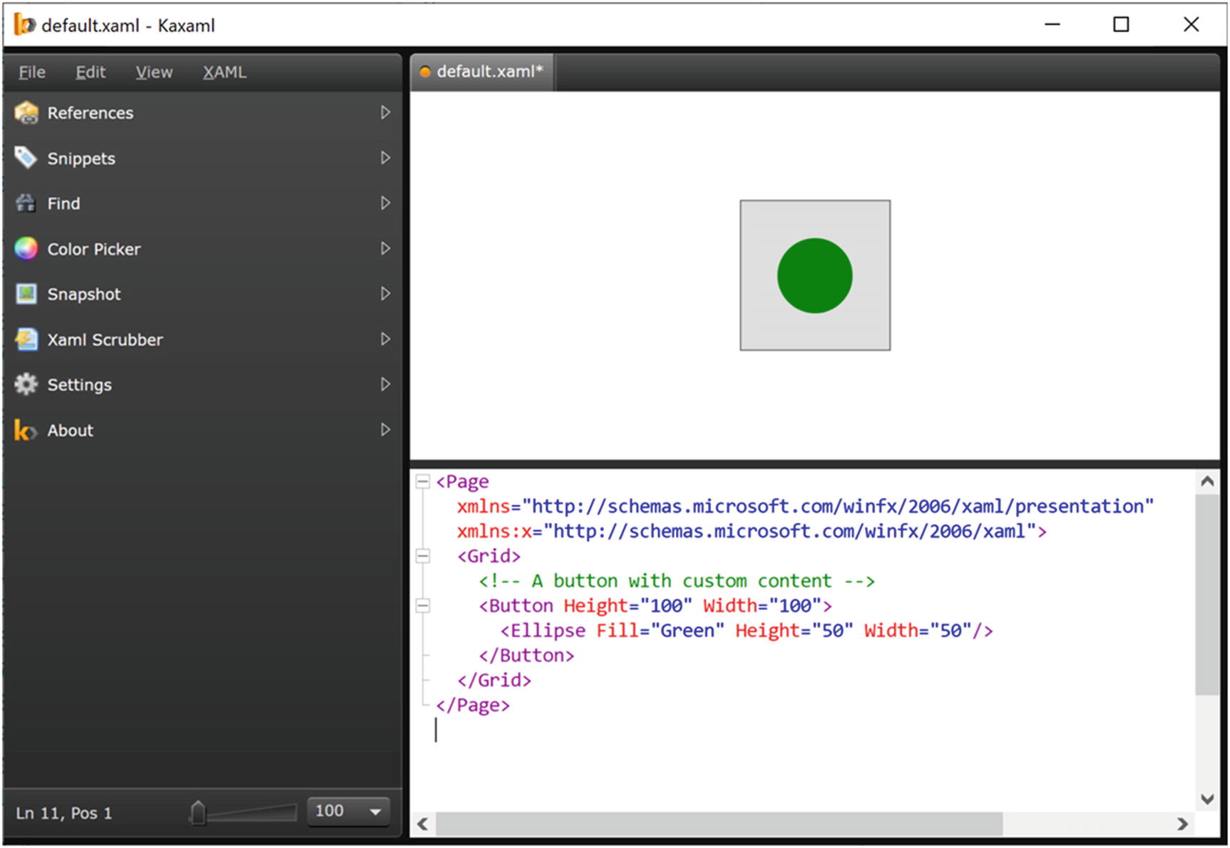
Kaxaml is a helpful (and free) tool used to learn the grammar of XAML
As you work with Kaxaml, remember that this tool does not allow you to author any markup that entails code compilation (however, using x:Name is allowed). This includes defining an x:Class attribute (for specifying a code file), entering event handler names in markup, or using any XAML keywords that also entail code compilation (such as FieldModifier or ClassModifier). Any attempt to do so will result in a markup error.
XAML XML Namespaces and XAML “Keywords”
The first XML namespace, http://schemas.microsoft.com/winfx/2006/xaml/presentation, maps a slew of WPF .NET namespaces for use by the current *.xaml file (System.Windows, System.Windows.Controls, System.Windows.Data, System.Windows.Ink, System.Windows.Media, System.Windows.Navigation, etc.).
The obvious downside of defining wordy XML namespace prefixes is you are required to type XamlSpecificStuff each time your XAML file needs to refer to one of the items defined within this XAML-centric XML namespace. Given that XamlSpecificStuff requires many additional keystrokes, just stick with x.
XAML Keywords
XAML Keyword | Meaning in Life |
|---|---|
x:Array | Represents a .NET array type in XAML. |
x:ClassModifier | Allows you to define the visibility of the C# class (internal or public) denoted by the Class keyword. |
x:FieldModifier | Allows you to define the visibility of a type member (internal, public, private, or protected) for any named subelement of the root (e.g., a <Button> within a <Window> element). A named element is defined using the Name XAML keyword. |
x:Key | Allows you to establish a key value for a XAML item that will be placed into a dictionary element. |
x:Name | Allows you to specify the generated C# name of a given XAML element. |
x:Null | Represents a null reference. |
x:Static | Allows you to refer to a static member of a type. |
x:Type | The XAML equivalent of the C# typeof operator (it will yield a System.Type based on the supplied name). |
x:TypeArguments | Allows you to establish an element as a generic type with a specific type parameter (e.g., List<int> vs. List<bool>). |
In addition to these two necessary XML namespace declarations, it is possible, and sometimes necessary, to define additional tag prefixes in the opening element of a XAML document. You will typically do so whenever you need to describe in XAML a .NET Core class defined in an external assembly.
The clr-namespace token is assigned to the name of the .NET Core namespace in the assembly, while the assembly token is set to the friendly name of the external *.dll assembly. You can use this syntax for any external .NET Core library you would like to manipulate in markup. While there is no need to do so at the current time, future chapters will require you to define custom XML namespace declarations to describe types in markup.
If you need to define a class in markup that is part of the current assembly but in a different .NET Core namespace, your xmlns tag prefix is defined without the assembly= attribute, like so: xmlns:myCtrls="clr-namespace:SomeNamespaceInMyApp".
Controlling Class and Member Variable Visibility
XAML Elements, XAML Attributes, and Type Converters
After you have established your root element and any required XML namespaces, your next task is to populate the root with a child element. In a real-world WPF application, the child will be a layout manager (such as a Grid or StackPanel) that contains, in turn, any number of additional UI elements that describe the user interface. The next chapter examines these layout managers in detail, so for now just assume that your <Window> type will contain a single Button element.
As it turns out, WPF ships with several type converter classes, which will be used to transform simple text values into the correct underlying data type. This process happens transparently (and automatically).
How can you represent your complex brush as a string? Well, you cannot! Thankfully, XAML provides a special syntax that can be used whenever you need to assign a property value to a complex object, termed property-element syntax .
Understanding XAML Property-Element Syntax
Notice that within the scope of the <Button> and </Button> tags, you have defined a subscope named <Button.Background>. Within this scope, you have defined a custom <LinearGradientBrush>. (Do not worry about the exact code for the brush; you’ll learn about WPF graphics in Chapter 28.)
Understanding XAML Attached Properties
Here, you have defined a Canvas layout manager that contains an Ellipse. Notice that the Ellipse can inform its parent (the Canvas) where to position its top/left position using attached property syntax.
Attached properties are a specialized form of a WPF-specific concept termed a dependency property . Unless a property was implemented in a specific manner, you cannot set its value using attached property syntax. You will explore dependency properties in detail in Chapter 25.
Visual Studio has IntelliSense, which will show you valid attached properties that can be set by a given element.
Understanding XAML Markup Extensions
As explained, property values are most often represented using a simple string or via property-element syntax. There is, however, another way to specify the value of a XAML attribute, using markup extensions. Markup extensions allow a XAML parser to obtain the value for a property from a dedicated, external class. This can be beneficial given that some property values require several code statements to execute to figure out the value.
Markup extensions provide a way to cleanly extend the grammar of XAML with new functionality. A markup extension is represented internally as a class that derives from MarkupExtension. Note that the chances of you ever needing to build a custom markup extension will be slim to none. However, a subset of XAML keywords (such as x:Array, x:Null, x:Static, and x:Type) are markup extensions in disguise!
First, notice that the <Page> definition has a new XML namespace declaration, which allows you to gain access to the System namespace of mscorlib.dll. With this XML namespace established, you first make use of the x:Static markup extension and grab values from OSVersion and ProcessorCount of the System.Environment class.
The x:Type markup extension allows you to gain access to the metadata description of the specified item. Here, you are simply assigning the fully qualified names of the WPF Button and System.Boolean types.
The previous XAML example is used only to illustrate a markup extension in action. As you will see in Chapter 25, there are much easier ways to populate ListBox controls!

Markup extensions allow you to set values via the functionality of a dedicated class
You have now seen numerous examples that showcase each of the core aspects of the XAML syntax. As you might agree, XAML is interesting, in that it allows you to describe a tree of .NET objects in a declarative manner. While this is extremely helpful when configuring graphical user interfaces, do remember that XAML can describe any type from any assembly, provided it is a nonabstract type containing a default constructor.
Building WPF Applications Using Visual Studio
Let’s examine how Visual Studio can simplify the construction of WPF programs. While you can build WPF applications using Visual Studio Code, Visual Studio Code does not have any designer support for building WPF applications. Visual Studio, with its rich XAML support, is a more productive IDE when building WPF applications.
Here, I will point out some key features of using Visual Studio to build WPF applications. Forthcoming chapters will illustrate additional aspects of the IDE where necessary.
The WPF Project Templates
The New Project dialog box of Visual Studio defines a set of WPF project templates, including WPF App, WPF Custom Control Library, and WPF User Control Library. Create a new WPF App (.NET) project named WpfTesterApp.
When selecting WPF projects from the Visual Studio “Add a new project” screen, be sure to select the WPF project templates that have “(.NET)” in the title, and not “(.NET Framework).” The current version of .NET Core has been renamed to simply .NET 5. If you select a template with “(.NET Framework)” in the title, you will be building your app using .NET Framework 4.x.
Beyond setting the project SDK to Microsoft.NET.Sdk, you will be provided with initial Window- and Application-derived classes, each represented using a XAML and C# code file.
The Toolbox and XAML Designer/Editor
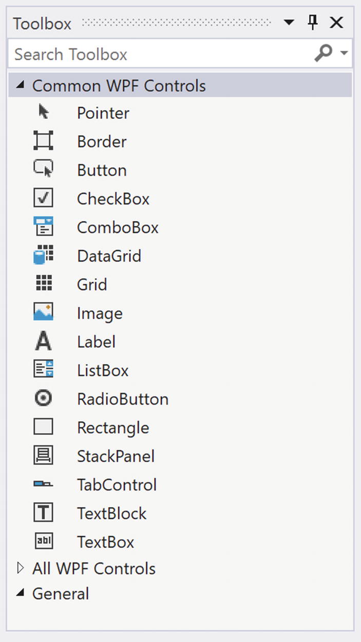
The Toolbox contains the WPF controls that can be placed on the designer surface
Using a standard drag-and-drop operation, you can place any of these controls onto the window’s designer surface or drag the control into the XAML markup editor at the bottom of the designer. When you do, the initial XAML will be authored on your behalf. Use your mouse to drag a Button control and a Calendar control onto the designer surface. After you have done so, notice how you can relocate and resize your controls (and be sure to examine the resulting XAML generated based on your edits).

The WPF Window designer
Take a few moments to add some property values directly in the XAML editor. Be sure you take the time to become comfortable using this aspect of the WPF designer.
Setting Properties Using the Properties Window

The Properties window can be used to configure the UI of a WPF control
The Properties window provides a Search text area at the top. Type in the name of a property you would like to set to quickly find the item in question.
Handling Events Using the Properties Window
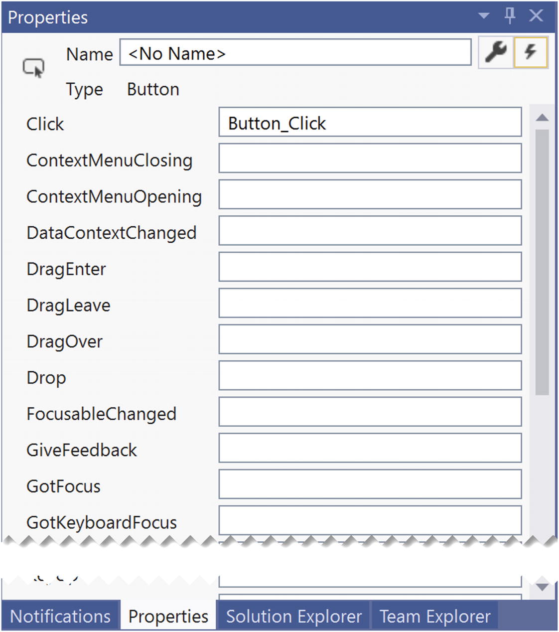
Handling events using the Properties window
Handling Events in the XAML Editor

Handling events using the XAML editor
Chapter 28 covers MVVM and the Command pattern, which is a much better way to handle click events in enterprise applications. But if you need only a simple app, handling click events with a straight event handler is perfectly acceptable.
The Document Outline Window
When you work with any XAML-based project, you will certainly make use of a healthy amount of markup to represent your UIs. When you begin to work with more complex XAML, it can be useful to visualize the markup to quickly select an item to edit on the Visual Studio designer.

Visualizing your XAML via the Document Outline window
This tool also provides a way to temporarily hide a given item (or set of items) on the designer as well as lock items to prevent additional edits from taking place. In the next chapter, you will see how the Document Outline window also provides many other features to group selected items into new layout managers (among other features).
Enable or Disable the XAML Debugger
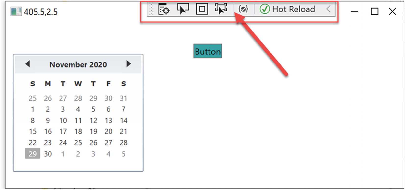
XAML UI debugging
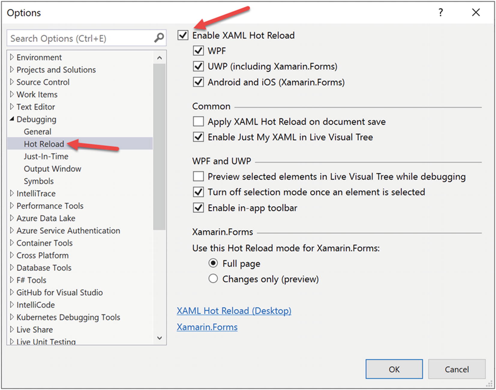
XAML UI debugging
Examining the App.xaml File
How did the project know what window to launch? Even more intriguing, if you examine the code files in your application, you will also see that there is not a Main() method anywhere to be found. You have learned throughout this book that applications must have an entry point, so how does .NET know how to launch your app? Fortunately, both plumbing items are handled for you through the Visual Studio templates and the WPF framework.
Note that the class is marked as partial. In fact, all the code-behind windows for XAML files are marked partial. That is key to solving the riddle of where the Main() method lives. But first, you need to examine what happens when msbuild.exe processes XAML files.
Mapping the Window XAML Markup to C# Code
When msbuild.exe processed your *.csproj file, it produced three files for each XAML file in your project with the form of *.g.cs (where g denotes autogenerated), *.g.i.cs (where i denotes IntelliSense), and *.baml (for Binary Application Markup Language). These are saved into the objDebug directory (and can be viewed in Solution Explorer by clicking the Show All Files button). You might have to hit the Refresh button in Solution Explorer to see them since they are not part of the actual project but build artifacts.
Now rebuild your solution (or project) and refresh the files in Solution Explorer. If you open the MainWindow.g.cs file into a text editor, you will find a class named MainWindow, which extends the Window base class. The name of this class is a direct result of the x:Class attribute in the <Window> start tag.
This class defines a private member variable of type bool (named _contentLoaded), which was not directly accounted for in the XAML markup. This data member is used to determine (and ensure) the content of the window is assigned only once. This class also contains a member variable of type System.Windows.Controls.Button, named ClickMe. The name of the control is based on the x:Name (or the shorthand form Name) attribute value within the opening <Button> declaration. What you do not see is a variable for the Calendar control. This is because msbuild.exe creates a variable for each named control in your XAML that has related code in the code-behind. If there is not any code, there isn’t any need for a variable. To make matters more confusing, if you had not named the Button control, there wouldn’t be a variable for it either. This is part of the magic of WPF and is tied into the IComponentConnector interface implementation.
This tells the framework that the control on line 20 of the XAML file has the SelectedDatesChanged event handler assigned, as shown in the preceding code.
At this point, the question becomes “what exactly is this embedded resource?”
The Role of BAML
As you might have guessed from the name, Binary Application Markup Language (BAML) is a compact, binary representation of the original XAML data. This *.baml file is embedded as a resource (via a generated *.g.resources file) into the compiled assembly. This BAML resource contains all the data needed to establish the look and feel of the UI widgets (again, such as the Height and Width properties).
The important takeaway here is to understand that a WPF application contains within itself a binary representation (the BAML) of the markup. At runtime, this BAML will be plucked out of the resource container and used to make sure all windows and controls are initialized to the correct look and feel.
Also, remember that the name of these binary resources are identical to the name of the stand-alone *.xaml files you authored. However, this does not imply in any way that you must distribute the loose *.xaml files with your compiled WPF program. Unless you build a WPF application that will dynamically load and parse *.xaml files at runtime, you will never need to ship the original markup.
Solving the Mystery of Main()
Interacting with Application-Level Data
Recall that the Application class defines a property named Properties, which allows you to define a collection of name-value pairs via a type indexer. Because this indexer has been defined to operate on type System.Object, you are able to store any sort of item within this collection (including your custom classes) to be retrieved at a later time using a friendly moniker. Using this approach, it is simple to share data across all windows in a WPF application.
To illustrate, you will update the current Startup event handler to check the incoming command-line arguments for a value named /GODMODE (a common cheat code for many PC video games). If you find this token, you will establish a bool value set to true within the properties collection of the same name (otherwise, you will set the value to false).
You will see the shameful message box displayed when terminating the application.
Recall that you can supply command-line arguments within Visual Studio. Simply double-click the Properties icon within Solution Explorer, click the Debug tab from the resulting editor, and enter /godmode within the “Command line arguments” editor.
Handling the Closing of a Window Object
End users can shut down a window by using numerous built-in system-level techniques (e.g., clicking the X close button on the window’s frame) or by indirectly calling the Close() method in response to some user interaction element (e.g., File ➤ Exit). In either case, WPF provides two events that you can intercept to determine whether the user is truly ready to shut down the window and remove it from memory. The first event to fire is Closing, which works in conjunction with the CancelEventHandler delegate.
This delegate expects target methods to take System.ComponentModel.CancelEventArgs as the second parameter. CancelEventArgs provides the Cancel property, which when set to true will prevent the window from actually closing (this is handy when you have asked the user if he really wants to close the window or if perhaps he would like to save his work first).
If the user does indeed want to close the window, CancelEventArgs.Cancel can be set to false (which is the default setting). This will then cause the Closed event to fire (which works with the System.EventHandler delegate), making it the point at which the window is about to be closed for good.
Now, run your program and attempt to close the window, either by clicking the X icon in the upper right of the window or by clicking the button control. You should see the confirmation dialog asking if you really want to leave. If you answer Yes, you will then see the farewell message. Clicking the No button will keep the window in memory.
Intercepting Mouse Events
The WPF API provides several events you can capture to interact with the mouse. Specifically, the UIElement base class defines mouse-centric events such as MouseMove, MouseUp, MouseDown, MouseEnter, MouseLeave, and so forth.
The XButton1 and XButton2 properties allow you to interact with “extended mouse buttons” (such as the “next” and “previous” buttons found on some mouse controls). These are often used to interact with a browser’s history list to navigate between visited pages.
Intercepting Keyboard Events
At this point in the chapter, WPF might look like nothing more than yet another GUI framework that is providing (more or less) the same services as Windows Forms, MFC, or VB6. If this were in fact the case, you might question the need for yet another UI toolkit. To truly see what makes WPF so unique, you require an understanding of the XML-based grammar, XAML.
Summary
Windows Presentation Foundation (WPF) is a user interface toolkit introduced with the release of .NET 3.0. The major goal of WPF is to integrate and unify previously unrelated desktop technologies (2D graphics, 3D graphics, window and control development, etc.) into a single, unified programming model. Beyond this point, WPF programs typically make use of XAML, which allows you to declare the look and feel of your WPF elements via markup.
Recall that XAML allows you to describe trees of .NET objects using a declarative syntax. During this chapter’s investigation of XAML, you were exposed to several new bits of syntax, including property-element syntax and attached properties, as well as the role of type converters and XAML markup extensions.
XAML is a key aspect for any production-level WPF application. The final example of this chapter gave you a chance to build a WPF application that showed many of the concepts discussed in this chapter. The next chapters will dive deeper into these concepts as well as introduce many more.