
Using the Tabs Widget
The tabs widget is superficially similar to the accordion that I described in Chapter 19 but offers more functionality and opportunities for customization. In common with the earlier widget chapters, I start with details of how to create the widget and then show you the settings, methods, and events that the widgets support. I finish this chapter with an example of how you can use the tabs widget to present forms to users in sections, which is a useful technique for dealing with long forms that require a lot of data input. Table 20-1 provides the summary for this chapter.
Table 20-1. Chapter Summary
JQUERY UI CHANGES SINCE THE LAST EDITION
The tabs widget underwent a significant API change in jQuery UI 1.10. There are fewer methods and configuration options and, in keeping with changes to other widgets, there is more reliance on directly manipulating the elements to which the widget has been applied when making changes.
The following options have been removed: fx, ajaxOptions, cache, spinner, selected, idPrefix, tabTemplate, panelTemplate, and cookie. The following methods have been removed: url, abort, select, add, remove, and length. The set of events that the tabs widget defines has been simplified. See the section “Using the Tabs Events” for details of the new events.
The changes may seem drastic, but the result is a widget which is simpler and easier to work with. All of the functionality provided by the methods and options remains available by using jQuery to manipulate the underlying HTML elements and then using the new refresh method to update the state of the widget, as demonstrated by the listings in this chapter.
Creating the Tabs
You create jQuery UI tabs using the tabs method. As with the accordion widget, the tab widget requires a specific HTML element structure to work, as shown in Listing 20-1.
Listing 20-1. Creating jQuery UI Tabs
<!DOCTYPE html>
<html>
<head>
    <title>Example</title>
    <script src="jquery-2.0.2.js" type="text/javascript"></script>
    <script src="handlebars.js"></script>
    <script src="handlebars-jquery.js"></script>
    <script src="jquery-ui-1.10.3.custom.js" type="text/javascript"></script>
    <link rel="stylesheet" type="text/css" href="jquery-ui-1.10.3.custom.css"/>
    <link rel="stylesheet" type="text/css" href="styles.css"/>
    <script id="flowerTmpl" type="text/x-jquery-tmpl">
        {{#flowers}}
        <div class="dcell">
            <img src="{{product}}.png"/>
            <label for="{{product}}">{{name}}:</label>
            <input name="{{product}}" value="0" />
        </div>
        {{/flowers}}
    </script>
    <script type="text/javascript">
        $(document).ready(function () {
            var data = {
                flowers: [{ "name": "Aster", "product": "aster" },
                { "name": "Daffodil", "product": "daffodil" },
                { "name": "Rose", "product": "rose" },
                { "name": "Peony", "product": "peony" },
                { "name": "Primula", "product": "primula" },
                { "name": "Snowdrop", "product": "snowdrop" },
                { "name": "Carnation", "product": "carnation" },
                { "name": "Lily", "product": "lily" },
                { "name": "Orchid", "product": "orchid" }]
            };

            var elems = $("#flowerTmpl").template(data).filter("*");
            elems.slice(0, 3).appendTo("#tab1");
            elems.slice(3, 6).appendTo("#tab2");
            elems.slice(6).appendTo("#tab3");

            $("#tabs").tabs();
            $("button").button();
        });
    </script>
</head>
<body>
    <h1>Jacqui's Flower Shop</h1>
    <form method="post" action="http://node.jacquisflowershop.com/order">
        <div id="tabs">
            <ul>
                <li><a href="#tab1">Row 1</a>
                <li><a href="#tab2">Row 2</a>
                <li><a href="#tab3">Row 3</a>
            </ul>
            <div id="tab1"></div>
            <div id="tab2"></div>
            <div id="tab3"></div>
        </div>
        <div id="buttonDiv"><button type="submit">Place Order</button></div>
    </form>
</body>
</html>
The element that the tabs method is applied to must contain two kinds of element. The first is the content elements, which are those elements whose contents should appear inside the tabs. The second kind of element is the structure elements, which give the jQuery UI tab widget the information it needs to create the tab structure.
I use div elements to provide the structure. In the following example, I have used three div elements, each of which will hold one row of flower product information, just as in earlier examples:
...
<div id="tab1"></div>
<div id="tab2"></div>
<div id="tab3"></div>
...
It is important that each content element has an id attribute so that the jQuery UI tab widget can find the right element to display. For the structure, I use li elements, each of which contains an a element, as follows:
...
<ul>
    <li><a href="#tab1">Row 1</a>
    <li><a href="#tab2">Row 2</a>
    <li><a href="#tab3">Row 3</a>
</ul>
...
The number of li items defines the number of tabs. The content of the a element is used as the tab label, and the href attribute specifies which content element the tab relates to.
 Tip I used data templates to generate the tab content dynamically because it lets me show the required structure more clearly. The content can be defined statically or, as I explain in the next section, obtained dynamically from the server.
You can see how the structure in the example is transformed into a set of tabs in Figure 20-1.
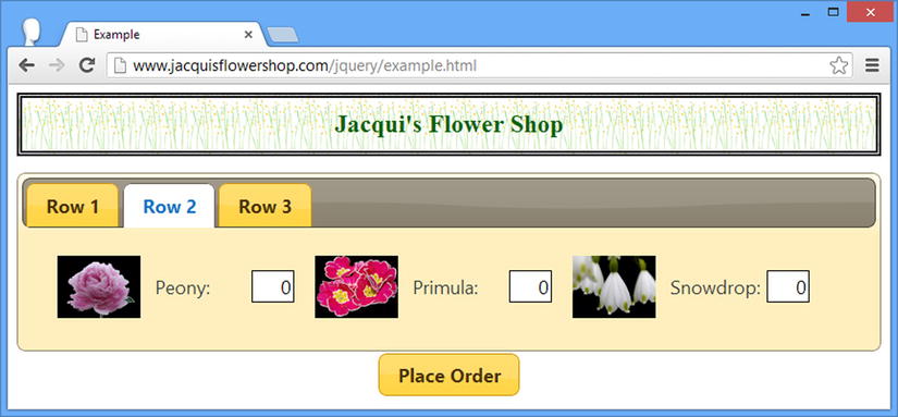
Figure 20-1. Creating jQuery UI tabs
Tabs are a familiar user interface metaphor. Clicking a tab causes jQuery UI to display the corresponding content element. As with the accordion, the tabs widget lets you present a lot of content in a relatively compact manner, allowing the user to focus on what is important to him. This means you have to think carefully about how the tabs and their content relate to one another. The goal should be to group your content to minimize the amount of switching the user has to do between tabs to find what she is looking for, while preserving the natural grouping of the content elements. As with any user interface, this requires a solid understanding of the task that the user is performing and how her workflow (and not your systems) operates.
One of the nice features of the tab widget is the ability to obtain tab content via Ajax. To do this, you simply specify a URL as the href attribute for the appropriate a element. A tab that gets its content via Ajax is known as a remote tab. To demonstrate this feature, I have created an HTML document called tabflowers.html, the contents of which are shown in Listing 20-2.
Listing 20-2. The Contents of the tabflowers.html File
<div>
    <div class="dcell">
        <img src="aster.png"/><label for="aster">Aster:</label>
        <input name="aster" value="0" />
    </div>
    <div class="dcell">
        <img src="daffodil.png"/><label for="daffodil">Daffodil:</label>
        <input name="daffodil" value="0" />
    </div>
    <div class="dcell">
        <img src="rose.png"/><label for="rose">Rose:</label>
        <input name="rose" value="0" />
    </div>
</div>
<div>
    <div class="dcell">
        <img src="peony.png"/><label for="peony">Peony:</label>
        <input name="peony" value="0" />
    </div>
    <div class="dcell">
        <img src="primula.png"/><label for="primula">Primula:</label>
        <input name="primula" value="0" />
    </div>
    <div class="dcell">
        <img src="snowdrop.png"/><label for="snowdrop">Snowdrop:</label>
        <input name="snowdrop" value="0" />
    </div>
</div>
I have used the same structure and content as for the generated content elements in order to keep the example simple. Listing 20-3 shows how I can use the tabflowers.html file as the content for a tab.
Listing 20-3. Obtaining the Content of a Tab via Ajax
...
<body>
    <h1>Jacqui's Flower Shop</h1>
    <form method="post" action="http://node.jacquisflowershop.com/order">
        <div id="tabs">
            <ul>
                <li><a href="tabflowers.html">Ajax Content</a>
                <li><a href="#tab1">Row 1</a>
                <li><a href="#tab2">Row 2</a>
                <li><a href="#tab3">Row 3</a>
            </ul>
            <div id="tab1"></div>
            <div id="tab2"></div>
            <div id="tab3"></div>
        </div>
        <div id="buttonDiv"><button type="submit">Place Order</button></div>
    </form>
</body>
...
In Listing 20-2, I have added a new tab called Ajax Content and specified the URL of the content that should be loaded. You can see the effect in Figure 20-2.
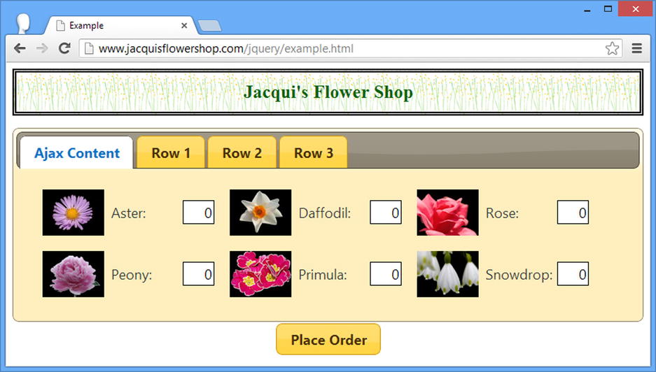
Figure 20-2. Getting the contents of a tab via Ajax
Tip You don’t need to create a content element for a remote tab. This is done for you automatically by the tabs widget.
At first glance, the tabs widget may look like a vertical variation of the accordion widget that I showed you in Chapter 19. There are some common characteristics, but there is a wider set of configuration options and settings when you use tabs. Table 20-2 describes the settings that are supported by the jQuery UI tabs widget. In the sections that follow, I show you how to use these settings to configure the widget.
Table 20-2. Tabs Settings
| Setting | Description |
|---|---|
| active | Gets or sets the currently displayed tab; individual panels are specified using a zero-based index and all panels can be closed by specifying false (but this only works if collapsible is set to true) |
| collapsible | When set to true, all of the tabs are closed |
| disabled | Used to enable/disable individual tabs |
| event | Used to set the event that triggers transition between tabs |
| heightStyle | Specifies how the height of the widget and its tabs is determined |
| hide | Specifies how tabs are animated when they are closed—I describe the jQuery UI animations in Chapter 35. |
| show | Specifies how tabs are animated when they are opened—I describe the jQuery UI animations in Chapter 35. |
Tip The set of configuration options for the tabs widget changed substantially in the jQuery UI 1.10 release. See the note at the start of this chapter for full details, but the new set of options—as shown in Table 20-2—are simpler and more consistent with those of the other jQuery UI widgets.
Selecting the Active Tab
The active setting provides support for determining and changing the tab that is currently shown, as demonstrated by Listing 20-4.
Listing 20-4. Using the active Option to Get and Set the Displayed Tab
<!DOCTYPE html>
<html>
<head>
    <title>Example</title>
    <script src="jquery-2.0.2.js" type="text/javascript"></script>
    <script src="handlebars.js"></script>
    <script src="handlebars-jquery.js"></script>
    <script src="jquery-ui-1.10.3.custom.js" type="text/javascript"></script>
    <link rel="stylesheet" type="text/css" href="jquery-ui-1.10.3.custom.css"/>
    <link rel="stylesheet" type="text/css" href="styles.css"/>
    <style>
        #radioDiv { text-align: center; margin-top: 10px;}
    </style>
    <script id="flowerTmpl" type="text/x-jquery-tmpl">
        {{#flowers}}
        <div class="dcell">
            <img src="{{product}}.png"/>
            <label for="{{product}}">{{name}}:</label>
            <input name="{{product}}" value="0" />
        </div>
        {{/flowers}}
    </script>
    <script type="text/javascript">
        $(document).ready(function () {
            var data = {
                flowers: [{ "name": "Aster", "product": "aster" },
                { "name": "Daffodil", "product": "daffodil" },
                { "name": "Rose", "product": "rose" },
                { "name": "Peony", "product": "peony" },
                { "name": "Primula", "product": "primula" },
                { "name": "Snowdrop", "product": "snowdrop" },
                { "name": "Carnation", "product": "carnation" },
                { "name": "Lily", "product": "lily" },
                { "name": "Orchid", "product": "orchid" }]
            };

            var elems = $("#flowerTmpl").template(data).filter("*");
            elems.slice(0, 3).appendTo("#tab1");
            elems.slice(3, 6).appendTo("#tab2");
            elems.slice(6).appendTo("#tab3");

            $("#tabs").tabs();

            $("#radioDiv").buttonset().change(function (e) {
                $("#tabs").tabs("option", "active", e.target.value);
            });
        });
    </script>
</head>
<body>
    <h1>Jacqui's Flower Shop</h1>
    <form method="post" action="http://node.jacquisflowershop.com/order">
        <div id="tabs">
            <ul>
                <li><a href="tabflowers.html">Ajax Content</a>
                <li><a href="#tab1">Row 1</a>
                <li><a href="#tab2">Row 2</a>
                <li><a href="#tab3">Row 3</a>
            </ul>
            <div id="tab1"></div>
            <div id="tab2"></div>
            <div id="tab3"></div>
        </div>
        <div id="radioDiv">
            <input type="radio" name="tabNo" id="one" value="1" />
                <label for="one">1</label>
            <input type="radio" name="tabNo" id="two" value="2"/>
                <label for="two">2</label>
            <input type="radio" name="tabNo" id="three" value="3"/>
                <label for="three">3</label>
        </div>
    </form>
</body>
</html>
I have added a jQuery UI button set to the document, as described in Chapter 18. I use the jQuery change method to register a handler function that is called when one of the buttons in the set is clicked. The handler function uses the option method to set the active property, producing the effect shown in Figure 20-3.
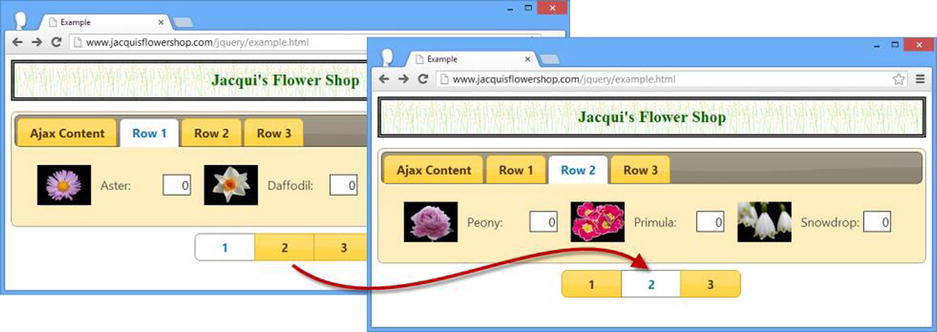
Figure 20-3. Using the active setting to change the active tab
Disabling Individual Tabs
The disabled setting changes the state of the tabs widget if you use boolean values, but it can also be employed to enable and disable individual tabs by using an array of numbers. Listing 20-5 demonstrates.
Listing 20-5. Enabling and Disabling Individual Tabs
<!DOCTYPE html>
<html>
<head>
    <title>Example</title>
    <script src="jquery-2.0.2.js" type="text/javascript"></script>
    <script src="jquery-ui-1.10.3.custom.js" type="text/javascript"></script>
    <link rel="stylesheet" type="text/css" href="jquery-ui-1.10.3.custom.css"/>
    <link rel="stylesheet" type="text/css" href="styles.css"/>
    <style type="text/css">
        #buttonDiv {margin: 5px}
    </style>
    <script type="text/javascript">
        $(document).ready(function () {

            $("#tabs").tabs();

            $("input:checkbox").button().click(function () {
                var disabledPositions = [];
                $("input:checked").each(function (index, elem) {
                    disabledPositions.push(Number(elem.value));
                })

                $("#tabs").tabs("option", "disabled", disabledPositions)
            });
        });
    </script>
</head>
<body>
    <h1>Jacqui's Flower Shop</h1>
    <form method="post" action="http://node.jacquisflowershop.com/order">
        <div id="tabs">
            <ul>
                <li><a href="#tab1">Tab 1</a>
                <li><a href="#tab2">Tab 2</a>
                <li><a href="#tab3">Tab 3</a>
            </ul>
            <div id="tab1">This is the content for tab 1</div>
            <div id="tab2">This is the content for tab 2</div>
            <div id="tab3">This is the content for tab 3</div>
        </div>
        <div id="buttonDiv">
            <label for="cb0">Tab 1</label><input type="checkbox" id="cb0" value=0>
            <label for="cb1">Tab 2</label><input type="checkbox" id="cb1" value="1">
            <label for="cb2">Tab 3</label><input type="checkbox" id="cb2" value="2">
        </div>
    </form>
</body>
</html>
I have created a tabs widget with static content and added a set of check boxes that I have transformed into jQuery UI toggle buttons. When one of the buttons is clicked, the corresponding tab is enabled or disabled, as shown in Figure 20-4.
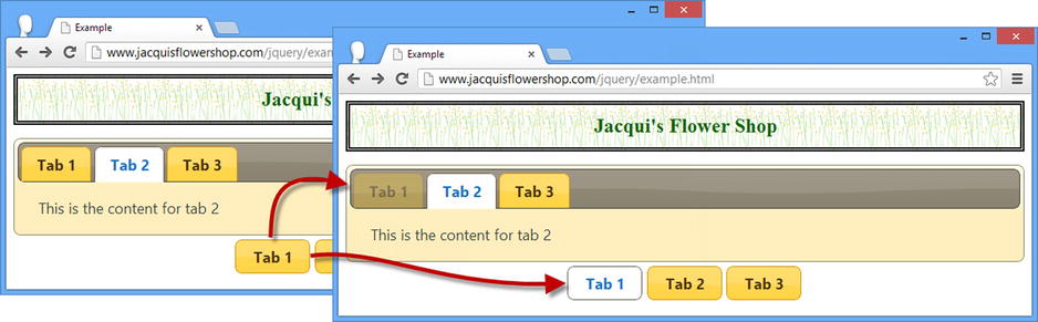
Figure 20-4. Disabling and enabling tabs in response to button clicks
Changing the Event Trigger
The tabs widget responds to the click event by default, meaning that users must click a tab to activate it. You can use the event setting to specify a different event to respond to. This is most useful for responding to mouse events, as shown in Listing 20-6.
Listing 20-6. Changing the Event That Activates a Tab
<!DOCTYPE html>
<html>
<head>
    <title>Example</title>
    <script src="jquery-2.0.2.js" type="text/javascript"></script>
    <script src="jquery-ui-1.10.3.custom.js" type="text/javascript"></script>
    <link rel="stylesheet" type="text/css" href="styles.css"/>
    <link rel="stylesheet" type="text/css" href="jquery-ui-1.10.3.custom.css"/>
    <style type="text/css"> #buttonDiv {margin: 5px}</style>
    <script type="text/javascript">
        $(document).ready(function() {

            $("#tabs").tabs({
                event: "mouseover"
            });
        });
    </script>
</head>
<body>
    <h1>Jacqui's Flower Shop</h1>
    <form method="post" action="http://node.jacquisflowershop.com/order">
        <div id="tabs">
            <ul>
                <li><a href="#tab1">Tab 1</a>
                <li><a href="#tab2">Tab 2</a>
                <li><a href="#tab3">Tab 3</a>
            </ul>
            <div id="tab1">This is the content for tab 1</div>
            <div id="tab2">This is the content for tab 2</div>
            <div id="tab3">This is the content for tab 3</div>
        </div>
    </form>
</body>
</html>
I specified the mouseover event in this listing, which means that the tabs widget will switch between tabs as the mouse moves across the tab labels.
Tip I recommend using this approach sparingly, just as I did for the same setting of the accordion widget. It is visually appealing but creates an annoying effect, forcing the user to take care not to move the mouse away from the label of the tab he wants to interact with.
Using Collapsible Tabs
You can create a sort of hybrid between tabs and accordions by using the collapsible setting, as shown in Listing 20-7.
Listing 20-7. Using the collapsible Setting
...
<script type="text/javascript">
    $(document).ready(function() {
        $("#tabs").tabs({
            collapsible: true
        });
    });
</script>
...
When the collapsible setting is true, clicking the active tab collapses it just like an accordion content element. You can see the transition in Figure 20-5.
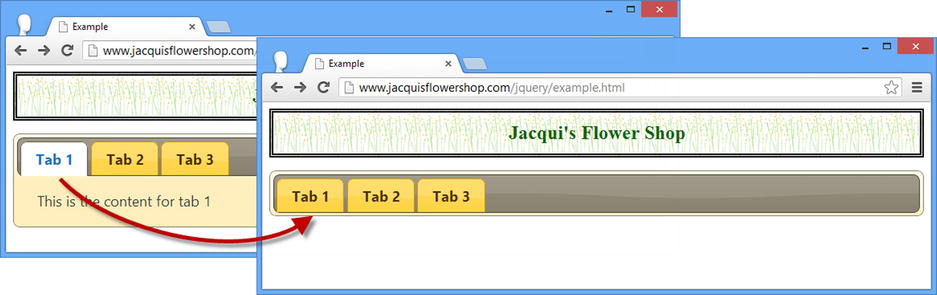
Figure 20-5. Collapsing the active tab
Tip I have included this setting for completeness, but it is one that I never use in my own projects because the result is confusing to users.
Using the Tabs Methods
Table 20-3 shows the methods that are supported by the jQuery UI tabs widget.
Table 20-3. Tabs Methods
| Method | Description |
|---|---|
| tabs("destroy") | Removes the tab widget from the underlying HTML element |
| tabs("disable") | Disables the entire widget or individual tabs (see the section “Using Collapsible Tabs” for an example of using the corresponding setting) |
| tabs("enable") | Enables the entire widget or an individual tab |
| tabs("option") | Changes one or more settings (see the section “Configuring the Button” in Chapter 18 for details of configuring a jQuery UI widget) |
| tabs("load") | Explicitly loads the contents of a tab using an Ajax request |
| tabs("refresh") | Updates the widget to reflect changes in the underlying HTML elements |
Tip The set of methods supported by the tabs widget changed in version 1.10. The following methods have been removed: add, remove, select, url, length, and abort. The add and remove methods have been replaced by a new method called refresh; the functionality of the select method is available through the active setting; you can implement the functionality abort method using the new beforeActivate event. There is no alternative functionality for the length method.
Adding and Removing Tabs
I use the jQuery UI tabs widget to define add and remove methods for manipulating the set of tabs that were displayed to the user. These methods were removed in jQuery UI 1.10 and replaced with the refresh method, which updates the tabs based on changes to the underlying HTML elements that the widget has been applied to. In Listing 20-8, you can see how to use the refresh method.
Listing 20-8. Using the refresh Method to Update the Tabs Widget
<!DOCTYPE html>
<html>
<head>
    <title>Example</title>
    <script src="jquery-2.0.2.js" type="text/javascript"></script>
    <script src="jquery-ui-1.10.3.custom.js" type="text/javascript"></script>
    <link rel="stylesheet" type="text/css" href="jquery-ui-1.10.3.custom.css"/>
    <link rel="stylesheet" type="text/css" href="styles.css"/>
    <style type="text/css">
        #buttons {margin: 5px 0}
    </style>
    <script type="text/javascript">
        $(document).ready(function () {

            $("#tabs").tabs();

            $("button").button().click(function (e) {
                var tabsElem = $("#tabs");
                if (this.id == "add") {
                    var tabID = tabsElem.children("div").length + 1;
                    tabsElem.children("ul").append($("<li>").append($("<a>")
                        .attr("href", "#tab" + tabID).text("Tab " + tabID)));
                    $("<div>").attr("id", "tab" + tabID)
                        .text("This is the content for tab " + tabID).appendTo(tabsElem);
                } else {
                    tabsElem.find("li").first().remove();
                    tabsElem.children("div").first().remove();
                }
                tabsElem.tabs("refresh");
            })
        });
    </script>
</head>
<body>
    <h1>Jacqui's Flower Shop</h1>
    <div id="buttons" class="ui-widget">
        <button id="add">Add Tab</button>
        <button id="remove">Remove Tab</button>
    </div>
    <div id="tabs">
        <ul>
            <li><a href="#tab1">Tab 1</a>
            <li><a href="#tab2">Tab 2</a>
            <li><a href="#tab3">Tab 3</a>
        </ul>
        <div id="tab1">This is the content for tab 1</div>
        <div id="tab2">This is the content for tab 2</div>
        <div id="tab3">This is the content for tab 3</div>
    </div>
</body>
</html>
I have added a pair of button elements that add and remove the li and div elements used by the tabs widget. When the Add Tab button is clicked I generate new elements and add them to the Document Object Model (DOM). When the Remove Tab button is clicked I remove the first li and div element I can find.
I call the refresh method after making these changes, notifying the tabs widget that it should update itself to reflect the changes I have made, creating the effect shown in Figure 20-6.
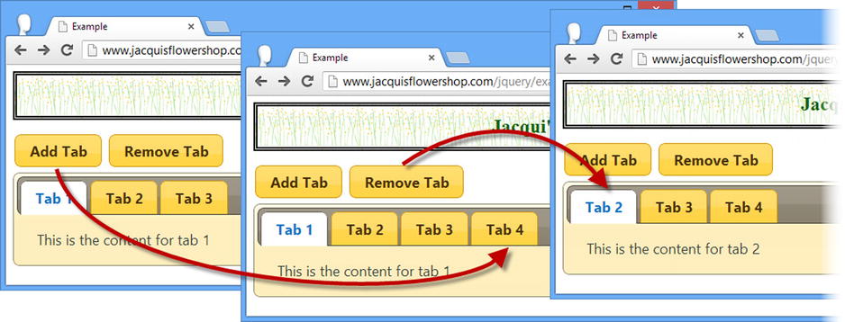
Figure 20-6. Adding and removing tabs
Triggering Tab Ajax Requests
By default, the tabs widget will only make Ajax requests for tabs that have remote content when the user opens that tab. This approach prevents requesting content that may never be displayed, but it can lead to delays when the user opens a tab. You can tell the tabs widget to explicitly load the contents of a remote tab using the load method, as demonstrated in Listing 20-9.
Listing 20-9. Using the load Method to Explicitly Obtain Remote Content
<!DOCTYPE html>
<html>
<head>
    <title>Example</title>
    <script src="jquery-2.0.2.js" type="text/javascript"></script>
    <script src="jquery-ui-1.10.3.custom.js" type="text/javascript"></script>
    <link rel="stylesheet" type="text/css" href="jquery-ui-1.10.3.custom.css"/>
    <link rel="stylesheet" type="text/css" href="styles.css"/>
    <style type="text/css">
        #buttons {margin: 5px 0}
    </style>
    <script type="text/javascript">
        $(document).ready(function () {

            $("#tabs").tabs();

            $("#load").button().click(function (e) {
                var tabsElem = $("#tabs");

                tabsElem.find("a").each(function (index, elem) {
                    if (elem.href.indexOf("example.html") == -1) {
                        tabsElem.tabs("load", index);
                    }
                });
            });
        });
    </script>
</head>
<body>
    <h1>Jacqui's Flower Shop</h1>

    <div id="buttons" class="ui-widget">
        <button id="load">Load</button>
    </div>

    <div id="tabs">
        <ul>
            <li><a href="#tab1">Tab 1</a>
            <li><a href="#tab2">Tab 2</a>
            <li><a href="#tab3">Tab 3</a>
            <li><a href="tabflowers.html">Ajax Content</a>
        </ul>
        <div id="tab1">This is the content for tab 1</div>
        <div id="tab2">This is the content for tab 2</div>
        <div id="tab3">This is the content for tab 3</div>
    </div>
</body>
</html>
The argument to the load method is the index of the remote tab you want to load content for. In this case, I have used the load method in response to a button being clicked.
Using the Tabs Events
The set of events supported by the jQuery UI tabs widget is described in Table 20-4 and I describe them in the sections that follow.
Table 20-4. Tabs Events
| Event | Description |
|---|---|
| create | Triggered when the tabs widget is applied to an underlying HTML element |
| beforeActivate | Triggered before a tab panel is shown to the user |
| activate | Triggered after a tab panel is shown to the user |
| beforeLoad | Triggered when the contents of a remote tab are about to be loaded |
| load | Triggered when the contents of a remote tab have been loaded |
Tip The set of events supported by the tabs widget changed in jQuery UI version 1.10, removing the select, show, add, remove, enable, and disable events and adding the beforeActivate, activate, and beforeLoad events. The events that are removed are moot either because the tabs widget now relies on the state of the underlying HTML elements (and the refresh method) or because the functionality can be recreated using the new events.
Intercepting Ajax Requests
The beforeLoad event is triggered before a request for the contents of a remote tab is made. Handler functions are passed a jQuery event object and an additional object—usually assigned the name ui in the handler function—that defines the properties shown in Table 20-5.
Table 20-5. The Properties of the Additional Object Passed to beforeLoad Event Handler Functions
| Name | Description |
|---|---|
| tab | Returns a jQuery object containing the tab element for the remote tab |
| panel | Returns a jQuery object containing the panel element for the remote tab |
| jqXHR | Returns the jqXHR object that will be used to make the Ajax request |
| ajaxSettings | Returns a map object that will be passed to the $.ajax method to make the request |
These properties reveal the close integration between jQuery UI and jQuery, by building on the jQuery Ajax functionality that I described in Chapters 14 and 15. In Listing 20-10, you can see how I handle the beforeLoad event to adjust the settings of the Ajax request.
Listing 20-10. Handling the beforeLoad Event
<!DOCTYPE html>
<html>
<head>
    <title>Example</title>
    <script src="jquery-2.0.2.js" type="text/javascript"></script>
    <script src="jquery-ui-1.10.3.custom.js" type="text/javascript"></script>
    <link rel="stylesheet" type="text/css" href="jquery-ui-1.10.3.custom.css"/>
    <link rel="stylesheet" type="text/css" href="styles.css"/>
    <script type="text/javascript">
        $(document).ready(function () {
            $("#tabs").tabs({
                beforeLoad: function (e, ui) {
                    ui.ajaxSettings.url = "flowers.html";
                }
            });
        });
    </script>
</head>
<body>
    <h1>Jacqui's Flower Shop</h1>
    <div id="tabs">
        <ul>
            <li><a href="#tab1">Tab 1</a>
            <li><a href="#tab2">Tab 2</a>
            <li><a href="#tab3">Tab 3</a>
            <li><a href="tabflowers.html">Ajax Content</a>
        </ul>
        <div id="tab1">This is the content for tab 1</div>
        <div id="tab2">This is the content for tab 2</div>
        <div id="tab3">This is the content for tab 3</div>
    </div>
</body>
</html>
The handler function that I registered for the beforeLoad event sets the url property on the ui.ajaxSettings object to change the source of the content that will be displayed by the remote tab. Instead of the tabflowers.html file specified by the HTML elements, the flowers.html file will be loaded instead.
Manipulating Remote Tab Data
The load event is triggered when the data for a remote tab have been loaded from the server and can be used to manipulate the content before it is shown to the user. The handler function is passed a jQuery event object and an additional ui object that defines the properties shown in Table 20-6.
Table 20-6. The Properties of the Additional Object Passed to load Event Handler Functions
| Name | Description |
|---|---|
| tab | Returns a jQuery object that contains the tab element that was loaded |
| panel | Returns a jQuery object that contains the element into which the content was loaded |
Notice that neither of the properties returned by the ui object directly refers to the content that was loaded from the server. Instead, the handler function has access to the elements that are used by the tabs widget for the tab header and the content panel. In Listing 20-11, you can see how I use these elements to change the title of the tab and manipulate the content loaded from the server.
Listing 20-11. Handling the Tabs load Event
...
<script type="text/javascript">
    $(document).ready(function () {
        $("#tabs").tabs({
            load: function (e, ui) {
                ui.tab.find("a").text("Loaded!");
                ui.panel.children().first().remove();
            }
        });
    });
</script>
...
I use the ui.tab property to locate the a element used for the tab and call the jQuery text method to change the title. I use the ui.panel property to locate the first child content element loaded from the server and remove it from the DOM. You can see the effect in Figure 20-7.
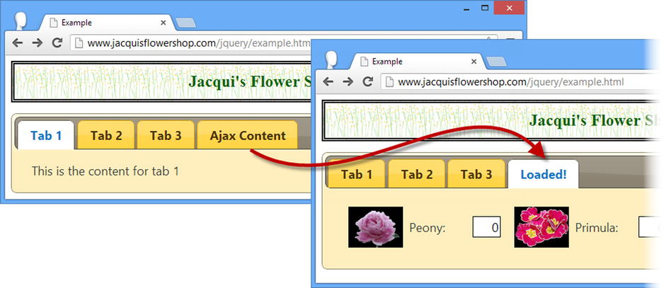
Figure 20-7. Handling the load event
Tip Notice that I don’t have to call the refresh method, even though I am modifying the DOM elements on which the tabs widget relies. The refresh is applied automatically after the load event has been triggered.
Using Tabs to Display a Form
This is a useful technique for making a long form more approachable while giving the user a sense of how far she has progressed through the form. To begin, Listing 20-12 shows the document that contains the form that I will use.
Listing 20-12. The Document That Contains a Form
<!DOCTYPE html>
<html>
<head>
    <title>Example</title>
    <script src="jquery-2.0.2.js" type="text/javascript"></script>
    <script src="handlebars.js"></script>
    <script src="handlebars-jquery.js"></script>
    <script src="jquery-ui-1.10.3.custom.js" type="text/javascript"></script>
    <link rel="stylesheet" type="text/css" href="styles.css"/>
    <link rel="stylesheet" type="text/css" href="jquery-ui-1.10.3.custom.css"/>
    <style type="text/css">
        #tab2 input, #tab3 input {width: 200px; text-align: left}
        #tab1, #tab2, #tab3 {padding: 10px}
        .fl {float: left}
        #buttonDiv {clear: both}
        #tabs, h1 {margin: 10px}
        .regLabel {width: auto}
    </style>
    <script id="flowerTmpl" type="text/x-jquery-tmpl">
        {{#flowers}}
            <div class="dcell ui-widget">
                <img src="{{product}}.png"/>
                <label for="{{product}}">{{name}}:</label>
                <input name="{{product}}" value="0"/>
            </div>
        {{/flowers}}
    </script>
    <script id="detailsTmpl" type="text/x-jquery-tmpl">
        {{#details}}
            <div class="ui-widget">
                <label for="{{name}}">{{name}}:</label>
                <input name="{{name}}" placeholder="{{hint}}"/>
            </div>
        {{/details}}
    </script>
    <script type="text/javascript">
        $(document).ready(function () {

            var data = [{ "name": "Aster", "product": "aster" },
                        { "name": "Daffodil", "product": "daffodil" },
                        { "name": "Rose", "product": "rose" },
                        { "name": "Peony", "product": "peony" }];

            var elems = $("#flowerTmpl").template({ flowers: data }).filter("*");
            elems.slice(0, 2).appendTo("#row1");
            elems.slice(2, 4).appendTo("#row2");

            var detailsData = [{ name: "Name", hint: "Enter your name" },
                    { name: "Street", hint: "Enter your street" },
                    { name: "City", hint: "Enter your city" },
                    { name: "State", hint: "Enter your state" },
                    { name: "Zip", hint: "Enter your zip code" }];

            $("#detailsTmpl").template({ details: detailsData }).filter("*")
                .appendTo("#tab2").clone().appendTo("#tab3")

            $("button").button();
        });
    </script>
</head>
<body>
    <h1>Jacqui's Flower Shop</h1>
    <form method="post" action="http://node.jacquisflowershop.com/order">
        <div id="tabs" class="ui-widget">
            <ul>
                <li><a href="#tab1">1. Select Products</a>
                <li><a href="#tab2">2. Your Details</a>
                <li><a href="#tab3">3. Your Shipping Address</a>
            </ul>
            <div id="tab1">
                <h2>1. Select Products</h2>
                <div id="row1"></div>
                <div id="row2"></div>
            </div>
            <div id="tab2" class="fl">
                <h2>2. Your Details</h2>
            </div>
            <div id="tab3" class="fl">
               <h2>3. Your Shipping Address</h2>
            </div>
        </div>
        <div id="buttonDiv"><button type="submit">Place Order</button></div>
    </form>
</body>
</html>
I have added some extra content and structure to the document to flesh out earlier examples. There are fewer flower products, but I have added regions of the document to capture the user’s personal and shipping details. You can see the basic form in Figure 20-8.
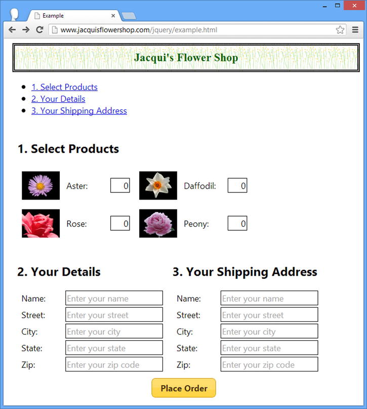
Figure 20-8. The multipart form for use with the tabs widget
There is nothing special about the form, other than being well-suited for use with the jQuery UI tabs widget because it is neatly divided into distinct regions, each of which can be displayed in a tab.
I have added most of the content programmatically using data templates and you can see how I use the jQuery functionality I demonstrated in earlier chapters to generate elements from the data, clone them as required, and then add the results to the document. This isn’t a requirement for using tabs to display forms, but in a book about jQuery, I like to use the core features as much as possible.
You can also see the ul element in the figure and the links that it contains that point to the content elements. I would usually hide this element, but I wanted to show you a nice side effect of the structure that the tabs widget uses for the labels. Creating a list where each list item contains a link means that clicking that link will jump to that part of the document, and, if the link is to another file, then the browser will navigate to that document. This will help me get the behavior I want from the tab headers.
Applying the Tabs
I am ready to apply the tabs widget to the example. Listing 20-13 shows the changes that are required in the script element. No changes are required anywhere else in the document.
Listing 20-13. Creating the Tabs Widget
...
<script type="text/javascript">

    $(document).ready(function () {

        var data = [{ "name": "Aster", "product": "aster" },
                    { "name": "Daffodil", "product": "daffodil" },
                    { "name": "Rose", "product": "rose" },
                    { "name": "Peony", "product": "peony" }];

        var elems = $("#flowerTmpl").template({ flowers: data }).filter("*");
        elems.slice(0, 2).appendTo("#row1");
        elems.slice(2, 4).appendTo("#row2");

        var detailsData = [{ name: "Name", hint: "Enter your name" },
                { name: "Street", hint: "Enter your street" },
                { name: "City", hint: "Enter your city" },
                { name: "State", hint: "Enter your state" },
                { name: "Zip", hint: "Enter your zip code" }];

        $("#detailsTmpl").template({ details: detailsData }).filter("*")
            .appendTo("#tab2").clone().appendTo("#tab3")

        $(".fl").removeClass("fl");
        $("#tabs").tabs().find("h2").remove();

        $("button").button();
    });
</script>
...
I remove the fl class that I used to position the content for the details and shipping address regions and remove the h2 elements that I was using for section headers. I then call the tabs method, which uses the content elements as the basis for the tabs, as you can see in Figure 20-9.
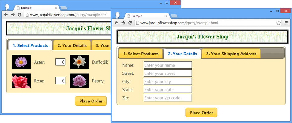
Figure 20-9. Applying tabs to the form
Handling the Button Presses
To make the form easier to fill in using the tabs, I have registered a handler for the click event of the button element. In this handler, I suppress the default action for the event and move to the next tab in the sequence until the last tab is reached. At this point, clicking the button submits the form to the server. Listing 20-14 shows the additions I have made to the script element.
Listing 20-14. Progressing Through the Form Using the Submit Button
...
<script type="text/javascript">

    $(document).ready(function () {

        var data = [{ "name": "Aster", "product": "aster" },
                    { "name": "Daffodil", "product": "daffodil" },
                    { "name": "Rose", "product": "rose" },
                    { "name": "Peony", "product": "peony" }];

        var elems = $("#flowerTmpl").template({ flowers: data }).filter("*");
        elems.slice(0, 2).appendTo("#row1");
        elems.slice(2, 4).appendTo("#row2");

        var detailsData = [{ name: "Name", hint: "Enter your name" },
                { name: "Street", hint: "Enter your street" },
                { name: "City", hint: "Enter your city" },
                { name: "State", hint: "Enter your state" },
                { name: "Zip", hint: "Enter your zip code" }];

        $("#detailsTmpl").template({ details: detailsData }).filter("*")
            .appendTo("#tab2").clone().appendTo("#tab3")

        $(".fl").removeClass("fl");
        $("#tabs").tabs().find("h2").remove();

        $("button").button().click(function (e) {
            var tabsElem = $("#tabs");
            var activeTab = tabsElem.tabs("option", "active");
            if (activeTab < tabsElem.find("ul > li").length -1) {
                tabsElem.tabs("option", "active", activeTab + 1)
                e.preventDefault();
            }
        });
    });
</script>
...
I use the active option to get the index of the active tab and use a jQuery selector to get the set of tab header elements and work out how many there are. If the user has not reached the last tab, then I set the active option to advance to the next tab in the sequence. I call the preventDefault method only when the user isn’t on the final tab, which allows the form to be submitted at the end of the tab sequence.
Performing Validation
At the moment, the user can just jump to the last page and submit the form. To prevent this, I am going to apply some basic form validation. To keep this example simple, I am going to handle the validation manually, but for real projects I recommend using the validation plug-in and the techniques I described in Chapter 13. Listing 20-15 shows the changes to the script element to implement some basic validation and stop the user from jumping to the end of the tab sequence prematurely.
Listing 20-15. Preventing the User from Skipping Through the Tabs with Some Basic Validation
...
<script type="text/javascript">

    $(document).ready(function () {

        var data = [{ "name": "Aster", "product": "aster" },
                    { "name": "Daffodil", "product": "daffodil" },
                    { "name": "Rose", "product": "rose" },
                    { "name": "Peony", "product": "peony" }];

        var elems = $("#flowerTmpl").template({ flowers: data }).filter("*");
        elems.slice(0, 2).appendTo("#row1");
        elems.slice(2, 4).appendTo("#row2");

        var detailsData = [{ name: "Name", hint: "Enter your name" },
                { name: "Street", hint: "Enter your street" },
                { name: "City", hint: "Enter your city" },
                { name: "State", hint: "Enter your state" },
                { name: "Zip", hint: "Enter your zip code" }];

        $("#detailsTmpl").template({ details: detailsData }).filter("*")
            .appendTo("#tab2").clone().appendTo("#tab3")

        var activePanel;

        $(".fl").removeClass("fl");
        $("#tabs").tabs({
            beforeActivate: function (e, ui) {
                validatePanel(e, ui.oldPanel);
            },
            activate: function (e, ui) {
                activePanel = ui.newPanel;
            }
        }).find("h2").remove();


        function validatePanel(e, panelElem) {
            var inputElems = panelElem.find("input");
            if (panelElem.attr("id") == "tab1" ?
                sumInputElems(inputElems) : countEmptyOrZeroValues(inputElems)) {
                alert("Validation Problem!");
                e.preventDefault();
            }
        }

        function sumInputElems(inputs) {
            var total = 0;
            inputs.each(function (index, elem) {
                total+= Number($(elem).val());
            });
            return total == 0;
        }

        function countEmptyOrZeroValues(inputs) {
            var count = 0;
            inputs.each(function (index, elem) {
                if (elem.value == null || elem.value == "") {
                    count++;
                }
            });
            return count > 0;
        }

        $("button").button().click(function (e) {
            var tabsElem = $("#tabs");
            var activeTab = tabsElem.tabs("option", "active");
            if (activeTab < tabsElem.find("ul > li").length - 1) {
                tabsElem.tabs("option", "active", activeTab + 1)
                e.preventDefault();
            } else {
                validatePanel(e, activePanel);
            }
        });
    });
</script>
...
I use two of the tabs events to get the effect I want. The beforeActivated event is useful when the user is navigating from one tab to the next because it provides me with a reference to the content panel of the tab that is about to be closed, which I access through the properties of the second argument passed to my handler function—the ui object—as described in Table 20-7.
Table 20-7. The Properties of the Additional Object Passed to beforeActivate and activate Event Handlers
| Name | Description |
|---|---|
| newHeader | The header element for the newly active tab |
| oldHeader | The header element for the previously active tab |
| newPanel | The newly active content panel |
| oldPanel | The previously active content panel |
I use the oldPanel reference to perform validation and stop the transition to another tab by calling the preventDefaultAction method on the event object (as described in Chapter 9).
There is a wrinkle with this approach, which is that the beforeActivate event isn't triggered when the user clicks the button element after completing the last tab because the form is submitted to the server. For this reason, I also handle the activate event and store a reference to the new tab that is displayed (which I access through the newPanel property of the ui object, which also defines the properties shown in Table 20-7). I use this reference to perform validation before allowing the form to be submitted to the server.
My approach to telling the user about a validation error is to call the alert function and display a message in a dialog box, as shown in Figure 20-10. Obviously, in a real project, you could use the summary features of the validation plug-in, as I described in Chapter 13.
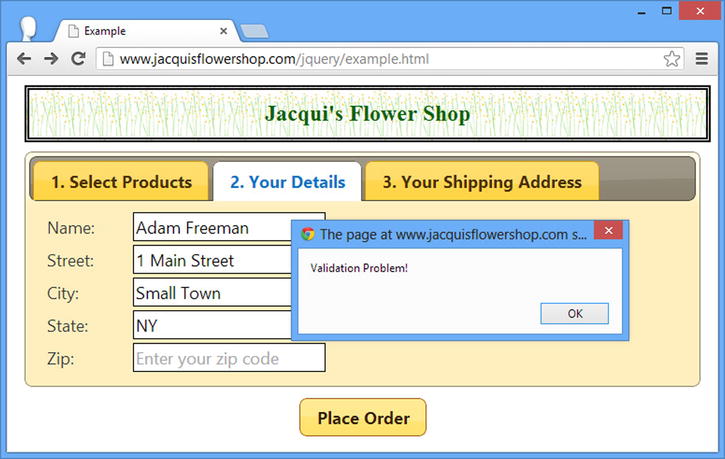
Figure 20-10. The alert box shown in response to a validation error
Summary
In this chapter, I showed you the jQuery UI tabs widget. This widget offers rich and complex functionality and can be used in a wide range of situations. I find myself using this widget a lot. It is flexible and completely customizable, and users are generally familiar with the idea of selectively revealing content contained in individual tabs, something that is not always the case with other widgets such as the accordion. In Chapter 21, I show you the datepicker widget.