
Getting Started with jQuery Mobile
In this chapter, I show you how to obtain jQuery Mobile and add it to an HTML document. I also explain that jQuery Mobile takes a different approach to creating widgets and how you must adapt to accommodate this approach. Touch-enabled devices provide some unique challenges for web application developers, and I explain some of the core features that jQuery Mobile provides to help simplify the process and set out some general guidance for the development and testing of mobile web apps. Table 27-1 provides the summary for this chapter.
Table 27-1. Chapter Summary
| Problem | Solution | Listing |
|---|---|---|
| Add jQuery Mobile to an HTML document. | Add a script element to import the jQuery and jQuery Mobile libraries and a link element to import the CSS. | 1 |
| Create a jQuery Mobile page. | Use the data-role attribute with a value of page. | 2 |
| Disable the browser virtual page. | Configure the viewport. | 3 |
| Defer the execution of custom JavaScript code until after jQuery Mobile has enhanced a document. | Use the pageinit event. | 4 |
| Simplify touch event handling. | Use the jQuery Mobile gesture and virtual mouse events. | 5–7 |
| Respond to changes in device orientation. | Handle the orientationchange event or use CSS media queries. | 8, 9 |
 Note As I explained in Chapter 1, the jQuery Mobile API changed with the release of version 1.3, and I highlight these changes in the chapters that follow.
Setting Up jQuery Mobile
To start this chapter, I’ll show you how to obtain and install jQuery Mobile. jQuery Mobile is built on the foundation of jQuery and jQuery UI, so you’ll see some common patterns that are consistent with these libraries.
Obtaining jQuery Mobile
The first thing you need is jQuery Mobile, which is available from http://jquerymobile.com. As I write this, the current version of jQuery Mobile is 1.3.1, and you can get a zip file from the download page. For version 1.3.1, this is called jquery.mobile-1.3.1.zip .
Tip Just as with jQuery and jQuery UI, jQuery Mobile can be loaded via a content distribution network (CDN). I described CDNs in Chapter 5, and they can be a great idea for Internet-deployed web applications (but rarely for intranet applications). The jQuery Mobile download page includes details of the links you will require to use jQuery Mobile via a CDN.
jQuery Mobile supports a theme framework, which is like a simplified version of the one that jQuery UI uses. There is a default theme included in the jQuery Mobile package, but if you want to create a custom theme, you can do so at http://jquerymobile.com/themeroller. Using the ThemeRoller application generates a zip file that contains a CSS file to include in your web documents. I describe how to use the theme framework in Chapter 28, but I’ll be using the default theme rather than creating a custom one in this part of the book – in part because the jQuery Mobile ThemeRoller doesn’t have a library of convenient themes available.
Getting jQuery
You also need jQuery. Version 1.3.1 of jQuery Mobile is intended to work only with versions 1.7.0 through 1.9.1 of jQuery. jQuery Mobile tends to lag behind releases of jQuery, and support for jQuery 2.0 is not available as I write this. However, you can use the latest 1.x release without any problems, and so I will use jQuery 1.10.1 for the examples in this part of the book.
Tip Even though jQuery Mobile is built on jQuery UI, you don’t need to install the jQuery UI library. Everything you need is included in the jQuery Mobile download.
You need to copy three items from the jQuery Mobile download into the directory from which you serve your web content:
- The jquery.mobile-1.3.1.js file (the jQuery Mobile JavaScript library)
- The jquery.mobile-1.3.1.css file (the CSS styles jQuery Mobile uses)
- The images directory (the jQuery Mobile icons)
You also need the jQuery library, of course, and once everything is in place, you can create an HTML document that uses jQuery Mobile. As with the earlier chapters, I called my file example.html, and I saved it in the same directory as the items in the previous list. Listing 27-1 shows the contents of this file.
Listing 27-1. The Contents of example.html
<!DOCTYPE html>
<html>
<head>
    <title>Example</title>
    <meta name="viewport" content="width=device-width, initial-scale=1">
    <script type="text/javascript" src="jquery-1.10.1.js"></script>
    <script type="text/javascript" src="jquery.mobile-1.3.1.js"></script>
    <link rel="stylesheet" href="jquery.mobile-1.3.1.css" type="text/css" />
</head>
<body>
    <div data-role="page">
        <div data-role="header">
                <h1>Jacqui's Shop</h1>
        </div>
        <div data-role="content">
            This is Jacqui's Flower Shop
            <p><button>Press Me</button></p>
        </div>
   </div>
</body>
</html>
The elements I highlighted are required for jQuery Mobile. The two script elements import the jQuery and jQuery Mobile JavaScript libraries, and the link element imports the CSS that jQuery Mobile relies on. Since my HTML file is in the same directory as the JavaScript and CSS files, I am able to refer to these files simply by name.
Tip Ignore the rest of the document for the moment. I’ll explain shortly what the meta element does and how the contents of the body element are.
Understanding the jQuery Mobile Approach
Although jQuery Mobile is based on jQuery UI, there are some significant differences that you need to be aware of. Before you start digging into the capabilities of jQuery Mobile, I need to explain those differences to provide a context for the information in the following chapters.
jQuery Mobile offers different levels of support for different mobile browsers. There are three grades of support available and a long list of the supported devices and browsers in each. At the high end, A-grade support provides the richest experience and implements all of the features that I describe in this part of the book.
B-grade support provides everything except Ajax navigation, which I describe in Chapter 28. This is still a good level of functionality, but the movement between pages in an application won’t be as smooth as for an A-grade device.
The C-grade category is basic. Only old devices fall into this category, and jQuery Mobile is unable to provide much functionality for these devices.
Happily, most modern mobile devices fall into the A-grade category of support. You can see a detailed list of supported devices at http://jquerymobile.com/gbs.
Understanding Automatic Enhancement
The most striking difference when using jQuery Mobile is that widgets don’t have to be created explicitly. When using jQuery UI, you use jQuery to select one or more elements and then apply a method such as button or tabs to create a specific jQuery UI widget in the document. If you look at Listing 27-1, you will notice that I have not added a script element to the document to create any widgets. The only script elements are there to import jQuery and jQuery Mobile libraries. And yet, as Figure 27-1 shows, I get formatted content. (This figure shows the Opera Mobile emulator that I use extensively in this part of the book and that I properly introduce later in this chapter.)
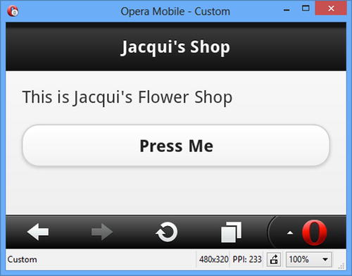
Figure 27-1. The example document
Note For most of the figures in this part of the book, I’ll be using the Opera Mobile browser emulator in a landscape resolution, which lets me pack more examples into each page.
When you bring the jQuery Mobile library into a web page with a script element, the page is enhanced automatically. First jQuery Mobile looks for elements that have a data-role attribute. The value of these attributes tells jQuery Mobile what enhancements should be applied to the elements. Listing 27-2 highlights the data-role attributes in the example document.
Tip Attributes whose name begins with data- are known as data attributes. Data attributes have been an informal convention for defining custom attributes for some time and have been included in the official standard for HTML5.
Listing 27-2. The data-role Attributes in the Example Document
<!DOCTYPE html>
<html>
<head>
    <title>Example</title>
    <meta name="viewport" content="width=device-width, initial-scale=1">
    <script type="text/javascript" src="jquery-1.10.1.js"></script>
    <script type="text/javascript" src="jquery.mobile-1.3.1.js"></script>
    <link rel="stylesheet" href="jquery.mobile-1.3.1.css" type="text/css" />
</head>
<body>
    <divdata-role="page">
        <divdata-role="header">
                <h1>Jacqui's Shop</h1>
        </div>
        <divdata-role="content">
            This is Jacqui's Flower Shop
            <p><button>Press Me</button></p>
        </div>
   </div>
</body>
</html>
One of the unusual features of jQuery Mobile is that a single HTML document can contain multiple pages (a feature that I demonstrate in Chapter 28). The page is the building block of a jQuery Mobile application. There is only one page in this example, and it is denoted by the div element whose data-role value is page. Because the page is nested inside an HTML document, you also need to provide jQuery Mobile with additional information about the purpose of the elements contained within the page. There are two other data-role attributes, which tell jQuery Mobile which element contains the header information for page and which element contains the content. Table 27-2 summarizes the three data-role values in this example and their significance. You can readily correlate the div elements and their data-role values with the structure of the page shown in Figure 27-1.
Table 27-2. Data-Role Attribute Values in the Example Document
| Value | Description |
|---|---|
| page | Tells jQuery Mobile to treat the content of the element as a page. |
| header | Tells jQuery Mobile that the element represents the page header. |
| content | Tells jQuery Mobile that the element contains the content for the page. |
Tip jQuery Mobile will automatically insert the wrapper for the content part of a page. This means that any elements that are not part of another section are treated as content, allowing you to explicitly skip defining an element for that section.
You don’t have to take any explicit action to make jQuery Mobile find the elements with data-role attributes and generate a page. This all happens automatically when the HTML document is loaded. Some elements, such as button, are automatically styled (although, as I demonstrate in later chapters, you can configure most widgets using other data attributes).
Tip jQuery Mobile goes to great lengths to minimize the amount of custom JavaScript that is needed to create a mobile web application. In fact, it is possible to create simple applications without any custom JavaScript at all. This doesn’t mean you can build jQuery Mobile applications for browsers that have JavaScript disabled, however. jQuery Mobile is a JavaScript library and requires JavaScript support to perform automatic enhancement of pages.
Although not part of jQuery Mobile, an important element to add to your HTML documents is the one highlighted in Listing 27-3.
Listing 27-3. The meta Element That Configures the Viewport
...
<head>
    <title>Example</title>
    <meta name="viewport" content="width=device-width, initial-scale=1">
    <script type="text/javascript" src="jquery-1.10.1.js"></script>
    <script type="text/javascript" src="jquery.mobile-1.3.1.js"></script>
    <link rel="stylesheet" href="jquery.mobile-1.3.1.css" type="text/css" />
</head>
...
I have highlighted the meta element whose name attribute is viewport. Many mobile browsers use a virtual page to display web content in order to improve compatibility with web sites that have been designed with desktop browsers in mind. This is generally a sensible idea because it provides the user with an overall sense of the page structure, even though the details are too small to read. Figure 27-2 shows the jQuery Mobile home page as it is displayed initially and zoomed so that the text is readable.
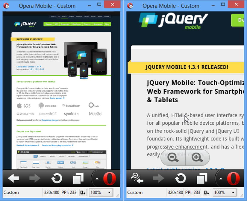
Figure 27-2. The mobile browser virtual page
The first frame shows the jQuery Mobile web site in a portrait orientation (which accentuates the effect). The text is too small to read, but mobile browsers have support for zooming in to regions of the page, as the second frame shows. The virtual page is a compromise, to be sure, but it’s an understandable one given that relatively few web sites are tailored to mobile devices.
The problem is that the virtual page is applied without much discrimination and causes problems for jQuery Mobile applications. Figure 27-3 shows how the example document is displayed when the virtual page is used.
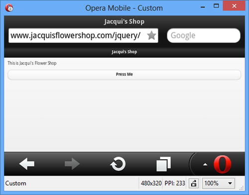
Figure 27-3. The example document displayed in a wide virtual page
As the figure demonstrates, the jQuery Mobile elements are displayed so small that they are unusable. The meta element in the example document tells the browser that the width of the page should be the width of the screen. This causes the browser to display your jQuery Mobile elements at a sensible size.
Understanding jQuery Mobile Events
There are two important pieces of information about events as they relate to jQuery Mobile. In the sections that follow, I describe each of them.
jQuery Mobile defines a series of events that describe the life cycle of pages. The most important of these is the pageinit event. jQuery Mobile automatically enhances pages by registering its functions to handle the jQuery ready event that you have been relying on in earlier parts of the book. If you want to include custom JavaScript in a document, you have to take care not to have your code executed before jQuery Mobile has finished processing the document. This means you have to wait for the pageinit event, and then it is triggered when jQuery Mobile has finished initializing the document. There is no convenient method like there is for the ready event, so you have to use the bind method to associate your function with the event, as demonstrated in Listing 27-4.
Listing 27-4. Using the pageinit Event
<!DOCTYPE html>
<html>
<head>
    <title>Example</title>
    <meta name="viewport" content="width=device-width, initial-scale=1">
    <script type="text/javascript" src="jquery-1.10.1.js"></script>
    <script type="text/javascript">
        $(document).bind("pageinit", function () {
            $("button").click(function () {
                console.log("Button pressed")
            })
        });
    </script>
    <script type="text/javascript" src="jquery.mobile-1.3.1.js"></script>
    <link rel="stylesheet" href="jquery.mobile-1.3.1.css" type="text/css" />
</head>
<body>
    <div data-role="page">
        <div data-role="header">
                <h1>Jacqui's Shop</h1>
        </div>
        <div data-role="content">
            This is Jacqui's Flower Shop
            <p><button>Press Me</button></p>
        </div>
   </div>
</body>
</html>
The arguments to the bind method are the name of the event you are interested in and the function that should be executed when the event is triggered. Your function will be executed only when the event is triggered for the element or elements you have selected and applied the bind method to.
In this example, I have used the bind method to register a function that will be executed when the pageinit event is triggered. Inside that function, I place the statements that I want performed when the document has been loaded and processed. In this case, I have used jQuery to select the button element in the document and used the click method to register another function that will be performed when the button is clicked, just as I have been doing throughout this book.
Tip Notice that I have inserted my new script element before the jQuery Mobile JavaScript library is imported into the document. This isn’t essential for the pageinit event but is required for the mobileinit event that you use to change some jQuery Mobile settings (I demonstrate how to do this in Chapter 28). I find it a good idea to always put the custom code before importing the jQuery Mobile library, even if I am only responding to the pageinit event.
There is a specification for touch events in a browser, but it is pretty low level because there is a lot of variety in the touch interaction model. Some devices support multi-touch, for example, and there is wide variety in the way that touch gestures are interpreted. Table 27-3 describes these low-level touch events.
Table 27-3. The Standard Touch Events
| Event | Description |
|---|---|
| touchstart | Triggered when the user touches the screen. For multi-touch devices, this event will be triggered each time a finger touches the screen. |
| touchend | Triggered when the user removes a finger from the screen. |
| touchmove | Triggered when the user holds or moves a finger while it is touching the screen. |
| touchcancel | Triggered when a touch sequence is disrupted. The meaning of this is device specific, but a common example is when the user slides a finger off the edge of the screen. |
The responsibility of interpreting these events and working out their significance falls to the developer. It is a painful task that is fraught with errors and one that I recommend you avoid wherever possible. It’s something that jQuery Mobile helps with, as I explain shortly.
Tip If you do want to get into the details of touch events, then you can find the specification at www.w3.org/TR/touch-events. This includes full descriptions of the events and the properties that are available for getting the detail of each touch interaction.
Most web sites have not been designed with touch events in mind. To support the widest possible range of web site scripts, the mobile browsers synthesize mouse events from the touch events. This means the browser triggers the touch events and then generates corresponding (fake) mouse events that represent the same actions, but as though they had been performed with a traditional mouse. Listing 27-5 contains a useful script that demonstrates how this is done.
Listing 27-5. Monitoring Touch and Synthesized Mouse Events
<!DOCTYPE html>
<html>
<head>
    <title>Event Test</title>
    <meta name="viewport" content="width=device-width, initial-scale=1">
    <link rel="stylesheet" href="jquery.mobile-1.3.1.css" type="text/css" />
    <script type="text/javascript" src="jquery-1.10.1.js"></script>
    <style type="text/css">
        table {border-collapse: collapse; border: medium solid black; padding: 4px}
        #placeholder {text-align: center}
        #countContainer * {display: inline; width:50px}
        th {width: 100px}
    </style>
    <script type="text/javascript">
        $(document).bind("pageinit", function() {
            var eventList = [
                "mousedown", "mouseup", "click", "mousecancel",
                "touchstart", "touchend", "touchmove", "touchcancel"]

            for (var i = 0; i < eventList.length; i++) {
                $("#pressme").bind(eventList[i], handleEvent)
            }

            $("#reset").bind("tap", function() {
                $("tbody").children().remove();
                $("#placeholder").show();
                startTime = 0;
            })
        });

        startTime = 0;
        function handleEvent(ev) {
            var timeDiff = startTime == 0 ? 0 : (ev.timeStamp - startTime);
            if (startTime == 0) {
                startTime = ev.timeStamp
            }
            $("#placeholder").hide();
            $("<tr><td>" + ev.type + "</td><td>" + timeDiff + "</td></tr>")
                .appendTo("tbody");
        }
    </script>
    <script type="text/javascript" src="jquery.mobile-1.3.1.js"></script>
</head>
<body>
    <div data-role="page">
        <div data-role="content">
            <div id="tcontainer" class="ui-grid-a">
                <div class="ui-block-a">
                    <button id="pressme">Press Me</button>
                    <button id="reset">Reset</button>
                </div>
                <div class="ui-block-b">
                    <table border=1>
                        <thead>
                            <tr><th>Event</th><th>Time</th></tr>
                            <tr id="placeholder"><td colspan=2>No Events</td><tr>
                        </thead>
                        <tbody></tbody>
                    </table>
                </div>
            </div>
        </div>
   </div>
</body>
</html>
There are two buttons and a table in this example. The Press Me button is wired up so that a selection of mouse and touch events are displayed in the table when the button is clicked. For each event, the event type and the number of milliseconds since the last event are shown. The Reset button clears the table and resets the timer. You can see the effect in Figure 27-4.
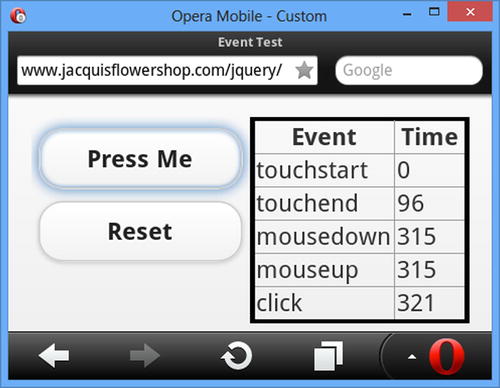
Figure 27-4. Observing the sequence of touch and mouse events
Table 27-4 shows the sequence of events and timings that arise when clicking the button in the Opera Mobile browser.
Table 27-4. The Event Sequence from Opera Mobile
| Event | Relative Time |
|---|---|
| touchstart | 0 |
| touchend | 96 |
| mousedown | 315 |
| mouseup | 315 |
| click | 321 |
You can see that the touchstart and touchend events are triggered first, responding to the moments when I touched and then released the screen. The browser then generates mousedown and mouseup events and then a click event. Notice that there is quite a delay between the touchend and mousedown events being triggered, roughly 300 milliseconds. This is enough of a delay to make relying on the synthesized events problematic because your web application will lag behind the user’s touch interactions. Not all browsers have this problem, but it is common enough to be an issue, and I recommend you measure the latency on the browsers you intend to target.
Using the jQuery Mobile Gesture Methods
jQuery Mobile does two things to make working with events easier. The first is a set of gesture events that are triggered in response to certain sequences of low-level touch events, meaning that you don’t have to analyze the touch sequence yourself to make sense of what gesture the user was making. These events are described in Table 27-5.
Table 27-5. The Standard Touch Events
| Event | Description |
|---|---|
| tap | Triggered when the user touches the screen and then removes her finger in quick succession. |
| taphold | Triggered after the user touches the screen, keeps her finger in place for about a second, and then releases. |
| swipe | Triggered when the user performs a horizontal drag of at least 30 pixels with a vertical variation of less than 20 pixels within a one-second period. |
| swipeleft | Triggered when the user swipes in the left direction. |
| swiperight | Triggered when the user swipes in the right direction. |
These events make dealing with basic gestures simple. Listing 27-6 adds these events to the timing example.
Listing 27-6. Adding the jQuery Mobile Gesture Events to the Timing Example
...
<script type="text/javascript">
    $(document).bind("pageinit", function() {
        var eventList = [
            "mousedown", "mouseup", "click", "mousecancel",
            "touchstart", "touchend", "touchmove", "touchcancel",
            "tap", "taphold", "swipe", "swipeleft", "swiperight"]

        for (var i = 0; i < eventList.length; i++) {
            $("#pressme").bind(eventList[i], handleEvent)
        }

        $("#reset").bind("tap", function() {
            $("tbody").children().remove();
            $("#placeholder").show();
            startTime = 0;
        })
    });

    startTime = 0;
    function handleEvent(ev) {
        var timeDiff = startTime == 0 ? 0 : (ev.timeStamp - startTime);
        if (startTime == 0) {
            startTime = ev.timeStamp
        }
        $("#placeholder").hide();
        $("<tr><td>" + ev.type + "</td><td>" + timeDiff + "</td></tr>")
            .appendTo("tbody");
    }
</script>
...
Figure 27-5 shows what happens when I click the button in the browser.
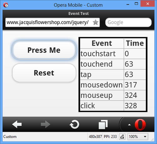
Figure 27-5. Adding the jQuery Mobile gesture events to the timing example
Table 27-6 shows the event sequence in an easy-to-read table. Since I am clicking a button, the only gesture event that appears is tap. The important thing to note is that the tap event is triggered quickly, usually within a couple of milliseconds of my releasing from the screen.
Table 27-6. The Event Sequence from Opera Mobile
| Event | Relative Time |
|---|---|
| touchstart | 0 |
| touchend | 63 |
| tap | 63 |
| mousedown | 317 |
| mouseup | 321 |
| click | 328 |
The nice thing about the gesture events is that jQuery Mobile will trigger them even in browsers that don’t support touch events or that are running on devices without touch interfaces. Figure 27-6 shows the example running in the Google Chrome desktop browser.
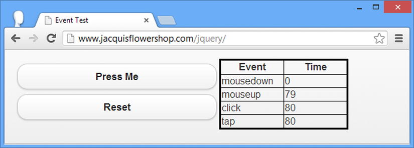
Figure 27-6. The event sequence in a desktop browser
Table 27-7 shows the sequence of events and their relative timings more clearly.
Table 27-7. The Event Sequence from Google Chrome
| Event | Relative Time |
|---|---|
| mousedown | 0 |
| mouseup | 79 |
| click | 80 |
| tap | 80 |
As you might expect, there are no touchstart and touchend events in this sequence, and the order of the events is different (because the mouse events are real, rather than synthesized). Even so, the tap event is still triggered immediately after the click event.
Tip I use the tap event instead of click in mobile web applications because it avoids the timing issue that comes from the synthesized events and because it is also generated on non-touch platforms.
Using the jQuery Mobile Virtual Mouse Events
Browsers are not required to synthesize mouse events, meaning that a web application that works on touch and non-touch devices should listen for both mouse events and touch events. For mobile browses that do synthesize events, you end up with touch and mouse events for each interaction. To help simplify this process, jQuery Mobile defines a set of virtual mouse events. When you register for these events, jQuery Mobile takes care of removing the duplicates and ensuring that the appropriate events are triggered, irrespective of whether you have touch support. Table 27-8 describes the virtual events.
Table 27-8. The Standard Touch Events
| Event | Description |
|---|---|
| vmouseover | Triggered in response to mouseover events (there is no equivalent touch event because the user’s finger isn’t always in contact with the screen). |
| vmousedown | Triggered in response to touchstart or mousedown events. |
| vmousemove | Triggered in response to touchmove or mousemove events. |
| vmouseup | Triggered in response to touchend or mouseup events. |
| vclick | Triggered in response to the click event. |
| vmousecancel | Triggered in response to touchcancel or mousecancel events. |
The way that these events are generated creates a mouse-like sequence, even on touch devices. To explain what I mean, I have added some of the virtual events to the timing example, as shown in Listing 27-7.
Listing 27-7. Adding the jQuery Mobile Virtual Events to the Timing Example
...
<script type="text/javascript">
    $(document).bind("pageinit", function() {
        var eventList = [
            "mousedown", "mouseup", "click", "mousecancel",
            "touchstart", "touchend", "touchmove", "touchcancel",
            "tap", "taphold", "swipe", "swipeleft", "swiperight",
            "vmouseover", "vmousedown", "vmouseup", "vclick", "vmousecancel"]

        for (var i = 0; i < eventList.length; i++) {
            $("#pressme").bind(eventList[i], handleEvent)
        }

        $("#reset").bind("tap", function() {
            $("tbody").children().remove();
            $("#placeholder").show();
            startTime = 0;
        })
    });

    startTime = 0;
    function handleEvent(ev) {
        var timeDiff = startTime == 0 ? 0 : (ev.timeStamp - startTime);
        if (startTime == 0) {
            startTime = ev.timeStamp
        }
        $("#placeholder").hide();
        $("<tr><td>" + ev.type + "</td><td>" + timeDiff + "</td></tr>")
            .appendTo("tbody");
    }
</script>
...
When I touch the screen, jQuery Mobile generates the vmouseover and vmousedown events. These don’t have any meaning in a purely touch environment. If you are writing an application that works across platforms, then you might want to perform some action when the user moves the desktop mouse over an element. The triggering of the synthetic vmouseover event in response to the real touchstart allows you to perform the same action seamlessly for touch devices. You can see the result in Figure 27-7.
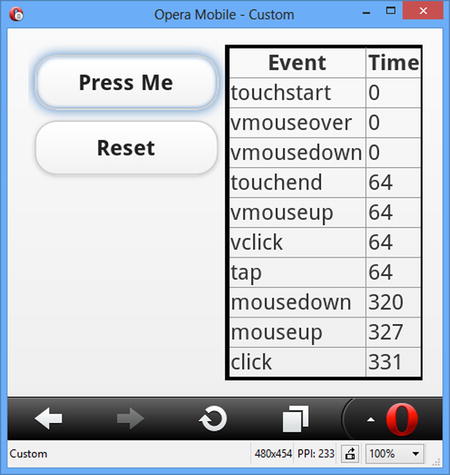
Figure 27-7. Adding the virtual events to the timing example
Table 27-9 shows the event and timing sequence in a more easily readable form. Although the vclick event is triggered long before the synthetic click event, this isn’t always the case, and I do not recommend using vclick as a substitute for click as a way to address the event latency issue.
Table 27-9. The Event Sequence from Google Chrome
| Event | Relative Time |
|---|---|
| touchstart | 0 |
| vmouseover | 0 |
| vmousedown | 0 |
| touchend | 64 |
| vmouseup | 64 |
| vclick | 64 |
| tap | 64 |
| mousedown | 320 |
| mouseup | 327 |
| click | 331 |
Caution It is important not to make assumptions about the way that the real and virtual events are interleaved. This is because the event sequence on a non-touch device will be different. The order of the virtual events relative to one another will be the same; the intervening real events can change.
Responding to Device Orientation Changes
Most mobile browsers support an event called orientationchange, which is triggered every time the device is rotated through 90 degrees. To make life easier, jQuery Mobile will synthesize the orientationevent when it is not supported by the browser. This is done by listening for changes in the window size and looking at the ratio of the new height and width values. Listing 27-8 shows how you can respond to this event.
Listing 27-8. Responding to Changes in Orientation
<!DOCTYPE html>
<html>
<head>
    <title>Example</title>
    <meta name="viewport" content="width=device-width, initial-scale=1">
    <link rel="stylesheet" href="jquery.mobile-1.3.1.css" type="text/css" />
    <script type="text/javascript" src="jquery-1.10.1.js"></script>
    <script type="text/javascript">
        $(document).bind("pageinit", function() {
            $(window).bind("orientationchange", function(e) {
                $("#status").text(e.orientation)
            })
            $("#status").text(jQuery.event.special.orientationchange.orientation())
        });
    </script>
    <script type="text/javascript" src="jquery.mobile-1.3.1.js"></script>
</head>
<body>
    <div data-role="page">
        <div data-role="header">
                <h1>Jacqui's Shop</h1>
        </div>
        <div data-role="content">
            <p>Device orientation is: <b><span id=status></span></b></p>
        </div>
   </div>
</body>
</html>
You must select the window object in order to bind to the orientationchange event. In this example, I change the text of a span element indicating the new orientation. This information is available through the orientation property of the Event object that is passed to the handler function.
jQuery Mobile also provides a method for determining the current orientation, as follows:
...
jQuery.event.special.orientationchange.orientation()
...
I use this method in the example to set the contents of the span element, since the orientationchange event isn’t fired when the page is processed, only when the device is subsequently reoriented.
If you don’t have a real mobile device to test this example with, then you can use one of the emulators that I describe later in this chapter. Most of them have the ability to simulate a rotation, triggered by a particular key stroke or button press. For the Opera Mobile emulator that I am using, pressing Ctrl+Alt+R triggers the effect, which is shown in Figure 27-8.
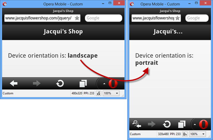
Figure 27-8. Responding to a change in orientation
The synthesized event that jQuery Mobile produces means you can get the same effect when you resize the window of a browser that doesn’t support orientation changes, such as a desktop browser. In this case, the orientation is determined by the width and height of the window.
Using Media Queries to Manage Orientation
The orientationchange event allows you to respond to changes in orientation using JavaScript. An alternative approach is to use CSS, applying different styles to elements for each orientation, something you can achieve using a CSS media query. Listing 27-9 shows how this can be done.
Listing 27-9. Responding to Orientation Using CSS Media Queries
<!DOCTYPE html>
<html>
<head>
    <title>Example</title>
    <meta name="viewport" content="width=device-width, initial-scale=1">
    <link rel="stylesheet" href="jquery.mobile-1.3.1.css" type="text/css" />
    <script type="text/javascript" src="jquery-1.10.1.js"></script>
    <script type="text/javascript" src="jquery.mobile-1.3.1.js"></script>
    <style type="text/css">
        @media screen and (orientation:portrait) {
            #pstatus {display: none}
            #lstatus {display: inline}
        }

        @media screen and (orientation:landscape) {
            #pstatus {display: inline}
            #lstatus {display: none}
        }
    </style>
</head>
<body>
    <div data-role="page">
        <div data-role="header">
                <h1>Jacqui's Shop</h1>
        </div>
        <div data-role="content">
            <p>Device orientation is:
                <span id=pstatus><b>Portrait</b></span>
                <span id=lstatus><b>Landscape</b></span>
            </p>
        </div>
   </div>
</body>
</html>
CSS media queries allow you to define sets of styles that are applied under specific circumstances, in this case when the orientation is landscape or portrait. I use the CSS display property to show or hide elements, allowing me to create the same effect I had with JavaScript in the previous example. There is no need for any kind of synthesis in this situation. Media queries for orientation work equally well for desktop browsers and mobile browsers.
Developing applications for mobile devices has some distinct differences from regular desktop development. In the sections that follow, I provide some guidance and information to help you get started and to highlight some of the key issues you will face.
IDENTIFYING MOBILE DEVICES
If you are offering an application to desktop and mobile users, you may want to tailor the interface you present. A common approach is to offer a jQuery UI interface to desktop browsers and a jQuery Mobile interface to mobile devices.
The difficulty is recognizing which browsers are running on mobile devices. There are various techniques for doing this, all of which are performed at the server, redirecting the browser to the appropriate HTML documents. I am not going to get into the detail of these, since they are outside the scope of this book. If you are new to this issue, then I suggest you look at http://wurfl.sourceforge.net, which contains a useful server-side component that can identify most mobile devices. You should also consider https://github.com/kaimallea/isMobile, which offers a client-side solution.
I recommend against automatically forcing the user to the mobile version of your application based on their browser. Some users prefer to use the desktop versions of applications, even on mobile devices, especially since mobile versions often have restricted functionality. My recommendation is to give the user a simple choice when he arrives at your site if you detect a mobile device and to make it easy to switch between the versions of your application even when the initial decision has been made.
Avoiding the Two Cardinal Sins of Mobile Development
There are two pitfalls to avoid when building web applications for mobile devices: bad assumptions and unrealistic simulation. I explain both and provide some context to help you avoid making some common mistakes.
Avoiding Bad Assumptions
The market for mobile devices is extremely vibrant, relatively immature, and lacking in standardization. When building web applications for desktops, there are some assumptions that are usually made (although they are often unstated). There is a general expectation about the minimum screen resolution, JavaScript support, the availability of certain plug-ins, and that the user will be able to point using a mouse and enter text using a keyboard.
That’s not to say that these are reasonable assumptions. If you assume that JavaScript will be available, for example, then you eliminate potential customers who don’t (or can’t) enable JavaScript in their browser. You might decide that this is a good trade-off, that most users could enable JavaScript if they wanted, and that you’ll just forgo users who don’t meet the specification you require.
The situation in the mobile device market is more complicated because the market is so fragmented. The desktop space may seem diverse, but a Mac, a Windows PC, and a Linux box all have quite a lot in common. The same can’t be said for mobile devices, and assumptions about screen size, network connectivity, and input method will eliminate some large segments of the market.
The World Is Not an iPhone
One of the worst assumptions I see made (and made often) is that the target market is the iPhone. The iPhone has been a wild success, but it isn’t the totality of the mobile device market, and there are even variations between different iPhone models. A common target screen resolution is 320 by 480 pixels, which comes from the older iPhone models. A lot of devices have this resolution, but a growing number do not. Using a fixed-screen resolution in your mobile application will simply eliminate users who have screens that are too small and annoy users who have paid a premium to get a higher-resolution device.
The World Is Not a Phone at All
Another common assumption is that the target market is mobile phones, ignoring the success of the tablet market. Not only do tablets typically have higher screen resolutions, but the way that people hold them and use them is different. To see what I mean, head to any coffee shop and watch the customers. My (entirely unscientific but consistent) observation is that the greater size of tablets makes them slightly awkward to hold and so they are usually propped up against something else. This means they are somewhat unstable, and dragging a finger across the screen makes the tablet wobble slightly (making accuracy a problem) and obscures a lot of the screen (because the user’s hand and arm are over the tablet itself).
My point is that the nature of mobile devices dictates a lot about how they are used and what kind of interactions are sensible and desirable. The best way to figure this out is to observe people interacting with a range of devices. If you have money and time available, then a usability lab is a fantastic resource. But even if you are in a hurry and on a budget, an afternoon spent in Starbucks can provide some valuable insights.
The World Is Not Touch Enabled
Not all mobile devices have touch screens. Some rely on a tiny mouse combined with a keyboard, and some have multiple input methods. One of my test machines is a small laptop that converts into a tablet. It has a touch screen as well as a full keyboard and mouse. Users expect to be able to use the best input method available to them, and making assumptions about the inputs available just leads to user frustration (which is why I rarely use the laptop/tablet combination device other than for testing).
Mobile Bandwidth Is Not Free and Not Infinite
The price of network connectivity goes through cycles, driven by the kinds of activities that the users of the network perform. At the moment, network providers are struggling to fund and build enough network capacity to satisfy demand, especially in densely populated urban areas. Eventually, the cost of capacity will fall and bandwidth available will increase, but at the moment, network providers are charging a premium for data access and applying low caps on the amount of data that a user can download in a month.
It is dangerous to assume that users are willing to dedicate a serious amount of their data to your web application. As a general rule, customers don’t care as much about your application as you’d like them to. It may hurt to hear, but it is almost always true. Your application fills your world, as it should, but it is just one of many to a user.
In Chapter 28, I show you how jQuery Mobile can pre-fetch the content for a web application before the user needs it. It is a great feature, but it should be used with caution because it assumes that the user is willing to spend bandwidth on content they may never need. The same goes for automatic and frequent data updates. Use sparingly, cautiously, and only when the user has explicitly indicated that your application should be a heavy user of his network quota.
Equally, do not make assumptions about the data rate available to a mobile device. Think about your use of large resources such as images and video. Some users will have the capacity to quickly download such content, but many won’t, and a low-bandwidth option is always welcome in my experience.
You should also be prepared to deal with the network being unavailable. I used to commute by train, and the network would drop out whenever I went into a tunnel. A well-written web application expects connectivity issues, reports them to the user, and recovers elegantly when the network becomes available again. Sadly, most applications are not well written.
Tip I once did some work for a global container shipping company, and the constraints they faced led them to create some of the most robust and adaptable applications I have seen. They had shipping agents at almost every port in the world, in places so remote that the agent’s office was just a shack at the end of a pier. They could ship modern PCs to these locations (that didn’t present a problem because they were a shipping company), but networking was often limited to a slow dial-up connection that worked for a couple of hours a day between power cuts, meaning that several days might pass between connections being established. Every application had to allow the local shipping office to carry on working even when there was no network link and synchronize the local data to the global network whenever a connection could be established. It took a lot of thought and testing, but the result was an IT infrastructure that helped them dominate global container shipping. I often think of these constraints when designing mobile applications – modern devices can usually expect better operating conditions, but the best applications always hope for the best, assume the worst, and deal with problems on behalf of the user.
Avoiding Unrealistic Simulation and Testing
The wide variation in mobile devices means you have to test thoroughly. Working with actual mobile devices during the early stages of development can be frustrating. The network requests are routed via the cell network, which requires the development machines to be publicly available. There are developer modes for some mobile devices, but they have their own drawbacks.
In short, you want a simulated environment in which to start your development, something that gives you the ability to build and test rapidly and conveniently and to do so without having to expose your development environments to the outside world. Fortunately, there are emulators that provide the facilities you require. I’ll describe some of the available options later in this chapter, but they fall into two categories.
The first category of emulator is where the actual mobile browser has been ported to another platform. Everything about the browser is as close to the real thing as possible. The second category relies on the fact that most browsers use a common rendering engine for mobile and desktop machines. So, for example, if you want to get a rough idea of how the iPhone browser will handle a document, you can use the Apple Safari browser because it shares common roots. The emulator is little more than a visual wrapper and a screen size constraint around the desktop rendering engine.
Both approaches can be useful, and they are worth exploring. I use them often in the early stages of mobile product development. But once I have the basic functionality in place, I start including testing on real devices, and as the project nears completion, I switch to using only real devices and stop using the emulators altogether.
The reason for this is that the emulators have two main failings. The first is that they are not 100 percent accurate in their emulation. Even the best of emulators don’t always present content the way that real devices using the same browser will. The second – and to my mind the most important – failing is that the touch inputs are simulated.
The mouse is used to make a touch-enabled browser work on a non-touch desktop PC, and a mouse just doesn’t create the same effect as a finger. Three touch factors are missing in a desktop emulation: tactility, obstruction, and inaccuracy.
The Lack of Tactility
The lack of tactility means that you don’t get a good idea about how using the web application will feel. Tapping and sliding on a glass display is an odd activity. When the application is properly responsive, the effect is elegant and enjoyable. The result is frustration when the application lags behind the input or misconstrues the touch interaction. The mouse isn’t capable of giving you feedback about how well you are dealing with touch.
The Lack of Obstruction
I have already alluded to the issue of obstruction. When you use touch devices, even small ones, your finger and hand cover up part of the screen. You need to take this into account when designing a web application for a touch device. You need to place controls carefully so that the user can still see what’s happening while she is touching the screen, and you need to bear in mind that roughly 10 percent of the population is left handed and so a different part of the screen will be obscured for these users. Only touching the buttons and links with your own hands gives you a true understanding of how easy your web application is to use.
Tip If you go and do some user observation at the coffee shop, look out for users following a distinctive pattern. They touch the screen and then move their hand completely out of the way for a second, before reaching back in and making another touch gesture. This is often indicative of an application that has located its widgets so that the visual feedback resulting from an action is under the user’s hand. The user has to move her hand out of the way to see what happened before moving back in for another gesture, a tiring and frustrating experience.
With the mouse, the user can be exceptionally accurate hitting a target on the screen. Per-pixel accuracy can be achieved with a modern mouse and a little practice. This is not the case with the human finger, and the most accuracy you can expect is “roughly in the area” of the target. This means you have to select widgets that are easy and create layout that takes inaccuracy into account. You can’t get a feel for how easy it is to hit your widgets in the emulator. The mouse is not a good-enough proxy. You need to test on a range of different screen sizes and resolutions to understand what your users will face. This information provides essential cues as to the size and density of the widgets on your pages.
A PERSONAL TALE OF INACCURACY
My personal frustration goes back to when I used to commute to work by train. I live in the United Kingdom where the timely arrival of a train is seen as an unobtainable goal. In the summer, I didn’t really mind when the train was late. I could linger in the sunshine. I never wanted to linger in the winter, and after a few minutes I would want to check to see just how late the train was going to be, which is possible with an online application.
Imagine the scene. The sun hasn’t yet come up, the wind is bitter, and the ground is icy. I am wrapped up warm, but the heat I carried with me from the car is quickly ebbing away. I want to load the application, navigate to the information for my local station, and get an idea of how long I will be waiting (and if it is going to be a while, return to my car and consider driving to the office).
As soon as I take off my gloves, my fingers start to feel cold. After a few minutes, I can’t flex my fingers properly and my hands start to shake, which is unfortunate because the widgets I need to hit are tiny; they are just regular web links displayed in a small font. I never managed to easily navigate to the information I wanted. I would hit the wrong link, be forced to wait for the wrong information to load, and then navigate back to try again. All the while, my ability to hit a widget accurately is getting worse as my hand gets colder. I grew to hate mobile web applications that assume pixel accuracy and that application in particular.
Using a Mobile Browser Emulator
Even though they have limitations, mobile browser emulators have a useful role to play. In the previous edition of this book, I described a range of different emulators and the benefits and drawbacks of each. Since then, my development style has changed, and I only use two tools: the Opera Mobile Emulator and BrowserStack.
USING DESKTOP BROWSERS TO TEST MOBILE APPLICATIONS
Desktop browsers are obviously not the same as the mobile versions, but share common underpinnings and can be useful for quick and dirty testing prior to deploying to real devices. I often use these browsers when I have the major building blocks of an application in place and I am fleshing out the functional areas. The main benefit of using the desktop browsers is that they have excellent development tools, including JavaScript debuggers and, for the most part, desktop browsers make excellent development tools for the early stages of a mobile project or when you are trying to track down problems in your code or markup.
Using the Opera Mobile Emulator
I use the Opera Mobile Emulator during the initial stages of my projects, at which point it tends to be the only testing I do. This browser allows me to simulate devices with different screen sizes, including tablets and landscape orientations.
The Opera Mobile browser that is being emulated is widely used, and the emulator does a reasonable (if not perfect) job of accurately laying out the content. Some jQuery Mobile features, such as navigation transitions (which I describe in Chapter 28), are not supported. This is the emulator that I used to obtain the screen shots for the figures earlier in the chapter.
The main benefit of this kind of testing is that it is fast, allowing for the quick write-and-test style of development style that I prefer. One nice feature is that you can debug the mobile emulator using the debugger built into the desktop version of Opera. The process for setting this up is a little clunky, but it can be a helpful feature. The Opera Mobile emulator is available without charge at http://www.opera.com/developer/mobile-emulator.
Using BrowserStack
BrowserStack is a commercial service that provides virtual machines running a wide range of browsers on common operating systems. I have started using this service because it is simpler than maintaining my own testing environments. It is not a perfect solution – the mobile browsers are emulators rather than actual hardware, for example, but the service is quick, easy to use, and pretty comprehensive. You can get a trial account at http://browserstack.com, and there are competing services available that offer similar functionality.
Note I have no affiliation with BrowserStack other than as a regular user – I pay for my account just like anyone else would and I don’t receive any special treatment or discounts.
Summary
In this chapter, I explained how to obtain jQuery Mobile and add it to an HTML document and set out the basic approach that jQuery Mobile takes for automatically enhancing HTML documents and separating pages from those documents. I described the custom events that jQuery Mobile provides to make it easier to create touch applications, and I set out some basic guidance about how to approach mobile development and testing.