
6
Confirmation of Maturity
Several data sources can be used for a product maturity confirmation.
6.1. Internal data from equipment manufacturer
Internal data are useful data that can be obtained by the equipment manufacturer during the product manufacturing cycle.
Test cone
The test cone is an illustration of the failure rate for each manufacturing stage, for example:
- – pre-test;
- – burn-in;
- – final acceptance report.
The test cone is a manufacturing indicator that allows the failure rate to be mapped during the manufacturing stage. This representation can be used to locate and detect the manufacturing stages in which efficiency may be improved, and take corrective actions. The idea is to push the failures as far upstream as possible. This type of analysis is illustrated in Figure 6.1.

Figure 6.1. Test cone example
NOTE.– The negative part has no practical meaning; its role is to make the graphical representation clearer.
Looking at Figure 6.1, it may seem surprising that the failure rate does not decrease during the manufacturing stages. Indeed, this result is quite logical, as this failure rate is estimated from one manufacturing stage to another. Let us consider, for example, the burn-in and acceptance stages:
- – The test conducted during the burn-in stage addresses only a small part of the components of the product, which are susceptible to having youth failures. This test is also conducted at the product level, and therefore it potentially has less coverage.
- – On the contrary, the acceptance test concerns all of the components of the product; it often addresses the map level, and therefore the testing and monitoring level is higher.
The test presented here is somewhat different from the one previously presented. Indeed, all of the failures possible for all of the stages of the lifecycle of a product should be considered, and for each stage a coverage rate of the corresponding test should be estimated. It is therefore a theoretical estimation. Figure 6.2 illustrates this method.
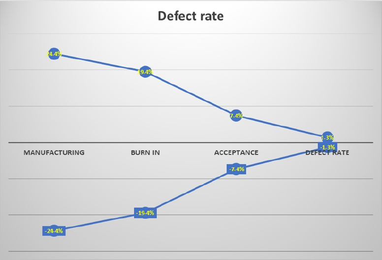
Figure 6.2. Global test cone
6.2. System manufacturer data
6.2.1. Original fit removal rate or “zero hour returns”
The “original fit removal rate”, also referred to as “zero hour returns”, are products identified as non-compliant with their specification when received by the system manufacturer (which is sometimes the end-user), or during a test conducted at a higher integration level by the customer. This happens despite the fact that they are declared compliant at the end of the manufacturing process.
Although this does not happen systematically, zero hour returns may reveal an inadequacy of the test coverage and/or of the burn-in conducted at the end of the manufacturing process. It is therefore important to take this indicator into account and analyze the reasons for these returns so that, if necessary, the product burn-in process can be enhanced: for example, a persistent failure at the origin of zero hour returns is generally a good indicator of poorly optimized test coverage.
EXAMPLE 6.1.– Using zero hour returns in order to improve a burn-in process
On computer equipment, the analysis of zero hour returns indicates two temporal stages:
- – period 1: zero hour return rate is of the order of 7%;
- – period 2: the return rate drops sharply to 1%.
The improvement by a factor of 7 of the zero hour return rate was obtained by analyzing the causes of returns and developing the burn-in process by adding an additional electrical test: the initial burn-in test allowed the precipitation of failures causing the returns, but did not allow its detection (insufficient test coverage).
During this stage of integration of various products into the system carrier, no reliability notion can actually be considered. Indeed, various tests under different conditions are conducted to verify the proper functioning of the set of products integrated into the carrier. Moreover, it is preferable to use the notion of removal rate defined as follows:
where N is the number of defective products and D is the number of delivered products.
This indicator can be used by the system manufacturer to verify the quality of products delivered by the equipment manufacturers. Quite often, it specifies a level of quality and therefore a removal rate that should not be exceeded, or would otherwise be liable for financial penalties. This removal rate is particularly influenced by youth failures, and this is why the burn-in stage is very important. It should also be noted that this notion of removal rate is valid only during the stage of product delivery. Generally, the removal rate is estimated periodically. If the quantity of delivered products is not sufficient, it may be difficult to quantify the removal rate. To avoid this type of problem, the removal rate can be estimated over a sliding period T. Therefore, the following definition can be formulated:
Example of removal rate of a product
In this example, the confirmation of maturity can be acquired and confirmed if the removal rate at the system manufacturer is lower than the one specified or intended by the equipment manufacturer.
Nevertheless, depending on the removal rate objective and the quantity of delivered products, this confirmation is not always easy to obtain.
Let us consider the following example as an illustration:
- – D = 100 products delivered per month;
- – three years of delivery;
- – maximum specified removal rate: 1.5%;
- – N = number of removals observed.
The following graphical representation is obtained (Figure 6.3).
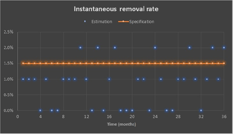
Figure 6.3. Example of removal rate over a three-year delivery period
No conclusion related to the maturity of the product can be drawn from Figure 6.3. This is due to the fact that the quantity of products delivered per month is relatively low over a one-month period. It is therefore preferable to reason over a sliding window of several months instead of on a monthly basis. Figure 6.4 illustrates a removal rate indicator over a sliding period T of six months.
As shown in Figure 6.4, with the removal rate estimator over six months, the objective is met, the indicator is meaningful and can be used.
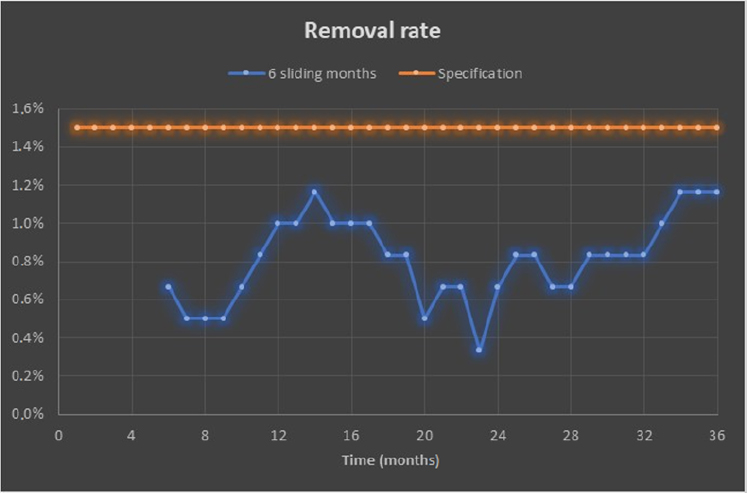
Figure 6.4. Removal rate over a sliding period of six months
NOTES.– The choice of the period T of the sliding window is important. This period should not be too low or too short (see previous example); however, if it is too large, a smoothing phenomenon would impede on following the finer periodic variations.

Figure 6.5. Example of removal rate with various sizes of sliding window
As Figure 6.5 clearly shows, the removal rate varies from one sliding period to another, but it is always lower than the specified one.
6.3. End-customer data
6.3.1. Burn-in effectiveness
Burn-in effectiveness is in its capacity to transform latent failures into patent failures. The major difficulty in estimating this is that it can only be indirect since the proportion of latent failures, and therefore their number, besides being random (it can vary during the product manufacturing period), is also unknown.
Therefore, the following theoretical definition cannot be used:
NOTE.– The observed failures should clearly be identified as youth failures.
Various methods can then be used depending on the available data.
6.3.2. First failure analysis
First failure analysis involves considering only the first failure for each of the products deemed defective during operation. This type of analysis can be conducted provided that the failures of the defective components are accessible. Our proposal is to use a Weibull distribution to model these failures.
- – Two cases are possible:
First case: Weibull modeling represents the observed failures in an acceptable manner
Three cases are then possible:
- – β < 1, which means youth failures are involved. This means that the manufacturing process is inadequate and the burn-in is ineffective.
- – β > 1, which means aging failures are involved. This case is unlikely, unless the same root cause is identified. If this is the case, then premature aging is involved due to a design problem, a batch of components, etc.
- – β = 1, which means catastrophic failures are involved. This means that the manufacturing process is excellent or the burn-in is effective, or both simultaneously.
Second case: Weibull modeling does not represent the observed failures in an acceptable manner.
Two types of failures can be expected, namely catastrophic and youth failures. A mixed Weibull model is employed, involving two distinct sub-populations.
- – The model represents data in an acceptable manner. Theoretically speaking, nine cases are possible, but only three are realistic, as illustrated in Table 6.1.
Table 6.1. Examples of various cases of Weibull law combinations
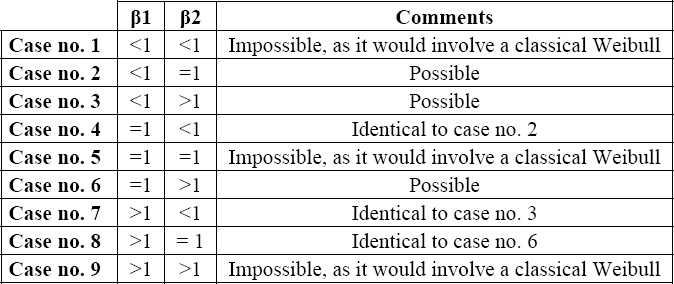
- – Cases no. 2 and 4: there is one sub-population of catastrophic failures and one of youth failures (β1 < 1 and β2 = 1 or vice versa). Depending on the proportion of the sub-population of youth failures, this proves that the burn-in is ineffective.
- – Cases no. 3 and 7: there is one sub-population of youth failures and one of aging failures (β1< 1 and β2 > 1 or vice versa). This case is unlikely as catastrophic failures can always be observed during product operation.
- – Cases no. 6 and 8: there is one sub-population of catastrophic failures and one of aging failures (β1 = 1 and β2 > 1 or vice versa). This means the manufacturing process is excellent or the burn-in is effective, or both simultaneously. However, aging failures tend to prove that the product is not mature enough.
- – Weibull modeling does not represent the observed failures in an acceptable manner. A histogram of the observed types of failures must be drawn. Two cases are possible:
- - The histogram is uniform. There are too many different root causes and the burn-in is not called into question.
- - There is one prominent root cause and corrective action must be taken to eliminate it.
All of the above can be synthesized, as shown in Figure 6.6.
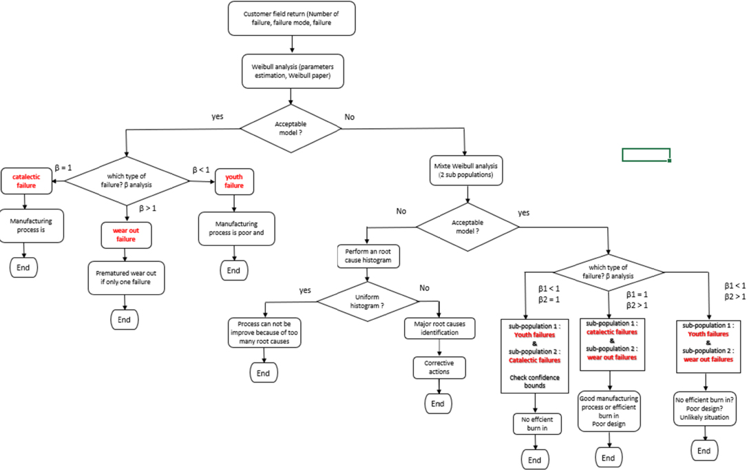
Figure 6.6. Overview diagram of how feedback data can be used
6.3.3. Method based on failure analysis
When the failure data is available, it is possible to compare the failures during burn-in and those resulting from feedback (data from the system manufacturer and end-customer), for example as a histogram. This is illustrated in Figure 6.7.
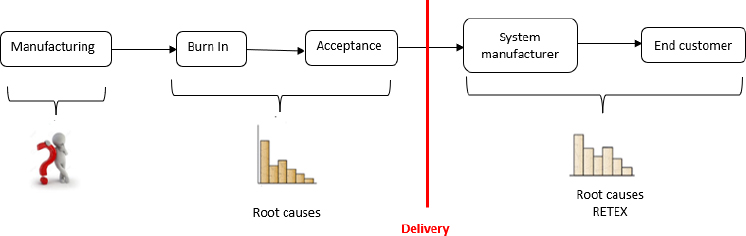
Figure 6.7. Root cause-based estimation of burn-in effectiveness
Burn-in effectiveness can then be estimated by:
6.3.4. Observed reliability
As already noted, the maturity of a product is considered correct if the observed reliability of the product is at the expected level (specification), as illustrated with the bathtub curve in Chapter 1 of the previous book.
The MTBF for the product must be estimated as soon as it is put into service. For this purpose, the method often used should consider the following estimator:
This estimator is well adapted when the MTBF is constant but irrelevant otherwise. In order to take into account a possible variation of the MTBF, an estimator over a sliding period T is often used:
Although it can be used to better monitor the evolution of the MTBF, this is a non-parametric estimator, which makes it difficult to determine the consistency of the MTBF, an essential aspect when addressing the maturity of the product.
A parametric estimator is therefore proposed. Under the hypothesis of minimal maintenance (product reliability is restored to approximately the same level as it was before the failure), the theory of the Poisson process (Gaudoin and Ledoux 2007) can be used, particularly the one that allows proper modeling of the bathtub curve profile, the power process.
This is defined by its MTBF given by:
NOTE.– The parameter β is not the shape factor of the Weibull law and its interpretation is totally different (Rigdon and Basu 2000).
The maturity of a product must be reflected by a constant MTBF and therefore by β = 1. Parameters λ and β are estimated using the maximum plausibility method (Gaudoin and Ledoux 2007). Although it is possible to conduct a statistical test to verify the maturity of a product, based on the confidence levels on parameter β, the maturity of a product can be verified using the following graphic representation (Figure 6.8):

Figure 6.8. Product maturity depending on parameter β
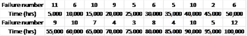
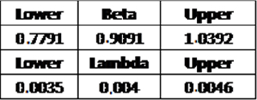
EXAMPLE 6.2.– Assume that data grouped by time intervals are available as follows:
We obtain Figure 6.9.
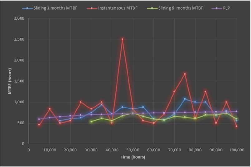
Figure 6.9. Example of product maturity
For the Power Law Process (PLP) model, it can be noted that the confidence level of parameter β in Table 6.2 places us in the third case of Figure 6.8. Product maturity can therefore be concluded, which is the benefit of this model compared to the other models proposed.
Table 6.2. Boundaries of β parameter of a PLP model
A comparison of various estimators reveals that an instantaneous MTBF cannot be used.
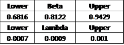
EXAMPLE 6.3.– Assume that the following time interval data are available:
We obtain Figure 6.10.

Figure 6.10. Example of product non-maturity
For the PLP model, it can be noted that the confidence level of parameter β in Table 6.3 places us in the first case of Figure 6.8. The non-maturity of the product can therefore be concluded, which is the benefit of this model compared to the other models proposed.
Compared to various estimators, it can be seen that an instantaneous MTBF cannot be used. It can also be noted that other non-parametric estimators have difficulty taking into account the reliability increase and are consequently rather pessimistic.
Table 6.3. Boundaries of parameter β of a PLP model
6.3.5. Estimation of the forecasting number of catastrophic failures
If the product was mature, only catastrophic failures should be observed. As these are estimated based on reliability forecasting models, it is possible – for each component of the product – to theoretically assess whether the number of catastrophic failures observed is of the order of magnitude of the number of predicted failures.
For this, we need:
- – failure rates of each of the accessible components based on the reliability forecasting analysis conducted during the design stage;
- – product operation flow (number of products becoming operational on a monthly basis, for example).
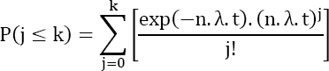
We know that these failures can be modeled by a homogeneous Poisson process (Rigdon and Basu 2000). This model formulates the hypothesis that the number of failures in time follows a Poisson law of parameter λ. For “n” products under operation, the average number of failures expected at instant “t” is given by:
The uncertainty of parameter λ, issued from reliability forecasting can be quite high, especially at the component level. In order to avoid raising inadvertent reliability alarms, it is preferable to estimate the number of failures with a risk α, which is set in advance. As the number of failures follows a Poisson law of parameter λ, the probability P(k) of observing “k” failures at time t is given by:
The probability Pcum of having no more than “k” failures is given by:
Demonstration
It can be written that:
Since the events are independent:
Or still
Under the hypothesis of a Poisson law, it can be written that:
End
NOTE.– A risk level α = 5% is generally used.
Consequently, a number of expected failures are estimated so that the probability Pcum is higher than the confidence level CL = 1 - α, hence:
This method is illustrated in Figure 6.11.
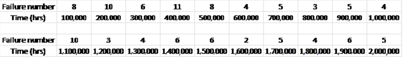
EXAMPLE 6.4.– Assume that the following data are available:
- – product in operation 5,625 hours per year;
- – failure rate forecasting of the product λ = 1,436 Fits;
- – period of observation, March 2016 to October 2018;
- – the delivery flow and the number of observed failures are given in Table 6.4.
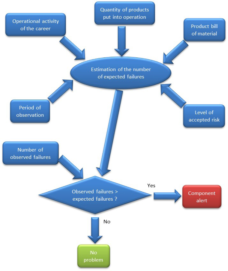
Figure 6.11. Illustration of the component alert principle
Table 6.4. Delivery flow and number of observed failures

Figure 6.12 indicates the number of observed failures, as well as the number of expected failures if the reliability level of the product was as forecast.
It also shows that the non-maturity of the product is significant, starting from April 2017.
EXAMPLE 6.5.–
- – product in operation 2,534 hours per year;
- – failure rate forecasting of the product λ = 1,436 Fits;
- – period of observation, March 2016 to February 2018;
- – the delivery flow and the number of observed failures are given in Table 6.5.
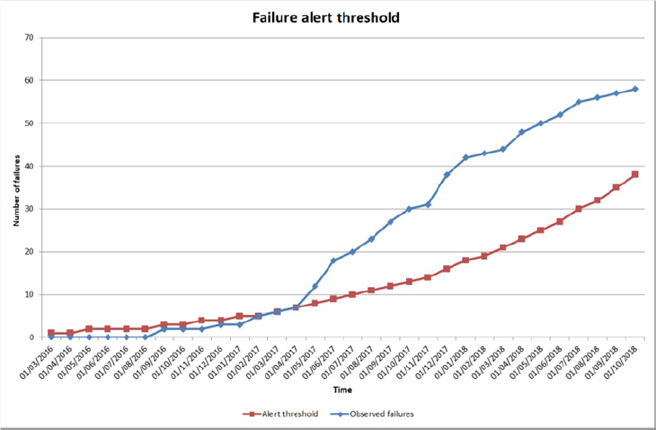
Figure 6.12. Example of the product that does not have the expected reliability level and is therefore not mature
NOTE.–
- – At the component level, this analysis is often not very interesting due to the fact that as soon as two failures are observed, an alert is raised, as this exceeds the number of expected failures, which is one.
- – It is possible to conduct this type of analysis over a sliding window (e.g. three or six months) rather than on a monthly basis, because more failures are accumulated.
- – It is also possible to conduct this type of analysis on a manufacturer reference and therefore potentially increase the number of failures if the chosen component is present in several parts of the product.
- – Furthermore, it is possible to conduct the analysis on a subset or on a complete product.
Table 6.5. Delivery flow and number of observed failures
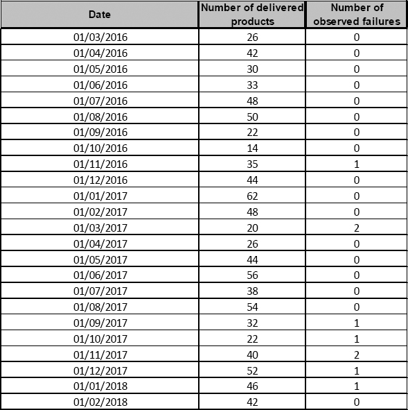
Figure 6.13 indicates the number of failures observed, as well as the number of expected failures if the product had the expected level of reliability.

Figure 6.13. Example of mature product
6.4. Burn-in optimization
Burn-in optimization aims to reach the highest possible effectiveness. There is always an initial stage of burn-in during which the levels of physical constraints applied to the product are initially set. There is no guarantee that these levels of physical constraints are optimal at each burn-in. Hence, depending on what is observed for the first burn-in products, these levels of constraints can potentially be modified to render the burn-in more effective. Depending on the method used to estimate burn-in effectiveness, the means employed are different. The previously proposed methods can be used.
A summary is presented in Table 6.6.
Table 6.6. Scoreboard of burn-in effectiveness
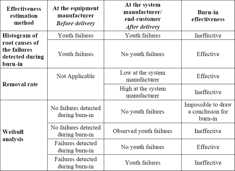
6.4.1. Distribution of failures observed during HASS cycles
A further way to optimize the burn-in, as proposed by McLean (2009), is to collect the number of failures observed during four burn-in cycles for each of the constraints applied to the product. This is illustrated in Figure 6.14.
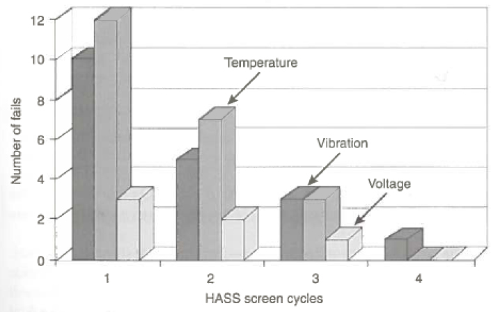
Figure 6.14. Example of failure distribution over four HASS cycles
The level of physical constraints for burn-in can be adjusted so that all of the observed failures belong only to the first burn-in cycle. This is illustrated in Figure 6.15.
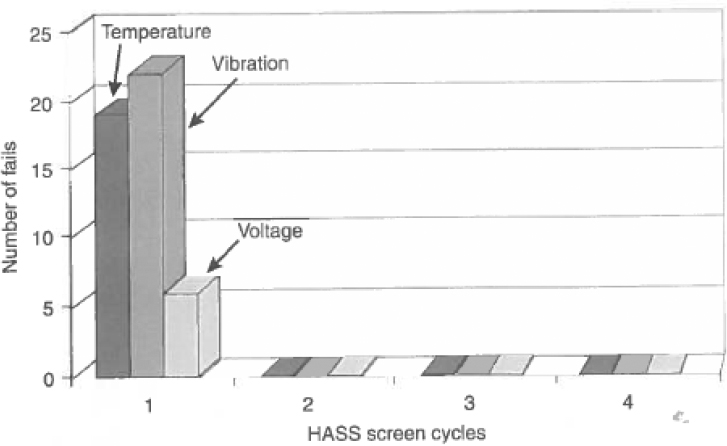
Figure 6.15. Example of failure distribution over four HASS cycles after optimization
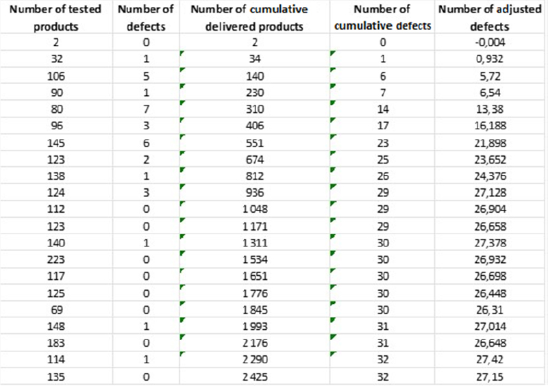
6.4.2. Verification of the degradation of the manufacturing process
It may also be interesting to verify a potential degradation of the manufacturing process throughout time, as proposed in McLean (2009). This can be achieved using a graphical tool in which the number of accumulated failures is used to detect a change in the failure rate. A possible technique involves the graphical representation of the number of failures “adjusted” depending on the cumulative sum of delivered products. The adjusted number of failures is given by:
The value of “p” is chosen so that the end of the curve is flat. In this case, the failure rate is then equal to p. In the chosen example, approximately 27 failures were observed after testing 1,000 products and the failure rate was stable after this period.
This is illustrated in Table 6.7.
Table 6.7. Example of evolution of the number of failures
This can be graphically represented, as shown in Figure 6.16.
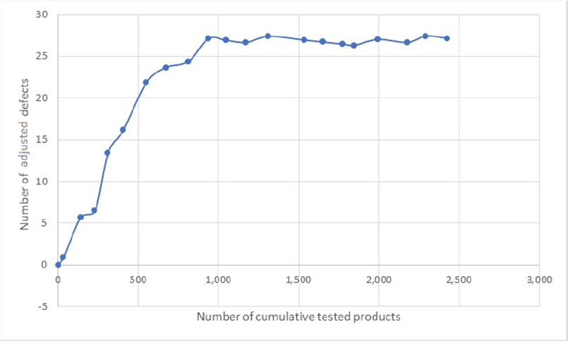
Figure 6.16. Example of evolution of the number of failures
The value of this method is that it is possible to:
- – estimate the failure rate p, which provides an indication on the quality of the manufacturing cycle including burn-in;
- – monitor, throughout the product manufacturing period, any deviation or potential modification occurring during the manufacturing cycle (change of means, machines, operators, etc.).