
3 LIGHTING AND PRACTICE

Bottles of Rosé and White Wine
Stores and websites that sell photographic equipment offer a wide range of useful accessories for product photography. But each tool has its own specific use, and they are not all suitable for all cases. One mistake many novice photographers make is to outfit themselves with a lot of accessories before they have really grasped what they are good for and how they work. In reality, every accessory has a very specific field of application, appropriate to one type of object and usually not very helpful for other kinds. The light tent, also known as a shooting !tent or diffusing cube, is a cube of white diffusing fabric, held in place by piano-wire frames (which allow the cube to be folded up between uses), and whose front side can be closed up. The camera lens is then placed through a small slit in the fabric to avoid frontal reflections. These come in a wide variety of sizes, ranging from ten inches to six feet wide. They generally come with fabrics in several different colors (typically white/gray/black, but some manufacturers offer other colors) that are placed against the background and underneath the object to be photographed. This makes it possible to light the object along several different axes while maintaining an even diffusion of the light. This setup is well suited to matte and/ or slightly satiny objects that produce diffuse reflections, as well as to cylinders. However, it is completely counterproductive if you’re lighting spherical objects that generate direct or specular reflections—because of its shape, its framing wires and interior seams are reflected in the glossy objects and are visible in the photo. EXAMPLE OF ARRANGEMENT OF LIGHT SOURCES FOR USE WITH A LIGHT TENT As with all diffusing fabrics, it is absolutely essential to perfectly smooth out all the sides of the cube ahead of time using a steamer; otherwise, its texture could appear in the reflections. Because most commercial diffusing fabrics are lightly plastic-coated, you can’t iron them. WORK STRATEGY For the lighting, we usually use four light sources: two on the side, one above the cube, and one in rim light (unless a fabric has been placed to appear in the background of the image). The front part of the cube is not specifically lit: the reflection of the light inside of it is sufficient for that. Even though the cube’s fabric diffuses the light, we place softboxes on each of the light sources so that we achieve consistent, even lighting. The light tent is perfectly suited to matte objects and to glossy cylinders, primarily polyhedrons: thus, it is the ideal tool for photographing soda cans, shoes, boxes, books, or untreated wooden toys. The diffusing dome is much like the !light tent, but it has the advantage of a rounded roof, which allows you to avoid any reflection of the interior seams for glossy objects that are rounded on their upper part. But it still won’t work for spherical objects. It is used similarly to the tent; it works well for polyhedrons and glossy cylinders and can also be used for objects with slightly rounded tops (with a family of angles that is less than 100°). The packaging shot table is more flexible !because it gives the photographer greater freedom of movement and allows for more lighting possibilities, but it also requires more equipment to operate effectively. TRADITIONAL PLACEMENT OF THE LIGHT SOURCES ON A PACKSHOT TABLE It is made out of a sheet of translucent, diffusing plexiglass (generally the Perspex brand) placed on an adjustable frame, where the angle of the background, in particular, can be manipulated. The table is generally equipped with wheels to allow it to be moved around, and with clamps to attach accessories (reflectors, diffusers, or barn doors) or light sources. The diffusing plexiglass allows for lighting from below, and the rounded cyclorama-shaped backdrop makes it possible to obtain a perfectly uniform background behind the object (as long as it is lit with direct light rather than backlighting, which would produce a shadow on the lower part of the background). Note, however, that the lighting from below must be very precisely measured so that the lower part of the object does not show highlights. You can also avoid problems by placing the object on a transparent plexiglass base. The final step is to set up your light sources around the object, being careful to diffuse them appropriately (see previous photo). The packaging shot table is suitable for objects of all shapes and surfaces. When the object is being photographed !from above, or from a bird’s-eye view, and the background does not appear in the photograph, a standard table can work fine. We shape the light by placing diffusers, barn doors, and reflectors in the appropriate places. This is the method I prefer for creating photographs of jewelry, watches, and glasses. For a few years now, manufacturers have !been offering cubes whose internal wall, equipped with a reflective fabric, has LED lighting. These have the same qualities as light tents, but with less lighting flexibility because the placement of the LEDs is fixed. A product photographer usually dresses in black or !dark gray. This may sound strange, but when you are photographing reflective objects, such as Christmas tree ornaments, your own reflection will often appear in the image; if you are dressed in dark colors, this is less problematic.TECHNICAL IMPLEMENTATION
The Light Tent


The Diffusing Dome
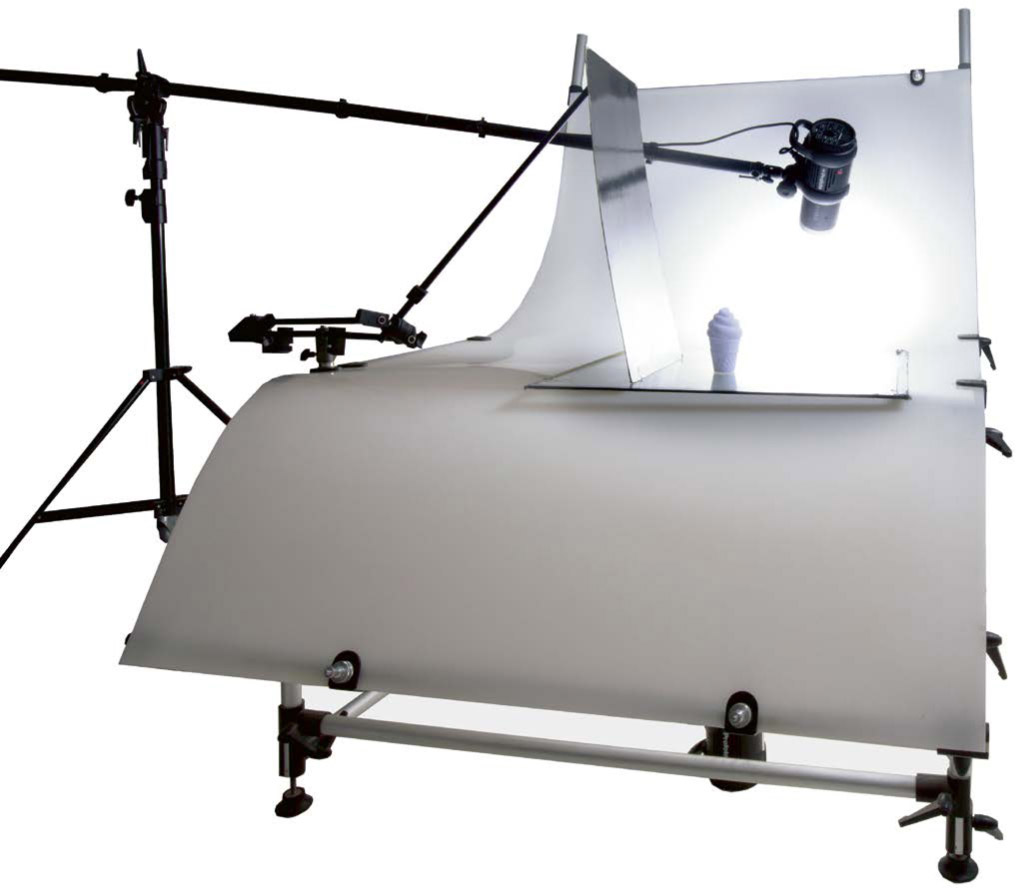
The Packshot Table
The Standard Table
LED Reflecting Cube
The Photographer’s Outfit
The studio of a photographer who specializes in packaging shots—with its profusion of panels, sheets, and materials used to showcase all kinds of objects—is a veritable treasure trove. With experience, it quickly becomes clear that the base on which the object is placed, and which will serve as a background, plays an important role in how the colors of the object end up looking and, overall, in the look of the photograph. With the exception of packaging shots for catalogs, which require a perfectly white background, you will have to think carefully about this issue. The surface on which we place the object to !be illuminated can play many roles, depending on the material out of which it is made, its optical qualities, and its color. Thus, aside from the effect that the background can have on the object, it is also necessary to think about its own intrinsic aesthetic qualities. It has to harmonize—in color, shape, mood, and texture—with the object being photographed. We wouldn’t use the same background to present Corsican figatelli sausages, a high-tech mobile phone, or a bottle of perfume: each of these objects belongs to a different aesthetic register, and so for each one we must determine the ideal context. Studio backgrounds, easy to use and perfectly matte, are made of thick high-quality paper, with a fine-toothed antireflective surface that allows you to obtain a uniform color. They are generally sold in rolls of 36 feet (the standard widths being 53 inches or 9 feet), and they are available in a multitude of colors. You can also choose cotton-fiber art papers (like those made by Canson), which have the same characteristics and also have the advantage of already being cut into dimensions that are appropriate for photographing objects. The idea is to choose thick sheets (> 150 gsm) to avoid running the risk of folds. You could theoretically work with all different colors of paper, depending on the scenario, but we most often end up choosing half-tones of black, gray, and beige, which work well in most situations. EXAMPLES OF BACKGROUNDS AND ACCESSORIES OFTEN USED IN PRODUCT PHOTOGRAPHY The reflection of the color of the paper being used as a background in this photograph ends up tinting the lower edge of each object being presented. Often used for their !nonreflective qualities, matte plastics are effective at avoiding reflections on objects while being easily washable (which is something we look for when we are working with fluids). The plastics are generally Trespa, HPL, or PVC, which can be found in hardware stores, home design stores, and kitchenware stores. Note that these backgrounds have a tendency to develop scratches and do not withstand heat very well, so you need to make sure to store them carefully and avoid impacts. Whether plexiglass, polycarbonate, Alupanel, PVC, or polyethylene, these backgrounds, once they have been lacquered, are very glossy and can occasionally serve as reflectors. They have the advantage of acting differently depending on their position in relation to the light source. Thus, a sheet of glossy black plexiglass placed within the family of angles transmits most of the light and appears white or light gray, depending on the luminous intensity—which is perfect for glassware: the background looks white but its reflection in the glass stays black, which provides well-defined silhouettes (see the photo above, right). And with glossy white plastic, we get the exact opposite effect: placed outside the family of angles, it will look completely black. This wineglass is positioned on a sheet of glossy black plexiglass that looks light gray because it is within the family of angles of the backlighting. A sheet of glass placed under the object makes it possible to both play with the reflection (as with glossy plastic) and separate the shadow from the object that produced it. The farther the shadow is from the object, the softer it becomes. This method is useful for obtaining photos without shadows, which is useful for photos that are meant to be cropped for use in catalogs, for instance. It also makes it possible to trick the viewer’s gaze, giving the impression that the object is suspended in air. And because glass is less susceptible to scratching than plastic, it is used much more often—whether transparent or translucent glass, or black smoked glass. Even though all the glossy materials mentioned so far act somewhat like mirrors, none of them are able to transmit all of the light they receive. When you want to make sure to get a perfect reflection of the object or light—in order to produce a perfectly white background or to reflect, for example, a computer screen—an actual mirror will be your best option. Mirrors can also be used as reflectors when the light is too weak and the reflectors can’t be brought any closer without appearing in the field of vision. Brushed cotton (or cotton flannel) is perfect for obscuring reflections and is therefore widely used in photography. It is generally black or white, but it also exists in a wide range of colors. As its name indicates, it is a cotton fabric whose very tight weave is machine-brushed, giving it a fuzzy appearance. Its irregular surface means there is no risk that it will cause a reflection. Brushed cotton is the ideal background material when you do not want to allow any reflections at the base at the base of an object, such as a crystal ball. It can also be used to make excellent barn doors. Perfume bottle suspended from a fishing line, half-submerged in the water of an aquarium. A black barn door is placed behind the aquarium, and two softboxes equipped with rust and cyan color gels are positioned in the backlight (see the staging arrangement above). Even though liquids are not, strictly speaking, backgrounds, there has been a custom of presenting objects in water, oil, or paint. These types of setups can be photographed from above, by placing the liquids in shallow containers, such as kitchen trays or terrariums, or through a glass, like the glass of an aquarium. Liquid is only interesting as a background when it is in motion, usually with undulations on the surface (we use the kind of electric blower that is used to clean computers, or a compressed-air spray bottle), or if the object itself is in motion (see photo opposite)—but the liquid must be partially within the family of angles of the lighting so that the different undulations on its surface can be clearly distinguishable. The maker of these golf club shafts chose to highlight their qualities in the rain by choosing a black marble background, moistened with a spray of water. Usually shown crumpled or twisted, textiles are perfect for being both background and props for the object being presented. They are widely used for watches, jewelry, and some cosmetics, for which satins and other glossy textiles are popular. Care must be taken to use them with very diffused, side lighting to give texture to their folds. One must, of course, also make sure to use fabrics that have been perfectly ironed and cleaned. Most of the backgrounds mentioned so far are smooth and uniform, but there are also other kinds of backgrounds that we specifically choose for their textures or their color tones. This is the case for the marble slab in the photo above. You can also choose wooden planks or flat stones, or for an advertising shot, create entire scenes that include all different kinds of textures. People generally prefer to use noble materials like leather, wood, and metal—which are very common in packaging shots—but anything can be considered as long as the material’s reflectance, mood, and color are a good fit for the object being highlighted. Nothing says that you have to work with flat backgrounds! You can easily make up all kinds of shapes using things like sand, fluff balls, paving stones, or foam. The only limits are, as always, the harmony of the colors, textures, and reflectance that are characteristic of each kind of material.CHOOSING A BACKGROUND
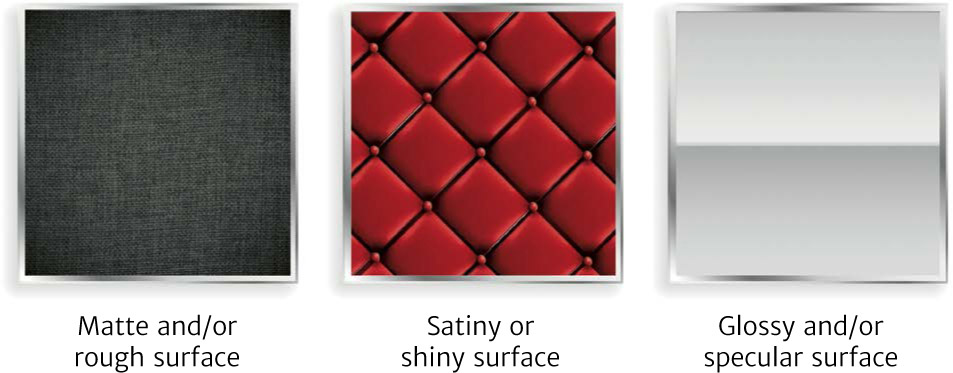
Diffusion and Reflection
Paper Backgrounds

Matte Plastics
Glossy Plastics

Glass
Mirrors
Brushed Cotton

Liquids

Textiles
Textured Media
Materials and Shapes
Product photography requires rigor, cleanliness, and organization. Throwing yourself into the lighting and shooting without having properly prepared the products beforehand will mean that you have to spend long hours on post-production retouching. It’s a better idea to carefully plan ahead for all possibilities. Most of the objects you will be asked to photograph are small, so small that all of the tiny defects, like scratches, dust, and fingerprints, will jump out at you once you are looking at the RAW preview on your computer screen. Incidentally, the fact that the object is so small also means that precision work is required in the placement of reflectors and barn doors. Thus, you will need to equip yourself with a series of items and devices to help simplify your work. As I said at the beginning of the very first section of part 1, after carefully checking the overall cleanliness of your studio and conscientiously getting rid of almost all of the dust, you then have to make sure that the object itself is ready to be photographed. Even though we are generally presenting brand-new objects, just out of their packaging, and thus mostly free of scratches and defects, it is still sometimes necessary to remove labels (you can get rid of all traces of glue using a degreasing solvent, which you can get at any hardware store). Make sure to handle the objects with antistatic gloves to avoid leaving fingerprints, or use chamois leather (natural or synthetic) to grip them with. If the object is made of a material that produces direct reflections and it cannot be illuminated without making the reflections appear, you can use an antireflective spray—but note that this kind of aerosol does not completely eliminate the reflections, so it is better to be careful to keep the object outside the family of angles. For plastic objects, an antistatic spray will prevent airborne dust from settling on the object while you prepare your lighting. As a general rule, we always use an aerosol dust remover (like the ones used for computer keyboards) just before we start shooting to get rid of residual dust. In addition to the standard shapers and tripods that are used for lighting, it is sometimes necessary to use a super clamp to clamp the lights as close to the object as possible; screwed to the edge of the table, this clamp is equipped with a spigot stud (a universal-sized brass cylinder that allows most studio lights to be attached to it). It may also be necessary to resort to articulated arms equipped with ball joints to position the light sources in places that are hard to reach with standard tripods and in cramped quarters—even if you often work with an extension or boom arm on your tripod. These arms are helpful not just for holding the light sources in place, but also for supporting backgrounds or accessories held up with transparent nylon fishing line. You will also need to have clamps of various sizes on hand for the different situations you might encounter. HANDLING, PREPARATION, AND SUPPORT MATERIALS MOST COMMONLY USED MATERIALS IN OBJECT PHOTOGRAPHY When it comes to one of the most essential accessories in product photography, namely diffusers, the offerings available from studio equipment manufacturers are actually quite poor. You will constantly need small diffusers, often arranged in circular arcs, to provide the right kind of light for rounded objects, like jewelry or soda cans. I have solved this problem by using 3-mm-thick sheets of translucent PMMA (plexiglass), which are made for diffusing LED lighting. I round them by stretching them and softening them with a thermal cleaner. Make a point of having several of these, of various sizes, on hand; they will be very useful. You can also make frontal diffusers in which you make a round opening for the camera lens, which will avoid frontal reflections on very glossy, spherical, and cylindrical objects. And finally, you can get large commercially available diffuser panels (make sure they are mobile) to even out your rear and vertical lighting; for use when lighting objects like spoons, for example. The objects that we need to photograph rarely stay in the perfect position by themselves! Small transparent plexiglass blocks of various sizes and shapes can be used as wedges; these do not produce problematic shadows or reflections. For opaque objects, commercial mounting putty, which you shape into the appropriate form, can be a good solution. You can also suspend the object using a fishing line attached to a mobile bar so that the entire arrangement can be easily moved without having to retighten the line. This is a good system to use for light objects, but you will have to do some editing in Photoshop to get rid of the line. Transparent objects, like perfume bottles, can be submerged in an aquarium filled with clean water. By limiting the phenomenon of refraction, we can obtain perfectly delineated photographs.SUPPORTING MATERIAL
Preparing the Object and the Workspace
Maintaining and Arranging Backgrounds and Lighting


Maintaining and Arranging Diffuser Fabric
Maintaining and Arranging the Object
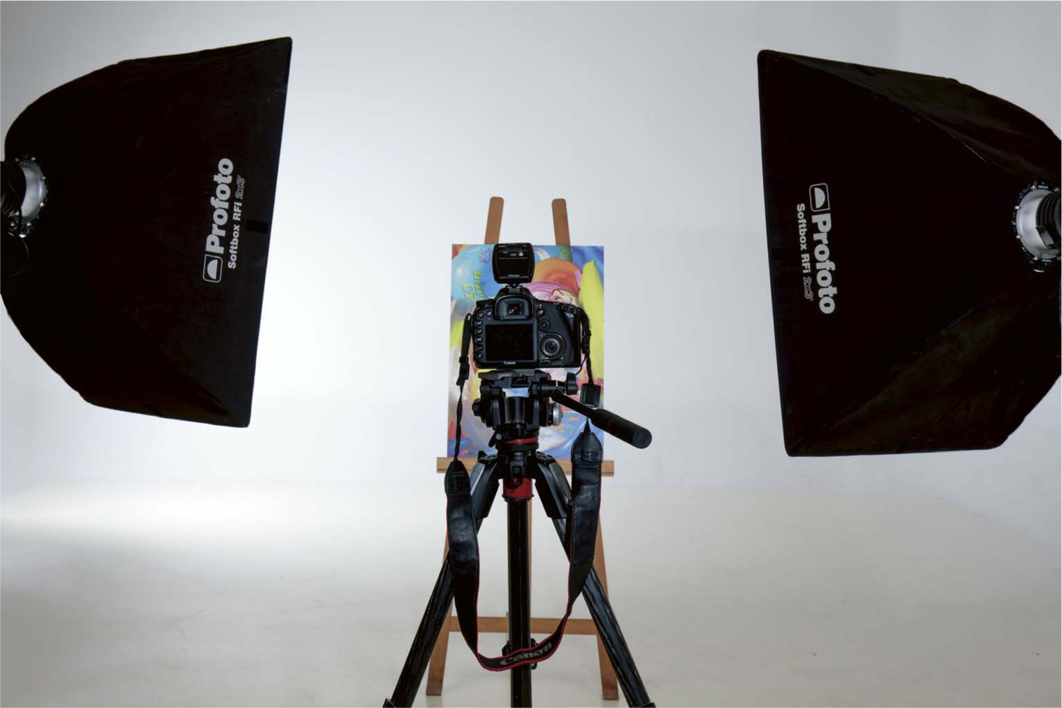
In product photography, the tripod is an indispensable accessory. Let’s look at how to choose the best one. Whether you’re shooting a cosmetics line, where every product has to be photographed at the exact same height and distance; taking several different shots for a composite photo; or just needing to position the camera at a precise spot with respect to the reflector panels, it’s impossible to take professional product photos without a tripod. We have seen how crucial the position of the camera is in relation to the lighting, especially for the issue of reflections produced by the families of angles. It is also often necessary for the shooting equipment to be placed in a specific position at a strategic angle for the lighting and rendering of the object. This is only possible, and comfortable, if you are able to position the camera precisely, which implies the use of a tripod and a well-calibrated ball head in order to capture the ideal angle for the shot. And given that the light sources and the diffusers, sometimes even the object itself, often have to be moved slightly, it would be absurd to try to work freehand, wasting time constantly trying to reestablish the perfect angle. We often have to photograph an entire product line of related objects, such as tubes of lipstick, for example. In this case, every object must maintain the same homothetic ratio (orientation of angles) and angle of view as all the others. Thus, we work from a fixed point of view, using a tripod. When creating a composite photo (see the section on composite photos, page 204), it is crucial to photograph the same object from the same point of view, but with different lighting each time. To simplify the editing in Photoshop and to be able to stack the layers easily, the camera must be perfectly fixed in the same spot. For objects that have LED lighting or an LCD screen, there is no other choice, if you’re shooting with a flash, than to lengthen the exposure time in order to be able to work in mixed asynchronous light. Again, this is only possible if the camera is completely stable. There is such a plethora of tripods available on the market that it can be difficult to know where to start. Here are the features you’ll want to consider when choosing a tripod: All manufacturers indicate the maximum weight for each model of tripod in their product sheets. Don’t forget that the tripod will be holding your camera and a lens, and you don’t want to let those fall! To make sure that you are getting a stable photographic tripod with an excellent weight/stability/size proportion, do the following: add up the weight of your camera and your heaviest lens and then multiply that result by 2.5. Depending on the objects you’re photographing, you will sometimes have to work very high up and other times down low, thus the tripod will need to be able to carry the camera from a height of ten inches all the way up to six or seven feet. Two elements can influence its minimum and maximum height: the presence of a center column and the legs. For product photography, choose a tripod with a tilting center column, which you will need for radical bird’s-eye views—and note that you will have to think about buying a counterweight to make sure your equipment stays stable when the column is tilted. But the most important thing is the ease that a column gives you: it is much easier to play with the height of the center column than the height of the three legs of the tripod every time you want to make an adjustment. The issue of the spacing of the legs is not critical in product photography, because we are generally working on a flat floor, but it can be an important consideration if you’re working outside, where you will need to be able to adjust the spacing of the legs individually and irregularly—this is why we do not generally use tripods with a crossbar fixing the legs in place; those are mostly intended for video shots. Example of a setup for a shot: the tripod plays a central role. The issue of the tripod’s weight is not crucial in product photography; you will rarely need to transport the tripod over long distances (of course, if you also use the tripod outdoors, the weight will become an important criterion). Heavy tripods (generally made of aluminum) are cheaper than the very light ones, which are made of carbon. If you are trying to equip a studio, then weight can be a plus, especially in terms of stability; if you are trying to limit vibrations as much as possible, then choose carbon, as it has greater absorptive power. There is a specific kind of ball joint tripod head for every situation and every kind of photography. For ease of use, ask yourself the following questions: In terms of weight, you will need to make the same calculations as for the tripod: the weight of the camera plus the weight of the heaviest lens, multiplied by 2.5. For attaching the ball head to the tripod, the screws on the top of the foot plate are almost always 3/8-inch screws—but make sure that the ball head you have chosen conforms to this standard (if not, you can buy adapters). The next question is the mounting plate, a small accessory that is attached to the body of the ball head and allows it to be secured to the camera. The plates usually have a 1/4-inch thread, which corresponds to the diameter of most camera mounts, but do make sure that they are compatible. Also pay attention to the size of the plates: they are not standard (some brands, like Manfrotto, make plates that only work with their own brands). There are many different ball heads: fluid heads, 3D ball heads, pendulum ball heads, pistol grip ball heads. The fluid heads are placed on a sphere that allows the camera equipment to be tilted into all positions (vertical, horizontal, and flipping from portrait to landscape). They are well suited to product photography but sometimes lack precision (a single notch serves all the different axes). 3D, or three-way, ball heads are equipped with three knobs to determine horizontality, verticality, and tilt: this is perfect for product photography because of its precision. Pendulum ball heads work like a pendulum (as their name implies): while they are well suited to fashion or sports photography, where you need to be able to change the angle of view quickly, they should be avoided for product photography. Pistol grip ball heads (or joysticks) are equipped with a trigger: when you press the trigger, it releases the movement. Even though these are easy to handle, they are generally imprecise, and not well suited to product photography.TRIPODS
Viewing Angle Accuracy
Repeated Shots and Composite Photos
Light Quantities and Long Exposures
Choosing Your Tripod
Choosing Your Ball Head
Making a solid preliminary study of the objects you’re photographing allows you to discern the right lighting and shooting strategy. Before you even begin to decide about what lighting to use or what methods to employ, you need to establish a checklist of the particularities of the object. The more precise your checklist, the easier it will be for you to define the lighting parameters and the constraints of your shoot. The very first thing to do is to handle the object, wearing gloves, and look at it under a perfectly white, hard light. By changing its orientation with respect to the light, you will see its texture, glossiness, and flaws appear and you will be able to observe how it reacts. This will also allow you to identify its specific shape and anticipate how and at what angle you will place it on the packshot table, find out whether it is light enough for the use of fishing line, or whether it needs to be filled with liquid or have labels removed. If you do it right, this preliminary work will save you a great deal of time later on. Let’s go through the various things that need to be checked. Handling the object under the light, you will be able to see very quickly whether it produces specular, direct, or diffuse reflections. Depending on its age (old objects are often glossy or oxidized) and its properties, it may also be that the reflections on its various parts are not all the same kind. In that case, observing the object will allow you to determine the ideal lighting with respect to the families of angles and which side is best suited to the lighting you have in mind, as well as plan what accessories you will need for lighting and shaping. Handling an object in the light also brings out any textures (some of which can be hard to see if the light is not falling in just the right way) and will allow you to determine whether those textures are more pronounced in grazing side light or in direct reflection—in reality, it all depends on the orientation of the textures. This is true especially for leather and certain types of plastic. Then, with this information in hand, you can decide whether you want any given texture to appear. DETERMINING THE CONDITION OF THE SURFACE Without a precise knowledge of the material that makes up the product, you run the risk of overlooking the lighting that would bring out its particular nature. A glossy black plexiglass cube looks almost exactly like a smoked glass cube or a black polished steel cube. But each of these will react very differently to light: the plastic cube will produce fairly diffused direct reflections, the steel one will create slightly wavy direct reflections, and the glass one will produce very sharp and perfectly straight direct reflections. DETERMINING THE DIFFERENT KINDS OF TRANSPARENCY When dealing with a transparent or translucent item, the material out of which it is made becomes crucial: a transparent glass bottle will not refract light in the same way as a crystal ball; the direct reflections generated by frosted glass will be different from those generated by a translucent plastic drinking cup. A crystal ball is placed in front of one of my photos, and the image appears inverted because of refraction. For transparent glass, colorless or not, it is essential to use rim lighting. The refraction of the bottle’s silhouette will be more pleasing if the bottle is filled with a colorless liquid (water, or better yet, transparent mineral oil, such as paraffin oil, whose refractive index is close to that of glass). For this type of material, if we want to obtain visible reflections, we will place light sources within the family of angles, while taking care to over-diffuse the light sources (softboxes, in front of which mobile diffusers have been arranged). For frosted glass, the lighting can come from anywhere because this kind of glass essentially produces diffuse reflections. For transparent plastic, backlighting is required, but we have to use harder lights than we do for transparent glass in order to get visible reflections (generally softboxes, but without mobile diffusers). For a flat surface, such as a window, lighting at right angles will create a phenomenon of complete transmission: the glass will be invisible, but it will create visible direct reflections in all other directions. Finally, we need to look at the shape of the object. We know that the kind of lighting we use and where we place it will be different depending on whether the object is flat, polyhedral, cylindrical, spherical, concave, or convex, in order to give the best sense of the shape and allow it to be grasped by the viewer. Its reflections need to be correctly positioned, the differences in shading depending on the shape must be visible, and so must the differences in contrast between the protrusions and hollows if the object is concave. DETERMINING SHAPES Let’s look at the example of the icosahedron, the twenty-sided polyhedron shown above. As shown, with its three forward faces lighter than the seven other ones, it looks convex. But if we had used a concave version of the same shape, with the light placed along the exact same axis, the result would have been the same. To make the sensation of a hollow visible, we would have had to light it from above and create a shadow on the upper part of the concave area. Next, we have to precisely determine the object’s colors (see the following section), and then anticipate how they will react to the environment, light, and props being used. The color of the studio’s walls, and even of your own clothing if you are working with a material that produces specular reflections, the color temperature of the lighting if it is not perfectly white, and the reflections produced by a colored mount or prop can all have an impact. Of course, each object is not just cubic, glossy, or transparent. It will often be composed of materials with multiple characteristics, like the microwave oven shown below: its glass window produces direct reflections, while the rest of the object, covered in matte plastic, produces only diffuse reflections. The same is true for the blender in the illustration: the pitcher is transparent, while the base is opaque. In this type of situation, we always give priority to the material that is the most complex to light in terms of placing the light sources. For the oven, that would be the glass; for the blender, it would be the transparent pitcher. DETERMINING THE COMPLEXITIES OF THE SHAPE/SURFACE/MATERIALTYPOLOGY OF OBJECTS
Observing the Object
Defining the Kind of Reflections
Texture
Assessing the Material

Defining the Transparency

Assessing the Shape

Defining Colors
Managing Complex Objects

In commercial photography, it is absolutely essential that the colors of an object in a photograph are faithful to the original object. Without a rigorous calibration of the elements in the imaging chain and discipline in your working method, there is no way to obtain the exact same color in your photo as in the actual object—and a discrepancy there would, of course, be inexcusable for a catalog photo or an advertisement. Thus, you must follow a precise procedure that you reproduce every time you change the lighting. As I discussed in the section on page 53, we perceive the color of an object because there is only one wavelength that it reflects, while it absorbs all the other colors. Thus, if we project a red light onto a green object, it will look black (having no green to reflect). Therefore, it is not so much the real color of the object that we are interested in here but the wavelengths that are present in the lighting. Moreover, the spectrum of the light reflected by the illuminated object, which determines the nerve impulses sent by the retina, varies widely depending on the lighting, while the color that we perceive does not change. This phenomenon is called color constancy. But this is not the case for color sensors, which react according to the light spectrum that reaches them: an object illuminated by an orangish light will not produce the same signal as when it is illuminated in blue. The only way to make the color look the way it does in reality is to calibrate the camera—a procedure that will need to be repeated every time the lighting, and the ambient light, changes. We thus “inform” the camera by giving it a surface recognized as white in the main light and then weighting the signals of the colors interpreted by the sensor: this is white balance. The same object photographed at 3500 K, 5500 K, cand7500 K. A TSL (Tone, Saturation, Luminance) profile was created by photographing a palette of colors in the same lighting conditions, using the SpyderCheckr software. The screen was calibrated using a SpyderX Elite probe. A Lastolite gray card The standard exposure calibration was set at 18% gray by Kodak in the 1930s. This is still used as the benchmark for measuring exposure and for color calibration. To standardize our white balance, then, we use a gray card. To simplify, a gray card reacts as if it is composed of 18% pigments that reflect light perfectly cand82% absolute black pigments. To make it clearer, we call it “neutral” gray because it includes as much red and green as it does blue: in RGB values, thus, neutral gray corresponds to a value of 118 (with a tolerance from 114 to 122), with the RGB including more levels in the dark tones than in the light ones, because human eyes are better adapted for distinguishing dark tones. I should note that manufacturers often offer a version of these charts that includes an X for the sake of focusing. Using a neutral gray card is very simple: 1. Place the card in the same place as the product to be photographed, under the same lighting conditions. 2. Measure the exposure using an independent exposure meter and set the camera to the measured value, without optimizing the exposure. Or proceed in reverse by adjusting the power of the light sources so that their measured illumination will correspond exactly to the camera settings. Because the photo is being taken in RAW, the white balance chosen for the first shot doesn’t matter. 3. Take a photo framing only the gray card. We activate the custom white balance function of the camera by choosing this shot. 4. Take a second photo including the object, the neutral gray card, and a color reference card (following photo) side by side. This second shot will be used to finalize the calibration of the development software. It is important to repeat this operation every time there is a change in the lighting. The RAW file format saves the values of the light received by the sensor and the adjustment of the white balance separately. The white balance adjustment performed by the camera is thus only an indicator during the post-production process, where it can be precisely corrected without damaging the file. But before calibrating the image itself, the screen that is used to view it must be calibrated. This instrument is seldom used by amateurs, but it is crucial for anyone who wants to obtain perfectly true colors. High-quality calibrators are now available for under $200. You will need to go through the following calibration process regularly, because screen color rendition varies depending on how long the screen has been turned on and how old it is: 1. Install the software supplied with the calibrator on your computer. 2. Position the calibrator on the screen (the calibrators usually come with an attachment system). 3. Once it has been launched, the calibration software will compare the colors of its palette with the actual display and will create an ICC colorimetric profile (a small file of a few dozen KB) that will correct the colors to keep them true. There are automatic modes, but I suggest you carry out a complete calibration, nonetheless. You will be surprised at the quality of the result. Photo of a reference palette including a neutral gray card placed in the exact same position and under the same lighting conditions as the pair of glasses on the previous page. The camera setting is what was measured with an independent exposure meter. You can save a lot of time by editing a colorimetric profile specific to your camera, using a color reference chart and the appropriate software. Simply photograph a calibrated color palette with each change in the light, and use the dedicated software to create a reference profile, which will then be interpreted by the development software. But note that this profile will only work for photos that are illuminated exactly the same way as the reference shots; every time you change the lighting, you will have to redo this operation. All development software (Capture One, Lightroom, Camera Raw, etc.) is equipped with a white balance selector tool. It is represented by an eyedropper next to the white balance editor. Simply import the photo of the neutral gray card, click on it with the eyedropper, and the software will apply the appropriate correction. Then duplicate this calibration and apply it to all of the photos that were taken with that lighting, under those conditions. Import the photo in Capture One (or your software of choice), select the white balance selector tool, and click on the neutral gray card. This operation will allow you to calculate the necessary white balance.RESPECTING COLORS
Color and White Balance
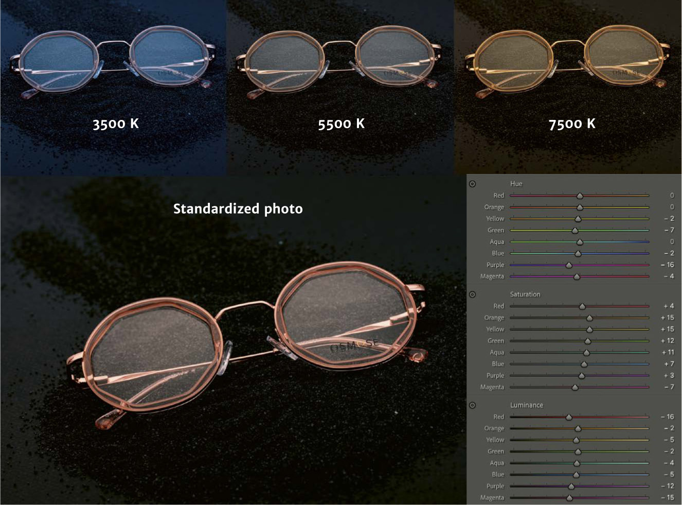

The Neutral Gray Card
Standardization in Post-Production
Monitor Calibrators

Creating a Color Profile for the Camera
Calibration Using Development Software

It is rare for photos of objects not to need any digital editing. However, we can reduce the amount of editing we have to do by carefully managing the lighting and shooting. This book is not meant to teach you how to do digital editing, something I do little of and that is also explained in detail in many other books. My aim here, instead, is to emphasize how to prepare the shot so that any editing will be quick and successful. After years of practice, I can state that most editing for product photography can be preempted by methodically preparing the product, carefully managing the placement of the light and the measurements, precisely positioning the diffusers and barn doors, rigorously managing the imaging chain (especially in terms of color), and knowing how to control your camera. As an example, I have used a lipstick tube placed on a transparent plexiglass wedge in front of a softbox. A reflector is placed to the right of the image. Looked at raw, before adjusting the white balance, the image shows a large number of problems, which could require dozens of minutes of editing. But most of the problems have very simple remedies: positioning barn doors to make the tube’s silhouette more precise and to unify the reflections on the front section, using a gray card to calibrate the colors, handling the object with gloves, etc. What is left are the defects that are inherent to the specific object we are dealing with here: in this case, the plastic shell is not completely smooth; the lipstick itself has miniscule nodules on its surface because the product was not stored properly; and a few fine scratches can be seen, even though the object was brand-new and in spite of the care I took while handling it. DEFECTS IN THE RAW FILE THAT COULD HAVE BEEN DEALT WITH DURING SHOOTING Here we changed the lighting of the lipstick tube by placing barn doors to either side behind the object, directed toward the front left side, while lighting from the back and from the front right using diffusers. The only editing consisted of erasing the little bumps on the bottom of the tube, the plexiglass base whose edge had been showing, and the fingerprint. Most scratches and bumps can be corrected using the frequency separation technique. There are a lot of great, in-depth tutorials online demonstrating this technique. For now, simply note that in Photoshop, this technique will allow you to separate the image into two separate layers—one including the textures, the other including the colors—that you can edit separately. The advantage of this process over the usual correction tools (the clone stamp tool, sample source overlay, etc.) is that you can limit the editor to working on only one of the two layers. Thus, for instance, you can make a scratch disappear by duplicating a nearby, contiguous area that has no flaws in the texture layer, without affecting the color. And if the issue is a color problem, you can do the same thing in the color layer, without affecting the texture. I used this process to eliminate the scratches and irregularities on the lipstick shown above left. For problems connected with the lighting, and with reflections that appear in the wrong place because the object has a shape defect, you can use the dodge and burn technique. In this case, on top of the layer of the image, you add a new layer filled with 50% gray (in Photoshop: Edit > Fill, and then choose 50% Gray from the Contents drop-down menu). Then, if you choose Soft Light under the blending mode option, this layer will become invisible. Using a very soft brush, set to a low opacity (less than 8%), you can then paint the areas in the gray layer where you want to fix something by applying black (to darken the areas) or white (to lighten them). An example of dodging and burning. On the left, the original photo; in the middle, the gray layer to which we applied black and white with the brush; on the right, the photo once the gray layer was made visible using the Soft Light blending mode.PHOTO EDITING
What Can Be Corrected During the Shot


What Requires Editing

Lighting wine bottles is a typical assignment for product photographers. There are countless winemakers, and the vintages change every year. But photographers who truly excel in this field are rare because it is a very difficult discipline. In photographing wine bottles, the lighting difficulties add up: we have glossy, cylindrical glass; a matte label that is sometimes embossed and gilded; there is stenciling on the glass that produces hard-to-control direct reflections; the background must be completely white for catalogs; the management of linear reflections on the edges of the bottle; the issue of lighting the stand or holder without creating reflections on the base of the object; and so on. Everything comes together to make this a very difficult assignment. The best way to deal with it is to address the problems one at a time. Before photographing a bottle, always make sure to ask the producer to choose products with no defects; they will not, however, always be able to do so. Because the bottles are packaged in industrial production lines, it often happens that the seam (the visible mold mark resulting from the press process) appears on the front of the bottle. The same is true for stains and tears on the labels and flaws in the stenciling. In each of these cases, the only solution is photo editing. Before starting anything, you will need to make sure that the bottle suits the lighting you have planned for it by examining its characteristics and possible flaws, the types of reflections that can be expected, etc. This examination will also allow you to determine whether you can photograph the bottle all at once or whether there are lighting issues that are impossible to reconcile (such as the presence of a medallion that contradicts the lighting of the bands, embossing on the label that will require that it be directly lit, etc.), forcing you to create a composite photo (see page 204). Then, when you have several bottles to photograph, you will be able to organize your work so that you don’t have to change the lighting for each one. An example of the lighting of a bottle of red wine for a catalog. This photo, illuminated using the methods laid out in this section, did not require any editing. On the golden part of the lettering, we can clearly see the influence of each light source. Next, you will prepare the product, making sure that it is perfectly clean (glass always attracts dust), that the capsule (protective sleeve on the neck) is well centered (you can just rotate it by firmly pressing on the neck), and that you have straightened out any folds in the label. Bottles are generally photographed on commercial pack-shot tables, but you could obtain a similar result by placing a sheet of translucent plexiglass over two trestles arranged in front of a white background. Just be careful that the space behind the arrangement, as well as on both sides of it, is wide enough for you to be able to set up your diffusers and light sources. It will make things much easier if you shoot in a place where there is no lighting other than what is intended for your product, with a black background behind you, and wearing black yourself: glass’s highly reflective surface works like the glossy sphere we discussed on page 87, where everything within the family of angles that is light-colored or luminous will show up. The ideal setup is to position the object on a stand solid enough that the lighting meant to illuminate the lower part of the image is not reflected on the bottom of the bottle. I use four-inch-high matte-black cylinders, with a slightly smaller diameter than that of the base of the bottle. Make sure that it stays perfectly straight. The stand can then be removed in post-production, using a linear filter in Lightroom if the bottom of the bottle is flat, or using an area selection tool in Photoshop if the bottom of the bottle is serrated. Start by placing a light source directed toward the background, in rim light, so that the entire space behind the bottle is white. It doesn’t matter whether the light is soft or hard, but it’s a good idea to use a zoom bowl equipped with barn doors to direct the light properly. STANDARD METHOD FOR LIGHTING A BOTTLE OF RED WINE The light on the background is then measured at +3.33 EV in relation to the camera setting (or more if the object is very far from the background). For example, when the lighting of the background is measured at f/18 for a camera setting of f/5.6, the background will be completely white. Of course, with this much light, there is also the risk that the edges of the bottle will be massively overexposed; but this can be mostly dealt with by making sure that the background is as far away from the product as possible. Proceed in the same way by positioning a light source under the table to accompany the reflection of the rim light. This light should not be very strong, since the table is very close to the bottle; this light is only meant to accompany the rim light, which already produces a significant reflection on the table (see diagram on page 125). The main issue here is to even out the light on the bottom of the image and give a little light to the label. PLACEMENT OF BARN DOORS FOR A SHARP SILHOUETTE This light, nicely diffused by the plexiglass of the table, will join the two side strip boxes to even out the lighting on the label. It should be adjusted (using the power measured on the table, with the lumisphere directed toward the light source) to the same value as the camera setting. Add +0.3 EV if the label is dark or black. We have already noted that when the backlighting is strong enough to create a perfectly burned-out background, there is a risk that its reflection will create an unappealing fade-out effect on the edges of the bottle. To avoid this, and to produce clean, well-defined edges, you will need to position two barn doors behind the object, one on each side (see diagram at left). Given that glossy cylindrical objects have a family of angles of 280°, like spheres, the barn doors will have to be positioned outside the family of angles—at least at 220° cand140°. They will, of course, appear in the photograph, but the bottle will be perfectly illuminated, and you can just crop the photo to remove them. In Europe, the tradition is that in lighting bottles of red wine, you must have one or two bands of direct reflections, more or less subdued depending on the category of wine, on at least one of the two sides of the bottle. The number of bands of reflection and their quality will vary depending on the grape variety, the appellation, the winemaker, and the photographer (see photo on following page), but the fact remains that for fine wines, very soft reflections are created, and for lesser wines, slightly harder reflections. There is no kind of light shaper that is perfectly suited to projecting these reflections, which must be long, narrow, and extremely diffused. You can use reflected lights, projecting the light from two strip boxes onto reflectors placed at 260° cand100°: the light quality will be perfect, but the width of the bands will be hard to correct. My advice is that you use two strip boxes behind two large diffusers instead (see diagram on page 125), both of them positioned in the same way, which will avoid climaxes in the reflections. By playing with the distance between the strip box and the diffuser, you can easily manage the quality of the reflections and comfortably decide on the result you would like to attain. One of the main advantages of this arrangement is that, along with the lighting positioned under the table, it allows you to illuminate the label as well. With two reflections, the light on the label is evened out and will not need any intervention in post-production (i.e., dodge and burn; see previous section). POSSIBILITIES FOR LIGHTING BOTTLES OF RED WINE The label does not generally need its own dedicated lighting. However, if it is embossed or has glossy lettering (usually gold or silver), you may need to place a light source along one of the frontal axes, which will produce an unsightly reflection in the glass. Then you will have to take two shots: one arranged as described above and one in which you only light the label. The two photos can then be combined in Photoshop, with only the label selected for the second shot. VOCABULARY The cylindrical shape of the bottle allows for radical “showerhead” lighting. (By “showerhead” lighting I mean the light is positioned like a showerhead in relation to the product; see the illustration on page 93). When the bottle also includes engraving (usually a coat of arms, such as the Occitan cross or cross of Languedoc for wines from southern France), you will have to light that separately, as you do for label embossing. Example of steps for positioning the lighting: 1. Place a light source directed toward the background and two barn doors within the family of angles. 2. Set up a light source underneath the table to light the bottom of the bottle and, to some degree, the label. 3. Place a strip box on one side of the bottle, at an angle of approximately 100°. 4. Arrange a diffuser in front of the strip box and a small white reflector at around 100° to direct the light onto the medallion. For this shot, because the presence of the diffuser and the reflector will give too much light to the engraving, the medallion will need to be addressed with a third photo. Because of the shape and the material of engravings, they are unable to produce diffuse reflections. No matter what the lighting, you will never achieve even lighting across the entire engraving. Therefore, you will need to use a snoot, equipped with a honeycomb grid and positioned in a vertical showerhead position, directed toward the engraving. This will produce direct reflections onto all of the convex surfaces situated within the same angle, leaving the rest in shadow. You just need to be careful to make the ray of light narrow enough so that it does not also light the bottle’s shoulders. When the capsule is light-colored, no additional lighting is needed, but for black capsules you might need to plan for more lighting. If the light is narrow enough (using a snoot equipped with a honeycomb) and directed horizontally at the level of the capsule, the result can be satisfactory. You can also place a barn door below to avoid possible reflections on the glass. Some bottles have a medallion, either awarded by an agricultural competition or indicating some special feature of the wine and meant to attract the consumer’s attention. These are stickers that are generally positioned between the capsule and the neck of the bottle, and they are often gold or silver. A medallion requires the same kind of lighting as the capsule, but the medallion is often too low for it to be lighted without risking creating reflections on the glass. Thus, a separate photo must be taken and then integrated as a layer in Photoshop. Likewise, there are often cardboard sleeves (printed cardboard placed on the bottle’s shoulders and wrapping around its neck). They usually do not cause any problems, because they react to light the same way the label does. If not, they should be treated like the capsule. Most bottles of red wine look opaque, in which case the color of the liquid is not crucial. But for light red wines, such as a Beaujolais Nouveau or a Bordeaux Clairet, the shot will have to be carefully calibrated using a gray card. Every wine expert will tell you that the color of the wine is both a commercial tool and the identity of the product. Also make sure not to oversaturate the colors in post-production.BOTTLES OF RED WINE
Before You Start
Preparing the Bottle
Setting Up the Object
Lighting the Background
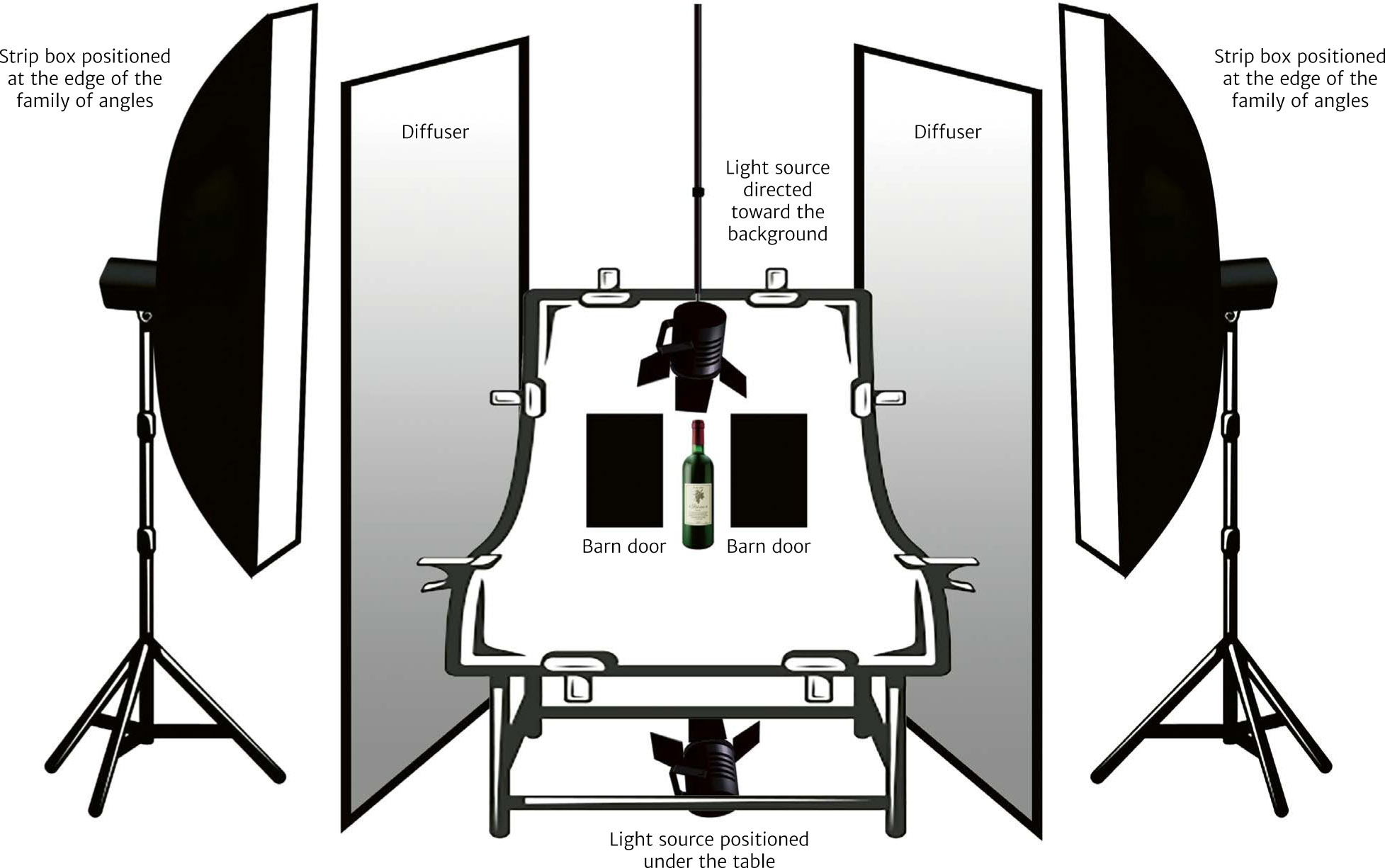
Lighting the Base

Producing a Sharp Silhouette
Producing Even Reflections on the Edges

Lighting the Label

Lighting the Engraving

Lighting the Capsule
Lighting the Medallion and the Cardboard Sleeve
Color and Preparation of the Shot
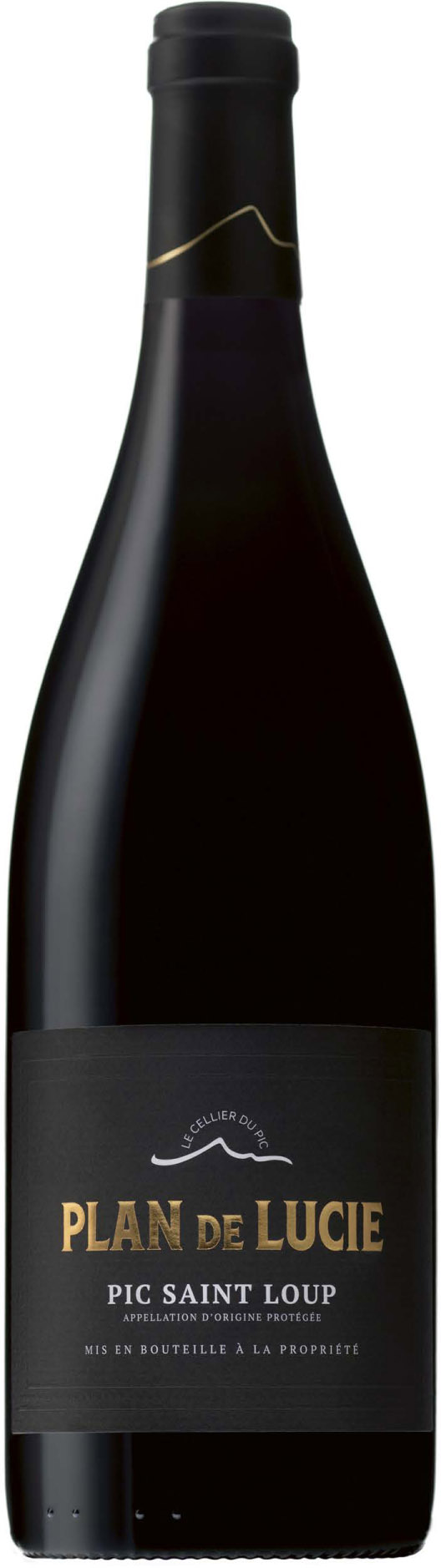
Even though the container is not that different from what is used for red wine, because of their greater transparency, rosés and white wines react differently to light. The question of color, therefore, takes on greater importance. While the lighting of bottles of rosé and white wine seems simpler, because you need fewer light sources, it also requires greater precision, especially in the management of tones and nuances. Unlike for the bottles in the previous section, here the challenge is to make the color of the liquid look as good as possible—it needs to be harmonious, true, and even. The lighting of the back of the bottle is no longer just a matter of lighting the background, but also of providing the luminance and color that match the wine itself. The light source, therefore, is no longer directed from the front to the background, but rather behind the background, so that the light is as diffuse as possible. If you don’t have a standard packshot table available, you can achieve a similar result by placing a diffusing fabric behind the bottle and then, behind that, arranging a light equipped with a relatively large light box. Make sure that the light measured on the diffuser (with the lumisphere directed toward the light source) is +3.33 EV, as with the bottles of red wine. This arrangement will ensure that you have a very soft, even lighting, while limiting the appearance of localized highlights. As usual, you will need to arrange two barn doors at the edge of the bottle’s family of angles to ensure a well-defined silhouette. Also pay attention to making the reflection of the black bands at the edges of the bottle as fine as possible by positioning the covers very precisely. You can make the positioning more exact by moving the bottle to the ideal distance. Think of the edges of the bottle looking as though they had been drawn with a well-sharpened gray pencil. Example of lighting of a bottle of rosé for a catalog. You do not need to light the bottle so as to produce bands of reflections on either side of the front of the bottle; some winemakers, however, will ask for that. The presence of the bands has the advantage that it solves the problem of lighting the label, while keeping the bottle from looking like it is made of frosted glass (see next section). If you’re trying to produce a shot without visible reflections, you will need to use the method for lighting cylinders: a rounded diffuser placed in front of the bottle, with a hole in it for the camera lens to pass through. This will position the backlighting to reflect on the diffuser, so that the front of the bottle is globally illuminated, without any reflections appearing on it—there will, in fact, be a reflection, but since it covers the entire visible surface, it can’t be distinguished. And if, by any chance, the result ends up looking a little foggy, you can just apply a 10% or 15% Dehaze filter in Lightroom. STANDARD METHOD FOR LIGHTING ROSÉS AND WHITE WINES POSSIBLE WAYS OF LIGHTING ROSÉS AND WHITE WINES A behind-the-scenes view of the lighting of the bottle shown on page 129. Three light sources were used: a bowl fitted with a barn door and placed behind the table’s backboard, using backlighting through the plexiglass; a light source on the ground, underneath the table, directed vertically toward the bottle; and a strip box behind a large diffusing fabric, to the right of the bottle. Two barn doors were placed behind the bottle, and a third one to the left of the bottle. If you decide to include visible reflections, then just use the method that has been outlined for red wine, while playing with the dimming as much as possible: move the light source away from the side diffuser so that its luminous flux covers all of it, or even move the diffuser away from the bottle if the light source is too close to it (because the diffuser is not fully illuminated, the source will look smaller, from the point of view of the bottle, than if it were fully lit). Some winemakers and some labels want their bottles of rosé and white wine presented so that the surface of the liquid cannot be seen, so it looks as though the bottle is filled all the way up to the cork. Of course, there is no such thing in reality, because the empty space left underneath the cork at the neck of the bottle prevents the wine from escaping if there is a change in temperature and a resulting increase in pressure. In these cases, therefore, you have no choice but to edit the photo in Photoshop. You can duplicate the color of the wine in the area above the label (which is the most even area in the photo) and then paste it into the empty space, using a layer mask. Then, all you need to do is pass the eraser tool, set to a low opacity, over the area as much as is needed to fill the empty space. White wines and rosés are textbook cases of the need to calibrate the camera using a well-suited colorimetric profile and the use of the gray card and the colorimetric probe described on pages 119–120. The color of the wine is not a coincidence, but rather is the result of meticulous work on the part of the enologist, who has chosen to blend several different wines according to their taste qualities, of course, and the result they desire in terms of color. Rigorous management of the imaging chain and rigorous control of the lighting will ensure that the final color is true, but you must also be careful not to saturate the colors that you obtain in the final phase of post-production: this would have the effect of “pinking” white wines, which is considered to be a flaw associated with poor winemaking—purists would think they looked like “stained” wines, which are wines contaminated by the presence of red wine anthocyanins. In addition, note that the fashion, originating with wines from Provence, is to present ever paler rosés, to give the impression that they are lighter and fresher.BOTTLES OF ROSÉ AND WHITE WINE
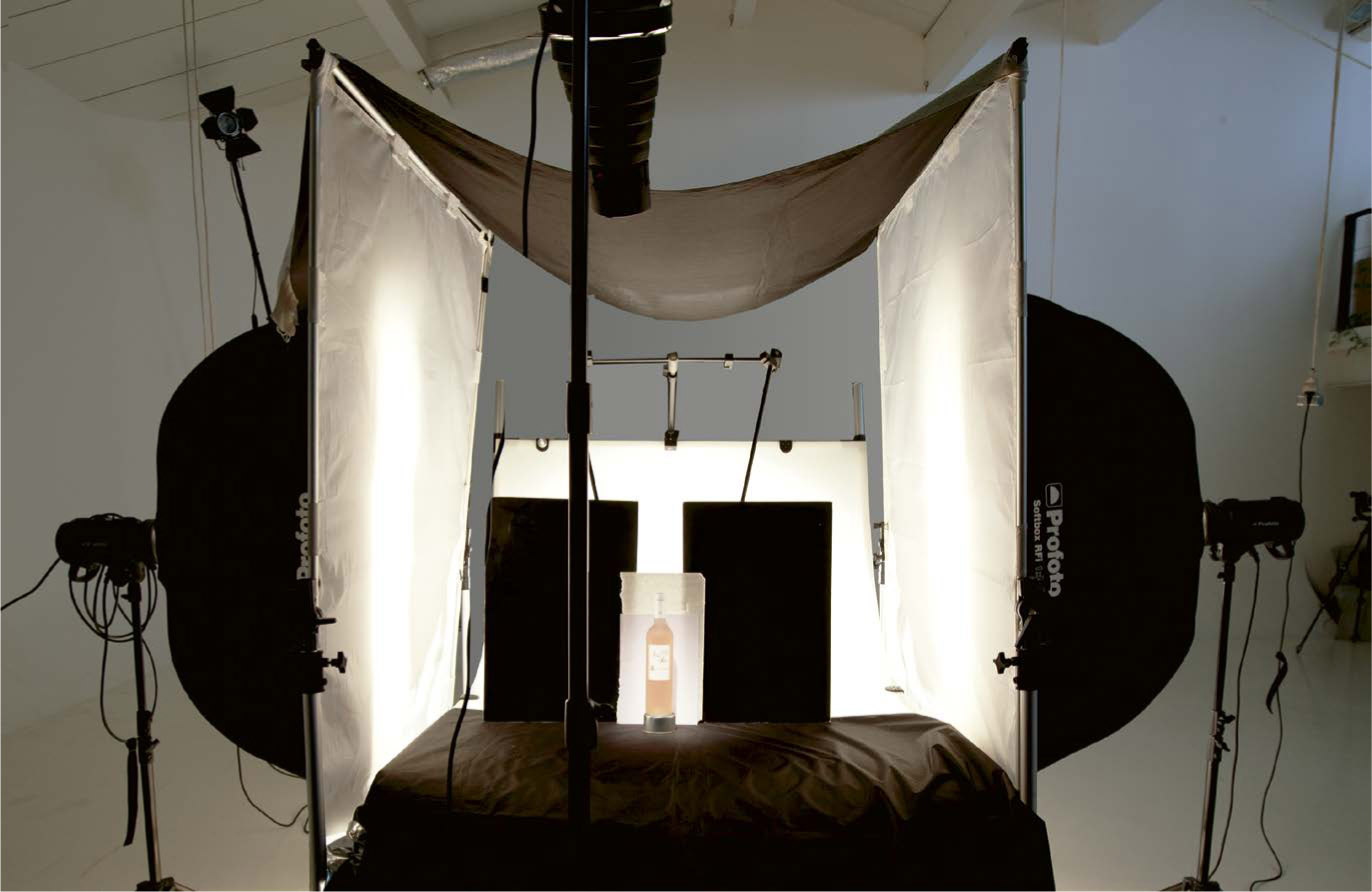
Delicate Lighting

Reflections or No Reflections?


Wine All the Way to the Top
Color and Post-Production
Frosted-glass bottles, generally used for white wine and rosé, are becoming more and more common. To illuminate them properly, the light must be extremely diffused. This kind of bottle is produced using a technique called satinizing, in which the bottle is immersed in an acid bath that attacks the surface of the glass, giving it a frosted or sandblasted look (depending on how long it is in the acid). After that, the lighting plays an essential role in emphasizing the impression of a silky finish. After it has been attacked by the acid, the surface of the bottle is no longer smooth, and it can no longer produce direct reflections, only diffuse ones. Thus, there is also no longer any risk of producing poorly positioned highlights. You might therefore reason that any light source, placed anywhere, would work just fine. And this would be true if you were photographing a bottle filled with something opaque, but the challenge here, as in the previous section, is to light the bottle while making the contents look as good as possible, in terms of both light and color. STANDARD METHOD FOR LIGHTING FROSTED-GLASS BOTTLES In addition, even though the bottle only produces diffuse reflections, there is still the risk, if you use lighting that is too hard or too localized, that shiny spots might appear, which would then require editing work. As with all translucent objects, therefore, you need to have a solid strategy for the lighting. The management of the light here involves producing very even lighting behind the bottle so that the color of the wine will be as constant as possible, while also maintaining the tonality that we expect from a cylinder (a gradual change in lighting across the various parts of the shape). As always in such cases, you will need to make sure that you have perfectly calibrated your screen and adjusted your white balance using a gray card, as well as a colorimetric profile on a palette. It’s essential to get the right shade. After that, you will have to place your light sources so that they are well centered—the laws of refraction mean that this positioning will ensure that the light is well distributed across the bottle, and will avoid the presence of discolored or grayish areas along its edges. As with all transparent glass, the strategy of backlighting is a necessity here. To achieve the softest and most even light possible, use the following steps: 1. Position the rim light, equipped with a softbox, behind the bottle, then place a diffusing fabric far enough away from the softbox that it will be lit up over its entire surface. The rim light can also be placed in reflection, as in the diagram on the previous page: pointing backward from the front, it is reflected on the panel located behind the bottle. The light is soft and even, and the setup will therefore be simpler. 2. Arrange two barn doors, one on each side of the bottle, to create a sharp silhouette. Place a sheet of translucent paper in the center (see the behind-the-scenes photo above) to harmonize the lights and give a sense that the color of the liquid has been smoothed. 3. Place two strip boxes along the two sides, behind diffusers, not to create reflections (as would be the case for smooth glass bottles), but to avoid creating areas of low light along the edges, and, especially, to illuminate the label and the capsule. 4. Because this kind of bottle is quite sensitive to grazing side light, do not light up its base from below. We generally place the bottle on a fabric that absorbs light, such as brushed cotton. A behind-the-scenes view of the lighting of the bottle at right. The front of the bottle and the label are illuminated using a snoot equipped with a honeycomb grid positioned frontally at 70°, from above. A brushed cotton sheet is placed under and over the bottle to avoid reflections from above and below, and a sheet of translucent paper is positioned behind the bottle to even out the lighting of the wine. Example of lighting of a frosted-glass bottle of rosé for a catalog.FROSTED-GLASS BOTTLES
Diffuse Reflections

Evenness in the Color of the Wine
Lighting Strategy

Glass bottles generally have a lot of flaws, particularly ones due to uneven thickness of the glass and the presence of opaque particles or air bubbles. We have seen that it is advantageous for a glass container to be shown full, because the presence of a transparent liquid has the effect of evening out the light through refraction. This is true for all the bottles we have looked at so far. But the problem must be addressed anew when we photograph empty bottles. Glassmakers have a rich vocabulary for describing flaws in bottles: streaks, refractive index gradients, inclusions, bubbles, chips, stones, tears, etc. It is clear that laborious editing work will be required to produce a high-quality shot that you can present to your client. The best way to solve the problem is to play with the refraction of light: filled to the brim, the bottle will behave like a magnifying lens, and all the flaws on the interior surface will disappear. You can use water for this, but for an optimal result you will find that a transparent mineral oil, like paraffin oil, works best. You can take this even further: by submerging the bottle in an aquarium filled with water, you can also eliminate the flaws on the outside of the bottle. In this case, it is the whole apparatus of aquarium, water, and bottle taken together that works as a magnifying lens. Of course, flaws related to the inclusion of particles and air bubbles will still be visible because their refractive indexes are very different from that of glass, but most defects will be corrected. As with the wineglass, we proceed using backlighting (a strip box placed behind a diffusing fabric). This light alone may be enough, as with the photo of the flask below, but glassmakers often require there to be a pronounced reflection on the front of the object: to make that happen, a strip box is placed at 90°. This kind of reflection makes it possible to emphasize how polished the glass is while also showing off the bottle’s specific shape. Three bottles, with different shapes and colors, filled with water and photographed using backlighting.EMPTY BOTTLES
Flaws
Filling the Bottle
Lighting

Creating photographic reproductions of pictorial works is a common commercial activitiy for object photography studios. It is easy to see that, more than in any other area, this activity requires absolute fidelity to the original. Reproductions meant for museums, photographs for exhibition catalogs or posters, certificates of authenticity—the list of areas in which a photographer is required is a long one, and provides regular work for professionals. It demands rigorous attention to fidelity in terms of both colors and proportions. The very first thing you have to do is make sure that the orientation of angles (homothety) in the shot is perfect. You do this by placing the camera lens at the level of the center of the painting, at a perpendicular angle to it. This requires setting up the camera on a tripod at the necessary distance to maintain an average diagonal angle of view of 24°. Thus, for a 12-inch painting, we use a 135mm lens at sixty inches away; for a 6.5-foot work, we use a 50mm lens with the camera 10 feet away (see the table on page 49). These precautions will allow you to guarantee that the proportions of the work are reproduced perfectly, matching the artist’s original work. The lighting is arranged so as to achieve the most even and largest light possible, while keeping its contrasts as minimal as possible. To do this, very diffused lighting is placed more than 6.5 feet away from the object—traditionally, this light consists of two light boxes at 45° on either side of the painting. For textured paintings, we shall see that we have to add diffusing fabrics to minimize certain localized shadows. But hard lighting (bowls, lenses, shapers without diffusion) cannot be used at all. As a rule, you should also avoid frontal lighting, which could allow the shadow of the camera (and of the photographer, if you aren’t using a remote control) to appear, and could generate very uneven lighting—the central climax area could cause highlights to appear on the painting. STANDARD METHOD FOR LIGHTING PAINTINGS Most of the works that photographers are asked to reproduce include material effects that you will have to try to render in the shot, while trying not to allow the shadows that they might produce to distort the image. To do this correctly, you will have to understand some things about painting. Watercolors allow the grain of the paper to show through, and they accentuate it, so the grain must therefore be visible in the shot. Some paints are mixed with extenders (most often gypsum, kaolin, or lime); these are used to add dimensionality to the painted surface, and you can make them show by adding a third light box at 90°—in other words, a grazing side light meant to bring out the textures through slight shadows. The same is true for oil paints or acrylics mixed with sand, sawdust, shavings, or undercoats of coarse canvas or crumpled paper (as used by the Surrealists). For other techniques, such as the palette-knife paintings that were common among the Impressionists and, earlier, Fragonard, or material work using sponges or brushes, it may sometimes be necessary to slightly lower one of the two light sources in the standard arrangement (by 0.1 to 0.3 EV) to make the technique visible. When the texture of the canvas or the paper on which the work is painted plays an important role, as in Kandinsky’s and Egon Schiele’s watercolors, you will obtain a more elegant and more precise result by using a camera without a low-pass filter, such as the Canon 5DSR or the Nikon D5300. This kind of equipment, which allows you to represent high-frequency information such as repetitive patterns (the screen of a canvas or the grain of a paper) without an anti-aliasing filter reducing the sharpness of the image, will provide good results. This painting, made by the children of a primary school in the Hérault department in France, was made up of seventy-two ten-inch cardboard squares, sewn together with strings. Many of the works that need to be photographed come in a variety of shapes. Collages, triptychs, stacked frames, 3D effects—the possibilities are endless. I remember, for instance, a painting by a Russian visual artist: it was red all over, and the very tightly woven cotton canvas was stretched in the center over a wooden pyramid, creating very different material effects depending on where you stood in relation to the work. In cases like this, you will need to use the lighting methods adapted to each kind of shape, as we discussed earlier: one of the two light sources will have to be somewhat minimized so that a slight shadow can indicate the presence of the pyramid. An accurate calibration to the color palette is crucial, especially if the photo is meant for reproduction or is being used for a certificate of authenticity. You will need to pay attention to the perfect measurement of your lighting (optimizing it during shooting, and correspondingly underexposing it during development), a good white balance using a gray card, the creation of a photographic reference on a color palette, and the precise calibration of your screen using the monitor calibrator. Remember that if the work includes materials that produce direct reflections, you will do well to wear black to avoid creating your own reflection as well. A behind-the-scenes view of the lighting of a painting.LIGHTING A PAINTING
Preparation
Lighting

Issues with Texture
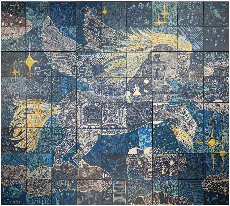
Particular Shapes and Materials
Faithfulness to Colors and Reproduction
Presented for their own sake or as part of another object, mirrors can be found in many situations. What I want to give you here is not so much a lighting method as a philosophy of photographing. In photography, a mirror is essentially nothing but a reflection. It is up to us to decide what it is going to reflect. Thus, even before we think about what kind of lighting we use, we need to decide what we want to see appear in the image. More than any other object, a mirror must be perfectly cleaned before it is photographed. Fingerprints, static dust—everything will be visible in the final shot. To clean the mirror, I suggest spraying it with a mixture of hot water and white vinegar (lemon juice also works well), and then wiping it off with a microfiber cloth, using horizontal strokes from top to bottom. The same mirrors, lighted along different angles. The lighting in the bottom photo does the best job of showing that this is a reflective surface. What you need to do now is determine what kind of result you’d like to obtain (see diagram below). If the camera is placed entirely within the family of angles of the light source, the mirror will appear completely white; if outside, it will appear completely black; if it is between the two, it will be partly black and partly white. MANAGING REFLECTIONS IN THE MIRROR Mirrors are traditionally shown progressing gradually from white to light gray. To create this effect, position a light source whose reflection is larger than the total surface of the mirror, usually by setting up a large reflective fabric so that the edge of the family of angles coincides with the edge of the object. In photo shown below left, for example, a large diffusing fabric was stretched and backlit at an angle to obtain the gradual white-to-gray effect that was desired. For the mirror to be easily identifiable, you need to make sure that it is positioned at the edge of the family of angles. More and more often, however, we see mirrors shown with a clear line between the light and the dark reflections (as in the photo above). To achieve this, use lights with barn doors set up to clearly delineate the difference between the two reflections. This more modern approach is what most manufacturers now prefer. For mirrors, as with all reflective surfaces, you will usually need to avoid hard light sources or lights that are too localized. Instead, you can increase the lighting surface by using either large shapers (octaboxes or umbrellas) or diffusing fabrics. Sometimes both. Another good solution is to aim the light toward a large white wall and then use its reflection to light the mirror. If it is placed far enough away to reveal what needs to be visible, this arrangement provides very even lighting, ideal for a mirror or any surface that produces direct and specular reflections. If you’re trying to produce very segmented lights, alternating between black and white, you can also use barn doors; a black piece of cardboard works just fine. But you should be aware that because of the particular conformation of mirrors, you will not be able to produce a perfectly clean break between the reflection and the unaffected area: there will always be a gray band that appears because of the refraction in the thickness of the glass covering the mirror; the thicker the glass, the wider the band. In product photography, mirrors are often used as a base for the objects being photographed. They make it possible to obtain clearly drawn reflections, which are very useful when the presence of reflections is required. If the glass of the mirror is very thick, a very clear outline will be visible at the base of the object. In fact, the thickness of the glass leaves a small margin of direct reflection in the place where the object is placed, while its reflection appears a little farther away: it’s useless to try to outline it with a pen. Mirrors are also used as reflectors. They are much more efficient than normal photographic reflectors because they reflect about 95% of the light. When you need to set up complex lighting arrangements, or if space is tight, you can always use small mirrors to help you light or unblock one area or another. They are widely used in jewelry photography, where you need to call on a large number of light sources to create light effects on as many facets of the jewelry as possible (for example for precious stones). And finally, as bases for objects to be photographed, mirrors make it possible to provide a faithful accompaniment for the projection of a particular subject (see page 197, backlighting method using a computer screen).LIGHTING A MIRROR
Preparation

Strategy

Light and Barn Doors
Accessory or Base
In theory, the problems posed by pyramids should not be that different from the problems of parallelepipeds. As with parallelepipeds, it should be a matter of showing half the sides, with different lighting, but it is not that simple. The only good way to show three sides of a pyramid with a square base is to photograph it from a bird’s-eye view. Let us begin by recalling that there are two main kinds of pyramids: pyramids with triangular bases, which have four sides; and pyramids with square or rectangular bases, which have five sides. For triangular pyramids, the exercise is easy enough: only two sides must be shown, and any angle of view will be effective. For square pyramids, on the other hand, the particular layout of the shape means that the only way to show three sides is if the photographer works from a bird’s-eye view. If the photographer is placed any lower, the third side will only appear at the very edge, thereby rendering the shot much less effective. The pyramid is thus an exception to the rule that says that for every shape, you have to show half of the sides. As with most objects that produce diffuse reflections, the lighting of matte pyramids is pretty simple: one of the two faces is lit up locally, leaving the other in shadow. Any kind of lighting can be used, but you must make sure to avoid having too great of a contrast between the high and low lighting if the object is large. Nevertheless, it is customary to use beams of light that are larger than the exposed side, placed perpendicularly so as to obtain even lighting. Glossy or polished pyramids are usually lit using indirect lighting, especially if they are small, like the obsidian pyramid shown below, which is only two inches high. The goal is to obtain a soft but gradual lighting, to give a nuanced sense of the material. The easiest way is to direct a narrow source, such as a snoot or a small honeycomb, toward a reflector, which you place to the side so that it will reflect the light toward the lateral side. It is usually the front face that is left in shadow, but nothing says you can’t do it the other way around. Example of lighting for a pyramid with a square base in glossy obsidian. The advantage of having a narrow, reflected source is that it avoids making the pyramid look too artificial, because the variation in lighting is easy to handle (all you have to do is rotate the reflector slightly to obtain more or less pronounced differences in tone), while also allowing you to show the material the object is made from. Marbles, brushed metals, and wood benefit greatly from being lit in this way. The pyramid is lit indirectly with a light source directed toward a reflector placed to the left of the object. Transparent pyramids, made of glass or crystal, act like prisms (see the following section): the refraction of the light and the particular angle of the sides of this shape create multiple internal reflections, resulting in a pretty chaotic outcome. To obtain a photo that is more pleasant to look at, you need to work in a controlled environment (for instance, inside a light tent), while making sure to use a black surface on one of the two sides to create a contrasting effect between them: one side will look black, and the other gray, which will allow the viewer to better comprehend the shape. Transparent pyramids act like prisms. To avoid refractions going every which way, like those shown here, it is advisable to photograph these shapes inside a light cube. STANDARD METHOD FOR LIGHTING PYRAMIDSLIGHTING A PYRAMID

Matte Pyramidal Objects
Satiny or Glossy Pyramidal Objects

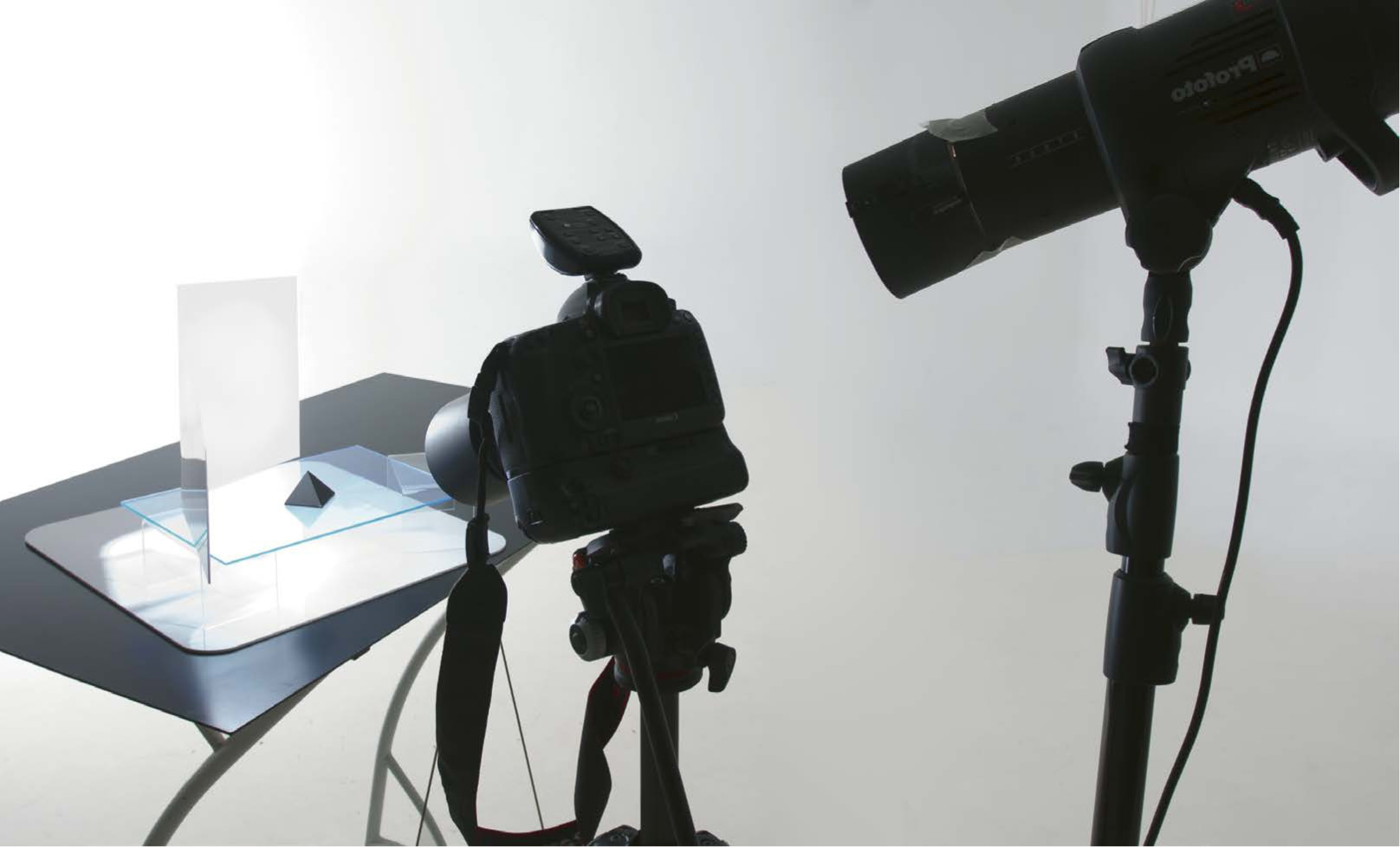
Transparent Pyramids


Transparent prisms are among the most complex shapes to light. Ideally, each of the three faces should show a different shade, but without a contrasting surface (as with the printed page shown at right), the project will be unsuccessful. Transparent prisms can be easy to light when it is a question of showing the breakdown of light into the rainbow. A beam of polychromatic white light crossing the prism will be refracted and break up into beams of seven colors, from violet to red. All you have to do is direct a very narrow light source, like that of a flash or flashlight equipped with a gobo with a very small aperture, toward one of the sides of the prism: the light will be refracted on the opposite side and the ray that is produced reveals a spectrum of seven colors. When it comes to lighting the prism itself, however, the situation is more complex. LIGHTING A PRISM WITHOUT REFLECTIONS Transparent prisms can only be lit without reflections by placing the camera and a light source exactly within the axis of one of the prism’s edges. To fully understand the shape of the object, it is generally desirable for there to be a direct reflection on one of the sides. But there are times when this won’t work, as in the illustration on the previous page where the text needed to be as precisely legible as possible. The only solution in this kind of situation is to arrange the light source and the camera within the exact same axis as one of the edges of the prism: the light will refract so that no direct reflection appears. The transparent prism refracts light within the angle of each of its sides. Thus, it produces three rays of light, and a shadow that is always opposite the incident light source. EXAMPLE OF LIGHTING A PRISM USING AN OPTICAL SHAPER EQUIPPED WITH A TRIANGULAR GOBO However, since what is interesting about a transparent prism is the way in which it refracts light, it is often presented so that we can see its effect on the light. The smaller the light source, the easier this is to see. In the examples shown at left, I used a Profoto Spot Small optical shaper. You can see that the shadow is always exactly opposite the incident light. It can easily be made to disappear by placing the prism on a glass surface elevated above the base (see the section “Eliminating Cast Shadows” on page 151). Three light beams of varying intensity (depending on their angle with respect to the incident light source) appear elsewhere, within the axis of each of the sides. You will notice that the prism reflects the light in its environment. If you want the light on all the visible sides to be uniform, place the prism inside a light cube, or else arrange solid sheets of cardboard vertically to either side of the object.LIGHTING TRANSPARENT PRISMS
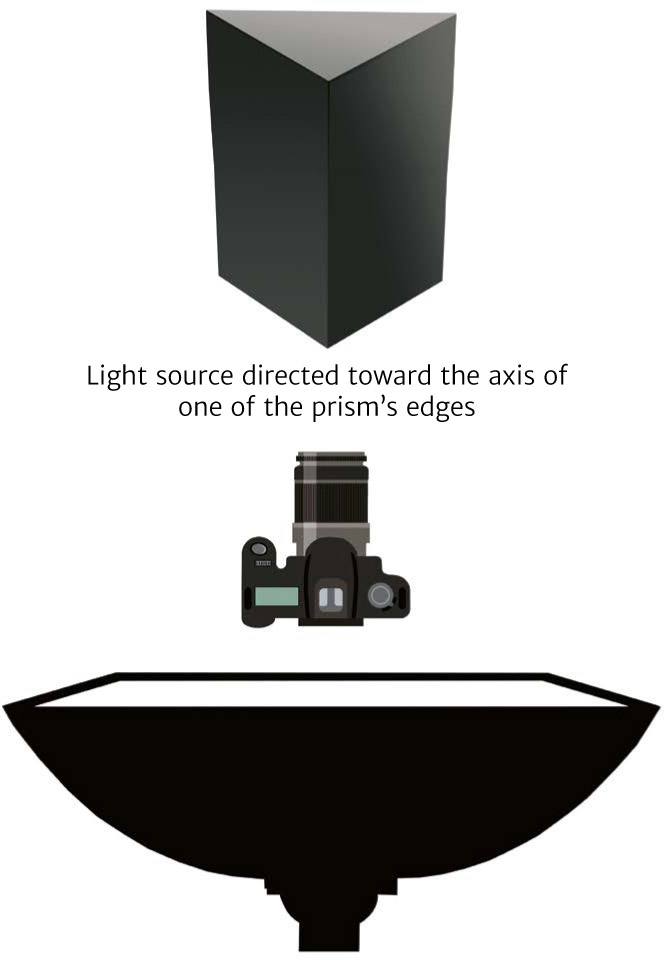

Prisms without Reflections

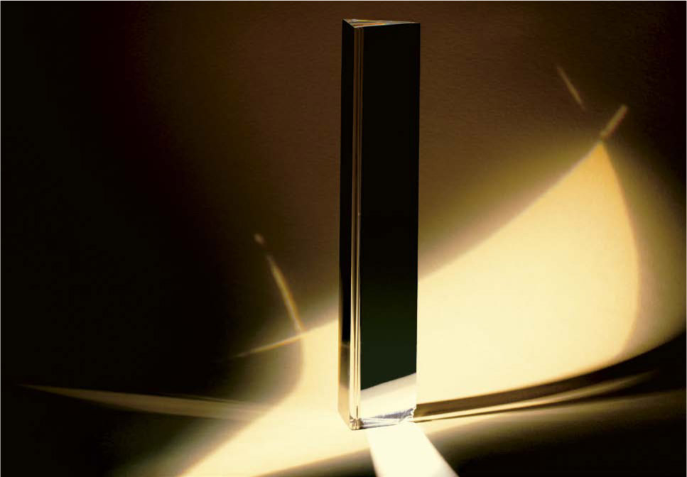
Using Refracted Rays
An product photographer is constantly dealing with articles whose general shape is close to that of cubes, slabs, or rhombohedrons. While lighting them does not usually create major difficulties, it is important to have a good grasp of the logic of the lighting. In the section devoted to the theory of parallelepiped lighting, we saw that it was necessary for at least three of the visible sides to be lighted in different ways to properly anchor the shape in space. In practice, however, there are a few pitfalls that may occur. It often happens that the object to be photographed is made up of multiple sections of various shapes, like the medium-format Hasselblad shown here: while the camera is cube-shaped, the lens is cylindrical. We could, of course, try to light each of the two shapes with its own dedicated light source, or else take two photos that would be combined in post-production, but an image produced using one light source would be more natural and more pleasing to the eye than a composite photo. Because the assignment here is to make a promotional photo in which the name of the brand needs to appear, the cubic shape of the camera itself will be given more weight. By placing the major light source (a 24 x 16-inch softbox behind a diffusing fabric) within the axis of the lens, we can simultaneously light the front surface of the lens and the front side of the cube. The multiple reflections within the lens are due to the presence of several glass layers. This lighting is measured at +1.33 EV with a flash meter placed level with the front of the lens. A second light source is placed to the side to illuminate the right side of the camera. It is measured at +0.4 EV. The last side of the cube, finally, is not lit, but the metallic elements (accessory shoe, shutter, etc.) benefit from the main lighting. When you want to light a parallelepiped that is glossy (such as a lacquered cube) or satiny (such as a box that is varnished but not polished), you must decide whether or not you want there to be visible reflections, and if so, what kind. In this photo, the lighting for the (cubic) camera itself was emphasized over the (cylindrical) lens, with different levels of lighting on each of the three sides. For perfectly smooth shapes, like polished steel or glass cubes, you would usually use hard (bowl-type) light sources and barn doors in order to get contrasting black and white reflections, with a quick transition from light to dark, for a lacquered effect. For practical reasons, you will normally emphasize the side closest to the incident light source, but if there is a particular detail of the object that needs to be highlighted, you can choose a different side, lighting it with a different source. Generally, you will use only one light source, positioned toward one of the sides. The climax is measured at +1.33 EV on that side, and then one of the other two sides is lit with a reflector. Because reflected light is always weaker than direct light, you can be absolutely sure that the lighting of the second side will be consistent with the presentation of the shape. Example of lighting a cube using a single light source placed at 45°. Based on the axis of the source light, each side looks different. Most of the parallelepipeds that we are asked to photograph are boxes. It is always a good idea to light their interior, with the lid raised. The method is simple: arrange a showerhead light source, usually a snoot or a bowl with a honeycomb, to avoid having the light “drool” onto the side edges of the box; then direct a second light, usually a softbox, laterally toward one of the other two visible sides of the object. If the box is shallow, like an empty sardine can, for example, you can use one showerhead light source, and one of the other two sides can be lit with a reflector, as shown in the diagram below. STANDARD METHOD FOR LIGHTING PARALLELEPIPEDSLIGHTING PARALLELEPIPEDS
Mixed Shapes
Satiny or Glossy Shapes
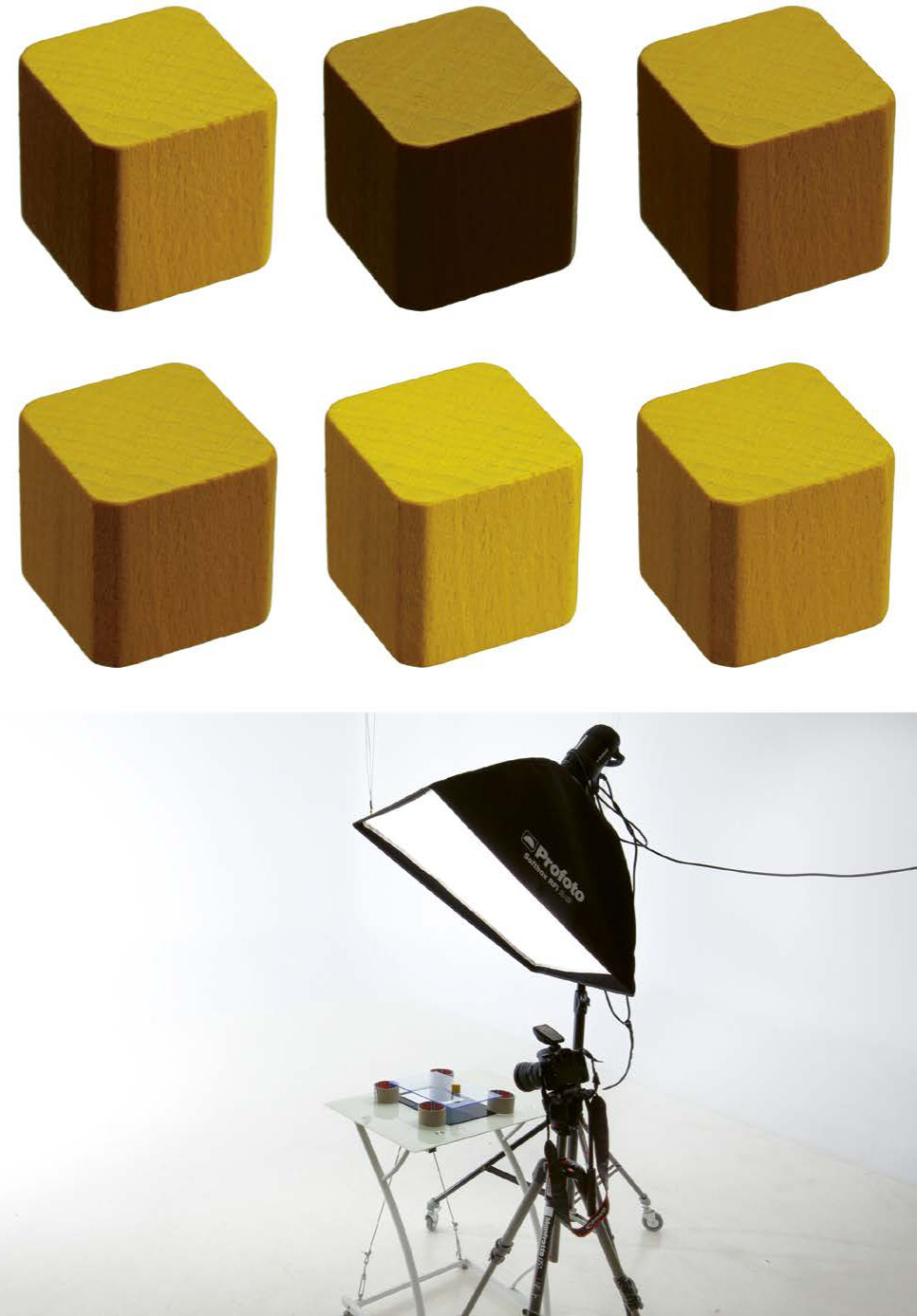
Boxes

Cylinders come up a lot in packshots and advertising, especially because of the large number of sodas and other kinds of drinks that come in cans. Cylinders require precise and perfectly controlled lighting. We have seen that cylinders, like spheres, have a family of angles of approximately 270°. This means that we will get direct reflections as soon as a light source is placed anywhere other than directly behind the object itself. Fortunately, this ability to produce direct reflections only applies around the perimeter, and cylinders can be lit from above and below with no fear of reflections. STANDARD METHOD FOR LIGHTING MATTE CYLINDERS Several possible ways to illuminate a candle. The shape and reflectance of tires, wooden rolling pins, candles, and such make these objects easy to light as soon as you place the incident light source to one side or the other of the cylinder. The important thing is to create a very gradual light and half-light, using very soft light sources such as large softboxes, lighting reflected off of light-colored walls, or very diffuse light sources. You can then control the gradient by changing the orientation of the light source and/or by modifying it using a reflector placed across from it. You will see that some objects benefit from showing more or less pronounced gradations of light and shadow. But we try to avoid hard light sources, which erase the sense of the object’s roundness and suggest a flat side, like that of a parallelepiped, by showing a shadow that is too localized. A behind-the-scenes view of the illumination of the candle. Remember that a cylinder needs to be lit so that the light is as gradual and diffuse as possible. In the five photos shown on the previous page, the two candles at the left suffer from having an overly pronounced area of shadow and a too-narrow area of half-light. Things get more complicated again with glossy cylinders. Without reflections, they look very dark and insubstantial; using standard lighting, like light boxes, the only reflections you will get are narrow bands. Of course, you need to avoid overly localized light sources, like bowls or snoots, which will only cause reflections in the shape of very obnoxious little circular highlights. This is due to the cylinders’ families of angles, which make it necessary to use very large light sources, arranged at very different angles, in order to produce reflections that will look much like what we tried to obtain with matte cylinders. You might think that a strategy like the one I have already mentioned, consisting of illuminating a large wall, would be enough to fill the entirety of the cylinder’s family of angles, but that would not work here. The only way to light a glossy cylinder and to cover most of the family of angles is to place a rounded reflector in front of the object (see the behind-the-scenes view on the following page). I use 3-mm-thick sheets of translucent plexiglass (PMMA), rounded with a heat gun. The cylinder reflects the reflector itself, and you can modulate the lighting, as we did with the candle, by choosing to place the light source on one side or the other of the diffuser, in order to vary the gradation from light to dark. You can use one rounded reflector or several, the important thing being that they cover the entire family of angles. The soda can, the most common example of cylindrical product photography, can be lit in many different ways. There are multiple lighting options using strip boxes, characterized by several parallel lines of lighting of variable intensities. The technique is simple: place at least three long, narrow light boxes on each side of the camera (traditionally at 30°, 150°, cand300°), pointed toward the soda can, but make sure that their lighting strengths are not the same (from +1.3 to +0.5 EV depending on the color of the can and the desired effect). The result is a “pop” look that emphasizes the glossiness of the product, but it plays down the writing and doesn’t allow for nuances in the photography. I find it much more elegant, and much simpler to carry out, to set up the lighting via a rounded diffuser. A single light source is sufficient for lighting the front of the object. If it needs to be presented against a white background, then a second light source can be placed, either directly (as in the behind-the-scenes view shown below) or else as a directed reflection toward a light-colored background, measured at +3.33 EV. Note that you can also arrange two light boxes for direct lighting on either side of the camera, directed toward the diffuser, if the surface of the object is not perfectly reflective, as is the case with certain brands of beer and some tea-based beverages. A behind-the-scenes view of the lighting of a soda can according to the method indicated on page 95. A behind-the-scenes view of the same scene from a different axis. You can also play up the contrasts on the can by arranging a black barn door on one of the edges to diminish the reflections on one side of the object. Final photo of the soda can.LIGHTING CYLINDERS
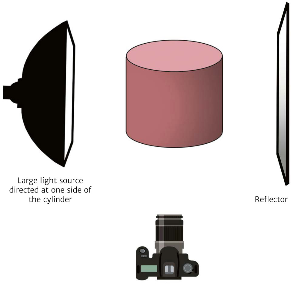

Matte Cylinders

Satiny and Glossy Cylinders
Soda Cans


As with mirrors, photographing spherical objects has more to do with a philosophy of shooting than with the practice of lighting—because it is not so much the sphere itself that we are photographing, but the reflections that it produces. Whether a sphere is matte or glossy, opaque or transparent, the challenge is always the same: presenting the roundedness of the shape through an even transition from light to dark and as soft of an ending as possible. This can only happen if you work with very large, very diffuse light sources, at the very outside edges of the family of angles. Even though matte objects are not going to produce the problem of throwing direct reflection, it is nevertheless true that frontal lighting, especially if it is localized, creates an effect of small round highlights, which is not a harmonious look. Depending on the desired effect, you can light spheres the same way that you light matte cylinders, using a very large light source positioned behind a large diffusing fabric, within the family of angles (from 100° to 140°), while also placing a reflector opposite it to help with the transition in the light and to soften the terminator. STANDARD METHOD FOR LIGHTING SPHERES The most effective solution, however, involves the method presented in the diagram below left. Position a large light source (such as a light box) behind the sphere, and a large, rounded diffuser, occupying the entire family of angles, in front. Then place a white reflector below the structure to cover all of the family of angles, and in that reflector create an opening for the camera lens. The backlighting will serve both as background light, by presenting a light-colored backdrop (or a white one, if it is measured at +3.33 EV), and as a key light, by reflection against the rounded reflector. A Christmas tree ornament photographed using the unfocus technique. Spherical and spheroid objects reflect all of the elements and lights that are present in their family of angles. However hard you try, you will always find the space behind you, the ceiling, the walls, and your camera appearing on the surface of the sphere. The idea, therefore, is to create a space whose reflection on the object will be compatible with the image that you want to produce. Transparent crystal sphere placed on a table that is backlit using reflection. Thus, to obtain a perfectly black sphere (as in the photo on page 90), simply lit along its upper edge, you need to place both a light source in rim light and the object on a black surface. If the studio is large enough, you can turn off all the lights and take cover under a black cloth (because as the photographer you are closer to the object than the studio walls are, the backlighting will otherwise illuminate you): then, because the sphere has nothing to reflect except for the backlighting, it will look black. To obtain a completely white sphere with a slight gradation toward light gray, the only possible procedure is to photograph it inside a light tent, with a light source placed to the side, but the result will not be perfect: you will see the rounded reflection of the tent’s interior seams, which you can only get rid of with editing software. The most common technique for photographing this kind of object (such as a Christmas tree ornament), however, is to make a composite shot using the unfocus technique: Position one or more direct light sources pointing at the sphere and place the camera on a tripod. Take a first shot focusing on the ball (basically on the edges, or on the loop at the top), and then a second one using a focus that blurs the reflections of the light sources. To create the photo on the previous page, all you have to do then is open up the two images in your image-processing software and combine the two images, keeping the blurred part of the reflections, along with the sharp focus on the edges of the ball, the plastic loop, and the elements around it (in this case, the needles of an artificial white Christmas tree). Crystal balls and other spherical transparent glass paperweights are reasonably easy to light. You just need to make sure that the rear lighting is intense enough to keep the frontal reflections from appearing. Let’s analyze the setup for the lighting of the crystal sphere photographed above (the behind-the-scenes view is on the next page). One light source is positioned on the ground, aimed at a white reflector placed at a 45° angle behind the sphere. As with the drinking glasses presented earlier, the lighting here has the effect of clearly defining the silhouette of the object, while maintaining a pronounced lightness of color on the interior. The reflector also spreads the light so that a direct reflection appears on the upper part of the sphere. The rest of the elements (air bubbles, sand, etc.) are lit by continuous refraction, with a pretty white-gray-black gradation: this is simply the image of the reflector’s white-gray-black lighting. A behind-the-scenes view of the photo on the previous page. These ideas can be extrapolated to complex spheroid objects, such as the plaster skull covered in glossy silver paint, at right. Its general shape, especially with the ridges formed by the bone structure of the eye sockets, nose, and jaw, make it impossible to use just one light source—the small photos show what a single light source would show, depending on its placement. The skull in the large photo at right was lit with three light boxes equipped with honeycombs so that the background would stay black. In addition, overly uniform lighting would cause an object like this to lose much of its power. Instead, I suggest using lighting consisting of three sources (see the behind-the-scenes view below): one placed to the right side to light the frontal bone, nasal bone, teeth, and the front of the lower jaw; a second one to the left at a 55° angle to light the sphenoid bone, temporal bone, and lower jaw; and finally, a third one, at 140° behind the skull, at the edge of the family of angles, to light the parietal bone. This plaster skull, covered in metallic paint, can look very different depending on the number and axes of light sources.LIGHTING SPHERES
Photographing a Matte Spheroid Object
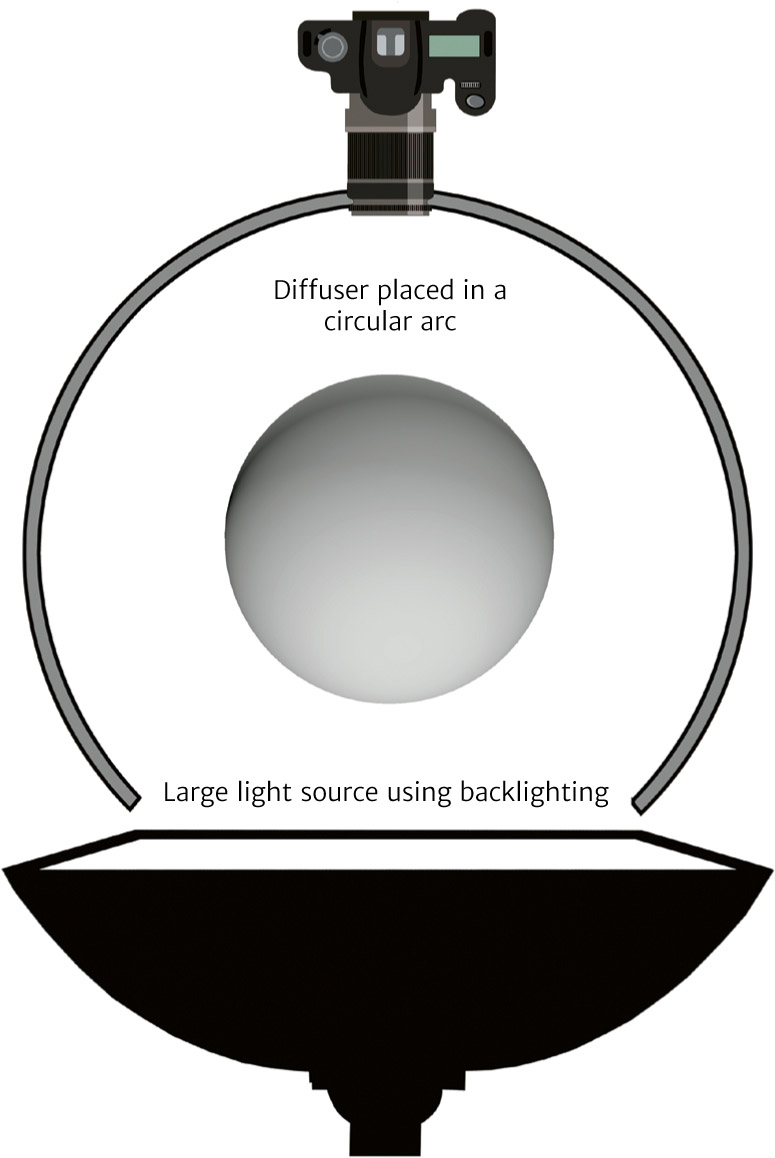

Photographing a Satiny or Glossy Spheroid Object
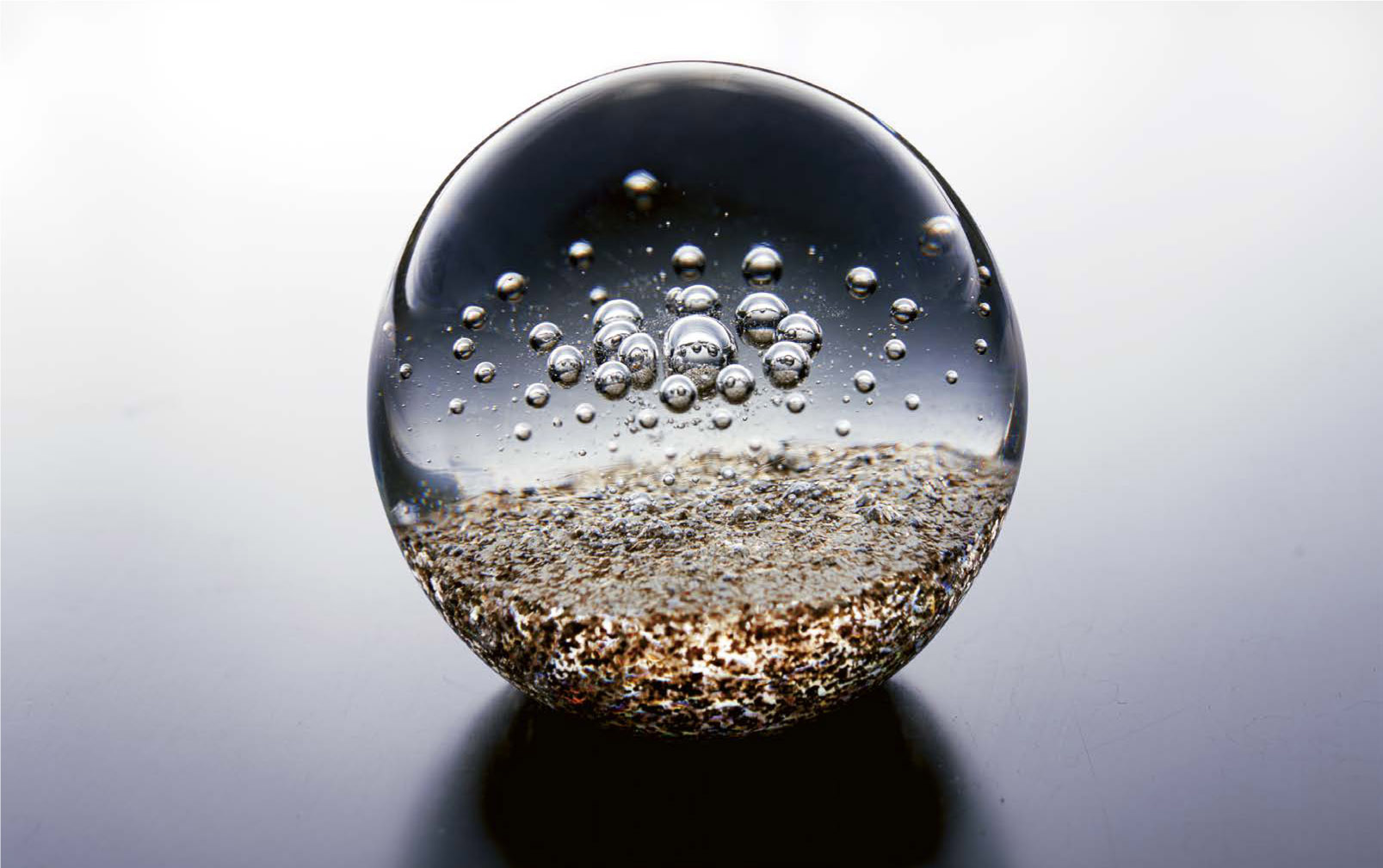
Photographing a Transparent Spheroid Object

Photographing a Complex Spheroid Object


Even though, in most cases, we want to show a shadow because it gives a sense of the relationship between the object and its environment, there are often times when graphic professionals require images without shadows. In this section, we’ll discuss the easiest way to achieve this type of image when photographing. If you are a professional in the visual arts, you have probably already had clients ask you for “cutout” photos. These are shots, generally delivered in PNG format, in which only the photographed object is present, without any background or shadows. You can, of course, obtain this kind of result in post-processing by using an object-selection software tool: a pen, lasso, color picker, etc. But there is a technique that is as old as photography that works very well, and which the profession appears to have forgotten—this book is a chance for me to refresh their memory. We have already seen that as long as it is at a right angle to a sheet of glass, light is transmitted perfectly, without producing reflections. Everything that is placed on the glass therefore seems to be floating in the air. The shadow cast by an object is usually directly underneath it, where it touches the surface it is sitting on, and the closer you are to the object, the darker it is. But in this particular case, the shadow of the object does not appear right where it connects, but instead is seen lower down, on the opaque surface underneath the glass sheet. This make-up brush was photographed using a technique that allows you to eliminate the object’s shadow (unedited photo). The object is photographed on a sheet of white plexiglass: the shadow appears very clearly below the object. If you separate the sheet of glass from its support with wedges, the object’s shadow may appear very distant from the object that generates it. I used this peculiarity of light to create the photo of the flying cup on page 237. By framing the shot to keep the shadow outside of the frame, you can give the impression that there is no shadow at all. To make it possible to understand the process better, I placed a mirror about four inches below the glass sheet (see the photo below of the behind-the-scenes view and the photo above on the right). This arrangement allowed me to get a good sense of where the shadow would have appeared if I had chosen a sheet of opaque paper instead of the mirror. In this way, depending on the angle that I choose for the shot, I can make the reflection or the shadow appear in the position I want it to. The object is photographed on a sheet of glass placed about four inches above a mirror: the reflection appears a good distance away and there is no shadow cast by the object. This method allows you to eliminate the cast shadow or, if the framing does show it, give the impression that the object is floating. This arrangement can be used to avoid undesirable reflections on glossy objects, like eyeglasses where the shadow that the glasses casts might appear in reflection on the glasses themselves. You could also choose to stack up several sheets of glass, using wedges to create different spacing between them, to give a sense of depth and segmentation to multiple objects. A behind-the-scenes view of the arrangement set up to eliminate the shadow cast by the make-up brush.ELIMINATING CAST SHADOWS
Direct Transmission


It would be easy to dedicate an entire book just to food photography alone. This field has taken on such importance in product photography over the last few years that it is essential to discuss it here. Let’s start by returning to the fundamentals. Despite the preconceived notions that you can find on many blogs, to understand food photography, you must begin with a good understanding of the basic foundations of the laws of optics: primarily reflection, refraction, and the idea of the family of angles. There is no difference, in terms of lighting, between a tomato covered in olive oil and a Christmas tree ornament. Both are spherical, opaque, and glossy. Their families of angles cover about 270° and in both cases we will see visible reflections if the incident light is placed anywhere other than at the rear. Beginning with this information, and with the fact that most foods are glossy, shiny, and vaguely rounded, it becomes clear that the primary lighting must be positioned as backlighting or, possibly, on the side. Most dishes presented on social media are lit by a large window or outside on a veranda. A diffusing fabric is placed in front of, behind, or next to the table that the food is on. This is not a surprise: a large, very diffuse source is required for all glossy objects. As usual, we adjust the camera by optimizing it to +1.33 EV in relation to the light measured at the peak. We then clear away the shadows generated by this main light source using a reflector (gold-colored for most food, silver for fish and other seafood) or, sometimes, with a second light source set at 1.5 EV weaker, in order to maintain the contrasts. Of course, we then vary this lighting depending on the dishes or the food being photographed. If we are trying to create an atmosphere around a complex winter dish, such as a beef bourguignon, we’ll choose a dark, rich background, with strong contrasts in the light (+1.33 EV for the key light and -0.5 EV for the fill light), whereas if it is a summery fruit salad, we might choose a very light background, lessening the contrasts between the two light sources (+1.33 EV for the key light, +0.6 EV for the fill light). Most food compositions are photographed from the front, at a slight angle from above (5° to 20°), so that the traditional axis of a seated diner can be maintained. The main dish and the accessory elements (ingredients, spices, cutlery, etc.) are arranged to keep the eye’s interest, and therefore the fill light is augmented somewhat, adjusting it to be no more than 1 EV lower than the key light. This type of shot, however, though it is still prominent on restaurant menus and advertising posters, is starting to go out of fashion. STANDARD METHOD FOR LIGHTING FOOD Traditional angle of shot. Most of the food items are spheroid and glossy, like the red fruits seen on the next page. Thus, they are treated like glossy spheres, with a soft, even light positioned within the edge of the family of angles. Over the past several years, it has become more and more de rigueur to shoot dishes and foods from a radical bird’s-eye view. The new wave of set designers and other food preparers prefer to emphasize the visual aspect of the food and the composition work, setting themselves apart from the traditional, old-fashioned kind of representation, which does less justice to the textures. This is done by reducing the intensity of the fill light or even doing away with it entirely to reinforce the visual contrast in the image and accentuate the graphic aspect of the presentation. In truth, more than the light or the angle, it is the composition of the scene that is most important, and that catches our eye, in this kind of image. A radical bird’s-eye-view shot is becoming more and more popular in culinary photography. In composing the shot, we generally use layers, which allows us to give depth to the image while emphasizing the shapes, colors, or textures. Let’s take the example of the photo on the next page, with a first layer made up of a sheet of white plexiglass, a second layer of ground paprika raked with a serrated putty knife, a third layer made up of the scattered fruit, and a fourth of small glass jars filled with fruit. I want to note that this is a method of composition, not a “rule,” as some writers put it. By borrowing organizational methods from classical painting, comic strip drawing, and even the movies, we can take advantage of many different methods of composition, as we will see in the section devoted to this subject (on page 208). For the image to work, we have to carefully manage the empty and full areas, the color harmonies, the geometry of the various elements, and the contrasts. But you will see that the further you progress in composition, the “lighter” your images will become. A large 24 x 55-inch softbox was placed in backlight, behind a diffusing fabric. Bird’s-eye-view shot. The fill light is adjusted to be less intense than in a traditional shot to maintain a nicely contrasting effect. It is often a must to have lighting that brings out textures—for instance, on a loaf of bread. You do not have to present food on a flat surface, not even on a table. The advertising of the last forty years has taught us to think of food in highly varied contexts: being thrown into liquid (such as breakfast cereal being poured into a bowl of milk), explosions (a common way to show hamburgers, showcasing each ingredient), syrup pouring over waffles (see pages 238–239) … All kinds of presentation are possible, with or without editing, but almost always with the main lights placed in backlight. In food photography, what is more important than the lighting or the managing of the camera is the art of preparing the dishes. The first step is to identify a dynamic, a series of geometric elements and/or colors that will give you a reason to arrange the food in a certain way—the basics of these techniques can be found in the section on composition (page 208). The idea is to highlight a food using either contrast or harmony: for contrast, we can look for opposing geometric shapes, different textures, contradictory orientations, etc.; for harmony, we can try to find similar or complementary shapes and colors to go along with the shape and color of the food. Finally, and this is certainly the biggest issue for novices, you are not trying to photograph what tastes good but what is the most visually stimulating to the appetite. If you pour maple syrup over steaming hot pancakes, by the time you press the shutter, the pancakes will already have absorbed the syrup! But if you substitute motor oil for the syrup, the syrup will look more real than life. And it will be easier to arrange for a more effective visual impact. This is also true for milk, which is replaced with white glue in ads for breakfast cereals and for many other foods. PREPARING FOOD TO BE PHOTOGRAPHEDLIGHTING FOOD
Fundamentals of Lighting
The Standard Shot


Shooting from a Radical Bird’s-Eye View
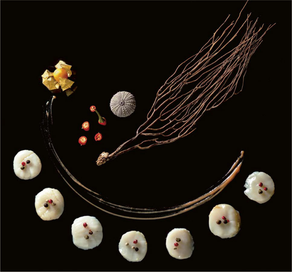
Composition in Three Layers
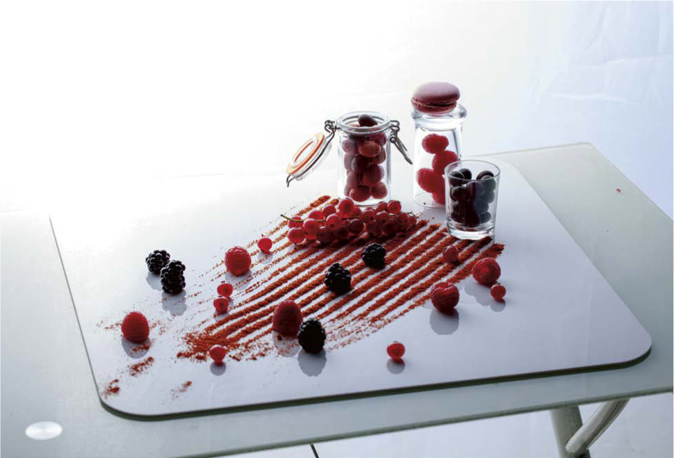
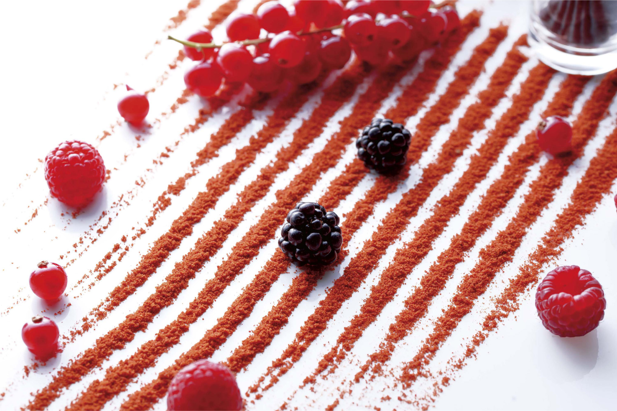
Moving Outside the Framework
Set Design and Preparation

Whether we’re talking about smartphones, computers, food processors, or electronic gadgets, it is crucial to manage the light to give the overall impression of innovation and technology. Every new laptop that comes onto the market has to relegate all the ones that came before to an old-fashioned past, making has-beens out of them. This needs to show in the photograph. Thus, in terms of both lighting and staging, we must be able to offer a new vision, often one that is inspired by science fiction, which regularly comes up with new ways of seeing modernity. Electronic objects are dust traps because of the static electricity inherent in the material they are made from, usually glossy plastic for their shells. It is therefore necessary to perform a very thorough cleaning of the workspace, as well as dust with an antistatic spray, wearing gloves. A robot vacuum cleaner, photographed using a variety of angles and lighting methods. It is customary to show technological objects with their screens turned on and lit up, so we have to work with asynchronous lighting. Electronic objects, which are often very glossy, do well if they are photographed along very precise lighting angles in order to bring out the direct reflections that will emphasize their shape in the appropriate places. I propose here a study of this process, using the ten photos on the previous page of the Amibot Spirit robot vacuum cleaner as an example. Depending on the angle of the incident light (a sixty-inch octabox, placed about three feet above the vacuum cleaner) to the surface of the robot, the impression that the direct reflection will give of the object’s shape will change, as will the look of the material. Even the power button looks different. There is no one best way to light a product like this because each angle allows us to show a particular aspect of the shape, the technical specifications, or the texture. It’s up to you and your client to agree on what should be highlighted. Most current electronic devices have screens and other lighting features, such as power and status lights, that must be shown in the photograph. The best practice is therefore to light the object with a flash, following the methods of asynchronous lighting. A flash delivers a considerable amount of light over a very small period of time (on the order of 1/1000 of a second), while the product’s lights themselves produce very weak but continuous lighting. You just need to work in a very dark space and measure the light of the flash so that it is optimized to +1.33 EV relative to the camera setting: for example, a flash measured at f/8 for a camera set to f/5, 1/200 s, ISO 100. At this point, if you release the shutter, the device’s lights or the LCD screen will disappear, but the object itself will be perfectly lit. Then, you simply need to change the exposure time, for instance by adjusting the camera (on a tripod) to 1/3 s, for the device’s lights to increase by 6 EV and to become 64 times more intense. Using this value, most products’ lights will be properly illuminated, but if the light seems too weak, there is no reason not to lengthen the exposure time even more. The power of the flash will remain constant: because the flash lasts a very short time, the exposure time doesn’t matter to it. In a case like this, make sure to work in the dark, and, of course, be sure not to leave the pilot light of the flash on: its continuous light would mess up the calculation. Because of online sales sites, it is now customary to present objects against a uniformly white (color value 255) background, in a square format. But for the purposes of demonstration, we also continue to take situational shots, like with the vacuum cleaner presented below. People expect to see its specifics, its practical functioning, or its design aspects in one image. Thus, the image we produce must correspond to the object’s style and colors: it would be very silly to show this vacuum cleaner underneath a Louis XV dresser or in front of 1950s floral wallpaper! The space must be organized to correspond to the environment that people want to see in combination with the product. We try to emphasize the technical aspects: here, the vacuum cleaner’s lighting system, which lets you see under the furniture.LIGHTING ELECTRONICS
Preparation
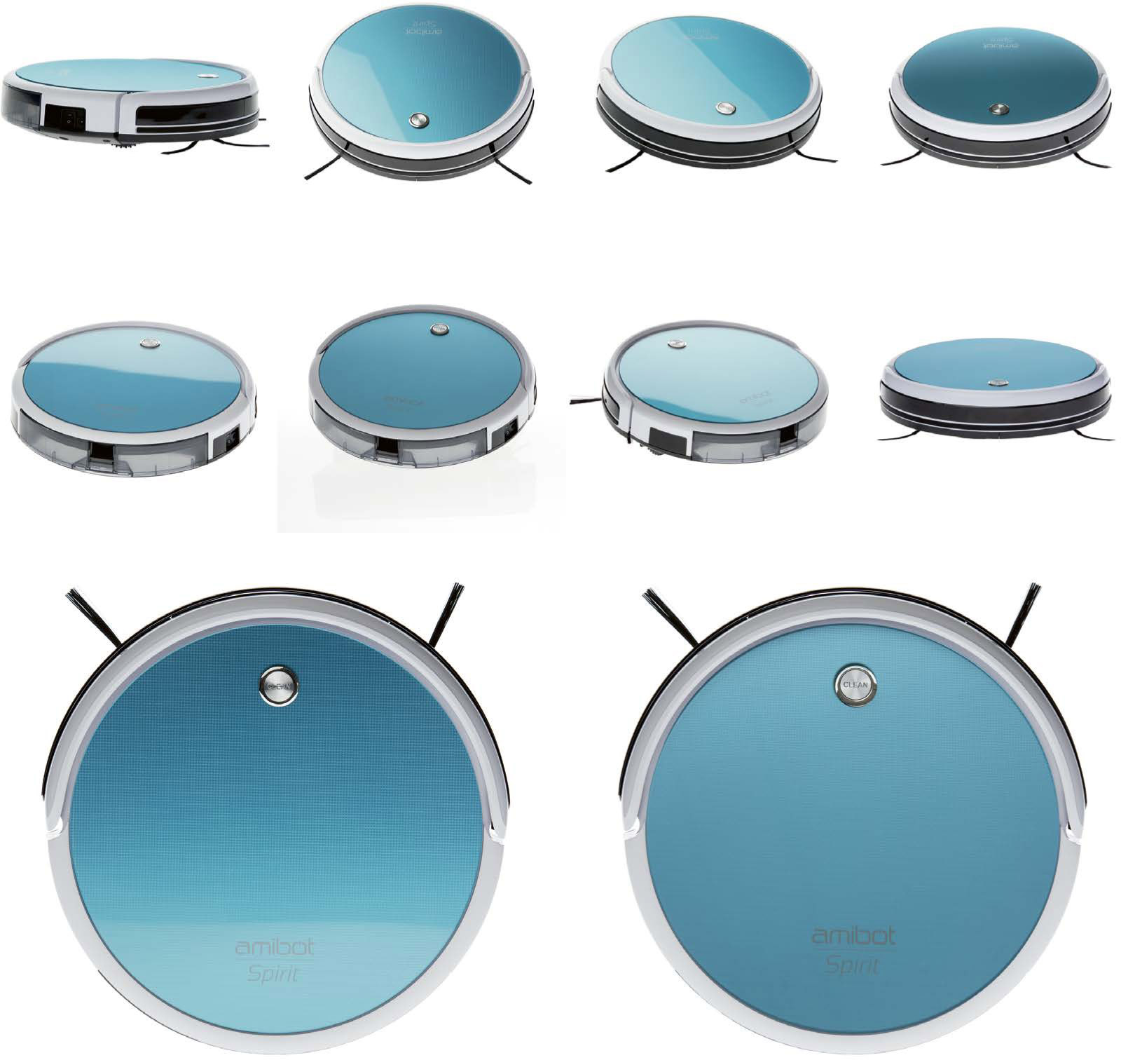
Lighting
Managing LCD Screens and Other Product Lights
Catalogs and Staging
For anyone just starting out, lighting and shooting jewelry, especially if it is metallic and has shiny or glossy stones like diamonds, can seem impossible without hours of post-production work. But careful management of the lighting can allow you to get a good result with the unedited shot itself. Because most jewelry is small, we always end up working close-up with macro lenses. Thus, even the smallest bit of dust and tiniest imperfections will be visible. It is essential to give the jewelry a good dose of antistatic spray and to handle everything with gloves. The jewelry itself is fixed into place with small pieces of sticky putty. Because of the size of the objects being photographed, we will, of course, have to use very small diameter light sources. I usually use snoots equipped with honeycombs, but many others in the profession often work with small directional LED lights, which are very effective when you need to manage the lighting on precious stones. STANDARD METHOD FOR LIGHTING JEWELRY No matter what kind of lighting you are using, the jewelry will need to have each of its parts lighted using different angles, quantities, and qualities of light. For the example of the rings shown here, we can distinguish three different areas: In the first photo, the lighting is localized on the front edge. In the second photo, the rings are backlit using a large diffusing fabric. LIGHTING EXAMPLE FOR JEWELRY The simplest procedure is to arrange rounded sheets of PMMA plexiglass along the axes that correspond to the desired lighting. Then install the snoots at the necessary positions for lighting the edge, the stones, and the inside and outside faces of the ring. I will just note here in passing that some objects, like simple bands (such as wedding rings), can be lighted using a simple arrangement of light boxes positioned to the side and above the object, but that for most other cases, the lighting will have to be more precise. The lighting of objects this small also requires a good number of very small adjustments of the angles: I recommend that you attach the ring to a mobile background, such as a piece of cardboard, so that you will not have to move every single light source every time you make an adjustment. Then, make sure that every part of the jewelry is well lit by scrupulously observing each of the reflections. A behind-the-scenes look at the lighting for the ring shown above. In the first photo, the backlight is too strong and the small diamonds remain dark. In the second photo, we can see dark reflections on the top part of the large ring. These can be eliminated by placing a white reflector overhead. In the last shot, finally, the light is projected from a snoot, through a diffuser, directed toward the diamonds. Jewelry is often made of glossy metal: generally rounded, it acts somewhat like the Christmas tree ornaments we looked at earlier, and it reflects the entire workspace. Thus, you need to make sure that there is no light source coming in to interfere with your lighting arrangement, so it’s important to work in a dark studio. If you are presenting several pieces of jewelry at the same time, you will also have to make sure that they do not reflect each other by choosing an angle of placement outside the families of angles. It is essential to take the colors of the metals and stones into account; therefore, you need to undertake a complete calibration, using a gray card and a color palette, before shooting. I recommend that you repeat this operation every time the lighting changes or anytime you decide to introduce new accessories or different backgrounds into your image. For catalogs, the fashion now is to have a white background and present the object in a square format. Rings are generally placed at an angle, balanced on the side using a small plexiglass wedge that is placed as far back as possible from the gemstone (this can easily be erased in post-production). But the presentation can vary depending on the brand, the style, and the medium where the images will be displayed. In the figure on the next page, you can see the most commonly requested angles. We look for the lighting to be as even as possible, with no pronounced shadows and no environmental reflection—the smoothest possible light. This is why we use diffusers so much, as close as possible to the piece of jewelry. Glossiness is also a requirement, with regular reflection lines across the entire piece of jewelry, and without any jaggedness or changes in texture. There are countless ways to highlight a piece of jewelry in advertising. People are always trying to come up with ingenious new ones, but there are five common methods we can list: TRADITIONAL PRESENTATION ANGLES FOR JEWELRYLIGHTING JEWELRY
The Lighting Philosophy


Implementation


Shines and Colors
Catalogs
Advertising

The lighting methods used for watches combine the methods used for jewelry, fabrics, and eyeglasses. As with jewelry, lighting a watch—emphasizing the outline of the case and giving body to the crystal face without allowing overly visible reflections to erase its inscriptions and hands—requires very precise, well-directed lights and careful management of the diffusions. Here, too, we work with great precision, with carefully directed light sources, generally snoots and small honeycombs. To avoid the direct reflections and highlights that tend to come with this kind of lighting, we arrange diffusing screens on each of the sides to be lit. Rectangular cases can be lit just like standard parallelepipeds, with lights generating differences in tone on each of the three sides of the case, while round cases can be lit just like cylinders, with a single light source placed to create a regular gradient along the edge. Plexiglass display stand used to hold the watchband closed for the photo setup. Example of lighting on a watch. As for the glass, there are different schools of thought. Some prefer to light it so that it disappears: they take advantage of the phenomenon of direct transmission by placing the light source at a right angle to the glass and photographing the watch from an angle. Others, however, including myself, prefer to manage the lighting so that a very slight, soft, gradual reflection appears on the glass. In such a case, you have to position yourself at the extreme edge of the family of angles of a very large and diffuse light source (such as a large octabox arranged behind a diffusing fabric). While dusting the watch, the hands are also adjusted so that they do not overlap with any of the inscriptions on the dial (which generally include the brand, the model, and the technical specifications). They are traditionally placed at 10:10, and the second hand at 40 seconds. Pay special attention to the knobs and to the mechanism, if it is visible: they tend to catch dust and small hairs, but a burst of compressed air will get rid of those easily. The watch can be held in a closed position by attaching it around a plexiglass form (see image above). There are also display units equipped with a plexiglass bracelet strap, a clip, and a base to hold the watch in the air, which makes it easier to light. It is easy to make the glass disappear, since all you need to do to make that happen is place the light source outside of the family of angles, but then shadows may appear on the dial, underneath the hands, and on any embossed elements. A better strategy is to place the light source in direct transmission and the camera outside the family of angles: this way the dial and the hands will be perfectly lit, but the glass will not be visible. The glass can also be lit at the edge of the family of angles with a large diffusing source. This will have the most attractive effect if the dial is black or very dark: the glass will appear just slightly, without any strong reflections that would make the inscriptions illegible. While the hands do not generally pose any kind of problem, they occasionally have a particular shape (with beveling, inlays, engraving, etc.) that requires lighting that is contradictory to what the glass requires, generally a grazing side light. In a case like this, we can create a composite photo using one lighting arrangement for the glass and one for the hands, putting it all together at the end using editing software. Unless you are creating a composite photo, the bezel (the ring or rectangle that holds the glass front of the watch in place) will of necessity be illuminated at the same time as the glass. Thus, it will look different depending on whether or not you have decided to make the glass invisible. And therefore, the look that you want to give to the bezel ends up taking priority. For large metallic bezels, such as those on men’s watches, lateral lighting is usually used to give a sense of chiaroscuro; in that case, you would light the dial and the glass in reflection, in order not to spoil the effect. For narrower bezels, direct lighting is appropriate. STANDARD METHOD FOR LIGHTING WATCHES Most photographers agree that backlighting is the most effective way to light the wristband. It is appropriate for most materials, from metal to leather to textured plastic. Simply place the light source in rim light or behind the wristband, within its axis, at a grazing angle. To obtain an even gradient, however, wristbands made of smooth plastic, like the wristbands on Swatch watches, will benefit from being lit with a very diffuse source, placed at right angles to the edges of the family of angles. EXAMPLE OF THE LIGHTING OF A WATCH For luxury watches with diamonds or other precious stone inlays, we use the method described for jewelry: direct light sources, slightly diffused (in this case, snoots equipped with honeycombs placed behind diffusers), directed toward the stones. If this ends up clashing with the lighting for the glass or the watch hands, then it will be necessary, again, to create a composite photo. Since the early 2000s, catalogs have presented most watches in the same way: with the dial facing forward and the wristband closed around a rounded support stand (as shown on the preceding page). This method is replacing the previous standard, which involved showing the watch photographed flat, with the wristband open or folded over, from a bird’s-eye view. In advertising, we use the same techniques as for jewelry: the watch can be displayed on a model’s wrist in a lifestyle context (in which case, a packshot image is also included in the ad as a reminder), as in the French ad for the 2015 Rolex master goldsmith Cellini model; or in a close-up on a model’s wrist, as in the ad for the 1995 Rolex Oyster Perpetual GMT master II, where a tight frame showed the watch on the arm of a man in a suit photographed in a subjective shot, as if the viewer was James Bond himself. Most campaigns, however, are centered on the object itself, staged with other items, as in the 2010 advertising for the Khésis watch by Chaumet (in which the object was posed on folded origami paper flowers), or else presented alone, as with the FO 264/1 from Festina (a gold watch photographed closed, from the front, against a midnight-blue background in a wide shot close-up, to show the diamonds on either side of the dial).LIGHTING WATCHES
Lighting Philosophy

Preparing the Watch
Lighting the Glass and the Hands
Lighting the Bezel and the Edges of the Case

Lighting the Wristband
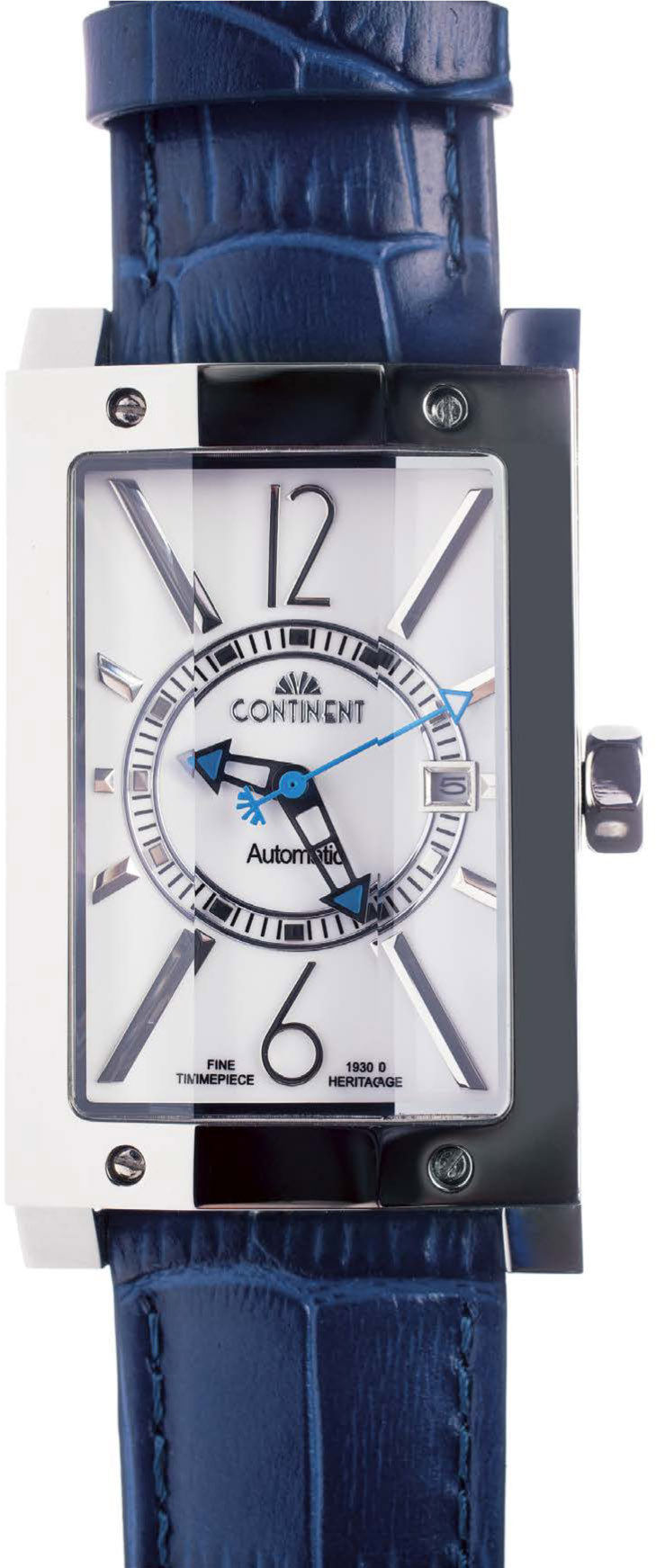
Lighting the Details
Catalogs and Advertising
Furniture photography was totally revamped at the beginning of the 1990s, with more dynamic images than the traditional presentations on location that had been produced up until then. In the late 1980s, brands like Ikea completely overhauled the concept of furniture, and thus the way pieces of furniture were presented in photography. Until then, furniture was exhibited in its traditional environment. But after that turning point, the entire context was staged in the studio, with the creation of miniature sets, usually consisting of a foamboard background to which paintings or shelves could be attached, and a removable floor (floating flooring, carpet, linoleum, etc.). This technique makes it possible to produce visuals more quickly by allowing the sets to evolve as the scene is rearranged. And for packshot images against a plain background, here, too, the standard is now white (color value 255) with a square-format presentation. Except in unusual cases, furniture is lit using very large light sources, as diffused as possible, which are arranged quite far away to avoid overly pronounced contrasts; in this case, that would be large octaboxes or umbrellas placed behind diffusers, or, more simply, light sources directed toward the walls, in reflection. Take care to ensure that there is a very light-colored and diffuse shadow underneath the object, to give it some “lift” while not attracting too much attention. There is no need to add an extra light source to attenuate the shadow, because that would cause problematic reflections on the piece of furniture; simply make sure that the light is as soft and as even as possible. For photographs meant for a catalog, the object is presented along several axes: front, three-quarter view, potentially from the back, and if the piece of furniture has doors, they are shown both open and closed. We also take “usage shots” by adding accessories or graphic elements: a television set on a TV stand, the dishes set out on a dining room table, a computer on a desk, clothes hanging from a clothing rod, etc. These situational shots are not insignificant at all; they allow the consumer to project themselves into the space and visualize whether the clothing rod they are thinking of buying will be large enough for the number of coats they want to store there, for example. STANDARD METHOD FOR LIGHTING FURNITURE The whole thing is lighted in the same way as individual pieces of furniture: large diffuse sources, perfectly white and low-contrast light, precise color calibration. Several presentation options for a bar set, and two lighting choices for the countertop. The countertop in the center image was lit using a large diffuser, and the one to the right with a softbox placed at the edge of the family of angles so as to emphasize its glossiness. We usually choose a viewing angle that is close to that of a person of average height facing the furniture being shown: horizontal for cupboards and bookcases, and at a slight downward angle for tables, desks, or beds. The only exception is that chairs and armchairs, when presented alone, are photographed from a horizontal angle. Because most other items of furniture are shaped approximately like a parallelepiped, they are presented in three-quarter view, taking care for the light to be more pronounced on the part that is naturally the most important: the tabletop for a table, the front side for a cupboard, the seat for a chair or a couch, etc. Example of the presentation of a bedroom set on location. A flash equipped with a sixty-inch umbrella was installed on the left and the exposure time was managed so that the light from the lampshades represented 40% of the total light, using a flash meter measurement. You can also create an interior design in the studio to present a piece of furniture in context. When it comes to putting the piece of furniture in context, the trend is to keep it simple: we don’t want to overload bookshelves with books and tchotchkes, we only put one category of objects on a table, and we present a limited number of frames and accessories on a wall. In the same way, we work in undersaturated interiors, with (monochrome) colors that harmonize with the piece of furniture. Think in terms of light mouse gray, beige, taupe, and ecru for all elements of the environment: carpets, curtains, wall art, lighting, etc. PRESENTATION EXAMPLE FOR A CHILD’S DESKPHOTOGRAPHING FURNITURE
Lighting Philosophy
Catalogs

Viewing Angle

Contextualizing

In this sector, where competition has increased over the last fifteen years with frames changing much more frequently than before, there is also a constantly increasing demand for photography. Let’s review lighting and shooting methods. Once you understand the laws that govern reflection on surfaces that produce direct reflections, a pair of glasses is not very difficult to light. But the common misconception that there should not be any reflections robs many of the images of life and of nuance. The current trend, on the contrary, is toward showing a slight veil over the lenses, which produces much livelier photos. Before beginning to arrange the light sources, the project needs to be defined: whether or not the lenses should appear (for prescription glasses; this question does not arise for sunglasses); how the frames should be placed; whether or not the arms (technically called the temples) should be folded; which specific material or color should be emphasized; etc. For prescription glasses, we usually work with a large diffused light box for the lenses and small diffused sources for the temples and edges (see diagram at left). For sunglasses, we usually use back-lighting, with a large light source (such as a light box), and a reflection, with a rounded reflector placed in front of the frame, so as to best showcase the lenses with a very even reflection. STANDARD METHOD FOR LIGHTING PRESCRIPTION GLASSES WITH FLAT LENSES EXAMPLE OF PRESENTATION FOR PRESCRIPTION GLASSES AND SUNGLASS CLIP-ONS Until the mid-2000s, we generally showed glasses frames without lenses in them, which had the advantage of solving the main problems of reflections. Today, however, the tendency is to not only leave the lenses in, but to highlight them. Of course, you still need to avoid overly pronounced or localized reflections; these would draw too much attention, overshadowing the temples and the internal parts of the glasses, such as nose pads, which need to be made visible when this kind of object is presented. This is why we try to obtain a very even reflection that is weak enough in terms of luminous intensity that it is possible to see through the lens. In glasses photography, it is very important to show the frame and its basic characteristics, while also providing tools for understanding the quality of the lenses, which can only be obtained through rigorous management of the reflections and the associated graphic elements. In this shot, we arranged the light source outside the family of angles of the lenses, which almost do not appear at all. We use very large lights that cover the entirety of the glasses’ family of angles: 180° for flat lenses and up to 250° for curved lenses (for ski goggles, that can go up to 300°). For the photos presented in this book, I worked using a sixty-inch octabox placed approximately three feet from the frame, behind a 98 x 60-inch diffusing fabric. For the kind of curved lenses that you find on sunglasses, and on certain lenses for correcting astigmatism, a flat diffusing fabric would not be enough to produce a reflection that covers the entire family of angles. The strategy here, then, is different: we use rounded diffusers that we place very close to the pair of glasses, making a hole in a diffuser for the camera lens. Because sunglass lenses are usually opaque, we don’t try to show what could be seen through them (which would be possible using backlighting); instead, we simply highlight the look of the lenses and frames. Thus, the lighting work consists of giving substance to the front of the glasses, which we light using a rounded reflector (see photo page 147). An elegant lighting arrangement will show an even but lightly gradated reflection, which implies that the light source placed at a slightly descending angle (of about 10° to 20°). For sports glasses and protective glasses, you can also play with a direct reflection trimmed by a barn door, which emphasizes the high-tech aspect that the brands who market this kind of product are looking for. STANDARD METHOD FOR LIGHTING SUNGLASSES OR PRESCRIPTION GLASSES WITH CURVED LENSES Most eyeglass frame manufacturers now use a slightly descending angle (about 15°) for the shots, showing the frames unfolded in three-quarter view. However, a horizontal shot with the frame shown from the front (sometimes without the temples, though this is considered less than ideal by American and Asian brands) is beginning to become standard, especially for photos meant for non-European markets. Some brands also require other kinds of presentations (see next page, bottom). These are most often photos against a uniformly white (color value 255) background, in a square format, meant for e-commerce. Unlike most objects, which we light to create a slight shadow cast by the object, eyeglasses are shown in catalogs without a shadow, and in order to manage that, the glasses are placed on an elevated sheet of glass (see the method outlined on pages 151–152). Obviously, with this technique, the reflection on the lenses disappears, but for the catalogs this is not a problem; in fact, it’s quite the contrary. To produce the photo on the following page, I used four light sources. 1. An octabox at a showerhead angle above the scene, with a large diffuser placed to create an even reflection on the lenses. 2. A snoot in backlight behind a sheet of translucent plexiglass to light the marble slab. 3. A small flash, uncovered, behind another sheet of translucent plexiglass, to eliminate the shadows cast by the snoot. 4. A light box, at the left, behind a large diffuser, to even out all the light. The final photo (setup on the previous page), presented without any editing. Advertisements usually show the glasses being worn by a model. Except for certain sunglasses frames, the object is seldom shown on its own or in a staged scene (that kind of photo is generally intended instead for a website or printed catalog). As for framing, it has been done in every possible way: from close-ups, as in the 1992 Krys campaigns, to the wide shots of the 2011 Atol campaign using Adriana Karembeu, by way of the medium shots of the 2015 advertisements for Optic 2000. The goal is more to show a lifestyle than it is to show the frame itself. Finally, in terms of lighting, what is required is often the kind of high-key lighting that we use for cosmetics, with large, very soft and diffuse light sources, in very clear-cut environments, demonstrating that “glasses are made so that you can see better.” STANDARD PRESENTATIONS FOR EYEGLASSESPHOTOGRAPHING EYEGLASSES
Lighting Philosophy


Sunglasses

Viewing Angle and Catalogs


Advertising

Whether we’re talking about lipstick, mascara, eye shadow, perfume, or skincare cream, make-up photography has obeyed very strict and mostly unchanging rules for lighting since the mid-1980s. What follows is an overview of those rules. For this line of lipsticks, it is easy to understand why the color calibration needs to be precise. Nothing has really changed in the lighting of products intended for body care, hygiene, and beauty for long enough now that their standard presentations have become firmly anchored within photographic practices. The rule is simple: when the cosmetic product is inside its tube, bottle, or jar, we begin with the lighting practices appropriate to the container depending on its shape and/or its ability to transmit light. Thus, a tube of lipstick, generally cylindrical, needs to be lighted from the side to create a band of reflection that covers both the tube and the lipstick itself. When the product itself is being shown, however, the lighting depends on the reflectance and the textural effects we want to obtain. Looking at the cold cream on page 175 it is easy to understand that the priority in this image is to show the texture, both liquid and stable, of the cream—which has been prepared to give this impression and which has been lit from the side with a grazing light. And yet, beyond the simple question of the lighting, there is the question of the intended use: a mascara meant for beauty, a moisturizing cream for body care, or a shampoo meant for grooming will not all be presented with the same effects. Even if a tube of concentrated milk and a tube of toothpaste have the same shape, we would never think of staging or lighting them in the same way. STANDARD METHOD FOR LIGHTING LIPSTICK METHODS FOR LIGHTING THE MAJOR CATEGORIES OF COSMETIC PRODUCTS Glossy tubes (made of either plastic or metal) are generally used for lipsticks and are often lighted to obtain a “glitzy” effect. Instead of using the rounded reflector method that is now used for soda cans, it is customary to arrange one or two light sources within the cylinder’s family of angles in order to allow a glossy line all along the length of the lipstick tube. We do this by placing two strip boxes, one at 90° and one at 60°. The tube is presented with the lipstick extended, so that the flat part of the top of the lipstick can be seen from the front or in a three-quarter view. This presentation makes it possible to distinguish the differences in shading and to better understand the color of the product. Customary angles for positioning the top of the lipstick; the flat part should be visible. Depending on the brand, we might choose one light source or two. In luxury and haute couture brands, the general preference is for one single, fairly narrow band, with a light source at 90°, but it is not uncommon to see two or even three bands, sometimes exaggeratedly wide. Lipstick is photographed horizontally, with the camera at the level of the center of the object. Example of the staging of a cosmetic product and its packaging. Example of the presentation of a moisturizing cream (prepared with shaving foam). Metallic tubes are sometimes also used for mascara. They are lighted in a similar way: with one or two bands of glossy light, usually placed along the edges. Matte plastic tubes and jars are generally used for health-care and hair care products. They are presented either standing vertically, with a shadow at the cap, or lying down, with a shadow along the whole length of the tube. They are cylindrical, and are sometimes illuminated with two bands, using the same method as for glossy tubes, but the more usual tendency is toward even lighting using a diffuser: a softbox-style light source is placed on one of the two sides in order to produce a lighting similar to that used for candles, shown on page 145. If the object being photographed is a healthcare product, like a moisturizing cream or a serum, the effect is softened using a reflector on the opposite side. Glass jars are usually made opaque by their contents, a cream that does not let light through. They are therefore treated the same way as glossy tubes. However, it is the reflectance of the lid that is going to dictate the choice of lighting: a metallicized plastic lid will benefit from showing reflections, while a matte cover deserves gradual, even lighting. In the first case, we use direct light sources (like strip boxes) placed within the family of angles; in the other case, a large and very lateralized light source is preferred, arranged behind a large diffusing fabric to obtain the usual gradual lighting. Example of the presentation of a tube of mascara. For several years now, however, the fashion has been to present the jar open, with the lid either visible or not, to show the texture of the cream—a very important element in encouraging the actual act of purchasing, because some creams are unpleasant to apply. For it to be a “seller,” the jar is presented as shown above. Because creams are often too thick or too runny, shaving foam of the same color as the cream is mixed in with the cream (I discussed this on page 157). This mixture is put into the jar using a piping bag like those used for whipped cream in pastry. The metal jars that powders and blushes come in are seldom presented from the front. Here, a radical bird’s-eye view is preferred, or a 45° angle, with a large, diffuse showerhead light source, like the light provided by octaboxes. The object is presented open, so that its contents can be seen. For most cosmetics, but especially for blushes, powders, and lipsticks, a good calibration of the colors to the palette is crucial. For powder, the color and texture are both crucial, and therefore the light source is arranged more from the side to provide more density to the texture. Blushes, meanwhile, require only direct, diffuse light; it is only their color that matters. Tinted transparent or translucent plastic tubes, like the ones that are used for serums and oils, benefit greatly from being backlit. This allows the consistency of the product, along with any pigments or glitter that it might contain, to be seen. A light source within the family of angles is usually added to show a reflection on one of the two sides of the tube, which gives a sense of radiance that is appropriate to the product being offered. We light transparent tubes the same way we do glass vials: with a single light source, very diffused, in rim light. Reflections are very seldom desired, but if they are desired they can be obtained by placing a strip box within the tube’s family of angles. A marketing trend launched in the 1980s involved giving the sense that the product is “clear,” that it includes no chemical products or toxic additives—that it is as pure as water. The way we translate this idea into lighting involves handling the artificial lighting and composition effects very soberly, drawing as little attention as possible to the container. The light should be managed by staying close to the optimization of +1.33 EV, without darkening the grays, the objective being for the viewer to guess at the tube more than actually see it. This type of container, usually reserved for body oils and perfumes, is always lit from behind to avoid badly aimed direct reflections on the front of the object. If certain brands require a visible reflection, we place a light box aimed directly at one of the sides: for rounded vials and bottles, between 100° cand120°, and for parallelepiped bottles, at 70°. The general preference, however, is to avoid visible reflections. A single backlight, through a diffusing fabric, not only illuminates the bottle while outlining its silhouette, as in the two following photos, but also has the advantage of revealing the liquid that it contains, along with its color. You must take great care to ensure that the luminance does not distort the color of the product. Perfume bottle presented in a packshot with a white background. Example of the presentation of a line of perfumes. For opaque liquids, such as glittery oils and thick lotions, you can choose between: Example of staging for a perfume advertisement. For cosmetics, the job of the advertising photograph is to present either the product, for what it is supposed to contain (a tube of skincare cream containing peach milk in the middle of a basket of peaches, for example, as in Clarins’ 2020 Milky Boost Cream campaigns), or the effect that it is supposed to cause (satiny reflections on skin, for example, as in the Nuxe campaigns for its “Huile prodigieuse,” running since 2016). Perfume, on the other hand, occupies its own special position. The object itself is not directly featured; it usually appears only as an inset packshot on large posters that otherwise feature a live model for the purpose of conveying a particular concept. Think, for example, of Givenchy’s campaigns for L’Interdit, where we see a young woman in an evening dress stealthily taking the Paris metro to an underworld party. However, there are some campaigns that prefer to focus on the product itself, alone, such as the campaigns for Jean-Paul Gaultier’s Scandal perfume, where the bottle is presented on a torn poster that the perfume seems to be blowing up.MAKE-UP AND PERFUME
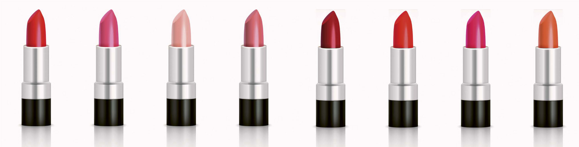
Lighting Philosophy


Glossy Tubes
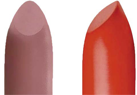
Matte Plastic Tubes and Jars
Glass Jars

Metal Jars and Cups

Tinted Translucent Plastic Tubes
Transparent Plastic Tubes
Transparent Glass Bottles


Advertising
Most textiles are very easy to light, but they require good technique in the preparation and a lot of ingenuity. Except for very glossy textiles used in particular shapes—things like polyester satin cushions or metallic Lycra cushions—which require special lighting, most textiles, which do not produce direct reflections, can be lighted any way you like, as long as the width of the light beam that is used covers the entirety of the surface being photographed. On the other hand, when the textiles are presented in those particular shapes, such as cushions or hangings, the lighting strategies will have to be specifically adapted. Matte textiles, like cotton, linen, wool, and viscose, are usually illuminated using large diffuse sources, like soft-boxes, placed at a right angle to the mesh of the fabric. Fabrics are usually shown flat, but sometimes you might be asked to show them crumpled, or in a compass-rose pattern—that doesn’t happen often, though. Traditional presentation in the form of a “compass rose,” used for glossy textiles (in this case, polyester). When the material of the textile needs to be emphasized, or for a fabric that looks different depending on the angle of the light, you will have to place your source at an oblique or grazing angle: the goal is to allow the textures and reflections to show. Here, too, you will want to use large light sources, like octaboxes. To achieve a good result, it is essential to smooth the fabric using a wire stretched across the hidden side of the cushion. When they are presented as upholstery—for instance, covering cushions—textiles have a tendency to fall into lots of folds and rarely present an elegant silhouette. To avoid hours of post-production work (continuous-knit textiles are very hard to retouch because of their moiré effects), the product can be firmly held in place using a thin wire cable or piano wire stuck to the hidden side of the object with gaffer tape. The same thing can be done for hats and purses. For hollow objects, like pencil cases, you can stuff them with cotton—avoid newspaper, because it creates little bumps that will be visible in the photo, especially with oblique lighting. PREPARING TEXTILES When you have to photograph fabrics in context, like curtains or drapes, you will need to use a steamer. Unlike an iron, which is useful for small-sized textiles, a steamer can be used on shaped objects (like cushions) or objects already in position: a large drape that was ironed on a table would crease again before it was even installed on a rod. A steamer can also be used for textiles that are attached to frames (like the fabric on the chaise longue below), which cannot be ironed. Matte fabrics are usually shown flat (or rolled up), after having been prepared with an iron. They must be positioned to highlight the specific qualities of the fabric that produce lighting or textural effects, as with metallic Lycra, lamé, jersey, organza, embroidered fabric, satin, and all glossy, satiny, or textured textiles. There are two standard techniques for these: crumpling and the compass rose: One last technique, which is, for now, used basically in the Asian market, is to place a rounded object underneath the fabric to suggest the effect it will have when it is worn as clothing. Example of various presentations of a textile element on a folding chair.PHOTOGRAPHING TEXTILES
Matte Textiles

Glossy Textiles

Textiles in Use

Drapes and Hanging Fabrics
Presenting the Materials

If there is one area where fashions, and therefore also photographic techniques, evolve quickly, then it is definitely the area of clothing. And yet, the basics of the most important techniques haven’t changed; they are just sometimes updated and tweaked a bit. This is typically an area where skill and experience make the difference. While the techniques of lighting, as with textiles, continue to be fairly simple because most materials produce diffuse reflections, the issues of preparation and staging do call for some in-depth study. Basically, we use large diffuse shapers, placed more than six feet away, in an axis at right angles to the product, in order to avoid overly pronounced contrasts in the materials that would distort the texture of the item of clothing. And yet, if the item is made from a glossy fabric (a satin boxing robe, for instance) or a textured one (like an Irish cable-knit sweater), the lighting might need to be closer up or more oblique. Traditionally, we work with large octaboxes or umbrellas. With rare exceptions, shapers like bowls or lenses are not used. We never photograph an item of clothing that has not been properly smoothed with a steamer and possibly brushed with a lint brush. Some fabrics, such as furs, velvets, and the thick wools used for winter coats, will also benefit from being cleaned of dust with a can of compressed air. This is especially important for dark garments or highly textured ones, on which dust is very visible. T-shirts, polo shirts, and (more rarely) button-up shirts are usually shown flat, on a large table. It’s important to make sure that all the important elements (the brand label, logo, any stitching, embroidery, etc.) are clearly visible and that nothing sticks out from the fold. For this type of presentation, we set up an octabox six feet above the item of clothing and the camera in a radical bird’s-eye view within the same axis. After calibrating with the color palette and gray card, and optimizing the measurement at +1.33 EV, we can then start shooting. For a T-shirt, polo shirt, or button-up shirt, what the potential buyer is mostly interested in is the shape of the collar, the shape of the neckline, the stitching, and any details on the sleeves; in other words, everything that is on the upper part of the garment. Thus, it is possible to present it folded and ironed, with the lower part hidden. This arrangement is often chosen to show the range of colors an item is available in. For the lighting and setup, you can proceed as with the presentation of flat items. THE SIX STANDARD WAYS OF PRESENTING CLOTHING FOR A CATALOG PHOTO Example of presentation on a hanger. This is a trend that is taking hold in the mass market and in e-commerce (Asos, Charmkpr, Shein, etc.). Putting the garment on a hanger has the advantage of speed for the shot and avoids the splayed-out look that can sometimes be a downside of presenting clothing flat. The hanger should be a solid color, darker than the item of clothing (usually gray or cream-colored, to harmonize best with the color of the clothing). The photo is presented without showing either the hook or the rod that hold up the hanger. As always, the garment must be properly dusted and ironed beforehand. It is lit with a large octabox located about six feet away. The crumpled way of presenting a piece of clothing, very trendy from 2000 to 2015 under the influence of fashion magazines that adopted it as a way to promote sportswear-style looks for young adults, shows the garment on a flat base, from a bird’s-eye view, without any of the ironed or rectangular look of the traditional flat presentation. Here, movement and the “pop” effect of the product are emphasized, and it is laid out in a way that brings it to life: the sleeves are folded as though the garment were out running, the interior folded down as if there were a gust of wind, etc. To highlight the sense of dynamism, the composition also often includes other elements, like coordinated shoes, or a T-shirt slipped into a jacket. This kind of presentation, lighted the same way as clothes presented flat, is still used by some sellers, such as LightInTheBox or Etsy. A behind-the-scenes view of the presentation on a hanger. Photography where the clothing is essentially “worn” by a ghost, a style that arrived in Europe in the mid-1990s, involves giving the item of clothing a shape. Thus, the consumer can visualize what the garment will look like when it is worn, while still seeing its interior—as if it were on a transparent model. Example of a jacket shown stuffed (worn by a ghost). A behind-the-scenes view of a photo of clothing worn by a ghost mannequin. Note that some photographers do still use composite photography and post-production editing here (photographing the item first with and then without a model, to capture, in several photos, the background elements hidden by the model, and then make the model disappear)—a terribly time-consuming technique that has become unnecessary. Plastic mannequins that can be disassembled were created especially for this process. The piece of clothing is put on the mannequin, from which everything that is not necessary to hold up the clothing and that could be visible is removed: the neck for T-shirts, the neck and the top of the throat for scoop-necked dresses, the arms for tank tops, etc. A large light source is positioned tilting slightly downward (by 5° to 15°), from the front or very slightly to the side (but not by more than 20°). The colors must, of course, be scrupulously calibrated and the measurement perfectly optimized. It should be that the manufacturers of these “ghost” mannequins also offer a wide range of stands for motorcycle helmets and hats (a dome held up by a metal rod). A photo taken this way usually does not require any editing, though the openings cut in the mannequin sometimes require a little bit of trimming: the shoulders for straps, the bottom of the thigh for skirts, etc. Shoe photography could justify an entire section of its own because there are so many possibilities and techniques. While the most common technique involves showing only one of the two shoes in profile (the right shoe if the front of the shoe is pointing right, the left shoe if the front is pointing left), there are actually seven standard ways to choose the angle and arrangement of shoes. CUSTOMARY WAYS OF PRESENTING SHOES FOR A CATALOG Presentation of a shoe in profile. For matte, fabric, or felted leather shoes, every kind of lighting is possible. The preference is usually for a light box above the product, with a reflector placed at an angle toward the back of the shoe (and if you leave the heel slightly in shadow, it makes it look like the shoe is smaller, which sells it better). For glossy or partly glossy shoes, especially athletic shoes, you should instead use localized sources for the purpose of creating direct reflections on the most important elements: the toe cap, the reinforcements, the heel cup, the upper, and the tongue. This is the method I used for the sneakers shown below. We try to create a sense of movement, even for catalog shots. The tendency now, especially for sportswear shoe brands, is to show the shoes in motion. They are suspended with nylon thread to give the impression of walking or running. For more traditional shoes, most manufacturers continue to present them in pairs, in a three-quarter view or just in profile. A behind-the-scenes view for the photo at left. Managing laces, whether they are shoelaces or corset laces, requires the use of best practices in preparing for the shot: if it is poorly prepared, the visual impact will likely be less effective. Straight lacing is generally preferred, but consumers expect to see ladder lacing or commando (military-style) lacing on safety shoes, for example. If you decide to work in this field, I can only recommend that you learn all the codes and practices of this specialty. A behind-the-scenes view for the photo at left. A behind-the-scenes view for the photo below. LIGHTING EXAMPLE FOR A PAIR OF SNEAKERS STRAIGHT LACING TECHNIQUE Widely used in shoe packshot photography, straight lacing provides an orderly appearance that is very pleasing to the eye. Please note that this technique only works with shoes that have an even number of eyelets. Straight lacingPHOTOGRAPHING CLOTHING
Lighting Philosophy
Preparing the Product
Flat Presentation
Folded Presentation

On the Hanger
Crumpled

Stuffed


The Lighting and Presentation of Shoes


Lacing


Although they look simple, spoons, forks, and glasses are very difficult to light. They require a solid understanding of the specificities of lighting on rounded or transparent surfaces. Every time I give a student a spoon to photograph, I watch their face, which is so confident at first, gradually fall as they discover the depths of complexity in lighting something that is actually nothing more than a concave mirror (or a convex one, depending on how the spoon is placed). Without a knowledge of the laws that govern the family of angles of spheroid surfaces (see page 87), it could take hours to find a lighting arrangement that really enhances the object. Let’s look at how to arrange high-quality lighting for these everyday objects. It is fairly easy to arrange the lighting for knives and all the flat metal objects that can be found on a table. We have seen that the reflection in a plane obeys elementary rules: the angle of incidence is equal to the angle of reflection. Thus, all we have to do is decide how much of the reflection we want to see on the object and then position ourselves accordingly, either inside or outside the family of angles. Every piece of cutlery has its own particular shape, generating different reflections. If we photograph all the pieces together, we have to choose very large, even lighting, with an orientation that is relatively angled with respect to the light source, in order to obtain a contrast. MANAGING THE REFLECTIONS ON A SPOON We generally place ourselves at the edge of the family of angles to obtain a reflection over 90% of the object while leaving a darker edge. We can also put the object right in the center of the family of angles and then insert a barn door between the object and the light source to create a more pronounced shadow, which is desirable on carved knives. On this type of product, the shadow of the barn door gives substance to any inlays or engravings, whether protruding or hollowed, by generating a contrast between the lighted part within the axis of the light source and the part that is darkened by the shadow of the barn door. Things get more complicated when we start trying to light forks, spoons, ladles, or any other kind of glossy rounded object. Now we are working in spherical geometry—it is impossible to get a good result if the illuminating source is only present on one axis. The lighting of a spoon. In this case, we need to set up a lighting arrangement that comes from several directions at the same time, with axes spread out over at least 200°; otherwise, the reflection will not be even or gradual over the entirety of the object. The surface of the lighting is greatly enlarged by placing a very large diffuser very close to the spoon, or even better, by setting up a rounded diffuser between the object and the light source. In truth, the size does not matter: the only thing that really matters is that the light comes from enough directions at the same time to be able to light the entire surface. Even a very wide source light with a large diffuser is insufficient to cover the spoon’s entire family of angles (see the reflection that is visible in the area between the bowl and the handle). The more rounded the object (like a ladle, for instance), the larger the family of angles that needs to be covered. This problem can be resolved by bringing the diffusing fabric closer or by positioning a diffuser to cover a larger angle, as in the behind-the-scenes photo above. Lighting example for a knife and fork. Detail of a fork. The goal is to obtain a gradation in the light, brighter in the center of the spoon, then becoming darker at the edges—a more or less rapid gradation depending on the effect you are looking for. Of course, you do not want any reflection to appear from any of the elements of the environment (parts of the studio, reflections of the photographer, etc.), which means that the diffusing panel needs to be very close to the spoon or ladle, and the angle of the shot needs to be as close as possible to the center of the family of angles. Properly lighting the glass makes it possible to get effective results from the moment of shooting. A behind-the-scenes view of the photo at left. A strip box is set up behind a diffusing fabric on which a band of black paper has been placed to cause the silhouette of the glasses to appear. A second strip box is positioned at 60° to the right, behind a diffusing fabric to obtain a reflection. I will not repeat the methods for lighting glass (see page 98). However, you may encounter difficulties if you try to create a composition that includes both glass and rounded objects—for instance, spoons—which will often happen when you are photographing a set table. In this case, two strategies are possible: Example of lighting for a plate. Our experience with lighting objects like cylinders and spheres makes it easy to resolve the problems posed by cups, mugs, and bowls. This kind of object is lighted by placing a single light source on one of its two sides, changing the intensity of the shadow on the other side by using a reflector. Then we add a light source at a radical showerhead angle to light the interior of the object (the single lateral light will not be enough here), generally with a slightly higher intensity (on the order of 0.3 EV)—because this light source is the key light, it will be the one we measure at +1.33 EV, and the lateral source will therefore be set to about +1 EV. Very glossy bowls—for instance, new porcelain or polished steel bowls—which produce direct reflections, must be lighted with very large and diffuse light sources, covering extended families of angles. Because it produces no diffuse reflections (or only very few), a pointed light source here would only result in a burst of light, without illuminating the object itself. Lighting a plate at a right angle (from a radical showerhead angle if the plate is set on a table, for instance) would cause us to lose most of the information about the edges and the shape (hollows, rounding, texture, etc.). A slightly lateralized lighting (as in the illustration above) is therefore required. The ideal is to obtain a direct reflection that emphasizes the curves and light shadows. We use light boxes that are large enough to cover the entire family of angles (which is about 20° for a standard plate): a sixty-inch octabox, placed at a 30° angle, slightly offset, six feet from the object, is more than enough. Even though tableware is usually presented empty, elements are sometimes added to give the image a little more life: wine in the glasses, a piece of fruit on a plate, coffee in a cup, and so on. Because the element being added is a subordinate one, the strategy is to choose an element that will react in the same way as the container: a transparent liquid in the glass will force us to change its distance from the light source (because of the refraction in the liquid); a rounded piece of fruit is preferred if the lighting for the plate has been placed behind (as on the photos above), etc.LIGHTING TABLEWARE
Lighting Flat Metal Objects


Lighting Rounded Metallic Objects


Lighting Glasses
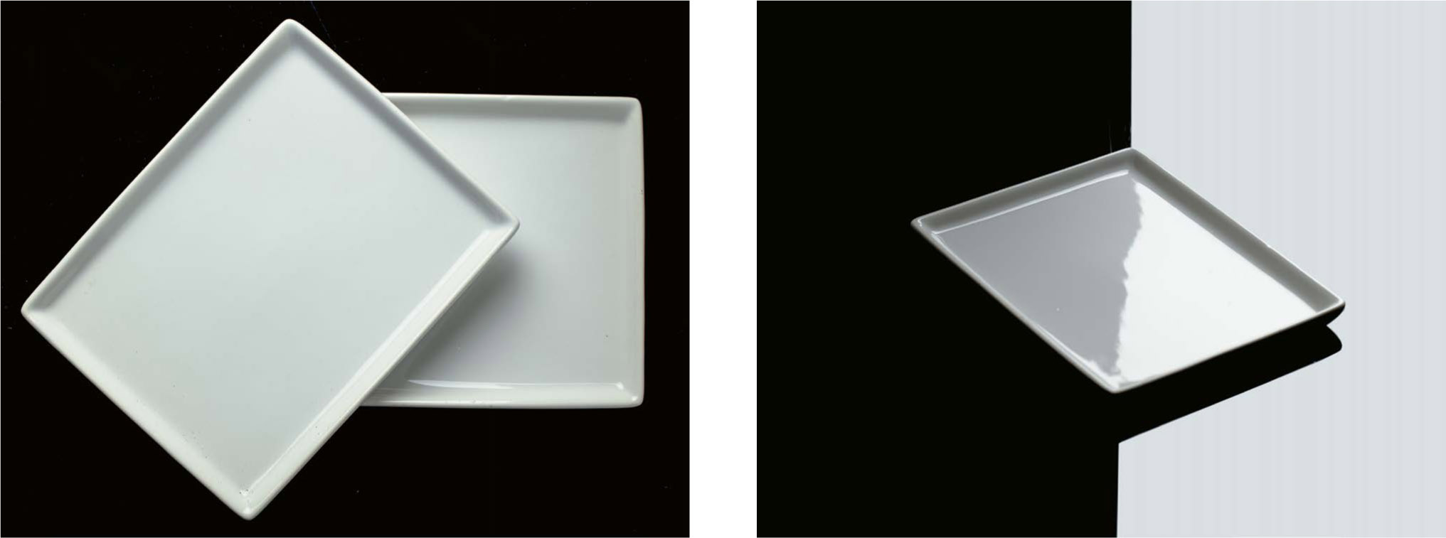
Lighting Spheroid Objects
Lighting Plates and Platters
Including Contents
When shooting transparent, liquid-filled objects, such as perfume bottles, the laws of refraction make it possible to obtain very precise shots with well-constructed lighting through the water of an aquarium. Immersed in water and photographed through the aquarium glass, transparent objects filled with liquid produce reflections that are better distributed, smoother, and more visually pleasing. With a minimum of effort, the aquarium technique yields well-lit photos that require no digital editing (or very little of it). The water around the object transmits the light and evens it out, and it also makes it possible to reduce the difference in the refraction coefficient from the liquid in the bottle. The only reason we don’t use this method for bottles of white wine and rosé is because of their paper labels: the water darkens the print while also revealing the veins of the paper, and there would be more post-production editing work than with the technique discussed in the section on page 129. You must, of course, make sure that the water and the glass surfaces of the aquarium are completely clean, and that all the air bubbles produced by filling the aquarium and submerging the object are gone. Also pay attention to the water temperature: if it is too cold, it will cause a problematic fog on the surface of the glass. The object must be completely submerged, but not touching the bottom (which would require you to edit the lower part of it afterward): it can be suspended using a fishing line (as in the photo opposite) or placed on a transparent glass base (avoid plexiglass, which tends to float). Because the aquarium is made of glass, the only way to light it is with backlighting (if the lighting were in front, we would see a reflection that would mask the object). Therefore, proceed with the method for lighting transparent glass (see page 99). Finally, we need to work on the look of the background. If we want it to be black, we put a piece of black cardboard behind the aquarium and one or two light sources on either side of the cardboard; if we’d rather have it light-colored, we set up a diffuser behind the aquarium and a light source behind that (usually with a light box). A behind-the-scenes view of the photo above at left.LIGHTING IN AN AQUARIUM

Preparation
Lighting

Lighting gold, silver, or palladium, whether plated or not, presents the same difficulties as lighting any glossy metallic surfaces, but when it is applied in thin leaf form, it poses an additional problem of texture. I have often had to deal with the problem of illuminating sheet metals. If the metal has been applied using the traditional method (using rabbit skin glue, red ocher, and oily mixtures), a gilded surface tends to react in unexpected ways to direct reflections: because every leaf (usually available in an 3 x 3-inch format) is applied separately, you run the danger of seeing the striated effect that can be observed in the photo on the left below. Because the gilded surface is not completely smooth or even, the direct reflections look irregular, creating unexpected material effects. But the metal we are showing is one whose surface usually looks smooth, and we expect the reflections to be harmoniously distributed and the color to be precise. Below, the world map created with gold leaf by Mickaël Lelouche, a gilder from Hérault, has been lit in two different ways: In the first shot, a 16 x 24-inch light box was placed to the right of the image. The color gradient suggests that the gold is appropriately glossy, but the angle that allows us to see that (about 60°) also brings out the texture of the gold leaf process. In the second photo, the light is directed toward the wall of the studio to illuminate about fifty square feet, and allows the angle of reflection to cover about 30° of the board. Because the lighting surface is much larger, the light is also softer, the angle of incidence more oblique, and the weave of the gold leaf less obvious—a much more pleasing result. Gold leaf applied to a flat surface always produces a striated effect. A large diffuser with a very lateralized light source can minimize this effect. On a surface that is not flat, like the draped fabric in the statue below, the issue of the texture is less problematic than properly rendering the look of the gold. It is necessary to generate a certain number of direct reflections so that some areas will appear in highlight, with other darker areas, even completely black ones, in juxtaposition. Here, too, we use diffuse lighting with light boxes arranged obliquely, and ensure that the colors are well calibrated to obtain the exact shade of the metal. Lighting of a gold-colored draped fabric.LIGHTING SHEET METALS
Cause and Remedy

Gold Leaf on a Non-Flat Surface

Smooth plastic produces soft direct reflections. For the material to be properly appreciated, those soft reflections must be brought out without allowing them to become too strong. Example of lighting for a plastic plate. Commercial plastic materials, which are smooth enough to make direct reflections appear, are nevertheless not smooth enough for those reflections to be well positioned or precisely defined. As with other glossy materials (glass, metal, etc.), we completely avoid the use of lights that are too pointed or too hard: they would produce reflections in the form of individual bursts, which are not very helpful for accentuating the silhouette of the object. This is why here, too, we use light boxes, sometimes softened with diffusing fabrics. The problem lies in the fact that these objects, which are often imperfectly molded, can generate direct reflections at a variety of angles, which gives the sense of a less precise shape than what we want to show. For instance, for the plate presented above, when lighted from the bottom up, it displays a reflection that makes it look like there’s a bump (which fortunately disappears when we light it in the other direction). Soft plastics, like the waterproof cover of the stroller opposite, always look wrinkled when you take them out of their box. They absolutely must be smoothed before being photographed. You can get good results by placing them flat in a heated space for a short time (between 95° cand105°F). Sometimes they also need to be stretched briefly, using weights, to smooth out their folds. The same is true for plastic bags and other soft wrappings. Once the material is nicely smoothed, the positioning of the light will be easier, even if you still need to be prepared for a few scattered direct reflections (at least those reflections will give the viewer a reasonably good sense of the kind of material it is). Soft transparent plastic can be prepared by using a hair dryer to limit the number of folds and achieve a smooth glossiness, like on a mirror-smooth water surface.LIGHTING PLASTIC
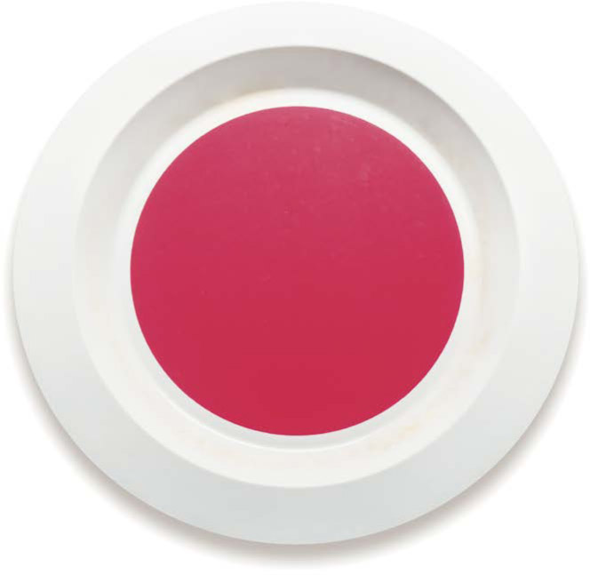
Molded Plastics
Soft Glossy Plastics

Most of the shots that are ordered from professional product photographers are meant for catalogs. The lighting, framing, and angle of view are standardized to achieve a result that is easily understood and that sells. Intended for presentation in a printed or online catalog, packshot photographs require a rigorous work mode, organization, and standardized procedures. Before launching into the preparation for lighting, you need to identify the products to be photographed and decide on a lighting that will be appropriate for all of them—or, if that is impossible (for instance, if there are both transparent glass bottles and opaque cubes), then you will need to organize the objects into categories in order to limit the lighting changes and avoid mistakes in colorimetry, viewing angles, or presentation angles. This preparation will save you a lot of time, especially if you are shooting a large number of objects. As with all objects, you need to make sure to carefully dust everything, remove the rear labels from transparent bottles, position caps on the correct axis, etc. PRESENTATION METHODS FOR CATALOG PHOTOS Your client expects standardized shots: you can’t have photos of similar objects, taken at different angles, with different lighting and varied framings, next to each other in the catalog. Thus, you need to use a tripod, making sure that the lens is perfectly horizontal and placed at the object’s center of gravity, at a sufficient distance to remove the sense of perspective. For a twelve-inch-tall object, for example, you will position yourself at sixty inches, with a 135mm lens (see page 49). For this collection of bottle stoppers, the client chose a white background and visible reflections cast onto the base. As usual, you need to perform a rigorous color calibration, using the method of identical gray card, color palette, file calibration, screen calibration, and color space on all the instruments being used. The images must be delivered with identical framing of objects with the same homothetic ratios. Even if they are objects of very different sizes, like a small container of mustard and a large bottle of whiskey, they need to be shown at the same size and in the same proportions since they will be appearing in the same catalog. You also need to maintain the same presentation method: if an object is shown with a cast reflection (see diagram on previous page), all the others must be as well. You will therefore have to maintain the same kind of base and overall approach to the lighting (even if you then need to adapt it to the shape and surface reflectance of each category of object). And, finally, the lighting must be standardized not only in terms of colors, but also in quality, quantity, and angle of light for each product category. There have traditionally been eight ways to present objects for catalogs: against a transparent background; against a white background with no cast shadows; with a cast shadow; with a cast reflection; as part of a product line (with or without packaging); flat; and in context. Presentation against a transparent background is achieved in post-production with editing software. This is where a very even lighting of the background, without any reflections on the edges of the product, is most useful. By positioning barn doors to avoid a reflection on either side of the back of the object, and by measuring the reflected light at less than +0.3 EV on its silhouette, we can make the silhouette perfectly sharp and clearly distinguished from the background. The object can be outlined in Photoshop, without any loss or “nibbling away” of the silhouette, using a simple selection tool—an infinitely faster operation than outlining it with a pen tool. Then all that needs to be done is to erase the background and save the file as a transparent PNG. The method for presenting the object against a white background is exactly the same, but without the need to use editing software. We simply need to make sure that the background is perfectly white (RGB color code 255/255/255) by exposing it at +3.33 EV and ensuring with the exposure meter that the lighting is identical over the entire framed area. To manage the cast shadows without any editing required, the objects are placed on sheets of glass, maintained at a good distance from the support so that the shadow will not appear in the framed area (see pages 151–152). Please note that this method only works with objects that can be lighted at a perfectly right angle to the sheet of glass. When we need to get shots with cast reflections, there are a couple of ways to proceed: With a black or white base, and depending on the angle of incidence of the lighting, we can obtain a more elegant cast reflection that is slightly blurred, appropriate for commercial imagery. With a light source placed within the family of angles of a black plexiglass base, the reflection that appears on the base will look white (or light gray, depending on the intensity of the lighting), but with respect to the object, it will retain the characteristics of a barn door: it will not produce any reflections on the object and it will give depth to the low lights, unlike mirrors or sheets of glass. Photos taken for a manufacturer of windows and glass doors. The key thing is to show the glass without it being too obvious, as well as all the specifics of the woodwork. Thus, we show the door closed, the door open, and details showing certain characteristics. For a flat presentation, the object is placed lying down and the camera is positioned above in a radical bird’s-eye view. For matte objects, the lighting is placed above the camera (for obvious practical reasons, we then use a remote control to release the shutter). When photographing glossy objects, the lighting will be arranged to the side or, when we are dealing with transparent glass, as backlighting—in which case it is necessary to use a light table or at least a translucent base (such as PMMA), underneath which a light source is installed. Depending on the brand and the kind of product, you will also see many other ways to highlight the functionality of the objects, their variations in shape and color, their options, their content, etc. Sometimes they will be shown with the same framing, as is done for the stroller below, or with close-ups of certain details, as in the door shown above. The important thing is to show the same characteristics of lighting, colors, depth of field, and sharpness, even while the framing and angle of view can vary greatly. Remember that all these shots will be presented in a coherent manner in the same space, and sometimes even as animated GIFs online (as was the case for the stroller shown below). Brands usually ask for photos that allow the consumer to visualize the different ways the product can be used.CATALOG SHOTS
Methods

Standardization

Standard Presentations

Other Kinds of Presentation

In advertising, the aim is not so much to give a realistic representation of the product as it is to create an image that arouses desire by using a variety of different psychological techniques. In most cases, it is up to the brand’s art director or the advertising agency to decide what image will be produced. However, you may find yourself directly in contact with the client, with no intermediary, and end up having to carry out the visual creative work yourself from scratch: from developing a concept to post-production, including the shooting itself, of course. It would be wrong to think that an advertising image is just the result of a “good idea” that a photographer came up with alone in their studio. On the contrary, the image is the result of a project that is constructed through a series of exchanges between the client and the creative agency, using a creative tool: the mood board. EXAMPLE OF A MOOD BOARD Words, which are subject to interpretation, are not enough on their own. Because we are dealing with images here, we operate using photography and drawings. There are a thousand different ways to represent a concept as diffuse as liberty, for example, in images: a kite in the sky, a figure on horseback in distant mountains, a barefoot dancer in the streets of New York—the list goes on. Initially, everything depends on the marketing strategy of the brand and its agency, which defines a series of concepts based on the target audience and market research. Then, a series of images is collected showing architecture, patterns, shapes, objects, textures, and colors that allow a dialogue to begin between the photographer and the client. After a few exchanges, which usually result in one or more images being changed, we arrive at a definitive mood board, like the one shown on the opposite page, a bridge between the concepts defined by the agency and the visual creation. The creative work then consists of developing a branding proposal, made up of several mood boards that are meant to describe, as effectively as possible, the universe of the final photograph, as well as defining a budget. A well-designed mood board makes it possible to identify all the requirements, and therefore all the costs, for a project: the locations where the shooting will be done if the photo is going to be taken outdoors (for instance, for a car ad), the elements and colors of the environment, the accessories and materials that need to be added, the desired lighting atmosphere (which will determine the time of day when the photo needs to be shot if it’s an outside or location shot, or the type of shapers to be collected if it’s a studio shot), and, finally, the “spirit.” The creative developer then brings all of these disparate elements together to design the image as a whole. Note that this technique is used in advertising, but that it can be transposed into all aspects of graphic creation. There are several different online platforms (like Pinterest) that make it easy to create mood boards, and you can also find extremely intuitive brainstorming and design tools (including gomoodboard Let’s learn to read and use the mood board on the previous page: There were thousands of images that could have been produced based on such a mood board. I have chosen to show you a method that is found more and more often in product photography for advertising, using the creation of the shot of the perfume bottles on the next page. We create an illustration that uses the key graphic elements (colors, geometry, etc.) and we display it on a computer screen. We then put the computer on a table, making sure to put a mirror (or a sheet of glossy black plexiglass) over the keyboard. A BEHIND-THE-SCENES VIEW OF THE PHOTO ON THE FOLLOWING PAGE We then arrange the bottles on the surface, based on the architectural order that has been decided on (such as the buildings of Manhattan). We set up the camera on a tripod within the axis corresponding to the photographic project, with the appropriate framing, after having carefully chosen the distance of the camera and the focal length of the lens to achieve the desired perspective. We then place one or more flashes in the positions that are best suited to presenting the shape of the objects, while avoiding unwanted reflections, and finally, we add the appropriate diffusers. PHOTO CREATED BASED ON THE MOOD BOARD ON PAGE 196 Once everything has been set up, we go on to measure the light produced by the screen (which we have set to the maximum so that we can be more flexible in adjusting the camera), using an independent exposure meter with the lumisphere in position and directed toward the screen. Using the built-in calculator, we modify the exposure time until we have reached the aperture we want to use on the camera. For example, if I measure the screen at 1/125 s, ISO 100, f/1, I will need to adjust my camera to f/8 to achieve the depth of field I want: by changing the exposure time on the exposure meter, I get f/8 at 1/2 s. I adjust my camera to that value (1/2 s, ISO 100, f/8), while making sure that there is no other light in the room where I’m working. The flashes are then adjusted—to produce the same amount of light, for example—and checked with the flash meter. Don’t forget to turn off the flashes’ guide lights because their light would be added to the light of the screen. Now all we have to do is release the camera shutter with a remote control (to prevent any jiggling of the camera in such a long exposure). The flashes will go off at the beginning of the shot, lighting the objects for a very short period. The rest of the exposure time will be devoted to recording the continuous light from the screen. The final photo is as you see it here.ADVERTISING SHOTS
From Concept to Mood Board
Mood Boards and Creation
Implementation of the Shot


Once you have mastered the laws of optics and the methods of lighting objects thematically, it is time to start creating some dynamism and movement in objects that are, by their nature, inanimate. Nothing works better for this than the fluidity of liquids. Splashes of water, gouache paints, cream, or colored powders produce the most beautiful effects when it comes to staging an object. They suggest movement and liven up the shot, producing striking effects. But it isn’t easy to know how to do this at first. By nature, water is colorless and transparent. To make it visible in photography, we need to work the same way we do when lighting glass. Backlighting works very well, as long as you create some contrast by including a dark area around the edges of the light; as with transparent glass against a white background, the liquid will reveal itself in gray-and-white material effects and darker borders. To do this, we place a diffusing fabric behind a transparent tray full of water, and against that, a flash equipped with a light box. Then we just release the shutter a fraction of a second after the object has pierced the surface of the liquid. For opaque liquids, like milk, cream, or gouaches, the lighting has to be placed within the family of angles of the projection, usually at a shallow showerhead angle (60° to 70°), or laterally (60° to 90°), depending on how many direct reflections we want to show. Note that thick or viscous liquids have the benefit of reacting slightly more slowly than water does, which makes it easier to time the shutter release when you’re working manually. A splash of tea in an aquarium. PHOTOGRAPHING AN OBJECT PIERCING THE SURFACE OF THE WATER PHOTOGRAPHING A DRINK CAN THROWN INTO THE WATER The fashion for photography using liquid in motion has prompted manufacturers to offer automatic release solutions. These electronic systems plug into the camera and trigger it when something (such as liquid) trips the laser beam that they produce. The Pluto brand was the first to market this kind of accessory, which also works with sound (making it very useful for capturing the precise moment when a balloon bursts or a firecracker goes off). Other brands, like Miops Smart, also offer triggers connected to microvalves and computerized Mariotte siphons, making it fairly easy to photograph water drops, or drops colliding. The most common technique consists of dropping an object into an aquarium half-filled with water and taking the photo at the moment the object pierces the surface of the liquid. The procedure is as follows: place a flash equipped with a light box behind a large diffuser, which is in turn set up behind the aquarium. If you want a black background, arrange a piece of black cardboard behind the aquarium and two light sources, one on either side of the container. Make sure that the walls of the aquarium are completely clean, without any fogging, and that the space above the liquid is large enough for the framing of the photo and the splashing that you expect. Set up the camera on a tripod, at the distance that will allow the framing to cover an area one-third below and two-thirds above the water surface. Place a target in the center of the aquarium as a way to focus on the spot where the object will be dropped. Block the focus. Then release the shutter at the right time, using a remote control, usually a fraction of a second after the object has hit the water. Of course, you will need several attempts to time this moment perfectly. Remember to set up plastic sheeting on the ground and to protect your lighting and camera equipment against splashing. SIMULATING A SPLASH While this technique is very good for rendering the liquid photographically, it does not take the appearance of the object itself into account, which is why many object photographers prefer a composite method. In that case, you follow the same procedure, except that what you drop into the water from above is a transparent object with a diameter similar to the one you are going to photograph. Then, in Photoshop, that placeholder object will be replaced by the actual object, as shown in the diagram above. This technique has the advantage of avoiding lighting that is unsuitable for the product, but it is very time-consuming to integrate the image of the product into the aquarium image using layer masks and differentiated transparency effects. BRINGING A BOTTLE OF WINE TO LIFE WHILE MAINTAINING THE DESIRED REFLECTIONS You can also create the impression of a splash by simply playing with its after effects. For example, you can drop a balloon full of paint onto a plain surface and then set the object to be photographed on top of the paint splashes (see diagram at bottom of page 200). The fashion is also for liquids to be presented in streaks or streams. As in the illustration above, we can simply empty a bottle and photograph the liquid as it flows out. Excellent results can be achieved by poking a 3/4-inch-diameter hole in the bottom of a bottle and then plugging it up with a piece of gaffer tape. Then fill the bottle with a liquid that has the desired characteristics, such as wine, plug the neck with your thumb, and turn the bottle upside down. At the appropriate time, remove the gaffer tape from the base, and after also removing your thumb, swing the bottle back and forth a little in a slight pendulum movement so that the flow of the liquid as it pours out will not be too straight. The hole pierced in the bottom of the bottle will keep it from emptying in spurts and jerks. In terms of lighting, proceed as in the case of the splashes shown on the previous page. From the resulting photo, choose the part of the liquid that you find most interesting and merge it with another shot, taken with the appropriate lighting. More simply, we can present an object in a shallow tray, like a cafeteria tray or a backing tray, into which we have poured a 1/2 or 3/4 inch of water. We place a large diffuser behind the arrangement so that the surface of the water is in the middle of the family of angles. It will then look uniformly gray or white, depending on the intensity of the lighting. Then, simply create a wave using a blower or an anti-dust spray and take the picture. The result will be similar to that of the picture of the watch shown above. A behind-the-scenes view of the photo on the following page: the watch is arranged in a black plexiglass tray in which water has been placed. Compressed air is blown onto the surface to create waves. A very diffused light source is placed at a 45° angle overhead. Using waves to highlight an object. We can play with movement in a similar way; for instance, with a necklace. Hang the necklace on a lever so that the medallion is just above the water. Then start the lever swinging, very gently, and you will get beautiful concentric undulations in the water, as seen on the following page. At rest, the thin layer of water in the arrangement explained in the previous section works like a mirror, but with a smoothness that a mirror never has. In fact, if the water is spotless and dust-free, it will have a very clean look and produce very soft light, well suited to the presentation of metal and glass objects. In this kind of arrangement, we place a small glass wedge at the surface of the water, smaller in diameter than the object to be photographed, and set the object on the wedge. The same watch as before, shown on water at rest. The necklace is placed just touching the surface of the water, creating concentric waves. A behind-the-scenes view of the photo above. A source (with zoom bowl and a barn door) is directed toward the rear to illuminate the wall and create a uniform reflection over the entire surface of the water. A second, similar source is set up behind a diffusing fabric and directed toward the front of the necklace to light it.USING LIQUIDS
Liquid and Contrasts


Laser Release
Real and Composite Splashes
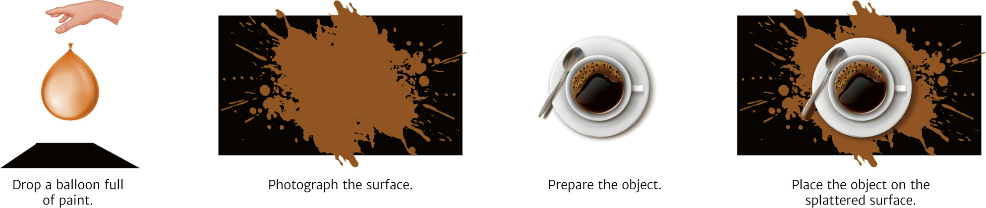
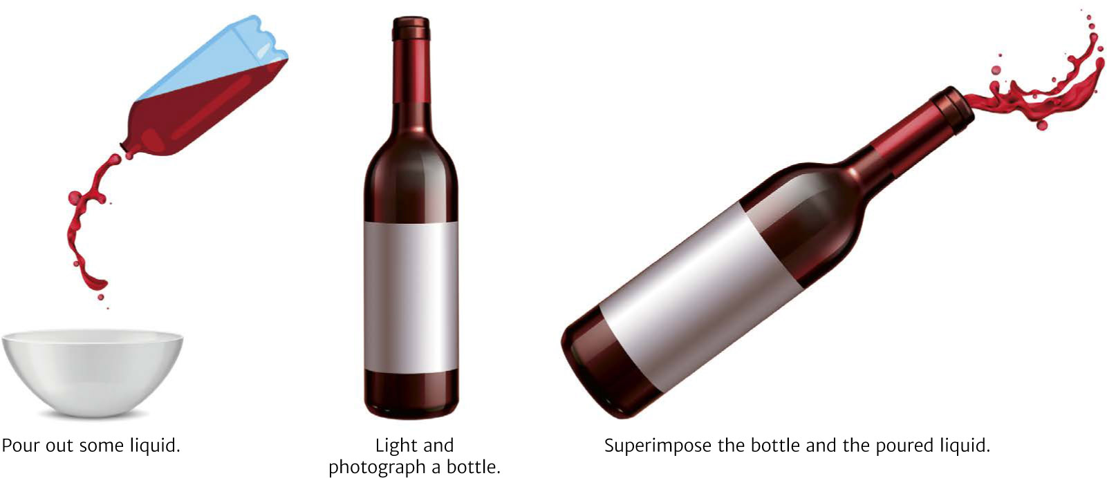
Splashes
Waves

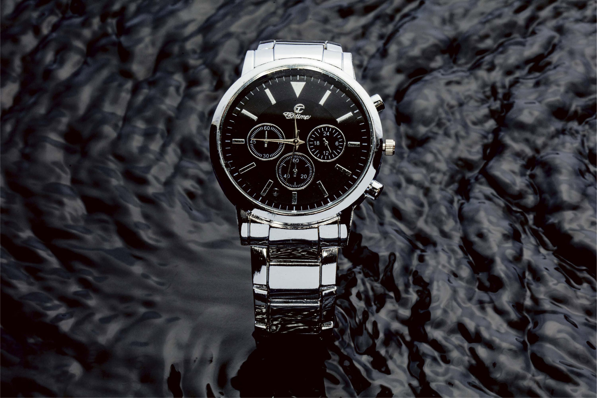
Without Movement


The industry’s requirements for packshots are increasingly pushing photographers to create composite photographs. This is a way to save time, limit editing, and present variations on a product. With the rise of e-commerce and the growing demand for photographs of objects, it has become necessary to become more efficient in our work by using the composite method, especially because of the increasing number of variations in the same product. Imagine that you need to present the same plastic duck in twenty different colors. You could, of course, photograph each object, one after the other. But you could also just photograph one of them, with the light falling just right, then photograph the rest of them with good color calibration, and finally successively apply each color to your original model in Photoshop. Example of the production of a photograph of a bottle of wine using the composite method. Each photo is lit so that it will add a particular detail to the assembled photograph. In the same way, because there is not an infinite number of shapes of wine bottles, you could choose to make perfect shots of the twenty existing models, the fifteen most common engravings, and the ten most commonly used capsules. Once you have compiled this catalog, all that is left to do is to photograph the labels and then attach them to the appropriate files. This kind of practice is more and more common in major studios that specialize in this area. As we have seen, the lighting of a bottle of wine involves the perfect positioning of at least three light sources, and many more than that if there are engravings, capsules, medallions, or sleeves to take into account. And this entire operation must be completely reproduced every time there is a new bottle. But we can also proceed differently, separately and selectively illuminating each of the elements to be highlighted. Care must be taken to ensure that the camera does not move at all and that the lightings do not overlap. Then all we have to do is group all the shots together, as layers, in Photoshop, and select each aspect of the object that we’re interested in on each particular shot, while erasing the others. This is the procedure often followed for wine bottles and perfume bottle caps. Most of the compositions shown in packaging photos are also created using a composite method. For instance, if we need to photograph thirty tubes of lipstick that all need to be presented together, it is a safe bet that not all of the tubes will be perfectly lit, given that they are not all in the same position with respect to the lighting and that they can also cast shadows on each other. Thus, we photograph each one of them separately; if it is only the color of the lipstick that changes, then we proceed in the same way as with the plastic ducks mentioned on the previous page. Then we place each of the different images into one file, where we can move the various elements around at will, depending on the client’s needs and the requirements of the layout. STEPS IN THE CREATION OF A COMPOSITE PHOTO OF A BOTTLE OF WINECOMPOSITE PHOTOGRAPHS
Increasing Efficiency
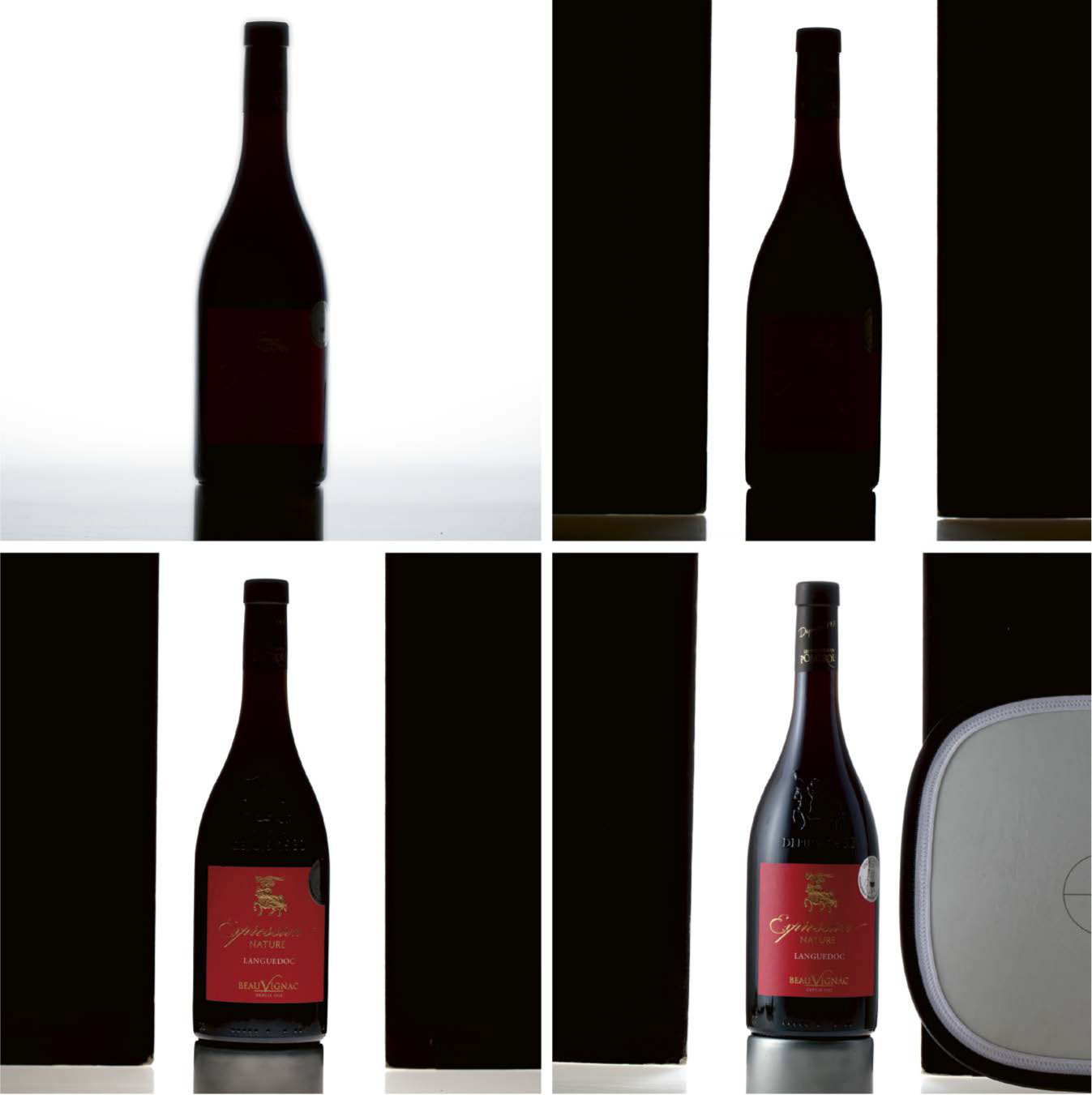
Composite Lighting Management
Photographing a Product Line
