
When you build a Web application, it usually has a similar look-and-feel across all its pages. Not too many applications are designed with each page dramatically different from the next. Generally, for your applications, you use similar fonts, colors, and server control styles across all the pages.
You can apply these common styles individually to each and every server control or object on each page, or you can use a capability provided by ASP.NET 3.5 to centrally specify these styles. All pages or parts of pages in the application can then access them.
Themes are the text-based style definitions in ASP.NET 3.5 that are the focus of this chapter.
Themes are similar to Cascading Style Sheets (CSS) in that they enable you to define visual styles for your Web pages. Themes go further than CSS, however, in that they allow you to apply styles, graphics, and even CSS files themselves to the pages of your applications. You can apply ASP.NET themes at the application, page, or server control level.
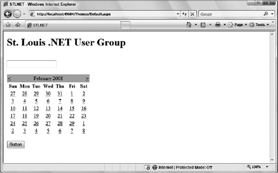
In order to see how to use one of these themes, create a basic page, which includes some text, a text box, a button, and a calendar, as shown in Listing 6-1.
Example 6.1. An ASP.NET page that does not use themes
<%@ Page Language="VB" %>
<html xmlns="http://www.w3.org/1999/xhtml">
<head runat="server">
    <title>STLNET</title>
</head>
<body>
<form id="form1" runat="server">
<h1>St. Louis .NET User Group</h1><br />
<asp:Textbox ID="TextBox1" runat="server" /><br />
<br />
<asp:Calendar ID="Calendar1" runat="server" /><br />
<asp:Button ID="Button1" runat="server" Text="Button" />
</form>
</body>
</html>This simple page shows some default server controls that appear just as you would expect, but that you can change with one of these new ASP.NET themes. When this theme-less page is called in the browser, it should look like Figure 6-1.
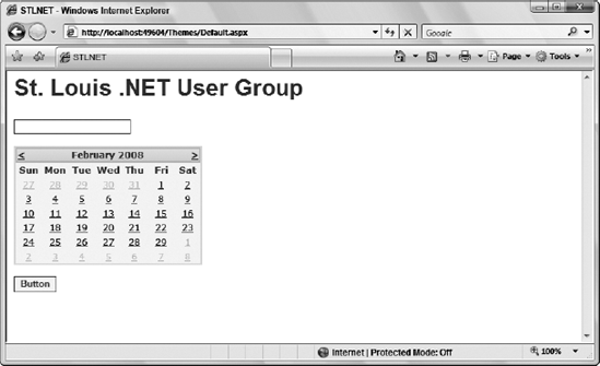
You can instantly change the appearance of this page without changing the style of each server control on the page. From within the Page directive, you simply apply an ASP.NET theme that you have either built (shown later in this chapter) or downloaded from the Internet:
<%@ Page Language="VB" Theme="SmokeAndGlass" %>Adding the Theme attribute to the Page directive changes the appearance of everything on the page that is defined in an example SmokeAndGlass theme file. Using this theme, when we invoked the page in the browser, we got the result shown in Figure 6-2.
From here, you can see that everything — including the font, font color, text box, button, and more — has changed appearance. If you have multiple pages, you may find that it is nice not to have to think about applying styles to everything you do as you build because the styles are already centrally defined for you.
In addition to applying an ASP.NET theme to your ASP.NET pages using the Theme attribute within the Page directive, you can also apply it at an application level from the web.config file. This is illustrated in Listing 6-2.
Example 6.2. Applying a theme application-wide from the web.config file
<?xml version="1.0"?>

<configuration>
   <system.web>
      <pages theme="SmokeAndGlass" />
   </system.web>
</configuration>
If you specify the theme in the web.config file, you do not need to define the theme again in the Page directive of your ASP.NET pages. This theme is applied automatically to each and every page within your application. If you wanted to apply the theme to only a specific part of the application in this fashion, then you can do the same, but in addition, make use of the <location/> element to specify the areas of the applications for which the theme should be applied.
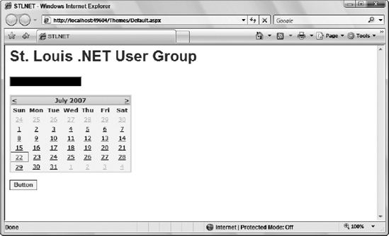
Whether themes are set at the application level or on a page, at times you want an alternative to the theme that has been defined. For example, change the text box server control that you have been working with (from Listing 6-1) by making its background black and using white text:
<asp:Textbox ID="TextBox1" runat="server"
 BackColor="#000000" ForeColor="#ffffff" />
The black background color and the color of the text in the text box are specified directly in the control itself with the use of the BackColor and ForeColor attributes. If you have applied a theme to the page where this text box control is located, however, you will not see this black background or white text because these changes are overridden by the theme itself.
To apply a theme to your ASP.NET page but not to this text box control, you simply use the EnableTheming property of the text box server control:
<asp:Textbox ID="TextBox1" runat="server"
 BackColor="#000000" ForeColor="#ffffff" EnableTheming="false" />
If you apply this property to the text box server control from Listing 6-1 while the SmokeAndGlass theme is still applied to the entire page, the theme is applied to every control on the page except the text box. This result is shown in Figure 6-3.
If you want to turn off theming for multiple controls within a page, consider using the Panel control (or any container control) to encapsulate a collection of controls and then set the EnableTheming attribute of the Panel control to False. This disables theming for each control contained within the Panel control.
Now what if, when you set the theme for an entire application in the web.config file, you want to exclude a single ASP.NET page? It is quite possible to remove a theme setting at the page level, just as it is at the server control level.
The Page directive includes an EnableTheming attribute that can be used to remove theming from your ASP.NET pages. To remove the theme that would be applied by the theme setting in the web.config, you simply construct your Page directive in the following manner:
<%@ Page Language="VB" EnableTheming="False" %>
This construct sets the theme to nothing — thereby removing any settings that were specified in the web.config file. When this directive is set to False at the page or control level, the Theme directory is not searched, and no .skin files are applied (.skin files are used to define styles for ASP.NET server controls). When it is set to True at the page or control level, the Theme directory is searched and .skin files are applied.
If themes are disabled because the EnableTheming attribute is set to False at the page level, you can still enable theming for specific controls on this page by setting the EnableTheming property for the control to True and applying a specific theme at the same time, as illustrated here:
<asp:Textbox ID="TextBox1" runat="server"
BackColor="#000000" ForeColor="#ffffff" EnableTheming="true" SkinID="mySkin" />When working with ASP.NET applications that make use of master pages, notice that both the Page and Master page directives include an EnableTheming attribute.
Master pages are covered in Chapter 5.
If both the Page and Master page directives include the EnableTheming attribute, what behavior results if both are used? Suppose you have defined your theme in the web.config file of your ASP.NET application and you specify in the master page that theming is disabled using the EnableTheming attribute as shown here:
<%@ Master Language="VB" EnableTheming="false" %>
If this is the case, what is the behavior for any content pages using this master page? If the content page that is using this master page does not make any specification on theming (it does not use the EnableTheming attribute), what is specified in the master page naturally takes precedence and no theme is utilized as required by the false setting. Even if you have set the EnableTheming value in the content page, any value that is specified in the master page takes precedence. This means that if theming is set to false in the master page and set to true in the content page, the page is constructed with the value provided from the master page — in this case, false. Even if the value is set to false in the master page, however, you can override this setting at the control level rather than doing it in the Page directive of the content page.
The Page directive also includes the attribute StyleSheetTheme that you can use to apply themes to a page. So, the big question is: If you have a Theme attribute and a StyleSheetTheme attribute for the Page directive, what is the difference between the two?
<%@ Page Language="VB" StyleSheetTheme="Summer" %>
The StyleSheetTheme attribute works the same as the Theme attribute in that it can be used to apply a theme to a page. The difference is that the when attributes are set locally on the page within a particular control, the attributes are overridden by the theme if you use the Theme attribute. They are kept in place, however, if you apply the page's theme using the StyleSheetTheme attribute. Suppose you have a text box control like the following:
<asp:Textbox ID="TextBox1" runat="server"
 BackColor="#000000" ForeColor="#ffffff" />
In this example, the BackColor and ForeColor settings are overridden by the theme if you have applied it using the Theme attribute in the Page directive. If, instead, you applied the theme using the StyleSheetTheme attribute in the Page directive, the BackColor and ForeColor settings remain in place, even if they are explicitly defined in the theme.
You will find that creating themes in ASP.NET is a rather simple process — although sometimes it does require some artistic capabilities. The themes you create can be applied at the application, page, or server control level. Themes are a great way to easily apply a consistent look-and-feel across your entire application.
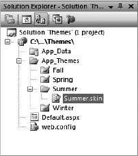
In order to create your own themes for an application, you first need to create the proper folder structure in your application. To do this, right-click your project and add a new folder. Name the folder App_Themes. You can also create this folder by right-clicking on your project in Visual Studio and selecting Add ASP.NET Folder
Within the App_Themes folder, you can create an additional theme folder for each and every theme that you might use in your application. For instance, if you are going to have four themes — Summer, Fall, Winter, and Spring — then you create four folders that are named appropriately.
You might use more than one theme in your application for many reasons — season changes, day/night changes, different business units, category of user, or even user preferences.
Each theme folder must contain the elements of the theme, which can include the following:
A single skin file
CSS files
Images
A skin is a definition of styles applied to the server controls in your ASP.NET page. Skins can work in conjunction with CSS files or images. To create a theme to use in your ASP.NET applications, you use just a single skin file in the theme folder. The skin file can have any name, but it must have a .skin file extension.
Even though you have four theme folders in your application, concentrate on the creation of the Summer theme for the purposes of this chapter. Right-click the Summer folder, select Add New Item, and select Skin File from the listed options. Name the file Summer.skin. Then complete the skin file as shown in Listing 6-3.
Example 6.3. The Summer.skin file
<asp:Label runat="server" ForeColor="#004000" Font-Names="Verdana"
Font-Size="X-Small" />
<asp:Textbox runat="server" ForeColor="#004000" Font-Names="Verdana"
Font-Size="X-Small" BorderStyle="Solid" BorderWidth="1px"
BorderColor="#004000" Font-Bold="True" />
<asp:Button runat="server" ForeColor="#004000" Font-Names="Verdana"
Font-Size="X-Small" BorderStyle="Solid" BorderWidth="1px"
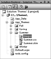
BorderColor="#004000" Font-Bold="True" BackColor="#FFE0C0" />This is just a sampling of what the Summer.skin file should contain. To use it in a real application, you should actually make a definition for each and every server control option. In this case, you have a definition in place for three different types of server controls: Label, TextBox, and Button. After saving the Summer.skin file in the Summer folder, your file structure should look like Figure 6-5 from the Solution Explorer of Visual Studio 2008.
As with the regular server control definitions that you put on a typical .aspx page, these control definitions must contain the runat="server" attribute. If you specify this attribute in the skinned version of the control, you also include it in the server control you put on an .aspx page that uses this theme. Also notice that no ID attribute is specified in the skinned version of the control. If you specify an ID attribute here, you get an error when a page tries to use this theme.
As you can see, you can supply a lot of different visual definitions to these three controls, and this should give the page a summery look and feel. An ASP.NET page in this project can then simply use this custom theme as was shown earlier in this chapter (see Listing 6-4).
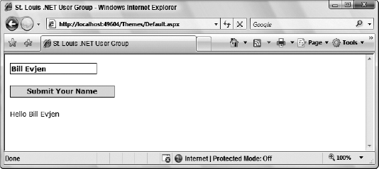
Example 6.4. Using the Summer theme in an ASP.NET page
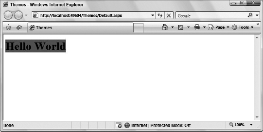
VB<%@ Page Language="VB" Theme="Summer" %> <script runat="server"> Protected Sub Button1_Click(ByVal sender As Object, ByVal e As System.EventArgs) Label1.Text = "Hello " & TextBox1.Text End Sub </script> <html xmlns="http://www.w3.org/1999/xhtml"> <head runat="server"> <title>St. Louis .NET User Group</title> </head> <body> <form id="form1" runat="server"> <asp:Textbox ID="TextBox1" runat="server"> </asp:Textbox> <br /> <br /> <asp:Button ID="Button1" runat="server" Text="Submit Your Name" OnClick="Button1_Click" /> <br /> <br /> <asp:Label ID="Label1" runat="server" /> </form> </body> </html>C#<%@ Page Language="C#" Theme="Summer" %> <script runat="server">
protected void Button1_Click(object sender, System.EventArgs e)
    {
        Label1.Text = "Hello " + TextBox1.Text.ToString();
    }
</script>
Looking at the server controls on this .aspx page, you can see that no styles are associated with them. These are just the default server controls that you drag and drop onto the design surface of Visual Studio 2008. There is, however, the style that you defined in the Summer.skin file, as shown in Figure 6-6.
In addition to the server control definitions that you create from within a .skin file, you can make further definitions using Cascading Style Sheets (CSS). You might have noticed, when using a .skin file, that you could define only the styles associated with server controls and nothing else. However, developers usually use quite a bit more than server controls in their ASP.NET pages. For instance, ASP.NET pages are routinely made up of HTML server controls, raw HTML, or even raw text. At present, the Summer theme has only a Summer.skin file associated with it. Any other items have no style whatsoever applied to them.
For a theme that goes beyond the server controls, you must further define the theme style so that HTML server controls, HTML, and raw text are all changed according to the theme. You achieve this with a CSS file within your theme folder.
It is rather easy to create CSS files for your themes when using Visual Studio 2008. Right-click the Summer theme folder and select Add New Item. In the list of options, select the option Style Sheet and name it Summer.css. The Summer.css file should be sitting right next to your Summer.skin file. This creates an empty .css file for your theme. I will not go into the details of how to make a CSS file using Visual Studio 2008 and the CSS creation tool because this was covered earlier in Chapter 2 in this book. The process is also the same as in previous versions of Visual Studio. Just remember that the dialog that comes with Visual Studio 2008 enables you to completely define your CSS page with no need to actually code anything. A sample dialog is shown in Figure 6-7.
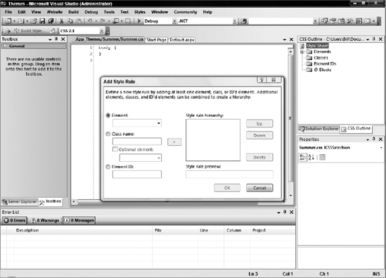
To create a comprehensive theme with this dialog, you define each HTML element that might appear in the ASP.NET page or your make use of class names or element IDs. This can be a lot of work, but it is worth it in the end. For now, create a small CSS file that changes some of the non-server control items on your ASP.NET page. This CSS file is shown in Listing 6-5.
Example 6.5. A CSS file with some definitions
body
{
 font-size: x-small;
 font-family: Verdana;
 color: #004000;
}

a:link {
 color: Blue;
 text-decoration: none;
}
a:visited
{
color: Blue;
text-decoration: none;
}
a:hover {
color: Red;
text-decoration: underline overline;
}In this CSS file, four things are defined. First, you define text that is found within the <body> tag of the page (basically all the text). Generally, plenty of text can appear in a typical ASP.NET page that is not placed inside an <asp:Label> or <asp:Literal> tag. Therefore, you can define how your text should appear in the CSS file; otherwise, your Web page may appear quite odd at times. In this case, a definition is in place for the size, the font family, and the color of the text. You make this definition the same as the one for the <asp:Label> server control in the Summer.skin file.
The next three definitions in this CSS file revolve around the <a> element (for hyperlinks). One cool feature that many Web pages use is responsive hyperlinks — or hyperlinks that change when you hover a mouse over them. The A:link definition defines what a typical link looks like on the page. The A:visited definition defines the look of the link if the end user has clicked on the link previously (without this definition, it is typically purple in IE). Then the A:hover definition defines the appearance of the hyperlink when the end user hovers the mouse over the link. You can see that not only are these three definitions changing the color of the hyperlink, but they are also changing how the underline is used. In fact, when the end user hovers the mouse over a hyperlink on a page using this CSS file, an underline and an overline appear on the link itself.
In CSS files, the order in which the style definitions appear in the .css file is important. This is an interpreted file — the first definition in the CSS file is applied first to the page, next the second definition is applied, and so forth. Some styles might change previous styles, so make sure your style definitions are in the proper order. For instance, if you put the A:hover style definition first, you would never see it. The A:link and A:visited definitions would supersede it because they are defined after it. In addition to order, other factors such as the target media type, importance (whether the declaration is specified as important or normal), and the origin of the stylesheet also play a factor in interpreting declarations.
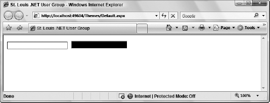
In working with your themes that include .css files, you must understand what they can and cannot do for you. For instance, examine an .aspx file that contains two text boxes — one text box created using a server control and another text box created using a typical <input> HTML element:
<asp:Textbox ID="TextBox1" runat="server" /> <input type="text" />
Suppose you have a definition for the TextBox server control in the .skin file:
<asp:Textbox runat="server" ForeColor="#004000" Font-Names="Verdana"
 BackColor="#ffffff" Font-Size="X-Small" BorderStyle="Solid" BorderWidth="1px"
 BorderColor="#004000" Font-Bold="True" />
However, what if you also have a definition in your .css file for each <input> element in the ASP.NET page as shown here:
INPUT
{
  background-color: black;
}
When you run the .aspx page with these kinds of style conflicts, the .skin file takes precedence over styles applied to every HTML element that is created using ASP.NET server controls regardless of what the .css file says. In fact, this sort of scenario gives you a page in which the <input> element that is created from the server control is white, as defined in the .skin file, and the second text box is black, as defined in the .css file (see Figure 6-8).
Again, other factors besides the order in which the items are defined can alter the appearance of your page. In addition to order, other factors such as the target media type, importance (whether the declaration is specified as important or normal), and the origin of the stylesheet also play a factor in interpreting declarations.
Probably one of the coolest reasons why themes, rather than CSS, are the better approach for applying a consistent style to your Web page is that themes enable you to incorporate actual images into the style definitions.
Many controls use images to create a better visual appearance. The first step in incorporating images into your server controls that consistently use themes is to create an Images folder within the theme folder itself, as illustrated in Figure 6-9.
You have a couple of easy ways to use the images that you might place in this folder. The first is to incorporate the images directly from the .skin file itself. You can do this with the TreeView server control. The TreeView control can contain images used to open and close nodes for navigation purposes. You can place images in your theme for each and every TreeView control in your application. If you do so, you can then define the TreeView server control in the .skin file, as shown in Listing 6-6.
Example 6.6. Using images from the theme folder in a TreeView server control
<asp:TreeView runat="server" BorderColor="#FFFFFF" BackColor="#FFFFFF"
   ForeColor="#585880" Font-Size=".9em" Font-Names="Verdana"
   LeafNodeStyle-ImageUrl="imagessummer_iconlevel.gif"
   RootNodeStyle-ImageUrl="imagessummer_iconmain.gif"
   ParentNodeStyle-ImageUrl="imagessummer_iconmain.gif" NodeIndent="30"
   CollapseImageUrl="imagessummer_minus.gif"
   ExpandImageUrl="imagessummer_plus.gif">
  ...
</asp:TreeView>
When you run a page containing a TreeView server control, it is populated with the images held in the Images folder of the theme.
It is easy to incorporate images into the TreeView control. The control even specifically asks for an image location as an attribute. The new WebParts controls are used to build portals. Listing 6-7 is an example of a Web Part definition from a .skin file that incorporates images from the Images folder of the theme.
Example 6.7. Using images from the theme folder in a WebPartZone server control
<asp:WebPartZone ID="WebPartZone1" runat="server"
 DragHighlightColor="#6464FE" BorderStyle="double"
 BorderColor="#E7E5DB" BorderWidth="2pt" BackColor="#F8F8FC"
 cssclass="theme_fadeblue" Font-Size=".9em" Font-Names="Verdana">
    <FooterStyle ForeColor="#585880" BackColor="#CCCCCC"></FooterStyle>
    <HelpVerb ImageURL="images/SmokeAndGlass_help.gif"
     checked="False" enabled="True" visible="True"></HelpVerb>
    <CloseVerb ImageURL="images/SmokeAndGlass_close.gif"
     checked="False" enabled="True" visible="True"></CloseVerb>
    <RestoreVerb ImageURL="images/SmokeAndGlass_restore.gif"
     checked="False" enabled="True" visible="True"></RestoreVerb>
    <MinimizeVerb ImageURL="images/SmokeAndGlass_minimize.gif"
     checked="False" enabled="True" visible="True"></MinimizeVerb>
    <EditVerb ImageURL="images/SmokeAndGlass_edit.gif"
     checked="False" enabled="True" visible="True"></EditVerb>
</asp:WebPartZone>
As you can see here, this series of toolbar buttons, which is contained in a WebPartZone control, now uses images that come from the aforementioned SmokeAndGlass theme. When this WebPartZone is then generated, the style is defined directly from the .skin file, but the images specified in the .skin file are retrieved from the Images folder in the theme itself.
Not all server controls enable you to work with images directly from the Themes folder by giving you an image attribute to work with. If you don't have this capability, you must work with the .skin file and the CSS file together. If you do, you can place your theme-based images in any element you want. Next is a good example of how to do this.
Place the image that you want to use in the Images folder just as you normally would. Then define the use of the images in the .css file. The continued SmokeAndGlass example in Listing 6-8 demonstrates this.
Example 6.8. Part of the CSS file from SmokeAndGlass.css
.theme_header {
 background-image :url( images/smokeandglass_brownfadetop.gif);
}

.theme_highlighted {
 background-image :url( images/smokeandglass_blueandwhitef.gif);
}

.theme_fadeblue {
 background-image :url( images/smokeandglass_fadeblue.gif);
}
These are not styles for a specific HTML element; instead, they are CSS classes that you can put into any HTML element that you want. In this case, each CSS class mentioned here is defining a specific background image to use for the element.
After it is defined in the CSS file, you can utilize this CSS class in the .skin file when defining your server controls. Listing 6-9 shows you how.
Example 6.9. Using the CSS class in one of the server controls defined in the .skin file
<asp:Calendar runat="server" BorderStyle="double" BorderColor="#E7E5DB"
 BorderWidth="2" BackColor="#F8F7F4" Font-Size=".9em" Font-Names="Verdana">
    <TodayDayStyle BackColor="#F8F7F4" BorderWidth="1" BorderColor="#585880"
     ForeColor="#585880" />
    <OtherMonthDayStyle BackColor="transparent" ForeColor="#CCCCCC" />
    <SelectedDayStyle ForeColor="#6464FE" BackColor="transparent"

     CssClass="theme_highlighted" />
    <TitleStyle Font-Bold="True" BackColor="#CCCCCC" ForeColor="#585880"
     BorderColor="#CCCCCC" BorderWidth="1pt" CssClass="theme_header" />
    <NextPrevStyle Font-Bold="True" ForeColor="#585880"
     BorderColor="transparent" BackColor="transparent" />
    <DayStyle ForeColor="#000000"
     BorderColor="transparent" BackColor="transparent" />
    <SelectorStyle Font-Bold="True" ForeColor="#696969" BackColor="#F8F7F4" />
    <WeekendDayStyle Font-Bold="False" ForeColor="#000000"
BackColor="transparent" />
<DayHeaderStyle Font-Bold="True" ForeColor="#585880"
BackColor="Transparent" />
</asp:Calendar>This Calendar server control definition from a .skin file uses one of the earlier CSS classes in its definition. It actually uses an image that is specified in the CSS file in two different spots within the control (shown in bold). It is first specified in the <SelectedDayStyle> element. Here you see the attribute and value CssClass="theme_highlighted". The other spot is within the <TitleStyle> element. In this case, it is using theme_header. When the control is rendered, these CSS classes are referenced and finally point to the images that are defined in the CSS file.
It is interesting that the images used here for the header of the Calendar control don't really have much to them. For instance, the smokeandglass_brownfadetop.gif image that we are using for this example is simply a thin, gray sliver, as shown in Figure 6-10.
This very small image (in this case, very thin) is actually repeated as often as necessary to make it equal the length of the header in the Calendar control. The image is lighter at the top and darkens toward the bottom. Repeated horizontally, this gives a three-dimensional effect to the control. Try it out, and you can get the result shown in Figure 6-11.
Using the themes technology in ASP.NET, you can have a single theme; but also, within the theme's .skin file, you can have specific controls that are defined in multiple ways. You can frequently take advantage of this feature within your themes. For instance, you might have text box elements scattered throughout your application, but you might not want each and every text box to have the same visual appearance. In this case, you can create multiple versions of the <asp:Textbox> server control within your .skin file. In Listing 6-10 you see how to create multiple versions of the <asp:Textbox> control in the .skin file from Listing 6-3.
Example 6.10. The Summer.skin file, which contains multiple versions of the <asp:Textbox> server control
<asp:Label runat="server" ForeColor="#004000" Font-Names="Verdana"
            Font-Size="X-Small" />

<asp:Textbox runat="server" ForeColor="#004000" Font-Names="Verdana"
            Font-Size="X-Small" BorderStyle="Solid" BorderWidth="1px"
            BorderColor="#004000" Font-Bold="True" />

<asp:Textbox runat="server" ForeColor="#000000" Font-Names="Verdana"
            Font-Size="X-Small" BorderStyle="Dotted" BorderWidth="5px"
            BorderColor="#000000" Font-Bold="False" SkinID="TextboxDotted" />
<asp:Textbox runat="server" ForeColor="#000000" Font-Names="Arial"
            Font-Size="X-Large" BorderStyle="Dashed" BorderWidth="3px"
            BorderColor="#000000" Font-Bold="False" SkinID="TextboxDashed" />

<asp:Button runat="server" ForeColor="#004000" Font-Names="Verdana"
            Font-Size="X-Small" BorderStyle="Solid" BorderWidth="1px"
            BorderColor="#004000" Font-Bold="True" BackColor="#FFE0C0" />
In this .skin file, you can see three definitions in place for the TextBox server control. The first one is the same as before. Although the second and third definitions have a different style, they also contain a new attribute in the definition — SkinID. To create multiple definitions of a single element, you use the SkinID attribute to differentiate among the definitions. The value used in the SkinID can be anything you want. In this case, it is TextboxDotted and TextboxDashed.
Note that no SkinID attribute is used for the first <asp:Textbox> definition. By not using one, you are saying that this is the default style definition to use for each <asp:Textbox> control on an ASP.NET page that uses this theme but has no pointer to a particular SkinID.
Take a look at a sample .aspx page that uses this .skin file in Listing 6-11.
Example 6.11. A simple .aspx page that uses the Summer.skin file with multiple text-box style definitions
<%@ Page Language="VB" Theme="Summer" %>

<html xmlns="http://www.w3.org/1999/xhtml">
<head runat="server">
    <title>Different SkinIDs</title>
</head>
<body>
    <form id="form1" runat="server">
    <p>
        <asp:Textbox ID="TextBox1" runat="server">Textbox1</asp:Textbox>
    </p><p>
        <asp:Textbox ID="TextBox2" runat="server"
         SkinId="TextboxDotted">Textbox2</asp:Textbox>
    </p><p>
<asp:Textbox ID="TextBox3" runat="server"
SkinId="TextboxDashed">Textbox3</asp:Textbox>
</p>
</form>
</body>
</html>This small .aspx page shows three text boxes, each of a different style. When you run this page, you get the results shown in Figure 6-12.
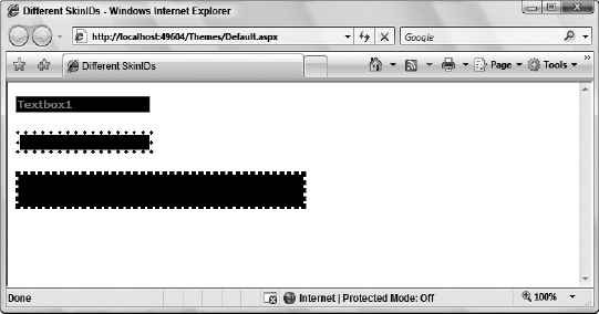
The first text box does not point to any particular SkinID in the .skin file. Therefore, the default skin is used. As stated before, the default skin is the one in the .skin file that does not have a SkinID attribute in it. The second text box then contains SkinID="TextboxDotted" and, therefore, inherits the style definition defined in the TextboxDotted skin in the Summer.skin file. The third text box takes the SkinID TextboxDashed and is also changed appropriately.
As you can see, it is quite simple to define multiple versions of a control that can be used throughout your entire application.
So far, you have seen examples of working with ASP.NET themes in a declarative fashion, but you can also work with themes programmatically.
To programmatically assign the theme to the page, use the construct shown in Listing 6-12.
Example 6.12. Assigning the theme of the page programmatically
VB<script runat="server"> Protected Sub Page_PreInit(ByVal sender As Object, ByVal e As System.EventArgs) Page.Theme = Request.QueryString("ThemeChange") End Sub </script>C#<script runat="server"> protected void Page_PreInit(object sender, System.EventArgs e) { Page.Theme = Request.QueryString["ThemeChange"]; } </script>
You must set the Theme of the Page property in or before the Page_PreInit event for any static controls that are on the page. If you are working with dynamic controls, set the Theme property before adding it to the Controls collection.
Another option is to assign a specific server control's SkinID property programmatically (see Listing 6-13).
Example 6.13. Assigning the server control's SkinID property programmatically
VB<script runat="server"> Protected Sub Page_PreInit(ByVal sender As Object, ByVal e As System.EventArgs) TextBox1.SkinID = "TextboxDashed" End Sub </script>C#<script runat="server"> protected void Page_PreInit(object sender, System.EventArgs e) { TextBox1.SkinID = "TextboxDashed"; } </script>
Again, you assign this property before or in the Page_PreInit event in your code.
If you are building custom controls in an ASP.NET world, understand that end users can also apply themes to the controls that they use in their pages. By default, your custom controls are theme-enabled whether your custom control inherits from Control or WebControl.
To disable theming for your control, you can simply use the Themeable attribute on your class. This is illustrated in Listing 6-14.
Example 6.14. Disabling theming for your custom controls
VBImports System Imports System.Collections.Generic Imports System.ComponentModel Imports System.Text Imports System.Web Imports System.Web.UI Imports System.Web.UI.WebControls <DefaultProperty("HeaderText"), _ ToolboxData("<{0}:WebCustomControl1 runat=server></{0}:WebCustomControl1>"), _ Themeable(False)> _ Public Class WebCustomControl1 Inherits WebControl <Bindable(True), Category("Appearance"), DefaultValue("Enter Value"), _ Localizable(True)> Property HeaderText() As String Get Dim s As String = CStr(ViewState("HeaderText")) If s Is Nothing Then Return String.Empty Else Return s End If End Get Set(ByVal Value As String) ViewState("HeaderText") = Value End Set End Property Protected Overrides Sub RenderContents(ByVal output As HtmlTextWriter) output.Write("<h1>" & HeaderText & "<h1>") End Sub End ClassC#using System; using System.Collections.Generic; using System.ComponentModel; using System.Text; using System.Web; using System.Web.UI; using System.Web.UI.WebControls; namespace ControlForThemes
{
    [DefaultProperty("HeaderText")]
    [ToolboxData("<{0}:WebCustomControl1 runat=server></{0}:WebCustomControl1>")]
    [Themeable(false)]
    public class WebCustomControl1 : WebControl
    {
        [Bindable(true)]
        [Category("Appearance")]
        [DefaultValue("Enter Value")]
        [Localizable(true)]
        public string HeaderText
        {
            get
            {
                String s = (String)ViewState["HeaderText"];
                return ((s == null) ? String.Empty : s);
            }

            set
            {
                ViewState["HeaderText"] = value;
            }
        }

        protected override void RenderContents(HtmlTextWriter output)
        {
            output.Write("<h1>" + HeaderText + "<h1>");
        }
    }
}
Looking over the code from the above example, you can see that theming was disabled by applying the Themeable attribute to the class and setting it to False.
You can use a similar approach to disable theming for the individual properties that might be in your custom controls. You do this as illustrated in Listing 6-15.
Example 6.15. Disabling theming for properties in your custom controls
VB
    <Bindable(True), Category("Appearance"), DefaultValue("Enter Value"), _
     Localizable(True), Themeable(False)> Property HeaderText() As String
        Get
            Dim s As String = CStr(ViewState("HeaderText"))
            If s Is Nothing Then
                Return String.Empty
            Else
                Return s
            End If
        End Get

        Set(ByVal Value As String)
ViewState("HeaderText") = Value
End Set
End Property
C#
[Bindable(true)]
[Category("Appearance")]
[DefaultValue("Enter Value")]
[Localizable(true)]
[Themeable(false)]
public string HeaderText
{
get
{
String s = (String)ViewState["HeaderText"];
return ((s == null) ? String.Empty : s);
}
set
{
ViewState["HeaderText"] = value;
}
}In this case, you set the Themeable attribute at the property level to False in the same manner as you did at the class level.
If you have enabled themes for these items, how would you go about applying a theme definition to a custom control? For this example, use the custom server control shown in Listing 6-14, but set the Themeable attributes to True. Next, create a .skin file in a theme and add the control to the theme as you would any other ASP.NET server control. This is illustrated in Listing 6-16.
Example 6.16. Changing properties in a custom control in the .skin file
<%@ Register Assembly="ControlForThemes" Namespace="ControlForThemes"
    TagPrefix="cc1" %>
<cc1:webcustomcontrol1 runat="server" HeaderText="FROM THE SKIN FILE" />
When defining custom server controls in your themes, you use the same approach as you would when placing a custom server control inside of a standard ASP.NET .aspx page. In Listing 6-16, you can see that the custom server control is registered in the .skin file using the @Register page directive. This directive gives the custom control a TagPrefix value of cc1. Note that the TagPrefix values presented in this page can be different from those presented in any other .aspx page that uses the same custom control. The only things that have to be the same are the Assembly and Namespace attributes that point to the specific control being defined in the file. Also note the control definition in the skin file, as with other standard controls, does not require that you specify an ID attribute, but only the runat attribute along with any other property that you wish to override.
Next, create a standard .aspx page that uses your custom server control. Before running the page, be sure to apply the defined theme on the page using the Theme attribute in the @Page directive. With everything in place, running the page produces the following results in the browser:
FROM THE SKIN FILE
This value, which was specified in the skin file, is displayed no matter what you apply as the HeaderText value in the server control.
In addition to changing values of custom properties that are contained in server control, you can also change the inherited properties that come from WebControl. For instance, you can change settings in your skin file as shown in Listing 6-17.
Example 6.17. Changing inherited properties in the custom control
<%@ Register Assembly="ControlForThemes" Namespace="ControlForThemes"
    TagPrefix="cc1" %>
<cc1:webcustomcontrol1 runat="server" BackColor="Gray" />
With this in place, you have changed one of the inherited properties from the skin file. This setting changes the background color of the server control to gray (even if it is set to something else in the control itself). The result is presented in Figure 6-13.
You can find more information on building your own custom server controls in Chapter 26.
With the availability of themes and skins in ASP.NET 3.5, it is quite easy to apply a consistent look and feel across your entire application. Remember that themes can contain only simple server control definitions in a .skin file or elaborate style definitions, which include not only .skin files, but also CSS style definitions and even images!
As you will see later in the book, you can use themes in conjunction with the personalization features that ASP.NET provides. This enables your end users to customize their experiences by selecting their own themes. Your application can present a theme just for them, and it can remember their choices through the APIs that are offered in ASP.NET 3.5.