Chapter 12. Making websites mobile-friendly
Don’t walk in front of me, I may not follow. Don’t walk behind me, I may not lead. Walk beside me and be my friend.
—A. Camus
When referring to software, the term mobile is usually associated with native applications for a particular platform such as Apple’s iOS, Windows Phone, or Android. A common vision in fact is that you should aim at having apps for some platforms and just ensure that the website can be comfortably viewed on smartphones and (mini) tablets. Most recent devices can comfortably display nearly any website. This leads many executives to address mobile with just a few native apps, thus completely ignoring the subtler issues of mobile web.
My vision is different. I don’t argue with having (or not having) mobile apps, because that is an aspect that is too business-specific to be addressed in general terms. But, I do argue that providing a mobile-friendly website is indeed quite important. More precisely, I argue that although any company can content itself with a website that just shows up and can be read on a smartphone, the user experience (UX) that you can provide with a mobile-optimized design of the site is incomparably better than just pinch-and-zoom to fill forms and read news.
In this chapter, you’ll first review some of the technologies that help you to make a website mobile-friendly. Of course, the list includes HTML5, but it also extends to Responsive Web Design (RWD) and touches on some specific JavaScript frameworks such as jQuery Mobile. Next, you’ll learn about the concrete challenges you face when you’re called to action. You will see how to link together two distinct sites (desktop and mobile) so that they appear to be just one to users. Chapter 13, takes the discussion one step further and addresses the entire point of multidevice website design.
Technologies for enabling mobile on sites
Mobile users have high expectations in terms of UX; they expect the application to provide an overall user interface (UI) similar to that of popular devices (for example, iPhone), touch-based, and populated by common widgets such as pick-lists and the iPhone-ish toggle-switch. These widgets don’t exist (yet?) as native elements of HTML and must be simulated by using server-side controls that output a mix of JavaScript and markup every time.
The bottom line is that it is one thing to create a plain site making the best possible use of HTML, cascading style sheets (CSS), and JavaScript; it is quite another to make a compelling mobile site that looks like a native application or, at the very minimum, behaves like that.
On the average, mobile browsers offer good support for HTML5 elements. This means that at least on devices that fall under the umbrella of “smartphones” or “tablets,” you can default to HTML5 elements without worrying about workarounds and shims. So, let’s summarize the key facts of HTML5.
HTML5 for the busy developer
HTML5 marks the beginning of the third age of the web in which HTML advances at a brisk pace toward becoming a true and fully-fledged application delivery format. HTML5 is not limited to presentation; rather, it also provides a slew of new functionalities for web and other types of applications. The big change is that HTML5 is about client-side programming and about building applications that can run within the browser with limited (or no) interaction with the back end.
Compared to its predecessor (which was defined more than a decade ago), HTML5 is a significantly richer markup language. One could say that all these years have not passed in vain as HTML5 now incorporates in the standard syntax many common practices that developers and designers employed in thousands of websites. In doing so, HTML5 issues specific rules on how to structure HTML elements and deprecates tags that were introduced in the past in favor of style elements. The new message is that you should use CSS to style elements and use specific (new) tags to define the structure of the document.
Semantic markup
Most all websites share a common layout that includes a header and footer as well as a navigation bar on the left of the page. More often than not, these results are achieved by using <div> elements styled to align to the left or the right. Most pages today end up with the following template that we also used in the samples throughout this book:
<div id="page">
   <div id="header">
      ...
   </div>
   <div id="navbar">
      <ul>
         <li> ... </li>
         <li> ... </li>
         <li> ... </li>
     </ul>
   </div>
      <div id="container">
         <div id="left-sidebar">
           ...
           <ul>
              <li> ... </li>
              <li> ... </li>
              <li> ... </li>
            </ul>
         </div>
         <div id="content">
           ...
         </div>
         <div id="right-sidebar">
           ...
         </div>
   </div>
   <div id="footer">
       ...
   </div>
</div>
This template includes header, navigation bar, footer, and a three-column layout between. The preceding markup alone, however, doesn’t produce the expected results. For that, you need to add ad hoc CSS styles to individual <div> elements and make them float and anchor to the left or right edge.
What’s different in HTML5?
First off, using HTML5 doesn’t mean that you stop using CSS to transform a layout into a nice looking page. You still need to use the same bit of CSS to make the page look compelling and place segments where they belong. However, you can now describe the page in a much cleaner way that is also easier to read for a designer working on CSS stylesheets. Essentially, with HTML5 you replace generic <div> elements with more semantically meaningful elements such as <header>, <footer>, and <article>. Here’s how you can rewrite the preceding template by using the newest HTML tags.
<header> ... </header>
<nav> ... </nav>
<article>
   <aside>
      ...
   </aside>
   <section> ... </section>
   <section> ... </section>
   <section> ... </section>
   <aside>
      ...
   </aside>
</article>
<footer> ... </footer>
The <nav> element logically groups links that would go in a navigation bar. The <article> element represents the container of any content for the page and incorporates <aside> elements and <section> elements.
All of these are block elements which must be styled properly to form a presentable page. Other new elements complete the list of enhancements such as <figure> and <details>. The <figure> element is designed to include figures with caption, whereas <details> replaces the canonical hidden <div> that developers use to hide optional content and display it via JavaScript.
A native collapsible element
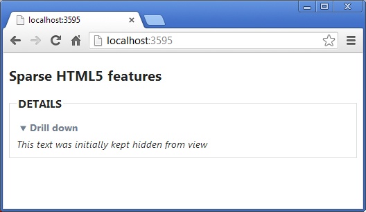
The new <details> element is functionally equivalent to a <div> but its internal content is interpreted by the browser and used to implement a collapsible panel. Here’s an example of the new element:
<details open="true">
   <summary>Drill down</summary>
   <div id="details_inside">
         This text was initially kept hidden from view
   </div>
 </details>
The open attribute indicates whether you want the content to be initially displayed or not (see Figure 12-1). The <summary> element designates the text for the clickable placeholder, whereas the remaining content is hidden or shown on demand. As of this writing, Google Chrome and Apple Safari are among the few browsers that support this feature. Internet Explorer 11 doesn’t support it.
Note
If you want to support HTML5-compliant browsers while remaining compatible with old browsers, too, you should use both new HTML5 tags and replacement tags; older browsers will just ignore the new HTML5 tags.
The icon you see in the figure is provided by the browser. The <details> element requires a bit of CSS to look nice. Here’s the CSS used for the element in Figure 12-1:
<style>
summary {
    padding: 5px;
    font-weight: bold;
    color: #708090;
}
#details_inside {
    font-style: italic;
}
</style>
Note
HTML5 removes a few elements of little use whose presence would only increase redundancy. The list of elements no longer supported most notably includes the <frame> (the IFRAME element remains, however) and <font> elements. In addition, a few style elements such as <center>, <u> and <big> are removed. The reason is that this functionality can be easily achieved through CSS. For some reason, the current draft maintains analogous elements such as <b> and <i>.
New input types
Currently, HTML (and subsequently browsers) supports only plain text as input. There’s quite a bit of difference between dates, numbers, or even email addresses, not to mention predefined values. Today, developers are responsible for preventing users from typing unwanted characters by implementing client-side validation of the entered text. The jQuery library has several plugins that simplify the task, but this just reinforces the point—input is a delicate matter.
HTML5 comes with a plethora of new values for the attribute type of the <input> element. In addition the <input> counts several new attributes mostly related to these new input types. Here are a few examples:
<input type="date" />
<input type="time" />
<input type="range" />
<input type="number" />
<input type="search" />
<input type="color" />
<input type="email" />
<input type="url" />
<input type="tel" />
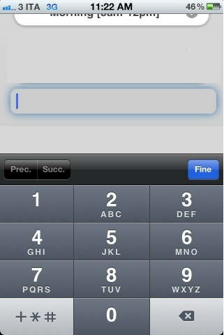
What’s the real effect of these new input types? The intended effect, although not completely standardized yet, is that browsers provide an ad hoc UI with which users can comfortably enter a date, time, or number. Some of these new input types specifically address the need of mobile site users. In particular, email, url, and tel types push mobile browsers on smartphones (for example, iPhone, Android, Windows Phone) to automatically adjust the input scope of the keyboard. Figure 13-2 shows the effect of typing on a tel input field on an iPhone: the keyboard defaults to numbers and phone-related symbols.
Today, not all browsers provide the same experience, and although they mostly agree on the UI associated with the various input types, still some key differences exist that might require developers to add script-based custom polyfills. As an example, let’s consider the date type. As of this writing, the interface provided by Opera is different from what you see in Chrome (see Figure 12-3); Internet Explorer 11 doesn’t offer any special support for dates.

In general, mobile browsers on recent smartphones are quite respectful of HTML5 elements. Still, as a mobile site developer, you might want to be very careful when using new input elements for email, number, url, date, tel—well, for just about everything!
Finally, it’s worth noting that for the placeholder attribute that implements the long-awaited ability to display a hint in a text box wherever possible, hint text is not displayed for range and date/time input fields.
Note
In the end, until browsers willfully and uniformly support the new input fields, developers have still a bit of work to do with JavaScript polyfills to ensure that correct data is posted to the server and that the users are properly informed about what is wrong. Mobile pages, much more than desktop pages, benefit from HTML5-compliant browsers.
The <datalist> element
Another nice improvement in HTML5 forms is the <datalist> element. The element is a specialized version of the popular <select> element. It provides the same behavior except that the drop-down list applies to a text input field. Here’s an example:
<input list="countries" />
<datalist id="countries">
   <option value="Italy">
   <option value="Austria">
   <option value="Australia">
   <option value="Albania">
   <option value="Sweden">
   <option value="Denmark">
</datalist>
The net effect is that when the input field receives the focus, the menu displays and the user can either enter free text or pick up one of the predefined options. Figure 12-4 presents the feature as you would find it in Google Chrome.

Local storage
HTML5 provides a standard API that makes saving data on the user’s device more affordable and represents an effective replacement for cookies. The average size of local storage is around 5 MB, which is much more than a cookie.
You access the local storage through the localStorage property exposed by the browser’s window object. The localStorage property offers a dictionary-based programming interface similar to that of cookies. You have methods to add and remove items, to count the number of items in the store, to get the value of a particular item, and to empty the store. Here’s how you can save a value and retrieve it later:
<script type="text/javascript">
function save() {
   window.localStorage["message"] = "hello";
}
function init() {
   document.getElementById("message").innerHTML = window.localStorage["message"];
}
</script>
Upon loading, the page retrieves and displays data from the local storage (if any). Data is saved to the storage through a function invoked interactively. Data saved to the local storage remains on the user’s device indefinitely unless you programmatically empty it. The storage is specific for the application.
In addition to localStorage, HTML5 provides a sessionStorage object with the same programming interface but saving to the browser’s memory, instead. The sessionStorage object is emptied at the end of the current browser session. Web storage accepts primitive types (the specification is not restrictive on this point, so any JavaScript type is acceptable), but you can save complex objects, as well, if serialized to the JavaScript Object Notation (JSON) format.
Audio and video
One of the biggest gains of HTML5 is saying farewell (but really?) to external plugins such as Flash and Silverlight for just playing audio and video. HTML5 brings two new elements, <audio> and <video>, that point to a URL and play any content. The browser implementation of these tags is also expected to provide a control bar for the user to pause and resume the playback. Here’s how to link an audio resource.
<audio poster="init.png" controls="controls">
    <source src="nicestory.wav" />
</audio>
The sore point of multimedia elements (mostly, video) is the format of files, both file format and codecs. The HTML5 standard won’t make an official call about codecs, so deciding about the format to support will remain up to the vendors. From a developer’s perspective this is not exactly great news because it represents a breaking point; different browsers support different formats, and you should detect the browser or provide multiple files for the browser to choose. Here’s the syntax to indicate a selection of video formats:
<video poster="init.png" controls="controls">
   <source src="tiger.mp4" type="video/mp4" />
   <source src="tiger.webm" type="video/ogg" />
   Oops, it seems that your browser doesn't support video.
</video>
Observe that you use the controls attribute to display the control bar and the poster attribute to specify an image to use as a splash-screen until the media is ready to play.
Popular codecs are MP4, MOV, and AVI. You should plan to have an MP4-encoded video for Internet Explorer and Safari, and OGG/Theora for all the others. At present, this seems to be the perfect solution to avoid external plugins. But, because this is a matter that changes frequently, look before you leap.
RWD
Most developers and technical managers remember very well the nightmare it was to build websites for a variety of browsers a mere decade ago. There was a time at which, for example, Internet Explorer had a different set of features compared to Firefox or perhaps Safari, or even just an earlier version of itself. That really made authoring markup for pages a mess. It is said that about 70 percent of the code that makes up jQuery today deals with quirks for older browsers, most notably Safari and Internet Explorer. I’d even say that developers started forgetting the “browser wars” as jQuery conquered ground; at the same time, the browser wars were definitely one of the factors for jQuery’s rapid adoption.
In the mobile space, the order of magnitude of different devices is thousands, not units as with desktop browsers a while back. If the browsers fragmentation of a decade ago scared you, what about the vastly larger fragmentation of mobile devices today? This can be a real torment. Mindful of that, developers learned to focus on effective capabilities rather than pointing out a generic behavior associated with a browser’s brand and name. This principle, however, is simple in understanding but quite hard in adoption. This is the starting point of RWD.
Feature detection
RWD sprung to life from the following example of lateral thinking. Detecting devices is hard? Well, then don’t do that. You grab a few snippets of basic information available on the client side (for example, the size of the browser window), set up ad hoc style sheets, and let the browser reflow content in the page accordingly.
You stop detecting the capabilities of the requesting device and decide what to display based on what you can detect programmatically on the device. This approach relies extensively on a number of browser technologies—primarily CSS media queries—and offers the significant plus that you as a developer have just one site to design and maintain. The burden of adapting content responsively is pushed to graphical designers or to ad hoc libraries such as Twitter Bootstrap.
The major strength of feature detection, which we can summarize as “one site fits all,” is also likely to be the major weakness, though. Is just one site what you really want? Do you really want to serve the “same” site to smartphones, tablets, laptops, and smart TVs? The answer to this question invariably is specific to each business. In general terms, it can only be a resounding, “It depends.”
Let’s first see the essence of RWD and then move to its possible shortcomings.
CSS media queries
The magic potion that gave life to RWD is CSS media queries. Introduced with CSS 3, media queries is syntax for developers to define conditional CSS style sheets that the browser will load dynamically any time the window is resized or some other system event takes place. CSS media queries make it possible for developers to easily create multiview pages that can be consumed through devices of different screen sizes ranging from the 24 inches of a desktop monitor to the 3-inch screen of most smartphones.
Note
It is crucial to note that CSS media queries are not specifically a technology for mobile development. However, the inherent power and flexibility of the solution makes it suitable for use in the building of a mobile site, too.
The key benefit of CSS media queries for developers is obvious. Developers write one set of pages and one back end. The set of pages targets the widest possible screen you intend to support—typically the desktop size—and stores as many elements as possible. Next, designers come up with multiple CSS files, one for each intermediate screen size to support. An intermediate screen size is referred to as a layout breakpoint. Most commonly, you have a break point placed at 480 pixels and another at 800 pixels, and possibly more. As the user resizes the browser window and width falls below 480 pixels, the browser automatically selects the CSS for 480 pixels. The same happens when the window is between 480 and 800 pixels; in this case, the CSS for 800 pixels is picked up. When the same page is viewed with a smartphone, the CSS for small screens (480 pixels) is automatically applied; for tablets you’ll likely get the 800-pixel layout. Simple and effective.
By adding another break point and related CSS file, you can create an ad hoc view when the screen size is between 480 and 800 pixels. In this way, you address minitablets, as well. Do you need to support large screens such as smart TVs? No problem. You just add another CSS file. It is really easy and it works great, even though setting up an RWD solution for a realistically complex set of pages might not exactly be a walk in the park.
CSS media queries in action
How many different screen resolutions do you want to support? The answer depends on the expected audience and also on the content to render. However, there’s a huge difference between a desktop browser resized to a width of 400 pixels and a smartphone screen of the same size. A laptop is one thing; a smartphone is quite another, as far as computing power and resources are concerned. CSS media queries, though, are unable to distinguish on a per-device basis.
Let’s assume that this is not going to be an issue for now and further assume that it is acceptable from a business viewpoint to focus only on the size of the viewport. First, you need to decide for how many resolutions you intend to have a different layout. A sample classification might consist of the following breakpoints:
Up to 480 pixels
Up to 800 pixels
Beyond 800 pixels
For each breakpoint, you create a distinct CSS file that takes care of styling elements, including flowing them toward the bottom of the screen or hiding some. In doing so, you can also decide to reference smaller images, if your pages link static images.
You reference such CSS files by using a slight variation of the classic syntax for the <link> element:
<link type="text/css"
      rel="stylesheet"
      href="view480.css"
      media="only screen and (max-width: 480px)">
In this case, the file view480.css will be used only when the page is rendering on a screen and when the browser window is no larger than 480 pixels. When media queries are used and no match can be found, quite simply no style sheet will be applied to the page.
Note
Historically the media attribute indicates the medium for which the CSS is intended—screen, printer, TV, video terminals, and more. In modern browsers that support the full CSS 3 standard, the value of the media attribute can include a query that selects the medium as well as some run-time conditions. You can find the full documentation about media queries at http://www.w3.org/TR/css3-mediaqueries.
The CSS media query language is based on a pair of Boolean operators—and and not—and a few browser properties. Table 12-1 lists the browser properties that you can use to select the most appropriate style sheet.
Browser property | Description |
device-width, device-height | Width and height of the physical device screen. |
width, height | Width and height of the rendering viewport; for example, the browser’s window. |
orientation | Returns portrait when height is greater or equal than width. Otherwise, it returns landscape. |
aspect-ratio | Indicates the ratio between width and height; an example is “16/9”. |
device-aspect-ratio | Indicates the ratio between device-width and device-height; an example is “16/9”. |
Keep in mind that device-width and device-height, as well as the width and height properties, also support min/max prefixes.
You often find the keyword only at the beginning of media query expressions, but it doesn’t really play a functional role. This keyword is added for the sole purpose of keeping older browsers away from the media query statements; older browsers don’t understand the media type when it is prefixed with only and blissfully ignore the statement.
You can use the media query expression within the <link> element of the host page as shown earlier. In this way, you end up with one distinct CSS file for each breakpoint. You can also create a single CSS file that contains multiple media sections, as demonstrated in the following code:
@media screen and (min-width: 480px) {
    body {
        background: yellow;
    }
    ...
}
@media screen and (min-width: 800px) {
    body {
        background: blue;
    }
    ...
}
Note
Whether you create a single file or multiple files, consider that in an RWD solution, you deal with a ton of CSS settings, repetitive for the most part. For this reason, it might be worth taking a look at dynamic stylesheet frameworks such as LESS (http://lesscss.org). Using these type of frameworks, you can create the CSS settings programmatically by using programmer-friendly constructs such as variables and functions.
In Table 12-1, there are two similar-looking properties: width and device-width. As mentioned, the former refers to the browser’s width, whereas the latter indicates the device’s screen width. For adaptive rendering, you should always be using width. However, on mobile devices (smartphones and tablets), any application is always available in full-screen mode, so there’s really no actual difference between the two. In this regard, Windows 8 tablets are a notable exception because applications can run in snapped and filled mode, not just in full-screen mode.
Note
In CSS Media Queries Level 4 (http://dev.w3.org/csswg/mediaqueries4), the next version of the standard, a few new properties will be added to make it simpler to distinguish between a mobile and a desktop device. It doesn’t seem, however, to be the set of device capabilities that developers need to arrange really mobile-oriented views.
Fluid layout
CSS media queries alone don’t really make the layout responsive, but it surely helps responding in some way to dynamically changing conditions. If your design caters only for a few preset breakpoints, users will get the same layout whenever their browser’s width falls between two breakpoints. For example, suppose you have the following:
@media screen and (min-width: 480px) {
    body {
        background: yellow;
    }
    #container {
        width: 480px;
    }
    ...
}
@media screen and (min-width: 800px) {
    body {
        background: blue;
    }
    #container {
        width: 800px;
    }
    ...
}
You have one breakpoint set when the browser width reaches 480 pixels—at that point, the background becomes yellow and the container element is set to 480 pixels. You can enlarge the browser window but you won’t notice any change until the width reaches 800 pixels. Figure 12-5 depicts a screen captured at 600 pixels.

Because the layout uses fixed measures, we end up with some empty and unused space. The impact of unused space can be mitigated by adding more breakpoints and then by authoring and maintaining more CSS files. However, for non-toy sites you can’t realistically deal with more than three or four breakpoints.
A truly responsive layout is a layout that adapts to any change in the width and/or height of the browser window. To achieve this, you need to build your layout using CSS measures based on ems or percentages. In this way, your design can scale up and down with nearly no limits. This is also sometimes referred to as a fluid or proportional layout.
In CSS, you can use a number of units to set width, height, and font sizes. A unit that is becoming more and more popular is em. One “em” equals the current font size; subsequently, “1.2 em” increases the current font size by 20 percent. Pixels and points are both fixed unit and can’t scale with the size of the window. However, percentage and em are both relative measures—although relative to different things. The unit “em” is always relative to font size, whereas percentage is relative to the containing block (for example, <body> or <div>). You can also apply a percentage to a font size. In this case, it indicates a variance related to the parent font size. In general, I’d say that using percentages to express dimensions of web elements (blocks and text) is more reliable and consistent across browsers.
Having said that, a fluid layout results primarily from expressing whatever is in the layout through relative measurements.
When RWD meets mobile
RWD is definitely a powerful approach to web design. It helps you in two ways: It makes your site look better, whatever the browser’s size is, and, through frameworks such as Twitter Bootstrap, it also makes it possible for non-designers to quickly create nice templates. RWD, however, was not devised to serve mobile devices specifically, but it is so powerful and flexible that it can be used to adapt views of pages on nearly any mobile device.
One of the key characteristics of mobile devices is a smaller screen—around 400 pixels for a smartphone and around 800 to 1000 pixels for a tablet. When RWD renders your views well on those screen sizes, you should be all set—right?
RWD requires CSS and CSS media queries to work. With CSS, you can do a lot, but CSS is not about programming. CSS media query properties tell you something about the device, but not all that you might need to know. For example, you still have no clue about the operating system, whether the device is mobile, whether it’s a tablet, smart TV, or perhaps a web robot.
RWD informs you that the page is currently hosted on a viewport, for instance, 800 pixels wide. But, it can’t indicate to you whether that viewport belongs to tablet or a resized Internet Explorer desktop window. Sometimes, this is a detail that makes a considerable difference for the end user; and subsequently for developers. So, the question is where exactly does RWD fit in a mobile scenario? Is it really reliable to use RWD when you are about to create a mobile site?
A mobile device is different from a classic personal computer. It has a smaller screen—sometimes a significantly smaller screen. It doesn’t have the same computing horsepower and storage; it doesn’t have the same power source; and it is always touch-enabled (the same can’t be said for desktops, although newer models might use a touchscreen monitor). Furthermore, a mobile device is often used on-the-go and to do things quickly and immediately. Because of this, connectivity might come and go at any time and might sometimes be slow and unreliable.
When users are on a mobile device they want to find options and actions one or two taps away; they likely don’t need a lot of functions and information. They sometimes need information or aggregates of information different from those that work well for full sites. Mobile users might need a different metaphor of work and definitely need you to carefully devise the use-cases of the application.
RWD is an excellent approach to take a site devised for the desktop and make it render well on a variety of mobile devices. But even with it, you won’t necessarily end up with a site that is optimized for mobile devices. Many developers sometimes claim to design in a mobile-first way, but all they are really doing is designing for desktop and then simply adapting to mobile. I’m not sure this is really a mobile-first approach!
jQuery Mobile’s executive summary
Working on top of the popular jQuery library, jQuery Mobile (jQM) is built from the ground up to be a comprehensive platform for building mobile sites. You code your way through the library and the library takes care of rendering the markup in the best possible way on the browser. By using jQM, you don’t have (necessarily) to worry about device detection and capabilities. The library guarantees that the output works also on down-level browsers; whether the obtained output is really what you want... well, that’s quite another story.
ASP.NET MVC developers can find the jQM library featured in the mobile project template that comes with Microsoft Visual Studio. This fact seems to push the vision that jQM is sort of a must for enabling mobile support in websites. As usual, it depends.
The quick answer is that jQM is simply a rendering JavaScript library that knows how to turn plain HTML markup into a mobile view. This means that buttons and input fields you might have in pages are rendered in a way that mimics the look-and-feel (and partly the behavior) of analogous visual elements of popular mobile platforms such as iOS. The simple adoption of jQM lends a mobile look-and-feel to your pages. It doesn’t necessarily mean that your site has suddenly become a well-crafted mobile site.
Important
You can use jQM (or even other vendor-specific frameworks such as Kendo UI or Sencha) and be happy. However, you’ll keep your customers happy primarily if you design the site to be easily and comfortably used from mobile devices. This is also a matter of reworking use-cases and data aggregations. No libraries will help with this.
The official site of jQM is http://www.jquerymobile.com. You can also get the latest version from NuGet or directly at http://code.jquery.com.
Themes and styles
The jQM library is nearly unusable without a companion CSS file. The library does a lot of work on any page and transforms it from a plain collection of <div> tags into a pleasing, usable, and mobile-friendly document. For this to happen, a slew of styles and images must be created that follow strict standards. The library comes with a predefined CSS file to include. Like many other things, themes are of course customizable by developers.
The jQM library comes with a few predefined themes identified with the first letters of the alphabet: a, b, c, and so forth. Each theme consists of a number of CSS styles being uniformly applied to various HTML elements. Most of the time, you just pick up the theme you prefer; and the choice is based on colors. Here’s how to set a theme.
<div data-role="page" data-theme="b">
   ...
</div>
You can apply a different theme to different parts of the page by using the data-theme attribute. (More on data-* attributes in a moment.) Themes are applied by default; however, you can override their settings by using plain CSS commands on particular elements, as shown here:
<div data-role="footer" class="my-footer center">
   ...
</div>
The preceding <div> element has been given the role of the footer. As such, it gets a particular style from the library depending on the current theme. However, the class attribute is used to override some properties (colors, borders, font, and so on). The class attribute will hardly replace settings completely; if that’s your purpose, you are probably better off creating your own custom theme by using the ThemeRoller tool of jQM.
Data-* attributes
In HTML5, data-xxx attributes are custom attributes that you can use to better define the semantic of an element. Such attributes are forced to have a name in the form of data-xxx, but any framework (or page) is responsible for specifying the xxx variable part and, more important, for its interpretation. A data-xxx attribute always returns and accepts a string.
The jQM library recognizes quite a few data-xxx attributes and uses them to decorate HTML elements and give them a special meaning. The semantic expressed by the attributes determines the graphical output.
One of the most important data-* attributes in jQM is the data-role attribute. It indicates the role played by that specific element in the context of the page. The attribute is commonly used to decorate <div> tags and make them pass as very specific semantic components such as the header, footer, or content.
Pages in jQM
In jQM, a page can either be a single HTML file or an internal section of an existing page. In the library jargon, the two scenarios are referred to as single-page template and multi-page template. Nicely enough, the library makes it possible for you to navigate to pages regardless of their nature, whether physical pages (distinct HTML file) or logical sections of an existing HTML file. Here’s the typical page definition:
<div id="homePage" data-role="page" data-theme="a" class="my-bkgnd">
   ...
</div>
A page is identified by a <div> element decorated with the data-role attribute set to the page value. The page can have its own ID and can use the class attribute to override style settings. You can select the theme for the entire page by using the data-theme attribute. A jQM page often comprises a header, footer, and content. It should be noted, however, that this is just a convention; the page can contain any valid markup. An HTML file can contain multiple elements marked as logical pages, such as those presented here:
<div id="homePage" data-role="page" data-theme="a">
   ...
</div>
<div id="aboutPage" data-role="page" data-theme="b">
   ...
</div>
When multiple logical pages are used, you might want to use unique IDs for each of them in order to enable navigation and also initialization.
jQuery developers are very familiar with the ready event. This event is fired as soon as the page DOM is fully initialized and the page author can safely complete the initialization of the page elements. In jQM, you don’t use the ready event; instead, you use the new pageinit event.
<div id="homePage" data-role="page">
    <script type="text/javascript">
        $("#homePage").bind("pageinit", function () { alert("home");  });
    </script>
    ...
</div>
The difference is that in jQM, Ajax calls are used to silently download requested pages and set up animations and page transitions. This means that the display of the page (whether a real page or a virtual page container) follows different rules than in classic jQuery.
In a nutshell, all you need to do is to add a <script> tag within the page element and bind the <div> that represents the page with the pageinit event. This code is guaranteed to be invoked every time that page is loaded, whether it was requested following a link or an Ajax call. In pageinit, you typically register your jQuery plugins and do your initialization work (apply localized strings, set up controls, and the like). Similar events exist for page display and unload.
Header and footer
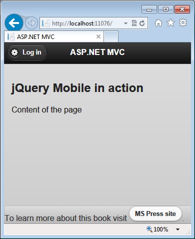
Two commonly used values for the data-role attribute are header and footer. The header bar contains the page title and a couple of optional buttons to the left and right (mimicking the iPhone template). The header role receives a special style by the framework and undergoes some default manipulation. As a developer, you can completely customize both the header template and text and target of the buttons. Here’s a sample header bar:
<div data-role="header">
   <h1>Home page</h1>
</div>
In particular, the first heading element (h1 through h6) is used to title the bar; if the content is not empty, that text also becomes the page title, overriding any value assigned to the <title> element. The heading element you use to title the header bar doesn’t matter as long as it is an Hx element—the style applied is the same. If you want to give the page its own title distinct from the header text, you use the data-title attribute on the page container. The first link found in the header bar is automatically styled as a button and moved to the left.
<div data-role="header">
   <h1>ASP.NET MVC</h1>
   <a href="..." data-icon="gear">Login</a>
</div>
The second link, instead, is placed to the right. If you want just one button to the right, you add an extra class attribute, as illustrated in the following:
<div data-role="header">
   <h1>ASP.NET MVC</h1>
   <a href="..." data-icon="back">Back</a>
   <a href="..." data-icon="gear" class="ui-btn-right">Login</a>
</div>
The data-icon attribute selects one of the predefined icons in the jQM themes; the ui-btn-right value moves the button to the right (in the example, it is not strictly needed because the button to the right is the second.) It is interesting to note that if you use ASP.NET MVC and HTML helpers, the preceding anchors must be rewritten as demonstrated here (the names of the methods and controllers might change):
@Html.ActionLink("Back", "index", "home", null, new {data_icon = "back"})
@Html.ActionLink("Save", "login", "account", null, new {data_icon="gear", @class="ui-btn-right"})
ASP.NET MVC will automatically expand the underscore (_) to the dash (-) symbol and the @ symbol escapes the word class, which would otherwise have another meaning to the Razor compiler.
Unlike the header, the footer is not designed to simplify a given markup template. However, any link you place in the footer area is automatically turned into a button and any markup, including form markup, is acceptable in the footer. In this way, you can place an application bar in the footer or even a drop-down list to let the user choose, for instance, the language. Note that jQM manages the actual position of the footer bar. By using the data-position attribute you can keep the position constant to the bottom of the page, as illustrated here:
<div data-role="footer" data-position="fixed" data-id="about">
   ...
</div>
When the user follows links between pages, jQM applies transitions to the entire page. Sometimes, you get a smoother effect by keeping the footer still. For this to happen, the footer must be fixed in both pages making the transition, and in addition, both footers must have the data-id attribute set to the same (unique) identifier. Figure 12-6 shows a sample page with header, footer, and a placeholder for the body.
To customize the header template entirely, you add a child <div> to the header block and populate it at will. Keep in mind that in this case you lose automatic manipulation; for example, links display as plain links. You need the data-role=button attribute to make the transformation.
<div data-role="header">
    <div>
       <img src="@Url.Content("~/content/images/mobile.png")" alt="">
       <h3>Custom templates</h3>
       @Html.ActionLink("Back", "index", "home", null,
                new {data_icon = "back", data_role="button", @class="ui-btn-right"})
     </div>
</div>
Lists, lists, and lists
The home page of most mobile sites should simply provide a list of actions like the classic main menu of applications of some thirty years ago. You can render the items of the menu in a number of ways; you can have them form a navigation bar, a button bar, a collection of tiles, or a plain list of nice-looking links. jQM supports nearly any scenario, but in particular, it is works great with navigation bars and list views.
The listview role provides the most common UI on mobile devices these days—very close to iPhone and Android picklists. The following plain HTML code, massaged by jQM, produces the output of Figure 12-7.
<ul data-role="listview" data-inset="true" data-theme="c" data-dividertheme="a">
    <li data-role="list-divider">Chapter 12</li>
    <li>@Html.ActionLink("Read content", "Content", "Home")</li>
    <li>@Html.ActionLink("Run samples", "Samples", "Home")</li>
    <li data-role="list-divider">General</li>
    <li>@Html.ActionLink("About the author", "About", "Home")</li>
    <li>@Html.ActionLink("About the publisher", "About", "Home")</li>
    <li>@Html.ActionLink("Related books", "About", "Home")</li>
</ul>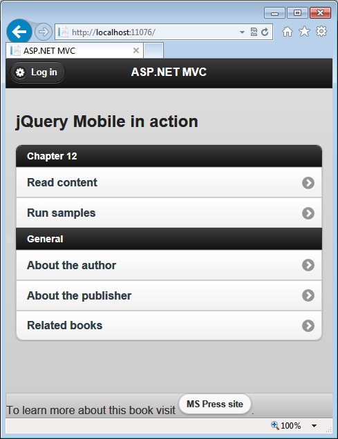
By using variations of the <ul> and <ol> elements you can create numbered lists as well as nested lists. Graphical variations include the data-inset attribute responsible for the rounded corners and nice scaffolding displayed in Figure 12-7 and data-filter to add a search bar with autocompletion of the list items statically added to the page. (This autocompletion doesn’t entail connecting to a remote service to download dynamic data.)
You can add icons and images to the list items. Here’s how to add a small icon to the left of the list item:
<li><a href="...">
     <img alt="" class="ui-li-icon" src="..." />
     <span>Run samples</span>
</a></li>
The class ui-li-icon ensures that the image is left-aligned; note that the image element must be a child of the anchor. Similarly, you can add text to the right of the list item. If you want the text to be automatically rendered within a bubble, as demonstrated in Figure 12-8, you mark the text with the ui-li-count class; otherwise, use the ui-li-aside class.
<li>
    @Html.ActionLink("Related books", "Related", "Home")
    <span class="ui-li-count">3</span>
</li>
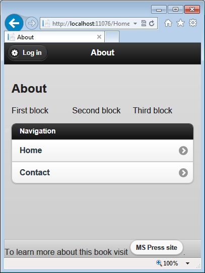
Fluid layout
Although having multiple columns in the layout is hardly a great idea in a mobile site, having an easy way to place a few elements side by side would be really nice. In jQM, you find a very basic but effective implementation of CSS grids and fluid layouts that automatically adapt to the screen.
The library makes available two main CSS classes: ui-grid and ui-block. The former marks a <div> (or a <fieldset>) as the container grid, whereas the latter marks a <div> as a child element. The main CSS classes, however, need a progressive letter to indicate number of cells and position, respectively. For example, the ui-grid-a class splits each row evenly into two blocks. The first is assigned to the content referenced by ui-block-a; the second goes to ui-block-b. Here’s an example:
<fieldset class="ui-grid-a">
   <div class="ui-block-a"> First block </div>
   <div class="ui-block-b"> Second block </div>
   <div class="ui-block-c"> Third block </div>
</fieldset>
In this case, we also have a third cell assigned to a grid that can’t host more than two (it splits 50/50 the row width). The net effect is that the third <div> styled as ui-block-c wraps to a second row. To keep the three child blocks on the same row, you change the grid style to ui-grid-b, which splits into three even parts (see Figure 12-9). Likewise, ui-grid-c splits into four parts, and ui-grid-d into five parts.
Collapsible panels
Collapsible panels are easy, too, as the following code snippet shows:
<div data-role="collapsible" data-theme="a" data-collapsed="true" data-content-theme="e">
     <h3>See navigation options</h3>
     <div>
        <ul>
          ...
        </ul>
     </div>
</div>
Assigned to a container element, the collapsible role uses the first <Hn> child element to title the panel and makes everything else collapsible. You can use data-collapsed to decide whether the content is initially hidden. You use data-content-theme to style the content of the panel and data-theme to style the header, as depicted in Figure 12-10.

By simply surrounding an array of collapsible panels with an outermost container, you can obtain an accordion widget.
<div data-role="collapsible-set">
    <div data-role="collapsible">
      ...
    </div>
    <div data-role="collapsible">
      ...
    </div>
     ...
</div>
By placing style attributes on the parent container, all panels are styled the same. Otherwise, you can style each panel individually.
Twitter Bootstrap at a glance
All websites today are expected to be responsive—at least responsive to changes in the width of the host screen. As a member of a development team, you can achieve this in two main ways: You can just order an HTML responsive template from a vendor (and be transparent to implementation details), or you can do in-house development of the template. In the latter case, which framework would you use? Bootstrap is probably the first framework that you should consider, but it’s not the only one. Other equally popular and effective responsive frameworks are Foundation (http://foundation.zurb.com), Skeleton (http://getskeleton.com), and Gumby (http://www.gumbyframework.com). You can find a quick guide to CSS responsive frameworks and custom development approaches at http://mashable.com/2013/04/26/css-boilerplates-frameworks.
Bootstrap is quickly becoming the de facto standard in modern web development, especially now that Visual Studio 2013 incorporates it in the default template for ASP.NET MVC applications. With Bootstrap, you can easily arrange the UI of webpages, make them responsive, and provide advanced navigation and graphical features. Bootstrap essentially consists of a CSS file and an optional JavaScript file. Applied to HTML page elements, Bootstrap’s CSS classes change the appearance of the current DOM and, more than everything else, your code will still look like plain HTML. As an added bonus, for most tasks you don’t even need additional JavaScript.
Setting up Bootstrap
Bootstrap is articulated in modules and was originally developed as a collection of LESS files. You have essentially a LESS file for each module the Bootstrap framework is made of: forms, buttons, navigation, dialogs, and so forth. A LESS file is an abstraction over plain CSS syntax that makes it possible for you to declare how a CSS file will ultimately be. You can consider LESS as a programming language that when compiled, produces CSS. For this reason, with LESS, you can use variables, functions, and operators—wildly streamlining the process of creating large and complex CSS stylesheets.
By making changes to the original LESS file, as a developer you can customize Bootstrap at will. If you don’t feel comfortable with the LESS syntax, you can still apply light forms of customization to Bootstrap by using a configuration engine. If you’re OK with the Bootstrap internals and only want to minimize the download, you can pick up the CSS file from the central GitHub repository, selecting just the modules in which you’re interested. You can download Bootstrap from http://getbootstrap.com.
Recently, Twitter released version 3.0 of Bootstrap, which introduces some new elements but also changed the behavior of existing styles. If you have a Bootstrap 2.x site, have a look at the migration guide on http://getbootstrap.com before you leap; in general you might expect some breaking changes.
To begin with Bootstrap, you just add the following to the <head> section of an empty HTML page:
<meta name="viewport" content="width=device-width, initial-scale=1.0">
<link href="bootstrap.min.css" rel="stylesheet" media="screen">
The viewport meta tag sets the width of the browser viewport to the actual device width and sets zoom level to normal. The <link> element just brings in the minified version of the Bootstrap style sheet. You are expected to download the Bootstrap CSS files from http://getbootstrap.com or link it from a known content delivery network (CDN).
<link rel="stylesheet"
      href="//netdna.bootstrapcdn.com/bootstrap/3.0.0/css/bootstrap.min.css">
You also need to link the jQuery library. This is enough for having a responsive template with no additional features such as drop-down menus or pop-up dialog boxes. If you intend to bring in some of the most advanced features that require client-side scripting, you should also add the Bootstrap.js file that you can find in the download. If you picked up a special Bootstrap theme, add the CSS file to the page, too. You can find free Bootstrap themes at http://wrapbootstrap.com/themes.
Keep in mind that Bootstrap is not supported in the old Internet Explorer compatibility mode. The best way to ensure that your pages are being viewed in the best possible rendering mode under Internet Explorer is to add the following <meta> tag in your pages:
<meta http-equiv="X-UA-Compatible" content="IE=edge">
CSS classes of Bootstrap make use of the latest CSS features (such as rounded corners) that might not be available on older browsers. A good example of an older browser that is partially supported by Bootstrap is Internet Explorer 8.
The grid system
Responsiveness in Bootstrap is achieved through a few breakpoints. The first breakpoint is placed at 480 pixels, which is considered the default. Other breakpoints are at 768 pixels (mostly tablets), at 992 pixels for desktops, and over 1,200 pixels for large screens. Any content in Bootstrap is usually laid out according to the following schema:
container > row > span
Each of the words above refers to a Bootstrap class name you typically apply to a <div> element. In particular, container manages the width of the page and padding. The row style ensures that the content is placed within the same row and multiple rows are stacked up vertically. Without a row element, any content within the container will flow horizontally and wrap to the next line when the end of the screen is reached. Finally, the span style identifies monolithic blocks of content within a row. In general, if you choose a combination different from container-row-span, results might be unpredictable. However, if you can manage to get exactly what you want, don’t be worried if it doesn’t fit the suggested relationship.
<div class="container">
   <div class="row">
      ...
   </div>
   <div class="row">
      ...
   </div>
</div>
The content of a row is subject to a fluid grid system that scales up to 12 columns as the device size grows. You use the col-md-N style for a row cell, where N is the number of cells in the grid to be used. In addition, you can use columns of different sizes using styles such as col-lg-N (large screens), col-sm-N (tablets), and col-xs-N (smartphones). Here’s an example:
<div class="container">
   <div class="row">
       <div class="col-md-3">
       </div>
       <div class="col-md-3">
       </div>
       <div class="col-md-3">
       </div>
   </div>
</div>
The preceding code snippet creates a block element with three <div> elements laid out horizontally to take up evenly the entire space. Content within each <div> is centered in the available space.
Navigation bars
You can easily turn a <div> element into a navigational bar by using the nav base class followed by more specific styles. Here’s how to create a top-level tab menu.
<ul class="nav nav-tabs">
  <li class="active"><a href="#">One</a></li>
  <li><a href="#">Two</a></li>
  <li><a href="#">Three</a></li>
</ul>
Accessory styles are nav-tabs, nav-pills, nav-stacked, and nav-justified. They end up producing graphical effects such as pills (equally spaced buttons), vertically stacked blocks, and horizontally centered blocks.
The navbar style generates a responsive navigation header for the website—something very similar to the classic toolbar. Quite interesting, Bootstrap navbars are initially displayed in a collapsed state in small views and stretch horizontally when there’s enough room and the viewport size increases. All of this behavior is automatic and built in to the Bootstrap CSS. If you’re not convinced yet, consider that this style gives you (for free) the typical behavior of a horizontal menu that collapses to a few vertical lines and expands back when the size of the host windows can accommodate that. Likewise, you can easily fix the position of the navbar at the top or bottom of the page by simply using the additional navbar-fixed-top or navbar-fixed-bottom styles.
Sometimes, the navigation bar is used to host the logical path of the page within the application’s tree. This is called a breadcrumb in Bootstrap. Here’s the code you need:
<ol class="breadcrumb">
  <li><a href="#">One</a></li>
  <li class="active"><a href="#">Two</a></li>
  <li>Three</li>
</ol>
The final output is a string of markup that automatically includes links and separators. You don’t have to spend a line of script or markup to complete the rendering.
Finally, as far as the top of the page is concerned, you can also use the page-header style. It is a basic wrapper for the <h1> markup element and recognizes the <small> element within the content. The nice effect is that the child small text is automatically styled differently to reflect a lower-level heading.
Embellishing the UI with icons and images
The zipped file that contains the Bootstrap files also includes a directory full of glyph icons licensed free from http://glyphicons.com. You can use these icons in any place where markup is expected; you don’t need an <img> element. Most typically, you wrap glyphs in a <span> tag set and combine that with some free text, as shown here:
<span class="glyphicon glyphicon-wrench"></span> Tools
The effect of the markup is to show the wrench glyphs followed by the text “Tools”. You can use that within a <div> element and easily style the container as a button. It is important to notice that you need to specify two classes: the base glyphicon class followed by the specific class that identifies just the icon you want.
In a responsive template, images are a bottleneck in the sense that they might be too large for some screen sizes and hit the bandwidth. In addition, when too large, images can be cut off the screen and provide a poor UI. In Bootstrap 3, you can easily make an <img> tag responsive by doing nothing more than adding the img-responsive class.
<img src="..." class="img-responsive">
The effect is that the following styles are added:
max-width: 100%;
height: auto;
In this way, the image scales nicely to the size of the parent element. Be aware that this trick is not helpful with the download. It only ensures that the images are rendered nicely and properly shrunk; however, the size of the downloaded image is always the same.
Drop-down menus
Drop-down menus are nothing new in computer UIs, but they only recently started becoming common in webpages. HTML—and not even the latest HTML5—has no syntax element that can be used to produce drop-down menus when buttons are clicked. You can accomplish this by using a mix of everything: CSS, ad hoc markup, and jQuery plugins. With Bootstrap 3, all of these nitty-gritty details are completely hidden from view. The code that follows shows the markup you need in a webpage to place a button and attach a drop-down menu to it.
<div class="dropdown">
  <button data-toggle="dropdown">Actions</button>
  <ul class="dropdown-menu" role="menu">
     <li role="presentation">
         <a role="menuitem" tabindex="-1" href="#">One</a></li>
     <li role="presentation">
         <a role="menuitem" tabindex="-1" href="#">Two</a></li>
     <li role="presentation">
         <a role="menuitem" tabindex="-1" href="#">Three</a></li>
     <li role="presentation" class="divider"></li>
     <li role="presentation">
         <a role="menuitem" tabindex="-1" href="#">Four/a></li>
  </ul>
</div>
As you can see, all of the markup is wrapped in a <div> element styled by the dropdown class. Defined in the Bootstrap CSS file, the class prepares the ground for actual UI and associated behavior. In a way, you could rewrite the entire preceding HTML markup by using some pseudo-markup, as illustrated in the following:
<dropdown>
     <trigger>Actions</trigger>
    <dropdown-menu>
        <menuitem href="#">One</menuitem>
        <menuitem href="#">Two</menuitem>
        <menuitem href="#">Three</menuitem>
        <menudivider />
        <menuitem href="#">Four</menuitem>
    </dropdown-menu>
</dropdown>
All a developer needs to do is to define the target URLs and the code behind them. It can be a hash tag to some internal HTML element or it can be a pointer to some JavaScript code or external URL. Figure 12-11 shows the effect of the drop-down markup.

There are many other aspects of the drop-down menu that you can customize. For example, you can add a sort of comment line between clickable menu items. All you need to do is define a regular <li> element and assign it the dropdown-header class.
<li role="presentation" class="dropdown-header">Special actions</li>
You can disable a menu item by styling the corresponding <li> element with the disabled class, as demonstrated here:
<li role="presentation" class="disabled">
     <a role="menuitem" tabindex="-1" href="#">Four/a>
</li>
To trigger the menu, you need a <button> or an <a> element configured with the data-toggle attribute set to the dropdown value. In Bootstrap, you use the data-toggle attribute for requesting click behavior on some elements. The value of the attribute is one of a few predefined keywords that basically instruct the framework to select a particular jQuery plugin which will actually do the dirty work. You use the keyword “dropdown” if you want a drop-down behavior accomplished through the dropdown jQuery plugin.
Button groups
More often than not, a webpage needs to display several buttons that are somewhat related. You can certainly treat buttons individually and style them as you prefer. However, a few years ago, the iOS UI introduced the concept of segmented buttons; now, segmented buttons are, if not a must, a feature that’s desirable to have on board. A segmented button is essentially a group of buttons acting individually but rendered as a single strip of buttons. The nicest effect is that the first and last button of the strip have rounded corners, whereas middle buttons are fully squared. In Bootstrap, you use the following HTML-based markup:
<div class="btn-group">
  <button type="button" class="btn btn-success">Agree</button>
  <button type="button" class="btn btn-default">Not sure</button>
  <button type="button" class="btn btn-danger">Disagree</button>
</div>
As you can see, there’s really little more than just a few distinct buttons, each with its own click handler added either explicitly through the onclick attribute or unobtrusively via jQuery. To have a button group, all you need to do is wrap the list of buttons with a <div> element styled as btn-group. Figure 12-12 shows the effect.
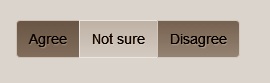
Each button is styled individually through the btn class; you can add additional attributes through the btn-xxx classes that affect the background color: success, danger, warning, info. You can control the size of buttons in the group with an additional class: btn-group-lg, btn-group-sm or btn-group-xs. By default, buttons are stacked horizontally. To stack them vertically, you just use the btn-group-vertical class. You can place multiple groups side by side by wrapping them in a button toolbar:
<div class="btn-toolbar">
  <div class="btn-group">...</div>
  <div class="btn-group">...</div>
  <div class="btn-group">...</div>
</div>
Finally, you can nest button groups. Nesting makes particular sense when one group is rendered as a drop-down list. Here’s an example:
<div class="btn-group">
  <button type="button" class="btn btn-default">One</button>
  <button type="button" class="btn btn-default">Two</button>
  <div class="btn-group">
    <button type="button" class="btn dropdown-toggle" data-toggle="dropdown">
      Numbers
      <span class="caret"></span>
    </button>
    <ul class="dropdown-menu">
      <li><a href="#">1</a></li>
      <li><a href="#">2</a></li>
      <li><a href="#">3</a></li>
    </ul>
  </div>
</div>
The first two items in the group are plains buttons, followed by a nested group. The button group is made of a button with an attached drop-down menu. Of interest, the button features a caret segment that visually implies the message that there are more options to see. The class caret assigned to a <span> element within a button renders a down arrow similar to that of classic Windows drop-down arrows.
Note
Bootstrap has many more features than discussed here. To find out more, visit http://getbootstrap.com.
Adding mobile capabilities to an existing site
The most important task when planning a mobile site is selecting use-cases. It doesn’t mean, however, that use-case selection is unimportant when developing full sites or other types of applications. It’s just that a mobile application and site are structurally built around a few (and well-chosen) use-cases. Sometimes, even if you simply pick up a use-case from the existing desktop site, the way in which you implement it for a mobile audience might require significant changes—possibly a different UI and perhaps even a different workflow. RWD is not always as powerful as you need it to be when it comes to serving completely different views to mobile users.
So, more often than many seem to think, it turns out that you need to have one set of pages for full browsers and then multiple sets of pages for each class of mobile devices that you support. Really, the desktop becomes the special case. How would you manage to make these multiple sets of pages look like a single site? In Chapter 13, I discuss the native tools that ASP.NET MVC makes available to route users to specific views depending on the requesting device.
Sometimes, though, it is simpler to build a separate website designed from the ground up for a mobile audience and then link the two sites together by using HTTP modules and cookies.
Routing users to the correct site
Because you now have two distinct sites, you now need an automatic mechanism to switch users to the appropriate site based on the capabilities of the requesting device. If the host name belongs to the desktop site and the requesting browser is detected to be a desktop browser, everything works as expected. Otherwise, the user should be presented with a landing page on which she will be informed that she’s trying to access a desktop site with a mobile device. The user is given a chance to save her preference for future similar situations. The preference is stored to a cookie and checked next.
The routing algorithm
If the request refers to a URL in the mobile site and the user seems to have a desktop browser, consider showing another landing page rather than simply letting the request go as usual. Finally, if a request is placed from a mobile device to the mobile site, it will be served as expected; namely, by looking into the device capabilities and determining the most appropriate view. Figure 12-13 presents a diagram of the algorithm.

Note
It’s always a mistake to assume a one-to-one correspondence between desktop and mobile pages. This might happen, but it should not be considered a common occurrence. By saying “page correspondence,” I simply mean that both applications can serve the same URL; I’m not implying anything about what each page will actually serve.
How would you implement the algorithm depicted in Figure 12-13?
Implementing the routing algorithm
In ASP.NET, the natural tool to implement this routing algorithm is by using an HTTP module that is active on both sites and capturing the BeginRequest event. The module will use plain redirection or, if possible, URL rewriting to change the target page, as appropriate.
Here’s some code that implements the aforementioned algorithm in the desktop site:
public class MobileRouter : IHttpModule
{
    private const String FullSiteModeCookie = "FullSiteMode";
    public void Dispose()
    {
    }
    public void Init(HttpApplication context)
    {
        context.BeginRequest += OnBeginRequest;
    }

    private static void OnBeginRequest(Object sender, EventArgs e)
    {
        var app = sender as HttpApplication;
        if (app == null)
            throw new ArgumentNullException("sender");

        var isMobileDevice = IsRequestingBrowserMobile(app);

        // Mobile on desktop site, but FULL-SITE flag on the query string
        if (isMobileDevice && HasFullSiteFlag(app))
        {
            app.Response.AppendCookie(new HttpCookie(FullSiteModeCookie));
            return;
        }

        // Mobile on desktop site, but FULL-SITE cookie
        if (isMobileDevice && HasFullSiteCookie(app))
            return;

        // Mobile on desktop site => landing page
        if (isMobileDevice)
            ToMobileLandingPage(app);
    }

    #region Helpers
    private static Boolean IsRequestingBrowserMobile(HttpApplication app)
    {
        return app.Context.Request.IsMobileDevice();
    }

    private static Boolean HasFullSiteFlag(HttpApplication app)
    {
        var fullSiteFlag = app.Context.Request.QueryString["m"];
        if (!String.IsNullOrEmpty(fullSiteFlag))
            return String.Equals(fullSiteFlag, "f", StringComparison.
                                 InvariantCultureIgnoreCase);
        return false;
    }

    private static Boolean HasFullSiteCookie(HttpApplication app)
    {
        var cookie = app.Context.Request.Cookies[FullSiteModeCookie];
        return cookie != null;
    }

    private static void ToMobileLandingPage(HttpApplication app)
    {
        var landingPage = ConfigurationManager.AppSettings["MobileLandingPage"];
        if (!String.IsNullOrEmpty(landingPage))
            app.Context.Response.Redirect(landingPage);
    }
    #endregion
}
After it is installed on the desktop site, the HTTP module captures every request and checks the requesting browser. If the browser runs within a mobile device, the module redirects to the specified landing page. The landing page will be a mobile-optimized page that basically offers a couple of links to the home of the desktop site and to the home of the mobile site. Figure 12-14 shows a sample landing page as viewed on an old Android 2.2 device.

Tracking the chosen route
If the user insists on viewing the full site, you can’t simply redirect to the plain home page. By its nature, the HTTP module will intercept the new request and redirect again to the mobile landing page. From the landing page, you can simply add a specific query string parameter that the HTTP module will detect on the successive request. Here’s the actual link that results in Figure 12-14:
<a href="http://.../?m=f">Full site</a>
You are responsible for defining the query string syntax; in this case, m stands for mode and f for full. The task is not finished yet, though. At this point, users navigate to the home page of the site. What about any other requests? Those requests, in fact, will be intercepted by the HTTP module. By adding a cookie, you can provide additional information to the HTTP module about requests deliberately sent to the desktop site from a mobile device.
How can the user switch back to the mobile site? Ideally, any desktop site with a sister mobile site should offer a clearly visible link to switch to the mobile version (and vice versa when the full site is viewed on a mobile device). If not, the user won’t be offered a chance to choose the full or mobile site until the cookie expires or is cleared. To clear cookies, users deal with the Settings page of the mobile browser.
Tweaking the configuration files
Where do you place the landing page? Is it on the desktop or on the mobile site? In general, it doesn’t matter; however, if you put it on the mobile site, you really can enable a scenario in which you deploy a mobile site with all the required routing logic without touching the codebase of the existing desktop site.
However, the desktop site needs some changes in its configuration. In particular, you edit the web.config file of the desktop site and deploy a library with the HTTP module in the Bin folder. No changes should be made to the source code. Here’s the configuration script to add a router HTTP module to the desktop site:
<system.webServer>
     <modules>
         <add name="MobileRouter" type="..." />
     </modules>
     ...
</system.webServer>
Keep in mind that the welcome page should always be visible, and it never should need authentication. Depending on how you deploy the mobile site—a distinct root site/application or a child application/directory—you might need to tweak the web.config file of the mobile site to turn off the HTTP module. If the mobile site is a distinct application, it needs its own web.config file that has been fully configured with the HTTP module. However, if the mobile site is hosted as a child directory in the desktop site, it inherits the configuration settings of the parent site (the desktop site), including the HTTP module. To speed up requests, you might want to disable the HTTP module in the mobile site.
Following is the configuration script that you need in the mobile site’s web.config file. The script clears the list of HTTP modules required by the mobile site.
<system.webServer>
     <modules>
         <clear />
     </modules>
     ...
</system.webServer>
In addition, you need to instruct the parent application/site explicitly to stop the default inheritance chain of settings. Here’s what you need:
<location path="." inheritInChildApplications="false">
<system.webServer>
     <modules>
         <add name="MobileRouter" type="..." />
     </modules>
     ...
</system.webServer>
</location>
Also, notice that when the mobile site is a child application/directory, it inherits a bunch of settings (for the section where inheritance is not turned off) that don’t need to be repeated (for example, connection strings and membership providers).
From mobile to devices
Until a couple of years ago, websites were for desktop browsers or mobile browsers. The term “mobile,” however, is progressively losing focus. Does mobile refers to smartphones or tablets, or both? And, what about minipads or large smartphones? How about regular cell phones? Smart TVs? The point is that you really need to start thinking in terms of multiple devices and decide whether your RWD gives you all that you need or you need to look elsewhere for more powerful device detection. In light of this, adding a single “mobile” site to an existing desktop site tastes like a temporary or just patched solution.
Reasonably, you should split the term “mobile” at least into two categories: smartphones and tablets. Having other categories such as large screens (for instance, smart TVs) and legacy, old-fashioned phones is also recommended but not strictly needed in just any application.
If you opted for a mobile site bolted on an existing desktop site, does this mean that you need to have two or three additional sites? When support for multiple classes of devices cannot be further delayed, you should look into multidevice design. Conceptually, it shares some aspects with RWD; in particular, it pushes the idea of a single back end and a single URL to invoke. Yet, at a deeper look, multidevice design is different from RWD because it pushes the use of different views for different classes of devices. A view is not simply a different CSS file, but it encompasses different markup and script, as well.
Multidevice doesn’t mean you are going to create a different UI for each device; and it doesn’t mean that you must be responsible for the identification of a given device. Classes of devices (smartphones, tablets, large screens) are nearly the same as the breakpoints in RWD. Feature detection needs to happen, but on the server side with some help from ad hoc tools such as device description repositories (DDR). Chapter 13 covers this in greater detail.
Summary
The challenge I see these days is how we can find a programming paradigm that weds mobile needs with desktop needs. Many efforts are focused on making mobile look and behave like the desktop. I’m not sure this is the right way of approaching mobile development.
Let’s even assume that in, say, five years, we end up with even more powerful devices than today; this won’t change the basic characteristics of a mobile device, though, which will likely remain smaller and less powerful than a laptop. In addition, businesswise, there’s the problem of the long-tail to address. How many devices do you lose along the way (possibly leaving them to your competitors) by addressing only the high-end devices?
Although several solutions are possible to make a website device-friendly, the main route passes through an architecture that serves different views for different classes of devices. Sometimes, different views can be simply obtained by changing a CSS file; sometimes this is not sufficient, and different markup and script is required. In the former case, RWD and client-side feature detection is a great option. Otherwise, you need to implement server-side feature detection, but possibly by using smart tools and not handmade code.
In this chapter, we covered the basics of what you need to make your webpages responsive to different browser window sizes. We covered HTML5, the foundation of responsive web design, and Twitter Bootstrap as one of the most common ways to create a responsive experience on websites. Furthermore, we looked into jQuery Mobile as a sample JavaScript framework for mobile views.