
Unsupervised learning is one of the most important branches of machine learning. It enables us to make predictions when we don't have target labels. In unsupervised learning, the model learns only via features because the dataset doesn't have a target label column. Most machine learning problems start with something that helps automate the process. For example, when you want to develop a prediction model for detecting diabetes patients, you need a set of target labels for each patient in your dataset. In the initial stages, arranging target labels for any machine learning problem is not an easy task, because it requires changing the business process to get the labels, whether by manual in-house labeling or collecting the data again with labels.
In this chapter, our focus is on learning about unsupervised learning techniques that can handle situations where target labels are not available. We will especially cover dimensionality reduction techniques and clustering techniques. Dimensionality reduction will be used where we have a large number of features and we want to reduce that amount. This will reduce the model complexity and training cost because it means we can achieve the results we want with just a few features.
Clustering techniques find groups in data based on similarity. These groups essentially represent unsupervised classification. In clustering, classes or labels for feature observations are found in an unsupervised manner. Clustering is useful for various business operations, such as cognitive search, recommendations, segmentation, and document clustering.
Here are the topics of this chapter:
- Unsupervised learning
- Reducing the dimensions of data
- Principal component analysis
- Clustering
- Partitioning data using k-means clustering
- Hierarchical clustering
- DBSCAN clustering
- Spectral clustering
- Evaluating clustering performance
Technical requirements
This chapter has the following technical requirements:
- You can find the code and the datasets at the following GitHub link: https://github.com/PacktPublishing/Python-Data-Analysis-Third-Edition/tree/master/Chapter11.
- All the code blocks are available in the ch11.ipynb file.
- This chapter uses only one CSV file (diabetes.csv) for practice purposes.
- In this chapter, we will use the pandas and scikit-learn Python libraries.
Unsupervised learning
Unsupervised learning means learning by observation, not by example. This type of learning works with unlabeled data. Dimensionality reduction and clustering are examples of such learning. Dimensionality reduction is used to reduce a large number of attributes to just a few that can produce the same results. There are several methods that are available for reducing the dimensionality of data, such as principal component analysis (PCA), t-SNE, wavelet transformation, and attribute subset selection.
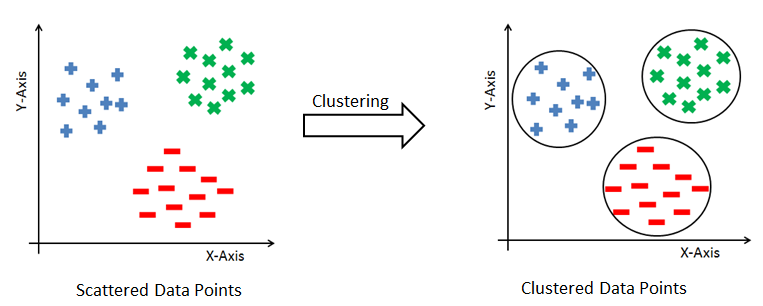
The term cluster means a group of similar items that are closely related to each other. Clustering is an approach for generating units or groups of items that are similar to each other. This similarity is computed based on certain features or characteristics of items. We can say that a cluster is a set of data points that are similar to others in its cluster and dissimilar to data points of other clusters. Clustering has numerous applications, such as in searching documents, business intelligence, information security, and recommender systems:

In the preceding diagram, we can see how clustering puts data records or observations into a few groups, and dimensionality reduction reduces the number of features or attributes. Let's look at each of these topics in detail in the upcoming sections.
Reducing the dimensionality of data
Reducing dimensionality, or dimensionality reduction, entails scaling down a large number of attributes or columns (features) into a smaller number of attributes. The main objective of this technique is to get the best number of features for classification, regression, and other unsupervised approaches. In machine learning, we face a problem called the curse of dimensionality. This is where there is a large number of attributes or features. This means more data, causing complex models and overfitting problems.
Dimensionality reduction helps us to deal with the curse of dimensionality. It can transform data linearly and nonlinearly. Techniques for linear transformations include PCA, linear discriminant analysis, and factor analysis. Non-linear transformations include techniques such as t-SNE, Hessian eigenmaps, spectral embedding, and isometric feature mapping. Dimensionality reduction offers the following benefits:
- It filters redundant and less important features.
- It reduces model complexity with less dimensional data.
- It reduces memory and computation costs for model generation.
- It visualizes high-dimensional data.
In the next section, we will focus on one of the important and popular dimension reduction techniques, PCA.
PCA
In machine learning, it is considered that having a large amount of data means having a good-quality model for prediction, but a large dataset also poses the challenge of higher dimensionality (or the curse of dimensionality). It causes an increase in complexity for prediction models due to the large number of attributes. PCA is the most commonly used dimensionality reduction method and helps us to identify patterns and correlations in the original dataset to transform it into a lower-dimension dataset with no loss of information.
The main concept of PCA is the discovery of unseen relationships and correlations among attributes in the original dataset. Highly correlated attributes are so similar as to be redundant. Therefore, PCA removes such redundant attributes. For example, if we have 200 attributes or columns in our data, it becomes very difficult for us to proceed, what with such a huge number of attributes. In such cases, we need to reduce that number to 10 or 20 variables. Another objective of PCA is to reduce the dimensionality without affecting the significant information. For p-dimensional data, the PCA equation can be written as follows:

Principal components are a weighted sum of all the attributes. Here, ![]() are the attributes in the original dataset and
are the attributes in the original dataset and ![]() are the weights of the attributes.
are the weights of the attributes.
Let's take an example. Let's consider the streets in a given city as attributes, and let's say you want to visit this city. Now the question is, how many streets you will visit? Obviously, you will want to visit the popular or main streets of the city, which let's say is 10 out of the 50 available streets. These 10 streets will give you the best understanding of that city. These streets are then principal components, as they explain enough of the variance in the data (the city's streets).
Performing PCA
Let's perform PCA from scratch in Python:
- Compute the correlation or covariance matrix of a given dataset.
- Find the eigenvalues and eigenvectors of the correlation or covariance matrix.
- Multiply the eigenvector matrix by the original dataset and you will get the principal component matrix.
Let's implement PCA from scratch:
- We will begin by importing libraries and defining the dataset:
# Import numpy
import numpy as np
# Import linear algebra module
from scipy import linalg as la
# Create dataset
data=np.array([[7., 4., 3.],
[4., 1., 8.],
[6., 3., 5.],
[8., 6., 1.],
[8., 5., 7.],
[7., 2., 9.],
[5., 3., 3.],
[9., 5., 8.],
[7., 4., 5.],
[8., 2., 2.]])
- Calculate the covariance matrix:
# Calculate the covariance matrix
# Center your data
data -= data.mean(axis=0)
cov = np.cov(data, rowvar=False)
- Calculate the eigenvalues and eigenvector of the covariance matrix:
# Calculate eigenvalues and eigenvector of the covariance matrix
evals, evecs = la.eig(cov)
- Multiply the original data matrix by the eigenvector matrix:
# Multiply the original data matrix with Eigenvector matrix.

# Sort the Eigen values and vector and select components
num_components=2
sorted_key = np.argsort(evals)[::-1][:num_components]
evals, evecs = evals[sorted_key], evecs[:, sorted_key]

print("Eigenvalues:", evals)
print("Eigenvector:", evecs)
print("Sorted and Selected Eigen Values:", evals)
print("Sorted and Selected Eigen Vector:", evecs)

# Multiply original data and Eigen vector
principal_components=np.dot(data,evecs)
print("Principal Components:", principal_components)
This results in the following output:
Eigenvalues: [0.74992815+0.j 3.67612927+0.j 8.27394258+0.j]
Eigenvector: [[-0.70172743 0.69903712 -0.1375708 ]
[ 0.70745703 0.66088917 -0.25045969]
[ 0.08416157 0.27307986 0.95830278]]

Sorted and Selected Eigen Values: [8.27394258+0.j 3.67612927+0.j]

Sorted and Selected Eigen Vector: [[-0.1375708 0.69903712]
[-0.25045969 0.66088917]
[ 0.95830278 0.27307986]]

Principal Components: [[-2.15142276 -0.17311941]
[ 3.80418259 -2.88749898]
[ 0.15321328 -0.98688598]
[-4.7065185 1.30153634]
[ 1.29375788 2.27912632]
[ 4.0993133 0.1435814 ]
[-1.62582148 -2.23208282]
[ 2.11448986 3.2512433 ]
[-0.2348172 0.37304031]
[-2.74637697 -1.06894049]]
Here, we have computed a principal component matrix from scratch. First, we centered the data and computed the covariance matrix. After calculating the covariance matrix, we calculated the eigenvalues and eigenvectors. Finally, we chose two principal components (the number of components should be equal to the number of eigenvalues greater than 1) and multiplied the original data by the sorted and selected eigenvectors. We can also perform PCA using the scikit-learn library.
Let's perform PCA using scikit-learn in Python:
# Import pandas and PCA
import pandas as pd

# Import principal component analysis
from sklearn.decomposition import PCA

# Create dataset
data=np.array([[7., 4., 3.],
[4., 1., 8.],
[6., 3., 5.],
[8., 6., 1.],
[8., 5., 7.],
[7., 2., 9.],
[5., 3., 3.],
[9., 5., 8.],
[7., 4., 5.],
[8., 2., 2.]])

# Create and fit_transformed PCA Model
pca_model = PCA(n_components=2)
components = pca_model.fit_transform(data)
components_df = pd.DataFrame(data = components,

columns = ['principal_component_1', 'principal_component_2'])
print(components_df)
This results in the following output:
principal_component_1 principal_component_2

0 2.151423 -0.173119
1 -3.804183 -2.887499
2 -0.153213 -0.986886
3 4.706518 1.301536
4 -1.293758 2.279126
5 -4.099313 0.143581
6 1.625821 -2.232083
7 -2.114490 3.251243
8 0.234817 0.373040
9 2.746377 -1.068940
In the preceding code, we performed PCA using the scikit-learn library. First, we created the dataset and instantiated the PCA object. After this, we performed fit_transform() and generated the principal components.
That was all about PCA. Now it's time to learn about another unsupervised learning concept, clustering.
Clustering
Clustering means grouping items that are similar to each other. Grouping similar products, grouping similar articles or documents, and grouping similar customers for market segmentation are all examples of clustering. The core principle of clustering is minimizing the intra-cluster distance and maximizing the intercluster distance. The intra-cluster distance is the distance between data items within a group, and the inter-cluster distance is the distance between different groups. The data points are not labeled, so clustering is a kind of unsupervised problem. There are various methods for clustering and each method uses a different way to group the data points. The following diagram shows how data observations are grouped together using clustering:
As we are combining similar data points, the question that arises here is how to find the similarity between two data points so we can group similar data objects into the same cluster. In order to measure the similarity or dissimilarity between data points, we can use distance measures such as Euclidean, Manhattan, and Minkowski distance:
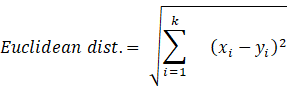
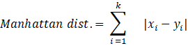
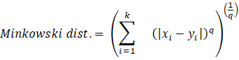
Here, the distance formula calculates the distance between two k-dimensional vectors, xi and yi.
Now we know what clustering is, but the most important question is, how many numbers of clusters should be considered when grouping the data? That's the biggest challenge for most clustering algorithms. There are lots of ways to decide the number of clusters. Let's discuss those methods in the next section.
Finding the number of clusters
In this section, we will focus on the most fundamental issue of clustering algorithms, which is discovering the number of clusters in a dataset – there is no definitive answer. However, not all clustering algorithms require a predefined number of clusters. In hierarchical and DBSCAN clustering, there is no need to define the number of clusters, but in k-means, k-medoids, and spectral clustering, we need to define the number of clusters. Selecting the right value for the number of clusters is tricky, so let's look at a couple of the methods for determining the best number of clusters:
- The elbow method
- The silhouette method
Let's look at these methods in detail.
The elbow method
The elbow method is a well-known method for finding out the best number of clusters. In this method, we focus on the percentage of variance for the different numbers of clusters. The core concept of this method is to select the number of clusters that appending another cluster should not cause a huge change in the variance. We can plot a graph for the sum of squares within a cluster using the number of clusters to find the optimal value. The sum of squares is also known as the Within-Cluster Sum of Squares (WCSS) or inertia:

Here![]() is the cluster centroid and
is the cluster centroid and ![]() is the data points in each cluster:
is the data points in each cluster:

As you can see, at k = 3, the graph begins to flatten significantly, so we would choose 3 as the number of clusters.
Let's find the optimal number of clusters using the elbow method in Python:
# import pandas
import pandas as pd

# import matplotlib
import matplotlib.pyplot as plt

# import K-means
from sklearn.cluster import KMeans

# Create a DataFrame
data=pd.DataFrame({"X":[12,15,18,10,8,9,12,20],
"Y":[6,16,17,8,7,6,9,18]})
wcss_list = []

# Run a loop for different value of number of cluster
for i in range(1, 6):
    # Create and fit the KMeans model
    kmeans_model = KMeans(n_clusters = i, random_state = 123)
    kmeans_model.fit(data)

    # Add the WCSS or inertia of the clusters to the score_list
    wcss_list.append(kmeans_model.inertia_)

# Plot the inertia(WCSS) and number of clusters
plt.plot(range(1, 6), wcss_list, marker='*')

# set title of the plot
plt.title('Selecting Optimum Number of Clusters using Elbow Method')

# Set x-axis label
plt.xlabel('Number of Clusters K')

# Set y-axis label
plt.ylabel('Within-Cluster Sum of the Squares(Inertia)')

# Display plot
plt.show()
This results in the following output:

In the preceding example, we created a DataFrame with two columns, X and Y. We generated the clusters using K-means and computed the WCSS. After this, we plotted the number of clusters and inertia. As you can see at k = 2, the graph begins to flatten significantly, so we would choose 2 as the best number of clusters.
The silhouette method
The silhouette method assesses and validates cluster data. It finds how well each data point is classified. The plot of the silhouette score helps us to visualize and interpret how well data points are tightly grouped within their own clusters and separated from others. It helps us to evaluate the number of clusters. Its score ranges from -1 to +1. A positive value indicates a well-separated cluster and a negative value indicates incorrectly assigned data points. The more positive the value, the further data points are from the nearest clusters; a value of zero indicates data points that are at the separation line between two clusters. Let's see the formula for the silhouette score:

ai is the average distance of the ith data point from other points within the cluster.
bi is the average distance of the ith data point from other cluster points.
This means we can easily say that S(i) would be between [-1, 1]. So, for S(i) to be near to 1, ai must be very small compared to bi, that is,e. ai << bi.
Let's find the optimum number of clusters using the silhouette score in Python:
# import pandas
import pandas as pd

# import matplotlib for data visualization
import matplotlib.pyplot as plt

# import k-means for performing clustering
from sklearn.cluster import KMeans

# import silhouette score
from sklearn.metrics import silhouette_score

# Create a DataFrame
data=pd.DataFrame({"X":[12,15,18,10,8,9,12,20],
"Y":[6,16,17,8,7,6,9,18]})
score_list = []

# Run a loop for different value of number of cluster
for i in range(2, 6):
    # Create and fit the KMeans model
    kmeans_model = KMeans(n_clusters = i, random_state = 123)
    kmeans_model.fit(data)

    # Make predictions
    pred=kmeans_model.predict(data)
    # Calculate the Silhouette Score
    score = silhouette_score (data, pred, metric='euclidean')

    # Add the Silhouette score of the clusters to the score_list
    score_list.append(score)

# Plot the Silhouette score and number of cluster
plt.bar(range(2, 6), score_list)

# Set title of the plot
plt.title('Silhouette Score Plot')

# Set x-axis label
plt.xlabel('Number of Clusters K')

# Set y-axis label
plt.ylabel('Silhouette Scores')

# Display plot
plt.show()
This results in the following output:

In the preceding example, we created a DataFrame with two columns, X and Y. We generated clusters with different numbers of clusters on the created DataFrame using K-means and computed the silhouette score. After this, we plotted the number of clusters and the silhouette scores using a barplot. As you can see, at k = 2, the silhouette score has the highest value, so we would choose 2 clusters. Let's jump to the k-means clustering technique.
Partitioning data using k-means clustering
k-means is one of the simplest, most popular, and most well-known clustering algorithms. It is a kind of partitioning clustering method. It partitions input data by defining a random initial cluster center based on a given number of clusters. In the next iteration, it associates the data items to the nearest cluster center using Euclidean distance. In this algorithm, the initial cluster center can be chosen manually or randomly. k-means takes data and the number of clusters as input and performs the following steps:
- Select k random data items as the initial centers of clusters.
- Allocate the data items to the nearest cluster center.
- Select the new cluster center by averaging the values of other cluster items.
- Repeat steps 2 and 3 until there is no change in the clusters.
This algorithm aims to minimize the sum of squared errors:

k-means is one of the fastest and most robust algorithms of its kind. It works best with a dataset with distinct and separate data items. It generates spherical clusters. k-means requires the number of clusters as input at the beginning. If data items are very much overlapped, it doesn't work well. It captures the local optima of the squared error function. It doesn't perform well with noisy and non-linear data. It also doesn't work well with non-spherical clusters. Let's create a clustering model using k-means clustering:
# import pandas
import pandas as pd

# import matplotlib for data visualization
import matplotlib.pyplot as plt

# Import K-means
from sklearn.cluster import KMeans

# Create a DataFrame
data=pd.DataFrame({"X":[12,15,18,10,8,9,12,20],
"Y":[6,16,17,8,7,6,9,18]})

# Define number of clusters
num_clusters = 2

# Create and fit the KMeans model
km = KMeans(n_clusters=num_clusters)
km.fit(data)

# Predict the target variable
pred=km.predict(data)

# Plot the Clusters
plt.scatter(data.X,data.Y,c=pred, marker="o", cmap="bwr_r")

# Set title of the plot
plt.title('K-Means Clustering')

# Set x-axis label
plt.xlabel('X-Axis Values')

# Set y-axis label
plt.ylabel('Y-Axis Values')

# Display the plot
plt.show()
This results in the following output:

In the preceding code example, we imported the KMeans class and created its object or model. This model will fit it on the dataset (without labels). After training, the model is ready to make predictions using the predict() method. After predicting the results, we plotted the cluster results using a scatter plot. In this section, we have seen how k-means works and its implementation using the scikit-learn library. In the next section, we will look at hierarchical clustering.
Hierarchical clustering
Hierarchical clustering groups data items based on different levels of a hierarchy. It combines the items in groups based on different levels of a hierarchy using top-down or bottom-up strategies. Based on the strategy used, hierarchical clustering can be of two types – agglomerative or divisive:
- The agglomerative type is the most widely used hierarchical clustering technique. It groups similar data items in the form of a hierarchy based on similarity. This method is also called Agglomerative Nesting (AGNES). This algorithm starts by considering every data item as an individual cluster and combines clusters based on similarity. It iteratively collects small clusters and combines them into a single large cluster. This algorithm gives its result in the form of a tree structure. It works in a bottom-up manner; that is, every item is initially considered as a single element cluster and in each iteration of the algorithm, the two most similar clusters are combined and form a bigger cluster.
- Divisive hierarchical clustering is a top-down strategy algorithm. It is also known as Divisive Analysis (DIANA). It starts with all the data items as a single big cluster and partitions recursively. In each iteration, clusters are divided into two non-similar or heterogeneous sub-clusters:
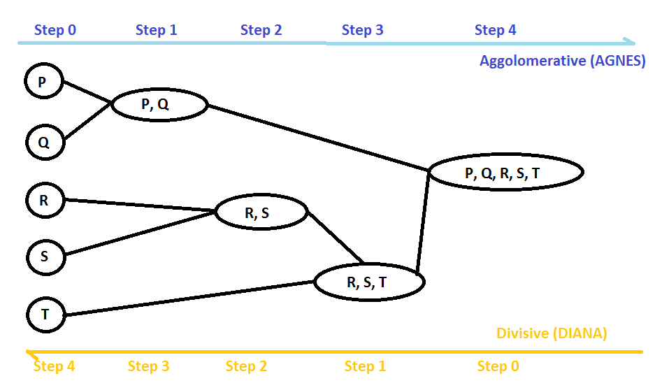
In order to decide which clusters should be grouped or split, we use various distances and linkage criteria such as single, complete, average, and centroid linkage. These criteria decide the shape of the cluster. Both types of hierarchical clustering (agglomerative and divisive hierarchical clustering) require a predefined number of clusters or a distance threshold as input to terminate the recursive process. It is difficult to decide the distance threshold, so the easiest option is to check the number of clusters using a dendrogram. Dendrograms help us to understand the process of hierarchical clustering. Let's see how to create a dendrogram using the scipy library:
# import pandas
import pandas as pd

# import matplotlib for data visualization
import matplotlib.pyplot as plt

# Import dendrogram
from scipy.cluster.hierarchy import dendrogram
from scipy.cluster.hierarchy import linkage

# Create a DataFrame
data=pd.DataFrame({"X":[12,15,18,10,8,9,12,20],
"Y":[6,16,17,8,7,6,9,18]})

# create dendrogram using ward linkage
dendrogram_plot = dendrogram(linkage(data, method = 'ward'))

# Set title of the plot
plt.title('Hierarchical Clustering: Dendrogram')

# Set x-axis label
plt.xlabel('Data Items')

# Set y-axis label
plt.ylabel('Distance')

# Display the plot
plt.show()
This results in the following output:

In the preceding code example, we created the dataset and generated the dendrogram using ward linkage. For the dendrograms, we used the scipy.cluster.hierarchy module. To set the plot title and axis labels, we used matplotlib. In order to select the number of clusters, we need to draw a horizontal line without intersecting the clusters and count the number of vertical lines to find the number of clusters. Let's create a clustering model using agglomerative clustering:
# import pandas
import pandas as pd

# import matplotlib for data visualization
import matplotlib.pyplot as plt

# Import Agglomerative Clustering
from sklearn.cluster import AgglomerativeClustering

# Create a DataFrame
data=pd.DataFrame({"X":[12,15,18,10,8,9,12,20],
"Y":[6,16,17,8,7,6,9,18]})

# Specify number of clusters
num_clusters = 2

# Create agglomerative clustering model
ac = AgglomerativeClustering(n_clusters = num_clusters, linkage='ward')

# Fit the Agglomerative Clustering model
ac.fit(data)

# Predict the target variable
pred=ac.labels_

# Plot the Clusters
plt.scatter(data.X,data.Y,c=pred, marker="o")

# Set title of the plot
plt.title('Agglomerative Clustering')

# Set x-axis label
plt.xlabel('X-Axis Values')

# Set y-axis label
plt.ylabel('Y-Axis Values')

# Display the plot
plt.show()
This results in the following output:

In the preceding code example, we imported the AgglomerativeClustering class and created its object or model. This model will fit on the dataset without labels. After training, the model is ready to make predictions using the predict() method. After predicting the results, we plotted the cluster results using a scatter plot. In this section, we have seen how hierarchical clustering works and its implementation using the scipy and scikit-learn libraries. In the next section, we will look at density-based clustering.
DBSCAN clustering
Partitioning clustering methods, such as k-means, and hierarchical clustering methods, such as agglomerative clustering, are good for discovering spherical or convex clusters. These algorithms are more sensitive to noise or outliers and work for well-separated clusters:

Intuitively, we can say that a density-based clustering approach is most similar t how we as humans might instinctively group items. In all the preceding figures, we can quickly see the number of different groups or clusters due to the density of the items.
Density-Based Spatial Clustering of Applications with Noise (DBSCAN) is based on the idea of groups and noise. The main idea behind it is that each data item of a group or cluster has a minimum number of data items in a given radius.
The main goal of DBSCAN is to discover the dense region that can be computed using minimum number of objects (minPoints) and given radius (eps). DBSCAN has the capability to generate random shapes of clusters and deal with noise in a dataset. Also, there is no requirement to feed in the number of clusters. DBSCAN automatically identifies the number of clusters in the data.
Let's create a clustering model using DBSCAN clustering in Python:
# import pandas
import pandas as pd

# import matplotlib for data visualization
import matplotlib.pyplot as plt

# Import DBSCAN clustering model
from sklearn.cluster import DBSCAN

# import make_moons dataset
from sklearn.datasets import make_moons

# Generate some random moon data
features, label = make_moons(n_samples = 2000)

# Create DBSCAN clustering model
db = DBSCAN()

# Fit the Spectral Clustering model
db.fit(features)

# Predict the target variable
pred_label=db.labels_

# Plot the Clusters
plt.scatter(features[:, 0], features[:, 1], c=pred_label,
marker="o",cmap="bwr_r")

# Set title of the plot
plt.title('DBSCAN Clustering')

# Set x-axis label
plt.xlabel('X-Axis Values')

# Set y-axis label
plt.ylabel('Y-Axis Values')

# Display the plot
plt.show()
This results in the following output:
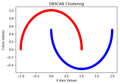
First, we import the DBSCAN class and create the moon dataset. After this, we create the DBSCAN model and fit it on the dataset. DBSCAN does not need the number of clusters. After training, the model is ready to make predictions using the predict() method. After predicting the results, we plotted the cluster results using a scatter plot. In this section, we have seen how DBSCAN clustering works and its implementation using the scikit-learn library. In the next section, we will see the spectral clustering technique.
Spectral clustering
Spectral clustering is a method that employs the spectrum of a similarity matrix. The spectrum of a matrix represents the set of its eigenvalues, and a similarity matrix consists of similarity scores between each data point. It reduces the dimensionality of data before clustering. In other words, we can say that spectral clustering creates a graph of data points, and these points are mapped to a lower dimension and separated into clusters.
A similarity matrix converts data to conquer the lack of convexity in the distribution. For any dataset, the data points could be n-dimensional, and here could be m data points. From these m points, we can create a graph where the points are nodes and the edges are weighted with the similarity between points. A common way to define similarity is with a Gaussian kernel, which is a nonlinear function of Euclidean distance:

The distance of this function ranges from 0 to 1. The fact that it's bounded between zero and one is a nice property. The absolute distance (it can be anything) in Euclidean distance can cause instability and difficulty in modeling. You can think of the Gaussian kernel as a normalization function for Euclidean distance.
After getting the graph, create an adjacency matrix and put in each cell of the matrix the weight of the edge  . This is a symmetric matrix. Let's call the adjacency matrix A. We can also create a "degree" diagonal matrix D, which will have in each
  element the sum of the weights of all edges linked to node i. Let's call this matrix D. For a given graph G with n vertices, its n*n Laplacian matrix can be defined as follows:

Here D is the degree matrix and A is the adjacency matrix of the graph.
Now we have the Laplacian matrix of the graph (G). We can compute the spectrum of a matrix of eigenvectors. If we take k least-significant eigenvectors, we get a representation in k dimensions. The least-significant eigenvectors are the ones associated with the smallest eigenvalues. Each eigenvector provides information about the connectivity of the graph.
The idea of spectral clustering is to cluster the points using these k eigenvectors as features. So, you take the k least-significant eigenvectors and you have your m points in k dimensions. You run a clustering algorithm, such as k-means, and then you have your result. This k in spectral clustering is deeply related to the Gaussian kernel k-means. You can also think about it as a clustering method where your points are projected into a space of infinite dimensions, clustered there, and then you use those results as the results of clustering your points.
Spectral clustering is used when k-means works badly because the clusters are not linearly distinguishable in their original space. We can also try other clustering methods, such as hierarchical clustering or density-based clustering, to solve this problem. Let's create a clustering model using spectral clustering in Python:
# import pandas
import pandas as pd

# import matplotlib for data visualization
import matplotlib.pyplot as plt

# Import Spectral Clustering
from sklearn.cluster import SpectralClustering

# Create a DataFrame
data=pd.DataFrame({"X":[12,15,18,10,8,9,12,20],
"Y":[6,16,17,8,7,6,9,18]})

# Specify number of clusters
num_clusters = 2

# Create Spectral Clustering model
sc=SpectralClustering(num_clusters, affinity='rbf', n_init=100, assign_labels='discretize')

# Fit the Spectral Clustering model
sc.fit(data)

# Predict the target variable
pred=sc.labels_

# Plot the Clusters
plt.scatter(data.X,data.Y,c=pred, marker="o")

# Set title of the plot
plt.title('Spectral Clustering')

# Set x-axis label
plt.xlabel('X-Axis Values')

# Set y-axis label
plt.ylabel('Y-Axis Values')

# Display the plot
plt.show()
This results in the following output:

In the preceding code example, we imported the SpectralClustering class and created a dummy dataset using pandas. After this, we created the model and fit it on the dataset. After training, the model is ready to make predictions using the predict() method. In this section, we have seen how spectral clustering works and its implementation using the scikit-learn library. In the next section, we will see how to evaluate a clustering algorithm's performance.
Evaluating clustering performance
Evaluating clustering performance is an essential step to assess the strength of a clustering algorithm for a given dataset. Assessing performance in an unsupervised environment is not an easy task, but in the literature, many methods are available. We can categorize these methods into two broad categories: internal and external performance evaluation. Let's learn about both of these categories in detail.
Internal performance evaluation
In internal performance evaluation, clustering is evaluated based on feature data only. This method does not use any target label information. These evaluation measures assign better scores to clustering methods that generate well-separated clusters. Here, a high score does not guarantee effective clustering results.
Internal performance evaluation helps us to compare multiple clustering algorithms but it does not mean that a better-scoring algorithm will generate better results than other algorithms. The following internal performance evaluation measures can be utilized to estimate the quality of generated clusters:
The Davies-Bouldin index
The Davies-Bouldin index (BDI) is the ratio of intra-cluster distance to inter-cluster distance. A lower DBI value means better clustering results. This can be calculated as follows:

Here, the following applies:
- n: The number of clusters
- ci: The centroid of cluster i
- σi: The intra-cluster distance or average distance of all cluster items from the centroid ci
- d(ci, cj): The inter-cluster distance between two cluster centroids ci and cj
The silhouette coefficient
The silhouette coefficient finds the similarity of an item in a cluster to its own cluster items and other nearest clusters. It is also used to find the number of clusters, as we have seen elsewhere in this chapter. A high silhouette coefficient means better clustering results. This can be calculated as follows:

ai is the average distance of the ith data point to other points within the cluster.
bi is the average distance of the ith data point to other cluster points.
So, we can say that S(i) would be between [-1, 1]. So, for S(i) to be near to 1, ai must be very small compared to bi, that is, ai << bi.
External performance evaluation
In external performance evaluation, generated clustering is evaluated using the actual labels of clusters that are not used in the clustering process. It is similar to a supervised learning evaluation process; that is, we can use the same confusion matrix here to assess performance. The following external evaluation measures are used to evaluate the quality of generated clusters.
The Rand score
The Rand score shows how similar a cluster is to the benchmark classification and computes the percentage of correctly made decisions. A lower value is preferable because this represents distinct clusters. This can be calculated as follows:

Here, the following applies:
- TP: Total number of true positives
- TN: Total number of true negatives
- FP: Total number of false positives
- FN: Total number of false negatives
The Jaccard score
The Jaccard score computes the similarity between two datasets. It ranges from 0 to 1. 1 means the datasets are identical and 0 means the datasets have no common elements. A low value is preferable because it indicates distinct clusters. This can be calculated as follows:

Here A and B are two datasets.
F-Measure or F1-score
The F-measure is a harmonic mean of precision and recall values. It measures both the precision and robustness of clustering algorithms. It also tries to equalize the participation of false negatives using the value of β. This can be calculated as follows:


Here β is the non-negative value. β=1 gives equal weight to precision and recall, β = 0.5 gives twice the weight to precision than to recall, and β = 0 gives no importance to recall.
The Fowlkes-Mallows score
The Fowlkes-Mallows score is a geometric mean of precision and recall. A high value represents similar clusters. This can be calculated as follows:

Let's create a cluster model using k-means clustering and evaluate the performance using the internal and external evaluation measures in Python using the Pima Indian Diabetes dataset (https://github.com/PacktPublishing/Python-Data-Analysis-Third-Edition/blob/master/Chapter11/diabetes.csv):
# Import libraries
import pandas as pd

# read the dataset
diabetes = pd.read_csv("diabetes.csv")

# Show top 5-records
diabetes.head()
This results in the following output:

First, we need to import pandas and read the dataset. In the preceding example, we are reading the Pima Indian Diabetes dataset:
# split dataset in two parts: feature set and target label
feature_set = ['pregnant', 'insulin', 'bmi', 'age','glucose','bp','pedigree']

features = diabetes[feature_set]
target = diabetes.label
After loading the dataset, we need to divide the dataset into dependent/label columns (target) and independent/feature columns (feature_set). After this, the dataset will be broken into train and test sets. Now both dependent and independent columns are broken into train and test sets (feature_train, feature_test, target_train, and target_test) using train_test_split(). Let's split the dataset into train and test parts:
# partition data into training and testing set
from sklearn.model_selection import train_test_split

feature_train, feature_test, target_train, target_test = train_test_split(features, target, test_size=0.3, random_state=1)
Here, train_test_split() takes the dependent and independent DataFrames, test_size and random_state. Here, test_size will decide the ratio for the train-test split (having a test_size value of 0.3 means 30% of the data will go to the testing set and the remaining 70% will be for the training set), and random_state is used as a seed value for reproducing the same data split each time. If random_state is None, then it will split the records in a random fashion each time, which will give different performance measures:
# Import K-means Clustering
from sklearn.cluster import KMeans

# Import metrics module for performance evaluation
from sklearn.metrics import davies_bouldin_score
from sklearn.metrics import silhouette_score
from sklearn.metrics import adjusted_rand_score
from sklearn.metrics import jaccard_score
from sklearn.metrics import f1_score
from sklearn.metrics import fowlkes_mallows_score

# Specify the number of clusters
num_clusters = 2

# Create and fit the KMeans model
km = KMeans(n_clusters=num_clusters)
km.fit(feature_train)

# Predict the target variable
predictions = km.predict(feature_test)

# Calculate internal performance evaluation measures
print("Davies-Bouldin Index:", davies_bouldin_score(feature_test, predictions))
print("Silhouette Coefficient:", silhouette_score(feature_test, predictions))

# Calculate External performance evaluation measures
print("Adjusted Rand Score:", adjusted_rand_score(target_test, predictions))
print("Jaccard Score:", jaccard_score(target_test, predictions))
print("F-Measure(F1-Score):", f1_score(target_test, predictions))
print("Fowlkes Mallows Score:", fowlkes_mallows_score(target_test, predictions))
This results in the following output:
Davies-Bouldin Index: 0.7916877512521091
Silhouette Coefficient: 0.5365443098840619
Adjusted Rand Score: 0.03789319261940484
Jaccard Score: 0.22321428571428573
F-Measure(F1-Score): 0.36496350364963503
Fowlkes Mallows Score: 0.6041244457314743
First, we imported the KMeans and metrics modules. We created a k-means object or model and fit it on the training dataset (without labels). After training, the model makes predictions and these predictions are assessed using internal measures, such as the DBI and the silhouette coefficient, and external evaluation measures, such as the Rand score, the Jaccard score, the F-Measure, and the Fowlkes-Mallows score.
Summary
In this chapter, we have discovered unsupervised learning and its techniques, such as dimensionality reduction and clustering. The main focus was on PCA for dimensionality reduction and several clustering methods, such as k-means clustering, hierarchical clustering, DBSCAN, and spectral clustering. The chapter started with dimensionality reduction and PCA. After PCA, our main focus was on clustering techniques and how to identify the number of clusters. In later sections, we moved on to cluster performance evaluation measures such as the DBI and the silhouette coefficient, which are internal measures. After looking at internal clustering measures, we looked at external measures such as the Rand score, the Jaccard score, the F-measure, and the Fowlkes-Mallows index.
The next chapter, Chapter 12, Analyzing Textual Data, will focus on text analytics, covering the text preprocessing and text classification using NLTK, SpaCy, and scikit-learn. The chapter starts by exploring basic operations on textual data such as text normalization using tokenization, stopwords removal, stemming and lemmatization, parts-of-speech tagging, entity recognition, dependency parsing, and word clouds. In later sections, the focus will be on feature engineering approaches such as Bag of Words, term presence, TF-IDF, sentiment analysis, text classification, and text similarity.