
MATLAB is well known for the ease with which one can visualize numeric data. Similar capability is available for Python, but before starting one must choose which among many excellent plotting modules to use. Standouts are
Altair
Bokeh
matplotlib
Plotly
Seaborn
Altair allows one to produce complex plots with relatively little code; Bokeh and Plotly excel at creating interactive, web-based plots; Seaborn is built on matplotlib and has a refined visual style and shortcut functions that create relatively complex plots, notably for statistics work. I chose the oldest among these, matplotlib, for several reasons: its commands and plotting paradigm most closely resemble MATLAB’s; it is the underlying plotting package for Cartopy (Section 12.4) and Pandas (Chapter 13); and Seaborn enhancements can be added at any time.
12.1 Point and Line Plots
MATLAB: | Python: |
|---|---|
x=-10:10; y= x .^2 - 36; plot(x,y) | import numpy as np import matplotlib.pyplot as plt x = np.arange(-10,11) y = x**2 – 36 plt.plot(x,y) plt.show() |

MATLAB

Python
MATLAB: | Python: |
|---|---|
t=linspace(0,10*pi,300); decay = exp(-t/10); osc = decay .* sin(t); pts = -decay(1:10:end); plot(t,osc,'g') hold on plot(t,decay,'r') scatter(t(1:10:end),pts) grid on hold off title('Decaying sinusoid') xlabel('Time [seconds]') ylabel('exp(-t/10)*sin(t)') saveas(1,"decay.png") | import numpy as np import matplotlib.pyplot as plt t = np.linspace(0,10*np.pi,num=300) decay = np.exp(-t/10) osc = decay*np.sin(t) pts = -decay[::10] plt.plot(t,osc,'g') plt.plot(t,decay,'r') plt.scatter(t[::10],pts) plt.grid() plt.title('Decaying sinusoid') plt.xlabel('Time [seconds]') plt.ylabel('exp(-t/10)*sin(t)') plt.savefig('decay.png') plt.show() # optional |
12.1.1 Saving Plots to Files
Matplotlib’s function to save plots to PNG, JPEG, and other formats is plt.savefig(). It resembles MATLAB’s saveas(), print(), and exportgraphics() functions but has an advantage in that it supports transparent backgrounds for PNG files—a desirable property for inclusion in PowerPoint presentations, Word documents, websites, ebooks, and PDF. MATLAB only supports transparency for plots saved as PDF files, a much slower process than writing PNG or JPEG files.

MATLAB

Python
If you want your Python program to display a plot to the screen and save it to a file, call plt.savefig() before plt.show(); otherwise, the image file will be empty.
12.1.2 Multiple Plots per Figure
MATLAB: | Python: |
|---|---|
t = -10*pi:0.1:10*pi; C = {{'blue' , 'red',}, ... {'green', 'black'}}; figure i = 1; for r = 0:1 for c = 0:1 subplot(2, 2, i) i = i+1; k = 1 + (1.1*r + 1.5*c)/10; y = sin(t) + sin(k*t); plot(t,y,C{r+1}{c+1}) xlabel('t') ylabel('y') title(sprintf(... 'r=%d, c=%d',r,c)) grid on end end | import numpy as np import matplotlib.pyplot as plt t = np.arange(-10*np.pi, 10*np.pi, 0.1) C = [['blue' , 'red',], ['green', 'black']] fig, ax = plt.subplots(nrows=2, ncols=2, constrained_layout=True) for r in [0, 1]: for c in [0, 1]: k = 1 + (1.1*r + 1.5*c)/10 y = np.sin(t) + np.sin(k*t) ax[r,c].plot(t,y,color=C[r][c]) ax[r,c].set_xlabel('t') ax[r,c].set_ylabel('y') ax[r,c].set_title( f'r={r}, c={c}', fontsize=14) ax[r,c].grid(True) plt.show() |

MATLAB

Python
12.1.3 Date and Time on the X Axis
MATLAB: | Python: |
|---|---|
t = .1:.01:.8; y = sin(3./t).*sin(5./(1-t)); S = 30*24*60*60*t + 1620000000; dates = arrayfun(@(x) datetime(... x,'ConvertFrom','posix'), S); scatter(dates,y,'v','filled') grid() xtickformat('yyyy-MM-dd hh:mm') xtickangle(30) | import numpy as np import matplotlib.pyplot as plt import matplotlib.dates as mdates from datetime import datetime t = np.arange(.1, .8, .01) y = np.sin(3/t)*np.sin(5/(1-t)) S = 30*24*60*60*t + 1620000000 dates = [datetime.fromtimestamp(_) for _ in S] fig, ax = plt.subplots() ax.scatter(dates,y,marker=11) plt.grid() ax.xaxis.set_major_formatter( mdates.DateFormatter('%Y-%m-%d %H:%S')) fig.autofmt_xdate() |

MATLAB

Python
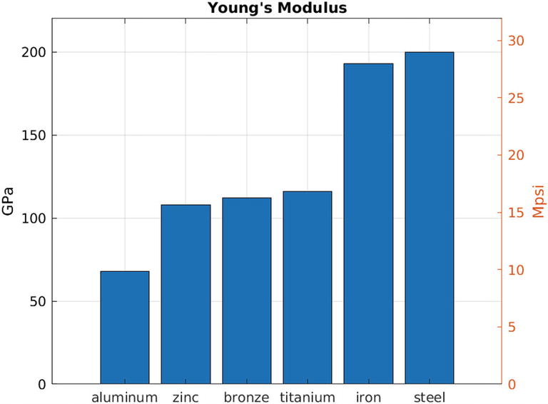
12.1.4 Double Y Axes
MATLAB: | Python: |
|---|---|
% file: code/plots/double_y_axis.m yL = [68 108 112 116 193 200]; yR = [9.86 15.7 16.2 16.8 28 29]; yLmax = max(yL) * 1.1; materials = {'aluminum',... 'zinc', 'bronze', 'titanium',... 'iron', 'steel'}; bar(yL) yyaxis left ylabel('GPa') ylim([0 yLmax]) yyaxis right ylabel('Mpsi') ylim([0 yLmax/6.8965]) xticklabels(materials) grid() title("Young's Modulus") | # file: code/plots/double_y_axis.py import numpy as np import matplotlib.pyplot as plt fig, ax = plt.subplots() yL = [68, 108, 112, 116, 193, 200] yR = [9.86, 15.7, 16.2, 16.8, 28, 29] yLmax = np.max(yL) * 1.1 materials = ['aluminum', 'zinc', 'bronze', 'titanium', 'iron', 'steel'] P = ax.bar(materials, yL) ax.set_ylabel('GPa') ax2 = ax.twinx() ax2.set_ylabel('Mpsi') ax.set_ylim(ymax=yLmax) ax2.set_ylim(ymax=yLmax/6.8965) ax.grid(True) ax.set_axisbelow(True) plt.title("Young's Modulus") plt.show() |
MATLAB

Python
12.1.5 Histograms
MATLAB: | Python: |
|---|---|
% file: code/plots/hist_demo.m Im = @py.importlib.import_module; rnd = Im('numpy.random'); N = int64(10000); rnd.seed(int64(123)); w1 = rnd.rayleigh(int64(3), N); w1 = py2mat(w1); w2 = rnd.normal(int64(8),... int64(3), N); w2 = py2mat(w2) ; bins = linspace(-5, 20, 80); h1 = histogram(w1,bins); set(h1,'FaceAlpha',0.5,... 'EdgeAlpha',0.0); hold on h2 = histogram(w2,bins); set(h2,'FaceAlpha',0.5,... 'EdgeAlpha',0.0); legend('Rayleigh','Normal'); grid on | # file: code/plots/hist_demo.py import numpy as np import matplotlib.pyplot as plt N = 10000 np.random.seed(123) w1 = np.random.rayleigh(3, N) w2 = np.random.normal(8, 3, N) bins = np.linspace(-5, 20, 80) plt.hist(w1, bins, alpha=0.5, label="Rayleigh") plt.hist(w2, bins, alpha=0.5, label="Normal") plt.legend(loc='upper right') plt.ylim([0, 700]) plt.grid(True) plt.show() |

MATLAB

Python
12.1.6 Stack Plots
MATLAB: | Python: |
|---|---|
% file: code/plots/stack_demo.m t = linspace(0, 20, 100); w = [0.11, 0.25, 0.17, 0.32]; L = {}; y = zeros(length(t),length(w)); for i = 1:length(w) F = w(i); y(:,i) = cos(F*t).ˆ2 + F; L{i} = sprintf(... '\omega = %.2f', F); end area(t, y) legend(L); xlabel('omega') grid on | # file: code/plots/stack_demo.py import numpy as np import matplotlib.pyplot as plt t = np.linspace(0, 20, 100) w = [0.11, 0.25, 0.17, 0.32] L = [f'$omega$ = {_:.2f}' for _ in w] y = np.zeros((len(w),len(t))) for i,F in enumerate(w): y[i,:] = np.cos(F*t)**2 + F fig, ax = plt.subplots() ax.stackplot(t, y, labels=L) ax.legend(loc='upper right') ax.set_xlabel('$omega$') plt.grid() ax.set_axisbelow(True) plt.show() |

MATLAB

Python
12.2 Area Plots
12.2.1 imshow()
The simplest two-dimensional plot is a direct rendering of a two-dimensional numeric array using a colormap to color individual array elements. Both MATLAB and matplotlib can display 2D arrays as images using a function named imshow() . MATLAB’s imshow(), however, displays the array so that each array element maps to one screen pixel; a 5 × 5 array appears microscopically small on most screens. The optional argument pair 'InitialMagnification','fit' is needed to scale small arrays to reasonably sized images. MATLAB’s imagesc() will scale the array to a comfortable size, but it doesn’t offer different interpolation methods as imshow().
MATLAB: | Python: |
|---|---|
% file: code/plots/imshow_demo.m x = 0:0.2:pi; S = sin(x); z = S .* S'; imagesc(z) colorbar | # file: code/plots/imshow1_demo.py import numpy as np import matplotlib.pyplot as plt x = np.arange(0,np.pi,0.2) S = np.sin(x) z = S[:,np.newaxis] * S[np.newaxis,:] hz = plt.imshow(z) plt.colorbar(hz) |

MATLAB

Python
MATLAB: | Python: |
|---|---|
% file: code/plots/imshow_demo.m x = 0:0.2:pi; S = sin(x); z = S .* S'; imshow(z, 'Interpolation', ... 'bilinear','Colormap', ... parula, ... 'InitialMagnification','fit') colorbar | # file: code/plots/imshow2_demo.py import numpy as np import matplotlib.pyplot as plt x = np.arange(0,np.pi,0.2) S = np.sin(x) z = S[:,np.newaxis] * S[np.newaxis,:] hz = plt.imshow(z, interpolation="bilinear") plt.colorbar(hz) |

MATLAB

Python
MATLAB: | Python: |
|---|---|
N = 500; rN = 1:N ; [J, I] = meshgrid(rN, rN); x = -10 + 20*J/N; y = -10 + 20*I/N; z = cos(2*x/3).*sin(y/3)./ ... (100 + x.ˆ2+y.ˆ2); contourf(z) daspect([1 1 1]) colorbar() title('Filled Contour') saveas(1,"m_contourf.png") | import numpy as np import matplotlib.pyplot as plt N = 500; rN = range(N) J, I = np.meshgrid(rN, rN) x = -10 + 20*J/N y = -10 + 20*I/N fig, ax = plt.subplots() ax.set_aspect('equal') z = np.cos(2*x/3)*np.sin(y/3)/( 100 + x**2+y**2) cf = ax.contourf(z) fig.colorbar(cf) ax.set_title('Filled Contour') plt.savefig('contourf.png') |

MATLAB

Python
12.3 Animations
Matplotlib can animate plots similarly to MATLAB. Unless the animations are simple though, it can be a challenge to avoid using global variables. We’ll begin with a simple program that draws an ellipse whose width changes with every frame. All the action is encapsulated in one function, and no global variables are required.
Key elements of the animation are A_values, the third argument to FuncAnimation() on line 23, and the update() function on line 18. A_values is a vector of coefficients that will be used to scale the width of the ellipse; its values range from 0.9 down to 0.1 and then back up to 0.9. Each time update() is called, the next coefficient from A_values is taken, and the ellipse’s image is redrawn.

The second animation example shows a ball bouncing in a parabolic bowl. It is considerably more complex and uses global variables to store the ball’s evolving trajectory.

12.4 Plotting on Maps with Cartopy
Python’s Cartopy module, developed by the UK’s Meteorological Office, provides a vast collection of cartographic transformation and projection functions that work with matplotlib. It is as feature-rich as the Mapping Toolbox for MATLAB. Several Cartopy submodules make use of web-based map tile services, so a connection to the Internet is desirable for making imagery-enhanced plots.
As with all plotting packages, the easiest way to start using Cartopy is to view its gallery2 and modify working examples.
We’ll begin our exploration of plotting on maps with point and line data in Cartopy and with MATLAB’s family of geo* functions. More complex geographical overlay plots in MATLAB need the Mapping Toolbox though. Alternatively, we can call Cartopy from MATLAB; this will be demonstrated with recipes to overlay sea surface temperature on a globe (Section 12.6) and draw a map of South America with countries shaded in proportion to their wheat production (Section 12.7).
12.4.1 Points
MATLAB’s geo* functions work with tables, covered in the next chapter, as well as regular matrix variables. This example shows two dots are overlaid on a high-resolution Paris city map, using a table in MATLAB and scalar variables in Python. The red dot is over the Notre Dame cathedral and the blue dot over the Pantheon.
Use Google Earth3 to find latitude and longitude bounds for your maps (calls to ax.set_extent()).
MATLAB: | Python: |
|---|---|
% code/plots/paris_pt.m T = table([48.853;48.846], ... [2.3497;2.3464],... 'VariableNames', ... {'Lat','Lon'}, ... 'RowNames', {'Notre Dame', 'Pantheon'}); C = [1 0 0; 0 0 1]; geoscatter(T.Lat, T.Lon,124,... C, 'Filled') geolimits([48.8425 48.8625], ... [2.3283 2.3722]) geobasemap streets title("Notre Dame (red) and " + ... "the Pantheon (blue)") | #!/usr/bin/env python3 # code/plots/cartopy_pt.py import matplotlib.pyplot as plt import numpy as np import cartopy.crs as ccrs from cartopy.io.img_tiles import OSM imagery = OSM() PC = ccrs.PlateCarree() fig = plt.figure() ax = fig.add_subplot(1, 1, 1, projection=imagery.crs) ax.set_extent([2.3283, 2.3722, 48.8425, 48.8625], crs=PC) ax.add_image(imagery, 14) ax.plot(2.3497, 48.853, transform=PC, marker="o", color="red", markersize=6) ax.plot(2.3464, 48.846, transform=PC, marker="o", color="blue", markersize=6) ax.set_title('Notre Dame (red) and ' 'the Pantheon (blue)') plt.savefig('Paris.png') plt.show() |

MATLAB

Python
Numerous explanations and workarounds can be found on the Internet, but for the specific case of getting map tiles for Cartopy, I’ve found the most reliable solution to be modifying Cartopy’s source code directly to use the requests module instead of urllib. Details appear in Section 12.4.4.
12.4.2 Lines
In this example, we plot the path of a whale known as “Blue Whale 158390” between September 21, 2018, and November 18, 2018. The location data4 must have a significant error margin because one of the data points, 48.64328° N, 66.47227° W, is in a field in New Brunswick, Canada, about 60 km inland. This corresponds to roughly 0.5° of latitude or longitude at the equator. In Python, we’ll use this information to overlay in blue a region 0.5° wide indicating the error bound on the whale’s path. The MATLAB code, while elegant in its extreme simplicity, has no mechanism to control the width of lines drawn with geoplot() so its figure lacks this feature.
This example also shows how additional detail—latitude and longitude grid lines, country borders, rivers—is added to Cartopy maps.
MATLAB: | Python: |
|---|---|
% code/plots/whale.m P = importdata('whale_path.txt'); geoplot(P(:,2), P(:,1),'r') geolimits([30 55], [-80 -50]) geobasemap colorterrain title("Blue Whale 158390, " + ... "Fall 2018") | #!/usr/bin/env python3 # code/plots/cartopy_whale.py import numpy as np import shapely.geometry as sgeom import cartopy.crs as ccrs import cartopy.feature as cfeature import matplotlib.pyplot as plt fig = plt.figure() PC = ccrs.PlateCarree() ax = fig.add_subplot(1, 1, 1, projection=PC) ax.coastlines(resolution='50m') ax.set_extent([-80, -50, 30, 55], crs=PC) ax.add_feature(cfeature.LAND) ax.add_feature(cfeature.OCEAN) ax.add_feature(cfeature.COASTLINE) ax.add_feature(cfeature.BORDERS, linestyle='-') ax.add_feature(cfeature.LAKES.with_scale('50m'), alpha=0.5) ax.add_feature(cfeature.RIVERS.with_scale('50m')) plt.title('Blue Whale 158390, Fall 2018') path = np.loadtxt('whale_path.txt') track = sgeom.LineString(path) error = track.buffer(.5) # degrees ax.gridlines(draw_labels=True) ax.add_geometries([error], ccrs.PlateCarree(), facecolor='#1F18F4', alpha=.5) ax.add_geometries([track], ccrs.PlateCarree(), facecolor="none", edgecolor="r") plt.savefig('whale.png', bbox_inches="tight", pad_inches=0, transparent=True) plt.show() |

MATLAB

Python
If you need the fine control over geographic lines in your MATLAB plots that geoplot() can’t give you, see Recipe 12.5, which shows how to reproduce the Cartopy plot on the right from MATLAB.
12.4.3 Area
The majority of data overlaid on maps spans areas rather than points or lines. There’s an endless list of these: earth science data such as land and sea surface temperatures, land surface type, vegetation index, and rainfall; commercial data such as agricultural production and gross domestic production; political data such as voting results, party affiliation, and conflict zones.
Native MATLAB options for overlaying area data on maps are the Mapping Toolbox and the freely available Climate Data Toolbox.5 In Python, we’ll continue with Cartopy.
12.4.3.1 Sea Surface Temperature
Our first example shows global sea surface temperature using a pair of projections. The plot is enhanced by using a custom background image of the earth from NASA’s Earth Observations6 collection—the vegetation index in this case. To do this, save the vegetation index image file, earth_veg_index.jpeg , and accompanying JSON metadata to a directory, then set the environment variable CARTOPY_USER_BACKGROUNDS to this directory.7
The sea surface temperature (SST) data comes from NOAA’s collection of daily AVHRR satellite data.8 Each day’s data is in a NetCDF file (Section 7.10) containing SST on a 0.5° latitude and longitude grid. The first row and column correspond to latitude –89.875° and longitude 0.125°; the equator is spanned by rows 359 and 360 (using zero-based indexing), while the international date line is spanned by columns 719 and 720.

Many projections are available. An orthographic projection over –10° longitude and 15° latitude can be produced by replacing the PlateCarree projection with

Create this plot in MATLAB with the recipe in Section 12.6.
12.4.3.2 South American Wheat Production, 2014
Our second example shows data bounded by country borders. Our dataset will be South American wheat production from 2014.9 The goal is to shade each country in proportion to its production values.
While Cartopy comes with a database of shore lines, it does not include country or state borders. Ideally, we would like to say something like plot(region(country='Canada'), 'grey') or plot(region(zipcode=90210), 'orange'), but such a capability does not exist. (Spoiler: GeoPandas, covered in Section 13.12, can do this.)
Instead, we will create our own database of country borders by downloading shape files and associated metadata from the Natural Earth project. The “low resolution” file10 contains Cartopy-readable files that contain country borders, country names in a dozen languages, name of the containing continent, economic status, and population and GDP estimates, among other pieces of information. However, the burden is on us to acquire the data, read it, and store it in a convenient form.
The following Python code expects the file ne_110m_admin_0_countries.zip to have been expanded into a subdirectory called nat_earth. We’ll use Cartopy’s shape reader to load both the country shapes and metadata and from these construct a dictionary, shp, storing the English country names in keys and border geometry as the associated values. For fun, we’ll populate a second dictionary, rec, storing each country’s metadata.
Exploring these dictionaries reveals interesting information:
More importantly, the matplotlib + Cartopy combination understands polygonal regions created from shape files and thus allows countries to be shaded with desired colors. There is one subtlety with polygons made from geopolitical borders: some borders are individual polygons, while others (e.g., the islands of Indonesia) have multiple disjointed polygons. The matplotlib add_geometries() function , used to add regions defined by polygonal borders, expects a list of polygons as the first argument. Therefore, we must first check to see if a country’s shape is a single polygon or a list of polygons; if it is a single, the calling argument to add_geometries() must be extended to a one-item list. Line 42 in the following listing shows how to handle these cases appropriately:

Create this plot in MATLAB with the recipe in Section 12.7.
12.4.4 MATLAB and Cartopy
or the resulting plots simply lack background images.
There is a workaround, but it involves modifying the Cartopy’s file cartopy/io/img_tiles.py to use the requests module to download tiles instead of urllib.request from the Python standard library. The first step is to find the directory or folder containing img_tiles.py. That can be done within ipython by importing cartopy.io and then examining its __path__ attribute. On my Linux computer, this directory is
If you installed Cartopy in multiple virtual environments, you’ll need to edit img tiles.py in each one you plan to start MATLAB from.
img_tiles.py original: | img_tiles.py fixed: |
|---|---|
39 import numpy as np 40 import six 41 42 import cartopy 43 import cartopy.crs as ccrs 188 url = self._image_url(tile) 189 try: 190 request = Request(url, headers={ "User-Agent": self.user_agent}) 191 fh = urlopen(request) 192 im_data = six.BytesIO(fh.read()) 193 fh.close() 194 img = Image.open(im_data) | 39 import numpy as np 40 import six 41 import requests 42 43 import cartopy 44 import cartopy.crs as ccrs 189 url = self._image_url(tile) 190 try: 191 request = requests.get(url, stream=True) 192 request.raw.decode content = True 193 img = Image.open(request.raw) |
The source listing for a utility that automates this patch, patch_cartopy.py, appears in Appendix E.
12.4.5 Avoid matplotlib’s Qt Backend in MATLAB!
MATLAB uses the Qt library to render graphics. While matplotlib can use a half dozen different graphics libraries, it defaults to Qt. This is a problem! The Qt libraries that come with an Anaconda distribution are unlikely to match those shipped with MATLAB. As a result, if you use matplotlib’s plt.show() command in MATLAB, you’ll cause MATLAB to crash.
There’s an easy workaround though: simply configure matplotlib to use a different backend. First, we’ll query the Python installation to see what backend it currently uses:
“Qt5Agg” will definitely be a problem in MATLAB. A good alternative is the TkAgg backend on Linux and macOS and WXAgg on Windows. Switching to the TkAgg backend, for example, is done like this in Python:
and like this in MATLAB:
12.5 Recipe 12-1: Drawing Lines on Maps with Cartopy
The MATLAB equivalent of the whale’s track shown in Section 12.4.2 looks like this:
12.6 Recipe 12-2: Overlay Contours on Globe with Cartopy
The sea surface temperature overlay made in Section 12.4.3.1 can be made in MATLAB with Cartopy.
12.7 Recipe 12-3: Shade Map Regions by Value with Cartopy
The map of South American wheat production made in Section 12.4.3.2 can be made in MATLAB with Cartopy.
12.8 Plotting on Maps with GeoPandas
The next chapter covers MATLAB tables and Pandas dataframes. GeoPandas, an extension to Pandas, combines Cartopy, Pandas, and Shapely (among other Python modules) and makes it possible to plot geographical data quite easily. Section 13.12 shows how to make a map of Los Angeles County home prices by zip code. It takes considerably less effort than calling Cartopy functions directly.
12.9 Making Plots in Batch Mode
Plot generation is mostly an interactive experience where a user views plots on a display as they are drawn. A fully automated workflow on the other hand eliminates displays entirely; plots can be written directly to PNG or other image formats for direct inclusion in websites or documents. Both MATLAB and Python support “headless” plot generation albeit with different methods.
MATLAB’s batch plot method relies on command-line arguments to the matlab command. This line runs the hist_demo.m script of Section 12.1.5:
matplotlib’s batch plot method requires the use of the “Agg” backend as shown on lines 4 and 5:
From an ipython session, you can get a list of all available backends with
In : import matplotlib
In : matplotlib.rcsetup.interactive_bk
12.10 Interactive Plot Editing
Fine-tuning matplotlib plots for publication can become a maddening exercise of font, color, glyph, and coordinate selection. MATLAB enjoys an advantage here in that its plot editor allows one to modify plot elements interactively.
Matplotlib’s Qt5Agg backend allows some interactive plot capability which can be accessed through the indicated icons in the display tool:

The Qt5Agg backend, however, is not included in the matpy conda environment because it conflicts with MATLAB’s own Qt5 libraries. You’ll need to leave that conda environment (conda deactivate) and return to the “base” environment to make such edits.
pylustrator11 is a more advanced tool for interactive editing of matplotlib plots. Its capabilities are best appreciated by viewing the YouTube videos at its documentation site, https://pylustrator.readthedocs.io/.