
Chapter 5. Quantitative Research and Optimization Roadmap
This chapter outlines the quantitative research methods that, used in concert with qualitative studies, help shape the optimization process. It discusses the benefits of this type of research, including the kinds of questions it can answer and ways to focus organizations on using data to drive action rather than simply distributing analytics reports. It also includes an example of how one company used the iterative optimization approach to interpret analytics data in an effective, action-oriented way. The chapter concludes with instructions on how to assemble the Optimization Roadmap, drawing on qualitative and quantitative studies as well as other relevant insights.
Benefits of Quantitative Studies
Through quantitative research, a business is able to effectively spend time with all of its customers at once by measuring what user actions are taking place across the site. Quantitative research includes collecting data, drawing insights from that information, and recommending evidence-based actions to help the business and its customers achieve their respective goals.
All too often, businesses stop working with analytics after step one—collecting data. Because most analytics systems can automatically generate ready-made reports, it is easy for a researcher to export an analytics report, distribute it, and then consider the job of quantitative research complete. This is a shame because analytics data is representative of the entire customer population; therefore, it contains a wealth of information that may have implications for the business as a whole, and could, when used well, trigger collaborative efforts across the organization, leading to dramatic improvements in performance.
Two tips for avoiding the trap of simply issuing disjointed data reports are to base quantitative research on answering questions, not simply referencing ready-made reports and to apply the insights and impact method described later in this chapter to interpret the data.
This section opens with a brief discussion of these guiding principles and then provides an overview of several effective metrics available for quantitative analysis. Finally, the section concludes with a concrete example of how one company applied this approach to achieve a wide range of improvements in its website.
Starting with Quantitative Questions
With analytics systems automatically generating report after report, it is easy even for seasoned researchers to get lost in a sea of data that may or may not be significant, a dilemma sometimes called analysis paralysis. It is vital, then, for analysts to focus their research tightly on a few principal questions.
As mentioned in Chapter 4, they should use analytics software to validate any lines of inquiry identified by existing qualitative research.
They should also concentrate on finding answers to the two following questions:
1. In which site areas should the business start testing?
2. In each of these site areas, what should the business test?
As noted in Chapter 3, both qualitative and quantitative studies ultimately seek to answer these two fundamental questions; these guiding lines of inquiry in turn lead to more narrowly focused questions that researchers use as a springboard for testing ideas. The following list details the kinds of questions that quantitative studies can help to answer; of course, each company would tailor such a list to its own particular needs.
To answer: “In which site areas should the business start testing?” the researcher can ask:
![]() How do key metrics fluctuate over time?
How do key metrics fluctuate over time?
![]() Which areas have the most overall traffic?
Which areas have the most overall traffic?
![]() Through which areas do most users enter the site?
Through which areas do most users enter the site?
![]() Through which areas do most users exit the site?
Through which areas do most users exit the site?
![]() Which site areas contribute the most to revenue?
Which site areas contribute the most to revenue?
![]() Which site areas contribute the most to conversions?
Which site areas contribute the most to conversions?
![]() Which products or services contribute the most to revenue?
Which products or services contribute the most to revenue?
![]() Which products or services contribute the most to conversions?
Which products or services contribute the most to conversions?
![]() How many times do customers visit the site before converting?
How many times do customers visit the site before converting?
To answer: “In each of these site areas, what should the business test?” the researcher can ask:
![]() How did the customers get there?
How did the customers get there?
![]() What actions do customers take once they’re there?
What actions do customers take once they’re there?
Addressing these questions enables researchers to figure out which areas should be prioritized for redesign and testing. For example, site areas with high traffic or a lot of revenue flowing through them present ripe opportunities for testing, because they are clearly the areas of greatest interest to customers and the business; similarly, site areas showing high abandonment rates would be flagged as priorities for improvement.
Telling a Story Using Insights and Impact
The “insights and impact” method is a simple way of structuring data analysis to ensure that quantitative research leads to interpretation and action rather than the mere dissemination of automated reports. For each piece of data analyzed, researchers document the insights, or what the data means, as well as the impact, or how the business will act on the data.
For example, if an analytics report shows that a large percentage of users abandon the site immediately after adding a product to their cart, the “insight” could be that the cart page is causing customer attrition, which is surprising because customers reach that page right after presumably expressing an intent to purchase. The “impact” could be a decision to test alternate versions of the cart page, as well as any preceding pages, such as the product page, that may inform what customers expect to see on the cart page. Although some people may find the impact of data studies to be obvious or implied, reporting data without explaining what it means and what should be done about it leaves recipients—marketers, designers, and others—to interpret and act on the data in their own way rather than sharing ideas and collaborating across the company.
Before proceeding to a real-life example of the “insights and impact” method, the following section briefly outlines the main data analytics measures to which this method would be applied.
Online Success Metrics
This section summarizes the primary metrics, or units of measurement, accessible through popular analytics software packages. Although these metrics represent industry standards, some software may define the metrics in different ways; therefore, end users should verify all such definitions before implementation.
The following metrics are commonly used to answer quantitative research questions and to determine winning designs through testing:
![]() Visitors. This metric tracks the number of unique users who arrive on the site within a variable time period. For example, if a user goes to a site next Monday, Wednesday, and Friday, that user would be counted as one visitor during the Monday–Friday time period. This metric is also sometimes referred to as unique visitors, or unique users.
Visitors. This metric tracks the number of unique users who arrive on the site within a variable time period. For example, if a user goes to a site next Monday, Wednesday, and Friday, that user would be counted as one visitor during the Monday–Friday time period. This metric is also sometimes referred to as unique visitors, or unique users.
![]() Visits. This metric counts each time a visitor arrives on a site within a variable time period, which many analytics packages define as being 30 minutes or longer of visitor inactivity. For example, if a user arrives on a site, browses across several pages, leaves, and then returns 30 minutes later, that user will be counted as one visitor with two visits.
Visits. This metric counts each time a visitor arrives on a site within a variable time period, which many analytics packages define as being 30 minutes or longer of visitor inactivity. For example, if a user arrives on a site, browses across several pages, leaves, and then returns 30 minutes later, that user will be counted as one visitor with two visits.
![]() Page views. This metric shows the number of times a webpage is viewed. For example, if a user arrives on the homepage, clicks to a product page, and then clicks the “back” button to return to the homepage, that will be counted as two homepage page views and one product page view.
Page views. This metric shows the number of times a webpage is viewed. For example, if a user arrives on the homepage, clicks to a product page, and then clicks the “back” button to return to the homepage, that will be counted as two homepage page views and one product page view.
![]() Revenue and orders. Revenue and orders are handled in a variety of ways by analytics systems. Of course, most systems produce reports showing the total number of orders placed and revenue generated during a variable amount of time. Some reports also track revenue and orders in one of two ways: allocation or participation. Allocation divides any online order evenly among all the pages viewed within the visit, and participation assigns the full order to each page viewed. For example, if a visitor viewed 10 pages and spent $10, then an allocation report would show each page as having led to $1 in revenue; a participation report would show each page as having led to $10 in revenue. Similarly, an allocation report would show each page contributing to 0.1, or one-tenth, of an order; a participation report would show each page contributing to one order.
Revenue and orders. Revenue and orders are handled in a variety of ways by analytics systems. Of course, most systems produce reports showing the total number of orders placed and revenue generated during a variable amount of time. Some reports also track revenue and orders in one of two ways: allocation or participation. Allocation divides any online order evenly among all the pages viewed within the visit, and participation assigns the full order to each page viewed. For example, if a visitor viewed 10 pages and spent $10, then an allocation report would show each page as having led to $1 in revenue; a participation report would show each page as having led to $10 in revenue. Similarly, an allocation report would show each page contributing to 0.1, or one-tenth, of an order; a participation report would show each page contributing to one order.
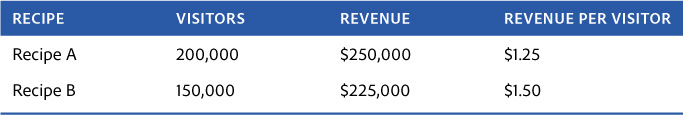
![]() Revenue per visitor (RPV). RPV refers to the amount of money made during a variable time period divided by the number of visitors in that period. This is the best measure of whether a test recipe has resulted in more or less revenue, because it accounts for different designs receiving different volumes of traffic. For example, in the hypothetical case shown in Table 5.1, even though Recipe A brought in more money overall, this is because Recipe A received more visitors. Recipe B would likely be declared the winner, because it makes more money for each visitor it receives, on average.
Revenue per visitor (RPV). RPV refers to the amount of money made during a variable time period divided by the number of visitors in that period. This is the best measure of whether a test recipe has resulted in more or less revenue, because it accounts for different designs receiving different volumes of traffic. For example, in the hypothetical case shown in Table 5.1, even though Recipe A brought in more money overall, this is because Recipe A received more visitors. Recipe B would likely be declared the winner, because it makes more money for each visitor it receives, on average.
RPV is especially important because even when setting up a 50/50 traffic split between recipes, it’s rare for each design to receive the same number of visitors. In some cases, an optimization team will also choose not to split traffic evenly. For example, if researchers are concerned that an alternate design might be risky, they may start by splitting traffic 60/40 or 70/30.
RPV is a popular metric across all industries. Although it would seem at first glance to apply largely to retailers, businesses that derive revenue more indirectly also track RPV. For example, online media companies measure the value of advertisements viewed online as RPV, because ads are their principal source of revenue. Similarly, financial institutions measure the value of different accounts created; hotels measure the value of rooms reserved; and telecommunications businesses measure the value of subscription services, all using RPV. If the value of a transaction is not fully known during the test period (for example, customers can cancel hotel reservations made during the test), then an estimate is used to determine the winning design, and long-term results continue to be tracked even after the business has moved on to testing new designs.
![]() Conversion rate. This metric is the percentage of customers who take a specific action during a variable time period. This is the best measure of whether a test has resulted in a specific customer behavior. Although it can apply to any customer action, the conversion rate usually refers to the primary business goal—the percentage of customers who made a purchase at a retail store, for example, or the percentage of visitors who opened a deposit account at a financial services site. Many businesses create analytics reports for a “conversion funnel,” the set of steps customers are expected to take. For example, a retail conversion funnel may consist of viewing a product page, adding a product to the cart, clicking to check out, filling out shipping information, giving billing information, and then checking out. Each step within that funnel can be represented by a different conversion rate (e.g., the percentage of customers who filled out shipping information, etc.).
Conversion rate. This metric is the percentage of customers who take a specific action during a variable time period. This is the best measure of whether a test has resulted in a specific customer behavior. Although it can apply to any customer action, the conversion rate usually refers to the primary business goal—the percentage of customers who made a purchase at a retail store, for example, or the percentage of visitors who opened a deposit account at a financial services site. Many businesses create analytics reports for a “conversion funnel,” the set of steps customers are expected to take. For example, a retail conversion funnel may consist of viewing a product page, adding a product to the cart, clicking to check out, filling out shipping information, giving billing information, and then checking out. Each step within that funnel can be represented by a different conversion rate (e.g., the percentage of customers who filled out shipping information, etc.).
![]() Click-through rate (CTR) and bounce rate. This metric counts the number of visitors who clicked a specific link divided by the number of visitors who viewed the page. For example, the CTR could be measured for customers clicking to “log in” to a site, “share” an article, or “check out.” When people refer to the CTR without referring to a specific link, they usually mean the CTR of an entire page—the percentage of visitors who clicked on any link on the page. The opposite of the CTR for a page is the bounce rate, the percentage of customers who left the site from that page. The click-through and bounce rates are especially helpful in testing to see how design changes on a page affect customer behavior.
Click-through rate (CTR) and bounce rate. This metric counts the number of visitors who clicked a specific link divided by the number of visitors who viewed the page. For example, the CTR could be measured for customers clicking to “log in” to a site, “share” an article, or “check out.” When people refer to the CTR without referring to a specific link, they usually mean the CTR of an entire page—the percentage of visitors who clicked on any link on the page. The opposite of the CTR for a page is the bounce rate, the percentage of customers who left the site from that page. The click-through and bounce rates are especially helpful in testing to see how design changes on a page affect customer behavior.
![]() Average order value (AOV). AOV is the amount of money made divided by the number of orders made during the test period. Unlike RPV, which accounts for all visitors, AOV counts only those who made a purchase. AOV can also be thought of as the average value of each cart at checkout. AOV is a great indicator of how new designs are affecting what customers spend.
Average order value (AOV). AOV is the amount of money made divided by the number of orders made during the test period. Unlike RPV, which accounts for all visitors, AOV counts only those who made a purchase. AOV can also be thought of as the average value of each cart at checkout. AOV is a great indicator of how new designs are affecting what customers spend.
![]() Page views per visitor. This metric is the average number of pages a visitor viewed during a variable time period. This metric is especially valuable for businesses such as media companies, where advertising in certain site sections is usually worth more than in others; by segmenting the page views per visitor according to site section, companies can determine whether readership within premium advertising sections has increased.
Page views per visitor. This metric is the average number of pages a visitor viewed during a variable time period. This metric is especially valuable for businesses such as media companies, where advertising in certain site sections is usually worth more than in others; by segmenting the page views per visitor according to site section, companies can determine whether readership within premium advertising sections has increased.
![]() Time on site (TOS). Calculating the amount of time an average visit lasted, this metric helps to measure whether a particular user experience causes visitors to stay longer on the site or not. It can be a tricky metric from which to draw conclusions, because more time spent on a site isn’t always a good sign. For example, on media sites a high TOS may indicate that the visitor is finding plenty of relevant content. However, it could also show that users can’t figure out how to find what they want. Similarly, a short TOS is likely a good sign for a search engine site, signaling that visitors are finding what they’re looking for quickly. Finally, researchers should keep in mind that some analytics software may register a visitor walking away from the computer as a higher TOS, though most advanced versions account for this possibility.
Time on site (TOS). Calculating the amount of time an average visit lasted, this metric helps to measure whether a particular user experience causes visitors to stay longer on the site or not. It can be a tricky metric from which to draw conclusions, because more time spent on a site isn’t always a good sign. For example, on media sites a high TOS may indicate that the visitor is finding plenty of relevant content. However, it could also show that users can’t figure out how to find what they want. Similarly, a short TOS is likely a good sign for a search engine site, signaling that visitors are finding what they’re looking for quickly. Finally, researchers should keep in mind that some analytics software may register a visitor walking away from the computer as a higher TOS, though most advanced versions account for this possibility.
Analytics in Action: A Case Study
This section shows how companies can draw on the guidelines described earlier—starting with questions and focusing on insights and impact—to make the most of the resources that analytics software can provide. By walking the reader through a real-life example, generously provided by the technology firm Lenovo Group Ltd., it also shows how this approach fits into the iterative optimization process as a whole.
A multinational business specializing in the manufacture, sale, and service of computers and electronic devices, including laptops, tablets, servers, televisions, and smartphones, Lenovo was the largest computer vendor in the world in 2013, based on the number of PCs sold.
The following example is taken from research conducted in 2011, when Lenovo was building its first Optimization Roadmap, which the company used to iteratively redesign its entire website. (Note that this case is specific to the company cited. Analysts in other businesses may not find it necessary to pull all of the reports discussed or to pull them in exactly the same way. They may even consult a technical expert to customize their analytics software if necessary.)
In this diary-style excerpt from Lenovo’s optimization program, the company’s analytics team starts with the first of the two fundamental research questions described at the beginning of this chapter: In which site areas should the business start testing? To answer this question, the researchers use the list of more detailed questions listed earlier, narrowing the focus from the site to templates to individual pages along the way. In each case, they apply the “insights and impact” method when interpreting the data reports.
How do key metrics fluctuate over time?
Start with an overview of the entire site by graphing the primary success metrics over time. This can help analysts understand business dynamics, such as the amount of traffic available for testing, weekday versus weekend traffic, historical seasonality, and so on. For example, a report of the page views over time appears in Figure 5.1.
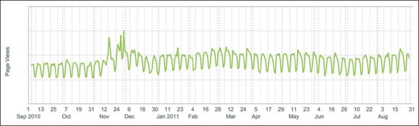
Figure 5.1 The site page views over the course of a year for Lenovo. The values for the y-axis have been redacted to preserve company confidentiality.
![]() Insight. Site traffic falls on most weekends. This might be due to the fact that Lenovo has a large audience shopping for computers for business use during weekdays.
Insight. Site traffic falls on most weekends. This might be due to the fact that Lenovo has a large audience shopping for computers for business use during weekdays.
Impact. This finding suggests several courses of action, including test featuring products, messaging, and promotions that will appeal to business users; segment test results by weekday and weekend traffic to understand whether customers behave differently depending on the day of the week; and test targeting experiences to specific consumer and business users.
![]() Insight. Although this insight is not apparent in the figure because the y-axis numbers have been redacted to preserve company confidentiality, there are consistently large volumes of traffic. Traffic levels also rise, and spike sharply, during the holiday season.
Insight. Although this insight is not apparent in the figure because the y-axis numbers have been redacted to preserve company confidentiality, there are consistently large volumes of traffic. Traffic levels also rise, and spike sharply, during the holiday season.
Impact. The high volume of traffic means the company can run multiple tests concurrently across the site all year round. The business should also ramp up testing just before and during the holiday season to take advantage of especially large traffic volumes.
A similar graph can be built for any metric: visitors, conversion rate, RPV, and so on. For example, a graph showing the conversion rate over time could be used to determine whether visitors are more or less likely to make a purchase during the holiday season.
Which areas have the most overall traffic?
Through which areas do most users enter the site?
Through which areas do most users exit the site?
Which site areas contribute the most to revenue?
Which site areas contribute the most to conversions?
One way to answer these questions is to build a table listing all the site’s pages ranked by key metrics over a set period of time. The example in Figure 5.2 shows Lenovo’s top 15 pages ranked by the number of page views, alongside columns for visits, entries, exits, revenue, revenue participation, orders, and order participation. (Note that all raw data, such as the amount of revenue, the number of orders, and so on have been redacted for confidentiality reasons, leaving only percentage values. The same holds true for all subsequent figures in this chapter.)
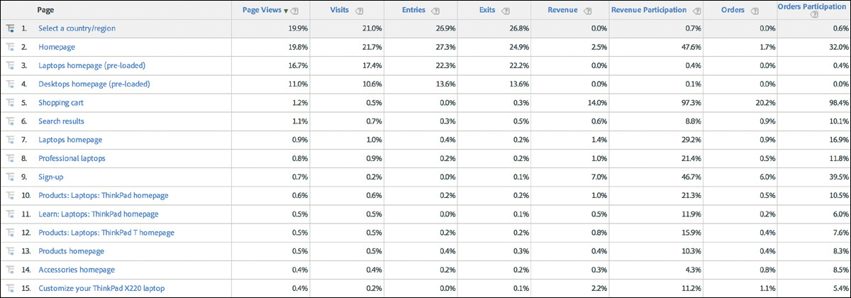
Figure 5.2 Pages ranked by page views from July 1 to Aug. 31, 2011. The page with the highest number of page views appears at the top of the list.
![]() Insight. The five site areas with the most overall traffic are the “Select a Country/Region” page, the homepage, the “Laptops” page, the “Desktops” page, and the shopping cart.
Insight. The five site areas with the most overall traffic are the “Select a Country/Region” page, the homepage, the “Laptops” page, the “Desktops” page, and the shopping cart.
Impact. Due to the large numbers of potential customers visiting these pages, all of these site areas are great candidates for testing.
![]() Insight. The shopping cart ranks among the top five for the number of page views—an unusual finding. This might indicate that very qualified traffic (i.e., customers who are highly likely to make a purchase) is visiting the site.
Insight. The shopping cart ranks among the top five for the number of page views—an unusual finding. This might indicate that very qualified traffic (i.e., customers who are highly likely to make a purchase) is visiting the site.
Impact. Look closely at cart-specific metrics to determine whether the cart is making good use of its high traffic levels by helping customers to check out easily. Also, because traffic is likely highly qualified, streamline access to the cart from areas throughout the site.
![]() Insight. The “Select a Country/Region” page has the most page views but also accounts for 26.8 percent of all exits from the site—an unusually high rate.
Insight. The “Select a Country/Region” page has the most page views but also accounts for 26.8 percent of all exits from the site—an unusually high rate.
Impact. Test whether this page can be removed altogether, because it is leading to customer exits. Test using geo-location to determine a user’s country from their IP address and then automatically sending them to the appropriate country site (this is also called geo-targeting). If this page must exist, try redesigning it to reduce the exit rate.
![]() Insight. The “Laptops” and “Desktops” category pages show very low revenue and order participation. It is unclear why, but a possible explanation is that customers are bypassing these pages when they place their order on a return visit. Perhaps these pages present an obstacle to customers who want to check out, causing them to abandon the site and come back later using a different path.
Insight. The “Laptops” and “Desktops” category pages show very low revenue and order participation. It is unclear why, but a possible explanation is that customers are bypassing these pages when they place their order on a return visit. Perhaps these pages present an obstacle to customers who want to check out, causing them to abandon the site and come back later using a different path.
Impact. Conduct a detailed analysis of these category pages, as well as a path analysis for converting and nonconverting customers. Test different designs, including simplifying the number of product choices these pages present to all customers, in case an overwhelming array of choices is discouraging customers from making a decision. Test targeting customers who have a computer or other large item in their cart by showing them versions of these pages that encourage checkout. Test changing global navigation when a customer has a large item in their cart to encourage checkout.
This single analytics report can lead to many more insights with corresponding impacts. For example, by examining the data in the other columns researchers can seek answers to key questions such as: “Through which site areas do most users enter and exit?” and “Which site areas contribute the most to revenue and conversions?” This data report focuses on specific pages, but the same type of analysis can be built for templates, such as those for section pages, product pages, and so on.
Which products or services contribute the most to revenue?
Which products or services contribute the most to conversions?
An effective way to answer these questions is to build a table listing all the business’s products and services ranked by key metrics over a set period of time. Figure 5.3 shows an example of two such reports for the business laptops category. Each laptop model belongs to a subseries, or family of computers, that is in turn part of a larger series. These reports are ranked by revenue, although the actual dollar values have been redacted.
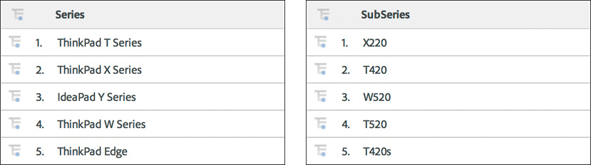
Figure 5.3 This figure shows Lenovo’s top-selling business laptops listed by series and by subseries, and ranked by the amount of revenue generated.
![]() Insight. The ThinkPad T and X are the two most popular series of business laptops, and so should be prioritized for testing. Because these series offer a broad range of products, it is important to find out whether the wide variety of customization and pricing options is providing a competitive advantage or whether some customers feel overwhelmed by the number of choices.
Insight. The ThinkPad T and X are the two most popular series of business laptops, and so should be prioritized for testing. Because these series offer a broad range of products, it is important to find out whether the wide variety of customization and pricing options is providing a competitive advantage or whether some customers feel overwhelmed by the number of choices.
Impact. Test removing certain lower-selling products (not shown in this report) from the site to simplify customers’ choices, a move that could also save the business the cost of producing many different types of units. Start testing changes that can be made across all series pages at once, and segment the data by the individual series. Alternatively, start testing on the most popular series pages specifically.
![]() Insight. The ThinkPad X220 and T420 are the two most popular business laptops.
Insight. The ThinkPad X220 and T420 are the two most popular business laptops.
Impact. Conduct a deeper analysis to understand the purchase path for these and other top-selling models to determine whether points along these paths should be prioritized for testing. Test featuring these popular subseries on the homepage or other prominent pages.
How many times do customers visit the site before converting?
Start by compiling a table listing the number of visits ranked by key metrics over a set period of time. Figure 5.4 shows one such report, which includes the number of visits a customer makes before making a purchase and the amount of revenue and orders received.
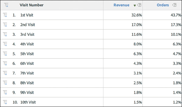
Figure 5.4 This Lenovo report shows the number of visits a customer makes before buying a product and the percentage of revenue and orders generated.
![]() Insight. The majority of customers visit the site more than once before making a purchase, which is not surprising, because computers are not an impulse buy. However, over 70 percent of all orders are placed, accounting for over 60 percent of the revenue, during the first three visits—a sign that these customers are extremely motivated to make a purchase. There is also a very long tail on this dataset, meaning that after the first three visits, the number of visits before converting varies widely, with some customers visiting hundreds of times.
Insight. The majority of customers visit the site more than once before making a purchase, which is not surprising, because computers are not an impulse buy. However, over 70 percent of all orders are placed, accounting for over 60 percent of the revenue, during the first three visits—a sign that these customers are extremely motivated to make a purchase. There is also a very long tail on this dataset, meaning that after the first three visits, the number of visits before converting varies widely, with some customers visiting hundreds of times.
Impact. Examine whether customers who purchase during the first three visits display common behaviors (for example, showing an interest in a specific type of product or discount) that can be emphasized to influence visitors who do not decide to purchase as quickly. Also, determine any barriers to checkout for visitors during their first three visits by examining the most common paths they take throughout the site, including their top entry and exit points. For visitors who visit more than three times before making a purchase, test ways to make it easy for them to save a cart or information on product configuration by emailing it to themselves. Additionally, test offering incentives on repeat visits, such as discounts, free shipping, free upgrades, and so on, to encourage customers to check out. Test more prominent placements for the company’s online chat option and toll-free telephone number for those who visit repeatedly but do not make a purchase. Stage a future round of qualitative research to find out why some customers visit the site repeatedly but do not make a purchase.
When studying customers’ behavior before converting, researchers often do a deep-dive analysis of the conversion funnel, creating what is known as a funnel, or fall-out, report. For sites with one-way conversion funnels, such as checkout processes or registration flows, this kind of report pinpoints where customers are entering and leaving the funnel, and helps to identify which areas of the funnel need the most attention. Although not all sites have enough traffic to test in multiple areas of the funnel simultaneously, any business can launch tests in different parts of the funnel one by one, using the results to determine in which other funnel areas to launch the next wave of tests. In the case study in question, Lenovo researchers analyzed several funnel reports, two of which are shown in Figure 5.5.
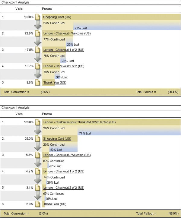
Figure 5.5 The first funnel report tracks the steps to checkout after entering the cart; the second traces the steps to checkout after visitors enter the “Customize Your Lenovo ThinkPad X220” page.
The first report shows whether customers who reached the shopping cart then progressed to the checkout, and the second shows the progression of users who visited the “Customize the Lenovo ThinkPad X220” page, which refers to the company’s top-selling business laptop.
![]() Insight. Both reports show alarmingly high drop-off rates between the shopping cart and first step of the checkout process, with a 77 percent drop-off for all users, and an 80 percent drop-off for X220 customizers. Also, 74 percent of users leave the X220 configuration page before even reaching the shopping cart. Once customers make it past the cart, it is comparatively smooth progress to checkout, with a drop-off rate of 20–35 percent for each step. Although it would be worthwhile to reduce these numbers as well, the bottleneck is clearly at the top of the funnel.
Insight. Both reports show alarmingly high drop-off rates between the shopping cart and first step of the checkout process, with a 77 percent drop-off for all users, and an 80 percent drop-off for X220 customizers. Also, 74 percent of users leave the X220 configuration page before even reaching the shopping cart. Once customers make it past the cart, it is comparatively smooth progress to checkout, with a drop-off rate of 20–35 percent for each step. Although it would be worthwhile to reduce these numbers as well, the bottleneck is clearly at the top of the funnel.
Impact. The cart and configuration pages should be given a high priority for redesign. These pages draw some of the highest traffic on the site; all revenue flows through the cart, and any visitors who customize a computer use the configurator. Helping users through these two steps could not only increase customer satisfaction, but raise revenue for the business substantially.
This analysis pinpoints the cart and configuration pages as top-priority areas for testing, which brings the Lenovo researchers to the second fundamental guiding question described at the beginning of this chapter: “In each site area of interest, what should the business test?” To help answer this question, they address the following two queries:
How did the customers get there?
What actions do customers take once they’re there?
Path reports show how customers arrived on a page and their subsequent actions. An example of a path report for the cart page is shown in Figure 5.6 on the next page. This report, which is a small subset of a much larger report, uses a tree diagram to show the top nine ways in which customers arrived on the cart page. Reports like this one can easily be expanded to show actions customers took two, three, or more steps before or after arriving on the cart page.
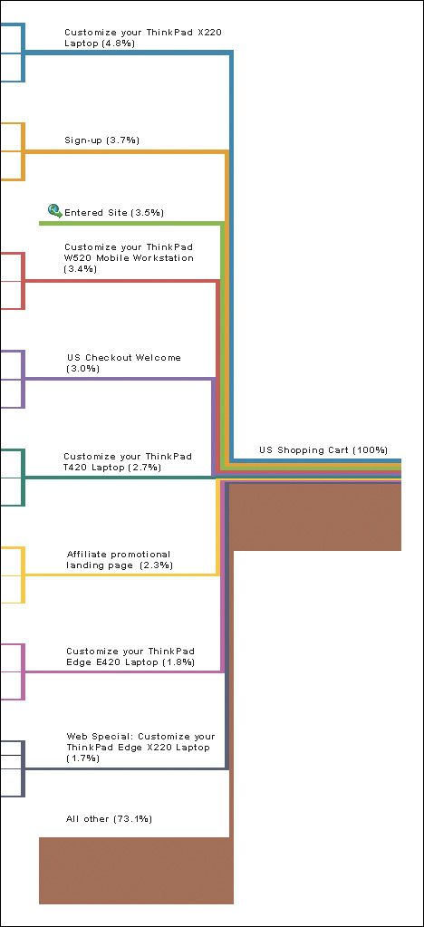
![]() Insight. Customization pages for the company’s popular ThinkPad products make up five of the top nine ways in which customers arrive at the cart, which suggests that customization is an important point in the path toward the checkout page. However, it is not clear whether the majority of total cart visitors customize products beforehand, because 73.1 percent of the paths are not detailed.
Insight. Customization pages for the company’s popular ThinkPad products make up five of the top nine ways in which customers arrive at the cart, which suggests that customization is an important point in the path toward the checkout page. However, it is not clear whether the majority of total cart visitors customize products beforehand, because 73.1 percent of the paths are not detailed.
Impact. Expand the path report to determine whether most customers customize products before going to the cart page. Test precustomized versions of products, or limiting customization options, in order to simplify or even eliminate this step. Conduct further quantitative and qualitative analyses of customization pages for all top products.
![]() Insight. The “sign-up” page is the second most popular way for a user to enter the cart.
Insight. The “sign-up” page is the second most popular way for a user to enter the cart.
Impact. After customers sign up, test sending them to the first page of checkout, bypassing the cart page altogether. Ensure that the checkout page displays a summary of cart contents and contains clear links to edit the cart.
![]() Insight. The third most popular way to view the cart is by entering the site directly, from a bookmark, for example.
Insight. The third most popular way to view the cart is by entering the site directly, from a bookmark, for example.
Impact. This likely indicates that customers are successful in saving their cart and accessing it later. Build on this positive behavior by testing ways to make it easier for users to save or email cart information to themselves.
![]() Insight. The fifth most common way to view the cart is from the checkout page, an indication that users are backtracking in the checkout process. This probably indicates that the first step in that process is missing information and customers have to go backwards to retrieve it.
Insight. The fifth most common way to view the cart is from the checkout page, an indication that users are backtracking in the checkout process. This probably indicates that the first step in that process is missing information and customers have to go backwards to retrieve it.
Impact. Test the prominence of existing information in the checkout flow, and test adding new types of information, such as cart contents, cart value, security messaging, shipping information, and so on. Conduct further quantitative research to identify the most common paths going backwards from the cart, and further qualitative research to understand customers’ needs during checkout.
As the preceding examples of Lenovo’s analyses show, quantitative research offers a powerful and highly versatile way to make sense of customer behavior. A few simple reports can yield a wealth of information, allowing even a relatively new analyst not only to validate qualitative research findings, but also to generate potentially impactful ideas for testing designs. It should be noted that these examples are by no means exhaustive: One can undoubtedly come up with more “insights and impacts” than are listed here.
Researchers can also pursue more questions using other data analyses, such as reports on page elements clicked, internal search terms, external search terms, referring-site URLs, marketing channel attribution, video engagement, and so on. Those with a keen interest in quantitative research may enjoy learning about predictive analytics, which incorporate statistical and machine learning techniques to model customer behavior; however, these topics are beyond the scope of this book.
Action Plan: Roadmap Assembly
The Optimization Roadmap pulls together the qualitative and quantitative research into an action plan for redesigning key areas of the business in an iterative and controlled fashion. The final stage in roadmap assembly requires some additional brainstorming and organizational work, as researchers focus on prioritizing what site areas to test and what to test within each area.
Accordingly, the roadmap document is typically divided into several parts: The first section includes research used to determine the prioritized site areas for testing; next, each prioritized site area has a section that details the qualitative and quantitative research used to build that site area’s test list; finally, the prioritized test list is outlined for each area. The remainder of this chapter illustrates this assembly stage by outlining the process Lenovo used to arrive at its action plan.
Prioritizing Where to Test
As noted earlier, the main criteria for giving a site area high priority for testing are high volumes of traffic, unusually high or low conversion rates, high abandonment rates, or other factors identified by qualitative and quantitative studies. However, there is no hard-and-fast rule: The Iterative Optimization Methodology aims to get tests up and running in each area identified for redesign, so perfect prioritization is neither required nor possible. There will be opportunities to adjust the priority list throughout the process, as researchers respond to testing data along the way.
In order to keep it manageable, team members should limit the list of priority areas to 5–10. A list of more than 15 items suggests the site may be overly complicated, especially if the list includes templates, which can affect hundreds, even thousands, of pages.
Businesses that have gone through this process a few times often get creative with prioritization. For example, some companies create test areas that span multiple aspects of the customer experience, such as “Global Navigation” or “Social Interactions” (i.e., social-media features ranging from authentication processes, to sharing and comment options, to testing on social network pages).
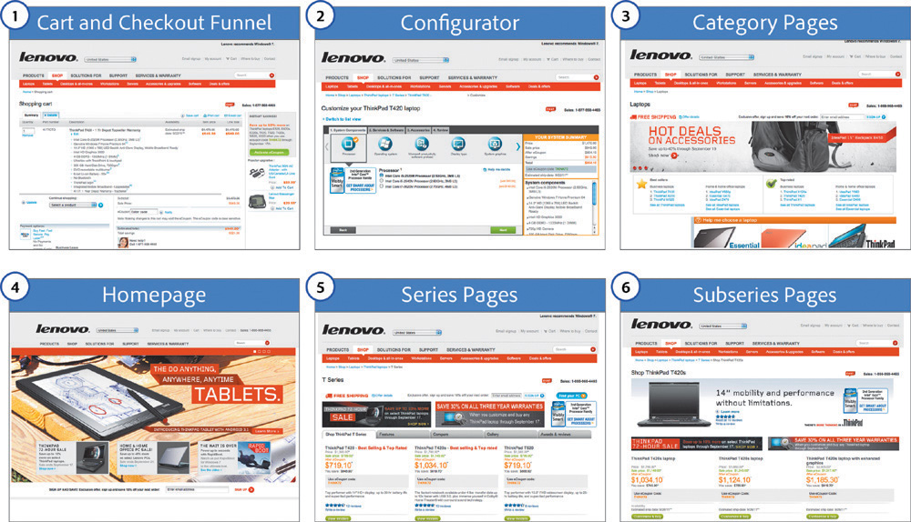
In Lenovo’s case, researchers drew on quantitative and qualitative studies to create a list of nine prioritized site areas, the first six of which are shown in Figure 5.7. Given the “insights and impact” analyses discussed earlier, it will come as no surprise that the cart, checkout funnel, and configurator were given top priority. (Although the “Choose a Country/Region” page had the most page views for Lenovo’s international site, it does not appear on this list, which focused exclusively on the U.S. market.)
Prioritizing Test Ideas
For each of the site areas slated for testing, the Optimization Roadmap includes the relevant qualitative and quantitative research, and a prioritized list of test ideas. To generate test ideas, team members conduct a brainstorming session for each site area; the ideas are then prioritized according to the value they could bring to the business and to customers, as well as the perceived difficulty of implementation.
Brainstorming test ideas
This brainstorming step is sometimes called a structured brainstorming session, because rather than starting from a blank slate, team members draw on a range of research material and follow a structured process of idea generation, prioritization, and action for each site area. Team members first review the goals of the business and its customers, as well as the findings from qualitative and the quantitative research for the relevant area. Then they brainstorm test ideas, striving to come up with at least 10–15 ideas for each site area.
Here are a few tips when brainstorming test ideas:
![]() Cast a wide net and get all ideas on the table. Include as many stakeholders as possible from across the business to draw on diverse skills and to foster engagement throughout the company. No idea is a bad idea. Encourage people to get creative, and document all concepts.
Cast a wide net and get all ideas on the table. Include as many stakeholders as possible from across the business to draw on diverse skills and to foster engagement throughout the company. No idea is a bad idea. Encourage people to get creative, and document all concepts.
![]() Incorporate upcoming business plans. If the business is working on new products, features, or other items, include those works-in-progress as test ideas for launch once the items are ready. The Optimization Roadmap should help drive the business, not exist outside of day-to-day operations. Early testing means the company can correct or stop making a flawed product or service before losing additional money.
Incorporate upcoming business plans. If the business is working on new products, features, or other items, include those works-in-progress as test ideas for launch once the items are ready. The Optimization Roadmap should help drive the business, not exist outside of day-to-day operations. Early testing means the company can correct or stop making a flawed product or service before losing additional money.
![]() Don’t simply tweak what already exists. Include full template redesigns as a test idea in each area.
Don’t simply tweak what already exists. Include full template redesigns as a test idea in each area.
![]() Simplify. Aim to simplify the user experience in every way possible—from the number of products, to the number of pages, to the way in which customers are asked to interact with the business. Examples of simplification include emphasizing important links and calls-to-action; making content easy to find and access; and removing extraneous page elements.
Simplify. Aim to simplify the user experience in every way possible—from the number of products, to the number of pages, to the way in which customers are asked to interact with the business. Examples of simplification include emphasizing important links and calls-to-action; making content easy to find and access; and removing extraneous page elements.
![]() Embrace innovation while avoiding fads. The best way to separate a fad from something truly innovative and helpful is to test it. Many online design trends of questionable customer benefit have emerged in recent years, including tag clouds, animated “splash” introduction pages, parallax scrolling, as well as skeuomorphic and flat design. There’s a time and a place for most any technology or design style. What matters most is that technology and design be applied in a way that improves the customer experience and the business—and these improvements can usually be measured. Don’t be afraid to take risks, but don’t blindly follow the crowd.
Embrace innovation while avoiding fads. The best way to separate a fad from something truly innovative and helpful is to test it. Many online design trends of questionable customer benefit have emerged in recent years, including tag clouds, animated “splash” introduction pages, parallax scrolling, as well as skeuomorphic and flat design. There’s a time and a place for most any technology or design style. What matters most is that technology and design be applied in a way that improves the customer experience and the business—and these improvements can usually be measured. Don’t be afraid to take risks, but don’t blindly follow the crowd.
Prioritizing based on value and difficulty
After brainstorming, team members arrange their test ideas in order of priority, based on how much value the new idea may bring to the business and its customers, as well as how difficult the test will be to launch.
Even though every test is based on research, predicting the value of a new design is a guessing game at the end of the day, even for the best businesspeople in the world. There’s no way to really know the worth of a new design in advance: The whole reason for testing is to find out. Therefore, although value is a useful means of prioritizing ideas, it should not be rigidly applied.
To assess the difficulty of implementing a test, researchers weigh a variety of factors, including how many wireframes and creative comps will be needed, the process for building the new designs, timelines for internal legal reviews, and so on. Although many tests can be set up and launched in a matter of minutes in most organizations, the level of difficulty varies from company to company. A committee of stakeholders from different areas of the business should be involved in assessing test difficulty; this team should of course include members of the business’s IT department.
A Brainstorming Checklist
![]() Navigation (global navigation, navigation within a section, etc.)
Navigation (global navigation, navigation within a section, etc.)
![]() Calls-to-action (anything clickable, such as links, buttons, images, etc.)
Calls-to-action (anything clickable, such as links, buttons, images, etc.)
![]() Imagery (clickable or not)
Imagery (clickable or not)
![]() Videos
Videos
![]() Text (headlines, sub-headlines, value proposition bullets, product/service descriptions, trust messaging, phone numbers, etc.)
Text (headlines, sub-headlines, value proposition bullets, product/service descriptions, trust messaging, phone numbers, etc.)
![]() Products or services
Products or services
![]() Features (sharing and chat options, order status, recommended items, etc.)
Features (sharing and chat options, order status, recommended items, etc.)
![]() Advertising (internal advertising, third-party advertising, partners, etc.)
Advertising (internal advertising, third-party advertising, partners, etc.)
![]() Flow (checkout, registration, lead generation, application submission, etc.)
Flow (checkout, registration, lead generation, application submission, etc.)
![]() Redesign (full redesign of page, template, email, etc.)
Redesign (full redesign of page, template, email, etc.)
![]() Layout (element size, arrangement, surrounding whitespace, etc.)
Layout (element size, arrangement, surrounding whitespace, etc.)
![]() Prominence (emphasize, combine, remove, or alter an element)
Prominence (emphasize, combine, remove, or alter an element)
![]() Content (copy, product or service name, button text, value proposition bullets, pictures and graphics, etc.)
Content (copy, product or service name, button text, value proposition bullets, pictures and graphics, etc.)
![]() Aesthetics (color hue, saturation, luminance, etc.)
Aesthetics (color hue, saturation, luminance, etc.)
![]() Function (what happens when the customer clicks, etc.)
Function (what happens when the customer clicks, etc.)
![]() Pricing (price, packages, sales, other special offers, etc.)
Pricing (price, packages, sales, other special offers, etc.)
![]() Alter flow (rearrange steps, remove steps, etc.).
Alter flow (rearrange steps, remove steps, etc.).
![]() Algorithms (internal search results, personalized offers, “people who bought this also bought,” etc.)
Algorithms (internal search results, personalized offers, “people who bought this also bought,” etc.)
Prioritization teams should assess value and difficulty simply as low, medium, or high, ranking tests with high potential value and low difficulty first. Team members should then stagger the remaining tests based on difficulty. For example, while easier tests are running, they can spend time preparing medium- or high-difficulty tests. They should also stagger tests that build on previous results. For instance, rather than placing two layout tests one after the other, team members should leave time to interpret the results of the first test before launching the second; in the interim, they can run an unrelated test to keep the optimization process going. After analyzing the results of each test, researchers should reevaluate the priority of upcoming tests.
Numbering tests to encourage iteration
As noted in Chapter 3, researchers assign numbers to site areas and tests to streamline communication. For example, for the Lenovo test labeled number 1.2, the “1” indicates that this is a test for the cart and checkout funnel, because this is site area 1 in Figure 5.7; the “2” indicates that this is the second test in that area. This numbering method facilitates iterative testing across the site, because team members can quickly determine where each test has run, how many iterative tests have run in each area, and sum up the total number of tests that have been conducted across the business.
This system also helps keep test results easy to find and retrieve when they are stored in a central location, such as a shared drive or library. As test lists are reprioritized, new test numbers may be added to the list, but once a test has run, no other test should have that number. Businesses often like to use descriptive names for tests, which is useful, but it’s best to place the descriptive name after the number—as in “1.1 Homepage Hero Test,” to aid in quick identification.
Up Next
This chapter showed how to harness the rich potential of analytics software without becoming overwhelmed by the volume of available data. It outlined how to keep a tight focus on business and customer value by applying the “insights and impact” method to data analysis. Finally, it showed how researchers decide what and where to test, as well as how they brainstorm and then prioritize test ideas, culminating in the assembly of the Optimization Roadmap.
The next chapter covers the last steps in the Iterative Optimization Methodology, from the planning and launch of design tests to the analysis of results and the launch of new tests, as the iterative cycle begins.
References
1. Lenovo Overtakes HP as the Top PC Vendor While U.S. Shipments Stabilize in the Second Quarter of 2013 (IDC Worldwide Quarterly PC Tracker; July 10, 2013).
http://www.idc.com/getdoc.jsp?containerId=prUS24213513