
7 Finally, after a long wait ... Queueing Theory
This final chapter in the final volume provides an introduction to the delights of Queueing Theory. Sorry, if you’ve had to wait too long for this.
By the way ‘Queueing’ is not a spelling mistake or typographical error; in this particular topic area of mathematics and statistics, the ‘e’ before the ‘-ing’ is traditionally left in place whereas the normal rules of British Spelling and Grammar would tell us to drop it … unless we are talking about the other type of cue which would usually be ‘cueing’ but paradoxically could also be ‘cuing’ (Stevenson & Waite, 2011)!
Let’s just pause for a moment and reflect on some idiosyncrasies of motoring. Did we ever:
- Sit in a traffic jam on the motorway, stopping and starting for a while, thinking, ‘There must have been an accident ahead,’ but when you get to the front of the hold-up, there’s nothing there! No angry or despondent drivers on the hard shoulder; not even a rubber-necking opportunity on the other side of the carriageway! It was just a ‘Phantom Bottleneck’ that existed just to irritate us.
- Come across those Variable Speed Limits (also on the motorways) and wonder, ‘How do these improve traffic flow?’ How does making us go slower enable us to move faster?
- Notice how in heavy traffic the middle lane of a three-lane motorway always seems to move faster than the outside lane … and that the inside lane sometimes moves faster still?
- J oin the shortest queue at the toll booths, and then get frustrated when the two lanes on either side appear to catch up and overtake us … until we switch lanes, of course, and then the one we were in starts speeding up?
All of these little nuances of motoring life are interlinked and can be explained by Queueing Theory, or at least it can pose a plausible rationale for what is happening.
However, Queueing Theory is not just about traffic jams and traffic management; it can be applied in other situations equally as well. Much of the early work on Queueing Theory emanates from Erlang (1909, 1917), who was working for the Copenhagen Telephone Company (or KTAS in Danish); he considered telephone call ‘traffic’ and how it could be better managed. Other examples to which Queueing Theory might be applied include:
- Hospital Accident & Emergency Waiting Times
- Telephone Call Centres
- Station Taxi Ranks
- Passport Applications
- Appointment Booking Systems
- Production Work-in-Progress
- Repair Centres
They all have some fundamental things in common. The demands for service, or arrivals into the system, are ostensibly random. There is also some limitation (capability and capacity) on how the system processes the demand and the number of ‘channels’ or requests for demand that that can be processed simultaneously.
Figure 7.1 depicts a simple queueing system but there could be different configurations in which we have multiple input channels, multiple queues and multiple fixed service points.
For example, let’s consider a crowd queueing for entrance to a football match, or any other large spectator crown sporting event …
- Multiple Input Channels: people may arrive individually on foot or by car, or in twos, threes or fours by the same way, or people may arrive in bigger batches by public or private transport such as buses, coaches or trains
- Multiple Queues and Service Points: there will be several access points or turnstiles around the stadium each with their own queue

Figure 7.1 Simple Queueing System
It is costly having to queue but it is also costly to have excess capacity to service that queue (Wilkes, 1980, p.132). Queueing Theory allows us to seek out that optimum position … the least of two evils! That said, the capacity of the system to process the demand must exceed the average rate at which the demand arises, otherwise once a queue has been formed, the system would not be able to clear it.
7.1 Types of queues and service discipline
We can divide the concept of queues into four distinct system groups:
- One-to-One System
- One-to-Many System
- Many-to-Many System
- Many-to-One System
A word (or two) from the wise?
‘An Englishman, even if he is alone, forms an orderly queue of one.
George Mikes (1946)
Hungarian Author
1912–1987

Figure 7.2 Single Queue, Single Channel System
Single ordered queue with one channel serving that queue (Simple Queue)
Single or dered queue with more than one channel serving that queue
Multiple queues with multiple channels. (Perhaps this would be better dealt with by understanding of the mathematics of Chaos Theory? Don’t worry, we are not going there.) In reality we are often better dealing with these as multiple One-to-One Systems
Multiple queues but only one channel to serve them all (Survival of the Fittest!). Think of a 3-lane motorway converging to a single lane due to an ‘incident’
Figures 7.2 to 7.5 show each of these configurations. In the latter two, where we have multiple queues, we might also observe ‘queue or lane hopping’. Not shown in any of these is that each Queue might experience customer attrition where one or more customers decide that they do not want or have time to wait and are then lost to the system.
Recognising these complexities, Kendall (1953) proposed a coding system to categorise

Figure 7.3 Single Queue, Multiple Channel System

Figure 7.4 Multiple Queue, Multiple Channel System (with Queue Hoppers!)

Figure 7.5 Multiple Queue, Single Channel System (with Queue Hoppers!)
Table 7.1 Kendall's Notation to Characterise Various Queueing Systems
| A/S / c/K / N/D | ||
|---|---|---|
| Code | Meaning | Examples |
| A | Type of ArrivalProcess | Categories include (but not limited to):[bam] M for Markovianor Memorylessarrival process (see Section 7.2) or Poisson Distribution (Volume II Chapter 4 Section 4.9)[bam] E for an ErlangDistribution[bam] G for a GeneralDistribution, which generally means another pre-defmed Probability Distribution[bam] D for Degenerate or DeterministicFixed Time interval |
| S | Type of ServiceProcess | Similar to Arrival but in relation to the Service or Departure times |
| c | Number of Service Channels | The number of service channels through which the service is delivered, where c is a positive integer |
| K | System Capacity (Kapacitat) | The number of customers that the system can hold, either in a queue or being served. Arrivals in excess of this are turned away. If the parameter is excluded, the capacity is assumed to be unlimited |
| N | Size (Number)of Potential Customer Population | If omitted, the population is assumed to be unlimited. If the size of the potential customer population is small, this will have an impact on the Arrival Rate into the system (which will eventually be depleted) |
| D | Service Disciplineapplied to the queue | FIFO or First In First Out – Service is provided in the order that the demand arrived. Sometimes expressed as First Come First Served (FCFS)[bam] LIFO or Last In First Out – Service is provided in the reverse order to which the demand arose. Sometimes expressed as Last Come First Served (LCFS)[bam] SIPO or Served in Priority Order – Service is provided according to some preordained priority[bam] SIRO or Served in Random Order – Service is provided in an ad hoc sequence |
the characteristics of different queueing systems, which has now become the standard convention used. Although now extended to a six-character code, his original was based on three characters, written as A/S/c (The last of the three being written in lower case!). The extended 6-character code is A/S/c/K/N/D. Table 7.1 summarises what these are and gives some examples.
The relevance of the Server Discipline is one that relates to the likelihood of ‘drop outs’ from a system. If the customers are people, or perhaps to a lesser extent, entities owned by individuals, then they may choose to leave the system if they feel that they have to wait longer than is fair or reasonable. The same applies to inanimate objects which are ‘lifed’ such as ‘Sell By Dates’ on perishable products:
FIFO is often the best discipline to adopt where people are involved as it is often seen as the fairest way of dealing with the demands on the system. The LIFO option can be used where the demand is for physical items that do not require a customer to be in attendance, such as examination papers in a pile awaiting to be marked. It doesn’t matter if more are placed on top and served first so long as the last to be marked is achieved before the deadline.
SIPO is typically used in Hospital Accident & Emergency Departments. The Triage Nurse assesses each patient in terms of the urgency with which that patient needs to be seen in relation to all other patients already waiting. Another example would be Manufacturing Requirements Planning systems which assign work priorities based on order due dates. An example of SIRO is ‘like parts’ being placed in a storage bin and consumed as required by withdrawing any part by random selection from the bin for assembly or sale. This is the principle underpinning Kanban.
If the Discipline is not specified, the convention is to assume FIFO (rather than SIRO which some might say is the natural state where there is a lack of discipline!).
Finally, we leave this brief discussion of the types of queue discipline with the thoughts of George Mikes (1946), who alleged that an Englishman will always queue even when there is no need, but by default we must conclude that this is in the spirit of FIFO!
7.2 Memoryless queues
A fundamental characteristic of many queueing systems is that they are ‘memoryless’ in nature. The concept refers to the feature that the probability of waiting a set period of time is independent of how long we have been waiting already. For example, when we arrive in a queue, the probability of being served in the next ten minutes is the same as the probability of being served in the next ten minutes when we have already been waiting for 20 minutes! (This might be taken as suggesting that we shouldn’t bother waiting as we will probably never be served … which always seems to be the feeling when we are in a hurry, doesn’t it?) However, what it really implies is that in Queueing Theory, previous history does not always help in predicting the future!
To understand what it means to be memoryless in a probabilistic sense, we first need to cover what Conditional Probability means. (Don’t worry, we’re not doing a deep dive into this, just dipping a single toe in the murky waters of probability theory.) For this we can simply turn to Andrey Kolmogorov (1933) and take his definition and the relationship he gave the statistical world:
For the Formula-philes: Conditional probability relationship (Kolmogorov)
Consider the probability of an event A occurring given that event B occurs also.

For the Formula-philes: Definition of a memoryless Probability Distribution
A distribution is said to be memoryless if the probability of the time to the next event is independent of the time already waited. Consider the probability of an event occurring F(t) within a given duration, T, independent of how long, S (the Sunk Time), that we have waited already.

… a memoryless probability distribution is one in which the probability of waiting longer than the sum of two values is the product of the probabilities of waiting longer than each value in turn
For the Formula-phobes: Exponential growth or decay is memoryless?
Consider an exponential function in which there is an assumption of a constant rate of change. This could be radioactive decay, or a fixed rate of escalation over time. In terms of Radioactive substance, its Half-Life is the time it takes for its level of radioactivity to halve.
It doesn’t matter where in time we are, the time it takes to halve its level is always the same … it’s almost as if it has forgotten (or doesn’t care) where it is in time, or what level it was in the past when it started to decay, its only knows how long it will be until it halves again, which is easy because it is constant.

Radioactive Decay, constant-rate Cost Escalation etc. are both examples of Exponential Functions. This Lack-of-Memory property (or memorylessness) also applies to the Exponential Probability Distribution.
This state of ‘memorylessness’ (or lack-of-memory property if we find the term ‘memorylessness’ a bit of a tongue-twister) can be applied to:
- The length of time a customer has to wait until being served
- The length of time between consecutive customer arrivals into a queue
- How long a server has to wait for the next customer (when there is no queue)
This state of memorylessness in queues leads us to the Exponential Distribution, the only continuous distribution with this characteristic (Liu, 2009) and the Geometric Distribution is the only Discrete Probability Distribution with this property.
If we refer back to Volume II Chapter 4 on Probability Distributions, we will notice the similarity in the form of the discrete Poisson’s Probability Mass Function (PMF) and the continuous Exponential Distribution’s Probability Density Function (PDF). Furthermore, if we assume that we have corresponding scale parameters for the two distributions, we will see that the Mean of one is the reciprocal of the other’s Mean, indicating that the Mean Inter-Arrival Time can be found by dividing Time by the Mean Number of Customer Arrivals. Figure 7.6 illustrates the difference and the linkage between
For the Formula-philes: The Exponential Distribution is a memoryless distribution
Consider an Exponential Distribution with a parameter of λ.

… which is the key characteristic of a memoryless distribution previously demonstrated.

Figure 7.6 Difference Between Distribution of Arrivals and the Inter-Arrival Time Distribution
Customer Arrivals and their Inter-Arrival Times. (Don’t worry if Volume II Chapter 4 is not to hand, we’ve reproduced them here in the Formula-phile section.
Mean Customer Arrival Rate = Number of Customers / Total Time
Mean Inter-Arrival Rate = Total Time / Number of Customers
We can go further than that and demonstrate that exponentially distributed inter-arrival times between successive Customer Arrivals gives us the equivalent of a Poisson Distribution for the number of arrivals in a given time period.
For the Formula-philes: Exponential Inter-Arrivals are equivalent to Poisson Arrivals
Consider a Poisson Distribution and an Exponential Distribution with a common scale parameter of λ,

which shows that the Average Inter-Arrival Time in a Time Period is given by the reciprocal of the Average Number of Customer Arrivals in that Time Period.
We can do this very effectively using Monte Carlo Simulation. Figure 7.7 illustrates the output based on 10,000 iterations with an assumed Customer Arrival Rate of 1.6 customers per time period (or an average Inter-Arrival Rate of 0.625 time periods, i.e. based on the average Inter-Arrival Rate being the reciprocal of the average Customer Arrival Rate).
In this example, we have plotted the number of arrivals we might expect in period 4 based on the Monte Carlo model of random inter-arrivals with a theoretical Poisson Distribution. We would have got the similar results had we elected to show Period 7, or 12 etc.
7.3 Simple single channel queues (M/M/1 and M/G/1)
As we have not specified the K/N/D parameters, it is assumed that these are ¥, ¥, and FIFO. The main assumption here is that customers arrive at random points in time, and that the time spent in providing the service they want is also randomly distributed.
There are a number of well-trodden standard results that we can use from a simple queueing system. Let’s begin by defining some key variables we may want from such a simple One-to-One Queueing System:
- λ Average rate at which Customers arrive into the System at time, t
- μ Average rate at which Customers are processed and exit the System at time, t
- Q Average Queue length, the number of Customers awaiting to be served at time, t
- q Average Waiting time that customers are held in in the Queue at time, t
- R Average Number of Customers in process of Receiving service at time, t
- r Average time that customers spend in Receiving service at time, t
- S Q + R, Average Number of Customers in the System at time, t
- s q + r, Average time that customers are in the System at time, t

Figure 7.7 Equivalence of Poisson and Exponential Distributions
Little (1961) made a big contribution to Queueing Theory with what has become known as Little’s Law, (or sometimes known as Little’s Lemma), that in a steady state situation:
Number of Customers in the System = Arrival Rate × Average Time in the System
This relationship holds for elements within the System, such as the queueing element. There is an assumption, however, that the average rate of providing the service is greater than the average Customer Arrival rate otherwise, the queues will grow indefinitely.
These relationships also hold regardless of the Arrival process… it doesn’t have to be Poisson.
There is often an additional parameter defined that to some extent simplifies the key output results of Little’s Law that we have just considered. It defines what is referred to as the Traffic Intensity (ρ) (sometimes referred to as the Utilisation Factor), and expresses the ratio of the Customer Arrival Rate (λ) to the Customer Service Rate (μ):
For the Formula-philes: Little's Law and its corollaries
For a Simple Queueing System, with a Mean Arrival rate of l, and the Average Number of Customers being served is £ 1 (single service channel), Little’s Law tells us that:

Traffic Intensity = Customer Arrival Rate / Customer Service Rate
Note: If the system is not in a steady state, we can consider breaking it down into a sequence of steady state periods
For the Formula-philes: Equivalent expressions for single server systems
Various characteristics of the Queueing System can be expressed in terms of the arrival rate, service rate or the Traffic Intensity, ρ:

These alternative relationships also highlight some other useful relationships we can keep in our back pockets (we never know when they’ll crop up at Quiz Night):
For the Formula-philes: Other useful relationships for single server systems
Other useful relationships include:


These relationships are all formulated on the premise that the average rate of service delivery (or capacity) is greater than the rate at which demand arises. If the service delivery or processing rate is temporarily less than the customer arrival rate, then a queue will be created. Let’s look at such an example.
In the introduction to this section on Queueing Theory we mused about phantom bottlenecks on the motorway: where traffic is heavy and then stops, before progressing in a start-stop staccato fashion … and then when we get to the front of the queue … nothing. We expected to find a lane closure or signs of a minor collision, but nothing … what was all that about?
For the Formula-phobes: Phantom bottlenecks on motorways
Some of us may be thinking ‘How does all this explain phantom bottlenecks on the motorway?’ Before we explain it from the Queueing Theory perspective, let’s consider the psychology of driving, especially in the outside or ‘fast lane’ as it is sometimes called.
In order to do that, let’s just set the scene a little more clearly, and consider the psychology involved. Let us suppose that vehicles are being driven close together, in a somewhat ‘tight formation’ to prevent the lane switchers. Experiential observation will tell us that the gaps left between the vehicles is often much less than the recommended distance for safe reaction and braking time in the Highway Code. (Note: This is not a Health and Safety example, but a reflection of a potential reality.)
Everyone in one lane is driving at about the same speed until a lane-switcher forces their vehicle into the small gap between two other vehicles. (Don’t we just love them: big cars aimed at small spaces?)
The driver of the vehicle to the rear instinctively brakes sharply, or at least feathers the brakes, causing the driver of the vehicle behind to brake also, probably a little harder. If the gaps between the vehicles are small, this is likely to create a domino effect of successive drivers braking equal to or slightly more than the one in front. Eventually someone stops … as do all the vehicles that are behind if the gaps between them are also small … which they always seem to be in heavy traffic as everyone seems intent on mitigating against the lane-switchers by keeping the distance as small as they dare.
Note: This example does not advocate or condone driving closer to the vehicle in front than the recommended safe distance advised in the Highway Code (Department for Transport – Driving Standards Agency, 2015).
Let’s look at this from a Queueing Theory perspective. We are going to work in miles per hour.

The nice thing about working in miles per hour is that it gives us a simple rule of thumb for yards per second. To convert from miles to yards requires us to multiply by 1,760. To convert ‘per hour’ to ‘per second’ we must divide by 3,600. This gives us a net conversion factor of 0.489 … which as a rule of thumb can be interpreted as almost a half. So an average speed of 50 mph is approximately 25 yards per second.
[If we assume that on a congested motorway where the average speed is around 50 mph, and that cars are some 20 yards apart (yes, we could argue that this is conservatively large when we think how close some people drive in such circumstances), then coupled with the assumption also that the average car length in Europe is around 4.67 yards, then this suggests that each vehicle occupies around 25 yards of ‘personal space’ … or equivalent to one second reaction time.
If a car slows down, this one second reaction time is equivalent to a shorter distance, and induces perhaps a slower speed in the driver behind of around 10 mph.
We get the result we can see in Figure 7.8, which shows a snapshot of the cars passing through the 25-yard bottleneck where our example lane switcher committed the act. (Come on admit it, wouldn’t we all love to make an example of them?)
The queue will only dissipate if either the rate at which cars can be processed through the section increases (because the road in front of them is clear), or if the rate at which vehicles arrive at the bottleneck reduces.
7.3.1 Example of Queueing Theory in action M/M/1 or M/G/1
Using the standard steady state equations can be less than straightforward, so it is often easier to model the results using a simulation tool. Here we will use a Monte Carlo approach in Microsoft Excel.

Figure 7.8 The Curse and Cause of Phantom Bottlenecks on Motorways
In this example, we will consider a very basic repair facility that can process one repair at a time (and we can’t get more basic than that) and that it exists in a steady state environment (i.e. not growing or reducing).
Assuming Steady State Random Arrivals, the procedure we will follow will be:
- Analyse the historical average rate at which the random arrivals occur.
- Analyse the historical data for repair times and establish whether there is a predictable pattern or distribution of repair times.
- Create a model to simulate a range of potential scenarios in order to create a design solution.
For simplicity, at the moment we will assume that steps 1 and 2 have been completed and that the arrivals are random but varying around a steady state average rate. Let us also assume initially that the repair times are exponentially distributed. This gives us a M/M/1 Queueing Model, illustrated in Table 7.2.
- Cells C2 and H2 are the Average Repair Inter-Arrival Time and Repair Time respectively
- Cells C3 and H3 are the Arrival and Repair Rates expressed as a number per month and are the reciprocals of Cells C2 and H2 respectively
- Cell J3 is the theoretical Traffic Intensity or Utilisation expressed as the ratio of the Average Arrival Rate (Cell C3) and the Average Repair Rate (H3)
- Cell K3 calculates the theoretical Average Queueing Time as Traffic Intensity or Utilisation (J3) divided by the difference in the Arrival Rate and Repair Rate (H3– C3). Using Little’s Law we can easily determine the Average Queue Length by multiplying the Average Queueing Time by the Arrival Rate in Cell C3
- Column C represents the random Poisson Arrivals for the Repairs which, as we discussed earlier, is equivalent to Exponentially distributed Inter-Arrival Times between the consecutive Repairs

Table 7.2 Example Simple Repair Facility with a Single Service Channel and Unbounded Repair Times
Unfortunately, in Microsoft Excel there is no obvious function that returns the value from an Exponential Distribution for a given cumulative probability, i.e. there is no EXPON.INV function. However, from Volume II Chapter 4 we know that the Exponential Distribution is a special case of the Gamma Distribution, with an alpha parameter of 1.
The good news is that there is the equivalent function in Microsoft Excel to generate the Gamma Distribution values for a given cumulative probability. For example, the values in Column C can be generated by the expression GAMMA.INV(RAND(), 1, $C$2). Exploiting this special case gives us the capability to generate the value for an Exponential Distribution
- Column D is the running total of Column C giving us the simulated point in time that the repair is received
- Column E is a ‘nice to have’ for reporting purposes and expresses the Month in which the repair arrives. We will look back at this shortly in Section 7.7 on the Poisson Distribution
- Column F calculate the earliest Repair Start Time by calculating the Maximum of either the current Repair’s arrival time from Column D or the previous Repair’s Completion Time from Column I (which we will explain in Step 11)
- Column G is similar to Column E but relates to the month in which the repair process is deemed to have started
- Column H is assumed to be a random repair duration with an Exponential Distribution and is calculated as GAMMA.INV(RAND(), 1, $H$2) (see Step 5 for an explanation)
- Column I is the time at which the repair is completed as is the sum of the Start Time (Column F) and the Repair Duration (Column H). The repair is ready to leave the system
- Column J is similar to Column E but relates to the month in which the Repair is deemed to have been completed
- Column K calculates the Queueing Time for each Repair as the difference between the Repair Start Time (Column F) and its Arrival Time into the system (Column D)
Figure 7.9 illustrates a potential outcome of the model, highlighting that queues tend to grow when there is an excessive random repair time and diminishes when the repair time is around or less than the average, or when the Arrival Rate reduces to less than its average. Figure 7.10 gives us a view on the observed Queue Lengths in this model in comparison with the Average Queue Length derived using Little’s Law.

Figure 7.9 Example of a Single Channel Repair Facility with an Unbounded Repair Time Distribution
Let’s look at our model again with the same Arrival pattern but with a different assumption on the distribution of repair times. What if our analysis showed that the repair time was a Beta Distribution with parameters α=2 and β=11.33, with a minimum repair time of one week (0.25 months) and a maximum of 1.25 months? This would give us the same Average Repair Time of 0.4 months that we used in the previous example. Using Kendall’s classification, this is now a M/G/1 Queueing System because we have now replaced the memoryless (M) Exponential Distribution used for the service function with a known general (G) distribution, in this case a Beta Distribution. Table 7.3 illustrates the model set-up. The only difference to the previous M/M/1 model is in the calculation of the random repair time which now utilises the Microsoft function for the Beta Distribution: BETA.INV(RAND(), alpha, beta, minimum, maximum).

Figure 7.10 Example Queue Lengths for a Single Channel Repair Facility with Unbounded Repair Times
To enable a direct comparison, we have recycled the same set of random numbers to generate both the Arrival Times and the Repair Times; the only difference therefore is the selected value of the Repair Time. (Such recycling smacks of the modelling equivalent of being an eco-friendly Green!)
Figures 7.11 and 7.12 provide the comparable illustrations of this model with those presented for the M/M/1 model. Whilst we still get queues building up, there is less chance of extreme values because we have limited the maximum Repair Time to nine weeks (2.25 months).
The problem with a Beta Distribution (as we discussed in Volume II Chapter 4, and is evident from the insert in Figure 7.11) is that the long tail means that whilst larger values from the Beta Distribution are theoretically possible, they are extremely unlikely. In essence, in this example the realistic range of Repair Times is between 0.25 and 1.0 months. In 10,000 iterations of this model, the maximum Repair Time selected at random was around 1.0. We should bear this in mind that if we our basing our Repair Time Distribution on empirical data we should be wary of assigning long tail Beta Distributions with high value parameters. In this case, the Beta parameter of 24.67 is probably excessively large. (In this example, the values were chosen to maintain the Average Repair Time within a perceived lower and upper bound. Normally, the parameter values would be calibrated around a thorough analysis of actual repair times, and not just three statistics of Minimum, Mean and Maximum.) When modelling with distributions such as the Beta Distribution, it is advisable to plot the Cumulative Distribution Function (CDF) that we intend to use just to check that it gives us the realistic range that we expect.

Table 7.3 Example of Simple Repair Facility with a Bounded Repair Time Distribution

Figure 7.11 Example of a Single Channel Repair Facility with a Bounded Repair Time Distribution

Figure 7.12 Example Queue Lengths for a Single Channel Repair Facility with Bounded Repair Times
7.4 Multiple channel queues (M/M/c)
This is where life begins to get a little rough, in terms of the number juggling required, (although in practice there may also be a bit of argy-bargy and jostling for position in the queues).
These systems are appropriate where the average service time is greater than the average Customer Inter-Arrival Time. By having a number of service channels we can dilute the effective average Arrival Rate to each service channel to being the true Arrival Rate divided by the number of service channels. If we have four channels then we would expect that each channel would serve approximately every fourth customer. If we have multiple physical queues rather than a single queue (physical or virtual) then this can lead to queue discipline issues with queue hopping as we illustrated previously in Figures 7.4 and 7.5. A virtual queue might be one where customers take a counter ticket which gives them their service sequence number. (We may have noticed that we often appear to choose the wrong queue … how often have we elected to switch queues or seen others do it … and then find it makes little difference?)
Little’s Law still applies to multiple channel systems, although we do need to amend some of the standard relationships when we are in a steady state situation. As this is meant to be just an introduction to Queueing Theory, we will not attempt to justify these formulae here. They can be found in other reputable books on the subject and in Operational Research books (e.g. Wilkes, 1980).
… like I said, things would begin to get a little rough on the formula front with Multi-Channel Queues.
For the Formula-philes: Useful Relationships for Multi-Server Systems
Some potentially useful relationships with Multi-Channel Queueing Systems in which Little’s Law still applies, include:

Rather than try to exploit these formulae, we shall use the basic principles of modelling the scenarios in Microsoft Excel.
7.4.1 Example of Queueing Theory in action M/M/c or M/G/c
Assuming steady state Random Arrivals, the procedure we will follow will be:
- Analyse the historical average rate at which the random arrivals occur.
- Analyse the historical data for Repair Times and establish whether there is a predictable pattern or distribution of Repair Times.
- Create a model to simulate a range of potential scenarios in order to create a design solution.
For simplicity, at the moment we will assume that steps 1 and 2 have been completed and that the arrivals are random but vary around a steady state average. Let us also assume initially that the repair times are exponentially distributed (memoryless) but on average their Arrival Rate is greater than the expected Average Repair Times. This means that we will need more repair service channels to satisfy the demand. Table 7.4 illustrates a potential M/M/c Queueing Model. Let’s begin with the same repair arrival rate that we assumed in our earlier models in Section 7.3, where we assumed an Average Arrival Rate of two repairs per month. This time we will assume a Mean Repair Time of 1.2 months, equivalent to a capacity of 2.5 repairs per month across three service channels or stations (calculated by taking the Number of Repair Stations divided by Average Repair Time.) Let’s begin by assuming unbounded Exponential Repair Times.
The set-up procedure for this model is as follows:

Table 7.4 Example of a 3-Channel Repair Facility with an Unbounded Repair Time Distribution
- Cells C2 and I2 are the Average Repair Inter-Arrival Time and Repair Time respectively
- Cell F3 is a variable that will allow us to increase or decrease the number of service channels. In this particular model we have assumed three service channels or stations initially. (There’s a hint here that we are going to change it later)
- Cells C3 and I3 are the Arrival and Repair Rates expressed as a quantity per month. Cell C3 is the reciprocal of Cell C2. Cell I3 is calculated by dividing the number of Repair Stations, F3 by I2
- Column C represents the random Poisson Arrivals for the Repairs which, as we discussed earlier, is equivalent to being Exponentially distributed Inter-Arrival Times between the consecutive Repairs. (To save us looking back to Section 7.3, just in case you haven’t committed it to memory, or jumped straight in here, the calculation rationale in Microsoft Excel is repeated below – see how considerate I am to you!)
In Microsoft Excel, there is no obvious function that returns the value from an Exponential Distribution for a given cumulative probability. However, from Volume II Chapter 4 we know that the Exponential Distribution is a special case of the Gamma Distribution, with its alpha parameter set to 1. We can exploit that here to generate the Exponential Distribution values for a given cumulative probability using the inverse of the Gamma Distribution. For example, the values in Column C can be generated by the expression GAMMA.INV(RAND(), 1, $C$2)
- Column D is the running total of Column C to give the point in time that the repair is received
- Column E is a ‘nice to have’ for reporting purposes and expresses the Month in which the repair arrives
- Column F calculates the time of the next available Repair station based on the projected completion times of the previous repairs in Column J (which we will discuss in Step 12). We can do this using the special Microsoft Excel function LARGE(array, k) where array is the range of all repair completion times in Column J across all previous rows, and k is the rank order parameter, equal here to the number of Repair Stations. For example: F12=LARGE($J$6:$J11,F$3)
- However, using this formula will create an error for the first few repairs (three in this example), until each repair station has processed at least one repair. To avert this we need to add a condition statement that sets the Time of the Next Available Repair Station (Column F) to zero if the Repair Number (Column B) is less than or equal to the number of Repairs Stations (Cell F3).
For example: F12=IFERROR(LARGE($J$6:$J11,F$3),0)
- We use Column G to calculate the earliest Repair Start Time by calculating the Maximum of either the current Repair’s arrival time from Column D if there is no queue, or the Time of the Next Available Repair Station from Column F
- Column H is similar to Column E but relates to the month in which the repair process is deemed to have started
- Column I is assumed to be a random repair duration with an Exponential Distribution and is calculated as GAMMA.INV(RAND(), 1, $H$2) (see Step 4 for an explanation)
- Column J is the time at which the repair is completed as is the sum of the Start Time (Column G) and the Repair Duration (Column I)
- Column K is similar to Column E but relates to the month in which the Repair is deemed to have been completed
- Column L calculates the Queueing Time for each Repair as the difference between the its Start Time (Column F) and its Arrival Time (Column D)
Figure 7.13 illustrates a potential outcome of the model. From this we can see that queues begin to build when the Repair Times are elongated, but between the three stations, the queues are manageable with 80% Utilisation or Traffic Intensity. If we were to have the same demand but invested in a fourth Repair Station, we can reduce the queues significantly (but not totally) with an overall utilisation of 60% as illustrated in Figure 7.14.
We can repeat this multi-channel model as we did for the single channel scenario and replace the unbounded Exponential Repair Time Distribution with a bounded Beta Distribution. For a like-for-like comparison we will assume the same demand Arrival Rate and an Average Repair Time of some three times the single channel case, as shown in Table 7.5. The mechanics of the model set-up are identical to the M/M/3 example, with the exception of the calculation of the Repair Time in Column I which is now assumed to be a Beta Distribution with the parameters shown in Cells I1 to I4. A typical output is shown in Figure 7.15.

Figure 7.13 Example of a 3-Channel Repair Facility with an Unbounded Repair Time Distribution

Figure 7.14 Example of a 4-Channel Repair Facility with an Unbounded Repair Time Distribution
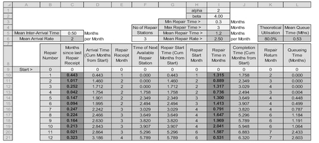
Table 7.5 Example of a 3-Channel Repair Facility with a Bounded Repair Time Distribution
7.5 How do we spot a Poisson Process?
The answer to that one is perhaps ‘with difficulty’!
We have concentrated so far on the pure Poisson Arrival Process, but how would we know if that was a valid assumption with our data?
If the Average Repair Time is significantly less than the average Inter-Arrival Time, who cares? We’d just do the repair when it turned up, wouldn’t we, because it would be so unlikely for there to be any queue to manage let alone theorise about?

Figure 7.15 Example of a 3-Channel Repair Facility with a Bounded Repair Time Distribution
Let’s consider the key characteristics of a Poisson Process:
- Arrivals are random
- Inter-Arrival Times are Exponentially Distributed
- This implies that relatively smaller gaps between Arrivals are more likely to occur than larger gaps
- The Standard Deviation of the Inter-Arrival Times are equal to the Mean value of those same Inter-Arrival Times
- There is no sustained increase or decrease in Arrivals over time
- The best fit line through the number of Arrivals per time period is a flat line
- The cumulative number of Arrivals over time is linear
- The incidence of Arrivals in any time period follow a Poisson Distribution
- The Variance of the number of Arrivals in a time period is equal to the Mean of those number of Arrivals per time period
However, as with all data there will be variations in what we observe and there will be periods when there may seem to be contradictions to the above. However, we should resist the urge to jump to premature conclusions and have to fall back on a dose of statistical tolerance. Two things would help us out here:
- Date and/or Time Stamping of the incoming data
- A longer period of time over which we gather our empirical data
If all our demand arisings were date and time stamped on receipt, then we could calculate the Inter-Arrival Times and verify whether they were Exponentially Distributed or not, using the techniques we discussed in Volume III Chapter 7. (Don’t worry about looking back just yet, we will provide a reminder shortly.) However, this very much depends on the specification of our in-house or commercial off-the-shelf information systems. In many instances, we may only be able to say which time period (week or month) the demand arose, which scuppers the Inter-Arrival Time approach to some degree if it is a relatively high rate per time period.
Let’s look at an example that is in fact a Poisson Process but where we might be misled.
The demand input data that we used in our previous models in Sections 7.3.1 and 7.4.1 was generated specifically to be Poisson Arrivals. Suppose then instead of this being randomly simulated generated data, that it was genuine random data, but that it was not date/time stamped; instead we only know which month the demand arose.
Now let’s look at the data we have after 12 months, 24 months and 48 months; our view of the underlying trend may change … the trouble is we cannot usually wait four years before we make a business decision such as sizing our repair facility, or contractually committing to a maximum turn-around time. In Figure 7.16, we might conclude that there appears to be a decreasing linear trend over time. Whilst the Coefficient of Determination (R2) is very low for the unit data (arisings per month), the cumulative perspective is a better fit to a quadratic through the origin, indicating perhaps a linear trend (see Volume III Chapter 2).
If we were to re-visit our data after two years (Figure 7.17), we would see that the overall rate of decrease was less than had been indicated a year earlier. In fact, it seems to have dipped and then increased. Perhaps the first year decreased as previously observed and then the second year flat-lined … or maybe there’s some other straw at which we can clutch!
If we’d had the luxury of four years’ data (Figure 7.18), we would have found that the demand for repairs was reasonably constant, albeit with a random scatter around an average rate, and a straight line cumulative.

Figure 7.16 Apparent Reducing Demand for Rpairs Over 12 Months

Figure 7.17 Apparent Reducing Demand for Repairs Over 24 Months

Figure 7.18 Constant Demand for Repairs Over 48 Months
What else could we have tried in order to test whether this was a Poisson Process at work? The giveaway clue is in the name, Poisson; the frequency of repair arisings in any month should be consistent with a Poisson Distribution. In Table 7.6 we look at the first 12 months:
- The Observed % Distribution is simply the proportion of Observed Occurrences per Month relative to the total for 12 months
- The Poisson % Distribution can be calculated in Microsoft Excel as POISSON. DIST(RepairsPerMonth, MeanRepairs, FALSE). (The FALSE parameter just specifies that we want the Probability Mass Function (PMF) rather than the Cumulative Distribution Function (CDF).) Here we will assume the observed sample’s Mean Repairs per Month which can be calculated as the SUMPRODUCT(RepairsPerMonth, ObservedMonthlyOccurrences)/Time Period. (The sum of the first two columns multiplied together divided by 12)
- The unrounded Number of Poisson Occurrences is simply the Time Period multiplied by the Poisson % Distribution to give us the number of times we can expect this Number of Repairs per Month in the specified time period

Table 7.6 Comparing the Observed Repair Arisings per Month with a Poisson Distribution
From our table, we may note that:
- We never had a month without a repair arising (zero occurred zero times)
- One and two repairs per month occurred four times each, both being greater than we would expect with a Poisson Distribution (but hey, chill, we can expect some variation)
- Three repairs occurred just once
- Perhaps surprisingly we had three months where five repairs turned up, and yet this was the maximum number also, whereas the Poisson Distribution was predicting one at best after rounding
- The observed sample Mean and Variance are similar values, which would be consistent with a Poisson Distribution (see Volume II Chapter 4)
- Despite these variations in monthly observations, from the Cumulative Distribution perspective in the right hand graph of Figure 7.19, it looks to be a not unreasonable fit to the data. (Note the characteristic double negative of the statistician in me rather than a single positive)
Rather than merely accept its visual appearance, in order to test the goodness of fit, we can perform a Chi-Squared Test (Volume II Chapter 6) on the Observed data against the Expected values derived from a Poisson Distribution based on the sample Mean. Unfortunately, even though there is a Microsoft Excel Function for the Chi Squared Test, we cannot use it here as this assumes that the number of degrees of freedom is one less than the number of observations; that doesn’t work when we are trying to fit a distribution with unknown parameters.
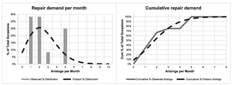
Figure 7.19 Comparing the Observed Repair Arisings per Month with a Poisson Distribution
In this case, with a Poisson Distribution, we have one unknown parameter, the Mean. We have only assumed it to be equal to the sample Mean; in reality it is unknown! (If we had been testing for normality we would have had to deduct two parameters, one for each of the Mean and Standard Deviation.)
Caveat augur
Degrees of freedom can be tricky little blighters. It is an easy mistake to make to use the Chi-Squared Test blindly ‘out of the box’, which assumes that the degrees of freedom are one less than the number of data points. This is fine if we are assuming a known distribution.
If we have estimated the parameters, such as the sample Mean of the observed data, then we lose one degree of freedom for each parameter of the theoretical distribution we are trying to fit.
Even though we can’t use the CHISQ.TEST function directly in Excel, we can perform the Chi-Squared Test manually. (Was that an audible groan, I heard? Come on, you know you’ll feel better for it afterwards!) as depicted in Table 7.7.

Table 7.7 Calculating the Chi-Squared Test for Goodness of Fit (Long Hand) over a 12 Month Period
However, now comes the contentious bit perhaps … over what range of data do we make the comparison? The Poisson Distribution is unbounded to the right, meaning that very large numbers are theoretically possible, although extremely unlikely. This gives us a number of options:
- Should we not test that we have an observed zero when theoretically we should expect a value that rounds to zero? In which case, at what point to we just stop; do we take the next expected zero and test that too? (… We haven’t got time to go on to infinity, have we?)
- Do we just ignore everything to the right of (i.e. larger than) the observed data? In this case, the sum of the fitted distribution will be less that the number of observations we actually have, and the result will include an inherent bias.
- Do we have a catch-all last group that puts everything together than is bigger than a particular value? In which case, which value do we choose … the largest observed value, or a value larger than this largest value? Would it make a difference?
We have already implied in our comments that the first two options are non-starters, so we have to select a value to use with option 3. Let’s go with a popular choice in some texts of using the largest observed value as the catch-all ‘greater than or equal to the largest value’. Firstly, we need to consider the mechanics of the calculations as shown in Table 7.7 to create the appropriate Chi-Squared Test:
- The first three columns have been read across from the first, second and fifth columns of Table 7.6. The only difference is that the last row now calculates the theoretical number of Poisson Occurrences we might expect for five or more repairs arising per month. The last cell of the third column is calculated as the number of time periods multiplied by the probability of having greater than four repairs per month. We do this as TimePeriod*(1-POISSON.DIST(MaxRepairs-1, MeanRepairs, TRUE). This takes the complement of the cumulative probability, i.e. the total probability through to 100%, or 1
- The fourth column computes the Fit Statistic by taking the difference between the observed data point (O) and the theoretical data point (E), squaring it and dividing by the theoretical value (E)
- In the fifth column, the rolling Chi-Squared Statistic, is the incremental cumulative of fourth column. Each row cell represents the change in Chi-Squared Statistic as an extra sequential data point is added
- The significance of Chi-Squared in the sixth column, is the probability of getting that value or higher if the null hypothesis is true that the data follows a Poisson Distribution. It is calculated in Microsoft Excel using the Right-Tailed Chi-Squared function CHISQ.DIST.RT(Chi-Square Statistic, df) where df are the degrees of freedom given by the number of intervals included less two (one for the Poisson Parameter and one for the pot). In the case of the first cell in the list, corresponding to 5 repairs per month (six intervals including zero), the number of degrees of freedom is 4 (6 intervals -1 distribution parameter -1)
- In the seventh column, we have calculated the Critical Value of the Chi-Squared Distribution at the 5% Level using the right-tailed inverse of a Chi-Squared Distribution function CHISQ.INV.RT(significance, df). The degrees of freedom, df, are calculated as above
- Finally, in the last column (eighth) we can determine whether to accept or reject the null hypothesis that the observed data follows a Poisson Distribution. We do this on the basis that the significance returned being less than or greater than the 5% level, or that the Chi-Squared Statistic is less than or greater than the Critical Value at 5% significance
Note: We really only need one of the sixth or seventh columns, not both. We have shown both here to demonstrate their equivalence; it’s a matter of personal preference.
In this example we have a probability of some 13.7% of getting a value of 5 or more, so we would accept the Null Hypothesis that the data was Poisson Distributed.
However, we might have some sympathy with the argument of whether we should test that getting zero occurrences of the higher arisings per month is consistent with a Poisson Distribution, so instead (just for the fun of it, perhaps), what if we argued that we want the ‘balancing’ data point to represent ’6 or more’ data points with an observed arising of zero? Table 7.8 repeats the test … and perhaps returns a surprising, and probably disappointing result.
What is even more bizarre is that if we were to change the ‘balancing’ probability to be geared around seven or more, we would accept the Null Hypothesis again as shown in Table 7.9!
We clearly have an issue here to be managed … depending on what range of values we choose to test we get a different result. Oh dear! We may be wondering does this always occur? The answer is ‘no’. Let’s consider the same model with the same first 12 months and extend it to a 24 months window, and re-run the equivalent tests. In Tables 7.10 and 7.11 the only difference is that the sample mean we use as the basis of the Poisson Distribution has dropped from 2.5 to 2.083. In this case the Null Hypothesis should be accepted in both cases, there is a drop in the significance level but the result is not even marginal.
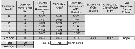
Table 7.8 Calculating the Chi-Squared Test for Goodness of Fit (Long Hand) over a 12 Month Period (2)

Table 7.9 Calculating the Chi-Squared Test for Goodness of Fit (Long Hand) over a 12 Month Period (3)
We would get a similar pair of consistent results if we extended the period to 48 months with a sample mean rate of 1.979 repairs per month.
What can we take from this?
- Statistics aren’t perfect, they are a guide only and estimators should use them carefully especially where results are marginal. However, in principle, their use normally enhances TRACEability (Transparent, Repeatable, Appropriate, Credible and Experientially-based)
- Statistics become more reliable as the volume of data used to generate them increases
- Overall, we would accept that this example does support the repair arrivals being a Poisson Process, which is very encouraging when we consider that the example was generated at random on that assumption. However, for a relatively small window, the statistics were not totally supportive and a judgement call would have had to be made if this was real data

Table 7.10 Calculating the Chi-Squared Test for Goodness of Fit (Long Hand) over a 24 Month Period (1)

Table 7.11 Calculating the Chi-Squared Test for Goodness of Fit (Long Hand) over a 24 Month Period (2)
Note: If we had inappropriately used Microsoft Excel’s CHISQ.TEST function here, it would have led us to accept the null hypothesis when we tested the ‘balancing probability’ set at ’5 or more’, or as ’6 or more’. However, in the spirit of TRACEability, we should conclude that:
It is better to make the wrong decision for the right reason rather than the right decision for the wrong reason?
The counter argument to this would be the ‘ends justify the means’ … but that fails to deliver TRACEability.
However, there are instances where an assumption of a steady state Arising Rate is not appropriate, and we have to consider alternatives.
7.6 When is Weibull viable?
We may recall (from Volume II Chapter 4) the Weibull Distribution (pronounced ‘Vaybull’) … it was the one with the ‘vibble-vobble zone’ that is used for Reliability Analysis over the life cycle of a product or project. Intuitively, it seems a reasonable distribution to consider here. To save us looking back to Volume II Chapter 4, let’s remind ourselves of its key features:
- In its basic form, the Weibull Distribution is a 2-parameter distribution that models the change in reliability over the product life cycle. It can be used to model the probability of failure over time
- Microsoft Excel has a specific function for the distribution:
WEIBULL.DIST(x, alpha, beta, cumulative)
x is the elapsed time relative to a start time of zero; alpha is the shape parameter; beta is the scale parameter, and cumulative is the parameter that tells Excel whether we want the PDF or CDF probability curve
- When alpha < 1, the failure rate decreases over time, indicating ‘infant mortality’
- When alpha > 1, the failure rate increases over time, indicating an ageing process (I think my alpha is greater than one now; parts are beginning to fail more frequently than they used to do!)
- When alpha = 1, the failure rate is constant over time, indicating perhaps that failures are due to random events
However, something special happens to the Weibull Distribution when alpha = 1 …
- When alpha = 1, we have a special case of the Weibull Distribution … we call it the Exponential Distribution. (Note: The Excel Function WEIBULL.DIST incorrectly returns a zero when x = 0, unlike the EXPON.DIST which returns the correct value of its scale parameter)
- Furthermore, its scale parameter is the reciprocal of the Weibull Scale parameter … just as it was with the special case of the Gamma Distribution. (it’s funny how all these things tie themselves together). See Figure 7.20
WEIBULL.DIST(x, 1, beta, cumulative) = EXPON.DIST (x, 1/beta, cumulative)

Figure 7.20 Weibull Distribution with Different Shape Parameter Values
The implication here is that a Poisson Process with its Exponential Inter-Arrival times is indicative of a Steady State failure rate … so rather than being an assumption, we could argue that it is a natural consequence of a wider empirical relationship exhibited by the Weibull Distribution. However, this argument is a little contrived because the context in which we have used the two distributions is different!
Talking of Empirical Relationships …
- A Weibull Distribution can also be used to model Production and Material Lead-times
- Often, we will have situations where failure rates increase or decrease over time
- We can also get ‘Bath Tub’ curves where failure rates decrease initially, then follow a steady state period before increasing again later in the product life (see Figure 7.21). These can be represented by more generic distributions such as the Exponentiated Weibull Distribution … but these are not readily supported in Microsoft Excel, so we’re not going to go there from here.
Given that these are empirical relationships, is there a practical alternative that allows us to tap into the Bath Tub Curve in Microsoft Excel? (You didn’t think that I would let that one go, did you?) Cue for another queueing model …

Figure 7.21 A Bath Tub Curve Generated by an Exponentiated Weibull Distribution
7.7 Can we have a Poisson Process with an increasing decreasing trend?
In Volume III Chapters 4 and 6 we discussed the natural scatter of data around a Linear or Logarithmic function as being Normally Distributed, whereas for an Exponential or Power function, the scatter was Lognormally Distributed, in other words, for the latter two the scatter is not symmetrical but positively skewed with more densely concentrated number of points below but close to the curve but more widely scattered above the line when viewed in linear space.
If we consider a line (or a curve for that matter) that increases or decreases over time, then we can conceive of the points being scattered around the line or curve as a Poisson Distribution. For example, as the number of aircraft of a particular type enter into service, then the demand for repairs will increase, but at any moment in time the number of such repair arisings per month can be assumed to be scattered as a Poisson Distribution. So, in answer to the question posed in the section title: yes.
If we already have data (as opposed to just an experientially or theoretically-based assumption) and we want to examine the underlying trend of the Mean of the data, then there are some techniques which are useful, … and some that are not. We have sum-marised some of these in Table 7.12.
Let’s create a model of what it might look like.
Suppose we have a situation where we have an initial repair arising rate of some four per month, falling exponentially over a 12-month period to two per month, with a rate of decline of 6% per month in terms of the average arising rate. After that let’s assume a steady state rate of two per month. Table 7.13 illustrates such a set-up.
- Cell C1 is the Initial Mean Arrival Rate and Cell C2 is the Exponential decrease factor per month
- Cells C3 and J3 are the Average Steady State Repair Arrival Rate and Repair Rate respectively
- Cells C4 and J4 are the Average Repair Inter-Arrival Time and the Average Repair Time expressed as the reciprocals of Cells C3 and J3 respectively. (Note that rows 3 and 4 are the opposite way round than we used for earlier models)
- The process arrivals are generated by a series of random probabilities in Column B using RAND() in Microsoft Excel
- Column C calculates the Time Adjusted Repair Arrival Rate using an Exponential decay based on the Initial Arrival Rate in Cell C1, reducing at a rate equal to Cell C2 until the Rate equals the Steady State Rate in Cell C3. In this example Cell C5 is given by the expression MAX($C$1*(1-$C$2)^F7,$C$3) which is the maximum of the Steady State Rate and the Time Adjusted Rate. We will look at the calculation of the relevant month in Step 8

Table 7.12 Some Potential Techniques for Analysing Arising Rate Trends
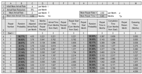
Table 7.13 Example of a G/M/1 Queueing Model with an Initially Decreasing Arising Rate
- Column D contains the random Poisson Arrivals for the Repairs which, as we discussed earlier, is equivalent to Exponentially distributed Inter-Arrival Times between the consecutive repairs and based on the random probabilities in Column B. Also as discussed previously, in Section 7.3, these inverse Exponential values are generated using the inverse of a Gamma Distribution with the alpha shape parameter set to one: GAMMA.INV(RAND(),1,TimeAdjustedMean) where the parameter value TimeAdjustedMean is that of the variable in Column C from Step 5. (Remember that the Exponential Distribution is a special case of the Gamma Distribution)
- Column E is the running total of Column D to give the point in time that the repair is received
- Column F expresses the Month in which the repair arrives This is the value we use to determine the Time for calculating the Time Adjusted Mean for the next Repair. (We could have used the unrounded value in Step 7, Column E – it’s a matter of personal choice)
- Column G determines the earliest Repair Start Time by calculating the Maximum of either the current Repair’s arrival time from Column E or the previous Repair’s Completion Time from Column K (which we will discuss in Step 12)
- Column H is similar to Column E but relates to the month in which the repair process is deemed to have started
- Column I is assumed here to be a random repair duration with an Exponential Distribution and is calculated as GAMMA.INV(RAND(), 1, $H$3). We could use another distribution if we have the evidence to support it; this would make the model a M/G/1 queueing system
- Column K is the time at which the repair is completed as is the sum of the Start Time (Column G) and the Repair Duration (Column J)
- Column L is similar to Column F but relates to the month in which the Repair is deemed to have been completed

Figure 7.22 Example of Time-Adjusted G/M/1 Queueing Model
Figure 7.22 illustrates the output from this model.
We could build a multi-channel time-adjusted M/M/c or M/G/c Model by combining this technique with that which we discussed in Section 7.4 (but to be honest, looking from here, it looks like many of us have had enough now, so we will not demonstrate it here).
That’s all we are going to cover in this introduction to Queueing Theory. (I hope it was worth the wait.)
7.8 Chapter review
Eventually (sorry for making you wait so long), we came to Queueing Theory and concentrated largely on how we might model different situations rather than manipulate parametric and algebraic formulae (you should have seen the relief on your face!), Perhaps the single most important learning point was that if the Demand Arisings into our system are distributed as a Poisson Distribution, then the Inter-Arrival Times between discrete demands will be Exponentially Distributed. (Don’t you love it when different models just tie themselves together consistently and neatly. No? Perhaps it’s just me then.)
In this journey into queueing we learnt that, as well as being spelt correctly, there are different Queueing Systems, which can be described by an internationally recognised coding convention, depicted by the notation A/S/c/K/N/D.
Many queueing scenarios rely on random arrivals, in which the time until the next arrival is independent of the time since the last arrival. This is property is referred to as being ‘memoryless’, and the Exponential is the only Continuous Probability Distribution with this property. We noted that a Geometric Distribution is the only Discrete Probability Distribution with this property.
We closed by considering the variation in demand over time by considering the viability of Weibull, used frequently to model failure rates (as well as manufacturing and process durations). We briefly considered the more complex end of the Weibull spectrum by acknowledging the empirical relationship of a Bath Tub Curve. However, we demonstrated how we could simulate this quite simplistically by splicing together Time-Adjusted Demand Model using Exponential Distributions, which, we noted, are special cases of the Weibull Distribution.
References
Department for Transport – Driving Standards Agency (2015) The Official Highway Code, London, The Stationary Office.
Erlang, AK (1909) ‘The theory of probabilities and telephone conversations’, Nyt Tidsskrift for Matematik B, Volume 20: pp.33–39.
Erlang, AK (1917) ‘Solution of some problems in the theory of probabilities of significance in automatic telephone exchanges’, Elektrotkeknikeren, Volume 13.
Kendall, DG (1953) ‘Stochastic processes occurring in the theory of queues and their analysis by the method of the imbedded Markov Chain’, The Annals of Mathematical Statistics, Volume 24, Number 3: p.338.
Kolmogorov, AN (1933) ‘Grundbegriffe der Wahrscheinlichkeitrechnung’, Ergebnisse Der Mathematik.
Little, JDC (1961) ‘A proof for the Queuing Formula: L = λW’, Operations Research, V olume 9, Number 3: pp.383–387.
Liu, HH (2009) Software Performance and Scalability: A Quantitative Approach, Hoboken, Wiley, pp. 361–362.
Mikes, G (1946) How to Be an Alien, London, Allan Wingate.
Stevenson, A & Waite, M (Eds) (2011) Concise Oxford English Dictionary (12th Edition), Oxford, Oxford University Press
Wilkes, FM (1980) Elements of Operational Research, Maidenhead, McGraw-Hill.