9
Data Visualization
Data Visualization is an important part of the data science process. Here we learn how to do data science in both languages.
9.1 Importance of Data Visualization
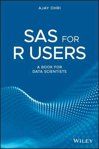
The anscombe dataset shows the importance of data visualization. On statistical examination it shows data is similar. But on visualization it shows the data is very different.
| Property | Value |
| Mean of x | 9 |
| Sample variance of x | 11 |
| Mean of y | 7.50 |
| Sample variance of y | 4.125 |
| Correlation between x and y | 0.816 |
| Linear regression line | y = 3.00 + 0.500x |
| Coefficient of determination of the linear regression | 0.67 |
But the graphs are quite different.
We are going to do the following graphs in this chapter for both SAS and R:
- Bar Plot: A bar chart represents data in vertical bars with height of the bar proportional to the value of the variable.
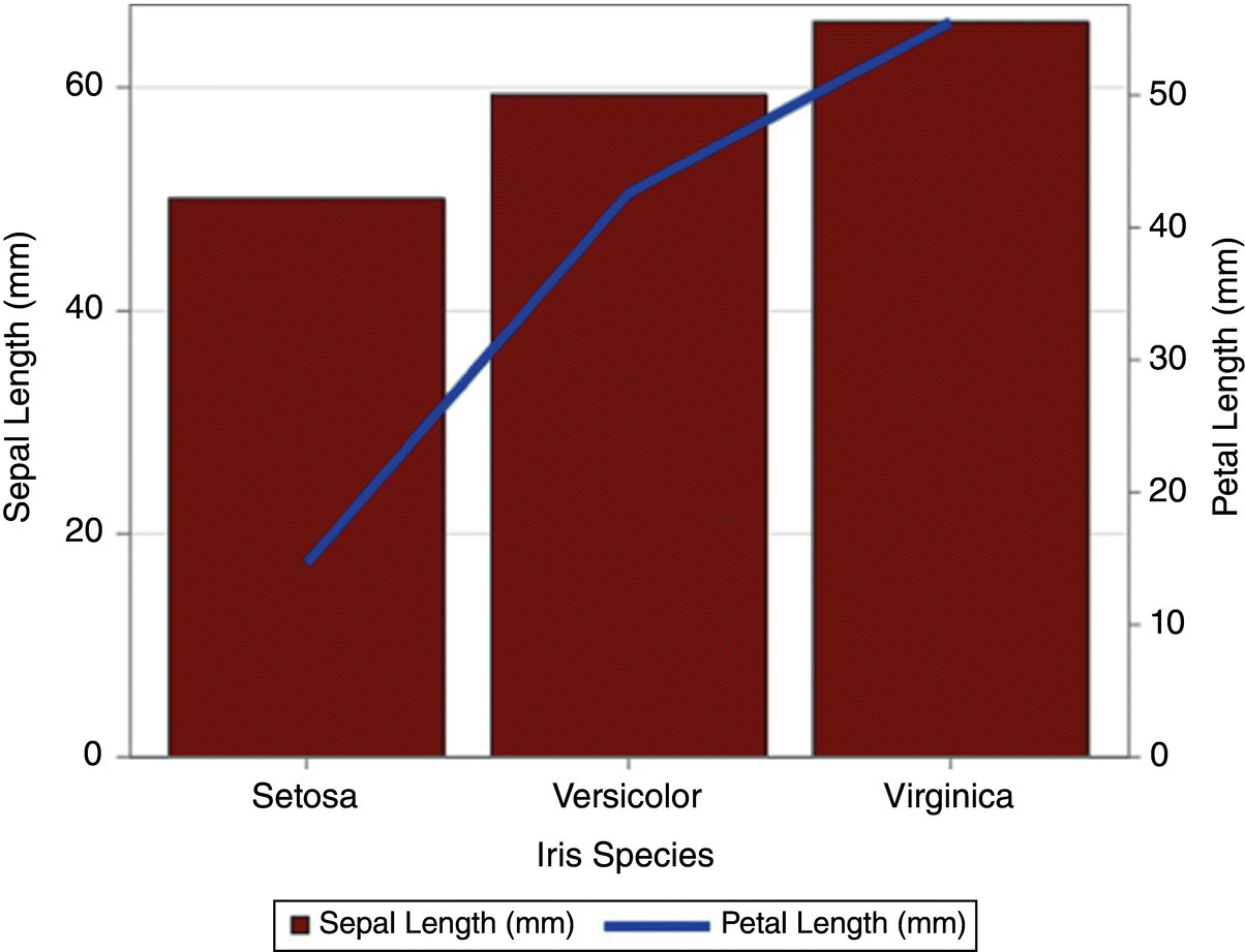
- Bar‐Line Plot: A combination of Bar Plots with Line Graphs, with one quantity being represented in a Bar Plot and the other in a Line Graph.
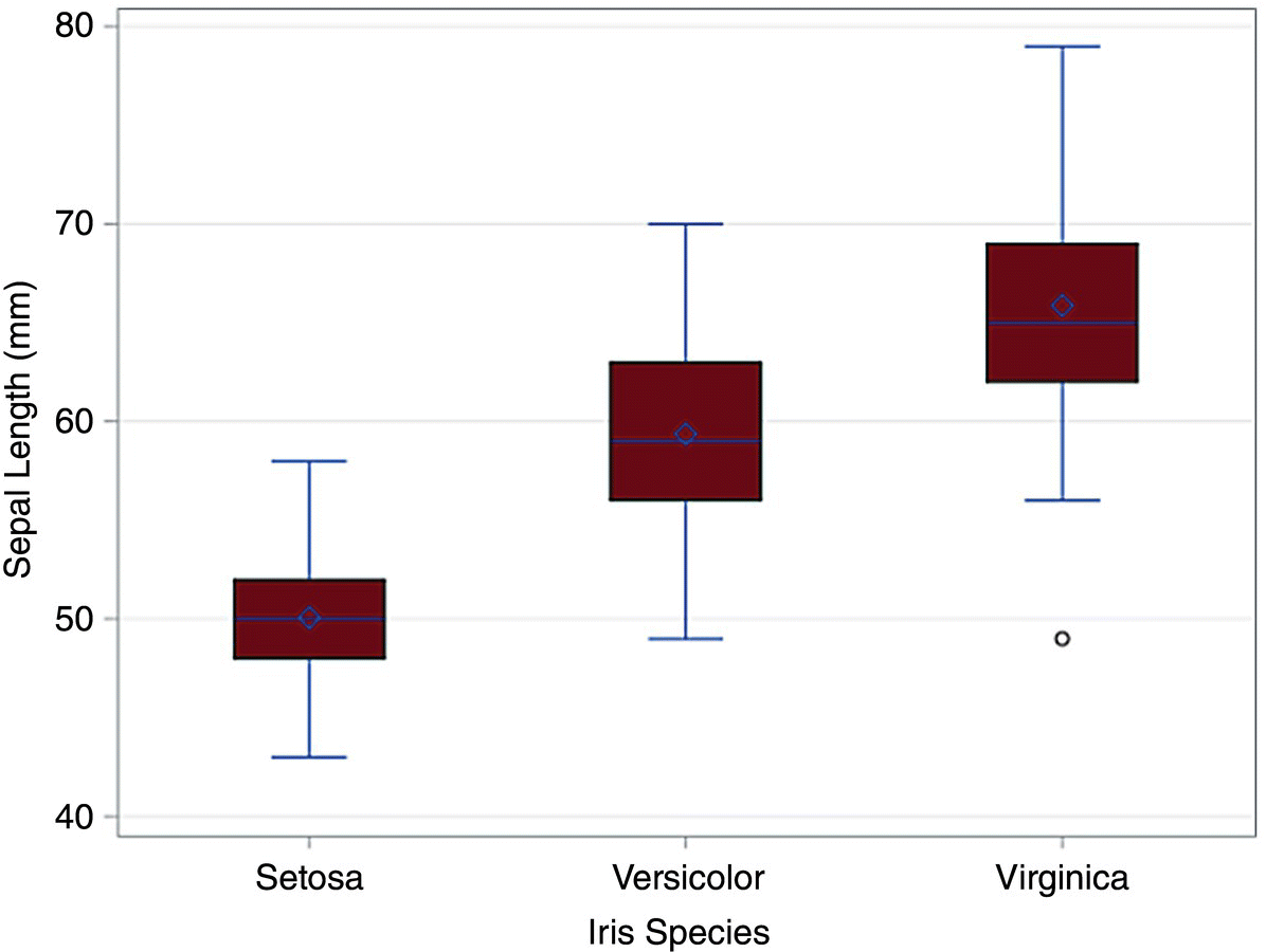
- Box Plot: A plot in which a rectangle is drawn to represent the second and third quartiles, usually with a vertical line inside to indicate the median value.
- Bubble Plot: A bubble chart is a type of chart that displays three dimensions of data. Each entity with its triplet (v1, v2, v3) of associated data is plotted as a disk that expresses two of the vi values through the disk's xy location and the third through its size.
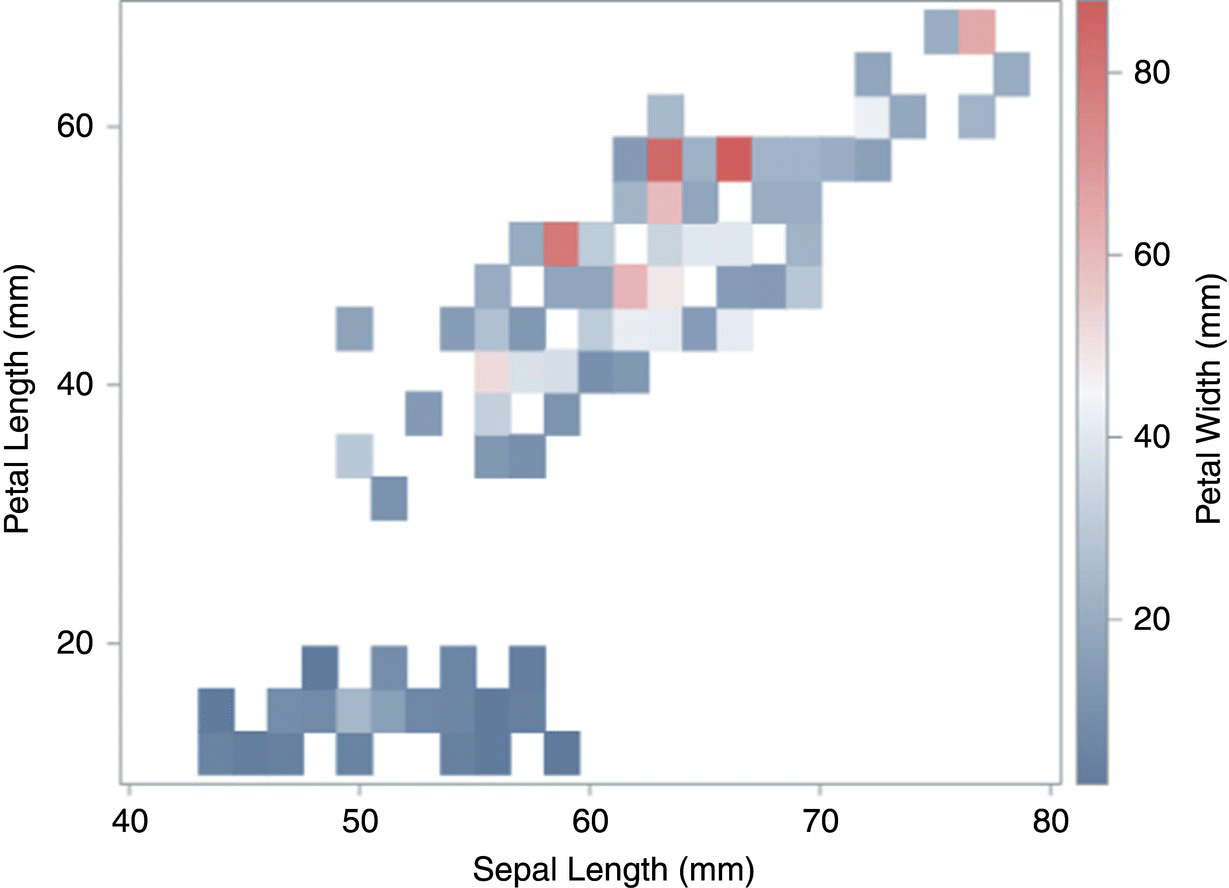
- Heat Map: A plot in which data values are represented as colors.
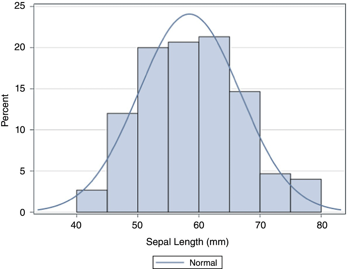
- Histogram: This represents the frequencies of a variable bucketed into breaks.
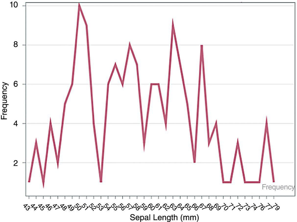
- Line Chart: A graph that connects a series of points by drawing lines between them.
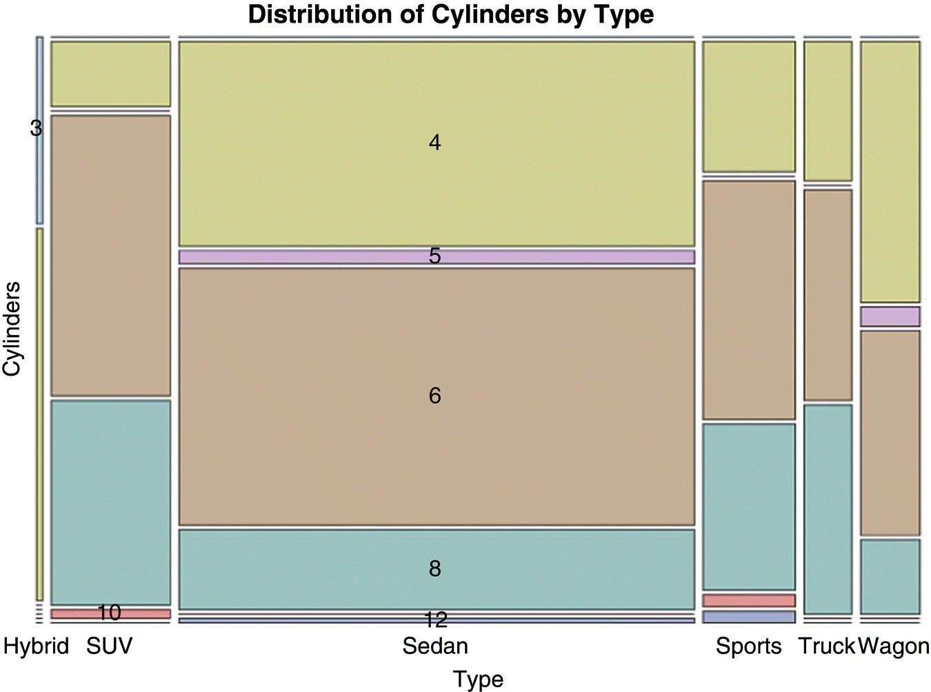
- Mosaic Plot: A graphical display of the cell frequencies of a contingency table in which the area of boxes of the plot are proportional to the cell frequencies.
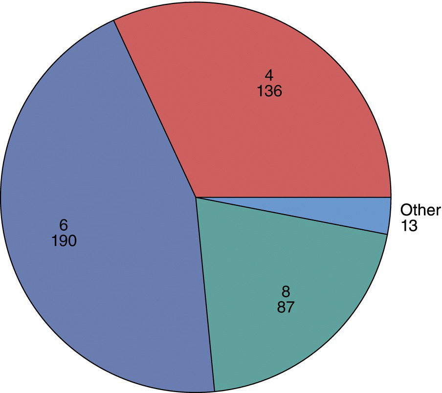
- Pie Chart: A pie chart (or a circle chart) is a circular statistical graphic, which is divided into slices to illustrate numerical proportion.
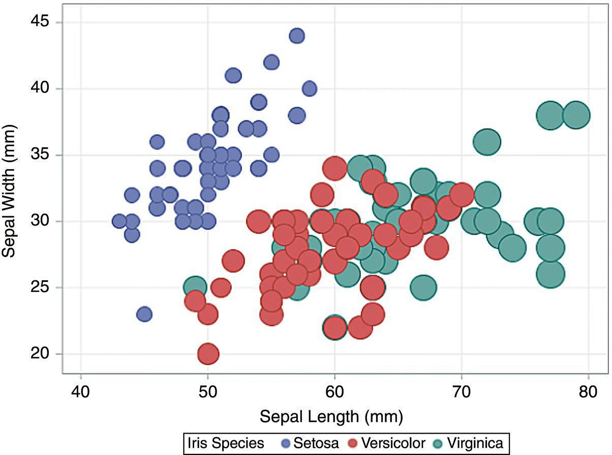
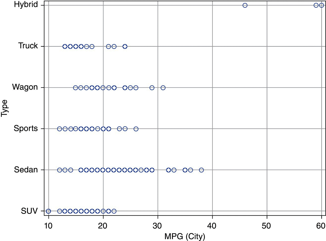
- Scatter Plot: A graph in which the values of two variables are plotted along two axes, the pattern of the resulting points revealing any correlation present.
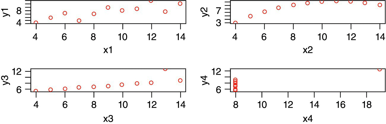
9.2 Data Visualization in SAS
The Tasks and Utilities option in SAS Studio enables graphs quite easily as well as generation of code. Due to printability options we are giving partial output here.
Bar Plot:
Bar‐ Line Plot:
Box Plot:
Bubble Plot:
Heat Map:
Histogram:
Line Chart:
Mosaic Plot:
Pie Chart:
Scatter Plot:
9.3 Data Visualization in R
Bar Plot:
Bar‐Line Plot:
Box Plot:
Bubble Plot:
Heat Map:
Histogram:
Line Chart:
Mosaic Plot:
Pie Chart:
Scatter Plot:
9.4 Quiz Questions
- What type of plot shows inter quartile range and median?
- What type of plot shows relative numerical quantities in terms of height?
- Which type of plot connects points with lines?
- Which type of plot shows relative frequency of two or more categorical variables through area?
- Which type of graph shows frequencies as grouped in breaks?
- Which type of graph shows color intensity as a measure of variable quantity?
- Which type of graph can show three and even four quantities?
- Which type of graph shows relative frequencies as a circle?
- Where do Graphs appear in SAS Studio?
- What does Anscombe dataset prove?
Quiz Answers
- Boxplot
- Barplot
- Line Plot
- Mosaic Plot
- Histogram
- HeatMap
- Bubble Plot
- Pie Chart
- Tasks and Utilities in the left pane
- Pure numerical statistics can be deceptive without data visualization.