In my book Say It with Charts, I lay out some easy techniques that business people can use to create visual presentations that are powerful, persuasive, and eye-catching. However, if you’re like many who face the challenge of mastering this skill, you know it takes time, patience, and, most of all, practice, practice, and more practice. That’s why I offer you this workbook.
In it, you’ll find three things:
A series of business charts that I’ve gathered from real-life situations
A challenge to you to improve them
Suggested improvements to communicate the information more quickly and clearly.
Your challenge in this workbook is to avoid the temptation of simply flipping the page to see my solution. Instead, I encourage you to study the charts and use the space you’ll find below them to sketch your ideas for improvement. Then, turn the page to compare your ideas with what I came up with in the real world and what led to my thinking.
As you accept this challenge, understand that I am in no way claiming that my answer is the best one. In fact, I have every confidence that your answer could work just as well. The important thing is that you take a critical look to determine what the level of improvement can be.
Also, understand that there’s nothing requiring you to do these exercises sequentially. Start anywhere. Dip in and out. Come back to the same example again as new ideas come up. I hope that after you’ve done a few of these you’ll conclude that “playing it with charts” can actually be fun.
Before you start, let me offer this quick refresher on the fundamentals of charts. As readers of Say It with Charts will remember, charts generally fall into two broad categories:
Data charts, also called quantitative charts, depict numbers graphically to make a point.
Concept charts, also called nonquantitative charts, use words and images.
Of course, some charts use elements of both categories.
We can translate data into five kinds of comparisons. Each comparison is shown best by a specific chart form. Here’s a reminder of how they are best used.

Concept charts describe a situation, such as interaction, interrelationship, leverage, or forces at work. There are basic examples in the visual below, but for some “thought starters,” before you tackle the exercises in this workbook, allow me to turn your attention to the fourth edition of Say It with Charts. In Section 3 of the book, you’ll find “Solutions in Search of Problems,” a chapter that offers a range of ideas for nonquantitative visuals.

As you begin your journey through this workbook, you’ll notice I’ve presented the examples in a jumbled manner. That’s to keep you on your toes. However, to help get you started, here are some broad categories for solutions to both data and concept charts. These solutions are by no means exhaustive. I call them:
Simpler is better.
More is better.
Different is better.
Creativity is better.
Take a look at the samples of each of these solutions on the following pages.
In this solution, we remove details from the chart that get in the way of the message we’re trying to send. This isn’t always easy. It’s a natural tendency to want to give your audience as much information as possible.
The problem is that this prompts you to present too much information, so your audience actually absorbs and retains very little of it.
The “simpler is better” solution requires you to think hard about the message you really want to convey in a chart, and eliminate material that distracts from that message.
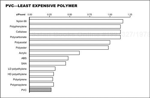
Here’s an example. The top chart supports the point that PVC is the lowest-cost polymer. Here, you’re quick to see that it shows all the data gathered during the problem-solving stage to make the point. This might be okay for a paper document, in which readers can spend as much time with the chart as they need. But if you’re presenting this chart to an audience, onscreen, the content should be greatly simplified.
For example:
Do we need two measures of cost performance to support the same message—one expressed in cents per pound, the other in cents per cubic inch? No. Cents per pound will do.
Must we show the data at the end of every bar? No. A scale will be sufficient to show the relationships.
In addition to these changes that make the chart simpler, I’ve changed the sequence of the bars, ranking them from high to low, to better show PVC’s position. The new chart with less data focuses attention on the message that PVC’s cost is lower than that of all other polymers.

Here, we create multiple charts to give a message that is too complex to be told on just one chart.
Sometimes, your goal for the presentation requires you to keep the details that you might eliminate if you used a “Simpler is better” solution. So you go back to cramming too much stuff on a page and hope you can explain it all to your audience.
The solution isn’t to eliminate details, but to present them in bites that are small enough to absorb. Sure, this will increase the number of pages in your presentation but, whenever this worries you, just remember this mantra:
“It takes the same amount of time to present five ideas on one slide as it does to present one idea on five slides.”
This example demonstrates what I mean. The visual on top shows how the information was captured on paper. I’ll grant you that if you were just distributing this on paper; the page might work, since, in this circumstance, the reader controls the communication. He or she can take as much time as needed to review all the information.
However, for an onscreen presentation to an audience, where you, the speaker, control the communication, I would suggest using six legible slides, with each slide comparing the competitor’s approach to one of the components of the business system.
An added benefit of this approach is that the audience focuses on one idea at a time, as it is presented. There is no risk that some will focus on different aspects of the visual than the point you’re discussing.
Yet another benefit: because there’s less information on each visual, we can use a larger type to fill the screen and ensure legibility.


In this solution, we scrap the chart form we had been using entirely and use a completely different form—one more appropriate for the data we’re trying to convey.
For instance, while the top chart on the facing page is certainly simple, I find it difficult to determine its message. Can you figure out which country’s margins are rising or falling without reading the data at the top of the columns? Also, is there any logic to the sequence of countries?
With such charts, it’s helpful to go back to the matrix at the beginning of this book to determine which chart form might be more effective. In this case, we’re comparing profit margins for six countries over time. A column chart is often appropriate for a “time comparison,” but if you switch to a line chart, use a larger scale, and put the countries in descending order, the trends become clearer. Now the audience can quickly see which countries have the highest margins and where the trends are going.


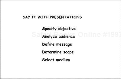
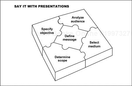
I would be the first to say that, at times, a basic text slide is all that’s needed to convey a message. On the other hand, creative images can help tell your story in a more interesting way, thereby reinforcing understanding. That’s what this solution is all about.
For instance, here is a list of recommended steps for planning any business presentation. Since, in this case, there is no set sequence to the order of these steps, and all the steps are independent, I’d suggest that the puzzle image will help make them more memorable.
Furthermore, you can use the puzzle image as a table of contents or “tracker page” to help guide your audience through the chapters of your story. As you move from step to step, you can add each piece of the puzzle. Then, by displaying the entire puzzle at the end, you effectively summarize your main points.