


Your solution
Here, we’ll assume that the content and its message are well thought through, but that somehow the layout you see—or don’t see—is simply illegible.
Now let’s be clear: if the chart is important enough to be presented, then it’s important enough to be legible. So what can you think of that would make the chart legible?
Yes, you could remove those columns that show no data, only dashes. However, grant me that that’s not going to help very much. Another solution I sometimes hear is to make a chart out of it. But grant me that charts use more space than tabular data do, so that’s not the solution here. Yes, you could break the table and make it into two horizontal rows, or for that matter, put it on several pages.
However, in this case the solution is so simple that it often escapes us: simply switch the axes. That’s exactly what I did to use the largest possible type to fill the visual, and you can see how the solution is many times more legible.


Your solution
This chart is actually not bad if you plan to use it in a memo or a report. However, for an onscreen presentation to a large audience, I’d recommend using six slides: the first to introduce the five quadrants, the subsequent five to highlight each quadrant—one at a time. (See the back of the facing page for subsequent slides.)
Yes, I feel your resistance. After all, using six slides where we had one seems to suggest more presentation time. But I think you’d agree that the amount of information being presented is exactly the same. So the time it takes to present that information should also be the same.
Using six slides also avoids the problem of audience distraction. They’ll focus on the specific point you’re making instead of reading other portions of the slide. And using six slides makes this a truly visual visual presentation, where you keep the audience’s interest by changing, changing, changing slides versus forcing them to look at the same slide for a boringly long time.


Gene’s solution


Your solution
At times, the obvious solution of splitting one detailed chart into several isn’t the answer to legibility. Sometimes, just reducing the amount of detail and highlighting the most important component of the story can result in a major improvement.
Follow the story: “This chart shows that the Tuckahoe plant is doing an excellent job of keeping variable costs low in the manufacture of three out of four products. For HFCS-42 and HFCS-55, it ranks as the second-lowest-cost producer. While it ranks fourth for pearl starch, the cost differential with the lowest-cost plant is small. However, for corn syrup, the combination of a seventh ranking and a sizable cost differential indicates the need to search for cost-reduction opportunities.”
For the visual presentation, the most obvious solution would be to use a separate slide for each product. However, with as many as 13 horizontal bars for each, the plant names would probably still be illegible. And creating four separate pages would prevent the audience from easily comparing the four products.
In this case, the answer is to “visualize the message, not the mess.” The important elements of the message here are: performance and Tuckahoe ranking. We use a range column chart to show the spread in total variable cost between the best and worst performers for the four products. Here, the ranges are the same length, creating an index chart; that is, the spread equals 100 regardless of the cost differentials. We show Tuckahoe’s ranking against the top and bottom performers. The message comes across with one clear and legible chart. If you feel the need to provide the detailed data, just distribute the original chart as part of any handouts you leave behind with your audience.


Gene’s solution


Your solution
This one took me a while to figure out, but the impact was worth the effort.
The solution came to me once I saw that the company’s name, at the bottom of the list, started with the letter “Q,” and that the logo-like symbol in the title began with a “Q.”
It became clear that the “Q” needed to dominate the visual. I was able to place the bullet points so the most important theme was at the center of the diagram and to position another theme at the bottom of the “Q,” reinforcing the image of movement over time.
I’m often asked how these ideas come to mind. Like anything else, the more you exercise your creativity, the more skillful you become. Practice, practice, practice!

Gene’s solution


Your solution
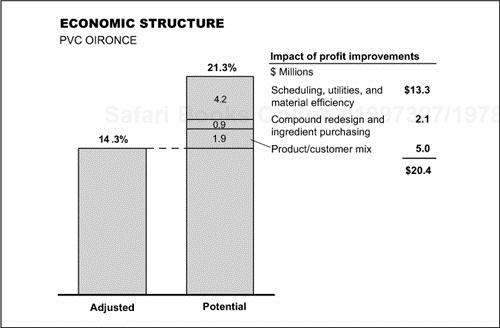
I’m with you if you feel this chart might suffice in many cases. It’s a typical example of a “waterfall” chart, showing the parts of a whole.
However, it strikes me as unnecessarily busy: I’m not getting a clear indication of the sum of the improvements; I’d like the dollars of improvements to line up; I don’t need to repeat the OIRONCE label at the bottom of both columns, since it’s introduced in the subtitle. All of this argues for using a different chart form.
By combining the profit improvement into one subdivided column chart, the labels line up and the dollars stack up to their total.

Gene’s solution
Your solution
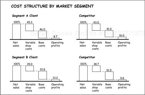
Once more, the waterfall chart is at work here, but this one strikes me as even busier than the last.
The scale is so squeezed that the differences in the plotted values are difficult to measure. In addition, the labels at the bottom of the columns are redundant. Most importantly, the chart doesn’t accomplish its main goal: allowing the audience to easily compare the company and its competitor in each of the two segments.
By placing the components within 100 percent columns, I can use a much bigger scale, I limit the number of labels, and I line up the data in a way that allows an easy comparison.

Gene’s solution


Your solution
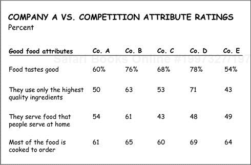
I’ll grant that there are those in the business community who “inhale” tabular data. That is, they look at a list of numbers and quickly read the trends they represent. However, as I point out in Say It with Charts, data implies relationships, whereas charts demonstrate them. And so it is with this example.
In this case, by plotting the range between the low and high performers for each of the attributes, we see Company A’s ranking much more quickly and without needing to read and interpret all the numbers in the table.


Gene’s solution


Your solution
On the surface, it’s hard to see why we would want to change the chart at the top of the next page. After all, it does a good job of showing how the proposed solution comes out of the differences identified between the developed and emerging markets.
And yet, for me, the word “Differences” in the title made me feel that the solution resulted from the combined forces at work—therefore what you see on the bottom chart.
The added benefits are that the visual looks more attractive as a design, and it makes it stand out from the crowd of other visuals we traditionally see in presentations.


Gene’s solution


Your solution

Resist the temptation to sneak a peak
Remember, your solution may be BETTER than mine
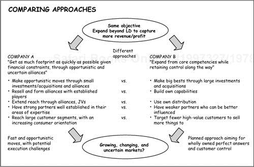
It doesn’t take long to understand that the point of the chart at the top of the next page is to contrast the approaches that the two companies take to reach the same objective.
However, I find myself spending too much valuable time reading all the bullet points to be able to appreciate the distinctions the chart describes and the flow of ideas.
My solution, shown below the first chart, is to switch the flow from top–bottom to bottom–top. In this manner, the chart first identifies the forces at work (growing, changing, uncertain markets) that lead to a summary of each company’s approach, seen at the base of the arrows. Then, the eye moves up to see a simpler and clearer contrast of each company’s moves, all of which leads to the common objective at the top.
Adding the arrows in perspective helps the eyes follow the flow.
A general tip is worthy of mention here: arrows are powerful tools to convey a number of concepts—changes in a situation, movement, or the passage of time, just to name a few. I use them often to “point the way.”


Your solution

One of the criteria for designing charts that work is making sure that the chart clearly depicts the message in the title.
In this case, I just don’t experience the word “significant.”
I do see the decline over the year for Company A because it’s measured against a flat base line. But what about the other companies?
Can you appreciate the difference that results from showing each company against its own base line? Also, notice that by squeezing the time scale and making better use of the layout space, we’re able to use a bigger scale that magnifies the “significant” differences mentioned in the title.


Your solution
Once more, an example of a chart that’s easy to follow and that doesn’t appear to need change.
However, did you notice the back-and-forth movement of your eyes as you sought to figure out the relationship of the column chart at the right with the column headings on the left?
Can you now appreciate the added benefit of the arrows, which more quickly distinguish the opposite direction of the two approaches and lead to the corresponding “recovery rate” resulting from each approach?

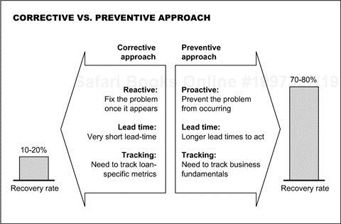
Gene’s solution


Your solution
Here’s an example showing that plotting every number results in hardly any visual difference among the data. It renders the chart frustratingly difficult to read, especially because the scale is so squeezed.
In this case, I plotted just the totals in a vertical bar chart and then left the rest of the data in a table underneath its respective country. In this manner, we can see the range of growth by country and then study the sources that contribute to the change in a much more restful table.
By the way, the sequence of columns could have been arranged in either descending or ascending order, depending on the situation at hand. Granted that this is an “item comparison” that should be treated more often than not as a horizontal bar chart. Let’s be flexible in this case and agree that the vertical bars work better.
This chart provides a good illustration of a solution that is sometimes so obvious we don’t see it. We frequently feel obligated to plot our data in bars, columns, or whatever, when the best idea may be to just “table it.”

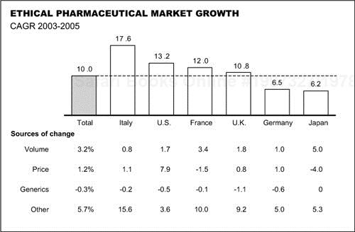
Gene’s solution


Your solution
Waterfall charts work best when they are used to show a combination of pluses and minuses. Otherwise, they demonstrate the first habit of bad chart design: “Nothing is ever so simple that we cannot make it complex.”
Can you see—or not see—that all we have here is a pie chart showing how the parts add up to the total? On the other hand, given the number of components in this case, I’ll grant that a pie chart would not work. Therefore, make it into an “item comparison” and create four clusters of bar charts.
Now you can use a much larger scale to differentiate the data. And notice how the labels are much easier to read, since they’re no longer limited by the width of the columns.


Gene’s solution

Your solution
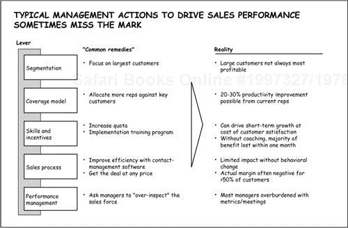
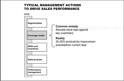
I’d like to believe that by now you can quickly figure out what to do with this one.
As before, this chart works well on a single page as a handout.
But for an onscreen presentation—no matter the pressure to minimize the number of slides—breaking it into multiple slides concentrates comments on each of the levers one at a time, and avoids the problem of the audience reading ahead.


Gene’s solution


Your solution
As simple as the chart looks, it takes time to figure out how best to read the information. With a bit of effort, we finally see that this is meant to show the correlation between the percentages of sales to earnings for each of four supermarket product categories.
The same message can be delivered more easily and quickly by using a two-columned chart.


Gene’s solution

Your solution
I have two simple suggestions that would make this chart easier to read.
One you see on the bottom, which is to use directional arrows to make it easier to see the ups and downs of the various components.
Second, on the other side of the facing page, is to group all the pluses into one arrow versus the sum of all the minuses, thereby reducing the number of individual components we usually see on these charts.

Gene’s solution


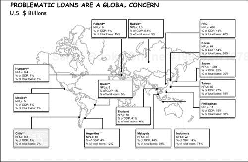
Whereas I find the use of the world map attractive, I don’t have to convince you that this chart has a major legibility problem. Also, it bothers me that the label for Hungary is all the way to the left, above those for Mexico and Chile, when it should be with its geographical colleagues of Poland and Russia across the top.
Beyond that, I find the repetition of the labels for the three measures redundant. And it takes up a lot of real estate.
In this case my solution to the problem is to “table it.” By putting all the data in a simple table, I can reduce the redundant labels, and make the chart legible. Also, the map is greatly simplified and the table of countries lines up vertically with their relative positions on the map. Depending upon the audience, the map could be arranged with Europe or the U.S. first instead of Asia, as shown.

Gene’s solution


Your solution
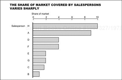
This is an example that demonstrates one of the first rules of chart design—that charts provide a quick visual impression and that the title, scale, and footnotes are all secondary to that impression.
When I first looked at this chart, my quick impression was that the share of market went through some wild fluctuations over time, but finally reversed the grave loss it endured in the first period.
When I looked more closely, I realized that this is not a “time series comparison” but an “item comparison” that contrasts the performance of several salespeople. Notice how much faster and more accurate the visual impression becomes when treated as a bar chart.

Gene’s solution


Your solution
At times, in our effort to show all the data we’ve gathered, we plot the wrong figures. Here it’s not so much the comparisons of the actual employment, assets, sales, and net income that tells the story, but their percentage change over time—in this case, the average annual growth rates.
By plotting these growth rates, we more clearly and quickly see the reverse pattern mentioned in the message title.
By the way, if showing the absolute values remains important, it’s perfectly appropriate to include them in tabular form underneath their respective time periods as you see here at the bottom of the chart.
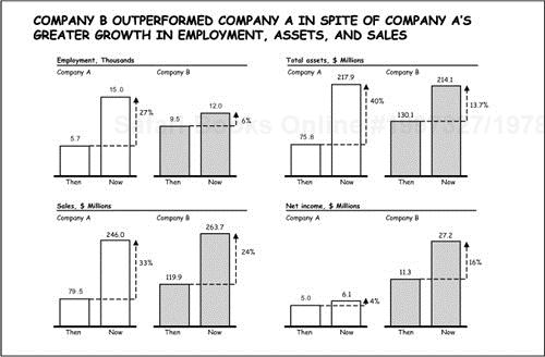

Gene’s solution


Your solution
I work very hard to make sure that I don’t ask the reader to turn his or her head in order to read the labels at the bottom of each column, as you must here. Similarly, I work hard to avoid forcing the reader to look back and forth between the legend and the chart itself to see what corresponds to what.
Here, by using horizontal bars instead of vertical columns, more room is allowed for the labels, so they may be read normally. Also, we can delete the legend and make its information part of the chart. We do this with a sliding 100 percent bar chart, using the line that separates internal and external as the base line so the differences between them are more clearly contrasted.


Gene’s solution


Your solution
As is, the chart does a good job of presenting the characteristics and demand for four segments of the consumer market for technology. It would be fine to leave it that way for the handout.
If you were doing an onscreen presentation, however, a “More is better” solution would be to design several visuals: the first to introduce the four quadrants, the second through fifth, to show the detailed characteristics and demand for each of the four quadrants.
My real-life situation in dealing with this material involved a large audience at an off-site conference. So we took the challenge one step further. As you see, we characterized the four quadrants with illustrations that gave a personality to each segment, leaving the speaker free to elaborate in as much or as little detail as the audience needed.


Gene’s solution


Your solution

Earn extra CREDIT
Think of ANOTHER WAY
Let’s nominate this one to the charting Hall of Shame. It’s both illegible and too complex. It took me some time, but I’ve come up with two possible solutions.
Multiple column charts show the pattern over time for each of the components. Respective growth is much more apparent because everything is measured against a common base. (I left off the CAGRs—compound annual growth rates—but I could have included them to the right of the second column.)
As I show on the back of the facing page, sometimes it’s simpler to leave information in tabular form. I realize that I’ve already said that tabular data merely implies comparisons whereas charts demonstrate them. However, a table works better here because the numbers line up with each other, making the comparison easy. If nothing else, it certainly works many times better than the original treatment.


Your solution
Give up? How much effort did it take you to follow the bouncing numbers … and their changing sizes … over the three time horizons … to figure out the message of this chart?
As you can see from my solution, one answer is to divide the message into its component thoughts and use five separate slides to get the story across. I’ve shown them all on one visual here, which would work for a handout. For an onscreen presentation to a large audience, you may want to show the first two in one slide as you explain how to read the upcoming charts, then show the next three, full-screen, in succession to ensure legibility.
The first two visuals explain the axes of the matrix and how to read the chart. The latter three show the pattern for the segments that became more profitable, those that showed no change, and those that lost their position over the three years.
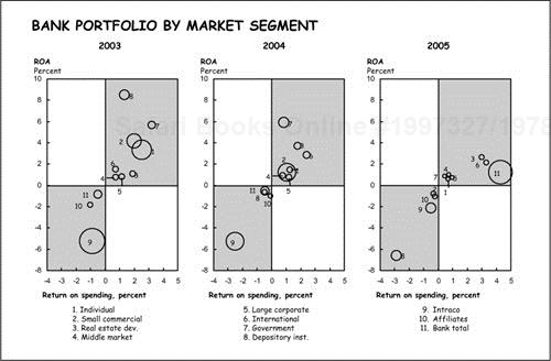

Gene’s solution


Your solution
I include this last one only to remind you that, at times, your best bet for finding ways to develop creative and interesting visuals is to look in the fourth edition of my book, Say It with Charts. Just turn to Section 3, and the chapter I subtitle “Solutions in Search of Problems.” This chapter offers a range of ideas for concept visuals.
Here is a sampling of the options I found.