
Chapter 2. The Anatomy of Search
"How can a part know the whole?"
In anatomy, we divide to understand. We dissect the whole to study its parts. We identify internal organs and map their relationships. As a major branch of biology, anatomy reflects both the power and the limits of specialization. For we must not allow our focus on form and structure to distract us from function or blind us to context. Anatomy can’t tell us how the mind works. It can’t reveal the sublime experience of vision. And it certainly can’t predict the behavior of an ant colony or a stock market. These complex adaptive systems exhibit macroscopic properties of self-organization and emergence. Not only is the whole greater than the sum of its parts, but it’s also different. It’s a territory off the map. And yet, our simple models have value, for they offer us a very good place to start.
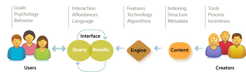
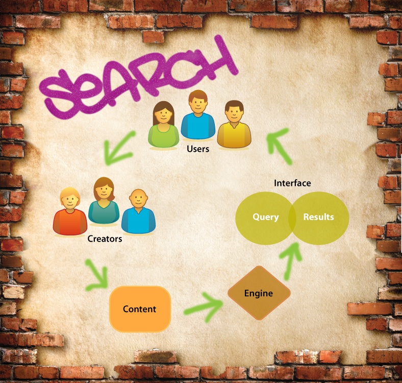
Our map to search features five elements: users, creators, content, engine, and interface. Like any map, it hides more than it shows. It’s deceptive by design. It shifts attention from software and hardware to the elements of user experience. Our plan is to study each element without losing sight of the whole. We must know enough about the technology to understand what’s difficult and what’s possible. But we need not become intimately familiar with load balancing, pattern matching, and latent semantic indexing. That’s why we have specialists. Instead, we’ll study the components and context in sufficient detail to inform strategy and design. We’ll survey the terrain in search of the big picture. So, let’s start at the very beginning with the users for whom we design.
Users
There’s a lot we can learn about our users. Demographics cover income, age, and gender. Psychographics reveal values, attitudes, and lifestyle. Technographics segment user populations by their adoption of tools and software. Some of this data is useful for designing better search systems. Much of it is not. It’s all too easy to stuff a treasure chest with worthless facts and figures. Organizations do it all the time. The key to profitable user research is knowledge. We must know enough to ask the right questions. We must understand the basics of user psychology and behavior as they relate to the type of system we plan to build. We require a conceptual framework that lets us focus on the pivotal questions that make the difference in design. We need a scalpel, not a hatchet.
For instance, we know the paradox of the active user is a constant in search. Most people refuse to read the manual, personalize the system, or prepare a strategy before they begin, despite evidence that such initial “presearch” improves overall efficiency. We enter two or three keywords and we GO. We’re seduced by the illusion of speed. It’s only when we find we’re lost that we check a map or ask for help. Of course, some users love manuals, while others must study them in training. But for most users in most contexts, this paradox is active. Knowing this helps us to excise unfit questions and designs.
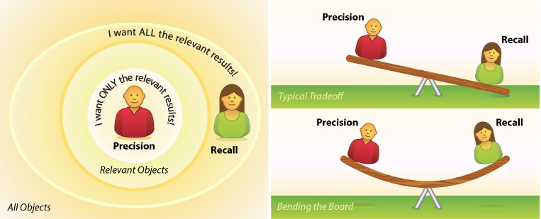
Another timeless topic is the question of precision versus recall. Do our users care more about finding only the relevant results or all the relevant results? In search design, the two are inversely related. Like kids on a seesaw, when one goes up, the other comes down. High precision generally means we miss some of the good stuff, while high recall forces us to sift through the good, the bad, and the ugly, except when a better algorithm or a richer interaction model lets us “bend the board” by amplifying the signal without adding noise. Either way, it’s worth asking, especially since the answer may signal a pivot point where user and business goals diverge. In e-commerce, for example, a user may want to find a specific product as quickly as possible, whereas a vendor may allow for more noise, hoping that cross-selling will spur an impulse buy. It’s critical to identify and manage this predictable source of tension in the user experience.
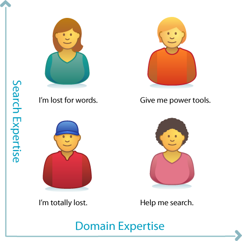
We should also consider expertise with respect to search in general and the domain in question. Let’s say we’re building a search application for health and medicine. Will most users (or our most important users) be familiar with medical terminology? And how about their digital literacy? Are they fluent or fumbling? It’s a common mistake to conflate these two types of mastery. People assume that good doctors are good searchers, but that’s not true at all. Their magic has limits. In most domains, there are wizards and muggles who can and can’t search, and each group needs different support. Knowing the relative strengths and weaknesses of our target audiences is a key to good design.
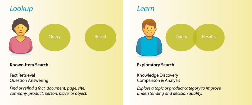
Type of search is another key variable. There’s a big difference between the simple lookup of known-item search and the dynamic learning of exploratory search. Google’s got lookup down. Fast, simple, relevant. If you know what you want, Google will find it in less than a second. It’s so fast, we use it for navigation, running queries even when we know the URL. But if you’re unsure what you need, Amazon offers a better model. Faceted navigation plus tools for recommendation help us learn. Search becomes an iterative, interactive experience where what we find changes what we seek. While each type begins in a box, the types diverge by process and goal. Many systems must support both. To design well, we must think carefully about how and where to strike the right balance.
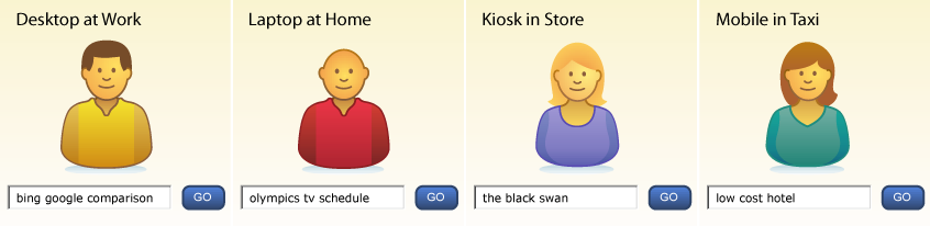
Of course, we must also consider platform, purpose, and context of use. Are we designing for desktops, laptops, televisions, kiosks, or mobiles in motion? The iPhone’s small screen and soft keyboard place new limits on search, especially when it’s jiggling in your palm in the back of a taxi cab in downtown Berlin at midnight. On the other hand, its multisensory I/O tears down old walls. When we integrate a microphone, speaker, GPS, accelerometer, magnetometer, and a multitouch interface, we redefine what’s feasible in search. The whole may not recognize the sum of its parts. Design must respond to context. That’s why it’s good to ask where your users will be when they need you.
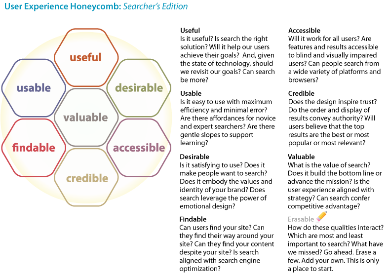
Finally, we should seek to balance the qualities of the user experience. In mobile, search must be useful and usable. Simple, fast, and relevant wins the day. But in music, search begets desire. Cover Flow makes it OK to look, while Pandora tempts us to buy. In government, accessible and credible are tops, but in business, search must be found, and real results add value to the bottom line. In each context, we must identify which qualities our users and organizations value, and then design with these priorities in mind.
User Experience Honeycomb: Searcher’s Edition
User Experience Honeycomb: Searcher’s Edition
That’s a lot to know about users, and we’ve only just nicked the surface. We could study their patterns of behavior or explore how to apply user research methods to search. But we’ll save those topics for later. For now, let’s interact with the interface.
Interface
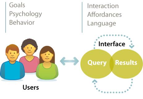
The classic view of search implies a two-step process in which a user types a query into the box and is presented with a list of results. The interface bisects input and output. It’s a delightfully simple model. It’s also increasingly wrong. Today, the speed of search and the richness of interaction blur the lines between query and results. Subsecond responses let us search, scan results, skim content, and search again. Autocomplete asks for only a letter or two before it suggests queries and recommends results, and faceted navigation rewards us with a map that is the territory. Query, results, content, and interface flow into one another in a journey that changes the destination. This intertwingled reality means we have to work together. Designers, engineers, and creators are all responsible. It also means we can’t rely on old patterns for the interface. We must think outside the box.
To begin, we might consider affordance. What are the real and perceived action possibilities? This simple query submits readily to the maxim of the Five Ws (and one H), as memorialized in a poem by Rudyard Kipling:
"I keep six honest serving-men
(They taught me all I knew);
Their names are What and Why and When
And How and Where and Who.”[7]
In journalism, this maxim is useful for getting the full story. In search, it’s helpful for creating and analyzing whole interfaces and their (perceived) affordances.
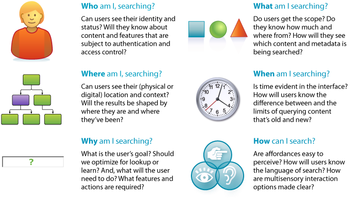
The most obvious questions are what and how. What am I searching? How can I search? An interface that fails to answer simply fails. But it’s also worth asking who, where, when, and why. These questions stretch our minds. They encourage us to think more holistically about the interface and how it separates and binds together input and output.
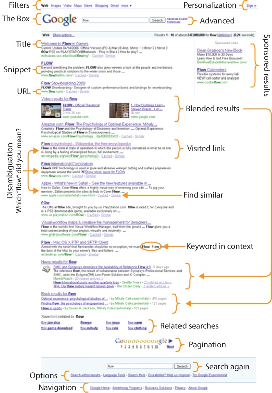
Which returns us to results. The search engine results page or SERP, as pictured in Figure 2-9 is among the most complex and important challenges to design. We’ll study the concepts, elements, and design patterns in detail later. For now, suffice it to say that whether the results are too few, too many, or just plain wrong, this interface addresses a pivotal point in the user experience. The surprise of results opens a gap in the paradox of the active user. It’s at this critical juncture that people know they are lost and admit they need help. It’s a teachable moment in which real humans (even grown men) will actually accept advice, read maps, customize parameters, and choose carefully from a list of next steps. It’s a tiny gap, and it closes fast. We must be ready with the right design empowered by the right technology, because behind every great search interface is an engine that delivers results.
Engine
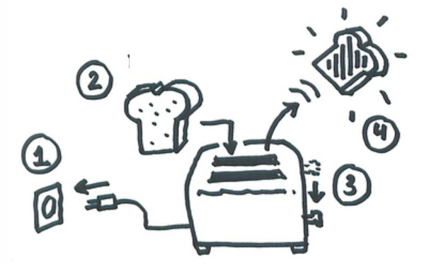
Most of us have no idea how stuff works. We are surrounded by technology sufficiently advanced that it’s indistinguishable from magic. We can’t possibly know everything, so we specialize. And outside our niche, we satisfice. We learn just enough to get by. As users, we rely on mental models to tame our technology. These simple explanations and visualizations, often derived via metaphor, keep us safe and efficient. For instance, we know how to use a toaster: insert bread, lower handle, wait for the pop. We also know not to chase a missing earring with a fork before unplugging the toaster, since the electricity that flows like water from the wall up the cord to the appliance might rush up the fork and zap us. This mental model is not technically correct, but it does keep us alive. Now, if we want to be better users, we may need better models. How should we adjust the timer for the second batch of toast? What if the kitchen is hot or cold? To answer, we must know the basics of capacitors and resistors, or we can learn by trial and error. If we aspire to build a better toaster, we’ll need even richer models and a deep understanding of users, technology, and how they (might) interact in the real world.
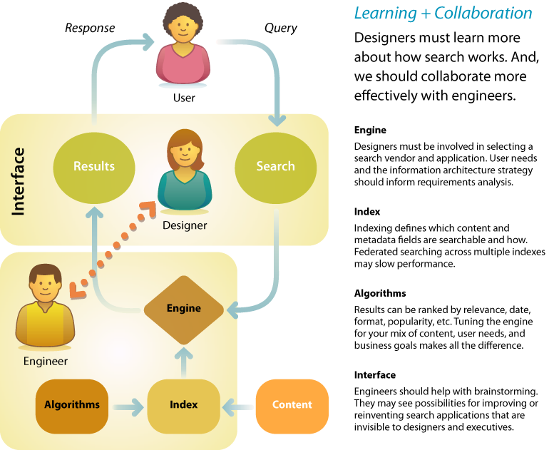
The same is true in search. Users have no idea how search works. Most designers aren’t sure, either. We treat search as a black box. We rely on engineers to define parameters for input and output. And we miss opportunities to make search better. It’s time to change. Designers must learn more about engines, indexes, and algorithms. And we should reach out and collaborate with engineers. We should engage them in the process of design and inject ourselves into search engine selection and configuration. Our expertise reveals what’s desirable. Their skill and insight shows what’s possible. By working together, we can identify risks, invent new solutions, and make search better.
Learning + Collaboration
Learning + Collaboration
Designers must learn more about how search works. And, we should collaborate more effectively with engineers.
Ideally, the evaluation of search applications is preceded by development of an information architecture strategy that puts user needs and business goals ahead of the features and limitations of software products. As we’ll discuss later in this chapter, the information architecture positions search within a broader context, allowing us to see how the multiple modes of ask, search, browse, and filter can work together. This blueprint clarifies priorities with respect to what we will actually need from search. Of course, more often than not, firms put the cart before the horse. There’s usually plenty we can do to work with and around any engine, but there’s no harm in hoping for blue skies.
On the other hand, it’s irresponsible to design an information architecture without practical consideration of technology, staff, and cost. A limited budget may suggest a hosted solution such as Google Custom Search. An open source solution like Solr may be right if there’s sufficient in-house technical expertise. If not, the quick install and easy configuration of Microsoft Search Server may appeal. If the user experience is mission-critical to your business, a high-end information access platform (like Endeca or Autonomy) that manages more than search may be the way to go. Each class and product imposes limits on what’s possible and what’s easy. For this reason, the architecture should be informed by analysis of the realistic outcomes of search engine selection.
A designer can add further value during the software selection process by building on the blueprint. Organizations often cover the bases in terms of technology and finance but fail to press vendors on exactly what will be required to support their unique mix of features and content. A typical checklist may include the following:
- System architecture
Formal description of the hardware and software components, including crawlers, indexers, data models, and query parsers.
- Performance
How many simultaneous queries are supported? What’s the maximum number of sources? How about the size of the data repository?
- File formats
What types of content and data (e.g., HTML, PDF, mySQL) are supported? Can the system handle both structured and unstructured data?
- Integration
Is there a standards-based Web Services API for embedding search functionality in other sites and software? Is there a list of available connectors?
- Access control
Does the system support multiple levels of access for different user types and individuals? How does it manage privacy and security?
- Features
How does the system handle full text and metadata? Does it support Boolean operators, wildcards, stemming, stop words, phrase and proximity searching, and spellcheck? What algorithms are used for ranking? What are the options for query refinement? Can results be saved, printed, and shared?
- Implementation
What sort of expertise is required for installation, configuration, and maintenance? How does the vendor handle training and support?
- Pricing model
Is the product priced by data or activity volume, CPUs, features, and/or number of unique applications? How about support, maintenance, and professional services fees? What’s the total cost of ownership?
- Vendor credentials
How long has the vendor been in business? How are they positioned in the market? Can we see their financials and customer references?
These are all necessary questions, but they’re also insufficient. Because there’s so much ground to cover, it’s easy to lose sight of the goal. The designer’s role is to repeatedly refocus attention on the user experience. A supplemental checklist that’s informed by an information architecture strategy and empathy for the user might include:
- Speed
What will it take to ensure subsecond response in the real world? It’s worth asking this question early and often. Don’t take “slow” for an answer!
- Relevance tuning
How are results ranked? Is it possible to adjust the settings to allow for popularity, content type, date, and diversity?
- Navigation and filtering
Is it easy to customize sort order and limit options? Is there native support for faceted navigation? Is it fast?
- Federated search
How does the system handle the simultaneous search of multiple databases or indexes? What is the impact on speed? Is it possible to merge several indexes into one to dramatically improve performance?
- Linguistic toolset
Is there support for thesaurus integration and crosswalking between vocabularies? How about autocategorization and entity extraction?
- Search analytics
What tools are provided for measuring and understanding user behavior? Is there an API that supports sharing and repurposing of this data?
These lists are just a way to start the conversation between designers and engineers. We must also track emerging technologies, because what’s possible in search keeps shifting. Because these changes come from so many directions, we need all the eyeballs we can get. By working together, we’re likely to make better purchase decisions, identify the long-term costs associated with continuous improvement, and generate insights that lead to innovation in search and discovery. Plus, we’ll learn a little more about how stuff works.
Content
The design of a search application is defined by its content. A social network, an image library, and a mixed media database merit totally different solutions. For starters, the availability (or lack thereof) of full text and metadata shapes the what and how of search.
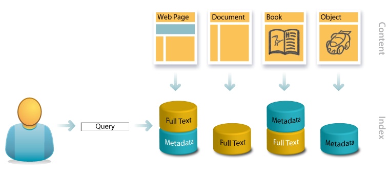
Consider, for instance, these four content types and their associated search scenarios:
- Web page
A web page includes both visible content and off-the-page HTML tags for title, description, and keywords. The first appears in the browser’s title bar and the second in the snippets of search results. All of these embedded metadata tags are indexed by web search engines, but keywords are not weighted heavily, due to spam concerns (e.g., keyword stuffing). Inbound links from other pages and the collective navigation, search, and post-query behavior of many users deliver rich streams of external metadata. In the case of hypertextual web pages, engines can rely on this full spectrum of content and metadata to discern meaning, which is why Google appears to work like magic.
- Document
On a typical underfunded intranet, search engines must rely solely on the contents of technical reports, white papers, spreadsheets, presentations, marketing materials, and online forms to reveal their own aboutness. The absence of structured metadata precludes faceted navigation, and full-text relevance-ranking algorithms struggle with the heterogeneity of multiple content types and lengths. There are limits on how much meaning can be “automagically” extracted from natural language, which is why intranet search is so bad.
- Book
In books, Amazon draws upon a rich index for search and navigation. While lacking Google’s database of inbound links, Amazon enjoys everything else: full-text content, social data, and behavioral metadata. Plus, it has oodles of formal, structured metadata to enable filtering, sorting, personalization, and faceted navigation, which is why Amazon integrates search and browse so well.
- Object
In the absence of full text, metadata is often a forced move. In cars, investment in controlled vocabularies and structured metadata is required, and search is limited to fields like make, model, price, and fuel efficiency. In images, Flickr found a way to share the cost with tags, notes, descriptions, and comments that power findability surprisingly well. Nontext objects present major challenges to search, which is why they inspire so much innovation.
Of course, we need not be satisfied with the status quo. Since complexity of the information retrieval challenge increases exponentially with linear increases in volume, we know the most dramatic way to improve performance is to search less content.
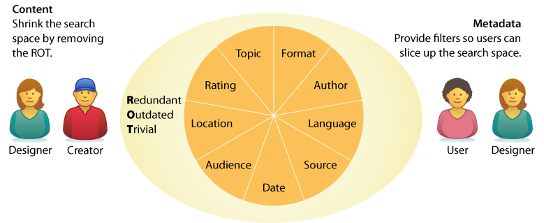
So, early in the design process, it’s worth asking two questions. First, can we shrink the search space by removing ROT, content that’s redundant or outdated or trivial? By crafting a content policy that defines what’s in and out, then rigorously weeding their collections, organizations are often able to cut what’s searched by half. Second, can we add metadata fields that let users slice content into smaller sections? Even a massive article database becomes manageable when users can limit searches by topic and date.
These questions invite consideration of context. What is the business model? What can we afford to invest? How much content are we talking about? Where does it come from? How quickly will it grow or change? And what about metadata? Is its creation inherent to the publishing process? Should we hire librarians? Or can software handle entity extraction and autocategorization? When we look at content, it’s easy to get technical. After all, this is the domain of information technology. But we should also get social, because search is a network that includes and inspires the creators behind the content.
Creators
In the early days, adventures in search required vertical integration and an entrepreneurial spirit. During the 1960s, pioneers of the first information retrieval networks couldn’t rely on existing infrastructure—they had to design the whole system. Hardware, software, networks, protocols, algorithms, content and metadata creation, user training, and billing were part and parcel of the job. In contrast, today we enjoy a robust infrastructure that affords specialization. Modern search tools and technologies allow us to concentrate on customization. Unfortunately, they also let us be lazy. It’s all too easy to focus on interface design without challenging our creativity by reimagining content and context.
That’s why the biggest innovations in search come from outside the category. Wikipedia serves as a case in point. By reinventing the encyclopedia as a collaborative work, Jimmy Wales made a huge improvement to search. While Google is the means, Wikipedia is the end. We Google to find the Wikipedia article. It’s inevitably at the top of results. The cocreators of Wikipedia invest time in writing and editing because they know their articles will be found via Google. Wikipedia is a tool that embodies process and incentives. It motivates millions of users to become creators of content and metadata, in part by sharing its analytics in detail. In addition to overall statistics, we can see data about each article, user, and creator. This transparency is conducive to widely distributed competition and collaboration. It’s a success story in which knowledge management and search combine to foster a participation economy where the reward is recognition. It’s also a repeatable solution to a common problem. This social design pattern, which enlists users as cocreators and coorganizers, has been copied liberally by entrepreneurs under the banner of Web 2.0. And while they may have already grabbed the low-hanging fruit, it’s a really big tree that has much to offer search.
Designers of search applications must no longer accept content in its current state. It’s time to shake the tree. Questions we should ask include:
Who are the current (and potential) creators of content?
How can we motivate them to improve quality and quantity?
What tools and processes will make publishing faster and easier?
How can we enlist users in content creation and organization?
How can we share analytics to inspire both use and cocreation?
Search is social. This realization invites us to think, not only about information and technology, but also about people. Of course, we shouldn’t stop there. It’s a mistake to believe the source of all creation is human. Sensors are creators, too. Increasingly, networks of sensors allow us to query temperature, pollution, traffic density, and product availability. Our mobile devices know their own locations, which changes how we search and how we are found. How can we improve the quality and quantity of content and metadata to advance user and business goals as they relate to search and discovery? Who (and what) are all the potential creators? These are the questions we ask when we see that knowledge management is part of search. And, upon finding we’re engaged in the holistic design of complex adaptive systems, we understand that we need a new map.
Context
The late Harvard professor Alan Watts, in a lecture on Eastern philosophy, used the following analogy to introduce the subject of context:
"If I draw a circle, most people, when asked what I have drawn, will say I have drawn a circle or a disc, or a ball. Very few people will say I’ve drawn a hole in the wall, because most people think of the inside first, rather than thinking of the outside. But actually these two sides go together—you cannot have what is ‘in here’ unless you have what is ‘out there.’"
A similar reaction occurs when we hear the word “search.” We tend to think inside the box. We forget that the search “in here” is made possible by the structure “out there.” That’s why the design of search applications is best framed by information architecture. We need a framework that positions search within the broader context of organization, navigation, personalization, and discovery. We need maps that reveal the paths, edges, districts, nodes, and landmarks of the user experience. We also need blueprints that show the complex relationships between form, function, structure, process, and goal.
Let’s consider, for instance, a website. Most sites don’t need search. Browse is sufficient for the vast majority of simple sites operated by individuals and small firms. A solid taxonomy with clear categories and labels is enough. Perhaps a sitemap or index is useful to complement navigation, but search is unnecessary. In fact, adding search may be downright dangerous, since most queries will lead to nowhere. However, when success leads to big business, the architecture must change. Browse fails to scale. For this reason, the sites of large organizations often exhibit the following problems:
- Fragmentation
Fragmentation into multiple sites, domains, and identities becomes a huge distraction. Users don’t know which site or subsite to visit for which purpose, and the lack of consistent, intuitive intersite search and navigation makes it hard to find content without knowing source and location.
- Findability
Users can’t find what they need from the home page, but that’s only the start of the problem. Most users don’t come through the front door; they enter via a web search or a deep link, and are confused by what they do find. Even worse, most potential users never use the site, because many of its resources aren’t easily discoverable via Google or other web search engines.
So, for most people, the content is invisible. You can’t use what you can’t find. And for those who do find the site, the experience is frustrating. These problems are common for good reason. By necessity, in large organizations, different groups are responsible for different pages, sites, and services. Over time, in the absence of a master plan, the structure devolves into a chaotic sprawl reminiscent of the Winchester Mystery House, a well-known California mansion that was under construction continuously for 38 years.
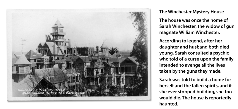
The Winchester Mystery House has 160 rooms, 40 staircases, 467 doorways, and no blueprint. It’s not an unattractive house, and the view from any individual room isn’t particularly unusual or overwhelming, but it’s virtually impossible to grasp the whole or to find your way.
When a site reaches this scale, it’s time to look for the levers. Since we all must live within limits, it’s imperative that we identify strategic opportunities where leverage affords the most positive impact for the effort and investment. In the context of websites, three key areas often emerge as powerful fulcra with the potential to move mountains: the portal, search system, and destination objects, as shown in Figure 2-16.
In a moment, we’ll explore these fulcra in the context of a big organization and its website. We’ll examine the unique potential of each lever. But first, it’s vital to recognize their interdependent nature. The information infrastructure of objects and search serves as a necessary foundation for a successful, sustainable, user-centered portal. As users shift between modes of browsing, searching, and reading, proper integration enables a sense of flow. The whole is greater than the sum of its parts. A concept map, as shown in Figure 2-17, can help us to realize this big picture. The goal is to capture the key elements so we can begin to discuss how they relate. In The Back of the Napkin, Dan Roam defines what he calls the garage-sale principle: “Everything looks different when we can see it all at once.”[9] An early stage concept map is an effective way to put all the parts on the table.
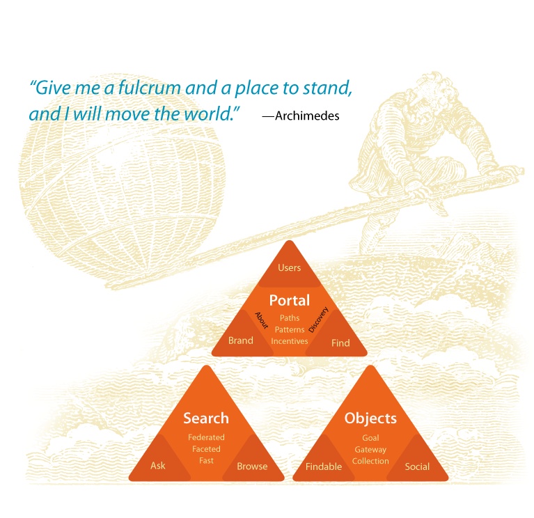
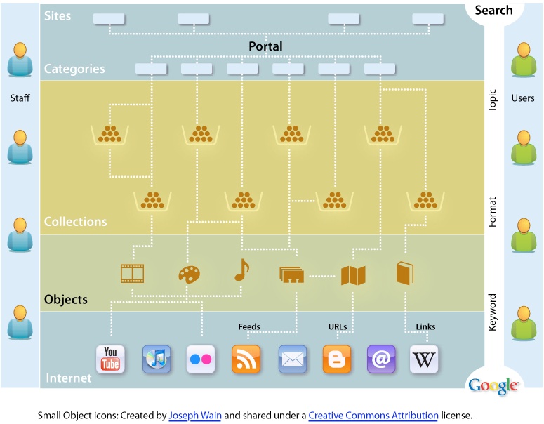
Portal
The portal, which includes the home page and the top few layers of the website, often presents an opportunity to improve the user experience and the brand. A user-centered redesign that helps people learn about the organization and its services, fosters exploration and discovery, and supports fast, effective search and navigation can make a big impact. Emphasis should be placed on providing multiple paths to the same information so that users can search or browse by format, topic, and keyword. Audience gateways should be provided but not relied upon, since most goal-oriented users won’t use them, it’s impossible to predict what every member of each audience might want to find, and information-seeking behavior tends to vary more by search expertise and institutional familiarity than by role or profession. The portal should support directed search while enabling discovery. For instance, a robust version of Most Popular (similar to the approach taken by the New York Times) can often attract a great deal of interest. In reimagining the portal, it’s also worth reconsidering the umbrella architecture, which may include multiple sites, domains, and identities. Are these divisions really useful to users, or do they exist solely as symptoms of organizational dysfunction?
The portal, in conjunction with a content management system, can also serve as a powerful tool for aligning staff efforts and incentives with user needs and goals. First, by establishing design patterns built upon industry best practices, the portal can provide staff in each unit with the tools, templates, and style guides necessary to implement a more consistent identity and suite of interfaces throughout the sites, collections, and documents. Second, since the portal has a significant influence on findability, a clear set of design standards and recommendations has a good chance of adoption. For instance, items should only be directly linked to from the portal if they meet a high standard (e.g., full compliance with the design template), and items should only appear at the top of search results if they meet a middle standard (e.g., assignment of descriptive metadata). The power of findability as a lever can be further strengthened by regular reporting of web analytics. A one-page report that highlights key metrics each month and is widely distributed can improve accountability and sensitivity to user needs and behaviors.
Search
Massive scale means that search must be positioned at the center of the digital architecture. The portal presents an opportunity to implement a consistent experience through the top layers. However, in the absence of a paradigm shift in our big organization’s approach to the Web, it is unrealistic to expect total conformity throughout the site, especially when you consider the inevitable change of technologies and priorities over time. The fact is that browsing simply doesn’t scale. At a certain point, it becomes impossible to avoid creating a digital version of the Winchester Mystery House.
And yet, sites and services as diverse as Amazon, Google, Flickr, and Wikipedia have all developed solutions that work despite their lack of centralized control over content and metadata. They have succeeded by embracing search-centered solutions that recognize that searching and browsing must be used in combination to help people effectively navigate. These solutions typically possess the following three qualities:
- Federated
Since most users don’t know where to look, the site should allow people to perform searches across all of its content. This should not preclude advanced, focused queries on particular collections or databases.
- Faceted
The site should embrace faceted navigation (with flexible search scopes) as widely as possible so that users can move fluidly from searching the site to searching a content collection or a product catalog without having to start over or learn a new interface. Global facets might include topic, format, date, and author. Each database might present additional category-specific facets to support narrowing and filtering.
- Fast
The organization must invest in the hardware, software, and staff necessary to deliver subsecond response times. Speed is absolutely critical in allowing users to fully engage in an iterative, interactive search experience.
Amazon serves as an excellent example. The site provides fast, federated search across many collections (e.g., books, electronics, toys, and automotive tools). Users can select a category and then search or they can search first, then select a category. Faceted navigation presents users with a customized, interactive map of their results and ample opportunities to narrow or filter those results. Plus, the facets adapt; they progressively conform to the content as users shift between categories or drill down within collections.
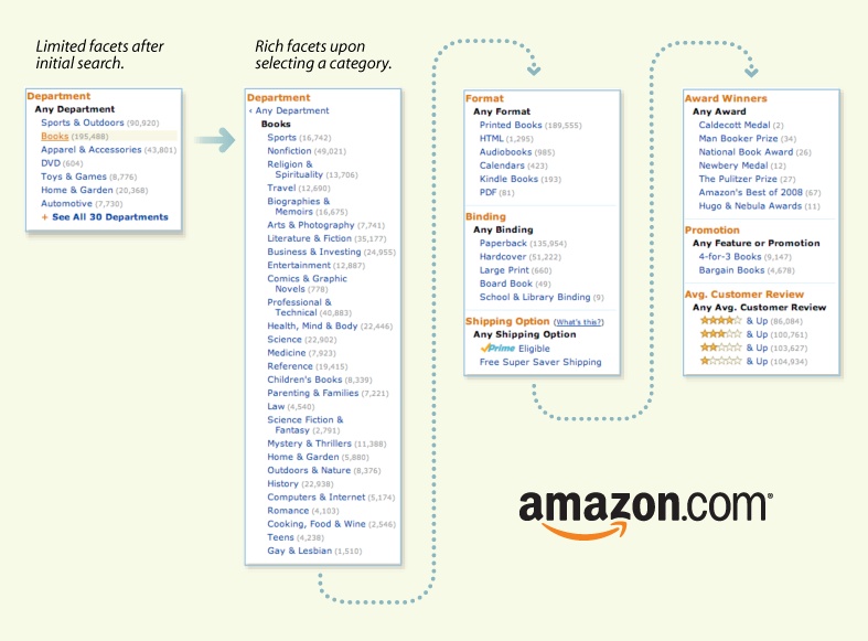
Finally, Amazon’s Product Pages are easily findable via Google. They have relatively simple URLs to support sharing and inbound links. They also offer options for tagging, rating, and reviewing that ultimately support even better navigation (from the page) and findability (to the page). In short, Amazon’s Product Pages are findable, social objects.
Objects
Similarly, our big organization has an opportunity to make its content more social (viral) and findable by adopting best practices in search engine optimization and social media design. This requires redesigning the objects of search to serve as destinations, gateways, and subjects of conversation. Amazon does this well. So does Flickr. Photos are easily findable via Google or Flickr’s own search system, and each photo offers many options for finding similar photos or for finding other photos from the same source, set, pool, or collection. Plus, users are invited to add tags, notes, and comments. Each photo is a catalyst for conversation and community. Additionally, the object isn’t stuck on the page. Users can share photos across multiple devices, channels, and services. We can order prints or add our image to stickers, calendars, business cards, T-shirts, magnets, puzzles, and mugs.
This versatility didn’t arise by accident. Flickr’s About page describes an explicit experience strategy with two main goals:
"We want to help people make their content available to the people who matter to them.
Flickr describes itself as “the WD-40 that makes it easy to get photos or video from one person to another in whatever way they want” and lists the Web, mobile devices, software applications, RSS feeds, email messages, and blogs as just some of those ways to import and export content. Finally, Flickr notes that part of the solution is to make the process collaborative:
"In Flickr, you can give your friends, family, and other contacts permission to organize your stuff—not just to add comments, but also notes and tags. People like to ooh and ahh, laugh and cry, make wisecracks when sharing photos and videos. Why not give them the ability to do this when they look at them over the internet? And as all this info accretes as metadata, you can find things so much easier later on, since all this info is also searchable.”
In this way, the social and findable elements form a virtuous circle in which conversation promotes findability and vice versa, which is why Flickr has succeeded so well.
All Together Now
In conclusion, having identified the objects plus the portal and search as strategic opportunities where leverage affords impact, the trick is weaving them together so that each element becomes a vital part of the whole. This returns us to Amazon, which serves as a great example of a service that has embraced and integrated all three fulcra. The portal supports multiple paths to the same information. It offers federated, faceted, fast search. And it’s all built upon an object-oriented foundation that positions Product Pages as the ultimate destination and conversation objects, and as gateways to related content.
Amazon also manages to keep alive the entrepreneurial spirit by engaging the whole ecosystem. With the Kindle, Amazon developed a software and hardware platform for reading e-books and other digital media. With its self-publishing program, Amazon invented a new mix of tools, processes, and incentives to turn users into creators. And, with customer reviews and transparent analytics (e.g., customers who bought this item also bought these items, dynamic sales rank by category), Amazon has made it easier to find and learn. These folks are reinventing publishing by changing the means of production and distribution. They’re also designing the ultimate place to search.
By working hard to serve users, refine the interface, tune the engine, enhance the content, and motivate creators while simultaneously striving to leverage and transform the wider context, Amazon and a handful of other pioneering firms are showing us how to make search better. We can’t copy all that they do; some solutions are uniquely situated. But we can learn a lot from their example. It’s about time we read the writing on the wall.
In particular, we must improve our ability to zoom in and out. It’s essential that we study the anatomy of search. To get each element right requires obsessive attention to detail. We must divide to understand. But we must also dare to lose focus. We must step back and consider the context. Search is only a subset of an information architecture and a wider communication ecology that together shape the user experience.
To make search better, we must ask larger questions. How do we turn users into creators? What are the ingredients for self-organization? Can we achieve our goals without search? How might search inspire us to reach for new goals? To see the big picture, we must know the parts and the whole. We need frameworks, maps, and blueprints; boxes and arrows that help us visualize relationships between a means and the end. But we can’t stop with strategy and structure, because search is a system that flows. The interface is only half of interaction. To achieve a holistic understanding of search, we must witness the system and the user in the act, together as one. And for that, we must study behavior.
[7] Just So Stories, Rudyard Kipling (Puffin).
[8] Dave Gray hosts a wonderful set of toaster diagrams as part of his visual thinking collection at www.flickr.com/photos/davegray/collections/72157600017554580/.
[9] The Back of the Napkin, Dan Roam (Penguin Books).
[10] Image by Bryce Glass, http://soldierant.net/archives/uploads/2007/10/FlickrUserModel_v3.pdf.