
19
What’s Selling
In addition to photographing subjects/objects/settings that interest you, there’s an advantage to keeping on top of what’s hot and trendy.
For example, you can go to design blogs to see what’s hot, and match the style you see there with art photography in your portfolio or create a shoot list for your next trip out into the field.
Here are some places where you can get good design ideas and the most popular design colors right now:
• apartmenttherapy.com (salmon)
• housebeautiful.com (brick red)
• crateandbarrel.com (olive, eco-brown)
• restorationhardware.com (antique white/gray)
• ikea.com (golden yellow, green, black, off-white)
• urbanoutfitters.com (black, yellow-orange, gray-green, brown and mustard)
• potterybarn.com (brick red, mustard, air force blue)
• bedbathandbeyond.com (plum, eco-green)
• marthastewart.com (brick red, true blue, vanilla)
• roomandboard.com (brick red, black)
This past year brick red has been a hot color, as are mustard yellow (see Figure 19.1) and purple.
Now that you know how to access the latest designs, you can get started on your own.
Note
Popular art is often seasonal, whether it’s the pumpkins of Halloween or the flags of Independence Day. Posting such images a week or two before the event increases your chances of a sale.
The best way to judge what photography is selling is to view the POD website sales. Fine Art America’s POD site is at http://fineartamerica.com/art/photographs/all/all.
Figure 19.1 Mustard yellow has been a popular color this past year.
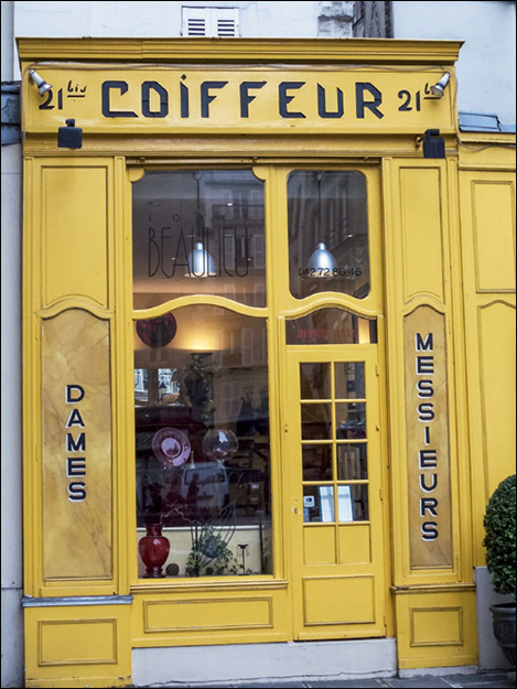
©Matthew Bamberg