Why efficiency?
Focusing on the efficiency of an interface forces you to start considering the impact of the details and helps you understand how those details impact user experience—especially in time-pressured environments.

Perceived Efficiency
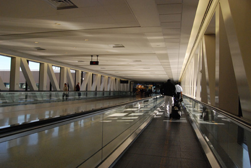
When the management at George Bush Intercontinental Airport in Houston (IAH) wanted to reduce the volume of complaints about baggage-waiting times they did the obvious thing: put on more baggage handling staff and reduced waiting times to just eight minutes—the industry norm. When the next set of figures came in they were disappointed to find that complaints persisted.
When they looked a little deeper, they discovered that customers got to the baggage claim about a minute after disembarking and then spent seven minutes waiting. So they decided to increase the distance passengers had to walk by about six times. Complaints dropped to almost zero. As the management at IAH found out, it’s often easier to get results by playing with perception than reality.
Anyone looking to improve the efficiency of a user interface has to deal with the fact that people are so poor at judging time that their perception of efficiency is often way out of line with actual efficiency. There are a number of temporal illusions that people fall foul of.
So, as we’ve seen, people lose track of time if they’re kept busy with a simple, repetitive task, one with just enough challenge to keep their attention but not so demanding that they give up or become irritated. If you’ve ever wasted hours playing Tetris or Angry Birds, you’ll know what that feels like.

George Bush Intercontinental Airport improved baggage handling, but complaints persisted. Keeping passengers occupied with a longer walk led to a sharp fall in complaints.
Another common myth is that when people are under pressure, time seems to slow down and they think faster. But when psychologist David Eagleman tested people under pressure (by making them look at rapidly updating wrist-mounted displays as they jumped off a 15-story tower), he discovered people’s perception was unchanged. However, they did estimate the fall at 4 seconds instead of the actual 2.6. What seems to happen is that people lay down more intense and detailed memories while under pressure. This distorts their perception of time when they recall those events. Of course, most users have the opposite problem. They sleepwalk through their interactions with email, ATMs, and websites without laying down detailed memories. They are amazed at how long they spend on drudgery.
Anyone designing a user experience should also beware of their own prejudices, too. We tend to confuse what’s familiar with what’s efficient. That means we assume that current designs are more efficient than novel designs and that designs based on our favorite apps or websites are best. If you’ve ever sat in a design review, you will probably recognize that prejudice in others and yourself.

Psychologist David Eagleman tested the idea that time slows down under high stress by recording the perceptions of people jumping from a high tower.
When Waiting is Good
Sometimes people prefer to wait. Coinstar machines count change for customers—literally by the bucket. Customers pour the coins in at the top and the machine counts them incredibly fast. So fast, that customers didn’t trust the results. So the company added a short delay to the machine during which a loudspeaker inside the machine plays the sound of coins falling. Altering the user experience to meet customers’ expectations restored their trust in the outcome.
Behavioral Economist Daniel Ariely tells of how he met a locksmith who said his customers complained that he was too fast. When the locksmith was still an apprentice, he struggled to open locks, but customers were happier and tipped him. As he got faster customers assumed his job was easy and were annoyed when they got his bill. The locksmith charged for his skills. Customers wanted to pay him for his effort.
If people’s expectations are broken, they’re disconcerted. However, it’s worth remembering that over time their expectations will change. When they redesigned Blogger, Jeff Veen and Douglas Bowman found that when customers hit the Create my Blog button they were concerned over whether something had gone wrong. Adding a short delay with an animated GIF restored their trust. Years later, people are used to creating accounts instantly, and Blogger no longer includes an artificial delay.

Daniel Ariely’s locksmith told him that customers were happier when they saw opening locks as effortful and slow.
Time Limits
Even though people’s ideas about time are twisted, there are some rules of thumb you can follow on how quickly a computer should respond. If you want the user to feel their actions are directly controlling the computer, then the computer needs to respond within about 0.1 second. Within 0.1 second feels instant, longer than that means users notice a lag between their action (such as clicking on a button or swiping a control) and the computer’s response (such as highlighting the button or scrolling).
If you want users to maintain a sense of flow in their task, then the system needs to respond within 1.0 second. Users will have the sense that the computer is working on its response but it won’t feel awkward, and you won’t need any special feedback for the user. It’s similar to the pauses you’d expect between people in a free-flowing conversation. If the pause is longer than one second, it’s useful to provide some feedback (such as a progress bar) to suggest that the computer is thinking.
If users wait longer than about 10 seconds, they’re likely to lose focus on the task and become distracted. That has a double impact: when users return to the task, they will need some time to reorient themselves to the task. If you want users to remain focused on the task, then delays of this length should be avoided.

Even if you play with perceptions, there are critical time limits in user experience.
When Efficiency Matters
If you can only focus on one usability measurement, it should be effectiveness. As we’ve seen, people tend to like effective products, and they believe them to be efficient. Especially when you’re trying to ship the first version of a product, it makes more sense to focus on effectiveness and perceived efficiency.
But actual efficiency has a real impact on user behavior. Amazon investigated page load time by adding tiny delays to their servers. They found that 100 milliseconds of extra load time resulted in a 1 percent drop in sales. What’s remarkable about this is that the delay is at the edge of what people can perceive. I doubt any users noticed the test was happening, yet it made a measurable difference to their behavior.
When Yahoo! tried something similar, they found that 400 ms of extra load time caused a 5 to 9 percent increase in the number of people that clicked the Back arrow before the page even loaded. And Google discovered that 500 ms of extra load time led to a 20 percent drop in searches. One company I worked with spent $350,000 shaving a second off their online checkout process—and earned that money back in extra sales inside a year. Put simply: speedier websites and apps have higher levels of user engagement.

If you’re serving thousands of users, tiny efficiencies add up.
That is a compelling reason to make efficiency—in the sense of technical performance—a design goal. The rules of thumb for time limits (above) are useful values to aim for. Will the software respond instantly (within 100 ms) to button presses? Will the software serve up answers to user queries fast enough (1.0 seconds)? Will the user ever be left waiting so long that she or he will be distracted (10 seconds)?
The easiest way to ensure this happens is to start every project by talking to your technical team to understand the impact of your design options on performance. Pick a few key moments in the user experience and identify which design or programming choices might improve or hurt the responsiveness of the user interface.
Mobile websites with large images are an obvious potential performance drag, but there are many more. A good technical team will always be able to find ways to mitigate (though not eliminate) drags on performance. But those technical solutions take time, which is usually in short supply, and they add to the maintenance costs further down the line. There’s no magic formula, but you’ll find that a thoughtful discussion will help you identify problems and solutions early in the project and help you get a better result.
Efficiency and the Individual User
A friend of mine banks with Wells Fargo in the US. He loves their ATMs because they remember that he visits them once a week to withdraw $50. So when he types in his PIN, the ATM recognizes him and shows him a shortcut to get $50 from his checking account. “It saves me five button pushes every time,” he says. I estimate that’s a saving of around 10 minutes a year, but it’s enough to leave him delighted. I’ve collected many similar stories of how tiny efficiencies lead to delighted customers.
As a designer I care about delight because I want my products to make people feel better. My clients also care about delight because it leads to word of mouth recommendations and loyal customers. So it’s worthwhile looking for small savings in efficiency.
Users only notice these savings with repeated use (either of your product or that of an inferior competitor). Just as a pair of shoes can feel fine when you try them on in the store but be agony after you’ve worn them a few hours, so tiny inefficiencies can seem acceptable during design or user testing but become increasingly irritating after repeated use. As you can see with the example of the ATM, repeated use doesn’t mean frequent or often—it can be as little as once a week.

Saving a few seconds from an ATM transaction can be enough to create a delighted customer.
