Chapter 3: The Key to Success
What truly makes a logo successful? Is it pretty colors? Fancy effects? The answer, of course, is no.
There is not one defined recipe to designing a successful logo—if there were, there wouldn’t be so many unsuccessful logos out there. Still, certain attributes contribute to the success of a logo. A logo might not contain every one of these attributes, but the more of them the logo draws upon, the more successful the logo will be.
In this chapter, I tell you what these key attributes are and give examples of logos that possess them.
Memorability
What makes something memorable? Why do you remember some logos and not others? When you’re designing a logo, trying to come up with something that sticks in the minds of the target audience, memorability can seem elusive, hard to pin down. But the good news is, memorable logos share some common traits, traits that I explore in this section.
Remember: Something can be memorable for good reasons or bad reasons. Obviously, you want every logo you design to be remembered only for good reasons. Anything that causes controversy or offends people will only hinder an identity and, ultimately, harm the reputation of a brand.
Simplicity
The simpler the image is, the easier it will be for the audience to remember—the brain simply has less information to process. When you think of all the well-known popular brands, you’ll notice that their logos are extremely simple. When I say the name McDonald’s, the first thing you probably think of is its simple, iconic Golden Arches logo, beautifully drawn with sleek curves.
Simplicity is probably the attribute that goes the furthest to improving the success of a logo. Simple ideas and imagery make effective logos.
A simple logo design improves how the logo performs at smaller sizes—a complex logo may look fine on a billboard, but on a business card or letterhead, all that detail will be lost. Plus, simple logos are recognized more quickly by viewers—they don’t have to spend a lot of time looking at the logo to know what identity it represents.
Studio Ink, a creative design agency in Victoria, Australia, decided to focus on pure simplicity for the design of its own logo (see Figure 3-1). The wordmark uses simple block characters, but the small imperfections make it recognizable even when viewed at smaller sizes.
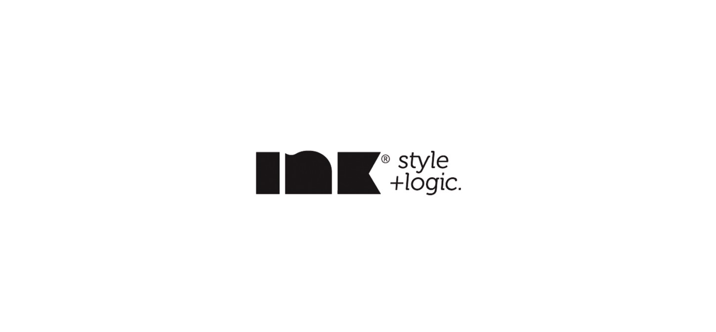
Figure 3-1: Studio Ink logo, designed by Studio Ink (www.studioink.com.au).
The element of surprise
A logo doesn’t have to be simple to be memorable. A logo can be memorable by showing the audience something that they aren’t expecting. A logo that surprises the viewer, catches him off-guard, will have great impact and, in turn, be memorable.
Attak, a graphic design firm based in The Netherlands, designed the identity for You Can’t Play a Trumpet with a Clenched Fist (see Figure 3-2). The logo acted as part of an exhibition entitled “Make Peace Not War.” The loaded gun barrel replaced by the trumpet surprises the viewer and, because of that, will have a lasting impact.
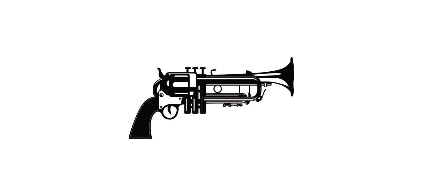
Figure 3-2: The logo for You Can’t Play a Trumpet with a Clenched Fist, designed by Attak (www.attakweb.com).
Timelessness
Trends come and go in logo design, as in anything else. But you want to design logos that are timeless—that way, they won’t look out of date in a year or two, and they may even last for decades. So, what makes a logo timeless? Timeless design is often simple, focusing on line work. Often, it completely ignores current or past common design trends, which makes it relevant to any time period. In a sense, it becomes pure design, which can have an everlasting effect on the minds of the viewer.
Oxide Design Co. designed the logo for Springbok (see Figure 3-3), a company that designs and manufactures precision test equipment for high-voltage power lines. The slick, precise lines make the identification of the era in which the logo was designed hard to pinpoint, and this will remain the case for years to come. The timeless illustration style allows the identity to be unsusceptible to looking outdated in the future, regardless of whether competitors choose to employ a current design trend into their own identities, thus rendering it more memorable.
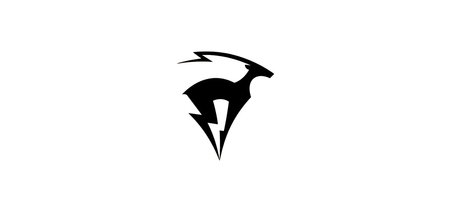
Figure 3-3: The Springbok logo, designed Oxide Design Co. (www.oxidedesign.com).
Originality
Another key attribute of successful logos is originality. If the logo you design looks like somebody else’s logo, or like a knock-off of logos that have come before, it won’t succeed. But this doesn’t mean that you have to start from scratch and come up with something that’s never been done before. You may be able to offer a unique take on a common concept.
Kevin Burr, a graphic designer working under the name of Ocular Ink in Nashville, Tennessee, designed the logo for Ecodiva (see Figure 3-4). Ecodiva produces eco-friendly skin-care products. Nature-related imagery is overused in logos for eco-friendly organizations and causes, but Kevin created a unique twist on that for the Ecodiva logo—it’s not overly obvious that the mark alludes to a leaf rather than the flowing hair of a young lady. Kevin played on themes viewers are used to associating with eco-friendly products and organizations, without hitting them over the head with it.
Figure 3-4: The Ecodiva logo, designed by Kevin Burr (www.ocularink.com).
I think that riskier and more adventurous designs are the most successful for any individual or organization. Of course, not every company should display an image of explicit images or make outrageous statements—this would get them noticed, but for all the wrong reasons. A logo that looks different, that makes people stop in their tracks and elicits a positive emotional response, is doing its job.
Jan Zabransky, a freelance identity design specialist based in Zlín, Czech Republic, designed an interesting wordmark for GENIUS (see Figure 3-5). GENIUS is a graphic design and strategic marketing firm specializing in brand identity, motion, and interactive design. Its focus is on building distinct and unique brands. This is brilliantly reflected in the GENIUS wordmark, which somehow manages to read well even though the word is typeset back to front with the letters upside down. Zabransky came up with an original solution for the GENIUS logo, and it succeeds, in part, because of this originality.

Figure 3-5: The GENIUS logo, designed by Jan Zabransky (www.janzabransky.cz).
Versatility
A logo needs to be versatile in order to succeed. It should allow the client room to grow, not lock the client in to one type of product (even if the client sells only one type of product at the start). And, even if your client tells you that the logo will be used only in magazine ads or won’t ever be used on a billboard, a logo isn’t successful unless it’s versatile enough to work well in any medium.
Leaving room for the brand to grow
When companies first start out, they often sell only one product or one type of product. As they grow, they may expand into other product lines. The key is to design a logo that doesn’t lock the client in, that allows the client to expand without needing a whole new brand identity.
Nadim Twal, a brand identity designer from Middlesex, England, designed the new logo for Jolly Monk, a brand of wine (see Figure 3-6). Instead of using images that we often see associated with wine producers, Nadim decided to create an abstract jolly monk character, which could be adapted and changed slightly for each variation of wine that Jolly Monk produces.
Figure 3-6: The Jolly Monk logo, designed by Nadim Twal.
Designing for every medium
The most successful logos are those that can be applied in every medium—screen or print, large or small. There is no point in having a logo unless you can use it to its full potential.
Rudy Hurtado, a graphic designer from Toronto, Canada, took on the role of designing the logo for Toronto Star and the Performing Arts (see Figure 3-7). The identity covers all the events relating to the performing arts covered by www.thestar.com. The old-school traditional style can be applied to the rest of the brand collateral, with elements of the logo taking on more prominent roles.
Figure 3-7: The Toronto Star and the Performing Arts logo, designed by Rudy Hurtado (www.rudyhurtado.com).
A Message
A logo can’t necessarily tell a whole brand story. That would be far too much information to encapsulate into a single image. However, it can act as the starting point to drawing viewers in and hitting them with a strong and powerful message. A powerful message that is portrayed visually in a logo design can go a long way toward achieving a recognizable understanding of what the brand stands for.
That said, the logo doesn’t have to tell it exactly how it is. For example, if a business’s unique selling point is that it sells the tastiest apples in the area, the logo doesn’t have to include that selling point—in fact, it really shouldn’t. Instead, the logo needs to communicate the message abstractly.
In 2009, I was approached by a startup nonprofit organization, the Information Center for the Prevention of Cruelty to Animals (ICPCA) to design its new identity. Animal cruelty is a sensitive and painful topic, so the challenge was to come up with a logo that communicated the organization’s message effectively and with sensitivity. I talked with the client about the main brand message that they wanted to communicate, and we decided that the message was, “Animal cruelty has to stop now.” The main goal of the organization is to make the cause known on a wider scale; we thought that the logo could play a key part in making people realize the message right away (as opposed to having to read additional literature or supporting headlines). Instead of shying away from the sinister nature of animal cruelty, I decided to use that in order to pull at the audience’s heartstrings (see Figure 3-8).
Figure 3-8: The ICPCA logo, designed by Gareth Hardy (www.downwithdesign.com).
Another approach is to represent the brand message subliminally within the logo. Any beliefs or ideas held by a business or organization that are illustrated in the design can help to tell the brand story, or at least form the basis for the start of communication between the viewer and the brand.
Roy Smith, a brand identity designer based in Norwich, United Kingdom, designed the new logo for the Royal Norfolk Show (see Figure 3-9), which is the largest agricultural show in the country. The show covers a range of traditional and modern events relating to agriculture. Roy represented a number of events within the design of the logo: The illustration shows a progression from an ear of corn (representing farming) to a tire tread (hinting at tractors) to birds (representing nature).
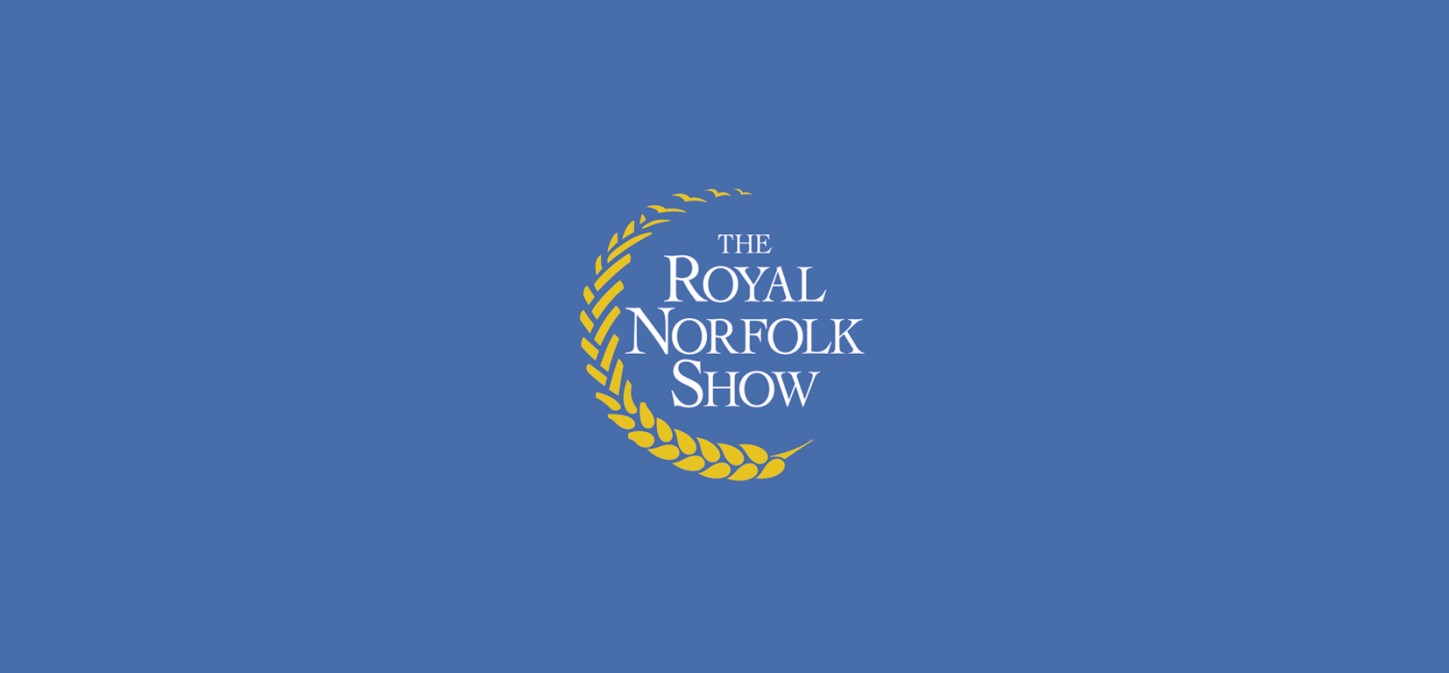
Figure 3-9: The Royal Norfolk Show logo, designed by Roy Smith (www.roysmithdesign.com).
The brand image
A logo can’t do it all, but it can act as the basis for the brand identity and should help support it. The style of the logo must be congruent with the brand image as a whole to keep from communicating different messages.
Nikita Lebedev, an identity designer from Kostroma, Russia, was faced with the task of designing the new identity for an elegant jewelry designer named Muhtarov (see Figure 3-10). The intricate design of the stylized initial hints at the fact that Muhtarov pays a lot of attention to detail in its jewelry designs. The overall image created by the logo matches the brand identity that Muhtarov wants to portray to its customers.
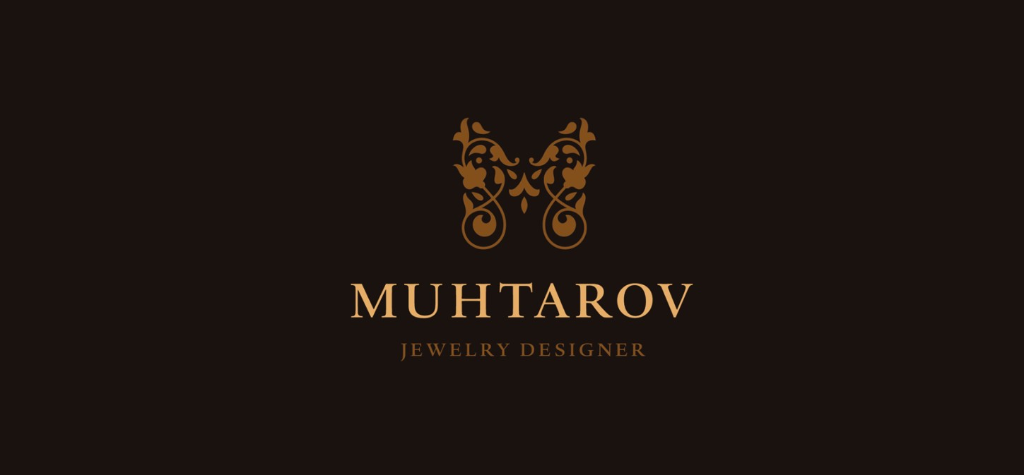
Figure 3-10: The Muhtarov logo, designed by Nikita Lebedev.
Scalability
The ability for a logo design to remain consistently legible regardless of the size is extremely beneficial. Each logo will have a different minimum size before the identity becomes affected. Of course, the smaller that this minimum size is, the more flexible the logo.
Muamer Adilovic, a senior graphic designer from Sarajevo, Bosnia, and Herzegovina, designed the logo for a new online community named Pozzitiva (see Figure 3-11). The bird illustration is simple, composed of few paths, so it allows the mark to scale down extremely well and still be distinguishable from a standard smiling face.
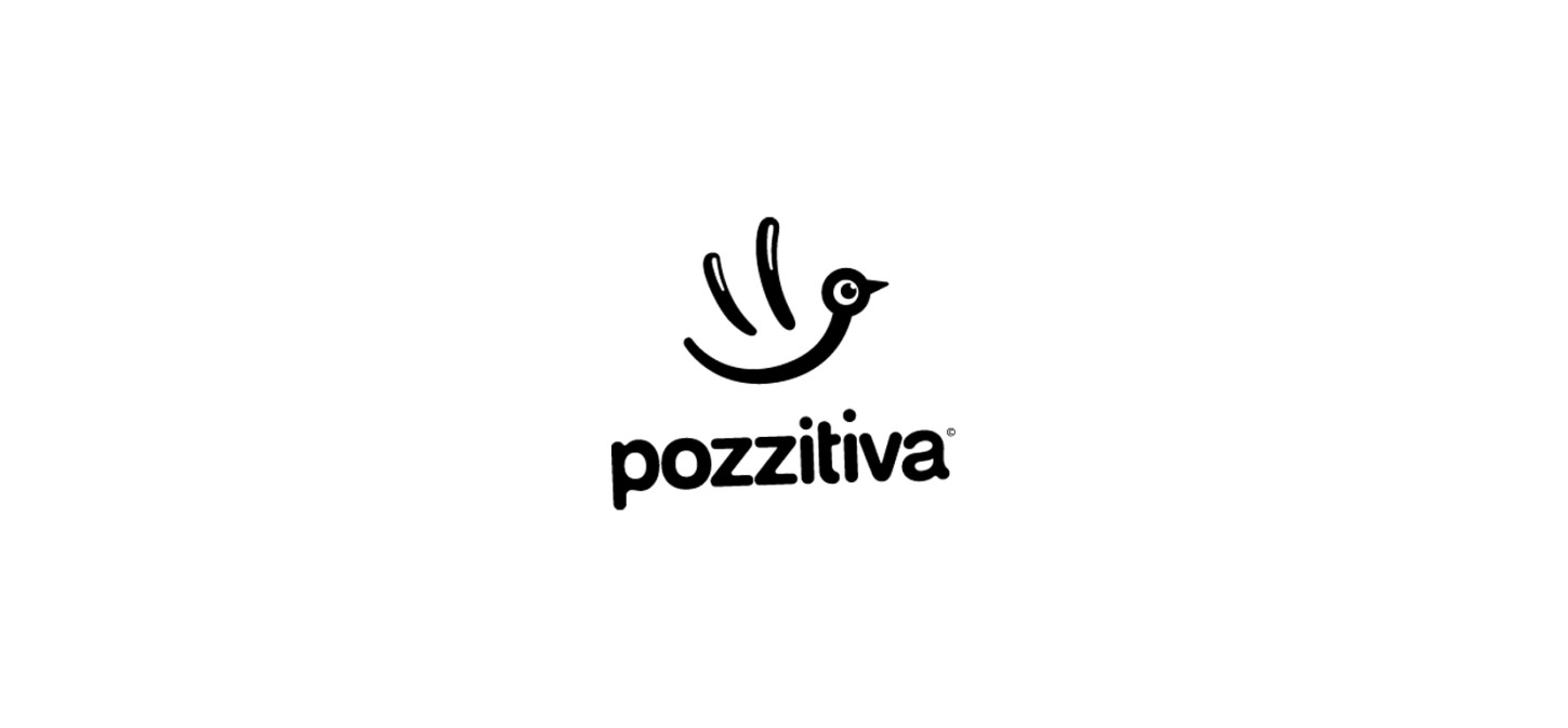
Figure 3-11: The Pozzitiva logo, designed by Muamer Adilovic (www.muameradilovic.com).
Execution
You may be able to think of a memorable, original and versatile concept that you know will be a suitable solution to the brief, but if you can’t execute that idea visually, the design won’t succeed. The execution of an idea is more often than not crucial in connecting with the audience; otherwise they won’t get it, even if you do. You can’t always be around to explain what your intentions were every time the logo is seen.
Burn Creative, a graphic design and branding form in Carlisle, Pennsylvania, decided to put into practice an unusual idea for Schick Enterprises (see Figure 3-12). Schick operate a unique business that involves providing technology solutions for the pork industry. The quirky stylized mark, a flying pig drawn in an electronic style, had to have been difficult to execute in such a way that the logo is recognizable and understandable, but Burn Creative pulled it off flawlessly.
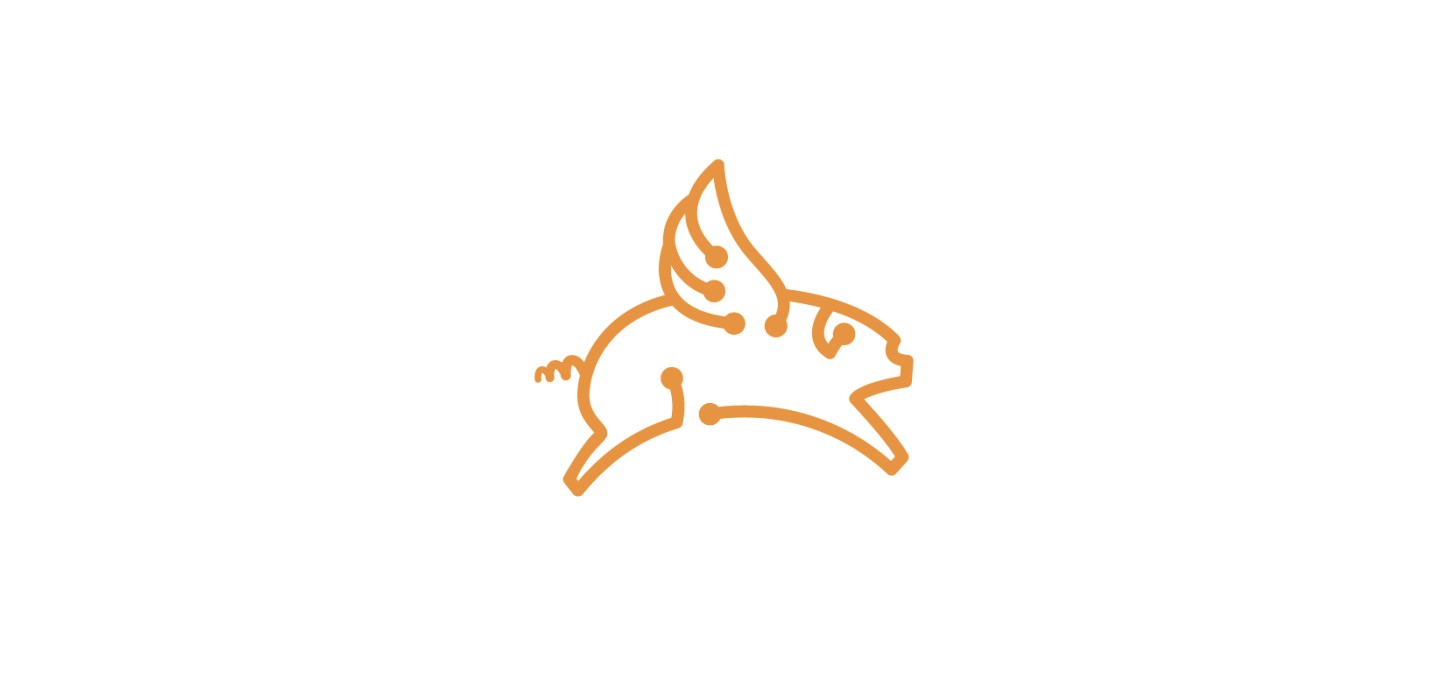
Figure 3-12: The Schick Enterprises logo, designed by Burn Creative (www.burncreative.com).
