
13
In Place: Fitting the Operational Context
Unsound Context
Since we were already in the bank that handled our corporate accounts, we decided to take care of a routine transfer of funds in person. On the other side of the big mahogany desk, the young bank officer helping us typed in the transaction until, suddenly, his terminal beeped. Curious, we leaned around to peek at the terminal. An error message was splashed across the screen.
With a look of slight embarrassment, the bank official said, “No problem. I can fix this,” and quickly typed another entry. Another beep and another message left him clearly flustered and us definitely amused. “Something is wrong here, but I can take care of it,” he said as he immediately resumed typing. “I can use an override to force it through.” There were no more beeps, but now he looked crestfallen. It seems that, in his rush to avoid embarrassment, he had inadvertently forced through an overdraft to our business account with several zeros too many.
There was nothing to worry about, he assured us. The error would be corrected automatically when the end-of-day balancing was performed. We were not satisfied, however. Until midnight, we would be unable to draw on any funds, and any routine inquiry regarding our assets would show us to be hundreds of thousands of dollars in debt. We insisted that the erroneous overdraft be corrected on the spot. Not possible, we were told. Once a supervisor override was effected on a transaction, it could not be undone. No, not even the bank president could change it, or so we were told.
This exchange highlighted a number of usability issues. The error message displayed for the bank officer may not have made the cause of the warning sufficiently clear. One can even question a system design that makes it so easy to initiate an exceptional transaction that cannot be undone. However, the problem would probably not have occurred if the bank officer had not become rushed; he would not have become rushed if we had not embarrassed him by looking at his screen; and we would never have known to look at the screen were it not for the loud beep in a quiet bank office. The use of audible feedback was ill-suited to the environment in which this system was being used.
Operational Modeling
Truly usable software is highly attuned to its environment. The user interface and the overall architecture are designed with the operational context in mind. Just as we would not use the same database design for a pet store as for an auto repair shop or build the same set of object classes for a telephone switching system and a point-of-sale application, we cannot approach the design of a system’s user interface with a one-size-fits-all mentality.
This is the Context Rule. Systems of all kinds need to be fitted not only to the work that they support but also to the context in which that work takes place. Systems that are deployed and used in different environments or different settings may require different solutions to user interface design problems. Similar capability deployed in varied settings may require divergent user interface solutions. Different constraints apply for a query system on a factory floor, in a kiosk within a busy shopping mall, or on a desk in an executive office suite.
Not all aspects of the actual work environment will necessarily have an impact on user interface design. That a factory floor is noisy will probably need to be taken into account in designing a system for process control, but the fact that the walls are painted green is almost certainly irrelevant. Those aspects of the operational context that are most likely to affect user interface design decisions constitute the operational context model, or, more succinctly, the operational model. The operational model is a collection of various operational and contextual influences that can play a role in usability. We refer to these collections as profiles because each is itself a compilation of a somewhat messy mix of factors that can shape the user interface design [Lockwood, 1994]. Operational factors that can affect user interface architecture and detail design include
• Characteristics of users and user roles
• Aspects of the physical work environment
• Features and limitations of operating equipment and interface devices
• General and specific operational risk factors
Environmental Adaptation
In a sense, the operational model serves as a repository for potentially significant information about the operational context. It is typically compiled through accretion. Although much of the information may become available quite early in the software development cycle, it can be quite acceptable and workable to continue to expand and refine the operational model as other models—and even the design itself—are being developed. As the operational model becomes more complete and detailed, its consequences are carried back into the other models—role model, task model, and content model—and forward into the implementation model.
The profiles of factors within the operational model can influence user interface design in more than one way. Commonly, the operational context can have an impact on the relative importance of various design objectives, such as speed of operation, accuracy, ease of learning, readability, and the like. In some cases, the operational context may have a direct impact on highly specific design decisions and details, such as the appropriate use of sound or color or even the placement of controls within interaction spaces. The impact of the operational context may be reflected either directly in the design process or indirectly, such as the way in which the operational context may need to be taken into account in the development and revision of style guides and working standards. For example, we might recognize that a substantial part of the equipment base on which a particular system is to be deployed utilizes monochrome displays. The project style guide might require that text be readable and that graphical displays be easily interpreted when presented in gray-scale.
We view the process of adapting a user interface design to the operational context, not as a separate step or a phase of the overall development effort, but as a continuous activity that proceeds concurrently with other design efforts. Traditional approaches to user interface and interaction design often begin with a primary focus on the work environment and operational context, but, in our experience, better designs result from a focus first on the work and secondarily on the work environment. Aspects of the operational context thus form a backdrop against which user interface design decisions are made. Each of the emerging contextual factors in the operational model is reviewed to ascertain its potential impact on the user interface design:
• How does it affect the design objectives?
• What implications does it have for specific aspects or parts of the design?
• What impact does it have on the project design guidelines and user interface standards?
Binding Context
Much of the information constituting the operational model becomes available relatively early in the development process as part of requirements gathering and user role modeling. As discussed in Chapter 4, a structured role model serves not only as an input to task modeling, but also as a repository for holding operational context information associated with user roles. When creating the structured role model we speak of profile attributes being bound to a specific user role or group of roles. But not all operational context information is closely bound to user roles. Often we find that the context information is most pertinent to an individual use case or a group of related use cases. Sometimes the operational characteristics apply to the system as a whole. In any case, the operational context information serves not only to help shape our decisions in designing the implementation model, but also to prioritize our usability objectives and focus our resources on those aspects of the user interface design that will have the greatest impact on producing efficient, effective, error-free use of the system.
Here again is the list of profiles introduced in Chapter 4:
• Incumbents—characteristics of the actual users who will play a given role
• Proficiency—how usage proficiency is distributed over time and among users in a given role
• Interaction—characteristic patterns of usage associated with a given role, use case, or set of use cases
• Information—nature of the information manipulated by users or exchanged between users and the system
• Functional support—specific functions, features, or facilities needed to support users in a given role or for a specific use case or set of use cases
• Usability criteria—relative importance of specific usability objectives for a given role or for a specific use case or set of use cases
• Operational risk—type and level of risk associated with a given role or for a specific use case or set of use cases
• Device constraints—limitations or constraining characteristics of the physical equipment
• Environment—relevant factors of the physical environment
The role of the proficiency profile in user interface design was thoroughly covered in the previous chapter. Here we will take up several of the other profiles and look at the implications such information has on interface design.
Incumbent Profile
The incumbent profile includes various characteristics of the actual users who will occupy a particular role in relationship to a system. It may not be possible in all cases to know in advance what sort of people are likely to make use of a system, but, in many instances, reasonable assumptions can be made, whether based on prior experience, user surveys, general knowledge, or merely informed guesses. Among the characteristics that may play a role in user interface design are such things as
• Knowledge of the application domain
• Knowledge of the system itself
• Level and nature of training
• Age
• Educational background
• Work and other relevant experience
• Cultural and social background
• Specific abilities or disabilities
The incumbent profile takes into account the knowledge that users can be expected to have about the broad domain of application and about the system itself. Domain knowledge and system knowledge may go hand in hand, but role incumbents in many cases are more highly knowledgeable in one than the other. For example, a supervisor filling in during a busy period at an airline ticket counter may have a thorough knowledge of the vagaries of modern airline ticketing practices and yet be relatively unfamiliar with the current software supporting those practices. Deep domain knowledge usually implies familiarity with vocabulary and concepts that can ease learning and use, but such familiarity can also carry expectations about how information and capability will be presented. If such expectations are not met by the design, usability will be reduced for some users.
Where most users can be expected to have thorough training and knowledge of a particular system, designers may have increased latitude in how to organize the user interface for greater efficiency. Especially where the application is used by itself, nonstandard solutions may be more acceptable in the interest of speed, safety, or other objectives.
Figure 13-1 Ineffective Accommodation to Users. (MICROSOFT BOOKSHELF 97)
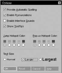
Very young or elderly users may need special accommodation. Enlarged visual targets and large, highly readable fonts may be appropriate for these populations, as well as for the visually impaired. If the recommendations for customization discussed in Chapter 12 are followed, one basic system operating under different profiles might be able to accommodate the needs of highly diverse populations. Once again, omitting user control over even one part of the interface can completely defeat the objective of customizability. For example, Microsoft Bookshelf 97 allows users to select type size—from three sizes, as shown in Figure 13-1—but this affects only the display of entries from the reference databases. The tiny, nonstandard type used in the rest of the interface remains stubbornly fixed and, contrary to recommended Windows 95 practices, does not conform to user display settings, such as when custom fonts have been specified for menus.
Age, educational level, and cultural background are obvious factors influencing the designer’s choice of appropriate vocabulary and usage within the user interface. Even where role incumbents may vary widely or where few assumptions can be made about these factors, designers should consider what might be an appropriate target for vocabulary and reading level within the planned user interface and how cultural issues might be relevant.
Interaction Profile
The interaction profile compiles a variety of information regarding how users in particular roles or for specific use cases can be expected to interact with the system being designed. Each of the following aspects of the interaction profile can have a substantial influence on user interface design:
• Frequency of use
• Regularity or periodicity of use
• Continuity (continuous versus intermittent use)
• Intensity (rate of interaction) and volume (total amount of interaction)
• Concentration (batches or distributed use)
• Complexity of interaction
• Predictability of interaction
• Locus of control (process-driven or user-driven)
If a system will be used relatively infrequently or sporadically, retention of learning assumes greater importance as a design objective. Either the interface must be designed such that its features and behavior are easy to remember from one use to another, or it will need to be tailored to novice usage since each use will be more like a fresh start. For example, over our years as PC users, we have on numerous occasions needed to format and partition a hard disk. The time between uses is long enough that, given the poorly organized user interface of the ancient software, we tend to fall into the same traps each time.
For systems that are used frequently and regularly, learnability and retention may become less important as design objectives, while efficiency of interaction rises in significance. Users who are involved in continuous interaction with a system can have somewhat different needs from those who use a system only intermittently.
With high rates of interaction, efficiency can become a dominant concern, as will accuracy. A telephone order entry system that must cope with hundreds of orders per day for each operator should be streamlined for efficient implementation of the focal use cases and designed to reduce costly and time-consuming entry errors. Very high rates of interaction—where users are working under pressure, for example—may require interfaces that are particularly fault tolerant or that are designed to minimize user errors or to reduce the consequences of errors.
Although high rates of interaction are often associated with large amounts of interaction, this is not always the case. A system with many users may process tens of thousands of queries a day even though each user may account for only one or a few transactions. From the standpoint of the individual user, speed of operation may seem inconsequential—an extra second or two completing a use case may hardly be noticed. Yet, to the entire community of users, the company as a whole, interactive efficiency may emerge as a major design objective.
Another possibility is that interaction may be concentrated into batches or bursts of activity. Concentrated interaction may cause efficiency to become a significant objective even if the total volume and rate of interaction are not particularly high. Such bunched interaction—entering a whole series of changes to a database, for example—can delay the user from getting on with other work. Moreover, users become more aware of the time needed to perform a task when they have to repeat it over and over again. Users can end up irritated and impatient and hence more prone to making mistakes. User satisfaction can also be adversely affected.
It is the high end of the scale of interaction rate and volume that most strongly affects user interface design; lower rates and volumes usually do not require special attention. If only some roles or some portions of an application involve particularly high interaction rates or volumes, those parts of the user interface can be tailored for performance. Ideally, software would be optimized for every task supported, but, in the real world, there is simply not enough time and resources to perfect every task supported, and optimizing one area often means detuning another. Reviewing the operational profile as a whole can help designers to make intelligent trade-offs in usability. A system that is awkward or slow to use in a task performed only once a week can be considered more usable than one that poorly supports a task performed 20 times daily.
Interaction intensity and volume can be considered properties of use cases as well as of user roles. Where there is substantial variance between use cases, ones with exceptional interaction patterns should be flagged for special attention in fitting the user interface design to the operational context.
Highly predictable interaction can simplify the design of the user interface, but it puts the onus on the designer to be aware of and understand the expected pattern of interaction in order to tailor the organization and workflow to this pattern. Highly predictable interaction makes it easier to optimize an interface for efficient use. When the content and sequence of interaction are highly variable and unpredictable, it can be much more difficult for designers to find the best layout; hence, learnability and flexibility in operation assume greater importance.
For example, the role of claimsEntryClerk in an automobile insurance application may be associated with high predictability. Most likely, there is only one form, and much the same pieces of information are entered from each form. In contrast, an executive using a decision support tool for financial analysis may bring up one set of data, then switch to a different set, produce a graph, and then filter the dataset and run a report. The next day he or she may look at completely different data, produce three reports, and do no graphing. All actions with the system are ad hoc and changeable.
The question of who is in charge can be an important one in user interface design. We use the psychological term locus of control to refer to this aspect of the interaction profile. Do the software and the process it embodies essentially drive the interaction, or is the user in control? Free-form interaction with the user in the driver’s seat can place more demand on the user to retain “knowledge in the head” and more demand on the designer to promote ease of learning and retention. Interfaces that take charge and walk the user through a set scenario are acceptable solutions for predictable interaction that is process-driven but are less effective for highly variable interaction where the user needs to be in charge. Of course, some fairly predictable interaction may still leave the user in control of the process. The claimsEntryClerk may have substantial control over the process in terms of the order of entry, what fields to skip, when to add clarifying comments, and the like, even though the overall task is fairly fixed and repetitious.
Information Profile
Closely related to the interaction profile is the information profile, which includes four factors regarding the information available to and received from users:
1. Input origins
2. Flow direction
3. Information volume
4. Information complexity
To the source. The information obtained from the user comes from somewhere. Either it starts in the user’s mind, with thoughts and ideas, or it reaches the user through one of the senses. Most commonly in software applications, information originates with one of three channels: (1) visual (such as a paper insurance form), (2) aural (such as a customer’s voice over the telephone), or (3) mental (such as the ideas generated by an artist using a photo-editing application). In exceptional cases, other senses could play a role. An inspection mechanic might use touch to identify defects in machine parts, which are entered into logging software through a headset microphone; an oenologist might enter details of the bouquet of a new vintage using the keyboard of a handheld terminal.
The ultimate origins of information flowing from the user to the system can be of crucial importance in fitting user interface design to the operational context. Since more than one channel may be used in some roles or some applications, we need to identify the dominant modality in each case. If the user is reading data values from a form or observing nonverbal behavior in a discussion group, it is highly unlikely that the user is also going to be looking at the display screen. Most of the time, such users would not be looking at the screen, and, when they do look at it, they must first reorient themselves within that visual context. Clearly, the user interface in such contexts cannot rely solely or primarily on visual feedback for error or warning messages. In these cases, sound might be much more effective. In contrast, if the user is listening to a customer through a telephone headset, a computer beeping away can be an annoying distraction to both user and customer or may even go unnoticed by the user. Where information originates in the thoughts of the user, the user interface should help users quickly capture ideas or thoughts and make it easy for them to change directions, revising their input or undoing their actions.
Data entry from paper forms and data entry over the telephone present an interesting contrast in the influences of information origin on user interface design. A paper form cannot talk back. You cannot ask it for a correction if an error is flagged. For this reason, careful attention must be paid to handling the exception cases covering missing or incomplete information when designing systems for input from paper sources. The telephone source is, by contrast, interactive, so the person on the line can be queried for corrections or more information.
In the interest of efficient and reliable input from paper forms, the input process needs to mirror the layout of the paper form. The screen layout best resembles the form layout when it comes to the fields of interest, and the tab order of screen fields should correspond with the order in which information appears on the printed page. Why? Visually skipping around the page takes time, and each visual skip has a chance of landing the attention on the wrong line. The entry task is made slower and more errorprone, and training may take longer since the user must learn how to zigzag through the form. In some applications, redesigning the form to facilitate data entry may be part of the user interface design problem.
With a telephone source, the input process need not follow a fixed sequence, although there may be advantages to following a script that sets the entry order (“May I have your telephone number, area code first?” “May I have your last name? Your zip code?”). In some applications, the system may display the script on-screen as a memory aid, especially for new entry operators.
When it comes to flagging errors or exceptions, beeps and buzzes may not be a good idea with a telephone source since the two streams of sound compete and the customer on the other end of the line may be able to hear the computer. In contrast, sound may be preferred to signal messages in paper-source data entry. Such applications are often known as “heads-down” data entry because the clerk is looking, with head down, at the paper form. If the software simply puts up a message box with no audible attention-getter, the user may not become aware of what has happened until he or she hears the “chirp-chirp-chirp” of the keyboard buffer overflowing.
In and out. Flow direction reflects the importance of taking into account whether interaction between the user and the system is predominantly organized around acquiring information from the user or providing it to the user. In an insurance forms-processing application or in a simple graphics paint program, the process is built around transcription or communication from the user. With a financier using a stock analysis system, the process is more focused on providing information to the user. Decision support and performance support systems are clearly organized around providing information to the user, while transaction-processing systems more typically focus on recording data from the user. Naturally, if the main focus is recording data, then the user interface should facilitate the input process. If the focus is on providing information to the user, then the emphasis within the user interface design should be in aiding data comprehension and helping the user build understanding out of data. Different parts of an application may have differing emphases on acquisition versus provision of information.
Deep and wide. Information volume and information complexity are distinct factors that can have similar influences on design. Information volume refers to how much information is potentially available or of interest to the user. Trying to display large quantities of information can, in itself, present design challenges. Information may have to be divided among multiple screens or pages. How is this best achieved? If divided, navigation and visual linking of different parts of the user interface emerge as critical design issues. If too much information is crammed into a single interaction context, readability can become a problem. If clever schemes for condensing data are used, ease of learning or of interpretation may be compromised. Systems with high information volume need to provide users with effective tools and aids for subdividing, grouping, and navigating what would otherwise be an unmanageable amount of information.
Information may be complex in many different ways. Information complexity encompasses such issues as the number of time periods represented or the number of subgroups within the information of interest—for example, figures from the London office, the Chicago office, and the Sunnyvale office. The number of different data types, the number of entity attributes, and so forth, can also affect information complexity. Applications with high information complexity need to help users keep track of which among subgroups are being viewed or manipulated. Designs will need to help the user tame the complexity and turn complicated data into useful information. Within applications with substantial information complexity, clarity of presentation, comprehensibility, and layout assume great importance.
It is important to keep in mind that the information profile reflects operational aspects associated with particular user roles or specific use cases. Users in some roles may, for example, be dealing with inputting a large amount of relatively simple information, but users in other roles may be analyzing and interpreting the more complex results from reducing that high volume of data.
Environment Profile
In what type of location is the user located? In a private office? At a kiosk in a public square? Amidst machinery on a factory floor? A mixture of environments? Many aspects of the actual physical working environment within which systems are used may need to be taken into account for effective user interface design. These include sundry things such as the level of ambient noise, the lighting conditions, and environmental factors such as temperature and humidity of the setting, or the presence of vibration. We capture information about these these types of factors in the environment profile.
A key element here is the level of distraction due to the physical environment. Distractions can be physical—a noisy fan, repeated phone calls, or an office mate who keeps interrupting, for example—or mental, such as trying to keep track of multiple tasks or trying to remember to do something that must temporarily be postponed. If the distractions are frequent, users may need extra help from the user interface in particular areas, such as in returning to tasks, figuring out where they left off, or easily switching among several tasks.
The ambient noise level of the environment needs to be taken into account quite apart from whether the noise is distracting. Users can become habituated to a high noise level, for example, but that does not mean they will be able to hear a quiet warning beep amidst the clanks and rattles of a bottling plant. On the other end of the spectrum, low ambient noise must also be taken into account. A raucous squawk from software announcing an imminent appointment might bring a smile in a home office but produce frowns in the halls of a conservative law firm.
In many cases, only site visits to the actual workplace will make the developers aware of what operational conditions may need to be accounted for in the design. Designers may need to consider a variety of aspects of the work setting. The physical layout can be important. If users working collaboratively on shared work are near enough to one another, plain old-fashioned talking may be one way to coordinate some of the work, but, if users are widely spaced or spread over multiple floors, electronic messaging may need to be an integral part of the user interface design.
Outdoor settings can impose design constraints that are dramatically different from those in a conventional office. (See sidebar, Lift Ticket Interface.) Extremes of temperature and humidity, whether outdoors or in interior settings, may need to be taken into account. A system intended for field use by archaeologists may need to cope with the presence of dust, with dirty fingers, and with bright sunlight, for example.
Vibration can be a complicating issue in some user interface designs, such as the control panel of a car stereo where the vibration, bouncing, and swaying of the car can make it more difficult for the user to press the right target button, a problem that is exacerbated under the low-light conditions of night driving.
Device Constraints Profile
Device constraints are limitations or constraining characteristics of the physical equipment on which a system is deployed or through which the user interacts with the system. The device constraints profile identifies equipment characteristics associated with specific roles, use cases, or the system as a whole. There may be limitations on the input side, the output side, or both. These constraints include screen size, resolution, and color depth; keyboard or keypad size and layout; and special controls such as sliders, toggle switches, rotary knobs, or the like. In some projects, the user interface designers may have wide latitude in specifying input and output devices; in others, the devices may be fixed by fiat, economics, or the user community. Monochrome displays limited to a few short lines of characters are still common in many industrial control systems. Even some PC-based software may need to accommodate to a substantial installed base of older monochrome screens with only VGA resolution. As mentioned in Chapter 7, this was found to be the case with software developed for deployment on laptops in police cruisers. Although not all the target computers were monochrome, the software had to be usable on the oldest and least capable systems that were still in wide use.
We may include under the heading of device constraints physical barriers or impediments between users and a system. For example, the most logical, wellplanned keyboard shortcuts will not help the factory worker who is wearing heavy, heat-shielding gloves. Keypad or touch screen used under these conditions may need to be heat and abrasion resistant and have oversized controls.
As one might expect, the most interesting and extreme limitations are often in embedded systems applications, which will be discussed in more detail in the next chapter. For some applications, input may be limited to one or two buttons and outputs to a single line of text or even a small number of LEDs. For example, a laboratory test instrument is to be built into a case the size of a fountain pen. Under common conditions of use, the user will often need to be looking elsewhere once the instrument is inserted into a sample. The system has to be able to convey six messages: testing in progress, testing complete, sample nominal, sample high, sample low, and instrument error.
How can the designer deal with such severe operational constraints? An LCD or LED display is impractical for this application. Sound is the only available channel, and the sound-generating device already chosen for engineering reasons can emit only two tones: one high, one low. In one possible design, the messages are combined into five and communicated as follows:
1. Testing in progress: |
' ' ' ' ' ' |
(rapid ticking made with very short pulse) |
2. Complete, sample nominal: |
- - - |
(three short, high tones) |
3. Complete, sample high: |
_---_--- |
(short low, long high, repeated) |
4. Complete, sample low: |
-__-__ |
(short high, long low, repeated) |
5. Instrument error: |
_ _ _ _ _ _ |
(rapid repeating low tone) |
Although such an interface may not be completely intuitable, it is likely to be easy to learn and to remember how to interpret it.
Operational Risk Profile
Operational risk refers to what is at stake if the user and the system fail in the correct completion of tasks. What are the consequences of an input error, a failure to complete a transaction, a system lockup, or a delay in processing? In some cases, an error may be inconsequential; in others, disaster may loom.
In far too many applications, designers fail to consider operational risk in connection with particular roles or use cases or fail to think creatively about how errors might be controlled or reduced. Seemingly small input errors may compound and result in substantial consequences. Countless customer databases are riddled with duplicate entries resulting from typing errors during order entry. The bogus records do more than just waste storage space and processing time; they can cost money in mailings and give a distorted picture of sales and the customer base that can lead to bad management decisions. Recognizing this, designers can incorporate soundex or nearest-match searching that makes it easier for an operator or entry clerk to spot whether a new entry matches an existing customer.
Ironically, many techniques for improving accuracy and reliability also increase efficiency of use. For example, a system can automatically generate the city and state from an entered ZIP code, thus reducing errors and speeding entry. In general, good validation and error checking on entry mean less information needs to be reentered and fewer bad transactions need to be corrected later.
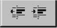
Even the appearance and layout of a display can have an impact on errors. Controls that serve radically different functions should not be too similar in appearance or be located too closely. The visual differences between the adjacent controls in Figure 13-2 are too limited for controls that have the opposite effect. In this case, the operational risk is small, especially since the effect can be easily undone, a risk-reduction technique of wide applicability.
Although some applications may be associated with elevated operational risk across the board, there are usually differences from use case to use case. The software controlling a nuclear power plant involves significant operational risk in all its aspects. However, the inherent risk is much higher in using a special command to override a safety feature than in requesting a routine plant status overview.
Where operational risk is higher in connection with particular roles or use cases, special attention needs to be paid to mechanisms that assure accuracy of input and accurate interpretation of output. Confirmation procedures need to be carefully considered.
Confirmation messages were covered in Chapter 11. It is important to remember that, as a rule, confirmation affords only relatively weak or nonexistent protection from error. If an operation is in fact potentially catastrophic, merely requiring the user to click on an OK button is not enough to significantly reduce risk. High-risk use cases require more definitive and unambiguous assurance that the user’s action is intentional. Some systems have used cascading confirmations, but users can keep clicking OK or hitting Enter faster than the eye can follow. A lesson might be lifted from the pages of weapon systems design. Two separate keys must be turned simultaneously to arm a warhead. An analogy on a graphical user interface might require the user to confirm an irrevocable action with simultaneous pressing of two specified keys while also clicking on a big red Delete System Image button. Reversibility, of course, is always highly desirable but not always completely possible or practical.
Figure 13-2 Adjacent, Nearly Identical Controls, with Opposite Functions. (MICROSOFT WORD 97)
In most cases, the best the designer can do is reduce the probability of error, not eliminate it altogether. Take the simple and common case of using an ATM to handle a deposit or withdrawal. The typical ATM asks the user to confirm each step in the process. To reduce the chance of the user’s confirming reflexively by just hitting the same Enter or OK key without even reading the display, most ATM software varies which key is used for confirmation. Each screen or menu requires the user to press a different key, forcing the user to look at the screen and thus increasing the likelihood that he or she has read and understood the confirmation request. However, there are no guarantees. With practice, a user could learn to tap the right sequence of keys without thinking, thus defeating the design and someday, perhaps, withdrawing $500 instead of an intended $50.
There are inevitable trade-offs in managing operational risks. Attempting to reduce or control one risk almost invariably heightens others or has some other impact on usability. The ATM user interface presents a classic example. Most ATMs in Australia and many other countries dispense cash only after the user retrieves the ATM card. This virtually eliminates the chance of the user forgetting the card in the machine, but it also makes it much more awkward and timeconsuming to perform multiple transactions on the same visit to the ATM.
Putting Context in Place
To make use of the operational model, designers need to fill in the blanks in terms of the various operation profiles it comprises. Using information from various sources, including the structured user role model, information about each of the many factors is identified. A checklist or simple form, such as the one found in Appendix E, can serve as a convenient way to assure that all potentially significant aspects have been considered. For this purpose, we are interested in aspects of the operational context that are salient—that stand out—and that are relevant. This requires a certain amount of judgment and filtering on the part of the designer. Once the salient and relevant aspects of the operational context have been identified, each is reviewed for its possible implications in terms of the user interface design, the design objectives, and the design guidelines. To understand this process better, let us compare and contrast two applications that differ rather sharply in their operational profiles.
Dimtel Products Order Taking
It’s after midnight on Australian television, and the commercials begin to change in character. All of a sudden, the screen is alive with a familiar figure making a frenetic pitch. It’s Tim, the DimTel man, hawking a set of razor-sharp kitchen knives for a paltry $19.95 plus postage and handling: “But wait, there’s more. If you order now, we will include this set of six steak knives with fabulous faux ebony handles absolutely free. But that’s not all. Especially for the viewers of this program, we will throw in this solid maple cutting board, hand-stamped with the legendary DimTel symbol of quality, at no extra charge. That’s right, the four incredibly sharp kitchen knives, the six luxury steak knives and this beautiful, hand-stamped cutting board, all for just $19.95 plus postage and handling. Be among the first 100 callers, and the shipping and handling is on us. That’s right, absolutely no charge to you. So, ring now and be ready with your credit-card details. Our trained telephonists are standing by to take your orders.” Similar scenes are familiar to latenight television audiences in many countries.
Those telephone order takers, standing ready to cope with the surge of callers, need to be supported by good order entry software. What can we say about the operational context that might need to be taken into account in our user interface design? First, this is a high-volume application that is used frequently, more or less continuously, and at a high rate of interaction. Each order is separate and much the same as the last one. The information source is aural, and the volume of information displayed or of interest to the operator is quite small, with only a few different kinds of data. The primary flow of information is into the system. With so many order takers crammed into the “boiler room” operation, the setting is likely to be quite noisy. Sounds generated by the software will only make matters worse.
The end users of this application may represent an interesting population. In telephone order processing, job turnover can be quite high, meaning that novices in training will be fairly common. However, novices quickly become experts in this context. After a two-hour training and one shift of processing many hundreds of orders, almost everyone reaches expert-level usage. So, the proficiency profile is one of mostly experts and novices. Order takers are unlikely to have much knowledge of the marketing and telephone sales domain, and, although they soon know one part of the software intimately, their systems knowledge is likely to remain rather narrow and restricted.
What do we conclude from this review of the operational context? Speed and accuracy of operation are crucially important. The system should be easy to learn and to master quickly. Flexibility of operation and adaptability of the interface are not high priorities. The design will need to focus on efficient workflow within a simple layout. The interface should be optimized for keyboard operation, with careful consideration of the tabbing order by which focus moves from field to field. Careful attention should also be paid to the choice of widgets to improve performance. For example, we might employ drop-down combo boxes to allow the operator to type only the first few characters of a product. The system could automatically fill in the city and state from the zip code, not only saving typing but also enabling the operator to validate the address (“That’s in Georgetown, Maryland, correct?).”
Bankinvest Portfolio Analysis
The BankInvest software is to be used by bank officers to review and analyze the investments of small investors seeking recommendations. The software must allow the bank official to examine the client’s portfolio of investments and look at its performance over different time periods in light of the investor’s goals. The user may want to make various “what-if” comparisons, substituting a different mutual fund, altering the mix, or changing the strategy. Since each portfolio and investor is different, it is difficult to say in advance what analyses may be useful and in what order they might be performed. The total volume of use is relatively low despite moderately frequent use. The application is apt to be used nearly every day, but not continuously since the targeted bank personnel will have other duties and use other software as well. In this case, the interaction is clearly directed by the user and is highly variable, originating with the particular thoughts and ideas of the bank analyst. The flow of information from the system is the most important to the user, and the information of interest may be both quite extensive and moderately complex.
Most users of BankInvest will be classic improving intermediates who can be expected to have a moderate knowledge of the BankInvest system coupled with substantial domain knowledge regarding investments and banking practices. They work in a relatively quiet office setting with comparatively few distractions. As they use the system, they may or may not consult paper sources, but they can be expected to be watching the screen fairly closely.
In this application, flexibility of operation and comprehensibility of the output become the driving forces. Being able to view information in various forms—tables, charts, graphs, and so forth—will be valuable. Easy linkages to other systems, such as databases of funds and fund performances, will be essential. Integration or interoperation with other supporting applications, such as calendars and specialized calculators, can help simplify operation.
For efficiency as well as flexibility, it would be desirable to allow users to define and save entire sequences of analyses and reporting for later reuse. Keeping in mind the incumbent profile, something more creative than a typical programmeroriented macro facility would be needed.