
Since last year’s State of the Computer Book Market posts, the Tech Book market has been going through some major changes, but none more profoundly affecting our industry as Borders Group Inc (BGI) going out of business. Much of what you will see in the 2012 trends are directly related to BGI’s demise, though the faint signals that the book market provides to other industries are still evident.
You can get a quick refresher on how we see Computer Book Sales as a Technology Trend Indicator and our other posts on the State of the Computer Book Market.
The data in the posts that will follow, are from Bookscan’s weekly top 3,000 titles sold. Bookscan measures actual cash register sales in bookstores. Simply put, whenever you buy a technology-oriented book in the United States, there’s a high probability it will get recorded in this data. There are now two major Retailers in Tech books and they are: Barnes & Noble, and Amazon and they make up the lion’s share of Bookscan’s recorded sales.
Before we get to the specifics of the computer book market, let’s get some context by looking at the whole book market for the week ending December 25, 2011. Everything that is printed, bound, and sold as a book, from Steve Jobs and Heaven is for Real: A Little Boy’s Astounding Story of His Trip to Heaven and Back to Diary of a Wimpy Kid: Cabin Fever and StrengthsFinder 2.0 is represented in the table below.
Overall Book Market - EVERYTHING - Week Ending: 2011-12-25
All Books, All Subjects | ||
|---|---|---|
Category | Share | YoY |
Adult Non-Fiction | 40% | -8% |
Computers | 1% | 2% |
Adult Fiction | 19% | -11% |
Juvenile Non-Fiction | 6% | 11% |
Juvenile Fiction | 25% | 10% |
Other | 9% | -30% |
Total | 100% | -9.25% |
As you can see, the computer market is up about 2% from last year which is much better than the whole market being down more than -9%. It should be noted that the computer book market makes up only about 1% of total unit sales in bookstores and online retailers. Also, for this report and the following four posts, I am using a data that is aggregated from weekly reports of the Top 3000 titles in Bookscan. So the numbers for all the long-tail titles are not included here. In other words the data in the table above shows a 2% growth and yet our top 3000 data shows a 0.7% growth. This actually means that a considerable number of long-tail titles sold in 2011 yet did not make it past the minimum threshold to make a weekly top 3000 report. If you would like to see the performance of the major book categories, this table shows percentage growth. I find it interesting that the Religion/Bibles category is the largest-growing category in an otherwise depressed market. Only 10 out of the 47 overall categories showed growth in 2011 and the computer category was one of them. We’ll look at precisely what fueled the growth for the computer category in future posts.
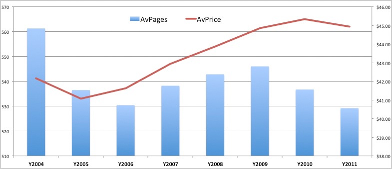
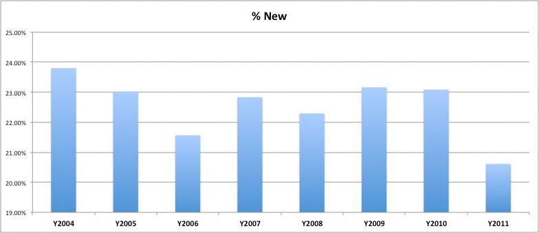
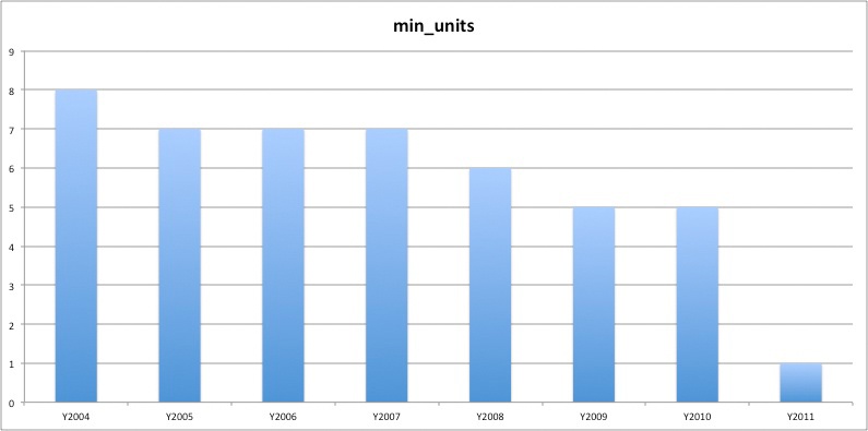
Now on to the technology book market. The four charts below provide some perspective into how each year stacks up against prior years from a Units and Title Count as well as Average Pages per book, and Average Price per book. The third and fourth charts provide context to how many new Titles were published during a given year and what the threshold was to make the Top 3000 report on a weekly basis. The chart on the top left shows the overall units sold per year with the Red Line showing the number of distinct titles that made the Bookscan Top 3000 weekly report. Looking at the two together provides a better insight into what happened. Basically as fewer units were sold, it looks as though more titles were published. Yet as you can see in the chart at the bottom of the four charts, there were fewer new titles in 2011 that contributed to the total units sold. So this leads me to believe that the numeric threshold to get into the dataset of the Top 3000 titles sold on a weekly basis was lower than previous years. And in fact the bottom right chart shows this was the case as 2011 had the lowest threshold in all years measured. So fewer books made the data with fewer of them being new and they had fewer pages and were priced lower on average than ever before. And yet the market showed a slight increase, so this must have come as a result of a few stellar performers that were likely titles published before 2011. We’ll explore this in the coming posts, so hang on to this thought.
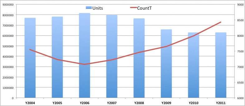
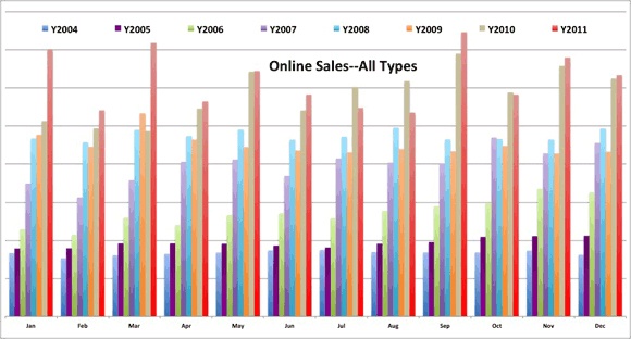
Immediately below is the weekly trend (from the Top 3000 titles reported weekly) for the entire computer book market since 2004, when we first obtained reliable data from Bookscan. Please remember that the data represents all publishers, and not just O’Reilly. The slightly thicker red line represents the 2011 data.
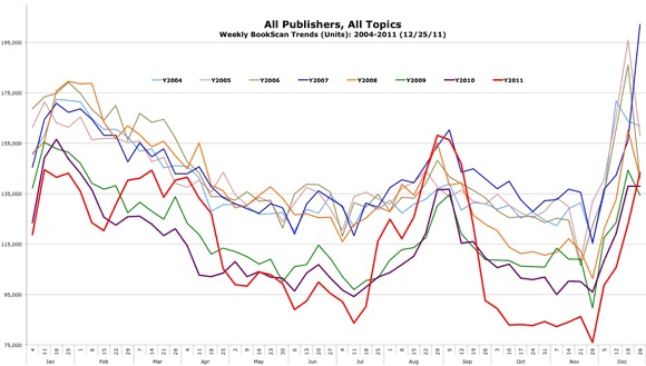
The clear seasonal pattern that we’ve pointed out before still exists, but with more extreme fluctuations. That is, we have a strong start that declines through the summer, spikes for the fall “Back to School” season, and finishes the year strong. And each subsequent year closely mirrors the year before but with usually a percent tick or two lower. But the biggest news for 2011 was that we had some weeks that were clearly above prior years and one week that was the highest we’ve seen for all the years. However, this boon comes through the unfortunate Borders fire sale, and then the eventual liquidation of their remaining inventory. In my opinion, it is too early to predict what long-term effect we will see with Borders gone, because as you’ll notice as soon as their doors closed, the market hit bottom. Not only did it hit bottom, but the market tanked further down than we have ever seen it. But the reason I still think we are not in a pattern of predictability yet is that the December climb up was higher than the four previous years. So in a nutshell, 2011 was a year of our highest highs and our lowest lows and that was likely due to the Borders situation.
What you won’t see on this chart is that the computer book market suffered its biggest losses in 2001 and then began shrinking 20 percent a year for 3 years, until it stabilized in 2004 at about half the size it was in 2000. (We have consistent and reliable data going back to 2004.) You can now see a second cratering in the market that started in the second half of 2008 and continued through 2010 until the more volatile and unpredictable 2011. The overall market growth rates for the previous seven years are: 2005 = 1.48%; 2006 = 3.17%; 2007 = -2.00%; 2008 = -4.27%; 2009 = -15.31%; 2010 = -4.29%; 2011 = +0.7%
So what about that market was news in 2011 other than Borders? In 2011, There were 21 weeks in the year that were ahead of the same week in 2010. In 2010 there were 11 weeks that were ahead of the prior year unit sales and in 2009, there were only two weeks that were ahead of the prior year. I am not willing to state that we are seeing a recovery in the market because a .7% growth is not exactly a strong signal in the right direction. To the optimists in the crowd, it appears as though we have seen bottom in October through November of 2011 — but pessimists will believe that they’ve seen this before: the market looks as though it hit bottom, but then takes another big hit downward. 2009 (the green line) was a turbulent rollercoaster ride to the bottom as well. So at this time the market is really too unstable to predict whether it will move down again or continue to recover.
Another way to look at the market is with the Treemap visualization tool. This tool helps us pick up on trends quickly, even when looking at thousands of books. It works like this:
The size of a square shows the market share and relative size of a category, while the color shows the rate of change in sales. Red is down, and green is up, with the intensity of the color representing the magnitude of the change. The following screenshot of our treemap shows gains and losses by category, comparing the fourth quarter of 2011 with the fourth quarter of 2010.
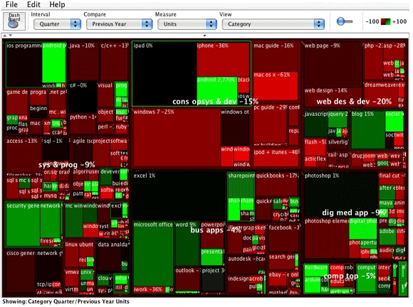
So what are all the boxes and colors telling us? First remember that this is compares the last quarters of the previous two years.
There were quite a few bright spots (bright green) during the last quarter of 2011. Take a look at Android Programming (in the upper-left box), the bright-green box showing growth from the fourth quarter of 2010. Right next to Android is iOS which is larger in size, but Black which means flat growth. You will also see Android again in bright-green (upper-middle box) — the difference is that the upper-left is for programmer-oriented books and the upper-middle is for Android consumer books [using your Droid]. Both had impressive growth in 2011 compared to 2010. In the upper-middle area is iPad and iPhone for consumers which where flat or down. I wonder if the iPhone 4GS was as big of a hit as the iPhone 4. The iPad, the upper-middle big black square, continues to impress with how big the box is at this early point in its evolution, and is flat because both years have netted lots of units sold. Look at Windows 7 just below iPad and notice that the iPad size is about 3/5 as big as Windows 7. That is amazing to me, as the iPad has grown to be almost as big as the business desktop operating system.
In 2010, Windows 7 was the number one growth area for units, followed by iPad, then Android (for consumers), and Android programming. This is unit growth, and a bit of the success for these technologies is that they are fairly new and do not have large market shares as a base to be measured against Looking at longer-established technologies, Security and Network Security and Digital Photography had strong unit growth.
I find it useful to organize the trends into classifications that are High Growth Categories bright green, Moderate Growth Categories dark green to black, Categories to Watch all colors, and Down Categories red to bright red. Most of these descriptions are self-explanatory, except perhaps Categories to Watch. This group contains titles that we’ve found are not typically susceptible to seasonal swings, as well as areas on our editorial radar. If there are categories you want to get on our watch list, please let me know: [email protected].
The table below highlights and explains some of the data from the chart above, although the data is for all of 2011. The Share column shows the total market share of that category, and the ROC column shows the Rate of Change (RoC = (current_period - prev_period) / prev_period). So, for example, you can see that Mac OS books represent 2.79% of the entire computer book market, and were shrinking by -7.49% (RoC).
High Growth | Share | ROC | Notes |
|---|---|---|---|
iPad | 04.46% | 65.57% | From no presence in 2009, to a 1.74% market share in 2011, to the the largest market share for all topics in 2011. Ironically, physical books about the iPad, sell. |
Nook | 00.86% | 100.00% | This category had no 2010 presence, but is now the 29th largest category in market share. Again, the irony of this — content about a book reader sells well in physical form. |
iPhone | 01.97% | 21.65% | This category has seen steady increases each year except in 2010. 2011 almost matched its high point in units which was in 2009. Of all categories it is ranked 6th in 2011. |
JavaScript | 00.98% | 18.79% | 2011 saw nearly 12,000 more units sold than 2010. 2006 was the high mark for JavaScript with 323 more units sold than 2011 but last year had the biggest growth year-over-year. |
Computers and Society | 01.11% | 32.53% | This area reached its highest ever point for unit sales and moved to the 16th ranked area in 2011. It ranks 45th on the all time list. |
Moderate Growth | Share | ROC | Notes |
|---|---|---|---|
Java | 01.32% | 08.27% | A nice steady pattern for Java now. Growth in each of the previous three years. It is the 12th largest category overall and reached that same rank in 2011. |
Web Design | 01.03% | 05.17% | This category pattern is like a roller-coaster, up and down. Overall it ranks 13th, but in 2011 it was 22nd even though it showed modest growth compared with 2010. |
C++ | 00.93% | 06.87% | A language that was built to last, and used to build things that last. The overall sales pattern is inconsistent. Its overall rank is 19th and in 2011 it was 25th. |
CSS | 00.78% | 06.34% | The pattern here has been downward since 2007 but in 2011 there was modest growth. Overall it is ranked 24th and in 2011 it was 31st. |
Game Development | 00.73% | 08.96% | Growth in the previous two years is fueled in part by new books on mobile game development. About 15% of the new Game Dev books were covered mobile. |
Categories to Watch | Share | ROC | Notes |
|---|---|---|---|
Office Suites | 2.71% | 6.88% | Our fourth largest category for all years measured and usually consistent. The fact that this category is up may be attributable to new Laptops and Desktops being purchased. |
Digital Photography | 05.71% | -3.17% | A very large category with five 2011 titles producing more than 10,000 units sold. 2011 had 6 additional titles making the list, yet the category sold -11,533 fewer units than 2010. |
Spreadsheets | 04.53% | 0.41% | The third largest category, with 3 titles selling more than 10,000 units; 13 fewer titles made the list in 2011 yet produced 1,172 more units than 2010. |
Software Project Management | 01.97% | -04.74% | A good-size and consistent category, though it is down in units sold. 31 additional titles in this category produced 5,941 fewer units in 2011. PMP and Agile still drive the category from a units perspective. |
Down Categories | Share | ROC | Notes |
|---|---|---|---|
Windows Consumer | 04.36% | -49.63% | All time the second largest category, yet the saw 21 fewer titles make the list in 2011 and -137,958 fewer units sold. Perhaps a signal that Tablets are becoming more important than the desktop? |
Web Programming | 01.68% | -17.77% | Historically, the 4th largest category yet in 2011 37 fewer titles made the list and -19,083 fewer units were sold. This loss is attributed mostly the PHP & MySQL books that used to dominate the web programming space. |
MacOS | 02.79% | -07.49% | This category is ranked #5 for all time, yet the past two years have seen significant decreases. 18 more titles made the list in 2011, but they produced -13,309 fewer units. Could it be that Snow Leopard and Lion were not significant enough releases? Or are tablets eroding this category too? |
Flash | 00.77% | -45.30% | Overall ranked 14th, this category has dropped in market share from 2.01% to .77%; it ranked 34th in 2010 and now 45th in 2011. HTML5 seems to be the clear influence in this space. |
Web Design Tools | 01.12% | -21.35% | All time ranking of 8th, yet this is the second year in a row this category takes it on the chin with -15,196 fewer units sold and 8 fewer titles making the list in 2011. The decline in this category is mostly attributed to Dreamweaver. |
In this second installment we look at computer book sales in specific technology categories.
Remember that we’ve organized the data into six “Category Families” — Systems and Programming, Web Design and Development, Business Applications, Digital Media Applications, Consumer Operating Systems and Devices, and Computer Topics.
Within each of these Families are category group, super-category, category, and atomic category, in a five-level hierarchy. For example, Systems and Programming includes the category groups programming languages, databases, software engineering, general programming, security, and so on.
In the rest of this post, we will contrast 2011 with 2010.
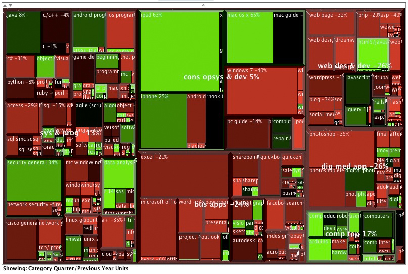
As a refresher, here are two treemaps of the Category Families, with their sub-areas for the final quarters of 2011 compared to 2010. The map on the left shows the growth of the count of titles in each area and the map on the right shows the growth in units for each area.
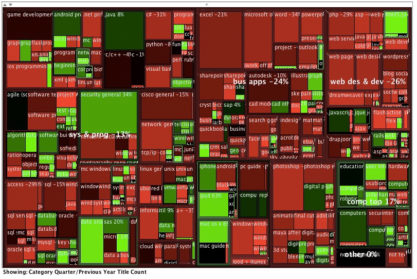
The Treemap on the left shows the number of new titles entering the Top 3000 in 2011. Security General (upper-left center), Data Analysis (left-bottom center), iPad-consumer (middle-bottom center), MacOSX (middle-bottom center) and HTML5 (upper-right corner) where the brightest green growth areas in 2011.
The Treemap on the right shows the top growing areas from a units perspective. The same areas are the top performers, but they have moved around a bit and are larger in some cases which reflects their market share. Again, this is comparing the last quarter of 2011 with the last quarter of 2010. This time period reflects the holiday shopping season and usually the best for consumer topics and not necessarily for the more technical titles which peak early in the new year.
In the next two images, you can see how our Category Families stack up. The image on the left shows the number of titles that made the Top 3000 in a given year. Contrast that with the image on the right, which shows the number of units sold in each year. What you will notice is that the number of titles in Systems and Programming went up in 2011 to its highest level since we began tracking, yet the units sold for the Category has been going down each year. Consumer Operating Systems and Devices and Computer Topics are the two areas that went slightly up in both the number of titles and units sold in 2011. Systems and Programming still is the largest category and is a chief indicator for the health of the computer book market, and it’s been in a consistent decline — for print books. You’ll see some more positive indicators in my upcoming post on digital distribution.
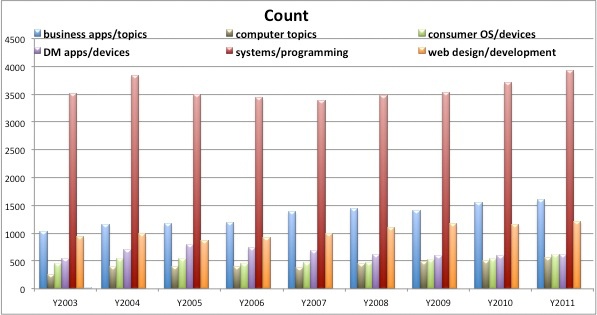
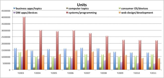
The table below shows each Category Family’s compared growth between 2010 and 2011 (YoY Growth), 2010 and 2011 ranking (10Rank/11Rank) and 2010 and 2011 percent of market share (10Share/11Share).
Category Families | YoY Growth | 10Rank | 11Rank | 10Share | 11Share |
|---|---|---|---|---|---|
Business Applications | -00.45% | 2nd | 2nd | 21.00% | 20.60% |
Computer Topics / Other | 15.78% | 6th | 6th | 03.15% | 04.11% |
Consumer Operating Systems | 04.22% | 3rd | 3rd | 15.44% | 17.27% |
Digital Media | 09.29% | 5th | 5th | 17.27% | 18.58% |
Systems and Programming | -00.64% | 1st | 1st | 34.62% | 35.02% |
Web Design and Development | -02.58% | 4th | 4th | 14.32% | 13.72% |
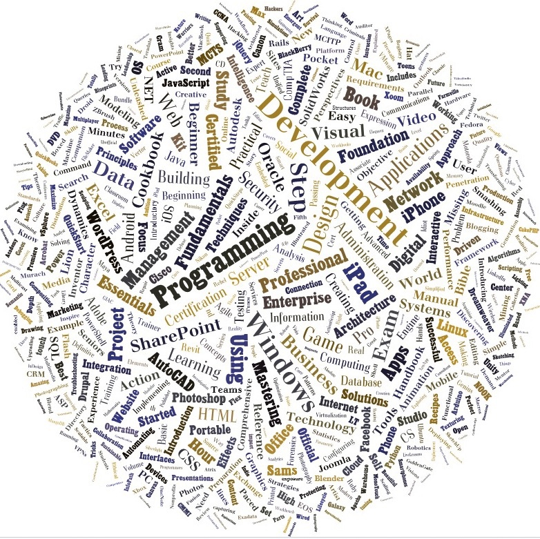
Before we look into categories further, let’s first take a look at the words that make up all the computer titles for 2011. It’s an interesting view of the words that the publishing industry puts on the front of books, online searches, and anywhere there is metadata about content. A note about this data: I threw away the stop-words like “the,” “and,” “it,” “with,” etc. I also disregarded “Microsoft,” since it is a descriptor used for various products and is redundant. Here is the “title” view of the market. What obviously pops to me is Programming and Development, but Data came from nowhere to being a discernible word on the image [located @ 10:00 on a clock].
As the market keeps declining, the response of many publishers is to increase the number of titles published, in an attempt to gain market share. Immediately below are two bar graphs showing the trend for how many titles made it into the Bookscan dataset in a given year, and the average units sold is for all titles. So this is the non-obvious point here: There are not necessarily more titles being published, but more titles making it into the dataset. This could be attributed to a lower threshold to get in. In other words, some weeks the threshold to make the Top 3000 list can be as low as 1 unit sold. It is a relative measure. The last couple of years have had lower thresholds, and thus more titles made the list but with worse average units. When the market is healthy, the threshold moves up and only the solid-performing titles make it into the Top 3000. The lower threshold barrier is resulting in a significant decrease in the average units per titles for all publishers.
When we drill into the category families a bit, we see that seven of our 10 top categories (known as super-categories) sold fewer units in 2010 than in 2009, for a net loss of -244,936 units for just the top 10 areas. In other words, our bigger and typically more stable areas were selling significantly fewer units in 2010. In the first half of 2010, there were 49 super category areas that were ahead in the sales over the first half of 2009, yet six of the 49 categories slowed down and ended up losing enough ground to show a year-over-year decrease in units. We ended up with 43 super-categories producing more units in 2010 than they did in 2009.
The biggest winners in growth order are: Tablet, Mobile Programming, Windows Consumer, Security Topics, Hardware Topics, Social Web, Computers and Society, Cloud Computing, Information Technology, and Data Topics. The Tablet super-category went from roughly 15,000 units in the first half of 2010 to an additional 100,000 units in the second half of the year. An increase in titles fueled this growth — output tripled from 7 titles in the first half of 2010 to 22 titles by the year’s end.
The areas with the largest drop in units were, in descending order: Web Page Creation, Digital Photography, Mac OS, Flash, Web Programming, Web Design Tools, Personal Computers, Linux, Software Project Management, and Personal Database. The category that surprises me the most is Web Programming. Sixteen fewer titles in the Web Programming area made the list in 2010, and only 7% of the titles sold more than 1,000 units, as compared to 11% in 2009.
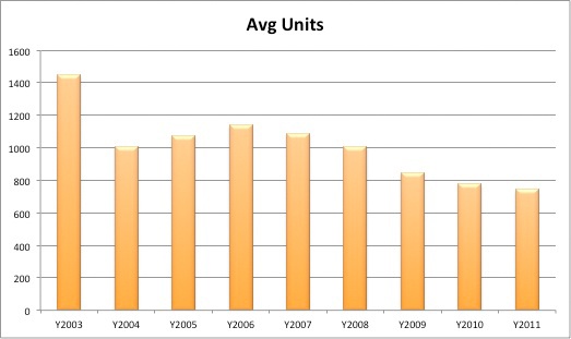
The table below provides a view of the market’s erosion. The Average Min value represents the “low threshold” weekly average during a given year. The Average Max is the high-range weekly average for a given year. Number of Titles is self-explanatory. You will notice that the years with the highest min had fewer overall titles represented in the data. The bottom line is that as the market erodes, it appears as though we are seeing a watering-down — more titles producing fewer units on average.
Year | Average Min | Average Max | Number of Titles |
|---|---|---|---|
2004 | 9.2 | 1,133 | 7,451 |
2005 | 9.6 | 1,099 | 7,123 |
2006 | 9.6 | 1,315 | 6,881 |
2007 | 9.4 | 1,348 | 7,092 |
2008 | 8.2 | 1,534 | 7,310 |
2009 | 7.3 | 1,057 | 7,557 |
2010 | 6.7 | 1,112 | 7,792 |
So it could be said that we’ve been in a bit of a tech innovation slump. But in my opinion we are in a distribution slump or holding pattern. By that I mean that we have print books, digital versions of the same thing, and yet have you seen any really innovative format for a tech book hit the market lately; something like what Khan Academy has done with other parts of education. They certainly have a long way to go to build out a Computer Science Curriculum. I think before publishers say we are in a tech slump, we need to look inside our own walls first and realize that we may be in a publishing slump as our consumers want different educational experiences.
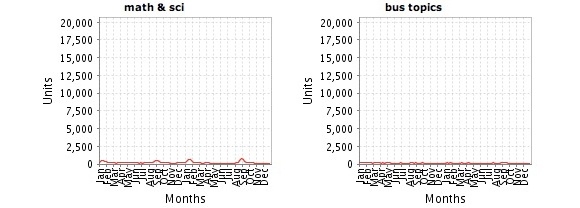
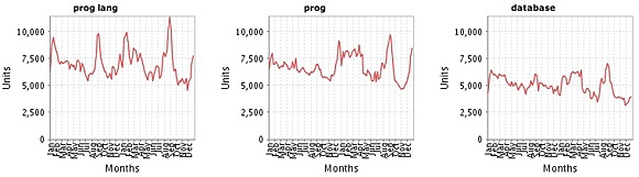
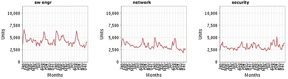
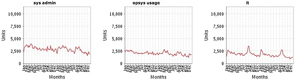
Now let’s look at the categories that comprise each category family. Below are some individual trend charts from our dashboard showing the 24-month period from January 2010 to December 31, 2011 for the major categories. By looking at a 24-month pattern, you get more insight into whether or not a particular area seems to be hit by seasonal factors, and if there is a steady decline/increase for the category. It is important to look at scale on these charts because it visually shows you the relative market size. Another way to think about it is if the trend line is high in the individual box, the category is big, and if it is low, it is a smaller category. What is interesting to note is that Consumer Operating Systems, Digital Media, and Business Applications and Devices all have a January spike, which is likely due to individuals buying “how to” books for their new computers, devices, and operating systems. This is a consistent seasonal pattern.
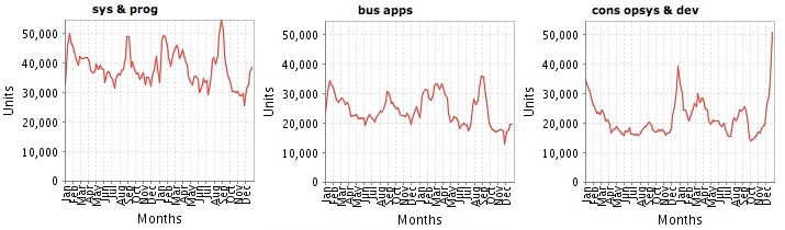
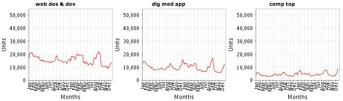
Clicking on the charts below will produce a larger view. When viewing the charts below, keep the reference charts above in mind. Viewing these jointly provides more context on the size of market and seasonal patterns.
Category_Family: Consumer Operating Systems and Devices
Here are the trend lines for the five main categories (cat_family) that make up Consumer Operating Systems and Devices.
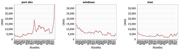
This category is a medium-sized area and was the one of three Category Families to show growth year-over-year. This category’s growth is driven by the iPad, the iPhone and the Nook in the Portable Devices sub-category.
The consumer operating systems and devices market shows ups and downs each year and pretty closely reflects what is going on in the whole market. If you compare the growth of Mac OS X with Microsoft Windows, the Windows books had in increase in 2010 but both declined in 2011. The chart below shows how these two are stacked up against each other. Foreshadowing the 2012 results, I believe that the Windows category will be up because Windows 8 will ship and be a significant upgrade for most. I believe that Apple will continue to decline as they roll out $29 upgrades that are minimal. The iPad, iPhone, and Android devices will continue to soar.
Category_Family: Business/Office Applications
When comparing the Business Apps area for 2010 and 2011, there were 12 super_cats (one level below cat_family) that performed ahead of the prior year and 21 that underperformed compared to the prior year. The 21 underperforming super_cats only lost 2,090 more units than the 12 positive areas had gained, for an overall -0.44% growth rate.
The three healthiest super categories were Office Suites at 7.49% growth, Collaboration Technologies at 12.43% growth and Social Network (Facebook) at 11.73% growth, while Presentation Topics at -11.88%, Accounting at -8.21%, and Search at -15.30% saw the biggest drop in units for this Business category. It is interesting to see that Spreadsheets is pretty much the same as the market. A very slight uptick in growth, 88 more units in 2011 that 2010, and is still a large super category in rank. Spreadsheets trails only Digital Photography and Tablets for the top spot as the biggest super category.
Here are the trend lines for the eight categories that make up Business/Office Applications.
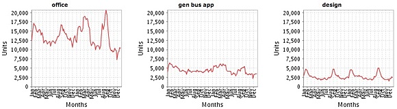
Notice how much bigger of a category “office” is than the other two (“gen bus app” & “design”). But the news in this category is that Office titles have slightly stabilized, having gone from -4.66% decrease last year to a -0.48% decrease this year. This decline mirrors the overall market. The category has been dominated by entry level user books. These sort of entry level books are driven by Series that have consistent promises and both Dummies and Microsoft Press each held four spots in the top 10 best sellers list for this category. This does make sense when you think about it. I said last year that it looked like Dummies have a bit of a book dynasty, so to speak, but in 2011 Microsoft Press rocketed into this space well. The category chart Web Apps is mostly dominated by books on Facebook. Who would have thought you’d need a book on how to use Facebook? These are not programming Facebook APIs, but rather how to use the Social Network. Foreshadowing 2012, I expect that this Category Family will continue to do well as Windows 8 will undoubtedly create more demand for Office books in 2012.
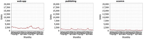
Category_Family: Web Design and Development
Web Design and Development is down -4.36% from 2010 to 2011. Another 37,438 fewer units were sold in this category in 2011 than in 2010. And remember, 2010 was one of the worst years we’ve seen in awhile for this category. There were eight sub areas that showed growth in this category — HTML5 at 74.60% growth and Social Web at 9.36% and JavaScript at 17.32% growth led the way in 2011 for this area. If we combine HTML5 and JavaScript because they are very closely related, the combined growth rate is a healthy 41.39% growth and 45,559 more units sold in 2011. O’Reilly has three of the top five books in this area with Learning PHP, MySQL, and JavaScript leading the category in unit sales for two years in a row. Head First HTML with CSS & XHTML and JavaScript: The Good Parts also cracked the top five for us.
The areas that surprised me the most, though, were Web Programming which saw ~25,152 fewer units sold in 2011 than in 2010 or a -23.61 growth. And closely behind was Web Design Tools that produced -16,534 fewer units for -23.67% growth and Web Development producing -11,684 fewer units and -28.54% growth. Yet HTML5 and JavaScript are growing. This is a bit perplexing but could be attributed to developers wanting more specific topics rather broad reaching topics and tools. In Web Design Tools it is mostly Dreamweaver’s fall that puts this category down. In Web Development it is Website creation type of books for “beginners” and “dummies” that have fallen the most.
Here are the trend lines for the eight categories that make up Web Design and Development.
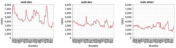
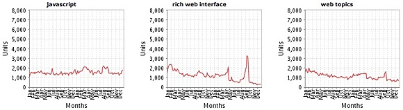
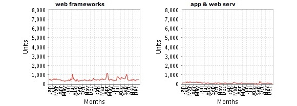
Obviously the big sub categories here are “web design” and “web development.” It is dominated by titles that talk about performance, scalability, reliability, and tuning. Similar to what you will find at our Velocity Conference. Foreshadowing for 2012, the area to watch is JavaScript. Doesn’t everyone need to know and learn JavaScript?
Category_Family: Systems and Programming
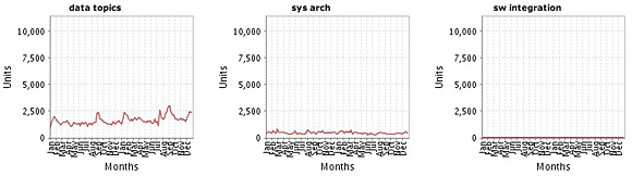
This is the largest of our top-level category families. It is the place where most of the programming language, database, and software development titles reside. There are now 73 super_cat subcategories (super category) in this area and in 2011, 46 of the areas were negative year-over-year and only 27 areas had growth. There were -68,0295 fewer units sold in these areas during 2011. This is only a -3.14% decline, so this large family of titles actually performed slightly worse than the overall market. Mobile Programming and Data Analysis were the two biggest growing areas. Mobile Programming produced 30,636 more units for a 38.84% growth rate while Data Analysis produced 22,925 more units for 22.42% growth rate in 2011.
The top five performing categories, in order, were Mobile Programming, Data Analysis, Security Topics [+9,648 units / 5.53% growth], Java [+7,316 units / 7.33% growth], and Python [4,886 / 10.55% growth]. The categories with the worst performance, in order, were IT Certification [-19,078 / -31.50% growth], Windows Administration [-14,852 units / -14.13% growth], Microsoft Programming [-13,491 / -27.70% growth], C# [-12,993 units / -20.26% growth], and Network General [-11,234 / -19.04% growth].
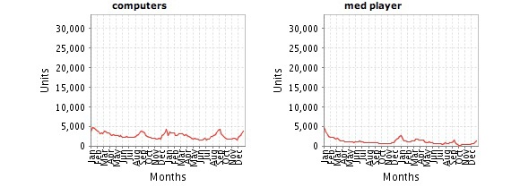
In the top performing area of Mobile Programming, iOS was nine times as large as Android in 2009, and roughly 2.5 times as large of a category in 2010, and today sells only 1.2 times as many copies of Android books to Developers. Again, this is developer books, not consumer-oriented titles. For more on how the mobile developer market is shaping up, it seems like a two horse race with iOS and Android. Windows Mobile is a blip along with cross-platform solutions like PhoneGap as you can see in the image directly below.
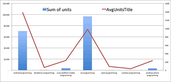
This chart shows the number of units (sum of Unit in blue bars) and the Average units per title (AvgUnitsTitle in red line) for the mobile area. Android has a higher unit average whereas iOS has more units sold because more titles made the list. This all makes me wonder about the Windows Mobile blip and whether Microsoft should just jump into the Android space too or continue to make more from licensing it than their own platform.
Here are the trend lines for the 12 categories that make up Systems and Programming.
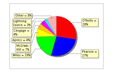
In this third installment we will look at how publishers fared in 2011, as compared to 2010. The chart below shows our dashboard view of the large publishers’ results for 2011. The most notable piece of information is that Wiley continues to hold the leading spot as the largest publisher (with 32% market share of units sold), while Pearson and O’Reilly both lost 1%, which is picked up by Cengage and McGraw Hill. (We’ll look at revenue share later in the analysis.)
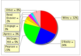
You may not recognize the names of all the top publishers, because they are actually conglomerates of many smaller publishing imprints that they’ve acquired, created or distributed over the years. The imprints are the familiar consumer-facing brands. For instance, when you purchase a book from Peachpit or Sams, you typically see Peachpit or Sams on the spine, not Pearson, even though Pearson owns both companies. In O’Reilly’s case, all the imprints that are not branded “O’Reilly” are part of a distribution partnership and are not owned by O’Reilly. The various imprints that make up each major publisher’s share are shown in detailed pie charts later in this post.
Let’s look at the top publishers and how they performed year-over-year. The following table provides some interesting comparative data.
Publisher | 2010 Units | 2011 Units | 2010 Title Count | 2011 Title Count | 2010 Efficiency | 2011 Efficiency |
|---|---|---|---|---|---|---|
Wiley | 1,887,493 | 1,919,065 | 1,538 | 1,624 | 1.65 | 1.68 |
Pearson | 1,386,301 | 1,450,504 | 1,934 | 1,893 | 0.97 | 1.09 |
O’Reilly | 1,404,607 | 1,327,487 | 1,145 | 1,219 | 1.65 | 1.55 |
McGrawHill | 276,439 | 251,691 | 466 | 451 | 0.80 | 0.79 |
Apress | 200,267 | 170,673 | 423 | 481 | 0.64 | 0.50 |
Cengage | 167,020 | 163,520 | 676 | 674 | 0.33 | 0.34 |
Reed Elsevier | 140,708 | 145,766 | 384 | 392 | 0.49 | 0.53 |
Lightning Source | 77,128 | 79,270 | 428 | 560 | 0.24 | 0.20 |
Sum/Avg | 5,539,679 | 5,507,976 | 6,996 | 7,296 | 0.845 | .835 |
So what is notable in this data? First, of the big three publishers (more than 1 million units per year) only O’Reilly had netted fewer units in 2011 than in 2010. Second, these top eight publishers produced a modest decrease in 2011. Overall, these top eight publishers collectively saw -31,703 fewer units sold in 2011, with 300 additional titles making the list which decreased the efficiency by .10.
A note on Market Share versus Title Efficiency
A typical indicator of publisher performance is market share of units sold, which is what we’ve been looking at so far. Perhaps a better measure is how many published titles it takes to get a comparable share of unit sales. This is the ratio of title share to unit market share. Think about it this way: if a publisher has 15% of the titles appearing in the Bookscan Top 3000, and gets a 15% share of units sold, they will have a ratio of 1:1, expressed as a title efficiency of 1.0. A publisher with 20% of the title share, and 10% of the unit share would have a .5 efficiency. An efficiency of 1 is the market average: 100% of the title count delivering 100% of the unit sales. A publisher that achieves its share with fewer titles will have a higher ratio. In 2011 three publishers continue to have an efficiency of more than 1: Wiley, Pearson, and O’Reilly, where the first two saw an efficiency increase while O’Reilly saw a slight decrease.
Publishers under the 1.0 threshold typically have many titles in the Bookscan data, but they are not selling many units. A note of caution though, some publishers have many evergreen titles, which can skew this data. Typically, older titles sell fewer units each subsequent year. But this is not always true, as some titles continue to sell like they are newly released. Head First Design Patterns is one example, still selling more than the majority of brand-new titles. So efficiency could be thought of as a frequency ratio rather than a true efficiency measure, because it is very efficient to publish a title and have it sell for years. A true efficiency metric would take into account all titles published by all publishers and how many make it into the Top 3000. Another caution is that many titles have new editions release every few years so those titles will not become evergreen. And some publishers have titles that never make the Top 3000, so we will not be able to count them (for or against an efficiency metric) because they are missing from the dataset.
A Note on Evergreen Status
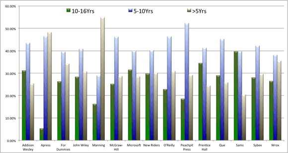
The chart below shows imprints that have a percentage of titles aged in ranges from 10-16 years, 5-10 years, and less than five years. The 10-16 range is the evergreen status and the bar indicating that is green. This is different than last year’s table that awarded points. This is purely titles that were published between X date and now. Surprisingly it looks as though Microsoft Press and New Riders are the most balanced, whereas Sams, Prentice Hall and Addison Wesley are more on the evergreen side of things. Manning, Apress and Wrox are the publishers more heavily weighted in the less than five years area.
Now that we have a basic understanding of title efficiency and evergreen status, let’s look further into the 2011 results for the imprints and drill in on the top three publishers: Wiley, Pearson, and O’Reilly. This is important because you typically see the imprint name on a book when you purchase it, but may not be aware of who the publisher is. (You’ll likely see the Publisher name inside the book on the copyright page, except in the case of O’Reilly because our other imprints are distribution partners. That is, O’Reilly provides some sales and distribution services to these partners, but they are not owned by O’Reilly as is the case for the Pearson and Wiley imprints.)

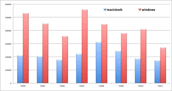
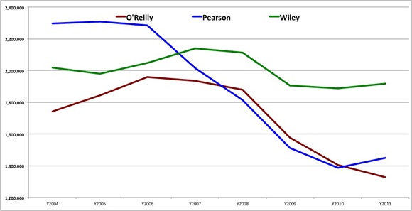
In 2011, Pearson moved past O’Reilly Media to reclaim their previously held spot as the second largest publisher. Again, this view is with all imprints and partners aggregated together. In the chart immediately below, I have included all partners and imprints and displayed the overall trend for the three large publishers between 2004 and 2011. Wiley continues to dominate as the largest publisher and seems to be more resilient to the market declines, chiefly due to the Dummies brand and its wide-ranging scope. The Wiley Publishing group started a decline in 2008 with Pearson and O’Reilly, but stopped its decline in 2009 and has been slightly up since then, while the other two continued their decline. Pearson rallied last year and turned their trend towards growth. O’Reilly has some work to get the ship turned around and moving in a positive direction again.
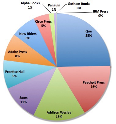
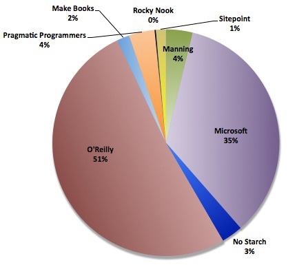
Now that you have an idea of the imprints that make up the largest three publishers, let’s tease out all the imprints and look at their respective market share. The following chart shows the top 20 imprints and how they stack up against each other and the prior year. Of the 20 imprints, only five saw more units sold in 2011 than in 2010. The list is sorted by overall units sold between 2004 and 2011 — that is why PeachPit is shown fourth on the chart yet both Wiley and Que have larger market shares for 2011 and Wiley is ahead of PeachPit for the prior two years.
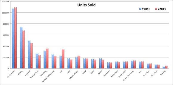
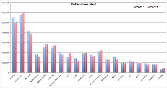
Before analyzing imprints by category, let’s revisit this same data with dollars rather than units. We have a fairly easy way of calculating this: units sold * listprice = dollars. Granted there are discounts, promotions, and other things that affect the precision of this, but it is a pretty good measure of market trends. If nothing else, you can think of this as retail dollar value. So here are the top imprints from a revenue perspective. Again, this is at the imprint level and from a dollar perspective. As you can see, compared to the units chart above, the leaderboard changes. O’Reilly Media becomes the number one revenue-producing imprint (by overall descending order 2004-2011), followed by Dummies, and then Microsoft Press. The biggest move in the top 20 is that Addison-Wesley jumps from #9 in units to #5 in dollars, and conversely, Wiley’s Visual imprint goes from #10 in Units to #17 in Dollars. The order in which the imprints are placed on the chart is based on their overall dollars generated during the period between 2004 and 2011. You can see that Wiley would displace O’Reilly as the top for the previous two years, and PeachPit has several imprints that would move them further down the list when looking at the most recent two years. Course Technology is another imprint to note here as they have experienced a couple outstanding years and would place them 6th overall for the combined previous two years, even though they are placed in the 12th position on the chart based on their 8-year history.
Imprint analysis by category
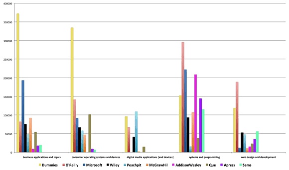
Now that we have seen a high-level picture of what imprints did in 2011, let’s take a look at which categories each of them publishes in and where their strengths lay. Dummies and O’Reilly appear to have the most diverse publishing programs, as they are not at the bottom in any category and have respectable market share in each. Dummies is clearly the leader in Business Apps and Consumer Operating Systems, while O’Reilly maintains a sizable lead over Addison Wesley in the Systems and Programming category. This chart also seems to indicate that Addison-Wesley is really only publishing in the System and Programming space, with a little in Web Design and Development.
The following category images are for 2011, and the tables have each publisher’s count of titles and sum of units. The top titles are also listed for each area in 2011.
Category: Systems and Programming
In this category, you can see that O’Reilly still has the largest market share among the publishers, with Pearson a close second. If we drill into this picture of the Publishers and down to the imprint level, the picture of who is driving market gets clearer. The top six imprints are O’Reilly at 13.00%, Addison-Wesley at 10.23%, Microsoft Press at 9.09%, For Dummies at 7.40%, McGraw Hill at 5.79%, and Prentice Hall at 5.35%. What is not obvious from this data is that a few percentage points have been swapped among the leaders. O’Reilly and Microsoft Press both saw modest decreases while Addison Wesley and McGraw Hill picked up the lost ground.
As you can see in the table below, O’Reilly has the most units, best average Units per title, and best title efficiency rating. It is a relatively healthy mix. That is, we do have quite a few titles and our efficiency is also significantly above the market average.
Sys & Prog - Publisher Market Share (01/01/2011 — 12/31/2011)
Publisher | Units | Title Count | Units/Title | Efficiency |
|---|---|---|---|---|
O’Reilly | 542,502 | 685 | 792 | 1.55 |
Pearson | 525,106 | 944 | 556 | 1.09 |
Wiley | 399,192 | 573 | 697 | 1.37 |
McGraw Hill | 128,841 | 242 | 532 | 1.04 |
Apress | 87,938 | 243 | 362 | 0.71 |
Cengage | 79,099 | 278 | 285 | 0.56 |
Lightning Source | 44,347 | 272 | 163 | 0.32 |
Reed Elsevier | 36,405 | 183 | 199 | 0.39 |
Note: This is the first year that I can remember that the PMP book is not the leading title, with McGraw Hill’s title CompTIA A+ Certification All-in-One Exam Guide, Seventh Edition taking the top spot. It might be due to the PMP book having a new edition published in July of 2011 and it needs more time to gain back its momentum. It is also interesting to see that the other top five titles are all 2+ years old and O’Reilly’s two titles are seven and eight years old. Evidence that this is a category where evergreen titles perform well. The leading titles and publishers for Systems and Programming in 2011 were:
CompTIA A+ Certification All-in-One Exam Guide, Seventh Edition (McGraw-Hill/Osborne)
PMP Exam Prep: Rita’s Course in a Book for Passing the PMP Exam (RMC)
Head First Java, 2nd Edition (O’Reilly Media, Inc.)
Pro C# 2010 and the .NET 4 Platform (APress)
Head First Design Patterns (O’Reilly Media, Inc.)
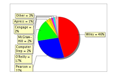
Category: Web Design and Development
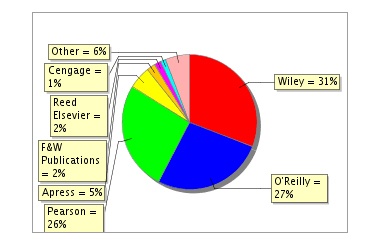
In this category, you can see that Wiley has the number one spot as a Publisher any O’Reilly has moved into the second spot ahead of Pearson. When we drill into the imprint level, the picture changes a bit. The top five imprints are O’Reilly at 19.84%, Dummies at 16.51%, Wiley at 6.14%, New Riders at 5.35%, and Peachpit at 4.82%.
As you can see in the table below, Pearson still has the most titles but their performance is not as strong as Wiley and O’Reilly in efficiency and units, units per title, and efficiency. In Web Design and Development, we have come back to a state where the market is steady and most publishers are above the title efficiency average of 1.0. As you can see, all publishers except for Apress have an efficiency rating higher than 1.0. F&W Publications might want to consider publishing more with the way they came from nowhere to the number four spot with excellent efficiency.
Web Des & Dev - Publisher Market Share ( 01/01/2011 — 12/31/2011 )
Publisher | Units | Title Count | Units/Title | Efficiency |
|---|---|---|---|---|
Wiley | 241,222 | 236 | 1,022 | 1.54 |
O’Reilly | 206,462 | 227 | 910 | 1.37 |
Pearson | 203,382 | 279 | 729 | 1.10 |
Apress | 42,372 | 140 | 303 | 0.46 |
F&W Publications | 17,616 | 4 | 4,404 | 6.65 |
During the past two years combined (2010 & 2011), O’Reilly’s Learning PHP, MySQL, and JavaScript has dominated this category. The leading titles and publishers for Web Design and Development for 2011 are:
Learning PHP, MySQL, and JavaScript: A Step-By-Step Guide to Creating Dynamic Websites (O’Reilly Media, Inc.)
Don’t Make Me Think: A Common Sense Approach to Web Usability, 2nd Ed. (New Riders’ )
Head First HTML with CSS & XHTML (O’Reilly Media, Inc.)
WordPress For Dummies, 3rd Edition (Dummies)
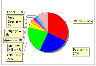
Category: Business Applications
In this category you can see that Wiley has the largest market share among the publishers and O’Reilly (apologies: the O’Reilly 23% is obscured in the graph) continued to stay ahead of Pearson for second. If we drill into the imprint level, the picture changes a bit. The top six imprints are Dummies at 28.03%, Microsoft Press at 15.94%, John Wiley at 6.45%, O’Reilly at 5.80%, McGraw Hill/Osborne at 5.73%, and Visual at 4.52%.
Bus Apps - Publisher Market Share ( 01/01/2011 — 12/31/2011 )
Publisher | Units | Title Count | Units/Title | Efficiency |
|---|---|---|---|---|
Wiley | 549,301 | 390 | 1,408 | 1.73 |
O’Reilly | 285,214 | 160 | 1,783 | 2.19 |
Pearson | 188,039 | 281 | 669 | 0.82 |
McGraw Hill | 77,813 | 97 | 802 | 0.98 |
Cengage | 38,483 | 192 | 200 | 0.25 |
Microsoft Press’s Office Plain and Simple is the only non-Dummies title to make the top five in this category. Dummies clearly dominates this category. The leading titles and publishers for Business Applications are:
Office 2010 All-in-One For Dummies (Dummies)
Excel 2007 for Dummies (Dummies)
QuickBooks 2011 For Dummies (Dummies)
Facebook For Dummies (Dummies)
Microsoft Office 2010 Plain and Simple (Microsoft)
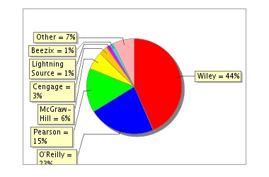
Category: Consumer Operating Systems & Devices
In this category, you can see that Wiley has the largest market share among the publishers with Pearson in second at 27%, and O’Reilly comfortably in the third spot at 17%. (Apologies: the Pearson percentage is partially cut off in the graph.) If we drill into the imprint level, the picture changes a bit. The top five imprints are Dummies at 31.38%, Que at 18.88%, O’Reilly at 11.87%, Wiley at 7.54%, and Wiley’s Visual at 6.68%. So when you combine Wiley, Dummies and Visual, you have a publisher that is nearing 50% of the market share.
As you can see in the table below, this is a category that supports a select few big publishers as there are three with efficiencies greater than 1.0. What is impressive with this category, is that it has three publishers averaging more than 1,000 units per title. To me, that means it’s a category that sustains numerous big-selling titles, not just an occasional retail success. As you can see from the best-selling titles below, Windows 7 continues to perform well, but the tablets and e-readers are what is driving this category in 2011.
Cons Opsys & Dev - Publisher Market Share ( 01/01/2011 — 12/31/2011 )
Publisher | Units | Title Count | Units/Title | Efficiency |
|---|---|---|---|---|
Wiley | 535,091 | 221 | 2,421 | 1.34 |
Pearson | 316,575 | 132 | 2,398 | 1.33 |
O’Reilly | 203,176 | 68 | 2,998 | 1.66 |
Computer Step | 28,533 | 34 | 839 | .47 |
McGraw Hill | 24,061 | 53 | 454 | 0.25 |
Cengage | 17.665 | 76 | 232 | 0.13 |
What is impressive with the top-titles list below, is Que had zero titles in the top five in 2010, and in 2011 they have three including the top two. The leading titles and publishers for Consumer Operating Systems are:
My iPad 2 (Que)
The NOOK Book (Que)
Windows 7 For Dummies (Dummies)
Windows 7 For Dummies Book + DVD Bundle (Dummies)
My iPhone (Que)
Category: Digital Media
In this category, you can see that Pearson continues to hold the top spot, followed by Wiley (31% partly obscured) and then Reed Elsevier displaces O’Reilly for third among publishers. As you can see in the table below, Pearson has the most titles and a relatively good efficiency rating. O’Reilly leads the category with its extremely healthy efficiency rate and average units per title. This is a tough category for lots of publishers because many of the books are four-color and yet low priced. It is hard to make that combination work at a sustainable and profitable level.
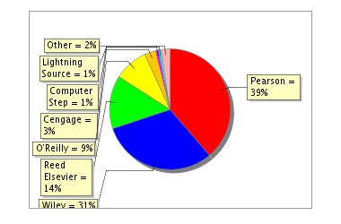
If we drill into the imprint level, the picture changes a bit. The top six imprints are Peachpit at 16.46%, For Dummies at 15.40%, Focal Press at 14.15%, Adobe Press at 12.08%, New Riders at 9.24%, and O’Reilly at 7.98%.
Digital Media - Publisher Market Share ( 01/01/2011 — 12/31/2011 )
Publisher | Units | Title Count | Units/Title | Efficiency |
|---|---|---|---|---|
Pearson | 190,868 | 173 | 1,103 | 1.32 |
Wiley | 153,647 | 149 | 1,031 | 1.24 |
Reed Elsevier | 70,154 | 114 | 615 | 0.74 |
O’Reilly | 44,495 | 31 | 1,435 | 1.72 |
Cengage | 15,156 | 52 | 291 | 0.35 |
The leading titles and publishers for Digital Media are:
Adobe Photoshop CS5 Classroom in a Book (Adobe Press)
The Adobe Photoshop CS5 Book for Digital Photographers (Peachpit)
Adobe Photoshop CS5 for Photographers (Focal Press)
Photoshop Elements 9: The Missing Manual (O’Reilly)
The Photoshop Elements 9 Book for Digital Photographers (Peachpit)
In this fourth secdtion we will look at programming languages and drill in a little on each language area.
Overall, the market for programming languages was up slightly at 1.15% in 2011 when compared with 2010. There were 6,435,247 units sold in 2011 versus 6,361,178 units sold in 2010, which is an increase of 74,069 additional units. Java was the biggest language again and experienced healthy growth of 13.46% or 33,930 more units in 2011 than 2010, while PHP occupied the opposite end with the biggest decrease at -26,994 fewer units year-over-year or a -22.50% rate of change.
Before we begin to drill in on the languages, we thought it would be best to explain our “language dimension.” When we group books by their language dimension, we categorize them by the language used in their code examples. So Flash Programming with Java would be in our Flash atomic category, but the language dimension would be Java. Similarly, our Head First Design Patterns book contains examples written in Java, so it too carries the “Java” tag on the language dimension.
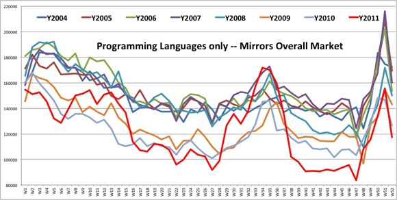
To provide some perspective, 2010 and 2011 have been a mixed-bag of results for tech publishing, meaning there were some bright spots with some of the technologies and some definite low areas too. The chart directly below does not include books that are method-oriented, about project management, about consumer operating systems, or books without language-oriented material. So this is a different view of the market than the overall view found in post 1 of this series. You can see all languages on a week-by-week basis while showing that the the languages closely mirrored the overall market found in post 1. In other words, the graph for Languages shows that 2011 was a roller-coaster for languages too.
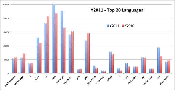
Java continues to be the number one language from book units sold and dollars. There is some shuffling going on with the languages tough. JavaScript is very hot now, as is R. Likely a result of Android and big data driving folks to these languages. Java grew 13.46% or roughly 33,930 additional units in 2011 and JavaScript doubled the growth rate of Java at 27.18% and an additional 61,758 units in 2011. PHP and C++ switched places in 2011 where PHP produced 126,994 units in 2011 and fell to #6 and C++ moved into 5th with 19,207 additional units. Only three languages kept their 2010 ranking, Java at #1, Objective C at #4, and Python at #8. As you can see in the 2010-2011 Top 20 languages chart below, Java has a significant lead in the language race with JavaScript moving up quickly.
2010-2011 Top 20 Languages
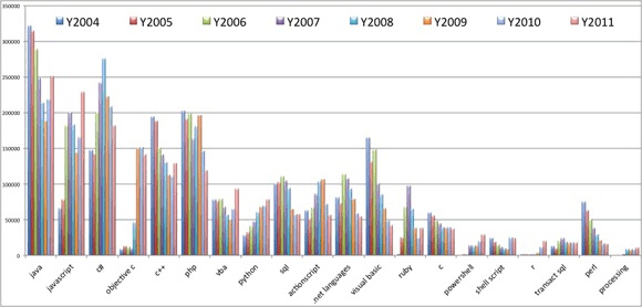
If you look at the chart below, you will see which languages were responsible for the most units sold between 2004 and 2011. The chart is basically the sum of units each year for the respective language. The top ten languages generated unit sales of 10,283,109 for the 8-year period, while the second ten generated 2,910,636 in the same period. The top ten languages represented roughly 72% of units sold during this period. With so many languages to choose from, makes me wonder if any language will every see the numbers that Java experienced in the early 2000 timeframe.
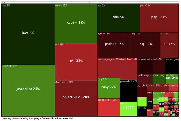
In the treemap view above, which compares the last quarter of 2011 with the last quarter of 2010, you’ll notice balance of green, red and black areas. This pretty much indicates that the last quarter of 2011 was roughly the same as the last quarter of 2010 from the programming languages perspective. Most of the bright green, which indicates rapid growth, is in the bottom right hand corner and small in size. This means there was some growth with small languages in the fourth quarter of 2011.
Before we dive in, let’s look at the high-level picture for the grouping of languages. I have grouped these languages by total number of units sold between 2004-2011. As you can see in the table below, the Large and Major languages were up collectively, and everything from Mid-Major and below was down. However books where the language was the focus, ended up 74,688 ahead of 2010 even though the Mid-Major and below lost -15,120 units compared to last year.
Group | Unit Range | Y2010 Units | Y2011 Units | 10MketShar | 11MketShar |
|---|---|---|---|---|---|
Large | 50,000 — 200,000 | 1,323,608 | 1,389,650 | 81.09% | 79.72% |
Major | 10,000 — 49,999 | 220,350 | 244,116 | 13.50% | 14.00% |
Mid-Major | 3,000 — 9,999 | 77,969 | 68,980 | 4.78% | 3.96% |
Mid-Minor | 1,600 — 2,999 | 17,822 | 17,739 | 1.09% | 1.02% |
Minor | 400 — 1,599 | 9,364 | 9,546 | 0.55% | 0.52% |
Linelist | 100 — 399 | 15,210 | 10,350 | 0.42% | 0.23% |
TheRest | < 100 | 2,365 | 995 | 0.14% | 0.06% |
For the sake of grouping and presenting this information in a more readable format, we have classified the categories for the languages in this way with the following headers:
Large
Language: Name or short name of the language
UNITS
2010 Units: Units sold in 2010
2011 Units: Units sold in 2011
TITLES
2010 Titles: Number of Titles making Bookscan 3000 in 2010
2011 Titles: Number of Titles making Bookscan 3000 in 2011
MARKETSHARE
10Mkt Share: 2010 Market Share
11Mkt Share: 2011 Market Share
The following table contains data for the Large languages. As you can see, 6 of the 11 top languages experienced growth in 2011 and were led by JavaScript impressive growth and Java’s continued strength. Objective-C has experienced a second year of declining units but seems to have slowed the decline. What is up with C++? Why is this language still growing? Is there something going on with devices that is fueling the growth of C++?
*Large* | UNITS | TITLES | MARKETSHARE | |||
|---|---|---|---|---|---|---|
Language | 2010 Units | 2011 Units | 2010 Titles | 2011 Titles | 10Mkt Share | 11Mkt Share |
Java | 219,031 | 251,710 | 374 | 420 | 13.42% | 14.45% |
JavaScript | 165,910 | 228,527 | 180 | 243 | 10.16% | 13.12% |
C# | 208,450 | 181,497 | 271 | 305 | 12.77% | 10.42% |
Objective C | 151,229 | 140,679 | 89 | 138 | 9.27% | 8.08% |
C++ | 110,624 | 129,373 | 196 | 201 | 6.78% | 7.43% |
PHP | 146,219 | 119,203 | 173 | 180 | 8.96% | 6.85% |
VBA | 64,443 | 92,954 | 71 | 77 | 3.95% | 5.34% |
Python | 69,805 | 78,200 | 95 | 109 | 4.28% | 4.49% |
SQL | 57,184 | 57,425 | 96 | 108 | 3.50% | 4.30% |
ActionScript | 71,797 | 56,075 | 99 | 114 | 4.40% | 3.22% |
.net Languages | 58,916 | 54,007 | 83 | 83 | 3.61% | 3.10% |
Here are the top titles for the Large languages:
O’Reilly | |
O’Reilly | |
Dummies | |
APress | |
O’Reilly |
You’ll notice in the Major languages that Ruby had the biggest growth among this grouping. And the R language had significant growth and surpassed Perl in sales units. Perl used to be one of the largest languages around and is now ranked #19 among the languages. PowerShell experienced it second consecutive year of growth in 2011.
*Major* | UNITS | TITLES | MARKETSHARE | |||
|---|---|---|---|---|---|---|
Language | 2010 Units | 2011 Units | 2010 Titles | 2011 Titles | 10Mkt Share | 11Mkt Share |
Visual Basic | 47,925 | 42,272 | 89 | 87 | 2.94% | 2.43% |
Ruby | 24,434 | 37,760 | 49 | 56 | 1.50% | 2.17% |
C | 38,786 | 36,828 | 92 | 82 | 2.38% | 2.11% |
Powershell | 19,861 | 28,520 | 26 | 30 | 1.22% | 1.64% |
Shell Script | 25,068 | 24,004 | 20 | 22 | 1.54% | 1.38% |
R | 11,431 | 20,072 | 18 | 26 | 0.70% | 1.15% |
Transact SQL | 17,507 | 17,308 | 28 | 27 | 1.07% | 0.99% |
Perl | 16,658 | 15,786 | 32 | 28 | 1.02% | 0.91% |
Processing | 9,053 | 10,791 | 9 | 11 | 0.55% | 0.62% |
SAS | 9,627 | 10,775 | 27 | 27 | 0.59% | 0.62% |
Here are the top titles for the Major languages.
Prentice Hall | |
Prentice Hall | Practical Guide to Linux Commands, Editors, and Shell Programming |
Dummies | |
SAS Publishing | |
O’Reilly |
The news in this set of languages is that 3 of the 11 languages saw growth in 2011 so the grouping as a whole is off by about 18.35%. This is partially due to a couple of the languages moving up to the prior category — most notably R and SAS..
*Mid-Major* | UNITS | TITLES | MARKETSHARE | |||
|---|---|---|---|---|---|---|
Language | 2010 Units | 2011 Units | 2010 Titles | 2011 Titles | 10Mkt Share | 11Mkt Share |
Pl/Sql | 10,774 | 9,322 | 24 | 35 | 0.63% | 0.52% |
Smalltalk | 9,294 | 8,716 | 2 | 2 | 0.54% | 0.48% |
MatLab | 8,332 | 8,504 | 22 | 27 | 0.49% | 0.47% |
SPSS | 8,973 | 7,598 | 16 | 18 | 0.53% | 0.42% |
Basic | 5,540 | 6,168 | 7 | 10 | 0.32% | 0.34% |
VBScript | 10,849 | 5,940 | 12 | 12 | 0.64% | 0.33% |
Assembly | 4,391 | 3,645 | 18 | 20 | 0.26% | 0.20% |
Lua | 6,309 | 3,636 | 7 | 8 | 0.37% | 0.20% |
MDX | 5,140 | 3,626 | 8 | 8 | 0.30% | 0.20% |
nxt-g | 1,172 | 3,535 | 4 | 5 | 0.07% | 0.20% |
F# | 4,939 | 3,285 | 7 | 6 | 0.29% | 0.18% |
Here are the top titles for the Mid-Major languages.
The news in this category is the growth of functional languages, like Scheme, Scala, Haskell, Alice and Lisp. These languages showed a nice 51.38% growth in 2010 and another 11.17% growth in 2011.
*Mid-Minor* | UNITS | TITLES | MARKETSHARE | |||
|---|---|---|---|---|---|---|
Language | 2010 Units | 2011 Units | 2010 Titles | 2011 Titles | 10Mkt Share | 11Mkt Share |
Scala | 2,531 | 2,844 | 5 | 5 | 0.15% | 0.16% |
Haskell | 1,051 | 2,129 | 5 | 6 | 0.06% | 0.12% |
Lisp | 1,684 | 2,038 | 4 | 6 | 0.10% | 0.11% |
Bash | 1,715 | 1,950 | 2 | 2 | 0.10% | 0.11% |
Scheme | 1,479 | 1,891 | 8 | 6 | 0.09% | 0.10% |
VHDL | 1,785 | 1,802 | 18 | 15 | 0.10% | 0.10% |
Alice | 2,713 | 1,745 | 10 | 9 | 0.16% | 0.10% |
UnrealScript | 3,028 | 1,736 | 3 | 3 | 0.18% | 0.10% |
Blitzmax | 1,836 | 1,604 | 2 | 2 | 0.11% | 0.09% |
Here are the top titles for the Mid-Minor languages.
Artima | |
O’Reilly | |
No Starch Press | |
No Starch Press | |
Sams | Mastering Unreal Technology, Volume I: Introduction to Level Design with Unreal Engine 3 |
This category of languages saw 4 of the 7 languages sell more units in 2011. There was roughly a 1.91% increase in units sold year-over-year. The biggest gains were Puppet and Stata. Even if there was only one book per language in this grouping, it would be hard to financially justify a print product because of economies of scale; unless of course the publisher of a title is selling lots of copies direct on their website or direct to corporations or colleges. The combination of digital and print may help some of the titles below this point actually make more financial sense. My experience says anything below this point is not financially beneficial to the publisher or author, yet there may be other reasons they are in print.
*Minor* | UNITS | TITLES | MARKETSHARE | |||
|---|---|---|---|---|---|---|
Language | 2010 Units | 2011 Units | 2010 Titles | 2011 Titles | 10Mkt Share | 11Mkt Share |
Clojure | 1,332 | 1,532 | 2 | 4 | 0.08% | 0.08% |
Puppet | 659 | 1,518 | 1 | 3 | 0.04% | 0.08% |
Stata | 856 | 1,511 | 6 | 4 | 0.05% | 0.08% |
Labview | 1,682 | 1,443 | 3 | 2 | 0.10% | 0.08% |
Scratch | 1,112 | 1,263 | 2 | 2 | 0.07% | 0.07% |
Groovy | 2,523 | 1,205 | 7 | 9 | 0.15% | 0.07% |
AWK | 1,200 | 1,074 | 2 | 2 | 0.07% | 0.06% |
Here are the top titles for the Minor languages.
Stata Press | |
Apress | |
Manning | |
Course Technology | |
Oxford University Press | Hands-On Introduction to LabVIEW for Scientists and Engineers |
This grouping of languages saw 12 of the 28 languages sell more units in 2011, although the sales volume is fairly insignificant. But there was significant erosion in this group as it collectively saw a -46.96% decrease in units sold year-over-year. I am not going to list the bestsellers, because they are not exactly bestsellers, by any measure, in this grouping. Here is the list of languages selling more than 100 units and less than 1,000 in order by the most units to the fewest:
d, erlang, opencl c, applescript, mathematica, latex, tcl, jscript, minitab, apex, autolisp, pure data, fbml, hla, peoplecode, opengl shader, spin, fortran, pig, silverlight, mel, sparql, kml, linden script, lingo, coffeescript, sml, cobol.
Lastly, the following languages sold fewer than 100 units in 2011. Here is the list in descending order:
abap, blitz3d, octave, nxt, gml, pascal, prolog, ml, chef, x++, inform, cfscript, cfml, racket, boo, jcl, siebel escript, idl, javafx, mvpl, m, verilog, jsl, nxc, limbo, mysql spl, rexx, rpg.
The following languages did not see any units sold in 2011. Here is the list in alphabetical order:
ada, awd, bondi, c/al, cachesql, cl, cs2, delphi, directx, dsl, e, egl, eiffel, go, haxe, maxscript, mumps, natural, ocaml, oopic, opl, pda languages, phrogram, pl/1, q, qbasic, realbasic, s, spark, squeak, windows script, xquery.
In this final section I will provide a summary of the first four segments, offer some insight into a view of top authors, and include data on electronic books and how parts of the digital world are surpassing the print world.
Here is a quick summary of sections 1-4.
In 2011 the book market, as a whole, saw about -9.25% fewer units sold than in 2010. The tech book market was up by 2% in 2011, so it out performed the whole market. Yet our data, which is based on the Top 3000 titles for each week, shows only 0.7% growth. This means that the majority of the growth was generated by the titles that produced very few copies and may not have made it into a weekly report for a given week in 2011. The market continued to follow its seasonal pattern, getting off to a fast start in 2011, taking its typical nose-dive downward in July, and recovering in the fall. Yet there were some anomalies with higher peaks and valleys in the trend-lines for 2011. These anomalies were caused by Borders Books (BGI) going out of business.
There were 21 weeks in 2011 that were ahead of the same week in 2010. In 2010 there were only 11 weeks that were ahead of the prior year’s unit sales. There were 442 more titles (from all copyright years) that made it into the Top 3000 reports during 2011, and 268 more in 2010 than 2009. This demonstrates that the threshold to make a Top 3000 report was lower than any other year. The average units per title, for all titles not just new, increased slightly from 37.95 in 2010 to 37.96 in 2011. As far as new 2011 titles, there were 349 fewer titles published that made the dataset, but they averaged 3.4 more units per title and averaged 1 less page per title, and on average cost $0.80 less than 2010. Again, these titles had a publish date during 2011.
The biggest winners in growth order are: Tablet, Mobile Programming, Windows Consumer, Security Topics, Hardware Topics, Social Web, Computers and Society, Cloud Computing, Information Technology, and Data Topics. The areas with the largest drop in units were, in descending order: Web Page Creation, Digital Photography, Mac OS, Flash, Web Programming, Web Design Tools, Personal Computers, Linux, Software Project Management, and Personal Database. In the top performing area of Mobile Programming, iOS was nine times as large as Android in 2009, and roughly 2.5 times as large of a category in 2010, and today sells only 1.2 times as many copies of Android books to developers.
From a publisher’s perspective, Pearson regained the second spot at the end of 2011, behind Wiley and slightly ahead of O’Reilly. The two imprints of O’Reilly and Dummies continue to have the most diverse publishing programs due to their strong performance in all six tech categories.
The number one title, from a dollar perspective, was PMP Exam Prep, Sixth Edition: Rita’s Course in a Book for Passing the PMP Exam and from a unit perspective, My iPad 2. From a dollars perspective, the PMP book has ranked in the top two since 2005. The number one programming language for three years running (2009, 2010, and 2011) was Java, with JavaScript and VBA also showing continued strong growth in 2011. That’s the quick review.
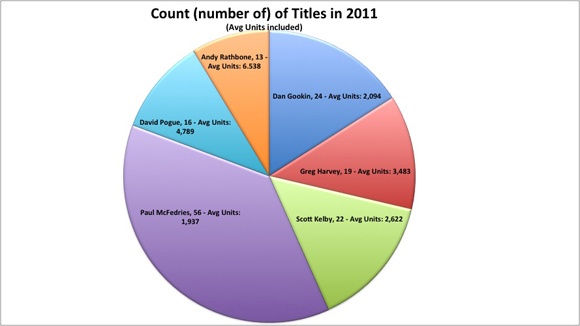
Now let’s turn our attention to the most important ingredient in publishing — authors. Authors are the entities that create all types of content. And there are all types of authors. Some are really like small publishing houses with “co-authors” doing most of the heavy lifting. Then there are those who do all the lifting: editing, writing, testing, and coding of the content themselves, and then move on to help promote, market and sell. These latter activities are what contribute to what we call an author platform. Some authors have an inherent platform by who they are or what their 9-5 job is, while others have to work hard to cultivate their platform. The most successful authors in our dataset have figured out both the upfront creation of content and the end-game of helping with marketing and sales. The table below shows the top 15 authors for 2011 and what their rank is for both 2011 and lifetime units. I’m also showing what their % Units ’11 was so you can see the percentage of their lifetime units that they sold in 2011. A few did really well in 2011 and yet lifetime are not a top 10 author. Scott Kelby and David Pogue did not have outstanding numbers in 2011 but are the top two lifetime authors from a units perspective. Gary Rosenzweig and Patrick Kanouse both had outstanding sales in 2011 but are nowhere near top 15 authors from a lifetime perspective.
Author_List | 2011 Rank | All Time Rank | % Units ’11 |
|---|---|---|---|
Paul McFedries | 1 | 6 | 17.68% |
Andy Rathbone | 2 | 3 | 9.18% |
Gary Rosenzweig | 3 | 61 | 59.19% |
Nancy C. Muir | 4 | 24 | 25.26% |
David Pogue | 5 | 1 | 7.57% |
Greg Harvey | 6 | 4 | 9.10% |
Edward C. Baig, Bob LeVitus | 7 | 44 | 41.49% |
Patrick Kanouse | 8 | 148 | 90.02% |
Brad Miser | 9 | 30 | 28.52% |
Dan Gookin | 10 | 5 | 7.75% |
Stephen L. Nelson | 11 | 8 | 9.49% |
John Walkenbach | 12 | 10 | 10.17% |
Wallace Wang | 13 | 13 | 11.10% |
Scott Kelby | 14 | 2 | 4.55% |
Peter Weverka | 15 | 19 | 11.41% |
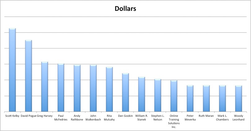
The noticeable change is that Scott Kelby takes the number one spot from a dollar perspective even though David Pogue sells more units. Books with slightly higher prices enable this movement in the position/rank. Notice that Rita Mulchay does not make the Top 15 for units sold, and yet as an author her books are ranked number seven in dollars generated. Another interesting observation is that there are about six authors that are in the mix for the top spot all-time, yet there is a significant drop-off after the top six. In the dollars view, the drop-off is even more significant after the top two authors.
When you look at the data for the top 15 authors (basically, who has produced more units and dollars), you get the following two charts, showing lifetime sales (2004-2011).

In 2011, Paul McFedries had his name on 56 different books (ranging from 2001 through 2011) that made our list, for an average of 1,937 units per book. His books sold the most units in 2011 but his average was the lowest of the all time top-five authors. His total was about 22,000 more units than David Pogue who saw 16 of his titles make the list with an average of 4,789 per title.
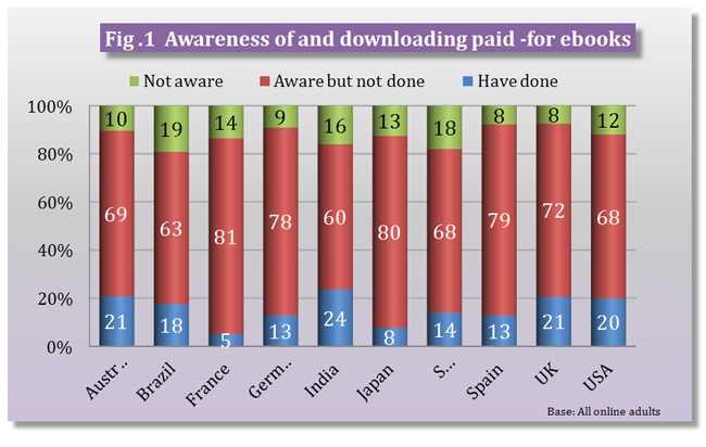
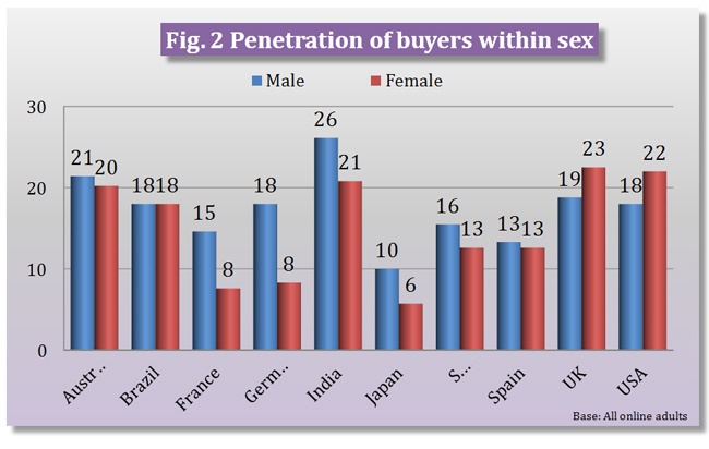
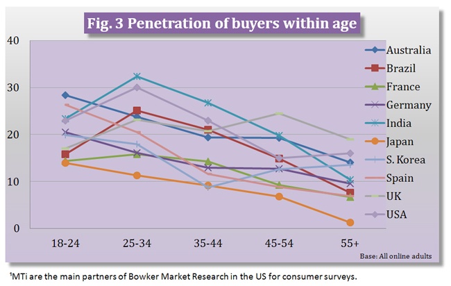
Now let’s move past print sales in 2011 — or at least partially away from traditional channels of distribution — to discuss e-distribution. The three charts immediately below are from Bowker, which has recently released its Results Of Global eBook Research. The charts show three interesting graphs about awareness of for-pay content, digital consumption by gender, and digital consumption by age. What is interesting to me is not that Indian males lead the way in both digital downloads and purchasing for-pay content, but rather that more women than men in the U.S. and U.K. are consumers of digital content. It is also no surprise, at least to me, that the 25-34 age group is the most active in consuming digital content.
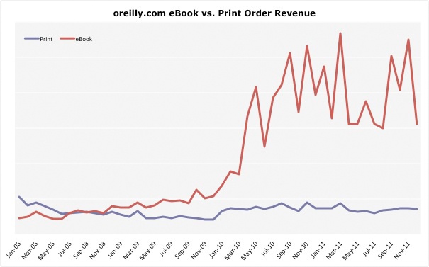
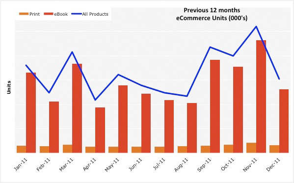
Now to take you into the tech book digital market, let’s look at what has happened in the past few years with O’Reilly products. The chart immediately below shows our digital products aggregated into one number and then plotted by year and month. This gives you a perspective of how things are changing. What it does not show is that early digital copies were all PDF files that were pretty clumsy and not as useful. Now we offer our content in virtually any form our readers prefer. So with Mobi and EPUB, we are seeing the less useful PDF decline significantly. But the chart below groups all digital forms together. Only two months in 2011 were not ahead of 2010. Those two months were June and July, which coincidentally coincided with the Borders’ liquidation of physical products.
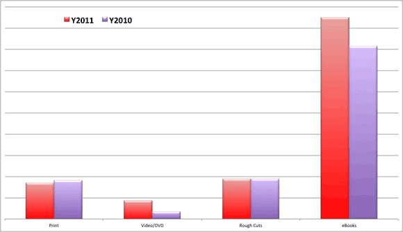
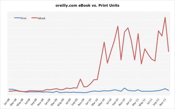
I also think it is important to look at what O’Reilly customers purchased when visiting oreilly.com. The chart below shows our content mix for the previous two years. The only thing declining in 2011 was our total sales for print products. Rough Cuts are early access editions of our content that are accessible on Safari. As you can see, our ebooks outsell everything by nearly 4 to 1.
What I am not sure exists is a good indicator of what the startup community uses for technical content and books. But if I had to bet, I would wager on ebooks direct from the publisher would be the preferred format in the startup world.
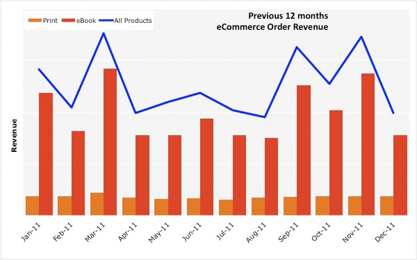
The four charts below show O’Reilly revenue and units growth through oreilly.com. The reason I am showing these is because the same content that goes into our print books is available in various digital forms. It is quite obvious that our customers prefer to shop on oreilly.com for digital copies.
The two charts on the left are showing revenue (top-left) and units (bottom-left) for 2011 exclusively. The two charts on the right are both revenue and units but are showing the trend for the previous four years. From talking with other publishers, this high-growth trend for digital books is indicative of what is happening in the market. The ebooks are just digital versions of our print products. We have not come to a point yet where the digital edition is a native creation that is a blend of live, editable code, video, text, images, links, assessment tools, and other resources all working together. At this point in time, most digital products are typically print books with a few links and some color for good measure. But don’t blink because the tech book market will change quickly to these more blended content types.
Again, this data is taken from direct sales for O’Reilly and oreilly.com, and may not represent the whole computer book market. One point that was recently brought in discussions at O’Reilly by our VP of online is that O’Reilly is selling more copies of digital editions than any other distributors that carry our digital copies. I think that may be due to the fact that we have DRM-free content that allows you to move your copy of your purchase to another device. For another perspective on DRM, I wrote this for our author newsletter a while back and I still believe that the ideas are sound. Have a look here.
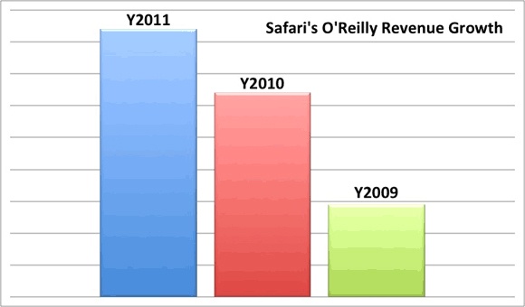
Another key ingredient to understanding what is happening in the digital world is to look at Safari Books Online. Safari is a subscription service with more than 500,000 users. Its main focus is its B2B service that allows developers from many of the largest companies in the world to have access to technical books from most of the major publishing houses and imprints. One notable difference is that the categories with consumer-oriented titles, including the Digital Media titles, do not perform as well in Safari. Developer titles rule in Safari; so as a proxy, Safari may be one of the better predictors of a tech book market. As you can see from the chart to the left, our content in Safari is growing at a nice steady rate. In fact it is safe to say that Safari represents the second largest distribution channel for O’Reilly, with Amazon still occupying the top spot and O’Reilly direct battling for third. It will be interesting to see how the distribution of technical content unfolds in the coming years.
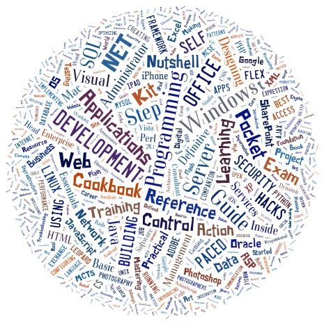
If you look at word clouds for the titles published in 2011 for all books, and the ones found on Safari for O’Reilly during 2011, you notice some similarities. Notably that “Development” and “Programming” are big in both images, but slightly larger on Safari. I was initially not sure why “Control” was so large on Safari, but after a bit of digging I found that Tidbits Publishing has a series called “Take Control” and O’Reilly Media is a distribution partner for them in Safari.

Thank you for reading these posts. If there is something that you are itching to see / understand more clearly, please let me know and I will try to help. I plan to excerpt updated pieces of these posts on Twitter or Google+ throughout the year. They’ll come from @mikehatora or +Mike Hendrickson and will likely get re-tweeted by @oreillymedia or +O’Reilly on Google+.