
8. Testing Differences Between Means: The Basics
One typical use of inferential statistics is to test the likelihood that the difference between the means of two groups is due to chance. Several situations call for this sort of analysis, but they all share the name t-test.
You’ll find as many reasons to run t-tests as you have groups to contrast. For example, in different disciplines you might want to make these comparisons:
• Business—The mean profit margins of two product lines.
• Medicine—The effects of different cardiovascular exercise routines on the mean blood pressure of two groups of patients.
• Economics—The mean salaries earned by men and by women.
• Education—Test scores achieved by students on a test after two different curricula.
• Agriculture—The crop yields associated with the use of two different fertilizers.
You’ll notice that each of these examples has to do with comparing two mean values, and that’s characteristic of t-tests. When you want to test the difference in the means of exactly two groups, you can use a t-test.
It might occur to you that if you had, say, three groups to compare, it would be possible to carry out three t-tests: Group A versus B, A versus C, and B versus C. But doing so would expose you to a greater risk of an incorrect conclusion than you think you’re running. So when the means of three or more groups are involved, you don’t use t-tests. You use another technique instead, usually the analysis of variance (ANOVA) or, equivalently, multiple regression analysis (see Chapters 10 through 13).
The reverse is not true, though. Although you need to use ANOVA or multiple regression instead of t-tests with three or more means, you can also use ANOVA or multiple regression when you are dealing with two means only. Then, your choice of technique is more a matter of personal preference than of any technical issue.
Testing Means: The Rationale
Chapter 3, “Variability: How Values Disperse,” discussed the concept of variability—how values disperse around a mean, and how one way of measuring whether there is great variability or only a little is by the use of the standard deviation. That chapter noted that after you’ve worked with standard deviations for a while, you develop an almost visceral feel for how big a difference a standard deviation represents.
Chapter 3 also hinted that you can make more rigorous interpretations of the difference between two means than simply noting, “They’re 1.5 standard deviations apart. That’s quite a difference.” This chapter develops that hint into a more objective framework. In discussing differences that are measured in standard deviation units, Chapter 3 discussed z-scores:
![]()
In words, a z-score is the difference between a specific value and a mean, divided by the standard deviation. Note the use of the Greek symbol σ (lowercase sigma), which indicates that the z-score is formed using the population standard deviation rather than using a sample standard deviation, which is symbolized using the Roman character s.
Now, that specific value symbolized as X isn’t necessarily a particular value from a sample. It could be some other, hypothetical value. Suppose you’re interested in the average age of the population of sea turtles in the Gulf of Mexico. You suspect that the 2010 oil well disaster in the Gulf killed off more of the older sea turtles than it did young adult turtles. In this case, you would begin by stating two hypotheses:
• One hypothesis, often called the null hypothesis, is normally the one you expect your research findings to reject. Here, it would be that the mean age of turtles in the Gulf is the same as the mean age of turtles worldwide.
• Another hypothesis, often called the alternative or research hypothesis, is the one that you expect to show is tenable. You might frame it in different ways. One way is, “Gulf turtles now have a lower mean age than turtles worldwide.” Alternatively, “Gulf turtles have a different mean age than turtles worldwide.”
The hypotheses are structured so that they cannot both be true: It can’t be the case, for example, that the mean age of Gulf turtles is the same as the mean age of sea turtles worldwide, and that the mean age of Gulf turtles is different from the mean age of sea turtles worldwide. Because the hypotheses are framed so as to be mutually exclusive, it is possible to reject one hypothesis and therefore regard the other hypothesis as tenable.
Note
We use the term population frequently in discussing statistical analysis. Don’t take the word too literally: it’s used principally as a conceptual device to keep the discussion more crisp. Here, we’re talking about two possible populations of sea turtles: those that live in the Gulf of Mexico and those that live in other bodies of water. In another sense, they constitute one population: sea turtles. But we’re interested in the effects of an event that might have resulted in one older population of turtles that live outside the Gulf, and one younger population that lives in the Gulf. Did the event result in two populations with different mean ages, or do the turtles still belong to what is, in terms of mean age, a single population?
Suppose that your null hypothesis is that Gulf turtles have the same mean age as all sea turtles, and your alternative hypothesis is that the mean age of Gulf turtles is smaller than the mean age of all sea turtles.
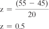
You count the carapace rings on a sample of 16 turtles from the Gulf, obtained randomly and independently, and estimate the average age of your sample at 45 years. Can you reject the hypothesis that the average age of turtles in the Gulf of Mexico is actually 55 years, thought by some researchers to be the average age of all the world’s sea turtles?
Using a z-Test
Before you can answer that question, you would need to know what test to apply. Do you know the standard deviation of the age of the world’s sea turtles? It could be that enough research has been done on the age of sea turtles worldwide that you have at hand a credible, empirically derived and generally accepted value of the standard deviation of the age of sea turtles.
Perhaps that value is 20. In that case you could use the following equation for a z-score:
You have adopted a null hypothesis that the average age of sea turtles in the Gulf of Mexico is 55, the same age as all sea turtles. You have taken a sample of those Gulf turtles, and calculated a mean age of 45. What is the likelihood that you would obtain a sample average of 45 if the population average is 55?
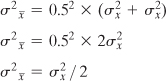
If you took many, many samples of turtles from the Gulf and calculated the mean age of each sample, you would wind up with a sampling distribution of means. That distribution would be normal and its mean would be the mean of the population you’re interested in; furthermore, if your null hypothesis is correct, that mean would be 55. So, when you apply the formula
![]()
for a z-score, the X represents not an individual observation but a sample mean. The ![]() represents not a sample mean but a population mean. And the σ represents not the standard deviation of individual observations but the standard deviation of the sample means.
represents not a sample mean but a population mean. And the σ represents not the standard deviation of individual observations but the standard deviation of the sample means.
In other words, you are treating a sample mean as an individual observation. Your population is not the population of individual observations, but a population of sample means. The standard deviation of that population of sample means is called the standard error of the mean, and it can be estimated with two numbers:
• The standard deviation of the individual observations in your sample. (Or, as just discussed, the known standard deviation of the population. You can use either, but your choice has implications for the type of test you run; see Using the t-Test instead of the z-Test later in this chapter.) In this example, that’s the standard deviation of the ages of the turtles you sampled from the Gulf of Mexico.
• The sample size. Here, that’s 16: Your sample consisted of 16 turtles.
Understanding the Standard Error of the Mean
Suppose that you take two observations from a population and that together they constitute one sample. The two observations are taken randomly and are independent of one another. You can repeat that process many times, taking two observations from the population and treating each pair of observations as a sample. Each sample has a mean:
![]()
The population variance is represented as σ2 (recall from Chapter 3 that the variance is the square of the standard deviation). So the variance of many sample means, each based on two observations, can be written as follows:
![]()
In this example, we are taking the mean of two observations: dividing their sum by 2, or equivalently multiplying their sum by 0.5. We won’t do it here, but it’s not difficult to show that when you multiply a variable by a constant, the resulting variance is the original variance times the square of the constant. More exactly:
![]()
And therefore:
![]()
When two variables, such as X1 and X2 here, are independent of one another, the variance of their sum is equal to the sum of their variances:
![]()
Plugging that back into the prior formula we get this:
![]()
The variance of the first member in each of many samples, ![]() , equals the variance of the population from which the samples are drawn,
, equals the variance of the population from which the samples are drawn, ![]() . The variance of the second member of all those samples also equals
. The variance of the second member of all those samples also equals ![]() . Therefore:
. Therefore:
More generally, substituting n to represent the sample size, we get the following:
![]()
In words, the variance of the means of samples from a population is equal to the variance of the population divided by the sample size.
You don’t see the term used very often, but the expression ![]() is referred to as the variance error of the mean. Its square root is shown as
is referred to as the variance error of the mean. Its square root is shown as ![]() and referred to as the standard error of the mean—that’s a term that you see fairly often. It’s easy to get using this formula:
and referred to as the standard error of the mean—that’s a term that you see fairly often. It’s easy to get using this formula:
![]()
Note
The term standard error has historically been used to denote the standard deviation of something other than individual observations: For example, the standard error of the mean, as used here, refers to the standard deviation of sample means. Other examples are the standard error of estimate in regression analysis and the standard error of measurement in psychometrics.
When you run across standard error, just bear in mind that it is a standard deviation, but that the individual data points that make up the statistic are not normally the original observations, but are observations that have already been manipulated in some fashion.
I repeat this because it’s particularly important: The symbol ![]() is the standard error of the mean. It is calculated by dividing the sample variance (or, if known, the population variance) by the sample size and taking the square root of the result. It is defined as the standard deviation of the means calculated from repeated samples from a population.
is the standard error of the mean. It is calculated by dividing the sample variance (or, if known, the population variance) by the sample size and taking the square root of the result. It is defined as the standard deviation of the means calculated from repeated samples from a population.
Because you can calculate it from individual observations, you need take only one sample. Use that sample’s variance as an estimator of the population variance. Armed with that information and the sample size, you can estimate the value of the standard deviation of the means of repeated samples without actually taking them.
Using the Standard Error of the Mean
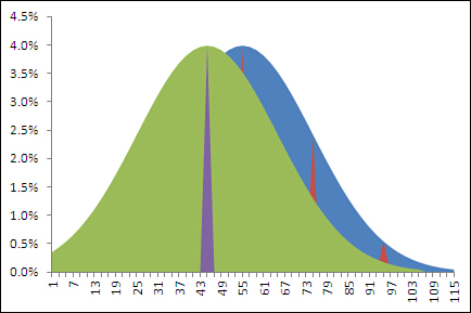
Figure 8.1 shows how two populations might look if you were able to get at each member of the turtle population and put its age on a chart. The curve on the left shows the ages of the population of turtles in the Gulf of Mexico, where the mean age is 45 years. That mean age is indicated in the figure by the heavy dashed vertical line.
Figure 8.1. The standard deviation of the values that underlie the charts is 20.
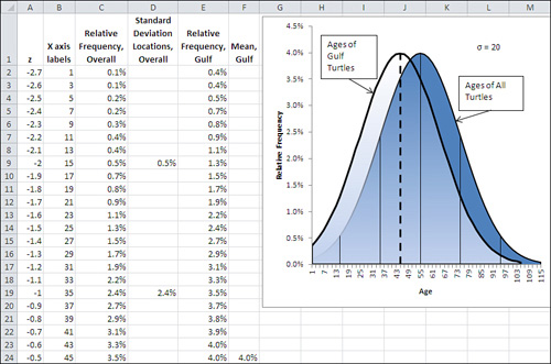
Visualizing the Underlying Distributions
Figure 8.1 shows five other, thinner vertical lines. They belong to the curve on the right. They represent the location of, from left to right, 2 σ below the mean, 1 σ below the mean, the mean itself, 1 σ above the mean, and 2 σ above the mean.
Note
Designing the charts in Figure 8.1 takes a little practice. I discuss what’s involved later in this chapter.
Notice that the mean of the left curve is at Age 45 on the horizontal axis. This matches the finding that you got from your sample. But the important point is that in terms of the right curve, which represents the ages of the population of all the world’s sea turtles, Age 45 falls between 1 σ below its mean, at Age 35, and the mean itself, at Age 55. In standard deviation terms, the mean age of Gulf turtles, 45, is not at all far from the mean age of all sea turtles, 55. The two means are only half a standard deviation apart.
So it doesn’t take much to go with the notion—the null hypothesis—that the Gulf turtles’ ages came from the same population as the rest of the turtles’ ages. You can easily chalk the ten-year difference in the means up to sampling error.
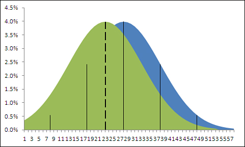
But there’s a flaw in that argument: It uses the wrong standard deviation. The standard deviation of 20 used in the charts in Figure 8.1 is the standard deviation of individual ages. And you’re not comparing the ages of individuals to a mean, you’re comparing one mean to another mean. Therefore, the proper standard deviation to use is the standard error of the mean. Figure 8.2 shows the effect of using the standard error of the mean instead of the standard deviation.
Figure 8.2. With a sample size of 16, the standard error is four times smaller than the standard deviation.
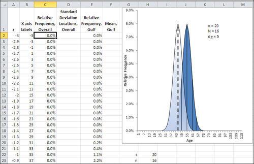
The curves shown in Figure 8.2 are much narrower than those in Figure 8.1. This is as it should be: The standard deviation used in Figure 8.2 is the standard error of the mean, which is always smaller than the standard deviation of individual observations for sample sizes greater than 1. That’s clear if you keep in mind the formula for the standard error of the mean, shown in the last section and repeated here:
![]()
The curve on the right in Figure 8.2 still uses thin vertical lines to show the locations of one and two standard errors above and below the mean. Because the standard errors are smaller than the standard deviations, they cling more closely to the curve’s mean than do the standard deviations in Figure 8.1.
But the means themselves are in the same locations, 45 years and 55 years, in both figures: Changing from the standard deviation of individual ages to the standard error of mean ages has no effect on the means themselves.
The net effect is that the mean age of the Gulf turtles is farther from the mean of all sea turtles when the distance is measured in standard errors of the mean. In Figure 8.2, the mean age of Gulf turtles, 45, is two standard errors below the mean of all sea turtles, whereas the means are only half a standard deviation apart in Figure 8.1. With the context provided in Figure 8.2, it’s much more difficult to dismiss the difference as due to sampling error—that is, to continue to buy into the null hypothesis of no difference between the overall population mean and the mean of the population of Gulf turtles.
Error Rates and Statistical Tests
Even if you’re fairly new to inferential statistics, you’ve probably seen footnotes such as “p<.05” or “p<.01” at the bottom of tables that report the results of empirical research. The p stands for “probability,” and the meaning of the footnote is something such as, “The probability of observing a difference this large in the sample, when there is no difference in the population, is .05.”
This book in general and Chapter 9, “Testing Differences Between Means: Further Issues,” in particular have much more to say about this sort of error, and how to manipulate and control it using Excel functions and tools. Unhelpfully, it goes by various different names, such as alpha, Type I error and significance level. (I use alpha in this book, because Type I error does not imply a probability level, and significance level is ambiguous as to the sort of significance in question.) You can begin to develop an idea of how this sort of error works by looking again at Figure 8.2 and by becoming familiar with a couple of Excel functions.
The probability of mistakenly rejecting a null hypothesis, of deciding that Gulf turtles really do not have the same mean age as the rest of the world’s turtles when they actually do, is entirely under your control. You can set it by fiat: You can declare that you are willing to make this kind of error five times in 100 (.05) or one time in 100 (.01) or any other fraction that’s larger than zero and less than 1. This decision is called setting the alpha level.
Setting alpha is just one of the decisions you should make before you even see your experimental data. You should also make other decisions such as whether your alternative hypothesis is directional or nondirectional. Again, Chapter 9 goes into more depth about these issues.
For now, suppose that you had begun by specifying an alpha level of .05 for your statistical test. In that case, given the data you collected and that appears in Figure 8.1 and 8.2, your decision rule would tell you to reject the null hypothesis of no difference between the Gulf turtle population’s age and that of all sea turtles. The likelihood of observing a sample mean of 45 when the population mean is 55, given a standard error of 5, is only .02275 or 2.275%.
That’s less than half the probability of incorrectly rejecting the null hypothesis that you said you were willing to accept when you adopted a .05 value for alpha at the outset. By adopting .05 as your alpha level, you said that you were willing to reject a null hypothesis 5% of the time at most, when in fact it is true. In this case, that means you would be willing to conclude there’s a difference between the mean age of all Gulf turtles and all sea turtles, when in fact there is no difference, in 5% of the samples you might take.
The result you obtained would occur not 5% of the time, but only 2.275% of the time, when no difference in mean age exists. You were willing to reject the null hypothesis if you got a finding that would occur only 5% of the time, and here you have one that occurs only 2.275% of the time, given that the null hypothesis is true. Instead of assuming that you happened to take a very unlikely sample, it makes more sense to conclude that the null hypothesis is wrong. (Compare this line of reasoning with that discussed in Chapter 7’s section titled Constructing a Confidence Interval.)
You can determine the probability of getting the sample result (here, 2.275%) easily enough in Excel by using the NORM.DIST() function to return the results of a z-test. NORM.DIST() returns the probability of observing a given value in a normal distribution with a particular mean and standard deviation. Its syntax is shown here:
NORM.DIST(value, mean, standard deviation, cumulative)
In this example, you would use the arguments
NORM.DIST(45, 55, 5, TRUE)
where:
• 45 is the sample value that you are testing.
• 55 is the mean assumed by the null hypothesis.
• 5 is the standard error of the mean, the population standard deviation of 20 divided by the square root of the sample size of ![]() or 20 / 4.
or 20 / 4.
• TRUE specifies that you want the cumulative probability: that is, the total area under the normal curve to the left of the value of 45.
Note
If you’re using a version of Excel prior to 2010, you should use NORMDIST() instead of NORM.DIST(). The arguments and results are the same for both versions of the function.
The value returned by NORM.DIST(45, 55, 5, TRUE) is .02275. Visually, it is the 2.275% of the area in the curve on the right, the curve for all turtles, in Figure 8.2, to the left of the sample mean, or Age 45, on its horizontal axis.
That area, .02275, is the probability that you could observe a sample mean of 45 or less if the null hypothesis is actually true. It is entirely possible that sampling error could cause your sample of Gulf turtles to have an average age of 45, when the population of Gulf turtles has a mean age of 55. But even though it’s possible, it’s improbable. More to the point, it is less probable than the alpha error rate of .05 you signed up for at the beginning of the experiment. You were willing to make the error of rejecting a true null hypothesis as much as 5% of the time, and you obtained a result that, if the null hypothesis is true, would occur only 2.275% of the time.
Therefore, you reject the null hypothesis and, in the somewhat baroque terminology of statistical testing, “entertain the alternative hypothesis.”
Creating the Charts
You can teach yourself quite a bit about both the nature of a statistical test and about the data that plays into that test, by charting the data. If you’re going to do that, consider charting both the actual observations (or their summaries, such as the mean and standard deviation) and the unseen, theoretical data that the test is based on (such as the population from which the sample came, or the distribution of the means of samples you didn’t take).
This chapter contains several figures that show the distributions of hypothetical populations, of hypothetical samples, and of actual samples. The easiest and quickest way to understand how those charts are created is to open the Excel workbook for Chapter 8 that you can download from this book’s website (www.informit.com/title/9780789747204). Select a worksheet (they’re keyed to the figures) and open the chart on that worksheet by clicking it.
You can then select the data series in the chart, one by one, and note the worksheet range that the data series represents. (A border called a range finder surrounds the associated worksheet ranges when you select a data series in the chart.) You can also choose to format the data series to see what line and fill options are in use that give the chart its particular appearance.
Note
Don’t neglect to see what chart type is in use. In this chapter and the next, I use both line and area charts. There are several considerations, but my choice often depends on whether I need to show one distribution behind another, so that the nature of their overlap is a little clearer.
However, the workbooks themselves don’t necessarily clarify the rationale for the structure of a given chart. This section discusses the structure of the chart in Figure 8.1, which is moderately complex.
The Underlying Ranges
The chart in Figure 8.1 is based on six worksheet ranges, although only five appear on the chart. The data in Column A provides the basis for calculations in columns B through F. Columns B through F appear in the chart. The columns are structured as follows.
Column A: The z-Scores
The first range is in column A. It contains the typical range of possible z-scores. Normally, that range would begin at −3.0 (or three standard deviations below the mean of 0.0) and end at +3.0 (three standard deviations above the mean). I eliminated z-scores below −2.7 because they would be associated with negative ages. Therefore, the range of z-scores on the worksheet runs from −2.7 through +3.0, occupying cells A2:A59.
One easy way to get that series of data into A2:A59 is to enter the first z-score you want to use in A2; here, that’s −2.7. Enter this formula in cell A3:
=A2 + 0.1
That returns −2.6. Copy and paste that formula into the range A4:A59 to end the series with a value of +3.0. You can use larger or smaller increments than 0.1 if you want. I find that increments of 0.1 strike a good balance between smooth lines on the chart and a data series with a manageable length.
Column B: The Horizontal Axis
Those z-scores in column A do not appear on the chart, but they form the basis for the ranges that do. It’s usually better to show the scale of measurement on the chart’s horizontal axis, not z-scores, so column B contains the age values that correspond to the z-scores. The values in column B are used for the horizontal axis on the chart. Excel converts z-scores to age values using this formula in cell B2:
=A2*20 + 55
The formula takes the z-score in cell A2, multiplies it by 20, and adds 55. We want the spread on the horizontal axis to reflect the standard deviation of the values to be graphed. That standard deviation is 20, and we use it as the multiple for the z-scores. Then the formula adds the average of the values to be charted because the average of the z-scores is zero. The formula is copied and pasted into B3:B59.
I chose to add 55, the higher of the two averages, to make sure that the chart displayed positive ages only. A mean of 45 would lead to negative ages on the left end of the axis when the standard deviation is 20. (So does 55, but then there are fewer negative ages to suppress.)
Column C: The Population Values
Column C begins the calculation of the values that are shown on the chart’s vertical axis. Column C’s label, “Relative Frequency, Overall,” indicates that the height of a charted curve at any particular point is defined by a value in this column. In this case, the curve on the chart that’s labeled “Ages of All Turtles” depends on the values in column C.
The formula in cell C2 is
=NORM.S.DIST(A2,FALSE)/10
and it requires some comment. In Excel 2010, the formula uses the NORM.S.DIST() function (if you are using an earlier version of Excel, be sure to see the following sidebar). That’s the appropriate function because we are conducting a z-test. As you’ll see in this chapter’s section on t-tests, you use z to test the difference in means when you know the population standard deviation, and you use t when you don’t.
The result of the function, whether you use NORM.S.DIST() or NORMDIST(), is divided by 10. This is due to the fact that I supplied about 60 (actually, 58) z-scores as the basis for the analysis. The total of the corresponding point estimates is very close to 10. By dividing by 10, you can format column C as percentages, which makes the vertical axis of the accompanying chart easier to interpret.
Column D: The Standard Deviations
It’s important for the chart to show the locations of one and two (but seldom 3) standard deviations from the mean of the population. With those visible, it’s easier to evaluate where the sample mean is found, relative to the location of the hypothesized population mean. Those locations appear as five thin vertical lines in the chart: −2σ, −1σ, μ, + 1σ, and +2σ.
The best way to show those lines in an Excel chart is by means of a data series with only five values. You can see two of those values in cells D9 and D19 in Figure 8.1. I entered them in those rows so that they would line up with age 15 and age 35, which correspond to the z-scores −2.0 and −1.0.
Notice that the values in D9 and D19 are identical to the values in C9 and C19. In effect, I’m setting up two data series, where the second series has five of the same values in the first series. In the normal course of events, they overlap on the chart and you can see only the full series in column C. But you can call for error bars for the second data series. It’s those error bars that form the thin vertical lines on the chart.
Why not call for error bars for the series in column C? Because then every data point in the column would have an error bar, not just the points that locate a standard deviation. I’ll explain how to create error bars for a data series shortly.
Column E: The Distribution of Sample Means
Column E contains the values that appear on the chart with the label “Ages of Gulf Turtles.” They are identical to the values in Column B, and they are calculated in the same way, using NORM.S.DIST(). However, the curve needs to be shifted to the left by ten years, to reflect the fact that the alternative hypothesis has it that the mean age of Gulf turtles is 45, ten years less than turtles overall.
Therefore, the formula in cell E2 is
=NORM.S.DIST(A7,FALSE)/10
which points to A7 for its z-score, whereas the formula in cell C2 is
=NORM.S.DIST(A2,FALSE)/10
The effect is to left-shift the curve for Gulf turtles by ten years on the chart—each row on the worksheet represents two years of turtles’ ages, so we point the function in E2 down five rows, or ten years.
Column F: The Mean of the Sample
Finally, we need a data series on the chart that will show where the sample mean is located. It’s shown by a heavy dashed vertical line on the chart. That line is established on the worksheet by a single value in cell F24. It appears on the chart by means of another error bar, which is attached to the data series for Column F.
Creating the Charts
With the data established in the worksheet in columns A through F, as described previously, here is one sequence of steps you can use to create the chart as shown in Figure 8.1:
- Begin by putting everything except the horizontal axis labels onto the chart: Select the range C1:F59.
- Click the Ribbon’s Insert tab and then click the Area button in the Charts area.
- Click the button for the 2-D Area chart. A new chart appears, embedded in the active worksheet.
- Click the legend in the right side of the chart and press Delete.
- Click the major horizontal gridlines and press Delete. (You can skip steps 4 and 5 if you want, but the presence of the legend and the gridlines can distract attention from the main message of the chart.)
- Now establish the labels for the chart’s horizontal axis. When a chart is selected, an area labeled Chart Tools appears on the Ribbon. Click its Design tab and choose Select Data. The Select Data Source dialog box in Figure 8.3 appears.
Figure 8.3. This dialog box will seem unfamiliar if you are used to Excel 2003 or an earlier version.
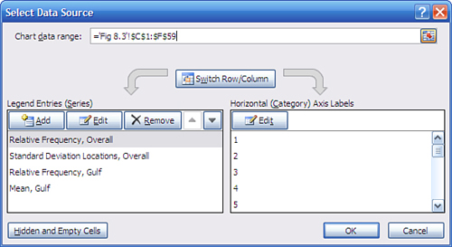
- The data series named Relative Frequency, Overall should be selected in the left list box. If it is not, select it now. Click the Edit button in the right list box. If you don’t see that series name, make sure you selected C1:F59 in step 1.
- The Axis Labels dialog box appears. You should see the flashing I-bar in the Axis Label Range box. Drag through the range B2:B59, type its address, or otherwise select it on the worksheet. Click OK to return to the Select Data Source dialog box, and then click OK again to return to the worksheet. Doing so establishes the values in the range B2:B59 as the labels for the chart’s horizontal axis.
The chart should now appear very much as is shown in Figure 8.4.
Figure 8.4. Removing the legend and the gridlines makes it easier to see the overlap of the curves and the location of the standard deviations.
- Steps 9 through 14 suppress the data series that represents the mean age of Gulf turtles and instead establish an error bar that displays the location of the mean age. Click the Layout tab in the Chart Tools area. Find the Current Selection area on the left end of the Ribbon and use its drop-down box to select the data series named “Mean, Gulf.”
- Choose Format Selection in the Current Selection area. A Format Data Series dialog box appears. Click Fill in its navigation bar, and then click the No Fill option button.
- Click Border Color in the dialog box’s navigation bar. Click the No Line option button and then click Close. By suppressing both the fill and the border in steps 10 and 11, you prevent the data series itself from appearing on the chart. Steps 12 through 14 replace the data series with an error bar.
- With the Layout tab still selected, click the Error Bars drop-down arrow and choose More Error Bars Options from the drop-down menu. The Format Error Bars dialog box appears. Click the Minus and the No Cap buttons in the Vertical Error Bars window.
- In the Error Amount pane on the Vertical Error Bars window, click the Percentage option button and set the percentage to 100%. This ensures that the error bar descends all the way to the horizontal axis.
- Click Line Style in the Format Error Bars navigation bar. On the Line Style window, select the Dash Type you want and adjust the Width to something relatively heavy, such as 2.25. Click Close to close the Format Error Bars dialog box.
- Steps 15 through 19 are similar to steps 9 through 14. They suppress the appearance of the data series that represents the standard deviations and replaces it with error bars. Click the Layout tab. Use the Current Selection drop-down box to select the data series named “Standard Deviation Locations, Overall.”
- Choose Format Selection. Click Fill in the Format Data Series box’s navigation bar and then click the No Fill option button.
- Click Border Color in the dialog box’s navigation bar. Click the No Line option button and then click Close.
- With the Layout tab still selected, click the Error Bars drop-down arrow and choose More Error Bars Options from the drop-down menu. Click the Minus and the No Cap buttons in the Vertical Error Bars window.
- In the Error Amount pane on the Vertical Error Bars window, click the Percentage option button and set the percentage to 100%. Click Close to return to the worksheet. The chart should now appear as shown in Figure 8.5.
Figure 8.5. You still have to adjust the settings for the curves before the standard deviation lines make sense.
- Finally, set the fill transparency and border properties so that you can see one curve behind the other. Right-click the left curve, which then becomes outlined with data markers. (You could use the Current Selection drop-down on the Layout tab instead, but the curves are much easier to locate on the chart than the mean or standard deviation series.) Choose Format Data Series from the shortcut menu.
- Choose Fill from the navigation bar on the Format Data Series dialog box.
- Click the Solid Fill option button in the Fill window. A Fill Color box appears. Set the Transparency to some value between 50% to 75%.
- Click Border Color in the navigation bar. Click the Solid Line option button.
- If you wish, you can click Border Styles in the navigation bar and set a wider border line.
- Click Close to return to the worksheet.
- Repeat steps 20 through 25 for the right curve. Be sure that you have selected the curve on the right: You can tell if you have done so correctly because data markers appear on the border of the selected curve.
The chart should now appear very much like the one shown in Figure 8.1.
To replicate Figure 8.2, the process is identical to the 26-step procedure just outlined. However, you begin with different definitions of the two curves in columns C and E. The formula
=NORM.DIST(B2,55,5,FALSE)
should be entered in cell C2 and copied and pasted into C3:C59. We need to specify the mean (55) and the standard error (5) because we’re not using the standard unit normal distribution returned by NORM.S.DIST(). That distribution has a mean of zero and a standard deviation of 1. Therefore, we use NORM.DIST() instead, because it allows us to specify the mean and standard deviation.
Similarly, the formula
=NORM.DIST(B2,45,5,FALSE)
should be entered in cell E2 to adjust the mean from 55 to 45 for the curve that represents the Gulf sample. It should then be copied and pasted into E3:E59.
To get the means and standard deviations, enter this formula in cell D27:
=C27
Then copy and paste it into these cells: D29, D32, D35, D37, and E27.
Again, this will all be easier and quicker if you have the actual workbook from the publisher open, so that you can compare the results of the instructions given earlier with what you see in the Chapter 8 workbook.
Using the t-Test Instead of the z-Test
Chapter 3 went into some detail about the bias involved in the sample standard deviation as an estimator of the population standard deviation. There it was shown that because the sample mean is used instead of the (unknown) population mean, the sample standard deviation is smaller than the population standard deviation, and that most of that bias is removed by the use of the degrees of freedom instead of the sample size in the denominator of the variance.
Although using N − 1 instead of N acts as a bias correction, it doesn’t eliminate sampling error. One of the principal functions of inferential statistics is to help you make statements about the probability of obtaining an observed statistic, under the hypothesis that a different state of nature exists.
For example, the prior two sections discussed how to determine the probability of observing a sample mean of 45 from a population whose mean is known to be 55—which is just a formal way of asking, “How likely is it that the mean age of sea turtles in the Gulf of Mexico is 45 when we know that the average age of all sea turtles is 55? Do we have two populations with different mean ages, or did we just get a bad sample of Gulf turtles?”
Those two prior sections posited a fairly unlikely set of circumstances. It is particularly unlikely that you would know the actual mean age of the world’s population of sea turtles. I based the discussion on that knowledge largely because I wanted you to know the value of σ, the population standard deviation. If you know σ in these circumstances, you certainly know μ, the population mean, so I figured that I might as well give it to you.
But what if you didn’t know the value of the population standard deviation? In that case, you might well estimate it using the value that you calculate for your sample: s instead of σ.
Note
It’s quite plausible that you might encounter a real-world research situation in which you know a population standard deviation but might suspect that μ has changed while σ did not. This situation often comes about in manufacturing quality control. You would use the same analysis, employing NORM.DIST() and the standard error of the mean. You would substitute a hypothesized value for the mean, the second argument in NORM.DIST(), for another value that you previously knew to be the mean.
Inevitably, though, sampling error will provide you with a mis-estimate of the population standard deviation. And in that case, making reference via NORM.DIST() to the normal distribution, treating your sample statistic as a z-score, can mislead you.
Recall that a z-score is defined as follows:
![]()
Or, in the case of means, like this:
![]()
In either case, you divide by σ. But if you don’t know σ and use s instead, you form a ratio of this sort:
![]()
Notice that the sample standard deviation, not that of the population, is in the denominator. When you form that ratio, it is no longer a z-score but a t-statistic.
Furthermore, the normal distribution is the appropriate context to interpret a z-score, but it is not the appropriate point of reference for a t-statistic. A family of t-distributions provide the appropriate context and probability areas. They look very much, but not quite, like the normal distribution, and with small sample sizes this can make meaningful differences to your probability statements.
Figure 8.6 shows a t-distribution (broken line) along with a normal curve (solid line).
Figure 8.6. Notice that the t-distribution is a little shorter at the top and thicker in the tails than the normal distribution.
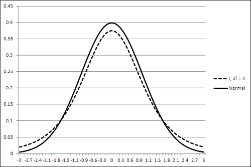
The t-distribution shown in Figure 8.6 is the distribution of t with 4 degrees of freedom. The t-distribution has a slightly different shape for every change in the number of degrees of freedom, and as the degrees of freedom gets larger the shape more nearly approaches the normal distribution.
Note
If you have downloaded the Excel workbooks from the publisher’s website, you can open the workbook for Chapter 8. Activate the worksheet for Figure 8.6. There, change the number of degrees of freedom in cell B1 to see how the charted t-distribution changes. You’ll see, for example, that the t-distribution is almost indistinguishable from the normal distribution when the degrees of freedom reaches 20 or 30.
Defining the Decision Rule
Let’s make a change or two to the example of the age of sea turtles: Assume that you do not know the population standard deviation of their age, and simply want to compare the mean age in your sample with a hypothetical figure of 55 years.
You don’t know the population standard deviation, and must estimate it from your sample data. You plan on a relatively small sample size of 16, so you should probably use the t-distribution as a reference rather than the normal distribution. (Compare the t-distribution with 15 degrees of freedom to the normal, as suggested in the prior note.)
Suppose that you have reason to suspect that the mean age of turtles in the Gulf of Mexico is 45, ten years younger than what you believe to be the mean age of all sea turtles. You might form an alternative hypothesis that Gulf turtles’ mean age is 45, and there can be good reasons to state the alternative hypothesis with that degree of precision. More typically, a researcher would adopt a less restrictive statement. The researcher might use “Gulf turtles have a mean age less than 55” as the alternative hypothesis. After collecting and analyzing the data, they might go on to use the sample mean as the best estimate available of the Gulf turtles’ mean age.
With your sample of Gulf turtles’ ages, you’re in a position to test your hypothesis, but before you do so you should specify alpha, the error rate that you are willing to tolerate.
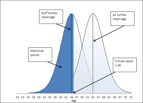
Perhaps you’re willing to be wrong 1 time in 20—as statisticians often phrase it, “alpha is .05.” What specifically does that mean? Figure 8.7 provides a visual guide.
Figure 8.7. The area in the left tail of the right distribution represents alpha.

I don’t mean to suggest that other figures and sections in this book aren’t important, but I do think that what you see in Figure 8.7 is at least as critical for understanding inferential statistics as anything else in this or any other book.
There are two curves in Figure 8.7. The one on the right represents the distribution of the means you would calculate on many, many samples, if your null hypothesis is true: that the population mean is 55. The grand mean, the mean of all samples from the population and shown by a vertical line in that curve, shows the location of the population mean, again assuming that your null hypothesis is true.
The curve on the left represents the distribution of the means you would calculate (again, on many, many samples) if your alternative hypothesis is true: that the actual mean age is not 55 but a smaller number such as 45.
It’s not possible for both curves to represent reality. If the population mean is really 55, then the curve on the left is possible only in theory. If the population mean is really 45, then the curve on the right is imaginary. (Of course, it’s entirely possible that the population mean is neither 45 nor 55, but using specific values here helps to make a crisper example.)
In Figure 8.7, look closely at the left tail of the right curve, which represents the null hypothesis. Notice that there’s a section in the tail that is shaded differently from the remainder of the curve. That section is bounded on the right at the value 46.2. That value separates the section in the left tail of the right curve from the rest of the curve.
Over the course of many samples from a population whose mean is 55, some samples will have mean values less than 55, some will be less than 50, some more than 60, and so on. Because we know the mean of the curve—the grand mean of those many samples—is 55 and the standard error of the mean is 5, the mathematics of the t-distribution tells us that 5% of the sample means will be less than or equal to 46.2. (For convenience, the remainder of this discussion will round 46.2 off to 46. Maybe one of the turtles lied about his age.)
That 5% is the alpha—the error rate—you have adopted. It is represented visually in Figure 8.7 by the shaded area in the left tail of the right curve. If your sample, the one that you actually take, has a mean of 46 or less, you have decided to conclude that the sample did not come from a distribution that represents the null hypothesis. Instead, you will conclude that the sample came from the distribution that represents your alternative hypothesis.
The value 46 in this example is called the critical value. It is the criterion associated with the error rate, so in this case if you get a sample mean of 46 or less, you reject the null hypothesis. You know that with a sample mean of 46 or less there’s still a 5% chance that the null hypothesis is true, but you have decided that’s a risk you’re willing to run.
Finding the Critical Value for a z-Test
The prior section on z-tests did not discuss how to find the critical value that cut off 5% of the area under the curve. Instead, it simply noted that a value equal to or less than the sample mean of 45 would occur only 2.275% of the time if the null hypothesis were true.
If you knew the population standard deviation and wanted to use a z-test, you should determine the critical value for alpha—just as though you did not know the standard deviation and were therefore using a t-test. But in the case of a z-test, you would use the normal distribution, not the t distribution. In Excel you could find the critical value with the NORM.INV() function:
=NORM.INV(0.05,55,5)
The general rule for statistical distribution functions in Excel is that if the name ends in DIST, the function returns an area (interpreted as a probability). If the name ends in INV, the function returns a value along the horizontal axis of the distribution. Here, we’re interested in determining the critical value: the value on the horizontal axis that cuts off 5% of the area under the normal curve.
So, we supply as the arguments to NORM.INV() these values:
• .05—The area we’re interested in under the curve that represents the distribution.
• 55—The mean of the distribution.
• 5—The standard error of the mean: the standard deviation of the individual values, 20, divided by the square root of the sample size, 16.
The NORM.INV() function, given those arguments, returns 46.776. If the mean of your sample is less than that figure, you are in the 5% area of the distribution that represents the null hypothesis and, given your decision rule of adopting a .05 error rate as alpha, you can reject the null hypothesis.
Finding the Critical Value for a t-Test
If you don’t know the population standard deviation and therefore are using a t-test instead of a z-test, the logic is the same but the mechanics a little different. The function you use is T.INV() rather than NORM.INV() because the t-distribution is different from the normal distribution.
Here’s how you would use T.INV() in this situation:
=T.INV(0.05,15)
That formula returns a t value such that 5% of the area under the t-distribution lies to its left, just as NORM.INV() can return a z value such that 5% of the area under a normal distribution lies to its left.
However, NORM.INV() returns the critical value in the scale you define when you supply the mean and the standard deviation as two of its arguments. T.INV() is not so accommodating, and you have to see to the scale conversion yourself.
You tell T.INV() what area, or probability, you’re interested in. That’s the 0.05 argument in the preceding example. You also tell it the number of degrees of freedom. That’s the 15 in the example. Your sample size is 16, from which you subtract 1 to get the degrees of freedom. (Recall that the shape of t-distributions varies with the degrees of freedom, so the area to the left of a given critical value does so as well.)
It’s easy to convert the scale of t values to the scale you’re interested in. In this example, we know that the standard error of the mean is ![]() , or 20 / 4, or 5—just as was supplied to NORM.INV(). We also know that the mean of the distribution that represents the null hypothesis is 55. So it’s merely a matter of multiplying the t value by the standard error and adding the mean:
, or 20 / 4, or 5—just as was supplied to NORM.INV(). We also know that the mean of the distribution that represents the null hypothesis is 55. So it’s merely a matter of multiplying the t value by the standard error and adding the mean:
=T.INV(0.05,15)*5+55
That formula returns the value 46.234. But the formula using NORM.INV() returned 46.776. So if you’re running a t-test, you need a sample mean—a critical value—of at most 46.234 to reject the null hypothesis. If you’re running a z-test, your sample mean can be as high as 46.776, as shown in the prior section.
Comparing the Critical Values
Step back a moment and review the purpose of this analysis. You know, or assume, that the world’s sea turtle population has a mean age of 55. You suspect that the mean age of sea turtles in the Gulf of Mexico is 45. You have adopted an alpha level of 0.05 as protection against falsely rejecting the null hypothesis that the mean age of Gulf turtles is 55, the same as the rest of the world’s sea turtles.
The preceding two sections have shown that if your sample mean is 46.776 and you’re running a z-test, you can reject the null hypothesis knowing that your chance of going wrong is 5%. If you’re running a t-test, your sample mean must be slightly farther away from the null’s value of 55. It must be at most 46.234, about half a year younger than 46.776, if you are to reject the null with your specified alpha of 0.05.
If you glance back at Figure 8.6, you’ll see that the tails of the t-distribution are slightly thicker than the tails of the normal distribution. That affords more headroom in the tails for area under the curve, and an area such as 5% is bounded by a critical value that’s farther from the mean than is the case with the normal distribution. You have to go farther from the mean to get into that 5% area, and therefore reject the null hypothesis, when you use a t-test. That means that the t-test has slightly less statistical power than the z-test. The section “Understanding Statistical Power,” which appears shortly, has more on that concept.
Rejecting the Null Hypothesis
Just looking at Figure 8.7, you can see that a sample with a mean value that’s less than 46 is much more likely to come from the left curve, which represents your alternative hypothesis, than from the right curve, which represents your null hypothesis. A sample with a mean less than 46 is much more likely to come from the curve whose mean is 46 than from the curve whose mean is 55. Therefore, it’s rational to conclude that the sample came from the left distribution in Figure 8.7. If so, the null hypothesis—in this case, that the right distribution reflects the true state of nature—should be rejected.
But there is some probability that a sample mean of 46 or less can come from the right curve. That probability in this example is 5%. Your alpha is 5%; you often see this expressed as “Your Type I error rate is 5%.” (You’ll see this stated in research reports as “p < .05” and as the “level of significance.” It’s that usage that led to the horribly ambiguous term statistical significance.)
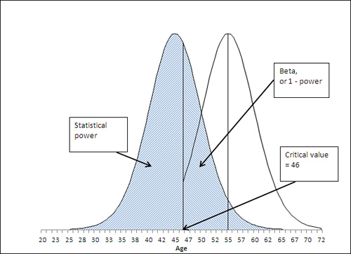
Understanding Statistical Power
Figure 8.8 shows the other side of the alpha coin. Notice the area under the left curve that is shaded. That shaded area is to the left of the critical value of 46. In contrast, in Figure 8.7, the shaded, alpha area is to the left of the critical value in the right curve.
Figure 8.8. The sample mean appears within the area that represents the statistical power of this t-test.
Suppose that the alternative hypothesis is true, and that Gulf turtles have a mean age of 45 years. Some of the possible samples you might take from the Gulf have a mean age greater than 46. You have already identified that number, 46, as the critical value associated with an alpha of .05, of a probability of rejecting the null hypothesis when it is true.
So a sample mean that’s less than 46 causes you to reject the null hypothesis. If the null hypothesis is false, then the alternative must be true: The mean age of Gulf turtles is less than the mean age of the population of all sea turtles. Getting a sample mean that’s less than 46 in this example would then represent a correct decision. That’s termed statistical power.
You can quantify statistical power by looking to the curve that represents the alternative hypothesis; in all the figures shown so far in this chapter, that’s the left curve. You want to know the area under the curve that’s to the left of the critical value of 46. In this case, the power is 58%. Given the hypotheses you have set up, the value of the sample mean, and the size of the standard error of the mean, you have a 58% chance of correctly rejecting the null hypothesis.
Notice that the statistical power depends on the position of the left curve (more generally, the curve that represents the alternative hypothesis) with respect to the critical value. In this example, the farther to the left that this curve is placed, the more of it falls to the left of the critical value (here, 46). The probability of obtaining a sample mean lower than 46 increases, and therefore the statistical power—which is exactly that probability—increases.
Note
This book goes into greater detail on the topic of statistical power in Chapter 9, but the quickest way to calculate, in Excel, the power of this t-test is by using the formula
=T.DIST(t-statistic,df,TRUE)
where the t-statistic is the critical value less the sample mean divided by the standard error of the mean, df is the degrees of freedom for the test, and TRUE calls for Excel to return the cumulative area under the curve. In this example, the formula
=T.DIST((46-45)/5,15,TRUE)
returns .5779, or 58%, the statistical power of this particular t-test.
Notice that the statistical power (in this case 58%) and the alpha rate (in this case 5%) do not total to 100%. Intuitively it’s easy to expect that they’d sum to 100% because power is the probability of correctly rejecting the null hypothesis, and alpha is the probability of incorrectly doing so.
But the two probabilities belong to different curves, to different states of nature. Power is pertinent and quantifiable only when the alternative hypothesis is true. Alpha is pertinent and quantifiable only when the null hypothesis is true. Therefore, there is no special reason to expect that they would sum to 100%—they are properties of and describe different realities.
As the next section shows, though, there is a quantity that together with statistical power comprises 100% of the possibilities when the alternative hypothesis is true.
Statistical Power and Beta
You will sometimes see a reference to another sort of error rate, termed beta. Alpha, as just discussed, is the probability that you will reject a true null hypothesis, and is sometimes termed Type I error. Beta is also an error rate, but it is the probability that you will reject a true alternative hypothesis. The prior section explained that statistical power is the probability that you will reject a false null hypothesis, and therefore accept a true alternative hypothesis.
So beta is 1 − power. If the power of your statistical test is 58%, so that you will accept a true alternative hypothesis 58% of the time, then beta is 42%, and you will mistakenly reject a true alternative hypothesis 42% of the time. This latter type of error, rejecting a true alternative hypothesis, is sometimes called a Type II error.
Figure 8.9 illustrates the relationship between statistical power and beta.
Figure 8.9. Together, power and beta account for the entire area under the curve that represents the alternative hypothesis.
Manipulating the Error Rate
The specification of the alpha error rate is completely under your control. You can choose to set alpha at, for example, .01. In that case, only 1% of the area under the right curve would be in the shaded section, and the critical value—the value that divides alpha from the remainder of the right curve—moves accordingly. Figure 8.10 shows the result of changing alpha from .05, as in Figure 8.7, to .01.
Figure 8.10. Reducing alpha reduces the likelihood of rejecting a true null hypothesis.
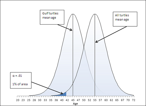
If you want to provide more protection against rejecting the null hypothesis when it’s true, you can simply adopt a smaller value of alpha. In Figure 8.10, for example, alpha has been reduced to .01 from the .05 that’s shown in Figure 8.7.
But notice that reducing alpha from .05 to .01 has an effect on the power of the t-test. Reducing alpha moves the critical value, in this case, to the left, from 46 in Figure 8.7 to 42 in Figure 8.10. Pushing the critical value to the left, to 42, makes it necessary for the sample mean to come in below 42 to reject the null hypothesis. That reduces the statistical power. But with alpha at .05, you can reject the null hypothesis if the sample mean is as high as 46. See the power as displayed in Figure 8.11, and compare it to Figure 8.8.
Figure 8.11. Compare to Figure 8.8, which shows the power of the t-test when alpha is set to .05.
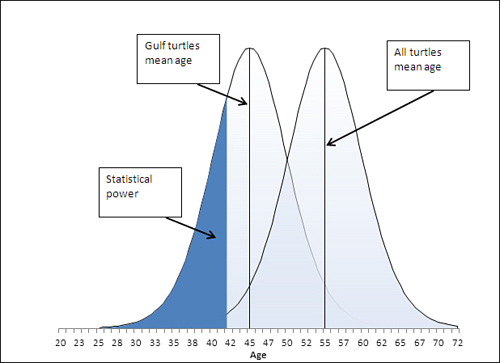
In Figure 8.11, with the critical value reduced from Age 46 to Age 42, and alpha reduced from .05 to .01, the power has also been reduced. A sample mean of 45 causes you to reject the null hypothesis when alpha is set to .05, but you don’t reject the null hypothesis when alpha is set to .01.
This illustrates the importance of assessing the costs of rejecting a true null hypothesis (with a probability of alpha) vis-à-vis the costs of rejecting a true alternative hypothesis (with a probability of beta). Suppose that you were comparing the benefits of an expensive drug treatment to those of a placebo. The possibility exists that the drug has no beneficial effect—that would be the null hypothesis. If you set alpha to, say, .01, then you run only a 1% chance of deciding that the drug has an effect when it doesn’t. That may save people money: They won’t spend dollars to buy a drug that has no effect (except in the 1% of the time that you mistakenly reject the null hypothesis).
On the other hand, reducing alpha from .05 to .01 also reduces statistical power and makes it less likely that you will reject the null hypothesis when it is false. Then, when the drug has a beneficial effect, you stand a poorer chance of reaching the correct conclusion. You may well prevent people who could have been helped by the drug from taking it, because you will not have rejected a false null hypothesis.
Over the past 100 years it has become more a matter of tradition and convenience to use alpha levels of .01 and .05. It takes some extra work to assess the relative costs of committing either type of error, but it’s worth it if your decision is based on cost-benefit analysis instead of on tradition. And because Excel makes it so easy to determine these probabilities, convenience is no excuse: You no longer need rely on tables that show critical values for only the the .01 and .05 significance levels of t-distributions with different degrees of freedom.
Chapter 9 goes more fully into using Excel’s worksheet functions, particularly T.DIST(), T.DIST.RT, and T.DIST.2T, to determine those probabilities based on issues such as the directionality of your hypotheses, your choice of alpha level, and sample sizes.