
7. Using Excel with the Normal Distribution
About the Normal Distribution
You cannot go through life without encountering the normal distribution, or “bell curve,” on an almost daily basis. It’s the foundation for grading “on the curve” when you were in elementary and high school. The height and weight of people in your family, in your neighborhood, in your country each follow a normal curve. The number of times a fair coin comes up heads in ten flips follows a normal curve. The title of a contentious and controversial book published in the 1990s. Even that ridiculously abbreviated list is remarkable for a phenomenon that was only starting to be perceived 300 years ago.
The normal distribution occupies a special niche in the theory of statistics and probability, and that’s a principal reason Excel offers more worksheet functions that pertain to the normal distribution than to any other, such as the t, the binomial, the Poisson, and so on. Another reason Excel pays so much attention to the normal distribution is that so many variables that interest researchers—in addition to the few just mentioned—follow a normal distribution.
Characteristics of the Normal Distribution
There isn’t just one normal distribution, but an infinite number. Despite the fact that there are so many of them, you never encounter one in nature.
Those are not contradictory statements. There is a normal curve—or, if you prefer, normal distribution or bell curve or Gaussian curve—for every number, because the normal curve can have any mean and any standard deviation. A normal curve can have a mean of 100 and a standard deviation of 16, or a mean of 54.3 and a standard deviation of 10. It all depends on the variable you’re measuring.
The reason you never see a normal distribution in nature is that nature is messy. You see a huge number of variables whose distributions follow a normal distribution very closely. But the normal distribution is the result of an equation, and can therefore be drawn precisely. If you attempt to emulate a normal curve by charting the number of people whose height is 56″, all those whose height is 57″, and so on, you will start seeing a distribution that resembles a normal curve when you get to somewhere around 30 people.
As your sample gets into the hundreds, you’ll find that the frequency distribution looks pretty normal—not quite, but nearly. As you get into the thousands you’ll find your frequency distribution is not visually distinguishable from a normal curve. But if you apply the functions for skewness and kurtosis discussed in this chapter, you’ll find that your curve just misses being perfectly normal. You have tiny amounts of sampling error to contend with, for one; for another, your measures won’t be perfectly accurate.
Skewness
A normal distribution is not skewed to the left or the right but is symmetric. A skewed distribution has values whose frequencies bunch up in one tail and stretch out in the other tail.
Skewness and Standard Deviations
The asymmetry in a skewed distribution causes the meaning of a standard deviation to differ from its meaning in a symmetric distribution, such as the normal curve or the t-distribution (see Chapters 8 and 9, for information on the t-distribution). In a symmetric distribution such as the normal, close to 34% of the area under the curve falls between the mean and one standard deviation below the mean. Because the distribution is symmetric, an additional 34% of the area also falls between the mean and one standard deviation above the mean.
But the asymmetry in a skewed distribution causes the equal percentages in a symmetric distribution to become unequal. For example, in a distribution that skews right you might find 45% of the area under the curve between the mean and one standard deviation below the mean; another 25% might be between the mean and one standard deviation above it.
In that case, you still have about 68% of the area under the curve between one standard deviation below and one standard deviation above the mean. But that 68% is split so that its bulk is primarily below the mean.
Visualizing Skewed Distributions
Figure 7.1 shows several distributions with different degrees of skewness.
Figure 7.1. A curve is said to be skewed in the direction that it tails off: The log X curve is “skewed left” or “skewed negative.”
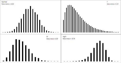
The normal curve shown in Figure 7.1 (based on a random sample of 5,000 numbers, generated by Excel’s Data Analysis add-in) is not the idealized normal curve but a close approximation. Its skewness, calculated by Excel’s SKEW() function, is −0.02. That’s very close to zero; a purely normal curve has a skewness of exactly 0.
The X2 and log X curves in Figure 7.1 are based on the same X values as form the figure’s normal distribution. The X2 curve tails to the right and skews positively at 0.57. The log X curve tails to the left and skews negatively at −0.74. It’s generally true that a negative skewness measure indicates a distribution that tails off left, and a positive skewness measure tails off right.
The F curve in Figure 7.1 is based on a true F-distribution with 4 and 100 degrees of freedom. (This book has much more to say about F-distributions beginning in Chapter 10, “Testing Differences Between Means: The Analysis of Variance.” An F-distribution is based on the ratio of two variances, each of which has a particular number of degrees of freedom.) F-distributions always skew right. It is included here so that you can compare it with another important distribution, t, which appears in the next section on a curve’s kurtosis.
Quantifying Skewness
Several methods are used to calculate the skewness of a set of numbers. Although the values they return are close to one another, no two methods yield exactly the same result. Unfortunately, no real consensus has formed on one method. I mention most of them here so that you’ll be aware of the lack of consensus. More researchers report some measure of skewness than was once the case, to help the consumers of that research better understand the nature of the data under study. It’s much more effective to report a measure of skewness than to print a chart in a journal and expect the reader to decide how far the distribution departs from the normal. That departure can affect everything from the meaning of correlation coefficients to whether inferential tests have any meaning with the data in question.
For example, one measure of skewness proposed by Karl Pearson (of the Pearson correlation coefficient) is shown here:
Skewness = (Mean − Mode) / Standard Deviation
But it’s more typical to use the sum of the cubed z-scores in the distribution to calculate its skewness. One such method calculates skewness as follows:
![]()
This is simply the average cubed z-score.
Excel uses a variation of that formula in its SKEW() function:
![]()
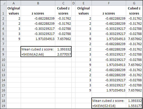
A little thought will show that the Excel function always returns a larger value than the simple average of the cubed z-scores. If the number of values in the distribution is large, the two approaches are nearly equivalent. But for a sample of only five values, Excel’s SKEW() function can easily return a value half again as large as the average cubed z-score. See Figure 7.2, where the original values in Column A are simply replicated (twice) in Column E. Notice that the value returned by SKEW() depends on the number of values it evaluates.
Figure 7.2. The mean cubed z-score is not affected by the number of values in the distribution.
Kurtosis
A distribution might be symmetric but still depart from the normal pattern by being taller or flatter than the true normal curve. This quality is called a curve’s kurtosis.
Types of Kurtosis
Several adjectives that further describe the nature of a curve’s kurtosis appear almost exclusively in statistics textbooks:
• A platykurtic curve is flatter and broader than a normal curve. (A platypus is so named because of its broad foot.)
• A mesokurtic curve occupies a middle ground as to its kurtosis. A normal curve is mesokurtic.
• A leptokurtic curve is more peaked than a normal curve: Its central area is more slender. This forces more of the curve’s area into the tails. Or you can think of it as thicker tails pulling more of the curve’s area out of the middle.
The t-distribution (see Chapter 8) is leptokurtic, but the more observations in a sample the more closely the t-distribution resembles the normal curve. Because there is more area in the tails of a t-distribution, special comparisons are needed to use the t-distribution as a way to test the mean of a relatively small sample. Again, Chapters 8 and 9 explore this issue in some detail, but you’ll find that the leptokurtic t-distribution also has applications in regression analysis (see Chapter 12).
Figure 7.3 shows a normal curve—at any rate, one with a very small amount of kurtosis, −0.03. It also shows a somewhat leptokurtic curve, with kurtosis equal to −0.80.
Figure 7.3. Observations toward the middle of the normal curve move toward the tails in a leptokurtic curve.
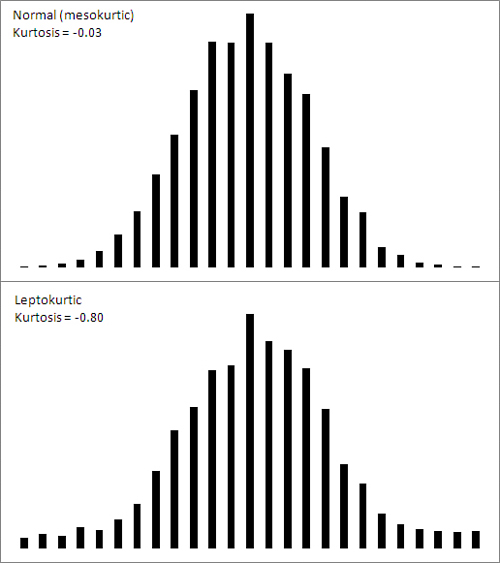
Notice that more of the area under the leptokurtic curve is in the tails of the distribution, with less occupying the middle. The t-distribution follows this pattern, and tests of such statistics as means take account of this when, for example, the population standard deviation is unknown and the sample size is small. With more of the area in the tails of the distribution, the critical values needed to reject a null hypothesis are larger than when the distribution is normal. The effect also finds its way into the construction of confidence intervals (discussed later in this chapter).
Quantifying Kurtosis
The rationale to quantify kurtosis is the same as the rationale to quantify skewness: A number is often a more efficient descriptor than a chart. Furthermore, knowing how far a distribution departs from the normal helps the consumer of the research put other reported findings in context.
Excel offers the KURT() worksheet function to calculate the kurtosis in a set of numbers. Unfortunately there is no more consensus regarding a formula for kurtosis than there is for skewness. But the recommended formulas do tend to agree on using some variation on the z-scores raised to the fourth power.
Here’s one textbook definition of kurtosis:
![]()
In this definition, N is the number of values in the distribution and z represents the associated z-scores: that is, each value less the mean, divided by the standard deviation.
The number 3 is subtracted to set the result equal to 0 for the normal curve. Then, positive values for the kurtosis indicate a leptokurtic distribution whereas negative values indicate a platykurtic distribution. Because the z-scores are raised to an even power, their sum (and therefore their mean) cannot be negative. Subtracting 3 is a convenient way to give platykurtic curves a negative kurtosis. Some versions of the formula do not subtract 3. Those versions would return the value 3 for a normal curve.
Excel’s KURT() function is calculated in this fashion, following an approach that’s intended to correct bias in the sample’s estimation of the population parameter:
![]()
The Unit Normal Distribution
One particular version of the normal distribution has special importance. It’s called the unit normal or standard normal distribution. Its shape is the same as any normal distribution but its mean is 0 and its standard deviation is 1. That location (the mean of 0) and spread (the standard deviation of 1) makes it a standard, and that’s handy.
Because of those two characteristics, you immediately know the cumulative area below any value. In the unit normal distribution, the value 1 is one standard deviation above the mean of 0, and so 84% of the area falls to its left. The value −2 is two standard deviations below the mean of 0, and so 2.275% of the area falls to its left.
On the other hand, suppose that you were working with a distribution that has a mean of 7.63 centimeters and a standard deviation of .124 centimeters—perhaps that represents the diameter of a machine part whose size must be precise. If someone told you that one of the machine parts has a diameter of 7.816, you’d probably have to think for a moment before you realized that’s one-and-one-half standard deviations above the mean. But if you’re using the unit normal distribution as a yardstick, hearing of a score of 1.5 tells you exactly where that machine part is in the distribution.
So it’s quicker and easier to interpret the meaning of a value if you use the unit normal distribution as your framework. Excel has worksheet functions tailored for the normal distribution, and they are easy to use. Excel also has worksheet functions tailored specifically for the unit normal distribution, and they are even easier to use: You don’t need to supply the distribution’s mean and standard deviation, because they’re known. The next section discusses those functions, for both Excel 2010 and earlier versions.
Excel Functions for the Normal Distribution
Excel names the functions that pertain to the normal distribution so that you can tell whether you’re dealing with any normal distribution, or the unit normal distribution with a mean of 0 and a standard deviation of 1.
Excel refers to the unit normal distribution as the “standard” normal, and therefore uses the letter s in the function’s name. So the NORM.DIST() function refers to any normal distribution, whereas the NORMSDIST() compatibility function and the NORM.S.DIST() consistency function refer specifically to the unit normal distribution.
The NORM.DIST() Function
Suppose you’re interested in the distribution in the population of high-density lipoprotein (HDL) levels in adults over 20 years of age. That variable is normally measured in milligrams per deciliter of blood (mg/dl). Assuming HDL levels are normally distributed (and they are), you can learn more about the distribution of HDL in the population by applying your knowledge of the normal curve. One way to do so is by using Excel’s NORM.DIST() function.
NORM.DIST() Syntax
The NORM.DIST() function takes the following data as its arguments:
• x—This is a value in the distribution you’re evaluating. If you’re evaluating high-density lipoprotein (HDL) levels, you might be interested in one specific level—say, 60. That specific value is the one you would provide as the first argument to NORM.DIST().
• Mean—The second argument is the mean of the distribution you’re evaluating. Suppose that the mean HDL among humans over 20 years of age is 54.3.
• Standard Deviation—The third argument is the standard deviation of the distribution you’re evaluating. Suppose that the standard deviation of HDL levels is 15.
• Cumulative—The fourth argument indicates whether you want the cumulative probability of HDL levels from 0 to x (which we’re taking to be 56 in this example), or the probability of having an HDL level of specifically x (that is, 56). If you want the cumulative probability, use TRUE as the fourth argument. If you want the specific probability, use FALSE.
Requesting the Cumulative Probability
The formula
=NORM.DIST(60, 54.3, 15, TRUE)
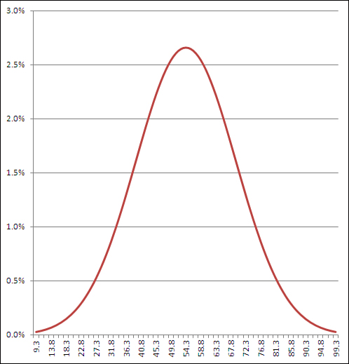
returns .648, or 64.8%. This means that 64.8% of the area under the distribution of HDL levels is between 0 and 60 mg/dl. Figure 7.4 shows this result.
Figure 7.4. You can adjust the number of gridlines by formatting the vertical axis to show more or fewer major units.
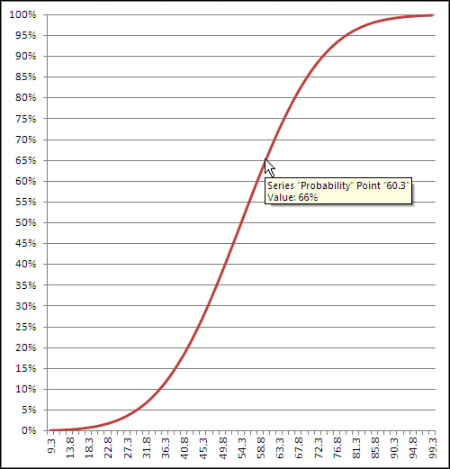
If you hover your mouse pointer over the line that shows the cumulative probability, you’ll see a small pop-up window that tells you which data point you are pointing at, as well as its location on both the horizontal and vertical axes. Once created, the chart can tell you the probability associated with any of the charted data points, not just the 60 mg/dl this section has discussed. As shown in Figure 7.4, you can use either the chart’s gridlines or your mouse pointer to determine that a measurement of, for example, 60.3 mg/dl or below accounts for about 66% of the population.
Requesting the Point Estimate
Things are different if you choose FALSE as the fourth, cumulative argument to NORM.DIST(). In that case, the function returns the probability associated with the specific point you specify in the first argument. Use the value FALSE for the cumulative argument if you want to know the height of the normal curve at a specific value of the distribution you’re evaluating. Figure 7.5 shows one way to use NORM.DIST() with the cumulative argument set to FALSE.
Figure 7.5. The height of the curve at any point is the probability that the point appears in a random sample from the full distribution.
It doesn’t often happen that you need a point estimate of the probability of a specific value in a normal curve, but if you do—for example, to draw a curve that helps you or someone else visualize an outcome—then setting the cumulative argument to FALSE is a good way to get it. (You might also see this value—the probability of a specific point, the height of the curve at that point—referred to as the probability density function or probability mass function. The terminology has not been standardized.)
If you’re using a version of Excel prior to 2010, you can use the NORMDIST() compatibility function. It is the same as NORM.DIST() as to both arguments and returned values.
The NORM.INV() Function
As a practical matter, you’ll find that you usually have need for the NORM.DIST() function after the fact. That is, you have collected data and know the mean and standard deviation of a sample or population. A question then arises: Where does a given value fall in a normal distribution? That value might be a sample mean that you want to compare to a population, or it might be an individual observation that you want to assess in the context of a larger group.
In that case, you would pass the information along to NORM.DIST(), which would tell you the probability of observing up to a particular value (cumulative = TRUE) or that specific value (cumulative = FALSE). You could then compare that probability to the alpha rate that you already adopted for your experiment.
The NORM.INV() function is closely related to the NORM.DIST() function and gives you a slightly different angle on things. Instead of returning a value that represents an area—that is, a probability—NORM.INV() returns a value that represents a point on the normal curve’s horizontal axis. That’s the point that you provide as the first argument to NORM.DIST().
For example, the prior section showed that the formula
=NORM.DIST(60, 54.3, 15, TRUE)
returns .648. The value 60 is at least as large as 64.8% of the observations in a normal distribution that has a mean of 54.3 and a standard deviation of 15.
The other side of the coin: the formula
=NORM.INV(0.648, 54.3, 15)
returns 60. If your distribution has a mean of 54.3 and a standard deviation of 15, then 64.8% of the distribution lies at or below a value of 60. That illustration is just, well, illustrative. You would not normally care that 64.8% of a distribution lies below a particular value.
But suppose that in preparation for a research project you decide that you will conclude that a treatment has a reliable effect only if the mean of the experimental group is in the top 5% of the population. (This is consistent with the traditional null hypothesis approach to experimentation, which Chapters 8 and 9 discuss in considerably more detail.) In that case, you would want to know what score would define that top 5%.
If you know the mean and standard deviation, NORM.INV() does the job for you. Still taking the population mean at 54.3 and the standard deviation at 15, the formula
=NORM.INV(0.95, 54.3, 15)
returns 78.97. Five percent of a normal distribution that has a mean of 54.3 and a standard deviation of 15 lies above a value of 78.97.
As you see, the formula uses 0.95 as the first argument to NORM.INV(). That’s because NORM.INV assumes a cumulative probability—notice that unlike NORM.DIST(), the NORM.INV() function has no fourth, cumulative argument. So asking what value cuts off the top 5% of the distribution is equivalent to asking what value cuts off the bottom 95% of the distribution.
In this context, choosing to use NORM.DIST() or NORM.INV() is largely a matter of the sort of information you’re after. If you want to know how likely it is that you will observe a number at least as large as X, hand X off to NORM.DIST() to get a probability. If you want to know the number that serves as the boundary of an area—an area that corresponds to a given probability—hand the area off to NORM.INV() to get that number.
In either case, you need to supply the mean and the standard deviation. In the case of NORM.DIST, you also need to tell the function whether you’re interested in the cumulative probability or the point estimate.
The consistency function NORM.INV() is not available in versions of Excel prior to 2010, but you can use the compatibility function NORMINV() instead. The arguments and the results are as with NORM.INV().
Using NORM.S.DIST()
There’s much to be said for expressing distances, weights, durations, and so on in their original unit of measure. That’s what NORM.DIST() is for. But when you want to use a standard unit of measure for a variable that’s distributed normally, you should think of NORM.S.DIST(). The S in the middle of the function name of course stands for standard.
It’s quicker to use NORM.S.DIST() because you don’t have to supply the mean or standard deviation. Because you’re making reference to the unit normal distribution, the mean (0) and the standard deviation (1) are known by definition. All that NORM.S.DIST() needs is the z-score and whether you want a cumulative area (TRUE) or a point estimate (FALSE). The function uses this simple syntax:
=NORM.S.DIST(z, cumulative)
Thus, the formula
=NORM.S.DIST(1.5, TRUE)
informs you that 93.3% of the area under a normal curve is found to the left of a z-score of 1.5. (See Chapter 3, “Variability: How Values Disperse,” for an introduction to the concept of z-scores.)
Caution
The compatibility function NORMSDIST() is available in versions of Excel prior to 2010. It is the only one of the normal distribution functions whose argument list is different from that of its associated consistency function. NORMSDIST() has no cumulative argument: It returns by default the cumulative area to the left of the z argument. Excel will warn that you have made an error if you supply a cumulative argument to NORMSDIST(). If you want the point estimate rather than the cumulative probability, you should use the NORMDIST() function with 0 as the second argument and 1 as the third. Those two together specify the unit normal distribution, and you can now supply FALSE as the fourth argument to NORMDIST(). Here’s an example:
=NORMDIST(1,0,1,FALSE)
Using NORM.S.INV()
It’s even simpler to use the inverse of NORM.S.DIST(), which is NORM.S.INV(). All the latter function needs is a probability:
=NORM.S.INV(.95)
This formula returns 1.64, which means that 95% of the area under the normal curve lies to the left of a z-score of 1.64. If you’ve taken a course in elementary inferential statistics, that number probably looks familiar: as familiar as the 1.96 that cuts off 97.5% of the distribution.
These are frequently occurring numbers because they are associated with the all-too-frequently occurring “p<.05” and “p<.025” entries at the bottom of tables in journal reports—a rut that you don’t want to get caught in. Chapters 8 and 9 have much more to say about those sorts of entries, in the context of the t-distribution (which is closely related to the normal distribution).
The compatibility function NORMSINV() takes the same argument and returns the same result as does NORM.S.INV().
There is another Excel worksheet function that pertains directly to the normal distribution: CONFIDENCE.NORM(). To discuss the purpose and use of that function sensibly, it’s necessary first to explore a little background.
Confidence Intervals and the Normal Distribution
A confidence interval is a range of values that gives the user a sense of how precisely a statistic estimates a parameter. The most familiar use of a confidence interval is likely the “margin of error” reported in news stories about polls: “The margin of error is plus or minus 3 percentage points.” But confidence intervals are useful in contexts that go well beyond that simple situation.
Confidence intervals can be used with distributions that aren’t normal—that are highly skewed or in some other way non-normal. But it’s easiest to understand what they’re about in symmetric distributions, so the topic is introduced here. Don’t let that get you thinking that you can use confidence intervals with normal distributions only.
The Meaning of a Confidence Interval
Suppose that you measured the HDL level in the blood of 100 adults on a special diet and calculated a mean of 50 mg/dl with a standard deviation of 20. You’re aware that the mean is a statistic, not a population parameter, and that another sample of 100 adults, on the same diet, would very likely return a different mean value. Over many repeated samples, the grand mean—that is, the mean of the sample means—would turn out to be very, very close to the population parameter.
But your resources don’t extend that far and you’re going to have to make do with just the one statistic, the 50 mg/dl that you calculated for your sample. Although the value of 20 that you calculate for the sample standard deviation is a statistic, it is the same as the known population standard deviation of 20. You can make use of the sample standard deviation and the number of HDL values that you tabulated in order to get a sense of how much play there is in that sample estimate.
You do so by constructing a confidence interval around that mean of 50 mg/dl. Perhaps the interval extends from 45 to 55. (And here you can see the relationship to “plus or minus 3 percentage points.”) Does that tell you that the true population mean is somewhere between 45 and 55?
No, it doesn’t, although it might well be. Just as there are many possible samples that you might have taken, but didn’t, there are many possible confidence intervals you might have constructed around the sample means, but couldn’t. As you’ll see, you construct your confidence interval in such a way that if you took many more means and put confidence intervals around them, 95% of the confidence intervals would capture the true population mean. As to the specific confidence interval that you did construct, the probability that the true population mean falls within the interval is either 1 or 0: either the interval captures the mean or it doesn’t.
However, it is more rational to assume that the one confidence interval that you took is one of the 95% that capture the population mean than to assume it isn’t. So you would tend to believe, with 95% confidence, that the interval is one of those that captures the population mean.
Although I’ve spoken of 95% confidence intervals in this section, you can also construct 90% or 99% confidence intervals, or any other degree of confidence that makes sense to you in a particular situation. You’ll see next how your choices when you construct the interval affect the nature of the interval itself. It turns out that it smoothes the discussion if you’re willing to suspend your disbelief a bit, and briefly: I’m going to ask you to imagine a situation in which you know what the standard deviation of a measure is in the population, but that you don’t know its mean in the population. Those circumstances are a little odd but far from impossible.
Constructing a Confidence Interval
A confidence interval on a mean, as described in the prior section, requires these building blocks:
• The mean itself
• The standard deviation of the observations
• The number of observations in the sample
• The level of confidence you want to apply to the confidence interval
Starting with the level of confidence, suppose that you want to create a 95% confidence interval: You want to construct it in such a way that if you created 100 confidence intervals, 95 of them would capture the true population mean.
In that case, because you’re dealing with a normal distribution, you could enter these formulas in a worksheet:
=NORM.S.INV(0.025)
=NORM.S.INV(0.975)
The NORM.S.INV() function, described in the prior section, returns the z-score that has to its left the proportion of the curve’s area given as the argument. Therefore, NORM.S.INV(0.025) returns −1.96. That’s the z-score that has 0.025, or 2.5%, of the curve’s area to its left.
Similarly, NORM.S.INV(0.975) returns 1.96, which has 97.5% of the curve’s area to its left. Another way of saying it is that 2.5% of the curve’s area lies to its right. These figures are shown in Figure 7.6.
Figure 7.6. Adjusting the z-score limit adjusts the level of confidence. Compare Figures 7.6 and 7.7.
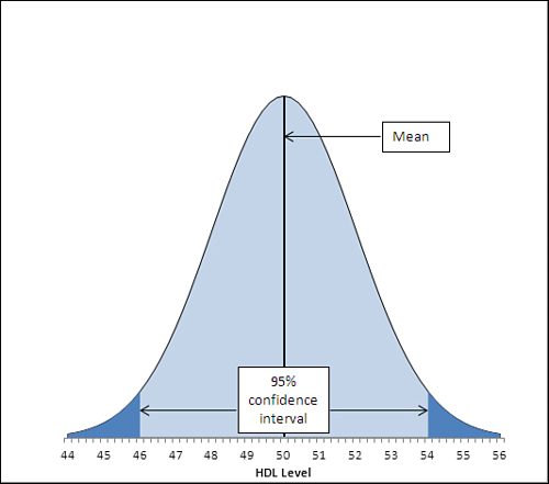
The area under the curve in Figure 7.6, and between the values 46.1 and 53.9 on the horizontal axis, accounts for 95% of the area under the curve. The curve, in theory, extends to infinity to the left and to the right, so all possible values for the population mean are included in the curve. Ninety-five percent of the possible values lie within the 95% confidence interval between 46.1 and 53.9.
The figures 46.1 and 53.9 were chosen so as to capture that 95%. If you wanted a 99% confidence interval (or some other interval more or less likely to be one of the intervals that captures the population mean), you would choose different figures. Figure 7.7 shows a 99% confidence interval around a sample mean of 50.
Figure 7.7. Widening the interval gives you more confidence that you are capturing the population parameter but inevitably results in a vaguer estimate.
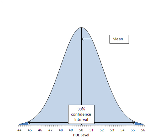
In Figure 7.7, the 99% confidence interval extends from 44.8 to 55.2, a total of 2.6 points wider than the 95% confidence interval depicted in Figure 7.6. If a hundred 99% confidence intervals were constructed around the means of 100 samples, 99 of them (not 95 as before) would capture the population mean. The additional confidence is provided by making the interval wider. And that’s always the tradeoff in confidence intervals. The narrower the interval, the more precisely you draw the boundaries, but the fewer such intervals will capture the statistic in question (here, that’s the mean). The broader the interval, the less precisely you set the boundaries but the larger the number of intervals that capture the statistic.
Other than setting the confidence level, the only factor that’s under your control is the sample size. You generally can’t dictate that the standard deviation is to be smaller, but you can take larger samples. As you’ll see in Chapters 8 and 9, the standard deviation used in a confidence interval around a sample mean is not the standard deviation of the individual raw scores. It is that standard deviation divided by the square root of the sample size, and this is known as the standard error of the mean.
The data set used to create the charts in Figures 7.6 and 7.7 has a standard deviation of 20, known to be the same as the population standard deviation. The sample size is 100. Therefore, the standard error of the mean is
![]()
or 2.
To complete the construction of the confidence interval, you multiply the standard error of the mean by the z-scores that cut off the confidence level you’re interested in. Figure 7.6, for example, shows a 95% confidence interval. The interval must be constructed so that 95% lies under the curve and within the interval—therefore, 5% must lie outside the interval, with 2.5% divided equally between the tails.
Here’s where the NORM.S.INV() function comes into play. Earlier in this section, these two formulas were used:
=NORM.S.INV(0.025)
=NORM.S.INV(0.975)
They return the z-scores −1.96 and 1.96, which form the boundaries for 2.5% and 97.5% of the unit normal distribution, respectively. If you multiply each by the standard error of 2, and add the sample mean of 50, you get 46.1 and 53.9, the limits of a 95% confidence interval on a mean of 50 and a standard error of 2.
If you want a 99% confidence interval, use the formulas
=NORM.S.INV(0.005)
=NORM.S.INV(0.995)
to return −2.58 and 2.58. These z-scores cut off one half of one percent of the unit normal distribution at each end. The remainder of the area under the curve is 99%. Multiplying each z-score by 2 and adding 50 for the mean results in 44.8 and 55.2, the limits of a 99% confidence interval on a mean of 50 and a standard error of 2.
At this point it can help to back away from the arithmetic and focus instead on the concepts. Any z-score is some number of standard deviations—so a z-score of 1.96 is a point that’s found at 1.96 standard deviations above the mean, and a z-score of −1.96 is found 1.96 standard deviations below the mean.
Because the nature of the normal curve has been studied so extensively, we know that 95% of the area under a normal curve is found between 1.96 standard deviations below the mean and 1.96 standard deviations above the mean.
When you want to put a confidence interval around a sample mean, you start by deciding what percentage of other sample means, if collected and calculated, you would want to fall within that interval. So, if you decided that you wanted 95% of possible sample means to be captured by your confidence interval, you would put it 1.96 standard deviations above and below your sample mean.
But how large is the relevant standard deviation? In this situation, the relevant units are themselves mean values. You need to know the standard deviation not of the original and individual observations, but of the means that are calculated from those observations. That standard deviation has a special name, the standard error of the mean.
Because of mathematical derivations and long experience with the way the numbers behave, we know that a good, close estimate of the standard deviation of the mean values is the standard deviation of individual scores, divided by the square root of the sample size. That’s the standard deviation you want to use to determine your confidence interval.
In the example this section has explored, the standard deviation is 20 and the sample size is 100, so the standard error of the mean is 2. When you calculate 1.96 standard errors below the mean of 50 and above the mean of 50, you wind up with values of 46.1 and 53.9. That’s your 95% confidence interval. If you took another 99 samples from the population, 95 of 100 similar confidence intervals would capture the population mean. It’s sensible to conclude that the confidence interval you calculated is one of the 95 that capture the population mean. It’s not sensible to conclude that it’s one of the remaining 5 that don’t.
Excel Worksheet Functions That Calculate Confidence Intervals
The preceding section’s discussion of the use of the normal distribution made the assumption that you know the standard deviation in the population. That’s not an implausible assumption, but it is true that you often don’t know the population standard deviation and must estimate it on the basis of the sample you take. There are two different distributions that you need access to, depending on whether you know the population standard deviation or are estimating it. If you know it, you make reference to the normal distribution. If you are estimating it from a sample, you use the t-distribution.
Excel 2010 has two worksheet functions, CONFIDENCE.NORM() and CONFIDENCE.T(), that help calculate the width of confidence intervals. You use CONFIDENCE.NORM() when you know the population standard deviation of the measure (such as this chapter’s example using HDL levels). You use CONFIDENCE.T() when you don’t know the measure’s standard deviation in the population and are estimating it from the sample data. Chapters 8 and 9 have more information on this distinction, which involves the choice between using the normal distribution and the t-distribution.
Versions of Excel prior to 2010 have the CONFIDENCE() function only. Its arguments and results are identical to those of the CONFIDENCE.NORM() consistency function. Prior to 2010 there was no single worksheet function to return a confidence interval based on the t-distribution. However, as you’ll see in this section, it’s very easy to replicate CONFIDENCE.T() using either T.INV() or TINV(). You can replicate CONFIDENCE.NORM() using NORM.S.INV() or NORMSINV().
Using CONFIDENCE.NORM() and CONFIDENCE()
Figure 7.8 shows a small data set in cells A2:A17. Its mean is in cell B2 and the population standard deviation in cell C2.
Figure 7.8. You can construct a confidence interval using either a confidence function or a normal distribution function.

In Figure 7.8, a value called alpha is in cell F2. The use of that term is consistent with its use in other contexts such as hypothesis testing. It is the area under the curve that is outside the limits of the confidence interval. In Figure 7.6, alpha is the sum of the shaded areas in the curve’s tails. Each shaded area is 2.5% of the total area, so alpha is 5% or 0.05. The result is a 95% confidence interval.
Cell G2 in Figure 7.8 shows how to use the CONFIDENCE.NORM() function. Note that you could use the CONFIDENCE() compatibility function in the same way. The syntax is
=CONFIDENCE.NORM(alpha, standard deviation, size)
where size refers to sample size. As the function is used in cell G2, it specifies 0.05 for alpha, 22 for the population standard deviation, and 16 for the count of values in the sample:
=CONFIDENCE.NORM(F2,C2,COUNT(A2:A17))
This returns 10.78 as the result of the function, given those arguments. Cells G4 and I4 show, respectively, the upper and lower limits of the 95% confidence interval.
There are several points to note:
• CONFIDENCE.NORM() is used, not CONFIDENCE.T(). This is because you have knowledge of the population standard deviation and need not estimate it from the sample standard deviation. If you had to estimate the population value from the sample, you would use CONFIDENCE.T(), as described in the next section.
• Because the sum of the confidence level (for example, 95%) and alpha always equals 100%, Microsoft could have chosen to ask you for the confidence level instead of alpha. It is standard to refer to confidence intervals in terms of confidence levels such as 95%, 90%, 99%, and so on. Microsoft would have demonstrated a greater degree of consideration for its customers had it chosen to use the confidence level instead of alpha as the function’s first argument.
• The Help documentation states that CONFIDENCE.NORM(), as well as the other two confidence interval functions, returns the confidence interval. It does not. The value returned is one half of the confidence interval. To establish the full confidence interval, you must subtract the result of the function from the mean and add the result to the mean.
Still in Figure 7.8, the range E7:I11 constructs a confidence interval identical to the one in E1:I4. It’s useful because it shows what’s going on behind the scenes in the CONFIDENCE.NORM() function. The following calculations are needed:
• Cell F8 contains the formula =F2/2. The portion under the curve that’s represented by alpha—here. 0.05, or 5%—must be split in half between the two tails of the distribution. The leftmost 2.5% of the area will be placed in the left tail, to the left of the lower limit of the confidence interval.
• Cell F9 contains the remaining area under the curve after half of alpha has been removed. That is the leftmost 97.5% of the area, which is found to the left of the upper limit of the confidence interval.
• Cell G8 contains the formula =NORM.S.INV(F8). It returns the z-score that cuts off (here) the leftmost 2.5% of the area under the unit normal curve.
• Cell G9 contains the formula =NORM.S.INV(F9). It returns the z-score that cuts off (here) the leftmost 97.5% of the area under the unit normal curve.
Now we have in cell G8 and G9 the z-scores—the standard deviations in the unit normal distribution—that border the leftmost 2.5% and rightmost 2.5% of the distribution. To get those z-scores into the unit of measurement we’re using—a measure of the amount of HDL in the blood—it’s necessary to multiply the z-scores by the standard error of the mean, and add and subtract that from the sample mean. This formula does the addition part in cell G11:
=B2+(G8*C2/SQRT(COUNT(A2:A17)))
Working from the inside out, the formula does the following:
- Divides the standard deviation in cell C2 by the square root of the number of observations in the sample. As noted earlier, this division returns the standard error of the mean.
- Multiplies the standard error of the mean by the number of standard errors below the mean (−1.96) that bounds the lower 2.5% of the area under the curve. That value is in cell G8.
- Adds the mean of the sample, found in cell B2.
Steps 1 through 3 return the value 46.41. Note that it is identical to the lower limit returned using CONFIDENCE.NORM() in cell G4.
Similar steps are used to get the value in cell I11. The difference is that instead of adding a negative number (rendered negative by the negative z-score −1.96), the formula adds a positive number (the z-score 1.96 multiplied by the standard error returns a positive result). Note that the value in I11 is identical to the value in I4, which depends on CONFIDENCE.NORM() instead of on NORM.S.INV().
Notice that CONFIDENCE.NORM() asks you to supply three arguments:
• Alpha, or 1 minus the confidence level—Excel can’t predict with what level of confidence you want to use the interval, so you have to supply it.
• Standard deviation—Because CONFIDENCE.NORM() uses the normal distribution as a reference to obtain the z-scores associated with different areas, it is assumed that the population standard deviation is in use. (See Chapters 8 and 9 for more on this matter.) Excel doesn’t have access to the full population and thus can’t calculate its standard deviation. Therefore, it relies on the user to supply that figure.
• Size, or, more meaningfully, sample size—You aren’t directing Excel’s attention to the sample itself (cells A2:A17 in Figure 7.8), so Excel can’t count the number of observations. You have to supply that number so that Excel can calculate the standard error of the mean.
You should use CONFIDENCE.NORM() or CONFIDENCE() if you feel comfortable with them and have no particular desire to grind it out using NORM.S.INV() and the standard error of the mean. Just remember that CONFIDENCE.NORM() and CONFIDENCE() do not return the width of the entire interval, just the width of the upper half, which is identical in a symmetric distribution to the width of the lower half.
Using CONFIDENCE.T()
Figure 7.9 makes two basic changes to the information in Figure 7.8: It uses the sample standard deviation in cell C2 and it uses the CONFIDENCE.T() function in cell G2. These two basic changes alter the size of the resulting confidence interval.
Figure 7.9. Other things being equal, a confidence interval constructed using the t-distribution is wider than one constructed using the normal distribution.
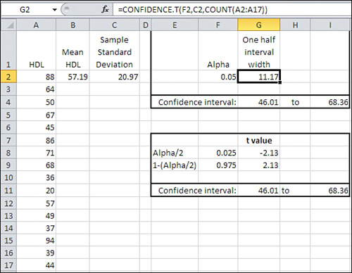
Notice first that the 95% confidence interval in Figure 7.9 runs from 46.01 to 68.36, whereas in Figure 7.8 it runs from 46.41 to 67.97. The confidence interval in Figure 7.8 is narrower. You can find the reason in Figure 7.3. There, you can see that there’s more area under the tails of the leptokurtic distribution than under the tails of the normal distribution. You have to go out farther from the mean of a leptokurtic distribution to capture, say, 95% of its area between its tails. Therefore, the limits of the interval are farther from the mean and the confidence interval is wider.
Because you use the t-distribution when you don’t know the population standard deviation, using CONFIDENCE.T() instead of CONFIDENCE.NORM() brings about a wider confidence interval.
The shift from the normal distribution to the t-distribution also appears in the formulas in cells G8 and G9 of Figure 7.9, which are:
=T.INV(F8,COUNT(A2:A17)-1)
and
=T.INV(F9,COUNT(A2:A17)-1)
Note that these cells use T.INV() instead of NORM.S.INV(), as is done in Figure 7.8. In addition to the probabilities in cells F8 and F9, T.INV() needs to know the degrees of freedom associated with the sample standard deviation. Recall from Chapter 3 that a sample’s standard deviation uses in its denominator the number of observations minus 1. When you supply the proper number of degrees of freedom, you enable Excel to use the proper t-distribution: There’s a different t-distribution for every different number of degrees of freedom.
Using the Data Analysis Add-in for Confidence Intervals
Excel’s Data Analysis add-in has a Descriptive Statistics tool that can be helpful when you have one or more variables to analyze. The Descriptive Statistics tool returns valuable information about a range of data, including measures of central tendency and variability, skewness and kurtosis. The tool also returns half the size of a confidence interval, just as CONFIDENCE.T() does.
Note
The Descriptive Statistics tool’s confidence interval is very sensibly based on the t-distribution. You must supply a range of actual data for Excel to calculate the other descriptive statistics, and so Excel can easily determine the sample size and standard deviation to use in finding the standard error of the mean. Because Excel calculates the standard deviation based on the range of values you supply, the assumption is that the data constitutes a sample, and therefore a confidence interval based on t instead of z is appropriate.
To use the Descriptive Statistics tool, you must first have installed the Data Analysis add-in. Chapter 4 provides step-by-step instructions for its installation. Once this add-in is installed from the Office disc and made available to Excel, you’ll find it in the Analysis group on the Ribbon’s Data tab.
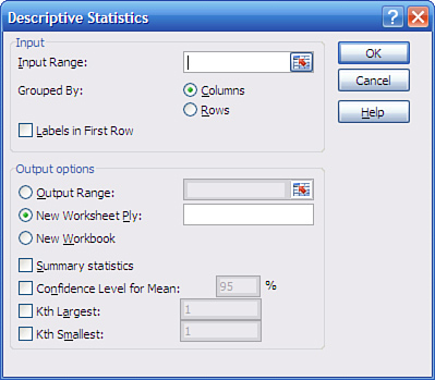
Once the add-in is installed and available, click Data Analysis in the Data tab’s Analysis group, and choose Descriptive Statistics from the Data Analysis list box. Click OK to get the Descriptive Statistics dialog box shown in Figure 7.10.
Figure 7.10. The Descriptive Statistics tool is a handy way to get information quickly on the measures of central tendency and variability of one or more variables.
Note
To handle several variables at once, arrange them in a list or table structure, enter the entire range address in the Input Range box, and click Grouped by Columns.
To get descriptive statistics such as the mean, skewness, count, and so on, be sure to fill the Summary Statistics check box. To get the confidence interval, fill the Confidence Level for Mean check box and enter a confidence level such as 90, 95, or 99 in the associated edit box.
If your data has a header cell and you have included it in the Input Range edit box, fill the Labels check box; this informs Excel to use that value as a label in the output and not to try to use it as an input value.
When you click OK, you get output that resembles the report shown in Figure 7.11.
Figure 7.11. The output consists solely of static values. There are no formulas, so nothing recalculates automatically if you change the input data.
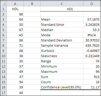
Notice that the value in cell D16 is the same as the value in cell G2 of Figure 7.9. The value 11.17 is what you add and subtract from the sample mean to get the full confidence interval.
The output label for the confidence interval is mildly misleading. Using standard terminology, the confidence level is not the value you use to get the full confidence interval (here, 11.17); rather, it is the probability (or, equivalently, the area under the curve) that you choose as a measure of the precision of your estimate and the likelihood that the confidence interval is one that captures the population mean. In Figure 7.11, the confidence level is 95%.
Confidence Intervals and Hypothesis Testing
Both conceptually and mathematically, confidence intervals are closely related to hypothesis testing. As you’ll see in the next two chapters, you often test a hypothesis about a sample mean and some theoretical number, or about the difference between the means of two different samples. In cases like those you might use the normal distribution or the closely related t-distribution to make a statement such as, “The null hypothesis is rejected; the probability that the two means come from the same distribution is less than 0.05.”
That statement is in effect the same as saying, “The mean of the second sample is outside a 95% confidence interval constructed around the mean of the first sample.”
The Central Limit Theorem
There is a joint feature of the mean and the normal distribution that this book has so far touched on only lightly. That feature is the Central Limit Theorem, a fearsome sounding phenomenon whose effects are actually straightforward. Informally, it goes as in the following fairy tale.
Suppose you are interested in investigating the geographic distribution of vehicle traffic in a large metropolitan area. You have unlimited resources (that’s what makes this a fairy tale) and so you send out an entire army of data collectors. Each of your 2,500 data collectors is to observe a different intersection in the city for a sequence of two-minute periods throughout the day, and count and record the number of vehicles that pass through the intersection during that period.
Your data collectors return with a total of 517,000 two-minute vehicle counts. The counts are accurately tabulated (that’s more fairy tale, but that’s also the end of it) and entered into an Excel worksheet. You create an Excel pivot chart as shown in Figure 7.12 to get a preliminary sense of the scope of the observations.
Figure 7.12. To keep things manageable, the number of vehicles is grouped by tens.
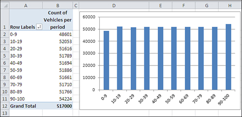
In Figure 7.12, different ranges of vehicles are shown as “row labels” in A2:A11. So, for example, there were 48,601 instances of between 0 and 9 vehicles crossing intersections within two-minute periods. Your data collectors recorded another 52,053 instances of between 10 and 19 vehicles crossing intersections within a two-minute period.
Notice that the data follows a uniform, rectangular distribution. Every grouping (for example, 0 to 9, 10 to 19, and so on) contains roughly the same number of observations.
Next, you calculate and chart the mean observation of each of the 2,500 intersections. The result appears in Figure 7.13.
Figure 7.13. Charting means converts a rectangular distribution to a normal distribution.
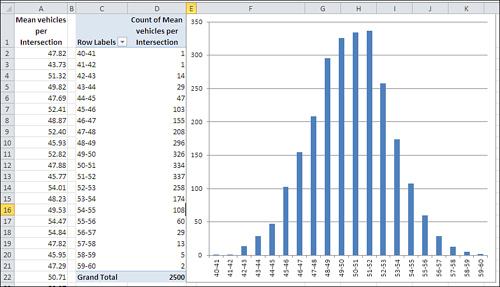
Perhaps you expected the outcome shown in Figure 7.13, perhaps not. Most people don’t. The underlying distribution is rectangular. There are as many intersections in your city that are traversed by zero to ten vehicles per two-minute period as there are intersections that attract 90 to 100 vehicles per two-minute period.
But if you take samples from that set of 517,000 observations, calculate the mean of each sample, and plot the results, you get something close to a normal distribution.
And this is termed the Central Limit Theorem. Take samples from a population that is distributed in any way: rectangular, skewed, binomial, bimodal, whatever (it’s rectangular in Figure 7.12). Get the mean of each sample and chart a frequency distribution of the means (refer to Figure 7.13). The chart of the means will resemble a normal distribution.
The larger the sample size, the closer the approximation to the normal distribution. The means in Figure 7.13 are based on samples of 100 each. If the samples had contained, say, 200 observations each, the chart would have come even closer to a normal distribution.
Making Things Easier
During the first half of the twentieth century, great reliance was placed on the Central Limit Theorem as a way to calculate probabilities. Suppose you want to investigate the prevalence of left-handedness among golfers. You believe that 10% of the general population is left-handed. You have taken a sample of 1,500 golfers and want to reassure yourself that there isn’t some sort of systematic bias in your sample. You count the lefties and find 135. Assuming that 10% of the population is left-handed and that you have a representative sample, what is the probability of selecting 135 or fewer left-handed golfers in a sample of 1,500?
The formula that calculates that exact probability is
![]()
or, as you might write the formula using Excel functions:
=SUM(COMBIN(1500,ROW(A1:A135))*(0.1^ROW(A1:A135))* (0.9^(1500-ROW(A1:A135))))
(The formula must be array-entered in Excel, using Ctrl+Shift+Enter instead of simply Enter.)
That’s formidable, whether you use summation notation or Excel function notation. It would take a long time to calculate its result by hand, in part because you’d have to calculate 1,500 factorial.
When mainframe and mini computers became broadly accessible in the 1970s and 1980s, it became feasible to calculate the exact probability, but unless you had a job as a programmer, you still didn’t have the capability on your desktop.
When Excel came along, you could make use of BINOMDIST(), and in Excel 2010 BINOM.DIST(). Here’s an example:
=BINOM.DIST(135,1500,0.1,TRUE)
Any of those formulas returns the exact binomial probability, 10.48%. (That figure may or may not make you decide that your sample is nonrepresentative; it’s a subjective decision.) But even in 1950 there wasn’t much computing power available. You had to rely, so I’m told, on slide rules and compilations of mathematical and scientific tables to get the job done and come up with something close to the 10.48% figure.
Alternatively, you could call on the Central Limit Theorem. The first thing to notice is that a dichotomous variable such as handedness—right-handed versus left-handed—has a standard deviation just as any numeric variable has a standard deviation. If you let p stand for one proportion such as 0.1 and (1 − p) stand for the other proportion, 0.9, then the standard deviation of that variable is as follows:
![]()
That is, the square root of the product of the two proportions, such that they sum to 1.0. With a sample of some number n of people who possess or lack that characteristic, the standard deviation of that number of people is
![]()
and the standard deviation of a distribution of the handedness of 1,500 golfers, assuming 10% lefties and 90% righties, would be
![]()
or 11.6.
You know what the number of golfers in your sample who are left-handed should be: 10% of 1,500, or 150. You know the standard deviation, 11.6. And the Central Limit Theorem tells you that the means of many samples follow a normal distribution, given that the samples are large enough. Surely 1,500 is a large sample.
Therefore, you should be able to compare your finding of 135 left-handed golfers with the normal distribution. The observed count of 135, less the mean of 150, divided by the standard deviation of 11.6, results in a z-score of −1.29. Any table that shows areas under the normal curve—and that’s any elementary statistics textbook—will tell you that a z-score of −1.29 corresponds to an area, a probability, of 9.84%. In the absence of a statistics textbook, you could use either
=NORM.S.DIST(−1.29,TRUE)
or, equivalently
=NORM.DIST(135,150,11.6,TRUE)
The result of using the normal distribution is 9.84%. The result of using the exact binomial distribution is 10.48%: slightly over half a percent difference.
Making Things Better
The 9.84% figure is called the “normal approximation to the binomial.” It was and to some degree remains a popular alternative to using the binomial itself. It used to be popular because calculating the nCr combinations formula was so laborious and error prone. The approximation is still in some use because not everyone who has needed to calculate a binomial probability since the mid-1980s has had access to the appropriate software. And then there’s cognitive inertia to contend with.
That slight discrepancy between 9.84% and 10.48% is the sort that statisticians have in past years referred to as “negligible,” and perhaps it is. However, other constraints have been placed on the normal approximation method, such as the advice not to use it if either np or n(1−p) is less than 5. Or, depending on the source you read, less than 10. And there has been contentious discussion in the literature about the use of a “correction for continuity,” which is meant to deal with the fact that things such as counts of golfers go up by 1 (you can’t have 3/4 of a golfer) whereas things such as kilograms and yards are infinitely divisible. So the normal approximation to the binomial, prior to the accessibility of the huge amounts of computing power we now enjoy, was a mixed blessing.
The normal approximation to the binomial hangs its hat on the Central Limit Theorem. Largely because it has become relatively easy to calculate the exact binomial probability, you see normal approximations to the binomial less and less. The same is true of other approximations. The Central Limit Theorem remains a cornerstone of statistical theory, but (as far back as 1970) a nationally renowned statistician wrote that it “does not play the crucial role it once did.”