
Advanced Control Charts for Variables
If all you have is a hammer, everything looks like a nail.
—Abraham Maslow
While the control charts for variables discussed in Chapter 4 are sufficient to cover most situations, there are a number of additional control charts for variables that are better for certain applications. This chapter introduces new control charts for variables and adaptations of charts we have already discussed. Each expands the utility of control charts beyond that discussed in the previous chapter.
The Delta Control Chart for Short Production Runs
There are many situations where items are produced in small lots, which make the use of the variable control charts discussed in the previous chapter more difficult. With small lot sizes, there may be an insufficient number of samples per lot to use pattern rules—run rules, zone rules—to detect changes in the process over time. It is also more difficult to detect other nonrandom patterns due to shift changes, raw material lot changes, or operator changes. Modern mixed model production where a variety of parts from a common part family is produced just-in-time (JIT) make the traditional control charts for variables impossible to use. Figure 5.1 illustrates a mixed model production line where three different sizes (tall, medium, and short) of a product are produced JIT. The delta control chart1 is designed for use in these short production run situations.
If a separate x-bar chart is used for each part produced by the process in Figure 5.1, the operator will constantly be switching from chart to chart to match the production mix. Often only a few points will be plotted on a chart before it is necessary to switch to a different one. But, as shown in Figure 5.2, given that the variation in the key quality characteristics (KQC) being monitored is not significantly different from part type to part type—and this should be tested—a single delta chart can be used for all of the parts produced by the process.
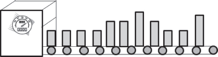
Figure 5.1 Mixed model production
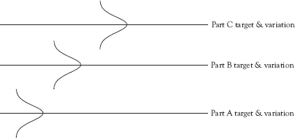
Figure 5.2 Equal variances but different targets
The delta control chart is known by a variety of names including the DNOM chart, the Nom-I-Nal chart, the deviation from nominal chart, and the code value chart. The delta chart functions in the same way as an x-bar chart and, as with the x-bar chart, is used in conjunction with an R- or s-chart. Because the target value of the KQC being plotted on the delta chart changes from small lot to small lot, the values used to calculate the sample mean to be plotted on the chart are the differences between the measured value and the target value. This is called the delta statistic.
The delta statistic is easily calculated using a spreadsheet such as Excel or within the SPC software used to create the control chart. Table 5.1 illustrates the calculation of the delta statistic where two parts per sample are taken and where two different parts (A and B) are being produced by the same process. The raw data are entered into the software that calculates the delta statistic (Observation – Target). Delta-bar, which is the mean of the delta statistics for each sample [for example (0.002 + 0.004)/2 = 0.003 Delta-bar for Sample No. 1)], is plotted on the delta chart.
Table 5.1 Calculation of the delta statistic
Sample No. |
Part ID |
Target |
Observation 1 raw |
Observation 1 delta |
Observation 2 raw |
Observation 2 delta |
Delta-Bar |
1 |
A |
1.000 |
1.002 |
0.002 |
1.004 |
0.004 |
0.003 |
2 |
A |
1.000 |
0.991 |
–0.009 |
1.009 |
0.009 |
0.000 |
3 |
B |
1.500 |
1.497 |
–0.003 |
1.501 |
0.001 |
–0.001 |
4 |
B |
1.500 |
1.501 |
0.001 |
1.503 |
0.003 |
0.002 |
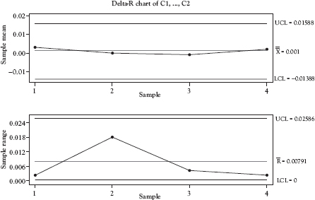
Figure 5.3 Delta and R-charts
Source: Created using Minitab 18.
The delta chart, shown in Figure 5.3 with its companion R-chart, looks like the x-bar chart, but note that if all parts are, on average, exactly centered on the target value, the central line (CL) of the delta chart will be zero with the points evenly distributed on either side of the CL when the process is operating in control.
Example 5.1
Universal Machining
Universal Machining produces machine parts for the automotive industry. Their customer requires frequent shipments of small lots to be delivered to their production facilities. To accommodate their customer, Universal has implemented mixed model production. Mill #1 is dedicated to producing a particular part family that consists of six similar parts with slightly different dimensions. One of those dimensions is the KQC that is used to measure the quality of the finished part.
Recently Universal Machining implemented SPC and began using a separate x-bar and R-chart pair for each of the six parts produced on Mill #1. The early results of the use of SPC were disappointing. There had been shifts that occurred in the process that were not detected by the control charts because the run lengths of each part were too short. In addition, production supervisors were overheard complaining about the large number of control charts that required maintaining on the production floor. One commented that he felt he was producing control charts rather than product.
The quality engineer assisting in the SPC implementation decided to use Mill #1 as the pilot process for switching from x-bar and R-charts to delta and R-charts. Her first step was to collect sufficient data from the process to confirm that the variances in the KQC for the six parts produced on Mill #1 were not significantly different. That being confirmed, her next step was to gather sufficient data to construct the control charts and train the operators in the use of delta and R-charts.
The switch was a great success. Patterns that had gone unnoticed in the past were now evident in the delta chart. One new pattern indicated a shift to shift variation in the delta statistic, which was corrected through standardization of training for all of the mill’s operators. The supervisors were encouraged at the reduction from six pairs of charts to a single pair of charts. The next step was to evaluate the suitability of using delta charts on other processes in the facility.
Exponentially Weighted Moving Average (EWMA) Chart
A variables control chart that is a good alternative to the I-chart is the exponentially weighted moving average (EWMA) chart, which is often used to detect small shifts in the process. The EWMA “is a statistic for monitoring the process that averages the data in a way that gives less and less weight to data as they are further removed in time”2 and is much less sensitive to non-normality than the I-chart. The EWMA control chart “is useful for smoothing out short-term variance in order to detect longer term trends.”3 This smoothing effect makes the EWMA chart less sensitive to individual points that are unusually large or small.
The plotted data points on all of the previously discussed control charts are considered to be independent, and the decision made about the state of control of the process using the single point signal depends solely upon the last point plotted. The EWMA chart, however, uses an exponential weighting system, which makes each plotted point a function of the current observation plus some portion of previous observations.
The amount of weight given to previous points can be adjusted by selection of the weighting factor (α). When the weighting factor is set to one, no weight is given to prior points. As the value of the weighting factor is made smaller, the amount of weight given to previous points increases. Changing the weighting factor and the number of standard deviations to set the upper control limits and lower control limits enables the construction of an EWMA chart that can detect almost any size shift in the process.
While various sources recommend specific weighting factors, in practice it is important to make this determination based upon the data and what the organization is trying to accomplish by use of this chart. Smaller weighting factors increase the sensitivity of the chart to out of control signals, but also increase the number of false signals. Figure 5.4 shows two EWMA control charts both constructed with the PMI data used in Figure 4.3. Figure 5.4a uses a weighting factor of 0.10 while Figure 5.4b uses a weighting factor of 0.40. The charts are quite different from the I-chart in Figure 4.3 and quite different from each other which highlight the importance of the appropriate selection of the weighting factor when using EWMA charts. Weighting factor selection requires considerable skill. If sufficient skill is lacking in the organization, it is best to use I- and MR charts instead of the EWMA, because the utility of the EWMA chart is highly dependent on weighting factor selection. A naïve selection of the weighting factor is likely to result in misleading conclusions being drawn from the chart.
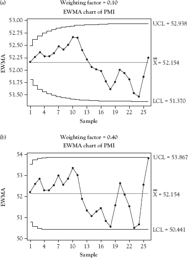
Figure 5.4 EWMA charts using the same data but different weighting factors
Source: Created using Minitab 18.
It is possible to use the EWMA control chart for sample sizes greater than one, but this application is beyond the scope of the current discussion.
Variables Control Charts with Unequal Sample Size
There are many situations where it is desirable or logical to work with data where the sample sizes are not equal. Examples include:
• Each day’s production is considered to be a sample and each unit produced is tested. Production rates per day often vary.
• Measurement of a variable customer KQC where each day is considered to be a sample and the number of customers varies from day to day.
• Mixed model production where each unit is tested and lot sizes for each model vary.
The control chart applications discussed to this point apply to samples of the same size—that is, sample size does not vary. However, X-bar charts, R-charts, s-charts, and delta charts can be adapted to operate in situations where the sample size varies. When variable sample sizes are used, the control limits are adjusted for sample size for each point plotted on the control chart as shown in Figure 5.5.
The sizes of each of the 10 samples comprising the control chart in Figure 5.5 are shown in Table 5.2. The pattern of the adjustments is clearly reflected in the variation in the sample sizes. When the sample size increases, the control limits are adjusted to be closer to the CL. When the sample size decreases, the control limits are adjusted to be farther from the CL. For example, the sample size for sample number 2 is larger than that for sample number 1. On the control chart that is reflected in the control limits for sample 2 being closer to the CL than those for sample 1.
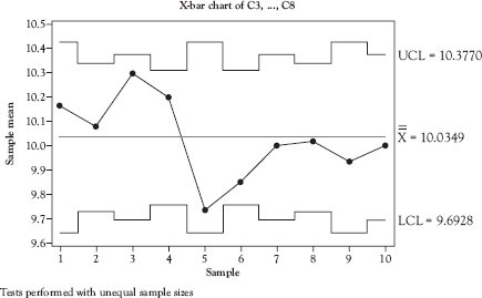
Figure 5.5 X-bar control chart with unequal sample size
Source: Created using Minitab 18.
Table 5.2 Sample sizes for control chart in Figure 5.5
Sample number |
Sample size |
1 |
3 |
2 |
5 |
3 |
4 |
4 |
6 |
5 |
3 |
6 |
6 |
7 |
4 |
8 |
5 |
9 |
3 |
10 |
4 |
Example 5.2
Variable Sample Sizes: A Service Example
A retailer of high-end merchandise is interested in tracking purchases by customers on a daily basis. The main purpose for the tracking is to provide an estimate of the effectiveness of advertising and promotions on purchase amounts per customer. The store manager plans also to track total daily sales as another measure of the effectiveness of advertising and promotions.
His first effort tracked daily sales and average sales per customer per day on run charts. He found that he was never sure whether the fluctuations he saw on the run charts were significant. His solution was to use SPC control charts instead of run charts. But which charts to use?
With the help of a professor at a local university, he examined the historical data and found that the daily sales data resembled a normal distribution, but did not fit exactly. He explained to the professor that he was more interested in long-term trends than in short-term fluctations. The professor recommended an EWMA control chart.
The professor further explained that a pair of control charts for variables should be used to plot the daily purchases by customer. Each day would be defined as a sample, and the number of customers would be the sample size. One chart would be used to track the process mean. The x-bar chart with control limits adjusted for the varying sample sizes would be appropriate for this application. Since the number of customers was always much greater than 11, the s-chart, with control limits adjusted for sample size, would be appropriate for tracking the within sample variation.
This combination of control charts enabled the manager to better assess the effectiveness of advertising and promotions.
Chapter Take-Aways
Figure 5.6 provides guidance for selecting among the control charts discussed this chapter and in Chapter 4.
Questions You Should be Asking About Your Work Environment
• Which processes in your organization have defied attempts to use conventional control charts such as x-bar, range, and s-charts?
• Which of the processes identified in the previous question might be better suited for one of the control charts discussed in this chapter?
• What would be the value of monitoring those processes more effectively using a control chart specifically developed for those types of processes?
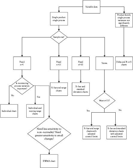
Figure 5.6 Comprehensive variables control chart selection guide