Basic Control Charts for Variables
The idea of control involves action for the purpose of achieving a desired end.
—Walter Shewhart
Data used to create SPC control charts can be divided into two basic types: attributes and variables. Attribute data are go/no-go or count information. Examples include the number of defective units, the number of complaints received from dissatisfied customers, and the number of patients whose meals were delivered more than 15 minutes late. Control charts for attribute data will be the subject of Chapter 6. Variable data are continuous measurement information. Examples include measurements of height, weight, length, concentration, and pressure (psig). Control charts for variable data are the subject of this chapter and Chapter 5.
Individual and Moving Range Control Charts
Chapter 3 used the chart for individuals (I-chart) to illustrate the theory of the control chart. The I-chart is a variable control chart. In this section, we will add the moving range (MR) chart, which is often used in conjunction with the chart for individuals. This section will also use a different type of example to illustrate the range of uses for the I-chart.
There are many situations where the logical sample size for measurement is a single value. Examples include:
• Measurements per unit of time of the output from a process. Examples used in previous chapters were the volume of sales per month, the number of tons of coal produced per week by a mine, the monthly output of silver from a refinery, and the time to run 2 miles. Other examples include overtime costs per week, and the number of gallons of gasoline sold per week.
• Economic data. Examples include gross national product by month, unemployment rates, and the Institute for Supply Management’s (ISM) Purchasing Managers Index (PMI).1
• Processes where a key quality characteristics (KQC) is measured for every item produced. Measurement of every unit may occur because of long cycle times, or because of the use of automated measurement systems. Examples include measurements of wall thickness for molding processes that take several hours to produce each unit, and fill weight for food containers from a process with automated inspection.
• Situations where measurements are dispersed over time. An example would be the percentage of moisture in shipments of solvent received from a supplier. Shipments may arrive on an irregular basis with an average of 4 to 10 days between shipments.
Control charts for individuals are sensitive to nonnormality. The data should be analyzed to determine that the distribution is approximately normal before using the I-chart.
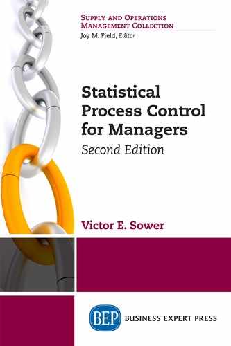
The I-chart alone is superior to a run chart because the control limits on an I-chart allow the user to determine when observed variation is significant. That is, the I-chart allows the determination of the state of control of the process while the run chart does not. A run chart is a “chart showing a line connecting numerous data points collected from a process running over time,”2 and can be useful for visually depicting changes in a process over time. The PMI is an indicator of the economic health of the U.S. manufacturing sector published monthly by ISM. Figure 4.1 shows a run chart of the PMI by month from November 2011 to April 2013. Some variability is evident, including some large swings between points 10 and 12 and between points 18 and 20, but there is no way to determine if these are significant. For this we need to use an I-chart.
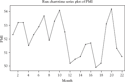
Figure 4.1 Run chart for PMI data
Source: Created using Minitab 18.
The I-chart for the same data used in Figure 4.1 is shown in Figure 4.2. This chart indicates that the PMI data are in control—that is only common cause variation is present.
However, in order to determine the variability of the process, another chart is used. This is called the moving range chart. Usually the MR is determined by calculating the difference between two successive points on the individuals chart. To be most useful, both I-chart and MR chart are used together. The MR chart plots the difference in successive individual values. Figure 4.2 shows the I-chart and the MR chart. The first point plotted on the MR chart is the difference between points 1 and 2 on the I-chart. The control charts show that the swings noted on the run chart are not significant and the overall process is in control. Notice that the distance between the central line (CL) and upper control limits (UCL) is greater than that between the CL and LCL on the MR chart. This is because the LCL cannot always be set at 3 standard deviations below the CL because that would result in a negative value for the range, which is mathematically impossible. In this case, the lower control limit (LCL) is set at zero—the lowest possible value for the range.
Since the data plotted here are economic data and do not represent a process where it is possible to control the inputs, the interpretation of the charts in Figure 4.2 is different than what has been discussed previously. Since both the I-chart and MR chart are in control, the conclusion can be drawn that there have been no significant changes to the causal system underlying the PMI for the 22-month period plotted on the charts. But look what happens when we add the PMI data for the next four months as shown in Figure 4.3.
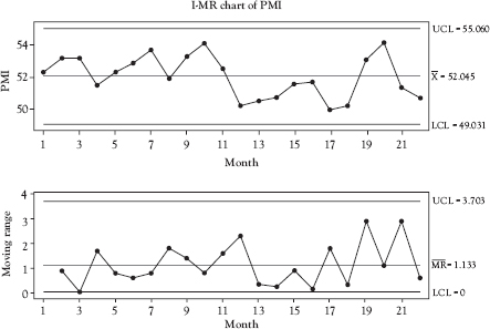
Figure 4.2 Individual and moving range (MR) charts for PMI data
Source: Created using Minitab 18.
With the added data, we have a single point out-of-control signal on the MR chart at point 25, and single point out-of-control signals on the I-chart at points 23, 25, and 26. The very large increase in PMI from point 24 to point 25 is reflected in the out-of-control point on the MR chart. This signal indicates an increase in the variation of PMI from month to month and is very likely due to some change in the underlying causal system. The I-chart is out of control—abnormally low—at point 23 then returns to normal at point 24. At point 25 the I-chart is out of control—abnormally high—and remains out of control at point 26, indicating that whatever change occurred in the causal system at point 25 likely remains that way at point 26.
It is important to note that when a pair of charts is used to monitor the state of control of a process, an out-of-control signal on either chart indicates the statistical measure being plotted is out of control. This is more true for the x-bar and R and X-bar and s-charts, which will be discussed in the next section, than it is for the I- and MR-charts. This is because the points on the MR chart are correlated and many experts argue that the MR chart actually provides little useful information about changes in process variation.
Figure 4.3 Individual and moving range charts for PMI data with additional data
Source: Created using Minitab 18.
X-Bar, Range, and Standard Deviation Control Charts
For many processes where the KQC is a variable, it is desirable to use samples consisting of two or more units instead of a single unit. Since the I-chart is designed to plot the data from a single unit, a new chart is required when using samples consisting of more than one unit. When this is the case, the control chart for means, called the x-bar chart (often shown as the x chart), is the right control chart for the job. x-bar (x) is the symbol for sample mean, which is the statistic that is plotted on an x-bar chart. The x-bar chart is always used in conjunction with a control chart that monitors the variability of the KQC just as we needed the MR chart in addition to the I-chart. The range chart (referred to as the R-chart) is the appropriate control chart for variation for sample sizes up to 10. For sample sizes greater than 10, it is necessary to use the standard deviation control chart (referred to as the s-chart) rather than the R-chart in conjunction with the x-bar chart. This is because with small sample sizes the range and standard deviation are almost the same, but as sample sizes become larger, the range diverges more and more from the standard deviation.
The points on an x-bar chart represent the means of each sample. The points on an R-chart represent the range within each sample. The points on an s-chart represent the standard deviation of each sample.
Figure 4.4 illustrates why it is important to use a control chart for variation (either an R-chart or an s-chart) in conjunction with the control chart for means (an x-bar chart). In Figure 4.4, the two dots represent the means of two samples plotted on an x-bar chart. The vertical lines coming from the data points represent the range of the data from which the means were calculated. The end of the top line from each point represents the largest individual value in the sample while the end of the bottom line represents the value of the smallest individual value in the sample. As you can see, both points are shown exactly the same on the x-bar chart—the sample means are equivalent—even though their ranges are quite different. Simply plotting a point on an x-bar chart is insufficient to capture this difference in the variation between the two samples. Indeed, based on the points alone, the process shown in Figure 4.4 appears to be in control because neither point is outside the control limits.
Figure 4.5 shows the information from the same sample as in Figure 4.4 plotted on x-bar and R-charts. The x-bar chart shows that the sample means are nearly unchanged while the R-chart clearly indicates a significant shift in the variability of the data between the two samples.
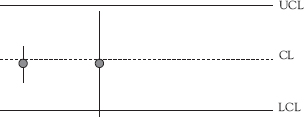
Figure 4.4 Why the x-bar control chart needs a companion range control chart for variation
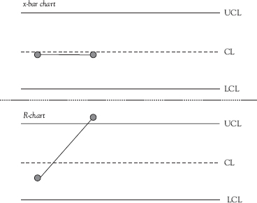
Figure 4.5 The x-bar control chart with its companion R control chart
When the sample size is greater than 10, the range is no longer a good measure of variation.3 In this case, the standard deviation, or s-chart, is used instead of the R-chart. Figure 4.6 illustrates why it is important to use an s-chart in conjunction with the x-bar chart. The two dots represent the means of two samples plotted on an x-bar chart and the normal curves show the distribution of the data within each sample. As you can see, while the points representing the sample means are the same, the variability in their distributions is quite different. The variation in sample one is less than the variation in sample two. Simply plotting a point on an x-bar chart is insufficient to capture this difference in the variation between the two samples. Based on the x-bar chart alone, the process shown in Figure 4.6 appears to be in control because neither point is outside the control limits. When the s-chart is added, the process is shown to be out of control because the point representing the standard deviation for sample 2 is above the UCL.
When using x-bar and R- or s-charts, care must be taken in determining the sampling procedure. The following questions must be addressed:
• How frequently should the process be sampled? Sampling frequency is often a balance between efficiency and effectiveness. Too frequent sampling can be expensive and a wasteful use of resources. Samples taken at large intervals can allow an out-of-control condition to persist for too long.
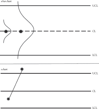
Figure 4.6 Why the x-bar control chart needs a companion standard deviation control chart for variation s-chart
• How large should the sample be? While in general, the larger the sample size the better, economics come into play. If the test is destructive, costly, or time-consuming, an economic sample size should be taken. In practice, sample sizes of 3 to 10 are commonly used.4
• How should units be selected for inclusion in the sample? Shewhart’s rational subgroup concept is usually satisfied by taking consecutively produced samples for testing. Alternatively, random samples may be taken from all of the outputs of the process since the last sample was taken. Care must be taken to ensure that the samples represent a single process. Two machines that output units to a common conveyor, for example, should be treated as separate processes with separate control charts. Sampling the combined output on the conveyor will lead to unreliable chart results. Samples should always be plotted on the control charts in time sequence order.
Example 4.1
x-bar and R-charts in Action
A manufacturer has instituted SPC for a process that produces approximately 5,000 units per 8-hour shift. The KQC being monitored is part weight and each measurement requires about 15 seconds. The sampling plan is used to select four consecutive units from the process about every two hours. The operator weighs each unit in the sample and immediately enters the data into Minitab® 18, which plots the data on x-bar and R-charts. The operator has instructions to follow if an out of control condition is found. The data collected during the past 24-hour period are shown in Table 4.1.
Table 4.1 Part weights for units in 12 samples
Sample number |
Unit 1 weight |
Unit 2 weight |
Unit 3 weight |
Unit 4 weight |
1 |
20.10 |
19.97 |
20.03 |
20.05 |
2 |
20.00 |
19.97 |
19.96 |
19.99 |
3 |
20.10 |
20.06 |
19.99 |
20.03 |
4 |
19.94 |
20.09 |
20.02 |
20.01 |
5 |
20.08 |
20.08 |
20.00 |
20.12 |
6 |
20.03 |
20.01 |
19.98 |
19.92 |
7 |
20.11 |
20.03 |
20.09 |
20.00 |
8 |
20.06 |
20.09 |
20.08 |
20.00 |
9 |
19.89 |
19.94 |
20.02 |
19.96 |
10 |
20.06 |
20.10 |
19.95 |
20.05 |
11 |
19.88 |
20.01 |
19.98 |
19.96 |
12 |
20.09 |
20.00 |
20.11 |
19.95 |
The x-bar and R-charts for these data are contained in Figure 4.7. The program creates the points to be plotted on the x-bar chart by calculating the average for each sample (20.0375 for sample 1 for example). The points plotted on the range chart are ranges for each sample (0.13 for sample 1 for example). The control charts indicate that the process is in control.
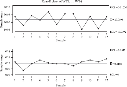
Figure 4.7 x-bar and R-charts for data in Table 4.1
Source: Created using Minitab 18.
Example 4.2
x-bar and s-charts in Action
If instead of taking samples consisting of four consecutive units as in Example 4.1, the organization decided to take samples consisting of 12 consecutive units, an s-chart should be used instead of an R-chart. The program creates the points to be plotted on the x-bar chart by calculating the average for each sample just as in Example 4.1. The points plotted on the s-chart are standard deviations for each sample. Figure 4.8 shows the x-bar and s-charts for this process. The control charts indicate that the process is out of control due to point 9 being below the LCL of the x-bar chart. The operator followed the instructions for reacting to an out-of-control signal, identified and corrected the root cause of the problem, and the next sample shows that the process has been brought back into a state of control.
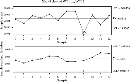
Figure 4.8 x-bar and s-charts for samples consisting of 12 units
Source: Created using Minitab 18.
When much of the science of SPC was being developed, computers and electronic calculators were not available for doing the calculations. For this reason, range charts were favored over standard deviation charts because of the extra complexity of calculating the points to be plotted on the s-chart. With the widespread availability of electronic calculators, computers, and reasonably priced SPC software, it is as easy to construct an s-chart as it is an R-chart. Since the range becomes less effective at showing the variation within a sample as sample size increases, it is best to use the s-chart than the R-chart when sample size is 11 or greater. The s-chart may also be used with sample sizes less than 11.
Chapter Take-Aways
Figure 4.9 provides guidance for selecting among the control charts discussed in this chapter.
• Variable data are continuous measurement information. Examples include measurements of height, weight, length, concentration, and pressure (psi).
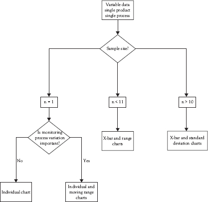
Figure 4.9 Basic variables control chart selection guide
• While I-charts are sometimes used alone, generally, variables control charts are employed in pairs. One chart monitors the changes in the process average (mean) while the other monitors changes in the process variation. The pairs of charts discussed in this chapter are the I- and MR charts, the x-bar and R-charts, and the x-bar and s-charts.
• The individuals chart alone is superior to a run chart because the control limits allow the user to determine when observed variation is significant. That is, the individuals chart allows the determination of the state of control of the process while the run chart does not.
• When using x-bar and R- or s-charts, care must be taken in determining the sampling procedure. The following questions must be addressed:
![]() How frequently should the process be sampled?
How frequently should the process be sampled?
![]() How large should the sample be?
How large should the sample be?
![]() How should units be selected for inclusion in the sample?
How should units be selected for inclusion in the sample?
• When using paired control charts, both charts must be in control to conclude that the process is in control.
Questions You Should be Asking About Your Work Environment
• Which processes have KQCs that are measured using variables data and are candidates for monitoring with variables control charts?
• For the processes identified by the previous question, what would be the value of monitoring those process using SPC?
• What is the appropriate control chart or combination of control charts to use to monitor this process?