
Bare Bones Introduction to Basic Statistical Concepts
I said at the beginning of this book that we would not get overly involved with statistics and manual calculations. There are many books available to those who wish to delve more deeply into the details of the statistics and manual calculations of SPC. These include Montgomery,1 Duncan,2 and Sower.3 For our purposes, we will utilize statistical analysis software for the calculations. However, it is important to understand some basic statistical concepts in order to make informed decisions about which tools available in the software to use for specific situations and understand the output received from the use of those tools. This section will focus on basic statistical concepts from a conceptual perspective rather than from a detailed theoretical and manual calculation perspective.
Distributions
When we collect data from a process periodically over time, the data are arranged in a time series with the earliest data listed first as shown in Table A.1. This is the data format used for creating run charts and control charts.
However, it is sometimes useful to reorganize the data based on the frequency with which specific values occur in order to better understand how the data are distributed. This is the data format used for process capability analysis and to visually assess the nature of the distribution. A good tool for showing the data in this latter format is the histogram as shown in Figure A.1.
What can we learn from organizing the data in this way and depicting it using a histogram? For one thing, we can see that the average or mean of this distribution of values appears to be somewhere near 10. The most frequently observed value (the value with the highest bar), called the mode, is 10. The maximum value is 15 and the minimum value is 4. Subtracting the minimum from the maximum value (15 – 4 = 11) gives one measure of the spread of the distribution called the range. The range is 11. The larger the range, the greater the spread of the distribution. We also can see that shape of the distribution appears to be approximately normal or bell-shaped. ASQ defines a normal distribution as one where “most of the data points are concentrated around the average (mean), thus forming a bell shaped curve.”4 In fact, we can have Minitab® fit a normal curve to the data set as shown in Figure A.2.
Table A.1 Data C1 arranged in time series
Time period |
Observation C1 |
Time period |
Observation C1 |
Time period |
Observation C1 |
1 |
7 |
16 |
12 |
31 |
9 |
2 |
8 |
17 |
11 |
32 |
10 |
3 |
12 |
18 |
9 |
33 |
13 |
4 |
10 |
19 |
11 |
34 |
10 |
5 |
14 |
20 |
6 |
35 |
8 |
6 |
11 |
21 |
10 |
36 |
7 |
7 |
9 |
22 |
8 |
37 |
10 |
8 |
9 |
23 |
12 |
38 |
12 |
9 |
7 |
24 |
9 |
39 |
9 |
10 |
11 |
25 |
4 |
40 |
11 |
11 |
8 |
26 |
10 |
41 |
6 |
12 |
13 |
27 |
9 |
42 |
10 |
13 |
10 |
28 |
11 |
43 |
8 |
14 |
11 |
29 |
10 |
44 |
9 |
15 |
10 |
30 |
15 |
45 |
11 |

Figure A.1 Frequency histogram for data C1
Source: Created using Minitab 18.
As you see, when we fit a normal curve to the histogram, Minitab® reports other information as well. The mean of the data is 9.778, which is close to the estimate we determined by examination of around 10. Instead of the range, Minitab® reports standard deviation (StDev) which, like the range, is a measure of the spread of the data. As with the range, the larger the value of the standard deviation, the greater the spread of the data. The standard deviation of the data is 2.152. Minitab® also reports that there are 45 individual data points in this data set. We can also see that the fit of the normal curve to the data is not perfect. The fit can be assessed quantitatively using Minitab®, which, however, is beyond the scope of this section. Suffice it to say that by eye, the fit appears to be pretty good but not perfect.
It is important to recognize that the normal curve is not a good fit for all data distributions. To assume that all data are normally distributed is a fundamental error in statistics. Indeed, there are many data sets that cannot be accurately modeled using any standard distribution. However, the concepts we discuss here using the normal distribution are applicable to all standard distributions.

Figure A.2 Frequency histogram for data set C1 with normal curve fitted
Source: Created using Minitab 18.
The normal distribution is a probability distribution, which means we can use the information it provides to determine the proportion of the total data set which can be expected to be found in different regions of the area under the curve as defined by the standard deviation. This is a very useful feature for SPC. Figure A.3 shows a normal probability distribution for a population with the area under the curve divided into regions based on the number of standard deviations above and below the mean. In this figure, we use the Greek letter mu (μ) to represent the population mean or average and the Greek letter sigma (σ) to represent the population standard deviation. (I know I promised to limit my use of Greek letters, but trust me, these are important.) The mean and the standard deviation of a sample taken from a population are represented by ![]() and s, respectively.
and s, respectively.
Statistical theory tells us that we can use the area under the normal probability distribution to estimate the percentage of observations that will fall within a certain number of standard deviations on either side of the mean. This is called the empirical rule. This is illustrated using the values for the mean and standard deviation taken from Figure A.2. For example, we can say that about 99.73 percent of all of the values in the normal distribution fall in the area between µ – 3σ and µ + 3σ. Theoretically, the normal distribution stretches from negative infinity (–∞) to positive infinity (+∞). Therefore about 0.27 percent (1 – 99.73%) of the values in the distribution will fall outside the µ ± 3σ range—that is, in the tails of the distribution from +3σ to +∞ and from –3σ to –∞. Since the normal probability distribution is symmetrical, half of that 0.27 percent falls in each tail. Additional statistical theory also tells us that this general concept applies in the same conceptual way to other standard probability distributions.5
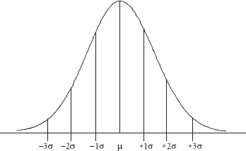
Figure A.3 The normal distribution with standard deviations shown
Table A.2 The empirical rule applied to the distribution in Figure A.2
Standard deviations |
Range of values |
% of population |
µ ± 1σ |
7.626 – 11.930 |
~ 68.26% |
µ ± 2σ |
5.474 – 14.082 |
~ 95.46% |
µ ± 3σ |
3.322 – 16.234 |
~ 99.73% |
Example A.1
Using the Empirical Rule
Using the normal distribution in Figure A.2 and the empirical rule in Table A.2, we see that 68.26 percent of the values can be expected to fall between ±1σ of the mean. One standard deviation below the mean is 9.778 – 2.152 = 7.626. One standard deviation above the mean is 9.778 + 2.152 = 11.930. Therefore, we can say that 68.26 percent of the values in this distribution can be expected to fall between 7.626 and 11.930.
Samples and Individuals
SPC uses statistics derived from both samples and individuals. It is important to understand when to use each. This is especially true when dealing with x-bar charts and process capability analysis as discussed in Chapter 7. Figure A.4 illustrates the relationship between the distribution of sample means and the distribution of the individual observations that comprise the samples. While the means will be the same, the spread, measured by the range or standard deviation, of the distribution of individuals will always be greater than the standard deviation of the distribution of sample means.

Figure A.4 Sample statistics versus process statistics
The process standard deviation (σx) is calculated for comparison to the tolerance or specification limits when calculating process capability. The process standard deviation (σx)(the standard deviation of the individual observations) will always be larger than the standard deviation of the sample means ![]() . The standard deviation of the sample means
. The standard deviation of the sample means ![]() is used when calculating control limits for the x-bar chart. It is very important to use the appropriate standard deviation for the intended purpose.
is used when calculating control limits for the x-bar chart. It is very important to use the appropriate standard deviation for the intended purpose.
Figure A.5 illustrates this point by providing a numerical example to illustrate the relationship between the distribution of sample means and the distribution of the individual observations.
There is a mathematical relationship between the standard deviation of the sample means and the standard deviation of the individual observations. To obtain an estimate of the standard deviation of the sample means ![]() , divide the standard deviation of the individual observations (σx) by the square root of the sample size
, divide the standard deviation of the individual observations (σx) by the square root of the sample size ![]() as shown below.
as shown below.
![]()

Figure A.5 Mean and standard deviation comparison—individuals versus sample means
Since the square root of the sample size for all sample sizes is greater than 1, mathematically, the standard deviation of the distribution of the sample means will always be smaller than the standard deviation of the distribution of the individual observations.
Control Chart Calculations
Chapters 4 through 6 discuss the selection and use of a variety of control charts for both variable and attribute data. The formulas for calculating the control limits for the control charts discussed in these chapters are in Table A.3 where:
UCL = |
upper control limit |
LCL = |
lower control limit |
CL = |
central line |
σx = |
standard deviation of the individual observations |
|
standard deviation of the sample means |
n = |
the number of observations in each sample or subgroup |
k = |
the number of samples or subgroups |
|
the sample mean |
|
the mean of the sample means; the grand mean |
∆ = |
Delta statistic (measured value – nominal value) |
EWMA = |
αyt + (1 – α) EWMAt − 1 |
α = |
EWMA weighting factor |
yt = |
the individual observation at time t |
|
the mean of the individual yi |
the previous period’s EWMA |
|
p = |
proportion of defective or nonconforming units in a sample |
|
the mean of the sample proportion defective or noncon-forming units; the grand average proportion defective or nonconforming |
np = |
the number of defective or nonconforming units in a sample |
|
the mean number of defective or nonconforming units per sample; the grand average number defective or nonconforming |
c = |
the number of defects or nonconformities in a sample |
|
the mean number of defects or nonconformities per sample; the grand average number of defects or nonconformities per sample |
u = |
the number of defects or nonconformities per unit in a sample |
|
the mean number of defects or nonconformities per unit; the grand average number of defects or nonconformities per unit |
Process Capability Calculations
Chapter 7 discusses the selection and use of different index measures of process capability. The formulas for calculating these indexes are in Table A.4 where:
USL = |
upper specification limit |
LSL = |
lower specification limit |
T = |
specification target value |
µ = |
process mean |
σx = |
standard deviation of the individual observations |
n = |
number of observations |
Table A.3 Control limit calculations

* Set LCL to zero if negative.
Note: In this table, the formulas for UCL and LCL are for control limits set at 3σ above and below the central line. If it is desired to set control limits at other than 3σ, simply replace the 3 with the number of standard deviations (σ) desired.
Table A.4 Process capability indexes

Appendix Take-Aways
In this appendix, we reviewed some statistical concepts that are keys to SPC. We did not delve deeply into statistical calculations and statistical theory—in fact to say that we have merely scratched the surface is a significant understatement. See the references listed at the beginning of this section for more detail.
Statistical Terms6
• Binomial distribution—A frequency distribution that “describes the behavior of a count variable x if the following conditions apply: (1) The number of observations n is fixed; (2) Each observation is independent; (3) Each observation represents one of two outcomes (‘success’ or ‘failure’); (4) The probability of ‘success’ (p) is the same for each outcome.”7
• Histogram—“A graphic summary of variation in a set of data. The pictorial nature of a histogram lets people see patterns that are difficult to detect in a simple table of numbers.”
• Mean—“A measure of central tendency; the arithmetic average of all measurements in a data set.”
![]() Population mean—symbol µ (also applied to process mean)
Population mean—symbol µ (also applied to process mean)
![]() Sample mean—symbol
Sample mean—symbol ![]()
![]() Grand mean (mean of all the sample means)—symbol
Grand mean (mean of all the sample means)—symbol ![]()
• Normal distribution—“The charting of a data set in which most of the data points are concentrated around the average (mean), thus forming a bell-shaped curve.”
• Poisson distribution—“A discrete probability distribution that expresses the probability of a number of events occurring in a fixed time period if these events occur with a known average rate, and are independent of the time since the last event.”
• Range—“The measure of dispersion in a data set (the difference between the highest and lowest values).” Symbol R.
• Standard deviation—“A computed measure of variability indicating the spread of the data set around the mean.”
![]() Population standard deviation—symbol σ
Population standard deviation—symbol σ
![]() Sample standard deviation—symbol s
Sample standard deviation—symbol s
![]() Standard deviation of the sample means—symbol
Standard deviation of the sample means—symbol ![]()