Chapter 3
Getting Started with the Basics of SwiftUI
IN THIS CHAPTER
 Understanding how SwiftUI views work
Showing an image
Showing a button
Stacking views using VStack and HStack
Tying up loose ends
SwiftUI is Apple's latest development framework for creating an application’s user interface (UI). It helps you to declaratively create the UI for your iOS applications.
In this chapter, I explain how SwiftUI views work. Then I explain the basic structure of a SwiftUI view through the use of the Text view and the Button view. I show you how to lay out your views using two of the common stacking views, VStack and HStack. Finally, I help you put the finishing touches on the example in this chapter.
Taking a Look at SwiftUI Views
To understand the basics of SwiftUI views, you can use the project you created in Chapter 1. If you haven't created that project yet, using Xcode, create a new Single View App project and name it Hello World.
The ContentView.swift file contains the following statements:
import SwiftUI
struct ContentView: View {
var body: some View {
Text("Hello World")
}
}
struct ContentView_Previews: PreviewProvider {
static var previews: some View {
ContentView()
}
}
Now you’re ready to dive into the statements in more detail.
Conforming to the View protocol
The ContentView struct defines the UI of your screen, and it conforms to the View protocol. Because it conforms to the View protocol, it must declare a property called body of type View. This body property needs to return a single instance of View, which in this case is the Text view. The Text view is a graphical view that displays one or more lines of read-only text.
 Note that the
 body property implicitly returns the Text view without needing to use the return keyword. This is one of the new features in Swift 5.1, where single-line function (such as body, in this case) can omit the return keyword.
Let's now make some changes to the Text view:
struct ContentView: View {
var body: some View {
Text("Hello, SwiftUI!")
}
}
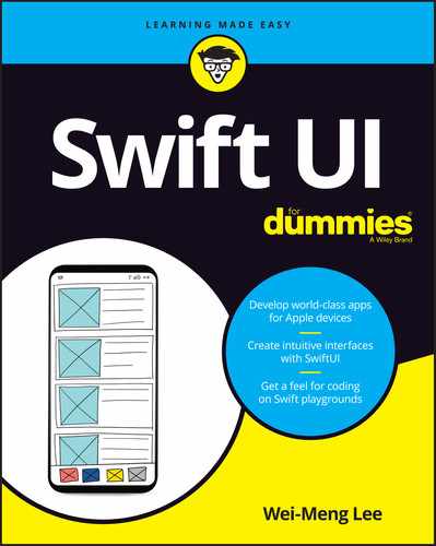
Figure 3-1 shows the preview automatically updated to reflect the changes in the Text view.

FIGURE 3-1: The Live Preview dynamically shows the changes made to your ContentView.
The next struct, ContentView_Previews, conforms to the PreviewProvider protocol. This protocol produces view previews in Xcode so that you can preview your UI created in SwiftUI without needing to run the application on the iPhone Simulator or real devices. Essentially, it controls what you see on the preview canvas. As an example, if you want to preview how your UI will look on an iPhone 8 device, you can modify the ContentView_Previews struct as follows:
struct ContentView_Previews: PreviewProvider {
static var previews: some View {
ContentView().previewDevice("iPhone 8")
}
}
The preview canvas on the right of Xcode will now display your UI on an iPhone 8. I talk more about the ContentView_Previews struct in Chapters 5 and 13.
Using modifiers
Now that you've changed the content of the Text view, let’s make some cosmetic changes to it:
struct ContentView: View {
var body: some View {
Text("Hello, SwiftUI!").font(.largeTitle)
}
}
In the preceding statement, you called a function named font(_:). This function is called a modifier. A modifier is a function that you apply to a view or the output of another modifier. largeTitle is a property belonging to the Font class; it can be shortened as .largeTitle.
In this example, you chained the Text view to call the font(_:) function. The preceding can also be rewritten as follows:
var body: some View {
let t = Text("Hello, SwiftUI!")
return (t.font(.largeTitle))
}
Notice that this isn't as elegant as the previous statement, where you used chaining to call a modifier after the Text view.
As a convention, you usually put the modifier on a separate line:
struct ContentView: View {
var body: some View {
Text("Hello, SwiftUI!")
.font(.largeTitle)
}
}
Stacking modifiers
Every modifier returns a new View instance, so you can chain them. The following example shows how various modifiers can be chained together:
Text("Hello, SwiftUI!")
.font(.largeTitle)
.bold()
.foregroundColor(.red)
Besides the modifiers that come with each view, you can also create your own custom modifiers. Chapter 13 discusses this subject in more detail.
Figure 3-2 shows how the Text view looks now.
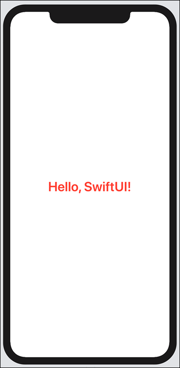
FIGURE 3-2: The Text view after applying the chains of modifiers.
Using the Inspector
You can visually inspect each of the views in the preview canvas by ⌘ -clicking any of the views. A pop-up appears, as shown in Figure 3-3.
Selecting Show SwiftUI Inspector reveals — drumroll, please — the SwiftUI Inspector (see Figure 3-4).
For example, under the Weight property (in the Font section), you can choose Thin (see Figure 3-5).
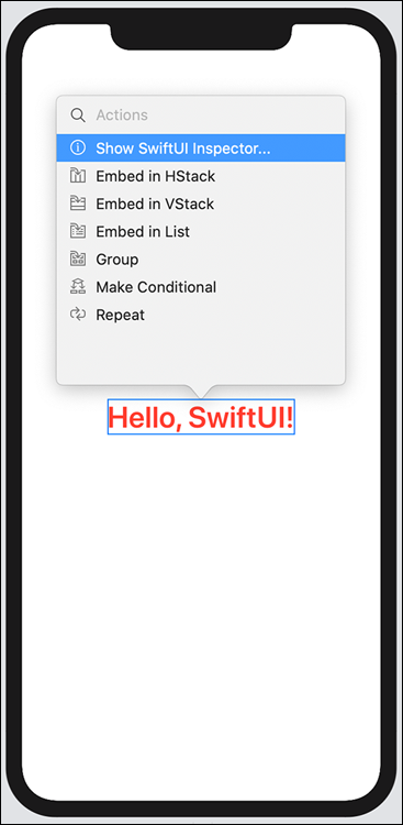
FIGURE 3-3: Showing the SwiftUI Inspector.

FIGURE 3-4: The SwiftUI Inspector allows you to customize the various properties of the view.

FIGURE 3-5: Changing the font weight of the Text view in the SwiftUI Inspector.
Xcode automatically modifies your code:
Text("Hello, SwiftUI!")
.font(.largeTitle)
.fontWeight(.thin)
.bold()
.foregroundColor(.red)
Besides modifying the properties of the view, you can also add modifiers to views visually (see Figure 3-6; be sure to scroll to the bottom of the Inspector).
For example, you can select the modifier named Border, which adds the statements (with the placeholders for the various parameters) shown in Figure 3-7.
You can now double-click the placeholders on the statement and replace them with the values you want. In this example, the border() modifier displays a border around the text (see Figure 3-8).

FIGURE 3-6: You can also add modifiers to a view through the SwiftUI Inspector.

FIGURE 3-7: Calling the border() modifier on the Text view.
FIGURE 3-8: Displaying a border on the Text view.
Displaying an Image
To display an image in your ContentView, you need to use the Image view. But before you can do that, you need to have an image in your application. The easiest way to add an image to your application is to drag-and-drop one onto the Assets.xcassets file (see Figure 3-9). In the example, the image was named weimenglee.
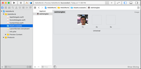
FIGURE 3-9: Adding an image to the Assets.xcassets file in your Xcode project.
To display the image, use the Image view and specify the name of the image located in your Assets.xcassets file:
var body: some View {
Image("weimenglee")
}
Figure 3-10 shows the image displayed.

FIGURE 3-10: The Image view displaying the image that you've just added to your project.
Using modifiers on the Image view
You can use modifiers on the Image view to customize its look and feel. Consider the following statements:
var body: some View {
Image("weimenglee")
.frame(width: CGFloat(300.0), height:CGFloat(300))
.clipShape(Circle())
.overlay(Circle().stroke(
Color.black, lineWidth: 5))
}
 Remember to click the Resume button to update the Live Preview.
The output is shown in Figure 3-11. Here’s what the preceding statements have achieved:
- Setting a fixed frame of dimension 300 x 300 points
- Setting a clipping shape for the image, which in this case is a circle
- Layering a secondary view in front of the image, which draws an outline for the circle with line width of 5 points
If the image is smaller than the dimension of the frame, it's aligned by default to the center of the frame. The following makes this clear:
Image("weimenglee")
.frame(width: CGFloat(300), height: CGFloat(300),
alignment: .center)
.clipShape(Circle())
.overlay(Circle().stroke(Color.black, lineWidth: 5))
You can set the alignment to something else, like to the bottom right:
.frame(width: CGFloat(300), height: CGFloat(300),
alignment: .bottomTrailing)
The image will now appear aligned to the bottom-right corner of the frame, as shown in Figure 3-12.
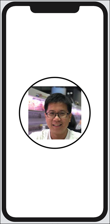
FIGURE 3-11: The Image view displayed with a circle.

FIGURE 3-12: Aligning the image to the bottom-right corner of the frame.
Resizing images
What about stretching the image to fill the frame? In SwiftUI, an image is always fixed in size unless you call the resizable() modifier on it, as the following example illustrates:
Image("weimenglee")
.resizable()
.frame(width: CGFloat(300), height: CGFloat(300))
.clipShape(Circle())
.overlay(Circle().stroke(Color.black, lineWidth: 5))
With the resizable() modifier, the image will now resize itself to fit the dimension specified by the frame() modifier (see Figure 3-13).
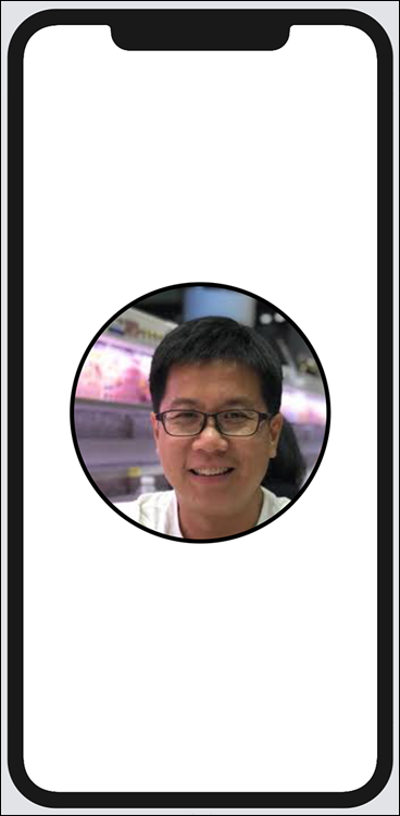
FIGURE 3-13: The image inside the Image view resizing itself to fit the frame.
Displaying a Button
In iOS, buttons look similar to the Text view, except that users can tap them to perform some actions. In SwiftUI, creating a button usually starts with a Text view. You then wrap it with a Button view, like this:
Button(action: {
// the action to perform here
}) {
Text("This is a button")
}
Notice that the Button view has a parameter named action, which uses a closure for its action. You can see how to add some actions to the Button view shortly.
Customizing the button
Like the Text view, the Button view is customizable. Let's chain some modifiers to the Text view located within the Button view to make the button look more presentable:
Button(action: {
}) {
Text("This is a button")
.fontWeight(.bold)
.font(.title)
.padding()
.background(Color.blue)
.foregroundColor(.white)
.cornerRadius(CGFloat(10), antialiased: true)
.padding(10)
.overlay(
RoundedRectangle(cornerRadius: 20)
.stroke(Color.blue, lineWidth: 1)
)
}
Figure 3-14 shows the final look of your customized button.
Remember to click the Resume button.
The preceding statements added the following to the Text view:
- Making the text in the button bold
- Changing the font using title text style
- Adding a padding around the text
- Setting the background color of the text to blue
- Setting the text color to white
- Rounding the corner of the rectangle enclosing the text
- Adding another padding around the rectangle surrounding the text
- Overlaying a secondary view with a
RoundedRectangleview with a blue colored stroke of width 1 point

FIGURE 3-14: The customized version of the button.
Adding actions
Apparently, the real use of a Button view is to perform an action. So, let's now add some action to the button that we’ve been building:
Button(action: {
if let url = URL(string: "https://www.apple.com") {
UIApplication.shared.open(url)
}
}) {
Text("This is a button")
.fontWeight(.bold)
.font(.title)
.padding()
.background(Color.blue)
.foregroundColor(.white)
.cornerRadius(CGFloat(10), antialiased: true)
.padding(10)
.overlay(
RoundedRectangle(cornerRadius: 20)
.stroke(Color.blue, lineWidth: 1)
)
}
In the preceding, when the action is tapped, you used the open() method from the UIApplication.shared instance to launch a web browser to display Apple's website.
Stacking the Views
In real-life applications, you rarely have a UI with just one view. You’re most likely going to have a combination of multiple different types of views, so you need a way to group them together. Plus, the body property of the ContentView must return a single View object, and this is where stacks come to the rescue.
In SwiftUI, there are three main types of stacks available to group your UI:
HStack: A horizontal stackVStack: A vertical stackZStack: A depth-based stack
In this section, you see how the first two types of stacks work. I explain more about the ZStack in Chapter 7, where I cover layouts in more detail.
Suppose you want to build a screen to display a business card. Typically, a business card contains a number of lines of text, with an optional image. In SwiftUI, you can do all this with the following views:
Text("Wei-Meng Lee")
Text("Founder")
Text("http://calendar.learn2develop.net")
Text("[email protected]")
Text("@weimenglee")
Image("weimenglee")
Logically, you might add them to the body property like this:
import SwiftUI
struct ContentView: View {
var body: some View {
Text("Wei-Meng Lee")
Text("Founder")
Text("http://calendar.learn2develop.net")
Text("[email protected]")
Text("@weimenglee")
Image("weimenglee")
}
}
But remember that the body property needs to return a single view. The preceding code will violate this rule and, hence, result in a syntax error.
VStack
One possible way to group this group of views is to use the VStack view. The VStack view arranges its children views in a vertical line:
import SwiftUI
struct ContentView: View {
var body: some View {
VStack {
Text("Wei-Meng Lee")
Text("Founder")
Text("http://calendar.learn2develop.net")
Text("[email protected]")
Text("@weimenglee")
Image("weimenglee")
}
}
}
Figure 3-15 shows the views lined up vertically.
The rectangle shown wrapping around the views is not part of the final UI. It is generated in the preview canvas and is shown when you click the VStack view in Xcode. This is a useful feature because it allows you to see the placement of the view with respect to the entire screen.
By default, all the views wrapped within the VStack view are aligned in the center. You can change this default alignment using the alignment parameter. For example, if you want to align the views to the left, you can use the leading property:
VStack (alignment: .leading) {
Text("Wei-Meng Lee")
Text("Founder")
Text("http://calendar.learn2develop.net")
Text("[email protected]")
Text("@weimenglee")
Image("weimenglee")
}

FIGURE 3-15: Using the VStack view to contain a series of views.
Figure 3-16 shows that the views are all now aligned to the left. You can also use the following values for the alignment parameter:
center(default)trailing
HStack
Besides the VStack view, you can also use the HStack view, which aligns views horizontally. What's more, you can nest the VStack and HStack views together to create more complex arrangements.

FIGURE 3-16: Aligning the views contained within the VStack view to the left.
Figure 3-17 shows one particular arrangement you can use to create your business card with the HStack and VStack views. It shows that the VStack view is nested within an HStack view. The VStack view itself contains the series of Text views, while the HStack view contains the Image view and the VStack view.
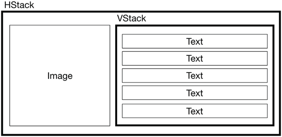
FIGURE 3-17: Nesting the various views.
The following statements implement the layout that you've just seen:
struct ContentView: View {
var body: some View {
HStack {
Image("weimenglee")
.resizable()
.frame(width: CGFloat(120),
height: CGFloat(120))
.cornerRadius(CGFloat(15),
antialiased: true)
VStack {
Text("Wei-Meng Lee")
.font(.largeTitle)
.bold()
Text("Founder")
Text("Developer Learning Solutions")
.italic()
Text("http://calendar.learn2develop.net")
Text("@weimenglee")
}
}
}
}
Figure 3-18 shows how the layout looks now.

FIGURE 3-18: The HStack view nesting the various other views.
The rectangle surrounding the various views is only a guide shown during the preview. Like the VStack view, the HStack view supports the alignment parameter and can assume the following values:
bottomcenterfirstTextBaselinelastTextBaselinetop
The alignment parameter specifies how views within the HStack view should be aligned. What if you want the entire HStack to be aligned to, say, the top of the screen? To do so, you can't rely on the alignment parameter in the HStack view; instead, you need to call the frame() modifier on the HStack view and set its alignment as follows:
struct ContentView: View {
var body: some View {
HStack {
Image("weimenglee")
.resizable()
.frame(width: CGFloat(120),
height: CGFloat(120))
.cornerRadius(CGFloat(15),
antialiased: true)
VStack {
Text("Wei-Meng Lee")
.font(.largeTitle)
.bold()
Text("Founder")
Text("Developer Learning Solutions")
.italic()
Text("http://calendar.learn2develop.net")
Text("@weimenglee")
}
}.frame(maxWidth: .infinity,
maxHeight: .infinity,
alignment: .top)
}
}
The HStack is now aligned to the top of the screen (see Figure 3-19).

FIGURE 3-19: Aligning the entire HStack to the top of the screen.
The alignment parameter of the frame() modifier can assume one of the following values:
bottombottomLeadingbottomTrailingcenterleadingtoptopLeadingtopTrailing
Embedding a view with HStack or VStack can also be done visually. In the preview canvas, ⌘ -click the specific view and choose either Embed in HStack or Embed in VStack (see Figure 3-20).
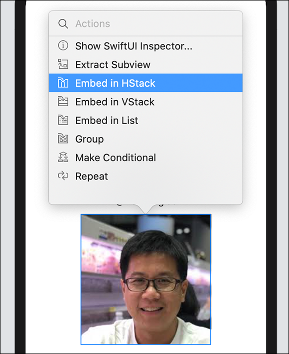
FIGURE 3-20: You can also visually embed views in the HStack or VStack views.
Putting on the Finishing Touches
To complete this example, you'll make the URL and the Twitter handle of the business card tappable. In other words, tapping the URL or the Twitter handle will launch the web browser on the iOS device and load the appropriate web page. To do so, you just need to wrap the URL and Twitter handle using the Button view:
struct ContentView: View {
var body: some View {
HStack {
Image("weimenglee").resizable()
.frame(width: CGFloat(120),
height: CGFloat(120))
.cornerRadius(CGFloat(15),
antialiased: true)
VStack {
Text("Wei-Meng Lee")
.font(.largeTitle)
.bold()
Text("Founder")
Text("Developer Learning Solutions")
.italic()
Button(action: {
if let url = URL(string:
"http://calendar.learn2develop.net") {
UIApplication.shared.open(url)
}
}) {
Text("http://calendar.learn2develop.net")
}
Button(action: {
if let url = URL(string:
"https://twitter.com/weimenglee") {
UIApplication.shared.open(url)
}
}) {
Text("@weimenglee")
}
}
}.frame(maxWidth: .infinity,
maxHeight: .infinity,
alignment: .center)
}
}
To test the buttons, run the application on the iPhone Simulator. Press ⌘ +R in Xcode to run the application. Figure 3-21 shows how the application looks (left), the Safari web browser displaying the URL (center), and the Twitter page (right).
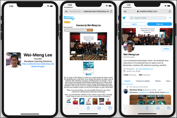
FIGURE 3-21: The final name card with tappable buttons.