Chapter 5. Fit to Print: Step-by-Step Printing and Color Management
In the last version of this book, this chapter was simply called color management, when in reality it was pretty much a chapter on printing, because if you’re not printing, who really cares if you’re color managed, right? What you see onscreen is what you get—you don’t have to match it to anything. But once you start printing, all heck breaks loose. (Note: I didn’t want to use the word “heck” there, but my editor is “with child” and I didn’t want to startle her.) The two are very closely tied together, and maybe that’s why much of Photoshop’s color management takes place in the Print dialog itself. So why did I change the name of this chapter? It’s because I would get letters from people asking, “Why didn’t you include a chapter about printing?” I would write them back and say, “I did—it’s the color management chapter,” and they’d write back and say, “I didn’t read that chapter because I didn’t want to learn about color management, I wanted to learn about printing.” Then I would write back, “But don’t you want the prints that come out of your printer to match what you see onscreen?” And they would write back, “I don’t use a screen because I’m Amish” and then I would write back, “Then how did you send this email?” And I would never hear from them again. Anyway, because Adobe made a number of enhancements and advances to printing in CS3, I thought I’d give this chapter a more descriptive subtitle (as seen above). The chapter name, “Fit to Print,” is from John Mann’s album Hands in the Pavement. It’s actually a pretty good song—ya know, for a song about printing and color management.
Configuring Your Camera to Match Photoshop’s Color Space
Although there are entire books written on the subject of color management in Photoshop, in this chapter we’re going to focus on just one thing—getting what comes out of your color inkjet printer to match what you see onscreen. That’s what it’s all about, and if you follow the steps in this chapter, you’ll get prints that match your screen. Now, I’m not going into the theory of color management, or CMYK soft proofing, or printing to multiple network printers, etc. It’s just you, your computer, and your color inkjet printer. That, my friends, we can do.
Step One
If you want to get consistent color from your camera to Photoshop to your printer, you’ll want everybody speaking the same language, right? That’s why if you shoot in either JPEG, TIFF, or JPEG + RAW, I’m recommending that you change your camera’s color space from its default sRGB (which is a color space designed for images only shown on the Web) to Adobe RGB (1998), which is probably the most popular color space used by photographers whose final image will come from a color inkjet printer. Now, if you only shoot in RAW, you can skip this because you’ll assign the color space later in Photoshop’s Camera Raw dialog, but otherwise, do it now. As an example, here’s how to set up a Nikon D200 to tag your photos with the Adobe RGB (1998) color profile. First, click the Menu button on the back of your camera.
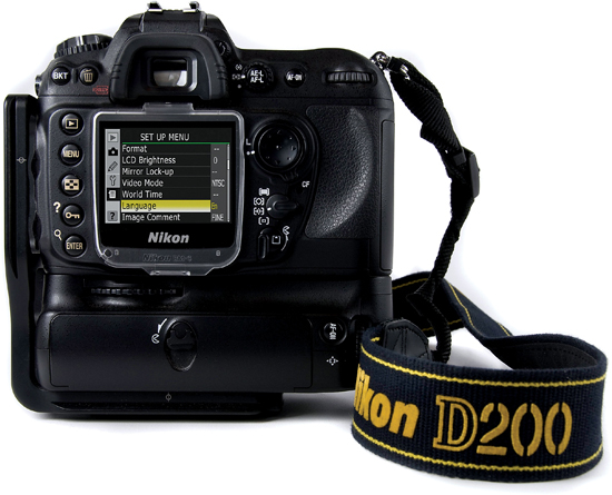
Nikon D200
SCOTT KELBY
Step Two
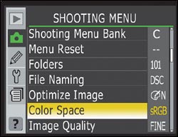
When the menu appears, use the round multi selector on the back to go to the Shooting menu, and then in that menu, choose Color Space (as shown here) by pressing the Right Arrow on the multi selector.
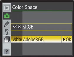
Step Three
This brings up the Color Space menu (shown here). Use the Down Arrow on the multi selector to choose Adobe RGB (as shown here), and then press the Right Arrow on the multi selector to lock in your change.
Step Four
Now when you look in the Shooting menu, you should see the word “Adobe” to the right of Color Space, which lets you know that Adobe RGB (1998) is your camera’s color space. So now you’ve taken your first step towards color consistency.

Setting up other cameras
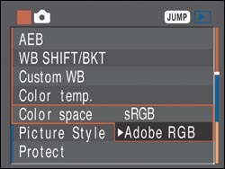
I just showed the simple color space setup for a Nikon D200, however if you’ve got a Canon digital camera (like the popular Canon 30D), it’s pretty simple to configure, too: Just like with the Nikons, you go under the Shooting menu, and use the Quick Control dial to scroll down to Color Space. Press the center Set button to edit the color space, then choose Adobe RGB (as shown here) and press Set again to lock in your choice.
Note Most dSLRs from Nikon and Canon work fairly similarly (although the menus may be slightly different), but if you’re not shooting Nikon or Canon, it’s time to dig up your owner’s manual (or download it from the manufacturer’s website) to find out how to make the switch to Adobe RGB (1998).
Configuring Photoshop for Adobe RGB (1998)
Once your camera’s set to the right color space, it’s time to set up Photoshop that way. In Photoshop 5.5, when Adobe (and the world) was totally absorbed with Web design, they switched Photoshop’s default color space to sRGB (which some pros refer to as “stupid RGB”), which is fine for photos on the Web, but your printer can print a wider range of color (particularly in the blues and greens). So, if you work in sRGB, you’re essentially leaving those rich vivid colors on the table. That’s why we change our color space to Adobe RGB (1998), which is better for prints.
Step One
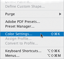
Before we do this, I just want to reiterate that you only want to make this change if your final print will be output to your own color inkjet. If you’re sending your images out to an outside lab for prints, you should probably stay in sRGB—both in the camera and in Photoshop—as most labs are set up to handle sRGB files. Your best bet: ask your lab which color space they prefer. Okay, now on to Photoshop: go under the Edit menu and choose Color Settings (as shown here).
Step Two
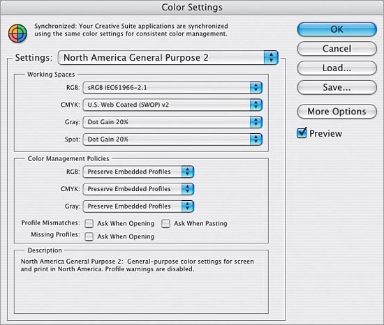
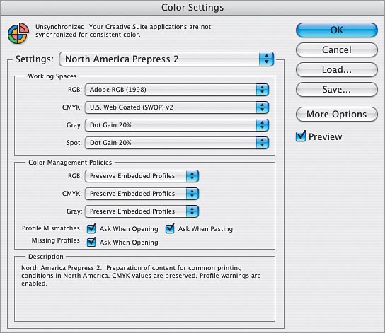
This brings up the Color Settings dialog. By default, it uses a group of settings called “North America General Purpose 2.” Now, does anything about the phrase “General Purpose” sound like it would be a good space for pro photographers? Didn’t think so. The tip-off is that under Working Spaces, the RGB space is set to sRGB IEC61966–2.1 (which is the longhand technical name for what we simply call sRGB, also sometimes referred to as “stupid RGB”). In short, you don’t want to use this group of settings. They’re for goobers—not for you (unless of course, you are a goober, which I doubt because you bought this book, and they don’t sell this book to goobers. It’s in each bookstore’s contract).
Step Three
To get a preset group of settings that’s better for photographers, from the Settings pop-up menu, choose North America Prepress 2. Don’t let it throw you that we’re using prepress settings here—they work great for color inkjet printing because it uses the Adobe RGB (1998) color space. It also sets up the appropriate warning dialogs to help you keep your color management plan in action when opening photos from outside sources or other cameras (more on this on the next page).
If you’re using Adobe Photoshop Lightroom for your printing, instead of printing from here in Photoshop CS3, you might want to change your RGB working space to ProPhoto RGB, which is the native color space for Lightroom. That way, when you export a file from Lightroom over to Photoshop, make edits in Photoshop, and then save back to Lightroom, everything stays in the same consistent color space.
Step Four
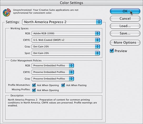
Before you click OK, just for fun, temporarily change the Settings pop-up menu to North America Web/Internet. You’ll see that the RGB working space changes back to sRGB. That’s because sRGB is best suited for Web design. Makes you stop and think, doesn’t it? Now, switch back to North America Prepress 2, click OK, and Photoshop is configured with Adobe RGB (1998) as your RGB working space. However, you probably still want to know about the warnings you turned on, right?
Step Five
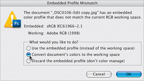
About those warnings that help you keep your color management on track: Let’s say you open a JPEG photo, and your camera was set to shoot in Adobe RGB (1998), and your Photoshop is set the same way. The two color spaces match, so no warnings appear. But, if you open a JPEG photo you took six months ago, it will probably still be in sRGB, which doesn’t match your Photoshop working space. That’s a mismatch, so you’d get the warning dialog shown here, telling you this. Luckily it gives you the choice of how to handle it. I recommend converting that document’s colors to your current working space (as shown here).
Step Six
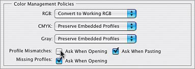
You can have Photoshop do this conversion automatically anytime it finds a mismatch. Just reopen the Color Settings dialog, and under Color Management Policies, in the RGB pop-up menu, change your default setting to Convert to Working RGB (as shown here). For Profile Mismatches, turn off the Ask When Opening checkbox. Now when you open sRGB photos, they will automatically update to match your current working space. Nice!
Step Seven
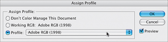
Okay, so what if a friend emails you a photo, you open it in Photoshop, and the photo doesn’t have any color profile at all? Well, once that photo is open in Photoshop, you can convert that “untagged” image to Adobe RGB (1998) by going under the Edit menu and choosing Assign Profile. When the Assign Profile dialog appears, click on the Profile radio button, ensure Adobe RGB (1998) is selected in the pop-up menu, then click OK.
Calibrating Your Monitor (The Lame Built-In Freebie Method)
To have any hope of getting what comes out of your color inkjet printer to match what you see onscreen, you absolutely, positively have to calibrate your monitor. It’s the cornerstone of color management, and there are two ways to do it: (1) buy a hardware calibration sensor that calibrates your monitor precisely; or (2) use the free built-in system software calibration, which is better than nothing, but not by much since you’re just “eyeing” it. We’ll start with the freebie calibration, but if you’re serious about this stuff, turn to the next technique.
Freebie Calibration
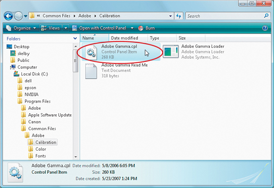
First, we’ll look at the worst-case scenario: you’re broke (you spent all available funds on the CS3 upgrade), so you’ll have to go with the free built-in system software calibration. Macintosh computers have calibration built into the system, but Windows PCs use a separate utility from Adobe called Adobe Gamma, so we’ll start with that, and then we’ll do the Mac freebie calibration. To get to Adobe Gamma on your Windows Vista PC, go to C:Program FilesCommon FilesAdobeCalibration and double-click on the Adobe Gamma.cpl file. In Windows XP, from the Start menu, go to the Control Panel and double-click on Adobe Gamma. Note: If Adobe Gamma didn’t load, you may have to manually copy the files from the GoodiesSoftwareAdobe Gamma folder on the installation CD to the Calibration folder.
Step One (PC)
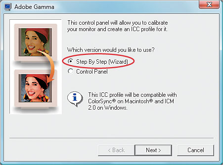
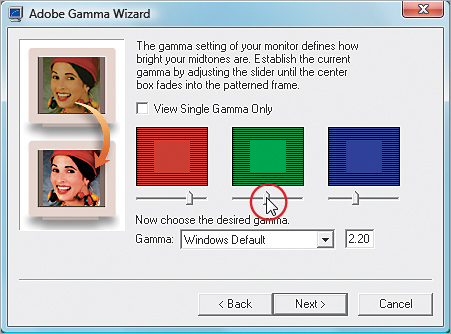
This brings up the Adobe Gamma dialog. Choose Step By Step (Wizard), which will lead you through the steps for creating a pretty lame calibration profile. (Hey, I can’t help it—that’s what it does. Do you really want me to sugarcoat it? Okay, how’s this? “It will lead you through the steps for proper calibration” [cringe].) Note: Results will vary depending on whether your monitor is a CRT, LCD, etc.
Step Two (PC)
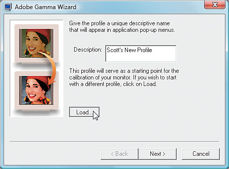
Click the Next button and you’ll be asked to name the profile you’re about to create. Now, it’s possible that when you first hooked up your monitor a manufacturer’s profile was installed at the same time. Although that canned factory profile won’t do the trick, it can save you some time because it will automatically answer some of the questions in the dialog, so it’s worth a look to see if you have one. Click on the Load button, then navigate your way to the ICC profiles in your system (you should be directed to them by default). If you see a profile with your monitor’s name, click on it and then click Open to load that profile. Click Next again.
Step Three (PC)
From here on out, you’ll be prompted with various directions (some with little square graphics with sliders beneath them). It asks you to move the sliders and then judge how the colors look. This is the very essence of the term “eyeing it,” and it’s why pros avoid this method. Everyone sees color and tone differently, and we’re all viewing these test squares under different lighting conditions, etc., so it’s highly subjective. But hey—it’s free.
Step Four (PC)
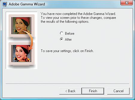
The questions will continue (along the lines of the Spanish Inquisition) until it completes the calibration process, and then it offers you a before and after. You can pretty much ignore the Carmen Miranda before/after photo—that’s just for looks—your before and after will be nothing like that, but after you’re prompted to save your profile, you’re done.
Step One (Mac)
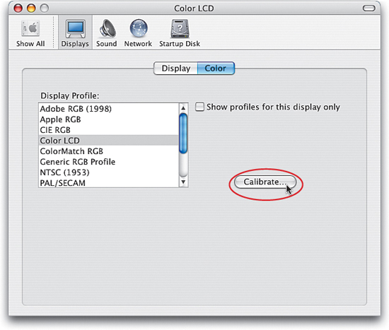
Now for the freebie calibration on the Macintosh: To find Apple’s built-in monitor calibration software, go under the Apple menu and choose System Preferences. In the System Preferences dialog, click on the Displays preferences, and when the options appear, click on the Color tab. When the Color options appear, click on the Calibrate button to bring up the Display Calibrator Assistant window (shown in the next step).
Step Two (Mac)
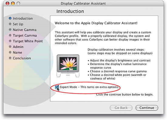
Now, at first this seems like a standard Welcome screen, so you’ll probably be expecting to just click the Continue button, but don’t do that until you turn on the Expert Mode checkbox. I know what you’re thinking: “But I’m not an expert!” Don’t worry, within a few minutes you’ll be within the top 5% of all photographers who have knowledge of monitor calibration, because sadly most never calibrate their monitor. So turn on the checkbox and click the Continue button with the full confidence that you’re about to enter an elite cadre of highly calibrated individuals (whatever that means).
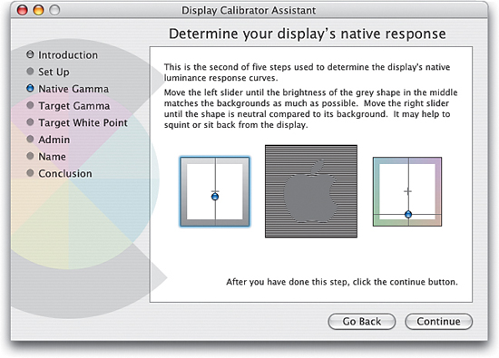
Step Three (Mac)
The first section has you go through a series of five different windows, and each window will ask you to perform a simple matching test using a slider. It’s a no-brainer, as Apple tells you exactly what to do in each of these five windows (it’s actually the same for all five windows, so once you’ve read the first window’s instructions, you’re pretty much set). So, just follow Apple’s easy instructions to get through these five windows, then I’ll join you right after.
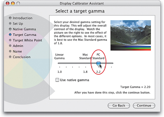
Step Four (Mac)
Okay, so you survived the “five native response windows of death.” Amazingly easy, wasn’t it? (It even borders on fun.) Well, believe it or not, that’s the hard part—the rest could be done by your 5-year-old, provided you have a 5-year-old (if not, you can rent one from Apple’s website). So here we are at a screen asking you to select a target gamma (basically, you’re choosing a contrast setting here). Apple pretty much tells you “it is best to use the Mac Standard gamma of 1.8,” but it has no idea that you’re a photographer and need something better. Most digital imaging pros I know recommend setting your gamma to 2.2 (the PC Standard), which creates a richer contrast onscreen (which tends to make you open the shadows up when editing, which is generally a good thing detail-wise). Drag the slider to PC Standard and see if you agree, then click Continue.
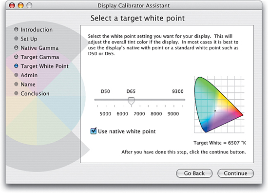
Step Five (Mac)
Now it asks you to select a white point. I use D65 (around 6500 Kelvin, in case you care). Why? That’s what most of the pros use, because it delivers a nice, clean white point without the yellowish tint that occurs when using lower temperature settings. With the slider set at D65, you can click the Continue button. The next window just asks if you’re sharing your computer with other users, so I’m skipping that window, because if you are, you’ll turn on the checkbox; if you’re not, you won’t. Snore.
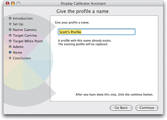
Step Six (Mac)
When you click Continue again, you’ll be greeted with a window that lets you name your profile. Type in the name you want for your profile, and click the Continue button. The last window (which there’s no real reason to show here) just sums up the choices you’ve made, so if you made some egregious mistake, you could click the Go Back button, but seriously, what kind of huge mistake could you have made that would show up at this point? Exactly. So click the Done button and you’ve created a semi-accurate profile for your monitor (hey, don’t complain—it’s free calibration). Now, you don’t have to do anything in Photoshop for it to recognize this new profile—it happens automatically (in other words, “Photoshop just knows.” Eerie, ain’t it?).
The Right Way to Calibrate Your Monitor (Hardware Calibration)
Hardware calibration is definitely the preferred method of monitor calibration (in fact, I don’t know of a single pro using the freebie software-only method). With hardware calibration, it’s measuring your actual monitor and building an accurate profile for the exact monitor you’re using, and yes—it makes that big a difference. I now use X-Rite’s Eye-One Display 2 (after hearing so many friends rave about it), and I have to say—I’m very impressed. It’s become popular with pros thanks to the sheer quality of its profiles, its ease-of-use, and affordability (around $230 street).
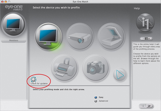
Step One
You start by installing the Eye-One Match 3 software from the CD that comes with it (the current version was 3.6.1 as of the writing of this book. However, once you launch Match 3 for the first time, I recommend clicking the Check for Updates button [as shown here] to have it check for a newer version, just in case). Once the latest version is installed, plug the Eye-One Display into your computer’s USB port, then relaunch the software to bring up the main window (seen here). You do two things here: (1) you choose which device to profile (in this case, a monitor), and (2) you choose your profiling mode (where you choose between Easy or Advanced. If this is your first time using a hardware calibrator, I recommend clicking the Easy radio button).
Step Two
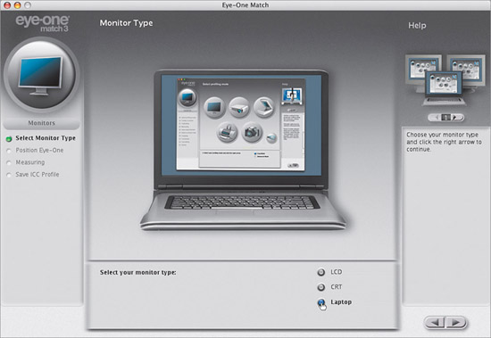
After choosing Easy, press the Right Arrow button in the bottom right, and the window you see here will appear. Here you just tell the software which type of monitor you have: an LCD (a flat-panel monitor), a CRT (a glass monitor with a tube), or a laptop (which is what I’m using, so I clicked on Laptop, as shown here), then press the Right Arrow button again.
Step Three
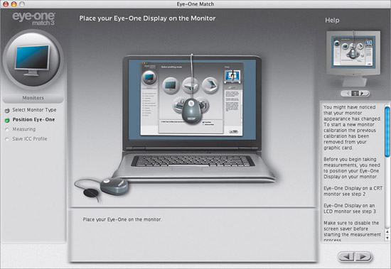
The next screen asks you to Place Your Eye-One Display on the Monitor, which means you drape the sensor over your monitor so the Eye-One Display sits flat against your monitor and the cord hangs over the back. The sensor comes with a counterweight you can attach to the cord, so you can position the sensor approximately in the center of your screen without it slipping down. There is a built-in suction cup for use on CRT monitors.
Step Four
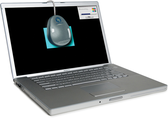
Once the sensor is in position (this takes all of about 20 seconds) click the Right Arrow key, sit back, and relax. You’ll see the software conduct a series of onscreen tests, using gray and white rectangles and various color swatches, as shown here. (Note: Be careful not to watch these onscreen tests while listening to Jimi Hendrix’s “Are you Experienced,” because before you know it you’ll be on your way to Canada in a psychedelic VW Microbus with only an acoustic guitar and a hand-drawn map to a campus protest. Hey, I’ve seen it happen.)
SCOTT KELBY
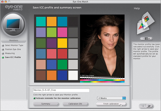
Step Five
This testing only goes on for around six or seven minutes (at least, that’s all it took for my laptop), then it’s done. It does let you see a before and after (using the buttons on the bottom), and you’ll probably be shocked when you see the before/after results (most people are amazed at how blue or red their screen was every day, yet they never noticed). Once you’ve compared your before and after, click the Finish Calibration button and that’s it—your monitor is accurately profiled, and it even installs the profile for you and then quits. It should be called “Too Easy” mode.
The Other Secret to Getting Pro-Quality Prints That Match Your Screen
When you buy a color inkjet printer and install the printer driver that comes with it, it basically lets Photoshop know what kind of printer is being used, and that’s about it. But to get pro-quality results, you need a profile for your printer based on the exact type of paper you’ll be printing on. Most inkjet paper manufacturers now create custom profiles for their papers, and you can usually download them free from their websites. Does this really make that big a difference? Ask any pro. Here’s how to find and install your custom profiles:
Step One
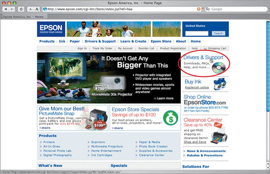
Your first step is to go to the website of the company that makes the paper you’re going to be printing on and search for their downloadable color profiles for your printer. I use the term “search” because they’re usually not in a really obvious place. I use two Epson printers—a Stylus Photo R2400 and a Stylus Pro 3800—and I generally print on Epson paper. When I installed the 3800’s printer driver, I was tickled to find that it also installed custom color profiles for all Epson papers (this is rare), but my R2400 (like most printers) doesn’t. So, the first stop would be Epson’s website, where you’d click on the Drivers & Support link (as shown here). Note: Even if you’re not an Epson user, still follow along (you’ll see why).
Step Two
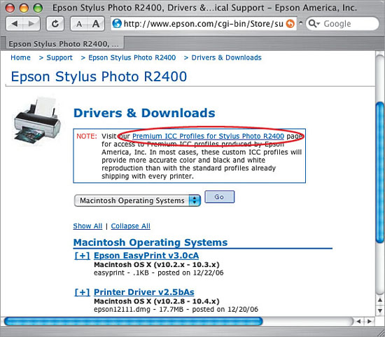
Once you get to Drivers & Support, find your particular printer in the list. Click on that link, and on the next page, click on Drivers & Downloads (choose Windows or Macintosh). On that page is a note linking you to the printer’s Premium ICC Profiles page. Here’s what Epson says right there about these free profiles: “In most cases, these custom ICC profiles will provide more accurate color and black and white reproduction than with the standard profiles already shipping with every printer.” So, click on that Premium ICC Profiles link.
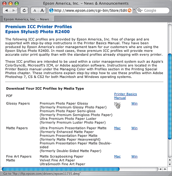
Step Three
When you click that link, a page appears with a list of Mac and Windows ICC profiles for Epson’s papers and printers. I primarily print on two papers: (1) Epson’s Premium Luster Photo paper, and (2) Epson’s Velvet Fine Art paper. So, I’d download the ICC profiles for the Glossy Papers (as shown here), and the Fine Art Papers Matte (at the bottom of the window). They download onto your computer, and you just double-click the installer for each one, and they’re added to your list of profiles in Photoshop (I’ll show how to choose them in the Print dialog a little later). That’s it—you download them, double-click to install, and they’ll be waiting for you in Photoshop’s print dialog. Easy enough. But what if you’re not using Epson paper? Or if you have a different printer, like a Canon or an HP?
Step Four
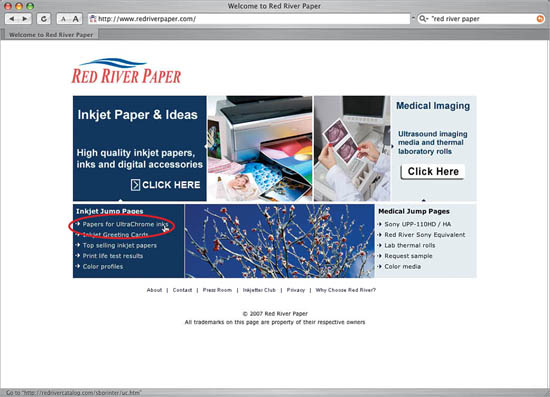
We’ll tackle the different paper issue first (because they’re tied together). I mentioned earlier that I usually print on Epson papers. I say usually because sometimes I want a final print that fits in a 16x20″ standard pre-made frame, without having to cut or trim the photo. In those cases, I use Red River Paper’s 16x20″ Ultra Satin Pro instead (which is very much like Epson’s Premium Luster, but it’s already pre-cut to 16x20″). So, even though you’re printing on an Epson printer, now you’d go to Red River Paper’s site (www.redriverpaper.com) to find their color profiles for the Epson 3800. (Remember, profiles come from the company that makes the paper.) On the Red River Paper homepage is a link for Papers for UltraChrome Inks (which are Epson’s inks), so click on that.
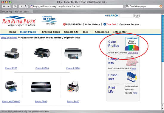
Step Five
Once you click that link, things get easier, because on the right side of Red River’s Epson UltraChrome Inks page is a clear, direct link—with a color graphic no less—right to their free downloadable color profiles (as seen here). Making profiles easy to find like this is extremely rare (it’s almost too easy—it must be a trap, right?). So, click on that Color Profiles link and it takes you right to the profiles for Epson printers, as seen in Step Six (how sweet is that?)
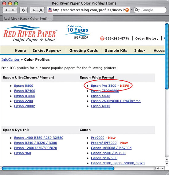
Step Six
Under the section named Epson Wide Format, there’s a direct link to the Epson Pro 3800 (as shown here), but did you also notice that there are ICC Color profiles for the Canon printers, as well? See, the process is the same for other printers, but be aware: although HP and Canon now both make pro-quality photo printers, Epson has had the pro market to itself for quite a while, so while Epson profiles are created by most major paper manufacturers, you may not always find paper profiles for HP and Canon printers. As you can see at Red River, they widely support Epson, and some Canon profiles are there too—but there’s nothing for HP yet. That doesn’t mean this won’t change, but as of the writing of this book, that’s the reality. Speaking of change—the look and navigation of websites change pretty regularly, so if these sites look different when you visit them, don’t freak out. Okay, you can freak out, but just a little.
Step Seven
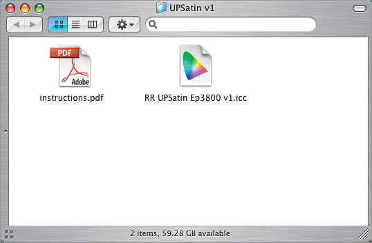
Although profiles from Epson’s website come with an installer, in Red River’s case (and in the case of many other paper manufacturers), you just get the profile (shown here) and instructions, so you install it yourself (don’t worry—it’s easy). On a PC, just Right-click on the profile and choose Install Profile. Easy enough. (Note: If you’re using Windows XP and this doesn’t work, you’ll have to drag the profile into the Profiles folder itself. It’s at C:Windowssystem32spooldriverscolor.) On a Mac, go to your hard disk, open your Library folder, and open your Color Sync folder, where you’ll see a Profiles folder. Just drag the file in there and you’re set (in Photoshop CS3 you don’t even have to restart Photoshop—it automatically updates).
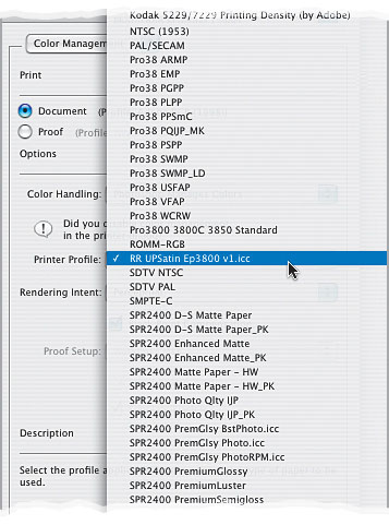
Step Eight
Now, you’ll access your profile by choosing Print from Photoshop’s File menu. In the Print dialog, change the Color Handling pop-up menu to Photoshop Manages Color. Then, click on the Printer Profile pop-up menu, and your new color profile(s) will appear (as shown here). In our example, I’m printing to an Epson 3800 using Red River’s Ultra Pro Satin paper, so that’s what I’m choosing here as my printer profile (it’s named RR UPSatin Ep3800 v1.icc). More on using these color profiles later in this chapter.
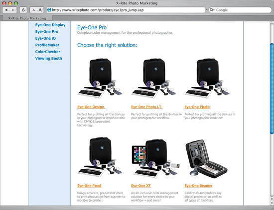
You can also pay an outside service to create a custom profile for your printer. You print a test sheet (which they provide), overnight it to them, and they’ll use an expensive colorimeter to measure your test print and create a custom profile. The catch: it’s only good for that printer, on that paper, with that ink. If anything changes, your custom profile is just about worthless. Of course, you could do your own personal printer profiling (using something like one of X-Rite’s Eye-One Pro packages) so you can re-profile each time you change paper or inks. It’s really determined by your fussiness/time/money factor (if you know what I mean).
Making the Print (Finally, It All Comes Together)
Okay, you’ve set your camera to Adobe RGB (1998); you’ve hardware calibrated your monitor (or at the very least—you “eyed it”); you’ve set up Photoshop to use Adobe RGB (1998); and you’ve set it up so any photos you bring in that are not in Adobe RGB (1998) will automatically be converted to Adobe RGB (1998). You’ve even downloaded a printer profile for the exact printer model and style of paper you’re printing on. In short—you’re there. Luckily, you only have to do all that stuff once—now we can just sit back and print. Well, pretty much.
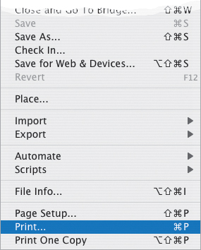
Step One
Go under Photoshop’s File menu and choose Print (as shown here). In previous versions of Photoshop, to access the color management features for printing you had to choose Print with Preview, but in CS3, we’re happily down to just one simple command—Print!
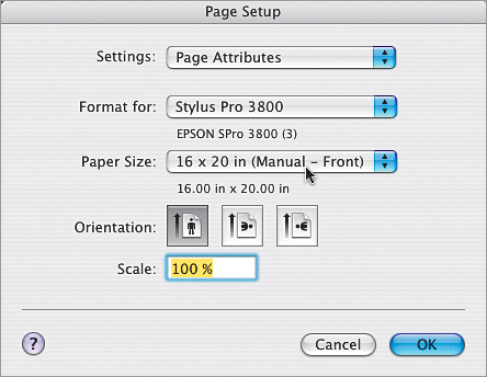
Step Two
When the Print dialog appears, let’s choose your printer and paper size first. Near the top of the center column, you’ll see a Page Setup button. Click on it to bring up the Page Setup dialog (shown here). Choose the printer you want to print to from the Format For pop-up menu (on a PC, you’ll have to choose it from the Printer pop-up menu before clicking Page Setup), and then from the Paper Size pop-up menu (found on the Paper tab on a PC) choose your paper size (in this case, a 16x20″ sheet). You can choose your page orientation here if you want, but you can also choose this later in Photoshop’s Print dialog. Leave the Scale at 100% (you can change that later), and click OK to return to the Print dialog.
Step Three
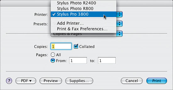
In the Print dialog, at the top of the far-right column, make sure Color Management is selected from the pop-up menu (as shown here). Then, at the top of the center column, choose your Printer from the pop-up menu (even though you chose it in the Page Setup dialog, you may have to choose it again from here).
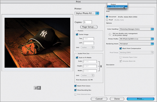
SCOTT KELBY
Step Four
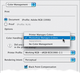
From the Color Handling pop-up menu, choose Photoshop Manages Colors (as shown here) so we can use the color profile we downloaded for our printer and paper combination, which will give us the best possible match. Here’s the thing: by default the Color Handling is set up to have your printer manage colors. You really only want to choose this if you weren’t able to download the printer/paper profile for your printer. So, basically having your printer manage colors is your back-up plan. It’s not your first choice, but today’s printers have gotten to the point that if you have to go with this, it still does a decent job (that wasn’t the case just a few years ago—if you didn’t have a color profile, you didn’t have a chance at getting a pro-quality print).
Step Five
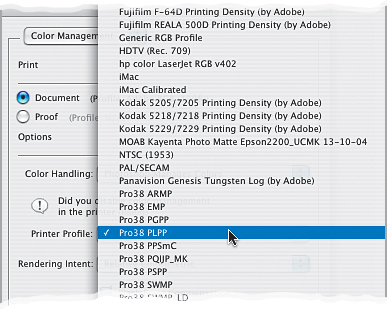
After you’ve selected Photoshop Manages Colors, you’ll need to choose your profile from the Printer Profile pop-up menu. I’m going to be printing to an Epson Stylus Pro 3800 printer using Epson’s Premium Luster paper, so I’ll choose the printer/paper profile that matches my printer and my paper (as I mentioned in the previous technique, the Epson 3800 came with color profiles for Epson papers already installed, but Epson does their best to give these color profiles names designed to appeal to people who decipher encrypted code for the NSA. So, for the 3800 on Premium Luster, I’d choose Pro38 PLPP). Doing this optimizes the color to give the best possible color print on that printer using that paper.
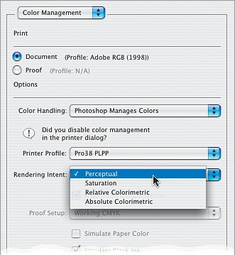
Step Six
Lastly, you’ll need to choose the Rendering Intent. There are four choices here, but only two I recommend: either Relative Colorimetric (which is the default setting) or Perceptual. Here’s the thing: I’ve had printers where I got the best looking prints with my Rendering Intent set to Perceptual, but currently, on my Epson Stylus Pro 3800, I get better results when it’s set to Relative Colorimetric. So, which one gives the best results for your printer? I recommend printing a photo once using Perceptual, then print the same print using Relative Colorimetric, and when you compare the two, you’ll know.
Step Seven
Lastly, before you click the Print button, just make sure the Black Point Compensation checkbox is turned on (it should be by default). When you’re printing photo-graphic images (like we are here), this option helps maintain more detail and color in the shadow areas of your photos. Now click the Print button, and when you do, another Print dialog will appear—your print driver’s dialog. Choose your printer from the Printer pop-up menu, as shown here (yes, this is the third time you’ve chosen your printer). The example shown here is from a Mac running Mac OS X. On a Windows PC, choose your printer from the Name pop-up menu, and then click on the Properties button to choose from your printer’s options.
Step Eight
Click on the Copies & Pages pop-up menu to reveal a list of all the printer options you can choose from. There are two critical changes we need to make here. First, choose Print Settings (as shown here) so we can configure the printer to give us the best-quality prints.
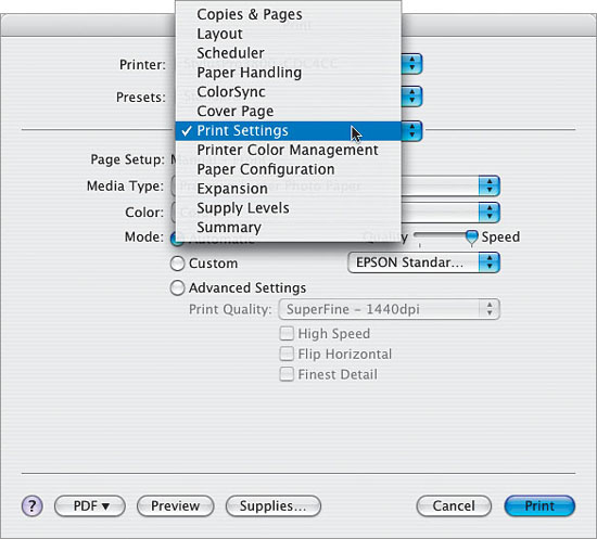
From this point on, what appears in the Copies & Pages pop-up menu is contingent on your printer’s options. You may or may not be able to access these same settings, so you may need to view each option to find the settings you need to adjust. If you’re using a Windows PC, after you click on the Properties button, you may have to click on the Advanced tab or an Advanced button in your printer’s Properties dialog to be able to choose from similar settings.
Step Nine
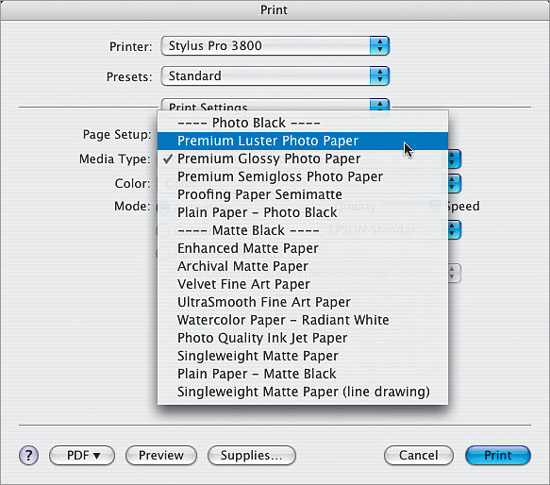
Once you choose Print Settings, and those options appear, choose the type of paper you’ll be printing on from the Media Type pop-up menu (as shown here). In our example, I’m printing on Premium Luster Photo Paper. Note: The Premium Luster Photo Paper is my favorite overall Epson paper for color and black-and-white prints. My second favorite is their Velvet Fine Art Paper, which I use when I want more of a painterly watercolor look and feel. It works really nicely for the right kind of photos because the paper has a lot of texture, so your photos look softer. Try it for shots of flowers, nature, soft landscapes, and any shot where tack-sharp focus is not the goal. Velvet Fine Art Paper is also a very forgiving paper when your photo is slightly out of focus.
Step 10
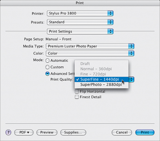
Under the Mode section, click on Advanced Settings. (On a PC, choose Custom and click on the Advanced button.) Choose your Print Quality from the pop-up menu. I used to choose Super Photo - 2880 dpi because I wanted to get the highest possible quality, but I feel the trade-off between time and ink usage vs. the difference in quality (which is fairly negligible in most cases, if visible at all) isn’t worth it, so now I choose SuperFine - 1440 dpi, which creates a wonderful quality print without waiting around all day. The only reason I might bump up to 2880 is if the photo I just printed has some visible banding, or I see a problem that I hope a higher printing dpi might fix, but thankfully that is rare. Again, this is one of those things to test with your own printer: print the same image on similar paper, once at 1440, once at 2880, and see if you spot a distinct difference.
Step 11
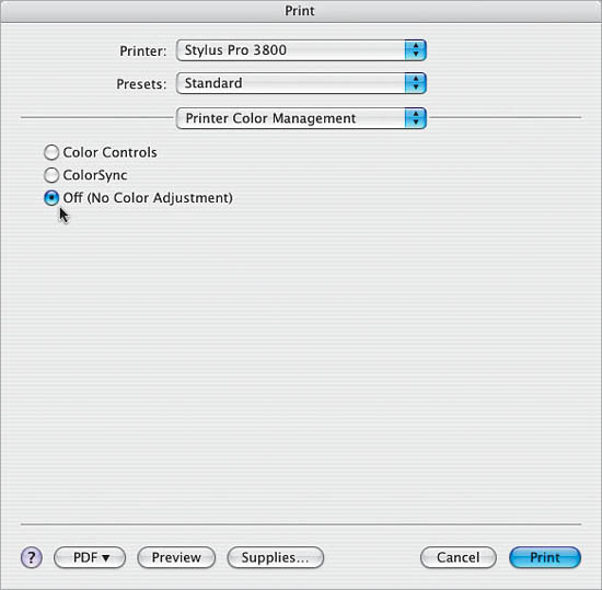
This next change, turning off the printer’s color management, is critical. You do this by choosing Printer Color Management from that third pop-up menu to make the Color Management options visible (on a PC, they are in the same Advanced dialog). Then, ignore these very tempting-looking settings (the Mode pop-up menu, Gamma pop-up menu, and lots of fun-looking sliders that are just begging you to mess with them—but don’t do it). Those controls are evil. So why did we come here in the first place? To turn this junk off—just click on the Off (No Color Adjustment) radio button (as shown in the next step).
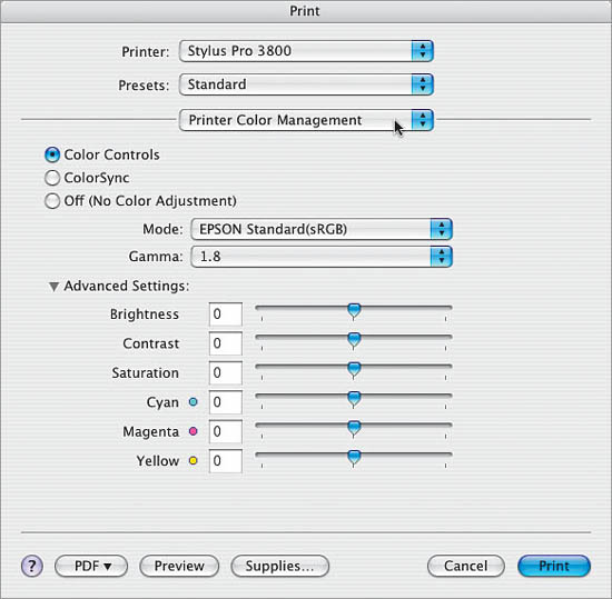
Step 12
When you select Off (No Color Adjustment), thankfully all that tempting stuff is immediately hidden from view, because now the printer’s color management features are turned off. You want no color adjustment from your printer—you’re letting Photoshop manage your color instead. Now you’re ready to hit the Print button to get prints that match your screen, as you’ve color managed your photo from beginning to end.
If you’re printing to a color inkjet printer, don’t ever convert your photo to CMYK format (even though you may be tempted to because your printer uses cyan, magenta, yellow, and black inks). The conversion from RGB to CMYK inks happens within the printer itself, and if you do it first in Photoshop, your printer will attempt to convert it again in the printer, and your printed colors will be way off.