| CHAPTER | 10 |
Using Photos, Graphics and Type
Only one news medium—radio—attempts to reach large audiences without strong graphic appeal. We live in a world in which visual stimulation is important in attracting and holding the attention of television viewers, newspaper and magazine readers, and Web surfers. Indeed, in today’s world it’s almost unthinkable to ignore the power of design and the impact of video, photos and graphics.
Unfortunately, too many journalists are so focused on written or spoken content that they fail to appreciate the power of visuals. Many word-oriented journalists view visual journalists as those who merely add form or ornamentation to the news. Indeed, word-oriented people often don’t view visual journalists as content providers. But visuals are content, too, and an important part of content at that. Research from The Poynter Institute tells us:
• About 90 percent of readers enter pages through large photos, artwork or display type (such as headlines and promos).
• Running a visual element with text makes it three times more likely that at least some of the text will be read.
• Headlines are more likely to be read when a photo is nearby.
• The bigger the photo, the more likely readers are to read the caption.
While these findings relate most directly to newspapers and magazines, it’s equally undeniable that visuals make television what it is and that visuals are extremely important in driving traffic through websites. ESPN’s website (www.espn.com) has become one of the most popular in the country, thanks to strong content, good design and ample use of digital video and graphics.
As a result, in today’s world, the wordsmith on the magazine editing staff and the newspaper city hall reporter need to be just as attuned to the power of visuals as the television videographer and the magazine designer. Although one journalist may spend all or part of her day working entirely with visuals, and another may spend all of his day working with words, both must recognize and respect the power of visual communication. Consider that:
• Photographs and information graphics markedly increase both comprehension of text and interest in stories.
• Graphics, photographs and headlines get far more attention from readers than text does.
The same is true in television and on the Web. When television stories are merely read by anchors, and Web stories are told only with text, news consumers show little interest. Add video, photos, graphics and display type, and the equation changes.
Television, of course, lives and dies with video and graphics. The television videographer oversees all aspects of the video image, including lighting and the operation of the camera. The videographer in many ways is televisions ultimate editor because of the incredible power of sound and video in that medium. But whatever the medium—except, of course, radio—the power of visuals is strong and undeniable. In this chapter, we address the fundamentals of using photos, graphics and type, devices available in all of the media capable of visual communication.
 EDITING FOR GRAPHIC APPEAL
Editors can do much to help increase graphic appeal. Here are some tips that apply equally well to newspapers, magazines and websites:
• Be on the lookout for sidebars. If a story seems too long and moves in several directions, consider breaking it into a main story and separate sidebars. Remember, the average person reads the paper only about 24 minutes a day—perusing the photos and reading mainly the headlines and other big type except on a few stories of interest. Breaking sidebars out of longer stories means the material looks shorter and more inviting. In addition, you spoon-feed the readers some extra information in the sidebar’s headline.
Boring: A 30-inch story describes the events of an upcoming town-history festival, relates some of the history to be commemorated and profiles the organizer of the event.
Better: The three parts of the story should be made separate stories, packaged with appealing photos or artwork. The events should probably be listed in an accompanying box. Don’t automatically make the history the centerpiece; the profile may be the better choice. People usually prefer to read about people rather than things or events.
Boring: A 75-inch investigative piece examines who lives in public housing, the history of public housing in the area, the complaints people in public housing have about life in the projects, the complaints neighbors have about having public housing nearby and responses from officials in charge.
Better: Organize this into separate stories that can run over several days as a series. Or run the stories as a package, probably on a Sunday, on a special page devoted to the issue. Promo it on the front page, or even consider starting the main story, probably a summary, on the front page and then jumping it to the special page. Another alternative: It could run in the Sunday magazine if you have a locally produced one. The less earth-shattering the revelations, the more likely this alternative would be considered.
• People will be more attracted to stories with photos or graphics, so keep the visual possibilities of each story in mind when designing a page. Even if you’re a newspaper copy editor, it may be helpful to your supervisor if you mention that a particular story has great quotes that could be used for blurbs or a list that could make a good chart. Is the story so complicated that the headline could use an extra deck? Adding that may result in better communication. Encourage reporters to think about visual possibilities for their stories. Remind them that stories almost always receive better play if accompanied by photos or graphics. Visual possibilities should be considered early in the writing and editing process, not as an afterthought.
• Bullets permit you to list a lot of items in a minimum amount of space and with added contrast. Bullets are solid circles, dashes, check marks or black boxes used to set off items in a list. USA Today makes extensive use of bullets to keep its stories short.
• If a story is long, subheads could help break it into shorter, logical parts. Use subheadings instead of transitional paragraphs between the parts. Magazines and websites use them frequently; newspapers use them less frequently, except in the longest of stories.
• Make sure the photographer knows the mood and theme of the story and takes pictures of the main people being interviewed. Too often, newspapers will have a sad piece with a smiling photograph or a feature with a photograph of one person and a story about someone else.
• Drawings, often called line art, are sometimes preferable to photos for series logos and for times when a camera may be intrusive. They also can explain complicated processes or things by stripping away the exterior and showing the inner workings of the object.
• Double-check charts for accuracy of figures.
USING PHOTOS
At good newspapers, the days are gone when a city editor would say to a reporter, “That’s a good story; now get me a photo to go with it.” Today, good newspapers treat graphical elements—photos, charts and illustrations—as the editorial equivalent of stories. Accordingly, they are assigned with the same care, and often at the same time, as news and feature articles.
That development came about late in the last century as newspapers faced increasing competition for readers’ attention. Editors found that newspapers needed to be more attractive if they were to hold or increase readership. The result was an era in which newspaper design became almost as important to many editors as content. In general, the size and quality of newspaper photographs increased, and charts, graphs and maps proliferated. All of these elements were increasingly likely to be printed in color.
None of that should be surprising. We live in a visual society in which color and design play important roles. Visual appeal is used to market everything from television to cereal boxes, and newspapers are not exempt. This has necessitated a change in the way almost all newspapers look. The gray, vertical columns of the past have given way to modular design, color, more and larger pictures, and charts, graphs and maps, which editors call information graphics. To make these changes, newsrooms have been forced to change their internal structures, too.
Today, photo editors are key members of the newsroom management team, usually equal in rank to news, city or metropolitan editors. Design desks have been added in many newsrooms to relieve the copy desk of the chore of designing as well as editing. Many metros have gone so far as to appoint assistant managing editors for graphics. And graphics departments, which produce charts, graphs and maps, have sprung from nowhere, even at relatively small dailies.
Not surprisingly, technological advance has helped. Few newsrooms today are without personal computers with design and charting software. These devices allow editors and artists to create graphics that would have taken days to execute through traditional methods.
Now, the art of photography itself has changed as digital cameras make silver-based photography obsolete. Both local and wire service photos are being processed with computers and digital-imaging software (see Figure 10-1). No fancy technology, however, can make a bad picture good or help an editor determine whether a graphic accomplishes what it purports to do. This chapter is designed not to make photographers or graphic artists of editors but to give editors an appreciation of the role of photos and graphics in the appeal of newspapers, magazines and websites. Visual literacy is critical to the competent editor.
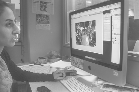
Figure 10-1 Photos are now edited on computer workstations at most newspapers.
Photo by Philip Holman.
Rewriting can turn a poorly written news story into an acceptable one. Little can be done to change the subject matter of clichéd photos—tree plantings, ribbon cuttings, proclamation signings and the passing of checks, certificates or awards from one person to another. Some newspapers, magazines and websites use photographs of these situations simply because of the tradition that “chicken-dinner” stuff must be photographed. It is a tradition that should be scrapped, and most good publications have already done so.
A photo editor is almost as essential to a newspaper as a city editor. Some executive—preferably one with a background in photography—should be responsible for assigning photographers to news and feature events. Someone in authority should insist that all photos, including those from news agencies, be edited and that captions be intelligently written.
If it is a good picture, it should get a good play, just as a top story gets a big headline. If pictures are a vital part of the story, editors should be willing to cut back on words, if necessary, to provide space for photographs. Some events can be told better in words than in pictures. Conversely, other events are essentially graphic, and editors need little or no text to get the message across.
Photographer-Editor Relationships
An encouraging development in recent years has been the trend toward making photographers full partners in the editorial process. Historically photographers were second-class citizens in the newspaper and magazine hierarchy. They did not enjoy the prestige of the reporter or the copy editor, and with rare exception their opinions were not solicited or were ignored.
Many insightful editors now realize that photographers possess an intangible quality known as visual literacy, a trait sometimes lacking in even the best of wordsmiths. Photographers should have a voice in how their pictures are displayed, and editors who have given them that voice invariably have been pleased with the results. The number of publications using pictures well is increasing each year, although leading photo editors agree that there is ample room for improvement. For every newspaper, magazine and website using pictures well, it is easy to find two still using the line-’em-up-and-shoot-’em approach.
A key to improvement in the quality of pictures is allowing the photographer to become involved in the story from the outset. If possible, the photographer should accompany the reporter as information for the story is gathered. If that is impossible, allowing the photographer to read the story—or to take time to talk with the reporter about the thrust of it—will help ensure that a photograph complements the story. Publications throughout the country each day are filled with pictures that fail to convey a message because the reporter, photographer and editor failed to communicate with each other.
An important part of this communications process involves writing the photo order, the document given to the photographer when an assignment is made. A photographer for the Columbia Missourian once received an order for a picture of an elementary school principal. The order instructed the photographer to meet the principal in his office at 3:15 p.m. and to take a picture of him at his desk. It mentioned that the principal would be unavailable until that time. The story focused on how the principal went out of his way to help frightened first-graders find the right bus during the first few weeks of school. Because the reporter failed to mention that when he wrote the photo order, the photographer followed his instructions exactly. He arrived at 3:15 and took the picture. Only after returning to the office did he learn the thrust of the story and discover that the principal was unavailable 15 minutes earlier because he had been helping students find their buses. The best photo opportunity had been missed.
Editing Decisions
Most photographs, like most news stories, can be improved with editing. The photo editor, like the copy editor, must make decisions that affect the quality of the finished product. The photo editor must determine:
• Which photo or photos complement the written story or tell a story of their own.
• Whether cropping enhances the image.
• What size a photo must be to communicate effectively.
• Whether retouching is necessary.
SELECTION
Photo selection is critical because valuable space is wasted if the picture does nothing more than depict a scene that could be described more efficiently with words. The adage that a picture is worth a thousand words is not necessarily true. If the picture adds nothing to the reader’s understanding of a story, it should be rejected. Conversely, some pictures capture the emotion or flavor of a situation more vividly than words. In other situations, words and photographs provide perfect complements.
A talented photo editor, experienced in visual communication, can provide the guidance necessary for successful use of pictures. Smaller newspapers, magazines or websites without the luxury of full-time photo editors can turn to their photographers for advice, but often the news editor or copy editor must make such decisions. When that is necessary, an appreciation for the importance of visual communication is essential for good results. At websites, there are sometimes no photographers or photo editors, which means those who produce the site must possess visual literacy.
Internal procedures reflect the media outlet’s picture-selection philosophy. Some allow the photographer to make the decision; the pictures he or she submits to the desk are the only ones considered for publication. This procedure may ensure selection of the picture with the best technical quality, but that picture may not best complement the story. A photo editor, working closely with the photographer, the reporter, the city editor and the page designer or copy editor, should have a better understanding of the story and be able to make the best selection. Printouts or a computer review of the photographer’s usable shots allow the photographer, reporter and editors to review all frames available so the best selection can be made.
CROPPING
A photograph is a composition. The composition should help the reader immediately grasp the picture’s message. If the picture is too cluttered, the reader’s eyes scan the picture looking for a place to rest. But if the picture contains a strong focal point, the reader at least has a place to start. A prime job of a photo editor, therefore, is to help the photographer take out some unnecessary details to strengthen the overall view.
Certain elements within the picture could be stronger than the full picture. Some photo editors try to find these interest points and patterns by moving the digital photo around in an art box with a mouse or by moving two L-shaped pieces of cardboard over the picture. This helps to guide the editor in cropping. The editor looks for a focal point, or chief spot of interest. If other points of interest are present, the photo editor tries to retain them. The editor searches for patterns that can be strengthened by cropping. The patterns help give the picture harmonious and balanced composition. Among these patterns are various letter shapes—L, U, S, Z, T, O—and geometric patterns such as a star, a circle, a cross or a combination of these.
Because most news and feature photos contain people, the editor strives to help the photographer depict them as dramatically as possible. The editor must decide how many people to include in the picture, how much of each person to include and what background is essential.
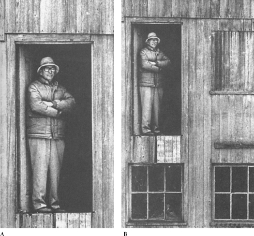
Historically, publications have opted for the tightest possible cropping to conserve valuable space. Severe cropping, however, may damage a photo to the point that not printing it would have been preferable. Those who win awards for photo editing appreciate the fact that background is essential to some photographs. As a result, they tend to crop tightly less often than editors with more traditional approaches to picture editing. In Figure 10-2, tight cropping allows the reader to see interesting detail. But in Figure 10-3, tight cropping eliminates the environment and damages the picture. Those who can distinguish between these approaches are valuable members of newspaper and magazine staffs. They possess visual literacy.
Through all this, the photo editor attempts to reserve the rule of thirds. Imagine a photo divided into thirds both horizontally and vertically. The four points where these lines intersect are considered the best focal points, or centers of interest, for the photo.
SIZING
The value of the picture, not the amount of space available, should determine the reproduction size of a photograph. Too often, editors try to reduce a photograph to fit a space and destroy the impact of the photo in the process. Common sense should dictate that a picture of 15 individuals will be ineffective if it appears as a two-column photo. More likely, such a photo will require three or even four columns of space.

Figure 10-2 Footprint on the lunar soil. An example of how cropping (B) can bring out an interesting detail in a photograph (A). The close-up view was photographed with a lunar surface camera during the Apollo 11 lunar surface extravehicular activity.
Photographs courtesy of the National Aeronautics and Space Administration.
Talented photo editors know that the greatest danger is making pictures too small. If the choice is between a two-column picture and a three-column picture, the wise photo editor opts for the larger size. Photos can be too large, but more often they are damaged by making them too small. Another alternative may be available. Modern production techniques make it easy for the editor to publish a half-column photo with text wrapping around it to fill the space.
Sizing of any photograph is an important decision, but sizing of pictures in mul-tiphotograph packages is particularly important. In such packages, one photograph should be dominant. The use of multiple pictures allows the editor flexibility that may not exist in single-picture situations. If a picture editor selects a photo of a harried liquor store clerk who has just been robbed and a photo of the outside of the store where the robbery occurred, the editor has three choices:
• Devote equal space to the two pictures. This is the least desirable choice because neither picture would be dominant and, consequently, neither would have eyecatching impact.
• Make the outside shot dominant and the close-up of the clerk secondary. This would work, but the dominant photo, which serves merely as a locater, would have little impact. The impact of human emotion, evident in the clerk’s face, would be diminished.
• Make the facial expression dominant with good sizing and make the outside shot as small as 1½ columns. The outside shot, standing alone, would look ridiculous if used in that size, but used in conjunction with another, larger photo, it would work well.
Dramatic size contrast is an effective device in multipicture packages (Figure 10-4). An editor trained in visual communication understands the usefulness of reversing normal sizing patterns for added impact.
ELECTRONIC ENHANCEMENT
Some photographs can be improved by electronic enhancement, once called retouching, the process of toning down or eliminating distractions within the frame. Minor imperfections in photos can be repaired with computer programs such as Adobe PhotoShop. Care must be exercised, however, to ensure that electronic enhancement does not change the meaning and content of the photo. Changing a photo to alter its meaning is as unethical as changing a direct quotation to alter a speaker’s meaning.
An unscrupulous editor can move one of the Great Pyramids in relation to the Sphinx to improve a picture’s composition or place the head of one person on the body of another. Both these things have happened as magazines, newspapers and websites have grappled with the ethics of altering photographs.
Most good editors have taken the solid ethical position that nothing more than changing the brightness, contrast or sharpness of a picture should be tolerated. Anything more than that leads to deception, which is sure to destroy a publication’s integrity.
Pictures as Copy
When the picture has been processed, someone—reporter or photographer—supplies the information for the caption, also known as the cutline. The picture and caption information then go to the appropriate department, where the editor decides whether to use the photo and, if so, how to display it.

Figure 10-4 Many editors would run the overall flooding shot (B) larger than the picture of the farmer laying sandbags in place (A). The pairing, however, has more impact if the close shot of the farmer is run larger than the scene-setting overall picture.
Columbia Missourian photos by Lee Meyer and Mike Asher.
 When Photos Lie
“Photos never lie” is one of the oldest media industry axioms. It’s doubtful whether this was ever true, and it certainly isn’t today. Computerized processing of photos makes it easier than ever to manipulate pictures in ways that are totally unethical.
National Geographic magazine moved a pyramid closer to the Sphinx to improve the composition of a photo, then listened to cries of outrage from photographers and others who objected to the practice. TV Guide put Oprah Winfrey’s head on another person’s body and suffered a similar fate.
One can’t help but wonder, though, how many similar things have occurred without someone noticing. The fact is that tampering with the content of a photo is just as wrong as printing a manufactured quotation and attributing it to a senator, the mayor or a police officer at the scene of a crime. It is unethical, and at many publications it is now grounds for dismissal.
Quality publications limit computerized alteration of photographs to the equivalent of minor electronic enhancement. Editors and photographers are allowed to make a photo lighter or darker. They also are allowed to do electronic edge sharpening, the equivalent of improving the focus.
Most other forms of alteration are prohibited, although some publications allow the removal of distracting background elements. This might include removal of an electric wire dangling behind a subject in such a way as to appear the wire is emerging from the person’s head. The best photographers eliminate such distractions the right way by making sure they aren’t there in the original photo.
Before submitting a picture to the production department, the editor supplies information to get the correct picture in the correct place with the correct caption. Today, most photos are sent from desk to desk within a newsroom electronically, although at some magazines actual photographic prints are still used. A picture, like a story, generally carries an identifying word or words to identify it. If photos are handled as prints, a slip of paper clipped on the picture or taped to the back normally contains information such as:
• The identifying word or name of the picture.
• The size.
• Special handling instructions.
• The department, edition and page.
• The date the photo is to appear.
• The date and time the picture was sent to the production department.
• A notation of whether the photo stands alone or accompanies a story.
In computerized photo editing, this information is contained in metadata that accompany the file.
Sometimes the photo may be deliberately separated from the story. A teaser picture may be used on Page One to entice readers to read the story on another page. If a long story has two illustrations, one illustration often is used on the page where the story begins and the other on the jump page. For major events, such as the death of a president, pictures may be scattered on several pages. In this case, readers are directed to these pages with a guideline such as “More pictures on Pages 5, 7 and 16.”
Changing Photo Technology
Technology is changing the way photographs are processed at newspapers, magazines and websites. Today, most photographs are taken digitally and electronically processed—lightened or darkened, sharpened, cropped and sized—using programs such as Adobe PhotoShop. More and more newspapers and magazines also are flowing photographs directly onto the page using personal computer programs such as Adobe InDesign. From there, entire pages, with all photos and graphics in place, are output to paper proofs, to film or even directly to the printing plate.
Scanning of photos is sometimes necessary because a few publications still prefer to use conventional photography to take pictures and because some are submitted in photographic print form by readers. Now that digital photography is widely accepted, darkrooms and chemical photo processing are, for the most part, a thing of the past. Digital processing saves time, which is of paramount importance for publications, particularly newspapers and websites.
Taste in Picture Editing
It was a tragic fire in the Boston metropolitan area. A woman and a child took refuge on an ironwork balcony. As firefighters tried to rescue them, the balcony collapsed, sending the woman to her death and the child to a miraculous survival. Photographers took sequence shots of the action (see Figures 10-5 and 10-6 on Pages 240–241). Should a photo editor use the pictures?
Some readers would be incensed, accusing the papers of sensationalism, poor taste, invasion of privacy, insensitivity and a tasteless display of human tragedy to sell newspapers. Picture editors could reply that their duty is to present the news, whether of good things or bad, of the pleasant or the unpleasant. Defending the judgment to use the pictures on Page One, the editor of the Battle Creek (Mich.) Enquirer and News said, “The essential purpose of journalism is to help the reader understand what is happening in this world and thereby help him to appreciate those things he finds good and to try to correct those things he finds bad.”
Of the flood of pictures depicting the war in Vietnam, surely among the most memorable were the Saigon chief of police executing a prisoner, terrified children fleeing a napalm attack and the flaming suicide of a Buddhist monk. Such scenes were part of the war record and deserved to be shown. More recently, the photograph of an airplane striking one of the towers of the World Trade Center in New York is similarly memorable.
Photos of fire deaths may tell more than the tragedy depicted in the burned and mangled bodies. Implicit could be the lessons of inadequate inspection, faulty construction, carelessness with matches, arson or antiquated firefighting equipment.
Picture editors have few criteria to guide them. Their news judgment and their own conscience tell them whether to order a picture for Page One showing a man in Australia mauled to death by polar bears after he fell into a pool in the bears’ enclosure in a zoo. Of the hundreds of pictures available that day, surely a better one could have been found for Page One.

Figure 10-5 One of the controversial sequence shots of a fire tragedy in a Boston apartment. Scores of readers protested the use of these widely distributed photos.
Stanleyformanphotos.com Pulitzer Prize 1976.
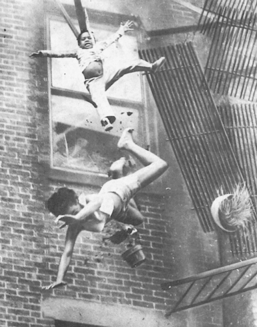
Figure 10-6 The second shot of the balcony collapsing in Boston. Most editors defended the use of the tragic photos.
Stanleyformanphotos.com Pulitzer Prize 1976.
Caption Guidelines
Picture texts are known by many names—cutlines, captions, underlines (or overlines) and legends. Caption suggests a heading over a picture, but most editors now use the term to refer to the lines under the picture. Legend may refer either to the text or to the heading. If a heading or catchline is used, it should be under, not over the picture.
The editor sells the reporter’s story by means of a compelling headline. By the same token, the picture editor can help control the photographic image with a caption. The primary purpose of the caption is to get the reader to respond to the photo in the manner intended by the photographer and the picture editor.
Readers first concentrate on the focal point of the picture, then glance at the other parts. Then, presumably, most turn to the caption to confirm what they have seen in the picture. The caption provides the answers to questions of who, what, where, when, why and how, unless some of these are apparent in the picture.
The caption interprets and expands on what the picture says to the reader. It may point out the inconspicuous but significant. It may comment on the revealing or amusing parts of the picture if these are not self-evident. The caption helps explain ambiguities, comments on what is not made clear in the picture and mentions what the picture fails to show if that is necessary.
The ideal caption is direct, brief and sometimes bright. It is a concise statement, not a news story. It immediately gets to the point and avoids the “go back to the beginning” of the background situation.
If the photo accompanies a story, the caption shouldn’t duplicate the details readers can find in the story. It should, however, contain enough information to satisfy those who will not read the story. Ideally, the picture and the caption will induce readers to read the story. Normally, the caption of a picture with a story is limited to two or three lines. Even when the picture relates to the story, the caption should not go beyond what the picture reveals. Nor should the facts in the caption differ from those in the story.
Captions stand out in the sea of words and strike the reader with peculiar force. Every word should be weighed, especially for impact, emotional tone, impartiality and adherence to rules of grammar.
Any editor who tries to write or rewrite a caption without seeing the picture risks errors. The cropped photo should be examined, not the original. The caption has to confine itself to the portion of the picture the reader will see. If the caption says a woman is waving a handkerchief, the handkerchief must be in the picture. In a layout containing two or more photographs with a single caption, the editor should study the layout to make sure that left or right or top or bottom directions are correct.
Although no one should try to write a caption without first looking at the picture, pictures often have to move quickly to the production department. When dealing with a paper copy of the photo, the editor removes the captions (from wire service and syndicated pictures) and jots down the slug and size of the pictures and any revealing elements in the pictures that might be added to the cutlines. A photocopy of the picture may be made. When dealing with the photo on a computer, simply copy the caption to a text field and edit as necessary. Time permitting, a proofsheet showing pictures and their captions should be given to the photo editor to make certain all the pieces have been put together properly and that the caption matches the content of the photo.
Writing The Caption
Here are some tips on caption writing:
• Don’t tell the obvious. If the person in the photo is pretty or attractive, that fact will be obvious from the picture. The picture will tell whether a person is smiling. It may be necessary, however, to tell why he or she is smiling. An explanation need not go as far as the following: “Two women and a man stroll down the newly completed section of Rehoboth’s boardwalk. They are, from left, Nancy Jackson, Dianne Johnson and Richard Bramble, all of West Chester.” An editor remarked, “Even if some of the slower readers couldn’t have figured out the sexes from the picture, the names are a dead giveaway.”
• Don’t editorialize. A writer doesn’t know whether someone is happy, glum or troubled. The cutline that described a judge as “weary but ready” when he arrived at court must have made readers wonder how the writer knew the judge was weary.
• Use specifics rather than generalities. “A 10-pound book” is better than “a huge book.”
• omit references to the photo. Because the readers know you are referring to the photograph, omit phrases such as “is pictured,” “is shown” and “the picture above shows.”
• Use “from left” rather than “from left to right.” The first means as much as the second and is shorter. Neither left nor right should be overworked. If one of two boys in a picture is wearing a white jersey, use that fact to identify him.
• Avoid “looking on.” One of the worst things you can say about a person in a photo is that he or she is “looking on.” If that is all the person is doing, the photo is superfluous.
• Don’t kid the readers. They will know whether this is a “recent photo.” Give the date the photo was taken if it is an old photo. Also, let readers know where the picture was taken—but not how. Most readers don’t care about all the sleet and snow the photographer had to go through to get the picture.
• Write captions in the present tense. This enhances the immediacy of the pictures they accompany The past tense is used if the sentence contains the date or if it gives additional facts not described in the action in the picture. The caption may use both present and past tenses, but the past time element should not be used in the same sentence with a present-tense verb describing the action.
• make sure the caption is accurate. Double-check the spelling of names. The paper, not the photographer, gets the blame for inaccuracies. Caption errors often occur because someone, the photographer or the reporter accompanying the photographer, failed to give the photo desk enough, or accurate, information from which to construct a caption.
• Double-check the photo with the caption identification. The wrong person pictured as “the most-wanted fugitive” is a sure way to invite libel.
• Be careful. Writing a caption requires as much care and skill as writing a story or a headline. The reader should not have to puzzle out the meaning of the description. Notice these jarring examples:
Fearing new outbreaks of violence, the results of Sunday’s election have been withheld.
Also killed in the accident was the father of five children driving the other vehicle.
• Don’t hit the reader over the head with the obvious. If the photo shows a firefighter dousing hot timbers after a warehouse fire and a firefighter already has been mentioned in the text, it is ridiculous to add in the caption that “firefighters were called.”
• Avoid last-line widows or hangers. The last line of the caption should be a full line, or nearly so. When the lines are doubled (two two-columns for a four-column picture), write an even number of lines. Short last lines are known as widows or hangers.
• Captions should be humorous if warranted by the picture. Biting humor and sarcasm have no place in captions.
• The caption should describe the event as shown in the picture, not the event itself. Viewers will be puzzled if the caption describes action they do not see. Sometimes, however, an explanation of what is not shown is justified. If the photo shows a football player leaping high to catch a pass for a touchdown, viewers might like to know who threw the pass.
• Update the information. Because there is a lapse between the time a picture of an event is taken and the time a viewer sees the picture in the newspaper, care should be taken to update the information in the caption. If the first report was that three bodies were found in the wreckage, but subsequently two more bodies were found, the caption should contain the latest figure.
• Be exact. In local pictures, the addresses of the persons shown may be helpful. If youngsters appear in the photo, they should be identified by names, ages, names of parents and addresses.
• Credit the photographer. If the picture is exceptional, credit may be given to the photographer in the caption, perhaps with a brief description of how he or she achieved the creation. On picture pages containing text matter, the photographer’s credit should be displayed as prominently as the writer’s. Most newspapers and magazines now credit every photograph to the photographer who took it.
• Pictures without captions. Although photographs normally carry captions, mood or special-occasion pictures sometimes appear without them if the message is obvious from the picture itself. Not all who look at pictures will also read the captions. In fact, the decline is severe enough to suggest that many readers satisfy their curiosity merely by looking at the photo.
• Know your style. Some papers use one style for captions with a story and another style for captions without a story (called standalone or no-story). A picture with a story might call for one, two or three words in boldface caps to start the caption. In standalones, a small head or catch-line might be placed over the caption.
• give the location. If the dateline is knocked out in the caption, make sure that the location is mentioned. Example:
Guarding Goats—Joe Fair, a 70-year-old pensioner, looks over his goats Rosebud and Tagalong, the subject of much furor in this northeastern Missouri community, boyhood home of Mark Twain.
The “northeastern Missouri community” was Hannibal, Mo., but the caption did not say so.
• Rewrite wire-service cutlines. The same photos from news agencies and syndicates appear in smaller dailies as well as in metropolitan dailies. Some papers merely reset the caption supplied with the pictures. Most, if not all, such captions should be rewritten to add to the story told in the picture and to indicate some originality on the paper’s part.
• Watch the mood. The mood of the caption should match the mood of the picture. The caption for a feature photo may stress light writing. Restraint is observed for photographs showing tragedy or dealing with a serious subject
After the caption has been set in type or readied for the Web, the editor should compare the message with the picture. The number of people in the picture should be checked against the number of names in the caption. Everyone appearing prominently in the photo should be identified. If a person is obscured in the crowd, that person need not be brought to the reader’s attention.
USING INFORMATION GRAPHICS
Photographs help the reader gain a visual appreciation of reality; information graphics help the reader understand the massive, the intangible or the hidden. A map of part of the city is usually a better locater than an aerial photo of the same area. A chart often helps the reader track trends over time. An artist’s cutaway can show the undersea levels of a sinking ship.
In recent years, information graphics, as these illustrations are known, have appeared with increasing regularity in newspapers and magazines, large and small, and on websites. Personal computers are ideal for creating such graphics quickly and inexpensively, and newspapers rushed to embrace them in the 1980s. Suddenly, publications that once had only photographers and artists added graphic designers to create charts, graphs and maps. Contests added categories for graphic design, and the Society of Newspaper Design was formed.
Many believe this transformation was sparked by the arrival of USA Today in 1979, and there is no doubt that it set new standards for the use of color and graphics. Colorful charts, graphs and maps play a key role in USA Today, which the Gannett Co. designed for the busy reader. Charts, graphs and maps are a good way of communicating lots of information in a hurry, and USA Today’s editors were quick to embrace them. The newspaper’s colorful weather map has been emulated by papers worldwide (see Figure 10-7).
USA Today is far from alone in adopting information graphics. The New York Times and other prestigious newspapers now publish full-page graphics on section fronts,

Figure 10-7 Following USA Today’s example, newspapers began publishing their national weather maps with color temperatures bands. Courtesy of © rickt / Shutterstock
Time magazine produces startling graphics, and syndicated services of graphics material proliferates. The Associated Press greatly increased the quality and quantity of the graphics it provided.
Like photographs, however, information graphics can be good or bad. Confusing charts, graphs and maps hinder readers rather than help them. Graphics that are too busy may confuse rather than enlighten.
Types of Information Graphics
illustrations help the reader understand complex things or concepts, including information that may be extremely difficult or impossible to describe in words. They take many forms, from the simple illustration to the complex diagram.
Maps, of course, help the reader locate things. Local maps help the reader locate places within the city. Maps of counties, states, regions or nations help readers locate sites with which they may not be familiar (see Figure 10-8). Good graphics departments maintain computerized base maps of various locales. When an event occurs, it is a simple matter to add specific locater information to the base map to create a helpful aid for the reader. Secondary windows within maps sometimes are used to pin down specific areas within geographic regions or to show the location of the specific region within a larger area.
Tables are used to graphically display numerical information (see Figure 10-9). They are useful when lots of numbers are involved, as in precinct-by-precinct election results.
All these devices are tools the editor uses to help convey information to readers. Some information is conveyed best in words, some in pictures and some in information graphics. The editor who knows when to choose each of these devices helps to create an easy-to-read publication.
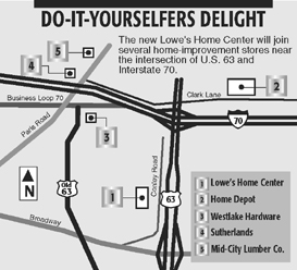
Figure 10-8 Maps help readers locate news events.
Source: Courtesy of the Columbia Missourian Newspaper.

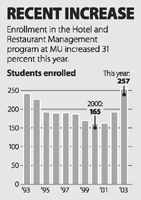
Figure 10-10 Bar chart.
Source: Courtesy of the Columbia Missourian Newspaper.
Bar charts help the reader visualize quantities (see Figure 10-10), and fever charts show quantities over time (see Figure 10-11). pie charts are used to show the division of the whole into components (see Figure 10-12). process drawings help readers visualize detailed plans (see Figure 10-13).
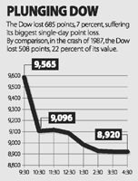
Figure 10-11 Fever chart.
Source: Courtesy of the Columbia Missourian Newspaper.

Figure 10-12 Pie chart.
Source: Courtesy of the Columbia Missourian Newspaper.

USING TYPE
Photos and graphics have strong eye appeal and therefore rank as important elements in creating visually attractive newspaper, magazine and Web pages. Even television uses a fair amount of graphics, and wise selection of typefaces is important in all the media.
Type is used in the print media as both body type and display type. Body type is the primary typeface used for the text of a publications stories. Display type is that used for headlines, blurbs, pull quotes and similar items that use large type. Although some magazines (and a few newspapers) switch body type styles with regularity, most stick with one basic typeface chosen for its legibility. legibility refers to the ease with which a reader navigates a story. If a typeface is easy to read, it is legible. If it’s difficult to read, it’s not legible.
Here are examples of some typefaces considered to be legible:
This typeface is called Palatino.
This typeface is Baskerville.
This typeface is Times.
This typeface is Goudy.
It’s obvious that some of those faces have a wider set width than others. Typefaces with wide sets require more space to print the same amount of copy (compare Palatino and Times in the example above). Newspapers often opt for more compact typefaces, such as Times, because they allow much more information to be printed in a given space than less compact faces such as Palatino. Magazines, often more concerned about overall appearance rather than space restrictions, frequently opt for the more attractive typefaces with wider sets.
Almost always, body typefaces are chosen for a combination of legibility and set width. (See Figure 10-14.) Here are other factors to consider, based on various legibility studies:
• Italic (slanted) type is more difficult to read than roman, or upright, type.
• A line set in all capital letters is more difficult to read than a line set in caps and lowercase.
• Ornamental and cursive typefaces are more difficult to read than simple ones.
• Serifs, the small strokes at the ends of letters, aid legibility, particularly in body type. A serif is a relatively fine line at the bottom and top of letters such as d, h, i, l, m, n, p, r, u, x and z. Serifs also appear on capital letters of a serif typeface.
• Conversely, sans serif type is more difficult to read as body type.
• Reverse type, white letters on a dark background, is more difficult to read than black on white.
Figure 10-14 These letters were all set in 24-point type, yet each has a different basic design. The names of the typefaces are underneath the e’s.
Generally, once a publication or website is designed, editors stick with the same body typeface all the time. Although the body type is an important part of the overall design of a publication, it has far less impact than display type on luring readers. Therefore, in this chapter we’ll focus on the importance of display type—headlines, blurbs, pull quotes and similar devices that employ large type. First, however, let’s review the basics of typography.
How Type is Measured
Most type measurements are carryovers from the old days of hot type and are identical to those used by traditional printers. Although desktop computers allow measurement in inches, many people retain the printers’ practice of measuring in picas and points. Following are the basic traditional measurements:
• Points. 72 points equal 1 inch (a point is 1–72 of an inch). The height of all type is measured in points. An editor can specify 12-point or 6-point type or any point size. Type may even be quite large, such as 120 points.
• Picas. 6 picas equal 1 inch (a pica is 1–6 of an inch). 12 points equal 1 pica. The width of a line of type is usually expressed in picas—for example, 14 picas or 35 picas wide.
• Page measurements. The trim size is usually measured in inches. For example, a page may measure 7 by 10 inches. (Width is usually expressed first and length second.) But the type area (the trim size minus the margins) is usually measured in picas. A page 7 by 10 inches with a half inch margin all the way around has a type area of 36 by 54 picas.
Differentiating Typefaces (Fonts)
An editor or designer specifies a particular typeface, or font, when preparing copy to be set. Specifications for any particular type may vary in several ways, including point size (see above), typeface (also called a font), weight and width (light or bold, condensed or expanded, for example) and style (roman or italic), as shown in Figure 10-15.

Figure 10-15 Basic information that should be on type specification sheets
DIFFERENCES IN TYPEFACE OR FONT
Just as members of the same human family tend to have similar facial characteristics, so do members of a type family A type family includes all variations of a given type with common characteristics. Some type families have many variations; others have few. Figure 10-16 shows one of the large families of typefaces. Any one of the styles within that family may be referred to as a typeface or font. All of those in Figure 10-16 are sans serif typefaces, which means they do not have fine closing strokes at the ends of the letters. The body type in most newspapers has serifs, as does most of the body type in this book. The three examples of large type in Figure 10-17 also have serifs. Research shows that typefaces with serifs are easier to read in large blocks of type, so most publications prefer a face with serifs for text. Headlines may be either serif or sans serif.

Figure 10-16 Some members of the Futura type family. Although each typeface is different, each also has family characteristics. When mixing different typefaces on the same page, use different members of the same type family.
Type letters also differ in their use of thick and thin elements, which can be placed in slightly different positions on each letter. Figure 10-17 on Page 253 illustrates the differences among three typefaces. The type user, however, should not pay too much attention to slight variations of single letters but should concentrate on their appearance in mass form, as in a typical newspaper or magazine paragraph. A paragraph of about 50 words can show the overall look of a typeface.
DIFFERENCES IN TYPE WEIGHT AND WIDTH
Type may be differentiated by the weight or width of the letter. Most typefaces are created in regular and boldface. Some faces are also created in lightface medium, demibold, heavy and ultrabold as well. The terminology tends to be confusing. One type designer calls its medium-weight type demibold, whereas another calls a corresponding weight medium. The terms heavy, bold and black also may mean the same thing. Figure 10-18 on Page 254 shows common examples of type weights. Most typefaces are manufactured in normal (or regular) widths (see Figure 10-19 on Page 254). Regular widths are used in most reading matter, but wide and narrow widths also are available. Type manufacturers have created extra-condensed, condensed, expanded and extended typefaces in addition to regular. These additional widths, however, are not manufactured in all type sizes or families.
DIFFERENCES IN TYPE STYLE
There are a number of ways to differentiate type by style. Each of them helps the editor find some unique quality in most typefaces. The most common classification divides type into broad categories termed roman, italic and script. It is best to think of these classifications as style characteristics that help in differentiating and identifying typefaces.
Roman Type. Roman type (see Figure 10-20) has a vertical shape and serifs. It usually has combinations of thick and thin elements in each letter. The body copy is always set in a roman typeface with serifs. Some type experts consider all vertical letters to be roman, even those without serifs or with no variations in the width of letter elements. This form of classification, therefore, may be confusing to the beginner because the roman designation will have two purposes: one to distinguish it from sans serif and the other to distinguish it from italic.
Italic Type. Sometimes called cursive, italic types are characterized by their slanted letter shapes (see Figure 10-21). Although italic typefaces were originally designed to print many letters in relatively little space, their use today is limited to citations or words that must be emphasized. They are also used in headlines and body types. Italic types are designed to accompany roman types to provide consistency in the family of design.
Differences Among Typefaces
Shown below are three typefaces often used on desktop computers. Study the differences and read the comments.
| Here is an example | of 24 pt. Bookman |
| Here is an example | of 24 pt. Times |
| Here is an example | of 24 pt. Palatino |
Comments
• The letters in one typeface are designed to be wider than others.
• Some letters in one face are taller than others.
• Compare the design of an “e” or “a” in each typeface. Note the differences.
• Each typeface has its own set of peculiar characteristics.
• Note the mass effect of each typeface below.
How Sample Typefaces Look in Paragraphs
10 pt. Bookman
Typefaces have been designed to have unique characteristics. In selecting typefaces for a story, think of the connotation (or feeling) of the typeface and its relationship to the story. Is one typeface better than another? Some typefaces are warmer, more legible, more powerful or more delicate. Some are more feminine or masculine.
10 pt. Times
Typefaces have been designed to have unique characteristics. In selecting typefaces for a story, think of the connotation (or feeling) of the typeface and its relationship to the story. Is one typeface better than another? Some typefaces are warmer, more legible, more powerful or more delicate. Some are more feminine or masculine.
10 pt. Palatino
Typefaces have been designed to have unique characteristics. In selecting typefaces for a story, think of the connotation (or feeling) of the typeface and its relationship to the story. Is one typeface better than another? Some typefaces are warmer, more legible, more powerful or more delicate. Some are more feminine or masculine.
Figure 10-17 Some of the more important ways typefaces differ.
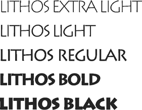
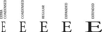
Figure 10-19 Variations in widths of type. Each variation is chosen for a specific purpose.

Figure 10-20 A roman typeface (Bodoni) showing a vertical look with thick and thin elements.
Figure 10-21 Italic version of the Bodoni family.
Script Type. Script letters resemble handwriting. Although the type designers have tried to make it appear as if all the letters are joined, small spaces can be seen between them. Some script letters appear to have been written with a brush, others with a calligraphic pen. Script should never be set in all capital letters because it is hard to read in that form.
ELECTRONIC DISTORTION OF TYPE
Computers and computer design programs such as Adobe InDesign have simplified typesetting and design. The software is so powerful that it permits distortions of type that can seriously damage the legibility of type.
When desktop publishing arrived in the early 1980s, default letterspacing (the space between letters in a word) was so loose that the resulting typography was often extremely unattractive. Designers with an eye for such things figured out ways to tighten the letterspacing but often with poor results. Applying the same space between each pair of letters produced varied results. As desktop publishing matured, default letterspacing improved dramatically. The problem now is that some designers can’t resist the temptation to overdesign, sometimes resulting in horrid distortions of typefaces.
Some software makes it possible to take a roman typeface and artificially create an italic version by slanting the type. But as any good typographer knows, that’s an abomination. Good italic fonts have the italicized sweep built right into the design of each letter. Publications that care about typography have set limits on the ability of designers to distort type electronically. Such distortion should be used rarely and then only in small doses as in a headline (or title) for a magazine feature story.
How to Measure Type from a Printed Page
It’s possible to measure type on a printed page but with less than complete accuracy. The height of type is measured from the top of the ascenders (the top stroke of a lowercase d, for example) to the bottom of the descenders (the bottom stroke of a lowercase p as an example).
Figure 10-22 shows imaginary lines by which letters are created. These lines are called the base line, on which all letters other than g, j, p, q and y rest; the cap line, to which most capital letters and tall letters rise; the lowercase line, where small letters align (called the x-height of letters); and the descender line. Each line helps in aligning letters.

Figure 10-22 The dashed lines define ascenders, descenders and x-height.

Figure 10-24 Why printed type is so difficult to measure. Each of these E’s is 48 points high, but the shoulder space (or descender space) of each varies.
For example, the ascender of the letter h rises above the lowercase line, but there is no descender below the base line. Thus, the shoulder underneath the letter must be included in the measurement. To accurately determine ascender space, simply look for a capital letter or one with a high ascender. If it is necessary to measure the point size of a line of capital letters, take the space normally used for descenders into consideration (see Figures 10-23 and 10-24).
Still, measuring type this way is far from accurate. Most typefaces have built-in leading to ensure white space between lines of type that is set solid. Further, on occasion printers enlarge or reduce pages during the printing process, so the end result might not be quite the same size as the original. So, at best, measuring type on a page is an estimate.
An Introduction to Leading
The space between lines of type is called leading (pronounced “ledding”). Remember that leading for body type usually has been determined when a newspaper creates its basic design. Therefore, computerized typesetting systems may be preset to control the amount of line spacing that the designer recommended. The machine automatically provides the leading desired.
But do not assume that because the leading has been preset it never can or should vary. In most operations, provisions have been made for changing the leading to meet certain needs, most often in feature stories or other special kinds of stories. When editors want to feature a momentous story, they should use additional leading. Leading usually makes lines of type easier to read because it gives readers more white space between lines, which helps them focus their eyes on the type. Also, when lines of type are 20 picas or wider and the shoulders of typefaces are short, additional leading should be used.
What, then, are the leading options? If a newspaper uses no leading at all beyond the height of the type itself, that practice is called setting type “solid.” (Actually there is a tiny bit of space between lines of type when it is set solid, caused by the descender space at the bottom, or shoulder, of each letter.)
LINE SPACING
The principle of making each line of type an easy eyeful can be aided by the generous (but not too generous) use of space between the lines. This provides a “rightof- way” for the eye along the top and bottom of each line. Types with short ascenders and descenders and large lowercase letters need more space between lines than faces with long ascenders and descenders and small lowercase letters. A fairly safe rule is to let the spacing between the lines approximately equal the space between words.
The above paragraph is set with generous spacing (3-point leads) between lines, while this paragraph is set with no leads and is consequently tougher ploughing for the eye. The type is the same size but looks smaller. Educated instinct will in time tell you the difference between jamming and scattering type lines.
Figure 10-25 The top paragraph has been leaded three points. The bottom has been set solid, meaning that there is no leading between lines. Leaded lines usually are easier to read than solid.
Options range from one-half–point to six-point leading for body type, and the range is extended from three to about 12 points of leading for headlines. The only way to know how type will look after it is leaded is to set a sample paragraph or two and study its readability. See Figure 10-25 for samples of alternative leading.
The Typography of Headlines
Type is most noticeable in publications and on websites when it is used in headlines. Indeed, one of the primary purposes of a headline is to attract the reader’s attention. As noted earlier, a headline often does this best when used in conjunction with photos or information graphics. Nevertheless, the bold display type used in headlines can be effective in attracting attention even when used alone. As noted in Chapter 9, most headlines are set in a downstyle in which editors use the same rules of capitalization as in sentences:
Bush defends decision to invade Iraq
Older forms of headline writing are increasingly out of style:
BUSH DEFENDS DECISION TO INVADE IRAQ
Bush Defends Decision to Invade Iraq
The all-cap style is out of vogue based largely on research that shows legibility is best, even in headlines, when normal rules of capitalization are followed. Occasionally, however, the news demands a splashy headline that conveys the added drama of the moment:
UNTHINKABLE TRAGEDY
Thousands die as airliners hit World Trade Center
Designers now know that any headline-size type can help draw readers into a story. As a result, newspapers, magazines and even websites use devices such as blurbs or pull quotes to draw readers into a story:
Eyewitness describes horror
of trapped victims leaping
to their deaths 100 stories below
‘I thought I had seen everything,
but this was the pinnacle of hell.’
—James Culligan,
New York firefighter
 Suggested Websites
National Press Photographers Association www.nppa.org
Pictures of the Year International www.nppa.org
Society for News Design www.snd.org
Suggested Readings
Baines, Phil, and Andrew Haslam. Type and Typography. London: Laurence King Publishing Ltd., 2005.
Franz, Laura. Typographic Web Design: How to Think Like a Typographer in HTML and CSS. Chichester, Sussex, England: John Wiley & Sons, Ltd., 2012.
Zavoina, Susan C., and John H. Davidson. Digital Photojournalism. Upper Saddle River, N.J.: Pearson Education, 2001.