PART 4
Editing for Different Media
| CHAPTER | 11 |
Editing Newspapers
For more than 300 years, newspapers have been the most comprehensive news medium around. Although they have lost much of their immediacy and some of their audience to radio, television and the Web, newspapers still provide unparalleled depth of information, particularly in local news. Only magazines and websites can equal newspapers here, but few magazines are available for the interpretation of local news, and most, although not all, quality local news sites are run by newspapers. In almost every city on Earth, the largest news staff is that of the local newspaper, often exceeding the size of the staffs of all the local broadcast stations combined.
As an example of the importance of newspapers in providing in-depth information, consider this: In 2012, Moore Information conducted a study of registered voters in America and discovered that 86 percent of those voting in the last previous local election read newspapers in print or online, including, surprisingly perhaps, 79 percent of voters aged 18 to 34. Newspapers and their websites also scored consistently higher than other media for being “reliable,” “accurate” and “in-depth” about local matters.
Another study, conducted by the Newspaper Association of America in 2012, found that 74 percent of Internet users rely on newspapers and their websites for news and other information, with 84 percent of them agreeing with the idea that newspapers contain more local news and 82 percent that they wanted the “depth and detail” newspapers offered.
Of course, the Web is well on its way to supplanting all traditional media, not just newspapers, or at least reducing their influence. But for now, we’re still a ways from seeing newspapers, magazines, books, movies, radio and TV disappearing. As for newspapers, they survived the coming of radio and television, and radio and movies survived the coming of television. History has shown that the rise of new media tend not to eliminate previous media but to take over some of their duties and bring about changes in their business models. Newspapers will survive for some time in some form, but increasingly they will be read online rather than in print, and editors will increasingly find themselves editing mainly for Web audiences. (See Chapter 13.)
As for newspapers, consider these facts from the Newspaper Association of America:
• Seventy-seven percent of adults nationwide read a newspaper or a newspaper website during the course of a week.
• Newspapers reach 65 percent of young adults (aged 18 to 24) in a given week.
• Newspapers reach high-income earners. Eighty-one percent of consumers planning to spend $35,000 or more on a vehicle in the next six months read newspapers. Indeed, newspaper readership increases as income increases.
• People with significant investments read newspapers. More than 80 percent of those with investments in stocks, mutual funds, money-market funds and the like read newspapers regularly.
• When consumers look to buy things, they think of newspapers first. Fifty-five percent go to newspapers first compared with only 19 percent for the Internet and 8 percent for television.
• Consumers rank newspapers as the best place to prepare for shopping for any kind. Direct-mail advertising and the Internet are distant second- and third-place choices, and television lags far behind.
• Newspapers reach men and women almost equally. About 78 percent of men and 77 percent of women read newspapers or their websites regularly.
• Visitors to newspapers’ websites say these sites are among their most-used media sources during the workday. Forty-nine percent spend time on these sites between the hours of 8 and 11 a.m.
• Eighty percent of newspaper website viewers cite these online destinations as their top Internet source for local news and information.
• Two-thirds (66 percent) of all online newspaper readers visit a newspaper website at least once a day. Half of these visit several times a day.
And yet, we all know that printed versions of newspapers are losing ground:
• Until 2008, newspapers often had profits in the 20 to 30 percent range. Now, profits average 11 percent. But by comparison, Fortune 500 companies typically make only 6 to 8 percent on their dollars invested.
• Newspapers had 27 percent of all ad revenue in the 1980s, but it’s fallen more than 20 percent since 2000. A main reason for the drop was the loss of classifieds to Craigslist and eBay, and job listings to sites like monster.com. Newspapers used to make 40 percent of their income from classifieds. Still, newspapers continued to have more ad revenue overall than any other medium, although the amount is dropping. Ad revenues for newspapers fell 8 percent in 2010. By comparison, online ads increased 10 percent the same year.
• Newspapers face online competition not only from sites by other newspapers, but also from broadcast outlets, TV networks and magazines; Internet-only local websites like The ChiTownDailyNews and TheVoiceofSanDiego.org; news aggregators like Google, MSN, Yahoo, Internet service providers and the Drudge Report; citizen journalism sites like CNN’s iReport; and blogs like dailykos.com and those at the Huffington Post. A big question facing journalism is who will pay for the newsgathering we need if newspapers, the source that has traditionally paid for it more than any other, can’t? Where will news aggregators get their news to link to and bloggers get their news about which to opine?
• The Web hasn’t made print papers obsolete, mainly because not as much money is made yet online as in print despite increases in online ad sales. Online revenue for newspapers was only 6 to 7 percent of their income in 2007. The vast bulk of their income continues for the time being to come from print. That’s why some papers publish print editions two or three days a week, also—to get more ad revenue. It’s also why Web publications often have small staffs, typically with many recent grads—to keep costs down.
• Young readers are moving to Web news, but they mainly weren’t reading print newspapers before. But many older people are following, and the Web seems the clear future. The problem is that although an Annenberg Center for the Digital Future study found in 2008 that Internet users were reading 53 minutes of news a week online, 22 percent said they had dropped subscriptions to print papers because they could get the news for free online. The same year, newspaper subscriptions dropped 7 percent, but by the end of the first quarter in 2009, unique visitors to newspaper websites grew by 10 percent.
• The business model problem facing newspapers, then, is how to transition from making most of their money in print, where costs of production and distribution are higher, to making most of their money online, where they face lower costs but more competition and an audience grown used to getting news for free.
All of this is important information for the prospective newspaper editor. The statistics describe a troubled but still profitable medium that is critical in the lives of many Americans. The statistics also describe a medium that has become a major player in the emergence of the Web as a viable and important source of news.
 EDITING THE WIRES
In Chapters 3 through 8, we explained in detail the role of the newspaper copy editor and the micro and macro editing that he or she must do. We also discussed legal and ethical issues that face the editor; grammar, usage and style; and how to put it all together. In this section, we address a facet of editing—editing wire copy—that is done almost exclusively at newspapers. To be sure, radio, television and websites also carry information from the wires, but much of it is run exactly as received. At newspapers, editors are encouraged to hone and improve what comes from The Associated Press and other services. Only at newspapers are reports from various wire services regularly molded into an entirely new story.
News from the wire services plays different roles in the various media. For radio, television and online media, breaking news provided by the wires remains a staple of the daily news report. For newspapers, which usually get second crack at wire stories after the broadcast media have used them, interpretation has become more important.
To be sure, newspapers still contain plenty of inverted-pyramid stories provided by the wires. But, increasingly, these are short summaries confined to roundup columns. The wire stories favored by newspapers today are those that expand on the bare-bones reports provided by radio and television. The mission of newspapers is to interpret, to explain and to amplify. That’s true of local news, too, but the trend is particularly noticeable in the wire report.
Today, most newspapers prefer what editors call second-day leads for second-day wire stories. For example, a report of an airplane crash written for radio, television or the Web would stress the breaking news that a plane had crashed. But by the time the local newspaper is published tomorrow morning, a fresh approach would be required that might, for example, try to answer the question: Why or how did this happen?
Seldom do newspapers have the opportunity to beat the electronic media to a wire story. That reality leads to a different approach to writing the story along with a headline that stresses the latest developments since the original story broke. Taking this approach is tacit recognition of the fact that the various media have different strengths. The broadcast and online media excel at delivering the news with speed; newspapers have the time and space to provide analysis and insight.
Sources of Wire News
The dominant wire service in the U.S. is The Associated Press, a cooperative owned by member newspapers and broadcast stations. Privately owned United Press International, once a major competitor, shriveled into a minor player after going through a series of bankruptcies and ownership changes during the past 50 years. Today, owned by News World Communications, UPI’s main presence is in radio newsrooms, where it provides a bare-bones news service at a relatively low price. Its news report is no longer adequate for newspapers to use as their only source of wire news, and few newspapers in today’s tough market can afford two mainstream services.
The decline of UPI opened the door to the U.S. market for British-owned Reuters, French-owned Agence France-Presse and other foreign-based services. Major U.S. newspapers often subscribe to such services, which provide excellent alternatives to AP for international news at affordable rates. Increasingly, the major foreign services cover U.S. news, as well.
Another source of wire news is the so-called supplemental wire services—syndicates and news services formed by major metropolitan newspapers, alliances of such papers or a newspaper group. Such services make it possible for a newspaper in Danville, Ill., to carry a major investigative piece from The New York Times on the same day the Times itself carries the story. Thus, even small newspapers have the opportunity to provide investigative accounts and in-depth reporting that radio and television rarely offer. Among the supplemental services are The New York Times News Service, the Los Angeles Times–Washington Post News Service, and the Copley, Cox, Gannett and Scripps-Howard news services. By syndicating their news, publishers participating in the supplemental services are able to recoup some of the costs of news gathering and, in fact, have been able to expand news coverage.
The services mentioned are among more than 200 syndicates offering news, features, photographs, illustrations and special services. In addition to giving spot and secondary news, these services provide news of sports, food and fashion, and bylined columns and features that cover everything from personal computing to zoo animals.
News is visual as well as written, so the wire services and syndicates often handle pictures and graphics in addition to text. The AP has special networks for delivering both photos and graphics. Today, wire photos are processed in digital form rather than with conventional photo-processing techniques. Information graphics—maps, charts and graphs—are delivered directly to computers.
With UPI’s decline, that service’s once-powerful picture service also suffered. Consequently, UPI linked with the French news agency, AFP, to retransmit its photos in the U.S. Reuters also has entered the picture business in the U.S., as have several syndicates.
How the Wires Operate
Stories delivered by a wire service come from several sources:
• Copy may be developed by the agency’s own large staff of reporters, feature writers, analysts, columnists and photographers. Other wire service staffers rewrite from any source available—smaller papers, research reports and other publications.
• Stories from the service’s subscribers may be circulated. Newspapers and broadcast stations contracting with a wire service agree to make their own news files available to the service, providing electronic versions of broadcasts or stories.
• Stringers or correspondents in communities where there is no bureau can submit stories. These newspaper reporters are called stringers because of the old practice of paying correspondents for their strings of stories by the number of column inches.
• Exchanges of stories may be made with other news agencies, such as foreign agencies.
A reporter transmits a story to the state bureau of AP. If the story has statewide interest, AP files the story on its state wire. If the story has regional interest, the state bureau offers it to a regional bureau, or, in some cases, the state office may offer the story directly to the national desk.
The national desk thus becomes the nerve center for the entire operation of the news agency. This desk collects news from all the state, regional and foreign bureaus, culls the material, then returns it to the regional and state bureaus or to subscribers directly.
Traditionally, the wire services have opened the news cycle with a news budget or digest that indicates to editors the dozen or more top national and international stories that were in hand or were developing. Today’s wire editors may get a four- or five-line abstract of the complete offering—foreign, national, regional and state—directly to the newspaper’s computer. From these abstracts or from computer directories, wire editors select the stories they think would interest their readers. Then they retrieve these stories directly from the newspaper’s computer.
Budgets and Priorities
The wire services operate on 12-hour time cycles—PMs for afternoon papers, AMs for morning papers. The broadcast wire is separate, but major broadcast stations also take the newspaper wire, which is more complete. The cycles often overlap so that stories breaking near the cycle change are offered to both cycles, or stories early in one cycle are picked up as stories late in the other cycle.
Wire editors have two considerations in selecting wire copy for publication—the significance of the stories and the space allotted for wire copy. If space is tight, fewer wire stories are used, and heavier trims may be made on those that are used.
Budget stories usually, but not necessarily, get top priority. When stories listed on the budget arrive, they are indicated by BUDGET, BJT or SKED, together with the length in words. If such stories are developing or are likely to have additional or new material, the editor will wait before assigning them if possible and concentrate first on stories that will stand. The wire service will typically notify wire editors when a recap is coming, and then deliver a complete story.
Editing Wire Stories
At most newspapers, wire copy is edited the same as local copy, but a few peculiarities apply to the editing of wire news. First, wire news, unlike most locally written news, usually carries a dateline, which indicates the city of the story’s origin:
OVERLAND PARK, Kan. (AP)—An apparent good Samaritan …
Note that the city of origin is in capital letters, and the state or nation is in uppercase and lowercase letters. At most newspapers, style calls for the dateline to be followed by the wire service logotype in parentheses and a dash. The paragraph indention comes before the dateline, not at the start of the first paragraph.
Stories that contain material from more than one location are called undated stories. They carry no dateline but a credit line for the wire service:
By The Associated Press
Arab extremists said today …
Stories compiled from accounts supplied by more than one wire service carry similar credit lines:
From our wire services
LA PAZ, Bolivia—Mountain climbers tried today to reach the wreckage of a …
 Wire Stories Versus Local Stories
Editing Wire Stories
• They usually take much less time to edit than local copy, but they still have errors. Don’t trust them too much.
• You usually can cut more from them, and you don’t get complaints from the reporter.
• Many newspapers don’t use bylines for wire stories.
• Don’t be afraid to call or email the wire service with queries.
• Don’t automatically assume that because you received a rewrite that you need to replace a story already on the page. Often, the rewrites contain only additional quotations or minor details. But you need to check them.
• Look for missed angles. Sometimes, the wires bury much more interesting angles than what they lead with, so move up the better ones, especially local angles.
Cutting Wire Stories
Given the limited space in many newspapers, editors usually try to run local stories fully and make cuts in wire stories. One thing you’ll be called on to do is to cut wire-service stories—often to turn 18-inch stories into 3-inch briefs.
Remember, though, that if the story is written in an inverted pyramid, the most important 3 inches are at the top. If it’s not in inverted pyramid form—if it’s a feature, commentary or analysis—it should not be chopped. Don’t even waste your time trying. Just point it out to the slot person, who probably was misled by a poorly written budget summary.
Here’s what to do when told to chop a wire story to a brief:
• Scan it to make sure it’s in the inverted pyramid form.
• Thoroughly edit the first four or five paragraphs, then ask yourself whether anything would be left up in the air if the remainder were cut.
• Scan the rest of the story to make sure a better detail is not buried, or that the first few paragraphs were not misleading.
• If necessary, move material up. If not, chop at that point.
• Measure the story, then tighten to the exact fit.
Editing Local Stories
• Even though you’re working with professionals, local stories may have more problems than wire stories.
• Local stories should not be cut, if possible, at the copy desk. That doesn’t mean they should never be cut, just that you try to cut from wire stories first.
• The copy desk usually isn’t as free to rewrite or reorganize local stories as it is wire copy, although editors hope they don’t have to do much of either given the deadlines.
• Become familiar with the local stylebook and note how it handles these two categories of items: the few ways it differs from AP and those entries local to your paper, such as names of places in the area and ethics policies of your newspaper.
On each news cycle, editors have more stories than they can use. On larger dailies using all the wires from the AP and several supplementals, the flow of copy is monumental. To handle this spate of copy, the computers are set to recognize the different headings on wire stories and sort them according to categories like state, national, world, Washington, features and so on.
An advantage of the paper’s subscribing to more than one news service is that the editor can use the story from one service to check facts against the same story from another service, such as casualty figures, proper names and spellings. If there is a serious discrepancy in facts, the editor asks the state or regional bureau for verification.
When editors combine stories, all should be credited, usually at the end of the story. Combining the stories this way often provides a newspaper’s readers with a better story than could be obtained from either of the major services alone. Good newspapers make a habit of doing this often. But note that wire stories often use the word here to refer to the city included in the dateline. If the editor has removed the dateline during the editing process, the city must be inserted in the text.
Wire services typically use Eastern time in their stories. Some newspapers outside the Eastern time zone prefer to convert these times by subtracting one hour for Central time, two for Mountain or three for Pacific. When this is done, if the dateline remains on the story, it will be necessary to use phrases such as “3 p.m. St. Louis time” or “1 p.m. PDT” in the text.
If you use other wire services in addition to the AP, as many newspapers do, be on the lookout for differences between the styles of those services and AP. There won’t usually be many. But once you’ve identified the differences and know what to look for, you can be faster and more complete in fixing the style in the stories to be more consistent. For example, The New York Times capitalizes federal, government and administration, contrary to AP style. The Times writes 3rd rather than III behind a name.
Two points should be kept in mind as you edit wire copy:
• The wire isn’t sacred. The AP has a deserved reputation for accuracy, impartiality and speed of delivery. It also makes errors, sometimes colossal ones. Other services do, too.
• No wire service tailors copy for a particular newspaper. You have to do that yourself. Abundant details are included, but most stories are constructed so that papers may use the full account or trim sharply and still have the gist of the report.
LOCALIZING WIRE STORIES
Wire stories often become ideas for local stories. If Congress has reduced the amount of money it will provide for loans to college students, a newspaper in a college town may want to contact the college’s financial aid officer to determine what effect the measure will have locally.
When the Soviet Union shot down a Korean Airlines plane, the Columbia Missourian learned that two people were aboard who had just completed their doctoral degrees at the University of Missouri. Their daughter was with them aboard the jet. Because members of the family had lived in Columbia for several years, many people knew them. As a result, a major international story became a local story.
Here are some tips for localizing wire stories:
• Convert time to local (EST becomes CST, for example).
• Adjust for local style.
• If you find a local name or place buried in a wire story, move that angle up or develop it into a sidebar or a story, using the wire service for background.
• Add the votes of local legislators to wire stories. These votes will often move on the wire as a sidebar to the story if the issue is important.
• Even if there is no local name in the story, ask yourself whether the story has local impact. If so, give a printout of it to the city desk and suggest a local sidebar.
 DESIGNING THE NEWSPAPER
Once material for the newspaper is gathered and edited, it’s time to produce the final product. Although the most important part of a newspaper is unquestionably its content, a close second is the newspaper’s design, which plays a critical role in selling it to readers.
A half century ago, newspaper design was an afterthought at most papers. When top editors felt pressed to compete with the eye appeal of television, however, that began to change. Now, design is considered a critical part of the newspaper’s sales equation. A reflection of that reality was the creation of the Society for News Design in 1979, an organization that has led revolutionary change in design.
Objectives of Newspaper Design
Five major objectives should guide an editor in working effectively with newspaper design:
The design should organize the news. Every design should show readers know which stories are most important. One element of organization is story placement throughout the newspaper. The design staff should place stories adjacent to other, similar stories in clearly labeled sections of the paper. Organization also covers each individual page. Page designers have many ways of telling readers which stories are most important: by placing them at or near the top of a page, by placing them in boxes and by setting their headlines in large type.
The design should create an attractive page. Good design should be attractive to most readers. An attractive design invites readers to come into a page and read the news. An unattractive design could do the opposite.
The design should complement the stories. Some stories need a second deck or a blurb to add more details than a single headline could provide. Some stories need pictures to get them across clearly. Some stories need graphics or charts, such as a list of main points from a speech or budget proposal, or a map of where a park mentioned in a travel story is located. Sometimes, the main story on the front of a feature section will use a different headline type that reflects the subject matter better, such as a typeface that captures the feel of a circus, for a story about one that’s come to town.
The design should be interesting or dramatic. To avoid creating a monotonous page, a design editor can vary story shapes or design stories into strongly vertical or horizontal shapes. Stories can be boxed, run over colored tints or run with multiple photographs. All these are styling devices to avoid boredom.
The design should appear contemporary. Design should reflect contemporary culture. It seems illogical to place contemporary news in an old-fashioned format.
Newspapers and the Principles of Artistic Design
The application of artistic design principles can help design editors achieve their objectives and carry out their responsibilities. The newspaper is a graphic art form, using words, pictures, color, lines and masses subject to the same principles of artistic design as other art forms. The principles most applicable to newspapers are known as balance, contrast and unity.
BALANCE
Balance means equilibrium. In other words, a page should not be overwhelmingly heavy in one section or extremely light in another. Top-heaviness is the most common form of imbalance in newspaper design, caused by placing large and bold headlines at the top while using almost insignificantly light headlines at the bottom. Another cause of imbalance is the practice of placing a large, dark picture at the top without having one of similar size or weight at the bottom. As a result, readers’ eyes tend to gravitate toward the bolder sections of the page and away from the lighter portions. Assuming that every element on a page has value, an unbalanced page is more difficult to read than a balanced page.
The easiest way to think of balance is to imagine a line down the center of the page from top to bottom and another across the middle of the page from left to right. Then, weigh the most outstanding elements—such as pictures, graphic elements and bold or large headlines—at the top of a page against similar headlines at the bottom, particularly in the opposite quadrant. If the bottom of the page has no bold or large headline, the page is probably top-heavy.
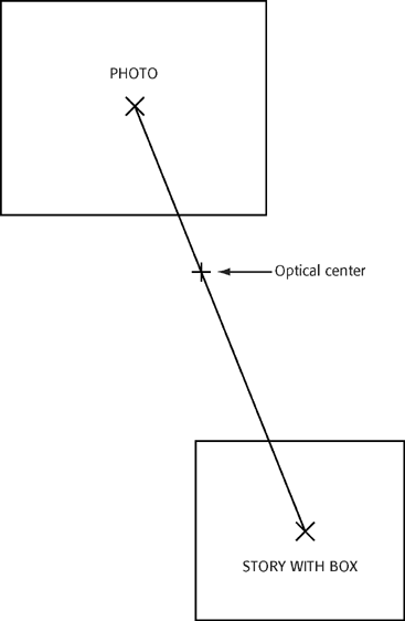
So, if there is a strong graphic element in the upper left quadrant, such as a picture, it should be balanced by a graphic element such as a picture or box in the bottom right one, but not one as big, or the page will look too symmetrically balanced. Balance is best when it’s not so obvious. Obvious page balance is called formal or symmetrical balance because one side of the page tends to mirror the other. But most designers prefer informal balance where the feeling of equilibrium is there less obviously. (See Figure 11-1.)
CONTRAST
Contrast is the principle of using at least two or more elements on a page, each of which is dramatically different from the other. A light headline may contrast with a bold headline, a small picture with a larger one. Because one element is different from the other, the page appears lively and interesting.
Contrast, therefore, is a means of preventing artistic pieces from becoming dull. Almost all art forms have some contrast—especially musical compositions, theatrical plays and printed material. A symphony, for example, contrasts a fast and loud first movement with a soft and slow second movement. A play has a relatively quiet scene contrasting with a lively scene. A book or magazine may have most pages printed in black and white contrasting with full-color illustrations.
In page design, contrast prevents a page from appearing too gray, a problem that occurs when there is too much body copy and too many light headlines. Gray pages appear uninviting and forbidding.
Sometimes, when a page has been deliberately designed to feature balance, it may lack contrast and appear rather dull. The editor, therefore, may have to brighten that page by adding another picture or large, bolder headlines to bring about better contrast.
Contrast may be achieved in four general ways: by shape, size, weight and direction:
• Shape contrast may consist of a story set justified in opposition to another story set flush left, ragged right. Or a profile of a person may be used with a rectangular picture.
• Size contrast may be achieved by using a large illustration on the same page as a smaller one, or large type with smaller type.
• Weight contrast may employ a picture that appears black with a lighter picture, or a headline set in boldface type contrasted with one set in lighter typefaces.
• Direction contrast would show vertically shaped stories next to horizontally shaped stories.
These contrast alternatives are but a few of many that are possible on any given page. An objective of designing a page, however, is to achieve pleasant contrast.
UNITY
The principle of unity creates a single impression in a page design. Stories on a unified page each appear to contribute a significant share to the total page design. A page that does not have unity appears as a collection of stories, each fighting for the reader’s attention to the detriment of a unified page appearance. A unified page, on the other hand, appears as if everything is in its correct position, and the page is therefore interesting.
The editor plans for a unified page by keeping the design of the entire page in mind at all times while working on any part of it. Each story, therefore, must be visually weighed against all other stories. The editor may have to shift some stories until a satisfactory arrangement has been found.
How to Recognize a Well-Designed Newspaper
Although graphic designers may disagree about the precise criteria of good design, there is enough agreement to build a body of knowledge that can help people recognize good design. These are the general characteristics of a well-designed newspaper:
• Good overall organization. Good design organizes the news to help readers easily find the news they want to read. Similar kinds of news ought to be nearby, if possible. Readers dislike reading stories in one section of the paper and then having to look for additional stories of the same type in some distant part of the paper.
• Placement of individual stories that is well thought out. The reader should be able to tell at a glance which stories the editors think are more important by not only which page they’re on but also where on the page, how big the headline is and how long the story is.
• News that is easy to follow. Pages should be arranged in a way that makes it easy to follow a story from column to column.
• Attractive display of illustrations. Photographs with a fine screen (above 100 lines to the square inch) are usually the ideal. This makes it easy to see the details. But the quality of newsprint often determines screen sizes, and with the cost of newsprint rising, better-quality paper may be too expensive. Photographs must be given adequate space, and enough of them should be used to illustrate at least the highlights of the news. There are no rules that require a precise number of photographs be used each day or how large they should be. Artistic judgment is usually required to place illustrations on a page. Some designers like at least one dominant illustration on every page, accompanied by one or more smaller illustrations. The worst-designed pages tend to use illustrations that are all about the same size.
• Graphic unity. Attractive pages usually look unified, as if everything on the page were carefully placed just where it is.
• Balanced pages. The best pages usually are not top- or bottom-heavy. Although readers usually cannot discern balance in particular, they get the feeling that a page is or is not out of balance, one way or another.
• Pages with contrast. Of all the basic principles of design, contrast is the most important for attractiveness. Pages should be designed to have some, but not overwhelming, contrast. Contrast generally provides attractive pages by offering readers a change of pace. The contrast may be large versus small photographs, dark versus light sections of the page, regularly versus irregularly shaped stories or illustrations and vertically versus horizontally shaped photographs.
• Adequate white space. There usually is a sense of agreement about what is attractive and what is not. Generally, an attractive newspaper has an adequate amount of space between lines of type, between stories and between columns. Avoid a tight page design, in which there is so little space between stories that readers have difficulty concentrating their attention on any one item. Good design tends to have generous amounts of white space carefully distributed on a page, which aids legibility.
• Generous line spacing. Good typography usually requires adequate to generous amounts of leading—space—between lines. But there may be a point of diminishing returns. It takes a keen sensibility to know what leading is ideal. Wider column widths require more leading than shorter widths.
• Different typefaces kept to a minimum. Copy editors typically have little choice on a daily basis over which fonts to use. Publications usually keep their overall design for years, each issue using the same fonts for all headlines, text, subheads, blurbs and captions. But a typical exception might be a feature-section cover page, in which in addition to the newspaper’s usual fonts, one more display type might be used to accent the main story’s headline. Editors without much of an eye for graphic appeal may be tempted to use too many typefaces on the same page, but the result may look like a ransom note. Designers typically say use no more than three fonts per piece—one for the display or headline text, one for the body text and one more for some kind of emphasis, such as blurbs. Often, there may be fewer than three, with headlines and text, for example, both using different sizes and boldness of Times New Roman.
PROPORTION AND MOVEMENT
Proportion is based on a cultural concept first delineated by the ancient Greeks, who felt that certain proportions are more interesting to look at than others. The ideal proportion is a ratio of approximately 3-to-5. You can see it most often in architecture, where one side of a rectangle is smaller than the other. The proportion of doors and windows is approximately 3-to-5, but square windows are not. In newspaper photographs, the more attractive shapes are about 3-to-5.
Movement is sometimes used on paintings, drawings, photographs and similar kinds of artwork. Advertising design often uses the concept of movement to get readers to move from the upper left-hand part of an advertisement, where the message usually begins, to the lower right-hand corner where the logotype often closes the ad. But for regular reading material, there is a natural movement in headlines and body type because we read from left to right. It isn’t necessary to try to move readers’ eyes in other directions.
Problems in movement, though, are created when kickers or read-in blurbs (see Chapter 9) are used. Because the type in them is smaller than the headline they’re placed over, a reader’s eyes will naturally be drawn to the bigger headline type first, then the kicker or read-in blurb second, which means not only that these elements will be read backward but also that the reader’s eyes will be drawn away from the story rather than into it.
Visualizing Total Page Structure
Page design begins with some idea of general structure. Will pages be horizontally or vertically shaped? If the designer doesn’t determine this early in the process, pages may have a circus design with little order to them.
In early U.S. newspapers, pages were all vertical. On a typical page with eight columns, the stories all started at the top, and readers read down and then up to the top of the next right-hand column. Reading down and up describes vertical designs. Today, publications mainly use modular design, which tends to be mainly horizontal.
We know from preference tests among consumers that most dislike equal divisions of space. Figures 11-2, 11-3 and 11-4 show how a page divided into equal proportions tends to look dull, while papers with uneven proportions tend to look much more interesting.
 Quick Guide to Newspaper Design
The Basics
• Work in rectangles.
— One is one column, one is multicolOn inside pages, begin by squaring off rectangles that match the top of the ads.
— Make the design primarily horizontal, but try to get at least one vertical element on each page.
— It is not essential to avoid gutters all the way down a page, but try to do so anyway. Think of a brick wall or a Piet Mondrian painting.
• Avoid bumps (headlines beside headlines) unless there is a line between them or
— One is one column, one is multicolumn.
— There is at least one standard point size difference between them (e.g., 24 against a 36, skipping 30).
— And, the multicolumn head is only one line deep.
• Avoid boxes against boxes.
• Avoid placing photos and graphics next to unrelated art.
• Avoid placing boxes or art against ads if they could be confused with the ad stack.
• Balance opposite quadrants of the page.
— Avoid formal balance. Asymmetrical design works better.
— On inside pages, place graphic elements in the corner opposite the ad stack.
— On the front page, the main story is usually either stripped across the top or put in the upper-right corner. The dominant art is usually placed in the upper-left quadrant of Page One and is often four-columns and boxed.
How to Add Flair
• Add second decks.
• Add read-out or read-in external (summary) blurbs.
• Add internal blurbs.
• Add a hammer or kicker.
• Set the story on a bastard measure (such as 5 on 6).
• Use art supplied with the story.
• Pull a mugshot from the morgue of someone prominent in the story.
• Create a summary box of bullet items from the story, such as key quotes from a speech or main items voted on at a city council meeting.
• Create your own information graphic.

Figure 11-2 Dividing a page into two equal divisions (either vertically or horizontally) tends to be dull or uninteresting.
Figure 11-3 Dividing a page into unequal modules is far more interesting. This arrangement is particularly attractive.

Figure 11-4 Additional page divisions also may be interesting, but may become too complex and hard to read.
 Suggested Websites
The Associated Press www.ap.org
Tim Harrower www.timharrower.com/designdoc.html
Los Angeles Times–Washington Post News Service www.washingtonpost.com
Newspaper Association of America www.naa.org/
Poynter Institute www.poynter.org
Society for News Design www.snd.org
Suggested Readings
Dignan, Larry. The Business of Media: A Survival Guide. Seattle, Wash.: Amazon Kindle, 2011.
Goldstein, Norm, ed. The Associated Press Stylebook and Briefing on Media Law. New York: Basic Books, 2012.
Harrower, Tim. The Newspaper Designer’s Handbook. New York: McGraw Hill, 2007.
Moen, Daryl R. Newspaper Layout & Design: A Team Approach. Ames, Iowa: Iowa State Press, 2000.