
Graphic designers see the Web as one more medium in which to present their work. Consumers see it as a place to buy music and sell used cameras and lawnmowers. Big business sees it as a platform on which to develop new kinds of applications.
Any way you look at it, the Web has changed the world of graphic design. In the earliest days of the Internet, content was king, plain old HTML got the job done, and website design was, at best, a hack. These days, the best website designs utilize Cascading Style Sheets (CSS). CSS is an established style sheet language that separates layout from content. This separation allows the designer to create visual consistency while somebody else works to create compelling content. CSS designs also make effective use of graphics, and that’s where GIMP comes in. It provides designers with the raster images required by the Web.
Note
css Zen Garden (http://www.csszengarden.com/) has some excellent examples of CSS in action and shows you how the same content might look in several different designs.
One traditional limitation of the Web, at least from the designer’s point of view, has been its static nature. Animated GIF images were an early hack, but they didn’t provide real interactivity. Today, Adobe Flash works well with raster images, but it also offers web designers a wealth of vector support. GIMP isn’t the best tool for vector work, but if your web designs use raster images, Flash and GIMP make a great team.
Note
If you’re interested in vector design, you can try Inkscape (http://www.inkscape.org/), another open source graphics tool.
Some of the previous tutorials have started with the default canvas size of 640 × 400 pixels. This has made it easy to re-create the tutorial image quickly, but you’d need to work with larger canvas sizes to make those images suitable for print or other media formats.
Well, that all changes now. Throughout this chapter, the image resolution of your desktop (72 ppi for most CRT displays or 98 ppi for LCD displays) will also be the image resolution of the medium. That means the images created in this chapter won’t need to be re-created at larger sizes. In fact, some will probably need to be scaled down (or re-created at a smaller scale) to be useful on the Web.
The focus of these tutorials will be the creation of simple graphics for the Web, specifically navigational aids, backdrops, advertisements, and logos. To find techniques for achieving more sophisticated photographic effects you can then incorporate into Flash or complex CSS designs, see Chapter 2 and Chapter 4.
When working on the Web, you’ll find yourself using a variety of the GIMP’s tools and filters. Two of the tools you’ll use for nearly every project are the Text tool and Blend tool.
Most web pages are made up of text and images. The text is often composed in WordPad, OpenOffice.org Writer, or vi, and web developers assume that the reader’s browser will have access to the fonts required to display the text. The web designer can request a particular font, but if the browser doesn’t have it, the browser gets to choose which font it will use instead. Because the various desktop platforms (Windows, Mac, and UNIX/Linux) don’t all have the same fonts, you can’t guarantee readers will see your web pages exactly the way you do. In short, because the Web still doesn’t support cross-platform font management very well, you can never be 100 percent certain that the font you request will be available on the system running the web browser.
Note
Support for web standards relating to typography is still too new for most web designers to depend on.
One solution to this problem is to use rasterized text for some text elements. Using the GIMP to render text into an image guarantees that everyone who sees the image will see it as you do. This little trick is only suitable for titles and small captions, however. It makes little sense to render entire paragraphs into an image because image files are much larger than text files, and editing the text would require working with graphics programs that aren’t as well suited to text editing as HTML editors. Despite this, it’s quite common to render text for headers, buttons, and title bars into images in order to guarantee that those elements will look the way the designer wants them to look.

The Blend tool and the Bucket Fill tool make it easy to colorize images and clipart. Sometimes adding a splash of color is the best way to give your client’s ordinary image a unique identity.
All your web design projects will use multiple layers. In addition to the familiar Layers dialog and Layer menu, the Colors menu will play a big role as well.

Finally, when designing web interface elements such as navigation aids, effective use of selections is crucial (see 1.4 Selections if you need a refresher).
Website buttons come in many shapes, sizes, and colors. Not every button makes sense in every design. Rectangular buttons are popular because they can be changed easily without having to worry about how they blend into background pages. Gel buttons, on the other hand, generally require a lot of page space. Their nonrectangular shape also requires antialiasing the background color and makes it difficult to switch the background on a whim. Despite these shortcomings, many clients want websites with gel buttons.
Should you decide to use gel buttons in a web design, you’re in luck. They’re easy to create with GIMP. As is true of most 3-D effects, the trick is to play with light and dark regions to simulate depth and reflection.
This tutorial will walk you through the creation of a simple gel button. The technique is essentially the same for any type of gel effect. The tutorial in 5.2 Gel Type shows a similar effect applied to text. Here you’ll see a more general version of the process, but the possibilities are endless. It’s not hard to imagine extending this effect to an oozing tube of toothpaste, for example. Just cycle the results through a wave filter.

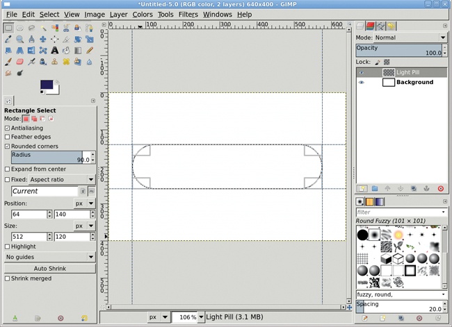
Start by opening a new white canvas window, set to the default width and height (640 × 400 pixels).
Create a new transparent layer in this canvas by choosing Layer▸New Layer and setting the Layer Fill Type to Transparency. Name the new layer Light Pill.
Add vertical guides at 10 percent and 90 percent (Image▸Guides▸New Guide (by Percent)). Add horizontal guides at 35 percent and 65 percent.
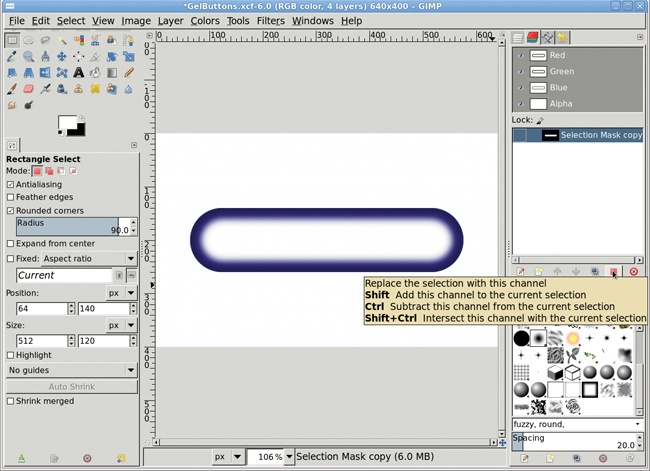
Choose the Rectangle Select tool and use it to create a selection in the center rectangle that’s outlined by these guides. In the Tool Options dialog, check the Rounded corners checkbox and set the Radius to 90 percent to provide a high level of arc on the ends of the selection. (The Radius specified is actually a percentage of half the width or height of the selection, whichever is smaller.)
Remove all guides (Image▸Guides▸Remove All Guides).
With the canvas selected, press D to reset the foreground and background colors.
Click the foreground color icon to open the Change Foreground Color dialog. Set the RGB values to 17/95/239 for the bright blue shown here, and then click OK to close the dialog.
Drag the foreground color icon from the toolbox into the selection to fill it with this color.
Shrink the selection by 20 pixels (Select▸Shrink) and save it to a channel (Select▸Save to Channel). You can keep the default channel name, Selection Mask copy.
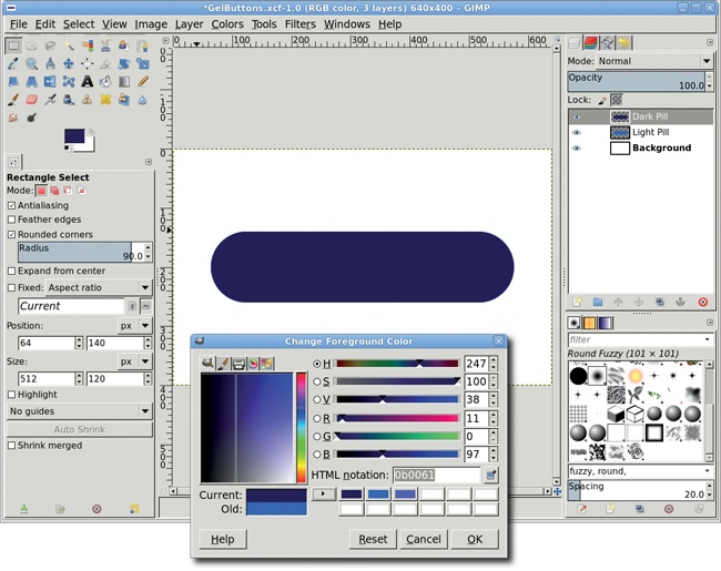
Return to the Layers dialog and click the Light Pill layer to make it active.
Clear the selection (CTRL-SHIFT-A).
Duplicate the Light Pill layer (Layer▸Duplicate Layer). Name the new layer Dark Pill.
In the Layers dialog, check the Lock alpha channel box (the small, gray checkered box in the “Lock:” row). Click the foreground color icon to open the Change Foreground Color dialog. Set the RGB values to 11/0/97 for the dark blue shown here, and then click OK.
Drag the foreground color icon from the toolbox into the Dark Pill layer. Because the Keep Transparency option is selected, only the pill should be filled with the new color.

Create a new transparent layer by choosing Layer▸New Layer and setting the Layer Fill Type to Transparency. Name the new layer Lower Highlight.
In the Channels dialog, click the Selection Mask copy channel, and then click the Channel to Selection button (red square with dotted outline).
Return to the Layers dialog and select the Lower Highlight layer to make it active.
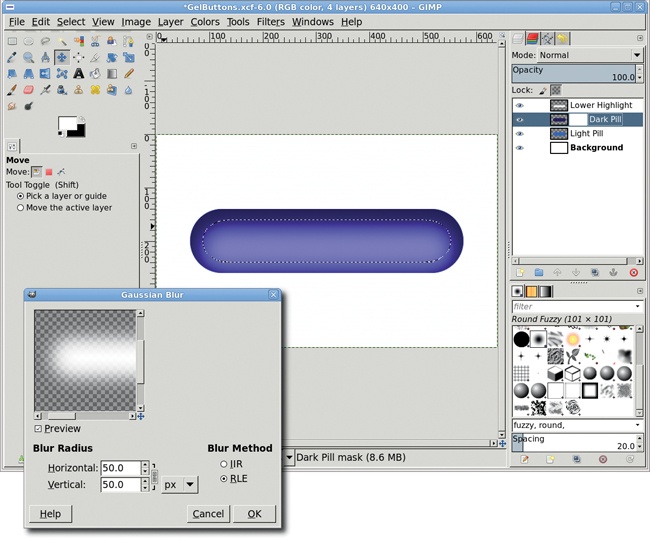
Feather the selection by 20 pixels (Select▸Feather).
With the canvas selected, press D and then X to set the foreground color to white, and then drag the foreground color icon into the selection. Clear the selection (CTRL-SHIFT-A).
Open the Gaussian Blur filter (Filters▸Blur▸Gaussian Blur) and apply a blur of 50 pixels to the Lower Highlight layer.
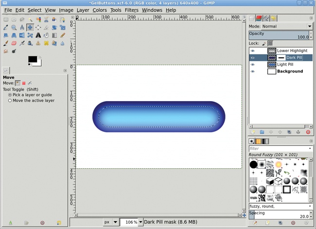
With the canvas selected, press M to activate the Move tool, and then drag the Lower Highlight layer down so its lower white edge just touches the Dark Pill layer’s lower edge. Set the layer mode for the Lower Highlight layer to Grain Merge.
Click the Dark Pill layer. Select the nontransparent region (Layer▸Transparency▸Alpha to Selection), and then invert the selection (Select▸Invert).
Click the Lower Highlight layer to make it active. Press CTRL-X to cut off any bits of the highlight that may overflow the bounds of the button when it’s moved down.
We’re beginning to see the 3-D effect, but you still need to bring out the highlights from the Light Pill layer showing through the Dark Pill layer. Do that with a layer mask on the Dark Pill layer. As a result, there’ll be more light reflection on the front of the pill and less reflection along its sides.
In the Channels dialog, click the Selection Mask copy channel, and then click the Channel to Selection button.
Click the Dark Pill layer in the Layers dialog. Add a white layer mask (Layer▸Mask▸Add Layer Mask), and then feather the selection by 50 pixels (Select▸Feather).
Drag the Foreground color box into the canvas to fill the selection with black.
Add a new transparent layer by choosing Layer▸New Layer and setting the Fill Type to Transparency. Call the new layer Top Highlight. If it is not at the top of the layer stack, move it there by clicking and dragging it up in the Layers dialog.
With the selection still active and the canvas selected, press M to activate the Move tool. In the Tool Options dialog, click the Selection button (red square with dotted outline in the “Move:” row). In the canvas, drag the selection up until its upper edge meets the pill’s upper edge. Be sure to reset the Move setting to Layer in the Tool Options dialog when you’re done to avoid confusion the next time you use the Move tool.
In the canvas window, press L to choose the Blend tool from the toolbox. In the Tool Options dialog, choose the FG to Transparent gradient.
Press D and then X in the canvas window to set the foreground color to white. Drag in a straight line from the top of the selection to the bottom.

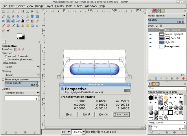
Reflections of light off of a shape like this one aren’t always uniform. To make this design more realistic, you need to stretch the upper highlight so it’s a little wider at the bottom. You can do this with the Perspective tool. This tool changes the angle between the sides of a rectangular area while keeping the sides straight. For an oval selection, imagine the selection is tied to the sides of a box bounding the selection. When the bounding box is stretched, the oval selection is stretched to keep it proportionally distanced from the sides of the bounding box. In this case you’ll be transforming the layer itself, not a selection, but you’ll use the selection to create the bounding box used to perform the transform.
Choose the Perspective tool. In the Tool Options dialog, select the Transform option to Layer.
Click the canvas. Drag the bottom handles horizontally until the highlight touches the left and right sides of the canvas window. You may need to zoom out first before attempting this so you can drag the handles past the edges of the canvas. You may also want to reduce the number of guide lines to 1 in the Perspective Tool Options dialog to make it easier to see the previewed changes.
Click the Transform button. Anchor the layer (Layer▸Anchor Layer).
Click the Light Pill layer. Select the nontransparent region (Layer▸Transparency▸Alpha to Selection), and then invert the selection (Select▸Invert).
Click the Top Highlight layer to make it active. Press CTRL-X to cut off any bits of highlight that overflow the bounds of the button.
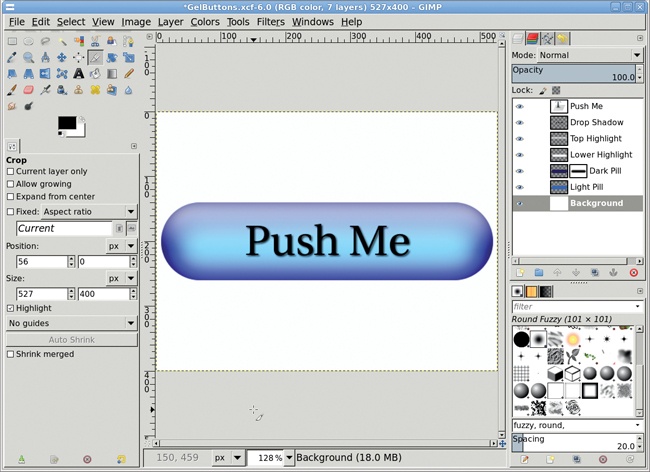
Now add some text to the button. Be sure to choose a legible font. I’ve used Utopia, set to 65 pixels and colored black. If the foreground is not black, type D in the canvas to reset it. (If your website will have multiple gel buttons, size the font so the longest piece of button text will fit comfortably.)
Clear the selection (Select▸None).
Click the canvas and type Push Me.
Use the Move or Align tool to center the text on the pill. Make sure the Push Me layer is active in the Layers dialog.
Add a drop shadow (Filters▸Light and Shadow▸Drop Shadow). In the Drop Shadow dialog, set the Offset X and Offset Y fields to 2 pixels, the Blur Radius to 3 pixels, and the Opacity to 80 percent. Check the Allow resizing checkbox.
Remember that reflected light is seldom uniform across an object, even if the object is perfectly shaped. This is what gives brushed metal its appearance and why gel buttons don’t look like metal tubes. To achieve an even more realistic look, try adding nearly transparent shadow layers in addition to the highlight layers.
The gel button technique is easy to master, but generating metallic buttons is even easier. This technique is very generic and simple to reproduce, with the only variation coming from how you colorize the button in the last step.
In this tutorial, you’ll create buttons that fill the 640 × 400-pixel canvas. In a real application, you’d probably scale down the steps in this tutorial to create smaller buttons. Alternatively, if creating buttons at such a small size is difficult, you can create them at the default canvas size and then scale them down to fit your website. If you choose to scale down the buttons, be sure to apply a little sharpening to bring out the reflective detail.

Open a new canvas at the default size (640 × 400 pixels).
Add a new transparent layer by choosing Layer▸New Layer and setting the Layer Fill Type to Transparency. Name the new layer Button.
Choose the Ellipse Select tool from the toolbox. In the Tool Options dialog check the Fixed checkbox and choose the Aspect Ratio option in the menu next to it. Be sure the text field below this shows 1:1, which should be the default. Drag from the upper-left corner down toward the bottom-right until your circular selection is as tall as the canvas window. Make sure the selection is completely inside the canvas boundaries. Alternatively, set the Size of the selection in the Tool Options dialog to 394 × 394 and the Position to 123 × 3.
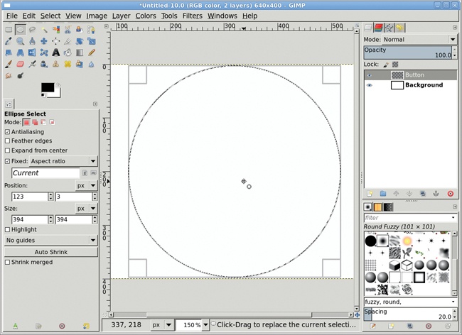
If the circular selection isn’t perfectly centered on the canvas, you can center it by clicking inside the selection and then dragging the selection to the center of the canvas. If the selection isn’t exactly circular, click the Reset button in the Tool Options first, and then set the Fixed option and try again.
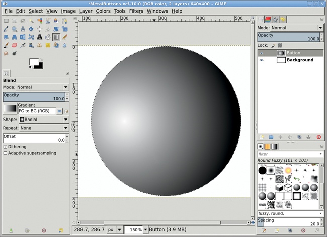
With the canvas selected, press D and then X to set the foreground color to white.
Press L to select the Blend tool from the toolbox. In the Tool Options dialog, set the Gradient to FG to BG (RGB) and the Shape to Radial.
Click inside the selection, about one-fourth of the width from the left side of the selection, and drag across the width of the selection. This creates the basic reflective highlight, but the reflection is a bit too perfect. (Recall from 3.1 Gel Buttons that light reflects unevenly off of most surfaces.) The next step is to add some variance to this perfectly reflecting sphere.
Add a new transparent layer by choosing Layer▸New Layer and setting the Layer Fill Type to Transparency. Name the new layer Darken.
With the canvas selected, press X to set the foreground color to black.
With the Blend tool still active, set the Gradient to FG to Transparent and the Shape to Linear in the Tool Options dialog. On the canvas, click the top of the selection and drag down to its midpoint.
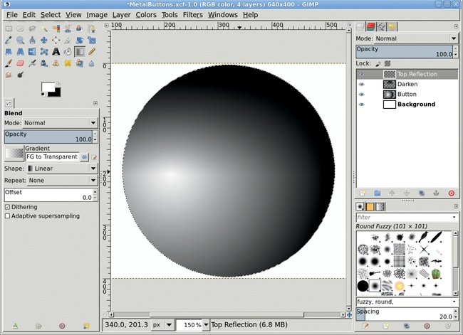
Add a new transparent layer by choosing Layer▸New Layer and setting the Layer Fill Type to Transparency. Name the new layer Top Reflection.
With the canvas selected, press X to set the foreground color to white.
The selection should still be active, so shrink it by 10 pixels (Select▸Shrink).
The Blend tool should also still be active. Click the top of the selection and drag to its midpoint. Deselect all (CTRL-SHIFT-A).
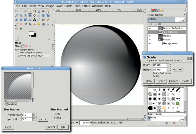
In the Layers dialog, set the Top Reflection layer’s Opacity to 75 percent. The light now reflects differently around the sphere, providing visual texture and giving the appearance of a smooth, glassy surface.
Duplicate the Top Reflection layer (Layer▸Duplicate Layer) and name the new layer Bottom Reflection.
Use the Flip tool to flip this layer vertically.
Using the Move tool, with the Tool Toggle set to Move the active layer in the Tool Options dialog, drag this layer so that its bottom white edge is just above the button’s bottom edge.
Open the Gaussian Blur filter (Filters▸Blur▸Gaussian Blur). Set the Blur Radius to 5 pixels. Click OK to apply the blur. Set the Opacity to 60 percent.
Click the Top Reflection layer to make that layer active.
With the canvas selected, press SHIFT-T to activate the Scale tool. In the Scaling Information dialog, choose % (percent) from the measurement unit drop-down menu. Change the Width and the Height to 85 percent and click the Scale button.
Use the Move tool to realign the layer so its upper left is just inside the upper left of the button.
Open the Gaussian Blur filter (Filters▸Blur▸Gaussian Blur) and set the Blur Radius to 5 pixels. Apply this blur to the Top Reflection layer.


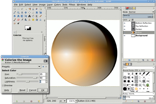
Click the Button layer in the Layers dialog to make that layer active.
Open the Colorize dialog (Colors▸Colorize).
Set the Hue to 35 and the Saturation to 90. You can create countless variations on this basic button by modifying the Hue and Saturation settings for this layer.
Creating a colored sphere might seem like a simple project, but it’s important, and it can be the basis for many more sophisticated designs. In fact, it serves as the foundation for another project in this book. Be sure to save this project as an XCF file (GIMP’s native file format) so you can use it again later.
Gel and metallic buttons can liven up a web page, but practical considerations are often more compelling design criteria. Round buttons can take up valuable screen space, for example. A more compact design might include the use of notebook tabs. Fortunately, using GIMP to create tabs is even easier than using it to create buttons.
This is one of the most straightforward tutorials in the book. It only takes a few minutes from start to finish, and the effect is easy to reproduce. You’ll also learn how to create multiple tabs and colorize them in ways that help visitors navigate your website.

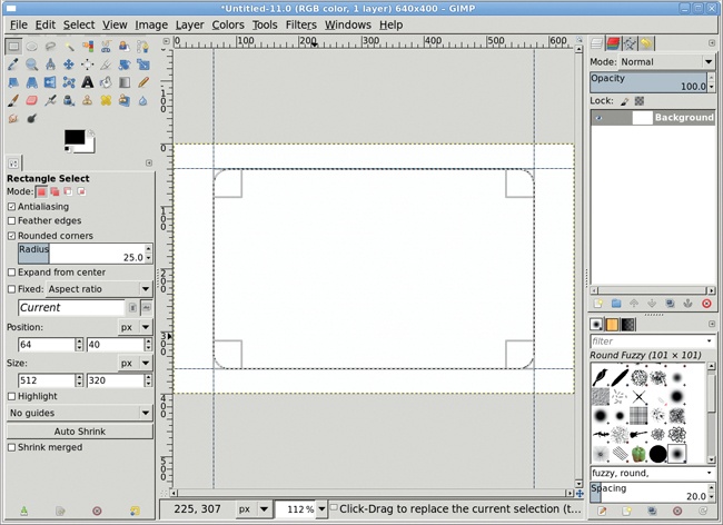
Open a new white canvas at the default size (640 × 400 pixels).
Add vertical and horizontal guides at 10 percent and 90 percent in each direction by selecting Image▸Guides▸New Guide (by Percent).
Choose the Rectangle Select tool from the toolbox. Select the Rounded Corners option in the Tool Options dialog and set the Radius to 25 percent. Create a selection in the center rectangle that’s outlined by these guides.
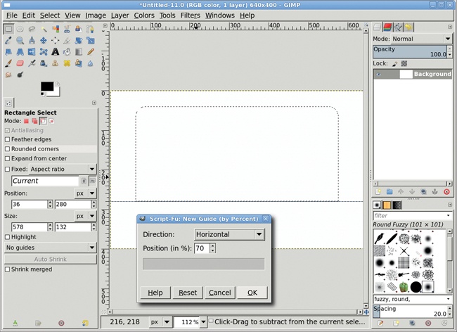
Remove the guides (Image▸Guides▸Remove All Guides).
Select Image▸Guides▸New Guide (by Percent) to add a new horizontal guide at 70 percent, just above where the corner begins to be rounded.
With the Rectangle Select tool still selected, in the Tool Options dialog set the Mode to Subtract (third from left of “Mode:”). Disable the Rounded Corners option in the Tool Options dialog. Drag a rectangular selection that passes through the existing selection and is bordered on top by the guide, and then press ENTER to accept the updated selection. We now have the basic tab shape.
Add a new transparent layer by choosing Layer▸New Layer and setting the Layer Fill Type to Transparency. Name this layer Tab.
In the canvas, press D to reset the foreground and background colors to black and white, respectively.
Select Image▸Guides▸New Guide (by Percent) to add a new vertical guide at 50 percent.
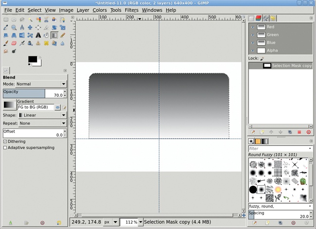
In the canvas, press L to activate the Blend tool. In the Tool Options dialog, set the Blend tool’s Opacity to 70 percent. Be sure the Gradient in the Tool Options dialog is set to FG to BG (RGB).
Click the canvas near the top of the selection and on the center vertical guide, and drag down to the bottom of the selection along the vertical guide to apply the gradient.
Save the selection to a channel by choosing Select▸Save to Channel. Name the saved channel Selection Mask copy. There’s no need to change the name for this tutorial.
Deselect all (CTRL-SHIFT-A) and remove all guides (Image▸Guide▸Remove All Guides).
In the Layers dialog, click the Tab layer to make it active. Duplicate the Tab layer (Layer▸Duplicate Layer), and then click the original Tab layer in the Layers dialog to make it active again.
Open the Gaussian Blur filter (Filters▸Blur▸Gaussian Blur). Set the Horizontal and Vertical Blur Radius to 7 pixels, and then apply this blur to the original Tab layer.
Click the Tab copy layer in the Layers dialog to make that layer active.
Open the Bump Map filter (Filters▸Map▸Bump Map).
Set the Azimuth to 180 degrees, the Elevation to 60, and the Depth to 30. Be sure to select the original Tab layer from the Bump Map drop-down menu at the top of the dialog.
Click OK to apply the Bump Map filter and rename the Tab copy layer Bump Map.

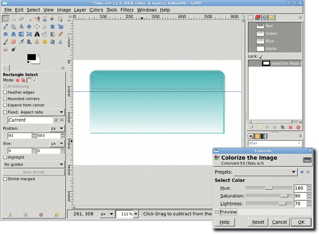
Duplicate the Bump Map layer (Layer▸Duplicate Layer). Name this layer Colorized.
Open the Colorize dialog (Colors▸Colorize). Set the Hue to 180, the Saturation to 90, and the Lightness to 70. This should produce a hazy, aqua-colored effect.
Retrieve the saved selection by clicking Selection Mask copy in the Channels dialog and clicking the Channel to Selection button (second from right) in the button bar of that dialog. Add a horizontal guide at 30 percent.
Choose the Rectangle Select tool, set the Tool Options Mode to Subtract, and drag a box with its upper edge along the horizontal guide to cut off the bottom of the existing selection. (Be sure to change the Rectangle Select tool’s Mode back to Replace when you’re done.) Then shrink the selection by 10 pixels (Select▸Shrink).
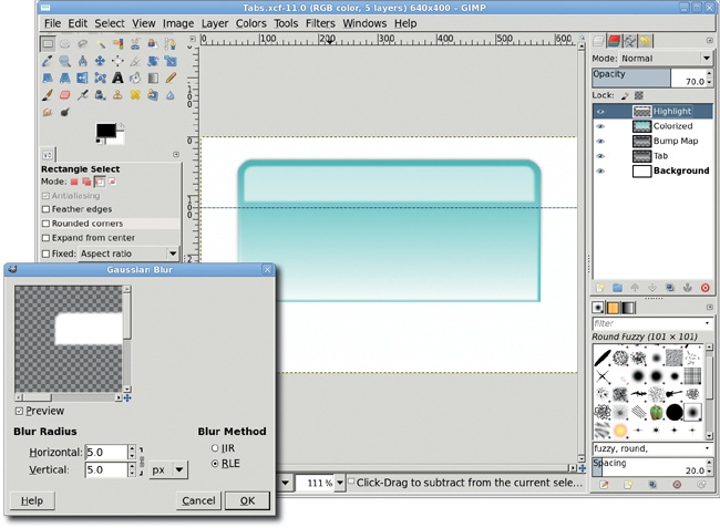
Add a new transparent layer by choosing Layer▸New Layer and setting the Layer Fill Type to Transparency. Call the new layer Highlight. Click the new layer in the Layers dialog, then set the layer’s Opacity to 70 percent.
Drag the background color (white) into the selection to fill the selection.
Deselect all (CTRL-SHIFT-A).
Open the Gaussian Blur filter (Filters▸Blur▸Gaussian Blur) and apply a blur of 5 pixels to the Highlight layer to soften the reflected highlight.
The basic tab is now complete. Now just add some text.
Remove all guides (Image▸Guide▸Remove All Guides).
Select the Text tool from the toolbox. Choose an appropriate font (this tutorial used Serif Bold set to 120 pixels with a black color). As when you choose a font size for button text, your font size here should allow the longest piece of tab text to fit. Keep in mind that a sans-serif font might be more appropriate if you plan to scale down the tab’s size.
Click the canvas to open the Text Editor. Type some text.
Use the Move tool to position the text in the center of the tab.
If you like, add a drop shadow (Filters▸Light and Shadow▸Drop Shadow). Set the Offset X and Offset Y values to 3 pixels, the Blur Radius to 8 pixels, and the Opacity to 80 percent.

In the real world, web pages usually have multiple tabs. A colored tab could indicate the page being viewed while gray tabs represent other pages available to your website visitor.
To create a series of tabs, start by turning off the visibility of the Background, Drop Shadow, and text layers. Then merge the visible layers (Image▸Merge Visible Layers), expanded as necessary.
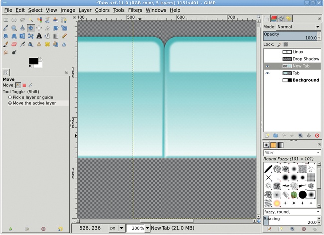
Duplicate the merged layer and name the new layer New Tab.
Use the Move tool to move this tab to the left of the first tab you created.
Resize the canvas (Image▸Fit Canvas to Layers), and then resize the canvas window (CTRL-SHIFT-J).
Move the New Tab layer so it aligns with the left and bottom edges of the original Tab layer. The Align tool can be used to align the top edges of the two layers. Then zoom in, select the Move tool in the Toolbox, and use the arrow keys on the keyboard to make fine adjustments left or right.
Desaturate the New Tab layer if it should have a different color (Colors▸Desaturate), and then colorize it using the Colorize dialog (Colors▸Colorize).
Add additional text as needed, and then turn visibility back on for the text and Drop Shadow layers for your original button.
Tabs can be placed on websites vertically instead of horizontally. Merge all visible layers, and then rotate the image 90 degrees counterclockwise (see Image▸Transform). Making text that reads vertically (where the letters are vertical but the word reads from top to bottom instead of from left to right) is more difficult because GIMP’s text alignment features are limited, but you could use a carriage return after each character.
If you’ve got a small business on one of the many online collectives such as CafePress.com or Shopify.com, or a blog or business running under WordPress.com, chances are you need professional-looking banners and product images to go with your website. Fortunately, GIMP solves this problem in just a few short steps.
The primary requirement for banners and product images is the size of the image. Most web-hosting sites provide configurable themes so users can customize their web presence. The theme selected defines the specifications for images. This includes the banner at the top of the page, slide show images, and extras such as backgrounds or images for specific divisions within a page. The trick is to use theme specifications to create visually appealing product displays and a professional appearance that separates your site from the competition.
This tutorial will focus on the tasks involved in creating a professional banner for a website with an artistic and a technical focus. The processes outlined here can also be applied to images used in scrolling slide shows and static product images.
As with the Photographic Effects tutorials, much of the work with banners starts with stock images.
The first thing to do is find information about the banner dimensions for the theme you’ll be using on your site. All banner dimensions are in pixels. Etsy.com, a shopping mall for handmade items, recommends a banner size of 760 × 100 pixels. Cafepress.com, a site for creating custom prints on a variety of products, suggests a maximum of 500 × 200 pixels. WordPress, an open source package for blogging and content management, provides a default theme that supports a maximum size of 940 × 198 pixels. Since it’s impossible to know what size display resolutions your visitors will have, it’s often wisest to keep the width under 1024 pixels. The height of the banner is usually restricted to the design limitations of the website theme.
In this tutorial you’ll use the dimensions for the WordPress banner because WordPress is easy to install on the desktop, making it easy to test designs without having to access a remote shop.
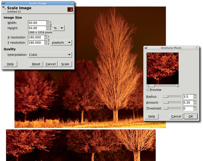
Open a stock image at least 1024 pixels wide. This one comes from BigStockPhoto.com. It’s a fairly large and detailed image at 2536 × 2302 pixels. If necessary, zoom out (View▸Zoom Out) to see the whole image.
Choose the Crop tool from the Toolbox. Drag an initial bounding box in the canvas, and then in the Tool Options dialog set the size to 940 × 198 pixels.
The image is so large that nothing meaningful fits into the crop boundaries. To fix this, scale the image by 50 percent (Image▸Scale Image). Zoom in on the image (+ or CTRL-SHIFT-J if using Single-Window mode) if necessary. In the canvas, click in the middle of the bounding box and drag the box until it’s over the area of interest.
Press ENTER to accept the crop. The image will be cropped to the area selected.
Open the Unsharp Mask filter (Filters▸Enhance▸Unsharp Mask) to sharpen the image. Set the Radius to 3.5 and the Amount to 0.35.
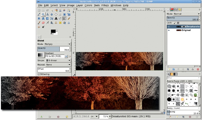
The image colors are dull. We need to adjust the image to intensify them.
Duplicate the Background layer (Layer▸Duplicate Layer). Name this layer Desaturated BG. Desaturate the duplicate layer (Colors▸Desaturate). Add a white layer mask (Layer▸Mask▸Add Layer Mask).
Add a Horizontal guide at 50 percent (Image▸Guides▸New Guide (by Percent)). Type D in the canvas window to reset the foreground color to black.
Choose the Blend tool from the Toolbox. In the Tool Options dialog set the Mode to Normal, the Shape to Bi-linear, and the Gradient to FG to BG (RGB). Drag along the horizontal guide from the middle of the image to near the right edge. Switch the Mode in the Tool Options to Multiply, then repeat the drag twice.
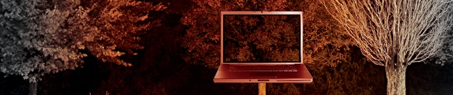
The foreground graphic is an open laptop computer. The background will show through the display of the monitor.
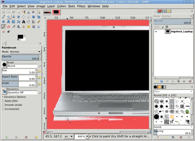
Open a stock image of a laptop at least 500 pixels wide. This one comes from BigStockPhoto.com and was chosen because of the high contrast between the background and the edges of the computer. That’ll make the laptop easier to isolate. Scale the image down to 247 × 185 pixels (Image▸Scale Image), which maintains the aspect ratio.
Choose the Fuzzy Select tool with the Threshold set to 12 in the Tool Options dialog. Click the white area outside the computer, then invert (Select▸Invert) the selection. This will select the laptop and may include a small amount of the background. Use the Quick Mask to clean up the selection. Copy this selection (Edit▸Copy).
In the Layers dialog, click the Desaturated layer, on the image icon, to make the image layer active (instead of the layer mask).
Paste (Edit▸Paste) the copy into the glowing tree image as a new layer (Layer▸To New Layer) named Laptop. Use the Move tool to position the new layer over the glowing colored section of the trees.
Close the original laptop image so it doesn’t get in the way of the rest of the tutorial.
Desaturate the laptop layer. Click the foreground color box in the Toolbox and set the RGB values to 122/0/31. Alternatively, choose a color from the Background layer using the Color Picker tool.
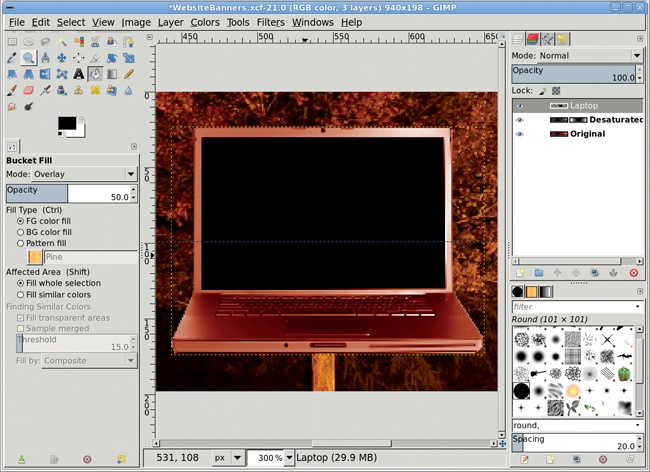
Choose the Bucket Fill tool from the Toolbox. In the Tool Options dialog, set the Opacity to 100 percent, the Fill Type to FG color fill, the Affected Area to Fill whole selection and the Mode to Soft Light. Click the canvas window over the laptop twice.
Change the Mode to Overlay and the Opacity to 50 percent. Click once in the canvas window.
Reset the colors by pressing D in the canvas window, then click once more in the canvas window.
The next step is to allow the trees to show on the laptop monitor.
Add a white layer mask to the Laptop layer.
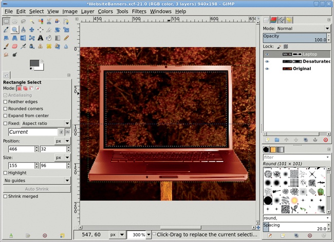
Use the Rectangle Select tool (make sure the Mode is set to Replace in the Tool Options dialog) to draw a selection outline in the laptop display. The outline should be slightly smaller than the display, leaving a small black space between the selection and the laptop display frame. Feather the selection (Select▸Feather) by 2 pixels.
Change the foreground color to a dark gray by setting the RGB values to 94/94/94. Drag the foreground color box from the Toolbox into the selection.
Before exporting as a JPEG for use in the website, save the file as an XCF file. XCF is GIMP’s native file format, and saving the banner as an XCF image allows you to edit it later. After saving as an XCF file, export the image (File▸Export) as a JPEG.
Banner sizes vary from site to site and are presented in different locations on the page. The Etsy banner for a single shop is smaller than the WordPress banner and is displayed off center. Choosing eye-catching components for the banner will draw website visitors to your content and away from the hosting site’s peripheral imagery.
Since font handling on the Web is still inconsistent, it can be useful to add text to the banner. By rendering text in the banner you’re assured it’s displayed the same by every browser on every platform. Future advances in HTML will help address this problem, but for the foreseeable future adding text to banners is still a useful practice.
Logo design is one of the most enjoyable branches of graphic design. For a smaller or newer company, the logo needs to graphically express the company’s main product or purpose. For a more established enterprise, the logo might be a unique symbol that has come to be identified with that company and its products. Think of the Nike swoosh or the AT&T globe.
Because they’re small, logos are also among the hardest designs to create. Expressing a corporate identity in such a small space is never easy. Fortunately, with a small amount of work, a logo can say a lot.

On the Web, small and simple logos work best. At roughly 72–98 ppi, this medium doesn’t leave much room for busy designs. Logos are generally small (but they don’t have to be), because they appear on all the website’s pages. When you scale down a large, busy design, detail can be lost, so it’s best to keep things simple.
GIMP provides tools to create logos of all types. For small companies with modest identity needs (web pages and perhaps stationery and business cards), these tools are often sufficient. For larger companies that will use logos in banner advertising, GIMP is best used only as a prototyping tool. You’ll want to transfer the design to vector art later so that it can be scaled to large print sizes easily.
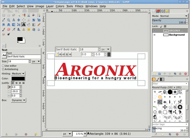
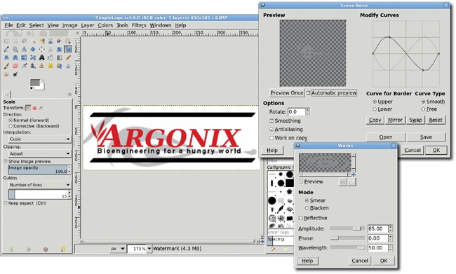
This tutorial will design a simple logo for a small, fictitious biotechnology company named Argonix. The design criteria are that the logo must be no more than two colors, must emphasize the company name, and must include a tag line and icon that represent the company’s association with bioengineered plants. The logo will be used on the company’s website and must fit in a space that is 400 × 145 pixels. The images for this tutorial are zoomed in to make them easier to see in print.
Type D in the canvas to reset the foreground and background colors. Start with a new white canvas sized to 400 × 145 pixels.
Choose the Text tool from the toolbox. In the Tool Options dialog, click on the Reset button on the lower right, and then choose a serif font. I use Serif Bold Italic in this example. (A sans-serif font is easier to trace with a vector tool, should this design need to be converted to vector format later, but I prefer the look of serif fonts.) The choice of font should also reflect the requirements of the client. For example, grungy text might be appropriate for a gaming company, but it probably wouldn’t suit a home furnishings chain.
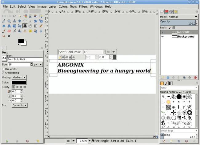
Click and drag in the canvas to create a bounding box for the text. The initial size of the box doesn’t matter. It will grow to fit the text as needed.
In the bounding box, type the word ARGONIX, in uppercase, followed by a newline. Type the phrase Bioengineering for a hungry world. Don’t worry about colors or text sizes. These will be changed in a moment.
After you type the text, the Box setting in the Tool Options may have changed to Fixed. If so, be sure to set the Box type to Dynamic.
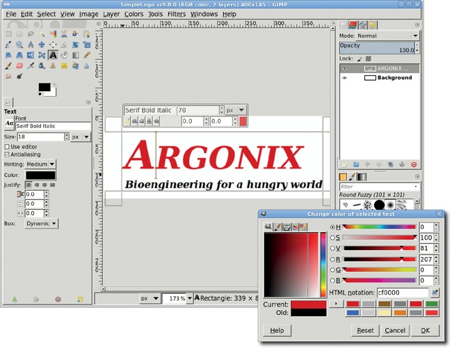
Double-click on the word ARGONIX to select it within the bounding box. In the Style Editor, type 55 in the Font Size field and hit ENTER. Click the Color button in the Style Editor to change the color of this word to RGB values of 207/0/0.
Select just the letter A in ARGONIX. Use the Style Editor to change the font size to 70 pixels.
Note
Remember that the Style Editor is the rectangular box of editing options displayed on the canvas directly above the text. This editor is new in GIMP 2.8 and is separate from the Tool Options and the Editor Dialog that can be opened from the Tool Options. See 1.8 Working with Text for an introduction to GIMP’s text features.
Click three times quickly on the second line of text to select all of that line. Use the Style Editor to change the Font to Nimbus Sans L Bold or similar thin-lined font. Font selection in the Style Editor is aided by typing a few letters of the font name. The Style Editor will show a filtered list of matching fonts from which to select.
Use the Style Editor to change the font size of the selected text to 15 pixels.
The letter kerning in the second line will need adjustment. The line should still be selected, so set the kerning field to 2.5 and hit ENTER. The letters will spread out slightly, nearly (though not exactly) aligning with the left and right ends of the first line.
Select just the first letter of the second line. Change the kerning value to –5 and hit ENTER. Now the ends of the second line should align with the first.
Optionally, adjust the line spacing for this text layer by setting the Line Spacing to –20 in the Tool Options dialog. Notice that changes to this field in the Tool Options apply to all lines in the text layer, not just the selected lines.

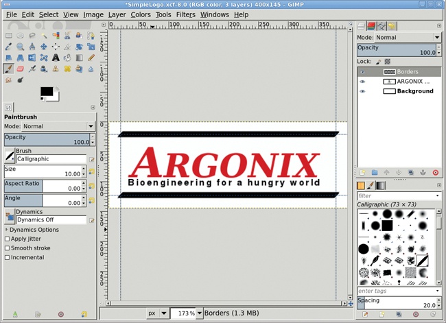
Add a new transparent layer by choosing Layer▸New Layer and setting the Layer Fill Type to Transparency. Name the new layer Borders.
Add two new horizontal guides at 15 percent and 85 percent by choosing Image▸Guides▸New Guide (By Percent). Then add two vertical guides at 5 percent and 95 percent.
Click the Paintbrush tool and choose Calligraphic from the Brushes dialog. In the Tool Options set the Size to 10. Click once at the upper-left intersection of the new guides. Hold down the SHIFT key and click the upper-right intersection to draw a straight line between the two intersections. Repeat this process with the lower-left and lower-right intersections. We’ll adjust the text layer position later.
Remove all guides (Image▸Guides▸Remove All Guides).
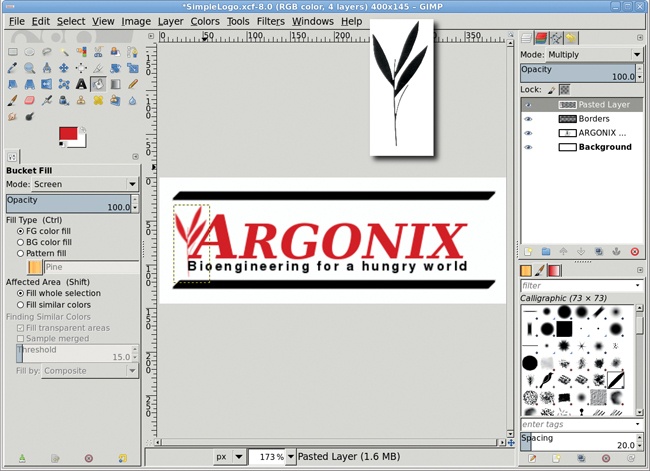
For the leaf icon that appears behind the logo text, you’ll use clipart. Open any appropriate clipart file (there are many freely available on the Internet, but be sure to check the copyright license for their use in your projects). Be sure the clipart is a black-on-white image.
Copy the clipart into the logo project canvas as a new layer. Make sure the Lock Alpha Channel box in the Layers dialog is checked for this new layer. You may need to scale down the art to fit the available space. In this example, the space between the two borders comfortably fits a clipart image that’s 90 pixels high.
Desaturate that layer (Colors▸Desaturate).
Choose the Bucket Fill tool and in the Tool Options dialog set the Mode to Screen, the Opacity to 100 percent, the Fill Type to FG color fill, and the Affected Area to Fill whole selection.
Open the Change Foreground Color dialog again, make sure the RGB values are set to 207/0/0 to match the red used for the text, then close the dialog.
Click the layer to colorize the clipart.
Assuming an original clipart of black-on-white, set the layer mode to Multiply. Otherwise, either choose a more appropriate layer mode to mask the background or select the background by color, add a layer mask, and fill the selection in the mask with black to mask the background of the clipart.
Use the Move tool to manually align the clipart layer between the top and bottom borders on the left side of the logo image.
Click the Background layer in the Layers dialog to make it active.
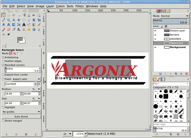
Add a transparent layer by choosing Layer▸New Layer and setting the Layer Fill Type to Transparency. Name the new layer Watermark.
Create a rectangular selection through the middle of this layer. The size of the rectangle makes no difference.
In the Change Foreground Color dialog, set the RGB values to 142/142/142 for a neutral gray and close the window.
Drag the foreground color into the selection, and then deselect all (CTRL-SHIFT-A).
To convert the new gray background into a watermark, open the Waves filter (Filters▸Distorts▸Waves). Set the Amplitude to 85 pixels and the Wavelength to 50 pixels. Click OK to apply this filter to the Watermark layer.
Open the Curve Bend filter (Filters▸Distorts▸Curve Bend). Adjust the Upper and Lower curves so they form a figure 8 on its side, then click OK to apply them to the layer.
Open the Gaussian Blur (Filters▸Blur▸Gaussian Blur) and apply a blur of 1.5 pixels to the layer. Set the layer Opacity to 50 percent.
If desired, use the Scale tool to stretch the layer larger or smaller. Then fit the layer to the image (Layer▸Layer to Image Size).
Click on the Text layer in the Layers dialog.
Select the Move tool from the Toolbox. In the Tool Options dialog make sure the Move the Active Layer option is selected. Click and drag in the canvas to move the text layer left or right and up or down till it centers visually between the top and bottom border lines. You may find it easier to do this with the layer boundary turned off (View▸Show Layer Boundary).
You might think that an alternative design choice for this project might have the first letter of the company name span both lines of text. To do this, the first line (without its first letter) would have its baseline adjusted to move it up, and the second line kerning and baseline would be adjusted to fit below this but to the right of the A in Argonix. However, the baseline adjustment will not allow the second line to overlap the first. Instead, the Line Spacing adjustment in the Tool Options dialog allows the second line to overlap the first.
Creating prototype designs in this way makes it easy to trace the image in a vector program later, should you need to scale the design for larger print media.
This is just one example of how you might create a logo for a small business. And the best part is there’s plenty of logo design work out there. Designing simple logos like this for personal use or for small businesses, lawyers, doctors, and other professionals can keep any graphic designer busy.
Buttons, tabs, and logos aren’t the only graphics found on the Web. Just like the desktop, the Web makes heavy use of icons. Icons help identify current position within navigable pages and provide easily recognizable references for commonly referenced sites. Icons can be used for brand identification or product labeling.
Icons can be created larger than their display size by letting the browser or JavaScript size the image for you. This automatic scaling isn’t recommended for large images, but with small icons—especially on pages that use only a few icons at a time—it allows the icon designer to work with larger images. This makes it easier to create icons, because GIMP users can work in a larger canvas.
In this tutorial I’ll visit the icon world and walk you through the design of icons suitable for use on the Web. Only basic knowledge of GIMP is required, such as using layers and understanding the default layout of the toolbox. No outside stock images are required. However, unlike previous projects, this project will require working with multiple GIMP canvases at once.
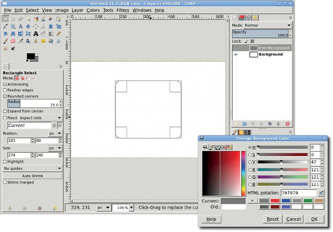
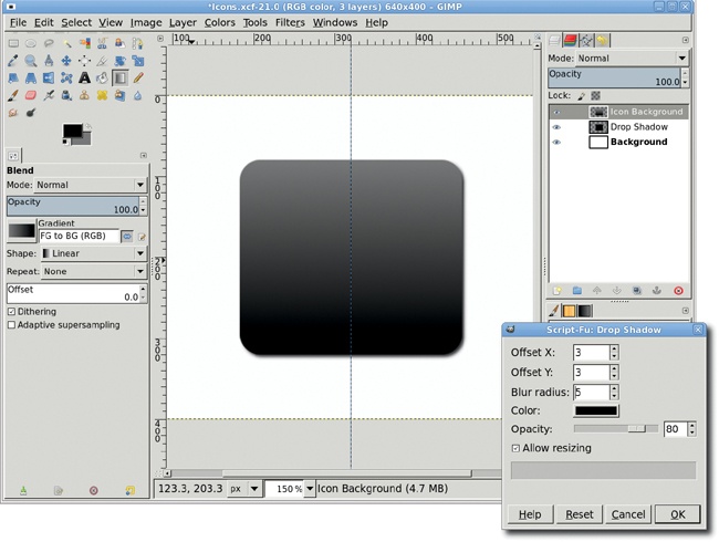
Reset the foreground and background colors by typing D in the image window. Open a new, 640 × 400-pixel image window (File▸New). Click the background color swatch in the Toolbox to open the Change Background Color dialog. Set the RGB values to 121/121/121 and close the dialog. The black and gray colors will be used as the background gradient for the icon.
Add a transparent layer (Layer▸New Layer) and name it Icon Background. Choose the Rectangle Select tool from the Toolbox. In the Tool Options dialog, set the Rounded Corners option with a Radius of 25. Draw an initial selection in the image window—its position and size don’t matter at this point. In the Tool Options dialog, set the Size to 274 × 240 pixels and the Position to 183 × 80 pixels. This will be the icon size, plus some transparent padding. The size was computed based on experimentation, so feel free to make this selection larger to create a larger icon.
Add a vertical guide at 50 percent (Image▸Guides▸New Guide (by Percent)).
Choose the Blend tool from the Toolbox. In the Tool Options dialog set the Mode to Normal, Opacity to 100 percent, Gradient to FG to BG (RGB) with the Reverse option checked, and the Shape to Linear. Drag in the image window from the top of the selection to the bottom, following the guide.
Clear the selection (Select▸None). Add a drop shadow (Filters▸Light and Shadow▸Drop Shadow) offset by 3 pixels and blurred by 5 pixels.
Open a new image window that is 16 × 16 pixels. In the image window that opens, hit the + key 10 times to zoom in.
Add a grid (Image▸Configure Grid) with 4-pixel spacing for width and height. This divides the window into 12 blocks. Enable snap to grid (View▸Snap to Grid).
Set the Foreground color RGB to 103/103/103. Use the Rectangle Select tool (be sure Rounded corners is not set) to outline and fill the blocks at the following row/column positions: 1/1, 1/3, 2/2, 2/4, 3/1, 3/3, 4/2, and 4/4 with the Foreground color. Press the SHIFT key to add to the selection as you select each block.
Change the Foreground RGB to 67/67/67, then select and fill the blocks at the following row/column positions: 1/2, 1/4, 2/3, 3/2, 3/4, and 4/1. If you selected all the previous blocks at once, then invert the selection to fill these blocks.
Change the Foreground RGB to 141/141/141 and fill in blocks 2/1 and 4/3.
Export (File▸Export) this file as IcondBG.pat to your GIMP patterns directory giving a Description of Web Icon BG. Open the Patterns dialog (Windows▸Dockable Dialogs▸Patterns) and click the Refresh button to add the new pattern to the list of patterns. Close the IcondBG.pat window.

Back in the icon image window, add a transparent layer and name it Pattern.
Click on the Background layer in the Layers dialog and create a selection of the icon (Layer▸Transparency▸Alpha to Selection).
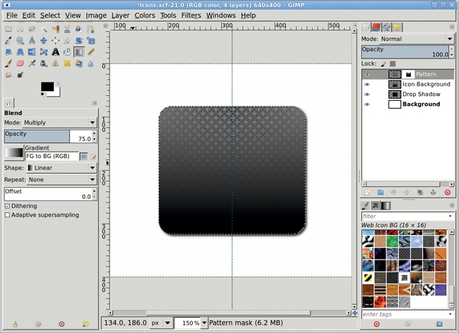
Click the Pattern layer in the Layers dialog to make it active. In the Patterns dialog (Windows▸Dockable Dialogs▸Patterns), drag the Web Icon BG pattern into the image window to fill the selection with the new pattern.
Add a white layer mask (Layer▸Mask▸Add Layer Mask) to the Pattern layer.
Type D in the image window to reset the foreground and background colors. Choose the Blend tool from the Toolbox. Set the Opacity to 75 percent and the Shape to Radial in the Tool Options dialog. Drag from the top of the icon to roughly the middle in the image window. In the Tool Options dialog, switch the Shape to Linear and the Mode to Multiply. Drag from the middle of the icon to the bottom edge in the image window. Drag again from the top to the middle of the icon.
Apply the layer mask (Layer▸Mask▸Apply Layer Mask).
Clear the selection. Remove all guides (Image▸Guides▸Remove All Guides).
Add a white layer mask to the Pattern layer.
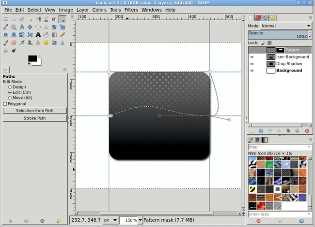
Add vertical guides at 183 and 457 and horizontal guides at 80 and 200.
Use the Paths tool from the Toolbox and place anchors on each corner starting at the lower left intersection of the guides, with one extra anchor just to the right of the first one. This will create five anchors.
In the Tool Options dialog, change the Edit mode to Edit. Click the last anchor and drag to the left to move the first handle out of the way. Click it again and drag the handle toward the upper middle of the icon. This causes the path to bend. Click the next-to-last anchor and drag right to move the first handle out of the way. Click that anchor again and drag toward the bottom middle of the icon. Click Selection from Path in the Tool Options dialog. Invert the selection (Select▸Invert). Fill the selection with black.
The icon backdrop is ready. Now it’s time to add application-specific identifiers. This can be done multiple times to create a series of applications using the same backdrop.
Add vertical guides at 220 and 420 and horizontal guides at 100 and 300. This makes a perfect square to bound a sphere.
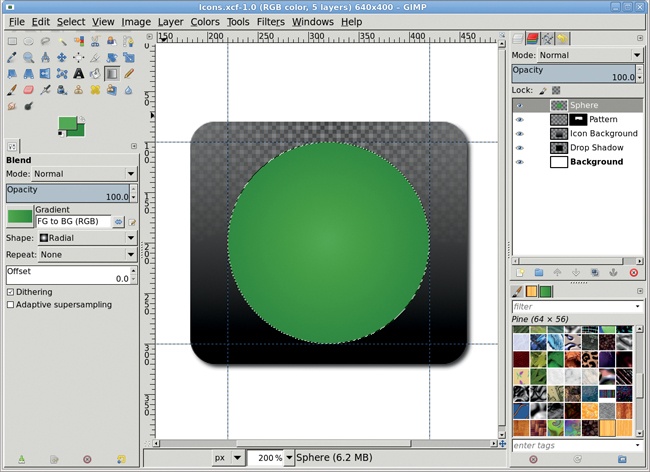
Add a transparent layer and name it Sphere. Be sure this layer is at the top of the stack in the Layers dialog. Choose the Ellipse Select tool from the toolbox. Click the upper-left guide intersection and drag to the lower right.
Reset the foreground and background colors by typing D in the image window. Open the Change Foreground Color dialog. Set the RGB values to 74/164/75. Click the background color swatch in the Toolbox to switch to the Change Background Color dialog. Set the RGB values to 28/130/29. Close the color dialog. The green shades will be used as the gradient for the application sphere.
Choose the Blend tool from the Toolbox. Set the Shape to Radial and the Gradient to FG to BG (RGB) in the Tool Options dialog and be sure the Mode is set to Normal and the Opacity to 100 percent. Drag from the center of the selection to the outside edge of the selection.
Add a transparent layer and name it Lower Highlight. Be sure this layer is at the top of the stack in the Layers dialog. Shrink the selection (Select▸Shrink) by 2 pixels. Reset and invert the foreground and background colors (type D and then X in the image window) so the foreground is now white.
Select the Blend tool from the Toolbox. In the Tool Options dialog set the Shape to Radial and the Gradient to FG to Transparent with Reverse button set, and then drag from the center of the selection to the outside edge of the selection.
Add a white layer mask to the Lower Highlight layer. Reset the foreground and background colors in the Toolbox. Choose the Blend tool from the Toolbox and set the Shape to Linear and the Gradient to FG to Transparent (with the Reverse button turned off) in the Tool Options dialog. Drag in the image window from the top of the icon to the bottom.
Change the Lower Highlight layer’s mode to Overlay.
Add a transparent layer and name it Upper Highlight. Be sure this layer is at the top of the stack in the Layers dialog. Shrink the selection by 2 pixels more.
Choose the Ellipse Select tool from the Toolbox. Click in the selection in the canvas to activate it. In the Tool Options dialog, set the Size to 134 × 80 and the Position to 254 × 107. This creates a small flat oval selection at the top of the green sphere. Click over the selection to finish editing it.
Reset and invert the color swatches in the Toolbox to make the foreground color white. Use the Blend tool with a Linear shape and FG to Transparent (no Reverse) gradient, and then drag from the top of the selection to the middle of the selection.
Clear the selection.

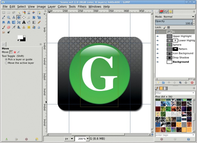
Choose the Text tool from the Toolbox. Choose any font—Nimbus Roman No.9 L Bold (commonly available on Linux systems) is used here. Set the Font size to 160 and the Color to White in the Tool Options dialog. The font size might be different on your system depending on the selected font.
Click the center of the sphere and type an uppercase G (for GIMP), centering it over the sphere with the Move tool.
To save the icon itself, delete the white background layer and use the Crop tool to crop the image, leaving a small amount of transparent space around the icon. Export the image as GIMPIcon.png or GIMPIcon.jpg. Scale the icon down as needed before placing it in your website.
The background and sphere can be used to create a common theme for your icons. To reuse the background and sphere, turn off the visibility of the Text and Background layers, then merge the visible layers. Drag the resulting layer onto the Toolbox to open a new image with just the merged contents. Export this as IconBG.png. Don’t save as a JPEG because that format doesn’t support transparency!
Later you can reopen the image, add the text layer, and export as a new icon.
GIMP is a tool capable of producing high-quality images for any design project—no matter what the medium—and its core support for RGB and indexed images makes it ideal for web design. Keep the following tips in mind as you begin using GIMP to create images for your websites.
GIMP gives you the tools to create website images, but you need something more sophisticated to provide layout rules and organize your creations for a coherent user experience. CSS is it. Web design is now as much about layout as it is about graphics. Good web design encompasses both CSS and GIMP.
Web design requires images intended for viewing on video displays. Most monitors today, including smartphones, use LCD or LED technology, so most images should be scaled to 72 ppi or 98 ppi. Before doing web design work, be sure to set your resolution preferences (Edit▸Preferences▸Default Image) to 72 pixels or 98 pixels, instead of print units such as inches or millimeters.
If you’re placing text over a background in an image bound for the Web, be certain there’s sufficient contrast between the edges of the text and the background. A low-contrast image might look good on a designer’s high-end display, but you can’t guarantee that all visitors to the website will see the image in the same way. Adding a drop shadow or outline can help separate the text from the background. A text screen is another option. For a more detailed discussion on screening text, see 2.7 Lake Reflection.
Backgrounds should be seen but not heard. A loud background is a bad design choice. If your eye is drawn to a background, chances are the background is distracting your visitors from the web content. To make your text pop, first reduce the contrast in the background image. Then desaturate the image and fill it with a light color using the Bucket Fill tool with its Mode set to Color or Grain Merge. You may need to choose a low setting for the Opacity.
There’s a reason so many different image file formats have been developed: not every format works well in every situation. If you have solid text in an image with no gradients, use the GIF format. Because it uses only 8 bits per pixel for color information, the GIF format works well for images that have only a few colors (256 or less) and strong contrast (like black text on a white background). The GIF format also provides lossless compression, which means it compresses the image as much as possible without sacrificing image quality. But skip the GIF format if you have photographs to display.
They’re better handled with the JPEG format, which was specifically designed for photographs based on how the human eye perceives color. Using 24 bits (three 8-bit RGB channels) to represent each pixel, the JPEG format easily handles up to 16 million colors. Unlike the GIF format, the JPEG format’s compression is described as lossy, which means (theoretically, at least) that by using it you’re throwing away data. The actual data loss is usually trivial, however, and you can specify how much to compress an image, depending on the degree of quality loss you’re willing to accept. A bigger disadvantage for some GIMP artists may be that the JPEG format doesn’t handle transparency information. The GIF format does, but it can only interpret transparency as on or off for any given pixel, leading to “stairsteps” in nonrectangular regions of your image.
The PNG format, on the other hand, can handle various levels of transparency and millions of colors. It also offers lossless compression, so no data is sacrificed. Not all browsers fully support the PNG format, though modern browsers, such as those provided with Windows Vista, Mac OS X, and any recent Linux distribution, should have no problem. For example, some older versions of Internet Explorer can’t display PNG images if they contain transparency information. If only all website visitors used Firefox!
Another option is to force visitors to use an external program to view your images. Firefox’s MIME Type Editor extension allows the visitor to configure external programs to handle various file types. Designers or photographers who provide sample hi-res copies of their work in private web galleries may choose this option. Full-color TIFF images might be appropriate in such a case, though thumbnail previews would still need to be GIF, JPEG, or PNG files because they would be displayed by the browser.
Choose file formats wisely. Using JPEG images for every project isn’t a good enough solution. And if you think choosing among these options is annoying, just wait until the Web (and all those browsers) finally support vector images. Viva la SVG!
If you can’t find suitable clipart on the Internet or in a book, you can always scan real-world objects, desaturate the resulting image, and then reduce the image’s color range using the Levels, Curves, or Posterize tools. Windows and Mac users have built-in system support for scanners. Scanner support for Linux is available from the SANE project at http://www.sane-project.org/. The XSane plug-in is required to scan directly from GIMP and is available at http://www.xsane.org/. SANE and XSane are included in most recent Linux distributions (such as Fedora and SuSE), though they still require manual configuration. Read the man pages or check the project websites for more information about configuring your scanner.
The use of gradients in background images is generally overlooked by visitors, but it can mean the difference between an average website and a professional design. 3.1 Gel Buttons, 3.2 Metal Buttons, and 3.3 Tabs used gradients in website buttons. Consider using extremely subtle, desaturated gradients in background images, with a light dusting of desaturated noise for texturing.
Transparent images using PNG allow for seamless blending with their backgrounds. CSS and JavaScript allow styling the background of images based on conditions, such as time of day. Mixing a well-constructed transparent PNG image with time-based backgrounds allows the same image to be used for different effects.
Web design also encompasses the use of proper color mixing. Choosing a color scheme for a website is just as important as the images you display. Choosing the right color mixture has a lot to do with how color affects individuals though processes. Reds can be stimulating and incite aggressive behavior—or spur the viewer to action—while blues then to invoke sensitive responses.
Study the psychology of color’s effects on behavior when choosing a color palette for the Web. Search the Internet for online color-mixing tools. Here are some of my favorites:
Color Mixers http://www.colormixers.com/mixers/cmr/
EasyRGB http://www.easyrgb.com/
GIMP 2.8 changed File▸Save so that it no longer saves to anything but GIMP’s native XCF file format. To save to some other file format, use File▸Export. If you’ll be using your image in a web design, export it to the appropriate file format: JPEG, GIF, or PNG. When you export a layered image to an image file format suitable for the Web, GIMP will automatically merge all visible layers. This costs you nothing in effort and won’t change your existing layered canvas. But don’t forget to save the layered version as an XCF file as well, just in case you need to edit the layers later.