
Advertising is about presenting a message to a target audience as effectively as possible, for the least possible cost. GIMP can’t help you rein in your media costs or identify your target audience, but it can help you present a compelling product message. The tutorials in this chapter utilize GIMP tools you’ve already encountered in this book, building on skills you’ve developed and teaching you how to apply those skills to common advertising tasks.
An advertisement’s destination dictates its design. Understanding the requirements and limitations of the destination medium is an important part of the advertising design process. Creating web ads doesn’t require as much time, effort, or computer memory as creating print ads, but the nature of the Web limits advertising in many ways.
Web ads are designed to be viewed on computer monitors, so the images are usually small and measured at the monitor’s resolution, typically 72 or 98 ppi. Web ads are also displayed in the same RGB format in which the images were created. For these reasons, they’re a bit easier to create than print ads, but because the monitor resolution and screen space are limited, web ads can’t show as much detail.
In comparison, print ads are usually larger and measured at higher resolutions (150 dpi to 300 dpi), which require far more computer memory to produce. Additionally, print ads created in RGB generally must be converted to the CMYK format the printer requires. Because GIMP doesn’t currently support direct manipulation of images in CMYK, your ads will be created in RGB, and the conversion process will have to be handled by the printer or a third-party service bureau.
Note
If you’re not afraid of the command line, you can also try using the ImageMagick suite of command-line tools to handle image color conversion. If RGB images are built with the Little CMS (LCMS) library, the Convert tool can convert them to CMYK using International Color Consortium (ICC) profiles. Your personal printer probably has ICC profile files, and GIMP supports their use even if it doesn’t work directly with CMYK color.
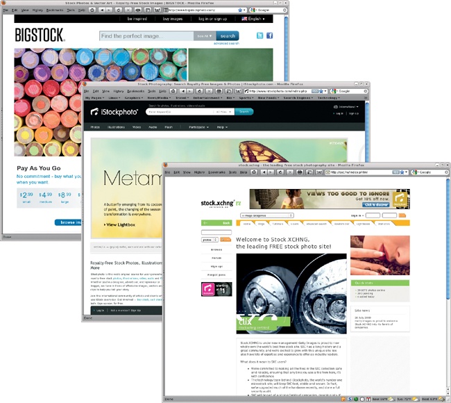
Most web and print advertising work starts with stock images. Luckily, the Internet has opened up stock image collections to the masses and reduced the cost of those images in the process. These images are ideal for use in web ads because they’re inexpensive, of reasonable quality, and available in many sizes. Most stock image collections provide images in GIMP-supported formats such as TIFF and JPEG, and prices on low-cost stock image websites like BigStockPhoto.com, iStockphoto.com, and CanStockPhoto.com range from $1 to $5 per image.
You can use low-cost stock images for some print ads, though for projects like posters and banners it may be best to use images from professional stock image collections instead. Professional stock image services usually offer much larger images, ones that are big enough to suit large-scale print projects. In addition to per-file downloads, professional stock image services may also sell complete CD collections or provide monthly subscriptions. Prices vary greatly, however. A single image might cost $80 to $200, while a CD collection might cost around $500. Websites like ThinkStockPhotos.com and GettyImages.com charge approximately $199 per month and $1,200 per year for subscriptions.
Online stock image collections typically offer each image in a few different sizes. These image sizes are generally given in pixels, and you’ll want to buy the largest version of the image you can afford. This will allow you to scale down the image to a size appropriate for your project. Remember that the dots per inch (dpi) value for print ads (150 dpi to 300 dpi) is different from pixels per inch (ppi) for web ads (72 ppi or 98 ppi). An image that is 1,200 pixels wide is 4 inches wide when printed at 300 dpi for a magazine (300 dpi × 4 inches = 1,200 pixels), but it’s over 16½ inches wide when printed at 72 dpi for the Web!
Note
In practice, there is no difference between dpi and ppi; both are references to points of color per inch. Dpi is generally used in printing, whereas ppi is used for monitors.
Another issue to consider when using stock images is licensing. Many low-cost stock image collections license all of their images for a wide range of uses, but some allow each photographer to specify his or her own license parameters. Professional stock image services have very specific licensing policies. You’ll need to read the licenses carefully to determine whether or not you can use the image as you’d like.
The issue of model releases is also tricky. A model release is written permission to use the likeness of a person, place, or identifying mark (such as a logo) that might otherwise have limited rights of use. Model releases are most often used in connection with photos of people and are required if the individual’s face is recognizable.
Most stock image websites require that anyone submitting a photo of a person also include a model release giving permission to use the likeness in other projects. A model release allows a designer to use a stock image for a wide range of purposes but protects the model’s image from misuse.
Note
A very detailed guide to model releases is available at http://www.danheller.com/model-release.html.
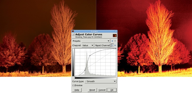
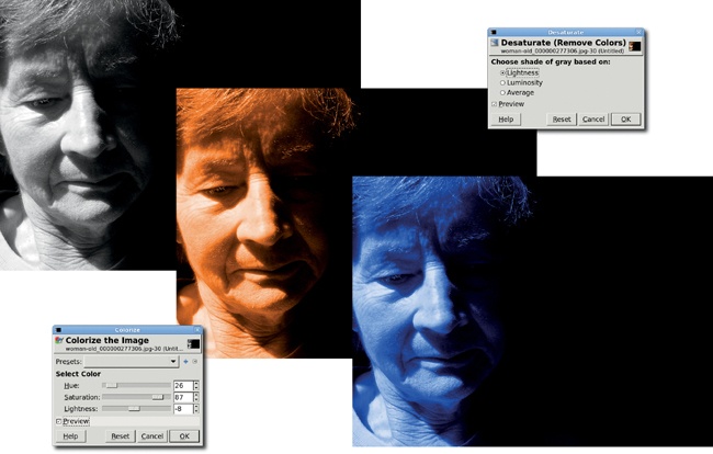
Flip through any glossy trade magazine, and you’ll see how color and contrast are used effectively in print advertising. GIMP offers several tools for enhancing existing colors, among them the Curves, Levels, and Hue-Saturation tools. Each of these can be used to add pizzazz to an image or to alter an image’s mood. The Brightness-Contrast tool is often used in conjunction with these other tools to make overall ambient lighting changes.
While color grabs the viewer’s attention, you can choose Colors▸Desaturate to remove color from an image, leaving just contrasting white, black, and gray to achieve a subtler effect. The level of contrast in a grayscale image sets the mood: a high-contrast grayscale image conveys energy, while a softly blurred grayscale image evokes a feeling of calm and lends the subject a sense of style and class. GIMP offers many tools for controlling contrast in grayscale images, including numerous layer and tool blend modes.
Note
Used in this context, grayscale is not the same as the Grayscale mode (Image▸Mode▸Grayscale). In Grayscale mode an image has no color content, because it only has a gray channel. In the case of desaturated RGB images, the color content has been removed, but because the image is still in RGB mode, color can be added back in.
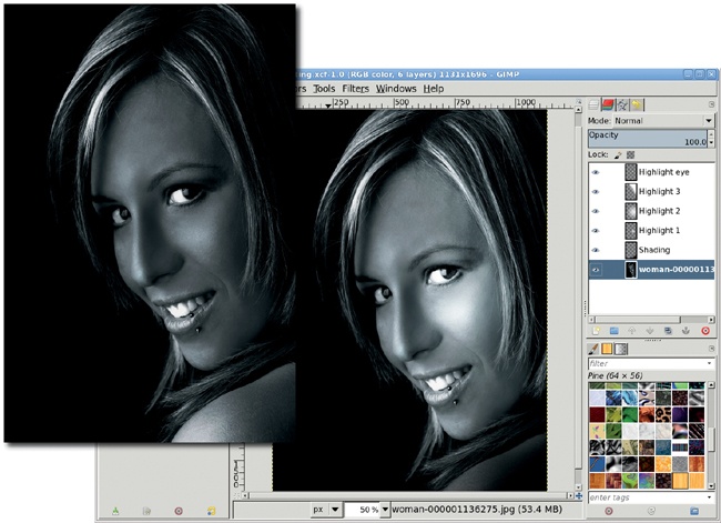
There’s another reason to consider desaturating images with GIMP: you can add color back in at any time—any color you choose. Colorizing a desaturated image is one more way to set the mood for an advertisement. A range of blues can be cold and harsh, while rich reds and yellows are warm and energetic.
GIMP gives the graphic designer many ways to create eye-catching advertisements. The tutorials in this chapter are less about learning new techniques than they are about practicing what you’ve already learned. Tutorials elsewhere in this book show you how to create 3-D images and reflections or enhance color and lighting. Try applying these techniques to stock photographs and you’ll soon find that in the hands of a creative designer, the possibilities are endless.
GIMP is first and foremost a tool for working with raster images. Most desktop users will prefer to work with GIMP when dealing with their digital photographs but might choose other tools like Inkscape or Scribus when working with text. Yet GIMP does a great job with text effects in ways that people might think can only be done with those vector applications.
In this tutorial I’ll walk you through a little text trick I stumbled upon in a design magazine. The goal of the project is to map an image onto text but keep the original image recognizable. In the original magazine article, the process was handled using Adobe InDesign, a vector layout tool. It does clever things with text using boxes to align and block objects within the layout. Fortunately, this particular effect turns out to be even easier to produce with GIMP than with InDesign.
Projects like this have important periphery components beyond just the text. This design requires a source image with sufficient color and contrast. Without color and contrast, the shapes within the image won’t be recognizable through the text.
The project also requires a suitable font. The font should be thick and without any serifs. Serif fonts clutter the final image and in most cases won’t allow as much detail from the source image to be displayed, even when bold versions of the serif font are used. Serif fonts can also make text from the image difficult to recognize.
GIMP’s text features make actual design possible in a few minutes, with a limited sequence of steps. Before diving in, take a look at some of those periphery issues.
To start the project, select an appropriate portrait from one of the many stock image sites on the Internet. The one in this tutorial comes from BigStockPhoto.com. The picture should ideally include two important features. The first is a solid-colored background. A multicolored or otherwise cluttered background makes it harder to isolate the subject of the image when you apply your text effect.
The second important feature is color contrast. An all-black image would work but would end up being mere shadow-filled text. For this project, I selected a woman in a black dress with enough skin tones to provide some color contrast. Later you’ll add to that contrast with a soft vignette.
This effect works best with thick, straight-edged fonts (script fonts don’t show the image well, even when boldface type is used). In this tutorial, I’m using the ErgoeExtrabold Thin font, but any sans bold font, such as Tahoma Bold, will suffice.
Select the Text tool and open the Tool Options dialog (Dialogs▸Tool Options). Near the bottom of the dialog are three options: Indent, Line Spacing, and Letter Spacing. You won’t be using the Indent option but will use the other two.
Line Spacing sets the space between lines. You want to decrease this (to negative values) so the lines of text will be as close together as possible, without overlapping.
Letter Spacing just sets the area between letters. This is similar to kerning but not exactly identical. Again, the technical explanation isn’t important here. You just want to reduce this setting (also to negative numbers) to reduce the space between letters, the closer the better.

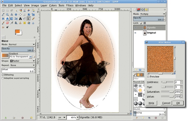
Now you’re ready to start the tutorial. The first thing is to add a soft vignette. This makes the final image more colorful while keeping the woman’s shape recognizable.
Add a transparent layer above the main layer (Layer▸New Layer) and name this new layer Vignette.
Choose the Ellipse Select tool from the Toolbox and draw an oval selection in the canvas around the girl. Then feather the selection (Select▸Feather) by 100 pixels.
Choose a warm color, such as the 231/127/35 used here, from the Change Foreground Color dialog that opens by clicking on the foreground color box in the Toolbox.
Choose the Gradient tool from the Toolbox. In the Tool Options dialog, set the Gradient to FG to Transparent and the Shape to Radial. Click and drag in the canvas from the middle of the selection to just past the top of the selection. Set the Vignette layer’s mode to Multiply.
A little noise can be added here for artistic effect, but this step is optional. Open the HSV Noise filter (Filters▸Noise▸HSV Noise) and set the Holdness to 2, the Saturation to 255, and the Value to 255. The default setting for Hue should be left at 3. Apply this to the Vignette by clicking OK. The noise will be applied within the selection and only to colored pixels, not transparent ones.
Clear the selection (Select▸None) and merge the Vignette and Background layers (Image▸Flatten Image).

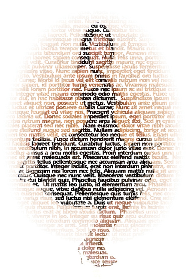
The text used for this tutorial can be from any source. Since most of the text won’t be visible, it doesn’t help to use text you expect to read, though many letters will be legible. The text here amounts to 1,500 words from the Lorem Ipsum Generator formatted with no line breaks, which was then loaded into the Text Editor window. If this isn’t long enough, copy and paste it again below the first block of text.
Reset the default colors in the Toolbox by typing D in the canvas. Choose the Text tool from the Toolbox and then click and drag in the image. This displays the editing box in the canvas where you can type text. Drag the handles in the editing box so it covers the girl and vignette. Click inside the editing box and paste the Lorem Ipsum text copied from your browser.
In the Tool Options dialog, set the font (ErgoeExtrabold Thin is used here), size, line spacing, and letter spacing as discussed previously. (Set the font and size before changing the spacing.) You’ll also want the text in black so you can see it in the canvas. Set the line spacing to –12 and the letter spacing to –3. This is sufficient to push the letters up against each other horizontally and vertically without overlapping, at least for this specific font and size.
Drag the Text Box handles so the text covers the entire image, making the bounding box larger than the canvas.
Use the Align Tool to align the text layer with the top and left sides of the image window.
Make the text layer fit the size of the image window(Layer▸Layer to Image Size).

Now you’re ready to create your mask. Unlike with other projects, you won’t use the Layer Mask feature of GIMP. Instead, this mask is simply a white layer over the text layer. What you’re going to do is paste over the original image with a white layer with text stamped out of it. Where the text is stamped out, the original image shows through.
Add a white layer to the image (Layer▸Layer New) and name it White. Drag this layer in the Layers dialog below the background layer with the woman in the black dress. Drag the text layer below the background layer too.
Click the text layer in the Layers dialog to make it active. Create a selection of the text (Layer▸Transparency▸Alpha to Transparency). Invert the selection (Select▸Invert).
Click the White layer in the Layers dialog to make it active. Copy the selection (Edit▸Copy). Paste the copy (Edit▸Paste). This creates a Floating Selection in the Layers dialog. Convert this to a new layer (Layer▸To New Layer).
Turn off the visibility of the text layer by clicking the Eye icon to the left of the layer thumbnail in the Layers dialog.
Click the Original layer containing the woman in the Layers dialog to make it active. Choose the Move tool from the Toolbox. Hold down the SHIFT key and click and drag in the canvas to move the woman and vignette around under the mask. Zoom in, if necessary, to get a closer look at the result.

Moving the source image around under the mask may not be sufficient to get a quality result. You may need to adjust the text layer font size or the line or letter spacing. You may even need to try a different font. If any of this becomes necessary, turn off the visibility of the mask layer first and then duplicate the text layer. Adjust the font settings in the text layer duplicate. Then repeat the selection, invert, copy, and paste process to create a new mask. Keeping multiple versions of the text layer and masks lets you compare the masks and return to the version that looks best without having to re-create it later.

Sometimes an ad needs to include a 3-D object that you don’t have available to photograph, such as a product package. There are many ways to use GIMP to simulate three dimensions. The most common method uses drop shadows to simulate a light source and add a sense of depth. But drop shadows only place one plane above another. They can’t add depth to the image itself.
Fortunately, light and shadows aren’t the only tricks available to GIMP users. You can also play with perspective. The Perspective tool in GIMP’s toolbox provides a simple interface that allows you to change the direction from which an object is viewed; for example, you might choose to view the image head-on or to rotate it and view it at an angle. If you need to use 3-D packages in your designs, it’s best to get familiar with the Perspective tool.
In this tutorial you’ll create a 3-D product package for a fictitious mobile phone manufacturer. You take a set of images, arrange them to form the front and sides of the box, align the sides, and then angle the box away from the viewer. As is often the case, you’ll save a lot of time if you choose stock images wisely. The actual layout and perspective changes are relatively simple tricks that bring the stock images to life.
This project is scaled for use on the Web, which generally uses 98 ppi for images. To produce the same effect for a print project, leave the original canvas at 300 dpi and scale up the processes accordingly.
Open a new canvas window by choosing File▸New in the toolbox. In the Create a New Image dialog that pops up, choose the US Letter template. Making this choice will change the settings in the Advanced Options section. For this project, which is bound for the Web, change the resolution to 98 ppi.
Add a vertical guide (Image▸Guides▸New Guide (by Percent)) centered on the canvas. This will be a visual cue to center the stock photos on opposite sides of the canvas.
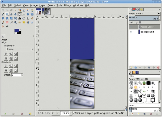
Open your two stock images and scale each one to about 5 inches wide—a little more than half the width of the new canvas (Image▸Scale Image). In this example I use a photo of an older-model mobile phone and a photo of someone using a phone.
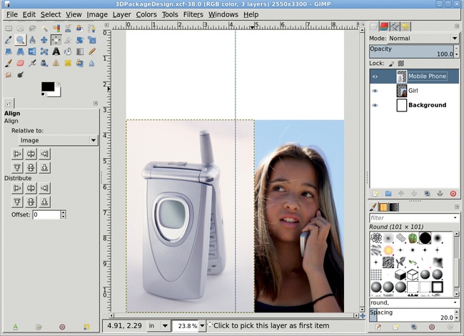
Copy and paste each stock image into the canvas as a new layer by choosing Layer▸New Layer after pasting each image. Name one layer Mobile Phone and the other layer Girl.
Use the Alignment tool from the Toolbox to left-align the Mobile Phone layer and to right-align the Girl layer, both along the bottom edge of the canvas. To use this tool, first choose the tool, and then click the layer in the canvas. Using the arrow buttons in the Tool Options dialog, align the layer relative to the image at the correct canvas edges.
Arrange the layer stack so the Mobile Phone layer is on top in the Layers dialog. If necessary, use the Move tool to manually adjust the Mobile Phone layer so the phone is roughly centered on the left half of the canvas.
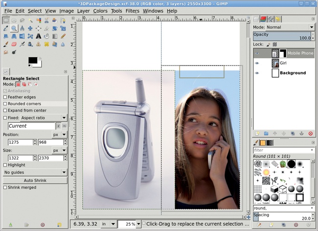
Click the Mobile Phone layer in the Layers dialog.
Add a white layer mask (Layer▸Mask▸Add Layer Mask).
Use the Rectangle Select tool to create a selection to the right of the guide that encloses the Girl layer.
With the canvas selected, press D to reset the foreground and background colors to black and white, respectively.
Make sure the layer mask is still active for the Mobile Phone layer by clicking the mask, and then drag the foreground color (black) from the toolbox into the selection. This will mask out the part of this layer overlapping the Girl layer.
Clear the selection (Select▸None).
With the Girl layer now properly visible, be sure to center the image of the girl on the right half of the canvas as necessary.
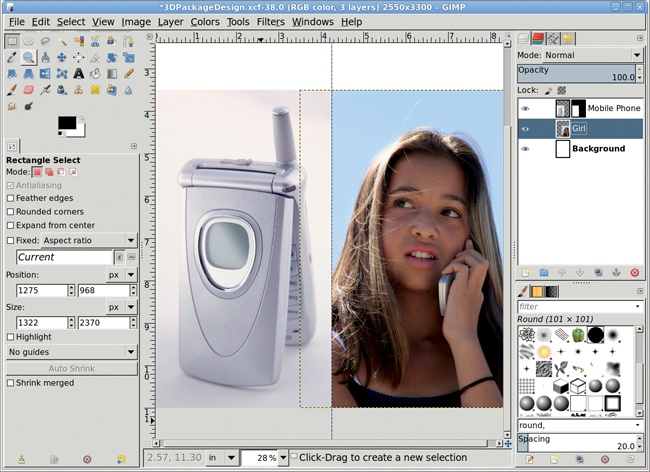
At this point we need to remove the white strap on the girl’s shirt because it distracts from the image. (Even if the image you’re using for this project doesn’t require a similar fix, you can use this technique whenever you need to remove some distracting element.) While coloring the strap is an option, a much simpler solution is to clone some of the girl’s hair and use it to cover the strap.
Note
For more cloning practice, see 2.8 Photo Restoration.
Turn off the visibility of the Mobile Phone layer in the Layers dialog while patching the Girl layer. Click the Girl layer to make it active.
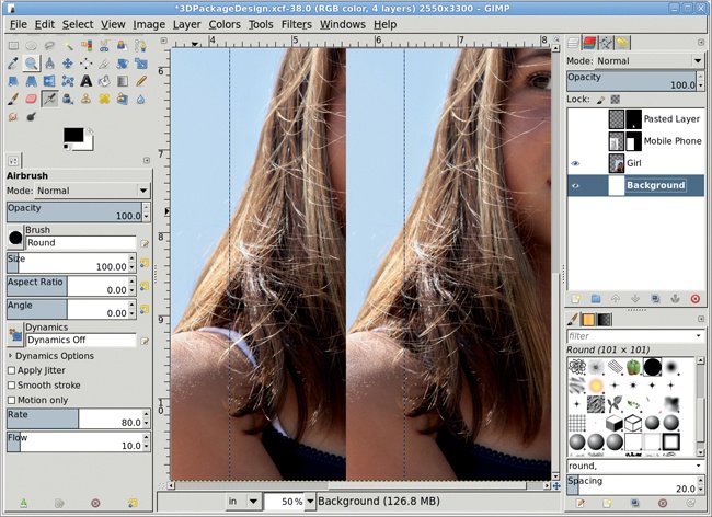
Zoom in on the image and use the Free Select tool to draw a selection around the white strap. Use the Move tool, changing to Selection in the Tool Options dialog, to drag the selection up till it covers just the girl’s hair.
Feather the selection by 3 pixels (Select▸Feather), and then copy and paste it as a new layer (Layer▸To New Layer).
In the Layers dialog, move the new layer down to just above the Girl layer, and then use the Move tool, changing back to Layer in the Tool Options dialog, to position the new layer so it covers the white strap.
Add a white layer mask, and then use the Airbrush tool to paint black over the patch and blend the new layer with the original image.
Merge down (Layer▸Merge Down) the patch layer with the original Girl layer.
Turn the visibility of the Mobile Phone layer back on.
Now that the images have been cleaned up, you can create the upper half of the package, the portion that contains the product text.
Click the Background layer to make it active.
Click the foreground color box to open the Change Foreground Color dialog. Set the RGB values to 6/6/155 for the blue shown here, and then click OK to apply the change.
Drag the foreground color into the Background layer to add a blue bar that runs across the top of the box.
Choose the Text tool from the toolbox. With the canvas selected, press D and then X to reset and then swap the foreground and background colors. Choose an appropriate font and size for the product name and description—I used Nimbus Roman No9 L Italic sized to 90 pixels.
Click the canvas to open the Text Editor window. Type a fictitious manufacturer name and model number like Nekioba VXS-1756.
Use the Move tool to center the text layer manually, and then add another text layer containing some descriptive text set in smaller type.
Save this image as front.xcf, and then flatten the image (Image▸Flatten Image). Scale the image (Image▸Scale Image) to 80 percent of its current size.


Open a new image, again using the US Letter template set to 98 ppi. Scale down this canvas to 3 inches in width but leave the height at 11 inches.
Click the foreground color box and select the blue used earlier from the presets or set the RGB values to 6/6/155. Close the Change Foreground Color dialog, and then drag the foreground color onto the new canvas. If you like, add another stock photo to the bottom of the canvas.
With the canvas selected, press D and then X to reset the foreground color to white.
Choose the Text tool from the toolbox. Choose an appropriate font and size—I used Nimbus Roman No9 L Italic sized to 40 pixels. Retype the text that appears on the front of the box, or modify it if you prefer.
Rotate the text layer counterclockwise by 90 degrees (Layer▸Transform▸Rotate 90 degrees counter-clockwise) and then use the Move tool to manually position the text in the blue area on the side of the package.
Save this image as side.xcf.
Flatten the image (Image▸Flatten Image) and then scale down the image to 80 percent of its original size.

With the toolbox selected, press D to reset the background color to white. Open a new white canvas using the US Letter template set to 98 ppi.
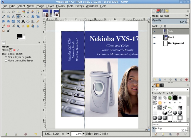
Copy and paste the front and side images into this canvas as new layers (Layer▸To New Layer). Name the new layers Front and Side, respectively.
Add a vertical guide 3 inches (3 × 98 = 294 pixels) from the left edge and then add a horizontal guide 1 inch from the top.
Click the Front layer and use the Move tool to align the left and top edges of the layer with the intersection of the guides. Click the Side layer and drag to align the right and top edges of that layer with the intersection of the guides. Both images will fit on the canvas vertically. Don’t worry if the sides spill over the edges of the canvas. Just press the minus key to zoom out and make it easier to work on the canvas.
Add another vertical guide at 8 inches. This marks where the front right edge of the box will end up.
Click the Front layer in the Layers dialog to make it active.
Choose the Perspective tool from the toolbox, and then click the canvas. Drag the top and bottom control points on the right side of the Front layer toward the horizontal center of the canvas until they line up with the vertical guide at 8 inches and slightly toward the vertical center of the image. Click the Transform button in the Perspective Transform dialog to apply the changes.
Add a vertical guide 1.5 inches from the left edge of the canvas to mark where the left side edge of the box will end up.
Click the Side layer in the Layers dialog to make it active.
Choose the Perspective tool from the toolbox, and then click the canvas. Drag the top and bottom control points on the image’s left side toward the horizontal center of the canvas until they line up with the vertical guide at 1.5 inches and slightly toward the vertical center of the image.


Remove all guides (Image▸Guides▸Remove All Guides).
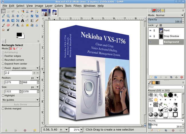
Merge (Layer▸Merge Down) the Front and Side layers by first clicking on the higher layer in the Layers dialog—this will merge the front and side panels into a single layer and leave the merged layer separate from the background.
Add a drop shadow (Filters▸Light and Shadow▸Drop Shadow), setting the Offset X value to 0 pixels and the Offset Y value to 12 pixels to cast a shadow that simulates a light source directly in front of and above the box. The Opacity should be set to 80 percent so the background can show through it slightly. The Blur Radius is dependent on the size of the image. For this image, which is bound for the Web, a blur of 15 pixels produces a very soft-edged shadow.
In the first edition of this book, this tutorial had additional steps to clean up jagged edges after the perspective transforms. The latest version of GIMP no longer has this problem, making this tutorial that much easier.
For added effect, consider changing the location of the shadow or adding additional shadows to make light appear to come from different directions. A rectangular selection modified with the Perspective tool, filled with black, and then placed behind the box with the bottom edges closely aligned can give the appearance of a light source shining directly on the front of the box and that the box is set atop a surface. Adjusting the brightness of the side panel is another trick that you can play with lighting in this project.
Advertising is a name game, and attention spans are running short. If you want to get your message across, you’ll need to establish the who and the what quickly. A logo is the centerpiece of a corporate identity, and it can do a lot to increase name recognition. While logo designs themselves are often quite simple, they can be placed near or inside other objects for added effect. Glass can reflect a company’s identity in a big way.
Glass effects are really just tricks with lighting and shadows. In previous tutorials you used lighting to simulate depth in an image. Shadows, too, provide a sense of depth by implying that another surface exists behind or below the main subject. Reflections can also be used to lend texture to a surface. In this tutorial you’ll learn how to use reflections to simulate a rounded, glassy surface.
This technique is easy to learn, but you may need to experiment to get the reflections just right. The trick is to create cutouts from an existing selection. And notice the use of paths in this tutorial—the two endpoints of a path will be connected when they are converted to a selection, and in this tutorial you want the line between those two endpoints to be outside an existing selection.
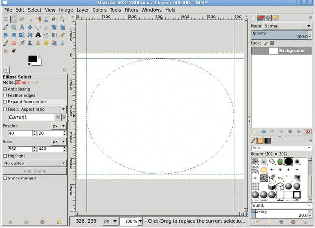
To make sure that the default colors are being used, press D in the canvas area to reset the foreground and background colors. Start with a white canvas set to 640 × 480 pixels. The techniques used in this tutorial scale up easily enough, so it’s okay to work with a canvas that’s set to a small size and 98 ppi until you get it right.
Open the New Guide dialog (Image▸Guides▸New Guide). Select Vertical from the Direction drop-down menu and set the Position to 40 pixels. Click OK to add the guide.
Repeat this process to add another vertical guide at 600 pixels. Then choose Horizontal from the Direction drop-down menu and add guides at 20 pixels and 460 pixels.
Choose the Ellipse Select tool from the toolbox. Drag from the upper-left intersection of the guides down toward the lower-right intersection of the guides so the selection touches each of the guides. (The selection should snap to the guides. If it doesn’t, verify that View▸Snap to Guides is set.)
Feather the oval selection by 3 pixels (Select▸Feather).
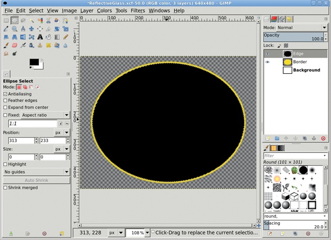
Add a new transparent layer by choosing Layer▸New Layer and setting the Layer Fill Type to Transparency. Name the new layer Border.
Click the Foreground color box in the Toolbox to open the Change Foreground Color dialog. Set the RGB values to 243/217/1 for a bright yellow. Click OK to set the foreground color, and then drag the foreground color from the toolbox into the selection.
You don’t need the guides anymore, so you can remove them (Image▸Guides▸Remove All Guides).
Add a new transparent layer by choosing Layer▸New Layer and setting the Layer Fill Type to Transparency. Name this new layer Edge.
Shrink the selection by 5 pixels (Select▸Shrink).
With the canvas selected, press D to reset the foreground color to black. Drag the foreground color into the selection.

Now that you have a border, use the Radial gradient to create a glassy surface inside it.
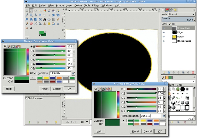
Add a new transparent layer by choosing Layer▸New Layer and setting the Layer Fill Type to Transparency. Name this new layer Green Glass and be sure it’s at the top of the layer stack in the Layers dialog.
Shrink the selection by 2 pixels (Select▸Shrink) to leave a thin black edge between the yellow border and green glass.
Click the foreground color box in the toolbox to open the Change Foreground Color dialog again. This time, set the RGB values to 17/157/43 for the bright-green end of the gradient, and then click OK to apply the change.
Click the background color box in the toolbox to open the Change Background Color dialog. Set the RGB values to 0/85/16 for the dark-green end of the gradient, and then click OK to apply the change.
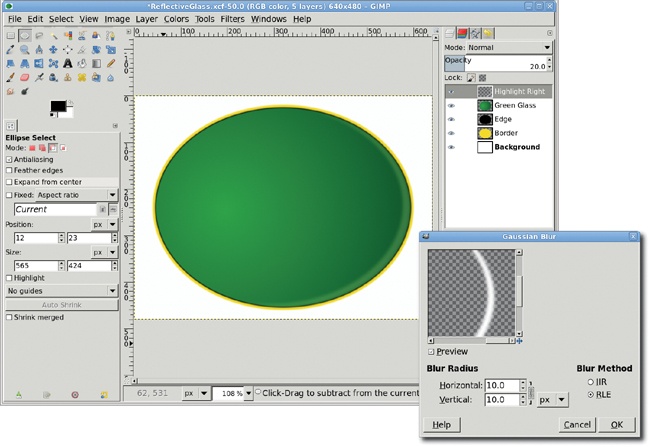
Choose the Blend tool. In the Tool Options dialog, set the Gradient to FG to BG (RGB) and set the Shape to Radial.
Drag inside the selection from the left focus of the oval (just left of center) to the right edge of the oval.

The gradient already simulates lighting changes on the surface of the emblem, but adding highlights will exaggerate this effect even more.
Save the selection to a channel (Select▸Save to Channel).
Click the Green Glass layer in the Layers dialog to make it active.
Add a new transparent layer named Highlight Right.
Reset the foreground and background colors by pressing D while the canvas is selected.
Choose the Ellipse Select tool from the toolbox. In the Tool Options dialog, click the third button from the left to select the Subtract mode.
Drag over the existing selection to create a new oval that covers all but the lower-right and right edges of the selection. It may take a little experimentation to get this just right. If your first attempt fails, press CTRL-Z to undo the change and try again.
Once you have the selection cutout just right, drag the background color box (which should be white) from the toolbox into the selection. Deselect all (CTRL-SHIFT-A).
Open the Gaussian Blur filter (Filters▸Blur▸Gaussian Blur). Set the Blur Radius to 10 pixels for both the Horizontal and Vertical directions, then click OK to apply the blur.
Reduce the Opacity of the Highlight Right layer to 20 percent.
Reset the Ellipse Select tool’s Mode to Replace.

Add a new transparent layer and name it Highlight Left.
Open the Channels dialog (Windows▸Dockable Dialogs▸Channels). Click the saved channel, which is the last item on the list. Convert this channel to a selection by clicking the Channel to Selection button second from the bottom right of the dialog.
Return to the Layers dialog and click the Highlight Left layer to make it active.
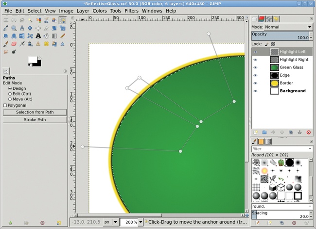
Choose the Path tool from the toolbox. Click outside the selection, and then trace a path similar to the one shown here. Make sure the first and last grab points in the path form a straight line outside of the existing selection. While holding down the CTRL and SHIFT keys, click the Selection from Path button in the Tool Options dialog.
Note
If you have trouble working with paths, take a look at 1.5 Paths.
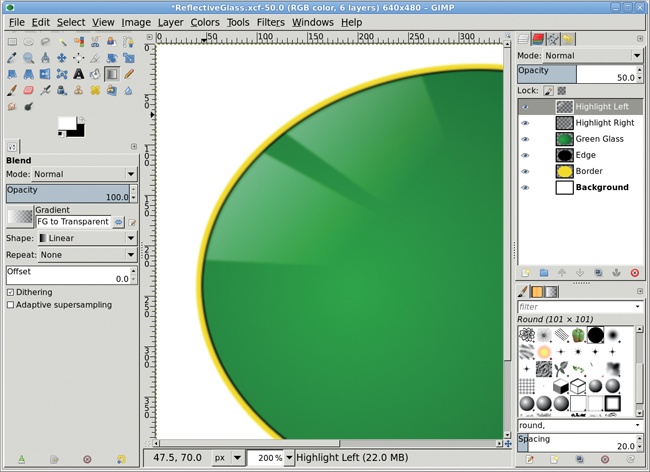
With the canvas selected, press X to swap the foreground and background colors and set the foreground color to white.
Choose the Blend tool from the toolbox. In the Tool Options dialog, set the Gradient to FG to Transparent and set the Shape to Linear. Drag from the upper-left edges of the selections to the lower-right edges of the selections. Deselect all (CTRL-SHIFT-A).
Open the Gaussian Blur filter (Filters▸Blur▸Gaussian Blur). Apply a blur of 3 pixels and reduce the Opacity of this layer to 50 percent.
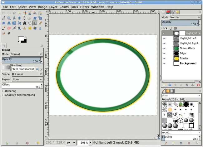
Add a new transparent layer and name it Highlight Left 2.
As before, retrieve the selection by converting from the saved channel and then shrink the selection by 20 pixels (Select▸Shrink).
Click the Highlight Left 2 layer to make it active again.
If the foreground color is not white, press D and then X, and then drag the foreground color box into the selection to fill the selection with that color. Deselect all (CTRL-SHIFT-A).
Open the Gaussian Blur filter (Filters▸Blur▸Gaussian Blur) and apply a blur of 5 pixels.
Add a white layer mask (Layer▸Mask▸Add Layer Mask).
Open the Paths dialog (Windows▸Dockable Dialogs▸Paths). An unnamed path should exist, created when you used the Paths tool earlier in this tutorial. Click the Path to Selection button at the bottom of the dialog (fifth from the left).
Click the layer mask in the Highlight Left 2 layer to make the mask active, and then fill the selection with black. Deselect all (CTRL-SHIFT-A).
Open the Gaussian Blur filter (Filters▸Blur▸Gaussian Blur) and apply a blur of 5 pixels to the mask.
In the Layers dialog, set the layer mode to Grain Merge and the Opacity to 50 percent, and then drag the Highlight Left 2 layer down below the Highlight Left layer.

With the canvas selected, press D and then X to set the foreground color to white.
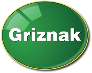
Choose the Text tool from the toolbox. In the Tool Options dialog, choose an appropriate font and size. Click the canvas and type Griznak. Make sure the text layer is at the top in the Layers dialog.
Use the Align tool to center the text on the canvas.
Add a drop shadow (Filters▸Light and Shadow▸Drop Shadow). Set the Offset X and Offset Y values to 2 pixels and set the Blur Radius to 2 pixels. Make sure the Allow resizing checkbox is not checked. Then apply the drop shadow by clicking OK.
Move the text layer and the Drop Shadow layer below both of the Highlight Left layers in the Layers dialog.
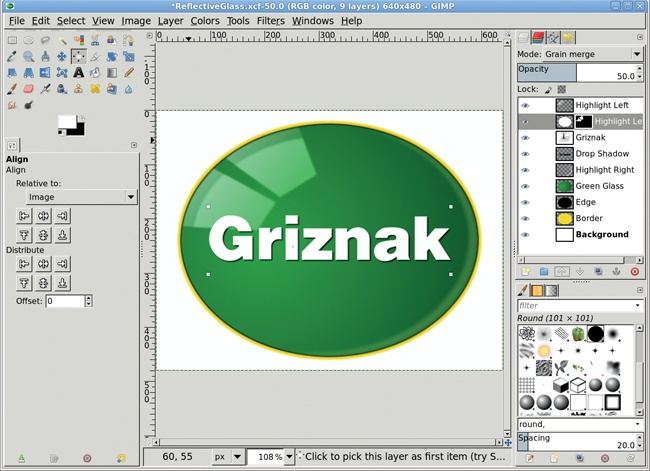
This effect works well with oval emblems such as this one, though there’s no reason why it wouldn’t work on a rectangular emblem as well. The key is the soft white layers that simulate reflections of light. These could be reflections of light coming through a window, or they could be the reflections of a nearby surface.
The emblem could also reflect another object, as shown in 2.6 Reflections on Glass and 2.7 Lake Reflection. Imagine this is a car dealership’s emblem and a car zooming down the road is reflected in it.
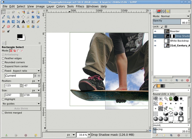
Popping is the term used to describe filling a portion of an image’s background with white so the image’s subject seems to pop off of the monitor or printed page. Advertisements use this technique extensively. It works much as a type screen does, except that in the case of popping, the screen is a solid color and its layer is actually placed between the image’s subject and background.
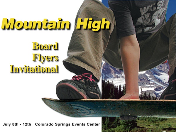
Much of the work in this tutorial involves using the Fuzzy Select tool to make a cutout of the subject—in this case, a skateboarder (sans wheels). The process is relatively simple because there’s a high contrast between the background and the foreground. Hold down the SHIFT key, click a few times, and you’ll be able to select the background fairly quickly. This may not be true of the stock image you decide to use for this project, but the basic process will remain the same.
Start with an image of an airborne skateboarder with blue sky in the background. The image will be used to advertise a skateboard invitational in the Rocky Mountain region of Colorado. What’s missing in the original image is some indication of where the event will take place. Along with popping the boarder from the image, we need to replace the blue sky with a mountain scene.
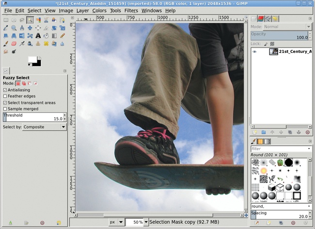
Open the boarder image in GIMP and choose the Fuzzy Select tool from the toolbox. Hold down the SHIFT key and click in various places to the left of the boarder and below the board until a nearly solid selection is made. Use the Quick Mask to fine-tune the selection.
When the entire area left of and below the boarder has been selected, turn the Quick Mask off and invert the selection (Select▸Invert).
Shrink the selection by 1 pixel (Select▸Shrink) and feather it by 2 pixels (Select▸Feather).
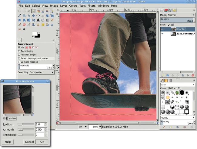
Copy and paste the selection as a new layer (Layer▸New Layer) and name it Boarder.
Open the Unsharp Mask filter (Filters▸Enhance▸Unsharp Mask). Set the Radius to 5 pixels and the Amount to 0.50. Click OK to apply the changes.
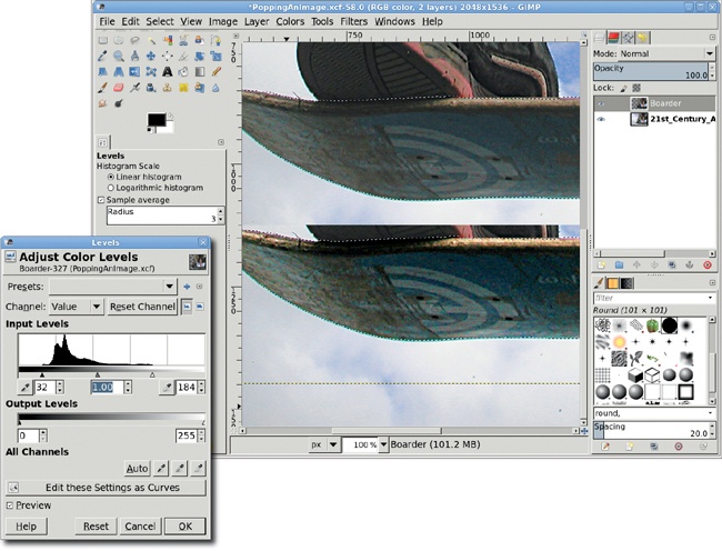
The highlights under the board need to be evened out so the board doesn’t look so washed out.
Use the Fuzzy Select and Quick Mask tools to make a rough selection of the board’s bottom.
Grow the selection (Select▸Grow) by 1 pixel, repeating this process until most of the board’s underside is selected.
Feather the selection by 3 pixels (Select▸Feather).
Use the Levels tool (Colors▸Levels) to modify the white balance on the board by dragging the right-most slider under the histogram slightly to the left, dragging the left-most slider to the right, and making sure the middle slider stays centered. Modifying the black-and-white balance this way will brighten the darker areas of the board and make the hazy underside of the board appear clearer. Click OK.
Deselect all (CTRL-SHIFT-A).
We’ve isolated the boarder, but there are still patches of sky and clouds between the boarder’s legs and along the sides of his torso. These patches need to be removed so we can swap in the Rocky Mountain background.
Use the Fuzzy Select tool to make selections of the sky on either side of the boarder’s torso and in the space between his right arm and each leg.
Feather the selection by 3 pixels (Select▸Feather).
Add a white layer mask (Layer▸Mask▸Add Layer Mask) and fill the selections with black. Deselect all (CTRL-SHIFT-A). Apply the layer mask (Layer▸Mask▸Apply Layer Mask).
Add a new transparent layer and name it White Backdrop.
Pull a vertical guide from the left ruler until it’s just to the right of the boarder’s right foot. Unlike in other tutorials, this guide is positioned without an exact pixel location. Choose the Rectangle Select tool from the toolbox—be sure the Replace mode is set in the Tool Options dialog. Use the guide as the right edge for a selection covering the left side of the layer. Fill the selection with white.
Move the White Backdrop layer down so it’s below the Boarder layer in the Layers dialog.
Deselect all (CTRL-SHIFT-A), and then hide the guide (View▸Show Guides).


A drop shadow adds to the pop effect.
In the Layers dialog, click the Boarder layer to make it active.
Add a drop shadow (Filters▸Light and Shadow▸Drop Shadow). Set the Offset X and Y values to 5 pixels and the Blur Radius to 15 pixels. Set the Opacity to 80 percent and uncheck the Allow resizing checkbox. Click OK to apply these settings and create the Drop Shadow layer.
Click the Drop Shadow layer in the Layers dialog. Add a white layer mask (Layers▸Mask▸Add Layer Mask).
Click the White Backdrop layer in the Layers dialog to make it active. Create a selection of the transparent region by choosing Layer▸Transparency▸Alpha to Selection, and then choosing Select▸Invert.
Click the Drop Shadow layer mask to make it active. Drag the foreground color (which should be black) from the toolbox into the selection. This will hide the drop shadow everywhere except over the white backdrop.
Deselect all (CTRL-SHIFT-A).
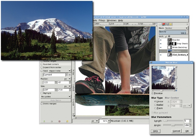
We want it to be clear from the advertisement that the event is being held in the Rocky Mountain region of Colorado. Let’s add in the mountains as a background layer.
Click the Boarder layer to make it active.
Open an appropriate background image, such as this one of the Rocky Mountains. Copy and paste the image into a new layer (Layer▸To New Layer) and name it Mountain.
Use the Scale tool to resize the layer so it’s as big as the canvas, then move the Mountain layer below the White Backdrop layer in the Layers dialog. Adjust the placement of the Mountain layer as appropriate.
Open the Motion Blur filter (Filters▸Blur▸Motion Blur). Set the Blur Type to Linear, set the Length to 5 pixels, and set the Angle to 180 degrees. Click OK to apply these settings to the Mountain layer.
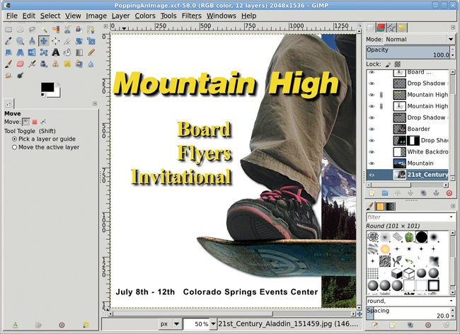
It’s time for the finishing touches. Let’s add text to the poster. Use the Text tool and type your text in black using any font. Duplicate the text and color the top version yellow. Offset the two layers by a few pixels to simulate depth. Make sure your text layers are at the top of the layer stack so you can see them over the layer masks and background images.
Projects like this are sometimes the most fun because they aren’t particularly difficult. As is true of many techniques described in this book, the hard part is creating good selections that isolate your intended subject. The Quick Mask tool is your best bet for objects that have many curves and edges, as this boarder’s leg does. If the object you’re trying to isolate has straighter edges and the background is a solid color, you can try using the Scissors tool.
Whether you’re designing a T-shirt, a website, or a letterhead for the company office, you’re probably going to use some kind of identifying symbol. While printed symbols are often easier (and cheaper) to create in solid colors, designing for the Web allows a bit more flexibility. Color is king on the Web, and because high-resolution, 16M-color monitors are the norm, three-dimensional effects are equally widespread.

Symbols play an important role in design, and they can make or break a product or company image—better known in the graphic arts industry as an identity. The symbol itself may be flat and solid, flat and textured, or three-dimensional with light effects and shadows. Visual identities are the symbols of the companies we know—just think about McDonald’s Golden Arches, a Red Hat for Linux, or IBM’s Big Blue.
Logos usually include text set in a specific font, which is often accompanied by a shape representing the company, group, or individual. As part of an overall identity campaign, logos are sometimes embedded within other shapes to create emblems.
One of the easiest emblems to create is a round, reflective logo that resembles glass. A glass logo uses soft gradients with little or no grain visible. Many white ovals (or partial ovals) are layered and placed over the logo to simulate reflections. Sometimes these round reflections are even outlined with distinct edges to simulate a frame in which the logo is set.
A metallic logo is even easier to create. The technique is based on the fact that reflections in metal aren’t as wide as reflections in glass, and they have more high-contrast areas between light and shadow. In the case of a metallic logo, the metal might be the focal point—as in a belt buckle or lapel pin—or you might just use metallic edges to accent a nonmetallic design, which is what you’ll do in this tutorial.
When you’re designing these emblems, it helps to examine real-world objects like glass buttons or even silver spoons. Notice how the light and colors reflect. One trick is to blur your eyes a little—try to see the reflections without focusing on the shape of the object. Then try to reproduce the effect with GIMP.
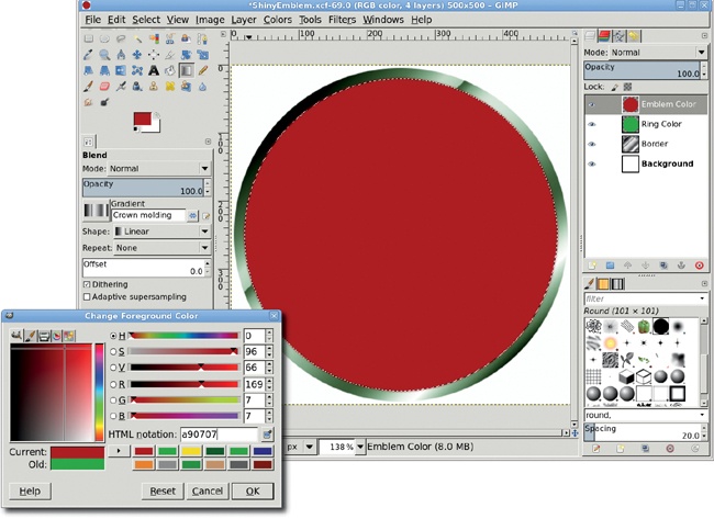
Adding reflectivity and color not only adds style to your design, it’s also incredibly easy to do with GIMP. In this tutorial you’ll work on a small canvas to demonstrate the ease of the technique. Remember that raster images—like those you create in GIMP—don’t scale up to larger sizes very well, so start with a larger canvas and scale up the technique if you need a bigger emblem.
With the toolbox selected, press D to reset the foreground and background colors to black and white, respectively.
Select File▸New. In the Create a New Image dialog, set the dimensions to 500 × 500 pixels to create a square canvas. Click OK to open the new canvas window.
Create a new transparent layer (Layer▸New Layer) and name it Border.
Choose the Ellipse Select tool from the toolbox and make sure the Mode is set to Replace. Click and drag on the canvas to create a circular selection. In the Tool Options dialog, set the size to 490 × 490 and the position to 5 × 5. Click inside the selection to accept these settings.
Choose the Blend tool from the toolbox. In the Tool Options dialog, choose the Crown Molding gradient. Click and drag from the upper left to the lower right of the selection.
Add a new transparent layer by choosing Layer▸New Layer and setting the Layer Fill Type to Transparency. Name the new layer Ring Color.
Click the foreground color box to change the foreground color. In the Change Foreground Color dialog, set the RGB values to 0/159/0 for the green shown here, and then click OK to close the dialog. The circular selection should still be active, so just drag the foreground color into the selection.
In the Layers dialog, set the Mode to Soft Light and the Opacity to 50 percent.


Add another new transparent layer by choosing Layer▸New Layer and setting the Layer Fill Type to Transparency. Name this new layer Emblem Color.
Shrink the selection by 15 pixels (Select▸Shrink), and then feather the selection by 4 pixels (Select▸Feather).
Open the Change Foreground Color dialog again, set the RGB values to 169/7/7 for the red shown here, and then close the dialog. Drag the foreground color into the selection.
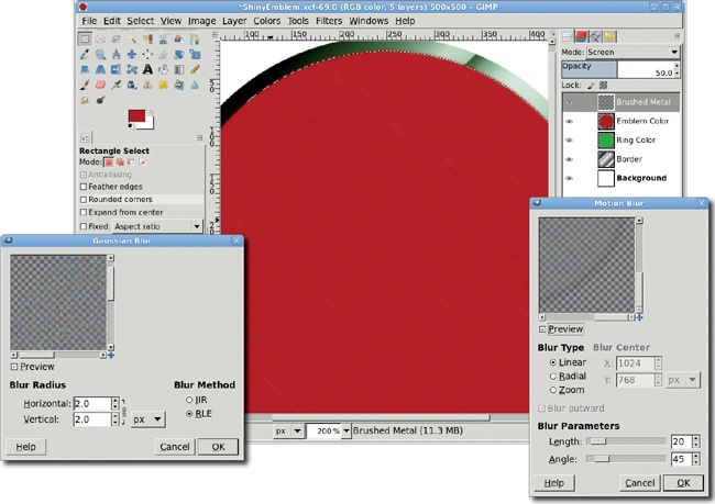
At this point, you have the basic metallic emblem. The rest of the tutorial shows how to get creative with this basic shape. Start by adding a slight brushed-metal effect.
Add a transparent layer and name it Brushed Metal.
Open the Hurl filter (Filters▸Noise▸Hurl). Set the Random Seed to 10, the Randomization to 35 percent, and the Repeat to 3 times. Click OK to apply this to the new layer.
In the Layers dialog set the Mode to Screen and the Opacity to 50 percent.
Open the Gaussian Blur filter (Filters▸Blur▸Gaussian Blur). Apply a 2 pixel blur both horizontally and vertically.
Open the Motion Blur filter (Filters▸Blur▸Motion Blur). Set the Length to 20 pixels and the angle to 45 degrees and click OK to apply the blur.
You will simulate brushed metal in 5.1 Chrome and Metal Text, using the same technique as you do here.
Add a transparent layer and name it Inner Ring.
Shrink the selection by 25 pixels (Select▸Shrink).
With the toolbox selected, press D to reset the background and foreground colors. Fill the selection with black by dragging the foreground color into the selection.
Shrink the selection by 4 pixels.
Press CTRL-X to cut out the selection from the Inner Ring layer and leave behind a thin, black ring.
Clear the selection.
Open the Gaussian Blur filter (Filters▸Blur▸Gaussian Blur). Set the Blur Radius to 5 pixels, and then apply the blur to the Inner Ring layer.
Create a selection from this layer by choosing Layer▸Transparency▸Alpha to Selection.
Add a layer mask to the Emblem Color layer by choosing Layer▸Mask▸Add Layer Mask. In the Add Layer Mask dialog, click the Selection radio button and check the Invert mask checkbox. This automatically creates a mask in the shape of the black ring.

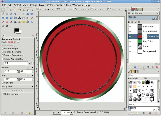
Click the Inner Ring layer and invert its colors (Colors▸Invert).
Set its layer Mode to Grain Extract. Clear the selection.
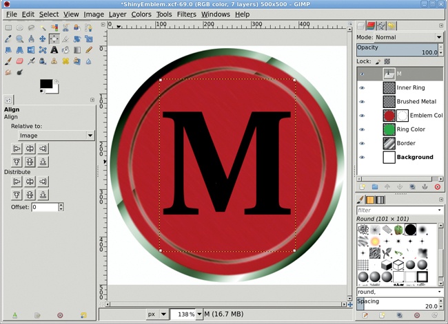
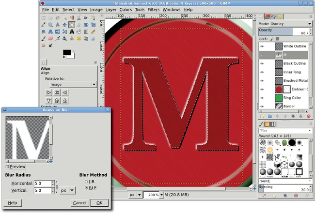
Choose the Text tool from the toolbox. In the Tool Options dialog, choose a large, thick font. This example used Utopia Bold sized to 310 pixels.
Click the canvas and type an uppercase M. Use the Align tool to center the text layer in the image window.
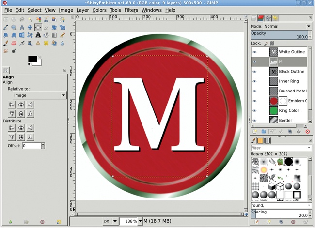
Duplicate the text layer (Layer▸Duplicate Layer), and then invert its color to white by choosing Colors▸Invert. Name the duplicate layer White Outline.
Choose Layer▸Transform▸Offset and set the Offset X and Offset Y values to –2 pixels.
Duplicate the original text layer again, naming the duplicate layer Black Outline.
Choose Layer▸Transform▸Offset once more, but set the Offset X and Offset Y values to 2 pixels.
In the Layers dialog, move the original text layer so that it’s between the White Outline and Black Outline layers.
Click the White Outline layer to make it active.
Open the Gaussian Blur filter (Filters▸Blur▸Gaussian Blur) and apply a blur of 5 pixels to the White Outline layer.
Set the White Outline layer size to match the image size (Layer▸Layer to Image Size).
Click the original text layer and create a selection by choosing Layer▸Transparency▸Alpha to Selection.
Click the White Outline layer to make it active again.
Press CTRL-X to cut out the selection from the White Outline layer.
Click the Black Outline layer to make it active, and then cut out the selection from that layer.
Set the original text layer’s mode to Overlay and its Opacity to 66.7 percent.
Set the RGB values for the foreground color to 172/172/172 for the red shown here.
Click the Emblem Color layer mask to make it active.
Drag the foreground color from the toolbox into the selection and then deselect all (CTRL-SHIFT-A).

A letter with curves that match the curve of the emblem might look more impressive than this somewhat ordinary M. You can also convert paths to selections to create your own curvy letters. If you do so, remember to save the selections so you can recall them when it’s time to create the white highlight and black shadow layers.
By now you’re all familiar with how GIMP can be used to manipulate stock photos. But photo editing is only half a story, like a wine glass with no wine. To get the whole story, you need the wine bottle: graphics created from scratch using GIMP’s vector tools.
This tutorial shows you how to draw using nothing but guides, a grid, and paths. Guides are straight lines that allow you to accurately position points, bound selections, or simply trace with drawing tools. Paths are vector components of an image that can be edited anytime to change their shapes using control points and drag handles. Path edits don’t immediately affect the image window; you have to retrace the paths or convert them to selections for use in the image.
Paths are to drawing what layers are to photo editing. You create multiple paths in a single path layer and then create multiple path layers to create a drawing. Since paths are editable curves, not just straight lines, they’re perfect for drawing manga or other types of cartoons. But there’s more to paths than cartoons. You’re going to use them as the basis for a 3-D shape.

This tutorial is for both new and experienced GIMP users who haven’t yet ventured into the world of drawing from scratch. You’ll need basic knowledge of GIMP’s windows–the Toolbox, image windows, and dialogs–though I’ll provide menu locations where needed. You should be familiar with creating new layers and naming them.
What you’ll get is a thorough understanding of how guides can perfectly align your design elements, how drawings don’t have be done in color initially, and how 3-D effects are just a matter of simulated lighting.
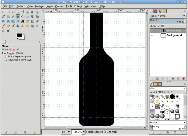
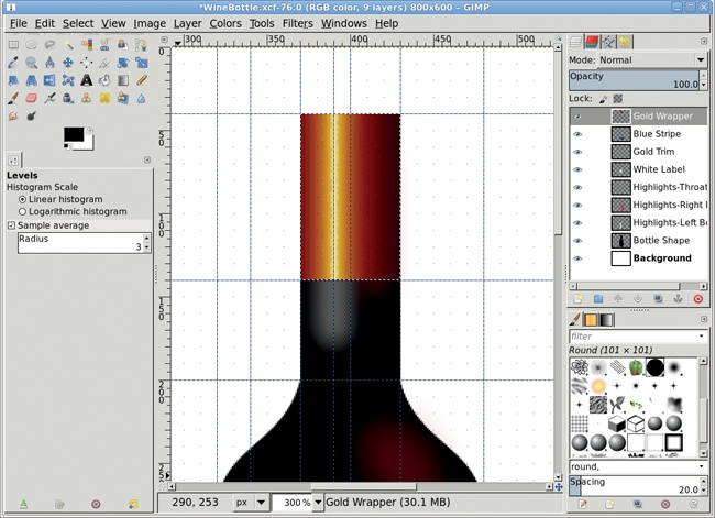
The bottle outline is created by outlining the left half using a path and then duplicating and flipping this to create the right half. Guides are used to precisely align the path control points. Four vertical and five horizontal guides are required for this part of the drawing.
Start with a new 800 × 600 image window (File▸New). Configure the grid (Image▸Configure Grid) with a spacing of 10 × 10 pixels and a Line style of Intersections (dots). Then enable the Snap to Grid feature (View▸Snap to Grid). The grid should also be visible (View▸Show Grid) when editing curves.
Add a vertical guide (Image▸Guides▸New Guide...) with an offset of 400 pixels, half of the canvas width. Additional vertical guides should be positioned at 320, 340, and 370. Horizontal guides should be positioned at 40, 200, 280, 520, and 560. These positions are all pixel offsets.
Choose the Paths tool from the Toolbox. In the Tool Options dialog, set the Edit mode to Design. In the image window, click on the following guide intersections (the vertical guide is listed first) to drop path control points: 400/40, 370/40, 370/200, 320/280, 320/520, 340/560, 400/560. This gives a straight-edged outline, which needs to be rounded.
In the Tool Options dialog, set the Edit mode to Edit. Click and drag straight up two grid dots on the control point at the guides intersecting at 370/200. This is the handle for the incoming curve to this control point, but you don’t need it, so just move it out of the way. Click again on the control point and drag the handle for the outgoing curve down 3 grid dots and left 1 grid dot. Repeat for the control points at the following grid intersections using the specified drag amounts:
320/280: incoming handle up 4 grid dots
320/520: outgoing handle down 3 grid dots
340/560: incoming handle up 1 and left 2 grid dots
In the Paths dialog, click the path name to rename this path Left Border. In the Tool Options dialog, click Selection from Path.
In the Layers dialog, add a transparent layer (Layer▸New Layer) and name it Bottle Shape. Type D in the canvas to reset the foreground color and then fill the selection with black.
Copy the selection (Edit▸Copy) and paste it (Edit▸Paste) as a new layer (Layer▸To New Layer). Using the Flip tool from the Toolbox, flip this copied layer horizontally. Use the Move tool and click and drag in the image window to move the layer so the left edge of the bottle in this layer aligns with the right edge of the bottle in the Bottle Shape layer. Merge the copied layer with the Bottle Shape layer (Layer▸Merge Down).


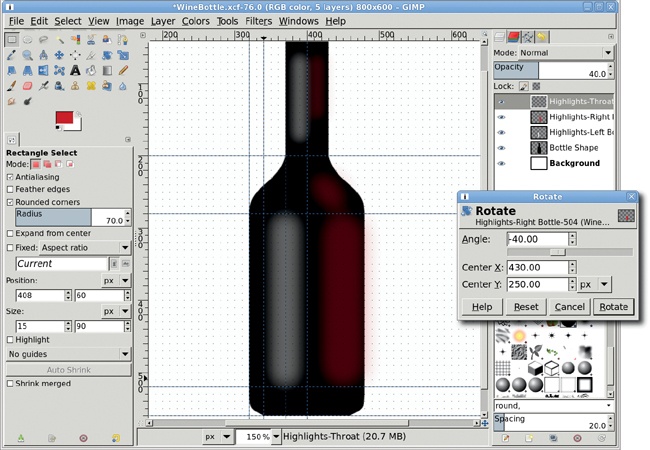
Rendering the bottle into 3-D is done simply by adding some lighting effects in the form of colored filled and blurred selections. The highlights require six selections: two on the left side of the bottle and throat will act as reflected white light, and four on the right side will simulate light shining through the bottle and its contents.
Create a transparent layer and name it Highlights-Left Bottle. Make it the top of the stack in the Layers dialog.
Choose the Rectangular Select tool from the Toolbox. Drag a selection in the image window starting at the intersection of the guides at 340/280 and dragging to the intersection of guides at 400/520. In the Tool Options dialog, change the Size to 40 × 240 and the Position to 350 × 280. Choose the Rounded Corners option and set the Radius to 70 percent.
Fill the rectangle with white. Remove the selection (Select▸None). Apply a Gaussian Blur (Filters▸Blur▸Gaussian Blur) that’s 30 pixels in both the X and Y directions. Reduce the Opacity of this layer to 40 percent.
Create a transparent layer and name it Highlights-Right Bottle. Make this the top of the layer stack.
Create a selection like the previous one, but set the Position to 420 × 280. Click the foreground color box in the Toolbox and set the RGB values to 198/31/31, respectively. Fill the selection and then remove it, but don’t blur yet. Set the layer Transparency to 40 percent.
Choose the Ellipse Select tool from the Toolbox. Create an oval selection starting at the intersection of guides at 340/200 to 400/280. In the Tool Options dialog, set the Position to 400 × 210.
Choose the Rotate tool from the Toolbox. In the Tool Options dialog, set the Transform option to Selection. Click in the image window and in the Rotate dialog that opens, set the Angle to –40 degrees, and then click the Rotate button to rotate the selection.
Shrink the selection (Select▸Shrink) by 10 pixels and feather it (Select▸Feather) by 5 pixels. Fill the selection with the same color as the previous selection, then remove the selection. Finally, apply a Gaussian blur to the layer of 30 pixels.
Add a transparent layer named Highlights-Throat. Drag a rectangular selection from the intersection of guides at 320/40 down to 340/200. In the Tool Options dialog, change the Size of the selection 20 × 120 and the Position to 380 × 60. Round the selection, feather it by 5 pixels, and fill it with white. Remove the selection.
Repeat this selection on the same layer, but set the position to 408 × 60 and its size to 15 × 90. Feather again and fill with the red color from the right-side selections created previously. Remove the selection.
Finally, blur this entire layer by 20 pixels and set the Opacity to 40 percent.
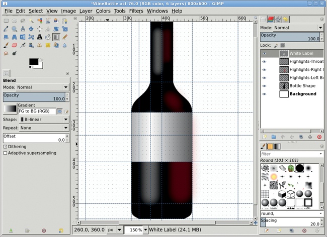
What would a wine bottle be without its label? Boring, at least. This bottle’s label will once again be outlined with guides, but it will be created using some new tools: gradients and the Colorize dialog. The label will be edged with multiple pieces of gold trim. The trick with these will be to create multiple, disconnected selections and apply the trim fill and coloring all at once.
Create a transparent layer named White Label and put it at the top of the layer stack. Add vertical guides positioned at offsets of 200, 480, and 600 pixels. Add horizontal guides at 340 and 410. Choose the Rectangle Select tool from the Toolbox, making sure the Rounded Corners option is disabled in the Tool Options dialog, and drag a selection from the guide intersection of 320/280 to 480/410.
Reset the foreground and background colors by typing D in the canvas. Choose the Gradient tool from the Toolbox. In the Tool Options dialog, set the Shape to Bi-linear. Set the Gradient to FG to BG (RGB) and click the Reverse button. In the image window, drag from the the guide intersection of 370/340 left to the intersection at 200/340. Clear the selection.
Create a transparent layer named Gold Trim at the top of the layer stack. Add horizontal guides at 415, 445, 450, and 515. Use the Rectangle Select tool to create a selection starting at the intersection of 320/410 and dragging to the right at intersection 480/415. In the Tool Options dialog, set the Mode to Add (second icon from the left). Now create selections 320/445 to 480/450 and 320/515 to 480/520. This creates three separate selections.
Use the Gradient tool with the same settings as the White Label and drag from the horizontal guide at 370 left to the guide at 200. Open the Colorize dialog (Colors▸Colorize) and set the Hue to 50, the Saturation to 86, and the Lightness to 0 and apply these settings. Finally, apply a Levels adjustment (Colors▸Levels) by setting the Input Levels midpoint value to 0.25. Clear the selections.

A thick blue stripe on the label will add color, as will a gold wrapper around the throat of the bottle. These will be made like the white label and gold edges.
Start with a transparent layer named Blue Stripe at the top of the layer stack. Create a rectangular selection (set the Mode to Replace in the Tool Options dialog for the Rectangular Select tool), starting at the intersection at 320/450 and dragging down and to the right to the intersection at 480/515.
Choose the Gradient tool from the Toolbox. Choose the FG to BG (RGB) gradient and make sure the Reverse button is set. Make sure the Shape is set to Bi-linear. Drag on any horizontal guide starting at the vertical guide at 370 and over to the left to the vertical guide at 200.
Finally, use the Colorize dialog to paint the label dark blue. Set the Hue to 200, the Saturation to 77, and the Value to –30. Adjust the midpoint slider in the Levels dialog to 0.25. Clear the selection.
Create a transparent layer named Gold Wrapper at the top of the layer stack. Add a horizontal guide at 140 and vertical guides at 390 and 430. Create a selection, starting with the intersection at 370/40 and dragging to 430/140. Create a gradient using the same settings as the Blue Stripe but drag left to right this time, from the vertical guide at 390 to the vertical guide at 480. Use Colorize with the Hue, Saturation, and Lightness set to 50, 86, and 0, respectively. Finish this part of the tutorial by adjusting the Levels on this selection, setting the Black Point to 175 and the Mid Point to 0.15.
That’s the basic bottle. The splash image for this tutorial takes this further by adding a bottle cap, text, and creative graphics to the labels. The cap is created using more guides but the same selection and gradient process as the labels. The graphics are cut from stock icon books and stock photography, desaturated, and blended with the bottle and labels. All these processes are extensions of techniques you’ve already learned in previous tutorials. Just give them a try!
Working with GIMP is not unlike working with wood. If you build a chair, you certainly don’t build it out of a single piece of wood. You cut and shape pieces, then put them together one at a time until you have the final product.
Complex GIMP projects are created the same way: by combining component parts into a unified whole. You start by crafting image pieces by hand or from stock photography, which you later combine as layers into your final draft. The final draft gets a coat of varnish or other “color corrections” before you sit on it or, rather, hang it on the wall. Maybe using GIMP isn’t exactly like carpentry, but you get the idea.
For example, say you wanted to create a handmade mechanical clock in GIMP. You’d perhaps start with a single gear, just like the one you’ll create in this tutorial. This gear can be duplicated and rearranged, as well as reused in entirely new projects.
This project won’t require any outside stock photography or specialized graphics knowledge. You should be able to follow along whether you’re a GIMP guru or just hammering out your first GIMP gear.

The small teeth around the edge of a gear are called cogs. You’ll start this project by creating 32 uniformly spaced cogs around a circle. Later you’ll connect the cogs with metallic rings, and then you’ll finish off the project by adding depth to give the whole gear a 3-D appearance.
The process for the cogs is so simple, I’ll explain it before you even start. You create a single cog at the top of a square canvas window in a layer by itself. You duplicate the layer and rotate it 90 degrees. Then you merge the duplicate with the original. Repeat this once to end up with cogs positioned at 12, 3, 6, and 9 o’clock. Then repeat the process but halve the rotation amount. Each successive repetition halves the rotation again. Now you can see this process in action.
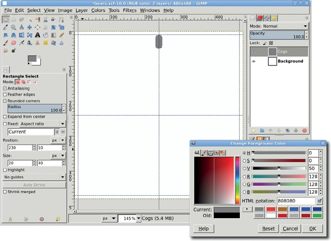
Open a new image and set the Width and Height to 480 pixels. The background color should be white to make it easier to see what you’re doing. Choose Image▸Guides▸New Guide (by Percent). Add a horizontal guide at 50 percent and a vertical guide at 50 percent. Then use Image▸Guides▸New Guide to add horizontal guides at 10 pixels and 470 pixels. Then add vertical guides at the same offsets.
Create a transparent layer. Name this layer Cogs. Choose the Rectangle Select tool from the toolbox. Drag a rectangular selection anywhere in the image window. The size and location of the selection don’t matter at this point; you’re about to change these manually.
In the Tool Options dialog, set the selection Size to 20 pixels wide by 40 pixels tall and the Position to 230 pixels and 10 pixels. This will place the 20 × 40 pixel selection at the top center of the image window. Round the corners of the cog by clicking the Rounded Corners option in the Tool Options dialog. This will display a slider to set the radius of the rounded corners. Move the slider all the way to the right, setting the Radius to 100.0.
Click the foreground color box in the toolbox and change the foreground color to gray by typing 808080 in the HTML notation box. Click OK, close the dialog, and then drag the foreground color box from the toolbox into the selection.
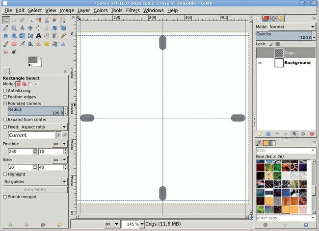
Copy the selection and paste it into the image window. Convert the floating selection to a new layer (Layer▸To New Layer). Change the layer to match the image size (Layer▸Layer to Image Size).
Rotate the layer by 180 degrees (Layer▸Transform▸Rotate 180). Note here that if you hadn’t expanded the layer to match the image size, the rotation would have been around the center of the cog. Instead, with the layer boundaries expanded to match the square image window, you’ve rotated the layer around the center of the image window. The result is that the duplicate cog is now at the 6 o’clock position.
Merge the new layer with the layer below it (Layer▸Merge Down). The new layer will inherit the original cog layer name of Cogs.
Having created two cogs, you make the rest simply by duplicating the existing cog layer, rotating the duplicate an appropriate amount, and merging the two cog layers again.
Duplicate the Cogs layer. Rotate this layer by 90 degrees (Layer▸Transform▸Rotate 90 degrees clockwise) to add the cogs at the 3 o’clock and 9 o’clock positions. (For this step it doesn’t matter if you rotate clockwise or counterclockwise.) Merge this layer with the previous one.
If you didn’t catch it, the last rotation of 90 degrees was half of the first rotation. That pattern of reducing the rotation by half each iteration will continue from now until you have all the cogs you want.
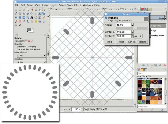
With 4 cogs in place, you move to 8 cogs by duplicating the layer, rotating by 90/2 = 45 degrees, and merging the layer. The trick here is that you no longer have a simple menu option to select “rotate by 45 degrees.” Instead, you choose Layer▸Transform▸Arbitrary Rotation. The dialog that opens has an input field labeled Angle. Instead of using the slider, it’s easier to just type in the amount (45) and click the Rotate button. Don’t forget to merge the layers.
There are two rotations left, and they follow the same process as the last step. For 16 cogs: duplicate the layer, rotate by 45/2 = 22.5 degrees, and merge the layers. For 32 cogs: duplicate the layer, rotate by 22.5/2 = 11.25 degrees, and merge the layers. That’s enough cogs for this gear.
The rotations have a side effect on the final layer: its layer boundaries are larger than the image window. To fix this, choose Layer▸Layer to Image Size once again.

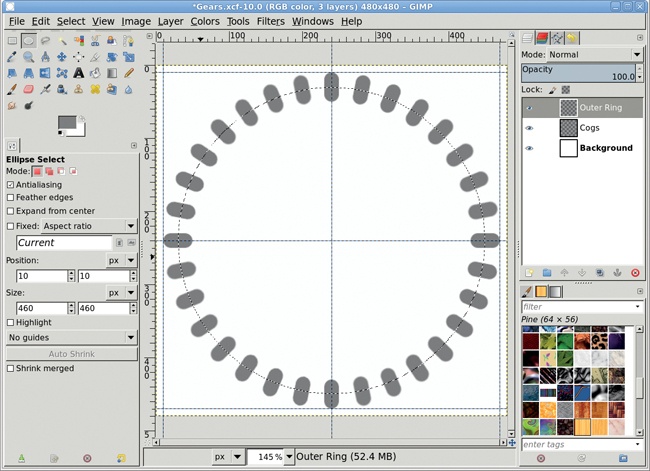
The next step in your gear design is to connect all those cogs. Do this by creating a solid disk and then cutting out an inner disk to create a ring in its own layer. You can then merge the ring and Cogs layers. Start by adding a transparent layer. Name this layer Outer Ring.
Choose the Ellipse Select tool from the toolbox. Use the guides to create a perfect oval that aligns properly with the outside edges of the cogs. In the image window, click the upper left intersection of the top and left guides, then drag to the lower right intersection of the bottom and right guides. The circular selection this creates overlaps the cogs completely, so reduce the size of the selection. The cogs are 40 pixels high, so reducing the selection by half that amount should do nicely. Choose Select▸Shrink and set the size to 20. Then click OK to shrink the selection.
The foreground color should still be the same color you used for the cogs, so go ahead and drag it into the selection. Now you want to cut a disk out of this selection. Remember that the height of the cogs is 40 pixels, so you need the outer ring to be at least 20 pixels (20 + the 20 pixels we shrunk in the selection the first time = the inside edge of the cogs). Give yourself a little extra room and shrink the selection by 25 pixels. All that’s left to finish the outer ring is to cut the selection from the existing gray disk. At this point you can merge the Cogs layer with the Outer Ring layer.
Next you’ll add an inner disk to the gear. Keep in mind that other than the cogs, the shape of the gear (inner rings and decorations) is completely an artistic choice. To hone your skills, you could attempt to duplicate a real gear down to the smallest detail. Or you could create shapes inside the outer ring that aren’t uniform disks and rods. For your first gear, however, keep it simple and use shapes that are easily created and duplicated.
The inner disk of your gear starts with another oval selection. The easiest way to create this is to select the transparent area inside the outer ring of the Cogs layer. The Cogs layer is active, so start by choosing the Fuzzy Select tool from the toolbox. Click inside the image window in the area inside the outer ring. This creates a selection that follows the inside edge of that ring. Add a transparent layer in which you’ll create the inner disk and name the layer Inner Disk. You want a disk significantly smaller than this selection, however. It’s time for a little math.
Remember that the image window is a square 480 pixels on each side. Also, you created a 40-pixel-tall cog placed 10 pixels down (vertically) in the image window. That means the bottom edge of the cog is 50 pixels down from the top of the image window. The vertical center of the image window is at 480/2 = 240 pixels. That means the current selection has a radius of 240 – 50 = 190 pixels (not including the 5-pixel extra space you added when creating the outer ring). Let’s halve that to 95 pixels, shrinking the selection by 95 pixels, and fill it with gray. Clear the selection.

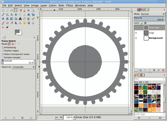
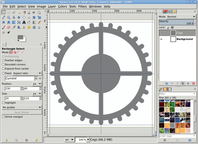
Before merging the inner disk, you’ll add some connecting rods between the inner disk and the outer ring. You can use similar techniques to the ones used to create the original cog, manually sizing and positioning a selection to create the first rod, then duplicating the layer and rotating each duplicate layer.
Choose the Rectangle Select tool from the toolbox and draw an initial selection in the canvas. In the Tool Options dialog, set the Size to 20 pixels wide by 115 pixels tall and set the Position to 230 pixels and 45 pixels. This centers the selection on the central vertical guide between the outer ring and inner disk. This time you can disable the Rounded Corners option (click it so the check mark is removed). Add a transparent layer named Rods, and then fill the selection from the foreground color.
The selection is still active, so copy and paste it as you did with the original cog. Convert the floating selection (created when you pasted) into a new layer. Set the layer boundaries to the image size. Now flip the pasted layer vertically (Layer▸Transform▸Flip Vertically). Merge the two rod layers. Duplicate the merged layer again. Rotate the layer by 90 degrees. Merge the two rod layers again. Finally, merge the rod layers with the Inner Disk layer, and then merge the Inner Disk layer with the Cogs layer.

That’s the template for your gear. Now you can add depth and texture to it.
Duplicate the Cogs layer and name it Cogs Blur.
Apply an RLE Gaussian Blur of 5 pixels horizontally and vertically. Turn off the visibility of the blurred layer in the Layers dialog.
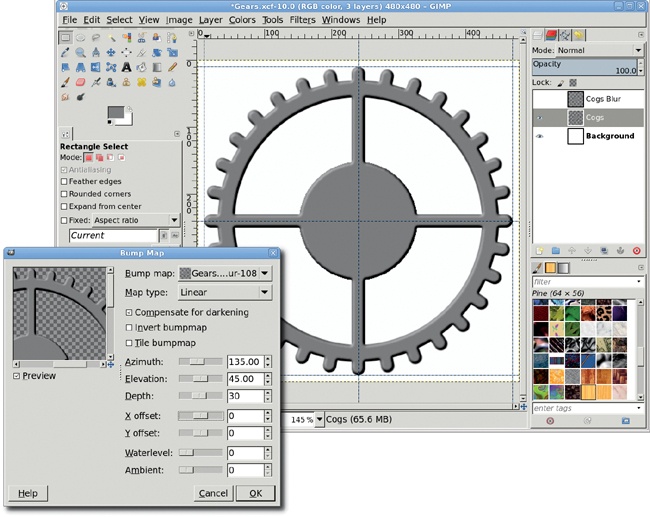
Select the Cogs layer. Open the Bump Map filter (Filters▸Map▸Bump Map). Set the Bump Map option to the Cogs Blur layer. Set the Azimuth to 135, the Elevation to 45, and the Depth to 30. Click OK to apply these settings. This will give the Cogs layer some depth.
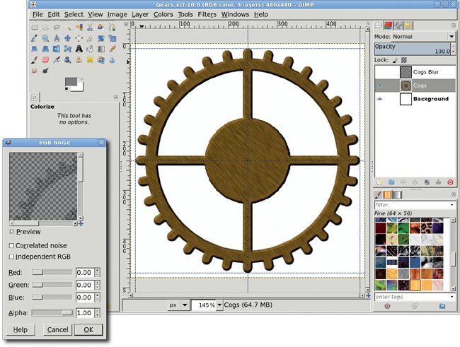
With the Cogs layer active, select the entire gear (Layer▸Transparency▸Alpha to Selection). Create a transparent layer and name it Noise. Use the RGB Noise filter (Filters▸Noise▸RGB Noise) to fill the selection with noise. Disable the Independent Noise button and move all the sliders to the far left (setting their values to 0) except the Alpha slider, which should be moved all the way to the right.
Add a motion blur (Filters▸Blur▸Motion Blur) to the Noise layer. Set the length to 10 and the angle to 45. Apply this to the Noise layer. Merge the Noise layer with the Cogs layer. Open the Colorize dialog and choose an appropriate color for the gear. Clear the selection (Select▸None).
There are lots of variations you can try with this tutorial. Try creating square cogs and placing them closer together (hint: you need to create more cogs). Other shapes you can try are sawtooth, or, if you’re really adventurous, you can try curved cogs. You can also be creative in how you connect the cogs. Instead of a ring and disk, you might try connecting the cogs to a ring that uses swirled shapes where the disk and rods are used in this tutorial.
For ideas on gear designs, try doing an Internet search for gears, clocks, and watches. Also, clipart books have lots of unusual shapes you can use to replace the connecting rods and inner disks.
What if the last tutorial was a bit too artistic for your project’s needs? You could turn to stock imagery for a much more recognizable, if two-dimensional, cityscape. Or you could ditch high art and have a little more fun. Maybe you need something with a little toon style to it. Maybe what you need is Cube City.
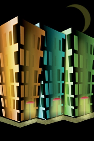
In this tutorial you’ll create three buildings from simple 3-D cubes, and then bend the buildings a bit to give the design a cartoonish look. The entire image takes only a few minutes to put together—once you’re familiar with the tricks of the trade.
The process starts by generating a single 3-D cube that’s duplicated and stretched to create each of the three buildings. Despite GIMP’s obvious bias toward 2-D artwork, creating the cube is far easier than it might seem. This design is created at 250 ppi to produce a print that’s 4 × 6 inches. If you’re after a larger print, you’ll need to create a larger cube. You can scale down the original cube for smaller prints, but the windows in the buildings will become difficult to see if you do, so it’s best start with a smaller version of the cube for smaller prints.
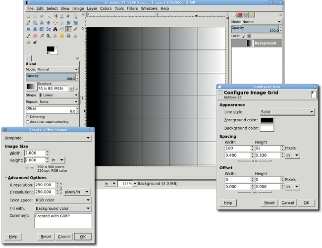
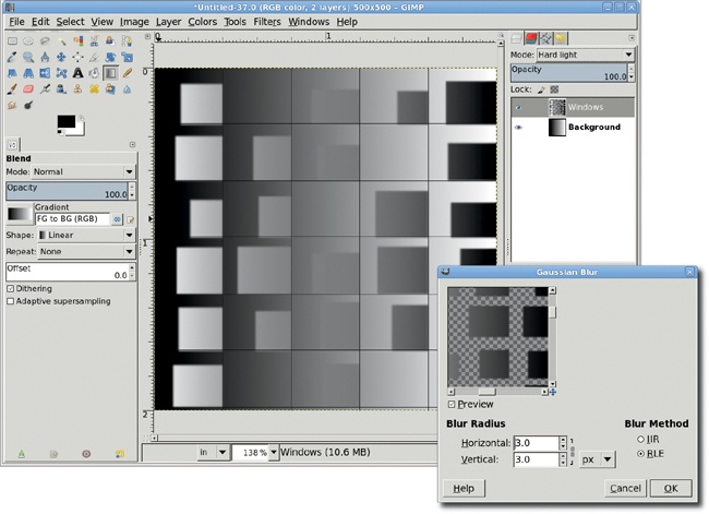
Open a new transparent canvas (File▸New) 2 × 2 inches at 250 ppi. This image will be used to create the 3-D cube for the main project. For comparison’s sake, note that if you were planning to create a cube city 420 × 300 pixels at 72 ppi, you’d start with a layer that was 60 × 60 pixels.
Choose the Blend tool from the toolbox. In the Tool Options dialog, set the Gradient to FG to BG (RGB) and the Shape to Linear. The rest of the options should be set to their default values.
With the canvas selected, press D to reset the default foreground and background colors, and then drag horizontally on the canvas from left to right.
Create a 6 × 5 grid (Image▸Configure Grid) by setting the width to 0.4 inches and the height to 0.33 inches. Be sure to turn on the visibility of the grid (View▸Show Grid) and enable snapping to the grid (View▸Snap to Grid). If necessary, press SHIFT-+ to zoom in and get a better look at the gradient layer. Click OK.
Add a new transparent layer by choosing Layer▸New Layer and setting the Layer Fill Type to Transparency. You’ll merge this layer with the background as soon as you’re done with it, so don’t name it.
Choose the Rectangle Select tool from the toolbox. Using a grid intersection point as the corner of a selection, drag to create a square selection that’s inside a rectangle created by the grid but doesn’t cover that entire grid rectangle. The extra space between the selections is the wall between adjacent windows.
Repeat this process for most of the grid boxes within this cube layer, leaving a few blank. Selections on the right side of the gradient will be more apparent in the final image, so don’t leave those blank. Hold down the SHIFT key as you drag or set the Mode to Add in the Tool Options dialog. This will add new selections to the existing selections. The selections needn’t all be the same size. This is, after all, a cartoonish design.
After all the selections have been created, click the Blend tool again to make it active. Drag from right to left across the width of the layer to fill the selections. Deselect all (CTRL-SHIFT-A).
Open the Gaussian Blur filter (Filters▸Blur▸Gaussian Blur), set the Blur Radius to 3 pixels, and click OK to apply the blur to the windows.
In the Layers dialog, set the layer mode to Hard Light and merge this layer with the Background layer (Layer▸Merge Down).
Hide the grid (View▸Show Grid) and disable snapping to it (View▸Snap to Grid).
Open the Map Object filter (Filters▸Map▸Map Object). Choose Box from the Map to drop-down menu and check the Transparent background checkbox. Make sure the Enable antialiasing checkbox is also checked.
On the Orientation tab, set the Y Rotation to 45 degrees. If the preview doesn’t show your rectangle converted into a nice cube as shown here, check the Box tab and make sure the correct layer (cube) is selected for each of the sides’ drop-down menus.
On the Box tab, set the Y slider to 0.75, and then click OK to apply the Map Object filter.
Select the whole canvas (Select▸All) and press CTRL-C to copy the cube. If you want, you can then close this image to save memory.
Note
Before continuing, you should save this image (File▸Save As) as an XCF file so you’ll always have a copy of the source cube for future Cube City projects. Saving subcomponents of a project like this is common practice and will, over time, help you build a library of small components suitable for multiple projects.

Open a new canvas that’s 4 × 6 inches at 250 ppi.
With the toolbox selected, press D to reset the foreground and background colors, and then drag the foreground color onto the canvas to fill the canvas with black.
Paste the cube you copied onto the black canvas as a new layer by pressing CTRL-V and then choosing Layer▸To New Layer.
Choose the Scale tool from the toolbox. Click the cube layer and drag up a bit to make the building taller. Click the Scale button in the Scaling Information dialog to apply the change.
Duplicate this layer twice by choosing Layer▸Duplicate twice. Name the three layers Left, Middle, and Right.
Click the Left layer to make it active, and then use the Move tool to drag it left of center on the canvas (hold down the SHIFT key if necessary). Then click the Right layer and move it right of center. Adjust the layers so the Left layer overlaps the Middle layer, which overlaps the Right layer.
Choose the Perspective tool from the toolbox. In the Layers dialog, click the Left layer to make it active. Then click the canvas to display the drag points around the layer. Drag the top-left and top-right points outward from the center of the layer. In the Perspective Transform Information dialog, click the Transform button to apply the change.
Repeat this process for the Right and Middle layers.
When all three buildings have been completed, use the Move tool to adjust the layers so the bottom edges of the buildings line up.
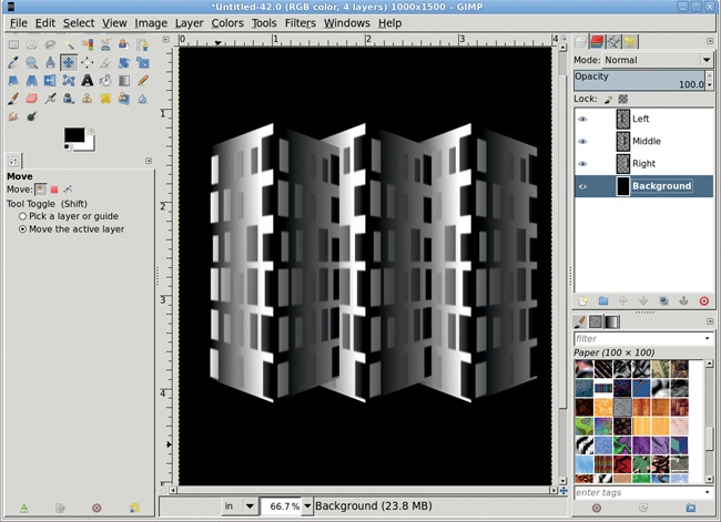

The buildings should be different colors, but you don’t want the colors to clash.
For each layer, open the Colorize dialog (Colors▸Colorize).
For the Left layer, set the Hue to 33, the Saturation to 66, and the Lightness to –15. For the Middle layer, set the Hue to 180, the Saturation to 60, and the Lightness to –15. For the Right layer, set the Hue to 100, the Saturation to 50, and the Lightness to –15.
At this point, you can use the Sharpen filter or the Unsharp Mask filter (Filters▸Enhance) to reduce any fuzziness that was introduced when you modified the perspective.

Add a drop shadow to the Left and Middle layers by choosing Filters▸Light and Shadow▸Drop Shadow. Set the Offset X value to 15 pixels, the Offset Y value to 3 pixels, and the Blur Radius to 15 pixels. Click OK to apply the drop shadow.
Click the foreground color box to open the Change Foreground Color dialog. Set the RGB values to 252/255/0 for the yellow shown here and click OK.
Click the Left layer to make it active, duplicate the layer (Layer▸Duplicate Layer), and name the new layer Left Yellow Oval. Press CTRL-A and then CTRL-X to clear the layer contents.
In the Layers dialog, uncheck the Lock Alpha Channel box as shown.
Choose the Ellipse Select tool from the toolbox and use it to create an oval selection on the left side of the building.
Feather the selection by 30 pixels (Select▸Feather), and then drag the foreground color box into the selection to fill it with yellow.
Use the Move tool to drag the selection to the right side of the building. Drag the foreground color box into the new selection. Deselect all (CTRL-SHIFT-A).
Open the Gaussian Blur filter (Filters▸Blur▸Gaussian Blur) and apply a blur of 60 pixels.
Set the layer mode to Grain Merge and reduce the Opacity to 35 percent.
Duplicate the Left Yellow Oval layer (Layer▸Duplicate Layer). Name the duplicate layer Middle Yellow Oval.
Use the Move tool to move the Middle Yellow Oval layer over the middle building, and then in the Layers dialog move the Middle Yellow Oval layer to just above the Middle layer. Repeat this process for the Right layer, naming the last duplicate layer Right Yellow Oval.
Adjust the Yellow Oval layers’ Opacity and Layer Mode and, if necessary, scale them to fit the buildings.
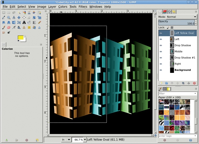

It’s incredibly easy to create 3-D objects in GIMP. As you’ve seen, it’s simply a matter of using gradients and shadows mixed with colored highlights.
And it’s easy to take this project to the next level. The first image in this section shows that a sidewalk and some street lighting have been added to the cityscape. Additional elements can be added from icon collections, pasted into the image, and colorized.
We’ve already discussed how setting the mood in an advertisement is crucial to getting your message across. In 4.6 Wine Bottle you saw how light can reflect both from inside and outside of a bottle.

One place we can go to set an eerie mood is underwater. Undersea atmosphere is a complex mixture of diminishing light, distorted visuals, and inverted surfaces. In the land of GIMP, however, the underwater realm is easy to create.
In this section you’ll create an underwater image for use in a print ad. The effect isn’t particularly difficult to produce, but it does take some patience and experimentation to get a realistic result. If you don’t succeed on the first try, make subtle changes to the Solid Noise filter’s settings and try again.
Open a new canvas sized to 1024 × 768 pixels.
Press D and then X to reset and then swap the default foreground and background colors. In the toolbox, click the foreground color box to open the Change Foreground Color dialog. Set the RGB values to 23/137/125 for the aqua green shown here, and then click OK.
Choose the Blend tool from the toolbox. In the Tool Options dialog, set the Gradient to FG to BG (RGB), set the Shape to Linear, and choose None from the Repeat drop-down menu. Drag vertically from the top of the canvas window to the bottom.
In the Layers dialog, temporarily turn off the visibility of the Background layer. You’ll turn it back on when you’re done creating the desaturated waves.
You’ll start by using the Solid Noise filter to generate the waves. Increasing the detail setting in this filter will increase the contrast in parts of the image, and stretching the effect horizontally will help simulate water instead of clouds.
Add a new transparent layer by choosing Layer▸New Layer and setting the Layer Fill Type to Transparency. Name the new layer Surface.
Open the Solid Noise filter (Filters▸Render▸Clouds▸Solid Noise). Check the Randomize checkbox, set the Detail to 5, set the X Size to 5, and set the Y Size to 10. Click OK to apply the filter.
Repeat this process four more times, creating four new layers and making sure to uncheck and check the Randomize box on each layer so that a new random value changes the shape of each rendering. Set the Mode to Difference for every layer except the original Surface layer.
Merge the visible layers into a single layer (Image▸Merge Visible Layers). Set the merged layer’s mode to Grain Merge.
Turn back on the visibility of the Background layer.
If necessary, adjust the Brightness and Contrast of the Surface layer to sharpen or soften the edges between the crests and troughs of the waves (Colors▸Brightness-Contrast). While the mouse is in the canvas window, press the minus (–) key to zoom out.
Choose the Perspective tool from the toolbox. Click the canvas to display the drag points at the four corners of the Surface layer. Pull up the lower-left and lower-right points to approximately one-third to one-half the height of the canvas.
Drag the upper-left point to the left and drag the upper-right point to the right, as shown here. In the Perspective Transform Information dialog, click the Transform button to apply these changes to the layer.
If the waves appear too small or crowded, use the Scale tool to stretch the layer. When this is completed, zoom back in by pressing SHIFT-+.
At this point you can use the Gaussian Blur filter (Filters▸Blur▸Gaussian Blur) to apply a blur of 2 to 5 pixels. You can also use the Ripple filter (Filters▸Distort▸Ripple) to add distortion. Neither of these steps is required—use your own judgment to get the most out of this effect.
Add a white layer mask (Layer▸Mask▸Add Layer Mask).
Reset and swap the default foreground and background colors by pressing D and then X while the canvas is selected.
Choose the Blend tool from the toolbox. In the Tool Options dialog, use the same settings you used earlier. Drag vertically, starting between the top and middle of the layer, to near the bottom of the layer. This will fade the Surface layer into the background, making it look as though the surface is disappearing into the distance.
Turn off the Layer Boundary (View▸Layer Boundary) so you can see the underwater effect more clearly. This is also a good time to save a copy of the project for future use (File▸Save As).

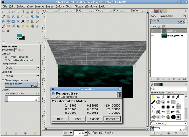
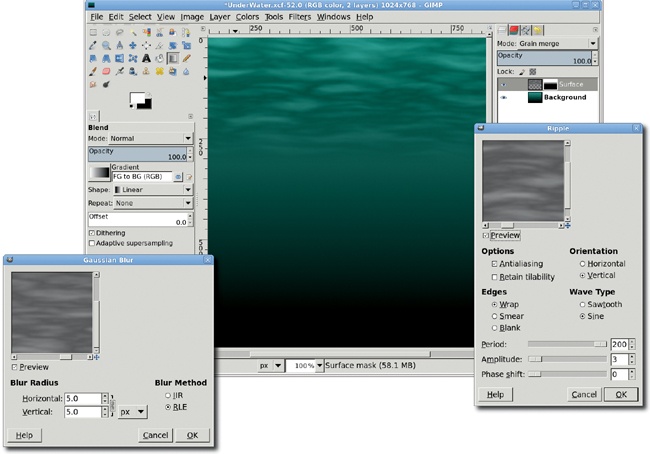
Now it’s time to add a light source that appears above the water.
Add a new transparent layer by choosing Layer▸New Layer and setting the Layer Fill Type to Transparency. Name the layer Light Source.
Choose the Blend tool from the toolbox again. Set the Gradient to FG to BG (RGB), set the Shape to Radial, and choose None from the Repeat drop-down menu. Click the top of the canvas near its middle and drag down through the canvas about halfway.
Add a white layer mask to this layer (Layer▸Mask▸Add Layer Mask).
With the Blend tool still active, set the Shape to Linear in the Tool Options dialog. Then drag vertically from the top of the canvas to the middle.
Set the Mode for this layer to Grain Merge. The black in the layer will darken the waves a bit, but the white will also lighten some of them—giving the overall appearance of a nighttime underwater scene.

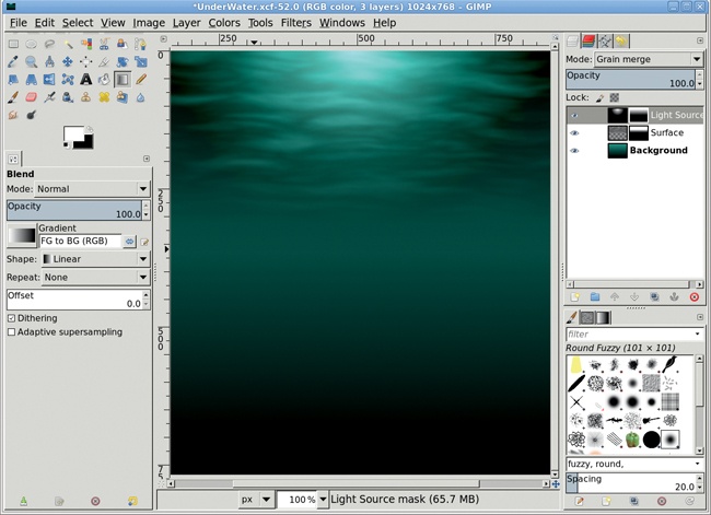
Now you can really make this scene shine.
Click the Background layer to make it active.
Choose the Rectangle Select tool from the toolbox. Drag through the top half of the canvas to create a square selection. The selection should cover the entire light source.
Copy and paste the selection, and then choose Layer▸To New Layer to make the pasted selection a new layer. Name it Light Rays. You won’t use the content of the copied layer, but this is a simple way to create an appropriately sized layer. Make sure the layer boundary is visible (View▸Layer Boundary).
Choose the Blend tool again. This time set the Gradient to Flare Rays Size 1, set the Shape to Bi-linear, and choose Sawtooth wave from the Repeat drop-down menu. Drag horizontally from left to right through the middle third of the new layer.
Open the Polar Coordinates filter (Filters▸Distorts▸Polar Coordinates). Set the Circle depth in percent to 0 and adjust the Offset angle so the most visible lines from the edges of the original layer (if any) are at the bottom of the preview. The To polar checkbox and the Map from top checkbox should be checked, but the Map backwards checkbox should be left unchecked. Click OK to apply the filter.
Choose the Scale tool from the toolbox. Click the canvas to display the drag points on the layer corners. Click near the bottom of the layer and drag down until the center drag point meets the original layer’s bottom, as shown here. Drag to extend the sides out toward the edges of the canvas as well. The scaling doesn’t have to be exact at this point. Click the center drag point and move it up near the top center of the canvas. Click Scale in the dialog to apply the scaling changes.
Add a white layer mask (Layer▸Mask▸Add Layer Mask). Then press D and then X to reset and swap the default foreground and background colors.
Choose the Blend tool from the toolbox. In the Tool Options dialog, set the Gradient to FG to BG (RGB), set the Shape to Radial, and choose None from the Repeat drop-down menu. Drag from the top of the canvas to the middle to blend the rays of light into the background.
Blend this layer with the Background layer by setting the Light Rays layer’s mode to Grain Merge.


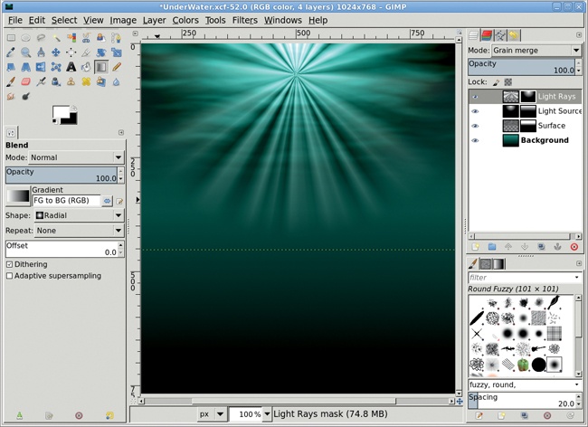
Add a new transparent layer by choosing Layer▸New Layer and setting the Layer Fill Type to Transparency. Name this new layer Sunlight.
The Blend tool should still be active. In the Tool Options dialog, change the Gradient to FG to Transparent but leave the other settings unchanged. Click the top center of the canvas and drag down through one-fourth to one-third of the canvas. Set the layer mode to Grain Merge.
If the light source is still too dark, then duplicate this layer (Layer▸Duplicate). If using the Grain Merge setting for these two layers doesn’t produce the effect you seek, try changing the layer mode to Soft Light or Overlay.

Some variations on this effect can be achieved by changing the color of the water or the location of the light source above it, but it’s what you add below the surface that’ll really make your ocean come alive. If you like, experiment on the final image by applying both the Gaussian Blur filter (Filters▸Blur▸Gaussian Blur) and the Ripple filter (Filters▸Distorts▸Ripple) to the Light Rays layer. Both filters will help soften the light rays. You can even add a text layer, as shown in the first image in this section, or cut and paste some ocean life into the scene to complete the project. For something special, look for stock brushes or images or fonts that include bubbles!
Whether in a portrait studio or while working in GIMP, colored lighting effects can set the mood. Different colors can evoke different feelings—blues are cool, reds are warm, yellow sets the stage for a sunny day, and green makes you think of spring.
Colored lighting can be applied so the light is directed at the subject and not the background. But for the most dramatic effect, colored lighting should be ambient lighting. It should be applied to the room, the background, even the open air around the subject.
Digital colored lighting effects are created using radial gradients and a variety of layer modes. The most suitable stock images have distinct left and right sides to the subject. This allows you to simulate light sources on either side without risk of overlapping.
In this tutorial you’ll add colored lighting to a studio portrait without desaturating the original image. The colored lighting you add will blend with the model’s original skin tone.
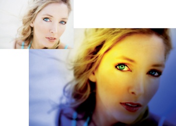
Open the original image file in GIMP. The image in this example is very bright, and adding colored lighting will only make it brighter.
First, use the Levels dialog to reduce the brightness (Colors▸Levels). Move the black point about one-third of the way to the right, move the gray point even farther to the right, and click OK to apply the levels changes. Not all images will require this kind of adjustment, and with some images you’ll get better results using the Curves or Brightness-Contrast tools instead.

You’ll want to enhance this image by adding both cool and warm lighting, starting with the cool lighting.
Add a new transparent layer by choosing Layer▸New Layer and setting the Layer Fill Type to Transparency. Name the new layer Left Side - Cool.
Click the foreground color in the toolbox to open the Change Foreground Color dialog. Set the RGB values to 25/59/225 for the blue used in this example, and then click OK.
Choose the Blend tool from the toolbox. In the Tool Options dialog, set the Gradient to FG to Transparent and the Shape to Linear.
We want to add a blue-to-transparent gradient in the new layer, but in which direction should the gradient flow? Imagine a straight line starting at the model’s right ear (left side of the image) and running along the edge of the model’s jaw. Starting in the lower-left corner of the canvas, drag a line passing through and perpendicular to the imaginary line. This will apply the gradient to the Left Side - Cool layer.
Set the layer mode to Color to blend the color in the gradient layer with the colors in the original layer.
This lighting only lights the left side of the image. You’ll need to add a similar lighting effect on the right side. Add another new transparent layer by choosing Layer▸New Layer and setting the Layer Fill Type to Transparency. Name the new layer Right Side - Cool.
This time, imagine a line that goes along the model’s left cheek (on the right side of the image). Starting in the lower-right corner of the canvas, drag a line passing through and perpendicular to the imaginary line. Set this layer’s mode to Color.
The coloring on this side should be a bit darker than on the other side, so duplicate this layer once (Layer▸Duplicate Layer).
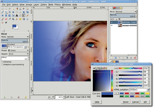
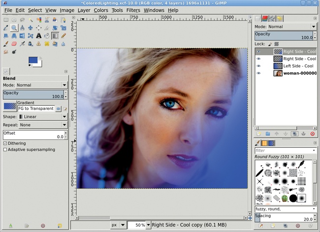
Add another new transparent layer and name it Warm Lighting. Open the Change Foreground Color dialog again and set the RGB values to 255/222/3 for the warm yellow shown here.
The Blend tool should already be active, but you should change the Shape to Radial in the Tool Options dialog before proceeding.
To apply the warm lighting, click the model’s right temple and drag down to the middle of her neck. The result of applying the Radial gradient is shown here in the smaller window before changing the layer mode. Change this layer’s mode to Soft Light.
To enhance this light further, duplicate the layer once (Layer▸Duplicate Layer).
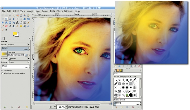
One more highlight is needed. Use the Blend tool to add it.
Add another new transparent layer and name it Warm Highlight.
Reset the foreground color to white by pressing D and then X in the canvas.
The Blend tool should still be active, but if it isn’t, choose it from the toolbox. Make sure that in the Tool Options dialog, the Gradient is set to FG to Transparent and the Shape is set to Radial. Click the outside tip of the model’s right eyebrow and drag toward the inside corner of that eye.
Set this layer’s mode to Soft Light to produce a brighter yellow over the temple and eyebrow area, as if this is where the light is directed and most intense.
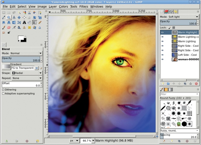
To add the finishing touch, soften the model’s face.
Duplicate the original layer (Layer▸Duplicate Layer).
Open the Gaussian Blur filter (Filters▸Blur▸Gaussian Blur). Apply a blur of about 8 pixels. If you aren’t satisfied with the result, press CTRL-Z to undo it, and then try again using a different value for the Blur Radius. The blur softens the model’s face, but her eyes, mouth, and some of her hair should be in focus.
Add a white layer mask (Layer▸Mask▸Add Layer Mask).
Reset the foreground color to black by pressing D in the canvas.
Choose the Airbrush tool from the toolbox. Select a soft-edged brush and use it to paint in the mask with black. Paint over the eyes, mouth, and hair until all three are more in focus, but leave the surrounding facial features blurred.
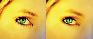
Because of my cheap nature, I rarely give myself a fancy gadget. Fortunately for me, I have a wonderful daughter who decided I needed a really nice holiday present: an iPod Nano.
The iPod is the pop-culture king these days. That title is due in no small part to the simple yet effective advertising campaign of silhouetted dancing hipsters with their high-contrast iPods and bouncing earphone wires. What’s fun about all this for GIMP users is the sheer simplicity of the design. The iPod advertising artwork takes only modest GIMP expertise, as long as you (and you knew this was coming) start with good stock imagery.
In this tutorial I’m going to show how to take your own dancing fool and iPodicize him (or her) into advertising “nerdvana.” All you need for this tutorial is a little straightforward selection and layer experience.
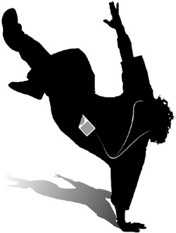
Finding photos of energetic music lovers on websites like BigStockPhoto.com or iStockphoto.com is no problem. The genre is popular, and photos abound. The dancers in the iPod ads all have one thing in common: their hands and feet are typically recognizable even in silhouette. Keep this in mind while searching online image archives. Another important feature to look for in stock images for this project is a solid-colored background, preferably white.
Choose the Fuzzy Select tool from the Toolbox, and click on the white background to create an initial selection. For this image, the click should be near the light shadow by the lower hand. Hold the SHIFT key and make additional clicks to extend the selection. Clean up the selection of the background by using the Quick Mask and by growing the selection (Select▸Grow) by 1 pixel.
The selection created is of the background, so invert it (Select▸Invert) to create a selection of the dancer.
Copy (CTRL-C) and paste (CTRL-V) the selection into a new layer (Layer▸To New Layer). Name the layer Silhouette.
Enable the Lock Alpha option for the new layer, then fill the layer with black.
Remember that it’s better not to modify the original image so it can be used again later if needed, so add a new white layer and move it below the Silhouette layer.

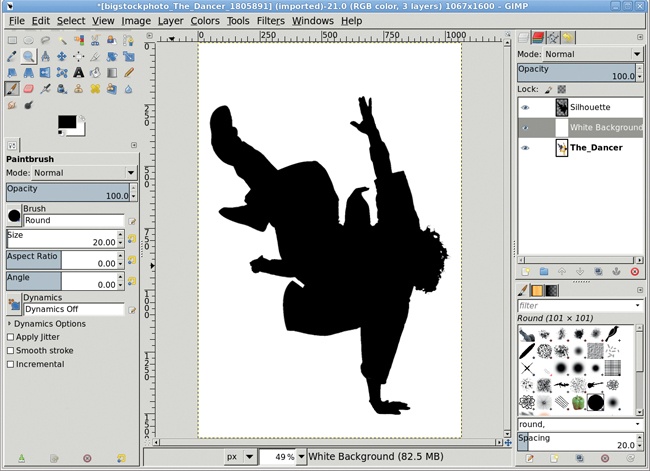
The dancer silhouette needs a little cleanup. Notice where the scarf and jacket fall away from the body in the original picture. In the silhouette these are not helpful features.
Use the Free Select tool to drag selections around most of these, then switch to Quick Mask mode to detail the area to be selected using a hard-edged brush.
Switch back to selection mode and cut the selections. Don’t fill the selection with white! The silhouette is on a layer of its own with transparency around it. Editing here should replace the selected parts of the silhouette with transparency.

Creating the silhouette was easy, and as it turns out, creating the iPod is just as easy. Since there isn’t a lot of detail in the device, it can be created in a separate image window, copied to the dancer window, and then scaled and rotated to fit. Scaling and rotating will blur the detail of the device, but because it’s so small and lacks detail, that won’t present a problem for this project.
Move the silhouette image out of the way for the moment, but don’t close it. Open a new image window (File▸New) with a width of 380 and height of 420. The background color doesn’t matter for this task. For now, turn off the visibility of the Background layer in the Layers dialog.
Add a transparent layer (Layer▸New Layer) to the image window. Choose the Rectangle Select tool from the Toolbox. In the Tool Options dialog, enable the Rounded Corners option, and then set the Radius to 20.
Drag through the image window to create a selection with rounded corners. The exact dimensions aren’t important, though the width should be smaller than the height. Reset the foreground and background colors by typing D in the canvas window, then drag the background color (white) from the Toolbox into the selection.
The selection will still be in Edit mode at this point, meaning the selection handles can be used to resize the selection. Drag the four sides of the selection inward to form a smaller rectangle centered in the upper half of the original, white-filled rectangle.
Click on the foreground color box in the Toolbox and change the color to a medium gray, with RGB set to 160. Close the dialog and drag the foreground color from the Toolbox into the image window selection. That creates the iPod display window. Remember, this style is very simple so no additional detail is required, such as adding depth around the display. Even if depth were added, it wouldn’t be seen after the iPod was scaled and rotated in the dancer’s image.
Use the Ellipse Select tool to drag a circular selection below the display window. The selection should span the width of the display window even if it’s not circular. Drag the selection to position it in the center of the lower half of the iPod case. Once again, fill the selection with the foreground color. Clear the selection (Select▸None). Use the Scale tool from the Toolbox to squeeze the iPod until the dial is circular.

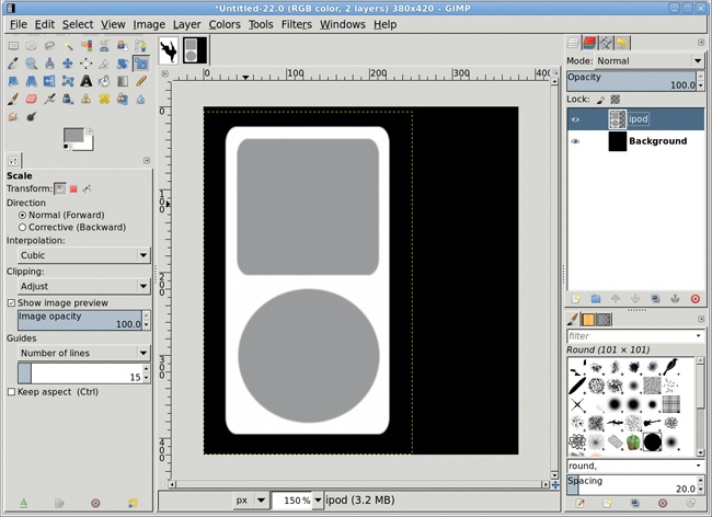
Copy the iPod layer and paste it into the silhouette image. Use the Scale tool to shrink the pasted layer to fit, then rotate it to align with an imaginary pants pocket. Hold down the CTRL key while scaling to keep the aspect ratio for the device. Use the Rotate tool to rotate the iPod, then use the Move tool to position it near a pants pocket.
Add a white layer mask to the iPod layer. Use the Paintbrush tool and a hard-edged brush to black out a small part of the bottom of the iPod, leaving just a bit of the dial visible. This simulates the iPod being in a pocket (though not for long, the way this guy’s dancing).
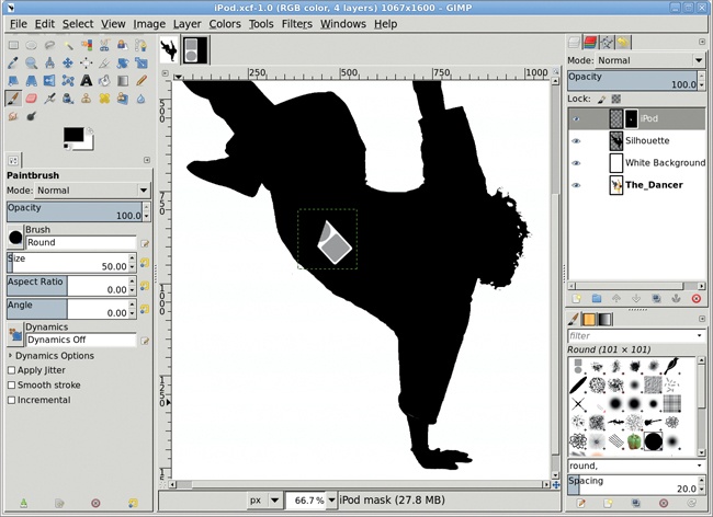
Add a transparent layer and name it Earphones. Before drawing the paths, select a brush to draw the wires. A hard-edged brush, such as the Calligraphic brush, works well if scaled appropriately for an image of this size. The selected brush will be used to stroke the paths. Choose the Paintbrush tool and enable Basic Dynamics in the Tool Options dialog. Also, set the foreground color to white in the Toolbox by typing D followed by X in the image window.
Choose the Paths tool from the Toolbox and click near the dancer’s left ear (or where that ear should be). Drag in the canvas to where the wire should meet the iPod. Click on the line you just made to adjust the shape of the wire.
Click the Stroke Path button at the bottom of the Paths dialog. This will open the Stroke Path dialog. Choose to stroke using the Paintbrush, which will utilize the brush selected earlier. For added effect, click the Enable Brush Dynamics option. This causes the brushstroke to fade in and out at both ends of the path. Finally, click the Stroke button to apply the brushstroke along the path. Repeat this process for a wire coming from the right ear and connecting to the first wire at the chest.
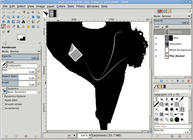
The last major component of this design is a shadow under the dancer. Like the silhouette, shadows in iPod advertisements are hard edged. As it turns out, that makes creating the shadow fairly easy.
In the Layers dialog, duplicate the Silhouette layer and rename the duplicate layer Shadow. Move this layer below the Silhouette layer in the Layers dialog. Select the Perspective tool from the Toolbox and click in the canvas to display the drag handles. Drag the upper left handle straight down and the upper right handle down and to the left, then hit ENTER to accept the changes.
Add a white layer mask to the shadow layer. Type D in the canvas to reset the foreground color to black. Choose the Gradient tool from the Toolbox, and in the Tool Options dialog make sure the Gradient Reverse button is set so the gradient flows from white to black. Drag in the canvas from the dancer’s hand to near the upper left of the shadow layer to apply a fade-out to the shadow. Finally, reduce the opacity of the shadow layer to 80 percent.
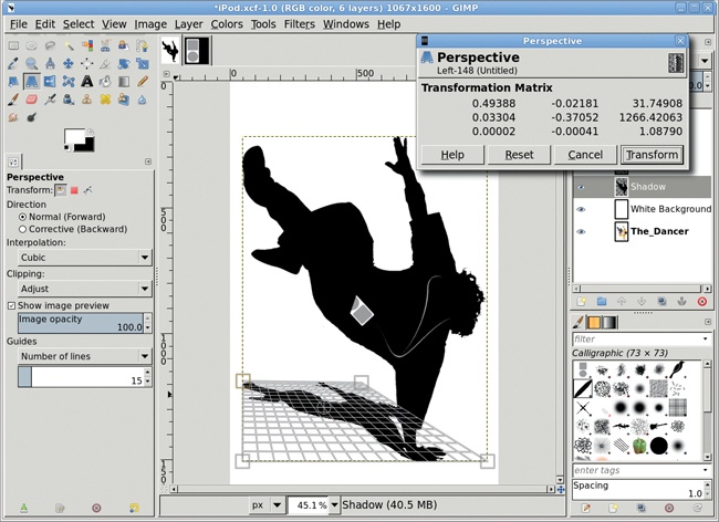
The Perspective tool will open a dialog when you click on the image window, but this dialog is of little value to most users. It shows a transformation matrix, which is nifty if you’re into math but of less help to this type of design work. Ignore the dialog and just drag the handles in the image window. Then hit ENTER to accept the changes.
Also, the drag handles are not bound to the viewable dimensions of the image. Zoom out on the image window to drag handles outside the visible edge of the canvas. This will allow the perspective layer to flow out to the edge of the image and beyond. Of course, what flows outside the visible edge of the canvas won’t be included in the final image, but that’s a design choice.
The shadow in this project didn’t flow to the image borders, but there’s no reason it couldn’t. In fact, adjusting the shadow provides a very specific feel to the design because it lets the viewer know the direction from where the light is shining.
You can splash a little color into this by adding color to the white background. In the end, the simplicity of the iPod style is what makes it both easy to identify with and, for GIMP users, easy to reproduce.
Keep the following suggestions in mind as you apply GIMP tools and techniques to designing web and print ads.
Light and shadows are the key components of 3-D effects. If you want to add an extra dimension to your work, first determine the direction of the lighting. Then use GIMP tools to increase the light on the surfaces that face the light and decrease the light on the surfaces that would be in shadow.
No surface is completely devoid of texture, not even glass. Wood grains, brushed metal, and scratches can all be created by using the Noise filters in combination with the Motion Blur filter.
Layer modes can be used to merge white reflections with textures. Try the Overlay mode to darken images or the Soft Light and Grain Merge modes to lighten and blend.
A gradient in a box doesn’t look like much. But a gradient applied inside a shape like a circle or a rectangle can look like a reflection. Play with the Blend tool’s gradients—many of them can produce reflective effects.
The Emboss filter (Filters▸Distorts▸Emboss) and the Bump Map filter (Filters▸Map▸Bump Map) both work quite well, but text-embossing effects are so easy to achieve, you might as well do things manually. Just duplicate, offset, blur, and cut. To make matters even easier, the blur and cut steps are optional.
GIMP no longer leaves many “jaggies” after performing transforms such as rotations or shearing, but if you find any, you can apply a light blur to layer edges to clear those up. Zoom out to view the edges of a layer extending beyond the canvas area. A few jaggies along the edge of a package where the front and side images meet may not be such a bad thing—they can provide contrast to show there’s an actual edge where common colors blend. Blurring the jagged edges may give you even better contrast.
Don’t try to align horizontal elements before applying perspective transformations when creating the front and side images for packaging projects. Applying a perspective change to any side will likely distort those horizontal elements so they become unaligned. Instead, avoid adding or using horizontal lines that need to align on the front and side of a package.