
Chapter 21
Proven Tactics for Boosting Conversion Rates
In This Chapter
• Maximizing conversion rates
• Giving website visitors an optimal buying experience
• Using proven strategies to boost sales
While it’s important to drive a lot of traffic to your website, you also need to get a lot of conversions. As discussed in Chapter 16, conversion refers to the process of persuading a website visitor to take the action you want him or her to take. That may be to sign up for your newsletter, take advantage of a free offer, click on an affiliate advertisement, or place an order online.
Boosting the conversion rates on your website pages is, by far, the quickest and most cost-effective way to generate more revenues. By implementing just a few key changes, you can dramatically increase clicks and sales—virtually overnight!
Conversions Are Just as Important as Traffic
Several months ago a website owner called asking for my help. He had a great web-based business offering products that, in my opinion, were excellent. The problem was he wasn’t generating nearly as many orders as he thought he should be getting.
“What I plan to do,” he said, “is to drive more traffic to my site using a combination of Google Adwords, advertisements in targeted e-zines and blogs, and publicity. That way I’ll get more sales.”
Those were all great ideas. However, those marketing tactics were going to cost him a lot of time and money. “Before you do all that,” I recommended, “why don’t we explore some ways of converting more of the website visitors you’re already getting into customers?”
Sales Builder
Your greatest opportunity to increase sales is to improve your website pages, especially the marketing copy, to increase conversion rates. The greater the percentage of website visitors that can be persuaded to place orders, the more revenues you will generate. Even a minor increase in the conversion rate on a key product page can quickly increase sales.
He agreed to give it a try. We worked together on one of his product landing pages, making improvements in how the marketing copy was structured and written. We also made some changes to the e-mail series—the autoresponders—associated with that page.
Once these changes were implemented, the landing page conversion rate (the amount of people who visited the page and placed an order) went up 180 percent. That meant that nearly three times as many people were placing orders.
His sales of that product almost tripled! And all we did was make some simple changes.
This is a common scenario among web-based businesses. You can spend a lot of money to generate traffic to your site, but if you can’t convert a significant percentage of those into paying customers, you won’t make much money.
That doesn’t mean your website needs to be packed with sales hype, like a carnival-barking snake oil salesman. That rarely, if ever, works. But your website does need to communicate like a good salesperson; the kind who is helpful, informative, and honest while guiding the website visitor through the process of learning about your offerings and making a buying decision.
How you write the web copy (see Chapter 10), structure the text, and organize the information all comes into play to maximize conversion rates.
There are other proven tips and tricks for boosting website clicks and sales as well, which are also covered in this chapter.
Help Them Find What They Need
Ever get frustrated in a retail store because you couldn’t find what you were looking for? Remember that feeling? You certainly don’t want your website visitors to feel that way, do you?
When visitors arrive at your website, they are on a mission. They’ve come to find information, look for a solution, take advantage of a special offer, shop for a specific kind of product, or any number of other quests. If they can’t easily find what they need, they’ll quickly click away—and may never return.
Recently, I responded to an Internet banner ad offering a free special report. I was interested in the topic, so I clicked. On the landing page I was taken to, I expected to find an online form or some other instructions on how to get the report. But it wasn’t there! I searched around and eventually found the information I needed on a different web page. But that was way too much work. Most website visitors would have simply given up.
How do you make it easier for website visitors to find what they need? Here are some proven strategies:
• Use descriptive headers. You’ve probably seen plenty of clever headlines produced by Madison Avenue ad agencies. But they don’t work so well on websites. To help visitors more easily find what they need, use simple headers that clearly describe what the page is all about. Headers include the main page headline and all the subheads within the body copy. (See Chapter 10 for more headline writing tips.)
• Tell them they’re at the right place. If your website sells used books, then say so in the web page copy. “If you’re looking for used books, in great condition, with FREE delivery on purchases over $49—you’ve come to the right place!”
• Make all links intuitive. The most popular place where people look to find information on a website is the navigation bar. Make sure the links are descriptive and identify clearly what those sections of the site are all about. Don’t worry if you have lots of links. That actually makes things easier to find for the website visitor. And it’s okay to have sub-links to a main link, or even two or three links pointing to the same page. Whatever works!
• Be repetitive. Don’t worry about repeating similar information on multiple pages. It’s perfectly okay to explain your shipping policy on your shipping page and then again on one of the checkout screens. Put applicable information anywhere a website visitor would expect to find it.
• Don’t send everyone to your home page. There may be other pages on your site that make more sense to send potential customers to. For example, when I advertise my home study copywriting course, I send those who respond to that product page, not to my home page. After all, that’s the information those website visitors are looking for.
• Place important information “above the fold.” This refers to the information that is visible on a web page without the visitor having to scroll down. Internet marketing studies show that website visitors will pay much more attention to what is above the fold than what is below it. So position your most important text in that area.
• Make the web copy scanable. Eye path studies, where they track people’s eye movements as they read a web page, reveal that website visitors are three times more likely to scan online content than comparable printed information. So it’s important to make your text scanable. Use bullet lists, bolded text, alternate text colors (ideal for subheads), and short paragraphs. If a website visitor can’t get the gist of the message by quickly running their eyes down the web page, then your text is not scanable enough.

Warning!
Many studies in Internet marketing have shown that first-time visitors will give your website about eight seconds to prove that the content is relevant to their needs. That isn’t very much time! So your web page content has to make it very clear to them that they are, indeed, at the right place and will easily find what they’re looking for.
Sometimes we’re so close to our own website business, and know the products, services, and information so well, that we lose perspective and can’t easily see our website the way others do. Ask a friend to put himself into the shoes of a potential customer and review your website. Give him a list of things to find, like a scavenger hunt. The feedback will help you identify ways to make shopping on your site easier for your website visitors.
Guide Them Through the Shopping Process
In most kinds of marketing communications, the customer doesn’t have to think about how the shopping process works. A television commercial plays from beginning to end and then tells you what to do. (“Eat KFC!”) A brochure guides readers through a front panel, the inside panels, and then a back panel. Even most retail stores are fairly intuitive, with shoppers coming in the front door, finding what they need in clearly labeled and organized aisles, and then proceeding to the checkout. It’s a no-brainer.
On a website, however, things are not so clear for the visitor. The home page may have a dizzying clutter of links and other information. Where do you go first? And according to statistics, more than 20 percent of first-time visitors to a site will arrive on an inside page, not the home page. Will they be able to find their way around?
The very nature of a website makes it easy for a website visitor to get lost or distracted, or confused about what he or she needs to do next.

Success Tip
Use text links strategically to guide customers through your website. The most effective text links are simple and intuitive for the website visitor, such as “Learn more …,” “Find out how ...,” and “Next Step: Get a Free Estimate ….” You might be tempted to get creative with text links and put them in an unexpected color or format. Don’t. Keep your links in blue text and underlined. People know that blue underlined text is clickable.
That’s why it’s important that your website structure, links, and web copy guide the website visitor through the buying process. Think about each page and ask yourself, “When a customer lands here, what is the next step I want him or her to take?” That next step could be to visit another page, sign up for your newsletter, click on an affiliate link, or place an order.
Here are some examples:
• A visitor reads an article on the website about how to quote on freelance writing jobs. Next step? “Learn more about the how-to guide: Pricing Your Writing Services.”
• A visitor clicks on the Contact Us page. Next step? “Contact us for a prompt same-day quotation.”
• A visitor reads a product description page. Next step? “Read what buyers are saying about this product.”
• A visitor reviews a web page highlighting the advantages of a new industrial pump. Next step? “Click here to download a PDF containing the technical specifications.”
• A visitor goes to a web page promoting a new seminar. Next step? “Register today. This program is filling up fast!”
• A first-time visitor arrives at the home page. Next step? “Click here to learn how online coaching works.”
I suggest you put a next step suggestion of some kind on every page of your website. Many customers will prefer to explore your site on their own, but some will want to be guided. Be that guide.
Answer Their Questions—Before They Ask!
If your website visitor has a question about a product or service on your website, there is no one to ask. He or she is all alone. So you want to make sure that your website clearly explains everything that a potential customer needs to know to make a buying decision. Otherwise, that person will be very reluctant to place an order.
I know what you’re thinking. “The website visitor is not alone. Our toll-free number is clearly listed on every page. Plus we have a customer service online form they can fill out.”
Those are excellent features. But the truth is, very few people will use them. Website visitors expect to find all the information they need to know about your product or service on your website. If they can’t, they’ll simply click away.
Think about it this way. Have you ever spoken to a salesperson that wasn’t able to quickly answer your questions or provide you with the information you needed? Did you buy from that person? Probably not.
Your website is your salesperson. So you must make sure that it answers all the questions a website visitor might have about your offerings.
Pretend you’re a customer and brainstorm a list of questions you might have before buying one of your products or services. I did this exercise recently for one of my products, a $700 home study course online. Here’s what I came up with:
• Who created the course?
• What are his credentials?
• How much does it cost?
• What do other buyers say about the course?
• How do I place an order?
• What course materials do I actually receive?
• How long does it take to complete the course?
• Do you have a payment plan?
• How are the course materials delivered?
• What exactly will I learn when I take the course?
• Is there a money-back guarantee if I’m not satisfied?
If your website leaves just one question unanswered, your conversion rates may not be as high as they could be.
When customers are confused about something, or have unanswered questions, their default answer is a no. Too many of those and your site won’t be selling much!
Make Special Offers
There is a reason why your weekend newspaper is stuffed with flyers announcing sale after sale after sale. Making special offers is a proven way to increase revenues. That’s why you should consider this technique for your own website.
For example, on my website I make a special offer to those who subscribed to my e-mail newsletter and have received a few issues. At the six-week “anniversary” of their subscription, I send them an e-mail with a gift: a discount certificate for one of my courses.
I won’t tell you the actual numbers, but a significant number of people who receive that e-mail take advantage of the offer and purchase the course.
I ran another promotion last year where I bundled 10 of my audio programs together and offered them for a special price during a three-day sale. I generated thousands of dollars in sales within hours of announcing that special to my e-mail newsletter subscriber list.

Warning!
Be careful not to make too many discount offers too often. Your customers might get so used to seeing them that they’ll wait until the next “sale” before buying anything from your website! If that happens, your sale price becomes your de facto regular price and you’ve just lost a chunk of your profit margin. By all means offer special discounts from time to time, but do so sparingly.
Of course, special offers don’t necessarily have to be in the form of a sale. Here are some other ways to use this technique to boost revenues:
• Offer free delivery for purchases that exceed a certain dollar amount. (Amazon. com uses this technique very successfully.)
• Give a discount when purchasing multiple items.
• Throw in something extra, such as an accessory. “A free bag of premium coffee beans with every order of the ACME Home Brewer.”
• Provide a discount when an order goes over a particular amount.
• Offer convenient payment terms. I use this technique with my home study courses by allowing customers to pay in installments.
Obviously, you want the majority of your sales to come from customers who pay the full price for your products and services and are happy to do so. However, offering a special deal once in a while is an effective way to get those who are still on the fence about buying from you to finally pull out their credit cards and place an order.
Free (and Almost Free) Trial Offers
Another form of special offer is the free trial. This is common for many types of products that are difficult to learn about without first taking them for a test drive.
For example, one of my clients, IXACT CONTACT, provides an excellent online contact management system for real estate professionals. But simply describing all the great features of that product and explaining how it works is not enough to convince most people to sign up. So they offer a free five-week trial.
Sales Builder
When determining the length of a free trial, use an unexpected period such as 5 weeks instead of the typical 30 days. Why? Because everyone uses that time frame, so your offer gets lost in the crowd of other free trial offers. However, if you say 5 weeks, or 45 days, or another atypical period of time, it stands out and gets noticed. I’ve tested this technique with many web-based business owners. It works.
Those who try a product for a particular period of time are likely to decide to buy it. In fact, I’ve seen some free trial offers with an over 90 percent conversion rate. In addition, people who are reluctant to make a purchase right away are more likely to sign up for a free trial. So this technique can dramatically increase your sales.
A trial doesn’t always have to be free. A fellow website owner I know offers his website visitors an opportunity to “try” his how-to manual for 30 days for just $7 plus shipping. After the 30-day mark, the customer can return the manual and get charged nothing, or keep the materials and have their credit card billed for the full purchase price of $295.
Won’t some unscrupulous customers simply photocopy the manual and then send the original back for a refund? That’s the risk of making this type of free trial offer. But if the increased sales outnumber the losses, it’s worth it.
Exit Offers
There is a significant number of your customers who will read your product sales page, hesitate, and then decide not to place an order at that moment. They’re on the fence. And they may never get off. How do you turn these almost-customers into dollars for you? Try an exit offer.
An exit offer is simply a special offer you make to those who decide not to push the Buy Now button. You simply place a link below that button that says something like, “Click here only if you have decided NOT to buy now.”
That link takes the customer to another page that makes a special offer, usually a discount or a free extra.
For example, a successful marketing coach I know makes exit offers to those who decide not to purchase one of his how-to guides. The guides are in binder format—a physical product that needs to be packaged and shipped. On his exit offer page, he offers a compelling alternative to those still on the fence: an online version of the guide they want at a much lower price. Web-based business owners I’ve spoken with say they’re getting an increase of 10 to 20 percent in conversion rates by using this technique.
Up-Selling and Cross-Selling
Buy any book from Amazon.com and what do you see on the very first checkout page? “Customers who purchased this product also bought ….” Amazon sure knows how to cross-sell!
def•i•ni•tion
Cross-selling is offering customers complimentary products to the items they have just ordered or are about to order.
Cross-selling refers to offering customers who have already placed an order, or are in the process of doing so, other complimentary products. If a customer buys a travel guide to Australia, it makes sense that he might also be interested in a hiking map of the Outback.
Effective cross-selling can increase your sales per order significantly. It takes advantage of the fact that the customer already has his wallet out and is in “buying mode.”
Sales Builder
The products you offer as a cross-sell don’t necessarily need to be your own. You can increase your profits per order by recommending related affiliate products. You can do this on the final thank you screen after the transaction is completed, or in a subsequent e-mail. See Chapter 6 to learn how affiliate programs work.
How do you cross-sell? There are many spots in the checkout process where you can place a cross-sell offer:
• On a special web page before the main checkout screen. The customer clicks on Buy Now and, before being taken to the checkout screen, is presented with an offer. “Would you like to add _______ to your order?”
• On the checkout screen itself. The shopping cart program I use, 1shoppingcart.com, has a feature that lets you display cross-sell products on the checkout screen. All the customer has to do is click the checkbox next to the product and it’s automatically added to the order.
• On the thank you page after the order is placed. This works well if you’re offering an affiliate product as your cross-sell offer because these usually cannot be promoted on your checkout pages.
• In the thank you e-mail after the order is placed. Again, great for affiliate products. Thank you e-mails are the ideal place to test cross-sell offers because they require very little effort to create.
A variation on the cross-sell technique is the up-sell. This involves offering the customer a premium version of the product or service he has decided to buy. It’s like an automobile salesperson offering you a sunroof for just an extra $500.
Perhaps the easiest way to present an up sell offer is right on the main product sales page. You simply offer two or three versions of the same product, such as Basic and Premium.
Here’s an example.
def•i•ni•tion
Up-selling is offering the customer a premium or upgraded version of the product they are interested in purchasing.

Example of an up-sell made on a product sales page.
You can also make up-sell offers on a special page that appears before the main checkout page, or on the checkout page itself.
A friend of mine uses up-sell and cross-sell techniques in a very daring way. When he sees an order come in while he’s at the computer, he immediately picks up the phone and calls the customer to make an up-sell offer. “Hi. John Smith here. I noticed you just purchased Product X. I have a complementary Product Y available at a 20 percent discount. Would you like me to add that to your order?” According to my friend, a surprising number of customers are delighted he called and accept his offer!
Success Tip
If your website sells a service or an information product of some kind, such as an e-book, seminar, or consulting program, then customers are often willing to pay extra for access to an expert. For example, if you sell an e-book on growing roses in colder climates, consider offering a 30-minute coaching session as an up-sell. Some people who purchase the e-book will also appreciate an opportunity to get answers and guidance directly from the author.
The point of up-selling and cross-selling isn’t to squeeze every dollar you can out of a customer. It’s to offer other products and extras that customers may already be interested in, if only someone would present those options to them.
Look at your product line and think about the types of products that naturally go together, or products that you can create premium versions of. Then try a few up-sell and cross-sell offers. You might be pleasantly surprised with how much additional sales you can generate in this way.
Closing the Deal with Effective Landing Pages
If you visited my website, ForCopywritersOnly.com, and clicked on a link to learn more about one of my how-to guides, courses, or coaching programs, you’d be taken to a page that explains that product in detail and attempts to persuade you to place an order. That’s a landing page (also known as a sales page or product page).
You should have a separate landing page for each special offer you make and product or service you sell.
When people visit a landing page, they are already interested, at least to some degree, in that particular offer, product, or service. The job of the landing page is to convert that interest into a click or sale.
Your landing page needs be informative and persuasive because this may be your only chance to convince a customer to take the action you want him or her to take. (No pressure!)
In Chapter 10, there is an excellent formula called the motivating sequence you can use to write persuasive web copy of any kind. Here are some additional tips specific to landing pages.
• Keep the layout simple. Ideally stick to one main column of text and, at most, one sidebar column.
• Be careful with images. An image on a web page is proven to draw the eye of the website visitor. That’s okay if the image helps communicate what you’re trying to say. But if it doesn’t, it’s just a distraction. And distractions are what you don’t need on a landing page.
• Stick to one topic. Don’t introduce other products or information on a landing page. The sole topic of the landing page should be the product or offer you’re trying to sell. Nothing else.
• Don’t place ads on a landing page. If your website is supported in part by affiliate advertising, don’t place these on the landing page. Customers might be tempted to click the ad instead of buying your product. (In Internet marketing, we call that “click and bye!”)
• Simplify the navigation links. Navigation bar links are tempting. They encourage website visitors to click and explore. But when a potential customer is on a landing page, you only want him or her to focus on one link: the link to buying the product. So, if possible, reduce the navigation links on your landing page to just a link back to your home page.
• Provide enough information. I covered this earlier in the chapter but it’s worth mentioning again here. Be sure to provide all the information a customer needs to make a buying decision. If that means that your copy runs three for four screens in length, so be it. Trust me, customers won’t mind.
• Put a Buy Now button above the fold. “Buy Now,” “Register today,” “Download your free e-book”—whatever your action link is called, make sure at least one is visible on the screen without the customer having to scroll to find it. Some may arrive on your landing page wanting to buy right away, and you don’t want them having to hunt for the button.
• Use multiple Buy Now links. If your landing page is longer than a screen, put a Buy Now link near the top and at the bottom. If it’s a very long screen, also consider placing one somewhere in the middle. Always make your action link easy to find on the landing page.
Here’s an example of a landing page that follows all these strategies:
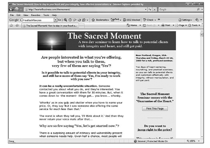
Landing page example. (Courtesy of HeartOfBusiness.com)
Always be tweaking your landing pages. As I mentioned earlier in this chapter, just a few minor improvements can have a dramatic increase in sales.
Top Internet marketers are constantly testing landing pages. They try new headlines, new offers, and new sections of body copy. They even test such minute details as font colors.
The easiest way for you to test a landing page is to create a duplicate. Split up your ads, e-mails, and other marketing efforts so that traffic is driven to each page. Then track which page is performing best. The winner might surprise you!
The Least You Need to Know
• Increasing conversion rates on your website is often the faster, and more cost-effective, way to boost sales.
• Look for ways to help visitors find what they need and get answers to all their questions.
• Use up-sell and cross-sell techniques, as well as effective landing pages, to build sales.
..................Content has been hidden....................
You can't read the all page of ebook, please click here login for view all page.