
SVG stands for Scalable Vector Graphics and is a language used to describe two-dimensional graphical objects in XML. In the past, SVG has been a standalone format used in web browsers through Adobe Flash as an embedded resource or as an image resource. Nowadays, all modern browsers support SVG natively, including Internet Explorer 9.
The main use of SVG on the Web is to allow the creation of interactive graphics with many objects that can be viewed at any zoom-factor without loss of resolution. Maps, technical diagrams, and hierarchical system diagrams are typically good examples of uses of SVG.
The current version of SVG supported in browsers is SVG 1.1.[100] The next version, SVG 1.2[101], also exists as a working draft and has a large number of additional features specified in so-called modules. In particular, it has a "Media" module[102] that contains <audio> and <video> elements. Of all the modern web browsers, only Opera supports some of the additional SVG 1.2 features, including the Media module.
In this chapter, we will look at how SVG 1.1 features can be used to manipulate HTML5 video. Because <video> has a visual dimension, SVG applies to it. It doesn't really apply to <audio>, though you can render SVG graphics together with audio elements. We will focus on SVG 1.1 features, but also look at the SVG 1.2 Media module to see what additional functionalities it provides.
We cannot give an in-depth introduction to SVG here, but since we will use only a few of the elements, it will be easy to follow. For a bit of a background, here is a list of the different types of elements that exist in SVG 1.1:
structural elements (<svg>, <defs>, <desc>, <title>, <metadata>, <symbol>, <use>, <g>, <switch>, <a>, <view>).
shapes (<circle>, <ellipse>, <rect>, <line>, <polyline>, <polygon>, <path>, <cursor>).
text (<text>, <tspan>, <tref>, <textPath>, <altGlyph>, <altGlyphDef>, <altGlyphItem>, <glyphRef>, <font> and font features).
styling (<style>, <marker>, <linearGradient>, <radialGradient>, <stop>, <pattern>).
effects (<clipPath>, <mask>, <filter> and filter effects).
animations (<animate>, <set>, <animateMotion>, <animateTransform>, <animateColor>, <mpath>).
<script>, <image> and <foreignObject>.
If you are looking for some good resources to help you get started with using SVG in the different browsers, we highly recommend the following links:
Firefox:
https://developer.mozilla.org/En/SVG_in_FirefoxWebKit (Chrome and Safari):
http://webkit.org/projects/svg/status.xmlOpera:
http://www.opera.com/docs/specs/opera95/svg/IE:
http://blogs.msdn.com/b/ie/archive/2010/03/18/svg-in-ie9-roadmap.aspx
This Wikipedia article is very useful to check which browser has implementation support for which 1.1 feature: http://en.wikipedia.org/wiki/Comparison_of_layout_engines_(Scalable_Vector_Graphics).
There are three different ways in which the <video> element and SVG can interact: inline SVG, SVG for masking, and video in SVG.
With HTML5, SVG has been natively integrated into web pages through its own <svg> element or as a referenced CSS property. Thus, you can now create web pages with inline SVG graphics, where the SVG graphics are fully integrated with the rest of the page; e.g. following CSS styling, allowing JavaScript to interact with SVG objects, drawing graphics, or creating effects on hover-over of certain SVG objects. Also, you can use inline SVG to modify given graphics and videos; e.g. cropping them, adding a filter, or adding animations.
Note that only Firefox, IE, and Chrome support SVG inline for HTML pages at this time; i.e. they allow the use of the <svg> element inside the HTML page. Safari and Opera support inline SVG only for XHTML pages, because XML can deal with the namespace inclusion. Where we want to use SVG elements to control a video element through JavaScript, we use XHTML with inline SVG at this stage. Also note that IE's support of SVG is still very sketchy, in particular for some of the features we use in this chapter.
A major use of SVG with HTML pages is as an advanced styling and effects tool. In Firefox, we have the CSS attributes[103] filter, mask, and clip-path to use inline or external SVG fragments for effects. In the WebKit-based browsers, it is possible to use external SVG files as a CSS mask through the -webkit-mask CSS attribute. Inline SVG cannot be used in -webkit-mask. Opera and IE at this stage have no means of using an SVG in CSS for extra effects, whether defined inline or in an external SVG file.
All browsers except for IE are capable of supporting <video> inside an SVG definition, either natively as a SVG 1.2 feature as is the case with Opera or through the <foreignObject> feature of SVG. IE hasn't implemented any SVG 1.2 feature yet, which means it does not yet support <video> or <foreignObject>.
The examples in this chapter will make use of all three ways of using SVG with HTML and <video>.
We use HTML and XHTML where we demonstrate only inline SVG elements together with a direct hook into the video element through JavaScript; e.g. for custom controls. This works in all browsers.
For demonstrating the use of SVG effects such as masking on video, we will use HTML and an external SVG file. In the HTML file, we will incorporate different CSS code for WebKit-based browsers (Safari and Google Chrome) and for Firefox. Unfortunately, this leaves Opera and IE out of these examples.
Where we want to experiment with both inline SVG elements and SVG effects, we can use only Firefox and thus we will use inline SVG.
Finally, we will also look at the use of video in SVG, but only as inline SVG with XHTML either through the <video> or the <foreignObject> element. This currently is probably the most cross-browser compatible means of using SVG effects for video, even though it still leaves IE out in the cold. It can be expected that IE will implement <foreignObject> or possibly even <video> in SVG relatively soon.
At the most basic level, SVG allows the creation of basic shapes and outlines:
<circle>
<ellipse>
<rect>
<line>
<polyline>
<polygon>
<path>
We can use any of the shapes as a mask to overlay onto video. This means we can clip a video to a complex shape defined by SVG. For this, we use an SVG image (in WebKit browsers) or an SVG fragment (in Firefox) as a mask through CSS. Listing 5-1 shows an example using the SVG file in Listing 5-2. The SVG file contains a circle that is applied as a mask on the video. Figure 5-1 shows the result in Firefox and Safari.
Example 5.1. Styling a video using an external SVG resource as a mask
<video class="target" height="270px" width="480px" controls >
        <source src="HelloWorld.mp4"  type="video/mp4">
        <source src="HelloWorld.webm" type="video/webm">
        <source src="HelloWorld.ogv"  type="video/ogg">
    </video>
    <style>
      .target {
        mask: url("basic_example_c5_1.svg#c1");
        -webkit-mask: url("basic_example_c5_1.svg");
      }
    </style>
Example 5.2. The SVG resource used by Listing 5-1
<?xml version="1.0" standalone="no"?>
    <!DOCTYPE svg PUBLIC "-//W3C//DTD SVG 1.1//EN"
              "http://www.w3.org/Graphics/SVG/1.1/DTD/svg11.dtd">
    <svg version="1.1" xmlns="http://www.w3.org/2000/svg"
         xmlns:xlink="http://www.w3.org/1999/xlink">
      <defs>
        <mask id="c1" maskUnits="userSpaceOnUse"
                      maskContentUnits="userSpaceOnUse">
          <circle id="circle" cx="240" cy="135" r="135" fill="white"/>
        </mask>
      </defs>
      <use xlink:href="#circle"/>
    </svg>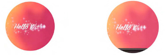
Opera and IE don't yet have support for applying SVG images as masks to HTML elements through CSS. They simply display the full video and we, therefore, have not included screenshots here. We will later look at how we can achieve this same effect with Opera, but we don't have a solution for IE.
Chrome is a special case. The example actually once worked in Chrome 6.0.xxx versions, but with the eventual version used for this book, it was broken and displayed just the same full video as Opera and IE. It seems that SVG masking has stopped working for <video>, even though it continues to work for <img>. A bug has been filed.[104]
You will note in the code that Firefox requires a link directly to a SVG fragment, addressed through a fragment URL (#), while the WebKit-based browsers link to the full SVG resource. Therefore, we provide two different specifications in the SVG resource: the <mask> element is for Firefox and the <use> element is for the WebKit-based browsers. The <use> element allows us to avoid repeating the definition of the circle. Instead, we just reference it, which requires inclusion of the xlink namespace. The <use> element basically instantiates the circle as a mask for WebKit-based browsers, while Firefox requires only the definition.
An interesting observation with all the masked videos is that as the video controls are turned on, it is possible to control playback by mouse clicks and guessing where in the hidden area are the play button and transport bar. This shows that mouse events penetrate the masked area—something to pay attention to since it might create unexpected side effects for users. It might be better to run your own controls instead.
Note that the <mask> element in SVG has two means of styling: you can set the @maskUnits and @maskContentUnits either to "userSpaceOnUse" or "objectBoundingBox." When you use "userSpaceOnUse," you can define the dimensions as absolute dimensions and position the mask within the boundaries of the object anywhere. If you decide instead to use "objectBoundingBox." the circle centre coordinates cx and cy as well as the radius r are interpreted as percentages in relation to the x and y dimensions of the object.
Listing 5-3 shows two different versions of the SVG using <mask> with "objectBoundingBox" in Firefox and results in the rendering in Figure 5-2. We've put this SVG inline, so you can see how it is done. The masks are defined in a <defs> element as they are not meant to be visible by themselves.
Example 5.3. Two SVG masks as used by Firefox with "objectBoundingBox"
<video class="target1" height="270px" width="480px" controls >
        <source src="HelloWorld.webm" type="video/webm">
        <source src="HelloWorld.ogv"  type="video/ogg">
    </video>
    <video class="target2" height="270px" width="480px" controls >
        <source src="HelloWorld.webm" type="video/webm">
        <source src="HelloWorld.ogv"  type="video/ogg">
    </video>
    <style>
      .target1 { mask: url("#c1"); }
      .target2 { mask: url("#c2"); }
    </style>
    <svg version="1.1" xmlns="http://www.w3.org/2000/svg">
      <defs>
        <mask id="c1" maskUnits="objectBoundingBox"
                      maskContentUnits="objectBoundingBox">
          <circle cx="0.5" cy="0.5" r="0.5" fill="white"/>
        </mask>
        <mask id="c2" maskUnits="objectBoundingBox"
                      maskContentUnits="objectBoundingBox">
          <circle cx="0.25" cy="0.25" r="0.5" fill="white"/>
        </mask>
      </defs>
    </svg>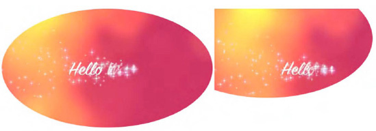
Figure 5.2. Applying a circle SVG mask to a video in Firefox using the object's bounding box as reference
The stretched circle in the second video is displaced with its center at 25% of the video's width and height.
When using <svg> inline, the @namespace attribute on the <svg> element is required because SVG runs in a separate namespace. Thus, if you want to manipulate an element inside the <svg> namespace through JavaScript, you need to use the namespace versions of the functions. Listing 5-4 shows an example where the SVG mask with the circle is extended with a rectangle shape. The resulting rendering in Firefox is shown in Figure 5-3. None of the other browsers supports this yet.
Example 5.4. Manipulating inline SVG with JavaScript in Firefox
<video class="target" height="270px" width="480px" controls >
        <source src="HelloWorld.webm" type="video/webm">
        <source src="HelloWorld.ogv"  type="video/ogg">
    </video>
    <style>
      .target { mask: url("#c1"); }
    </style>
    <svg version="1.1" xmlns="http://www.w3.org/2000/svg">
      <defs>
        <mask id="c1" maskUnits="objectBoundingBox"
                      maskContentUnits="objectBoundingBox">
          <circle cx="0.25" cy="0.25" r="0.5" fill="white"/>
        </mask>
      </defs>
    </svg>
    <script>
      var rect = document.createElementNS("http://www.w3.org/2000/svg",
                                          "rect");
      rect.setAttribute("x", "0.5"); rect.setAttribute("y", "0.5");
      rect.setAttribute("width", "0.5"); rect.setAttribute("height", "0.5");
      rect.setAttribute("fill", "white");
      var mask = document.getElementById("c1");
      mask.appendChild(rect);
    </script>
Another basic SVG construct consists of text elements:
<text>
<tspan>
<tref>
<textPath>
<altGlyph>
<altGlyphDef>
<altGlyphItem>
<glyphRef>
<font> and font features
In this section we will use SVG text as a mask for video.
Listing 5-5 shows an example video with a text mask using the SVG file in Listing 5-6. The SVG file contains a circle applied as a mask to the video. Figure 5-4 shows the result in Firefox and Safari.
Example 5.5. Styling a video using an external SVG resource as a mask
<video class="target" height="270px" width="480px" controls autoplay>
        <source src="HelloWorld.mp4"  type="video/mp4">
        <source src="HelloWorld.webm" type="video/webm">
        <source src="HelloWorld.ogv"  type="video/ogg">
    </video>
    <style>
      .target {
        mask: url("basic_example_c5_4.svg#textClip");
        -webkit-mask: url("basic_example_c5_4.svg");
} </style>
Example 5.6. The SVG resource used by Listing 5-5
<?xml version="1.0" standalone="no"?>
<!DOCTYPE svg PUBLIC "-//W3C//DTD SVG 1.1//EN"
"http://www.w3.org/Graphics/SVG/1.1/DTD/svg11.dtd">
<svg version="1.1" xmlns="http://www.w3.org/2000/svg"
xmlns:xlink="http://www.w3.org/1999/xlink">
<defs>
<mask id="textClip" maskUnits="userSpaceOnUse"
maskContentUnits="userSpaceOnUse">
<text id="text1" x="40" y="120" dx="0,5,5,5,0" dy="10,0,0,0,−20"
rotate="−20 −30 −40 −50 0 0 −10" font-size="120" fill="white"
font-family="Verdana" font-weight="bold">
<tspan x="40">HELLO</tspan>
<tspan x="0" dy="120">WORLD</tspan>
</text>
</mask>
</defs>
<use xlink:href="#text1"/>
</svg>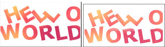
The mask consists of two lines of text in <tspan> elements starting at a x=40 px and y=120 px offset with a dx and dy distances and individual letter rotations. Again, Opera and IE don't yet support SVG in CSS and Chrome is broken due to a bug.
You might have noticed that the SVG masks are all filled with the color "white." This is because of the way in which masking is specified.
In WebKit browsers, the image (even the SVG image) is interpreted as an alpha mask, which is an image that contains alpha values ranging from 0 to 1. Any color, including black and white, is masked as a fully transparent area; colors with a higher transparency result in less transparency in the mask.
In Firefox by contrast, the mask value is calculated from both the color and alpha channel values as per the SVG specification.[105] A linear luminance value is computed from the color channel values and then multiplied by the alpha channel value. For a black picture, all color channel values are thus 0, which is why a mask from a black picture results in nothing in Firefox. So make sure to fill your mask with a nonblack color. For full transparency, use white as in the examples above.
With CSS3, much of the advanced styling functionalities of SVG have found entry into HTML. However, some of the advanced features of SVG, such as masks, clipPaths, filters and animations, can be styled only in SVG.
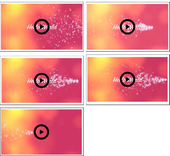
One particularly nice application of SVG for video is to run your own video controls. Listing 5-7 shows an example of a video without native controls, but with a SVG play/pause toggle that hooks into the video JavaScript API and uses the page's CSS. Because this uses inline SVG and hooks into the JavaScript of the web page, we need to use XHTML to allow it to render in all browsers. Figure 5-5 shows the result.
Example 5.7. Running your own controls in SVG
<!DOCTYPE html>
<html xmlns="http://www.w3.org/1999/xhtml" lang="en" xml:lang="en">
<head>
<style>
.svginside > * {
position: absolute;
}
.svgbutton path {
pointer-events: none;
}
</style>
<script>
/* <![CDATA[ */
var vid;
window.onload = function() {
vid = document.getElementsByTagName("video")[0];
vid.addEventListener("ended", updateButton, true);
vid.addEventListener("play", updateButton, true);
updateButton();
}
function updateButton() {
document.querySelector("#controls .play").style.display =
isPlaying(vid) ? "none" : "block";
document.querySelector("#controls .pause").style.display =
!isPlaying(vid) ? "none" : "block";
}
function isPlaying(video) {
return (!video.paused && !video.ended);
}
function togglevideo() {
!isPlaying(vid) ? vid.play() : vid.pause();
updateButton();} /* ]]> */
</script>
</head>
<body>
<div id="controls" class="svginside">
<video height="270px" width="480px">
<source src="HelloWorld.mp4" type="video/mp4"/>
<source src="HelloWorld.webm" type="video/webm"/>
<source src="HelloWorld.ogv" type="video/ogg"/>
</video>
<svg height="270px" width="480px" xmlns="http://www.w3.org/2000/svg"
xmlns:xlink="http://www.w3.org/1999/xlink" >
<g class="svgbutton">
<circle stroke="black" fill="transparent" fill-opacity="0"
stroke-width="12" cx="240" cy="135" r="40"
onclick="togglevideo();"/>
<path class="play" fill="black" d="M 230 120 v 30 l 25 −15 Z"/>
<path class="pause" stroke-width="12" stroke="black"
d="M 230 120 v 30 m 16 −30 v 30"/>
</g>
</svg>
</div>
</body>
</html>Note that because this is XHTML, you need to put the JavaScript into a CDATA section.
The XHTML page contains first a list of JavaScript functions. There is a function to toggle the play and pause state of the video, one to identify which state it actually is in, one to update the image upon toggling play/pause, and one to initialize the hook-up of toggle button events to the functions. Then we display the video and the SVG toggle button overlay, which consists of a circle, a path that draws the play image, and a path that draws the pause image. The SVG is positioned absolutely by nailing the video down to 480x270, and the circle, pause and play buttons are centered on that. By taking away pointer events from the play triangle and the pause rectangles, we give all the pointer events to the circle to call the toggleVideo function.
We also created the same version of this web page as an HTML page, which works in Firefox, Chrome, and IE, but not in Safari and Opera.
Being able to use SVG gradients on SVG masks, clipPaths, and other SVG effects is another styling advantage of SVG over CSS. Listing 5-8 shows an example of an SVG mask for a video that has a gradient applied to everything that's not masked. The HTML file required for this is very similar to the one in Listing 5-1. Figure 5-6 shows the result.
Example 5.8. A SVG mask with a gradient
<?xml version="1.0" standalone="no"?>
    <!DOCTYPE svg PUBLIC "-//W3C//DTD SVG 1.1//EN"
              "http://www.w3.org/Graphics/SVG/1.1/DTD/svg11.dtd">
    <svg version="1.1" xmlns="http://www.w3.org/2000/svg"
                       xmlns:xlink="http://www.w3.org/1999/xlink">
      <defs>
        <mask id="c1" maskUnits="userSpaceOnUse"
maskContentUnits="userSpaceOnUse">
<g id="group">
<linearGradient id="grad" gradientUnits="objectBoundingBox"
x2="0" y2="1">
<stop stop-color="white" offset="0"/>
<stop stop-color="white" stop-opacity="0" offset="1"/>
</linearGradient>
<circle id="circle" cx="240" cy="135" r="135" fill="white"/>
<rect x="0" y="0" width="480" height="270" fill="url(#grad)"/>
</g>
</mask>
</defs>
<use xlink:href="#group"/>
</svg>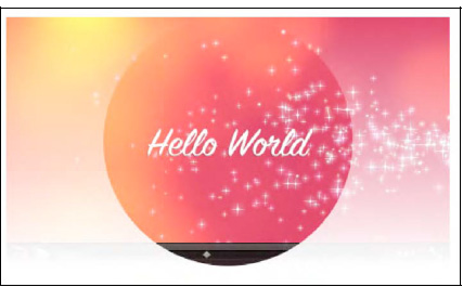
Figure 5.6. An SVG mask and a gradient applied to a video in Safari and Firefox shows the same effect
The SVG mask is defined by a circle in the center of the video and a rectangle over the whole height. The rectangle is filled with the gradient, which starts at the top boundary of the image and increases toward a final value of white at the bottom. Two mask shapes come together, so the mask multiplies these two together before applying it to the video.
It certainly makes a lot of sense in the above example to run your own controls instead of having the semi-transparent default controls shine through the mask. One can imagine creating a video player that plays back a series of videos and uses SVG and JavaScript to provide transition effects, such as wipes or fades.
In the next example, we use a circle as a pattern to blend in more than the central circle of the video. Listing 5-9 shows the SVG mask. The HTML file required for this is very similar to the one in Listing 5-1. Figure 5-7 shows the result.
Example 5.9. An SVG mask with a pattern
<?xml version="1.0" standalone="no"?>
    <!DOCTYPE svg PUBLIC "-//W3C//DTD SVG 1.1//EN"
              "http://www.w3.org/Graphics/SVG/1.1/DTD/svg11.dtd">
    <svg version="1.1" xmlns="http://www.w3.org/2000/svg"
                       xmlns:xlink="http://www.w3.org/1999/xlink">
      <defs>
        <mask id="c1" maskUnits="userSpaceOnUse"
                      maskContentUnits="userSpaceOnUse">
          <g id="group">
            <pattern id="pat" patternUnits="userSpaceOnUse" x="0" y="0"
                     width="20" height="20">
              <circle cx="6" cy="6" r="5" fill="white" stroke="white"/>
            </pattern>
            <rect x="0" y="0" width="480" height="246" fill="url(#pat)"/>
            <circle id="circle" cx="240" cy="122" r="122" fill="white"/>
            <rect x="0" y="246" width="480" height="25" fill="white"/>
          </g>
        </mask>
      </defs>
      <use xlink:href="#group"/>
    </svg>
First we have a rectangle over the complete video to which the small circle pattern is applied. Over this we mask the big circle for the video center. Finally, we also have a small rectangle that roughly covers the video controls and provides for better usability. In browsers where the controls disappear during pause time, this looks rather funny, as can be seen in the Firefox example. It, however, works mostly with Safari.
We've already seen multiple examples of masks. Other interesting SVG effects are clip-paths and filters.
Clip-paths restrict the region to which paint can be applied, creating a custom viewport for the referencing element. This also means that pointer events are not dispatched on the clipped regions of the shape. This is in contrast to masks, where only visibility and transparency of the masked regions is changed, but the masked regions still exist and can be interacted with.
Listing 5-10 shows an example use of clip-path on a video. We need the controls to be able to interact with the video. This currently will work only in Firefox in HTML since it is the only browser that supports inline SVG, which is necessary for the controls. You can get Safari to display it, too, but you need to move to XHTML and use the -webkit-mask CSS property; see Listing 5-11. See Figure 5-8 for the result.
Example 5.10. An SVG clip-path used with the controls from Listing 5-7
<?xml version="1.0" standalone="no"?>
    <!DOCTYPE svg PUBLIC "-//W3C//DTD SVG 1.1//EN"
              "http://www.w3.org/Graphics/SVG/1.1/DTD/svg11.dtd">
    <svg version="1.1" xmlns="http://www.w3.org/2000/svg"
                       xmlns:xlink="http://www.w3.org/1999/xlink">
      <defs>
        <clipPath id="c1" maskUnits="userSpaceOnUse"
                          maskContentUnits="userSpaceOnUse">
          <polygon id="poly" fill="white"
                   transform="translate(−180,−90) scale(1.2)"
                   points="350,75  379,161 469,161 397,215
                           423,301 350,250 277,301 303,215
                           231,161 321,161" />
        </clipPath>
      </defs>
      <use xlink:href="#poly"/>
    </svg>
Example 5.11. Addition to the HTML page in Listing 5-7
<style>
      video {
        clip-path: url("basic_example_c5_8.svg#c1");
        -webkit-mask: url("basic_example_c5_8.svg");
      }
    </style>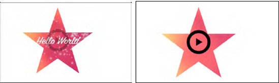
Figure 5.8. A clip-path in the form of a star applied to a video in Firefox and Safari with SVG controls
The HTML page from example Listing 5-5 is extended with a CSS feature called clip-path. This feature links to the SVG block that contains the <clipPath>. In our example, that clipPath contains a polygon that describes a star, which creates a cut-out from the video. Onto this, the controls of Listing 5-7 are rendered to enable interaction with the video.
Now let's move on to the most interesting functionality that SVG can provide for the video element: filters. Filters are composed from filter effects, which are a series of graphics operations applied to a given source graphic to produce a modified graphical result. They typically are applied to images and videos to expose different details from the graphical image than are typically seen by the human eye or to improve a particular image feature—be that for image/video analysis or for artistic purposes.
A long list of filter effects, also called filter primitives, is defined in the SVG specification[106]:
Blending two images together: <feBlend>.
Color matrix transformation: <feColorMatrix>.
Component-wise remapping of pixel data: <feComponentTransfer> using one of the following component transfer functions:
identity, table, discrete, linear, gammaon one of the color channels through <feFuncR>, <feFuncG>, <feFuncB>, <feFuncA>.Combine two input images pixel-wise: <feComposite>.
Matrix convolution of pixels with their neighbors: <feConvolveMatrix>.
Light image using the alpha channel as a bump map: <feDiffuseLighting>, <feSpecularLighting>.
Spatially displace an image based on a second image: <feDisplacementMap>.
Create filled rectangle: <feFlood>.
Gaussian blur on input image: <feGaussianBlur>.
Load external graphic into filter into RGBA raster: <feImage>.
Collapse input image layers into one: <feMerge> with a list of <feMergeNode>.
Dilate (fatten)/erode (thin) artwork: <feMorphology>.
Offset image: <feOffset>.
Fill rectangle with repeated pattern of input image: <feTile>.
Create turbulence or fractal noise: <feTurbulence>.
Light source effects: <feDistantLight>, <fePointLight>, <feSpotLight>.
Firefox, Opera, IE, and the WebKit-based browsers support all of these filter effects for SVG, but the use in HTML is supported only by Firefox[107]. Firefox made use of the CSS filter property for this, which was previously supported only by IE.
Listing 5-12 shows application of a blur filter to the video element, defined in an inline SVG. Figure 5-9 shows the result in Firefox.
Example 5.12. An SVG-defined blur filter applied to a video
<video class="target" height="270px" width="480px" controls >
      <source src="HelloWorld.webm" type="video/webm">
      <source src="HelloWorld.ogv"  type="video/ogg">
    </video>
    <svg height="0">
      <defs>
        <filter id="f1">
          <feGaussianBlur stdDeviation="3"/>
        </filter>
      </defs>
    </svg>
    <style>
      .target {
        filter: url("#f1");
      }
    </style>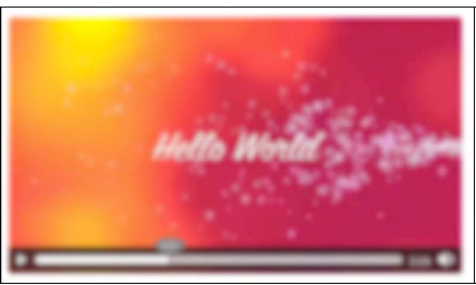
In CSS you use the filter property to refer to the SVG <filter> element. The Gaussian blur effect is the only filter primitive used here. It is possible to combine more filter effects in one filter. Note that the filter is also applied to the default controls, so it is necessary to run your own controls.
Let's look at a few more filters. Listing 5-13 shows several filters:
f1: a color matrix, which turns the video black and white.
f2: a component transfer, which inverts all the color components.
f3: a convolution matrix, which brings out the borders of color patches.
f4: a displacement map, which displaces the video pixels along the x and y axes using the R color component.
f5: a color matrix, which lightens the colors and moves them towards pastel.
Figure 5-10 shows the results of the filters used with the HTML code in Listing 5-12 in Firefox, applied to a somewhat more interesting video. The first image is a reference frame without a filter applied.
Example 5.13. Several SVG filter definitions
<filter id="f1">
        <feColorMatrix values="0.3 0.3 0.3 0 0
                               0.3 0.3 0.3 0 0
                               0.3 0.3 0.3 0 0
                               0   0   0   1 0"/>
      </filter>

      <filter id="f2">
        <feComponentTransfer>
          <feFuncR type="table" tableValues="1 0"/>
          <feFuncG type="table" tableValues="1 0"/>
          <feFuncB type="table" tableValues="1 0"/>
        </feComponentTransfer>
      </filter>

      <filter id="f3">
        <feConvolveMatrix order="3" kernelMatrix="1    −1  1
                                                 −1 −0.01 −1
                                                  1    −1  1"
                          edgeMode="duplicate"/>
      </filter>

      <filter id="f4" x="0%" y="0%" height="100%" width="100%">
        <feDisplacementMap scale="100" in2="SourceGraphic"
                           xChannelSelector="R"/>
      </filter>

      <filter id="f5">
        <feColorMatrix values="1 0 0 0 0
                               0 1 0 0 0
                               0 0 1 0 0
                               0 1 0 0 0"
                       style="color-interpolation-filters:sRGB"/>
      </filter>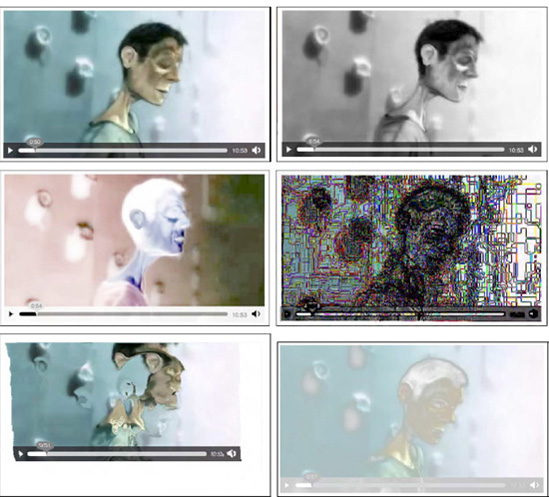
Figure 5.10. Application of the filters in Listing 5-13 to a video in Firefox with the image at top left being the reference image and the filters f1 to f5 applied from top right to bottom right.
Finally, we want to make a few combined filters. Listing 5-14 shows several combined filters:
f1: a blue flood on the black color.
f2: a canvas-style rendering.
f3: two layers of blur and convolution merged.
f4: a line mask on the re-colored video.
Figure 5-11 shows the results of the filters used with the HTML code in Listing 5-12 in Firefox.
Example 5.14. Several composite SVG filter definitions
<filter id="f1" x="0%" y="0%" width="100%" height="100%">
          <feFlood  flood-color="blue" result="A"/>
          <feColorMatrix type="matrix" in="SourceGraphic" result="B"
                         values="1   0  0  0 0
                                 0   1  0  0 0
                                 0   0  1  0 0
                                 1   1  1  0 0"/>
          <feMerge>
            <feMergeNode in="A"/>
            <feMergeNode in="B"/>
          </feMerge>
        </filter>

        <filter id="f2">
          <feGaussianBlur in="SourceAlpha" stdDeviation="4" result="A"/>
          <feOffset in="A" dx="4" dy="4" result="B"/>
          <feSpecularLighting in="A" surfaceScale="5" specularConstant=".75"
                              specularExponent="20" lighting-color="#bbbbbb"
                              result="C">
            <fePointLight x="-5000" y="-10000" z="20000"/>
          </feSpecularLighting>
          <feComposite in="C" in2="SourceAlpha" operator="in" result="C"/>
          <feComposite in="SourceGraphic" in2="C" operator="arithmetic"
                       k1="0" k2="1" k3="1" k4="0" result="D"/>
          <feMerge>
            <feMergeNode in="B"/>
            <feMergeNode in="D"/>
          </feMerge>
        </filter>

        <filter id="f3">
          <feGaussianBlur in="SourceGraphic" stdDeviation="6" result="A"/>
          <feConvolveMatrix order="3" edgeMode="none" result="B"
                            kernelMatrix="1 −1  1 −1 −0.01 −1 1 −1 1"/>
          <feMerge>
            <feMergeNode in="A"/>
            <feMergeNode in="B"/>
          </feMerge>
        </filter>

        <filter id="f4">
          <feColorMatrix values="1 1 0 0 0
                                 0 0 1 0 0
                                 0 0 0 1 0
                                 0 0 0 0 1"
                  style="color-interpolation-filters:sRGB" result="A"/>
          <feConvolveMatrix filterRes="100 100" preserveAlpha="true" in="A"
                  style="color-interpolation-filters:sRGB"
                  order="3" kernelMatrix="0 −1 0   −1 4 −1   0 −1 0" />
        </filter>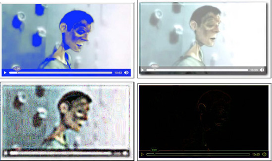
Figure 5.11. Application of the filters in Listing 5-14 to a video in Firefox with the image at top left being the reference image and the filters f1 to f5 applied from top right to bottom right.
We now briefly move on to SVG animations, which allow us to animate basically all the SVG effects and features we have experimented with. Animation functionality in SVG originates from SMIL's animation module[108]
The <animate> element is used to animate a single attribute or property over a time interval. Listing 5-15 has an example for animating the circular mask used in Listing 5-2. The HTML page for this example is identical to the one in Listing 5-1. Figure 5-12 has the rendering in Firefox and Safari.
Example 5.15. An animated circle in SVG
<?xml version="1.0" standalone="no"?>
    <!DOCTYPE svg PUBLIC "-//W3C//DTD SVG 1.1//EN"
              "http://www.w3.org/Graphics/SVG/1.1/DTD/svg11.dtd">
    <svg version="1.1" xmlns="http://www.w3.org/2000/svg"
                       xmlns:xlink="http://www.w3.org/1999/xlink">
      <defs>
        <mask id="c1" maskUnits="userSpaceOnUse"
                      maskContentUnits="userSpaceOnUse">
          <circle id="circle" cx="240" cy="135" r="135" fill="white">
            <animate attributeName="r" values="150;240;150" dur="3s"
                     repeatCount="10" />
          </circle>
        </mask>
      </defs>
      <use xlink:href="#circle"/>
    </svg>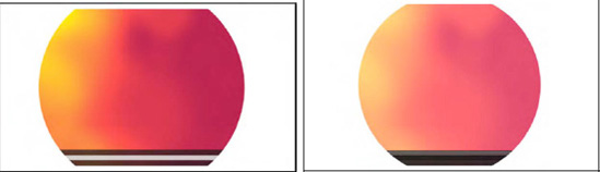
In the example, the circular mask on the video is animated from a radius of 150 px to 240 px and back, which makes for a sliding width mask on the exposed video. This animation is executed 10 times before the mask falls back to the original circle of 135 px radius as used in Listing 5-1.
Note that the <animate> element allows animation of only simple attributes. To animate color-related attributes, you need to use <animateColor> and to animate the @transform attribute, you need to use <animateTransform>.
With the <animateMotion> element, it is possible to move an element along a certain path defined by <mpath>. Listing 5-16 has an example for animating a small circular mask in searchlight fashion over the video. The HTML page for this example is identical to the one in Listing 5-1. Figure 5-13 has the rendering in Firefox and Safari.
Example 5.16. A motion animation in SVG used as a mask
<?xml version="1.0" standalone="no"?>
    <!DOCTYPE svg PUBLIC "-//W3C//DTD SVG 1.1//EN"
              "http://www.w3.org/Graphics/SVG/1.1/DTD/svg11.dtd">
    <svg version="1.1" xmlns="http://www.w3.org/2000/svg"
                       xmlns:xlink="http://www.w3.org/1999/xlink">
      <defs>
        <mask id="c1" maskUnits="userSpaceOnUse"
                      maskContentUnits="userSpaceOnUse">
          <circle id="circle" cx="120" cy="70" r="50" fill="white">
            <animateMotion path="M 0 20 C 150 30 250 250 50 70"
                           begin="0s" dur="6s" fill="freeze" />
          </circle>
        </mask>
      </defs>
      <use xlink:href="#circle"/>
    </svg>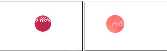
In the example, a path is defined inside the <animateMotion> element. This could have been done in a separate <path> element with an <mpath> subelement referencing it. However, the path was simple enough to simply retain in the element.
We've had plenty of examples now where SVG was used inline or as an externally referenced CSS mask to provide effects into an HTML video element. In this subsection we turn this upside down and take a look at using the HTML5 video element inside SVG resources. While this is strictly speaking the development of SVG content and not of HTML, we will still take a look, because the SVG markup can be used inline in HTML.
Let's start with the simple first step of displaying video in SVG. Opera has the <video> element of SVG 1.2 implemented, so you can just use <video> inside SVG. The other browsers require the use of the <foreignObject> feature of SVG.
Listing 5-17 shows an XHTML file with inline SVG that just displays a video. The renderings in all browsers except IE are shown in Figure 5-14. IE doesn't understand <video> or <foreignObject> yet, so it shows nothing.
Example 5.17. Inline SVG with a video element in XHTML
<!DOCTYPE html>
    <html xmlns="http://www.w3.org/1999/xhtml" lang="en" xml:lang="en">
      <body>
        <svg version="1.1" xmlns="http://www.w3.org/2000/svg"
             xmlns:xlink="http://www.w3.org/1999/xlink" width="480px"
             height="270px">
        <g id="video">
          <foreignObject width="480px" height="270px">
            <body xmlns="http://www.w3.org/1999/xhtml" style="margin:0;">
              <video class="target" height="270" width="480"
                     controls="controls">
                <source src="HelloWorld.mp4"  type="video/mp4"/>
                <source src="HelloWorld.webm" type="video/webm"/>
                <source src="HelloWorld.ogv"  type="video/ogg"/>
              </video>
            </body>
          </foreignObject>
        <video class="target" height="270" width="480" controls="controls"
               xlink:href="HelloWorld.ogv">
        </video>
      </g>
    </svg>
      </body>
    </html>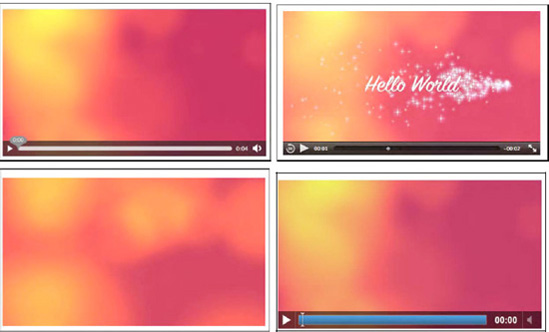
Figure 5.14. Rendering inline SVG with video in Firefox (top left), Safari (top right), Opera (bottom left), and Google Chrome (bottom right).
Notice how it is necessary to put two video elements in the inline SVG: the first in a <foreignObject> is interpreted on Firefox, Safari and Google Chrome, while the second one is interpreted by Opera. It has an @xref:href instead of an @src attribute because it is native XML/SVG rather than a foreign object. Because of this, it also doesn't deal with <source> elements, and it doesn't actually display controls, but is always autoplay.[109]
Also note that we had to put a 0 margin on the <body> element in SVG since some browsers—in particular Firefox—have a default margin on inline SVG.
This example works in all browsers except for IE.
Now we can try to replicate the example of Listing 5-1 inside SVG; i.e. put a circular mask on the video. Listing 5-18 has the XHTML code and Figure 5-15 the renderings.
Example 5.18. Inline SVG with a video element in XHTML and a circular mask
<svg version="1.1" xmlns="http://www.w3.org/2000/svg"
       xmlns:xlink="http://www.w3.org/1999/xlink" width="480px"
height="270px">
<defs>
<mask id="c1" maskUnits="userSpaceOnUse"
maskContentUnits="userSpaceOnUse">
<circle id="circle" cx="240" cy="135" r="135" fill="white"/>
</mask>
</defs>
<g>
<defs>
<g id="video">
<foreignObject width="480px" height="270px">
<body xmlns="http://www.w3.org/1999/xhtml" style="margin:0;">
<video class="target" height="270" width="480"
controls="controls">
<source src="HelloWorld.mp4" type="video/mp4"/>
<source src="HelloWorld.webm" type="video/webm"/>
<source src="HelloWorld.ogv" type="video/ogg"/>
</video>
</body>
</foreignObject>
<video class="target" height="270" width="480"
controls="controls" xlink:href="HelloWorld.ogv">
</video>
</g>
</defs>
<use xlink:href="#video" mask="url(#c1)"/>
</g>
</svg>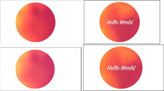
The WebKit-based browsers don't seem to be able yet to apply a mask on a <foreignObject>. IE doesn't support either masks or <foreignObject>. Opera works fine, so this provides the opportunity to mix the implementation of Listing 5-1 with the implementation here to gain the same effect in all browsers except IE.
To finish off this chapter, let's look at some more effects now provided in inline SVG on the video elements.
Listing 5-19 shows the inline SVG code for a reflection created by copying the video in a <use> statement, mirroring through a scale(1-1) transform, moving it below the video through a translate(0-540) transform, and applying a gradient to the copied video. Figure 5-16 shows the renderings in Firefox and Opera.
Example 5.19. SVG code for a video reflection
<svg version="1.1" xmlns="http://www.w3.org/2000/svg"
         xmlns:xlink="http://www.w3.org/1999/xlink"
         width="480px" height="540px">
      <defs>
        <linearGradient id="grad" y2="1" x2="0">
          <stop offset="0.2" stop-color="white" stop-opacity="0"/>
          <stop offset="1"   stop-color="white" stop-opacity=".4"/>
        </linearGradient>
        <mask id="c1" maskContentUnits="objectBoundingBox">
          <rect width="1" height="1" fill="url(#grad)"/>
        </mask>
      </defs>
      <g id="reflection">
        <g id="video">
          <foreignObject width="480px" height="270px">
            <body xmlns="http://www.w3.org/1999/xhtml" style="margin:0;">
              <video height="270" width="480" autoplay="autoplay">
                <source src="HelloWorld.mp4"  type="video/mp4"/>
                <source src="HelloWorld.webm" type="video/webm"/>
                <source src="HelloWorld.ogv"  type="video/ogg"/>
              </video>
</body>
</foreignObject>
<video height="270" width="480" xlink:href="HelloWorld.ogv"/>
</g>
<use xlink:href="#video" transform="scale(1 −1) translate(0 −540)"
mask="url(#c1)"/>
</g>
</svg>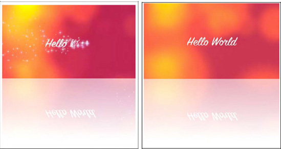
Opera's presentation is much smoother than Firefox's, which seems to do a lot of processing. As we can see from the screenshot, it seems that Firefox has two different renderings of the video data, since the video and its reflection are not synchronized. In contrast, the <use> element just seems to copy the data from the <video> element. Opera can possibly do some optimization since it is using <video> as a native SVG element, while Firefox has to deal with the <video> in an HTML <foreignObject>. It seems to be an advantage to have a native <video> element in SVG. It could be a good idea, however, to synchronize the markup of the <video> element in SVG and HTML, in particular introduce a <source> element.
Listing 5-20 shows the inline SVG code for edge detection created through a convolution matrix. Figure 5-17 shows the renderings in Firefox and Opera.
Example 5.20. SVG code for edge detection
<svg version="1.1" xmlns="http://www.w3.org/2000/svg"
           xmlns:xlink="http://www.w3.org/1999/xlink"
           width="480px" height="540px">
      <defs>
        <filter id="c1">
          <feConvolveMatrix order="3" kernelMatrix="1  1 1
                                                    1 −8 1
                                                    1  1 1"
                            preserveAlpha="true"/>
        </filter>
      </defs>
      <video height="270px" width="480px" xlink:href="HelloWorld.ogv"
             filter="url(#c1)"/>
      <defs>
        <g id="video">
          <foreignObject width="480px" height="270px">
            <body xmlns="http://www.w3.org/1999/xhtml" style="margin:0;">
              <video height="270px" width="480px" autoplay="autoplay">
                <source src="HelloWorld.mp4"  type="video/mp4"/>
                <source src="HelloWorld.webm" type="video/webm"/>
                <source src="HelloWorld.ogv"  type="video/ogg"/>
              </video>
            </body>
          </foreignObject>
        </g>
      </defs>
      <use xlink:href="#video" filter="url(#c1)"/>
    </svg>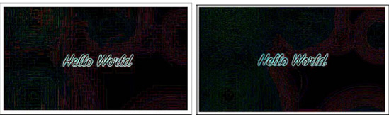
The filter can be directly applied to the native SVG 1.2 <video> element in Opera. In Firefox, we need to define the <foreignObject> and then apply the filter to the object through a <use> statement.
In this chapter we analyzed how the HTML5 <video> element can interoperate with objects defined in SVG. First, we looked at using objects specified in SVG as masks on top of the <video> element. In Safari we can reference external SVG "images" in the -webkit-mask CSS property. This also used to work in Chrome, but is currently broken. In Firefox we can use the mask CSS property with a direct fragment reference to the <mask> element inside the SVG "image." Use of URI fragments in the way in which Firefox supports them is not standardized yet.
Firefox is also able to reference inline defined SVG masks through the fragment-addressing approach. This means <mask> elements inside the same HTML file in an <svg> element can be used as masks, too. IE and Chrome also support inline definition of <svg> elements in HTML, but since they don't support the fragment-addressing approach inside the mask CSS property, they cannot use this for masking onto HTML <video> elements.
The same approach with the mask and -webkit-mask CSS properties is also used later for applying CSS animations to HTML5 <video> in Firefox and Safari.
We then moved on to using SVG inline for defining controls. If we define them in XHTML, all browsers, including IE, display them. You can create some of the prettiest controls with SVG. Because Safari and Opera do not support inline <svg> in HTML yet, we have to use XHTML. It is expected that these browsers will move toward a native HTML5 parser in the near future, which will then enable <svg> support inline in HTML pages, too.
Next we looked at how Firefox managed to apply SVG filter effects to HTML elements. It uses the CSS filter property for this and again references SVG objects with a fragment reference. In this way you can apply some of the amazing filter effects that are available in SVG to <video>, including blur, black-and -white, false-color effects, pastel colors, and contours.
We rounded out the chapter by using the SVG <video> and <foreignObject> elements to play back <video> directly in SVG. Such SVG was further included as inline SVG in an HTML page through <svg>. This enabled us also to make use of masking and other effects on <video> in Opera, since it is the only browser with native <video> element support in SVG.
[100] See http://http://www.w3.org/TR/SVG/intro.html for specification.
[101] See http://www.w3.org/TR/SVG12/
[102] See http://www.w3.org/TR/2004/WD-SVG12-20041027/media.html
[103] Also proposed to W3C for standardization http://people.mozilla.com/~roc/SVG-CSS-Effects-Draft.html
[104] See http://code.google.com/p/chromium/issues/detail?id=63055
[105] See http://www.w3.org/TR/SVG/masking.html#Masking
[106] See http://www.w3.org/TR/SVG/filters.html#FilterPrimitivesOverview
[107] See https://developer.mozilla.org/En/Applying_SVG_effects_to_HTML_content
[108] See http://www.w3.org/TR/2001/REC-smil-animation-20010904/
[109] See http://www.w3.org/TR/SVGMobile12/multimedia.html#VideoElement