

IMAGE © ANGELA FARIS BELT, Prism Heart, 2009.
FRAMING, BORDERS, AND MULTIPLE FRAMES
PHOTOGRAPHY IS ABOUT FINDING OUT WHAT CAN HAPPEN IN THE FRAME. WHEN YOU PUT FOUR EDGES AROUND SOME FACTS, YOU CHANGE THOSE FACTS. —GARRY WINOGRAND
INTRODUCTION: FRAMING, THE FIRST PHOTOGRAPHIC ELEMENT
Once we photographers understand metering and exposure, we’re most interested in creating images that apply our technical knowledge in meaningful ways. While the traditional elements of design aid composition, there are additional aspects within the process of making photographs that require examination because this process leads to a final image that is created all at once. That is to say, while other 2-dimensional arts reveal traces of their additive and subtractive processes over time, finished photographs have no such reference, even though the process plays an equally important role in their creation. This means photographers have to be even more aware of the process until the moment of exposure, covering all of our visual bases while designing the image, because once the moment has passed, there is no opportunity to refine it.
Designing a photograph requires doing so while seeing, while formally arranging contents within the photographic frame—the imposed confines of the camera’s format. This process applies to all photographs made with all camera formats; and although they range widely in size, camera formats generally “crop” the image to the shape of the viewfinder placed in front of your eye. But using a camera to translate the three-dimensional world onto two-dimensional media, and doing it well, isn’t as easy as it might seem. That’s what this chapter is about: mastering the first element of photography—framing. Part 1 explores how to meaningfully arrange contents and depth within the photographic frame, Part 2 addresses the edges of that frame, and Part 3 moves beyond the single frame to combining multiple frames into a single image.
One certainty is that every camera imposes a frame; as soon as you place it between the world and your eye, you engage with the first photographic element that directly affects the visual outcome and meaning of the image. Like a formally structured work of written language (a haiku, sonnet, etc.), the camera encapsulates part of the world within a defined structure. Framing reveals a photographer’s decisions regarding image content; it’s the transition point between the world and an image of it.
CONSCIOUS FRAMING, VISUAL QUALITY, AND PHOTOGRAPHIC MEANING
Here’s the rub: the frame contains the content that viewers see and interpret regardless of the attention paid to it by the photographer. Photographers make framing decisions based upon their opinion of the important aspects of the scene; once captured, the image contains all the content it will contain. This is important to keep in mind for two reasons. First, the contents of the frame are a viewer’s only reference to what was in front of the camera. Visually literate viewers assume the photographer intentionally included everything he or she saw in the image, and through framing the photographer tacitly states that all contents refer to the meaning of the image. Imagine that someone shows you a picture of a group of people and says, “Just ignore that guy. I don’t know who that is.” Well, ignoring that guy can be difficult and problematic because he is captured in the frame along with the intended people. In this respect, framing the contents of a photograph is like composing a work of literature; conscientious authors avoid random words and unnecessary sentences because non sequiturs misdirect readers’ interpretation. Meticulous readers interpret each sentence (indeed each word) of a novel to derive meaning, and meticulous viewers interpret every aspect of a photograph’s content to derive meaning as well.
The second reason why image contents are important is that while the photographer experiences all the events surrounding the making of the image, the viewers don’t benefit from that expanded context. Their experience is confined to the final image. So your experience as a photographer “being there” can’t invade your judgment about the quality or communicative effectiveness of your photographs. This gap in experience is well explained by Annie Dillard in The Writing Life:
“Every year the aspiring photographer brought a stack of his best prints to an old, honored photographer, seeking his judgment. Every year the old man studied the prints and painstakingly ordered them into two piles, bad and good. Every year the old man moved a certain landscape print into the bad stack. At length he turned to the young man: “You submit this same landscape every year, and every year I put it on the bad stack. Why do you like it so much?” The young photographer said, “Because I had to climb a mountain to get it.”
Framing is the building block of photographic language in that viewers interpret what is in the frame, not what isn’t. But from the photographer’s perspective, framing is also subtractive. The process of capturing a photograph has as much to do with what we choose to “frame out” as what we choose to “frame in.” In this way photographers distill the content of the image to its essentials. It is for these reasons that a photographer’s shift in attention from “seeing” to “seeing through the camera” is worth cultivating. And that’s what framing is all about.

IMAGE AND ILLUSTRATION © ANGELA FARIS BELT, 2010.
The world extends beyond the frame. Camera formats confine the image to the area of even illumination within a circle of illumination projected through the camera lens. Although the photographer’s field of vision is as boundless as the world we move throughout, our photographs have definite boundaries. Framing requires decisions about both what to keep in and what to leave outside of that boundary.
ORGANIZING THE FRAME: PICTURE PLANES, VANTAGE POINT, AND JUXTAPOSITION
The frame does more than include and exclude potential content; it plays an indispensable role in organizing that content. Since we’re projecting our 3-dimensional world onto a 2-dimensional media plane, we force content at varying spatial distances into new and interesting relationships with one another. When we change our position in space, we also alter those relationships. This fact touches on three important aspects of framing: picture planes, vantage point, and juxtaposition.
Picture Planes
The first organizational aspect of framing, picture planes—the flat, physical surface on which the image is captured—delineat the way three-dimensional space is ordered when it’s projected through a single lens onto a two-dimensional plane. Picture planes contain only the illusion of distance (near to far) and volume (an object’s mass). This illusion is so powerful that viewers refer to objects in images being “in front of” or “behind” other objects, when in fact everything in the image exists on a single, flat plane. So as photographers, how do we decide whether to minimize or emphasize the illusion of space within the picture plane, and once we decide how do we accomplish it?
In addition to translating space and volume, picture planes also play an important role in setting the pace at which the viewer’s eye moves through the image. In other words, there is also an illusion when looking at a photograph that our sense of focus literally advances and recedes with the foreground and background distance relationships in the image. Will the picture plane encourage the viewers toward lingering contemplation or move them more rapidly through the image content? Which pace best reflects your subject?

IMAGE © JON LYBROOK, 2009.
The illusion of depth. This landscape image illustrates how powerful the illusion of depth is when we view a photograph. Here you don’t feel as though everything is the same distance from your eye, with the mountains above the ground, and the clouds above the mountains on the same plane. You feel as though your focus recedes into space from the bottom of the image (where the rocks at the bottom of the frame seem to be just before our feet), rises up with the mountains, and then focuses closer to you as you progress to the clouds moving toward the foreground. But everything in the image is resting on a single plane—the image surface—so it’s really only your attention that refocuses into and out of the pictorial space. The way our 3-D world is projected onto a flat plane can be a powerful asset when constructing photographs.
The answers to questions regarding depth in a photograph depend on how you arrange three-dimensional space within the frame. There are three types of picture planes: parallel, diagonal, and overlapping, and each has unique characteristics. Like most aspects of the elements of photography, picture planes operate on a continuum. Few pictures fall strictly into a single category, because various contents within the frame relate to one another differently depending on vantage point. However, when you know you want to create a particular degree of perceived depth within the frame, approaching its contents from a well-considered place in space is how to do it.
Parallel picture planes emphasize the two-dimensionality of the image; in them the image content runs horizontally, vertically, or flat against the picture plane, limiting the illusion of depth or receding space. Parallel picture planes often contain contents that are all at the same distance from the camera, or they are made from a vantage point where the background feels like it’s on the same plane as the foreground. On the one hand, these images can be quiet and meditative; on the other hand, they can be stagnant and boring; in part the result depends on the image content. To limit or eliminate the sense of receding space in a photograph, approach content straight on, such that from your vantage point three-dimensionality is minimized. Think of photographing a building from directly in front of it; it would look like a stage set cutout facade as flat as the two-dimensional pictorial plane itself.
Diagonal picture planes provide a sense of receding space by placing image content diagonally in the frame. A real or implied diagonal line through the image that, aided by the diminishing scale of objects as they move into the distance, conveys a sense of rapidly receding space. Your eye follows a fast course from contents in the foreground to those in the background. Think of moving from directly in front of a building to its side where you can simultaneously see both the front and the side receding into the background; a photograph from this angle creates the illusion of the building receding into the pictorial plane.


PHOTO © DAVID BECKERMAN, BECOME YOUR DREAM, NEVV YORK, 2005.
Parallel picture plane. This image faces all the content of the frame head on. The image forcibly refers the tall background tenement buildings to the hand-scrawled “become your dream” graffiti. There is great distance between the foreground and background, but except for depth of field that distance is negated because everything is parallel to the picture plane.

PHOTO © DAVID BECKERMAN, CROSSING BROOKLYN BRIDGE, 1993.
Diagonal picture plane. The image composition creates dramatic depth in receding space, because the frame’s primary content runs diagonal to the picture plane. Your eye moves from the man to the vanishing point of the bridge in the background. The direction of the subject’s movement toward the corner of the picture activates the composition in the other direction, leading the viewers’ eyes rapidly forward where we view a significant piece of secondary content—the overturned trashcan.
Overlapping picture planes contain a sense of depth as a result of the image content overlapping from foreground to background. In these cases, the viewer perceives depth as a result of some content being in front of other content from the camera’s point of view. In other words, as viewers we perceive objects as closer to us when they block our view of other objects. Our eye starts at foreground content and gradually moves back, skipping from content to content in succession. Think of standing in front of three buildings that are getting progressively farther from you; by photographing from a position where you see one building partially in front of the other, you create the illusion of depth within the pictorial plane.
As you look at photographs day to day, practice analyzing them through the elements of photographic language. Pay attention to the pace your own eye takes into picture planes so you cultivate better awareness of how to arrange contents when making your own photographs, not only to control the illusion of depth, but to set the pace at which viewers’ eyes move through your images, and to create a mood. Do you want a quiet, serene picture? Try making it with a parallel picture plane. Do you want to relate a series of contents at different distances from the camera? Try overlapping planes. Do you want a highly energetic picture? Try a diagonal picture plane.

PHOTO © DAVID BECKERMAN, MANHATTAN MALL, NEW YORK, 2006.
Overlapping picture plane. In this image, planes at varying angles overlap to juxtapose the place name in relation to other contents with the frame. It describes the crowded nature of the place and gives the viewer a definite sense of foreground (in front of) to background (behind) relationships in the image plane.
While picture planes operate on a continuum from negating to exaggerating the illusion of three-dimensional space within the frame, vantage points determine the actual contents within it and how those contents interact. Vantage point—the position and distance of the camera in relation to the image contents—is altered by simply moving your own position in space. You can move horizontally (right or left), vertically (higher or lower), or change your depth (closer into or farther away) in relation to your subject. These options let you organize the frame by creating hierarchies within the frame’s contents, creating juxtapositions, and adding or eliminating content.
Vantage point helps you communicate your feelings and ideas about a subject and carries powerful connotations worth considering. For instance, if you’re making a portrait of someone you admire and whom you want the viewer to admire, you might adopt a slightly lower vantage point and literally look up to the person, placing your subject above (from your vantage point) other content in the frame; conversely, if you want to diminish the subject of the portrait, you might literally adopt a vantage point looking slightly down at the person. With vantage point, subtle changes make a big difference.
Vantage point is also a means of distributing image contents from foreground to background. Because overlapping occurs from the point of view of the camera, photographers can choose to either avoid or create visual tangents, e.g., the classic tree in the background that appears to sprout from the head of someone in the foreground.
Juxtaposition
Juxtaposition creates meaning through the relationship and interaction among discrete contents. It results from consciously organizing contents with respect to both picture plane and vantage point. As photographer Stephen Shore stated in his outstanding book, The Nature of Photographs:
“[Photographers are] confronted with a complex web of visual juxtapositions that realign themselves with each step the photographer takes. Take one step and something hidden comes into view; take another and an object in the front now presses up against one in the distance. Take one step and the description of deep space is clarified; take another and it is obscured. In bringing order to this situation, a photographer solves a picture more than composes one.”
Juxtaposition is a key component in any language. The solitary word or isolated image content leads to narrow meaning and interpretation. But the relationship between multiple words or image contents creates higher levels of meaning. Rarely do words or objects exist in isolation, so juxtaposition of contents is a powerful tool in building more potent images, more complex statements. Conscious awareness of all contents within the frame helps you to adopt a vantage point to conceptually and creatively relate them to one another. If the image is staged, such as a still life, you can research and think about contents and how to juxtapose them to reinforce to your intended meaning. If not, then awareness of the realignment of contents throughout the shooting process is paramount.
Image Discussion 4: Vantage Point
While in a botanic garden, I noticed a plant’s leaf struck by beautiful light and recognized it was in the first stages of dying—curling into itself at its ends. For me the juxtaposition between intense light and dying holds powerful connotations that I wanted to capture through the formal beauty of the scene. I took the first picture from where I saw it, the vantage point of my own height. Then I took my time consciously reframing the image from lower and closer vantage points. I made four pictures in all, gradually progressing to where background darkness envelops the sunlit leaf, and there are no visual distractions behind or intersecting its lighted form. The final image composes the scene most clearly; but perhaps more important, its simplicity better communicates my intention to viewers.

ANGELA FARIS BELT, TURN INWARD, 2009.
Image Discussion 5: Vantage Point
While in Peru, photographer Jill Mott’s train was stopped because of a mudslide. While waiting for a rescue, she did what any dedicated documentarian would do—she made photographs. Upon seeing a man walking toward the train with a pickax over his shoulder, she put her camera to her eye to frame the scene and focused on him. In the few seconds that passed, she continually changed her vantage point by moving horizontally to her left to reposition her subject as he moved forward within the frame. The final image creates an active composition that hones in on the man’s weathered features and concerned expression, while supporting content moves the viewer’s eye throughout the frame and provides a contextualizing environment. In so doing, she created an “environmental portrait” rather than a simple picture.

IMAGES © JILL P. MOTT, NEAR MACHU PICCHU, PERU, 2009.

PHOTO © DAVID BECKERMAN, MAN AND WOMAN, SUBWAY, NEW YORK, 1993.
Juxtaposition of contents. This photograph uses juxtaposition within the frame to create meaning. The contents were already there, but the photographer recognized and framed them in a conscious way. The subway passengers gazing passively downward—heads visually connected by a line behind them—and the sign with eyes intensely peering back at us juxtaposes two disparate contents. The combined contents’ larger meaning could refer to the active nature of our own gaze upon others in the public sphere.
Image Discussion 6:Juxtaposition
Brazilian artist Alexandre Orion’s work relies on the nature of juxtaposition; the contents within his carefully composed frames reference one another in mutually beneficial ways in order to create humor or irony. In so doing, the artist photographically explores the relationship between his painting and the scene that interacts with it. In this image, the artist painted onto a wall in São Paulo graffiti of a man shouting into a bullhorn. With regard to meaning through juxtaposition, it doesn’t matter whether the artist staged the man sleeping beneath the painting or whether the man actually fell asleep there on the street. What matters is that the painting juxtaposed with the man creates a new level of meaning that could not exist with the painting on an empty street or the man alone with no interactive painting above. (Orion’s work also uses the “decisive moment,” discussed in Chapter 4, and can be found in that chapter’s Portfolio Pages.)

IMAGE © ALEXANDRE ORION, FROM HIS SERIES METABIOTICA.
Knowing how to organize and juxtapose contents within the picture plane is just the beginning of framing. The rest involves insuring you get what you need inside the frame while you’re there, because you might not have a second chance. One way to do this is to adopt a practice that many photographers call “covering your subject,” which essentially encourages you to add variety to your approach. This doesn’t mean taking rapid-fire shots at everything you see; it means engaging framing as a process so you’re more likely to make images that really say what you want them to say. As Henri Cartier-Bresson observed in The Decisive Moment:
You shouldn’t over-shoot. It’s like over-eating or over-drinking; you have to eat, you have to drink but over is too much. Because by the time you press and arm the shutter once more maybe the picture was in between. It’s a fraction of a second; it’s an instinct.
That instinct refers to knowing the “decisive moment” to release the shutter (we’ll cover that aspect of it in Chapter 4), but it also refers to positioning yourself in the right place to make the contents within the exposed frame meaningful. Visual variety not only affords you the opportunity to understand your subject through exploration, but it also produces a broader range of images from which to edit.
There are three simple methods that, if you remember to employ them, can help you achieve visual variety in your images. I call them macro to micro, outside in to inside out, and looking up to looking down. These methods of framing will combine with the other elements of photography as you expand your exploration of your subject to become increasingly more adept at visual communication.
Macro to Micro
One of the best ways to add visual variety is to explore the scene from macro to micro views. With respect to framing, macro (meaning large or long) means making photographs of the overall scene. In photographic essays and journalism, these views are called “scene setters.” Macro views are pulled back from the details to capture an overall image that aids in contextualization. Macro views provide “the big picture,” at times confining the subject to a very small portion of the frame (maybe 10%) and using the rest of the frame to provide important information about it. The opposite of macro, micro (meaning small or close) means photographing the details. These details provide all the textures and information to reinforce the macro views. Most micro views get in close enough to literally define the frame area using the subject itself. Micro views often fill the frame edge to edge (100%) with the subject, though if you want the viewer to be able to identify what’s there, take care not to get so close as to abstract it.
But macro to micro isn’t an either-or proposition; it’s a process that includes all the images in between. By starting farther away from your subject, you give yourself a better overall view and can begin to figure out the best vantage points. As you move closer in, you’ll continue readjusting your vantage point and changing your frame orientation to best suit the content of each image.
Outside In to Inside Out
A second easy way to add visual variety and more thoroughly explore your subject is to see if you can shoot from an outside vantage point looking in or from an inside vantage point looking out. This doesn’t always mean indoors and outdoors; it could mean from behind and in front of your subject. In so doing, you place the viewers in the position you want them to be. At a ballpark, say, sometimes the most interesting part of being there isn’t the game itself, it’s the crowd. By turning your camera away from the game and toward the spectators, you broaden the viewer’s sense of what it’s like to be at the game.
Image Discussion 7:Macro to Micro
These three images progress from relative macro-to-micro views. The outcome is greater variety from which to edit. You can use a range of lenses to help you achieve visual variety, or you can simply move closer to your subject, and it doesn’t require a micro or macro lens.
In the example of pink roses, I used only a 35 mm focal length lens. The first image is a relatively “macro” view; it contextualizes the scene of flower petals falling along a brick path. The second image focuses on the flowers themselves and moves us close enough to see raindrops on the flowers. The final image, made at the lens’s closest focusing distance, is close enough to concentrate on the raindrops and a single flower’s textures, shape, and subtle color variations. By choosing to shoot the micro view of this particular flower, I single it out as the ideal flower representing this scene. Although finding the ideal isn’t always the reason to choose a specific micro view, it’s a big consideration. After all, who wants to examine the details of an inconsequential part of a scene?
The visual variety created by shooting just three macro-to-micro views of even a small scene demonstrates the ease and benefits of this method. Additionally, changing frame orientation from vertical to horizontal composes the image contents of each view best. The macro-to-micro approach to visual variety gives you a number of choices when editing. Any of the images is successful, so editing down to one is a matter of personal choice and the context in which the image is to be used.

IMAGES © ANGELA FARIS BELT, 2009.
Technical Discussion 1:Go Micro with Extension Tubes
The closer the better when it comes to the details. Whereas most bellows cameras allow you to focus very close in by extending the bellows farther out from the camera body, most SLR camera lenses do not. If you want to focus as close as actual size (called 1:1) or even closer (creating an image on the medium larger than actual size) with an SLR camera, there are simple and inexpensive tools that allow you to get closer than you thought possible. They’re called extension tubes, stackable tubes sold in incremental lengths that attach between your camera body and the lens. Using extension tubes allows you to focus very close on your subject simply because the lens is placed farther away from the media plane. Extension tubes are inexpensive because they have no optics inside—they’re hollow tubes. And they don’t degrade the image quality because there is no additional glass to focus through, as there is if you use a close-up filter.
Extension tubes are designated for your camera’s brand and model. To use them, mount one or more between your camera body and lens. Once attached, use manual focus, focus on infinity (∞ is the longest focus distance for your lens), and slowly move closer while looking through the viewfinder until your subject looks sharp. Using a tripod is helpful because the area of focus is very narrow the closer you are to a subject, and the tripod will allow you to hold your position once you achieve accurate focus. There will be more information about extension tubes and lenses in the next chapter, but for framing micro views, they can let your lenses get closer than they’ve ever gotten before!

Three extension tubes attached together. These are 12 mm, 28 mm, and 36 mm extension tubes. An advantage to extension tubes over close-up filters is that they attach to any focal length lens and can be used separately or stacked together to make even closer micro views possible. They don’t degrade image quality because they are hollow, and they connect to the camera’s electronics so your meter still operates. When using extension tubes, you’ll want to use a sturdy tripod and you might want to use your camera’s mirror lockup, if the option is available, to prevent camera shake (covered in Chapter 5). If mirror lockup isn’t an option, a self-timer or cable release is helpful. Fine focusing is a must, because depth of field is very shallow (covered in Chapter 4), so take your time and focus carefully.


IMAGES © ANGELA FARIS BELT, 2011.
Getting micro with extension tubes. The image on the left is shot at the closest focusing distance with a 50 mm lens; the image on the right is shot with that same lens and 12 mm + 28 mm + 36 mm extension tubes stacked between it and the camera body.

IMAGE JON LYBROOK, BONNIE IN THE HOT SPRING, 2009.
From the outside in. As photographer Jon Lybrooks wife, Bonnie, enjoyed a hot springs spa, he noticed her from an outside hallway. Her direction facing away from us toward the water’s reflection makes her feel solitary and unaware, and the glass between them made the scene even quieter. Going inside could disturb her peacefulness and would change the vantage point that first urged him to make a photograph. His choice to shoot from the outside looking in communicates the quiet introspective feeling of the scene.
Looking Up to Looking Down
We’re used to seeing the world from our own height. We look straight ahead, often seeing just what we expect to see. But sometimes the most significant things about a particular scene are just above our heads or under our noses, and we’d capture them if only we remembered to look above and below our usual field of vision. It seems simple enough, but when trying to describe your subject, simply looking up and looking down add the visual variety and dimension that looking ahead just can’t. This simple process works on a continuum like macro to micro seeing. Exploring not just what is directly above and below but also what is between and beneath contents in the scene helps you to discover the best image. By looking to (or from) different heights, you discover new vantage points to adopt along the way.
Go Where the Image Is
Sometimes even changing vantage point and approaching a subject with visual variety aren’t enough to get the best image. To create visual variety, think about vantage points you haven’t explored yet, even the ones you think are impossible or “off-limits.” This is what I call “seeing with your mind’s eye;” it’s your ability to conceptualize adopting a vantage point where your feet alone can’t go. And you might have to leave terra firma to get there.
Image Discussion 8:Visual Variety
The only thing as beautifully solitary as a cabin in the woods is waking to the morning light through its windows. These are from a series of photographs throughout which I maintain parallel picture planes to underscore the quiet nature of these places. For this reason the series could get redundant, so I add visual variety in other ways—macro to micro views, frame orientation, and so on. These photographs demonstrate how expansive the description of a subject (in this case a place) becomes by simply moving from outside in to inside out. By photographing outside the cabin on a morning when simple white sheets hung to dry against its rough-hewn siding, I juxtaposed the textures and tones that describe the building and hint at the austerity inside. Subsequently moving to an interior view describes the warm light filtering through the trees. There is no need to literally look outside the window; I’m trying to describe the place by exploring its range of views. The interior photograph describes what’s outside through shadows cast on the textured walls and the empty picture frame inside. When seen in context with other images from the series, viewers gain a broader understanding of these rustic places.


IMAGES ANGELA FARIS BELT, 2010.

IMAGES © ANGELA FARIS BELT, 2009.
Looking up to looking down. While shooting the image of the curled leaf at the botanic garden (from the earlier vantage point discussion), I made these two additional images. From where I was standing I simply looked up to make an image of diffuse light filtered through a leaf that defined its structure beautifully, and then I looked down to make an image of the surface of the same kind of leaf with contrasting fallen leaves that had scattered on it. The range of different images that describe a single subject add dimension to your viewer’s experience of it, often without you having to take a single step.
Image Discussion 9: Fisheye and Bird’s-Eye Views
Like all great photojournalists and documentary photographers, Jill P. Mott conceptualizes “the big picture” from fisheye to bird’s eye views in order to place viewers exactly where she wants them to be. These views exemplify her methods.
Fisheye View
Sometimes you really have to think outside the box to envision the best vantage point. This image documents an underwater ballet club on a day when dads are invited to join in the swim. A spectator’s usual view of underwater ballet is from above water, but a significant part of the ballet takes place below the water’s surface, so Mott found a way to get there. Her solution—use an empty fish tank that happened to be nearby. By partially submerging the tank, she was able to get her camera just below the surface of the water to describe the scene uniquely and successfully. We are seeing the view participants see. If you do a lot of underwater photography, there are specialized waterproof housings designed for camera gear, though some are quite expensive. Otherwise, just be creative in your maneuvering.

Jill P. Mott; Alpine Angelfish Synchronized Swim Team father-daughter event.

Jill P. Mott; Deodo and Gail Schipper fly antique planes from antique fields.
Bird’s-Eye View
This image follows two biplanes from the air. Mott had the opportunity to photograph the planes before takeoff, but when she received an offer to ride in the air beside them, she was already thinking about vantage point and visual variety. These midair images give viewers perspective that just can’t be achieved from the ground looking up. The horizon provides a minimal sense of depth within the frame because of the vantage point (imagine if the planes weren’t there, how flat the picture plane would seem), and the planes add that illusion of depth. The biplanes overlap the ground, and although they don’t overlap one another, the diminishing size of the yellow plane adds to our sense of depth and references the distance from the ground. Like going underwater, going into the air places viewers out of the sideline spectator position and into that of the participants. In terms of using the elements of photography to interpret the subject of images like these, keep in mind that the primary purpose of documentary photography isn’t to operate metaphorically; the purpose is to take you there so that you as viewer can experience something as close to the reality of it as possible.
As the first photographic element, framing seems so simple as to need no explanation. That’s because whether we put to camera to our eye or not, if we press the shutter we get a picture. In all seriousness, if you hand a chimpanzee a camera, he or she will likely return it to you with pictures recorded. But as a photographer, once you really begin to employ the element of framing—from picture planes to vantage points to visual variety—you begin to engage the process of really communicating something significant. Framing doesn’t work in a vacuum, and it doesn’t end here. It combines with the other elements of photographic language—when employing depth of field, time and motion, and so on, framing remains an integral part of making successful pictures. As you progress through each chapter’s exercises, remember to use this chapter’s information to structure your images while adding depth and dimension using the other elements of photography.
CONTACT SHEETS: KEY TO CHOOSING THE BEST FRAME
Once you capture and process images in your traditional or digital darkroom, the next step, and a tremendously important one, is to edit. And making contact sheets—prints with several small images on them—is an indispensable way to help you choose your best images. Contact sheets allow photographers to really examine the sum of their images printed side-by-side and choose those that most successfully represent their ideas. Also important, contact sheets track your progress throughout a shoot, revealing your own strengths and weaknesses in your process of seeing through the camera. If you look to your contact sheets for feedback about your process, you become increasingly more conscious of how to improve your approach the next time out.
Unfortunately, when digital media became widespread, making contact sheets became more rare, in part because photographers are capturing positive images and they don’t see the need to print them. They just try to edit from their LCD camera screen and their computer monitors. But I know from nearly two decades of teaching that photographers who look at contact sheets make better editing decisions and learn more about their own process than do photographers who edit only from images on a screen. Looking at negatives or screen images is a fine start, but actually printing contact sheets (with images large enough to see detail in individual frames) provides invaluable perspective during editing. It’s easier to note subtle technical and formal differences from frame to frame—changes in exposure, focal length, distance, vantage point, shutter speed, and depth of field—which significantly affects the image as the photographic process unfolds. In the contact sheets, the photographer’s growing awareness and sharpening of composition from frame to frame is more apparent. Also, whereas negatives are tonal reversals and digital files move fleetingly past, printed contact sheets of your best edits allow you to concentrate on your imagery conveniently and repeatedly over a period of time. Similar to editing a work of literature, the first edit might provide improvement over the initial draft, but not nearly as much as you’ll gain from living with the work and refining it over time. The more you do this, the closer the final product will be to perfectly communicating your intended message.
There are many methods of editing images from contact sheets. Like framing itself, editing is a process that decides what to leave in and what to leave out. I recommend editing first for technical quality; for example, immediately eliminate any poorly exposed or out-of-focus images. Commit to not trying to “fix” technical problems in the traditional or digital darkroom; instead, learn from your mistakes to avoid making the same ones again. With digital media, it’s best to move technically poor images to the trash so they don’t use space on your hard drive, they don’t further slow your editing process, and so you don’t spend money printing them in contact sheets. Next, edit for content and formal quality; ask yourself, of the technically sound frames, which ones best convey your ideas about your subject? Take notes on your contact sheetscircle frame numbers, make crop marks, and write critique responses on the back. These aren’t intended to be pristine documents; they’re intended to help you decide which images to make into pristine documents. After editing your contact sheets, I recommend enlarging the best images into work prints—prints that you can hang up and live with for a while in your studio or office. In a short time the best of those images, the ones with real communicative or emotive power, will emerge as successful final edits to enlarge onto good paper. Conversely, through the subtractive nature of editing, the less successful images will eliminate themselves. Work prints only need to be 5” × 7” to be effective, but many photographers (myself included) make them 8” × 10”. Develop a habit of making contact sheets and work prints with good density, contrast, and color to help you to really know what you’ve got. To keep cost down, use inexpensive photo papers for contact sheets and work prints, and reserve your good paper for final enlargements.
Image Discussion 10: Contact Sheets
I came upon a controlled burn of bark beetle–infested forest on Colorado’s Western Slope. The light was cycling rapidly in and out of clouds, which, combined with the smoke, intermittently made beautiful scenes of a tragic landscape. I edited my images down to around 80 that I believed best balanced the beauty and devastation, and then I printed contact sheets and lived with them for a while. Those that stayed with me from this contact sheet (circled) became work prints, and of those, two (the circled images on the second and fourth rows) made the cut to final prints. The vertical image of the tree I chose best shows the quality of light through the smoke, formally describes the scene, and metaphorically refers to the individuality of each the tree about to be destroyed and the bare landscape they leave behind. The final circled image shows a fireman walking toward a pyre, which dwarfs him because of its position in the foreground, referring to the scale of the natural disaster in relation to our ability to mitigate it.

IMAGES © ANGELA FARIS BELT,2010.

IMAGES © ANGELA FARIS BELT,2010.
Image Discussion 11:Contact Sheets
Your contact sheets provide a means for editing images, but they also provide you with important insights about your own working processes that you can capitalize on during future shoots. This contact sheet contains images from three separate shoots, but all three demonstrate that even the slightest changes in vantage point can make a big difference in the image.
In the top and bottom shoots (the flowers and clovers), I change my own vantage point in relation to the image content to explore my subject through the framing process—looking up, down, horizontally, vertically, closer, and farther away. If I had settled with the first frame of each scene, I wouldn’t have explored the potential for making a better image. In the top shoot, the flowers and stucco wall caught my eye from the road while I was driving past. I stopped and made some pictures, trying to bring out the vibrant color and organic form of the flowers against the rustic wall. The circled images are worthy of work prints, which would help me edit to the best one. In the bottom shoot I noticed I had placed my tripod next to a four-leaf clover. I took a picture of it just before my traveling companion pulled the hapless plant out by its roots. I decided to take advantage of the situation and hold the clover up in an attempt to make it stand out from the background. In the first frame it’s difficult to differentiate the clover’s form from that of the foliage, so I moved it in front of the light bark of an aspen tree. From there I tried framing the clover against the sky by looking up at it. The two circled images are significantly different, but both are worthy of work prints for further consideration.
In the middle shoot, the subject moves more than I do. In this sequence the peacock moves slightly to make three different compositions (circled), each of which could be the best edit, depending on how I want the animal to be viewed. The other images document a process, that as the peacock moved his head I inched closer to him, creating a frame filled with, and completely defined by, my subject. This part of the contact sheet reveals the advantage of sticking with a subject until you know you have it.
CROPPING: A SECOND CHANCE TO FRAME IT RIGHT
Contact sheets and work prints also reveal that even the best attempts at in-camera framing sometimes fail to produce the desired formal arrangement; it’s then you might decide to crop—to exclude some portion of the frame’s outer edges from the final print. Essentially, cropping is your second chance to refine the frame’s contents. Because the time to add content has passed, the subtractive nature of framing comes to the forefront; the final image becomes a product of what you decide to leave out. Viewers are unaware of the content you subtract, so if cropping helps you communicate more successfully (and if you aren’t philosophically opposed to it), then crop away!
To crop or not to crop: photographers decide which to do for different reasons. First, although the ideal time to make framing decisions is in-camera, it’s not always practical. For example, when making images from the hip (not looking through the viewfinder), a photographer knows to some extent what will be captured in the frame but can’t predict it with accuracy. Or in the rapidly evolving circumstances documentary photographers often face, capturing the moment’s events might outweigh perfectly framed composition. In these cases the decision to crop extraneous content in the traditional or digital darkroom can help clarify the image or make it visually more powerful.
Although conscious cropping is a valid, and valuable, means of defining the frame’s contents, many photographers choose never to crop an image in the printing stages. These photographers often print their images “full frame” with a fine black border denoting their conscious decision not to crop. (Part 2 of this chapter covers a variety of techniques used to control the appearance of a print’s borders.)
Whereas this section of the element of framing discusses image capture, the next section moves into its presentation, dealing with the fact that while the world has no boundaries, the image does. Somehow we need to acknowledge those boundaries, and how we do it has a distinct effect on the image and the viewer’s perception of it.
Image Discussion 12: Three Crops
I see square images in my mind’s eye, so when I began shooting film in the 1980s I chose the 6cm × 6cm format, first using a Mamiya C330 twin-lens camera and then single-lens Hasselblad cameras. When I started using digital media in 2004 I discovered, much to my dismay, only rectangular sensor formats available. I knew I had to previsualize, excluding part of the sensor format, and later crop the image to square. The top horizontal image is the original capture, with three different crops of that frame below. Each crop includes different content suggesting different meanings. For instance, the far left image feels most dramatic, with extreme offset compositional weight making the drop-off appear most precarious for the tree. The far right image feels more grounded with plenty of rock extending to the left side of the frame, no visible drop-off, and the solid wall the tree is nestled into adding to a sense of stability. The center image is, well, in between; it has a more standard composition but too little left side drop-off or right side wall to make a committed statement. Any of these crops could work, but each communicates differently.

IMAGES © ANGELA FARIS BELT, 2009.
CHAPTER EXERCISES, PART 1: FRAMING YOUR SUBJECT IN CONSCIOUS WAYS
In Chapter 1, I recommended choosing a specific subject or genre to work with throughout the chapter exercises. Before commencing with the first exercise, clearly define your subject or concept and commit to conducting research about it. The more you know about your chosen subject, the more likely you are make informed decisions about content, and the better able you will be to use photography’s technical elements to guide your creation of meaningful images. This subject should be one that engages you visually and intellectually throughout the exercises, a subject of interest to you and that is potentially of interest to others. Throughout the course of these exercises, you’ll learn as much about your subject as you will about the elements that constitute photographic language. I also recommend that outside of a classroom setting you form a small critique group. Through critique discussions you’ll cultivate a fuller understanding of how to use the elements of photography, and you’ll gain valuable feedback about which images succeed in communicating to others.
For all of these exercises you may shoot traditional or digital media, color or black and white, or you might shoot an alternative medium with an alternative camera. Media choices are completely up to you.
1. Vantage Point and Juxtaposition
For this exercise, explore your subject in 10 frames—no more, no less—in order to improve your concentration on how the frame’s contents interact as you move to horizontally, vertically, closer, and farther from your subject. Concentrate on foreground and background contents and on ways to juxtapose them (make them interact) meaningfully within the frame. This exercise is especially important for photographers shooting digital media. Because digital media frames are cost-free to expose, digital photographers tend to overshoot and underconcentrate, which is referred to as “the digital disease.” This exercise will cultivate your awareness so you don’t have so many poor frames to sift through during the editing process, and will train you to recognize the best images as they present themselves.
Repeat this exercise as many times as you wish with as many different scenes as you find, but maintaining the frame restriction while trying to achieve meaningful relationships between content is key.
2. Picture Planes
Consciously structuring content in the frame allows photographers to delineate the three-dimensional world’s sense of space onto the two-dimensional picture plane. It also dictates the pace at which viewers read the image and the viewer’s sense of spatial relationships among various content within the image.
For this exercise you’ll make three images of each scene you photograph. Consider the placement of your subject matter and the way that the sense of depth (or lack thereof) through the picture plane affects your viewers’ attention to it, their pace at reading the image, and sense of relationship between objects within the pictorial space.
First, choose a scene knowing that you can change vantage point and distance between each frame as you shoot:
• Structure the content using a parallel picture plane, where all content is straight-on to the camera and the sense of depth in the image is minimized.
• Structure the content using a diagonal picture plane, where the contents of the image recede into space, diminishing in size as they do.
• Structure the content using overlapping planes, such that some objects literally overlap others from foreground to background.
3. Macro to Micro
This exercise is used to define your subject both for yourself and for viewers, and it will assist you in maintaining awareness of your in-camera framing decisions. Concentrate on using the camera’s imposed frame to define the content of your images. For each subject or scene, make two photographs:
• Macro. Step back from your subject matter. Provide an overall view of the primary subject matter within its larger context. Continue shooting as you move in to the micro view.
• Micro. Photograph the same subject matter so that it fills the frame. For this image, you’ll move as close to your primary subject matter as you can. Try not to create an abstract image, but instead show us the textures and details of the subject.
• Additional challenge. Make macro images that contextu-alize the overall scene but confine your primary subject matter to a very small portion of the frame, say, 10% of it. Then, when you make the micro views, do the same. In this more advanced exercise, the challenge is to make the majority of the content within the frame refer to the small portion of the image that is your primary subject matter.
Understand that it will likely take several images per scene to achieve successful images for each. It’s a process that relies on good exposure along with improving your ability to make that transition from seeing to seeing through the camera. Study your results and edit several images to enlarge. Discuss your results and the results of your peers in your critique group.
Optional Exercise
Review the chapter pages and make photographs based on looking up to looking down and outside in to inside out. Practice editing from contact sheets and make work prints to “live with” throughout the next chapter, by which time the best edits will have spoken to you.
The Portfolio Pages throughout this text highlight a number of artists whose work I find engaging, meaningful, and who use specific elements of photography in a way that can educate photographers on the path of improving their practice. I also wanted to create a book with a marvelous collection of images that can be enjoyed on any coffee table. But perhaps more important, the Portfolio Pages are intended to spark discussion about the artist’s work, to allow you the opportunity to analyze how artist statements contextualize visual work, and to introduce you to a wide range of photographic practice.
At the beginning of each artist’s portfolio I have provided a brief Elements statement outlining how the work uses the chapter’s element of photography. Some artists’ work uses multiple elements particularly well, combining them to create additional meaning, and this will also be discussed. Because of this, as you proceed through the text you might refer back to previous Portfolio Pages to examine how and to what end the photographers combine the elements of photographic language to communicate meaning.
I encourage you to conduct additional research about these photographers and discuss their work in your critique group to add dimension to your understanding of the elements and the work itself.
THE STAGES OF RESTORATION
ELEMENTS
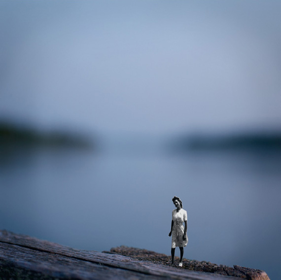
I first saw Angie Buckley’s work published as illustrations for a 2007 article in Tricycle: The Buddhist Review magazine. Although these are fine art images, like much fine art they are used editorially and commercially, which reflects the contemporary bridge between commercial and fine art practices. I immediately responded to her frame-within-a-frame approach and how well the images illustrated the article’s concept about the duality of ego. By taking historic snapshots out of their original context and placing them in another, alternating between negative and positive cutouts, they lose content as well as gain it inside the same frame. By recontextualizing previously framed photographs, Buckley creates images with compounded meanings and explores framing as both an additive and subtractive boundary.
ARTIST STATEMENT
More often than not, we do not know the stories behind the family pictures we find in our attics, leaving us to project our own meaning and history. For me, the use of these vintage images connects the past as an important part of our present. Alongside projections, habits and psychological patterns are passed from one generation to the next. When the self-defeating habits rise to our consciousness, and more important when we act on changing these routines, we can break free from what confines us.
The cutout silhouettes imply the loss of a person who suffers from these blind spots. These silhouettes are the play of photography framing the repeated habits of people in new environments; it is a frame within a frame. Though we don’t see the people whose bodies are removed, we see their gestures and absences. Not only do we naturally perform those gestures, we learn them.
Meanwhile, these newly isolated figures reenter the contemporary world in search of new contexts. These remote figures have accomplished a journey through their dark nights of the soul and now have the capacity to reveal their deeper, truer selves. Once we fully release our past and other collective memories, we can create a stronger sense of place. Dedicating oneself to venture through a vulnerable, lonely path leads to shedding light on the subconscious and conscious voices in our minds. Commitment—to personal growth and healing—is ultimate freedom.

approval, 2010
simultaneous, 2010

nest, 2010.

retrieval, 2010.
IMAGES © ANGIE BUCKLEY, FROM HER SERIES THE STAGES OF RESTORATION.
CIRCULAR CAMERA IMAGES
ELEMENTS
In the beginning of this chapter, I explained that film format denotes the area of even illumination from within the lens’s projected circular image. Essentially, the camera format crops into the inherently circular image before you even frame it. Photographer Sam Wang uses this circle of illumination to create unique imagery using the circular shape. The diagrams here display his cameras, the negative and positive images it produces, and the format that would normally crop into his images. The unique result provides a softer format frame encircling the content which speaks more eloquently to his feelings about his subject.

Much of my work is about discoveries through observation. Without observation there can be no perception, and without perception there can be no art. In my traditional black-and-white work, I built my cameras and have been using them to directly confront my subjects. I hope to give the viewer an intimate dialogue with what the camera captured, under an illusion of objectivity.
As digital tools become mature, I use them extensively also. Some of the methods and processes I use when I am outputting these digital images include very old photographic printing processes that require a great deal of time, labor, and patience. It is interesting to note that such extremely task- and skill-oriented processes seem to complement the fast and powerful hardware and software that we now have. Through my work I hope that the viewer can get a glimpse not at completed art but at the underlying creative process.

PHOTOGRAPHS © SAM WANG, PRINTS FROM TRADITIONAL 4” × 5” NEGATIVES; DIMENSIONS VARIABLE.
RALLY BIKERS
ELEMENTS
Austere, borderless frames that focus our concentration on solitary subjects help us understand this singular group of people who truly own who they are. There is no need for secondary content juxtapositions to inform us, to elevate them, or otherwise distract from their adorned, aging, tanned, and tattooed bodies. Michel LeRoy’s conscious decision to isolate subjects in a frame celebrates the individual, while displaying them within a series refers to their collective identity. Through his direct approach to framing and vantage point, he offers us an open door to understanding people we otherwise might never encounter.
ARTIST STATEMENT
Rally Bikers comprise a spontaneous community of ordinary people defined by common interest. I attend motorcycle rallies and create portraits of riders ranging from 7-year-old kids on 90cc hill climbers, to middle-aged firemen on 1200cc road bikes, to sun-burned grandparents on 1800cc luxury touring marvels. The style is unrelenting black-and-white images that reveal texture and detail beyond the casual glance.
Meeting bikers on the street, in parking lots, or at a car wash, I photograph them in a portable studio to capture that initial moment, the point of simple truth while communal humanity remains in our eyes. The studio removes visual distractions and allows for a more intimate portrait, a brief shared moment to reveal the truth and the façade of identity.
Through portraits of Rally Bikers, I am looking for the significance of the individual in the community that defines them. Biker clichés, based on the notoriety of outlaw motorcycle clubs, do little to describe the other 99% of ordinary people who live for the freedom of open roads, camaraderie, and the love of bikes. The leather, the Kevlar, and the tattoos are trappings of a lifestyle that riders have chosen as an alternative to the everyday obligations of a 9-to-5 weekday existence.
My task was to create a portfolio of images representing the diversity of biker rallies through the people who keep the spirit and legacy of the community alive. The goal is to bring greater attention and understanding to the lifestyles of individuals and their surrogate communities through exhibitions and published books.

PHOTOGRAPHS © MICHEL LEROY, FROM HIS SERIES RALLY BIKERS.


CITYSCAPE PANORAMA PROTECT
ELEMENTS
Photographer T. John Hughes merges two passions—documentary fine art and architecture—into projects that engage a range of audiences. In this project, Hughes specifically chose a panoramic camera format that captures a 90-degree angle of view onto a 2(1/4}” × 9(1/2}” negative. His initial choice for each scene’s contents were based on intensive initial research and knowledge of the city, near-term and long-term plans for the spaces, and wanting places indicative of the built urban environment’s changing landscape over time. He meticulously frames identical compositions by taping outtake transparencies to his camera’s ground glass and using them to align the views every five years, creating a scientific kind of authenticity that unconsidered framing could not. The result is a fascinating study that urges us to thoughtfully consider the nature of change.
ARTIST STATEMENT
The Cityscape Panorama Project is a manifestation of my interests in the built environment, change, downtown Denver, panoramic viewing and the preservation of memory. In 1992 I walked throughout Denver, taking 160 snapshots with the intent to choose a specific number of views to define the city and set the stage to record its fabric and pace of change. These were edited to 40 views that I believed accurately represented the various looks of downtown from attractive to ugly, from humorous to sad, from boring to stimulating. I stepped away from my commercial sensibilities of glamorous light and planned to shoot at various times of day. I kept careful records of each shot, its location and the weather conditions, so that I could return in five years, repeat the shot under similar conditions, and allow for “apples and apples” comparisons.
This project has many facets and implications. Some are about form: lighting, composition, and timing. But the most significant aspects are definitely about content.
Watching the city change tells us about what works and what does not. It makes us think about what should remain and what could change. It is a visual record, in a society with so many organized written records and so few organized visual records.
Showing this work has made me realize that I enjoy projects that appeal not only to my fellow artists but also to people completely removed from the art world. Both seem to be engaged by the photos, spending long periods examining the prints. Finally, I want viewers to think about the value of the “preservation of memory.” It is so easy for us to forget what was on a corner a short while after it has been replaced with something else. The Cityscape Panorama Project helps us retrieve those memories as individuals and as a society.


Union Station.

Platte Valley.
PHOTOGRAPHS © T. JOHN HUGHES, FROM HIS SERIES CITYSCAPE PANORAMA PROJECT.

IMAGE © ANGELA FARIS BELT, DAWN, MAROON BELLS, 2010.
PART 2: BORDERS: THE EXTERIOR EDGES OF THE FRAME
BOUNDARIES ARE ACTUALLY THE MAIN FACTOR IN SPACE, JUST AS THE PRESENT, ANOTHER BOUNDARY, IS THE MAIN FACTOR IN TIME. —EDUARDO CHILLIDA
INTRODUCTION: WHAT PURPOSE DOES A BORDER SERVE?
Even photographers with a practiced sense of framing and composition in-camera might be delayed in realizing that the image border—the transitional space between the frame’s content and its surroundings—has its own significance. Perhaps because it is a boundary space, the image area’s border carries with it all the weight and connotations of any other boundary. It is a demarcated line, whether it’s specifically addressed or not. It’s the point at which viewers enter, rather unconsciously most of the time, the pictorial space. Entering the frame is like opening a book; the quality and attention to the outside cover affect our ideas about its content, prior to our reading a word of it.
As an undergraduate darkroom photography student, I hadn’t thought of a “carrier edge” (not adjusting the easel blades to within the image area) as being anything other than sloppy craftsmanship, until my professor Jack Teemer explained it in reference to his color photographs of children at play. When I asked about the colorful, jaggedly inconsistent border area he said, “I wanted to suggest that this environment continues beyond the frame.” And it did! At their outermost edges were “additional” hints of color and detail that extended each frame. Conceptually, the rough edges also set a tone referencing the underprivileged people and neighborhoods he captured within the frames. At that moment I realized the importance of image borders, and I began to experiment with a variety of darkroom border effects. I started to consider as part of my printmaking decisions the type of border to create (if any) to enhance my images of a particular subject.

IMAGE © JACK TEEMER, FROM HIS SERIES CHILDREN AT PLAY.
Carrier-edge border. With a carrier-edge border, artist Jack Teemer suggested to viewers that the world captured inside the photograph extends beyond the frame. This carrier-edge was created using a standard negative carrier (not filed out) with the easel blades adjusted to outside the image area; the jagged edge is a natural outcome of light refracting between the negative and the interior edge of the negative carrier. (Learn how to control borders in the next section.)
TRADITIONAL DARKROOM BORDERS AND TECHNIQUES
In the traditional darkroom, negative carriers hold film flat between the light source and the paper so the image can be enlarged. The place where the carrier’s inside edge meets the negative is also projected onto the paper and so produces a visual outcome. Because the interior opening of a standard negative carrier is slightly smaller than the image area on film, where they meet creates an inconsistent, jagged border due to light refracting from the inside edge of the carrier (hence, “carrier edge”). Because this printed effect generally isn’t pleasing, photographers use easels (which hold the paper flat) and adjust the blades to crop just inside the visible carrier-edge to produce clean, borderless images. With borderless prints, the image simply ends where the paper’s white space begins; it’s the default method of printing both traditional and digital photographs. In fact it’s so common that most viewers never think about it, which can make prints with borders all the more compelling.
If borderless images sound too plain and you prefer other options, help is on the way! With some simple customizing, your negative carrier allows you to create a wide range of striking image borders. The techniques outlined here are straightforward if you’re familiar with traditional darkroom printing, but if not a little additional research and experimentation might help.
A note to digital photographers: the information in this section is still relevant to your practice because understanding how traditional darkroom borders look helps you replicate them in the digital darkroom. A digital darkroom borders discussion follows the traditional darkroom technical section.
Technical Discussion 2:How to Create Image Borders
This illustration outlines in red the interior dimension of a standard negative carrier in relation to the negative; as you can see, it ends just inside the image area. The larger blue outline shows a typical interior dimension of a “filed out” negative carrier, which allows you more freedom over the types of image borders you can print. You can file out negative carriers by hand, but the process is time consuming and the results aren’t as precise as you might like. Also, hand filing often leaves residual metal burrs, and no matter how minute they are they will irreparably damage your negatives. Instead of going it alone, I recommend outlining the size that you want the carrier enlarged (remember it still must hold the negative on all four sides) and taking it to a local tool and die shop. These experts have the proper tools to modify your carrier to exact dimensions without leaving any sharp edges. Once your carrier is filed out, experiment to see if light refraction bounces into the image area; if it does, then reduce it by using flat black spray paint or black Sharpie marker on the interior edge.

Using a filed-out carrier, you can customize a range of print borders. To aid your endeavor, a four-bladed adjustable easel is an indispensable tool. There are many brands and types of easels, but exacting photographers use easels with four independently adjustable blades because they’re designed to precisely control print sizing, cropping, and borders.
The most common border types are: borderless, fine black line (called a “stroke” in digital photography), carrier edge, and vignetted. I refer to these four borders as “organic” because they are a natural, albeit nurtured, outcome of the interrelationship among the tonal values at the edge of the frame, the interior edge of the carrier, and exposure to light. Think of borders like the adverbs of framing—they modify the already existing frame edge for the purpose of enhancing it. I recommend making work prints with a variety of borders and living with them to help you determine how they reflect on the subject of your images. You can also use specialized glass negative carriers (discussed at the end of this section) to help you control borders, though image quality can be slightly reduced as a result of printing through the glass.
Basic Borders: Borderless and Fine Black Line
BORDERLESS
In the darkroom, the easiest and most common way to print is borderless. To make a borderless print, all you need to do is adjust the easel blades (which hold the paper) to within the image area so that no light refraction from the carrier edge is printed. A borderless print has no demarcated boundary, only a clean transition from inside to outside the frame.

Borderless. Printing with easel blades adjusted to just inside the image area eliminates carrier-edge refraction from the printed area. The resulting pristine border between the image and the paper is a somewhat default method of printing negatives and digital files. The borderless print’s frame edge is inconsequential to the image meaning; since there is no border content, the edges go unconsidered by viewers.
FINE BLACK LINE
The second basic border, and likely the second most popular choice for photographic printing, is a fine black border. It’s made by using a filed-out negative carrier, which allows the film base + fog around the image area to be printed to maximum black. To make a fine black border, simply adjust your easel blades to include some of the clear film area around the image. You can adjust the blades for as wide a black border as you want within the boundary of the carrier edge. Even the finest black line serves to separate the image from the white of the paper, defines the frame edge firmly for viewers, and tacitly indicates an un-cropped image, whether or not it really is.

Fine black border (stroke border). Using a filed-out negative carrier, the easel blades are adjusted to a position just outside image area to include the film base + fog. The width of the black border can be adjusted to any width inside the carrier edge. By creating a black border around the image area, the photographer tacitly points to the boundary of the image, and the viewer more consciously enters the pictorial space.
Carrier-Edge and Film-Edge Borders
Carrier-edge borders can have a smooth or rough edge, with rough edges ranging from slight to extreme. Just like fine black line borders, you can control the width of carrier-edge borders with a four-blade easel. Carrier-edge borders feel handmade, but they walk a fine line between organic and overdone. Where they land depends on their width in relation to the image size, their presence (textural quality) in relation to the image content, and what aspects of the film edge they reveal. There is no standard for making carrier-edge borders, but the more of them you see and make, the better you’ll become at determining whether they enhance or detract from an image.

Rough carrier-edge border. Printed with a negative carrier filed out to the distance you see here. Adjusting easel blades ouside the carrier’s projected light refraction creates an irregular border in the film base + fog area. A variation: Adjust easel blades to outside the area of light refraction of an unfiled carrier. This often creates visually unappealing results, but in cases like Jack Teemer’s color Children at Play images, it can be very interesting.
Film-edge borders are printed using a negative carrier filed out extremely wide, or by using a glass carrier (covered in the next section). Like carrier-edge borders, film-edge borders include film base + fog, but outside that area is a clean edge. Whereas you adjust easel blades to outside the area of light refraction to create a carrier edge, you adjust the easel blades to just inside that refraction to include film base + fog but still maintain a clean edge.

Film-edge border. Printed with a negative carrier filed extremely wide or using a glass negative carrier. Using a four-blade adjustable easel you can easily print a wide area around the film edges and still make a smooth outside border by moving the blades inside the area of light refraction. This allows you to include film sprocket holes, frame numbers, and so on.
Vignetted Borders
In addition to any of the borders that negative carriers allow you to create, you might choose to vignette—to darken or lighten the image gradually toward its edges. Making vignetted borders in the traditional darkroom is easy (and is easily mimicked in the digital darkroom), but like carrier-edge the effect can range from organic to overdone. Where they land depends on the vignette’s density, width, and degree of gradation in relation to the image size and content. To make a dark vignette, simply supplement the overall print exposure to darken the edges by burning them in. The degree of vignette is determined by the duration of the burn’s added exposure as well as the contrast filter used. When a borderless print is vignetted very subtly, the effect is often referred to as a “psychological burn” because while viewers don’t recognize the edges as vignetted, their vision tends to stay within the frame.
Most often, vignetted-edge manipulations carry with them connotations of memory, traveling back in time, or projecting forward to the future. They can also allude to notions of ephemerality, ethereality, and other transitional states. The edges of a vignette should create a smooth visual easing into the pictorial space, encouraging viewers to linger within the image. Vignetting applied to the wrong image content can have an overly sentimental or clichéd feeling, but technique helps you avoid it.
As an alternative form of vignette, some photographers vignette their images to white by dodging them, by blocking some of the exposure to light that the paper receives during the initial exposure. The technique is rather uncommon but can be successful when working with some (in particular high-key) images.
A variation of these techniques is to vignette the border to dark edges while printing the entire sheet of paper to black. To do this, simply make an exposure set to maximum black to the area of photographic paper outside the image area, after the initial image exposure is made. Simply place an opaque board the size of the image on top of the image area, lift the easel blades, and expose the remainder of the paper surface. In the digital darkroom, simply make the canvas size around the image area the size of your printing paper and fill it with black. This technique is often used when you want the entire sheet of photographic printing paper to be regarded as part of the work itself. Often, these prints are displayed “floating” in a frame using spacers (with no window mat), or they are incorporated into a larger piece (this will be discussed in Chapter 6).

IMAGE © ANGELA FARIS BELT, DHARMA IN A PAISLEY FIELD, 2005.
Four border treatments. Clockwise from upper left: borderless, fade-to-white vignette, fade-to-black vignette with paper printed to black, and black vignette border. The various types of vignettes change the feeling and intensity of the image and affect how the viewer reads the image content. Notice that while the dark vignettes serve to keep your eye inside the frame, the white vignette leads your eye outside the frame.
Glass Negative Carriers for Special Film Formats
Standard film format negative carriers are filed out to allow greater control over the appearance of your image borders. But what if you shoot custom image formats or if you want to include the entire film base + fog area around 4” × 5” film (these carriers are hard to file out)? You can buy a glass negative carrier—two sheets of Anti-Newton glass, attached together, which accommodate a larger than 4” × 5” area. They can be expensive, but the special glass prevents the concentric circles that will appear in your prints if you try to use regular glass. When using glass negative carriers, simply place the negative inside and mask it off just outside the area you wish to print using rubylith tape, which is opaque to photo paper but allows you to see through. Then adjust the easel blades to create the borders you want.
Another alternative for nonstandard negative sizes is to make your own carrier out of four-ply black mat board. Measure and cut two pieces of black mat board to fit your enlarger, and cut interior openings that work with your image format. You can make very crisp edges with a mat cutter or make rough cutouts by distressing the interior edges of the mat.

IMAGE © TODD DOBBS, BUILDINGS NO. 12, 2002.
Glass negative carrier. In this example, fine art photographer Todd Dobbs created a traditional darkroom gelatin silver print from a long strip (multiple, overlapping Holga plastic camera exposures) of 120 film placed in a glass negative carrier and masked just inside the image edge with rubylith tape. The resulting clean, pristine border between the image area and the paper is a common way to print standard negative sizes, but it can be difficult to achieve with nonstandard negatives without a glass carrier.
THE DIGITAL REALM: BORDERS WITHOUT FILM
We’ve just looked at print borders produced organically in the traditional darkroom. But what about adding borders to digital prints? Whereas traditional darkroom borders are an organic outcome of the relationship of light to the media, in the digital darkroom no such relationship exists, but that makes the possibilities endless.
In photography’s digital age, adding a film-edge image border necessarily references one or more key notions about the image and its subject (discounting borders made because the photographer “just likes them”). First, the border could be used to harken the viewer back to a particular period in photography’s history. I’m not talking simple nostalgia here; since photography’s existence its various media have produced physical edges that are recognizable when printed. In terms of interpreting photographs, without knowing the vintage of the image, viewers might refer to the time period during which its particular border was most commonly made. Digitally added film-edge borders can also imply that a particular camera type and format was used. For instance, film borders from view camera images have distinct edges, as does Polaroid Type 55 film; and Hasselblad cameras leave small triangular notches of unexposed film at the edge that are visible when printed to a fine black border. All of these things could denote meaningful juxtapositions between the medium and the subject, but not always; the digital realm has undone many former assumptions about how the medium dictates form.
Technical Discussion 3: Digital Image Borders
With digital photographic capture, there is no physical medium extending beyond the frame, so nothing outside the image area to work with. This combined with the darkroom norm led digital photographers to carry on the borderless tradition. But if that’s too limiting for you, the digital realm provides nearly infinite possibilities. Read on.
There are two invaluable online resources for adding image borders: tutorials and templates. Tutorials show you step-by-step how to mimic photographic borders, even those from the traditional realm not made with negatives, such as Polaroid lifts and transfers. These kinds of widely recognized borders are sought after in both fine art and commercial use, and they can be easily replicated by researching the vast number of on-line Adobe Photoshop tutorials in the subject. Just search something like “photo border Photoshop tutorial” in your browser, or use the specific border name, but don’t settle on the first tutorial you find. Like anything else in photography, fabricating borders is a process, so try several tutorials to see which produce the most pleasing effect.
Templates are prefabricated borders that are often supplied with online Photoshop tutorials and are digitally loaded into the image document and set in place. Template borders are either scanned or digitally created and are often made to mimic traditional film borders and Polaroid Type-55 and transfer images. When looking for a download template border, find a large image size (in pixel dimensions) or vector-based options. Vector-based borders can be scaled to any size without a loss in quality and then rasterized (made pixel based, like photographs) once you have them incorporated into your image.
Many template borders are perfect for commercial imagery, but editorial, fine art, and decorative art photographers often want to create and control the appearance of their images, even to the borders. This is where customization comes in. For instance, in the traditional darkroom the carrier edge is unique to each image, and the potential for that same unique-to-each-image character exists in the digital darkroom as well. Because borders in the digital realm are independent entities from the original image, they can be scaled, rotated, distorted, recolored, and so on, providing exponentially more options than are offered in the traditional darkroom. With some understanding and practice with image-editing software tools, you can turn a single template into unique but similar borders for several images in a series. You can scan your own borders from traditional images or even objects, or create them from scratch digitally. The farther from the ease of canned effects and closer to more organic and conceptually sound approaches you get, the more authentic your images become.
Image Discussion 13: A Hybrid Approach to Image Borders
Fine art and editorial portrait photographer Dan Snow was trying to come up with the perfect borders to surround his Portraits series, and he began by mixing traditional and digital techniques. As an expert in traditional darkroom printing, Snow already knew how to create a range of borders, and he knew the general look of the border he envisioned. Although he wanted a rough, organic feel similar to a carrier edge, he didn’t want to simply copy a darkroom border. Because he was shooting digital media, however, he knew he’d have to experiment to come close to something achievable in the darkroom, so he began discussing with his critique group their perceptions of the variations he produced.

Far left: In his initial experiment, he began by painting black brushstrokes on paper. Once dry, he scanned them and using Adobe Photoshop he layered the painted border onto the photographs. In going through the process, he quickly determined that though he liked the uneven quality, the first border was overdone and distracted from the photographs.
Center: Undeterred he began a second experiment by buying some Adobe Photoshop brushes resembling the painterly brushstrokes he was going for. The borders looked far closer to what he intended, but with two problems. First, they were still somewhat distracting from the subject, and, second, removing himself from the creative process by buying the brushes wasn’t what he wanted to do. He tried making his own digital brushes and made prints to evaluate at each stage, but noting suited.
Far right: For his final experiment Snow went back into the darkroom. He used filed-out 4” × 5” negative holders with no negative inside and exposed the carrier-edge refractions onto RC paper; once processed, he made high-resolution scans. In Photoshop he turned the scanned borders into digital brushes and placed them around the images. He then edited the borders so that each was as unique as if it was printed in the darkroom with filed-out carriers—individual, handmade borders that support the images.

IMAGES © DAN SNOW FROM HIS ONGOING PORTRAITS PROJECT.
Borders are not an element of photography on their own, but they are an extension of framing and an aspect of presentation (which will be covered in Chapter 6). Not all photographs need borders; borderless prints are classic for a reason. The best image borders are the ones that feel inseparable from the image. The last thing you want is for viewers to notice overpowering image borders first and then see the image. Borders that distract from rather than enhance images fail in their purpose. From this perspective, less is more.
Research and experimentation are the best ways to determine the types of borders, if any, you want for your photographs. In addition, you can analyze borders you find in commercial and fine art work for aesthetics and potential meaning in reference to the subject or the era of traditional photography from which they came. The process of making a border, then looking at it, then making another, and so on is similar to the process of determining display methods (covered in Chapter 6). It’s most beneficial to actually see the prints with borders (as opposed to on screen or via small contact sheets). Making as many versions as necessary and living with them as work prints will reveal which border is right for your image both visually and conceptually.
CHARTER EXERCISES, PART 2: EXPERIMENTING WITH BORDERS
1. Tear Sheet Discussions
In Chapter 1 I recommended collecting tear sheets. Whether you view images in magazines or online, saving a copy of the ones that really strike you in some way—intellectually, visually, emotionally, or on a gut level—enhances your understanding of photographic language and how to use it. This exercise is best done in the context of a critique group as well. Find two to three images whose borders refer to the form or subject of the images, and bring them in for discussion. Because we can learn as much from failures as we do from successes, you could also discuss images whose borders don’t work, that are unnecessary, or that distract from the image. Be aware of images within series that have identical (“canned”) borders versus those that have customized “variations on a border” throughout the series.
2. Borders Experimentation
Edit to your three best images from the previous chapter exercises. Using the medium of your choice, create two different border effects and apply them both to each of the three images. Critique these images and determine which border effect works best to support your subject and the style of your images, and if the effect needs to be revised in some way. Determine whether this border effect might be used throughout the series of images. You might decide that borderless is the way to go with your images, but it’s difficult to know without looking at alternatives.

IMAGE © ANGELA FARIS BELT, FLOCKING, 2007.
PART 3: MULTIPLE FRAMES TO CREATE A SINGLE IMAGE
WORDS—SO INNOCENT AND POWERLESS AS THEY ARE STANDING IN A DICTIONARY, HOW POTENT THEY BECOME IN THE HANDS OF ONE WHO KNOWS HOW TO COMBINE THEM. —NATHANIEL HAWTHORNE
INTRODUCTION: EXTENDING THE FRAME
The most basic element of photographic image making is the frame, since it’s the first element you encounter when you pick up a camera. The most basic way of using the frame is to make individual photographs, single captures of time and space. Since individual images have such potential for great and lasting communicative and emotive power, what more is there? Well, you can use two, three, or multiple frames to create a single image, which might help you expand your statement about your subject. And why would you choose multiple frames to make a single image? There are several reasons.
First, using multiple frames challenges photographers to conceptualize new ways of creating images. In addition to organizing the individual frames, you now have to organize several of those frames to cohere through gestalt. To successfully combine a group of images into a singular work forces us to previsualize each frame within the multiplicity of frames, their relationship to one another, and the interrelationship among image contents. Additionally, it challenges viewers to understand our subject and the nature of photographic language in a more faceted way.
A second reason to use multiple frames is it allows photographers to extend a camera’s frame format. It lets you include physical space beyond what a single frame can capture, in effect capturing a wider angle of view than the camera’s format could otherwise capture. It also allows digital media users to effectively increase the sensor and megapixel size of the camera.
A third reason to use multiple frames is that it gives photographers the option of representing the passing of time without blurring motion—that is, since each frame is captured separately, there is the opportunity to add, move, and change contents from one frame to the next, affecting interconnection and evolution between frames.
Finally, using multiple frames in the form of montage allows photographers to incorporate historical and other images that expand on their subject, as in recent works by Mark Klett and Byron Wolfe (shown in this chapter’s Portfolio Pages). For commercial photographers, it enables you to “shoot to a layout” provided by advertising art directors. If the director needs a panoramic or square image, you’ll know how to combine frames to achieve it.
This part of the chapter isn’t about multiple exposures or multiple printing techniques (those are more closely related to the element of time covered in Chapter 5). It’s about using multiple frames to create a single image; it’s about ways to extend and add complexity to the way you approach your subject. Think of multiple frames like individual stanzas in a poem: their proximity to one another within a single poem defines each as part of the larger whole; they may be read individually, but to get the full meaning of the poem you have to interpret all of its stanzas together. And like stanzaed poems, multiframe images have distinct “framed” content, each independent of the larger whole; however, only in relation to the other frames (other stanzas) is the image complete. Like stanzas, multiframe image components tend to be of equally measured size for the purpose of structural unity, but that’s in no way a rule because adding frames allows for (and even encourages) creative variation. In this section we’ll discuss some common types of multiframe images and ways to create them.
Originally a term from the field of psychology, gestalt refers to a unified whole. Applied to visual art and perception, gestalt is necessary in making discrete, individual parts act as and be perceived as a single image. There is a great deal of information about gestalt visual principles, and I encourage you to do independent research as you proceed in making multiframe images. There are five basic aspects to gestalt design: similarity, continuation, closure, proximity, and figure/ground. Although they’re all important, one is particularly relevant to making multipanel images work—proximity. Proximity means that separate elements, placed close together spatially, will be perceived as one whole. For example, as viewers we can envision the squares to the left as one larger square, while we see the squares to the right as separate entities, even though the same number of individual squares are arranged in the same amount of space. We still acknowledge that the “single square” is made from distinct parts, which is what gives gestalt images unique communicative power!

Even more powerful, gestalt proximity allows you to construct images from multiple sources as well as from the same scene. The ways in which multiple frame images can expand your statement about your subject will become clear as we go and as you consider your subject within constructs such as multiframe panoramas, contact sheet images, diptychs, and triptychs. Not every technique will suit every subject, but the knowledge will expand your photographic vocabulary, and one technique might emerge as an incomparable way to express something important about your subject.

IMAGE © ANGELA FARIS BELT, WISHBONE STICK, FROM THE SERIES TRACES, 2007.
Gestalt. This simple image uses nearly all aspects of visual gestalt. The frames are in close proximity to one another, so your eye continues through the space between frames to close the wishbone and complete the contents of the scene. Because the strong foreground figure has a similar shape and size on both sides, we recognize it as a continuous entity. Extremely shallow depth of field also helps the figure stand out (more on this in the next chapter). In interpreting these multiple frames, the slightly asymmetrical panel width refers to one side coming out just that far ahead when wishbones are split. Although we visually acknowledge two panels, we mentally construct one image whose meaning relies on two distinct but interconnected images.
You run into them quite often, and they frustrate you every time: a perfect scene with too wide an angle of view to capture with the focal length lens you have. To your advantage you’re shooting digital media. You think about it, and you proceed to make several consecutive exposures from left to right with a plan to put them seamlessly together later. The process can be exacting, and your success depends on how well each image aligns and overlaps. You’re trying to make a panorama—a continuous extensive view, whether composed of a single panoramic frame or several images seamlessly stitched together. Although it was captured that way, the final image has no gestalt parts. With respect to framing (remember, it’s our first photographic element), individual frames seamlessly stitched are no different than a single panoramic frame made with a panoramic camera—in the end they are still read as a single frame. Stitched panoramas do, however, rely on gestalt principles while photographing in order to stitch together succcessfully.
Although it’s helpful to know how to make digitally stitched panoramas, we’ll not spend too much time on them because we really want to discuss methods of using several, clearly distinguishable frames to make gestalt images. The following Technical Discussion describes the process for anyone wanting to extend the width of your frames.
Technical Discussion 4: Stitched Panoramas
One advantage of the digital darkroom is the ease with which several images can be seamlessly “stitched together.” Stitching digital panoramas can be valuable for two reasons: it lets you make wide format images without cropping, and it lets you effectively increase your megapixel capture size.
When you’re capturing the frames to stitch, there are some general guidelines to help ensure success. First, choose a still subject and use a stable tripod. Align each image as carefully as possible and try to maintain a level horizon for each image; the more level the individual images, the more level your stitched image will be. There are tripod heads made specifically for complex panoramic imagery, but with some attention a regular three-way head with bubble levels works perfectly well.

ILLUSTRATION © TOBY COCHRAN.
When making panoramas, be methodical in your approach. Your lens’s angle of view will dictate the degree of rotation for each frame; wide-angle lenses will create more distortion, and normal focal length lenses (best for beginners) will yield a more natural looking result.
Second, maintain an overall exposure for middle gray. Meter the entire scene you wish to capture from side to side, and use a balanced exposure to minimize loss of highlight and shadow detail throughout. Use an aperture that will render adequate depth of field throughout the subject area, and lock in the exposure and focus so that neither one shifts between frames. The more consistent the exposures and focus, the more likely the frames will seamlessly stitch.
Finally, use vertical frame orientation (for horizontal panoramas), and overlap as close to 1/4 of the frame content as possible as you pan across the scene. This makes a more balanced aspect ratio for the resulting panorama, and gives the program enough information on which to base stitching decisions. I highly recommend making a second round of exposures for any panorama; in case of an unexpected exposure change or gap in content, you’ll have the second try to fall back on.

IMAGE © ANGELA FARIS BELT, DAWN, MAROON BELLS, 2010.
21 megapixels to 36 megapixels in less than 10 seconds. I captured these two images to make a square image with a large file. I didn’t use a tripod; I just shot a frame to the left and another to the right, overlapping about one third of the image content (notice the peaks repeated in both frames). I also maintained the same focus distance and exposure. Although I didn’t quite double my camera’s megapixel size (because of overlapping content), the increase I did get was well worth it. I stitched them together using Adobe Photoshop’s automated Photomerge function. The Help menu in Adobe Lightroom or Photoshop will easily guide you through the stitching process.
Multiframe Panoramas
Multiframe panoramas, what I call gestalt panoramas, are panoramic images with recognizable components. They’re made in much the same way as stitched panoramas, but rather than negating the individual frames by stitching you use them in proximity to one another. This is where gestalt comes into play. If there is too much space between frames in the final image, they will be read as separate entities; if proximity or other gestalt principles bridge the individual frames, then the space between them can vary and there can even be repeated content in separate frames. But too much repeated content makes it difficult for the viewer’s eye to continue from one frame to the next. Worse, gaps in content, even small ones, can stop viewers at the point where continuity ends. With any multiframe image I recommend making more than one attempt at capturing the scene (in other words, hedge your bets), because you can’t see the finished product until you construct it afterward.
When making gestalt panoramas, some of the same stitched panorama technical considerations still apply. They aren’t always necessary, but they’re an advisable starting point until you understand how gestalt works and become more adventurous in your constructions. Using a tripod still increases your likelihood of success by giving you time to align each frame as carefully as possible. Maintaining a level horizon for each image and maintaining similar content at the top and bottom of each frame also helps, but the advantage to gestalt is that you don’t have to. Also, maintaining an overall exposure for middle gray to minimize loss of highlight and shadow detail throughout the scene gives you more latitude to “mix it up” in the traditional or digital darkroom. For standard multipanel panoramas, the more consistent the exposures, the more seamless the gestalt effect will be.

IMAGE © ANGELA FARIS BELT, WYOMING PLATEAU, JUNE 2006.
Multipanelpanorama with horizontal camera orientation. This six-panel panorama was made on my first expedition into Wyoming. The view was so expansive and so foreign to me that I wanted to make a panoramic image of it. I placed my camera on a tripod and leveled it for each frame using the circular bubble level on the tripod head. I paid attention to what was in the far right edge of each frame, being careful to repeat that element only slightly in the far left side of the next frame as I panned across. The slight repetition of content from frame to frame provides visual continuity so the six images are easily read as one. Although panoramas tend to have a more pleasing height-to-width ratio when you orient the camera against the direction of panning, in this case the opposite approach best represented the feeling of the place.

IMAGE © DAVID HILLIARD, TEPID. 2010.
Multiple frames and passing time. You don’t have to stick to still subjects to make multipanel images. There is boundless potential for interpreting time’s passage, as this image by David Hilliard demonstrates. In this scene, the image content changes from the far left image to the central image it references; we can experience a sense of time passing during the ritual bath because the child’s reflection counters his position in the next frame. The close proximity between frames allows us to mentally construct a single panoramic scene.
Multiframe Overlapped Panoramas
Another way to construct multiframe panoramas is to overlap frames wherever primary content intersects. You can collage separate prints onto another substrate, or you can montage overlapped frames printed on the same piece of paper (my preferred method) in the traditional or digital darkroom. Overlapped content means there is no space between the images, yet they are still not seamlessly stitched. Often small elements are repeated where the frames overlap. You can choose to make the top and bottom of the image align by cropping all frames evenly, or you can maintain the unevenness of the panorama. Both methods of frame alignment add texture and complexity. Remember, content doesn’t have to align exactly (that’s part of the appeal); it only has to proximally align.
Image Discussion 14: Two Panoramas
Multiframe Overlapped Panorama with Borders
This panorama is made from nine separate frames, captured from my deck on a particularly beautiful snowy Colorado morning. I wanted a high megapixel file that I could print very large, so I used multiple frames and stitched them together in Photoshop. I don’t care for the telltale borders created by stitching programs—they tend to be very jagged and somewhat warped—but I did respond to how their unevenness related to the textures of the scene, so I modified each frame’s height and left them uneven but with less jagged edges. I avoided aligning the spacing between “frames” at the top and bottom to energize the borders. The effect adds interest to the panorama while maintaining a seamless interior frame.

IMAGE © ANGELA FARIS BELT, DAWN LIGHT AFTER BLIZZARD. VIEW FROM MY DECK. COLORADO FRONT RANGE, 2008.
Multiframe Overlapped Panorama with Seams
This panorama was made on the same snowy day as the previous one, after a storm hit full-force. I wanted to capture the avalanche conditions behind my home, so I decided to shoot a panorama flanked by hints of the house and shed. The center of the image had a dramatic arc that felt too empty, so I copied partial frames down to fill the space. It not only added content to balance the frame but also elongated the trees. This panorama differs most from the previous one in that the individual frames are easily recognized within the larger frame, adding even more complexity to the image.
When you’re working within a larger series of images, it helps to have several images that utilize the same (or similar) image constructions. This keeps them from being read as anomalies within the rest of the group and reinforces the use of the technique. Although these were personal images, I still wanted to use a similar approach to each because they each told a part of the same story.

IMAGE © ANGELA FARIS BELT, AVALANCHE LOOMING, POST-BLIZZARD, VIEW FROM BACK ENTRYWAY, COLORADO FRONT RANGE, 2008.
You don’t necessarily have to capture several frames in order to create a gestalt image; you can also divide a single capture into multiple frames and rearrange them. In this image, I saw hundreds of birds flocking, preparing for winter migration. The scene was loud and frenzied; I just had to make photographs. I edited to two images and cropped one into a wide horizontal to follow the flow of dense trees and shadows surrounding the bright cornfield.

IMAGES © ANGELA FARIS BELT, FLOCKING, 2006–2007.
After evaluating the panoramic crop, I chose a slightly different edit with more birds and decided to crop it into four separate frames, symmetrically aligned. The multipanel image is the final version I made; I felt it best represented the scene by underscoring its organized chaos and reflecting the rhythm and energy of the migrating birds.
Contact Sheet Images
We’ve discussed contact sheets as invaluable editing tools that also allow us to analyze our shooting process, but what else could they offer? Well, as prints they have a life of their own, and their distinctive appearance (including media borders and the space between frames) has prompted some photographers to use the contact sheet’s unique multiframe format to make gestalt images. Contact sheets—prints with images the same size as the negatives—originated from traditional darkroom practices as a means of editing tonally reversed exposures. They can be printed with as many frames as will fit onto larger sheets of photo paper. Since they allow us to see many positive images in close proximity to one another, they open the door for creative use of gestalt.
Like most other multiframe images, each frame comprising it is captured separately, allowing you to create relationships and construct images that are entirely different than a single image of the scene. For instance, you can shoot some content out of focus to mimic depth of field wherever you like, you can change vantage point between frames, you can blur some frames and not others, and you can add, move, and remove content between frames. The possibilities are almost limitless, and that makes the photographic challenge more exciting!
Because contact sheets allow us to see and compare the multiplicity of images within them, we can consciously engineer the organization of images to cohere through gestalt. Simply by knowing the number of frames a particular contact sheet will hold horizontally and vertically, as well as their printed orientation, you can preplan each frame as you shoot. Film needs to be shot in sequence, so the process is less forgiving than with digital media, but the appearance of the film-edge borders running throughout are worth it. (For examples, see Thomas Kellner’s amazingly complex film-based contact sheet images in this chapter’s Portfolio Pages.)
Although digital contact sheets lose the characteristic film-edge borders surrounding the images, they do offer one distinct advantage: they allow you to configure the sheet with as many or as few rows and columns as you like. You’re not constrained to the length of a roll of film, and you can shoot more frames than necessary (like bracketing, to hedge your bets) and include only those that work well in the contact sheet. And if you want film-edge borders, you can always scan film strips to layer with the file or drop your digital frames into a scanned traditional contact sheet.
Technical Discussion 5: Making Contact Sheet Images
Gestalt contact sheet images are an interesting way to approach many subjects, and they also provide a direct reference to the history of the photographic medium. Making successful contact sheet images can be difficult, so it takes a good deal of planning prior to shooting. The following tips will help you along.
First, the medium. If you’re using traditional film, be sure to know its orientation and the direction it advances inside the camera. Also, determine how the film fits into its designated sleeves (rows and columns, inserted vertically or horizontally), or plan to hand-place your negatives under glass in a specific configuration for printing. If you’re using digital media, predetermine how many rows and columns of frames you want in the final piece, and shoot for that configuration. You can make contact sheets through Adobe Photoshop or Lightroom in a few simple steps through their automated functions (see the program’s Help menu). Be sure to name your files such that they’re placed in order when the automated function runs. Digitally you can make contact sheets with black, white, or color backgrounds and with or without file text identification. You can also use layers to manually place the images onto a separate digital canvas.
Second, the visuals. Making a preliminary sketch that matches general content to the number of rows and columns you want in the final piece will help you organize your thoughts and provide a reference while shooting. Contact sheet images work best when they’re previsualized.
Third, the technical stuff. Before you begin shooting, determine proper exposure by metering an average (middle-gray) part of the scene or using an incident-light meter, and keep your exposure the same throughout the contact sheet regardless of your camera meter’s changes between frames; otherwise your gestalt image won’t have consistent density. Zone-focus and keep your focus point at the same distance (turn off auto-focus) if you want your image focus similar to a single capture.
Once you choose your subject and camera position, do a dry run by panning the camera sequentially from side to side, row by row. Consider your distance from your subject, because a common reason for failed contact sheet images is too much distance from the subject matter. You should only see a small part of the larger whole in each frame, so move in close or use a longer focal length lens.
Finally, remember that you can choose a fixed vantage point or you can vary it. For a fixed perspective use a tripod, for a varied perspective you might not need one. If you want to draw attention to content in specific frames, then change focus to capture other frames at varying degrees of soft focus (mimicking shallow depth of field). Also remember you can change your distance from your subject between each frame; what might those things help you to communicate about your subject? Above all, experiment and have fun!
Following is a great example of what can be done with a contact sheet or any grid-type configuration used to make a multiframe image. Be open to any means of combining images to make a unique statement about your subject.

IMAGE © JASON LAVERIS, STACEY PLOTT, 2000.
Contact sheet image. This comparative image by Jason LaVeris was designed by envisioning the contact sheet divided into seven distinct scenes, and shooting to that format. This inventive concept allowed his friend and collaborator Stacey to show off the well-planned pieces of her extensive wardrobe in a unique way. To create the gestalt image, Jason captured five frames of Stacey from her head to her toes (far left). She then changed outfits, returned to the same spot, and they repeated the process six more times, taking care to maintain similar content across the rows. The result is a kind of typology and a whimsical look at an equally whimsical model.
As we discussed in the first part of the chapter, juxtaposition creates meaning through the relationship and interaction among discrete contents. To reference written language again, when juxtaposition occurs inside a frame, it’s similar to a “complex sentence,” rather than a “simple” one. You can take this complexity a step further by juxtaposing one frame’s content across its borders and into another frame, like the interaction between two complex sentences. Diptychs (two images arranged in proximity) and triptychs (three images arranged in proximity) offer one way to do just that. A terrific example is fine art photographer Dan Estabrook’s Untitled Twins, Joined, discussed in the beginning of Chapter 1. (I recommend taking a moment to reread Image Discussion 1, “Interpreting Subject by Examining Content and Form”). His use of the diptych format juxtaposed two men, one whose hand seems to be reaching out of his frame and into the other. Diptychs like these create connotative meanings beyond what can be accomplished in a single frame.
Diptychs and triptychs differ from other types of multiframe images in that their content does not connect panoramically. One frame’s content isn’t continued into the next; rather, two or three discrete frames of content are placed in proximity to one another to indicate that they create a combined meaning.
The creative and communicative advantage offered by these and all gestalt images is that there are different frames, each captured with individual exposures at individual times. Armed with this knowledge, you can create even more interesting images by conceptualizing simulated depth of field (shooting strategically placed frames of secondary content slightly out of focus); by changing the frame orientation or crop between each image (who says all the images have to be vertical or horizontal?); and by varying density, color, and contrast (who says they all have to match?) to make truly unique images that work as a whole. You can even incorporate images from other times and places into them.

IMAGE © MELISSA MERCADO, #4 FROM HER SERIES AT REST, 2006.
Diptych with vignetted borders. Photographer Melissa Mercado encapsulates her diptychs from this series within heavily vignetted borders. Combining traditional and digital media, Mercado uses the vignette to simultaneously isolate and bind the disparate images, forcing us to consider each one prior to considering the larger meaning they suggest together. The opera glass-like feeling provides a tunnel through time and suggests a relationship between the people in the historic image and the tombstone image placed beside them.

IMAGE © JOE LAVINE, 2007.
Juxtaposition between frames in multiframe images. This dual-panel image operates as a diptych because of the dramatic difference in color from one panel to the next, even though at first glance one assumes the horizon is a continuous (panoramic) one. The approach allows photographer Joe Lavine to create a disjointed landscape, making the message of toxicity within “pristine” farmland more visceral.
There are innumerable ways to combine several images into a single piece; the idea is to think about how multiple images might communicate about your subject specifically and what using multiple frames will allow you to accomplish that using a single frame could not. Experiment, practice, be open to conceptual implications, and be sure to notice all of the multiple frames around you. We discussed several ways to make gestalt images with individual frames, but don’t stop here. Expand your creative vocabulary and innovate with your own unique use of gestalt.
CHAPTER EXERCISES, PART 3: A FACETED APPROACH TO YOUR SUBJECT
These exercises will help you take your adventures in framing one step further by using multiple frames to communicate about your chosen subject. Take a no-holds-barred approach to conceptualizing and creating these images, in particular when it comes to unique ways to make several frames interact. Research and problem-solve to overcome any technical hurdles you might encounter so you can make your images exactly the way you want them.
1. Multipanel Panoramic Images
Make a series of photographs in a row with the intention of printing them as a multipanel panorama. Determine how many frames will create the image you envision, and plan it from left to right or top to bottom. Remember to keep your focus distance and exposure consistent throughout all images in the panorama. You may or may not use a tripod, but you’ll have more control with one. If you’re shooting film, remember the size constraint of your enlarger; for instance, a 4 × 5 enlarger can accommodate a panoramic image of three horizontal 35 mm frames using a handmade or glass negative carrier. Or, you could print each frame individually and physically arrange them afterward by window matting or dry mounting.
For this exercise, use the format of your contact sheet to create an image. Consider what the format—the number and configuration of frames and space between them—of a contact sheet can add to a viewer’s perception of your subject.
Shoot each frame deliberately, so that when they are printed together as a contact sheet, the resulting gestalt image represents the unified whole that you had envisioned. Making a successful contact sheet image can be easier said than done, because everything has to be meticulously planned to be successful; one incorrect frame and the entire piece could fall apart. See the tips included earlier in this chapter for help. When using traditional film, be sure to cut your negatives in the right place, because once you cut them there’s no reconnecting them.
3. Incorporating Other Images
In this exercise, think about using images you have previously made or found imagery of any kind (maps, snapshots, antique-store photos, magazine ads, etc.) and build on them to broaden your statement about your subject. You could rephotograph the images, or you could use an original, one-of-a-kind image. You may choose to collage or montage; you can tear, cut, slice, recolor, and resize. Anything goes, really.
Concentrate on combining any other imagery with your new imagery to expand on concepts surrounding your subject. You might look through this and other chapters’ Portfolio Pages first to help you conceptualize. This exercise provides a unique take on multiple frames because many photographers don’t want to appropriate someone else’s imagery into their own. Suffice it to say that even if you don’t emerge from this exercise with a portfolio piece, you will have expanded your vocabulary about recontextualizing images.
With each chapter, continue conducting independent research about your subject, and keep pushing your creative boundaries. You might even add to these exercises making diptychs or triptychs, or any other multiframe construct you can think of. Remember, not every image you make is going to be a masterpiece, but the journey you take in making it is where the lessons are.
The photographer-artists represented in these Portfolio Pages all use more than one image to piece together a more faceted view of their subjects than any single image could provide. Their images defy the hold of time over single captures to create significant visual and conceptual references to their subjects. Their work isn’t about multiple frames; however, their meanings are intrinsic to the physical interrelationship or interconnectedness among the frames.
To create their images, these photographers use the range from film to digital and combined media to suit their specific needs. This is not a Photoshop textbook; it’s a book about photographic language and using the camera as the means of interpreting the world. But using layers in the digital darkroom allows for mimicking certain camera effects, and as such it is a viable substitute (at times even a necessary substitute) to add historical and other types of imagery. The artists in these Portfolio Pages use all of these techniques and more. They should inspire ideas and discussion regarding the use of multiple frames and should whet your appetite for multiframe possibilities.
YOSEMITE IN TIME
ELEMENTS
Through an intensive process of research, photography, exacting rephotography, and incorporation of historic images, Mark Klett and Byron Wolfe have broken through the temporal barrier separating past from present. By combining multiple frames in a single image, they juxtapose some of the first photographs of the American West with their own contemporary images of the same physical space. The result allows us to compare and contrast the effects of time while documenting change in specific environments.
ARTIST STATEMENT
We began our collaboration as a way of sharing ideas about time and change and to examine the ways we had developed personal relationships with place. Working together we began with 19th-century landscape photographs of the American West and made rephotographs from the same locations as the initial starting point for what became an extended form of visual research that combined historical images with scenes from the same location. By relocating the vantage points of historic photographs and embedding them into contemporary panoramas made of the contemporary view, the composite images revealed aesthetic decisions of photographers in both centuries.
The pictures also clarified how the basic physical reality of the world is often quite different from what is suggested within the borders of an original photograph. Such comparative techniques are especially complex in Yosemite National Park, a landscape filled with many iconic photographs that helped define photography as an art form. Assembled as single, all-encompassing views containing historic images by photographers such as Carleton Watkins, Eadweard Muybridge, Edward Weston, and Ansel Adams, these multidimensional composites led us to consider a form of stratigraphic layering of physical and cultural changes across time and space.

View from the handrail at Glacier Point overlook, connecting views from Ansel Adams to Carleton Watkins, 2003. Left inset: Ansel Adams, c. 1935. (Courtesy the Center for Creative Photography, University of Arizona.) Right inset: Carleton E. Watkins, 1861. (Courtesy the Center for Creative Photography, University of Arizona.)

Four views from four times and one shoreline, Lake Tenaya, 2002. Back panels: Swatting high-country mosquitoes, 2002. Left inset: Eadweard Muybridge, 1872. (Courtesy the Bancroft Library, University of California, Berkeley.) Center and right insets: Ansel Adams, c. 1942; Edward Weston, 1937. (Both courtesy the Center for Creative Photography, University of Arizona.)

Panorama from Sentinel Dome connecting three views by Carleton Watkins, 2003. Left to right insets: From the Sentinel Dome, Down the Valley, Yosemite, 1865–1866; Yosemite Falls from the Sentinel Dome, 1865–1866; The Domes, from the Sentinel Dome, 1865–1866. (All courtesy Fraenkel Gallery.)

Panorama from Timothy O’Sullivan’s 1872 Canyons of Lodore, Dinosaur National Monument, Colorado, 2000. Inset: Timothy O’Sullivan, 1868. (Courtesy U.S. Geological Survey.)
IMAGES © MARK KLETT AND BYRON WOLFE FROM YOSEMITE IN TIME; LARGE-FORMAT PIGMENT PRINTS.
SEEKING PERFECTION: TRADITIONAL APPLE GROWING IN JAPAN
ELEMENTS
Jane Alden Stevens carefully composes square and panoramic format images, then juxtaposes them to create complex statements. The resulting layouts are as classically measured as the traditional Japanese apple growing practices she documents. Significantly, Stevens arranges images within the borders of each page with austerity, paying specific attention to sequencing within and between pages. Her methods tell the story in a style reflective of her subject, while beckoning us to consider the larger meanings created by the interrelationship among the images.
ARTIST STATEMENT
Growing apples in the traditional way is a laborious, hands-on process in Japan. At the moment of harvest, an apple raised in this manner has been touched by the farmer’s hands at least ten times since its blossom was set. This includes picking off unwanted flower buds, hand-pollinating the blossoms, pruning the branches, covering individual fruit in colorful bags, hand-culling imperfect fruit, hand-turning them to ensure even coloring, and, in some cases, affixing stencils to the apples.
This approach to raising fruit is slowly disappearing. When asked why fewer apples are being bagged now than 15 years ago, the farmers will hold up their hands in front of them and say, “There are simply not enough hands!” This is a reflection of the lack of migrant workers in Japan, as well as the desire of young people to move off the farms and find work in the cities.
Over the course of two growing seasons, I photographed this process on the apple farms in Aomori Prefecture. The resulting body of work is a meditation on the time, care, and attention that farmers using this method lavish on their orchards. Speaking to a tradition that is becoming increasingly marginalized, these photographs preserve for future generations a memory of the agricultural past.

Bagging Apples in June, Aomori Prefecture.

Culled Apples, Aomori Prefecture.

Hand-Pollination of Blossoms in Spring, Aomori Prefecture.

Stencils on Apples in Autumn, Aomori Prefecture.

Apples After Inner Bags are Removed, Aomori Prefecture.
PHOTOGRAPHS © JANE ALDEN STEVENS, FROM HER SERIES SEEKING PERFECTION: TRADITIONAL APPLE GROWING IN JAPAN; ARCHIVAL PIGMENT PRINTS ON WATERCOLOR PAPER, 22” © 17”.
PANORAMIC PHOTOGRAPHS
ELEMENTS
David Hilliard creates large-scale, multipanel color photographs based on his experiences and the lives of people around him. Although the contents of his images are personal and unique to his experience, his subject is universal—interpersonal relationships and simple, daily existence. His panoramas direct the viewer’s gaze across the gestalt image, while allowing narrative, time, and space to unfold frame by frame.
ARTIST STATEMENT
For me, the construction of panoramic photographs, composed of various single images, acts as a visual language. Focal planes shift, panel by panel. This sequencing of photographs and shifting of depth of field allows me the luxury of guiding the viewers across the photograph, directing their eyes; an effect that could not be achieved through a single image. The idea of “time” is also called into question, as the single moment is fractured and perhaps sped up or slowed down. For years I have been actively documenting my life and the lives of those around me, recording events and attempting to create order in a sometimes chaotic world. While my photographs focus on the personal, the familiar, and the simply ordinary, the work strikes a balance between autobiography and fiction. Within the photographs physical distance is often manipulated to represent emotional distance. The casual glances people share can take on a deeper significance, and what initially appears subjective and intimate is quite often a commentary on the larger contours of life. I continually aspire to represent the spaces we inhabit, the relationships we create, and the objects with which we surround ourselves. I hope the messages the photographs deliver speak to the personal as well as the universal experience. I find the enduring power and the sheer ability of a photograph to express a thought, a moment, or an idea to be the most powerful expression of myself, both as an artist and as an individual.

Lickety Split, 2008.

Boys Tethered, 2008.

Bleeder, 2008M.
IMAGES © DAVID HILLIARD; ARCHIVAL PIGMENT PRINTS, DIMENSIONS VARY.
UTOPIC
ELEMENTS
Brilliant color, vertical framing, and ironic whimsy first caught my attention in Jason DeMarte’s work. Each frame isolates its own contents, but only until juxtaposed with another frame; with no space separating them, their interconnection is unavoidable. Using both vertical and horizontal frame orientation and varying dimensions within each diptych, DeMarte converts banal and humorous scenes into complex and serious images about the environment, its nonhuman creatures, and our perceptions of them.
ARTIST STATEMENT
Utopic investigates how our modern-day interpretation of the natural world compares to the way we approach our immediate consumer environment. I am interested in modes of representing the natural world through events and objects that have been fabricated or taken out of context. This unnatural experience of the so-called natural world is reflected in the way we, as modern consumers, ingest products. What becomes clear is that the closer we come to mimicking the natural world, the farther away we separate ourselves from it.
I work digitally, combining images of fabricated and artificial flora and fauna with graphic elements and commercially produced products such as processed food, domestic goods, and pharmaceutical products. I look at how these seemingly unrelated and absurd groupings and composites begin to address attitudes and understandings of the contemporary experience. I represent the natural world through completely unnatural elements to speak metaphorically and symbolically of our mental separation from what is “real” and compare and contrast this with the consumer world we surround ourselves with as a consequence.


Buck Shot, 2006.

Shopping Season, 2007.
IMAGES © JASON DEMARTE, FROM HIS SERIES UTOPIC; ARCHIVAL PIGMENT PRINTS, DIMENSIONS VARY.
COLOR FALLS DOWN
ELEMENTS
Although my own cultural experience initially drew me to Priya Kambli’s work, the intensity with which she saw and juxtaposed images drew me to consider her uniquely Indian cultural experience. By relating color, content and form across frame boundaries, she helps us understand the dilemmas facing nearly all immigrants trying to embrace the American way of life while simultaneously honoring their own cultural identity.
ARTIST STATEMENT
My photographs visually express the notion of transience and split cultural identity caused by the act of migration. Recently in my artwork I have been viewing this issue through the lens of my own personal history and cultural identity. My move from India to the United States 13 years ago left me feeling that I do not belong fully to either culture, leaving me unable to anchor myself in any particular cultural framework. This disconnection from both cultures has changed the way I perceive myself by forming a hybrid identity, a patching together of two cultures within one person. Photography has been a way of bridging the gap between the two cultures while coming to terms with my dual nature. Ironically, because photography appears to be true, it allows me to create convincing fictional depictions of my new identity. My digital photographs reflect the tension caused by the duality by piecing together fragmented images and by mingling family snapshots with carefully staged imagery.

Me (Red), 2008.

Me (Tonka and Turmeric), 2008.

Muma (Turmeric), 2008.

Muma and Me (Cast Shadows), 2008.

Muma and Me (Gold Earrings), 2008.
IMAGES © PRIYA KAMBLI, FROM HER SERIES COLOR FALLS DOWN; ARCHIVAL PIGMENT PRINTS.
CONTACT SHEET IMAGES
ELEMENTS
I first saw one of Thomas Kellner’s contact sheet images in a magazine in 1998; it made such an impression that I still remember it today—London’s Big Ben clock tower. I was drawn to the relevance of the filmstrips printed in full, especially as the dawning of photography’s digital age was at hand. And I was impressed by the degree of advance planning and on-location engineering needed to make these complex contact sheets work. The continuity of his images—their gestalt power—comes from two things: proximity and alignment of vertical contents throughout the image. Kellner can tilt the camera any number of ways between frames and the image will cohere because the vertical aspects provide continuity from the contact sheet’s first row to its last. The images allow us to experience some of the world’s most famous architecture in reference to the countless minute parts that combine to form their structures and aesthetics.
ARTIST STATEMENT
My work has been titled in very different ways in the past years. Usually I go back to its basic technical description: contact sheets. Some have called my work deconstructive, others collage, de-collage, or montage; some say it is architectural photography—no and yes; only the subject is architecture. In a time where everyone turns to digital photography (some have not even used film in their life at all), “index prints” might be the more contemporary description, but I still use film and I use every image on the roll. If I shoot on one frame, the final size of the print is 20 × 24 cm; if I use 36 frames, the print is 100 × 120 cm. And because the single frames are all shot in sequence, I simply cut the strips, mount them together, and make a contact print.
I began creating multiple image reconstructions using an 11-pinhole-camera and one with 19 pinholes made for the whole length of a 35 mm roll of film. I learned to collage on the negatives by shooting different objects or moving the camera in between each shot. This I still do today when I shoot architecture—each frame is a single shot and each shot I tilt the camera differently.
But it all starts with choosing the object and finding the right time of day and weather (everything is shot with the same exposure time and aperture). Then I decide the final size of the image through the number of frames I am going to use. I already know how many frames there will be and I have to divide the images into this number of frames by finding the right focal length. I use a scale on my tripod to match all the vertical lines to line up precisely. Shooting can take anywhere between 30 minutes and five hours, depending on the size of the image.

40#11 New York, Lower Manhattan Skyline. 2003.
IMAGES © THOMAS KELLNER; LIMITED EDITION C-PRINTS, DIMENSIONS VARY.

41#05 Washington, Lincoln Memorial, 2004.

51#01 Houston, Texas Refinery, 2006.

42#16 San Francisco, Afternoon at Golden Gate Bridge, 2004.
IMAGES © THOMAS KELLNER; LIMITED EDITION C-PRINTS, DIMENSIONS VARY.
DAY’S END
ELEMENTS
Mark Eshbaugh uses multiple frames in a wholly unique way. His method includes designing and constructing cameras that hold several rolls of stacked film so that exposure extends through the medium’s edges. At these edges we see the slight curl of the film, light refraction, and other artifacts of how a single camera serves to frame multiple rolls simultaneously. Whereas one frame usually suggests an encapsulated piece of the world, these frames suggest that the world extends only as far as the camera format and film do. Alternately, while his diptych and triptych images suggest continuous scenes, in fact they are carefully arranged multiframe images of different scenes, which reflect his concepts and his process itself.
ARTIST STATEMENT
My continual experimentation with different cameras and different film formats has eventually led to the creation of my own unique camera that I use today, which shoots multiple rolls at once. Through dedication to experimentation, my images are works of art that incorporate the medium they’re composed in.
The fractured imagery reminds us of the limitations of the medium and the limitations of our own memories. We cannot capture a complete moment of time with a photograph, just as we can never remember a complete moment of time accurately. Humans can only remember bits and pieces of a moment, and as time moves on, biases and changed perspectives cloud that vision. Each fractured pane exists in a paradox of harmony and conflict. One moment the pieces are working together to create a whole image; the next moment the pieces are fighting one another, trying to capture your full attention.

Outside of Tahoe, From The Mural Series, 2007; 30” × 46”.

Triptych (Chelmsford, MA) from the series Day’s End.

Diptych (left: Savannah, Georgia; right: Carlisle, Massachusetts) from the series Day’s End.
IMAGES © MARK ESHBAUGH; CHROMOGENIC CONTACT SHEET IMAGE AND MULTIPLE SELECTIVE TONED SILVER PRINTS, DIMENSIONS VARY.
CELL PHONE MOSAICS IN THE PROJECT “JIM RIVER”
ELEMENTS
As one who always has a cell phone by my side, I can honestly say that I treasure its ability to capture photographs. The world-wide abundance of cell phones has ushered in a new era remarkable for its proliferation of pictures, although few photographers have embraced it as a mode of serious practice. But Roddy MacInnes has, and he not only uses the ease with which this technology allows a multiplicity of images, he counters and questions it through his choice of nontechnological subject matter. Employing the cell phone camera’s ubiquity, he makes multiple images of the same or related subjects and combines them into elaborate multipanel grids. In doing so he blurs the line between the uniqueness of contents within individual frames, and broadens the way we think about this technology’s resulting images.
ARTIST STATEMENT
I began using a cell phone camera while working on a project in North Dakota. The project was inspired by two albums of photographs I purchased at an antiques mall in Wheatridge, Colorado. It turned out that a North Dakota woman, Nina Weiste, made the photographs in 1917. The more I looked at the people and places in her pictures, the more I felt connected to Nina and to North Dakota. When I arrived in North Dakota for the first time, it felt as though I was coming home. Using a variety of photographic media, the project attempts to generate conversation on the relevance of photographs in the construction of identity. The introduction of roll film toward the end of the 19th century by George Eastman made photography accessible to Nina Weiste. In 1917, she represented the first generation of ordinary Americans to keep a photographic record of their lives. Celebrating the cell phone camera as representing a further paradigm shift in the evolution of photography offered a new medium through which I could connect with Nina’s world. I also had a novel way to add variety to the project.

Camo’, Aberdeen, South Dakota.

Hands, North Dakota and Colorado.

Hay Bales, Ellendale, North Dakota.
IMAGES © RODDY MACINNES, FROM HIS SERIES CELL PHONE MOSAICS, 2010; ARCHIVAL PIGMENT PRINTS, 30″ × 30″.
PATHETICA AND NINE SYMPTOMS
ELEMENTS
Usually associated with his combined use of historic photographic processes and drawing, Dan Estabrook also works on a higher level using photographic language. His process combines with form and content to create meaning, perhaps best illustrated in his diptychs and grid images. Estabrook’s diptychs pair original paper negatives alongside their resulting positive prints, binding his subject and process, and providing a logical platform to mirror contrasting words as well. Like photographic processes themselves, Estabrook’s images reflect the human condition as a chemical and physical process subject to the elements, time, and one another.
ARTIST STATEMENT
It is the alchemy that moves me. The first photographs, just baby steps from drawing, exist for me in an ideal transitional state between the rational world of the machine and the more human world of the hand. The base materials of these processes—paper, silver, and salt—are for me invitations to transform my photographs, to draw or paint or cut, acting willfully on the object in an attempt to cross the divide between the past and the present, and between the real and the absurd.
Early photographers even sought to correct by hand the technical limitations of their new art, and over time it is their handwork that seems to tell the real story: a rose-tinted cheek is now brighter than the faded face it once enlivened. In combining the handmade image with the magic of the machine, my “corrections” and reimaginings can begin to tell a tale of their own—a braid turns to rope, the shadows are false, and a painted sea doesn’t quite hide what it should.
The old photographs that inspire me—especially those lost, without name or history—have a way of seeming less real yet more revealing, as though the passage of time could simultaneously obscure meaning and expose truth. Even the dust, decay, and stains of an old print appear almost legible: they are time’s own language, written on the skin and bones of paper, tin, and glass.
Using 19th-century techniques and celebrating their flaws and failures, I make seemingly anonymous photographs in order to reimagine a more personal history of photography, seen from a 21st-century perspective. With these processes, I can create my own “found photos”—highly personal objects in which to hide my own secrets and stories. I am not interested simply in recreating the past; instead I wish to make contemporary work inspired by the ever-growing gap between what we know of the past and how we understand the present.

Nine Symptoms no. 5: Fever, 2004; salt print with ink, 14” × 11”.

9 Symptoms; grid view.

Breath (Lying), 2004; pencil on waxed calotype negative, and platinum-toned salt print (diptych), 8” × 10” each.

Forever & Never, 2003. Pencil on calotype negative, and salt print (diptych), 5” × 7” each.
IMAGES © DAN ESTABROOK, FROM HIS SERIES PATHETICA; MIXED MEDIA, DIMENSIONS VARIABLE.
CONTEMPLATING PEACE
ELEMENTS
Fine art photographer Katharine Kreisher’s work has many of the elements I respond to in highly communicative photographs. Her pinhole camera images captured on darkroom photographic paper produce a soft and receptive negative canvas to which she adds painting and drawing. She scans the images to digitally create vertical diptychs, which at times include scanned objects referencing the original image. Between frames, comparisons can be made, narratives invented, real and psychological worlds linked. Her use of diptychs allows her to imply progression throughout various internal and external states of being.
ARTIST STATEMENT
All my images begin with photography. Over several decades of art making, I have altered photographs of myself and my personal environment by employing the distorting effects of handmade cameras, linking pictures through direct collage, painting on the surface of finished photographs, transforming them as photo etchings, and eventually feeding them to the computer.
Current images about one’s unstable sense of self in an unpredictable world are driven by archetypal images derived from dreams. I begin with pinhole photographs, because they extend the serendipitous nature of the photographic medium, supplying me with pictures that seem to come directly from the unconscious, the source of dreams. The process is enhanced by the reinterpretation of everyday experience through meditation and disciplined yoga practice. For me, the images reflect our anxious experience of ongoing metamorphosis as elusive, fragile constructed identities shift throughout life. The contemplation of images emerging from the unconscious supports a search for peace, both an individual peace of mind and a shared universal peace.

Contemplating Peace: Corpse Pose, 2006.

Contemplating Peace: Sunspots, 2006.

Contemplating Peace: Waiting, 2006.

Contemplating Peace: Angles Near and Far, 2008.
IMAGES © KATHARINE KREISHER, FROM HER SERIES CONTEMPLATING PEACE; 16″ × 6″ DIPTYCHS CONSTRUCTED DIGITALLY FROM PINHOLE PAPER NEGATIVES.