

IMAGE © ANGELA FARIS BELT, Ice Prints, from the series Traces.
MATERIALS, PROCESSES, AND PRESENTATION: THE AGGREGATE IMAGE
THE PHOTOGRAPH IS NOT A PICTURE OF SOMETHING BUT IS AN OBJECT ABOUT SOMETHING. —ROBERT HEINECKEN
PART 1: GOING BACK TO THE BEGINNING
We start with a concept, from our mind’s eye or by exploring the world through sight. We see something that intrigues us, that inspires or moves us, that makes us question, entertains or simply pleases us. We want to capture it in a photograph. We frame the scene in our camera’s viewfinder; we meter the light and set the ISO, aperture, and shutter speed for good exposure density. We carefully consider all contents inside the frame, choose the right focal length lens, and find just the right vantage point to describe it, arranging juxtapositions and defining depth within the picture plane. We choose an aperture to produce the ideal depth of field, and balance that with a shutter speed to place any movement precisely where we want it on the continuum of time. We’ve left the realm of just taking pictures and engaged in the process of making photographs. We’re using the grammar of photographic language to articulate our vision to the world. Like combining parts of speech, we’ve synthesized all the necessary components to make an image whose appearance reflects our intended meaning. But then what? We’ve come full circle, and now we realize that even though we’ve captured a successful image, it exists only as a latent projection onto some form of photographic media.
Although this is where all photographs begin, it’s not where most of them end. We generally bring them beyond the film or CF card to exist in the world in some form or another. That’s where the materials and processes from which photographs are made become important. They affect how our images look and communicate as much as the other elements of photography, because in their ability to gather light or hold a picture plane they contribute a grammar of their own—that is, in the end, because most photographs exist as three-dimensional objects again, we need to consider what those objects are made of. I recognize that an increasing number of images are intended to be viewed on-screen, to exist only in the digital realm, and although that won’t be the focus of this discussion, you can apply some of the information here to those images (things like perceived texture, color and tone, size and scale, etc.).
This is the fourth element of photography—the materials and processes that constitute the aggregate photographic object. The materials and processes from which they’re made affect all photographic images. However, some images, such as photojournalistic and documentary images, surveillance photographs, x-rays, ID photos, and the like, rely on materials and processes only as a means to an end, not as an aesthetic attribute. Although materials and processes affect how these images look, they generally aren’t intended to hold sway over interpretation of meaning. The communicative effectiveness of other images, however, relies heavily on the visual effects accorded by the specific materials and processes used to create them. These are the images we’ll address most specifically in this chapter, helping you to interpret images you encounter, as well as inform your photographic practice.
THE AGGREGATE IMAGE: STRUCTURE AND SCALE
As stated in the introduction, this book is about what I call the grammar of photographic language—the four elements that comprise the technical foundations, as well as dictate the visual outcomes, of all photographic images. Framing, focus, and how time and motion are rendered are all associated with post-capture image production, but first they are camera and capture controls. The final element, materials and processes, is different from the first three in that it isn’t related to camera controls; this element is significant because it’s the physical stuff of which images are made. It’s what literally records and holds photographic images, thereby contributing to their appearance and meaning.
The aggregate image consists of two broad categories: image structure and image size/scale, each of which has several qualities and considerations. The first of those, image structure, consists of light, tone, tint, and texture. We’ll discuss those attributes first and then move on to the physical space of the image, its size and scale. Afterward we’ll touch on how images exist in the world and a few of the considerations you might take into account when you put them out there, in particular in a gallery or exhibition setting.
Light
The majority of traditional and digital, black and white, and color images captured are made from panchromatic materials—photographic media sensitive to all colors in the visible spectrum. Within that spectrum lies our control over the intrinsic appearance of images: density, contrast, and color. These attributes must exist for us to see images at all; as such they’re often intellectually transparent when we interpret images, because we tend to look at contents and composition first. But the seamlessness with which they affect images makes density, contrast, and color invaluable in communicating to a viewer’s emotions and subconscious.
Density and contrast refer to the tonal values of the image; they result from the quantity and quality of light striking the medium. Density refers to the relative lightness or darkness of an image. Increased density (as we know from Chapter 2) means a darker image and decreased density means a lighter image. Contrast refers to the difference between the darkest shadows and lightest highlights in an image. Increased contrast means greater difference between the image’s shadows and highlights and decreased contrast means less difference between them. Density and contrast each work on a separate continuum and dramatically affect the mood of an image. Density’s light extreme is a “high-key image,” and its dark extreme is a “low-key image” (also discussed in Chapter 2); the high contrast extreme has no gray tones and the low contrast extreme has no black or white tones. None of these is right or wrong, they are aesthetic decisions that move closer to or farther from supporting the image subject. Think about the style of images you’re attracted to (look over your tear sheets, discussed in Chapter 1). Are they dark and brooding with very few highlights and detail-less shadows? Thinking connotatively and emotively, would this type of look (density and contrast) work with the subjects you shoot? Why or why not? If so, learn how to make your images reflect your vision, and if not then define what type of look would reflect it. Either way, help comes in the form of understanding light.
It’s not only the amount of light in the scene and reflectance value that affect density and contrast, but it’s the color of light as well. Therefore, the color of light affects even tonal aspects of image appearance, and how it does so isn’t as difficult to understand as you might think. The premise lies in the primary colors of light; all you need to know is how your media responds to them in order to control them. The primary colors of light are red, green, and blue (RGB); traveling in wavelengths they combine to varying degrees to create all the colors we see. These colors affect density, contrast, and color based on the degree to which they reflect off of objects in the scene and are recorded onto the medium. An object is red because it reflects red spectrum light more than the other colors, whereas a cyan object reflects both green and blue light (see the light color star illustration and description). There’s no need to get into its physics; a basic understanding of panchromatic sensitivity allows you to adjust the appearance of your images.

The light color star. The first thing you’ll notice is that it’s not the same as the pigment color star (ROYGBIV, which refers to printed color). The light color star is a simple way to understand how light affects not only color but also density and contrast. The primary (additive) colors are red, green, and blue. The secondary (subtractive) colors are yellow, cyan, and magenta. By combining equal amounts of two adjacent primary colors, you form a secondary color. You know this works only for light (and not pigment), because while combining red and green light will make yellow light, combining red and green paint will not. The colors opposite other colors are called complementary colors, they are red-cyan, green-magenta, and blue-yellow. Complementary colors absorb one another, and the degree of absorption depends on their saturation and value.
An important aspect of the color star is complementary color contrast—whereas like colors transmit, opposite colors (complements) absorb one another. That the colors work on a continuum of hue, saturation, and value allows them to affect the image density, contrast, and color in endless configurations.
Color is inseparable from light, and light is inseparable from exposure. Even pure white is made of equal amounts of all three primary colors, and black is the absence of all light. And because increased light leads to increased exposure, increasing light of a certain color increases exposure to that specific color. These principles hold true for any panchromatic photographic process, from historic ones to digital ones. That’s what makes understanding the color of light so powerful. Because it works across the range of photographic media, perhaps the easiest way to demonstrate how it affects density and contrast is to look at a color image broken into its component parts, as in the following images of red chili peppers hanging out to dry.

Absorption and transmission. There are five ways to affect light: you can transmit it, absorb it, reflect it, refract it, or diffuse it. In terms of surface appearance, absorption and transmission are the two to understand. They dictate the density, contrast, and color of all images. The visible light spectrum (the amount of light in the scene) reflects to varying degrees from the scene toward the photographic media. If, say, a red filter were placed between the world and the camera, then there will be more exposure to red light than to green and blue. Color materials will look redder, but black-and-white materials will be affected in contrast—red objects in the scene will become lighter (because of the increased exposure from transmitted red light) and complementary colors in the scene will become darker (because of absorption). You can use this knowledge when shooting traditional black-and-white materials or when converting digital color images to black and white.
In the digital darkroom when you set the individual RGB color channels to 100% of any color and 0% the others, it’s like shooting with color contrast filters for black-and-white film; the red filter transmits more red light to the medium and absorbs the others, making red objects lighter in the scene and opposing colors darker. Note the dramatic difference in contrast among the three images, while their overall density remains the same. The digital darkroom offers nearly unlimited potential for altering density, contrast, and color, far beyond that which can be achieved with traditional materials. There are many outstanding resources available to improve technical skills and expand your creativity; just research topics like “digital image management” and you’ll find plenty out there.
Tone
Although the two terms are often used interchangeably, for this discussion I’ll use tint to reference a substrate’s color characteristics (the paper, fabric, etc. on which the image is printed) and I’ll use tone to reference the image material’s color characteristics (the emulsions, inks, etc. that form the image). They are separate aspects of image structure.
The second characteristic of image surface structure is its tone—the color characteristics of the image material, the emulsions, dyes, inks, etc. that form the image on the substrate. When referring to tone we have to think of the attributes of color that compose it. Color has three qualities—hue, saturation, and value—and each affects the look and feel of the image differently. These qualities can be adjusted separately or in combination with one another to make your images look the way you want them to look. Read on.

PHOTOGRAPH © ANGELA FARIS BELT.
Black and white comes from color. A digital color image looks much the same as a traditional color image because both processes use panchromatic light sensitivity. Panchromatic materials capture red, green, and blue light to create full-color images, and even traditional black-and-white negative film does so. Both of these images contain density, contrast, and color. All panchromatic black-and-white images can be separated into their component primary colors (called “channels” in the digital realm). This black and white is how the image would be rendered when converted to grayscale using Photoshop’s default settings or when captured, processed, and printed without manipulation in the traditional darkroom. In Photoshop, the default grayscale settings are red 40%, green 40%, and blue 20%, which gives you a decent looking black-and-white image. But knowing that all three-color channels make up the image, you can mix them to customize density and contrast. There are similar controls with traditional materials, including filtration for capture and printing. We’ll touch on these things in this chapter, but part of the process is researching how to use your materials so you can apply the elements of photography.

Three separate color channels as seen in black and white. Panchromatic images are made of red, green and blue colors. When combined they make a full-color image; but when they’re separated into individual “channels” in the digital realm, you can use them to control image contrast to minute degrees. Here, the red chili peppers are brightest in the red channel, because they reflect red light and therefore increase red exposure (increased exposure to a color means that color becomes brighter). The same peppers are nearly black in the green channel, because green is nearly opposite of red, and the red light reflecting from the peppers is absorbed, causing less exposure. It might sound complicated, but you can be a color pro with just a little research and time spent using Photoshop’s color channels.
HUE: THE ACTUAL COLOR AS IT APPEARS WITHIN THE VISIBLE SPECTRUM
Hue is a powerful communicator of feeling and emotion, and as we look at color in the world we have subconscious emotional responses. Warm colors (reds, oranges, yellows) evoke warm emotions; these emotions range from literal feelings of warmth or comfort to more harsh feelings from anger to hostility. On the opposite side of the spectrum, cool colors (greens, blues, purples) evoke cool emotions such as calm but can also associate with more depressed feelings from sadness to indifference. Photographers can choose the colors in staged scenes (like still life), but most scenes have their own colors (their own hues), and our response to it is what attracted us in the first place.
This photograph’s hues are dramatic; the warm orange flowers starkly contrast the cool green foliage. The colors in the photograph are those reflected from the objects themselves, and exist along the visible light spectrum. You’ll see that we can change specific hues in the image without affecting the other two attributes of color (saturation and value).

SATURATION: THE PURITY OF A COLOR
Saturation affects the intensity of color in an image and by extension affects the intensity of the viewer’s experience. Desaturating an image in effect removes color, whereas saturating it adds color. We have emotional responses to saturation just as we do to hue and value: desaturated color is quiet, and saturated color is loud. These connotations are important considerations when printing images to view. Extreme desaturation is a grayscale image.

VALUE: THE RELATIVE DEGREE OF LIGHTNESS OR DARKNESS OF A COLOR
Value (also called brightness) is the third aspect of color; it is like adding white or black to a particular color of paint—the color is there, but it becomes either lighter or darker. Darker values range from feelings of stability or concreteness to oppression and foreboding, whereas lighter values range from feelings of ethereality to ephemerality and even youth.
TRADITIONAL DARKROOM TONE CONSIDERATIONS
The first thing to recognize is that color exists in the traditional black-and-white darkroom as well. There are two aspects of all darkroom prints that affect their color tone: the chemical processes used in developing and the paper’s emulsion formulation. Of primary importance is the paper’s emulsion. Chloride emulsions are generally used for contact printing, as they have slow sensitivity to light and will often fog before an enlargement can be made; they tend to produce extremely warm tone prints. Bromide emulsions are generally used for making enlargements, as they are more sensitive to light; they tend to produce colder tone prints. Chlorobromide emulsions are (as you might suspect) a mixture of the two and can produce exposure and color qualities anywhere in between, depending on the ratio of chloride to bromide. This describes the way typical over-the-counter emulsions respond, but it also illustrates that all light-sensitive chemical emulsions have distinct tonal properties.
Because darkroom processes are chemical, you can alter the tone of prints by using other chemicals. There are two common means of altering the tone of traditional darkroom grayscale images: sepia toning and split toning. Sepia-toned prints come in a range of rich, warm brown colors, whereas split-toned prints have warm highlights and cool shadows (generally made by submerging a warm-toned paper in a concentrated selenium bath). Many other types of toners are available as well, and with a little research you can discover the tones you like. Each toning process requires special chemicals widely available through photographic chemistry suppliers, and each must be handled and disposed of appropriately based on their toxicity. There are other ways to tone prints; some photographers even submerge their processed prints in tea (yes, the kind you drink) to “stain” the print to a particular tone. As is the case with so many aspects of photography, these and other toning effects can be replicated in the digital darkroom; all it takes is some research into using the RGB channels to create the tones you want.

PHOTOGRAPH © ANGELA FARIS BELT, LUNA MOTH.
So many tones. The color and tone of an image greatly affect the way it is perceived, and the choices are limitless. Clockwise from upper left: the original digital color image, a grayscale version, a split-toned version, and a sepia-toned version.
The second important darkroom consideration is that whereas traditional black-and-white film is panchromatic, black-and-white darkroom printing paper is orthochromatic; it is only sensitive to green and blue light (which is why you can use it under red safelights). But multigrade or variable-contrast papers operate on the same principles as digital channels to allow you to control contrast. The emulsion is sensitive to green and blue light. Green-sensitive silvers provide lower contrast, whereas blue-sensitive silvers provide higher contrast. When the contrast filter is lowered from the baseline (usually #2 to #2½ filter), it gets increasingly yellow in color, blocking blue light from exposing the paper and thereby lowering the image contrast. When the contrast filter is raised above the baseline, it gets increasingly magenta in color, blocking green light from exposing the paper and thereby increasing the image contrast.


PHOTOGRAPH © JENNIFER HARDMAN, HANDS, 2007.
Digital tint, tone and texture. Understanding how toning and special effects work (even things like infrared film) in the traditional darkroom enables you to create similar effects in the digital darkroom. To sepia tone a digital image, it helps to know how sepia toning actually looks; to create grain structure in a digital image, it helps to know how the grain structures for various films look. Both of these images are lovely on their own: on the left is the original digital color image captured under warm tungsten light, and on the right is the same image converted to black and white with a grain and sepia effect applied.
An often-overlooked attribute of image structure, tint refers to the substrate’s color characteristics. Substrates are generally papers; some papers look warm, some neutral, and others cold. Some papers look bright white, some natural white, and others dingy white. There are less common printing materials as well, such as linen, canvas, and other fabrics as well as metallic substrates. Alternative substrates to which photosensitive emulsions can be added range from fine art papers to clear glass.
The substrate’s tint is a factor in both traditional and digital imagery. While presensitized traditional darkroom substrates are becoming more limited, precoated inkjet substrates are becoming more varied. In addition to using coated substrates, some artists use traditional watercolor papers and other materials to coat with their own emulsions or to print using pigment or dye inks. Other artists transfer traditional or digital images from one substrate onto another, similar to traditional Polaroid transfer techniques. The results of these printing methods vary as widely as substrates themselves; once you find a look you like, you can apply it to your images through a little research and experimentation.
Texture
The final aspect of image structure is its texture—the visual and tactile quality of an image surface. Image texture comes in two varieties: perceived and physical. Perceived texture refers to the way the light-sensitive medium’s configuration (what it’s made of) affects the “embedded” visual texture of the image. Perceived texture isn’t texture you can feel, but it is texture you can see, which makes it a potentially powerful communicator. Physical texture refers to the substrate material’s tactile qualities, to how it actually feels and how its surface affects image appearance.
PERCEIVED TEXTURE: GRAIN AND NOISE
The first kind of image texture results from the capture media, in particular after it is enlarged. It’s usually difficult to discern a particular medium’s texture at actual size, but as it’s enlarged it becomes increasingly apparent. Because light-sensitive media is itself a physical object, perceived texture comes from its composition becoming embedded within the image itself.
Traditional film is made of millions of tiny light-gathering particles (usually silver) called “grain,” and digital sensors are made up of millions of light-gathering cells called “pixels.” While both types of media have similar attributes regarding light-gathering ability, their textures are vastly different. Film grain tends to have a random pattern that is often visually appealing, but digital pixels are identically sized and spaced, making their appearance rather homogenous and visually unappealing. This explains why many photographers manipulate perceived texture in the digital darkroom, to bring a more unique and organic look to their images.
The light-gathering ability of photosensitive media is rated by the International Standards Organization; the lower the ISO rating, the slower the media responds to light to record an image. (ISO is explained in Chapter 2.) As a general rule, slower ISOs produce images with finer grain or noise; faster ISOs produce images with larger or more apparent grain or noise. The reason is that with traditional film, the faster the ISO, the larger the actual grains of silver have to be to provide a larger surface area so light renders an adequate exposure faster. With digital media, the effect is similar—increased noise with increased ISO—but the reason is different; digital sensors are optimized at their slowest ISO, and the electrical signal created upon exposure to light is amplified when you move to higher ISOs, thus rendering faster exposure but with noisier image quality.

PHOTOGRAPH © ANGELA FARIS BELT, 2007.
Original full-frame capture.
The following example represents a digital image captured at both 100 ISO and 3200 ISO sensor speed ratings. The blown-up versions show the increased noise caused when a faster ISO is used.
Generally speaking, photographers choose the ISO rating to best suit the lighting condition and exposure needed, but often the decision about ISO can be made for purely aesthetic or connotative reasons. For example, consider that because a slower ISO medium creates a finer image, it might communicate more seamlessly or transparently about a subject, whereas a faster ISO medium might draw the viewer’s attention to itself through added texture. In addition to the capture material’s ISO characteristics, the processes used in the traditional or digital darkroom can emphasize either extreme, so mixing the materials and processes together enhances your ability to communicate to your viewer.
Perceived texture sets a sort of backdrop for the image; it’s the subtle, underlying “background noise” created by the way the light-sensitive medium looks. Consider for what subjects you might navigate toward a particular quality of perceived texture. For instance, imagery about difficult subjects (poverty, war, disease, social injustice, violence, etc.) created with enhanced grainy, gritty texture, when used right, can deliver an edgier, more visceral experience for a viewer than the same imagery using the finest grain structure. The potential impact of emphasizing the light-sensitive material’s structure for emotive quality is apparent most famously (or notoriously) in Robert Frank’s The Americans, as well as in his contemporary William Klein’s work. (If you don’t know these two photographers, conducting some independent research will prove rewarding.) Smooth, silky imagery minimizing the light-sensitive material’s structure is in many ways at odds with the types of intellectual and emotional responses these subjects are intended to evoke.

100 ISO: Increased Clarity and Detail Less Noise or Grain

3200 ISO: Less Clarity and Detail Increased Noise or Grain
PHYSICAL TEXTURE: THE SUBSTRATE MATERIAL
The second kind of texture, physical texture refers to the tactile qualities of the substrate the image is printed on—how it feels, its smoothness, sheen, and so on. Substrates have several levels of texture that imprint themselves onto the final image; they range from smooth to coarse, soft to rough, high gloss to matte, patterned to random textured surface, heavy to lightweight, and thick to thin material. These textural qualities affect how the image tone is applied to (and accepted by) the material, how the image emerges from the substrate, and provide another level to engage with the work. They also affect how materials should be handled (i.e., many high-gloss materials must be handled with extreme care because they are prone to surface scratches, and many watercolor papers need to be brushed off with a drafting brush prior to printing in order to dislodge cotton particles, which will flake off when printed and dried).
Controlling your image texture is challenging and rewarding, and once you really look at the full range of substrates out there you can start to use it conceptually. Even darkroom photo paper can be used to add perceived texture in that a unique texture comes from printing through it. To do this, place photo paper into a 4” × 5” film holder or at the film plane in any film camera and expose it to light (depending on the paper, your ISO will range from 4 to 200, so testing is required). Once you’ve exposed each sheet, process and dry the paper as you normally would in the darkroom (you’ll have a negative image). Then place the paper into a negative carrier or contact print it (if the negative size is what you want the positive to be) using a long exposure time (the light has to go through the paper) to make a positive image. You can still focus the images using a grain magnifier, and you can still manipulate them (dodge, burn, tone, etc.) just like their film negative counterparts. Images from paper negatives feel “soft” because the substrate (paper pulp or cotton fibers) diffuses the enlarger light, and the substrate’s textural patterns can be become evident as well. In addition, the degree of enlargement affects the softness and texture of the projected image—the larger the print, the more pronounced the perceived texture. Digital photographers can achieve the look of paper negative images by scanning the processed image to process and print digitally.

Above, a single video frame edit; on the following page, a greatly enlarged detail. Image (C) Anna Norton.

PHOTOGRAPHS © ANNA NORTON, FROM THE ROAD TO STILLMORE, 2006.
The texture of video. Photographer Anna Norton found a way to make her images match her concept for them. Using a video camera, she captures multiple, rapidly sequenced frames and later edits them to a single frame, which she enlarges considerably to 24” × 30”. The resulting image quality creates painterly, impressionistic photographs when viewed from a distance; however, from close range the forms within the landscape break apart into almost pointillistic digital textures. Although the video is captured moving through a particular place, the edited scenes leave the viewer with a generic sense of it and a blurred sense of materials, past and present. See more of her work from this series in Chapter 5 Portfolio Pages.
Light, tint, tone, and texture are material aspects we use to create photographic objects with their own lives in the world, objects that are created and characterized by their physical nature. Through their materials and processes photographic images take on unique appearance, and combined with their content and form they affect viewers’ interpretations of a subject. Decisions regarding all aspects of image making are important throughout the process, and research and experimentation are invaluable guides to give you the experience you need to make images communicate the way you envision.
In addition to surface structure, consider that because they are objects, the size and scale of images (relative to their environment as well as our own size) also contribute to their meaning. Just as materials and processes allow us to see photographic objects, their size and scale allow us to physically relate to them. And just as focus and time swing along continuum, size and scale provide a range, too. As is too often the case, the determining factor for the size of your printed images shouldn’t depend on current trend; rather, it should depend on what its size says about your subject, as well as practicality (what’s the end use of the image, and what’s an appropriate size for this use). So if size and scale contribute to image meaning, how do you choose what size to print them so they best represent your particular subject?
In her critical text On Longing, Susan Stewart astutely recognizes that “The body is our mode of perceiving scale.” Our perception of size and scale outside ourselves is relative to our own (human) size. Stewart says that “The miniature is … a metaphor for the interior space.” This is why small things feel personal, secretive, sensual, precious, private as a family snapshot, or at times sentimental. On the other hand, she says that “The gigantic is considered as a metaphor for the abstract authority of the collective state and the collective, public life.” Large things are engulfing, overpowering, and can be seen by many viewers simultaneously, making experiencing them rather impersonal; they are the shopping mall to the mom-and-pop store of small things.
Two contemporary artist-photographers come to mind when when I think of size and scale. First, the team of Mark Klett and Byron Wolfe (see their work in the Chapter 3 Portfolio Pages), whose prints can engulf a space as large as 4’ high × 12’ wide. The contents of their images directly refer to their subject—the western landscape and its history of change—both of which are decidedly expansive (the grand landscapes themselves, and the space of time separating their montaged images). Their views are wide enough to visually overwhelm us, dwarfing our own physical size; and they are often taken in by crowds of visitors who flock to these remote locations, making them public spectacles. Even in the largest gallery space, Klett and Wolfe’s prints are also as overwhelming as the landscapes they depict, allowing crowds of people to view them at once. Experiencing them feels public and collective through their size and scale relative to the space and our own size.
On the opposite side of the size-scale continuum exist Japanese artist Yamamoto Masao’s series A Box of Ku, Nakazora, and KAMA = Flow, in which each unique image is small enough to fit in the palm of a hand. In his work, not only does scale feel intensely personal, but his traditional darkroom print surfaces feel as though each image has had its own life in the world, outside of the gallery. Their borders and edges are uneven, the physical picture planes interrupted by creases and stains, making them feel as though they have lived in a pocket. Their scale within the gallery space makes them feel simultaneously universal and personal, and speaks to the understated beauty of their varied and quietly framed content.
Image Discussion 21: In the Gallery
How did you get interested in the dynamic between the individual image and its relation to the whole? What is the nature and meaning of that relationship as it helps the viewer better understand your photography?
My earlier series of A Box of Ku and Nakazora are small photographs that are both individuals works and elements of installations. The sizes of these prints are anywhere between 2 inches and 6 inches.

Yamamoto Masao; installation view and reference image for size and scale. (left) Installation at Forum Fotografie, Kolon, 2009. Unframed, small prints are the artist’s installation styles for A Box of Ku and Nakazora series.
IMAGES © YAMAMOTO MASAO, NO. 103 FROM HIS KAWA = FLOW SERIES.
Vast landscapes, societies, countries, and space are all made from smaller parts. These small things do not only exist as elements that make up the whole; they each have their own story, as everyone has their own life. Under the rock there are thousands of baby ants being born, caterpillars are eating leaves, birds are being attacked by cats—small events are taking place in the continuous flow of time. Searching for beauty within these easily overlooked small events.
Why did you exhibit these images as unframed, snapshot-sized prints?
Unframed, small prints are all from my earlier A Box of Ku and Nakazora series taken before 2008. In 2008, I started KAWA = Flow series, which are singular images and larger in size. The following passage explains how I moved from “dispersion” to “concentration.” Up to now I have been working in the form of installation. What overflows from one photograph would flow into the next piece, and in twos and threes, the groups would create a combined effect, like the layered notes of an orchestra. But recently my thoughts are more focused on the individual incident—the urge to dwell deeper into each element is rising slowly.
This text from an earlier interview offers us insight into Yamamoto Masao’s choices in image content as it relates to their very small scale. Too, he reminds us that a series doesn’t have to consist of repetitive variations on a theme; rather, it is held together by the artist’s vision of an overarching subject all its images share.
The small scale of these images makes looking at them an intimate experience, like holding a personal snapshot. There is no way to engage them without physically moving close to them, and the experience cannot be shared simultaneously with many viewers. Additionally, precious images we hold over time begin to show signs of wear, signs that exist in Yamamoto Masao’s images before he places them on the gallery wall. Though he looks at universal things, he does so in a highly personal way, and through his approach extends an equally personal experience to viewers.
The final aspect of the images as they exist in the gallery is the configuration they take within the viewing space. In his earlier works he “scatters” the images, establishing a rather sporadic flow to our viewing experience, which, like life itself, offers treasures and transcendent experiences unpredictably spaced. His newer series, however, are displayed as evenly spaced (a more traditional gallery-style installation), as he says, “moving from dispersion to concentration,” focusing viewers more on individual image content than the experience.
PART 2: HOW IMAGES EXIST IN THE WORLD
How many Americans, in particular those interested in U.S. history, have read the Declaration of Independence (or the Bill of Rights or the Constitution) in a textbook or online? If the influential document’s words move you, how much more so would they if you read the original, hand-written on parchment document in the National Archives? What makes being in the presence of the physical document imbue its words and their message with more power? Perhaps it allows us to connect, through time and space, with its authors. Perhaps we recognize that the object itself bridges time and space, its physical presence a testament to the enduring nature of the things we create. The central component of a work that loses impact in a reproduction is its form, or at least part of it. The subject (or theme) and the content (in this case words) are reproduced, but the physical object (the color of ink, quality and tone of parchment, style of handwriting, etc.) are lost. As are its size and scale in relation to our own physical selves, which is central to communicating its nature.
A discussion of the Declaration of Independence might seem misplaced in a book about photography, but it isn’t. Like this document, every aspect of a photographic object holds significant meaning. When photographers intend our images to take a particular physical form beyond the camera’s latent image, it’s important for viewers to experience them that way. And although reproduction in various forms lets us share them with a wider (even global) audience, copies will always fall short of transmitting an experience of the thing itself.
We’ve discussed what images are made from, and what their size might convey, but what about where and how they exist in the world? We all know that photographs are ubiquitous—they exist in matte low-fidelity newsprint, high-gloss magazines, on-screen—we see them in family albums, museums and galleries, on billboards and in books. Where they’re to be seen and how they’re perceived in various contexts is far too large a topic to fully address here, but it helps to consider a few aspects specific to gallery exhibition to get you thinking about this particular context.
FINAL PRESENTATION IN THE GALLERY
Much like carrier-edge borders can imply a world extending beyond the frame’s boundary, presentation methods act as extensions of the work, and gallery spaces (or alternative means of sharing images) operate to contextualize the image. It does so in that everything we see before and after the image, everything adjacent to the image, and the conditions of the gallery environment impose themselves to a certain degree onto the images, affecting viewers’ interpretations. This principle is further examined in the Image Discussion of Susan Kae Grant’s work.
Image Discussion 22: Experiencing Images

Photographic panels are 4’ × 8’ heat transfers on chiffon fabric, installed in 36’ × 40’ gallery space with sound track.
SUSAN KAE GRANT, FROM NIGHT JOURNEY; GIGLéE PRINTS (RIGHT), ARE 32” X 43.75”.
After a long day of looking at images behind glass on gallery walls, I walked into Susan Kae Grant’s Night Journeys exhibition and was given an experience that I had not gotten from any of the previous exhibitions. I am a strong advocate of the lasting validity of traditionally framed photographs; single images set inside window mats and behind glass will always communicate powerful insights and create intense emotional connection with viewers. But in this case, the way the images existed as objects, their scale, and the way they were displayed all spoke to Grant’s subject in a eerily visceral way which brought them to life within our physical realm.
The humans, animals, and objects are shadows printed on extremely fine fabric which offers only hints of things behind them. Their large scale frames make these larger than life-size figures, and creates ghosted walls throughout the room. Displayed loosely hanging, they move with the slightest breeze of passers-by, who can follow dimly lit paths among the tapestries. These images, their materials, processes, scale, and installation undeniably communicate the mysteries that exist in the night. No one aspect of the images is sufficient to communicate all that they as objects do. Through their combined content and form, their effect is at once quiet and disquieting, much like dreams that wake us in the midst of night.
Framing behind Glass
Photographs are most often displayed behind glass with a window mat extending beyond the image area, ending with a frame that holds the whole thing together. Window mats provide breathing room around images to help isolate them within our field of view, but they also prevent prints from resting against the glass (never a good idea because it deteriorates their surface). Frames separate the matted space from the wall, and provide a final border outside of which the photographic object does not exist. When your images are surrounded by the right mats inside the right frames, the combination works very well; when they’re not it can really detract. In this section I’ll offer some information about framing and presentation to give you a basis for getting started. Like everything else, additional research into materials and services is the only real way to choose the perfect way to present your work.
Your first consideration is “to glass or not to glass.” And if you choose to put prints behind glass, it’s important to know the available options, and which are best suited for your needs. This consideration is like choosing the right eyeglass lenses; it affects the way anything you see through it will look. The higher quality the glass, the better your images will look, but like for an athlete in a contact sport, maybe plastic lenses are safer even if they’re not quite as clear.
There are several types of glass and Plexiglas made specifically for framing purposes, and both have benefits and drawbacks to consider that range from clarity to UV protection and from stability to weight. The best way to understand how the various kinds of glass look is to go to a high-end local frame shop and ask to see them.
The first consideration is clarity, and glass is king, but most glass is also highly reflective, and nothing is worse than wanting to see photographs on a gallery wall and more clearly seeing the room behind you and reflections of spotlights everywhere. The problem of reflectivity is solved with nonglare glass, which reduces reflections but can have a foggy appearance. The second consideration is that ultraviolet light passing through it can destroy photographs; while glass manufacturers make UV-coated products, they can be distinctly hazy when they are thick enough to be effective (the thicker the material, the more UV they absorb). So how to provide a clear view to prints, avoid reflections, and simultaneously protect them? Though it’s quite costly (up to five times more expensive than regular glass), the best option is to frame behind “museum glass,” anti-reflective coated and UV protected glass that’s so clear it’s virtually invisible. For valuable or collectible photographs that will hang in your home, as well as your own artwork for display in high-end galleries, museum glass highlights your work the best while protecting it at the same time.
Whenever possible, the choice for framing two-dimensional work should be glass, but its drawback is its fragility—it’s highly breakable, especially when shipped, and when it breaks it usually irreparably scratches and punctures the print (and that’s never good). If you’re going to ship framed work, then Plexiglas is the best choice; it’s shatter-resistant and comes in clear grades for framing. It can also be purchased UV coated. However, the drawbacks of Plexiglas are that it scratches easily and adding UV protection makes it look foggy. Handling all framed artwork with care and shipping it in soft sleeves intended for that purpose can help alleviate scratching. And clarity is a check and balance really; what’s your priority and how can you meet it? If your work won’t hang in direct light for long periods of time you can go without UV coating.
Another method of framing is to “float” the work behind glass without a window mat. This method is a bit more austere than window matting in that there is nothing present but the print inside the frame. It’s done by adhering the print to a backing board on the rear of a deep frame (1 inch is often sufficient) and running spacers along the frame-edge channels to prevent it from moving forward inside the frame. This way the print is protected from contact with the glass, and you still have it framed.
Avoiding Glass Altogether
If you want to avoid putting your images behind glass there are several ways to do it. The methods I’ll discuss are often better done by professionals, because they rely on specialty materials, and even the smallest speck of dirt can ruin an entire image. For about the last decade the trend in galleries has been to liberate the photographic object from behind glass, giving it presence like a painting by eliminating the barrier between it and the viewer. There are two basic alternatives to traditional framing, though they can be used in conjunction with frames if you prefer. Like the materials and processes you choose, the way you want your images to look is the deciding factor in framing decisions.
The back of a flush-mounted print is adhered to a rigid substrate, commonly gatorboard, aluminum, Sintra, or Dibond, so it’s ready to display and protected from crimping and bubbling. Because the print’s surface is exposed, it is then sprayed with a matte, luster, or gloss protective UV coating that also helps prevent scratches. The advantage to flush mounting is that, like printing on canvas, there is nothing between the print surface and the viewer. Also, flush mounting provides two options: you can choose to mount the image “full-bleed” so that the backing material ends at the print edge, or you can allow some of the backing material to show around the image area, separating it from the surrounding environment like a mat (substrates like brushed aluminum look beautiful around the right images). Flush-mounted images can also be recessed into a frame of any depth, which helps to give the piece dimension.
FACE MOUNT
Face-mounted prints are adhered to an ultra-clear sheet of Plexiglas using ultra-clear adhesive, a process definitely best performed by a professional. Face mounted prints don’t look much different from having glass in front of them in that there is a clear barrier between the viewer and the image. However, the Plexi becomes part of the image surface, and allows for no mat and no frame so the image “floats” on the wall and can be regarded all the way to its edges. This method can be particularly good for images shown in grids because they can interact with one another without a frame border between them.
OTHER MOUNTING ALTERNATIVES
Some photographs just don’t look right behind glass, flush mounted, or face mounted, and some photographic processes won’t even allow for it. Depending on the materials and processes you use, you might have to be inventive in your means of display. For instance, if your photographs are integrated into 3-dimensional sculptural forms, you might need appropriate pedestals to to place them on; if your images are on glass plates, then you might need small shelves with light behind them, and so on. The possibilities are endless. Photographs and their objecthood will suggest appropriate methods of presentation, and looking at a lot of work in galleries, online, and in your tear sheets will expand your knowledge of the range of possibilities and provide food for thought.
BACKING CHANNELS
Backing channels are made from lightweight aluminum channel material and are configured in a rectangle or square on the back of the finished/mounted image. They’re like smaller frames adhered to the back of a face- or flush-mounted image that allow for easy hanging and hold the image parallel to the wall. Backing channels may provide the only hanging solution for some flush-mounted images if you want the hanging mechanism to be invisible, and they allow the print to float in front of the wall. To hang pictures parallel to the wall without backing channels, glue “bumpers” to the bottom corners just inside the edges of the frame.

PHOTOGRAPHS © TRACY LONGLEY-COOK, FROM HER SERIES BEARING STILL, 2006. DIGITAL PIGMENT PRINTS MOUNTED ON BIRCH PANEL WITH CLEAR ENCAUSTIC OVERLAY. (LEFT) CAT’S CLAW, 28” × 24” × 3”; (RIGHT) RIPENING, 22” × 18” × 3”.
A process presents itself. Tracy Longley-Cook avoids glass because her nontraditional process seems at odds with traditional framing conventions. Through her tactile process of layering encaustic medium over her prints, the images glow and become seductively textured objects. She then floats them just inside wooden frames, which contain them while allowing viewers to directly experience the image surface.
SPACING
In addition to display considerations, a significant factor in experiencing images as objects in the world is the spacing between them. In the gallery, almost by default, spacing is usually set to equal increments, creating a predictable, steady stream of images as you pass. Sometimes this is the kind of spacing you want, but often it doesn’t utilize the fact that the space between images helps to set the pace and rhythm for viewing them. When you’re spacing images in a gallery, the first consideration is what kind of spacing would best reflect the pace of the images. If there are several distinct groups within the series, like stanzas in a poem, then maybe there are images that should act as punctuation and stand out from the others by having more space on either side of them. Second, consider how to arrange them in relation to the amount and configuration of the space they’re in (how many prints versus how much space). You don’t want your images too crammed or too sparse within a space; ideally you want the two to complement each other. When you’re installing work in a gallery, map out the space and the images first, and then lay them out along the walls prior to hanging them so you can get a feeling for how the images and spacing work. Nothing is more satisfying than seeing your vision realized in a gallery space, from image to print, presented to its scale within the space.
Working with materials, processes, and presentation is similar to using (or making) borders for your images; anything you add to your images affects the way they’re perceived, so it helps to experiment with several variations in order to actually see which work best, to see which combination of materials, processes, and presentation feels like an organic part of the images themselves.
Although the material in this chapter might seem to be beyond the scope of photographic language, it’s quite similar to style in written language. Writers have written about the same subjects a multitude of times, but one author’s poem about dreams is different from another’s and is different from a novel about the same subject or a research paper about it, and so on. Their uniqueness might not be found in the subject but in how it’s presented. These are the considerations that turn photographs into experiences for viewers, and when you enhance their experience without overpowering the imagery, you’ve created a successful aggregate image.
CHAPTER EXERCISES: EXPERIMENTING WITH THE AGGREGATE IMAGE
This final chapter’s exercises are designed to get you carefully considering the materials and processes you use to make your photographs and to determine if those materials and processes help your images communicate what you want them to. Try a variety of capture and output methods, and consider the ways in which the materials and processes you use imprint themselves on your images.
1. Changing Media
This exercise gives you the reason you need to experiment with some photographic processes you’ve always wanted to try but never had the time. We’re all attached to some photographic material and processes, and sometimes we’re so attached that we can’t even think of anything better. But there are other processes with visually attractive aspects to you—maybe it’s the texture of paper negatives, maybe it’s the surface aberrations that occur when Polaroid Type-55 film processes too long, maybe it’s a plastic lens, or maybe it’s the way digital print transfers look. Whatever it is, think about ways to incorporate it into making some images about your subject. Don’t let traditional versus digital boundaries stop you; traditional media can be scanned and digital media can be output as enlarged negatives onto transparency film so that the images can be printed in the darkroom. The key is not to switch processes, but to find ways to bring the visual attributes you like about another process into your own.
2. Presentation
Whether you want to enter it in a gallery show, give it as a gift, or hang it in your own home, by this time you’ve made at least one image that you really connect with and that you know works well on visual and communicative levels because of your use of photographic language. That’s the image you should choose to finish for display (you can finish several images for display, but depending on cost you might start with one).
Process and print several versions of the image—in color, black and white, or some other tone you’re considering. Print the toned image you like best in a variety of sizes to see which you respond to most. Then print it on glossy and matte substrates also to see which looks best. Discuss you results with your critique group to see which they respond to as well. If you don’t have the equipment to do what you want to do, choose a good photo lab to work with. Then, using the same image, try a couple of versions of display—window mat it with a variety of sizes and tones of mat board, face or flush mount it, whatever methods you think would work best. Once you’ve gone through the process, get prices and go for it! Complete the image and make it an object in the world. If you’re planning a gallery show of several works in a series, you might work up all of the images in similar fashion.
The artists represented in the following Portfolio Pages engage in a wide range of photographic practices. To create their work they use traditional, digital and hybrid media, and they are conscious of (visually as well as conceptually) how their materials and processes affect the appearance and meaning of their photographs.
Like the previous chapter portfolios, the work in these pages is not about the processes used; rather, it consciously uses the visual outcomes of specific processes to address the subjed of their images. These artists push the envelope in terms of combining and hybridizing media; they use image size and framing to affect how viewers experience the work; some use scanners and alternative means of capturing images; some consciously draw attention to processes and methods; and all of them customize the process to the meaning they wish to infuse in their images.
These Portfolio Pages are intended to inspire creative thinking and critical debate about materials and processes as they relate to the subject of the work. And I encourage you to continue looking for new photographers whose work can expand your scope of appreciation and, through practice, to find your own unique voice.
FROM THE CABINET OF CURIOSITIES
ELEMENTS
Moving from film to digital, then to digital negatives, and finally to a contemporary version of the historic Civil War era process, Alida Fish’s tintypes are their own curiosities. Like the objects she photographs, each tintype is unique. Her process allows her to create new marvels that simultaneously reflect and embody the remarkable content of her photographs, making viewers relate to her images and their contents in similar ways.
ARTIST STATEMENT
During the 17th century in Europe, some privileged individuals assembled collections known as “cabinets of curiosities.” These cabinets displayed marvels that were rare, foreign, or exotic. Sometimes they contained the bizarre, the unusually large, the unusually small, triumphs of technical skill, the remarkable, and the unexpected.
I have been frequenting small museum collections looking for and photographing, in situ, objects that might have been part of a cabinet collection. In addition, I have been taking objects from my own shelves and borrowing pieces from friends to photograph in the more controlled environment of my studio.
The final prints are 8” × 10” tintypes. There is a pearly, rich patina to the surface that enhances the images’ straightforward presentation. The prints have a tendency to be dark, suggesting the way one might discover the objects cloistered in a cabinet.

PHOTOGRAPHS © ALIDA FISH, FROM HER SERIES FROM THE CABINET OF CURIOSITIES; 8” × 10” TINTYPES.
CHARACTER RECOGNITION
ELEMENTS
Glass-plate ambrotypes are the deepest black, and hold their contents such that they beckon from deep inside. Myra Greene uses this unique historic process to refer her own cultural historic roots through the features of race. Indeed, her subject is deeply embedded in the psyche of nearly all African Americans and runs throughout our collective American heritage. That she chose a process that ran concurrent with and documented the visual history of the American enslavement of blacks connects viewers to her subject in immediate and conceptually relevant ways.
ARTIST STATEMENT
Throughout my artistic practice, I have returned to the body to explore a variety of issues. Issues of difference, beauty, melancholy sentiment, and physical and emotional recollections have played out on the surface of the skin.
Confronted with an upswell of bigotry both personal and public (the rhetoric surrounding Katrina), I was forced to ask myself, what do people see when they look at me? Am I nothing but black? Is that skin tone enough to describe my nature and expectation in life? Do my strong teeth make me a strong worker? Does my character resonate louder than my skin tone? Using a process linked to the times of ethnographic classification, I repeatedly explore my ethnic features.

PHOTOGRAPHS © MYRA GREENE, FROM HER SERIES CHARACTER RECOGNITION, 2006; 3” × 4” BLACK GLASS PLATE AMBROTYPES.
REPRESENTATIONS
ELEMENTS
By removing common objects from their environments and reducing them lines and tones, Cynthia Greig calls into question our own ability to perceive the content of the photographs. Are we seeing drawings or photographs? becomes the question in our minds, and the answer that they’re both makes the images all the more engaging and significant to puzzle over.
ARTIST STATEMENT
As a kind of playful homage to Henry Fox Talbot’s 19th-century treatise, The Pencil of Nature, my series Representations combines color photography and drawing to create what I like to call photographic documents of three-dimensional drawings. Choosing objects from the recent past, I first whitewash them with ordinary house paint and then draw directly onto their surfaces with charcoal so that they appear to be simply sketched outlines when viewed through the camera. No digital manipulation is involved; however, the angle of view is imperative as the monocular vision of the camera’s lens helps produce the illusion. The resulting images present visual hybrids that vacillate between drawing and photography, black and white and color, signifier and signified, and explore the concept of photographic truth and its correspondence to perceived reality. Examining the conventions for representing, identifying, and categorizing the world around us, the series draws attention to how we see, and it considers to what degree human vision is learned or innate. I’m interested in creating images that unite what appear to be opposites, to throw perceptual expectations off guard and subvert passive viewing. Ultimately, my photographs examine the camera’s role in negotiating what we consider to be real, as well as those assumptions we might have about photography and its relationship to what we believe to be true.


IMAGES © CYNTHIA GREIG, FROM HER SERIES REPRESENTATIONS, BORDERLESS CHROMOGENIC DEVELOPMENT PRINTS, 24” × 20”.
INSIDIOUS CHARMS
ELEMENTS
Through seductive textures and saturated colors that just feel rich and unreal, we see glimpses of coveted, yet ultimately unattainable glamour and beauty. Cara Lee Wade’s combined Mordancage, oil painting, and digital media process integrates perfectly with her subject matter. Through it she makes these images as unique as they are, and able to communicate powerfully the muddied waters that divide the reality of women and our projected ideal.
ARTIST STATEMENT
Throughout history, women have put their bodies and, thusly, their psyches through torturous measures trying to live up to the elusive thing that is beauty. We have constricted our breathing and injected ourselves with poison. We have teetered precariously, balancing on minuscule pedestals. We have crafted our flesh into acceptable contours. But we have not been forced into doing so. We have consensually, if not violently, subjected ourselves to these dangerous tribulations.
This is a condition that I not only detest but also welcome and embrace. It has left me in a love/hate relationship with the idea of beauty and the quest to attain it. These images have emerged from this dichotomy. Through a combination of technical processes, I am able to merge representations of the accepted and established beautiful with those of my own manufactured grotesque. In this manner I am able to create imagery that manages to at once glorify and chastise, ultimately giving way to a different definition of beauty, one of engaging oddity and lush ambiguity.

IMAGES © CARA LEE WADE, 2004, FROM HER SERIES INSIDIOUS CHARMS; MIXED MEDIA MORDANCAGE AND DIGITAL COLLAGE, 24” × 36” ON CANVAS.
UNTITLED, FIGURES
ELEMENTS
Tension is added to otherwise peaceful meditative figures in glowing light through edgy perceived and tactile texture. These textures, provided by his gellage process, help Michal Macku communicate certain dualities, the nature of choice and chance, and the simultaneous value and immateriality of the individual. The three-dimensional glass gellage pieces expand on these themes while allowing viewers to see the figures from all sides and through them, underscoring the “objecthood” of photographs as they exist in the world.
ARTIST STATEMENT
I use the nude human body (mostly my own) in my pictures. Through the photographic process [of gellage], this concrete human body is compelled to meet with abstract surroundings and distortions. This connection is most exciting for me and helps me to find new levels of humanness in the resulting work.
I am always seeking new means of expression and, step by step, I am discovering almost unlimited possibilities through my work with loosened gelatin. Photographic pictures mean specific touch with concrete reality for me, one captured level of real time. The technique of gellage that I use helps me to take one of these “time sheets” and release a figure, a human body, from it, causing it to depend on time again. Its charm is similar to that of cartoon animation, but it is not a trick. It is very important for me to be aware of the history of a picture and to have a sense of direct contact with its reality. My work places “body pictures” in new situations, new contexts, new realities, causing their “authentic” reality to become relative. I am interested in questions of moral and inner freedom. I do what I feel, and only then do I begin to meditate on what the result is. I am often surprised by the new connections I find in it. Naturally, I start out with a concrete intention, but the result is often very different. And there, I believe, lies a hitch. One creates to communicate what cannot be expressed in any other way. Then comes the need to describe, to define.

IMAGES © MICHAL MACKU, UNTITLED GELLAGE PRINTS.


IMAGES © MICHAL MACKU, UNTITLED GLASS GELLAGE.
“THE TREASURE STATE”: MONTANA 1889–1989
ELEMENTS
Some photographers, like David T. Hanson, make images about the shadow that human beings have cast on the landscape. But Hanson goes a step further by making the shadow literally fall on his devastated aerial views. By etching the names of Montana’s endangered species onto frame glass and setting it in front of his prints, viewers can better understand Hanson’s entire subject, an integral aspect of which is not present in the image contents. The images are inseparably tied to their presentation method, allowing them to communicate in a way that images alone could not.
ARTIST STATEMENT
During the past 25 years, my photographic work and mixed media installations have investigated the contemporary American landscape as it reflects our culture and its most constructive and destructive energies. These works explore a broad range of American environments, from mines and power plants to military installations, hazardous waste sites, and industrial and agricultural landscapes, examining the relationship of humans with their environment in the late 20th century. Collectively these works begin to reveal an entire pattern of terrain transformed by human beings to serve their needs.
“The Treasure State”: Montana 1889–1989 is a personal response to the state’s centennial celebrations, “100 Years of Progress in Montana.” This series (1991–1993) is a study of land use in Montana, examining the primary economic and industrial forces that have shaped and radically altered the state’s environment. I photographed farms and cattle feed lots, timber clear-cuts and paper mills, mines and smelters, military bases, oil and gas industries, industrial waste sites, railroads and airports, hydroelectric dams, urban and suburban environments, and tourist recreation areas. Each site is paired with one of Montana’s imperiled wildlife species that have been impacted by it. The Latin and common names of the species have been etched onto the glass covering the print. Under a gallery spotlight, the etched text is projected onto the recessed print below, casting a kind of “ghost shadow” of the name onto the photograph. The works are sequenced by the species’ name, alphabetically within taxonomic class. The correspondences between sites and species are in most cases direct and documented: for example, the siltation and contamination of streams by logging and paper mills have severely impacted the bull trout, and the damming of major regional rivers like the Missouri and Big Horn has destroyed the breeding habitat for several bird species and disrupted the spawning of pallid sturgeon and other native fish. In some cases the correspondences are more broadly representative of the toll taken on native wildlife and habitat by increasing agriculture, industry, human population, and tourism. All of the animals included in this series have been heavily impacted by human activities; their numbers have declined significantly, and they are now vulnerable to extinction. Most of them are officially listed as endangered or threatened, or are candidates for listing; some of them are already extirpated. All that remains are their names, faint traces evoking those that have disappeared.
In November 1995, a flock of snow geese migrating from the Arctic to California stopped over in Butte. They landed in the Berkeley Pit, the world’s largest toxic pond, which is filled with 28 billion gallons of highly poisonous mine wastes. Within the next two days, 342 snow geese were found dead in the lake, all of them poisoned and internally burned. Surrounded by one of the largest open-pit copper mines in the world, Butte is a part of the biggest Superfund hazardous waste site in the United States. Wastes from 130 years of gold and copper mining and smelting have heavily polluted the neighboring hillsides, grasslands, and 100 miles of the Clark Fork River. Lush mountain valleys, pristine creeks and rivers, and abundant wetlands have been replaced by a barren wasteland of frequent fish kills, toxic dust storms, and the carcasses of snow geese floating in a sulfurous, poisoned pit.

Kootenai River Valley timber clear-cut, Kootenai National Forest, Lincoln County.

Fort Peck Dam spillway, Missouri River and irrigated cropland, Valley County.

ASARCO East Helena Lead Smelter and waste ponds [EPA Superfund Hazardous Waste Site] and town of East Helena, Lewis and Clark County.

Stone Container Co. Pulp Mill and settling ponds along Clark Fork River, Frenchtown, Missoula County.
PHOTOGRAPHS © DAVID T. HANSON, FROM HIS SERIES “THE TREASURE STATE”: MONTANA 1889–1989; INSTALLATION VIEWS OF FRAMED EKTACOLOR PRINTS WITH ETCHED GLASS, 20” × 23.5”, 1991–1993.
BEARING STILL
ELEMENTS
With the right presentation techniques, it’s possible to make larger images feel intimate. Tracy Longley-Cook does this by applying layers of encaustic medium over her prints, simultaneously encasing them and allowing them to glow. Some of the images she hangs like tapestries with light to illuminate them from behind. She also uses the tilts and swings of view camera movements to concentrate focus to the most important areas of image content, even when they aren’t parallel to the picture plane. The organic feeling works well with her subject, enticing viewers to move close in to see through the veil of literal and perceived softness.
ARTIST STATEMENT
The parameter of a box formed by the camera’s viewfinder encourages the act of looking, framing, and piecing the world together. Observing the integrated visual relationships within a particular environment permits me to navigate further into the meaning of things, becoming an important tool for examining my surroundings.
These images represent a psychological investigation where an elusive threshold between what is perceptible and what is unknown exists. Acting as both participant and examiner in these obscure settings, I reflect on themes of memory, desire, personal inquiry, and transformation. I am interested in how we perceive and process experience, both consciously and subconsciously. Similar to the ever-present evolutions within our natural environment, cycles of physical and psychological change exist as a continuous undercurrent in our lives. Observing the symbolic relationships between the two becomes a form of navigation toward understanding the literal and figurative spaces we occupy.

Installation view: Backlit digital pigment prints with clear encaustic overlay.


IMAGES © TRACY LONGLEY-COOK, FROM HER SERIES BEARING STILL; BACKLIT DIGITAL PIGMENT PRINTS WITH CLEAR ENCAUSTIC OVERLAY.
WALLET BOOK AND SCARS
ELEMENTS
I first met Frank Hamrick at a portfolio review session. The beauty of his images took me aback, especially after seeing so many other photographers’ great concepts fall flat owing to poor technical quality. Hamrick’s images merge content and style along with presentation methods suited to the work. The intensity with which he sees even the quietest things is powerfully conveyed through his use of photographic language, absolute technical control throughout his process, researched understanding of his traditional black and white materials, and uncompromising craft.
ARTIST STATEMENT
I have found the artist’s book to be a favorable alternative to the traditional method of exhibiting photographs on the wall. Artist’s books do not require costly matting and framing to be presentable. The artist’s book can convey ideas in ways other media cannot. The viewer has an intimate relationship with the book by holding it, feeling its textures, and turning its pages, instead of just standing across the room staring at it. Additionally, the artist’s book is its own piece of work and is not to be confused with a monograph, a book that often reproduces two- or three-dimensional works of art that should be seen in person.
If you were to think of a photograph in the same way you consider a single song, then an artist’s book is similar to an entire album of music complete with cover art and liner notes. The artist’s book allows me to combine imagery and text and incorporate materials, like handmade paper, and processes, such as staining and letterpress printing, to create unique or limited works of art.
The pieces I make have particular meaning to me, but I understand other people will see them in their own way. My photographs are not necessarily created to illustrate or provide answers. If anything, I would like for my images to generate more questions. I do not see them as end points, but rather starting places where I give viewers ideas to ponder and allow room for their imagination to create the rest of the story.
The Wallet Book is a one-of-a-kind piece where the materials relate to the content. It is a twist on the notion of a pocketbook containing things we want to protect from other people, such as our identification and financial information. Slots that normally hold a driver’s license or a social security card now contain credit card–size photographs with stories typed on the back confessing personal traits and incidents I have had with friends and family members.

IMAGES © FRANK HAMRICK, FROM THE WALLET BOOK
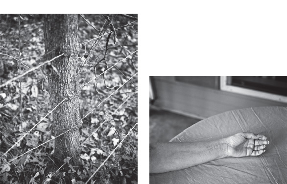
Scars is a limited edition book featuring six photographs of scarred people, plants, and places. A scar is strong subject matter to photograph. It is not just an image of something. It is, on multiple levels, an image about something. A scar is an effect, which inspires us to ask what the cause was. A scar can also be a metaphor. So while viewers may wonder what created the scar, they might also think about moments that have left impressions in their lives.
The photograph Mom’s Scar shows marks remaining from the surgery my mom had after falling and breaking her wrist. But it goes beyond simply showing a healing wound to also suggesting a larger symbolism for both weakness and survival. The relationship I have with my parents has evolved over time. I am now able to understand they are human beings just like everyone else and should not be expected to have all the answers just because they are parents.

Every copy in the edition of Scars is made unique by the coffee-stained paper used for the front and back covers. The stain on one cover may be straight across and resemble the high water mark from a flood, whereas the stain on another cover may rise and fall and suggest the distant horizon of a wide-open desert. Stains are like scars in that they are seen as blemishes and people want to know the story behind a stain just as they would ask about the cause of a scar.


IMAGES © FRANK HAMRICK, FROM SCARS. IMAGES PRINTED IN A LIMITED EDITION ARTIST BOOK.
A BOX OF Ku, NAKAZORA, AND KAWA = FLOW
ELEMENTS
Have you ever been to a museum or gallery and immediately been attracted to the smallest image on the wall? Sometimes it’s the smallest things that make the most profound statements, and when these images speak to you, you’re able to internalize their message through a kind of interpersonal bond. This describes the experience of walking into an exhibition of Yamamoto Masao’s work. The scale of such small objects surrounded by so much space makes them feel precious, and walking closer to them like some act of reverence, both of which are highly personal acts that seem to reflect his personal experience in making them.
ARTIST STATEMENT: NOTES OF REFLECTION IN REFERENCES TO THE SERIES KAWA
KAWA = Flow reminds me of “this world and that world,” “previous life and current life,” “this world and afterlife,”“human world and the world of the gods,” and life itself.
I hope the KAWA = Flow series will awaken a sense of relaxation and purification in the viewers’ minds. I would be happy if my work somehow gives support and encouragement to the viewers as they move through their life. We should not hurry, but not stop. An ideal life for us is one of harmony and contentment.
I enjoy watching transitions in nature.
Clouds in the sky are all different from each other. While watching the clouds, I realize I am seeing beyond the clouds. I may be focusing on the clouds, but my mind is immersed in something else.
There is a haiku Ryokan (1758–1831), a Zen monk, wrote. It goes like this:
A Japanese maple leaf
It turns to show its back
It turns to show its front
Before it is time to fall
This haiku has made a great impact on me. I believe Ryokan wrote about life through using the metaphor of falling leaves.
Life is an accumulation of moments. There are moments when leaves show the sunny front, and there are moments when they show the dark backside. But at the end, all leaves fall and decay.
Ryokan’s attention to nature and realization of how humans are but a part of nature made it possible for him to write this poem. I imagine how Ryokan led his life enriching, soothing, and purifying people’s mind.
“Active passiveness,” a teaching of Zen, influenced me, too. It is necessary to acquire the sense of active passiveness to reach a steady mind and body. When you achieve a calm feeling by finding yourself integrated into nature, you will develop a respect and humbleness toward the whole universe. You will be enveloped in a deep sensibility of the universe and the earth you are placed on.
This thinking is widely known in Budo (martial arts). I try to sharpen my sensibility to reach this state of mind when I photograph.
ADDITIONAL REFLECTIONS
Drips of water seep out of the mountain and form a flow known as a KAWA. A KAWA can also be seen as a pond on the top of a mountain, overflowing, creating small streams that grow into great rivers. KAWA changes its face, sometimes seen as a rapid stream and other times as a quiet flow of almost still water. All rivers eventually flow into an ocean, and then into vast expanse of chaotic sea, reemerging as the majestic cloud.
Buddha taught that a person starts living toward death on the day he or she is born, and there is nothing more obvious than that.
Ryokan’s last Haiku poem:
Cherry Blossoms petals falling
Even the ones remained
Will soon be falling


No. 1141.

IMAGES © YAMAMOTO MASAO FROM KAWA = FLOW. COURTESY OF JACKSON FINE ART, ATLANTA. INSTALLATION VIEWS FROM WOOLRICH WOOLEN MILLS AT LORENZELLI ARTE, MILANO, 2010.
JOURNAL, IN PROGRESS
ELEMENTS
Suzanne Szucs’s photographic practice is woven into her life. Through copious numbers of exposures made throughout many years, she demonstrates to viewers the significance of each moment in our lives—the comedic ones, tragic ones, the banal and quiet ones. She adds text to each image documenting its date and time, as well as some of her thoughts at the moment. How we relate the words to the images is our own personal contribution to interpreting them. Her installation method engulfs viewers with thousands of intimate moments captured on Polaroid instant film to exist in the world almost immediately. Time is part of this thematic portrait; as the images occurred sequentially but viewing them does not; it documents more than a decade of the artist’s life, but goes beyond that to reflect photography’s ability to carry moments into new temporal realms.
ARTIST STATEMENT
Journal, In Progress, is the accumulation of an instant Polaroid self-portrait made every day since January 1994. Started as a visual diary, the project soon evolved its own set of guidelines. Not quite snapshots, the images seem at first to catch random moments. Together the unassuming and approachable images present a narrative timeline measuring growth, change, and regression. Individually they address issues of the body and identity in a direct and nonglamorous way.
The simplicity of an instant image undermines fine art photography, at the same time belying the complexity of meaning the photographs hold as a group. The randomness of the moments depicted and their equal treatment subvert the importance of any single portrait. Their diaristic candor breaks down personal boundaries and presents a series of surrogate selves for the viewer. Together the photographs depict universal experience; their raw, personal, and sometimes frivolous nature demythologizes the self with humor and vulnerability. The text written on them—at the least recording the time and date—ranges from the factual to the absurd, becoming more about mark making than dialogue.
The images document, yet remain elusive. Viewed close up, they suggest individual transformations, recording momentary changes. Seen from a distance, the figures evaporate, the ritual becomes more apparent, and the measurement of time emerges. Whereas the regularity of the image making imposes structure, the formal qualities of the piece as a whole—color, shape, light—are determined by chance. The images will fade and change over time, like memory, imprecise and shifting, an imperfect memorial to the everyday. Their deliberate presentation—like a figure traveling across the wall—contradicts the immediacy with which the individual images are made.
As an installation piece, Journal, In Progress, grows around the viewer. The 4” × 4” Polaroids are arranged chronologically as vertical strips of 17 images, equaling the artist’s height of 5’6” and growing an average of 7 feet a year. The strips are each put up individually; therefore they can wrap around and turn corners. For this reason, the project transforms to whatever space it is displayed in, mimicking our own tendencies to transform to ever-changing situations. When installed, new images are constantly added, the piece literally accumulates itself, even as we accumulate experience and memory. Through its process, Journal, In Progress, becomes a constantly changing piece of art—different each time it is displayed, its parameters of height and chronology allow for flexibility in its presentation, keeping the piece lively and engaging.

Journal, In Progress, installation views.


Journal, In Progress; installation views.


Journal, In Progress; installation view.
IMAGES © SUZANNE E. SZUCS, FROM HER SERIES JOURNAL, IN PROGRESS. INSTALLATION VIEWS FROM FLATFILE GALLERY CHICAGO, 2004; INDIVIDUAL 4” × 4” POLAROID SPECTRA PHOTOGRAPHS, 5’6” × APPROXIMATELY 80’ INSTALLATION PHOTOGRAPHS BY CYNTHIA LAPP AND SUZANNE E. SZUCS, 2004.
NIGHT JOURNEY
ELEMENTS
How do your dreams feel? Do they feel real but fleeting? Do you feel you’re really there but it’s too dark to fully see? Are they pleasant but never quite comforting? These and other aspects of dreams can not only be seen in Susan Kae Grant’s photographs, but they can be experienced through her highly conceptualized means of printing and displaying them. The experience of the installed photographs allows us to have a waking experience by placing us as close inside their depicted dreams as we can be.
ARTIST STATEMENT
Night Journey embodies the collaboration of artistic creativity and sleep laboratory methodology in the exploration of REM sleep, memory, and the unconscious. The work is composed of a series of intriguingly haunting large-scale images that re-create the fragmented and multisensorial experience of dreaming. The inspiration for the project came from the artist’s desire to conduct an inquiry into the subconscious, which led to her experiences sleeping as a subject in a sleep laboratory. The series now takes two complementary forms: a suite of lushly printed 35” × 47” black-and-white giclée prints and a room-size installation consisting of 24 4’ × 8’ digital murals printed and heat transferred onto sheer chiffon fabric juxtaposed with a sound track of whispered phrases.
To produce the work for both versions, Grant collaborated with John Herman, Ph.D., at the sleep research laboratory of the University of Texas Southwestern Medical Center at Dallas. To access unconscious visual memory, Grant used herself as subject and was digitally monitored and awakened from REM sleep and then interrogated by trained technicians. The tapes of these narrative interviews were then used as inspiration to create the imagery for the series. The shadow gestures depicted in the images suggest a fragmented narrative as they shift in and out of focus, signifying the impermanent quality of the dream state. To create the gestures and narratives inspired by the dream recordings, Grant photographs shadows of models and props in her studio using a high-resolution digital back and employs digital technologies to manipulate and print the images on 100% rag paper. The mural prints were printed digitally as CYMK murals on paper and then heat transferred onto chiffon.
The Night Journey series examines the perceptual and psychological aspects of the dream state and provides a pictorial access to the unconscious. It raises universal questions among viewers and re-creates an unexplainable experience all humans share.

Installation view from Night Journey. Installation size: 36’ × 40’ with sound track and 4’ × 8’ photographic panels; heat transfers on chiffon fabric.

What’s Being Offered? 2002.

Dancing Girl, 2007.

Far from Home, 2007.

Idle Curiosity, 2005.
IMAGES © SUSAN KAE GRANT FROM NIGHT JOURNEY; GICLéE PRINTS 32” × 43.75”.