
One characteristic of software development in a modern digital organization is that it puts the needs of the user at the core of the purpose of the team, rather than just focusing on more detached engineering goals. The discipline of user experience (UX) works hand-in-hand with this new style of development to help build software that truly meets the user’s needs.
There is no clear definition of UX; the discipline is relatively young, and rapidly evolving. UX has evolved from a number of separate, but related, fields, into one that brings them all together. It merges the more academic discipline of human-computer interaction (HCI) with the traditional “designer” roles of visual design, interaction design, and product design, but it also covers designing processes and services, which may previously have been done by a business analyst.
Before UX, many digital designers came from a traditional print background. For many marketing or content-driven web sites, these were designed in the same way as a newsletter or poster campaign might have been. This often left a big gap in skills between designers and the developers; Photoshop files were thrown over a wall and expected to be implemented in pixel-perfect fashion. The rise of responsive design made this increasingly challenging, as the initial reaction was to make a design that fit perfectly on an iPhone, but failed to adapt to the rapidly changing sizes of screens that evolved from other manufacturers. This forced designers and developers to work closely with each other, as these designs could no longer be specified perfectly in Photoshop, but instead had to be specified in a more abstract way that conformed to the intent of the designer. The developers then had to understand the design intent to express that in code, rather than just creating a facsimile of the design.
For other types of applications, especially process-driven ones, many early digital projects were taking existing paper-driven processes and implementing them electronically. Traditionally, these types of forms were designed by business analysts, who developed processes that satisfied the needs of the business, and when it came time to implement these forms electronically, a business analyst would often specify these interactions in the same form as the paper-based system. Sometimes a designer would take those designs and style them to be aesthetically pleasing, but this missed any wider scope of seeing how the process as a whole met the user’s needs, not just the business’s.
The study of human-computer interaction arose as a field within academic computer science in the 1970s, but as web design grew out of the world of print design, these two arenas were disjointed until the spread of a process known as user-centered design. This new approach evolved from the traditional design of processes and interactions by taking the scientific approach that HCI researchers used. This was to test prototype user interfaces out on real users when they were in an early draft stage, then use the observations from these experiments to iterate and evolve the design.
Combining this process design with UI design and applying a scientific approach to bring users to the center of the process amounts to what is now known as the field of UX.
The UX of a product is more than just its UI; it is also the principles behind it and how it works as a whole system. There are many sub-fields within UX, although only the biggest organizations are fortunate enough to be able to employ specialists for every field. Instead, most UX practitioners do a bit of everything.
Like in software engineering, job titles and roles are not universal. Some people within UX use “designer” as a catch-all term, while others use it to refer to someone who focuses more on visual design, but there are three main types of roles you might come across. UX designers are similar to a traditional visual designer, who can produce high-quality designs and assets for a developer to implement, and sometimes have some front-end development skills themselves. Researchers, or user testers, are typically focused on designing and running studies with potential users to test the suitability of particular designs and proposed experiences. Finally, a UX architect (or information architect) thinks about how the system is structured as a whole and where the information is presented to users based on their needs. Something an information architect might produce for a traditional web site is a site map showing how the user might navigate through the pages, but ultimately the goal is for a user to find the information they want to find where they expect to find it, and make sure that information is at the level of detail they expect—not too detailed, but also not so general that the user doesn’t end up satisfying their original need.
There are overlaps between these roles. A content-heavy web site may have a role that combines the architect role with that of a copywriter. The output here isn’t the visual design, but instead both the content that will fit into the website and the architecture that holds that content. The content is written in direct response to user need, and the same UX discovery and design processes still apply to develop this output. It’s increasingly common for UX designers to also have front-end development skills, so that they can implement their designs directly in code, as well as skills related to the process of understanding and testing user requirements. Conversely, full stack developers will often learn skills that were previously in the domain of a UX specialist, further realizing the benefits of full stack development.
User experience has become so prevalent that if an organization doesn’t embrace it, they will quickly be outclassed by competitors who do. Sometimes the smallest teams have no one dedicated to these UX activities, but it’s important for the whole team to stay focused on meeting the needs of customers who use the product. Any user interface will have some design to it. Even if that design hasn’t been fully developed by a designer, it will emerge from the implemented code. As a developer, fully understanding the UX of what you’re building from the point of view of those who are building it will help you make a better product, and you’ll likely work with UX practitioners on this endeavor.
Information Architecture
If the end goal of a UX designer is an aesthetically pleasing look and feel that makes each feature easy and obvious to use, then the ultimate goal of an information architect is making sure each individual component on a page is where a user expects to find it, with minimal ambiguity. This goes beyond a single page, though, and applies to the structure of a whole site, ensuring that a user can navigate a site or app to find the information they want.
On a team where there is a silo between UX and developers, UX designers might often hand over visual specifications for components, and UX architects hand over the site map and wireframes showing how a page displays its components. In the world of a full stack team, these teams work hand in hand. In fact, aesthetics are actually the least important concern of a UX team. If your users can’t find the information they’re looking for, then it doesn’t matter how good it looks. Similarly, once they get to the right place, the information they’re looking for or the feature they’re trying to use must have “affordance ,” meaning it should behave in an obvious and unsurprising way. Together, these concepts are thought of as usability, and the main goal of a UX team is to produce a usable web site, and then apply branding and aesthetics on top of that as a “cherry on top.” A classic example of design versus aesthetics is Craigslist. The visual design of Craigslist is very basic, but the site offers a strong user experience. Information is structured in a logical way, and it is obvious how to use each feature of the site.
Affordance is an important concept in HCI, and therefore in user experience. It applies to design in general, not just digital design. The affordances of an object are said to be the way its form indicates how it can be used—for example, a handle on a teapot, or a handle on one side of a door versus a push panel on the other. Computer user interfaces will usually have non-physical affordances. It is typical to make use of common patterns to indicate a way of interacting with something (for example, a button on a web page may have padding and be surrounded with a box, and have some hover state), or to suggest affordances by using skeuomorphism—borrowing design from a real-world object.
The concept of perceived affordances puts any affordances an object may have into context. For example, the affordance of a toilet door lock is often that it will be green to indicate it is available and red if not, but this affordance is not a perceived affordance for color-blind people. Similarly, in UX design, the reasons people might come to a web site or use a web app will often put them in a certain mental state or give them expectations about how a thing should work. Designers need to take these perceived affordances into account.
Affordances by themselves are often not enough, especially when the user is undertaking an action that is especially complex. In these cases, it is important to make sure the user is aware of the logical model underlying the operation they are trying to achieve and guiding them through the action. Designers must also try to pre-empt and restrict any actions that may be taken due to a faulty understanding of the underlying model. However, this should not be used as an excuse for bad design. The “guided tour” pattern that many web apps use now is often executed inappropriately and used when the underlying model is overly complex. Although users can navigate bad design (especially when given no choice to do so, such as with internal tools), it should still be avoided, and fixing it is the ethical thing to do as it will reduce stress, increase efficiency, and reduce mistakes for an organization. Given a choice though, many users will eschew a badly designed site completely.
It is common to see job openings for “content designers,” especially in the financial services sector, and there is often some overlap between the role of an information architect and that of a content designer.
A content designer goes one step beyond that of a copywriter (although many content designers end up creating the content too), in that they help determine the content that needs to be conveyed. They can help determine the high-level structure of this content within the context of an entire site, as well as the structure of a piece of content itself, and the links between them.
One area of overlap between an information architect and a content designer is the process of naming things. As the old joke goes, naming things (alongside cache invalidation and off-by-one errors) is one of the two most difficult tasks in computer science, but consistent and clear naming can make it much easier for users to find what they are looking for. Names should be chosen from the point of view of the user, rather than that of the business. For example, a rail operator may announce that they have a “vehicle failure due to a pantograph issue,” but this can come across as meaningless jargon to many members of the public. Instead, announcing that “the train is cancelled due to a fault with the overhead lines” is clearer and still conveys the same information.
One important responsibility of an information architect is to make sure the structure of the site reflects what users actually want. In organizations without information architects, it is common for different parts of a site, or different sites for the same organization, to be run by different internal teams, and as a result the structure of a web site then reflects the management hierarchy of the organization, meaning that some information might not be where a user expects it to be. This is an example of “Conway’s Law,” which states that anything designed by an organization is destined to mirror the internal corporate structure of that organization. When an organization takes information architecture seriously, its information architects must break down these siloed walls. An information architect might belong on one team but have to work with other teams (or work with other information architects across an organization) in order to produce something that works holistically from the perspective of a user outside the organization.
One final note on information architects: there is another similar-sounding job title of data architect. Data architects are responsible for defining structures and relationships, but as the name suggests, they work with the raw data underlying an organization. Data architects also usually focus on the needs of the business, rather than that of the users, often addressing on concerns such as removing duplication, security, and accuracy of the data. Ultimately, this data is used to convey information on a web site, so information architecture has an impact on data architecture, but the skills are quite different.
Getting the User Experience Right
On a project where user experience and development teams are separated, it may be the case that a designer would build a design based on their own experience and the requirements of that particular feature and hand that over for a developer to implement. Often, aesthetics are one of the driving forces of the design.
Following the principles of UX, when a designer builds a design, or an architect comes up with a structure, they think about the assumptions they’ve made. If different assumptions can be reasonably made and it is unclear which ones are correct, then different designs are built that each focus on different assumptions. These designs are then tested with real users to check whether those assumptions are correct, and ensure there are no hidden issues in the design and that it behaves as a user expects it to.
One of the biggest indicators that a team is working in a modern way is how often they do user testing, and how they do it. A team that user tests constantly might be new to it and trying to find the balance between this new way of working and the old, whereas teams that never user test may be stuck in a traditional mindset.
User testing at its core seems deceptively simple. You simply invite users to interact with your web site and give them tasks to complete, watching them as they do so. It’s important to not only watch what they are doing and saying, but also their body language, as this can suggest frustration or other problems that might not be obvious from what they’re saying or doing. However, correctly designing your test (the tasks you ask the users to perform) and selecting the right users to test with can be quite tricky, which is where the role of dedicated researchers come in. Often having a psychology background, these researchers can use their formal training and experience to help develop tasks that focus on the nature of the system being tested, avoid any leading questions, and ask appropriately probing questions to get a good level of insight.
In terms of the number of users you want to test with, one school of thought promoted by Jakob Nielsen is to run many tests, where each test focuses only on one thing, and has five participants. An alternate school of thought is to use larger groups (perhaps a dozen participants), but look at many parts of an application at once.
The final thing to consider is what to test. Of course, you’re not actually testing the user, but rather your application (or a part of it) to see if it’s usable (in terms of perceived affordances of the UI components and the discoverability of a goal within an information architecture). In some cases, it may be acceptable to test a finished product— perhaps if it’s a current legacy site you’re trying to improve—but often waiting until the end of development before user testing can be expensive if it turns out there are significant issues that need to be resolved. As a result, user testing is most often done on some level of prototype.
At the other end of the spectrum to testing with the final product is testing with a paper mockup. Although some details will get lost, this type of prototyping is often quick to make and useful for checking any high-level concepts that underpin the entire site, and is especially useful if you’re making any assumptions about the mental model a user may have about the actions they are about to undertake.
In between these two extremes is where good collaboration between developers and designers can be effective. Prototypes can be built in actual web technology that are suitable for user testing, often without the full level of robustness that would go into production code. Depending on exactly what is being tested, concerns such as responsiveness, cross-browser compatibility, accessibility, and error handling can be disregarded. It is common for a prototype front-end component to be developed in isolation, using canned responses and without being connected to any back ends. These prototypes are then thrown away, even if the design was successful, as retrofitting the concerns of accessibility, responsiveness, etc., is usually more effort than re-building it from scratch and considering these qualities from the start. Speed, rather than quality, is more important here.
You may be tempted to ask a user directly what they want it to do, but this often does not work as well as you may hope. It’s not easy for a user to realistically visualize the way they want a thing to work, and they often don’t come up with the best ideas in practice. Performing these more formal user tests allows you to check against the “gut” feeling of a user. However, some UXers will undertake “co-design” workshops, where stakeholders (including users) will get together and design something collaboratively, rather than just being presented with a finished design at a user testing session, and this can be a valuable way of working to generate designs too.
There is a downside to running formal user testing sessions and experiments however, which is the cost. If a new feature on a site is not especially groundbreaking in terms of requirements or interactivity, or is largely similar to another one elsewhere, it can be effective to simply apply a known pattern to that feature instead of testing everything, and then sense-checking that by using analytics after it has been fully built, if there’s a low risk of getting that design wrong.
This trade-off can be dangerous, where common web patterns that seem effective have been shown to actually not achieve their goals very well after further scrutiny. This includes patterns such as the “hamburger menu,” icons without a label next to them, and carousels, which have seen widespread adoption.
It’s important to remember that user testing does not need to be very formal. There are low-cost ways to execute user testing without having to hire a specialist or rent a facility with one-way glass or recording devices. Although these don’t give you as detailed or accurate insight as a more formal session, they can help you identify the most obvious issues with your app. These low-cost sessions are referred to as “guerrilla” user testing. A common guerrilla testing session might take place in a coffee shop, where (with permission from the owner) you could offer to buy someone a coffee in exchange for 10 minutes of their time, where you observe them using your site or carrying out some common tasks. If you are developing internal tools, then this becomes even easier; you just need to ask potential users whether you can observe them using your designs in situ, and many will be more than happy to do so.
As we will discuss in the Ethics chapter, user testing is a form of experimentation on humans. In this regard, we must behave ethically. Fortunately, there is much we can learn from other disciplines (especially social sciences), as they have honed a good understanding of how to undertake these kinds of experiments ethically. The general rule of thumb is informed consent: the user must be aware of what they’re being asked to do and agree to take part, with the ability to withdraw from the agreement at any time. The user tests shouldn’t aim to mislead or trick a user, and should treat them with respect. The results should also be suitably anonymized.
Although user testing has become the poster child of the UX process, it is not the only technique you can use to check the usability of your site. A web app or site with good analytics should allow you to interpret the data to answer certain questions about how your site performs in production.
Halfway between user testing in person and purely focusing on analytics after the fact is a type of testing known as A/B testing. A/B testing involves presenting a number of variants (often two) to a user along with a “control” case of the current site with no changes. A subset of users on your site are randomly selected to take part in the trial and then given one of each variant. Analytics are then used to determine how many users completed an activity using each variant and the control, and this number determines which was the most successful (or not; it is not assumed that both variants will perform better than the control) by applying a statistical test to the collected data.
Despite what many companies might try to sell, A/B testing is not always an appropriate tool to use. A naive approach to A/B testing might be to directly compare the number of people who were able to complete the action you were testing. However, the theory of statistics tells us that these numbers are actually slightly fuzzy underneath. The statistical significance of the result needs to be determined in order to evaluate whether the relevance of these numbers. This concept comes from the idea of “sampling.” In this case, a sample is a subset of your user base that undertakes the experiment. It’s impossible to pick a perfectly representative subset, so a level of fuzziness is applied to the results to determine if differing results are a result of the different subsets just behaving in subtly different ways, or if there is actually a real change there. When analysis finds that two numbers legitimately represent a difference in the performance of two versions, this is said to be “statistically significant.” With few participants, the fuzziness of the numbers is more intense, so it is harder to determine if one number is accurate or not, so a large number of participants is needed to determine if a difference is actually significant. A/B testing is therefore inappropriate on low-traffic areas of a web site, although by running tests for a long period of time (perhaps as long as several weeks) you can increase the number of participants and hence get more accurate results. On very busy parts of a web site, it might seem that you only need to run a test for a short period of time, but this can be biased too. For example, running a test for an hour on a Friday afternoon will only give you data for that period of time, and users may behave different in the morning versus the evening. Running your test for at least a whole day, and often a week, is recommended.
A/B testing also becomes complicated if you want to run multiple tests at once. These tests can interfere with one another and invalidate each other’s results. Although it is possible to run multiple tests on the same site, they should test distinct activities a user might want to undertake. Similarly, when you A/B test something, the changes made should be fairly small. For example, if you’re experimenting with changes to your checkout process, if you redesign the flow of the forms as well as the visual elements, it will be hard to determine if user changes are due to the improved flow or the visual elements. With A/B testing, you also need to implement the full version of all the variants being tested; a prototype isn’t good enough.
The ethics of A/B testing are still under debate. It is not feasible to get informed consent in some cases, while in others, having users opt in to a “beta” mode might be sufficient. Much of the discussion around A/B testing has focused on whether or not the results of the test could cause harm. A famous example was an A/B test Facebook undertook that involved showing posts with positive and negative sentiment in users’ feeds, and then seeing if that impacted the sentiment of the posts that user then made. Many decried this as bringing harm by making people sadder. Another common type of A/B testing (especially in startups) is by experimenting with different pricing structures. If a user signs up at a higher price, which they are still happy to pay, despite the fact they were randomly disallowed from knowing there was a lower price, has this caused them harm? Some organizations work around this by always giving the lower price at the end of the process regardless of which flow the user chose, but the answer to this question is not clear.
A downside of using analytics and these kinds of “quantitative” methods is that they often lack depth. It can be easy to miss the “why” of people behaving the way they do, which the “qualitative” methods like user testing do pick up. For example, Google used A/B testing early in their existence to compare two user experiences, and then later found that one performed poorly because it had a larger load time for technical reasons, rather than usability ones. Conversely, the “qualitative” methods are often expensive to run at scale, and it can be difficult to generate large enough directly comparable data sets. The most powerful teams will use both, with user testing giving depth and analytics further validating those assumptions at scale, or suggesting where further work needs to be done.
Polishing the User Experience
As patterns and frameworks are useful for developers as they implement code, patterns are useful when designing user experiences. Even when designing more complex or novel experiences that are being user tested, having a set of patterns to draw from can speed up this process. The “principle of least surprise” comes into play in user experience; a feature should work the way the user expects it to work, and consistency across your app, and the Web as a whole, is an effective way to help achieve this.
There are non-functional requirements that go into a user experience too. Things like use of images and colors, and the voice of the text, can set an atmosphere for users. For organizations that also have a physical presence, such as brick-and-mortar retailers, it can be important to make the web site feel like part of that same chain of physical stores, as this can reinforce any marketing messages that are being transmitted and set expectations for the experience based on that atmosphere.
A brand book is often the foundation for what a UX team delivers. It doesn’t change often and provides a set of fundamentals for implementing a design: colors, typography, logos, and rules about how the brand should be projected. For example, a financial services company may be trying to project an image of being reliable and trustworthy with money. Writing error messages in an overly friendly format, or illustrating features with pictures of cartoon cats, may not be compatible with this goal, and these kinds of rules should be expressed in the brand book. These simple primitives, like colors and typography rules, are very effective in establishing consistency. Especially in large web sites or digital presences where there are different microservices for different parts of your frontends, any inconsistencies between these primitives can reveal the underlying seams of your application, which can be jarring for users who perceive you as a single site regardless of the underlying application structure.
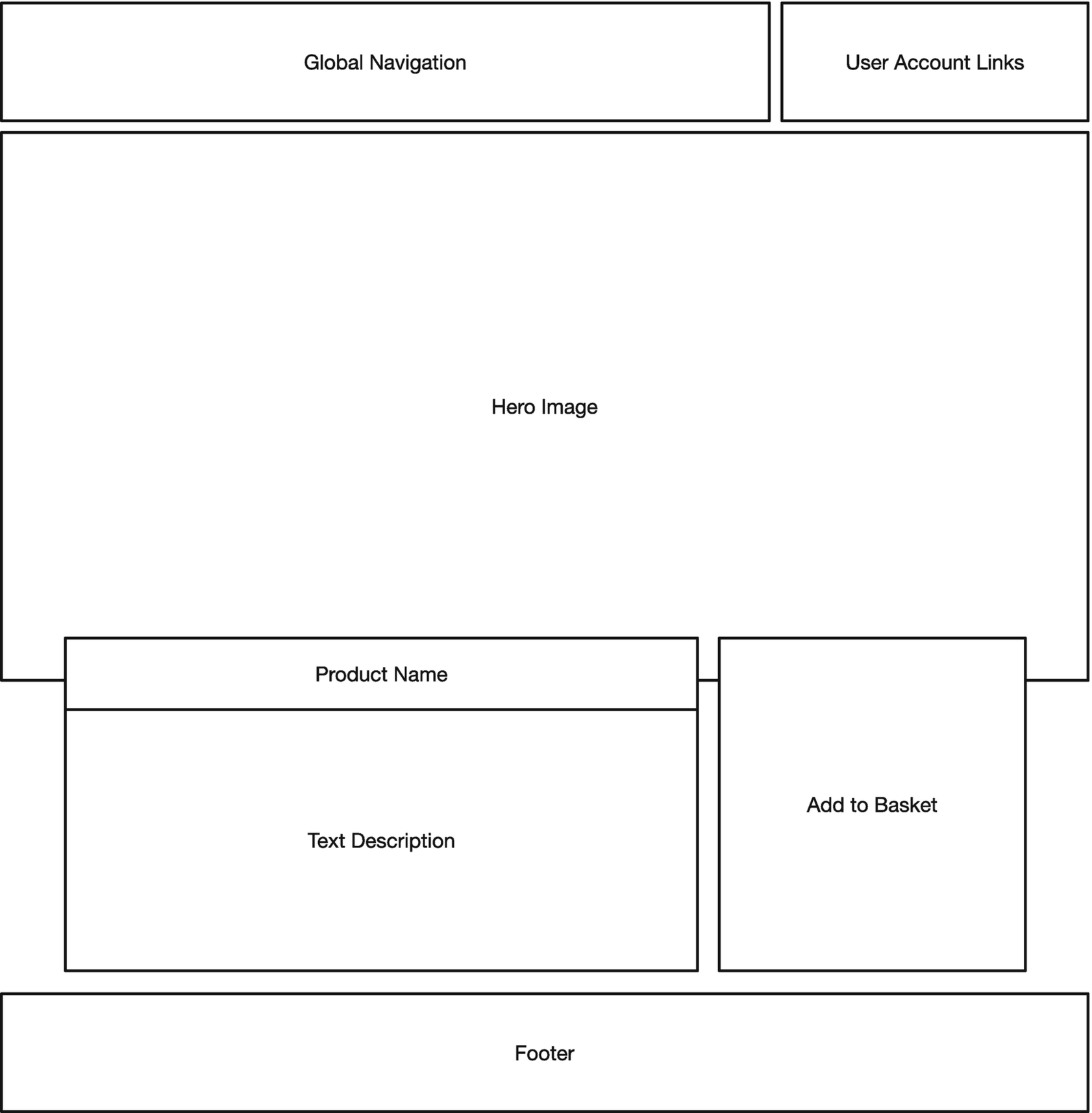
A wireframe for a product landing page
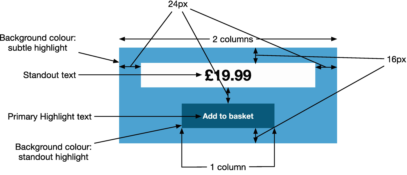
An annotated design specification
But as mentioned earlier, a new page will often make use of patterns that have existed before, and if a page reuses a pattern, there’s often not a need to re-specify these details.
Sometimes these patterns are just re-using fundamentals, such as referring to colors that are referenced in the brand (e.g., instead of expressing a hex code in the design, reference to colors such as “primary color,” which are defined in the brand book). Specifying these kinds of details can make it much easier for us to implement as developers, as it makes the underlying intention clear so we can optimize and reuse an implementation, rather than potentially re-implement the same code as it’s not obvious that it’s a reuse of a design pattern. Specifying typography in terms of common primitives is very powerful too.
When it comes to specifying layout, alignment of items on the page can have a pleasing aesthetic effect. This is sometimes referred to as a rhythm, and pages that do not have a rhythm can look messy and jarring. Attributes like even vertical spacing and alignment of items horizontally contribute to the aesthetic and feeling of a rhythm. A common tool to help enforce a rhythm on a page is to apply a “grid” to the page. Grids are made up columns, and they define column widths and gutters (white space to give elements room to breathe). All elements on the page then line up with column boundaries, and when it comes to dictating a page layout, a designer can simply specify the number of columns an item should take up. Grids can also help in designing variable width and responsive web sites, such as on mobile phones, as these columns can be defined as a percentage of available screen width, but still maintain the desirable property of “rhythm.”
Many designers, especially for more complex applications, go a step further, and develop a library of components that can be reused. In this case, a wireframe can simply refer to components that may already exist in such a library (this is sometimes called a style guide, component library, or pattern library). If a new component is involved, then this is often first specified as a standalone item rather than in the context of the page where it is used, easing the ability to implement it reusably.
Implementing the User Experience
Once a user experience has been designed, it must be implemented. This is another area where collaboration between UX practitioners and software engineers can be invaluable. Most UX designers will work with an underlying set of rules, especially around alignment and rhythm of the placement of elements on a page, and an awareness of what these rules are will make it easier to create robust implementations of the designs a UX team has developed.
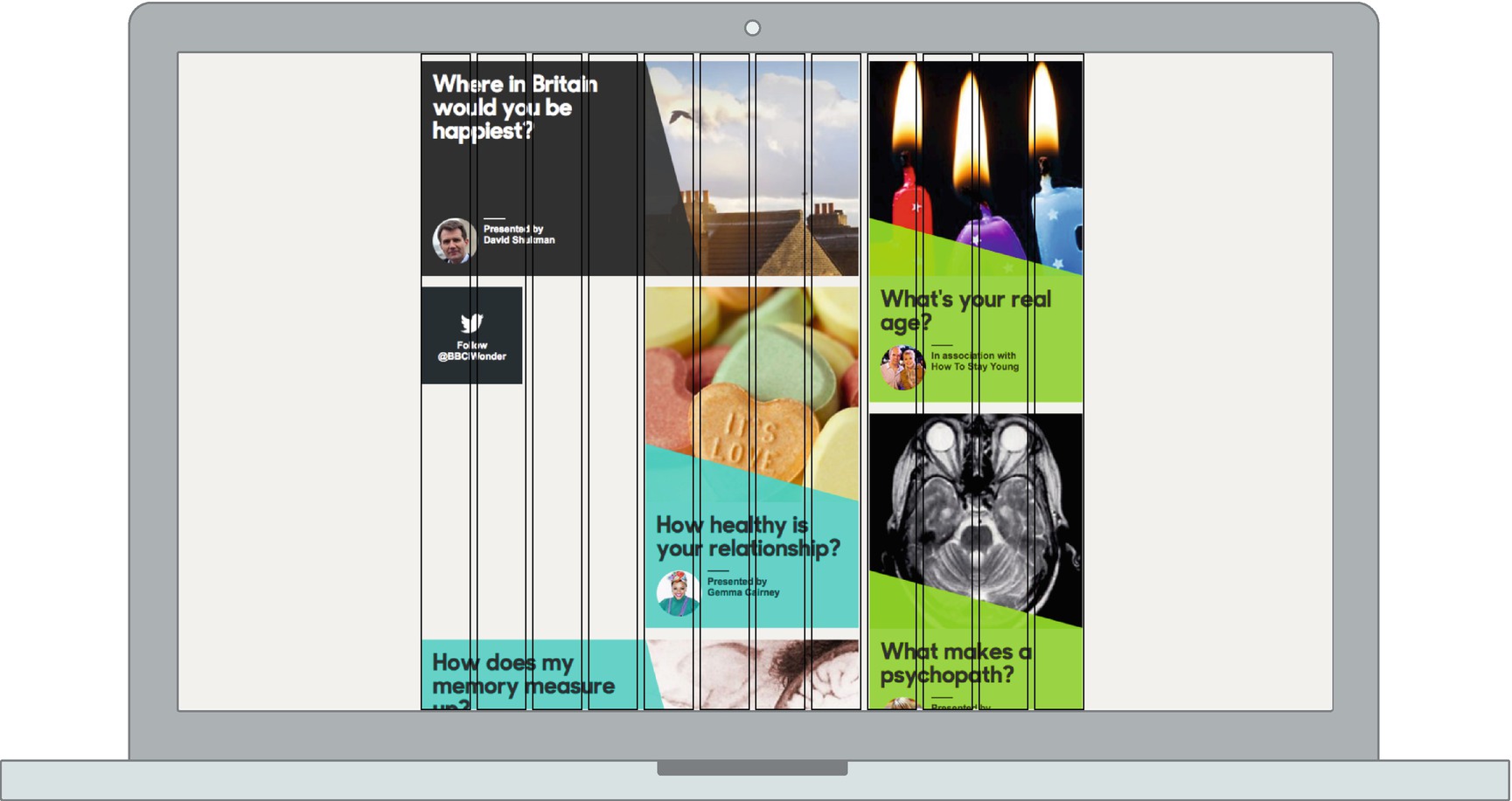
A 12-column grid laid out over a landing page
UX designers will often produce designs that align with their own concept of a grid, so it is important to make sure that whatever grid you use in your CSS is configured the same way as your designer’s grid. Also common is the use of padding and margins in a design to give elements a consistent rhythm (through even spacing of elements). Understanding how a UX designer employs this concept means you can also start using variables to define these kinds of elements, as well as other elements that end up being reused, such as a color palette.
You do need to be careful when coordinating with a designer, in that sometimes the same words may not necessarily mean the same thing to both of you. For example, the way a designer uses the words “padding” and “margin” might not be exactly the same as the way a CSS box model defines them; a designer might specify a 12px padding between the text and the border of a box it’s in. You might think a simple padding: 12px would suffice here, but if there is a line-height attribute applied to the text that makes the height of the line taller than the text within, then that could affect what a designer sees as the padding (they might define it as the top of the text to the edge of the border), in which case you might need to reduce the top and bottom padding described in CSS in order to match the padding the designer expects. Learning about the differences between the domains of design and implementation, through learning or just open communication, can help clarify the intent and avoid these kinds of misunderstandings. This works both ways, not only for a developer to understand the language of design, but for designers to understand the language of implementation, as both can grow to blur boundaries and work more closely together.

The CSS box model
Microsoft eventually replaced its implementation with the standardized one, but many felt that the Microsoft definition was more useful, and in CSS3, the option to change the CSS box model was introduced with the box-sizing directive. The default W3C style is known as content-box, and the Internet Explorer alternative is defined as border-box.
In order to generate a consistent look and feel across a site, designers will often reuse components. There are various common patterns used to do this, but they all derive from the same principles of having a hierarchy of components that are arranged to make an end result.
Atoms
Molecules
Organisms
Templates
Pages
An atom is the smallest unit of design, and often has one-to-one mapping with a HTML element—for example, a generic button or text field. This will often include all the possible states—for example, a button in a disabled or hover state, or text fields where validation is failing. Atoms are combined into molecules, which are a more useful component because they represent some distinct functionality. A molecule might be an address finder or a search box, something that represents a distinct part of user functionality but not so much that it becomes a stage of the journey in its own right.
The layer above molecules is known as organisms. Organisms are distinctive elements of a page that may be reusable in theory, but are often only used once. The ubiquitous header and footer of a web page may be an organism that is reused, but a “confirm shipment” organism, which consists of atoms and molecules to build forms and capture other bits of information, will only be used once in a checkout process.
Templates put organisms into a structure (without content) that is essentially a whole view for the user. Pages are templates that have been populated with content, either dynamically, if it’s a product information page or similar, or statically, if it’s something more like an “About Us” page.
The good thing about this kind of structure is that it maps well into the ways of implementing design specifications using HTML and CSS. Atoms can be implemented as CSS classes, which are applied to plain HTML elements. Molecules and organisms are often implemented either as template partials or as components in virtual DOM libraries like React, then get composed together into templates that are populated with real data to make a page.
The other most important aspect to translate from a design into an implementation is the typography—the look and feel of the text on the page. Typography is one of the most studied parts of design, since as far back as movable type in East Asia at the start of the second millennium. Many typography purists decry the lack of control that web technology gives designers and developers over the rendering of text, but many have overcome the challenge, and with proper control, good typography can be achieved.
As with individual page components in atomic design, it’s a good idea to design a series of typography atoms that are then included in the individual components, rather than constantly reimplementing typography rules per component. This can give you a high level of consistency in the look and feel of text across your application.
It can be tempting to simply apply typography rules to headings and paragraph tags directly, but this can reduce flexibility. For example, if the visual structure of your page means it makes sense to skip a heading level, then doing so introduces accessibility issues into your application. Additionally, you might want to style elements such as form labels at different levels depending on their context, so having a series of CSS classes or SCSS mix-ins is a more flexible approach.
A popular school of thought dictates giving your typography atoms generic names that do not link them to specific page elements, which can give designers and developers more freedom to use the right classes, rather than having a jarring feeling of applying a class called “heading” to a <p> tag if that’s the right thing to do. The BBC’s Global Experience Language, for example, uses names such as “Primer,” “Canon,” and “Trafalgar” as typography identifiers.
It is no surprise that the transition of digital design from being analogous to print design to embracing the UX-focused methods we see today has happened hand in hand with the need for and rise in responsive design. Responsive design is all about making your site or app work on all sizes of screen. For many designers, this was a significant shift in mindset, as previously “pixel-perfect” designs were produced and expected to be implemented. In responsive design, the concept of a breakpoint is introduced. A breakpoint is usually based on device width (but could be based on attributes such as device height or aspect ratio, too), and designers will often design each component or page with a mode for either side of a layout, perhaps changing attributes of the typography, spacing, or layout. It is common to produce design specifications that are representative of each break point, but it is impossible to cover every case, especially for smaller screens where variable width is most common.
Implementing a responsive design once again shows that a close working relationship between a designer and a developer is important. The developer must understand the designer’s intention, as it is no longer a simple case of just replicating a design pixel-for-pixel, as there are gaps between any representative breakpoint structure a designer may have designed for. Similarly, a developer may find gaps in a design—certain screen widths where assumptions (commonly about how much text can fit into a particular area) fail, in which case a designer must rethink and correct.
Another difference between the worlds of a visual designer and a developer is in the definition of a pixel. You might think that a pixel is an individual bit of light on a computer monitor, but in CSS, this is not true. The underlying pixel implementation is called a “display pixel,” but CSS pixels are known as “reference pixels.” A reference pixel is defined as a single pixel on a 96dpi screen that is at arm’s length from the viewer. This might seem complicated, but it allows you to design a site that will appear roughly the same size regardless of the pixel density of a screen and the viewer’s distance from it.
Mobile phones often have a smaller physical pixel size, but as mobile phones are held closer to the eyes, the ratio is maintained, and devices with “retina” or high-DPI screens will map a single CSS pixel onto multiple device pixels. It is important for designers to understand this, as this means if a designer is working on a responsive design with a specific screen size in mind, it is the CSS pixels that matter, not the display pixels. For example, when the iPhone 4 (the first “retina” iPhone) came out, you still specified dimensions as if the width of the device was 320px, despite the actual screen being 640 physical pixels across.
You can take advantage of the fact that there are multiple device pixels underlying a CSS pixel, as text and vector graphics will render at the higher resolution with the upscaling being handled by the underlying browser renderer. Similarly, you can load bitmap graphics that may appear to be scaled down when their size is expressed in CSS pixels, but will render at their native resolution if the device pixels allow it.
The final thing to consider is that there may be cases where the skills of a dedicated designer aren’t available to you. This is often the case for views like admin panels or other development tools. Fortunately, by working with designers on other components, and through designers using systems like atomic design, you should have enough knowledge to proceed regardless. By picking and choosing components from a component library, and using color palettes defined in a brand book, as well as using components that have some proven usability, you should be able to implement a design that feels consistent with the look and feel of the rest of the product. There’s no harm in doing ad-hoc guerrilla testing yourself (especially if the users are your peers, in the case of development tools) to help refine the front end too.
Information architecture is important too when it comes to implementing a design. Understanding the underlying information hierarchy can help you avoid mistakes in choosing HTML elements such as heading elements or <aside> tags. Although it may be tempting to be satisfied with the hierarchy being expressed visually, using the correct semantics for the underlying HTML is important for users of accessible technology to understand your design too.
Summary
User experience is a relatively modern discipline that’s arisen from several interconnected fields, and is most often associated with the principles of user-centered design, where the needs of the user are placed first and foremost, with any aesthetic design considerations being secondary.
The lines of UX become blurred between business analyst and front-end developer, and as a full stack developer, you’ll be expected to understand those UX principles too, even if you have dedicated UX specialists on your team.
Information architecture is one aspect of UX that deals with how content is organized on a web site or app, specifically to be in a place where the user wants to see it. Another aspect of UX is that of testing, where any assumptions in the design of a feature or a site can be tested to validate that they are correct and increase the usability of a site. This user testing can range from small-scale observations to generate deep insights (qualitative data) to using analytics to generate shallow but broad insights on performance with your entire user base (quantitative data).
Designing and implementing a user experience needs to happen hand in hand and use a common language to minimize friction. Using techniques to break down designs into components is one way of doing this, and also allows for reusability of implemented code and increases usability of the site by implementing common patterns. Documenting the fundamentals of a design also helps with consistency.