
1 Library Basics
Lightroom is a modular workflow application that uses a database (called the Catalog) to store information (both metadata and editing settings) about your images. During the image-ingestion process, Lightroom reads the information for each file and stores this information in the Catalog. The photos and videos are still on disk, located either where you originally had them or wherever you tell Lightroom to put them during ingestion. They don’t reside in the Catalog; they’re just referenced from it. Once an image is ingested into Lightroom, you have the option to work with your photos offline; that is, with the image drive disconnected. You only need to reconnect the drive once full resolution output is required. Lightroom can handle video editing, too, but not offline.
Tech Talk: File Formats
Speaking of images and video, Lightroom is limited in terms of the types of files it can import. For images, it supports JPEG, TIFF, PSD, DNG, PNG, CMYK, and RAW files. For video, it supports a large range of camera video types, including avi, mp4, mov, and avchd. File extensions for these are: MOV, M4V, MP4, MPE, MPEG, MPG4, MPG, AVI, MTS, 3GP, 3GPP, M2T, and M2TS. These are all the file types that Lightroom will work with.
JPEG, TIFF, PNG, and PSD are rendered files. This means that certain information, like White Balance, has been embedded in the file. JPEG is a lossy format, meaning that information has been thrown away to make the file smaller (compressed) while still retaining the original look. Editing and resaving a JPEG will lead to a loss in file quality. It only takes a few saves for this to become noticeable.
TIFF and PSD are lossless formats, meaning they keep all information available from the file. They are a high-quality format, and can contain layers and alpha channels—perfect for use with Photoshop. The main difference between them is that TIFF is now an open format, whereas PSD is an Adobe proprietary format. TIFF has better universal support than PSD, though a number of third-party apps also use PSD.
DNG is Adobe’s generic RAW file format. The aim is to allow RAW files from any manufacturer to be readable at any time in the future. The specification does get updated, and even includes lossy versions for RAW control at JPEG file sizes (using JPEG compression).
PNG stands for Portable Network Graphics, an image format that can contain transparency. This format is good for logos, etc.
RAW files include sensor capture information. Each camera has a different RAW file format, even though they may have the same file extension. Canon has .CR2, Nikon has .NEF, Olympus has .OPF, etc. Lightroom supports files from hundreds of cameras; see http://helpx.adobe.com/creative-suite/kb/camera-raw-plug-supported-cameras.html for details. Lightroom adds support for new cameras (either full or provisional) in quarterly releases.
Lightroom does not support Adobe Illustrator® files, Nikon scanner NEF files, or files with dimensions greater than 65,000 pixels per side or larger than 512 megapixels.
You can access files from the Folders Panel. The Folders Panel looks like a file browser, but remember that it only has access to the files you’ve uploaded. There is a file browser in the Import Panel, though, so you can easily get to any files you’d like to add to Lightroom.
Installing Lightroom
Both Mac and PC require you to use a new version of the Lightroom installer. This brings Lightroom up-to-date with all other Adobe installers. If you have a Creative Cloud Bundle, the file is installed from there. Follow these instructions to install Lightroom:
1. Run the installer. Choose from either a purchased or trial version. The installer can install both the CC and Perpetual versions of Lightroom. Perpetual versions require a serial number to work after the trial runs out, whereas Creative Cloud versions require you to log in.
2. You must sign in to your account with your Adobe ID, whether or not you are using Creative Cloud. This will store your serial number, which will prevent you from losing it.
3. Accept the EULA (End User License Agreement) to continue installing.
4. Select your prefered language from the list. Choose your install location and select Install.

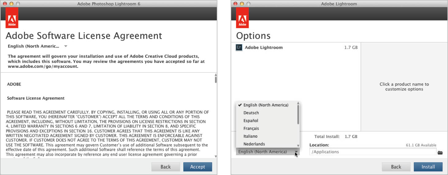
5. The install will run. When the process is finished, you’ll be invited to manage your software and use Launch Now to start Lightroom.

Note: An uninstaller is installed with the application. In the past, Mac users could simply delete the application to remove it. It is now essential that Mac users use the uninstaller to remove the program. It’ll save a lot of headaches if you do this. Windows users have always had to uninstall. Perpetual users will see Lightroom 6 branding in the application; Creative Cloud users will see Lightroom CC branding.

The Lightroom 6 Splash Screen
Getting Around in Lightroom
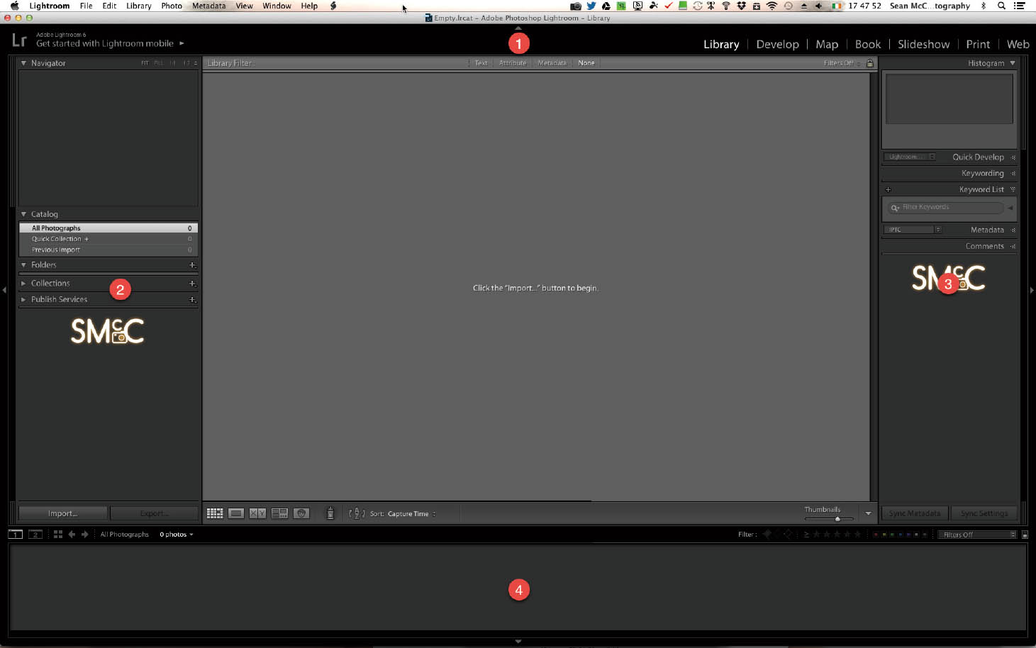
When you open Lightroom for the first time (or after creating a new Catalog), you’re presented with a blank central area with panels around it. There’s a prompt in the center: Click the “Import . . .” button to begin. Before you upload your photos and begin playing, let’s first explore and get to know the interface. There’s no point in making your photos look fancy if you don’t know where to find them!
There are four panels around the main image: The Module Picker at the top (1), the Left (2) and Right (3) Panels, and the Filmstrip on the bottom (4).
The Layout of Lightroom
The Module Picker
The Module Picker allows you to go directly to any of Lightroom’s many modules. The first time you use Lightroom you’ll be in the Library Module. Lightroom will remember the last module you were using and open it when you restart the program.

Module Picker
Lightroom has 7 modules, covering a range of tools a photographer might use. We’ll take a more in-depth look at each later, but for now, here’s a brief overview:
Library
The Library Module is Lightroom’s asset management area. This is where files are added via import, sorted into folders and collections, have metadata (e.g., keywords) applied, and can be exported or published for use outside of Lightroom. Library allows various views of your images, from a thumbnail view in Grid to a double-image view in Compare, as well as a multi-image view in Survey. Loupe view is Library’s standard single-image view. People view is a new option in which Lightroom runs its new face detection engine. This allows you to tag faces in your images. There will be more on this function in later sections.
Develop
This is the visually creative heart of Lightroom where your images are processed. Because Lightroom is designed for batch processing, settings can be applied to all selected images as you work, or by syncing settings afterward. For long-term applications, presets allow you to save settings for future use. Each setting is saved to the Catalog automatically as you work. There’s no traditional Save in Lightroom—it all happens as you work. All the steps you make are recorded in the History, so it’s easy to step back. If you reach a point where you want to keep those exact settings, you can save a Snapshot, making it easy to jump back to that point if you edit further.
Map
Map is effectively like having Google Maps inside Lightroom. You can search locations, view them via many views, including Satellite, Road Map, Hybrid Satellite/Map, and Terrain. There are also Light and Dark views. Location metadata, GPS, and tracklog information can be applied to photos. You can also use Saved Locations to jump to favorite places quickly.
Book
Making PDF books and printed Blurb Books is really easy through this template-based module. You can also view pricing as you work so you know roughly how much the book will cost. Books can be saved for future reprints.
Slideshow
Videos, photos, and music can be mixed to create an audio-visual treat. You have substantial control over backgrounds and text. Lightroom 6 allows you to use more music tracks than Lightroom 5 does, and both Automatic and Manual transition timing modes are available. There’s also a Pan and Zoom option for Ken Burns-type effects. Slideshows can be exported as JPEG, PDF, or video files. You can also create Timelapse videos via a free template.
The Print option allows you to create color-managed prints of anything from single photos to complex multi-image layouts, and even contact sheets. There are three layout options: Single image/contact sheet, Picture Package, and Custom Package. These packages offer enough options to cover most requirements for prints. You can also use the Print to JPEG function to save layouts for lab printing or online use.
Web
Web allows you to choose a range of individual galleries for use on the web. There is a major change from previous versions of Lightroom: Flash galleries are gone, and three new HTML galleries have been added instead. The Lightroom HTML Gallery is now the Classic Gallery, which includes the Grid, Square, and Track Galleries. Third-party plugins from Lightroom Blog, The Photographers Toolbox, and The Turning Gate expand the range of options to include creating whole websites from Lightroom.
Output Modules
Book, Slideshow, Print, and Web are often referred to as the Output Modules because you’re creating some form of output for your images that is different from Export and Publish.
On the left side of the Module Picker is the Identity Plate, one of Lightroom’s personal branding features. It contains the login panel for Lightroom mobile (Creative Cloud account required), Address Lookup, and Face Detection information.
Left Panel
Each module contains different panels in the Left Panel. These panels do have a common theme, though: they generally contain template- and management-related panels; e.g., the Folders Panel in Library, the Presets Panel in Develop, and the Template Browser Panel in the Output Modules. (The Collections Panel, however, is in every module.) It’s slightly confusing to have panels inside panels, but this is the terminology Adobe uses.
The Left Panel
Right Panel
The setting controls for each module are located in the Right Panel. For instance, in Library, the Right Panel holds Quick Develop, Keyword, and Metadata tools. In Develop, the Right Panel has all the tools to creatively interpret the look of your photos. In the Output Modules, the Right Panel contains layout settings. In Map, it contains the Location metadata for the selected images.
The Right Panel
The Filmstrip
Located under the image, the Filmstrip shows a long strip of single images from the current folder or collection. This allows you to move between your assets when in a single-image view mode like Loupe or Develop, and helps with managing your selection in Survey or Compare view.
The Filmstrip
You’ll find navigation, view, screen, and filter tools located above the images in the Filmstrip. On the left-hand side, the number icons show the main and secondary screen options, followed by a shortcut to Grid View. The left and right arrows move you through recently used folders and collections, which are also available as a dropdown list. On the right are the basic filter options that allow you to filter by flag, rating, and label. Initially the view is collapsed, but clicking on the word Filter will open it up.
There are two other parts to the workspace: The Toolbar and the Filter Bar. The shortcut “T” toggles the Toolbar on and off. This toggle only applies to the current module. You’ll find module or current tool-related options on this Toolbar. On the right of the Toolbar is a disclosure triangle; clicking this will prompt a dropdown menu with available options. Checked tools appear in the bar; unchecked ones are hidden.

The Toolbar
The Filter Bar allows you to choose criteria regarding what will be visible in the current view. Choose from Text, Attributes (flags, ratings, etc.), Metadata (EXIF or IPTC info, etc.), or any combintion of those three. This bar can be toggled from the View menu or with the shortcut “”.
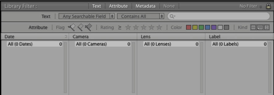
The Filter Bar
Personalizing Your Workspace
Lightroom has a myriad of options to control the UI Appearance. The overall color scheme can’t be changed, but plenty of other stuff can.
Panels
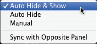
In the center of each panel (Module Picker, etc.), there is a small disclosure triangle. Clicking this will alternately show and hide that panel. When the panel is closed, hovering the cursor over it will temporily show the panel. In theory this is a great time saver, but often the panel will pop open at inoppurtune times. Fortunately, there are options. You can right-click on the panel’s disclosure triangle. Choose from Auto Hide & Show, Auto Hide, and Manual. Auto Hide & Show is the default behavior—the panel will pop open when you hover your cursor over the triangle. Auto Hide means you have to click the triangle to open a panel, but moving away from that panel will hide it. Manual means you have to manually open and close the panel. I prefer Manual. Sync with Opposite Side will copy the setting to the opposite panel (e.g., select the Sync function to match what is on the Right Panel to the Left Panel).
Pressing the Tab key will hide/show the Left and Right Panels, while pressing Shift + Tab will hide/show all panels (or toggle through them). This doesn’t affect the Toolbar or Filter Bar, which must be toggled separately.
The four main panels (Left, Right, Module Picker, and Filmstrip) also have dedicated open and close shortcuts.
The panel’s Hide and Show options
• F5: Module Picker
• F6: Filmstrip
• F7: Left Panel
• F8: Right Panel
As well as the main panels, you can also change how the internal panels are viewed, including turning off individual panel headers. You can’t move the panel headers, though.
Right-click on any panel header to see a menu with a list of the panels and viewing options. By default, there will be a check to the left of the name of each visible panel. Clicking the panel name will uncheck it, hiding it from view. This can happen by accident, which will cause you to lose view of a panel; simply right-click to reselect it. In our sample figure, there’s an asterisk beside Catalog. This indicates that this is the currently selected panel in the Left Panel.
The panel contextual menu
The viewing options are farther down this menu. Hide All will remove all panel headers except for the Navigator. Other panels will have all panel headers removed. If you hide all the panels, you’ll need to bring at least one panel back via the Windows>Panels menu. Right-click and select Show All to bring the rest of the panels back.
The next option is Solo Mode. Solo Mode allows you to have only one panel open at at a time. When you click on a panel header, the panel will open, while similtaneously closing the previous panel. This saves a lot of scrolling down the panel, especially in modules with a lot of settings. You can also toggle Solo Mode via a shortcut. Option- or Alt-click on a header to open it in Solo Mode. Repeat to turn off Solo Mode.
The Left Panel of Library with Hide All active
The final pair of options consists of Expand All and Collapse All. These options open and close all panels. Command- or Control-click on a panel header to apply these as a shortcut.
You can open any panel from the Window>Panels menu. Shortcuts are listed in the menu.
Full Screen Modes
Occasionally it can be useful to see your photo as large as possible. For this, Lightroom provides a number of full screen modes. The main full screen mode, Full Screen Preview, is toggled using the shortcut “F”. This overlay covers the controls, but remember that they’re still active. For example, the B&W shortcut “V” will turn the full screen preview into a black and white photo.
Full Screen Preview was introduced in Lightroom 5. There are three older Full Screen modes that can be toggled using the shortcut “Shift + F”. These are: Normal, Full Screen with Menubar, and Full Screen. Normal is the default—it shows Lightroom in an application window. Full Screen with Menubar expands to fill the screen, but maintains a visible menu. Full Screen hides the Menubar, which can be accessed by moving the mouse to the top of the screen.

The Screen Modes menu in Window
These modes won’t hide panels, but an additional option, Full Screen and Hide Panels, will. It doesn’t hide the Toolbar/Filterbar; this must be done manually.
Preferences
Lightroom Preferences are located in the Lightroom menu on Mac, or the Edit menu on PC.
Lights Out/Dim Mode
A great feature that works really well with those older screen modes to hide interface clutter is Lights Dim/Out mode. Use the shortcut “L” to toggle between the three views, or access the Lights Out menu in Window. Off is the normal view. Lights Dim darkens everything around the image. By default it darkens everything to 80% of the original brightness. This means that while the interface outside the image is dark, you can still see it clearly enough to make changes to settings. Why is this viewing option useful? Sometimes it’s simply easier to work without visual distractions.
Pressing “L” again toggles Lights Out, making the interface black. I use Lights Out to quickly hide clutter when clients are present. That way, their attention is drawn to the photo, not to Lightroom.
The Lights Out screen color and dim level can be set in the Interface tab of Lightroom Preferences. Screen Color can range from black to white, and Dim Level can run from 50% to 90%.

The Lights Out menu in Window
Lights Out active in Grid

The Lights Out Preferences showing available settings
Panel End Marks
This decorative option is turned off by default. It provides the ability to add flourish to the end of the panels in the Left or Right Panel, and custom branding to Lightroom. People complained about these flourishes in earlier Lightroom versions, so they’ve been removed as a default option; however, they’re still useful for branding purposes.

The End Mark dropdown menu
Past versions of Lightroom came with a large selection of flourishes, but currently only Small Flourish remains. To add your own Panel End Marker, go to the Interface tab in Lightroom Preferences. From the Panels section, click the End Mark dropdown, and choose Go to Panel End Marks Folder. This opens the Lightroom Presets folder with the Panel End Marks folder selected. Drag the image you want to use as an end mark to this folder. You can use a JPEG, but images with transparency look better in this case. Restart Lightroom to have the image appear in the End Mark dropdown.
Custom Panel End Mark in the Left Panel, now visible in Preferences
Font Size
Font Size is another option in the Panels section. This option allows you to change the size of the font used throughout Lightroom’s panels. You can choose between Small (default) and Large. A warning appears at the bottom of Preferences when you change this option, and a restart is required for the setting to take effect.
Background
While the dark gray of Lightroom’s interface can’t be changed, the background behind the photo can. Look further down the Interface Tab to find the Background section. There are two options: the main window and the secondary window. Both options have an identical dropdown menu: Fill Color. This controls the color of the background and has six options: White, Light Gray, Medium Gray, Dark Gray, Darker Gray, and Black. The default is Medium Gray, which lessens visual distractions. White or Black might unfairly influence your judgment of the brightness of a photo.
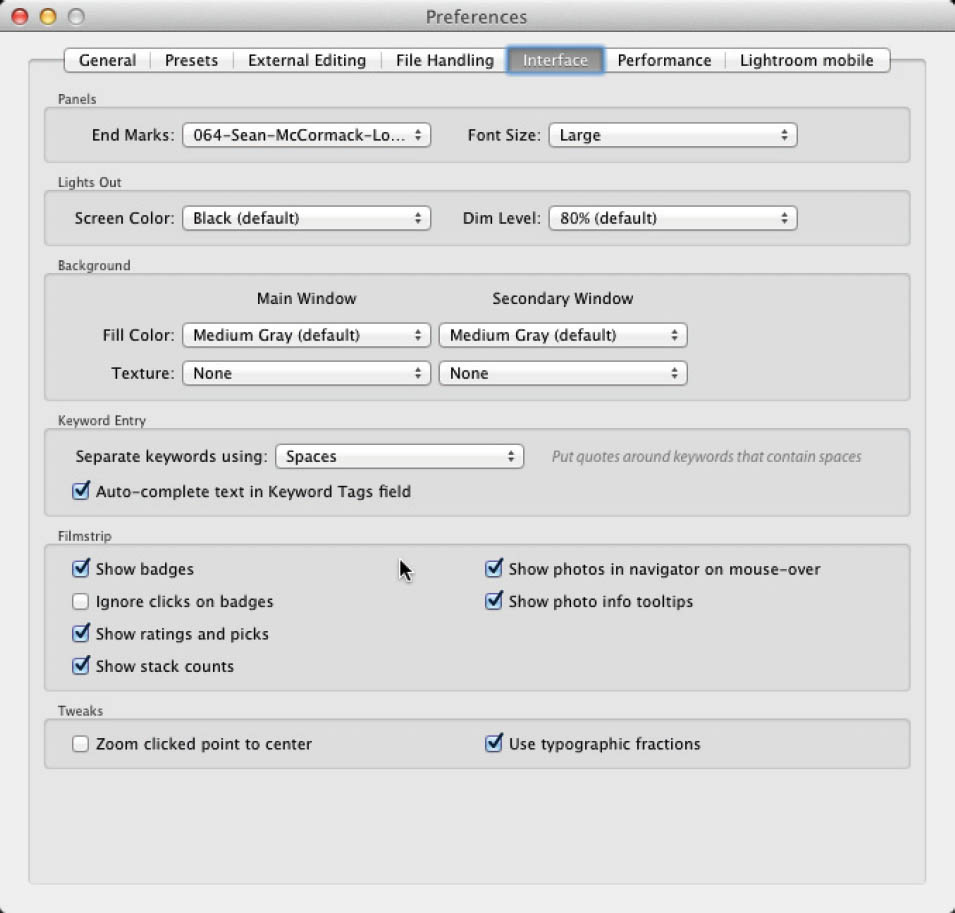
The remaining Interface preferences
Keyword Entry
In the Keyword Entry preference section, you have the choice between using Commas or Spaces to separate keywords. With Commas, you can use spaces as you normally would; with Spaces, keyword phrases using spaces need to be inside quotes, e.g., “Nimmo’s Pier”.
Auto-complete text in the Keyword Tags field turns auto-completion on or off. This is where Lightroom remembers keywords that have already been entered and guesses what you’re trying to enter as a keyword.
Filmstrip
There are six options in the Filmstrip Interface Preferences. Note that these options also depend on the filmstrip being tall enough to display the items.
• Show badges: Badges are the little icons in image cells that indicate the image has been edited, cropped, tagged, has GPS information, or is in a collection.
• Ignore clicks on badges: When this feature is turned off, badges are active links that will bring you to related areas of Lightroom when you click on them. When this option is turned on, the badge links are inactive, and clicking on the badges will not reroute you to another area of Lightroom.
• Show ratings and picks: This turns on the display of stars and flags under the image.
• Show stack counts: This shows the number of images in the stack in the Filmstrip.
• Show photos in navigator on mouse-over: With this function set to on, hovering the cursor over a thumbnail will show a larger version of the image in the Navigator window.
• Show photo info tooltips: When active, filename, exposure, and lens data will be shown when you hover the cursor on a photo for a few seconds.
Tweaks
The Tweaks section has two checkboxes:
• Zoom clicked point to center: The area of the photo you click will automatically move to the center of the screen.
• Use typographic fractions: Easy-to-read fractions are used instead of plain text.
Identity Plate
One of my favorite branding features is the Identity Plate. As well as placing your preferred text or logo into the Lightroom interface, it also makes it available for your Slideshows, Prints, and for Web Galleries. It’s really easy to set up:
1. Right-click the default Identity Plate on the left side of the Module Picker.
2. Choose Edit Identity Plate (at the bottom of the menu). Alternatively, choose Edit>Identity Plate Setup on PC, or Lightroom>Identity Plate Setup on Mac.
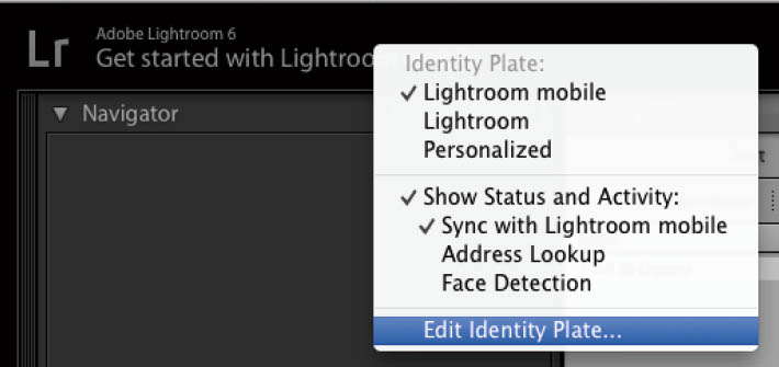
3. There are three sets of options for the Identity Plate: Lightroom mobile, Lightroom, and Personalized. Lightroom/Lightroom mobile only has a Status and Activity checkbox, so choose Personalized (or turn off Status and Activity messages by unchecking the box). The options can also be selected from the Context menu.

4. Initially, Lightroom creates a text Identity Plate based on your username. You can mix and match fonts, as well as colors. Simply select the text you want to modify, then choose a new font and color from the font dropdown menu and the color swatch. Only the selected text will change, meaning you can mix and match fonts and colors to create a logo.
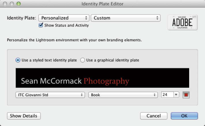
5. You can also use a graphical logo. Originally, this needed to be no more than 57 pixels high, but with the addition of Lightroom mobile and with the availability of high-resolution display, this 57-pixel rule isn’t hard-set. The default header is 41px high for normal screens, 62px for Windows machines in 150% scaling, and 82px for Retina displays. Essentially, that means you should start with those heights and see what works for your machine. The graphical file should use transparency for best effect. PNG files make for the best size/quality ratio. To load this logo, choose Use a Graphical Identity Plate. An advice box will tell you: Paste or drag an image into this space, Images can contain transparency. You can also double-click the text, or click the Locate File button to open the OS file browser. When you locate the file, click Choose to load it.

6. There’s no limit to the number of Identity Plates you can make, but you must save them if you want easy access to them. Click the Custom dropdown menu beside the Personalized dropdown menu to access the Identity Plate list. At the bottom of the menu are the Save As and Remove commands. Initially, the Identity Plate list will be empty; Remove will be grayed out until you create a saved Identity Plate. Choose Save As and then enter a suitable descriptive name in the box and click Save. The Preset menu will update to add the new preset.

7. Click the Show Details button to get options to change the font and color of the module names in the Module Picker.

The Identity Plate can be used to create image borders for Slideshow, as well as branding for Web galleries. More on this in those sections.
Lightroom Library View Options
There are five view modes in the Module Picker: Grid, Loupe, Compare, Survey, and People. It’s time for more detail!
Grid
Grid view is the main thumbnail view of the currently selected source. Even if you’re not usually a shortcut person, the shortcuts for these views are worth knowing to speed up your work. Grid has the shortcut “G”. You can access it from the first icon in the Toolbar “T”, the small grid icon in the Filmstrip, or by selecting Grid in the View menu of Library.
The size of the thumbnail cells can be changed using the Thumbnail slider, or you can use the “-” and “=” keys to decrease or increase the size. There are also three cell settings: Compact Cells, Basic Cells, and Expanded Cells. The “J” key toggles between them. Compact shows only the photo thumbnail with no information. Basic adds a small amount of information. Expanded adds file information such as filename, dimensions, file extension, etc. Choose what will be displayed in the View>View Options menu (shortcut: Cmd + J on Mac, Ctrl + J on PC).
Grid View Options
There are two tabs to the Library View Options dialog: Grid view and Loupe view. Here we’ll just look at Grid view.

The Grid View options work for both Compact and Expanded Cells. The first checkbox toggles the Grid Extra options. I’d leave this on to get more information in the cells.
Options
The Options section is available no matter what position the Grid Extras toggle is in.
• Show Clickable items on mouseover only: this shows or hides things like image rotation and flags.
Note the flag and rotation arrows are on the right image where the cursor is, but not on the left
• Tint grid cells with label colors: This puts a tint in unselected cells, and a border on selected images that matches the applied label color. It can be tinted from 10-50% in 10% increments, with 20% as the default.

• Show image info tooltips: This shows more information on cell badges when you hover the cursor over them.
Cell Icons
There are four Cell Icon options.
• Flags (1): Shows the flag status (Pick, Unflagged, or Reject).
• Unsaved Metadata (2): Shows the Metadata status, indicating if metadata needs to be saved.
• Thumbnail Badges (3): Shows information relating to Crop, GPS, Tags, Settings, and Collections, along with Stack information.
• Quick Collection Markers (visible on mouseover) (4): Allows adding or removing images from the Quick (or Target) Collection.
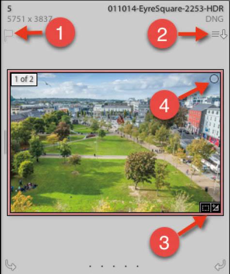
All Cell Icons Visible
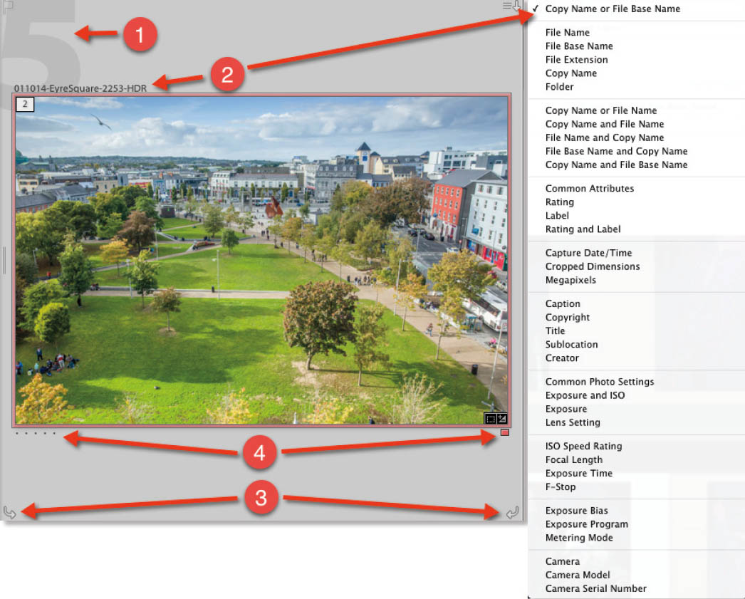
Compact Cell Extras
There are four Compact Cell Extras options.
• Index Number (1): This large number shows numerical grid position.
• Top Label (2): This information is about the image in the cell. In the dropdown menu to the right, you can see all available command options.
• Rotation (3): This shows the image-rotate arrows at the bottom of the cell.
• Bottom Label (4): This is the information under the image in the cell (it includes the same options as the Top Label).
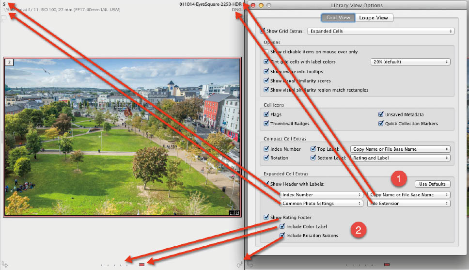
Expanded Cell Extras
There are four header information sections from the same list options (arrows show related positions). It’s almost the same as Compact Cell Extras, but with the addition of Index Number. A Use Default button (1) is available to reset these options. The footer can be added (2), with Ratings, Labels, and Rotation Arrow options. Applying settings with more than one image selected will apply those settings to all images.
Loupe View
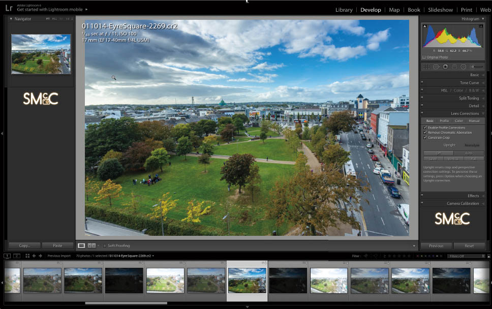
Loupe is the single-image view in Library. It enlarges the selected image (or current image, if several images are selected) to fill the image area. What you see depends on the zoom level in the Navigator window. Loupe view is enabled in a number of ways:
• Use the keyboard shortcut “E”.
• From Grid, press the spacebar.
• Select the Loupe icon in the Toolbar.
• From another view, you can temporarily change to Loupe and back via the View menu>Toggle Loupe View command.
In Loupe, information about the image is displayed in a different manner than it is in Grid. Use the shortcut “I” to toggle through the two available Info Overlays (or from the View>Loupe Info menu). As mentioned in the Grid section, there are view options. Again, the shortcut is Cmd + J on Mac or Ctrl + J on PC.
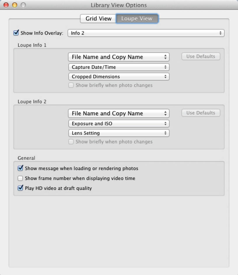
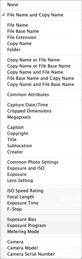
The two Info Overlays have three sets of information available from a dropdown menu with the options shown to the left.
Note that in Loupe mode, settings only apply to the current photo, even if other photos are selected in Library Grid mode.
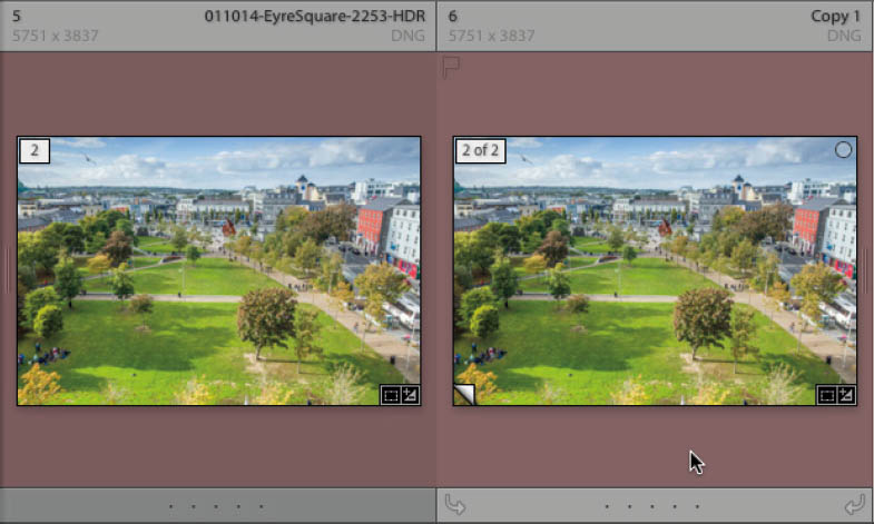
Compare View
Compare is a two-image view. As with the other views, there are several ways to activate it.
• Use the keyboard shortcut “C”.
• From the View menu, choose Compare.
• Select the Compare icon in the Toolbar.
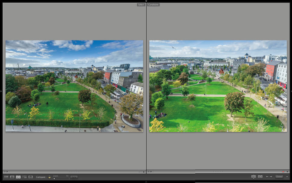
Once active, Compare view presents two photos, either two you’ve selected already, or the currently selected photo and the next one in order. The left-hand image is the Select, while the right-hand image is the Candidate. Use the left and right arrows to change the Candidate to the previous or next available image.
To check detail, zoom in on the photo using the standard zoom options in the Navigator, or use the Zoom slider in the Toolbar. To lock both photos to a zoom level, click the Link Focus lock icon in the Toolbar. Dragging around one image will also drag the other. To match the zoom position in the images, click the Sync button. This will force the Select to match the Candidate.

The aim is to check the two photos and choose the better one. If the Select is the better one, use the arrows to move to the next image. If the Candiate is better, you have two options: Swap or Make Select. These are the “X” and “Y” icons in the Toolbar. Swap will switch the positions of the Select and the Candidate. Make Select will change the Candidate into the Select and then go to the next available image. Alternatively, you can click the X at the bottom right of the Compare cells. Clicking on the X for the Select performs a Make Select operation. Clicking on the X for the Candidate navigates to the next available image.

When you’ve gone through the set of similar images, the Select is now the best image. It can be rated, flagged, or labeled to make it easy to find later. This can be done either via the options at the bottom of the cell, or via the shortcut discussed in the Choosing your best photos section. Click Done to exit to the Select showing in Loupe view.
Survey View
Survey is Lightroom’s multi image view. The shortcut is “N”, which is a little obscure—it’s mathematician speak for a random number. A series of numbers is described as being from 1 to n—hence, Survey is referred to by the Lightroom engineers as the n-up view. You can also select Survey view from the View menu, or from the Toolbar in Library.

Survey displays the selection of images made previously in Grid, or via the Filmstrip. In Survey, the current image has a white border to help it stand out. Applying settings here will only apply to that image, unlike applying settings in Grid. As you hover the cursor over any photo in Grid, the ratings, flags, and labels become clickable for that photo. An X also appears in the bottom right of the photo. Clicking this X deselects the image in the Filmstrip and removes it from the main window.
Survey provides the heart of one of my selection methods; I’ll cover it in detail in the Choosing your best photos section.
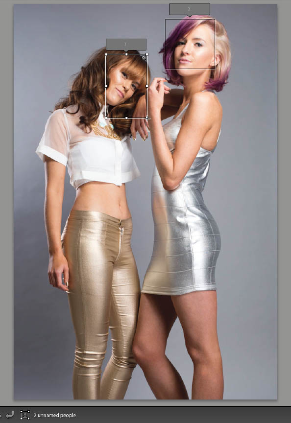
People View
People view is new to Lightroom 6. This is where you make use of the new Face Recognition engine. The engine is designed to be replaceable as better engines are designed, meaning Face Recognition will be improved in future Lightroom updates.
People view can be entered through the View>People menu, via the shortcut “O”, or by clicking the face icon in the Toolbar. At first, you’ll see the info box shown below, announcing that you need to index your photos to detect all the faces in them. This is a background process that will take a long time if you have a large catalog, and it will impact Lightroom performance.
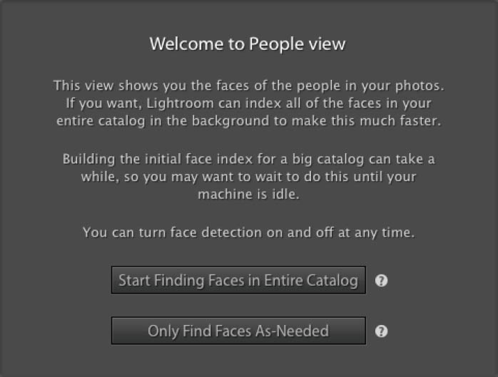
Hovering the cursor over Start Finding Faces in Entire Catalog prompts a flyout dialog that alerts the user that Lightroom will begin background processing, making it faster to find people later. Alternatively, you can select Only Find Faces As-Needed, which won’t index your files. This requires you to manually index a folder or collection when you want Face Recognition.

Clicking Start . . will trigger a flyout dialog and a little animation that goes to the Identity Plate menu and shows the process starting. I’ve watched this animation a few times, and the dialog doesn’t stay long enough to be readable. Fortunately, it’s just a matter of manually clicking on the Face Detection item in the Identity Plate menu.
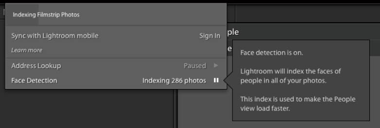
This process can be paused from the dialog, and appears as a setting in the Metadata panel of Catalog Settings.

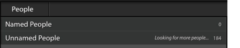
Once indexed, People view splits images into two categories: Named People and Unnamed People. The photos displayed here depend on where you are in Library. If you’re in All Photographs in the Catalog Panel, you’ll see all indexed photos here. If you’re in a folder or collection, you’ll see only photos located in that folder or collection.
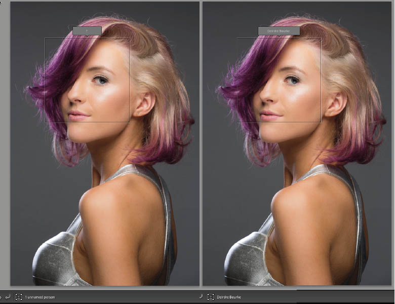
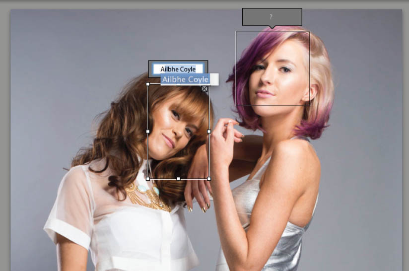
It might seem counter intuitive, but the next step is to go to Loupe view, where there will be a new icon in the Toolbar: 1 unnamed person (or unnamed people). Click on this icon to show the face regions that have been detected. Since this is the first name that is being entered for this face, Lightroom shows a “?” above the face region. Click on the “?” and enter the corresponding name.
Going back to People view will now show the named faces in the Named People section, and the remaining faces in the Unnamed People section.

Lightroom will not get all the faces. It tends to miss faces at odd angles, and obviously it won’t recognize the back of a person’s head as a face. You can manually draw faces in these cases. Notice that in Loupe view the cursor is a crosshair; just click and draw it across a face to create a face region.
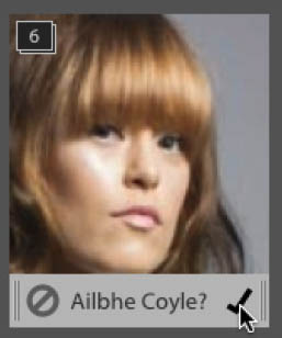
Once you’ve entered some names, Lightroom will start to suggest names based on the information already entered.
Back in People view, the Unnamed People will also have suggested names on them. Faces that Lightroom thinks are the same get put into stacks, and clicking the check that appears as you hover the cursor over the stack will apply that name to the entire stack. Clicking the cancel icon will tell Light-room that it’s not correct.
To speed things along, you can select a series of photos that have the same face and apply a name to one of them—this will apply to the entire sequence.
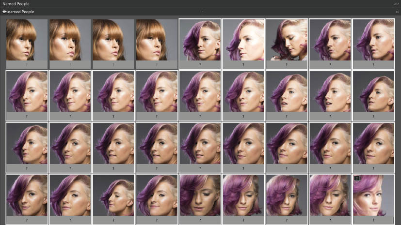
To check that all the faces are labeled correctly, double-click the face stack in Named People to bring up all the confirmed photos of a particular person. Change the name of any incorrectly labeled faces.
Lightroom will sometimes think it sees a face where none exists, which is why sometimes images of fabric or trees will be labeled as a face. Light-room can also label faces with incorrect names. These problems will be less frequent as the underlying face recognition engine improves.
External Editing
While Lightroom is a versatile and functional program, there are things that it won’t do. Fortunately, Lightroom allows external editors to integrate within its workflow. Images sent to photo-editing programs come back into Light-room automatically when saved.
As a parametric editor (meaning one that records and applies settings to a preview), Lightroom doesn’t edit pixels. It can remap using Lens Corrections, and fix blemishes and dust via Spot Removal, or even dodge and burn using the Adjustment Brush, but if you need to slim someone, flip color channels, or swap heads, you need an external editor. Because it is an Adobe product, Lightroom has special integration with Photoshop. In addition, there is an extensive collection of third-party editors that integrate with Lightroom, many of which have been covered in my Maximum Workflow articles for Photoshop User magazine. Examples include onOne Software’s Perfect Photo Suite and MacPhun’s Tonality Pro.
Control of the integration for Photoshop, and of Application Presets for third-party software, is done in the External Editing tab in Preferences.

Photoshop
There are four sections in the External Editing preferences. The top section is for the currently installed version of Photoshop. As you can see, I have Photoshop CS6 (I have Creative Cloud on two other machines, so am using the perpetual version of CS6 on the machine you see in the screenshot). Lightroom automatically detects this version, and will update it when you update Photoshop.
The Photoshop options (invoked via the Edit in . . menu in the Photo menu) are based on files created by Photoshop. The first option is for file type, of which there are two options: TIFF and PSD. Both are layered files, but PSD is a file proprietary to Adobe, whereas TIFF is an open standard file format. This means TIFF is readable by more applications and is therefore the recommended option. Some third-party applications, like the Perfect Photo Suite, also create and use PSD files.

The second option is Color Space, which I’ll cover in more detail in the Color Management section. The largest Color Space is ProPhoto RGB. sRGB covers the smallest range of colors. This doesn’t necessarily make ProPhoto RGB the best, nor sRGB the worst. If you want the highest quality, set this option to ProPhoto RGB and convert the files to a more readily usable space like Adobe RGB or sRGB later on.

The third option is Bit Depth. This option decides the number of bits used to describe each color. 16 bit gives a larger range and is better for preserving graduation in a photo. It also prevent artifacts in the photo when doing extensive editing. Again, you can always export a copy of the final photo in 8 bit when all editing is complete. Note that not all Photoshop filters work with 16-bits files.

The fourth option, Resolution, maps the pixels to a physical dimension. By default, this is 300 pixels per inch (ppi), meaning that Photoshop will display 300 pixels in one inch of screen when viewed at 100%. The file size is dependent on the absolute pixel dimensions, not the Resolution, so a 72ppi file will still be the same size as a 300ppi file as long as the dimensions remain fixed. 300ppi is a good starting point, nevertheless. There’s no point in arguing these semantics with a designer or printer, though. If they want 300ppi then set this option to 300ppi and forget about it!
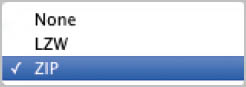
The fifth option, Compression, reduces the space a file takes on disk. There are many types of compression, and they usually work by comparing a pixel with the surrounding pixels. For example, instead of reading a row of black pixels as “black, black, black, black,” it might read it as “four blacks,” thus taking less space to describe a file. LZW (Lempel–Ziv–Welch) is an older compression method. ZIP is more regularly used, and hence is the recommended option if you want to use compression. This compression is lossless so even though the file is smaller, no information has been thrown away in the process.
If you want the highest quality file to work with in Photoshop, use a16-bit ProPhoto RGB TIFF at 300ppi. An sRGB 8-bit TIFF will suffice for an image (with basic edits) that will be used on the web.
To open a file in Photoshop, go to the Photo menu. From the Edit in . . command, choose Open in Photoshop or one of the other Photoshop-related commands. You can also use the shortcut Command + E (Mac) or Control + E (PC).
Sometimes Lightroom can get out of step, in which case you need to reinstall Photoshop, then reinstall Lightroom. You can also edit the registry in Windows if the problem persists. For information, go to this Adobe Help page: http://helpx.adobe.com/x-productkb/multi/edit-photoshop-command-missing-photoshop.html
Additional External Editor
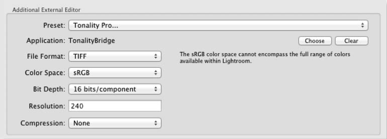
The next section covers other external editors besides Photoshop. The settings are similar to those in Photoshop, with the addition of JPEG. JPEG (or jpg) is the most common photo file format and provides great quality in a smaller files size than the TIFF format. It uses lossly compression though, so some file information is lost when JPEGS are created. These files also lose quality each time you save them. However, some external editors only read the JPEG file format.
To choose a new external editor for immediate use:
1. Go to the Application option, and press Choose.
2. Navigate to the editor’s location (generally in Program Files or Applications).
3. Click Choose or press Return.
4. To remove the currently selected Application, press Clear.
5. To create a Preset that can be accessed from the Edit in . . Menu, open the Preset dropdown.
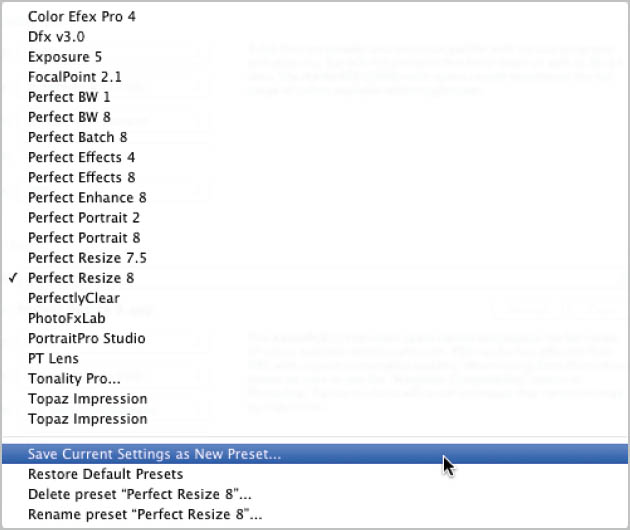
6. At the bottom of the menu, choose Save Current Settings as New Preset.
7. To activate any other preset, select it in this menu.
8. Additionally, you can Rename, Delete, or Restore Presets from here.
To open a file in the additional external editor, go to the Photo menu. From the Edit in . . command, choose either Open in Application or one of the Presets in the list. You can also use the shortcut for the currently selected editor: Command + Option + E (Mac) or Control + Alt + E (PC).
For the correct settings, please check the external editor’s documentation for compatible file types. Newer editors will generally create their own Presets when they are installed.
Elemental
Elemental by Matt Dawson is a Lightroom plugin that gives Photoshop Elements the extra commands that Photoshop offers, such as Open as Smart Object, Merge to Panorama, Open as Layers, and the additional Remove Lens Distortion. It’s available from: http://thephotogeek.com/lightroom/elemental
Stack With Original
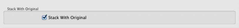
This option has one checkbox: Stack With Original. This forces the saved file to the top of a stack when it returns from the external editor. Stacking will be discussed later.
Edit External File Name

When a file returns from the external editor, you can add a suffix to differentiate it from the original file name. From the Template dropdown, you can create any file naming format for the edited file. Creating these Templates will be discussed shortly.
Selecting Files
Clicking a file will make it the active or selected file. Often you need to work on many files together, so it’s important to know how to select them in a group, especially if they’re scattered throughout the Grid or the Filmstrip.
To select multiple continuous images in Grid or Filmstrip, click the first photo you want selected, then Shift click the last one to include all photos in between. Note that the selected photos become highlighted. The first selected photo will be an even lighter shade to show that it’s the active photo. If you selected too many or too few photos, holding down Shift again and clicking another photo will increase or decrease the selection.
You can change which photo is active in the selection by using the arrow keys, or by clicking on another photo in the selection. Be warned: you must click on the photo rather than the gray border. Clicking the border will force the selection from the multiple photos you chose to just that single photo.
Command + click (Mac) or Control + click (PC) on any photo to add it to the selection, or to remove a previously selected photo. Note that using the Shift key for a row of photos can only be done at the start of a selection. If you Command or Control click and then use Shift-click, the photo you last clicked will become the first photo in a new row selection, clearing the previous selection(s).
With many photos selected, using Shift + Command + D (Mac) or Shift + Control + D (PC) will reduce the selection down to the active photo. You can also click the gray border on that image to make it the active photo.
Clicking on any other photo will wipe the current selection and make that photo the active photo.
Command + A (Mac) or Control + A (PC) will select all images.

Command + D (Mac) or Control + D (PC) will deselect all images.
If you have multiple photos selected, the “/” key will deselect the active photo and make the next photo in the selection active instead. This can be useful to break a long selection into two while removing photos that are no longer required.
Managing Color in Lightroom
With so many different devices in our workflow, from cameras to printers, it’s essential to keep the colors looking consistent no matter what device we use to view images. It’s important to match what we print to what we see onscreen. The whole process is called Color Management, and it is an area that often inspires fear in the photographer. Lightroom takes the pain out of this process and manages it under the hood. There are still things that you need to do to have it work. It’s critical to calibrate your screen and use correct profiles for the paper and inks you use in your printer.
Screens
How does Color Management work? It begins in the camera. By making the choice to shoot RAW, the camera creates a file that contains all the information captured by the sensor. This information can be interpreted many ways, and it’s something that Lightroom works with natively. As you view the RAW file in Lightroom, you’re looking at it through Lightroom’s Working Space. This Working Space describes the range of color and tone that Lightroom can reproduce, called the color gamut. There are many common color spaces, including ProPhoto RGB, Adobe RGB 1998, and sRGB, which define particular ranges of color. The Lightroom Working Space is based on ProPhotoRGB, but with minor changes. It’s affectionately known as “Melissa RGB.” If you want to know more about the origin of Lightroom’s Working Space, you can check out one of the original Lightroom podcasts created during the development of Lightroom: https://itunes.apple.com/ie/podcast/podcast-8-tim-mark-hamburg/id116073210?i=8141122&mt=2.
Color Space
A defined subset of all visible colors, usually created artificially.
Every computer monitor varies in the colors it can display, and even identical monitors from the same batch will have differences. What’s visible onscreen depends on the monitor’s color profile. Even if you’ve never made a profile, your computer will still have a default profile set as part of your operating system, or a profile provided by the screen manufacturer. Obviously it’s generic, so it doesn’t account for any variance in your screen. This is why it’s necessary to calibrate your monitor.
Lightroom automatically maps the internal color of the image to your screen’s color via this monitor profile. The better your monitor, the more colors it can display, and the more accurate it will be. It doesn’t make sense to buy the best camera in the world and then edit your images on a poor-quality screen—as a photographer, you need to invest in a good monitor. Even good screens need calibration to get the most accurate view of your photo.
When you’re done with your work in Lightroom, you can specify how you want your images to be displayed. The options Export, Publish, Print to JPEG, and Web all make you select a color space (or they choose it for you). The main three spaces mentioned already (ProPhoto RGB, Adobe RGB 1998, and sRGB) are the main options (Web uses sRGB only), but Lightroom will allow custom profiles to be attached to files.
As a general rule, ProPhoto RGB is an editing space. It encompasses most visible colors, and keeps your color intact as you edit. Adobe RGB 1998 holds less color, but is very popular for magazine work because it has more color than sRGB. High-end monitors can reproduce the entire gamut of Adobe RGB, meaning what you see onscreen is identical to the color in an Adobe RGB file. sRGB is a reduced color space and was created to match the color of the average computer screen. It’s the same color gamut you see on the internet. Not all internet browsers are color managed, so using sRGB gives your photo the best chance of looking like it does on your screen once it’s been uploaded to the web.
Printer
As well as digital output, you also need some way to make your prints look the way the images looked on your screen. Lightroom maps to the printer’s colors using printer profiles. Like with monitors, you can make your own profiles; however, print and paper manufacturers provide very accurate profiles, which makes it much easier to get accurate prints. Lightroom does have dedicated panels to work with these profiles. We’ll cover this in the section about the Print Module.
Calibrating your Monitor
Historically, monitor calibration was carried out by visual inspection. Photoshop shipped with Adobe Gamma, but this was phased out as screen calibrators became more affordable. You can still do visual inspection on both Mac and PC; while they can’t beat a hardware calibrator, some management is better than none.
Apple has a software calibrator built into the Displays control in System Preferences. Click on Color, then Calibrate . . . Turn on Expert mode and follow the instructions.

Visual calibration is no match for a hardware tool. Your ambient light, viewing angle, and even your alertness all factor in your results. Using a hardware calibrator is ultimately the best option for repeatable color. There are many on the market, such as the Color Munki, Spyder 4, and i1 Display Pro. For Windows, there is Quick Gamma, a German product. I’ve seen some videos on it, but haven’t used it. You can check it out here: http://www.quickgamma.de/indexen.html
In the past, I used Monitor Calibrator Wizard (http://www.hex2bit.com/products/product_mcw.asp), but development on this product seems to have stalled, and I can’t vouch for whether or not it will work with current Windows versions.
For explanation purposes, I’m using the X-Rite i1 Disply Pro, simply because I’ve found it reliable. I’m not specifically endorsing the product, just using it to show the calibration process. In previous books I’ve used Spyder as an example.
Using a Hardware Calibrator
The i1 Display Pro connects to an available USB port and is hung over the top of the screen. A weight is attached to the cable to provide a counterbalance, preventing it from moving during the calibration process. Let the monitor warm up for a bit before beginning—the color can vary in the moments just after starting up.
1. Install the software and do any updates necessary to get to the most current version of the software. Older versions often break when the operating system updates, so it is a necessary evil. With the calibrator plugged in, start the software. The calibrator acts as a dongle to make the software work.

2. Click Display Settings to begin. Here you set the attributes for the display. Normal settings are D65 for white point and 120cd/m2—though a lower brightness can be used, e.g., 100cd/m2. 120cd/m2 is probably the brightest setting you can use and still match prints accurately. Cd/m2 is a measure of brightness level. D65 refers to 6500k color temperature. You can also use D50 (5000k), but it looks quite blue on most screens, which is why D65 is generally preferred. You can choose to monitor the ambient light levels, but mine don’t change much, so I prefer not to use this feature. It also means I can store the calibrator device safely between uses. Click Next.

3. Click ADC to have the software automatically set up the display to a base level for measurement. The color tiles on the right show the colors that your screen will display during the measurement cycle. Click Start Measurement to begin.

4. Place the device over the center of the screen. Let the software know what controls are provided in your on-screen display menu (OSD). Click the right arrow to proceed.

5. Use the Quality Indicator to set the correct brightness level via your OSD. You may need to refer to the manual that came with the screen. Click the right arrow to proceed.

6. The software will flash the colors on the screen from the Start Measurement page. This takes a few minutes, so be patient. Once this process finishes, click the Create Profile button to create and save the new profile. You can overwrite the old profile, or rename it to keep it.

That’s it. You’re done. Welcome to better color! You can choose to set a reminder to do this at intervals. I wouldn’t leave it longer than four weeks, since monitors do change as time passes.