Chapter 8
Reporting Websites
Today, companies use their websites for a multitude of purposes: to market their products, advertise, engage with customers and employees, post important information on a real-time basis, enhance their image, and reinforce their brand—not to mention to sell products themselves. In comparison, how a company uses its website for corporate reporting purposes is fairly narrow. Because it is an increasingly significant channel through which the company can communicate with shareholders and other stakeholders, however, it is an important one. By capitalizing on their reporting websites, companies can move beyond the paper constraints of an integrated report in order to create a platform for the company's integrated reporting—a more multidimensional, interactive, and engaging form of communication. In the previous chapter, we saw that most companies producing integrated reports were doing little to support these documents online in a way that would make the information they contain more useful and usable. While the Internet has the potential to dramatically enhance integrated reporting and integrated thinking, it can also do so for more traditional corporate reporting. To the extent this is happening, it is reasonable to expect that large companies have the resources to do so.
To assess how the world's most sophisticated companies are leveraging the Internet for corporate reporting purposes, we studied the websites of the largest 500 companies in the world: the “Global 500.”1 The list came from Fortune for fiscal years that ended on or before March 31, 2013. While size is not equal to sophistication, we reason that it is a good proxy. Furthermore, a few statistics indicating the economic significance of these companies give them, in our view, a responsibility to be effective in communicating their performance to shareholders and other stakeholders through both reports and websites. Their revenues ranged from $467.2 billion for the number-one-ranked Royal Dutch Shell to $24.1 billion for Ricoh at number 500. Market capitalization ranged from number 11-ranked (in revenues) Chevron's $ 504.8 billion to 309-ranked (in revenues) Alliance Boots at $17.0 million.2 In 2012, their revenues totaled $24.3 trillion, and they had profits of $1.9 trillion. Their market cap of $21.9 trillion represented 42% of the global market cap of the world's approximately 46,000 listed companies. This tremendous economic power is concentrated in a very small number of companies, and even within this elite group, there is also a high degree of concentration. The top 100 represent 48%, 43%, and 32% of the revenues, profits, and market cap, respectively, of these 500 companies.3
Based upon detailed studies of over 100 companies' websites,4 including some of the best examples of how integrated reporting companies are using their websites, we developed an inventory of items to cover general website characteristics (e.g., did the company have a separate website focused on the corporation itself or was it part of its e-commerce websites, as under an “About Us” tab), how the website was being used for financial reporting (e.g., how many years of annual reports were available online and whether reports provided in different languages), and how the website was being used for sustainability reporting (e.g., does the company provide information about sustainability on their website such as a report and how difficult it was to find it). Only 24 of these companies were practicing integrated reporting.
Methodology
The data collection exercise proved challenging5 due to the vast variation in structure, functionality, and presentation of websites. Approximately 75% of the companies on our list were headquartered outside the United States. Consequently, we encountered language barriers and cultural differences, such as lower use of social media in China compared to the United States and Europe. This may be explained by China's comparatively lower percentage of Internet users and the growing use of social media services unique to China that would not appear on the English version of the site.6 Determining which languages were covered on a site was sometimes difficult due to the number of languages and alphabets used by some companies. In some cases, the website did not offer an English version and we relied on Google Translate.7 While we initially sought an automated method for gathering the data, we found that it had to be done by hand and carefully checked.8 We created a template for coding up the features of each company's website, and the data were then transferred into a spreadsheet.
The last step in the data collection and preparation process was to create a set of logical categories for grouping the individual features (shown in Appendix 8.A).9 The categories we created were Financial Transparency (amount and quality of financial information), Sustainability Transparency (amount and quality of sustainability information), Connectivity (easy and obvious linkages of related parts of the website to each other),10 Interactivity (features to engage the user), and Utility (features to make the website as usable and user-friendly as possible).11 The raw score for each company was aggregated by category and converted to a Z-Score, which was then normalized between 1 and 100.12
Website Category Analysis
Table 8.1 shows the average category scores by sector. Technology & Communications has the highest score of 61 (Healthcare is 59 and Resource Transformation is 58) and Infrastructure the lowest score of 40. The high scores may be a result of companies in these industries needing to have high-quality websites in general. Technology & Communications companies attempt to differentiate commodity products through branding and Healthcare companies need to educate consumers and build trust. Resource Transformation companies are necessary, but highly controversial, and need to ensure their license to operate.
Table 8.1 Global 500 Reporting Website Categories by Sustainability Accounting Standards Board (SASB) Sector
| SASB Industry | Number of Companies | Financial Transparency | Sustainability Transparency | Connectivity | Interactivity | Utility | Total |
| Consumption | 64 | 54.51 | 51.01 | 51.13 | 55.66 | 60.75 | 57.28 |
| Financials | 108 | 54.10 | 51.58 | 47.68 | 45.71 | 50.79 | 52.36 |
| Healthcare | 28 | 63.36 | 43.65 | 50.89 | 60.42 | 64.00 | 59.45 |
| Infrastructure | 43 | 41.57 | 42.96 | 43.14 | 40.04 | 31.93 | 39.98 |
| Nonrenewable Resources | 100 | 43.20 | 49.54 | 46.66 | 41.95 | 45.30 | 46.28 |
| Resource Transformation | 41 | 54.53 | 52.08 | 48.19 | 55.35 | 59.42 | 58.02 |
| Services | 14 | 50.25 | 44.04 | 41.65 | 47.88 | 55.08 | 48.45 |
| Technology & Communications | 51 | 58.90 | 62.97 | 47.48 | 55.36 | 58.66 | 60.57 |
| Transportation | 51 | 49.10 | 52.30 | 44.15 | 50.95 | 42.98 | 49.76 |
| Average score | 52.17 | 50.01 | 46.77 | 50.37 | 52.10 | 52.46 | |
| “Most major industry classification systems use revenue as their basis for classifying companies into specific sectors and industries. However, a company's market value is determined by more than financial performance: in many industries as much as 80 percent of market capitalization is made up of intangibles. To address this shortcoming, SASB developed the Sustainable Industry Classification System™ (SICS™), which categorizes industries based on resource intensity and sustainability innovation potential. The system is tied back to traditional classification systems such as Global Industry Classification Standard (GICS) and Bloomberg Industry Classification System (BICS). SICS is structured in three levels. The lowest level, industry, is comprised of the 80+ industries for which SASB is developing standards. The middle level, industry working groups, groups industries based on sustainability impact similarities. The highest level, sector, is comprised of ten sectors that reflect the ultimate purpose given to these resources.” Sustainability Accounting Standards Board. Industry Classification, http://www.sasb.org/industryclassifica-tion/, accessed April 2014. | |||||||
For the separate categories, Connectivity shows the least variation across sectors ranging from Consumption (51) to Services (42). Utility has the widest range in scores by sector, from 64 for Healthcare to 32 for Infrastructure. This could be due to the fact that Consumption companies need to have much more useful websites for selling their products in comparison to Infrastructure companies. Financial Transparency, Sustainability Transparency, and Interactivity all have virtually the same range in scores across sectors.
Total Score by region saw more variation, with Europe highest at 67 and Asia lowest at 35 (Table 8.2). However, this comparison may be somewhat artificial since it is possible that the native language version of Asian company websites would receive a higher score. While it is easy for companies based in non-English-speaking countries to translate an integrated report document into English, creating a fully functional English corporate reporting website is more challenging. How much a company should invest in doing so largely depends upon how important its foreign investors and other stakeholders are to it.
Table 8.2 Global 500 Reporting Website Categories by Region
| Region | Number of Companies | Financial Transparency | Sustainability Transparency | Connectivity | Interactivity | Utility | Total |
| Asia | 187 | 34.08 | 44.06 | 41.81 | 30.58 | 31.33 | 35.25 |
| Europe | 150 | 68.68 | 64.09 | 56.21 | 62.89 | 55.51 | 66.78 |
| Latin America and the Caribbean | 13 | 41.77 | 54.30 | 48.08 | 42.43 | 46.03 | 51.09 |
| North America | 141 | 56.58 | 45.04 | 44.11 | 59.39 | 72.30 | 58.23 |
| Oceania | 9 | 51.60 | 64.52 | 56.19 | 43.61 | 53.43 | 59.27 |
| Average score | 50.54 | 54.40 | 49.28 | 47.78 | 51.72 | 54.12 | |
| Note: For the definition of regions, Global Reporting Initiative's (GRI's) Sustainability Disclosure Database was used. https://www.globalreporting.org/reporting/report-services/sustainability-disclosure-database/Pages/default.aspx | |||||||
Table 8.3 contains data for the six countries with the largest number of Global 500 companies. The variation across each category is even greater than that by region due to the extremely low scores of China, which ranged from 18 to 25 across all categories. The European countries of Germany, France, and the United Kingdom mostly score higher than U.S. or Japanese companies. After China, U.S. companies have the lowest Sustainability Transparency and Connectivity scores. Yet on Interactivity, their score is in the same range as the European countries, and they have the highest Utility score by a wide margin.
Table 8.3 Global 500 Reporting Website Categories by Country
| Country | Number of Companies | Financial Transparency | Sustainability Transparency | Connectivity | Interactivity | Utility | Total |
| United States | 131 | 55.83 | 44.92 | 44.06 | 60.00 | 73.83 | 58.53 |
| China | 84 | 18.71 | 24.22 | 25.45 | 20.42 | 13.34 | 15.03 |
| Japan | 61 | 50.84 | 66.26 | 60.92 | 38.30 | 50.00 | 57.83 |
| France | 31 | 67.46 | 58.87 | 52.50 | 67.57 | 43.60 | 62.36 |
| United Kingdom | 30 | 63.84 | 62.27 | 58.92 | 63.41 | 64.15 | 66.49 |
| Germany | 29 | 76.78 | 66.24 | 54.99 | 63.22 | 54.90 | 70.17 |
| Average score | 55.58 | 53.80 | 49.47 | 52.15 | 49.97 | 55.07 | |
| Note: Information on the country location for each company was from Fortune, “Global 500.” | |||||||
The variation in Total Score by size range is the same as it is for the sector differences (Table 8.4). On balance, these data confirm our use of size as a proxy for sophistication. There is a clear relationship between Total Score and size of company, following a rank order aside from the last two size ranges, in which the order is reversed. Yet even the 100 largest companies in the world only received a Total Score of 61. The lowest variation was seen in Connectivity: the 100 largest companies actually received a score virtually identical to that of the companies ranked 200–300 in size. Although these differences are not large, the greatest variation occurred in Interactivity and Utility, suggesting that only the very largest companies see the benefit in making these important features of their reporting website. The least variation occurred in Financial Transparency and Sustainability Transparency.
Table 8.4 Global 500 Reporting Website Categories by Company Size in Revenues
| Rank | Number of Companies | Financial Transparency | Sustainability Transparency | Connectivity | Interactivity | Utility | Total |
| 1–100 | 100 | 60.52 | 57.46 | 49.99 | 57.67 | 62.58 | 61.46 |
| 101–200 | 100 | 54.00 | 56.10 | 47.25 | 58.13 | 55.00 | 56.45 |
| 201–300 | 100 | 53.13 | 51.30 | 51.09 | 48.72 | 51.02 | 53.43 |
| 301–400 | 100 | 43.21 | 42.27 | 41.27 | 38.25 | 40.28 | 41.34 |
| 401–500 | 100 | 45.74 | 47.77 | 46.40 | 41.93 | 45.71 | 47.48 |
| Note: Information on the revenue for each company was from Fortune, “Global 500.” | |||||||
Since listed companies have more reporting requirements than State-Owned Enterprises (SOEs) or private companies, we correctly expected them to have higher scores for their reporting websites. We compared the scores of the 415 listed companies to the remaining 85 unlisted ones (Table 8.5), most of which are SOEs, with a few private family-owned companies. Our expectations were confirmed. Reflecting the fact that they have no obligations to outside shareholders, the unlisted companies rank much lower, with scores of one-quarter to one-half of the listed companies and especially low scores on Financial Transparency and Utility. However, unlisted companies are still subject to scrutiny and pressures from civil society, perhaps explaining their higher but still modest Sustainability Transparency score and comparable scores on Connectivity and Interactivity.
Table 8.5 Global 500 Reporting Website Categories by Type of Company
| Number of Companies | Financial Transparency | Sustainability Transparency | Connectivity | Interactivity | Utility | Total | |
| Listed | 415 | 58.11 | 55.55 | 50.97 | 53.53 | 58.17 | 58.84 |
| Unlisted | 85 | 18.16 | 28.64 | 28.81 | 26.52 | 15.52 | 18.82 |
| Note: We used Bloomberg LP's market status coding to classify each company as Active, Private, and Unlisted. | |||||||
Finally, we compared the websites of a subset of the integrated reporting companies (Table 8.6) discussed in the previous chapter to the Global 500. Using the same methodology, we analyzed the top 40 non-South African companies in terms of their total score on their integrated report and the same for the top 10 South African companies.13 The websites of the South African companies rank distinctly lower in every category except Connectivity, an ostensible artifact of their integrated report production. These results clearly indicate that having a high-quality integrated report and a high-quality corporate reporting website are completely independent of each other.
Table 8.6 Website Categories of Integrated Reporting Companies
| Region | Number of Companies | Financial Transparency | Sustainability Transparency | Connectivity | Interactivity | Utility | Total |
| Non-South Africa | 42 | 55.71 | 54.20 | 49.56 | 53.49 | 54.31 | 53.17 |
| South Africa | 10 | 32.29 | 43.40 | 73.93 | 31.19 | 32.45 | 40.92 |
Website Feature Analysis
The aggregate category scores analyzed above do not reveal some important differences in the individual features comprising each category. Since it is through these features that companies create effective reporting websites, we examined them in order to gain insights into exactly what a company needs to do to improve its corporate reporting website. These data are shown in Tables 8.7 (by SASB sector), 8.8 (by region), 8.9 (by country), 8.10 (by size), 8.11 (by type), and 8.12 (for companies publishing an integrated report). As expected, much of the variation in these specific features matches the patterns discussed above, since these categories are comprised of the items shown in these tables. While some features, such as social media, are used by most of the Global 500, others, like providing data in the Extensible Business Reporting Language (XBRL) format, are used by very few. Most companies could dramatically improve the quality of their corporate reporting website with relatively little effort.
Table 8.7 Global 500 Reporting Website Features by Sector
| SASB Industry | Number of Companies | Social Media (%) | Videos (%) | Feedback (%) | Account (%) | Games (%) | Webcasts (%) | Contact (%) | Tools (%) | Excel (%) | Custom (%) | XBRL (%) |
| Consumption | 64 | 78 | 36 | 3 | 3 | 0 | 70 | 36 | 61 | 48 | 0 | 41 |
| Financials | 108 | 62 | 26 | 5 | 1 | 1 | 54 | 33 | 52 | 31 | 6 | 19 |
| Healthcare | 28 | 86 | 46 | 7 | 0 | 0 | 79 | 61 | 71 | 54 | 4 | 50 |
| Infrastructure | 43 | 53 | 21 | 0 | 5 | 0 | 40 | 23 | 30 | 14 | 0 | 5 |
| Nonrenewable Resources | 100 | 53 | 26 | 4 | 0 | 0 | 42 | 29 | 48 | 32 | 3 | 15 |
| Resource Transformation | 41 | 71 | 34 | 12 | 5 | 2 | 66 | 34 | 56 | 49 | 2 | 41 |
| Services | 14 | 71 | 29 | 0 | 0 | 0 | 57 | 36 | 71 | 43 | 14 | 21 |
| Technology and Communication | 51 | 78 | 33 | 14 | 0 | 0 | 63 | 35 | 63 | 43 | 2 | 24 |
| Transportation | 51 | 63 | 37 | 8 | 10 | 0 | 41 | 25 | 41 | 24 | 0 | 18 |
| Average score | 66 | 31 | 6 | 2 | 0 | 54 | 33 | 52 | 36 | 3 | 24 |
Table 8.8 Global 500 Reporting Website Features by Region
| Region | Number of Companies | Social Media (%) | Videos (%) | Feedback (%) | Account (%) | Games (%) | Webcasts (%) | Contact (%) | Tools (%) | Excel (%) | Custom (%) | XBRL (%) |
| Asia | 187 | 34 | 14 | 3 | 0 | 0 | 19 | 9 | 25 | 13 | 2 | 4 |
| Europe | 150 | 83 | 47 | 10 | 6 | 0 | 71 | 63 | 67 | 31 | 4 | 5 |
| Latin America and the Caribbean | 13 | 62 | 15 | 0 | 0 | 8 | 38 | 8 | 54 | 38 | 0 | 0 |
| North America | 141 | 88 | 38 | 6 | 2 | 1 | 84 | 35 | 72 | 72 | 4 | 73 |
| Oceania | 9 | 78 | 11 | 0 | 0 | 0 | 89 | 44 | 78 | 11 | 0 | 0 |
| Average score | 66 | 31 | 6 | 2 | 0 | 54 | 33 | 52 | 36 | 3 | 24 |
Table 8.9 Global 500 Reporting Website Features by Country
| Country | Number of Companies | Social Media (%) | Videos (%) | Feedback (%) | Account (%) | Games (%) | Webcasts (%) | Contact (%) | Tools (%) | Excel (%) | Custom (%) | XBRL (%) |
| United States | 131 | 89 | 38 | 7 | 2 | 1 | 83 | 36 | 71 | 76 | 3 | 78 |
| China | 84 | 12 | 10 | 0 | 0 | 0 | 5 | 6 | 5 | 0 | 0 | 0 |
| Japan | 61 | 48 | 21 | 5 | 0 | 0 | 34 | 0 | 41 | 26 | 5 | 10 |
| France | 31 | 87 | 48 | 19 | 6 | 0 | 61 | 45 | 45 | 13 | 3 | 0 |
| United Kingdom | 30 | 80 | 60 | 7 | 0 | 0 | 80 | 60 | 90 | 43 | 0 | 10 |
| Germany | 29 | 76 | 52 | 10 | 21 | 0 | 66 | 76 | 62 | 38 | 7 | 0 |
| Average score | 62 | 33 | 6 | 3 | 0 | 54 | 29 | 49 | 39 | 3 | 30 |
Table 8.10 Global 500 Reporting Website Features by Size
| Ranking | Number of Companies | Social Media (%) | Videos (%) | Feedback (%) | Account (%) | Games (%) | Webcasts (%) | Contact (%) | Tools (%) | Excel (%) | Custom (%) | XBRL (%) |
| 1–100 | 100 | 76 | 41 | 10 | 5 | 0 | 74 | 41 | 62 | 50 | 4 | 39 |
| 101–200 | 100 | 72 | 49 | 7 | 5 | 1 | 52 | 29 | 57 | 41 | 4 | 21 |
| 201–300 | 100 | 74 | 23 | 5 | 1 | 0 | 59 | 30 | 53 | 31 | 4 | 19 |
| 301–400 | 100 | 53 | 16 | 3 | 0 | 1 | 39 | 30 | 41 | 25 | 1 | 18 |
| 401–500 | 100 | 53 | 24 | 4 | 1 | 0 | 48 | 35 | 49 | 31 | 1 | 22 |
| Average score | 66 | 31 | 6 | 2 | 0 | 54 | 33 | 52 | 36 | 3 | 24 |
Table 8.11 Global 500 Reporting Website Features by Type of Company
| Ranking | Number of Companies | Social Media (%) | Videos (%) | Feedback (%) | Account (%) | Games (%) | Webcasts (%) | Contact (%) | Tools (%) | Excel (%) | Custom (%) | XBRL (%) |
| Listed | 415 | 74 | 34 | 7 | 3 | 0 | 65 | 38 | 63 | 42 | 3 | 29 |
| Unlisted | 85 | 26 | 13 | 0 | 0 | 0 | 4 | 11 | 2 | 2 | 1 | 0 |
| Average score | 66 | 31 | 6 | 2 | 0 | 54 | 33 | 52 | 36 | 3 | 24 |
Table 8.12 Website Features of Integrated Reporting Companies
| Region | Number of Companies | Social Media (%) | Videos (%) | Feedback (%) | Account (%) | Games (%) | Webcasts (%) | Contact (%) | Tools (%) | Excel (%) | Custom (%) | XBRL (%) |
| Non-South | 42 | 83 | 38 | 5 | 0 | 5 | 60 | 67 | 76 | 60 | 21 | 5 |
| Africa | ||||||||||||
| South Africa | 10 | 70 | 0 | 0 | 0 | 0 | 70 | 70 | 80 | 20 | 0 | 0 |
| Average score | 81 | 31 | 4 | 0 | 4 | 62 | 67 | 77 | 52 | 17 | 4 |
Two-thirds of these companies use social media; one-half use webcasts and provide tools for users to help analyze data; one-third provide videos, the name of a specific contact person at the company (vs. a general “Investor Relations” email address); and one-quarter provide data in XBRL. Very few companies ask for feedback on their website (29 companies), ask the user to create an account so they can analyze website usage by type of person (12 companies), enable the user to create a “custom report,” or provide interactive games to help the audience understand the trade-offs the company is grappling with (two companies). The larger companies, especially the largest 100, are more likely to have taken advantage of most of these features. The exception lies in asking for the user to register an account, to participate in instructive games, or create a custom report; even for the very largest companies, only an extremely small percentage have this functionality on their website. This raises the question of whether these are simply not important features or whether even the largest companies are only beginning to tap into the power of the Internet. The private companies, as expected, have extremely low scores: 0% on 4 of the 11 factors and less than 5% on 8. One-quarter use social media and a little more than 1 in 10 had videos.
Unlike financial reporting, integrated reporting can perform a transformation function. With this in mind, we looked for evidence of companies trying to do so by comparing the integrated reporting companies to the Global 500. For the entire sample of integrated reporting companies, they score noticeably higher on providing the name of a specific contact (67% vs. 33%) and tools for analysis (77% vs. 52%). Both features contribute to the transformation function. The latter enables the user to better understand the meaning of what the company is reporting. Perhaps indicative of a desire for greater engagement that comes with integrated reporting, the former gives the user an accessible channel through which he or she can ask the company questions. The latter indicates a desire to foster integrated thinking on the part of the audience. On all other features, this group looks about the same as the Global 500. However, again we found a few areas in which the South African companies are notably weaker: videos (0% vs. 38%) and providing data in Excel spreadsheets (20% vs. 60%).
Three Examples
We will conclude this chapter by looking at the reporting website use of three leading integrated reporting companies previously mentioned in this book: Novo Nordisk, Philips, and SAP.14 In highlighting their websites, we simply wish to illustrate some of the interesting and useful things being done today that could be replicated with modest effort by any company of significant size. Each company scored high on its integrated report and corporate reporting website.15 Novo Nordisk uses its website to supplement the PDF version of its integrated report with rich detail and interactive games. The approach to website use at Philips is similar to Novo Nordisk's; however, unlike Novo Nordisk's site, Philips engages the website visitor with video presentations. SAP is distinctive in that it places much greater emphasis on making the site itself, rather than a document, the basis of its integrated reporting.
Novo Nordisk
While Novo Nordisk's primary communication vehicle for the company's integrated report on financial, social, and environmental performance is a PDF document that can be viewed online or downloaded, information supplementing the annual report, as on materiality and stakeholder engagement, is available via the Home Page with a single click on the “Sustainability” tab.16 Materiality is covered at a very high level in the integrated report. Using the path, Home; Sustainability; Our Priorities, brings the reader to six topics: Access to health, Responsible business practices, Our people, Environment and climate change, and Communities and Bioethics. Each topic, in turn, has links to as many as six subtopics, each of which can be explored further. “Our positions,” a subsection of Sustainability, also provides position papers on issues of relevance to Novo Nordisk and insights into how the company views its role as a global corporate citizen. In addition, the website also presents interactive games17 that simulate business ethics, climate change, and economics and health dilemmas illustrative of the trade-offs the company might encounter among its stakeholders. Finally, the company recently introduced a publication called “TBL Quarterly” (for Triple Bottom Line) which “tells the actions, challenges and opportunities of conducting a sustainable business. Each quarterly issue offers articles, photos, videos and infographics that demonstrate how responsibility supports long-term value creation.”18
Like materiality, stakeholder engagement is not covered in depth in the PDF report. Rather, the “Sustainability” page links to a discussion of stakeholder engagement that identifies several key stakeholders and makes clear that patients are the ultimate stakeholder to which the company must hold itself accountable.19 In addition to consulting with employees, investors, suppliers, and other business partners and neighbors, the company considers memberships in industry and business associations, advocacy organizations, and affiliation with think tanks to be integral parts of stakeholder engagement.
Insofar as “behind the scenes” website user tracking features are concerned, Novo Nordisk tracks content areas by interest to the company's stakeholders (seen in Table 8.13) via the number of downloads. Few users downloaded quarterly financial figures for 2011 and 2012, most likely because this information is readily available elsewhere, but they expressed a high level of interest in how much of the company's shares are held by management, management's interpretation of accomplishments and results in 2012, the consolidated statements of all types of performance,20 and what assurance has been given on the report.21
Table 8.13 Most Viewed Sections of Novo Nordisk Annual Report 2012
| Section | Views |
| Management's holdings of Novo Nordisk shares | 1086 |
| Accomplishments and Results 2012 | 402 |
| Consolidated financial, social and environmental statements | 286 |
| Assurance | 246 |
| Our business | 149 |
| Quarterly financial figures 2011 and 2012 | 79 |
| Additional Information | 36 |
| Outlook 2013 | 24 |
| Governance leadership and shares | 23 |
| Note: Special thanks to Novo Nordisk for providing this data, especially Susanne Stormer, Vice President, Corporate Sustainability; Christina Salomon, Project Manager, Corporate Sustainability; and Scott Dille, Team Leader, Insights and Outreach. Specific sections of Novo Nordisk's 2011 and 2012 annual reports can be downloaded and viewed from Novo Nordisk's reporting website. Although only overall count data is provided on the number of downloads, we surmise that those visiting and downloading information from the annual report are an accurate reflection of the company's stakeholders. | |
Philips
While Philips uses its website to supplement information in its integrated report,22 the company does much more than provide additional information. It weaves interactive elements throughout the site to connect with visitors in a more visceral way than narrative and numbers can accomplish alone, while simultaneously gathering data about the kinds of people using the site. Visitors to the Philips annual report website are greeted by a request to identify which constituency they represent. The selections include customer, shareholder, financial analyst, sustainability analyst, employee, supplier, nongovernmental organization (NGO), portfolio manager, journalist, job seeker, or student. Philips also provides an “other” category with space to enter a brief description.
The use of video to engage a visitor has been a humanizing feature on the Philips website since it published its first integrated report in 2008. The 2012 website includes video commentary from the chief executive officer (CEO), chief financial officer (CFO), and Chief Human Resources Officer. The Message from the CEO brings the traditional CEO Letter to life; a visitor can hear the CEO's passion and commitment. The CFO's review of financial performance provides texture that the corporate Balance Sheet and Statement of Income cannot offer. Similarly, the Chief Human Resources Officer delivers remarks on how Philips is driving structural and cultural change.
An example of using animation creatively, “Interactive charts” encourage visitors to design their own presentations of Philips' performance. Seven charts are available—Balance Sheet, Statement of income, Profitability, Cash flow, Key figures per share, Employees, and Sustainability. Each allows manipulation based on several different properties. For example, the Statement of income charts provide sales and different computations of earnings for five years for the Group or individual business segments.
The report download center23 offers a visitor several choices for accessing report information. While one may download the entire annual report, the visitor can also compile a personalized report by selecting individual sections. Philips also provides three prefabricated reports: Analyst selection, Sustainability selection, and Employee highlights.
SAP 24
Containing the only report available exclusively online, SAP's website does an excellent job of organizing integrated reporting content (Table 8.14). Because of its logical structure, for example, “The International <IR> Framework” Content Elements related to the Guiding Principles of Strategic focus and future orientation are relatively easy to find.
Table 8.14 “The International <IR> Framework” and SAP's Corporate Reporting Website
| “The International <IR> Framework” Content Element | Path on SAP website |
| Business model | Performance; Business Activity |
| Strategy and resource allocation | Performance; Vision, Mission and Strategy |
| Risks and opportunities | Performance; Risk Report |
| Outlook | Performance; Outlook |
Materiality is a separate section accessed from the “About This Report” tab. The materiality discussion provides a link to Stakeholder Engagement, an integral part of the process to determine materiality.
One of the most significant features of SAP's 2012 Integrated Report25 is the interactive graphic connecting financial and nonfinancial performance. The graphic depicts three economic indicators, four environmental indicators, and seven social indicators (Table 8.15) and shows the relationships between them.
Table 8.15 SAP Connecting Financial and Nonfinancial Performance
Data Source: SAP Integrated Report 2012. “Key Facts: Connecting financial and non-financial performance,” http://www.sapintegratedreport.com/2012/en/key-facts/connecting-financial-and-non-financial-performance.html, accessed April 2014 (site discontinued).
| Economic Indicators | Environmental Indicators | Social Indicators |
| Revenue | GHG Footprint | Employee Engagement |
| Operating Margin | Total Energy Consumed | Business Health Culture Index |
| Customer Success | Data Center Energy | Employee Retention |
| Renewable Resources | Women in Management | |
| Social Investment | ||
| Capability Building | ||
| Employer Ranking |
SAP's approach allows the reader to click on an indicator to display its relationship to other factors. For example, clicking on the environmental indicator, total energy consumed, displays a link to an economic indicator, operating margin, and to an environmental indicator, greenhouse gas (GHG) footprint. The environmental indicator, data center energy, is identified as the direct driver of total energy consumed. Similarly, Figure 8.1 illustrates this for employee engagement. No other company website we studied illustrated its interdependencies between financial and nonfinancial factors to the same degree.26
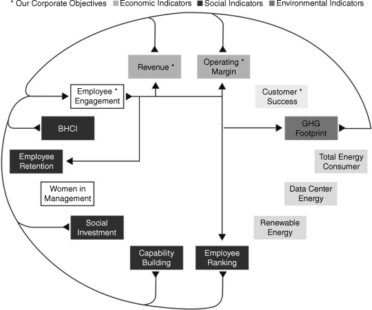
Figure 8.1 The Performance Implications of Employee Engagement
Source: SAP Integrated Report 2012, “Connecting Financial and Non-Financial Performance,” (site discontinued).
A first step in a process toward quantitative valuation of the relationships between financial and nonfinancial performance as contemplated by the International <IR> Framework,27 this graphic representation demonstrates SAP's understanding of how different dimensions of financial and nonfinancial information are related to each other.28
Further, the SAP Integrated Report 2012 includes an Independent Auditors Report29 and an Independent Assurance Report.30 The Independent Auditors Report provides a traditional opinion on the company's consolidated financial statements. The Independent Assurance Report provides both limited and reasonable assurance on selected sustainability information.31 Limited assurance is provided on SAP's application of the AA1000 AccountAbility Principle Standard (2008) and on selected qualitative claims and quantitative indicators on sustainability performance. Reasonable assurance is provided on the indicators for Business Health Culture Index, employee engagement, employee retention, women in management, GHG footprint (Scope 1 and 2 as well as selected Scope 3 emissions including business flights and employee commuting), renewable energy, total energy consumed, and customer success.
The fact that SAP's reporting website is one of the most sophisticated we studied is not surprising given that it is a technology company. Yet its website features are based more on the exercise of integrated thinking than sophisticated technologies, and virtually everything their website contains could be easily replicated by any company of significant size. Important as a reporting website is, however, it is only one way information technology can be used to improve integrated reporting and in the process, foster integrated thinking.