2
THE PICTURE WINDOW AND ITS FORMAT
In the first chapter, we learned about the importance of converting nature’s complexity into simplified and more visually concise shapes. Now, we turn our attention toward how those shapes are placed and arranged within our picture—otherwise known as composition.
The natural world is so vast and all-inclusive that it would be impossible to compose a landscape without limiting what we take in. The first act of composition, then, is to consider the rectangular paper or canvas that surrounds our subject—the picture window. How we position the window around our subject tells us what will be included in our composition and what will be left out. What small portion of the world will become the subject of our picture? The shape, or format, of the window itself—be it horizontal, vertical, or square—also imposes its own type of directional energy onto a composition.
In this chapter, we will look at the picture window as the first step in composition and in particular the unique attributes held by each of the formats.
Tibor Nagy, Fading Light Each picture format—horizontal, vertical, or square—imposes its own type of directional energy on a composition. Fading Light is framed within a vertical format. The format itself imposes a directional movement—inward and upward—that supports the sense of deep space.
Oil on linen, 16" × 12" | 40.5 × 30.5 cm
LIMITED FOCUS AND THE PICTURE WINDOW
The rectangle, or picture window, we impose around our subject is essentially the framing device for our composition. The picture window (or cropping, if we are to use the less formal term) determines which parts of the subject will be included in our composition, how those parts relate to each other, and how they relate to the four sides of the picture window itself. Limited focus is an apt term. It wonderfully describes the dual nature of the picture window: it limits what we include in our painting, but improves the composition by focusing our visual intent.
THE PICTURE WINDOW
When we look out a window, we see only a small portion of the wider world outside. Similarly, the rectangle, or picture window, we impose around our subject is the framing device for our picture. A composition cannot exist independent of the window that surrounds it.
LIMITED FOCUS IN ACTION: LESS IS MORE

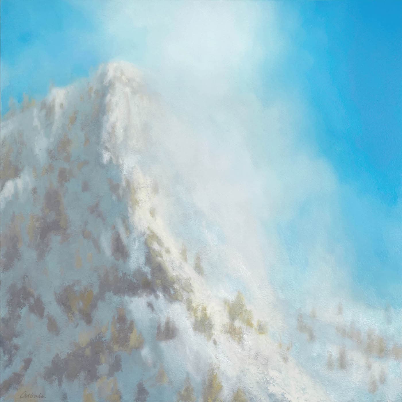
Mitchell Albala, Ascension, North Cascades
Oil on panel, 18" × 18" | 46 × 46 cm
The original subject, as seen in the photo, holds the seed of a visual idea—the snowcapped mountain catching the light and the mist rising into the sky. But that idea is lost in a sea of excessive, repetitive information that adds nothing to the visual story. A limited focus allows us to decide what the visual story is and eliminate everything that doesn’t contribute to it.
WAYS OF APPLYING A LIMITED FOCUS

LIMITED FOCUS IN PLEIN AIR
When working outdoors, a limited focus can be applied by using a plastic or cardboard viewfinder. Any type of camera can be used in the same way. For a more hands-on approach, consider a traditional thumbnail sketch. Unlike a viewfinder, which frames the subject, a thumbnail requires you to position the subject within an existing window drawn on the paper. This is more challenging because you have to decide how the elements will be positioned relative to the boundaries of the window. (See the exercise “Notan from Observation”.)

LIMITED FOCUS IN THE STUDIO
When working from photos in the studio, you can use a pair of L-shaped cropping devices to experiment with different compositions. You can also crop images digitally with an image editing app.
TIP
When shooting photos, feel free to take a “postcard” shot, composing it as perfectly as you want—but always shoot one that includes more real estate than you think you would ever need. This is your non-composed work photo from which you can extract multiple compositions. A good source photo will preserve your options, not eliminate them. (See the exercise “One Subject, Different Formats” at the end of this chapter.)
PICTURE FORMATS AND DIRECTIONAL ENERGY
Because the picture window is such a key determinant of a composition, it stands to reason that the shape, or format, of the window—horizontal, vertical, or square—will also have an effect. And indeed, it does. Each format asserts its own type of directional energy. The “landscape” format reinforces horizontal movement. The vertical format encourages inward and upward movement. And the square, with its symmetrical sides, does neither; it asserts uniform pressure on all sides.
If the same subject were composed within each of the formats, you would get three very different compositions. This is the exercise you will do at the end of the chapter.
When we understand the properties of each format, we realize that format is not arbitrary. We choose the format that best suits our compositional intent for each particular subject.
THE STRONGEST FORCES
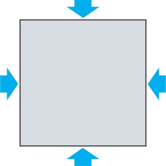
When I discuss composition in my workshops, I often point to the painting in question and ask, “What are the strongest compositional elements in this picture?” The answers are always things like “the perspective of the road,” “the contour of the hill,” or “the visual weight” of a particular element. Although these do affect the composition, the correct answer is not always obvious. The most important forces in the composition are formed by the top, bottom, left, and right sides of the picture window.
THE “LANDSCAPE” FORMAT: HORIZONTAL MOVEMENT
The horizontal format—aptly named “landscape”—is the most frequently used picture format in landscape painting. When we survey the history of landscape, even as far back as the eighteenth and nineteenth centuries, we find that most landscape paintings are horizontal. Why is this the case?
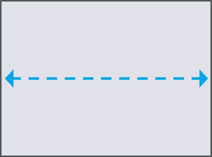
A wider format is a natural “fit” for the horizontal character of the landscape itself. We are surrounded on all sides by landscape elements, both natural and man-made. Some elements are nearer to us and some elements are farther away. Yet when we consider the totality of all that surrounds us, the predominant directional energy is horizontal—from left to right, east to west, and back again.
Furthermore, our own natural tendency is to scan the landscape horizontally, from left to right, across some segment of the 360 degrees that surround us. The horizon line, a strong presence in many landscapes, also reinforces horizontal movement. Even if the horizon line is obscured, it is always implied by the elements that rest upon it and follow its course.
EAST TO WEST
The horizontal format asserts directional energy along the horizontal axis. This tends to reinforce any horizontal movement the subject itself may contain.
HORIZONTAL REWARDS, HORIZONTAL RISKS
A painter may choose a horizontal format for various reasons. Some subjects are so expansive that they simply won’t fit well in a vertical or square format. The greatest strength of the horizontal format is its stability. Because humans are so grounded to the horizontal plane, the format can have a steady and calming effect, like a river flowing lazily past. However, one can also have too much horizontal energy.
When a subject that flows horizontally is placed within a format that reinforces horizontal movement, one can get an excess of horizontal energy.
This can inhibit the ability of the composition to suggest depth. The key to avoiding this is to add verticals and/or diagonals to the composition.
COUNTERACTING HORIZONTAL MOVEMENT WITH VERTICALS


One way to counteract excess horizontality is with verticals. Each of these wide compositions is anchored to a long horizontal shoreline. On the left, the thin cloud, the reflections in the water, and the shoreline all flow from left to right and back again. It is calm and stable, but without any verticals or diagonals, the composition is static. On the right, larger trees and their reflections form three vertical axes. It is still a relatively calm composition, but it is now more active. The eye can move in different directions.
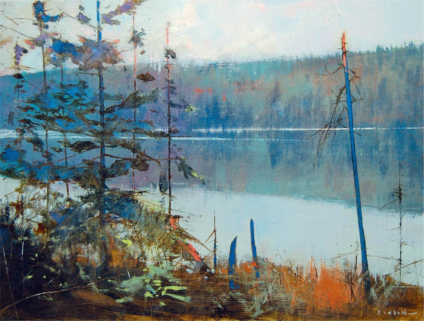
David Lidbetter, Morning, Brewer Lake
Oil on panel, 12" × 16" | 30.5 × 40.5 cm
Morning, Brewer Lake is a good example of how a painter can use verticals to counteract the horizontality asserted by the subject and the format. The vertical axes formed by the trees run in opposition to the horizontal axis of the shoreline. Also note the slight deviations from these horizontals and verticals: the tilt of the thin blue tree on the right and the subtle diagonals of the shoreline and foreground. Though shallow, these diagonals add a welcome note of variation to the strict horizontal structure of the composition.
COUNTERING HORIZONTAL MOVEMENT WITH LINEAR PERSPECTIVE

Kim Matthews Wheaton, The Promise of Abundance
Oil on canvas, 24" × 48" | 61 × 122 cm
Matthews Wheaton frequently works with an extended horizontal format. In less skilled hands, this format could be a recipe for excess horizontality. However, she provides a dramatic counterpoint to both the format and the many horizontal lines of the subject. Like an arrow, a vast green field pierces the horizontal space in dramatic perspective. Also note how the alternating patterns of light and dark in the fields keep our eye jumping back and forth from one side of the painting to the other.
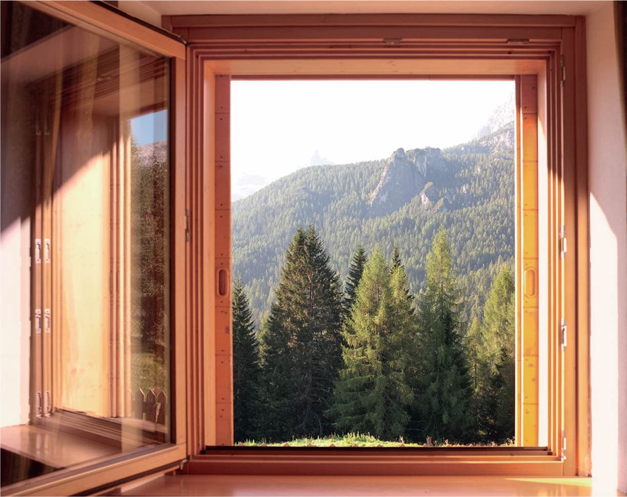
THE VERTICAL FORMAT: INWARD AND UPWARD
Just as the horizontal format reinforces movement along the horizontal axis, the vertical format reinforces movement along the vertical axis. In terms of composition, this translates as inward and upward movement—which on a flat picture plane can help suggest depth. This makes the vertical format particularly useful for the landscape painter who might be struggling with a composition that has too much horizontal movement or lacks depth. By positioning the subject within a vertical format, we allow the format to perform some of the depth-inducing work not provided by the subject.

INWARD AND UPWARD
The directional energy imposed by the vertical format is inward and upward. This effect is especially pronounced when the subject has elements of linear perspective.
ENHANCING DEPTH WITH THE VERTICAL FORMAT

The main event in this subject is the ground lines and fence sweeping back in perspective. This is evident in both the vertical and horizontal formats. In the vertical, however, the sense of depth is heightened. It’s as if the vertical sides of the picture squeeze the subject inward and push it upward. This action of the vertical format is particularly heightened in subjects that have a lot of linear perspective.

The focus of this subject is the formation of red rocks towering in the distance. In the horizontal format, we feel their upward thrust, but that feeling gets diluted because most of the directional energy is from left to right. In the vertical format, horizontal movement is curtailed. The eye is pulled inward and upward, increasing the sense of height in the rocks.
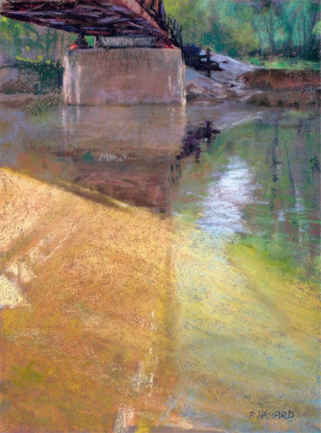
Ray Hassard, Flood of Light
Pastel on sanded panel, 16" × 12" | 40.5 × 30.5 cm
In Flood of Light, Hassard uses a series of diagonals and lines of perspective to create a strong sense of depth. The broad yellow plane of light (which occupies more than half the area of the painting), draws us sharply into the space. Note the subtle lines of perspective Hassard adds to that area. Then, by placing his composition within a vertical format, which lends inward and upward movement to the subject, he further reinforces the illusion of depth.
THE SQUARE FORMAT: CONTAINMENT
If the landscape format reinforces horizontal movement and the vertical format suggests inward and upward movement, then what does the square format do? As you might expect, it does neither. It exerts a uniform pressure on all sides and so lends no directional energy of its own to the composition. To suggest movement, therefore, a painter must rely entirely on the internal elements of the composition.
Scott Gellatly, whose work appears on these pages, says, “The allure of the square is its neutrality. It does not come with preconceived notions of the restful horizontal or the upward thrust of the vertical format. The square elevates the painting into an object, not just a window. The square format firmly supports the abstract nature of painting.”
CONTAINMENT
Unlike the horizontal and vertical formats, the square exerts a uniform pressure on all sides. This acts as a force of containment. Movement is focused toward the center and, in some cases, can even be suppressed.

Mitchell Albala, Upper Ridge in Snow
Oil on panel 18" × 18" | 46 × 46 cm
If this subject had been framed within a horizontal format, there would have been greater movement from left to right. But in a square, the movement created by the patterns of snow and rocks is constrained by the symmetrical confines of the square. The sense of stillness in Upper Ridge is, in part, conferred by the square itself.
THE SQUARE FORMAT: INTENTIONAL OR ARBITRARY?
The square format has become increasingly popular in recent decades. Painters are drawn to its balance and symmetry. It’s different. The availability of ready-made square panels and canvases has also contributed to its wider usage. Many websites and social media platforms constrain users to square thumbnails, which further standardizes the neat formality of the square.
As appealing as the square may be, it should never be chosen arbitrarily. The painter should always ask, “How does the square format serve my intent for this composition?”
Choosing a square simply because it’s available or because you like it is not a compelling enough reason. As with any format, the square should be chosen because it supports your compositional intent. Don’t force a subject into a square if it will work better in a horizontal or vertical format.

Mitchell Albala, Ballard Bridge, Under a Golden Light
Oil on paper 12" × 12" | 30.5 × 30.5 cm
In Ballard Bridge, the sky is the main compositional event. The darker tones around the periphery form a circle, drawing our eye toward the center. The square format acts as a force of containment and pulls the eye inward, reinforcing the centeredness of the subject.
REVIEW QUESTIONS: PICTURE WINDOW AND ITS FORMAT
If working from a photo, are you accepting its composition as final?
There are many potential compositions hidden within every scene. By working with a limited focus and testing different formats, you can often find better compositions than what was captured in the initial photo. See “Photos: Preparing for Limited Focus”.
Have you considered other formats besides horizontal?
The horizontal format is the most frequently used, but it isn’t ideal for every subject. How would your composition react in a vertical format? A square? Is one better suited to your intent for the composition?
How is movement within the subject affected by the picture format?
Each format has its own directional energy that can work to encourage or suppress movement.
When working within a horizontal format, are there also vertical and/or diagonal lines to counteract the horizontality of the format?
The landscape format exerts strong horizontal directional energy. What compositional elements allow the eye to move in other directions?
Would a vertical format help suggest greater depth?
The vertical format has an inherent ability to suggest inward and upward movement.
If choosing a square format, have you considered its unique qualities?
The square format has no directional energy of its own. It exerts a uniform pressure on all sides. Does it suppress movement within the composition? If so, would a vertical or horizontal format work better? Don’t select a square format arbitrarily.

Colley Whisson, Rain Showers Approaching, Australia
Oil on panel, 10" × 12" | 25.5 × 30.5 cm
EXERCISE: ONE SUBJECT, DIFFERENT FORMATS
OVERVIEW: A seasoned landscape painter may be able to identify a good composition quickly, with a single thumbnail study or one glance through the viewfinder. But most of us will find it revealing to discover that a single subject can often yield many potential compositions. In this exercise, you will develop three compositions from the same subject, in each of the three formats: horizontal, vertical, and square. By developing multiple options, you’ll see the effect each format has on the composition, allowing you to select the one that works best.
MATERIALS: Reference photo | Tracing paper | Soft 2B to 6B pencil or markers | Tape | L-shaped cropping tool
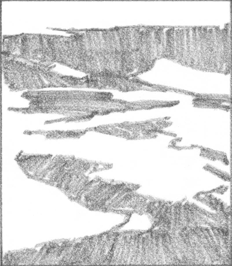
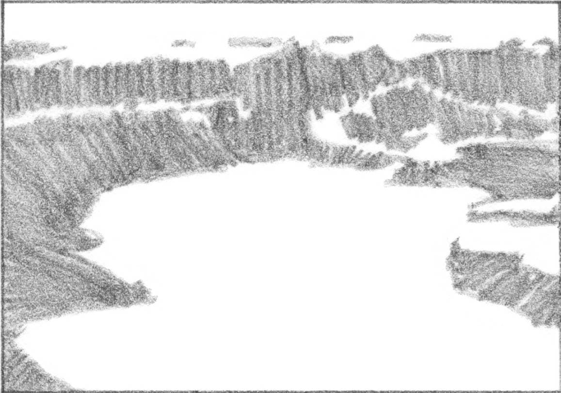
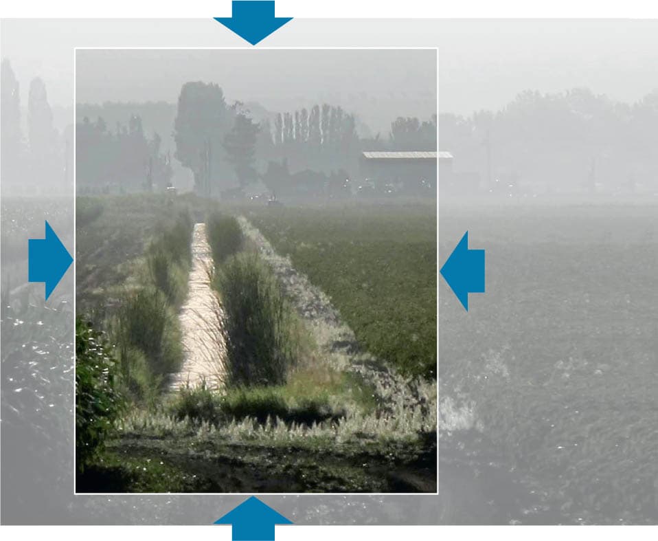
STEP 1: SUBJECT SELECTION
Don’t choose a “postcard” subject that is already perfectly composed. Choose one that has more real estate than you would typically include in single painting. This will give you more options to explore various compositions. This expansive, wide-angle subject offers many options, indicated by the movement lines.

Photo: Charles Sharpe
STEP 2: COMPOSING
Place the L-shaped cropping tool over the photo and begin to look for a vertical composition. Position the window over different areas of the subject, opening and closing the window. For a better idea of the aspects of composition to look for, see chapter 3. As you explore different compositions, you’ll arrive at one that rings true. Tape the cropping device in place.

STEP 3: TRACING
Slip a piece of tracing paper beneath the cropping device and then draw the edge of the picture window, defining the format. Then, in a shape-oriented thumbnail style, using pencil or marker, trace the composition. Don’t get bogged down in articulating details or every single value. Two or three values are enough to define the main shapes and the broad areas of light and dark. Here, I worked in notan-style thumbnail, using just two values. (For tips on doing thumbnail studies, see “Building a Better Study: Notan Technique”.)
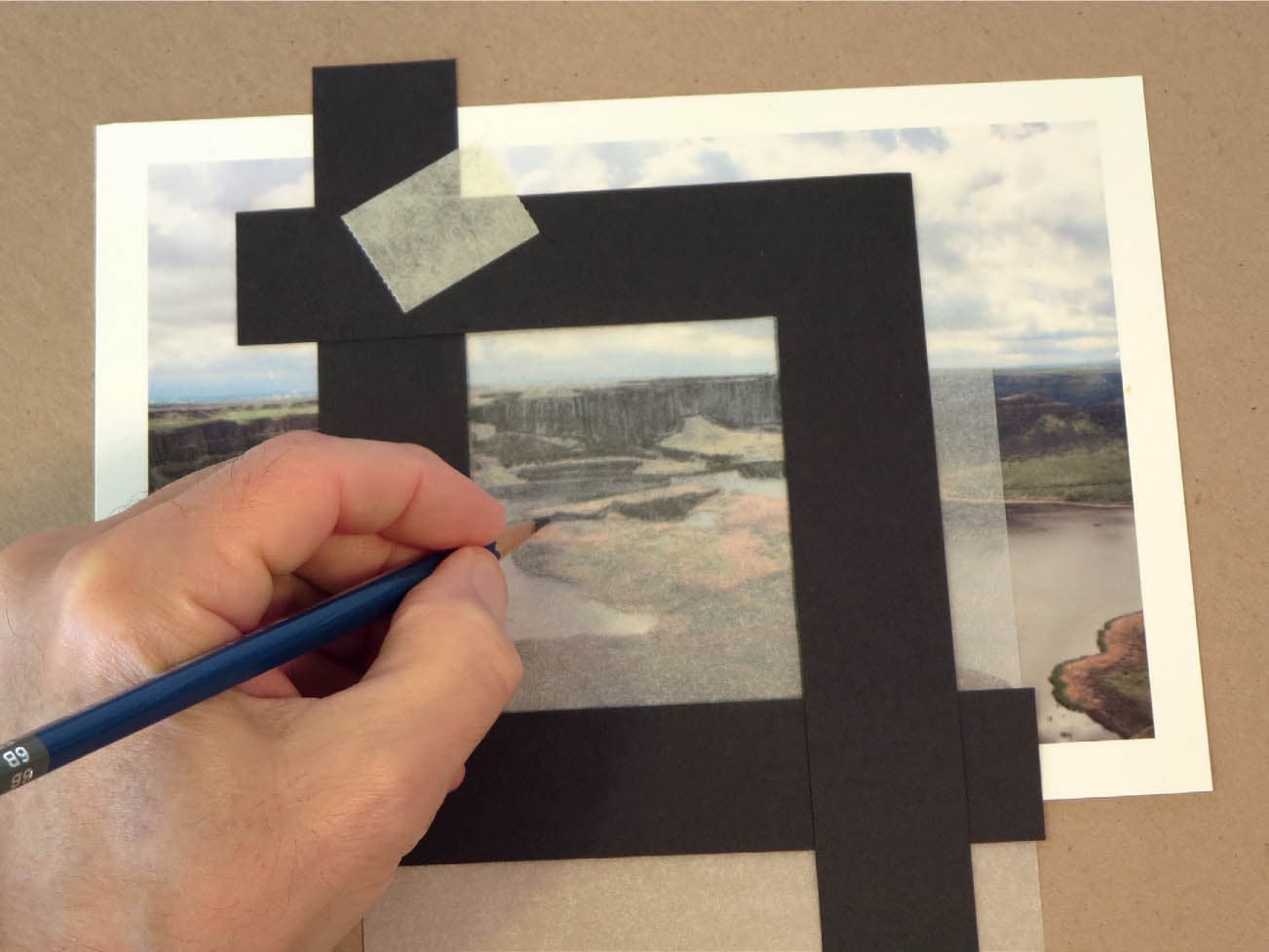
STEP 4: ALL FORMATS
Also do studies in horizontal and square formats and then evaluate each. How do the different formats affect the composition? Is one stronger? If so, why? The square captures the movement with the downward-pointing triangular shape formed by the water. The horizontal is the simplest of the three and best conveys the distance of the cliffs. The vertical format has a zigzag that draws the eye upward, but it is not as simple as the horizontal and square compositions. All three capture the curvilinear movement and depth found in the original scene, but in different ways.