
3
COMPOSITION IN ACTION
In the last chapter, we learned about the picture window and how using a limited focus determines what portion of the world will become our subject. Now, we turn our attention toward what goes on inside that window. How do the elements we typically associate with a composition—the various parts of the subject—relate to one another? How do they keep a viewer engaged? How do they suggest movement?
For many, composition remains the most elusive area of our practice. This isn’t because we can’t tell the difference between good and bad composition. We have an innate sensibility that allows us to do that. The problem is that we haven’t trained ourselves to approach each aspect of composition as an inquiry. When we do, we inevitably find the answers we seek. In this chapter, we will cover three main areas of compositional inquiry: variation and differences, movement, and active negative space.
Bill Cone, Looking Up The main goal of composition is to keep the viewer’s eye active and engaged. One of the most effective ways of doing this is through movement. In Looking Up, a zigzag pathway carries our eye upward. So decisive is this movement, it becomes the main event of the composition.
Pastel on paper, 12" × 9" | 30.5 × 23 cm
VARIATION: THE CARDINAL RULE OF COMPOSITION
As in so many aspects of life, the differences are what make it interesting. We are averse to boredom and seek variety wherever we can find it. And so it is with pictorial composition.
There are many aspects of variation, all of which conspire to do the same thing: keep the viewer’s eye active and engaged. Without adequate variation, viewers can lose interest very quickly. They instinctively know the difference between a composition that speaks in a monotone and one that varies its pitch and volume.
If there is a cardinal rule of composition, it is this: variation and differences keep a composition alive and interesting.

Tad Retz, Light Covering
Oil on board, 12" × 18" | 30.5 × 46 cm
The aspects of variation in the “forest” thumbnails on the next page come to life in this painting by Tad Retz. In this forest, every aspect of variation is at play. There are marked differences in the thickness (visual weight) of the trunks and limbs. There are differences in the angles of the limbs, including the downed trees in the foreground. There are differences in the heights of the trees and the intervals between them. And there are differences in color and value. Some trees are very dark, some medium value, and others as light as the snow.
ASPECTS OF VARIATION
The more aspects of variation that are at work within a composition, the more engaging the composition will be. In this sequence of thumbnails of a group of trees, the composition becomes progressively more interesting as aspects of variation are added.

NO VARIATION
In the first sequence, everything is the same. The spaces in between each bar or tree are the same, as are their thicknesses, angles, and lengths. The result is balanced and symmetrical, but it is a static composition.

INTERVALS
Intervals are the “spacing and pacing” between elements. Are they the same or do they vary? By varying the intervals, our “forest” becomes slightly less static.

LENGTH AND HEIGHT
By changing the length of the trees and adding a ground plane, the composition begins to suggest depth. Now, there are different intervals and lengths, as well as depth.

ANGLES AND WEIGHT
Two aspects of variation are added. The thickness (visual weight) of each tree is different. And each element (including the ground plane) is at a different angle. Now, we have variation of intervals, lengths, visual weight, and angles.
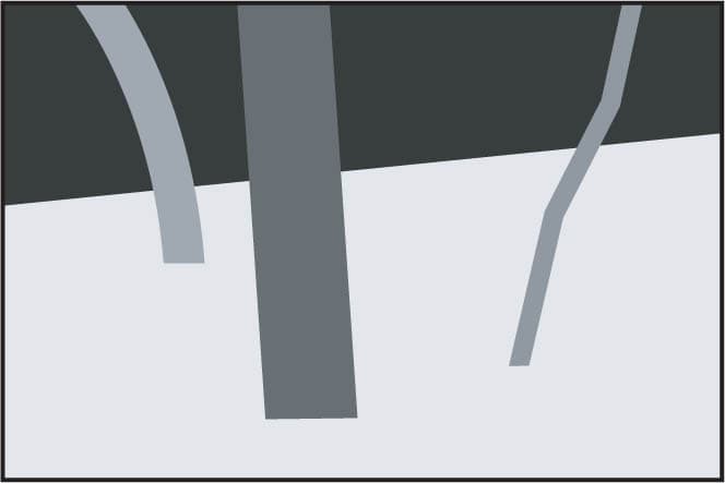
COLOR AND VALUE
In the final sequence, the color of the elements change. Note how the gray and black negative spaces that surround the trees all vary in size and proportion. Variation of intervals, lengths, visual weight, angles, shapes, and color makes for the most interesting composition.
VARIATION IN ACTION
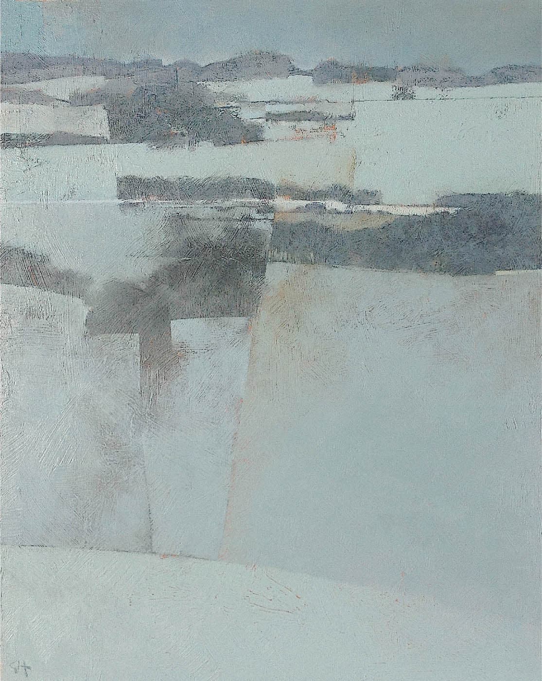
Greg Hargreaves, Winter Fields
Acrylic on canvas, 30" × 24" | 76 × 61 cm
Variation and differences are just as important in an abstract landscape painting as they are in a representational one. The biggest aspect of variation in Winter Fields is the different amount of area allocated to the lights and the darks. A lot more area is allocated to the lighter color. The darker bands at the top are made up of a patchwork of irregularly sized shapes. They flow roughly from left to right, but they also shift vertically. The bottom half is one large zone, but it is far from empty. It is divided into four smaller shapes, each one a different size. (See “Active Negative Space”.)

Bill Vrscak, Mostly Sunny, High 76
Watercolor, 17" × 23" | 43 × 58.5 cm
Variation and differences abound in Vrscak’s beautifully executed composition. One aspect of variation in Mostly Sunny is in the type of shapes: irregular organic forms on the left are played against the architectural forms on the right. Shape sizes vary as well : the large shapes of the grassy slope and the street contrast with the smaller shapes of the houses, the car, and the details at the far end of the street. These scale differences set up a sense of near and far. The amount of color used is also a form of variation. The yellow-green color group is most dominant in the foreground. A smaller instance appears in front of the houses and finally, there’s a tiny dash in the house at the far end of the street.
ANGLES
There is a lively interplay of angles in Mostly Sunny: the slightly angled trees, the arcing diagonals of the street and the grassy slope, and the diagonal perspective in the houses. The entire scene is offset slightly from the rigid verticals and horizontals of the picture window. Not a single angle in the picture is strictly horizontal or vertical.
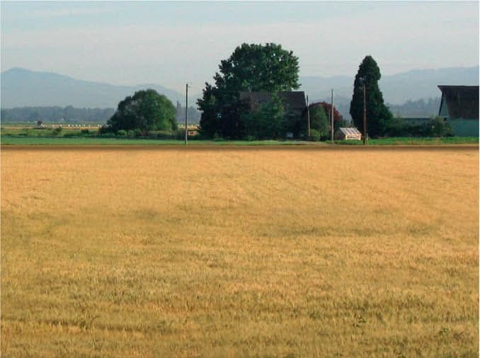
DEMONSTRATION: BALANCING LAND/WATER AND SKY WITH SIZE VARIATION
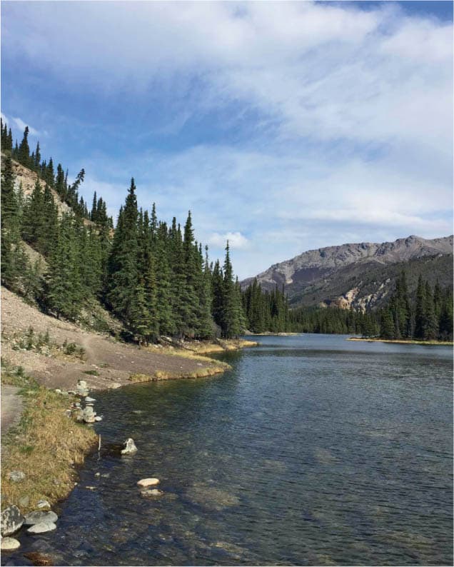
The greatest potential for size variation in landscape is often found through the difference in the amount of area devoted to the sky and the ground. A subject like this, with well-differentiated shapes and dramatic content, can easily convince us that a composition is fully resolved. However, in the original photo, the major areas of the picture compete for attention. Will the painting be about the water? The sky? Or the middle ground trees and hills? A lack of variation leads to a lack of focus. A painting, of course, can have several foci, but one must have priority.
Photo: Dirk Greeley

LAND/WATER-DOMINANT
In this version, the water occupies about 80 percent of the picture. By focusing on this area, we pick up several dynamic points of interest: the linear perspective of the shoreline, the arc of the shadow in the water, and the implied movement along the rocks.
SKY-DOMINANT
In this version, the sky is the main event. The large difference in size between the sky and the water lends a dynamic tension to the composition. When considering the relative size of the sky and the land or water, always look to make one noticeably larger than the other.
MOVEMENT: ANIMATING THE COMPOSITION
Movement is what animates a composition and brings it to life. Our eye remains active and engaged as it moves around and through the picture. Only a blank painting surface, absent of any mark or shape, would have no movement at all. But as soon as we add shapes and colors and lines, our eye naturally begins to find pathways and seek connections between elements. Movement in landscape painting may be fast or slow, strong or gentle, steady or halting, but it is always desirable.
Almost anything within the picture may be used to suggest movement. The most common generators of movement are lines, the visible pathways that fall along the edges of picture elements.
Our eye glides along the mountain’s edge or follows the arc of a tree limb. It follows the bend of the river or flies up a rock face. This is called direct movement. Less obvious, but of equal importance, is implied movement. Implied movement doesn’t follow visible contours or edges, but is created as the eye makes connections between different spots within the picture, in a connect-the-dots fashion.
One criteria for selecting a subject is whether it suggests enough movement. Some subjects have obvious pathways of movement. All we need to do is make sure we include them in our composition. Other subjects suggest less movement. We may choose to reject that subject, or perhaps we can amplify the movement by slightly shifting elements around or modifying colors and values to accentuate an edge or contour.
MOVEMENT IN ACTION

Mitchell Albala, Cascadia
Oil on canvas, 20" × 42" | 51 × 107 cm
The movement in Cascadia flows in two directions: vertically, through the downward thrust of the waterfall; and horizontally, as the water expands outward to the left and right. The vertical column of water serves as a counterpoint to the extended horizontality of the format. While movement often flows along hard edges or lines, in Cascadia, there are only soft edges. The lines in the diagram don’t correspond to hard edges, but indicate the direction in which the water flows.

INTO THE THIRD DIMENSION: DIAGONALS AND LINEAR PERSPECTIVE
As we learned in chapter 2, horizontal lines carry the eye from left to right. Vertical lines carry our eye up and down. And the built-in horizontal or vertical thrust of the picture format reinforces these movements. These are essential directional energies in composition—but they only move us in two dimensions.
To experience a full range of movement within a picture, we also need diagonals. In a flat two-dimensional picture, diagonals break away from the rigid horizontality and verticality of the picture window itself and allow us to move at any angle, in any direction. We would be hard put to achieve dynamic movement in our pictures without diagonals.
Diagonals also form lines of perspective. The technique is the single most powerful way to foster the illusion of depth, to lead the eye into the third dimension.

DIAGONALS AND THE Z-AXIS
A painting is flat and two-dimensional, so any suggestion of depth is always an illusion. We can imply movement into the third dimension with diagonals and linear perspective. In geometry, the X-axis represents the horizontal, and the Y-axis represents the vertical. They define movement in two dimensions. The Z-axis— corresponding to lines of perspective in our paintings—passes through the flat picture plane defined by the X- and Y-axes and carries the eye into the imaginary third dimension.
DEPTH THROUGH LINEAR PERSPECTIVE
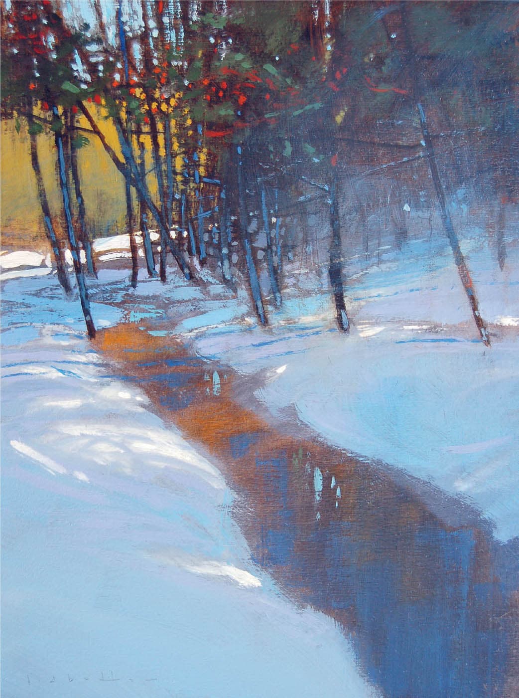
David Lidbetter, Trickle Down
Oil on panel, 12" × 9" | 30.5 × 23 cm
Nothing counteracts the flatness of the two-dimensional picture plane and suggests depth more effectively than linear perspective. Starting in the lower-right corner, Lidbetter pulls us sharply into the space with the steep perspective of the stream. The depth suggested through the linear perspective is also reinforced by the vertical picture format, which lends an inward and upward movement to the composition.
MOVEMENT THROUGH DIAGONALS
Cindy Baron, Spring Passage
Watercolor, 15" × 9½" | 38 × 24 cm
Linear perspective is achieved with diagonal lines, but not all diagonals create linear perspective. In Baron’s majestic piece, we find a series of diagonals that, through multiple pathways, carry our eye to the uppermost peaks. In combination with the extended vertical format, Baron achieves a strong upward movement. Other than the tiny trees at the bottom, there is not a single horizontal or vertical line in the painting or even a horizon line.
DIRECT AND IMPLIED MOVEMENT

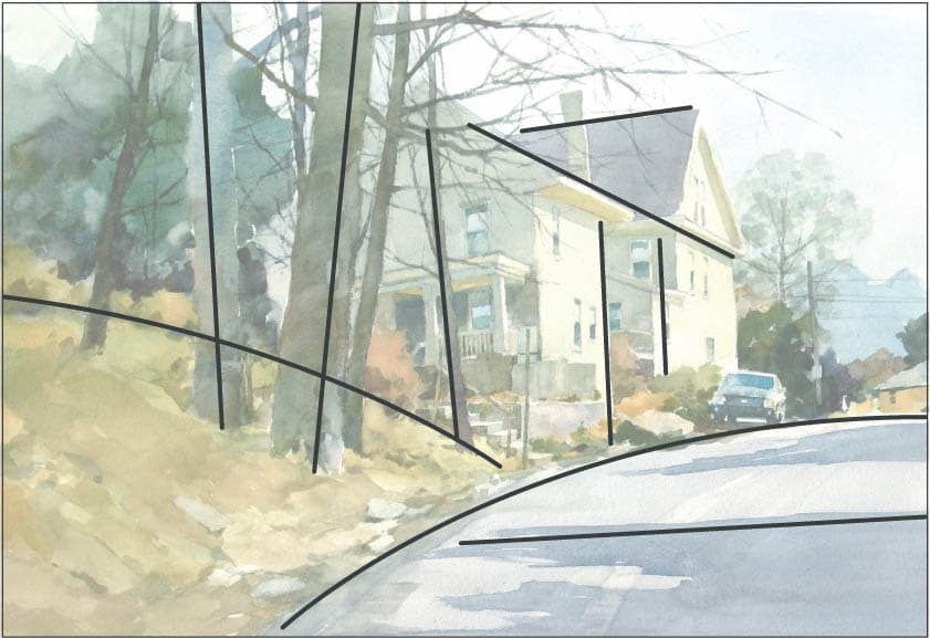
Mitchell Albala, Pathway to the Canal
Pastel on paper, 5" × 8" | 13 × 20.5 cm
With direct movement, the eye follows a continuous path, such as the contour of a mountaintop or the edge of a road. Implied movement, on the other hand, forms an implied connection between two or more points in a connect-the-dots fashion. In Pathway to the Canal, the direct pathway is indicated by a solid line. Our eye moves up the vertical street on the right, turns sharply left, up again along a diagonal, and then back toward the right. Implied movements are indicated by the dotted lines. Our eye jumps from rooftop to rooftop until it arrives at the canal in the upper right.
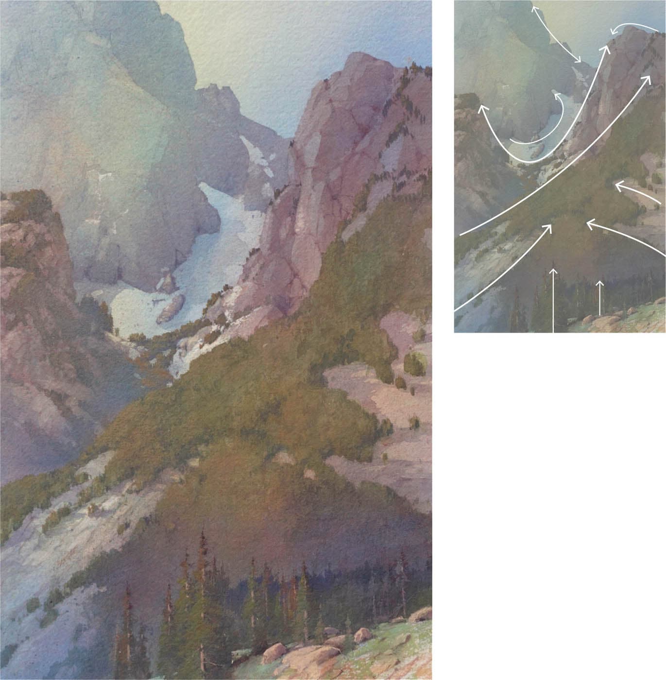
CIRCULAR MOVEMENT
The circle is a tried-and-true compositional armature, in which the eye follows a complete, or nearly complete, path around the painting. Circular movement doesn’t have to be an actual circle, however. It may be oval, triangular, or even rectangular, as longs it carries the eye in a full course around the painting. Circular movement keeps the eye contained within the bounds of the composition.

Bill Cone, Garnet Pond
Pastel on paper, 93/10" × 9" | 23.5 × 23 cm
In Garnet Pond, direct pathways are indicated by solid lines: along the mountain ridge, up and down the trees on the sides, and along the slope in the foreground. Together, these pathways form a roughly circular course around the picture. The diagonal across the center connects the upper right and lower left. The implied pathway, indicated by the dotted line, doesn’t follow a continuous line or contour, but hops across the rocks in a connect-the-dots fashion.
Negative space is typically defined as the area in between or around the “positive” elements of a subject. In figurative or still life painting, for instance, the negative space is usually the space behind the subject, in the background. In landscape, the sky comes closest to behaving in this way, sitting like a vast backdrop behind all the land-based elements. But, there are other large spaces in landscape composition that behave similarly, such as large bodies of water, fields, or empty streets that advance toward the viewer. These are not negative spaces in the traditional sense—they are “positive” forms—but because they are so large and often uniformly colored that they effectively behave like negative spaces.
If these areas are not properly activated—if they are treated like “empty” spaces—they won’t feel like a fully integrated part of the composition. We never want one part of the painting to feel separate from any other part. Negative spaces can be activated in several ways:
- Varying the color and/or value within the negative space
- Dividing the negative space into smaller portions (closed negative space)
- Adding spatial cues to the negative space, such as clouds in the sky, furrows in a field, or reflections in the water

ACTIVATING SKIES WITH COLOR AND TONAL VARIATION
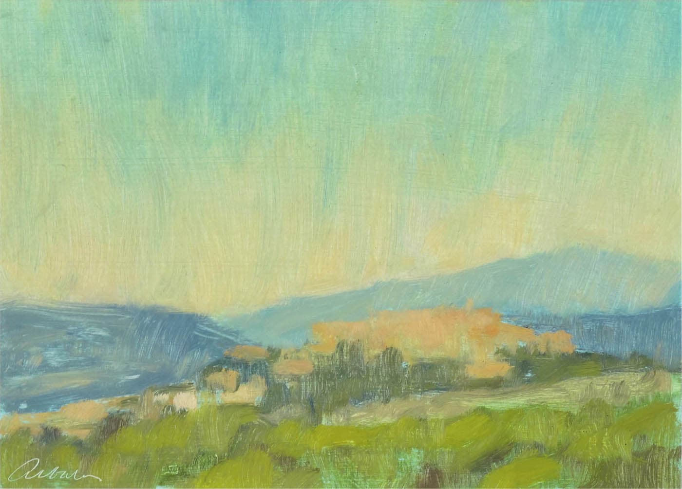
Mitchell Albala, Montegabbione, Umbria
Oil on paper, 5" × 7" | 13 × 18 cm
How do we activate a cloudless sky so it becomes more than just an empty blue backdrop? In the original Montegabbione painting on the previous page, the sky has a noticeable shift in hue, temperature, and value. This activates the sky and gives it more dimension than if it were evenly toned—which is what we see in the modified version. When the color and tonal variation is stripped out, it appears flat and less interesting. As a general rule of thumb, avoid painting a sky as a flat, unvarying color.
ACTIVATING SKIES WITH CLOSED NEGATIVE SPACE

Alvaro Castagnet, Montevideo Urban Series
Watercolor, 40" × 26" | 101.5 × 66 cm
Skies can also be activated by using closed negative space. When parts of the subject—such as a tree, a telephone pole, or a rooftop—touch or nearly touch the edge of the painting, it breaks up the negative space into segments. Two or three segments of negative space are more visually interesting than a single space. Here, Castagnet allows the uppermost corner of the building to touch the top edge, dividing the sky into two major segments of different sizes. The telephone lines and street light break up the larger negative space even further.
ACTIVATING THE GROUND PLANE IN A NATURAL SETTING
The dominant event in this subject is the field, but it lacks visual cues that carry the eye over the field and into the distance. By bringing out the subtle ground lines and furrows and accentuating the linear perspective, the field becomes much more interesting. In some subjects, it is necessary to take existing cues and exaggerate them. In others, you may have to invent new cues. The trick is not to overdo it. A few accents or spatial cues can be enough to bring the negative space to life.

ACTIVATING THE GROUND PLANE IN AN URBAN SETTING

Roads that advance toward the viewer can offer a dramatic entry into a painting. In this scene, though, the negative space of the road is empty and appears to drop down at the bottom edge, like an upright plane. By adding perspective cues—cracks, a crosswalk, and white lines—the road becomes more active. It becomes as much a part of the composition as the upper portion. Note how the addition of the crosswalk raises the portion of the road closest to us so it no longer feels like an upright plane.

REVIEW QUESTIONS: COMPOSITION IN ACTION
VARIATION
How do the sizes of the shapes differ?
Big shapes versus small shapes; major shapes versus minor shapes. Differences in size make a composition more varied and engaging. Can you compose the picture in a way that amplifies the size differences?
What is the relative area devoted to the sky versus the ground or water?
The relative area devoted to the sky versus the ground or water often accounts for the biggest size differential in a composition. Is the subject sky-dominant or land- or water-dominant? How big of a size differential is there? Can it be greater? How would that affect the reading of the space?
Do the spaces in between shapes vary enough?
Are the intervals the same, or are there differences in the “pacing and spacing” between elements? The more the intervals vary, the more compelling the composition will be.
How does the visual weight of elements vary?
Visual weight may be affected by size, value, color, or position. Avoid having too many elements with the same visual weight.
Is there an adequate difference in the amount of light and dark values?
Having a different proportion of light and dark is a means of applying variation across the overall composition.
How do the colors in the painting affect the composition?
Size affects the visual weight or density of a shape, but so does its color. Variation of color adds interest to the visual tapestry.
MOVEMENT
What are the pathways of movement in your subject?
One of the criteria for a good subject is whether it has pathways of movement that will allow the eye to move around the picture. Is there naturally occurring movement in the subject? Can you heighten the effect of movement by emphasizing or exaggerating certain elements?
Is there any linear perspective in the subject that you can capitalize on?
Diagonals that form linear perspective not only serve as a counterpoint to horizontal and vertical movement, they are the most direct means of suggesting depth. Even small angles and shallow perspective can instigate movement.
Is movement direct or implied?
Is movement direct, found along the contours and edges of elements? Or is it implied, formed by connecting various points within the composition in a connect-the-dots fashion?
ACTIVE NEGATIVE SPACE
Are the negative spaces in your composition fully activated?
Skies, bodies of water, fields, or empty streets can occupy large areas of a subject. Are they inactive, empty, or flat? How can you add interest to these areas?
Is the sky an active part of the picture or is it treated like an empty blue backdrop?
Would introducing variations of color and/ or value into the sky make it more active? Is there a way to apply closed negative space? Allowing a tree, a mountain, a telephone pole, or a building to touch the edge of the painting will break up the sky into smaller segments, which is more interesting than one single sky shape.

Marc Hanson, A Quiet Frost, oil on linen, 16" × 20" | 40.5 × 51 cm
What is the direction of the movement?
Is the movement mostly horizontal or vertical? Are there diagonals to counteract horizontal and vertical movement? Can the eye move around the composition in a circular fashion? In a zigzag? Generally, a composition is more engaging if there is a dynamic interplay of horizontals, verticals, and diagonals.
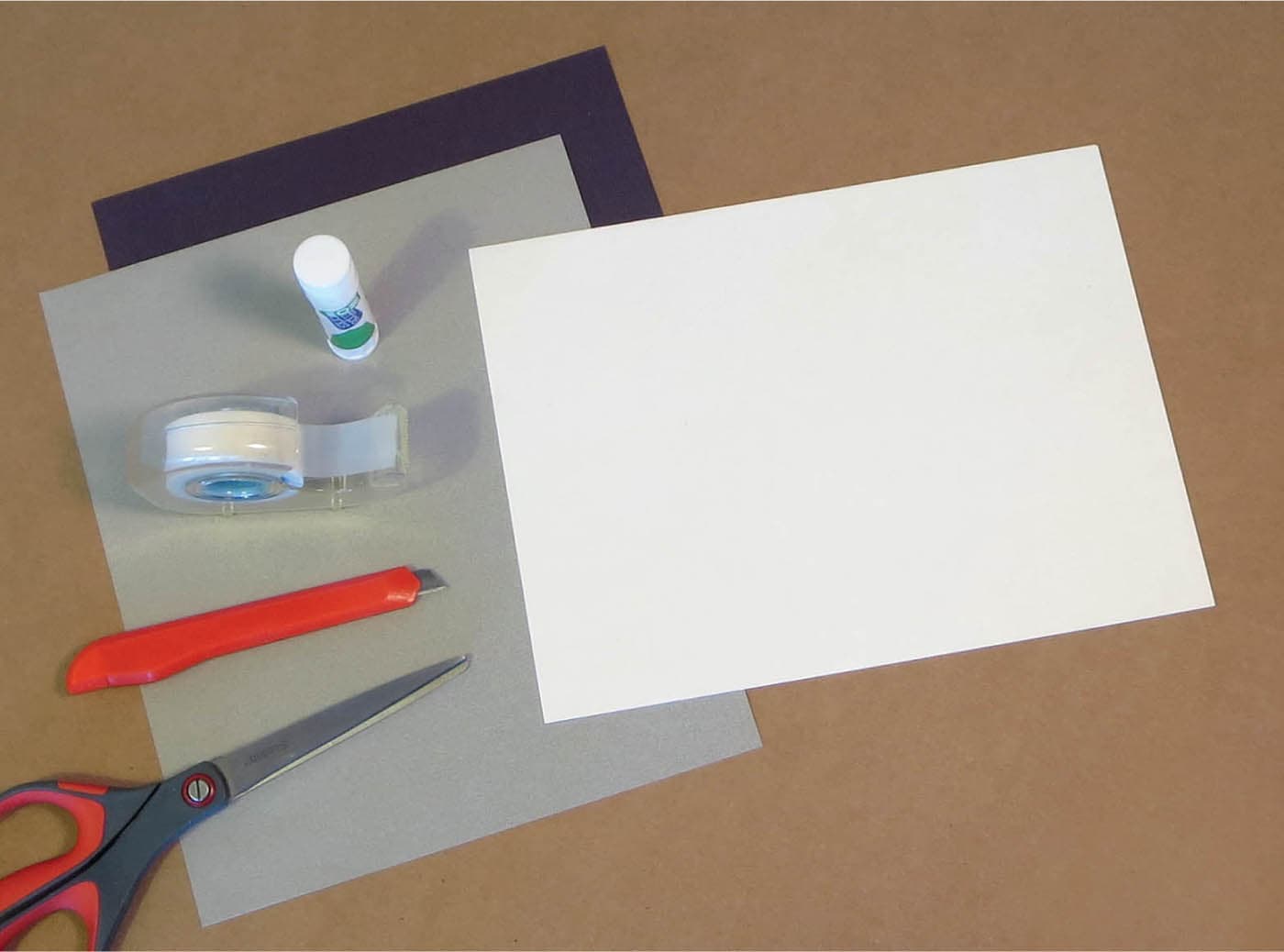
EXERCISE: CUT PAPER: ASPECTS OF VARIATION
OVERVIEW: In this exercise, you will create a flat, simplified composition of a “forest,” using as many aspects of variation as possible. You’ll use cut paper, in collage-like fashion, with only three values: black, white, and middle gray. Use five, six, or seven trees and one ground plane. This exercise looks simple and unrefined, but it isn’t easy. You’ll find it challenging to assert variation at every level.
NOTE: The more trees you include, the more challenging the exercise. The more intervals there are, the harder it is to make them all different.
MATERIALS: White, black, and gray paper (inexpensive craft paper or toned charcoal paper) | Scissors and/or hobby knife | Glue stick or transparent tape (removable) | White craft glue | Metal straightedge or ruler
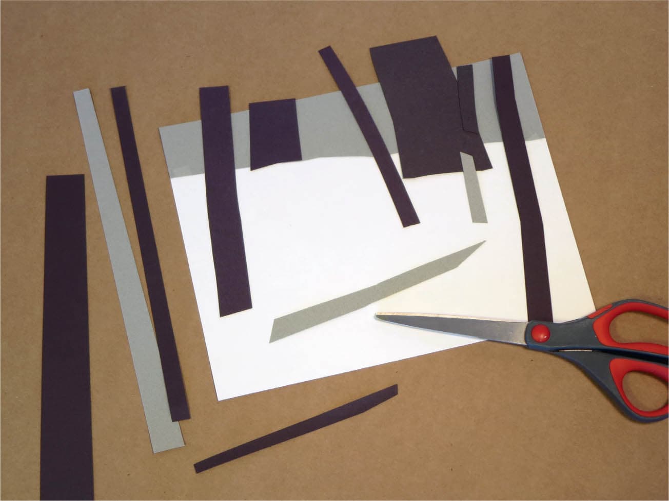
STEP 1: SET THE STAGE
Begin with a sheet of paper approximately 8 × 10 inches (20.5 × 25.5 cm). Starting on a white foundation is easiest, but you can also start on gray or black. The format can be horizontal, vertical, or square. Although the composition loosely resembles a forest, avoid high representation or detail. A high degree of craft or polish is not required here.
STEP 2: DESIGN
Begin by cutting out strips of paper of varying thicknesses and different tones. (You can also tear the paper, which will give a different edge quality.) Create a ground plane and decide whether it will sit above or below the midline. As you position the shapes, continually ask yourself: How does the thickness of this tree differ from that one? How do their angles differ? Their heights? Be especially conscious of the intervals (spaces) between the trees. No two should be the same. At every turn, assert variation and avoid sameness. Temporarily hold pieces in place with a glue stick or removable transparent tape. Take photos of your progress so you can refer back to earlier versions of your design.
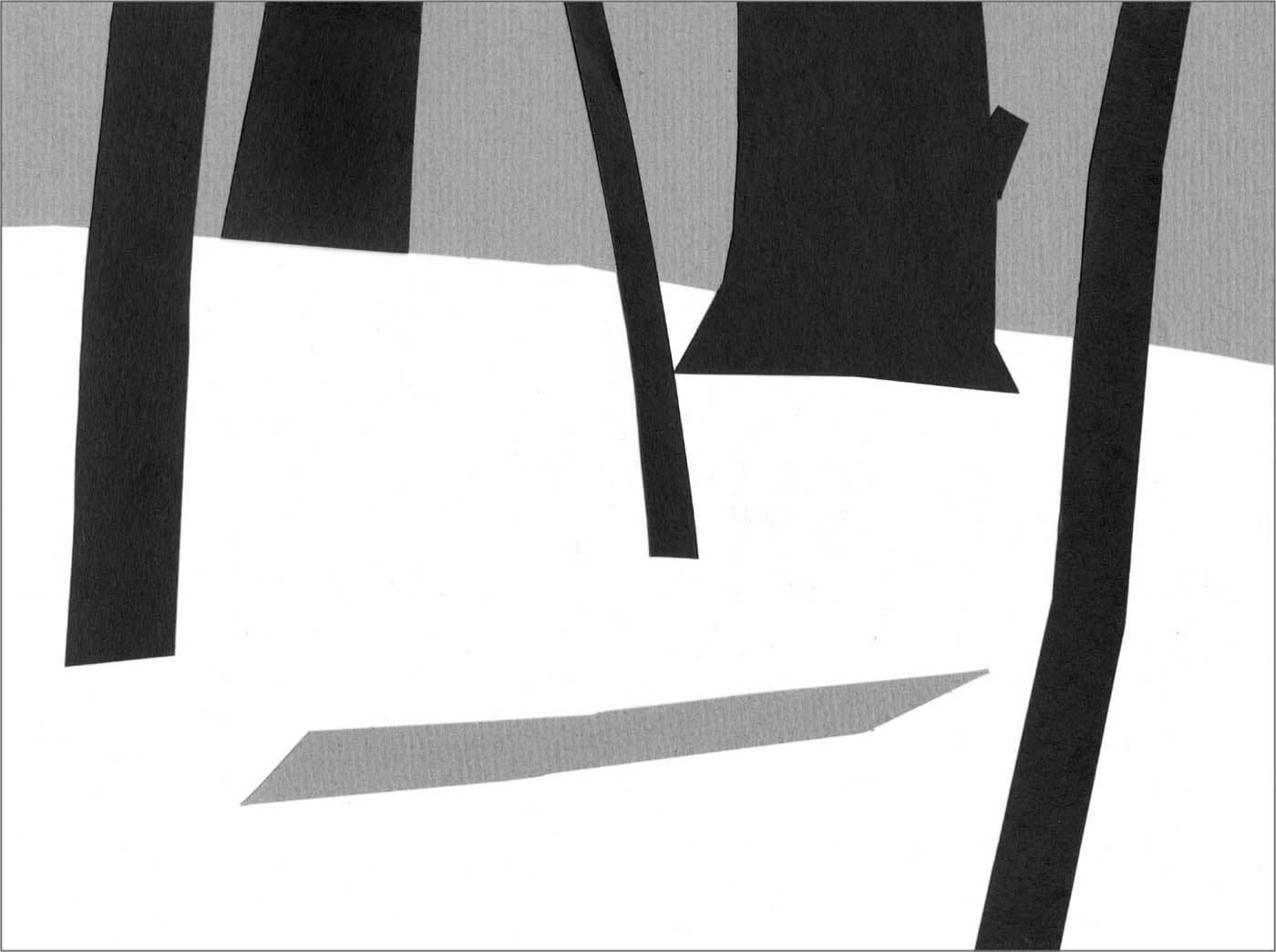
STEP 3: FINAL COMPOSITION
When you’re done, affix the pieces into place with a glue stick or a bit of white glue. Notice that each tree has a different visual weight, as indicated by its thickness. One tree is a different value. Each tree is at a different angle, including the fallen tree that is nearly horizontal. Each of the gray intervals between the black trees at the top is also different.
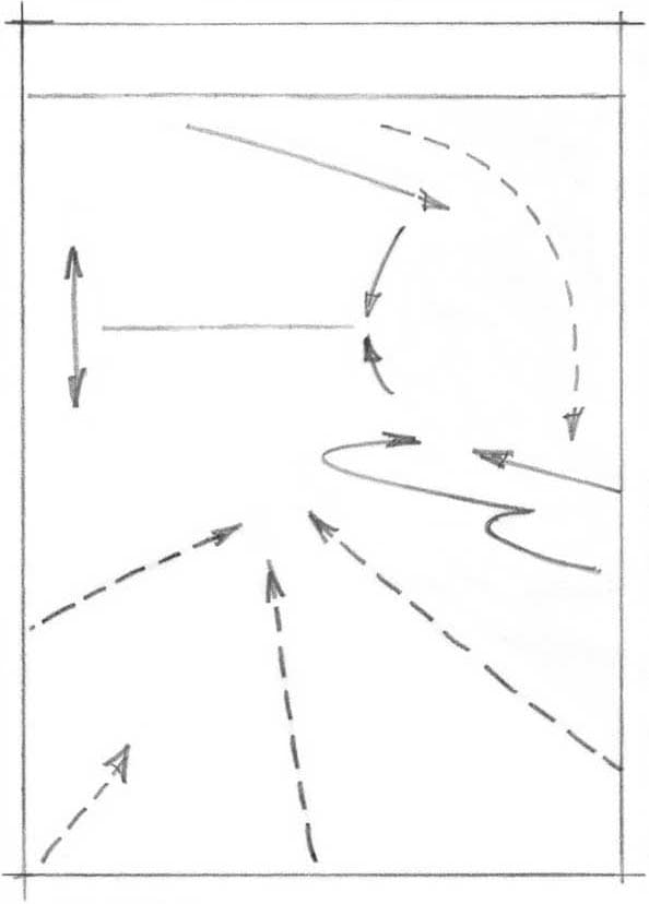
EXERCISE: MAPPING PATHWAYS OF MOVEMENT
OVERVIEW: Movement is a powerful way to keep the viewer’s eye active and engaged. This exercise is designed to build your awareness of movement. In Part 1, you’ll diagram or “map” the pathways of movement you find in an existing painting. In Part 2, you’ll do the same with one of your own subjects. These movement maps will be drawn by hand, but they are similar to the diagrams for Bill Cone’s Garnet Pond (here) and Cindy Baron’s Spring Passage (here).
MATERIALS: Tracing paper | Soft pencil (2B to 6B) | Tape | Eraser
Place arrowheads on the lines to indicate the direction of movement. If it flows in both directions, put an arrowhead on each end.
Make bolder lines for strong movements and thinner lines for subtler movements.

Use solid lines for direct pathways and dotted lines for indirect pathways.
PART 1: MAPPING MOVEMENT IN A MASTERWORK
STEP 1: PAINTING SELECTION
Select a classic or contemporary painting, in any medium, that suggests movement. For this exercise, I’ve chosen Bill Cone’s Iceberg Shore. There are several paths of entry along the rocks at the bottom. There are also clear jumps from the foreground to the middle ground and then to the background, through both direct and indirect pathways.

Bill Cone, Iceberg Shore, Pastel on paper 20" × 14" | 51 × 35.5 cm
STEP 2: MAPPING
Tape a piece of tracing paper over your example. Begin drawing lines that suggest the pathways of movement you see in the painting. Use a soft pencil so you can erase and make adjustments. Some pathways may fall along the edges of elements, others may not. Your lines should indicate the direction and flow of the movements.

STEP 3: COMPLETED MAP
If we think of our diagram as a weather map, then our movement lines are like indications of the wind direction. The most dynamic movements in Iceberg Shore are found in the lower portion, where several pathways skim over the submerged rocks. Note how the energy of the movement calms down as we move upward (further back in space). At the very top, the horizontal line of the shore is the quietest movement of all and is therefore indicated with a lighter line. Although some movement lines fall along the edges of elements, your map should not look like an outline drawing of the painting. If it does, you may be too focused on shapes and contours and not enough on the pathways the eye naturally follows.
PART 2: MAPPING MOVEMENT IN YOUR OWN SUBJECTS
Part 1 of this exercise was a warmup for the real challenge: finding movement in your own compositions.
EXAMPLE 1
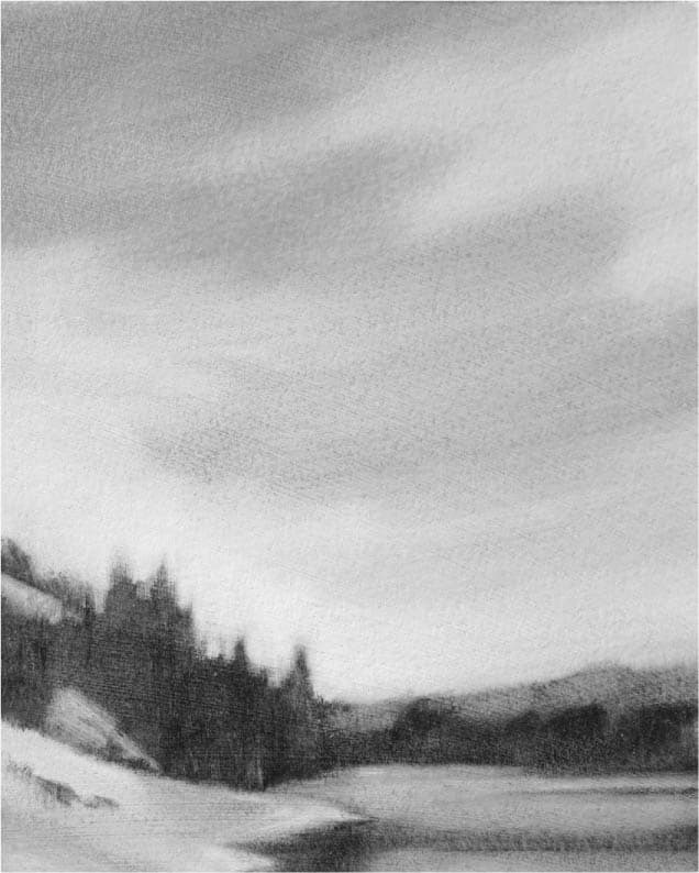
In terms of movement, the most interesting thing about this composition is how the silhouetted trees connect with the shoreline to form a roughly circular (oval) pathway. The bottom rim of the clouds echoes this. Shorter arrows on the left tree and on the building in the middle indicate smaller, but important movements.
CONSIDER: If five different painters created a map of this subject, each map would not look identical. When it comes to movement, there is room for interpretation.

EXAMPLE 2
We can often bring greater attention to movement within a scene by how we position the landscape within the picture window. The original “pre-composed” scene certainly suggests an expansive and deep space, but it devotes nearly equal amounts of area to the foreground and the blue background, which weakens the impact of both. By tightening the focus, and allowing the background to become the dominant area, greater attention is drawn to the main event of the scene—the deep blue space and atmospheric perspective beyond the foreground.
This scene has many diagonals, which are a direct means of suggesting movement. However, the strongest movement in the final composition is entirely implied. Our eye is pulled over the foreground ridge, across the diagonal edges of the mountaintops, and deep into the space beyond (indicated by the broad arrow right of center). Implied pathways can sometimes provide the strongest movement in a composition.

Photo: Carol Sandor