


If ever something was considered magic in Photoshop it would have to be blend modes. There is so much we can do with these and they are, without a doubt, the fastest way to create special effects. The best results are often achieved purely by experimenting with blend modes. I recommend approaching them with the attitude of “what would happen if . . . ?”.
Unless you have an incredibly scientific mind like my friend and digital artist Olaf Giermann from Germany, who totally understands the inner workings of blend modes, don’t concern yourself with how they work, but instead work on developing a broad understanding of what you can do with them. Thankfully, blend modes have been organized in such a way that makes this a whole lot easier.
NOTETo make it easier to understand blend modes, I’ll talk about them in two parts—namely, the BASE (the bottom layer) and the BLEND (the layer to which the blend mode has been applied).
There are 27 blend modes and although they all behave differently from one another, they are organized into six groups (Figure 4.1). Some of the following descriptions might sound vague, but we’ll go through some examples as we work through this chapter. You’ll find that no matter how experienced you become with Photoshop, you’ll likely only ever use a portion of the blend modes; it’s highly unlikely you’ll ever use all 27, but you will have your favorites.
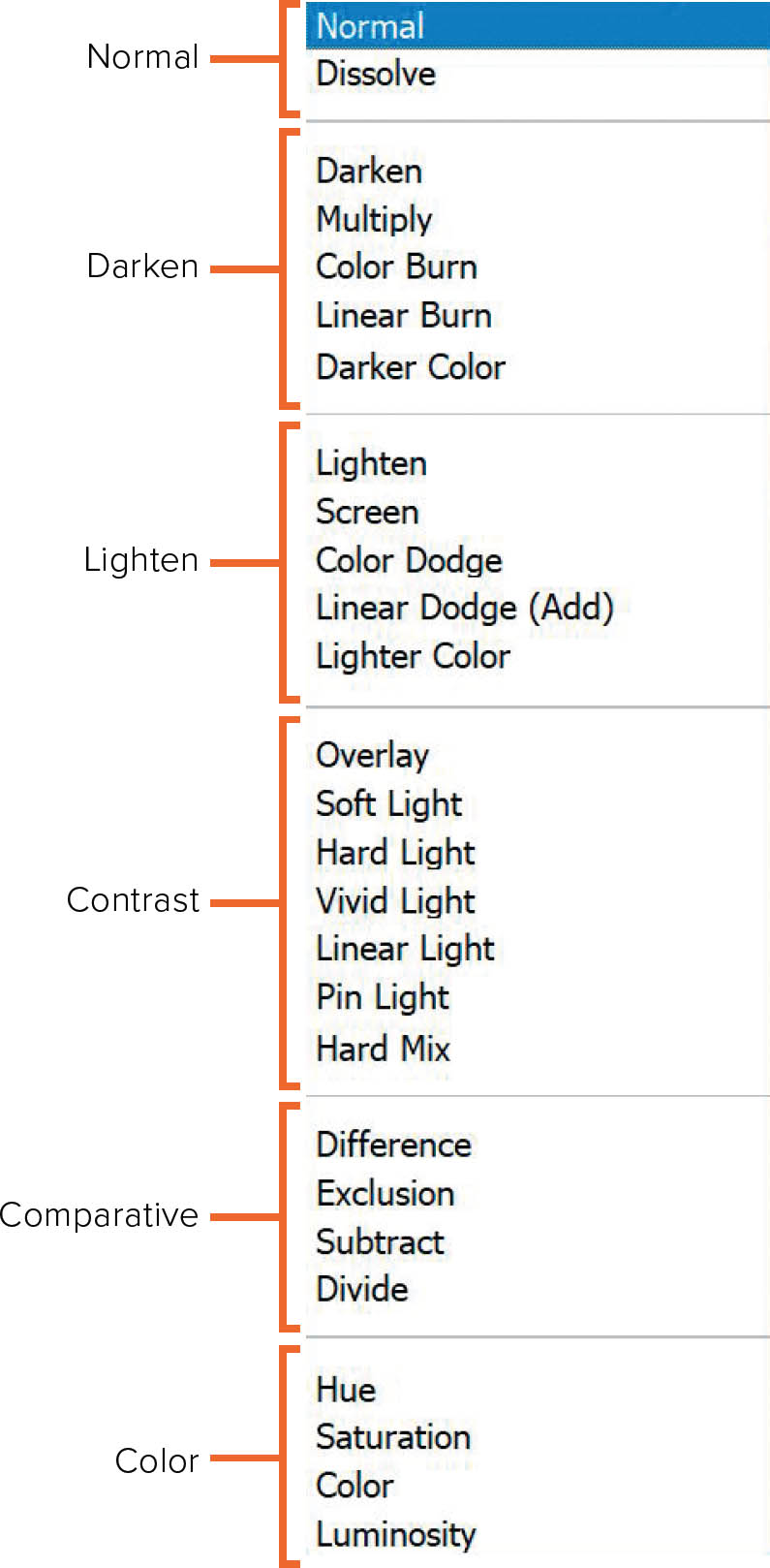
FIGURE 4.1Photoshop blend modes
The six blend mode groups are as follows:
- NORMALAs the name suggests, when you select Normal, nothing happens to the image. However, Dissolve is a bit of a standalone, and you can create some cool effects with it that we’ll cover in a bit.
- DARKENThese blend modes will darken the image in their own unique way. It’s particularly useful to know that when there is white on the BLEND layer, using the Darken blend mode makes the white areas invisible.
- LIGHTENThese blend modes will lighten the image in their own unique way. This is the opposite of the Darken blend mode—if there is black on the BLEND layer, it becomes invisible.
- CONTRASTThese blend modes will add contrast to the image in their own unique way. Areas that are 50% gray become invisible when they are used on the BLEND layer.
- COMPARATIVEThese blend modes compare the BLEND and BASE layers to each other and create cancellation or inversion blends—either completely cancelling out or inverting the colors—depending on the content of the BASE layer. You’ll see what I mean as we go through them in a little more detail soon.
- COLORThese blend modes affect color on the BLEND layer in their own unique way.
You’ll find blend modes in a number of different places in Photoshop, but the main place you’ll find and select them is in the Layers panel (Figure 4.2). If there is only a Background layer in the layer stack, then you’ll see that the option to change the blend mode is grayed out because you need to have at least two layers (BASE and BLEND) to use a blend mode. If you unlock this single Background layer by clicking once on its padlock icon, the blend modes become available; however, using them will have no impact on the single layer in the layer stack. When there is more than one layer in the stack, the blend modes will be available—just click on Normal to open up the menu with the available blend modes.
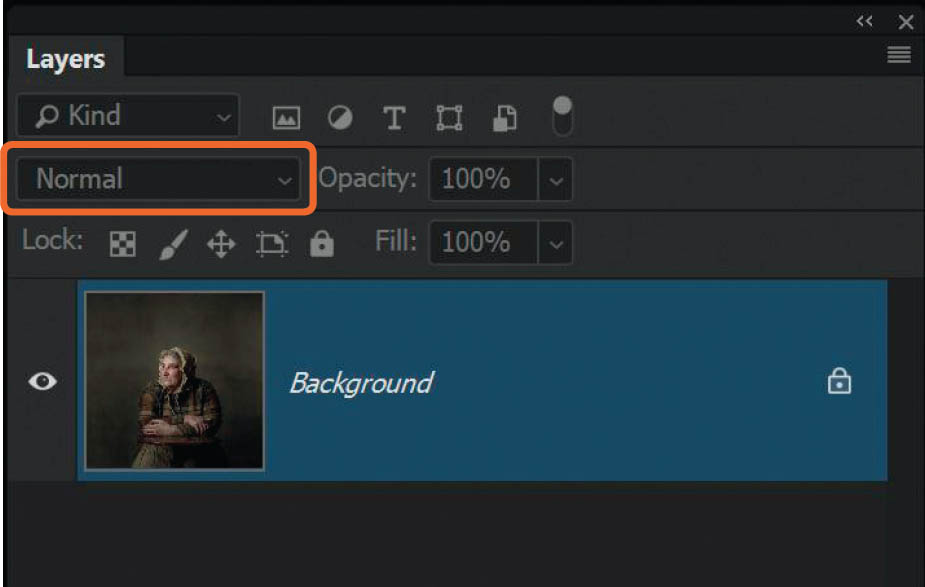
FIGURE 4.2
PUTTING BLEND MODES TO USE
Let’s start by taking a look at the effects of each blend mode. For each of the following examples, there is a BASE layer, which is a portrait (Figure 4.3), and a BLEND layer, which is a texture (Figure 4.4).
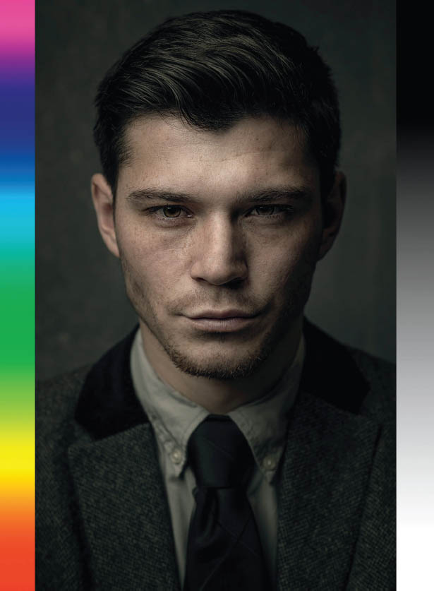
FIGURE 4.3
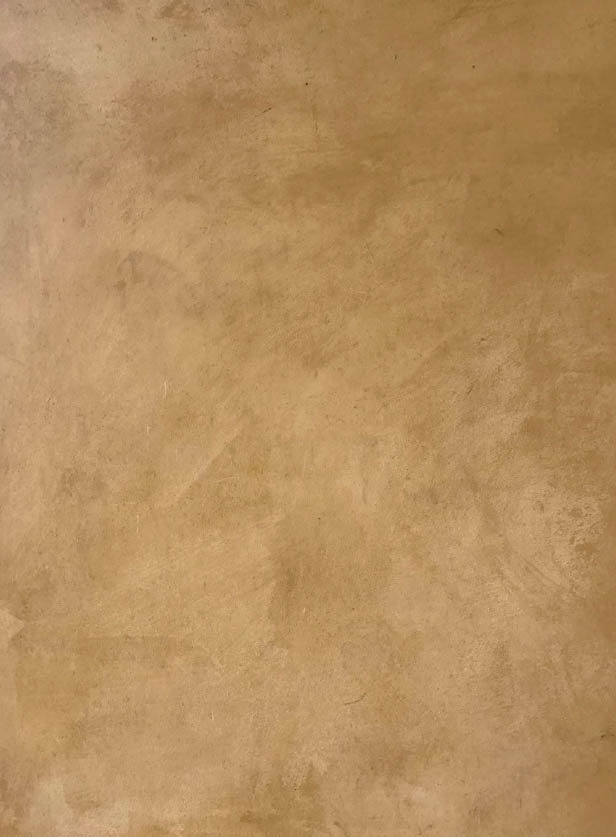
FIGURE 4.4
We’ll apply the blend modes to the BLEND layer in the Layers panel (Figure 4.5).
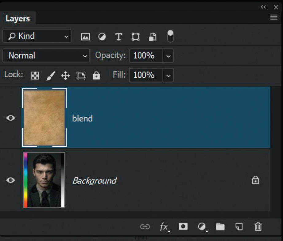
FIGURE 4.5
My friend Colin Smith, who runs a superb educational site called PhotoshopCAFE (photoshopcafe.com), produced a cheat sheet for blend modes and he added a color bar and grayscale bar to the BASE layer picture, which really helps to show what is going on. With Colin’s permission, I’m stealing that idea and using it here (thanks, Colin).
So, as we change the blend mode of the BLEND layer, here’s what happens . . .
Normal Blend Modes
NORMALNothing happens when you use the Normal blend mode. All you can see is the texture, which is on top of the portrait in the layer stack. To see the layer beneath (BASE), you need to lower the opacity of the BLEND layer. In Figure 4.6, I’ve lowered the Opacity to 50%.
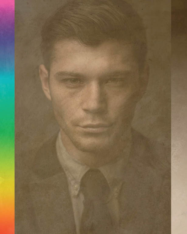
FIGURE 4.6
DISSOLVEDissolve is the same as Normal except that no transparency effects are applied to the pixels. Dissolve dithers pixels on and off—or in other words, granulates the BLEND layer—which creates an almost spray-paint effect that is visible when the Opacity is lowered. In Figure 4.7, I again lowered the Opacity of the BLEND layer to 50%. The Dissolve blend mode doesn’t actually blend pixels, but simply randomly reveals and conceals areas. If you use this blend mode you’ll likely end up using it at a reduced opacity.
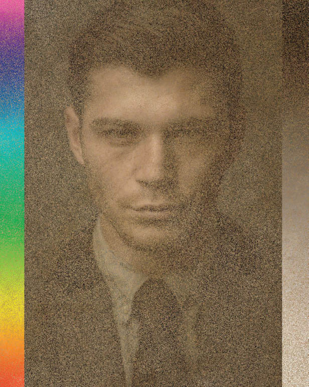
FIGURE 4.7
Darken Blend Modes
DARKENAll of the Darken blend modes will do just that—darken the layer below with varying degrees of contrast or tone (Figure 4.8). If the BLEND layer contains white, then that part of the layer will not affect the BASE because you can’t darken with white, right? However, if parts of the BLEND layer are a darker tone than white, then those areas will darken the BASE layer. Again, this is one of the those blend modes that you’ll likely use at a reduced opacity.
FIGURE 4.8
MULTIPLYThe Multiply blend mode can be particularly useful for creating composite images because it combines the contrast and luminosity of both the BLEND and BASE layers. In Figure 4.9, the Multiply blend mode has blended the texture of the BLEND layer and has also darkened the BASE layer.

FIGURE 4.9
COLOR BURNAs with Multiply, Color Burn darkens both the BLEND and BASE layers, but it creates a much darker image with added contrast and saturation, almost to the point of giving it a burned look. You can see in Figure 4.10 that the black area of the gradient has turned completely dark, but at around the 50% gray area it looks much nicer. Notice how the white area is untouched.

FIGURE 4.10
LINEAR BURNThis is another really useful blend mode for getting a great darkening effect. It’s kind of similar to the regular Darken blend mode, but it’s definitely more subtle. You’ll see this blend mode used for creating an aged, vintage-looking effect but again using a lowered opacity on the BLEND layer. Again, no change to white (Figure 4.11).
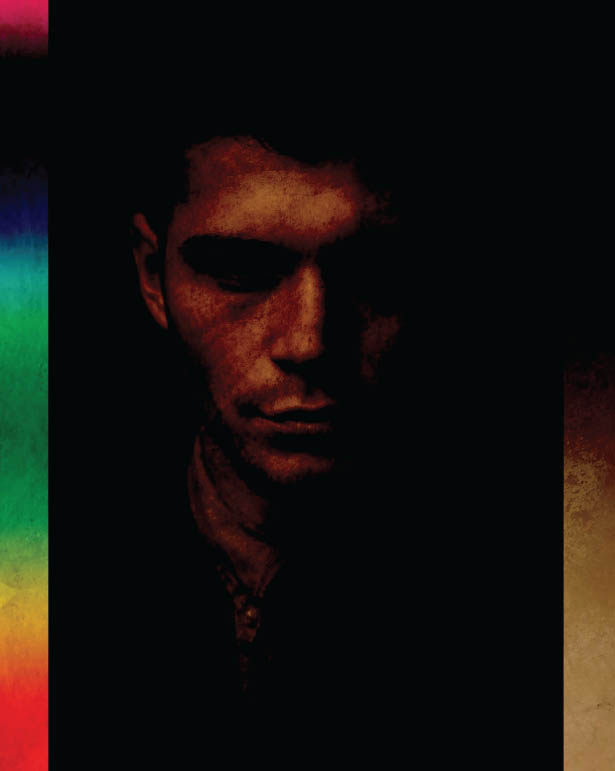
FIGURE 4.11
DARKER COLORTo be honest, I don’t use this blend mode much, if at all. The result is that the darker colors on the BLEND layer are darkened, as you can see in Figure 4.12. Notice how in the white-to-black gradient, the texture above the 50% gray area is blended invisible. You could lower the opacity of this layer to see what results you get, but this isn’t a blend mode I tend to use at all.
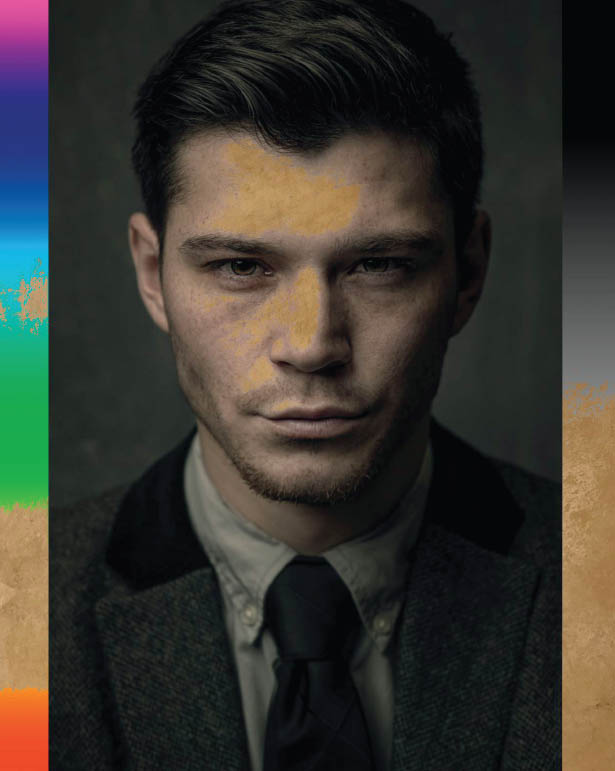
FIGURE 4.12
Lighten Blend Modes
LIGHTENThis does exactly the opposite of the Darken blend mode—only the lightest areas of the BASE and BLEND are visible (Figure 4.13). As the name suggests, this blend mode is used to lighten the image, which would explain why black areas of the BLEND are unaffected—you wouldn’t use black to lighten, right? Any area brighter than black will affect the BASE to some degree. In the white-to-black gradient you can see that the texture is unaffected in any area darker than around 50% gray.

FIGURE 4.13
SCREENThis is the opposite of Multiply. With the Screen blend mode, everything is brightened, with the exception of black on the BASE layer, which remains the same (Figure 4.14). If you look at the white-to-black gradient, you can see that pretty much all the way up until black, the texture is brightened and some fade is added. The black area remains unaffected.
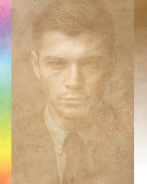
FIGURE 4.14
I tend to use the Screen blend mode quite often when adding snow or rain effects to a picture, where the BLEND layer is a black-and-white layer with the snow or rain being the white parts. Using the Screen blend mode on a layer like this when its positioned as the BLEND layer (top) means the black disappears and only the white areas are visible. It also fades the image slightly, so lowering the Opacity and using some masking can help.
COLOR DODGEThis is the opposite of Color Burn. The BASE color is what influences the resulting image, which is brighter and has less contrast (Figure 4.15). Again, black remains unaffected.
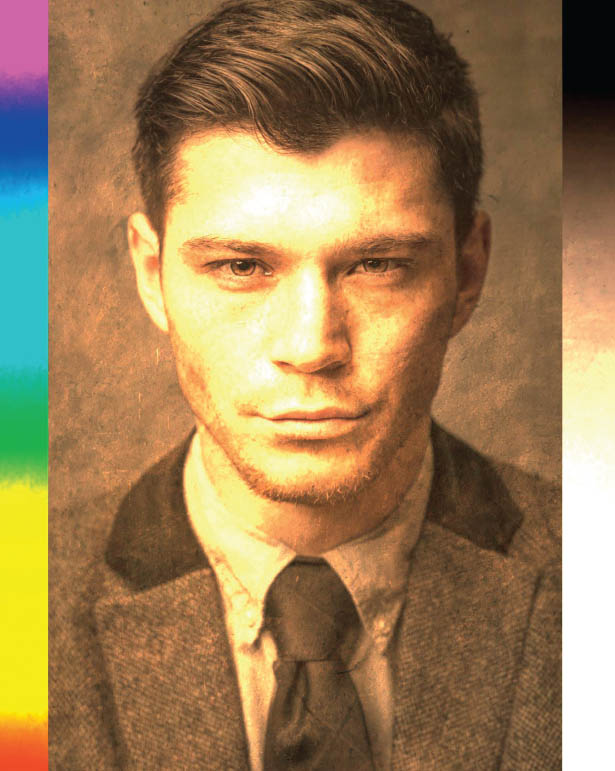
FIGURE 4.15
This is one of my favorite blend modes for creating lighting effects; in particular, very powerful, bright lights of any color. Simply add a blank layer and use a brush to add a few strokes. When you change the blend mode to Color Dodge, you will see the effect to some extent, but you can increase the effect by duplicating the layer multiple times. I love it! Ultimately, when used on an entire layer, the Color Dodge blend mode brightens the image and intensifies the saturation.
LINEAR DODGE (ADD)Linear Dodge is a toned down version of the Color Dodge blend mode. It has a brightening effect, but the colors aren’t as intensely saturated, nor is there quite as much contrast (Figure 4.16).

FIGURE 4.16
I love to use this blend mode when brightening eyes. First I make a selection of the iris, and then I add a Selective Color adjustment layer and change the blend mode to Linear Dodge. Finally, I lower the Opacity of the layer to control the brightness of the eyes. You could use an adjustment layer to do this, but I use a Selective Color adjustment layer because it gives me even more options to alter the color and contrast with the sliders.
LIGHTER COLORThis is the opposite of Darker Color. If I’m being honest, I don’t recall ever using this blend mode. It’s bit more aggressive in how it blends the white areas of the BLEND layer to the BASE layer. Any areas of white up until around 50% gray are heavily blended, while anything beyond that is basically transparent (Figure 4.17). Again, I haven’t found a use or need for this blend mode, but hey, you never know.

FIGURE 4.17
Contrast Blend Modes
OVERLAYI use Overlay a lot when I’m adding texture to pictures where I’ve photographed a subject against a gray roll of paper. Anything darker than 50% gray will add contrast to the BASE layer, and anything brighter than 50% gray will brighten and add contrast to the BASE layer (Figure 4.18). Yep, I use this one a lot! However, when adding textures, I do tend to desaturate the BLEND layer (texture) beforehand because otherwise the colors can look a little funky.
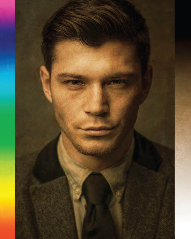
FIGURE 4.18
SOFT LIGHTThis is another blend mode that I use a lot. It works pretty much the same as Overlay, except that the result is less contrasty and much more subtle (Figure 4.19). Whether you choose Soft Light or Overlay is purely a matter of personal taste.
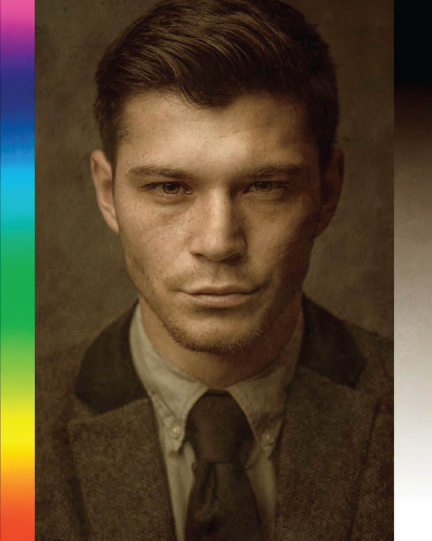
FIGURE 4.19
HARD LIGHTJust based on the name of this blend mode, you know the results are going to be strong, and you’ll see this when you give it a try. You’ll definitely want to reduce the Opacity of the BLEND layer when you use this. At 100% Opacity, Hard Light keeps the whites completely white and the blacks completely black, but the resulting blend is much less subtle (by a long shot) than Soft Light (Figure 4.20).
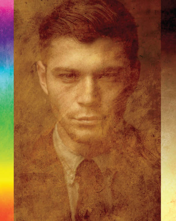
FIGURE 4.20
There’s only one technique with which I find myself using this blend mode (at the moment, anyway), and that’s when I add fake detail into eyes that don’t have any by adding a layer that contains monochromatic (grayscale) noise. There is a video on my YouTube channel showing this technique: http://bit.ly/dewis-hardlight
VIVID LIGHTThis is similar to Hard Light except that it uses Color Dodge and Color Burn instead of Screen and Multiply, resulting in much more contrast (Figure 4.21).
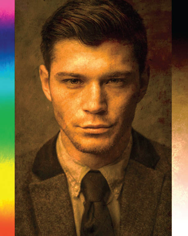
FIGURE 4.21
LINEAR LIGHTIf the BLEND color is lighter than 50% gray then the result we see is dodged, or the brightness has been increased. If the BLEND color is darker than 50% gray, then the result we see is burned, or the brightness has been reduced (Figure 4.22).
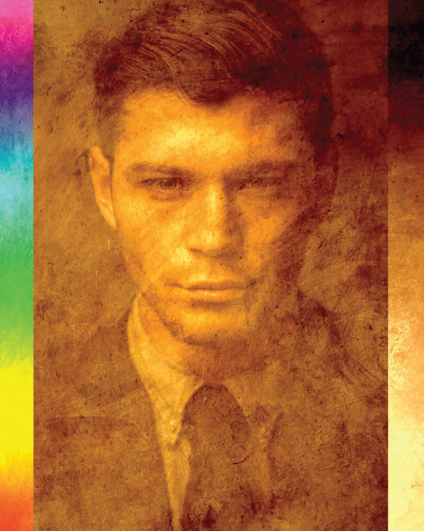
FIGURE 4.22
PIN LIGHTIn areas of the BLEND layer where the colors are 50% gray, the BASE layer will show through; anything else (lighter or darker than 50% gray) will remain visible on the BLEND layer (Figure 4.23).

FIGURE 4.23
HARD MIXThis basically results in a posterized image displaying red, green, blue, cyan, magenta, yellow, white, or black—i.e., the primary colors. There are no gradients blending the colors together (Figure 4.24).
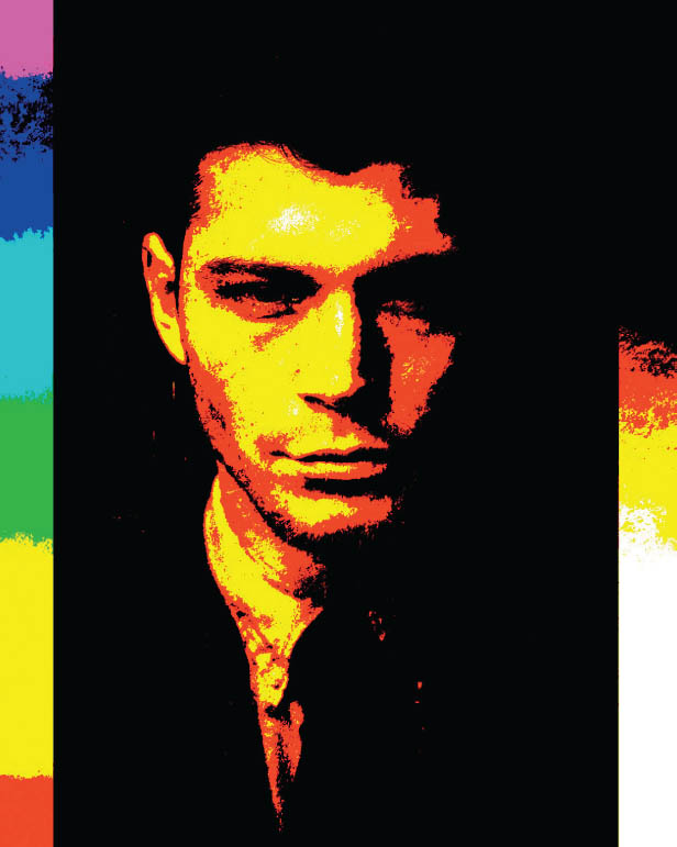
FIGURE 4.24
You can create some really cool looks by using both the Pin Light and Hard Mix blend modes because of the way they remove the smooth transition between colors and create a posterized effect. Admittedly, you get some pretty extreme results with these blend modes. Although I’ve never found myself using them, I can totally see how they could be used for compositing and adding texture to images.
Comparative Blend Modes
DIFFERENCEI use this a lot for lining up images. As you’ll see later in this chapter in the section called “Lining Up Layers with the Difference Blend Mode,” this is a super useful blend mode. It works by subtracting the lighter colors from the darker colors between the BLEND layer and BASE layer. White inverts the BASE layer and black makes no change (Figure 4.25).

FIGURE 4.25
EXCLUSIONThis is similar to Difference but with less saturation (Figure 4.26).
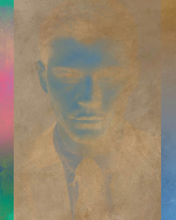
FIGURE 4.26
SUBTRACTThis subtracts the BLEND color from the BASE color, resulting in a darker image (Figure 4.27). Looking at this image now, I’m liking the effect a lot. Hmmm, might be something to use in a future project!
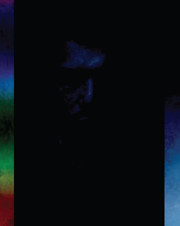
FIGURE 4.27
DIVIDEThis divides the BLEND color from the BASE color, resulting in a lighter image (Figure 4.28).
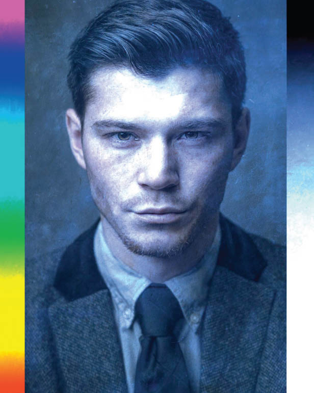
FIGURE 4.28
Color Blend Modes
HUEThis uses the color/hue of the BLEND layer and the saturation and luminosity of the BASE layer (Figure 4.29).
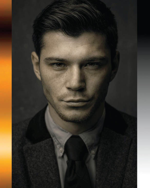
FIGURE 4.29
SATURATIONThis uses the color saturation of the BLEND layer and the hue saturation of the BASE layer (Figure 4.30).

FIGURE 4.30
COLORThis uses the color from the BLEND layer and the luminosity and detail from the BASE layer (Figure 4.31).

FIGURE 4.31
LUMINOSITYAll of the detail on the BLEND layer is visible along with the color from the BASE layer (Figure 4.32). This is a great blend mode to use, for example, when you’re adding contrast to an image using something like a Curves adjustment layer and you notice that doing so also affects the colors by making them more saturated. Using the Luminosity blend mode can help with this by ensuring that the contrast doesn’t affect the colors. Of course, you may see a little change in the colors when adding contrast, but the Luminosity blend mode does a great job of helping to reduce that change.
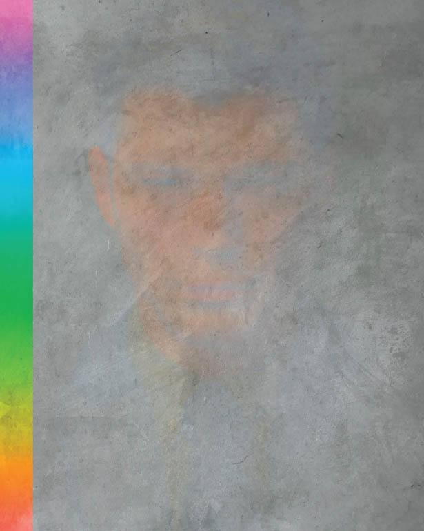
FIGURE 4.32
I’m guessing if you’re anything like me, now that we’ve gone through the role of each blend mode, you agree about not needing to know how and why they do what they do, right?
Like I said before, out of all the blend modes, there will be a handful that you regularly turn to in your own workflow with your own images. However, I would advise experimenting and playing around with the blend modes to see what results you can come up with. I often do this just to see if I can come up with something new.
|
TIPTo quickly cycle through the blend modes so you can see what they do to an image, press V to select the Move Tool, and then hold down the Shift key while pressing the + or – keys. |
PUTTING THEORY INTO PRACTICE
Now let’s take a look at a number of examples showing how I use blend modes in my images to create effects, blend images, create composites, and so on.
Adding Fire
In this first example I want to add some fire to the foreground of a composite image I created. I photographed the model, Jessie, in the studio and added the background and floor later in Photoshop (Figure 4.33). As you’ll see in the following steps, adding the fire is extremely easy to do with blend modes.

FIGURE 4.33
- 1. Open jessie.jpg in Photoshop, and then open the Libraries panel and type “flames” into the search field (Figure 4.34). This gives you a bunch of results from Adobe Stock.
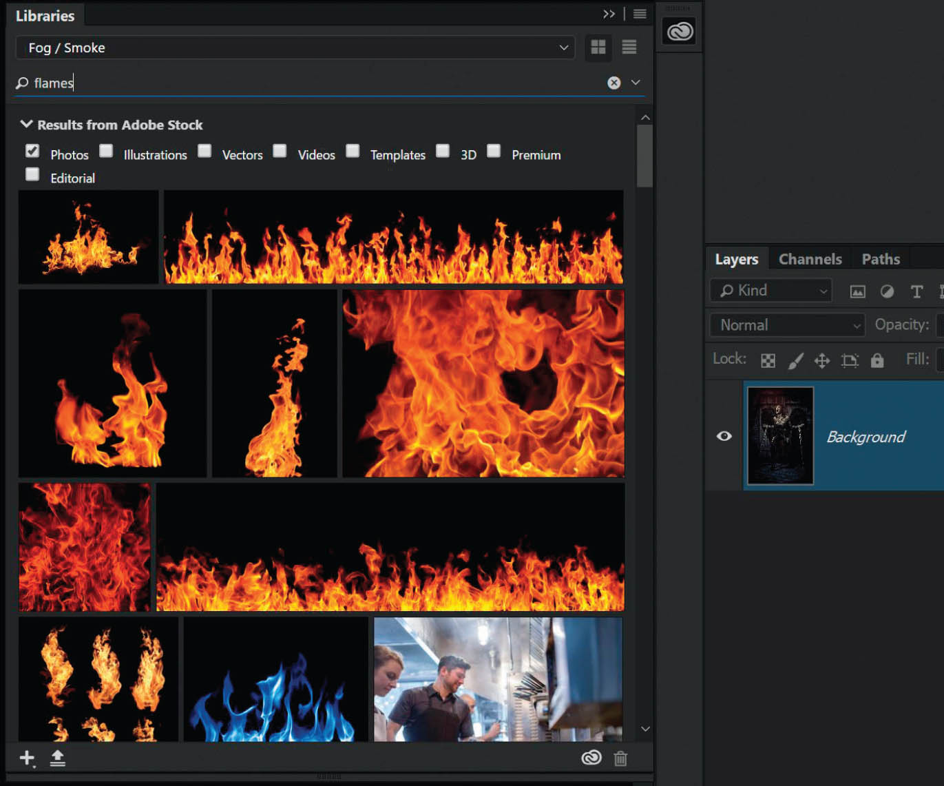
FIGURE 4.34

Download all the files you need to follow along step-by-step at: http://rockynook.com/pstoolbox
- 2. The handy thing here is that if you’re not sure which image you want to use, you can try out various images before buying them by dragging one on top of your photograph and then using Free Transform to resize it (Figure 4.35). As you can see, if you haven’t bought the stock image it has an Adobe Stock watermark, but once you license it that disappears.

FIGURE 4.35
- 3. With the flames in position all we need to do now is use a blend mode to add them to the image. Since the flames are on a black background, change the blend mode of the flames layer to one in the Lighten group (e.g. Lighten), which will remove black from the layer (Figure 4.36).

FIGURE 4.36
As always, it’s a good idea to try a few other blend modes to see what results you get and what you prefer. In this case, I also tried the Screen blend mode (Figure 4.37), which made the flames look less contrasty and saturated, so I decided to stick with Lighten (Figure 4.38).

FIGURE 4.37Using the Screen blend mode

FIGURE 4.38Using the Lighten blend mode
Having the ability to quickly remove the black from an image to blend it with another without having to make a selection is so incredibly handy. This is a technique I’ve used many times before and will continue to use in the future.
In the picture of my friend Brian Dukes (Figure 4.39 and 4.40) and the picture of the stag (Figure 4.41 and 4.42), which is actually a composite I made, the snow came from files I’d made myself by filming 4K footage of fake snow falling in front of a black piece of cardstock (Figure 4.43).

FIGURE 4.39Before

FIGURE 4.40After

FIGURE 4.41Before
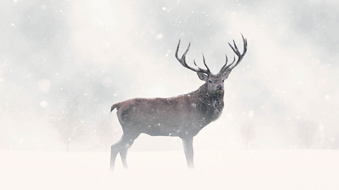
FIGURE 4.42After

FIGURE 4.43Example of a snow file I created
To add the snow to each picture I simply positioned the file containing the snow at the top of the layer stack and changed the blend mode to Screen, which removed the black and left the snow. I added multiple layers of snow to create depth.
NOTEI’ve included the picture of Brian (brian.jpg) and a snow file (snow.jpg) from my Creativity Pack 2 in the downloads for this book so that you can give this technique a try.
Adding a Logo
In this example I want to add my logo onto one of my pictures before posting it online. However, when the logo was designed by my buddy Dave Clayton, it was originally blue on white (Figure 4.44).

FIGURE 4.44The original logo
I could keep the logo in blue, but I think it will look better if I change it to black or white before adding it to the picture, so let’s go ahead and do that.
- 1. Open the logo.jpg file in Photoshop and go to Image > Adjustments > Desaturate to remove the color. The logo now looks gray (Figure 4.45). To turn it black, go to Image > Adjustments > Levels and choose the Set Black Point sampler in the Levels dialog (Figure 4.46), then zoom in and click anywhere on the logo itself (Figure 4.47). This tells Photoshop that where you clicked should be black, so Photoshop changes it to black (Figure 4.48)! Click OK to close the Levels dialog.

FIGURE 4.45 The desaturated logo now looks grey

FIGURE 4.46
FIGURE 4.47 Select the Set Black Point sampler and click on the logo

FIGURE 4.48 The logo is now black
- 2. Open the victorian.jpg file by going to File > Open. Click on the tab containing the logo and select the Move Tool (V), then click on the logo and drag it onto the tab containing the victorian. jpg file. When you see the victorian.jpg file, drag the logo on top of it and release. The logo will now be above the Victorian female image in the layer stack (Figure 4.49).

FIGURE 4.49
- 3. Use the Move Tool (V) to drag the logo into the bottom-left corner of the picture. Go to Edit > Free Transform, hold down the Shift key, and drag the transform handles inward to reduce the size of the logo. Press Enter (PC) or Return (Mac) to commit the size transformation (Figure 4.50).
FIGURE 4.50
- 4. So that the logo is more visible on this dark picture, let’s invert it by going to Image > Adjustments > Invert. We now have a white logo with a black surround. Now all we need to do is use one of the blend modes in the Lighten group to remove the black from the logo. Change the blend mode of the logo layer to Screen (Figure 4.51), and you’re done (Figure 4.52). Easy, huh?!

FIGURE 4.51
FIGURE 4.52
Lining Up Layers with the Difference Blend Mode
Earlier in the chapter I mentioned that the Difference blend mode is great for lining up layers, so I thought I’d show you how that works and then take it a step further.
- 1. Open the rosa.jpg file in Photoshop and create a copy by pressing Ctrl + J (PC) or Command + J (Mac) (Figure 4.53).

FIGURE 4.53
- 2. Click on the rosa copy layer and change the blend mode to Difference (Figure 4.54), and you’ll then see that the image turns completely black (Figure 4.55).
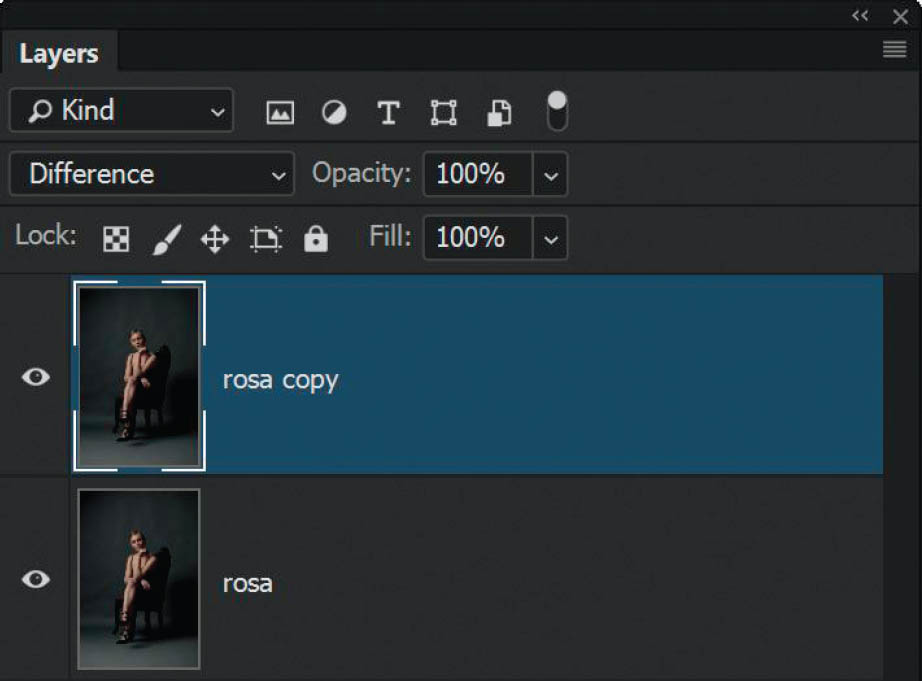
FIGURE 4.54
- 3. This happens because when you use the Difference blend mode, any parts of the BLEND layer and BASE layer that are identical will turn completely black (Figure 4.55). Any areas that aren’t perfectly lined up would be obvious (Figure 4.56).

FIGURE 4.55 The image turns black when the Difference blend mode is applied, which means the layers are perfectly lined up.

FIGURE 4.56 I’ve moved the BLEND layer with the arrow keys on my keyboard, so the two layers are no longer perfectly aligned.
This is incredibly handy, for example, when you have two photographs taken in quick succession in which the person photographed maybe has their eyes closed, but is posed perfectly in one picture, and in the other picture their eyes are open, but they’d moved one of their hands. You can line the images up using the Difference blend mode and the arrow keys on the keyboard, and then consider using a layer mask to reveal or conceal different areas of each image to end up with an image in which the person is posed perfectly and has their eyes open.
Let’s take it a step further. What if we wanted to line up two separate pictures, but it’s not quite as simple as using the Difference blend mode because one of the pictures is at a slight angle?
Figures 4.57 and 4.58 show a couple of pictures that I took of photographer and friend Ian Munro. You’ll find both files in the downloads folder for this book: ian_1.jpg and ian_2.jpg.

FIGURE 4.57
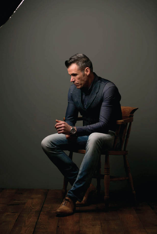
FIGURE 4.58
With ian_1 in the bottom layer position in Photoshop and ian_2 in the top layer position (Figure 4.59), if I change the blend mode of ian_2 to Difference, you can clearly see that it would take quite a bit of movement to get both layers lined up (Figure 4.60).
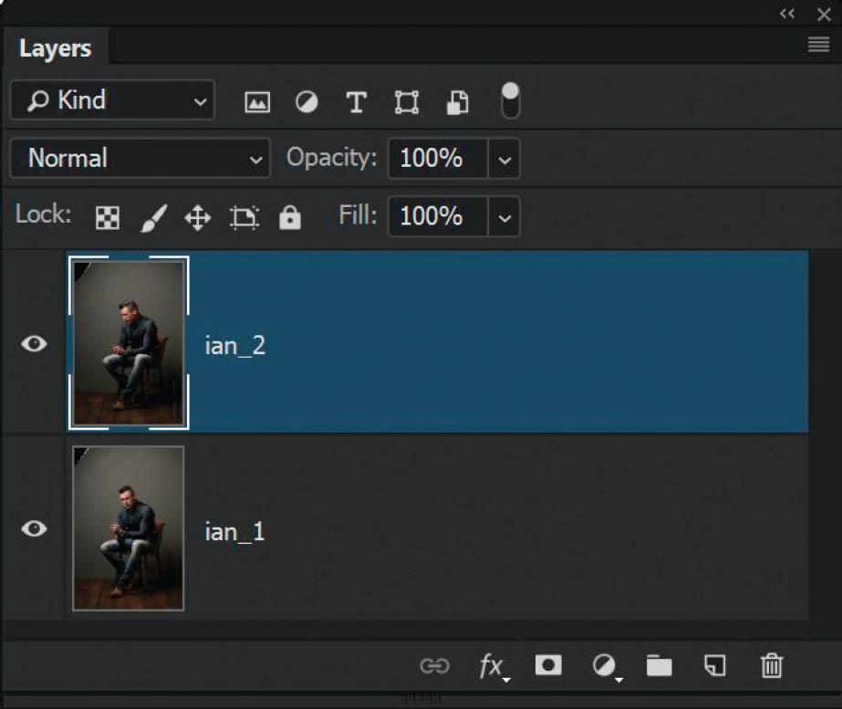
FIGURE 4.59

FIGURE 4.60 Setting the ian_2 layer to the Difference blend mode shows that the layers don’t line up.
Ideally what I want to do is to mask out Ian’s head in the ian_2 layer to reveal the head on ian_1. So here’s a quick fix that will line up the layers in no time:
- 1. Open the ian_1.jpg and ian_2.jpg files in separate tabs in Photoshop, and then go to File > Scripts > Load Files into Stack.
- 2. In the Load Layers dialog box, click on Add Open Files (so that Photoshop knows it will be using the two pictures of Ian) and put a check mark in the Attempt to Automatically Align Source Images checkbox (Figure 4.61). Click OK.
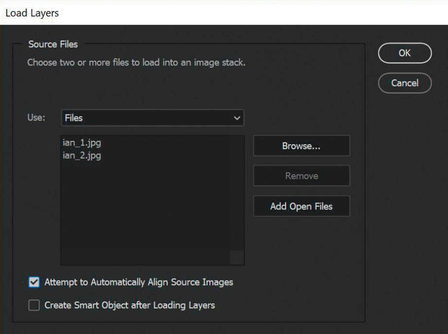
FIGURE 4.61
- 3. Photoshop has now adjusted the position and orientation of the layers so that any identical areas, such as the chair and Ian’s legs, are lined up. Change the blend mode of the uppermost layer (ian_2) to Difference to see that those areas turn black, meaning they are aligned (Figure 4.62). Once you’ve checked this, change the blend mode back to Normal.

FIGURE 4.62
- 4. We only want to see the head from ian_1, so to make the masking easier drag the ian_2 layer to the top of the layer stack, and then click to add a layer mask (Figure 4.63).

FIGURE 4.63
- 5. Click on the layer mask in the Layers panel so that it is active (the frame is visible around it). Using a normal round, soft-edged brush and a black foreground color, paint directly on the picture of Ian to mask away the head from the upper layer and reveal the head from the layer beneath (Figure 4.64).
FIGURE 4.64
Now that the layers have been aligned and we’ve masked out the head, we could carry on with other retouching steps, but this technique again shows that there is always more than one way to do the same thing in Photoshop, and some ways are simply more time efficient.
Using Difference for Color Correction
This next technique is one I absolutely love! It is a superb way to color correct pictures, and is a really clever, but logical use of the Difference blend mode, as you’ll see.
We’re going to use a method whereby we need to tell Photoshop what is black and what is white in the picture, which is very simple to do; however, the clever part is identifying the 50% gray areas so we can do a much more accurate color correction.
- 1. Open the harley.jpg image in Photoshop. Can you see how there’s a slight green color cast across the picture (Figure 4.65)? To fix this, start by adding a Threshold adjustment layer (Figure 4.66), and in the Properties panel drag the marker all the way to the left side (Figure 4.67). Doing so will likely make the picture turn completely white. When you then begin to slowly drag the marker back across to the right, you will start to see areas of the picture reappear (showing up in black). The first areas that start to reappear will be the black areas within the picture (Figure 4.68).
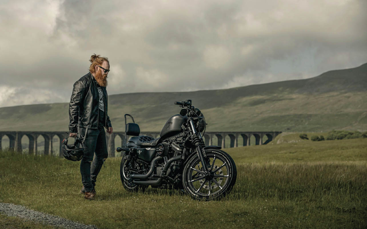
FIGURE 4.65
FIGURE 4.66

FIGURE 4.67
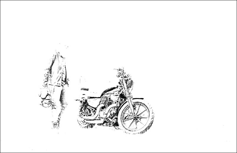
FIGURE 4.68
- 2. To tell Photoshop which area of the picture is black, grab the Color Sampler Tool from the toolbar (Figure 4.69) and click on the image in a black area. I clicked just underneath motorcycle’s fuel tank (Figure 4.70). You’ll notice that doing this leaves a numbered marker where you clicked.
FIGURE 4.69
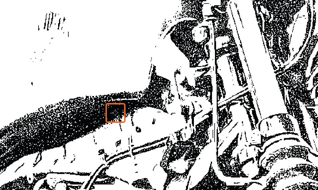
FIGURE 4.70
- 3. Now go back to the Threshold Properties and drag the Threshold marker all the way over to the right side so that the picture turns black, and then slowly drag the marker back across to the left. As you do this, areas of the image start to show up in white, and indicating what is actually white within the picture (Figure 4.71). With the Color Sampler Tool, click down on a white area. I chose to click on the motorcycle’s forks (Figure 4.72). This will leave another marker in the image, which in this case has the number 2 next to it.
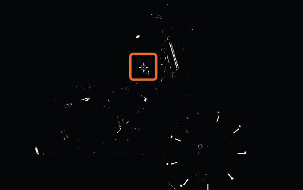
FIGURE 4.71
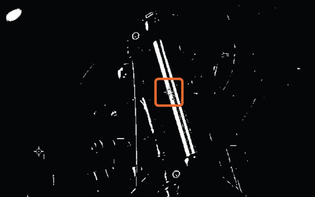
FIGURE 4.72
- 4. At this point you can delete the Threshold adjustment layer because we only needed it to identify the black and white points in the picture, which we marked using the Color Sampler Tool. Click on the Threshold adjustment layer and press delete, or simply drag the adjustment layer on top of the trash can icon at the bottom of the Layers panel.
- 5. Click to add a Levels adjustment layer (Figure 4.73). In the Properties panel choose the Set Black Point sampler (Figure 4.74), and then click directly in the middle of the number 1 marker, which indicates the black area within the picture. When you do this you may see a slight change in the picture.

FIGURE 4.73
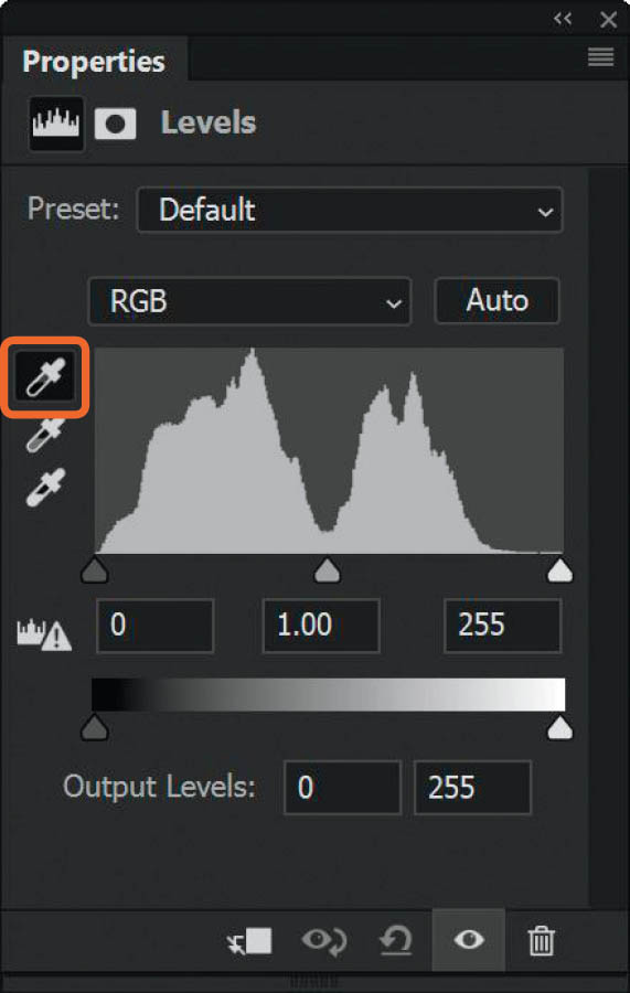
FIGURE 4.74
- 6. Now choose the Set White Point sampler (Figure 4.75) and click directly in the center of the number 2 marker, which indicates a white area within the picture. Again, you may see a slight change in the image.
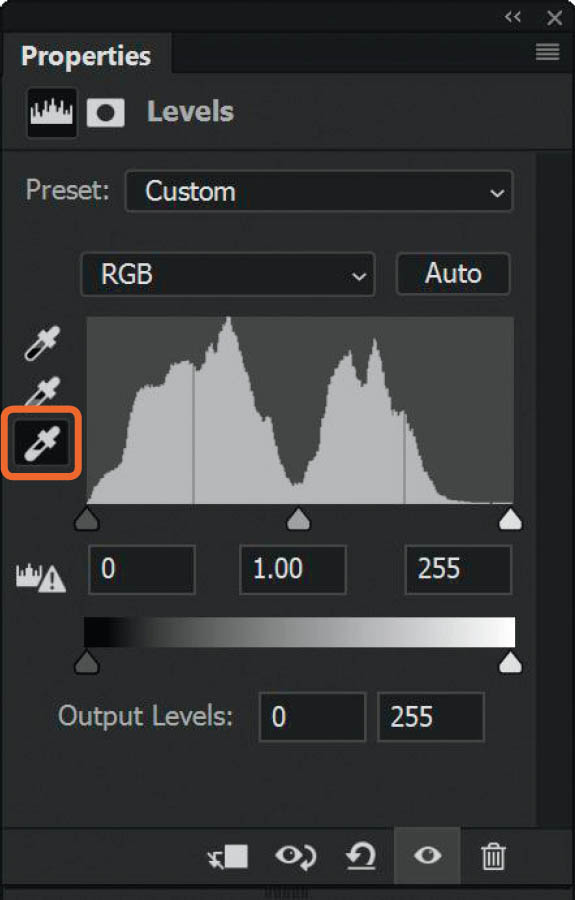
FIGURE 4.75
Now we need to use the Set Gray Point sampler, and here’s how we can establish the gray areas within the picture:
- 7. Add a new blank layer above the Background layer in the layer stack. Go to Edit > Fill, choose 50% Gray from the Contents drop-down menu, and click OK. In the Layers panel, change the blend mode of this 50% gray layer to Difference (Figure 4.76).

FIGURE 4.76
- 8. Remember that when we use the Difference blend mode, any areas where the layers are identical show up as black. Well, here we have applied the Difference blend mode to a 50% gray layer, so now any areas that show up as black are 50% gray in the picture, and that’s exactly what we need to know.
- 9. Select the Color Sampler Tool and click down on a black area, and you’ll notice that another numbered marker is left where you clicked—this time number 3. I clicked on the biker’s (Sam’s) shoulder (Figure 4.77). Now you can delete the 50% gray layer.

FIGURE 4.77
- 10. Click on the Levels adjustment layer in the layer stack to open the Properties, and then choose the Set Gray Point sampler (Figure 4.78). Click directly in the middle of the number 3 marker on the picture.
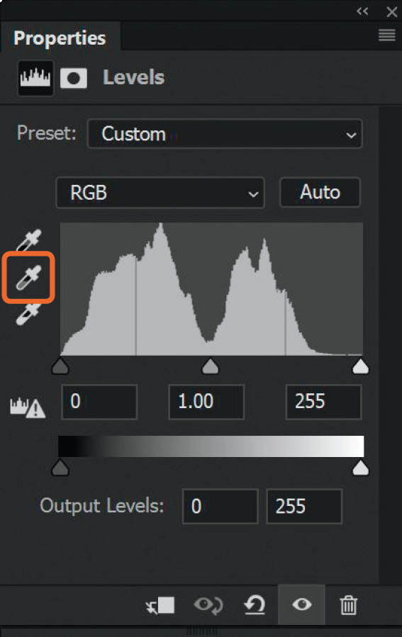
FIGURE 4.78
- 11. We have now color corrected the image to remove the green color cast, and you can adjust the Opacity of the Levels layer to suit your taste. In my example, I lowered the Opacity of the Levels adjustment to 60%.
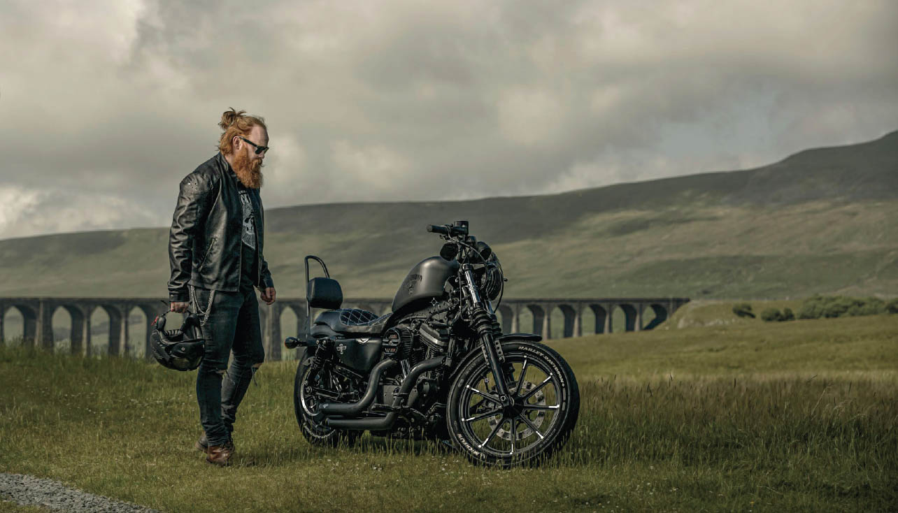
FIGURE 4.79 Before color correction
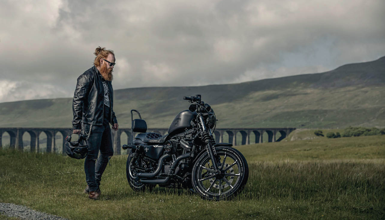
FIGURE 4.80 After color correction
NOTETo remove the markers that were put in place with the Color Sampler Tool, make sure the Color Sampler Tool is selected and click on Clear All in the options bar at the top of the screen (Figure 4.81).

FIGURE 4.81
Textures
To put it in the simplest terms, I absolutely love textures! I’ve used and continue to use them in so many of my pictures, whether it’s to add in new backgrounds or floors or simply to give the image an artistic or aged feel. There’s so much you can do with textures.
Each of the pictures shown in Figures 4.82–4.85 started off with a plain gray paper background behind the subject, and the texture was applied in Photoshop.

FIGURE 4.82
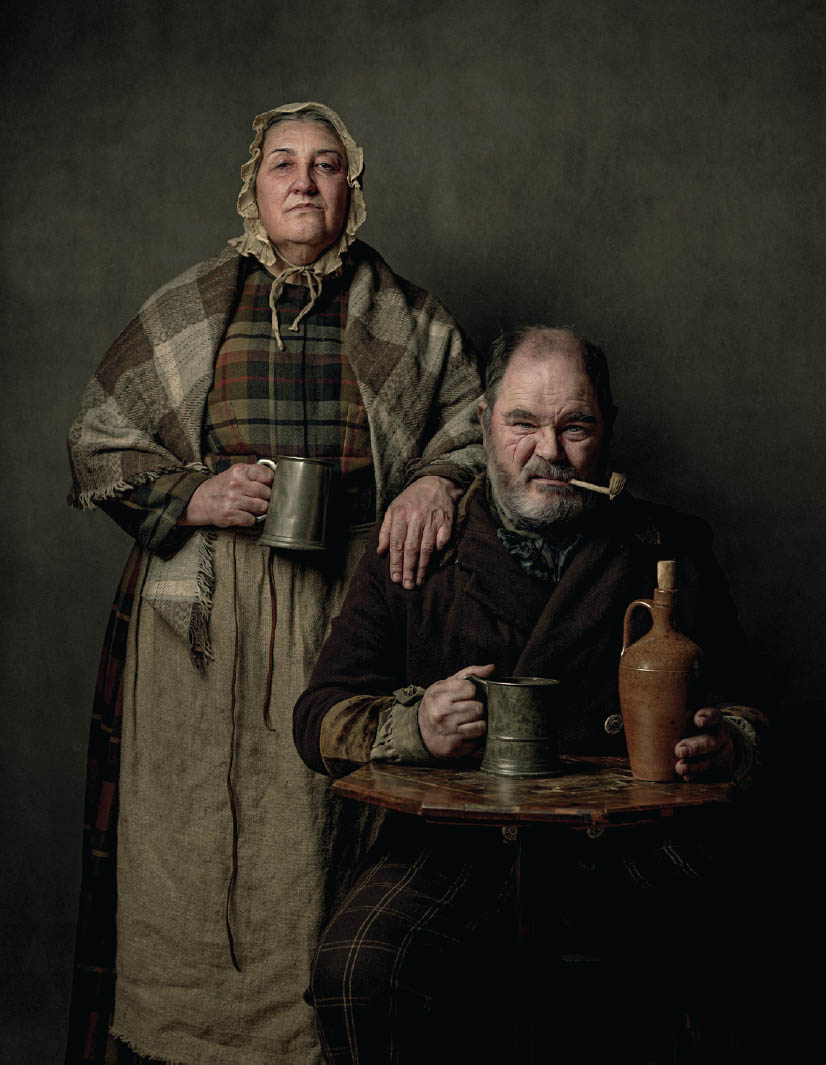
FIGURE 4.83
FIGURE 4.84
FIGURE 4.85
I want to take a moment to show you how I use textures in my portraits. When I say a moment, I really do mean a moment because you’ll see how quickly and easily you can transform your pictures by adding textures.
As an example, I’ll show you how easy it is to add in a new background or floor by using a blend mode, without the need for making complex selections and cutouts.
- 1. Open the ragged_victorians.jpg picture in Photoshop. You can see here that the subjects were photographed against a seamless roll of gray paper (Figure 4.86).

FIGURE 4.86
- 2. Go to File > Place Embedded or File > Place (depending on which version of Photoshop you are currently using), navigate to texture_1.jpg, and click Place. This will add the texture to the top of the layer stack (Figure 4.87). Drag the transform handles outward until the texture completely covers the portrait of the Ragged Victorians (Figure 4.88). If you don’t see any transform handles, go to Edit > Free Transform. Press Enter (PC) or Return (Mac) to confirm the placement of the texture.
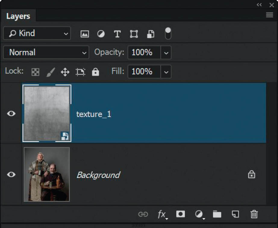
FIGURE 4.87
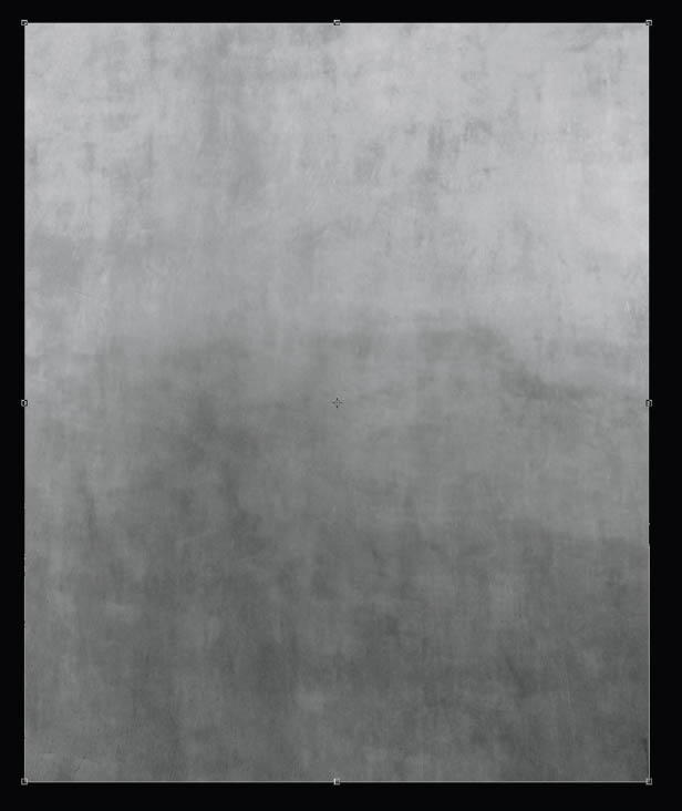
FIGURE 4.88
In the overview of the blend modes I mentioned that with Soft Light if the colors on the BLEND (in this case, the texture) are darker than the BASE (Ragged Victorians), then they are darkened. If the colors on the BLEND are lighter than the BASE, then they are lightened. Areas that are 50% gray remain unaffected, and the result of the blend adds a subtle amount of contrast.
With that in mind, let’s see what happens when we use the Soft Light blend mode for this image.
- 3. Change the blend mode of the texture_1 layer to Soft Light (Figure 4.89). Look how the texture seems to blend into the seamless gray paper (Figure 4.90)—cool, huh?! There are traces of the texture on the Ragged Victorians, but we can sort that out in a moment.
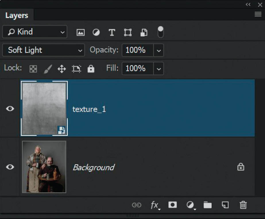
FIGURE 4.89
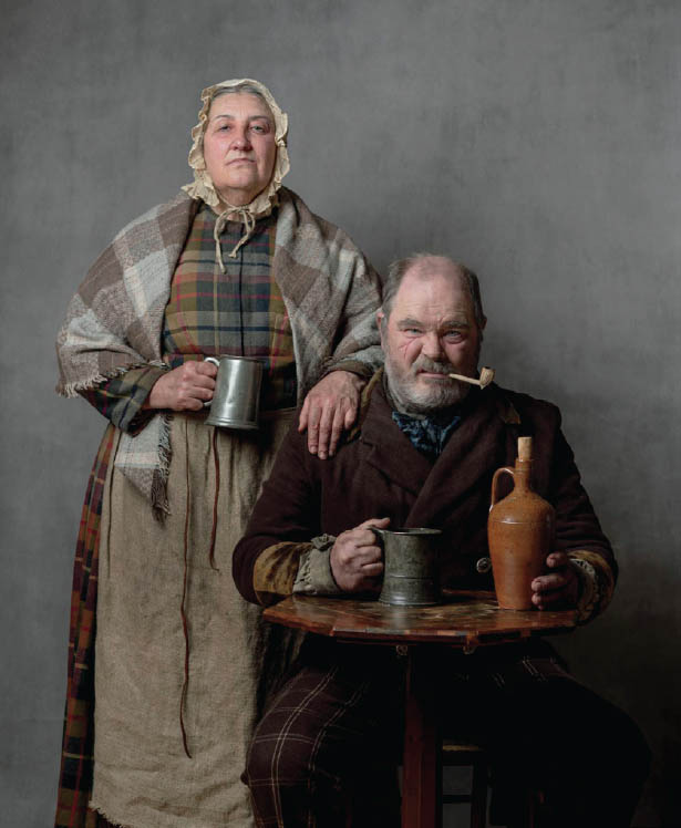
FIGURE 4.90
- 4. For now, let’s add one more texture. Use the File > Place Embedded or File > Place again to add texture_2.jpg to the top of the layer stack (Figure 4.91). This time change the blend mode to Overlay. Notice that now there is much more contrast and this is because of how Overlay behaves (Figure 4.92).
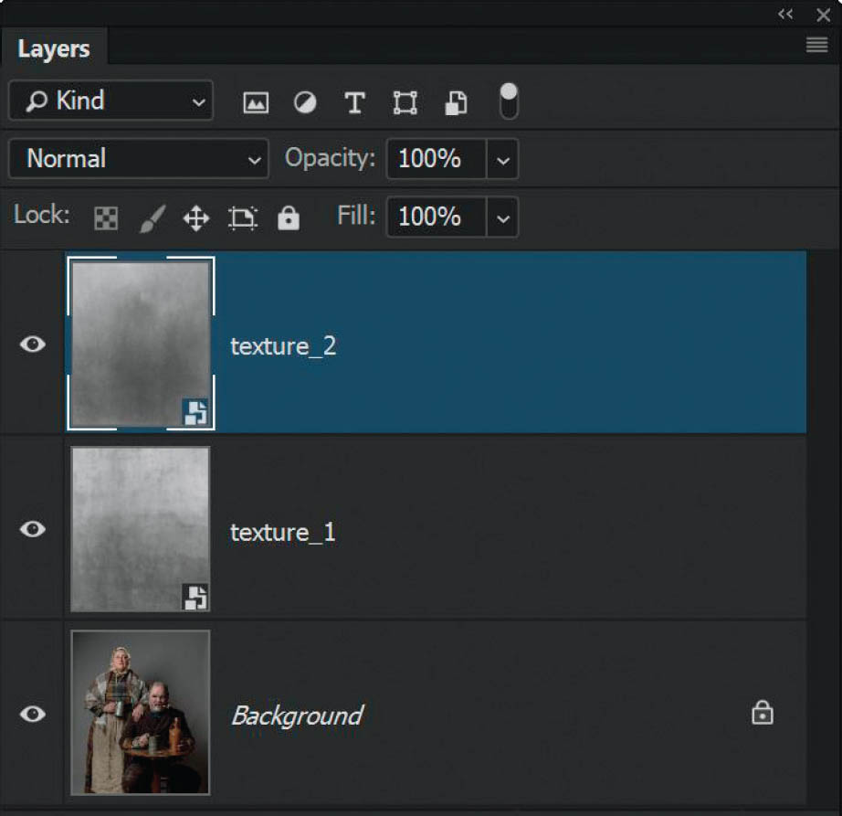
FIGURE 4.91
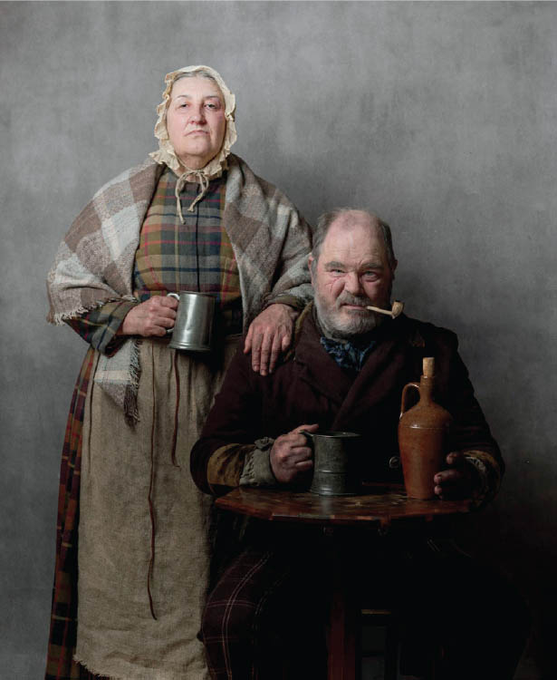
FIGURE 4.92 The Overlay blend mode creates much more contrast
- 5. Now that we’ve added a couple of texture layers, we need to remove the texture from the subjects in the picture. Click on texture_1 in the layer stack, hold down the Shift key, and click on texture_2 so that both texture layers are highlighted. Then go to Layer > New > Group from Layers, name the group texture, and click OK (Figure 4.93).

FIGURE 4.93
NOTEAfter grouping the textures I lowered the Opacity of the group to around 60% to reduce the overall effect of the textures on the background—done for no other reason than my own personal taste.
- 6. Click on the Add Layer Mask icon at the bottom of the Layers panel to add a layer mask to the texture group. With a normal round, soft-edged brush and black foreground color, paint over the picture to hide (conceal) the texture in areas you don’t want it to be visible (i.e., the ragged Victorians, the table, the tankard, etc.) (Figure 4.94).
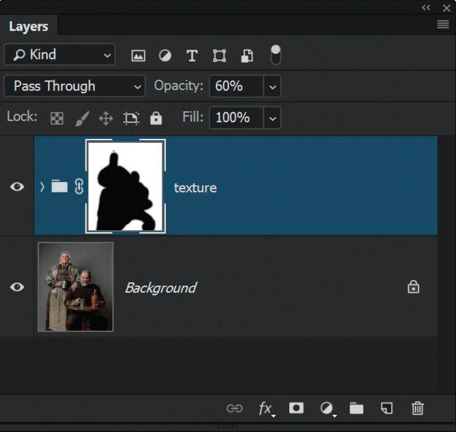
FIGURE 4.94
NOTEWhen you place layers into a group, you’ll see that the blend mode of the group is Pass Through. This is basically telling Photoshop to look into the group and continue to apply the blend modes of the layers within it. You could always experiment here and change the blend mode of the group to see what results you get.
That’s all there is to it! Now you’re ready to carry on with any other retouching you’d like to do.
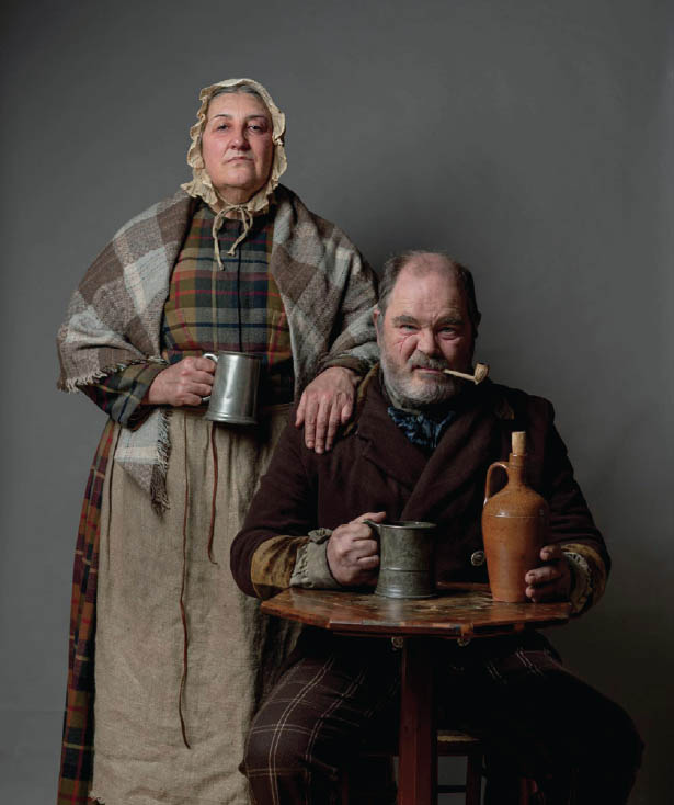
FIGURE 4.95 No texture

FIGURE 4.96 Texture added

FIGURE 4.97 Final edit
Removing Skin Shine
So far we’ve looked at blend modes that we can access within the Layers panel, but blend modes do actually appear in other places within Photoshop, such as with Brushes, the Healing Brush, Clone Stamp Tool, Gradient Tool, and so on.
Here I want to show you my preferred technique for removing or reducing skin shine, whereby I use a blend mode with the Healing Brush for a very realistic result.
- 1. With the foxy.jpg file open in Photoshop, click on the Add New Layer icon at the bottom of the Layers panel to add a new blank layer (Figure 4.98). Double-click on the layer name and rename it skin shine, then press Enter (PC) or Return (Mac).

FIGURE 4.98
NOTEBy using a blank layer we’re working nondestructively, so we can remove the shine but still keep our original image safe and untouched.
- 2. Choose the Healing Brush from the toolbar (Figure 4.99) and in the options bar at the top of the screen, change the Mode of the Healing Brush from Normal to Darken. Also ensure that Sample is set to All Layers (Figure 4.100).
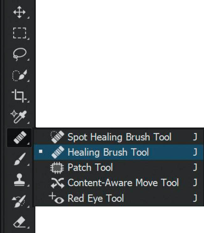
FIGURE 4.99

FIGURE 4.100
- 3. We’re going to remove/reduce the skin shine on Foxy’s forehead and the little bit on his nose. First, position the Healing Brush over an area of Foxy’s forehead that isn’t shiny, but is near the shiny area we’re going to work on, and then while holding down the Alt (PC) or Option (Mac) key, click down once to sample the skin (Figure 4.101). This tells Photoshop what area of skin to use when covering over the shiny area.
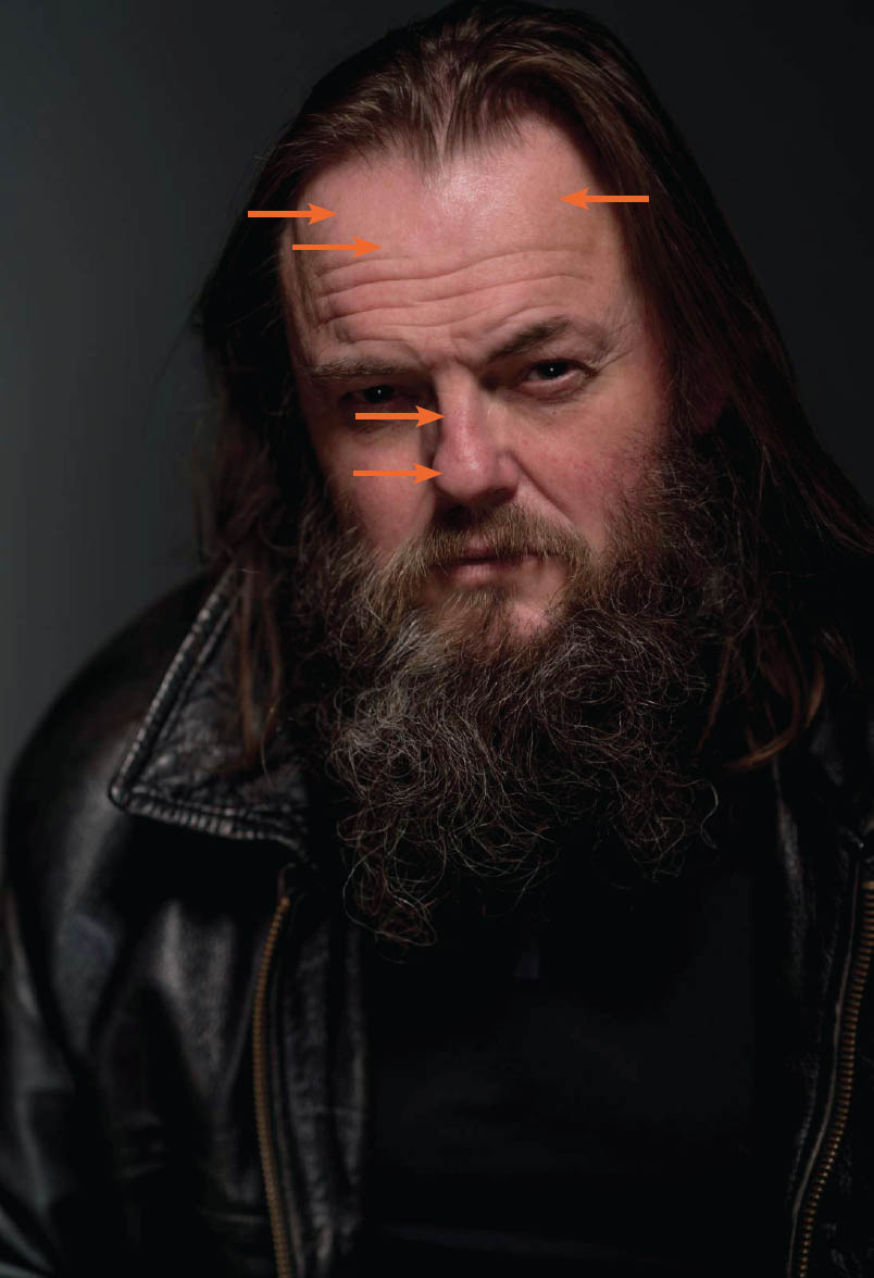
FIGURE 4.101 I sampled areas of skin that aren’t shiny, but are near the shiny areas
- 4. Now that you’ve sampled the area of skin, you can start to brush over the shiny area so that Photoshop can start to remove or reduce it. For best results, the trick is to continually take samples of non-shiny skin as you’re brushing over the shiny area, rather than only using the first sample that you took.
On the opposite side of that, if you were working on a picture with an area that was darker than the area around it, you could try setting the Healing Brush to the Lighten blend mode. In theory, this would only lighten areas that were darker than the area you sampled.
WHY USE THE DARKEN BLEND MODE?When we sample the non-shiny skin with the Healing Brush set to the Darken blend mode, Photoshop will only darken areas of skin that are lighter/brighter than the area we sampled. So in this case, since the shiny skin is lighter/brighter than the area of non-shiny skin, Photoshop will only “heal” those shiny areas and will leave other areas completely untouched. This way it won’t heal areas of skin that it doesn’t need to, which can look obvious and often produces a smudged-looking result.
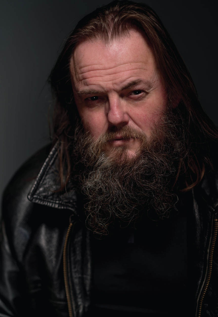
FIGURE 4.102 Before
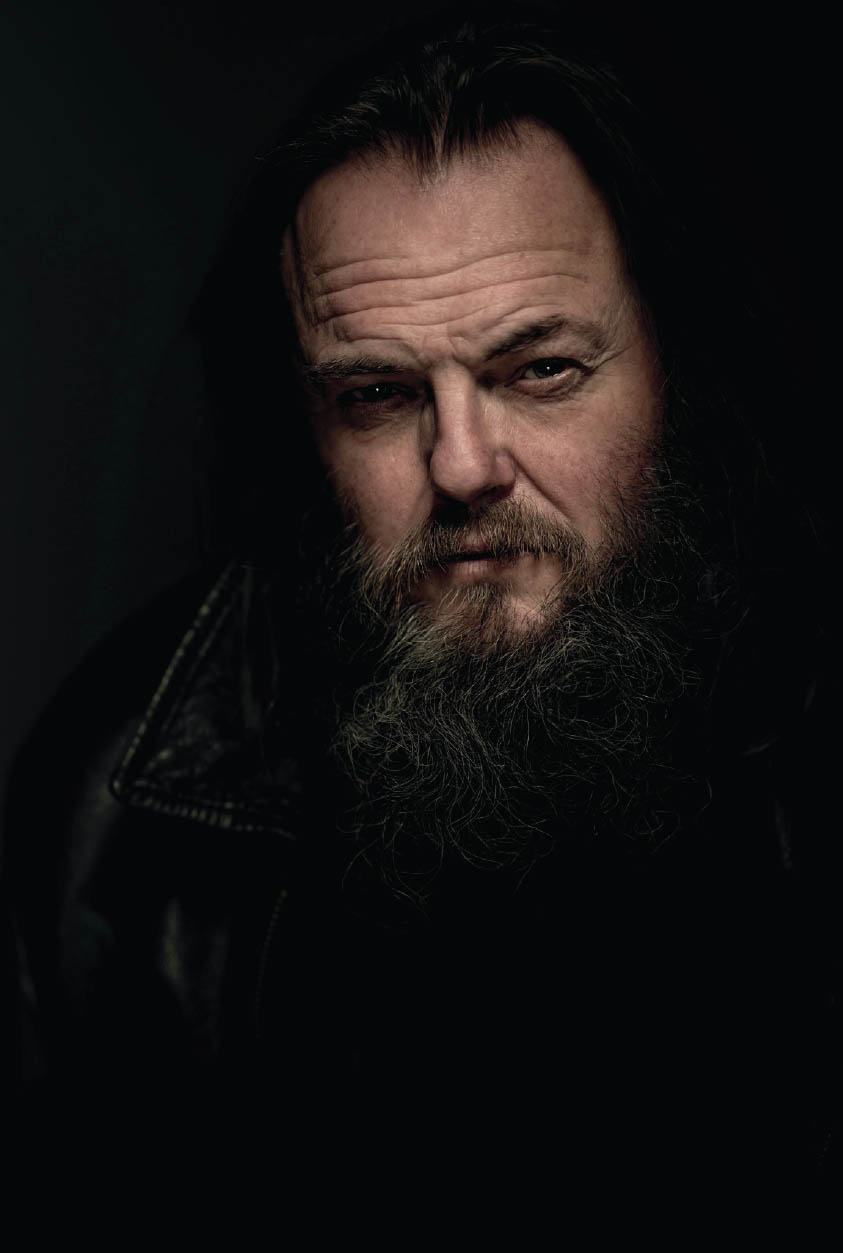
FIGURE 4.103 Final edit of actor Simon “Foxy” Fowler with skin shine removed and finishing touches
NOTEI’ve recorded a video on my YouTube channel where I take this technique a step further and show how to retain the skin texture. You can check it out at the following URL: bit.ly/tptb_skin
Dodging and Burning
Like with most techniques in Photoshop, there’s more than one way to dodge and burn, but however you choose to do it, you have to be careful because it’s definitely one of those things you can get carried away with and before you know it, you’ve done way too much. That’s exactly why I choose to use the technique I’m going to show you in this section (Figure 4.104).
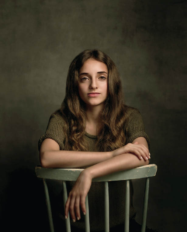
FIGURE 4.104
While we’re on the subject of dodging and burning, a few years back a retoucher friend of mine recommended a DVD set of training material that goes through dodging and burning pixel by pixel—seriously heavy stuff. After about 10 minutes of watching I couldn’t watch anymore because the instructor’s voice was so incredibly monotone that all I could think about was the scene in Ferris Bueller’s Day Off when the teacher keeps calling out “Bueller. . . . Bueller.” I told my friend I couldn’t watch it, but she convinced me to stick with it, saying the instructor does get into his groove and it improves. But, let me tell you, after four hours he didn’t!
Now I’ll never get that time back and I don’t want you to go through the same, so this technique is a lot simpler. It is nondestructive and produces great results, so let’s get started.
- 1. With the lissy.jpg file open in Photoshop, add a new blank layer to the top of the layer stack by going Layer > New > Layer. In the New Layer dialog, name the layer Dodge + Burn, change the Mode to Soft Light, put a check mark in the checkbox labeled Fill with Soft-Light-neutral color (50% gray), and click OK (Figure 4.105).
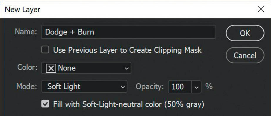
FIGURE 4.105
What we have now is a 50% gray layer at the top of the layer stack, but we can still see the lissy.jpg image. Why is that?
First of all, the reason we’ve added a new layer as opposed to either working directly on our picture or working on a copy of our picture is so that we can work nondestructively. The reason we’ve added 50% gray into this new layer is because we need pixels to dodge and burn (make brighter and darker), and a blank layer doesn’t contain any pixels. Because 50% gray is a neutral color, when we do the dodging and burning, we won’t see any color artifacts appear. We also use gray because with blend modes we can make it transparent and keep the pixels on the layer.
- 2. Select the Dodge Tool from the toolbar (Figure 4.106). In the options bar at the top of the screen, leave the Range set to Midtones (there’s no point in changing this since we’ll be working on a 50% gray layer), lower the Exposure (strength) to around 5%, and turn on the icon (or put a check mark in the checkbox) for Protect Tones (Figure 4.107).

FIGURE 4.106

FIGURE 4.107
NOTEIt’s best to keep the Exposure setting fairly low so that you build up the effect gently. When dodging and burning, it’s easy to do too much without realizing it.
- 3. Now you’re all set to start dodging and burning. There’s so much that can be said about how to do it, but let’s keep it simple and say that the main objective here is to add depth and dimension by brightening the bright parts and darkening the dark parts. You can toggle quickly between the Dodge Tool and the Burn Tool by simply holding down the Alt (PC) or Option (Mac) key. You won’t see any changes in the toolbar, but you will be using the opposite tool, and the great thing here is that it will maintain the same settings in the options bar as you switch between the tools. For example, if you’re using the Dodge Tool at 5% Exposure and then hold down the Alt (PC) or Option (Mac) key, you will then be using the Burn Tool with 5% Exposure. Figure 4.108 shows where I have worked on the picture of Lissy.

FIGURE 4.108
|
TIPTo see only the gray layer you’re working on, hold down the Alt (PC) or Option (Mac) key and click on the eye icon next to the gray (Dodge + Burn) layer in the Layers panel. This will turn off every other layer. To go back to the normal view, hold down the Alt (PC) or Option (Mac) key and click on the eye icon for the gray (Dodge + Burn) layer again. |
- 4. You could also choose to dodge and burn on the gray layer by using a combination of black and white brushes, and this would work fine. However, the reason I choose not to is so that I can set my foreground color to 50% gray by clicking on the foreground color in the toolbar and setting the HSB (Hue, Saturation, Brightness) values to 0, 0, 50 (Figure 4.109). Then when I’m dodging and burning, if I need to remove or reduce the effect anywhere I can quickly select a brush and paint over the area with a 50% gray color at whatever opacity I choose (Figure 4.110 and 4.111).
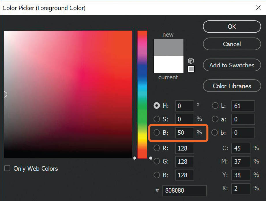
FIGURE 4.109
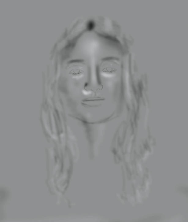
FIGURE 4.110
FIGURE 4.111
In Figure 4.111 you can see that the dodge and burn has been reduced by 50% on Lissy’s hair and nose, and has been completely removed from her mouth. You can also see how the area under her eyes was dodged (lightened) to reduce the dark areas.
FIGURE 4.112 Before

FIGURE 4.113 After
The Never-Ending Lighting Rig
I wanted to make sure to include this technique because it’s one that I have used more times than I care to remember. I call it the Never-Ending Lighting Rig because with this incredibly simple technique you can actually make it look as though you had more lights with you at the time of your photo shoot to light other areas in the picture. Of course, I’m not suggesting you use this technique instead of capturing it all in-camera, but there are times when, for one reason or another (usually time constraints), that’s not possible, and Photoshop can give us a helping hand.
As an example, we’re going to use a picture I took of my dear friend Tom and his gorgeous dog Ruby in one of the barns on his farm (Figure 4.114).
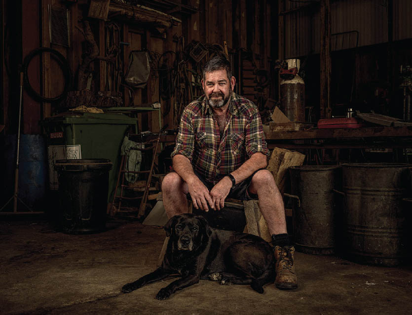
FIGURE 4.114 Tom and Ruby
- 1. With the tom.jpg file open in Photoshop, add a new blank layer to the top of the layer stack and name it Light.
- 2. With the foreground color in the toolbar set to white, choose a normal round, soft-edged brush with 100% Opacity and 100% Flow at around 400px. Click to place a single dot in the center of the picture (Figure 4.115).
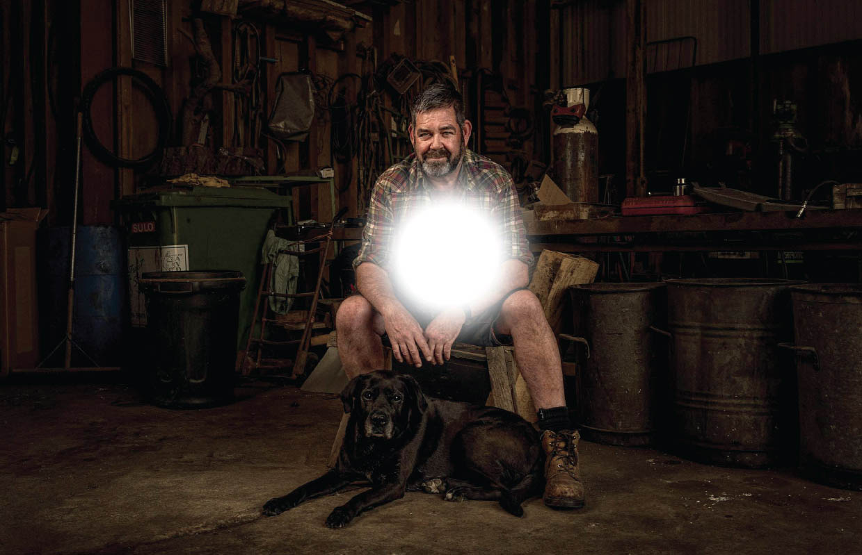
FIGURE 4.115
NOTEWe want to use a normal round, soft-edged brush for this effect, so make sure when you use the brush that there are no settings active in the Brush Settings panel.
- 3. With the Move Tool selected, click on the dot and move it around the picture. Obviously, it doesn’t look like a real light source at the moment, but if you change the blend mode of the Light layer to Overlay (Figure 4.116) and then move the dot around, check out the difference—you now have a light source.
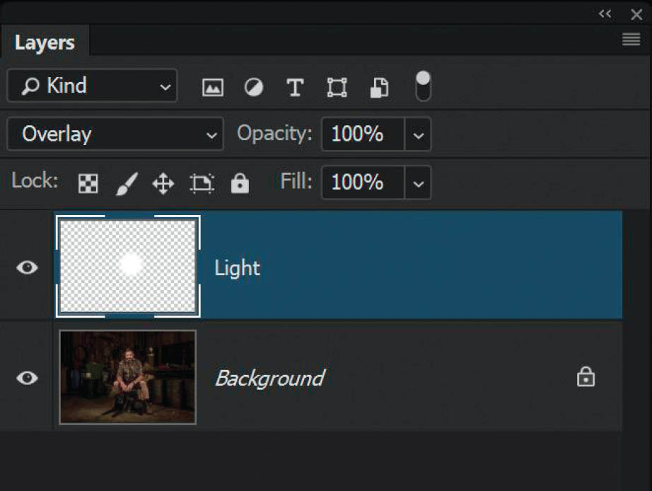
FIGURE 4.116
- 4. To resize this light source, go to Edit > Free Transform and while holding down Shift + Alt (PC) or Shift + Option (Mac), click and drag any of the corner transform handles outward or inward (Figure 4.117).

FIGURE 4.117
- 5. Despite the brush having been at the maximum 100% Opacity, we can also make the light source brighter by duplicating the Light layer. Make sure the Light layer is selected and press Ctrl + J (PC) or Command + J (Mac) to create a duplicate, or simply drag the Light layer on top of the Add New Layer icon at the bottom of the Layers panel.
- 6. Put both layers (Light and Light copy) into a group by first clicking on the top layer, and then holding down the Shift key and clicking on the layer beneath so that both layers are highlighted (Figure 4.118). Then go to Layer > New > Group from Layers.
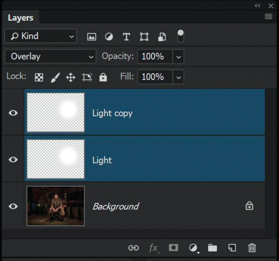
FIGURE 4.118
- 7. Name this group Light 1, and then close the group by clicking the arrow next to the folder icon in the Layers panel. With the Move Tool (V), drag the light source around the picture to reposition it.
- 8. Now that the Light and Light copy layers are in a group, you can use Free Transform to resize the light source, and you can change the Opacity of the group in the Layers panel to adjust the brightness if the effect is too bright (Figures 4.119 and 4.120).
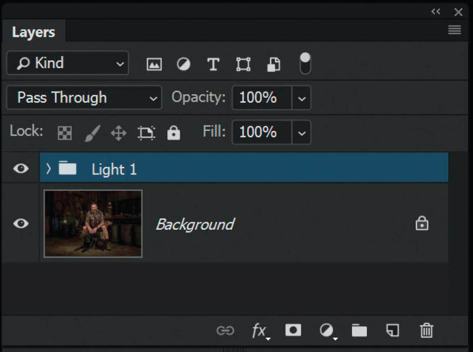
FIGURE 4.119
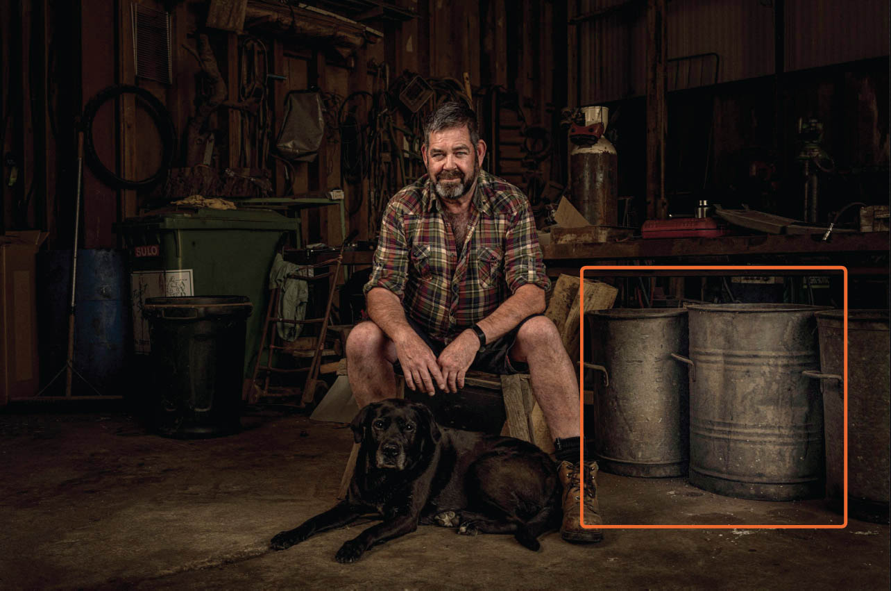
FIGURE 4.120
|
TIPIf you want to add more light sources, rather than repeating these steps, simply duplicate the group by pressing Shift + Alt (PC) or Shift + Option (Mac) or dragging the group onto the Create New Group icon at the bottom of the Layers panel. |
The reason I love this technique is because of the Overlay blend mode. With Overlay, if the colors on the BLEND are lighter than the BASE, then they are screened. In this case, the Light layer is the BLEND, and with it being a white dot, the areas beneath it are screened (brightened), resulting in this fake light source. Handy, right?
In Adobe Camera Raw and Lightroom, you can use the Radial Filter to draw out an ellipse and adjust the exposure, shadows, etc., for a particular area in the picture; however, all that does is brighten that part of the picture. When you use a blend mode (in this case, Overlay), the light source reacts with the contrast and tone in the picture so the result is much more realistic. Like I’ve said before, it’s the small things that make the big difference when using Photoshop!
More Overlay Magic – Perfect Layer Masks
Before we jump into the Bonus Content chapter, I wanted to go through a superb technique using the Overlay blend mode. If you ever do cutouts and selections and use layer masks like I covered in chapter 2, you’ll absolutely love this!
Let’s say that we’re working on putting a composite together and we need to cut the tree in Figure 4.121 out from its original background so that we can use it in another picture.
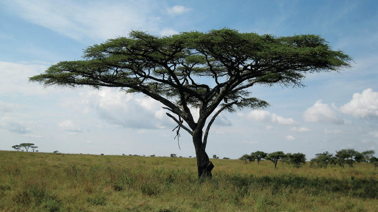
FIGURE 4.121
- 1. With the tree.jpg file open in Photoshop, go to Select > Color Range. In the Color Range dialog drag the Fuzziness slider to the left to around 25 (for now).
If you don’t know how Color Range works, it’s basically a way to make selections based on color. If you choose the Eye Dropper Tool from the Color Range dialog and then click down directly onto the tree image, you will see some areas in the preview turn white. These are areas that are the same as the color directly underneath where you clicked, and these are the areas you are selecting.
For example, if I click on an area of green leaves, you can see areas that are the same shade of green represented in the preview in Figure 4.122. If I click on the sky, you can see it in the preview in Figure 4.123.

FIGURE 4.122
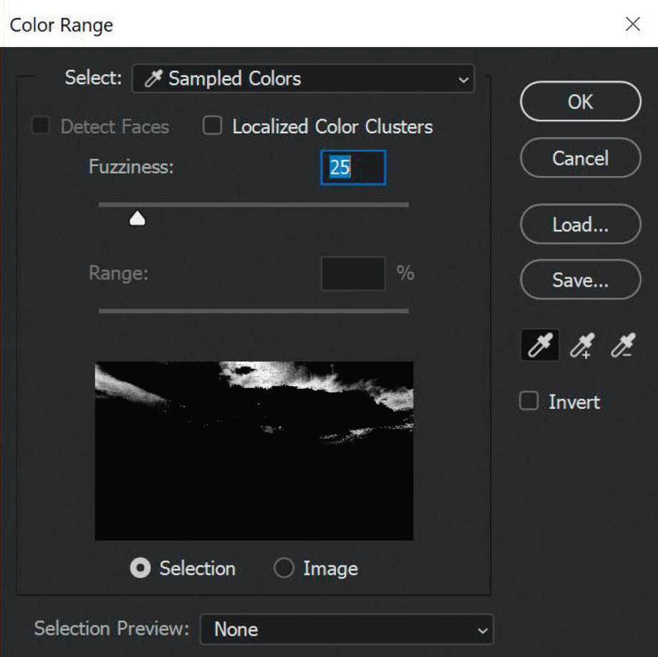
FIGURE 4.123
The Fuzziness slider is Photoshop’s way of being super friendly and saying, “Hey, I know you want the color you just clicked on, but if you move this Fuzziness slider to the right, I’ll add more colors in. If you drag it to the left, I’ll remove colors so that you’re selecting less area.” Get it?
Okay, let’s use this function to select the tree.
- 2. Select the Eye Dropper Tool and click on an area of the leaves. Then grab the Add to Sample Tool and add to this selection by clicking and dragging over other areas of the leaves and branches. It’s highly likely you’ll select other areas, but don’t worry too much about that. Now drag the Fuzziness slider over to the right a bit. I moved it to around 69, as this seems to select more of the tree (Figure 4.124).

FIGURE 4.124
- 3. Click OK to exit the Color Range dialog. Upon doing so, you’ll see lots of marching ants selections all over the picture (Figure 4.125). I don’t know about you, but I think it can be quite difficult to see what is and isn’t selected, so this is where I use Quick Mask, which we looked at in chapter 2.
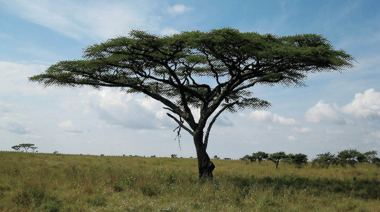
FIGURE 4.125
- 4. Press Q on the keyboard or press the Quick Mask icon in the toolbar to enter Quick Mask Mode. When you do this you can clearly see what is and isn’t included in the selection—areas that aren’t included are covered with the red overlay (Figure 4.126). We only want the tree to be selected, but at the moment the ground is selected, too, so choose a normal round, soft-edged brush with a black foreground color and paint over the ground (white reveals, black conceals) (Figure 4.127).

FIGURE 4.126

FIGURE 4.127
- 5. Press Q to exit Quick Mask Mode and go back to seeing the marching ant selection, and then to cut the tree from its background, click on the Add Layer Mask icon at the bottom of the Layers panel (Figure 4.128).

FIGURE 4.128
Now comes the magic of the Overlay blend mode . . .
- 6. Hold down the Alt (PC) or Option (Mac) key and click directly on the layer mask attached to the tree layer to get the layer mask view. Now you can see how good your selection and cutout really is (Figure 4.129).
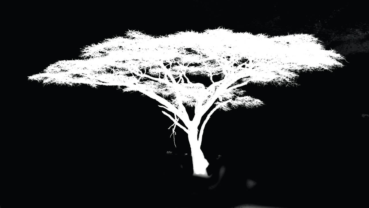
FIGURE 4.129
- 7. In Figure 4.130, you can see that there are some gray areas on the layer mask in the area of the sky, meaning those areas will be partly visible. Only areas that are solid black will be hidden from view. If you use a black brush to paint over these areas it can be very difficult to avoid painting over the tree; however, if you change the blend mode of the brush to Overlay in the options bar at the top of the screen (Figure 4.131), you can paint in black without affecting the white areas of the tree.

FIGURE 4.130

FIGURE 4.131
Also, if there are areas that are gray but should be solid white, you can paint with a white brush set to the Overlay blend mode without affecting the black areas (Figure 4.132).
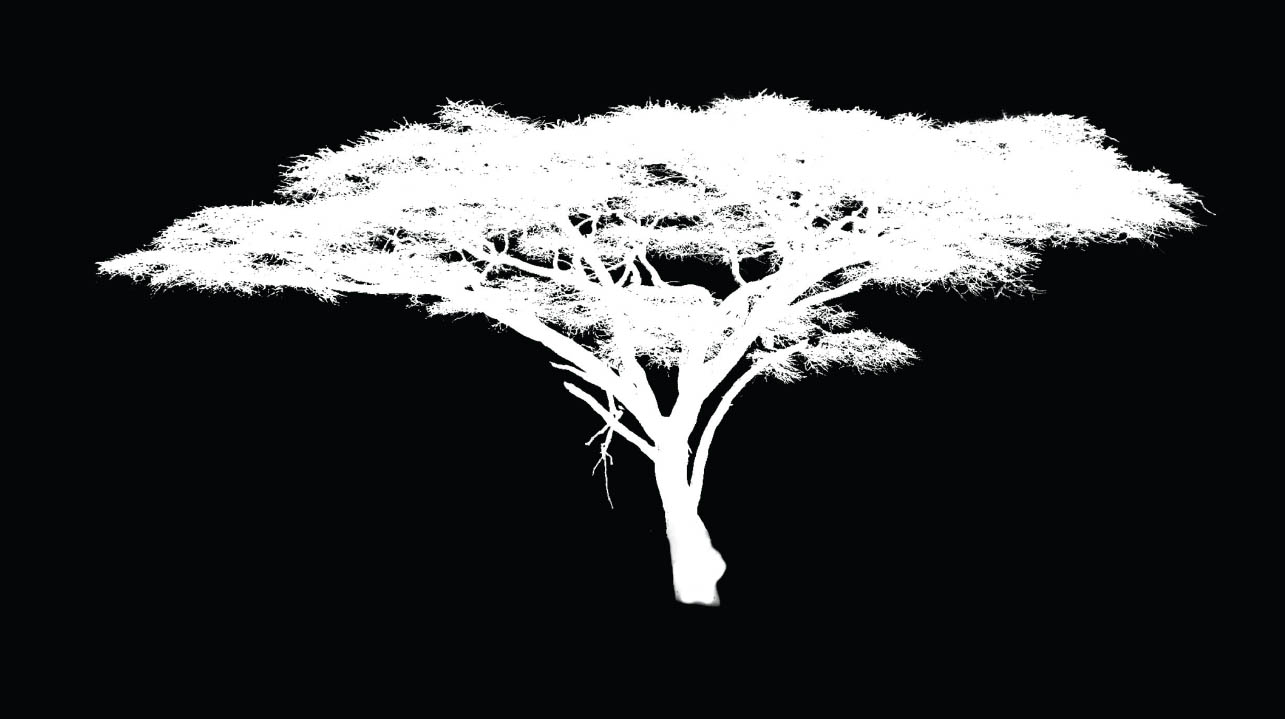
FIGURE 4.132
Using the Overlay blend mode makes it so that the brush will only affect gray areas, regardless of whether you’re painting on the layer mask in white or black. If you paint in white, the black is left alone, and if you paint in black, the white is left alone; only grey is affected.
- 8. Now that we’ve tidied up the layer mask, hold down the Alt (PC) or Option (Mac) key and click on the layer mask attached to the tree layer to go back to the normal view so you can see the tree cutout (Figure 4.133).

FIGURE 4.133