
CHAPTER 6
How to make pictures that inform
Graphics—photos, illustrations, diagrams, maps—add to, replace, reinforce, explain, and illustrate words. Reduced to their simplest, most familiar visual language, lines and curves, they can communicate almost instantly, more quickly than words do. And readers (of printed documents, not necessarily Web sites) often look at them before anything else and use them to decide whether to read adjacent text. But that doesn't mean pictures only have to show up to be effective.
Used to their full potential, graphics help to eliminate any possible wiggle room in the words. When we read descriptive words, we form a picture in our minds, but it's rarely the same mental image as another reader's. It might not even be the same as the writer's. (It's similar to seeing a movie after reading the book, and disagreeing with the casting based on what you had envisioned.) And we had to read first to get any picture.
But with a clear graphic to go with the words, we see the same picture as the writer right away. And we get some meaning even before, or without, reading anything.
Photos in information design must be clear.* They must:
- be in focus
- have a focus (give the right amount of detail, not more or less than the reader needs)
- mean something
- show what you're telling
- tell what you're showing (include legible and consistent captions, titles, and labels)
- appear close to where you talk about them
- point readers into the text
Photos must be in focus
Informative pictures are sharp—shot well and produced in high resolution. (That's true unless what's being conveyed is the absence of sharpness, as in the difference between one camera's output and another's.) They have contrast that supports the focal point. For example, if the photo is meant to show a remodeled building entrance, it won't inform if the entrance is in shadow, is fuzzy, or blends in with surrounding details.
Photos must have a focus
Don't let the camera or photo frame decide what ends up in a picture. Edit the photo to include no more or less than the reader needs. Charts, diagrams, and illustrations work similarly: Also limit their information so the reader can focus on the important points.
As discussed in Chapter 1, the camera lens picks up everything within its range. So a typical point-and-shoot photo includes too much detail. Viewers can get lost in it, admiring the scenery without a visual clue to show why they're admiring it or what they're supposed to notice. Even a well-composed photo can hold distractions for info seekers.
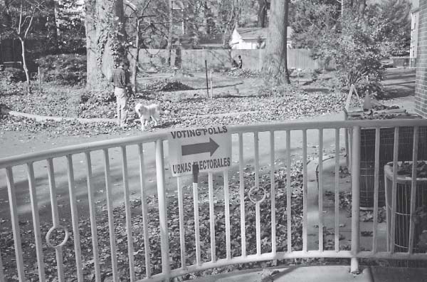
Hidden in this photo is an apt illustration for a (hypothetical) story: A town follows (and covers up) the letter, but not the spirit, of required bilingual voting signs. But the busy background competes with the sign that should be the photo's focal point. Photographer: Ronnie Lipton.
Such sightseeing trips might be desirable for vacation or wedding snapshots, but not for photos that viewers depend on for information. So eliminate the guesswork with a strong focal point and no elements in the foreground or background that compete with it.
If you can, start with a photo that cuts to the chase, one that has what master photographer Henri Cartier-Bresson called “the decisive moment.” Like a good sentence, a good photo is “built with a subject, verb, and object,” photojournalist (and the author's husband) Jeff Young says. And, Young says, a good photo favors storytelling over clichés. For example, instead of one more shot of a person accepting an award, show what she did to win it.
If you can't take or direct an ideal photo, crop or silhouette* it to keep only what tells the story. And check the remaining background for signs of ambiguity by asking other people what they see in it. (See Color Plates 28 and 29.)
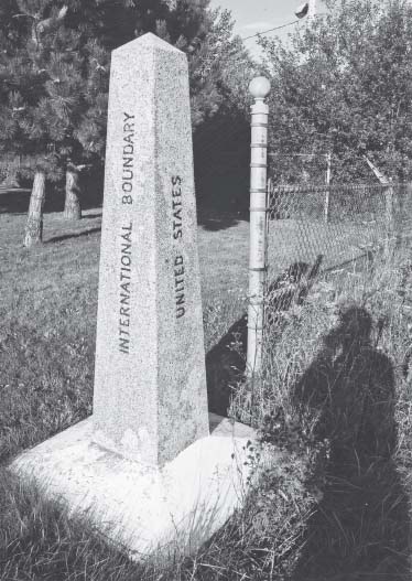
For example, a tight crop or silhouette of a marker between Canada and the United States could illustrate relations between the two countries. (See the photo on the next page.) The editor/designer could make an editorializing political statement by leaving in (and mentioning in the caption) the fence and the shadows on the U.S. side, or even the comparative condition of the foliage.
A crop showing only the shadow of the shooter could tell another story, if only a warning in a photography guide to make sure you're out of the frame when you shoot.
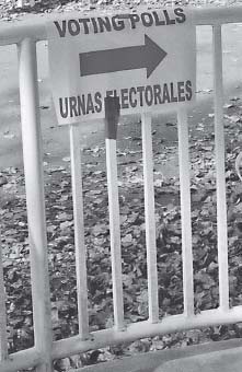
Crop out the background and emphasize the message. Exercise: How might you crop the original photo to show the presence of voting places in residential areas? (And what would you crop, no matter what the story, to eliminate a weak area in the composition?)
EXERCISE: Find the story in a photo of your choice, and crop to emphasize the story.
- Crop with Post-it notes for print photos or a photo-editing program for digital ones.
- Trace the crop onto tracing paper.
- Briefly describe the story the cropped photo illustrates.
- Write a benefit headline for the story the cropped photo illustrates.
- Find two different crops/stories in the same photo, and repeat the process for each.
How many stories—and their corresponding crops—can you see in this simple photo? Photographer: Jeff Young.
Photos must mean something
Designers add pictures for many reasons, which unfortunately don't always include reader comprehension. For example, people who write proposals with imposed page limits often try to replace text with as many graphics as they can, because pages with graphics aren't counted in the total. The skewed thinking is that more pages translate to a stronger proposal. But most of the time (and especially to the people who must read all the proposals), puffed-up documents actually seem to hide a lack of good ideas. You're more likely to impress your readers with muscular proposals—clear, meaningful images (along with tightly edited text).
Too much info can plague other forms of infographics as well. In a bar graph, for example, cluttered increments draw attention away from the trends. The nature of a graph, you'll see later in this chapter, is to encapsulate information, not list it all as you would in a table.
Photos must show what you're telling
Words in Western languages all look pretty much the same (just ask someone who can't read one). They're formed by letters that give no clues to their combined meanings. For example, words with m's in them don't form a different category of meaning than those without them. Words come in different widths, but the widths don't relate to meaning.* Pictures, on the other hand, can illustrate meaning in a glance, and they should.
Photos must tell what you're showing
Include captions, labels, and titles that compellingly connect the picture (along with the reader) to the text. A name under a person's photo is better than nothing, but it's not enough. Tell the readers not just who this person is but why they're looking at him.
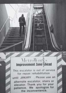
The nonverbal messages—the stair walker next to the gutted escalator—reinforce the verbal message and maybe even make it redundant. Crop here (with Post-it notes) to eliminate useless areas and tighten the focus on the message.
Consider a photo that goes with a story about a new human-resources manager. The name alone under the mug shot gives readers some information to go with the text. But it's not likely to lead the reader into the text. Neither is adding the person's title. You want a caption you know your readers will care about (because you know your readers), such as “Karen Williams, the new human resources manager, will help approve promotions” (or “pitched a no-hitter at the last company picnic”).
Most photos and pictures need captions because they're highly visible. People will look at them, at least in print, so use that attention to get people into the story.† Every diagram needs a title and labels. Make them legible and consistent.
Connecting the dots is tougher than it should be
In the booklet in Color Plate 30, inconsistent labeling is just one of the obstacles in the path between the illustrated diagram and the text. On the illustration of a neuron, clearly numbered labels identify the parts and those numbers show up where the parts do in the text. But in text, the numbers reverse out of gold circles, while on the diagram, the numbers print in black. That might force a reader to hunt to confirm the connection.
The number circles also interrupt the text, forcing readers’ eyes to leap over them. To add to the potential confusion, the same text panel includes a second set of the first three numbers representing a different type of information (the three classes of neurons).
And the numbers run out of order in the text. For reading comprehension, it makes more sense to put them in order there, instead of on the diagram. If the numbers are needed, and that's iffy, it would be clearer to use them more like bullets or a glossary instead of putting them in text. Or omit the numbers and maybe add a brief definition with each diagram label.
Another visual element that looks like a color code but isn't: The gold of the circles matches the gold of the neuron, even when the numbers flag a neuron part that's shown in red or blue. The various neuron colors remain consistent throughout the diagrams.
(On the cover, though, the title colors suggest other meanings: Gold is for living neurons, black is for dying ones, and red, as the last line—“of a neuron,” seems to have a stronger link to the red support cell of a neuron than to the neuron itself. See Color Plate 31.)
It also would make sense to illustrate the boxed facts that are reversed out of navy blue, as in, “It would take 30,000 neurons just to cover the head of a pin.”
Back in the first spread, notice the challenges to legibility and meaning posed by type sections on inconsistent backgrounds. The word architecture in the title of the first inside spread straddles white and two colors, seeming to emphasize the part of the word that's higher-contrast black on white.
All the text on a pink background suffers from diminished legibility, compared with panels of text on white. It's even worse when a paragraph runs into and out of the two tones.
Why does a bird lead into the introduction panel? (See Color Plate 32.) It's a fair question, which isn't answered until the third paragraph (research into birds’ learning behavior inspired breakthrough research on the human brain). The image seems out of place and not likely to tease readers into reading to uncover its mystery.
As a general rule, include no illustration that “doesn't extend the information in print and no print unless it further explains an illustration,” Richard Saul Wurman says. “Pictures have to extend words … nothing is just illustrated.”
Pictures must show up close to where you talk about them
At a minimum, “close” means on the same spread. Support readers’ desire to connect related info by putting it on the same page as its text, and if you can, next to, above, or below it. If you can't put them on the same spread, provide enough info in the caption to satisfy readers where they happen to be, and point to the text's location. (You're right if you noticed this book's design violates the guideline. A limit on four-color pages with plenty of art that demanded four-color printing dictated that art be separated from the text. My apologies.)
Pictures must point readers into text (if they point at all)
Some photos and drawings have an inherent direction. For example, a profile of a person or vehicle in motion favors one side. (See Color Plate 33.) If the picture has a direction, it's like an arrow that can point where you want it. Place directional photos so they point toward the text, not off the page. The eye tends to follow the direction to its natural conclusion.
Two Gestalt grouping principles might apply:
- Common fate. People see elements going in the same direction as being related. That suggests enough awareness of a perceived direction to follow it.
- Good continuation. People see elements that are arranged in a line as a group, even if the line contains gaps. That suggests they'll mentally fill in the gap between a direction and its object.
To flop or not to flop
If you can't move the photo to take advantage of its natural arrow, maybe you can flop it. (Flopping, as the name suggests, means turning the negative around to make it point in the opposite direction.) Or maybe you can't. Some organizations’ strict photo-accuracy policies don't allow flopping. And some photos suffer from a direction change, including military insignia, police badges, buildings, hair parts, wedding rings on hands, or anything with type (unless you lift the type up in a program such as Photoshop and replace it after flopping).
* Substitute the word pictures or graphics, and these principles still apply.
* Cropping is a form of visual editing in which you cut from a photo any elements that distract from the story you want to tell with the photo. Silhouetting is a form of visual editing in which you cut the photo subject out of its background and horizontal borders. A variation is a partial silhouette, in which you cut out only the part you want to draw attention to, such as a mortarboard that looks as if it's thrown out of a photo of a cheering graduate.
* For example, the word narrow is wider than the word wide; short is longer than long. So typographers and designers sometimes manipulate words so they look like their meaning (w i d e). Have fun with these kinds of effects, but keep them out of your information designs. They tend to call too much attention to themselves and to writing that didn't do its job. Communicate more clearly—and elegantly—with a picture and words that illustrate what's wide.
† Online pictures get less attention because of the way Web sites traditionally have used them, as background, and the way people have used Web sites, as informational sources. So for informative pictures to take up valuable Web space, they'd better look as informative as they are … and even more stripped down. Use a caption, title, or label (or not), depending on how close the photo is to text and whether the audience needs an explanation.