
Chapter 3
The Power Of Iterations And Artboards
You just completed the first iteration of the details screen of the app and already learned a ton about Sketch. But, as you know, a design is never finished, so let’s keep iterating. Sketch makes it very easy to iterate on a design by duplicating the artboard. Select it in the layers list (or with a click on its name in the canvas) and press Cmd + D, which places a copy right next to it. Rename it to “Visit Austria Detail Variation” with Cmd + R and confirm with Enter.
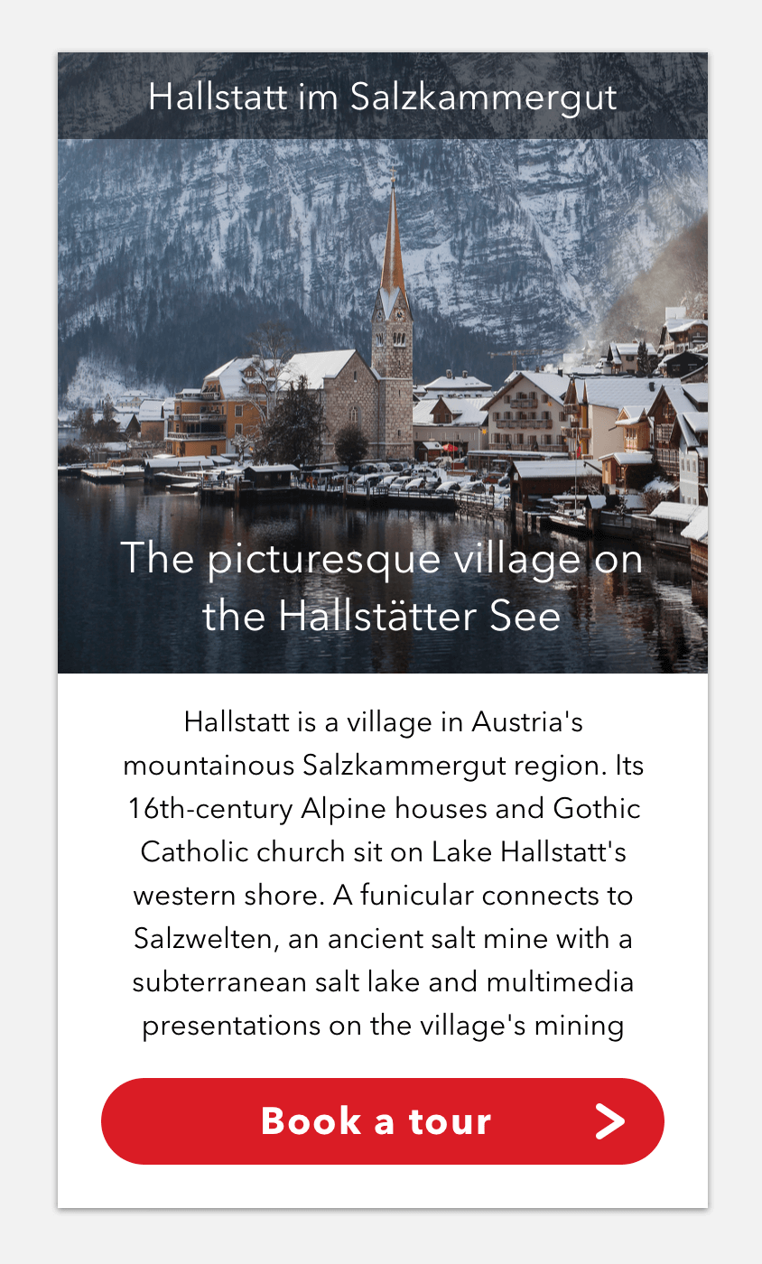
Fig. 3.1: The variation of the details screen we are going to create.
If you share my preference for even numbers you may enjoy that an offset of 100 pixels has been used. Trust me, whenever you see a different spacing you will feel the urge to adapt it to this lovely even number. Alternatively you can also hold Alt and drag the current artboard in any direction to create a copy. When I duplicate artboards and iterate on a design I always follow this pattern: if I simply want to try out a new element or slight change, I will go to the right with Cmd + D to create a copy. For a major change or different element I will duplicate the artboard to the bottom with an Alt-drag and keep iterating to the right from there.
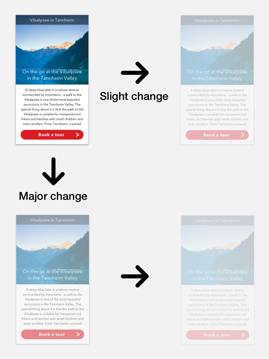
Fig. 3.2: The type of modification determines in which direction the artboard should be duplicated when you iterate.
Quick tip: Press Fn + Left (arrow key) to cycle through the artboards on the canvas. Use Fn + Right to go in reverse.
This way I often end up with dozens of artboards, but that’s OK as it lets you try out an unlimited number of ideas quickly, one of the big strengths of Sketch. Have a new idea? Make a new artboard! Just keep in mind that too many artboards on the canvas can slow down Sketch. Before things get out of hand consider making an entire new page and iterate from there. Read more about pages in chapter 4.
Quick tip: To prevent Sketch from adding “Copy” to the names of duplicated artboards and layers, go to Sketch → Preferences in the menu bar (or Cmd + ,), navigate to Layers and deselect Rename duplicated layers. I’d also advise you to do the same for Offset duplicated layers as it’s easier to move duplicate layers from the initial position than from an offset position.
Some Variation
For a variant of the “Details” page we will try out another tourist attraction with a different image and text to see how our design holds up (Fig. 3.1). First hide the grid with Ctrl + G so that we have a clear view of the background image. Instead of a dedicated image layer we will take a different approach with a pattern fill. Select the former image in the layers list and delete it with Del (remember we can’t select it on the canvas as it is locked). Then create a rectangle that spans the upper part of the artboard, up to the content area. The easiest way to move it to this bottom position in the layers list is to press Ctrl + Alt + Cmd + Down. Like before, name it “BG image.”
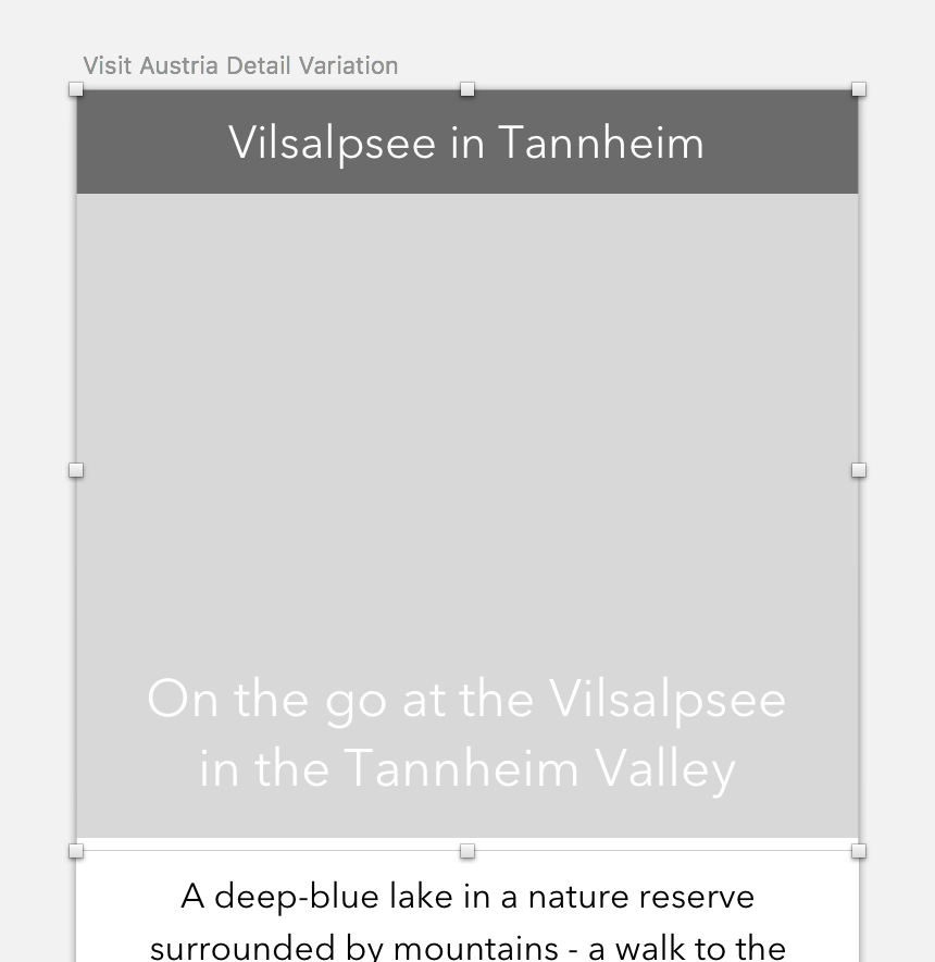
Fig. 3.3: The layer for the image should fill the upper part of the artboard.
To apply the image fill, click on the fill color of this layer in the inspector and navigate to the second to last type, the pattern fill (Fig. 3.4). There click on Choose Image… to select an image on your hard drive. Alternatively, you can drag it from another application into the preview area on the left, or copy and paste (Cmd + C and Cmd + V) a layer from the layers list. Now change the drop-down below to Fill or Fit. To show the relevant part of the picture resize the layer and move it around until you are satisfied. Alternatively you can also set it to Tile and use the slider below to adapt the size.
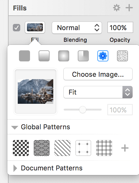
Fig. 3.4: The correct settings for the image fill.
The advantage of a pattern fill is that you can easily crop it by resizing the rectangle. However, images set up this way are always centered to the shape (with the Fill setting) or the top-left edge (with Tile), with no chance to change this alignment. Finally, it’s quite hard to assess their original size, so there’s the possibility that you use them at a much bigger size, which can affect the quality. To circumvent that, switch to tile temporarily to see the original size.
Change the text of the title bar, heading and body copy to something different for some variation. For the heading, we’d better switch to Fixed text before so we don’t need to make a manual line break anymore.
Apart from that, everything looks fine and we can keep iterating, tweak the design and add some further elements. Select the initial design with the Vilsalpsee, hold Alt and drag it to the bottom with a spacing of 100px — remember? Finally, name it “Visit Austria Detail v2.”
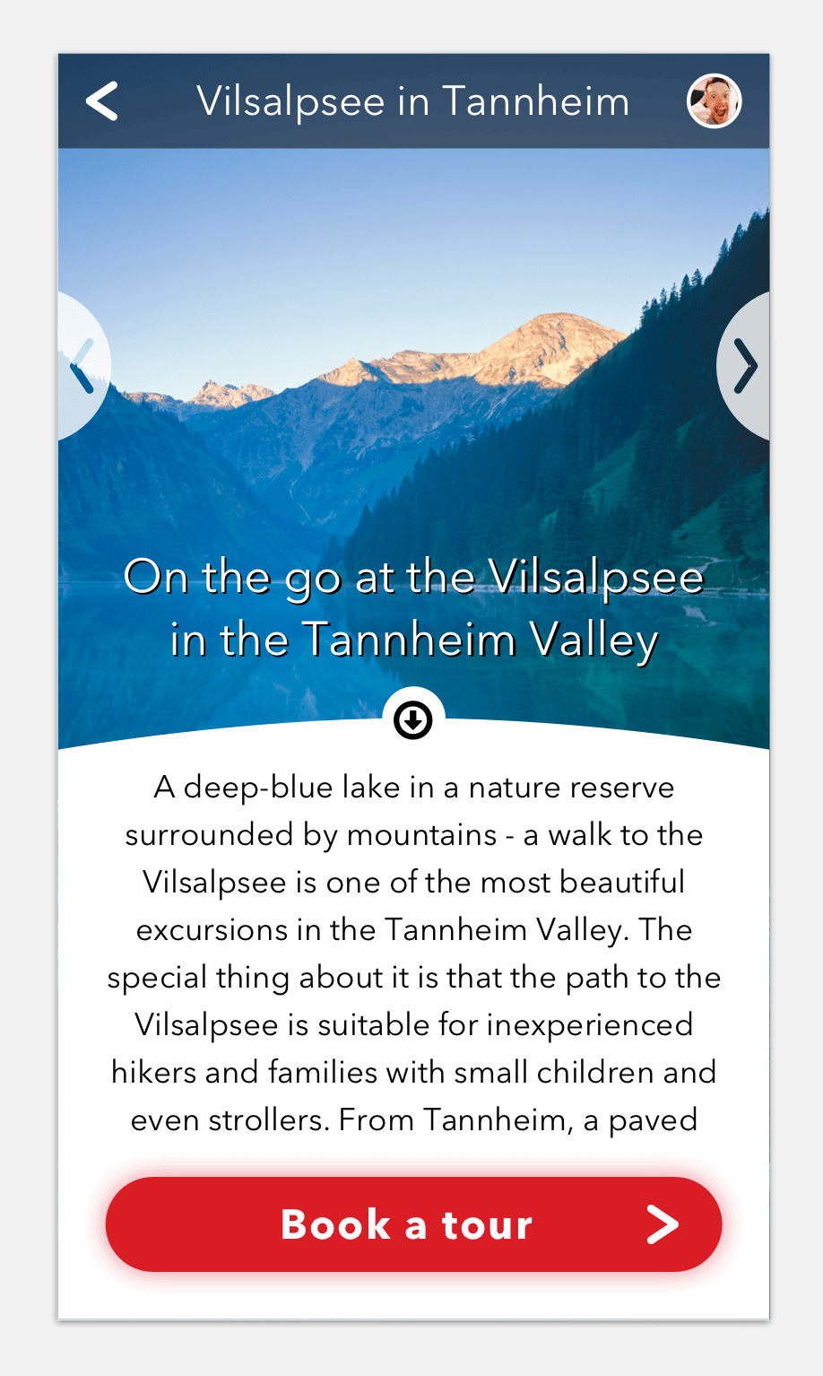
Fig. 3.5: This is how the second iteration will look when we are finished.
Quick tip: To create a quick copy of an element hold Alt and drag it to any side on the canvas with the mouse. Press Cmd + D afterwards to create a duplicate with exactly the same spacing and direction. This also works multiple times.
App v2
The first task we will take care of for our second iteration of the design is to adapt the title bar and add some new controls: an arrow to go back to the “Overview” page, and a profile image, which enables users to change their settings. Since we already have an arrow in our design we could go down the easy route and simply copy it from the button.
The Power of Symbols
But what if we decide that the arrow would look better with a different color or border width? We would need to adapt both instances for a consistent look. This is no problem with just two instances, but imagine if you were using it on six different screens. To account for that we will use one of Sketch’s strongest features: symbols. Think of them as layer groups with superpowers. You can duplicate or insert an instance of a symbol as often as you want, but as soon as you change the master symbol all of its instances get updated immediately.
Info Box: Symbols
Symbols are the ultimate way to create reusable assets, whether small elements like icons or buttons, or entire page elements like footers, or even whole screens. As soon as the master symbol is changed, all of its instances get updated immediately. This affects properties like color, transformations or the position of nested layers.
To create such a symbol select all the layers it should consist of and click on Create Symbol in the toolbar. In the dialog choose a name and whether the master symbol should either be sent to the dedicated “Symbols” page (check Send Symbol to ‘Symbols’ Page), or placed right next to the last artboard on the current page (Fig. 3.6). The advantage of the dedicated “Symbols” page is that all symbols are nicely arranged in a separate location and you always have an overview of all the assets. However, this way they can feel a bit detached from the current design and it’s harder to assess how changes affect its appearance. But you can always remove the symbol from the dedicated page and drag it to other pages.

Fig. 3.6: The creation dialog of symbols.
After you have confirmed the dialog, a little double arrow is added to the name in the layers list, both for the master symbol and the instance. To add a new instance go to Insert → Symbols in the menu bar. There’s a clever way to organize how symbols are listed here: If you need to select from two button states, selected and inactive, you can name one “button/selected” and the other “button/inactive”; this will group the symbols inside a “button” subfolder. If you want to swap one state to the other later, use the dedicated drop-down in the inspector (Fig. 3.7), or make a right-click and select it from the Replace With menu. This also works for switching symbols per se.
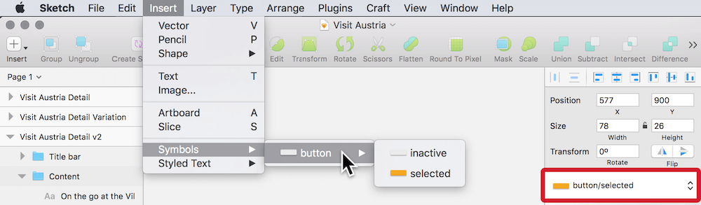
Fig. 3.7: You can organize symbols into folders. Right: Use the drop-down in the inspector to swap one state or symbol with another.
To alter a symbol, double-click on it to bring you to the master symbol with a handy Back to Instance link in the upper left corner (Fig. 3.8). Everything that is changed here gets immediately drilled down to all of the instances. They can be modified in multiple ways: You are able to flip them, change their rotation, opacity or blending mode, or add shadows. There’s even the possibility to resize them, with multiple options available in the Resizing drop-down in the inspector. But more on that in chapter 8.
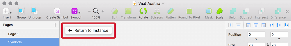
Fig. 3.8: Return from the master symbol to the instance with the dedicated button.
Symbols are quite versatile, as they let you change text values and images separate to each instance with a dedicated Overrides input field in the inspector (Fig. 3.9). This way you can have a shared symbol for all the entries in a list, but each entry can be populated with different content and still share the same appearance. That’s also quite handy for buttons. Sketch is even smart enough to respect the text length of overrides and moves subsequent layers if the content gets too long.
Fig. 3.9: Overrides let you adapt text values, images, and nested symbols per instance.
Furthermore symbols can be nested, which lets you have a symbol for a whole screen, with a nested footer symbol, for example, that in turn includes the symbol of an icon. Nested symbols even have a dedicated Overrides field, so that you can swap one symbol of the same size with another. Nothing lasts forever, so if you decide that a symbol isn’t appropriate anymore select Layer → Remove Symbol from the menu bar; for individual instances, right-click and choose Detach from Symbol, which reverts it back to a simple layer group.
To create the arrow symbol, select it within the button with a Cmd-click and go to Create Symbol in the toolbar. In the dialog, name it “Arrow” and select Send Symbol to ‘Symbols’ page so that the master symbol is sent to a dedicated “Symbols” page (Fig. 3.6.).
After that, go to Insert → Symbols in the menu bar and select our new “Arrow” symbol to insert it into the artboard. For an easier workflow with symbols in future, you should also add the Symbol icon to the toolbar (see the quick tip below). Place this new “Arrow” instance in the title bar on the artboard and also move it to the appropriate group in the layers list. Make sure that you place it above the “BG” layer.
You will notice that this symbol has a double-arrow in front of it now. This immediately associates it with the master symbol on the “Symbols” page. You can check this out if you double-click on the instance. There it’s also possible to customize the symbol and all changes get immediately propagated to the instances. To go back to the details screen, click on the handy Return to Instance link (or press Cmd + Esc).
To represent an actual back arrow, flip it horizontally with Transform → Flip Horizontal from a right-click and align it to the grid horizontally with a left offset of 16px. Use the smart guides to align it to the center of the background in the vertical direction.
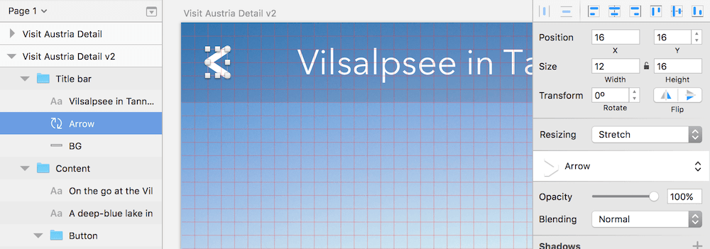
Fig. 3.10: The correct placement of the Arrow symbol. Please note that I lowered the opacity of title bar’s background to help visualizing the grid.
Info Box: Customize the Toolbar
Add more icons to the toolbar with a right-click and the Customize Toolbar… option (Fig. 3.11). Here you have an overview of all the available icons and can either drag them directly to the toolbar or the area at the bottom of this dialog. For better organization and categorization, insert a space or flexible space between them. If you’re savvy with the meaning of the icons, you can switch off their labels with the drop-down below, as well as change their size. To rearrange the icons in the toolbar you don’t need to enter this dialog at all: just hold Cmd and drag the icon anywhere you want. Some recommended additions to the toolbar are: Symbol, Scissors and Round To Pixel. Everything else can be accessed more efficiently with keyboard shortcuts. But with custom shortcuts (read more about them in the related info box in this chapter) in mind, even these three might be redundant.
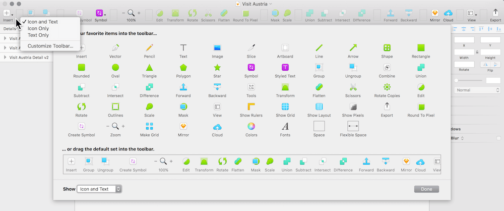
Fig. 3.11: The customization dialog of the toolbar.
Important Settings
The second element to deal with is the profile icon. To prepare it, create an oval using O, with a size of “24px” and hold down Shift to get a circle. Place it in the upper right corner of the artboard and make sure it’s in the “Title bar” group, above the “BG” layer. Then offset it 16px from the right edge (Fig. 3.12). The grid can be a huge aid here. For more detail and greater control on the user icon, zoom all the way in with Cmd + 2 (Cmd + 0 brings the canvas back to 100% again).
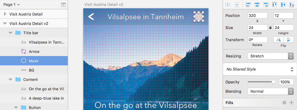
Fig. 3.12: The properties of the mask for the user icon. Please note that I lowered the opacity of the title bar’s background to help visualizing the grid.
To align it vertically with the background layer we could use the smart guides again, but this time let’s try something else and use the alignment icons at the top of the inspector (Fig. 3.13). Select both layers by holding Cmd (to drill into the group) + Shift (to select multiple layers) and click on them. Now select the second icon to the right (align vertically), which aligns them vertically to each other.
Info Box: Aligning Everything
It’s quite easy to align layers to one another or the artboard in Sketch with the alignment icons in the top area of the inspector. As the first two are distribute icons (more on them later in this chapter in the related info box), let’s start with the third from left: align left, align horizontally, align right, align top, align vertically, and align bottom.
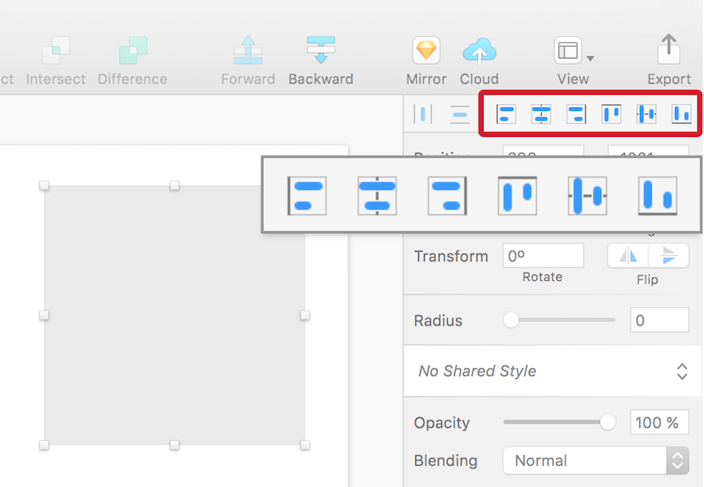
Fig. 3.13: The alignment icons at the top of the inspector. Please note that they have a light border if only a single layer is selected. This way it gets aligned to the artboard.
Depending on the number of selected layers, they slightly change their appearance and behavior. With just a single element picked, the icons have a light border, which denotes that the alignment happens relative to the artboard. But the moment you select multiple layers, the icons change their appearance and lose the border (Fig. 3.14). When you click on left, right, top or bottom now, they are aligned to each other, specifically the layer that is on the farthest end of the selected alignment direction. By clicking on align horizontally or vertically, on the other hand, the chosen layers are aligned to their shared center. However, if you want a specific layer to act as the reference point to which the remaining layers should be aligned, lock this one with Shift + Cmd + L.
Although it isn’t immediately obvious, you can also align multiple layers to the artboard by holding Alt before you click on one of the alignment icons. In this case, they gain the aforementioned border again as a visual cue.
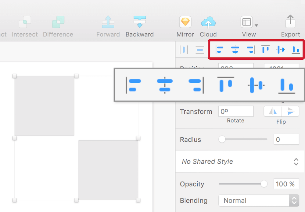
Fig. 3.14: The moment multiple layers are selected, the icons change their appearance and lose the border. Now the selected layers are aligned to each other instead of the artboard.
The alignment icons work not only for layers, but also for vector points when you enter the vector point mode of a layer with Enter. Unlike for layers, you always need to select multiple points; the alignment is always related to the points and not the object or the artboard, and it’s not possible to lock them to change the reference point.
There’s a good chance that the alignment icons will soon become the most clicked area inside Sketch, so what a pity there’s no easier way to apply them! Well, you could right-click and select the appropriate alignment option (if multiple layers are selected), but wouldn’t it be easier to just press a key? Read more about the ability to set custom shortcuts in the info box.
Info Box: Custom Shortcuts
While Sketch is keyboard-accessible right from the start, there are some functions here and there that lack a related keyboard shortcut or simply don’t work for you. Luckily, OS X (or its successor macOS) provides a native way to define custom shortcuts for applications. Go to System Preferences (the easiest way is to press Cmd + Space to fire up the spotlight search and enter “pref”) and select Keyboard, followed by the Shortcuts tab. On the left is an entry called App Shortcuts, which lets you define custom shortcuts for every application on your system, including Sketch.
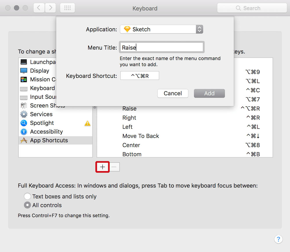
Fig. 3.15: Enter the exact menu title from Sketch and the desired keyboard shortcut once you have clicked on the + icon.
After selecting this option, click on the + icon below, select Sketch from the drop-down and enter the exact Menu Title (Fig. 3.15). This needs to noted exactly like the menu bar command in Sketch. For example, if you want to apply a shortcut to Type → Baseline → Raise, you have to insert “Raise” as the menu title. Then select the Keyboard Shortcut field and press the keys on the keyboard you want to assign, let’s say Ctrl + Alt + Cmd + R. When you click on Add now, go back to Sketch, select a text portion and press the keys you’ve set — you’ll see that the baseline is raised. Nice! This new shortcut is also shown next to the appropriate command in the menu bar (Fig. 3.16). You can not only set new shortcuts, but also redefine existing functions this way.
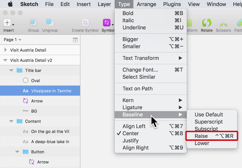
Fig. 3.16: The keyboard shortcut is added to the appropriate command.
For some inspiration, have a look at the keys I’ve assigned in this manner:
•Arrange → Align Objects → Left: Ctrl + Cmd + L
•Arrange → Align Objects → Right: Ctrl + Cmd + R
•Arrange → Align Objects → Horizontally: Ctrl + Cmd + C
•Arrange → Align Objects → Vertically: Ctrl + Cmd + V
•Type → Text Transform → Uppercase: Alt + Cmd + P
•Type → Text Transform → Lowercase: Alt + Cmd + L
•Type → Bigger: Alt + Cmd + + (instead of Alt + Cmd + =)
•Arrange → Move to Front: Ctrl + Cmd + Up
•Arrange → Move to Back: Ctrl + Cmd + Down
•Edit → Collapse Artboards and Groups: Shift + Ctrl + Cmd + C
The circle we just created will act as a mask for an avatar image. Good places to find free user photos are Random User Generator1 and uiFaces2. Pick one, drag it into Sketch (or save it and drag it from the Finder) and center it to the circle. To prevent that the circle gets moved while aligning lock it first, so that it acts as the key object. Now select it together with the image in the layers list and use the appropriate alignment icons to center the elements in both dimensions. Finally make sure that the image is above the shape, as we will set up the mask now. Select both layers and click on the Mask icon in the toolbar (Fig. 3.17).
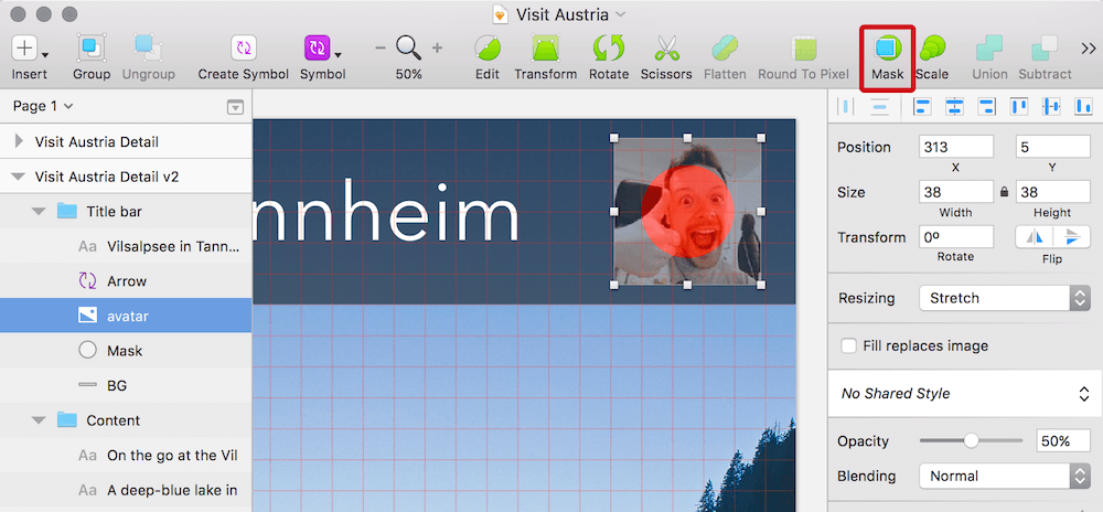
Fig. 3.17: The image will be masked by the circle (set to red to help visualizing it) once you click on Mask in the toolbar.
Info Box: Masking
First the definition of a mask: it’s a layer that clips other content to its shape. Everything within it and above the mask in the hierarchy of the layers list is shown, everything outside is visually removed. The easiest way to set up a mask is to select it together with the content to be masked and click on the Mask icon in the toolbar (or right-click and select Mask). This creates a group that contains both elements and sets the lowermost layer as the mask. The group is especially important here, as everything within it gets clipped, denoted by a little arrow in front of the masked layers. Alternatively you can also use the keyboard shortcut Ctrl + Cmd + M, but this doesn’t create the group for you.
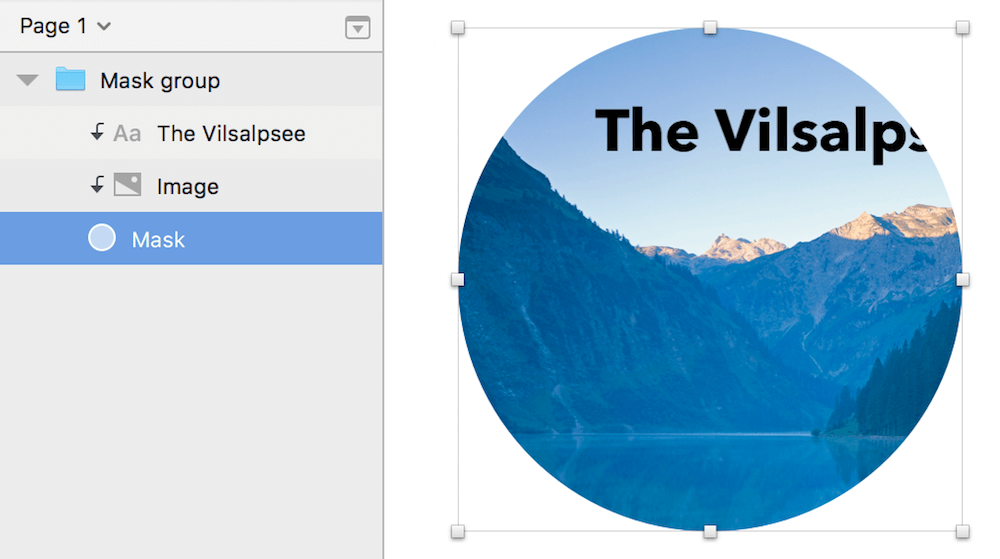
Fig. 3.18: A mask clips everything that is in the same group and above it. The masked content is denoted by an arrow.
You can still exclude layers from being masked by right-clicking and selecting Ignore Underlying Mask. The mask itself can be removed with a right-click and the option Mask. Simply hiding doesn’t disable it. Please note that masks don’t need to have a background color — they can also be transparent so only the masked content is visible. Since masks are normal shapes they can still have a border or shadow.
Masking is not limited to images — every shape can mask another shape independent from its form. Even text can act as a mask (Fig. 3.19), but it needs to be converted to outlines with Layer → Convert to Outlines first, which creates a shape from every letter. Unfortunately, the text can’t be edited after that anymore, but it gives you a lot of freedom over the placement of the masked content. If you just want to overlay text with an image, you can also apply a pattern fill. Read more about this technique in chapter 12 at Create textured type.

Fig. 3.19: Masking is not limited to shapes — text can also act as a mask once it is converted to outlines.
Finally, when you set up a masked image it can easily happen that you catch it instead of the mask layer when you click, so it’s always a good idea to lock the image with Shift + Cmd + L to prevent an incorrect selection after you have set its final size.
Select the photo now and resize it from the middle by holding Alt and using the handles on the canvas so that it fits nicely with the circle. Give the mask a white Outside border with a thickness of “2.” Lastly, rename its group to “User icon” and make sure that it is within the “Title bar” group, above the “BG” layer (Fig. 3.20).
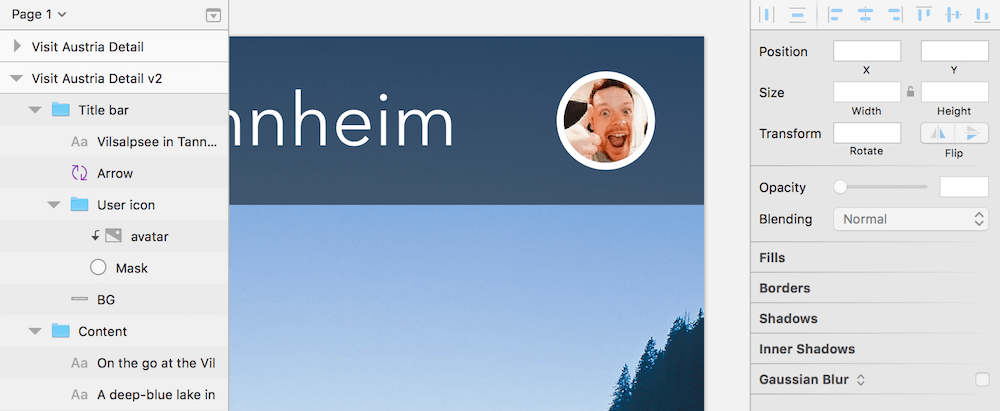
Fig. 3.20: The finished user icon.
As an alternative to a masked image you can also apply a pattern fill to the mask layer itself. A plugin that can be a huge help here is sketch-uifaces3. With the plugin installed, after you have selected the mask go to Plugins → Sketch UIFaces, which automatically loads a random user image from the uiFaces website. Remember to hide the image you first loaded into Sketch. Read more about plugins and how to handle them in the related info box later in this chapter.
Info Box: Zooming
There’s a good chance you won’t always work with the canvas size at 100%, so it might be necessary to zoom in with Cmd + + to work on some details, or zoom out with Cmd + - to get a broader view. Press Cmd + 0 afterwards to go back to 100% again, and Cmd + 1 to see an overview of all the artboards or elements on the canvas.
Since some work will need extra attention, occasionally zoom all the way in to the currently selected layer or group with Cmd + 2, and if you are not sure of its whereabouts press Cmd + 3 to center it to the viewport. This move is pretty handy if you are looking for a specific artboard: use Cmd + 1 to zoom all the way out and then, with a click on the specific artboard, Cmd + 3 to center it to the canvas, and Cmd + 0 to bring it to 100%. If you are getting sick of the slight animations that happen as you zoom, deselect Animate zoom under the Canvas tab of the Preferences (Cmd + ,).
If you are currently at quite a high zooming level (Sketch has a maximum zoom of 6,400%!) you can always switch to 100% temporarily with $. Alternate ways to zoom are: the scroll wheel of your mouse in combination with Cmd, the trackpad with the “pinch to zoom” gesture, or holding Z to zoom in with a click, and Alt + Z to zoom out (I accept no responsibility for any physical damage to your hand, however).
Lastly, to pan around the canvas (that is, to change the viewport) hold Space and drag the mouse, use the touch area of your Magic Mouse (which is one of the main reasons I still favor it over a more ergonomic model) or employ the trackpad.
A Matter Of Style
The last thing to handle for the title bar is to switch the text to a text style, so we can reuse it later. It also makes sure that changes in one place can be propagated to other instances with a simple click. Text styles are similar to symbols, but they only affect the styling of text layers. To convert the title, click on the drop-down in the inspector that says No Text Style. Pick Create New Text Style and name it “Title bar title” (Fig. 3.21). The icon of the text changes to purple in the layers list to represent it being a text style. Whenever you want to reuse this style anywhere else select the text and choose the style from this drop-down. Just like for symbols, you can also organize text styles into folders: just add the folder name and a slash “/” before the text style.
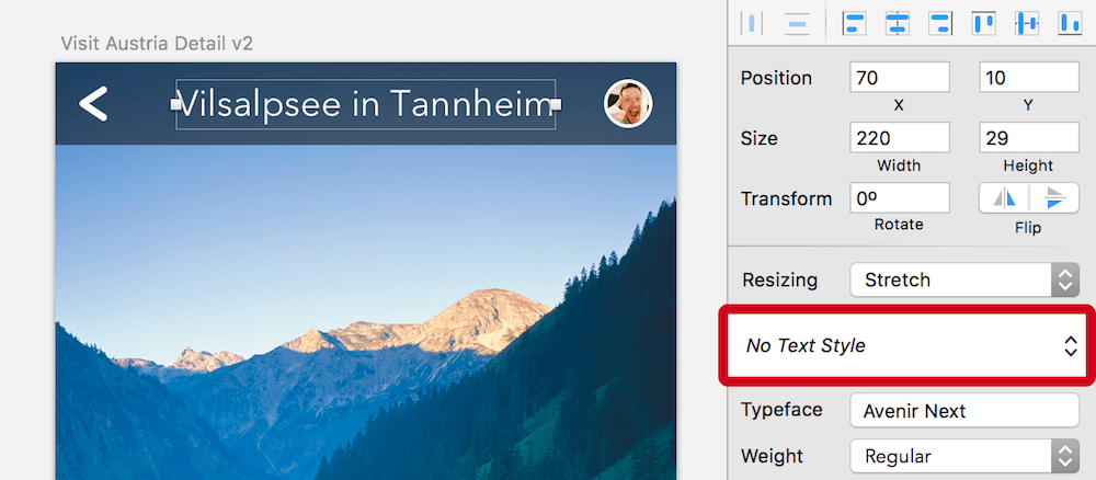
Fig. 3.21: Create a new text style with the respective drop-down in the inspector.
To avoid changing a text style accidentally at one of its instances, you must click on the round double-arrow when its style should be updated (Fig. 3.22). (Funny side note: it wasn’t always like this, and boy how often did I adapt a text style or symbol only to notice it much later when I’d already made a bunch of changes and screwed up all of the instances.) To create an entirely new element of this type, choose its entry from Insert → Styled Text in the menu bar.
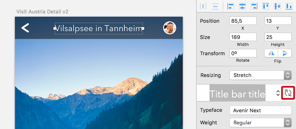
Fig. 3.22: Once you have changed a text layer with an applied text style you need to click on the round double-arrow to update all other instances of it.
Shared styles can not only be used for text but also for the properties of layers, like fills, borders, shadows and blurs. Select the relevant layer that should act as the model and choose Create New Shared Style from the drop-down in the inspector that says No Shared Style. Everything else, like the Update icon, or the purple appearance in the layer list, works exactly as for text styles. For a nice overview of all the styles created so far, select Organize Shared Styles (or Organize Text Styles) from the drop-down, where you can also rename and delete them (Fig 3.23).
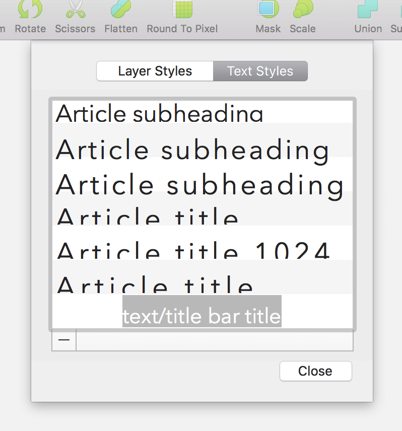
Fig. 3.23: Choosing Organize Shared Styles (or Organize Text Styles) gives you a nice overview of all styles created so far.
Info Box: From the Past to the Future
The ability to undo and redo things with Cmd + Z and Shift + Cmd + Z is a great way to try things out. It even lets you copy things from the “past” into the “future.” Imagine you have added a text layer and tried out a few different colors, but decided in the end that an intermediate color was the best one. You can press Cmd + Z until you reach this specific point in the “past” again and keep working from there (Fig. 3.24).
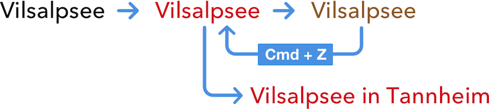
Fig. 3.24: Go back to the “past” and keep working from there.
Or alternatively, to compare this specific iteration from the past with the latest version, copy the layer with Cmd + C, press Shift + Cmd + Z to redo all the steps in between and insert the change from the past with Cmd + V. Now you have the old version and the most recent state at the same time (Fig. 3.25).
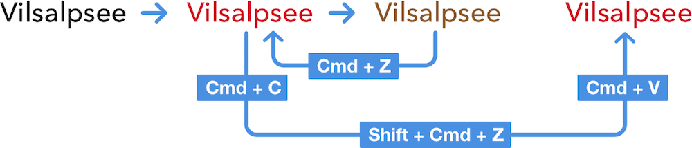
Fig. 3.25: Compare a version from the “past” with the most recent state.
Nice Curves!
How about making the white background of the content a little bit more exciting with a round shape at the top? Sounds good. Select the “BG” layer in the “Content” group with a Cmd-click and press Enter to go into vector point mode. We won’t alter the existing points but we will add a new one, which is just a matter of clicking on a segment of the shape. Instead of an arbitrary position let’s place it in the exact middle, which is possible if you hold down Cmd while clicking at the top side of the rectangle.
If you have a look at the inspector now you’ll see that each vector point has its own X and Y coordinates. To move this new point up by 8px just add “−8” to the Y field. We could have also used the Up arrow key to nudge it in this direction.
What you will notice now is that we didn’t get a curve at this new point but a sharp edge. To give it a pleasant roundness, double-click on the point. Sketch is smart enough here to adapt this curve to the rest of the shape. Now select the outer two points of this line: first click on the one on the left, hold Shift and select the point on the right. Move these two down by 8px in turn, again either by adding “+8” to the Y field or using the arrow keys. Finally, press Esc twice to leave the vector point mode.
Fig. 3.26: Add a new point in the middle of the top side of the white background and change it to a curve.
Enhance Sketch with Plugins
The third new icon for this screen is the one to make the body copy temporarily smaller and see the image in its full glory. You may want to zoom in with Cmd + + now to have a better view. Let’s add an oval for the background of this icon: press O, hold Shift, and draw a circle with a diameter of 32px. Use the grid lines as an aid to get to these dimensions. Name it “BG.” Now change its fill to white and align the circle to the center of the artboard with the fourth icon from the alignment icons (align horizontally) in the inspector. Move it vertically to the middle of the curved line we just created. The easiest way is to use the arrow keys, probably in combination with Shift to span a bigger distance. In the end it should align to the grid (Fig. 3.27). To give the heading above enough room to this new shape move it up by two grid units, so that it has an Y position of “248.”
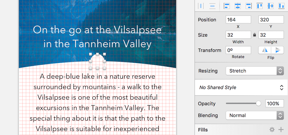
Fig. 3.27: The circular background for the new collapse icon.
Instead of creating the new collapse icon from the ground up, we will use our first plugin. Plugins are a great way to enhance the functionality of Sketch, created by the community to make up for missing features.
Info Box: Plugins
The easiest way to manage plugins is to use Sketch Toolbox4, a simple plugin manager (Fig. 3.28). After you have unpacked and started it, you’ll see an extensive list of plugins to choose from with a handy search option. As soon as you’ve picked a plugin you can install it right from Sketch Toolbox and it’s automatically kept up to date. It shows up under the Installed tab and can also be removed with Uninstall from there.
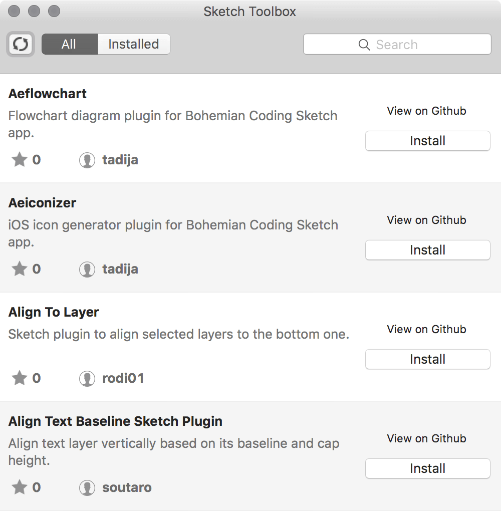
Fig. 3.28: Sketch Toolbox is the best way to manage existing and discover new plugins.
Natively, plugins can be handled in Sketch at Plugins → Manage Plugins… in the menu bar, which shows you a list of all the available plugins. After selecting an entry here you have further options when you click on the gear icon at the bottom-left of the dialog. Show Plugins Folder points you to the relevant folder on your hard drive in case you ever need to manually install or remove such an add-on.
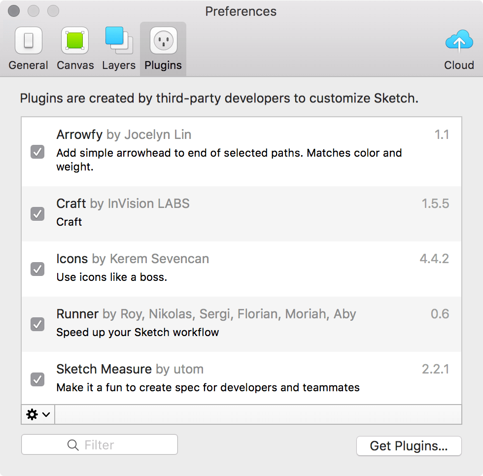
Fig. 3.29: You can also maintain the plugins inside of Sketch.
The Filter field lets you search for an installed plugin, a click on Get Plugins… leads you to the official directory of the little helpers from Bohemian Coding. For a list of interesting Sketch plugins, check out the section in the appendix.
Finally, to run (or rerun) a plugin simply select it from Plugins in the menu bar. Most of them come with a separate submenu or have predefined keyboard shortcuts.
The plugin we need right now is Sketch Iconfont5, a great way to find and add icons to your Sketch files. After you have installed it with the help of Sketch Toolbox and added the font bundle to your system6, go to Plugins → Icon Font → Grid Insert → FontAwesome from the menu bar, which gives you a list of all icons from this icon set. Enter “arrow circle o,” press Enter and click on the first icon (a down-pointing arrow within a circle), which inserts it at the top of the artboard as a text layer. Just make sure that no other element is already selected.
Click on this new icon, give it a font size of “23,” a black fill color and center it to the circle we already created. The easiest way is to use the alignment icons, but lock the circle with Shift + Cmd + L first so that its position doesn’t change. Now create a “Collapse icon” group from them with Cmd + G and drag it to the very top of the “Content” group.
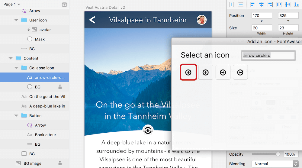
Fig. 3.30: The icon in the dialog of the plugin (red border) and readily placed on the artboard (middle).
Quick tip: Sometimes Sketch doesn’t tell you the distance to a certain layer when you show the smart guides with Alt. This is especially true if you want to keep a certain spacing in relation to another element or the edges of the artboard while you move a layer. There’s a little trick to always show you the right spacing at the right time. Select the element you need a certain distance for, hold Alt to trigger the smart guides and hover over the layer (or edge of the artboard) that is acting as the reference point. Now leave the mouse pointer where it is so that the smart guides keep showing and reposition the layer with the arrow keys on keyboard instead (Fig. 3.31).
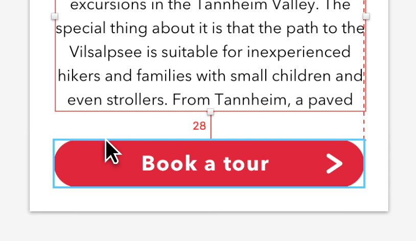
Fig. 3.31: To keep a certain spacing from one layer to another — for example between the text layer and the button — hold Alt, point at the button, leave the mouse pointer where it is and move the text layer with the keyboard. This way the distance keeps showing.
Highlights
To give the heading even more emphasis and better visibility on the dark background let’s add a strong black shadow. Click on the Shadows area in the inspector to add a shadow and change the properties to “1/1/0” (X/Y/blur) with a black color and an opacity of “100” (the A value in the color dialog). See Fig. 3.32, top. Remember that you can use Tab to jump from one input field to the other.
Talking about emphasis and shadows: we also want to highlight the button even more with a shadow, to make it look as if it floats above the page. Select its background shape with a Cmd-click and add a shadow in the same way as before. Since we don’t need an offset here we leave the X and Y positions at zero and only alter the blur to “13.” For the color we will choose the red from the button with the color picker (press Ctrl + C, but click on the color box first) and give it an alpha value of “55” (Fig. 3.32, bottom). Finish the button by converting it to a symbol with the respective icon in the toolbar (Create Symbol). Be sure to send it to the dedicated “Symbols” page with the respective checkbox.
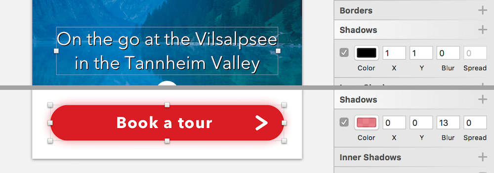
Fig. 3.32: The shadows for the heading and the button.
Info Box: The Art of Shadows and Blurs
With the current trend of making everything flat, shadows have fallen out of favor a bit. Yet a subtle shadow here and there can give parts of your design the required emphasis. Besides the X and Y values of a shadow, which control the offset on the respective axes (and which can also be negative values, see Fig. 3.33, top), and the Blur, that handles how diffuse a shadow is, it also has a Spread value. This last property pushes the shadow out and makes it bigger (Fig. 3.33, second from top). To control the opacity of a shadow, click on its fill color and change the A (alpha) value.
The difference between a normal shadow and an inner shadow is that the former is added outside of the element (Fig. 3.33, top), while the latter is rendered inside of it (Fig. 3.33, bottom). Shadows are not only limited to shapes but can also be applied to text, with the only difference that there is no spread option available (Fig. 3.33, second from bottom). Note: An element can have multiple shadows, that are stacked on top of each other (Fig. 3.33, bottom).
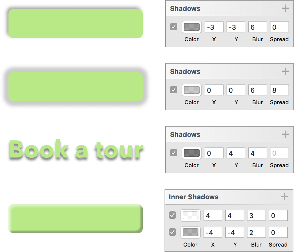
Fig. 3.33: The X and Y values can also have negative values (top). The Spread value pushes the shadow out and makes it bigger (second from top). Shadows can also be applied to text layers, but without the Spread value (second from bottom). Inner shadows are painted on the inside of the element (bottom).
Somewhat related to shadows are blurs, as a shadow is nothing more than a (usually) blurred copy of the layer. Sketch also has you covered here with its four types of available blur modes.
Motion blur (Fig. 3.34, top left): Imagine taking a photo of a moving car with a long exposure — that’s what you get with this type of blur. You can control the intensity (Amount) and the direction of movement (Angle).
Zoom blur (Fig. 3.34, bottom left): This also originates in photography, as it can be created when you zoom while the camera shutter is open. The result is an object of focus with motion lines radiating from it. Here you can customize the intensity (Amount), and where the effect has its origin.
Gaussian blur (Fig. 3.34, top right): The standard blur, which blurs the layer by a certain amount, is certainly the most useful kind of blur. I can only speak for myself, but motion and zoom blurs don’t make much sense in a UI design app.
Background blur (Fig. 3.34, bottom right): While the other kinds of blurs can be applied to any kind of layer, this one only works for shapes. It replicates the effect you may know (and may already be tired of) from iOS and the Mac, in that the content underneath certain parts of the screen appears blurry. To apply it, create a shape, apply Background Blur to it and reduce the opacity of its fill — you can also switch it off entirely. This type of blur is best used above a complex background, or else you won’t notice the effect.
Please note that blurs, especially background blur, are very CPU-intensive and can slow down Sketch noticeably, especially if used on large areas.
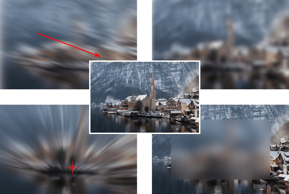
Fig. 3.34: Center: Original. Top left: Motion blur (amount: 12px; angle: 162, marked by the red arrow). Bottom left: Zoom blur (amount: 18px, the red cross marks the origin). Top right: Gaussian blur (amount: 4px). Bottom right: The image is overlaid with a rectangle that has Background blur applied (amount: 8px).
Gradients
Since it’s not immediately obvious that our body copy is scrollable and can contain more text than what’s visible, we will add a gradient as a visual indicator. There are three ways to achieve that: the first is to give the text a gradient fill (1); the second is to overlay a layer with a gradient fill (2); and the third is to use a special kind of mask, an alpha mask (3). I’ll show you all three methods (please also refer to Fig. 3.36). You should create a new artboard for each approach for comparison.
Text Gradient (1)
The easiest option is to add a gradient fill to the text layer, which is quite unusual, as you don’t normally need a fill to set the text color. For this special case, however, click on the Fills area and choose a linear gradient instead of a solid fill (the second icon above the color field). Make sure that it is vertical — if not drag the first color stop to the top of the text layer, and the second one in the same vertical line to the bottom. Choose black and an alpha value (A) of “100” for both color stops.
Now insert a third stop at 80% by double-clicking anywhere on the gradient axis in the color dialog and press 8 on the keyboard to move it to this exact position. Then jump to the last stop with Tab and give it an alpha value of “0.” In case you can’t see the gradient you need to cut the content so that it has the same height as the text layer itself.
Info Box: Fill Types, Part 2: Gradients
There are three types of gradients available in Sketch: linear, radial and angular. They basically all consist of a series of colors on a gradient axis. While this axis is a straight line for the first two, it forms a circle for the third (marked blue on Fig. 3.35). By default, every gradient has a start and a stop color (marked with a red and green circle on Fig. 3.35). If you want to add a new color stop (marked with a blue circle on Fig. 3.35) either double-click on the gradient axis (the horizontal bar) in the color dialog, or make a single-click on the gradient axis on the canvas (Fig. 3.35, bottom).
After that you have a few options: place the stop on a certain location with 1 to 0 (for example, to 30% with 3 or 80% with 8, and so on); insert it in the middle of the surrounding stops with =; or move it with the arrow keys or the mouse (both on the canvas and in the the color dialog). Once you have placed it, use Tab to jump conveniently from one stop to another. Instead of a smooth transition, you can also create hard color stops by placing two points on the same location on the axis. Lastly, to remove a point select it and press Del or Backspace.
Each of the gradients has some particulars:
Linear: The angle and size can be changed by moving the start or stop color around on the canvas. To flip the gradient by 90 degrees use the arrows below the alpha field in the color dialog.
Radial: Move the gradient on the canvas by dragging its center point with the mouse (Fig. 3.35, 1). If you need an oval shape instead of a circle, drag the white dot on the left side of the gradient’s outer circle (Fig. 3.35, 2); in case you want to change its size or angle, move the stop color on this circle at the canvas (Fig. 3.35, 3).
Angular: This type is always centered to the layer and fills the whole element. The start and stop color are on the same spot by default, forming a hard color transition.
Please note that Gradients are not limited to fills but can also be applied to borders.
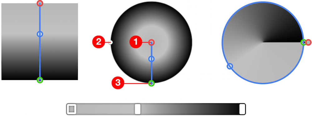
Fig. 3.35: Left: Linear gradient. Middle: Radial gradient. Right: Angular gradient. The gradient axes and intermediate color stops are marked blue, the start color is marked with a red circle, the stop color with a green circle. Bottom: The gradient axis in the color dialog is the same for all three types. 1: Move radial gradient. 2: Change shape. 3: Change size or angle.
Overlay Gradient (2)
For the second technique, create a new rectangle above the body copy text layer in the “Content” group; it should have about the same width as the text layer and a height of “32.” Now lock the text layer with Shift + Cmd + L, which makes sure that it isn’t repositioned, as we have already aligned it perfectly.
Select both layers in the layers list and align the rectangle to the left (third icon) and bottom (last icon) with the alignment icons in the inspector. Group them into “Body copy” and enter “100%” for the width of the rectangle in the inspector, which gives it the same length as the text layer (you can unlock it again now). Apply a gradient to the rectangle: it is basically the same as above, but you only need the default two color stops set to white, with the top one at “0” alpha and the bottom one at “100.”
Quick tip: Sketch typically highlights the layer in the layers list the moment you select it on the canvas. If that doesn’t happen or you scrolled to another point in the layers list, press Shift + Cmd + J to reveal it there.
Alpha Mask (3)
The third method also makes use of an additional layer, but this time it acts as a special kind of mask, an alpha mask. Add a rectangle in the same manner as above, but this time align it to the top-left of the text layer and for both the width and height use 100%, which gives it the same dimensions. Drag the rectangle below the text layer in the layers list. Assign the same linear gradient fill with black as in the “Text Gradient” method, but this time give the first and the second stop “100%” opacity, and the last “0”. If you select the rectangle now and go to Layer → Use as Mask and then Layer → Mask Mode → Alpha Mask you’ll see that you achieved the same effect as above. An alpha mask is determined by the opacity of its color stops: it shows the masked content where it has an alpha value of “100” and covers it where it has “0,” with all the nuances in between. However, the color of the gradient stops doesn’t matter.
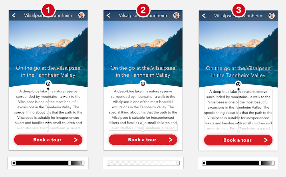
Fig. 3.36: The gradients of the three methods for the visual indicator side by side, each with the gradient axis from the canvas and the color dialog. 1: Text gradient. 2: Overlay gradient. 3: Alpha mask. Please note that I’ve given the overlay and the mask (2 and 3) a grey border for better visualization.
Which method you choose in the end is up to you.
Back and Forth
To make it easier for our users to explore different locations we will now add navigation arrows that let them go back and forth. Create a new circle shape at the upper part of the artboard, above the “Content” group. It should have a diameter of “80px.” As only one third of this navigational arrow should be shown (the rest moved out of the left edge of the artboard), we can use the mathematical capabilities of Sketch again.
In the X field of the inspector enter “80 * -1 * 0.66.” To clarify: “80” is the size of the circle, “−1” makes the value negative (thereby moving it to the left), and “0.66” hides two-thirds of the shape. As this results in a number with a decimal place, go back to an integer with Layer → Round to Pixel in the menu bar. For the Y axis use a value of “118,” which aligns the top-left edge to a grid line (have a look at the grid with Ctrl + G). Please see Fig. 3.37.
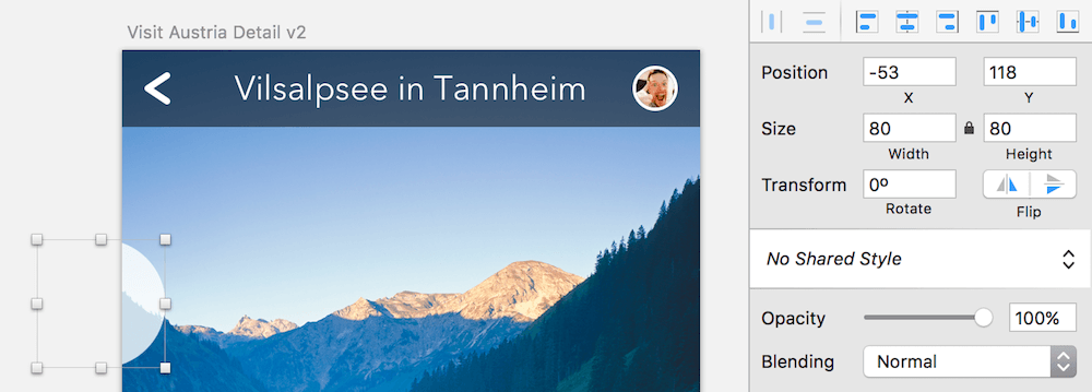
Fig. 3.37: The base circle of the navigation arrow moved out of the left edge of the artboard by two-thirds.
Quick tip: You can perform mathematical operations in every input field in Sketch. For example, triple a border’s thickness with “*3”; halve the width of a layer with “/2”; or increase the font size by 12px with “+12.”
For the arrow itself we can use our “Arrow” symbol as a base, so insert an instance with Insert → Symbols from the menu bar and place it over the circle. Since we need a different shape for the arrow we can’t use it as a symbol but must detach (unlink) it from the master symbol: make a right-click and select Detach from Symbol, which changes it back to a normal layer group. Also ungroup it with Shift + Cmd + G. Then flip it horizontally with the first icon in the Flip area of the inspector to get an actual back arrow.
Change the border color of the arrow to black and enter the vector point mode with Enter to alter its height. Zoom all the the way in to the selection with Cmd + 2 and select the upper point of the shape. As we need the arrow 8px higher move this point up: the easiest way is to employ the arrow keys. You could have also used the Y position field in the inspector and added “−8” (Fig. 3.38). But be sure to leave the input field with Esc in this case to be ready for the following actions.
Cycle to the next point (the tip of the arrow) with Tab and move this one to the right by 4px to make the arrow narrower. Now select all the vector points of this shape with Cmd + A and distribute them vertically by clicking on the second alignment icon at the top of the inspector (distribute vertically), and leave the vector point mode by pressing Esc twice. Note: In case this whole process doesn’t work as expected, try to leave and re-enter the vector point mode before you start to modify the points.
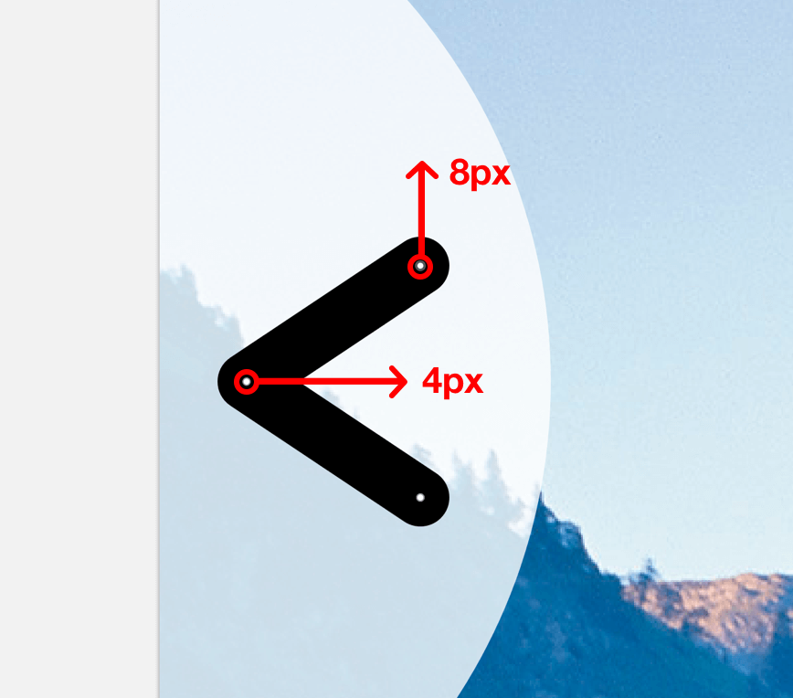
Fig. 3.38: Move the points in the respective directions.
Info Box: Distribute Content
As well as the alignment icons at the top of the inspector there are also two distribute icons that allow you to spread three or more layers evenly among themselves (Fig. 3.39).
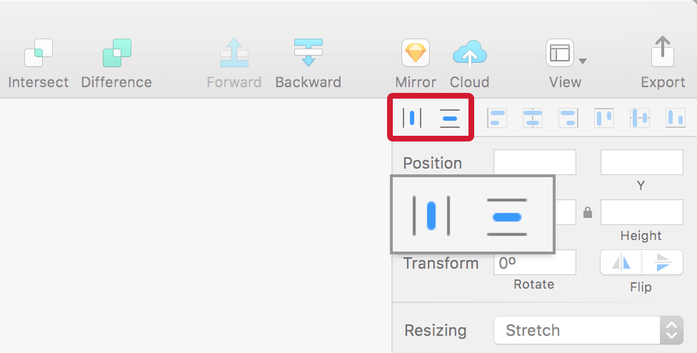
Fig. 3.39: The distribute icons.
In this case, the outermost layers remain where they are and the ones within are distributed evenly so that they gain the same space between one another (Fig. 3.40). In case the layers can’t be distributed to full pixels, Sketch asks you if they should be distributed unevenly or placed on sub-pixels (resulting in a decimal). Distributing doesn’t only work for layers but also for vector points.
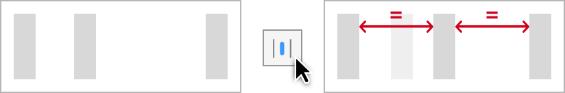
Fig. 3.40: When distributing, the inner layer is moved to have equal spacing from the elements outside.
Unfortunately, it’s not possible to set the distance elements should be spaced apart, but there’s way to alleviate this. Go to Arrange → Make Grid… in the menu bar. Based on the orientation and number of selected layers, pick the appropriate quantity of rows or columns (inserting “1” for the other value) and enter the desired margin (Fig. 3.41). Please keep in mind that the layers are aligned to the leftmost element if you choose columns, or the top if you choose rows, after you press Arrange, so you might need to rearrange them subsequently.
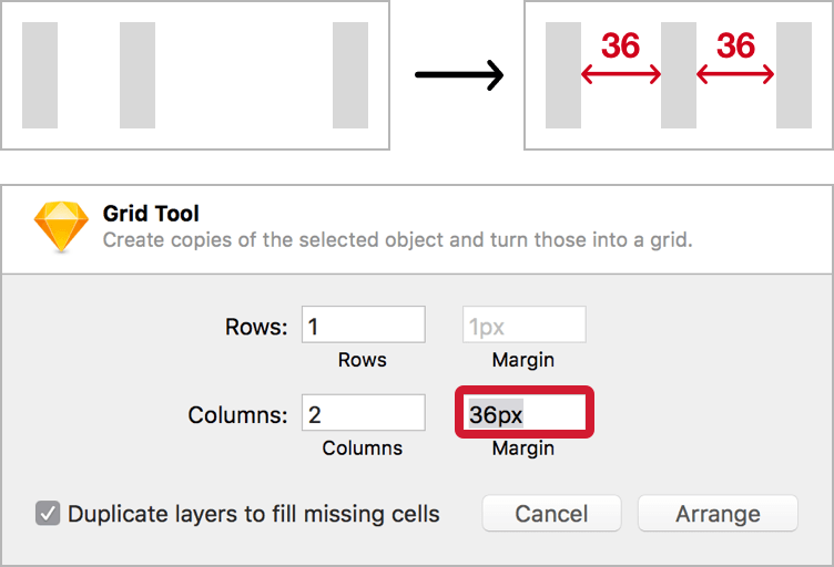
Fig. 3.41: Use Make Grid… from Arrange in the menu bar to distribute elements with a defined spacing.
The next step is to center the arrow vertically with the circle. Select both and use the second alignment icon from the right (align vertically). Move the arrow to an X position of “8” to align it to the grid. It looks good now, but we haven’t reached our final goal yet, as we want to cut the arrow away from the circle to get a hole through which you can see the background image.
We will use Boolean operations for this task, which let you combine shapes in different ways. A requirement, though, is that all the shapes involved must consist of fills instead of a border, which isn’t the case for our arrow, so select Layer → Convert to Outlines in the menu bar or press Shift + Cmd + O. When you enter the vector point mode you’ll see that the arrow doesn’t consist of a simple line with a border anymore, but is defined by a shape with numerous points.
For the Boolean operation make sure the arrow is above the circle, select both, and click on Subtract in the toolbar or press Alt + Cmd + S, which cuts the arrow away from the circle. The order matters here, since layers can only be subtracted from underlying ones. You should now see a circle with a hole in the form of an arrow (Fig. 3.42). The layers merged not only on the canvas but also in the layers list. There you’ll see a simplified version of this shape, which you can expand with the disclosure triangle to get a glance at the layers involved.
Fig. 3.42: The Boolean group, that cuts away the arrow from the circle.
A big strength of Sketch is that Boolean operations remain editable, so you can still move the layers separately from each other, and also completely undo the operation by selecting Layer → Paths → Split from the menu bar. Finally, rename the Boolean group to “Nav arrow previous,” set the opacity to 80% and make sure it is right above the “Content” group in the layers list.
Info Box: Boolean Operations
Boolean operations let you combine shapes in different ways, affording countless possibilities for entirely new forms. Most of the time it’s much easier to build elements this way than to draw entirely new objects with the vector tool.
There are four types of Boolean operation (Fig. 3.43). To create one, select the shapes you want to combine and either click on the related icon in the toolbar or press the appropriate keyboard shortcut:
1. Union (Alt + Cmd + U): Merges two shapes into one.
2. Subtract (Alt + Cmd + S): Removes one shape from another.
3. Intersect (Alt + Cmd + I): Shows just the part where the shapes overlap.
4. Difference (Alt + Cmd + X): Retains the area where the shapes don’t meet.
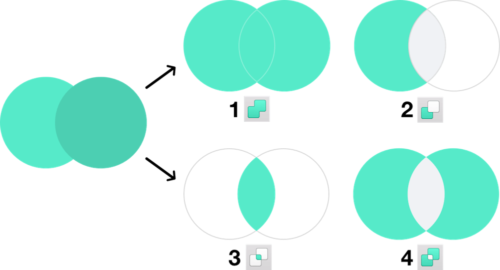
Fig. 3.43: The four types of Boolean operations.
The ones you will need the most are Union and Subtract, while the other two are not that common. Subtract especially can lead to some awkward situations, but if you keep in mind a few simple points there shouldn’t be a problem at all.
1. Order matters. Shapes on top of others are always removed from the ones below.
2. The biggest shape in the combination should be at the bottom, with the shapes getting smaller the higher you go in the hierarchy of the layers list.
3. Shapes that don’t interact directly and just sit on top of others should be set to None.
An Example
Let me give you an example using the following truck shape, which consists of eight basic shapes:
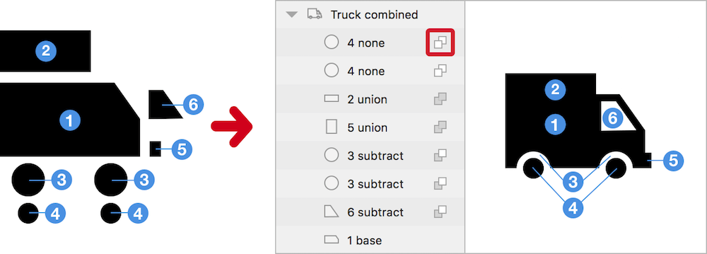
Fig. 3.44: Left: The individual shapes. Right: The shapes combined to form the truck. The little icon next to the layer name (red border) is used to change the type of Boolean operation.
•The driver’s cabin (6) and wheel cases (3) the are subtracted from the body (1).
•The load bed (2) and the bumper (5) are set to Union, so that they are combined with the body (1).
•The wheels (4) are set to None, because they don’t need to interact at all. Union would also be an option, but None is safer.
If you reduce things to their basic elements it becomes quite easy and almost any form can be created this way.
Flexibility
The best thing about Boolean operations in Sketch is that they can always be reversed, reordered and reapplied in different ways, either by moving the shape(s) out of the Boolean group and executing another Boolean operation, or by clicking on the little icon next to the related layer and changing the type of Boolean operation (Fig. 3.44, red border). If you want to remove all operations at once select the group and go to Layer → Paths → Split in the menu bar.
There are multiple ways to enter a Boolean group for manipulation: to access its individual shapes double-click it on the canvas. Use Tab or Shift + Tab in succession to cycle through the available layers. Not to mention that you can also expand it in the layers list and select a layer from there. If you press Enter instead while the Boolean group is selected you go straight into the combined vector point mode of all involved shapes. Now Tab (and Shift + Tab) lets you switch through the various vector points of all layers.
In all cases Esc is used to quit the manipulations, however for the vector point mode it needs to be pressed two times: once to deselect the current point, another time to actually leave the mode. This combined vector point mode also applies to normal layers, that are not part of a Boolean group: whenever you select multiple shapes and press Enter, you access the vector points of all at once.
When to Flatten
When shapes get complex, try to break the process down into different steps, flatten the combined form in between and then continue with other Boolean operations. To do so go to Layer → Paths → Flatten in the menu bar. This reduces the complexity and creates a single shape, that is easier to handle. Flattening is also a good idea if you want to export a shape as SVG. Just remember to keep a copy of the original for later reference.
Apart from that, keep shapes in their editable state with Boolean operations as long as possible, so that you are always able to change them. Remember that forms created with Boolean operations, that have holes (like rings or letters like “P”) can never be flattened and are always comprised of subpaths (Fig. 3.45). Sketch will not get tired of telling you that.
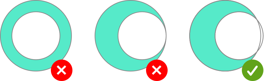
Fig. 3.45: Shapes with holes can only be flattened if their subpaths fully overlap.
Awkward Situations
If you ever encounter a strange result after a Boolean operation, no matter how you reorder the layers or change the type of operations involved, it might be caused by the order of one of the layers it consists of. Every shape in Sketch has a certain order, which mustn’t be confused with the order in the layers list, but the order of its vector points. You can see it when you enter the vector point mode with Enter and press Tab to jump to the next vector point. If you try to combine shapes with different orders with a Boolean operation, Sketch doesn’t know exactly what to do (Fig. 3.46). To remedy this, break the Boolean operation with Layer → Paths → Split from the menu bar, track down the shape with the wrong order, go to Layer → Paths → Reverse Order and reapply the Boolean operation. Now everything should be fine.
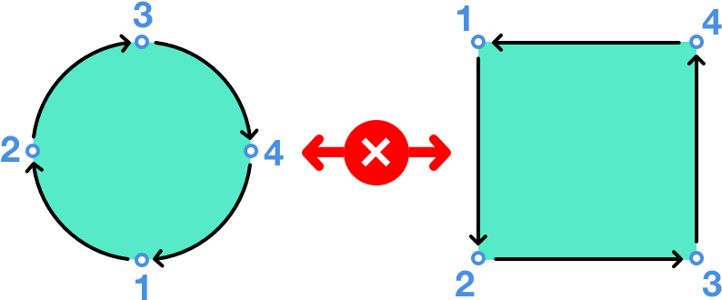
Fig. 3.46: The circle has a clockwise order, the rectangle a counter-clockwise order. If you try to combine these shapes it can cause problems.
Duplicate this group and rename it to “Nav arrow next” to get the arrow to jump to the next tourist attraction. Move it to the right of the artboard with the fifth alignment icon (align right) and flip it horizontally — either with with the first icon at Flip in the inspector or a right-click and Transform → Flip Horizontal. We only need to offset it by the same distance as the left icon, so that only about a third of the arrow icon can be seen. So check out the X position of the left icon (which should be at about “−53”) and keep this value in mind as the target value for the right-hand icon. To get to the correct placement we will use the mathematical capabilities again. Switch to the right navigation icon, enter the X field and add “53” (the target value from above) to the current X position: “280 + 53.”
Finally, select both of the navigation arrows and combine them to a new “Navigation” group (Fig. 3.47). The second iteration of our “Details” page looks great now, with just one important fix left for branding reasons: the logo, but more on that later. Right now, we will have a look at how easy it is to create an icon in Sketch.
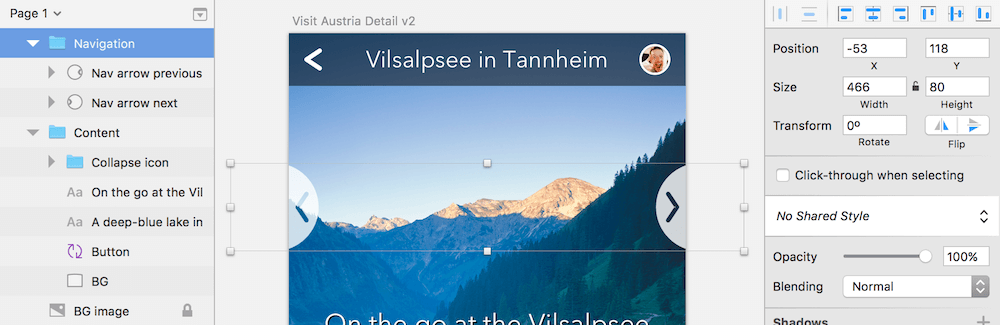
Fig. 3.47: The finished navigation arrows.
Replicate the Collapse Icon
While premade icons are a great way to try out ideas quickly and iterate on different concepts, Sketch makes it quite easy to build them from scratch. That’s exactly what we will do now with the “Collapse” icon from earlier, which lets users hide the text and see the great view of the Vilsalpsee. In preparation, create a new artboard with the size of 100 × 100px: place it next to the current artboard and name it “Collapse icon.” Select the old icon with a Cmd-click (to drill into its layer group) and copy it into the new artboard. Zoom in with Cmd + 2 to get a better view. Drag it to the left while holding Alt to get a duplicate and change its color to red (or any color other than black) so we can overlay it with our replica and assess the various dimensions.
Comparison
When we take a close look, we see that it’s 20px wide, so make a new circle at its top-left corner and give it a diameter of exactly this size. Change from a fill to a black (inside) border and increase its thickness until it matches the old icon, which should be at about 3px. Also change the opacity of the layer to 50% with the 5 key, so that you can still see the original icon behind it for comparison. When we overlay the upper part of the arrow with a (black) rectangle, we notice that a size of about 3 × 5px is needed (plus another pixel in the vertical dimension for some tolerance). It doesn’t matter at the moment that the two shapes don’t match exactly.
For the tip of the arrow we will use a triangle (Insert → Shape → Triangle) of the same color and if you continue in the same manner as before you’ll see that it needs a size of about 9 × 5px (to match the other icon). Flip it vertically and move it to the bottom of the rectangle plus one pixel up so that both shapes overlap. Select and align them horizontally, and combine them with a Boolean operation of Union with Alt + Cmd + U, which gives us the final arrow shape (Fig. 3.48). Then change it to 50% opacity and rename it to “Arrow.”

Fig. 3.48: Left: The original icon. Right: The original icon, overlaid with our replica.
Quick tip: An alternate way (one I prefer) to create a triangle is to make a rectangle with the same size. Enter the vector point mode, insert a new point in the middle of the side where the arrow should point by holding Cmd and clicking. Then remove the outer two points on the same line by selecting and deleting them with Backspace or Del.
Sketch allows you to add arrows to lines or vectors out of the box. Unfortunately, they are quite useless in practice, as their size can’t be customized. If that doesn’t put you off, you can click on the little gear icon on the right in the Borders area of the inspector to see the options for Start Arrow and End Arrow. Just be sure that the Ends are set to the first property (see Fig. 2.8).
If you take a closer look at the template of the icon, you’ll see it has rounded corners. The easiest way to set them for all corners is to flatten the arrow with Layer → Paths → Flatten, so that we can apply them to the whole shape. Enter the vector point mode and select all points with Cmd + A, but not the ones where the rectangle and the triangle meet: hold down Shift and click to deselect these points. Now use the Corners slider in the inspector to set a border radius — “1” would be too much, so use “0.5” instead (Fig. 3.39, red points). Either directly enter this value or hold Alt and use the Up arrow to go up in steps of 0.1 to end at “0.5.” The outermost points of the arrow need a radius of “1” in turn (Fig. 3.49, blue points). Leave the vector point mode by pressing Esc twice. You can delete the old icon in the back now.
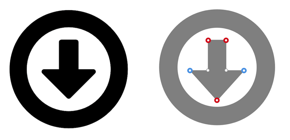
Fig. 3.49: Set the border radius (Corners) to “0.5” for the red points, for the blue points use “1”. The other two don’t need a radius at all.
Odd Dimensions
The arrow looks good now, but we can’t center it to the circle, which would result in half-pixels: the circle’s dimensions are even, but the circle’s are odd. To switch off this pixel-snapping we could go to the Preferences and uncheck Fit layers and points to pixel bounds in the General tab, but this should be avoided if you work on icons and want to have a pixel-perfect result. On the other hand, it can be quite handy when you create something more complex like a logo. In turn a good idea when making an icon is to switch on the pixel grid with View → Canvas → Show Pixels Grid (or press Ctrl + X).
Quick tip: Sketch saves your files automatically. If you want to go back to a previous version, select File → Revert To → Browse All Versions... in the menu bar. To switch off this safety net, uncheck Auto Save files while editing under the General tab in the Preferences.
To solve our dilemma with the misaligned arrow we simply need to give the circle odd dimensions, so select it and change the width to “19.” A quick way to do that right on the canvas — without even needing to touch the mouse — is to employ the arrow keys in combination with Cmd. To make a layer bigger press Cmd + Right or Cmd + Down; to make it smaller use Cmd + Left or Cmd + Up (Fig. 3.50); add Shift to go in 10px steps. Whenever I need to resize a layer I do it this way as it is much more efficient and precise than using the mouse. Please note that you can also resize lines using the same technique. After that you can finally center the circle to the arrow in both dimensions.
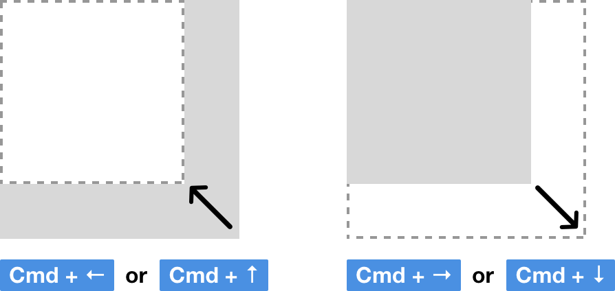
Fig. 3.50: A quick way to resize layers with the keyboard is to use the arrow keys in combination with Cmd. Left: Make a layer smaller. Right: Make it bigger.
Quick tip: An even simpler way to resize a line is to enter its vector point mode and use the arrow keys alone (without Cmd). Again, combine them with Shift to span 10px at once. You can even change the direction from which the size is adapted with Reverse Order from Layer → Path in the menu bar.
Finalize the Icon
For the final icon we first need to create a dedicated shape for the circle as we’ve used a border up until now. Select it and go to Layer → Convert to Outlines in the menu bar, or press Shift + Cmd + O, which creates a Boolean operation with two circles. Now add the arrow to the this group: simply drag the shape into it in the layers list. Make sure the arrow is at the very top and change the Boolean type to Subtract (with a click on the two overlapping squares next to the layer name, see Fig. 3.51). The type for the two circles should be None. Finally, leave the Boolean group with Esc and change the opacity back to 100% with 0.
Note that the Boolean operation of the ring is quite different from what we’ve covered so far, as the bigger circle is above the smaller circle and the Boolean operation isn’t set to Subtract (only for the arrow, see Fig. 3.51, left). This is just another way to approach this operation, which you should keep in mind for the future. Alternatively you could also drag the small circle above the bigger circle and set the Boolean type to Subtract, as well as changing the type of the arrow to Union (Fig. 3.51, right). Try it out with another copy of the icon!
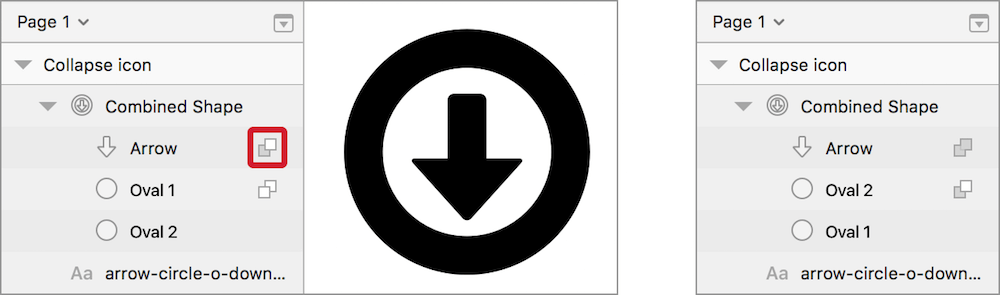
Fig. 3.51: Left: Original Boolean operation of None for the circles, and Subtract for the arrow (red border). Right: Alternative approach, where the positions of the ovals are swapped and the type is changed to Subtract. The Boolean type of the Arrow needs to be set to Union here.
To assess the quality of our new icon we can press Ctrl + P to Show pixels, which gives us a preview of how the icon would look outside of a vector-based environment (a browser, for example). If you compare it with the old icon, you’ll see that the new version looks much better, as we adhered to the pixel grid wherever possible.
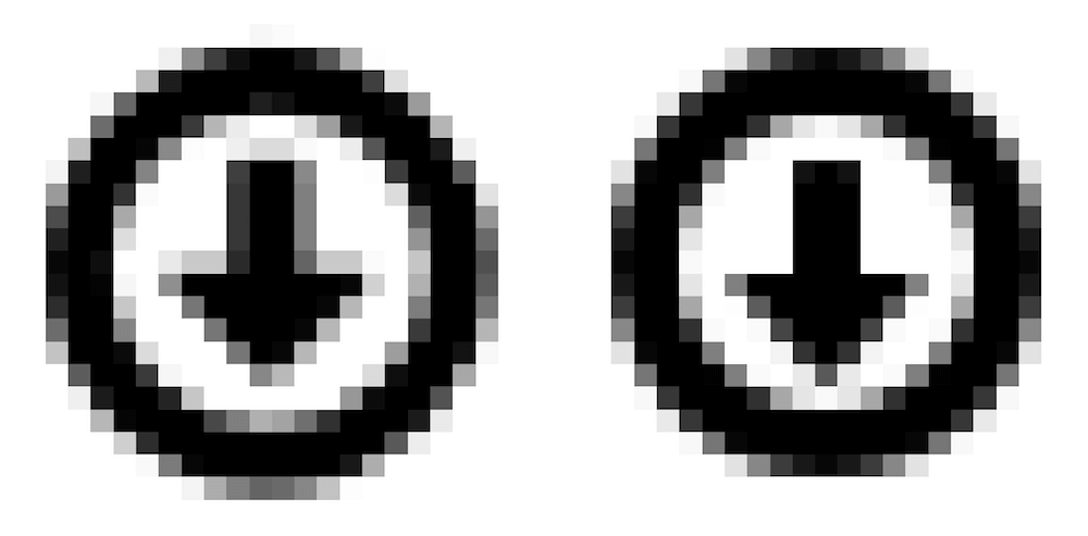
Fig. 3.52: The old icon (left) and new icon (right) in the pixel mode. As you can see the new version looks much better, with more lines being on full pixels.
Info Box: Pixel Precision
While everything you build in Sketch is based on vectors and, therefore, infinitely scalable, many things you export still need to be in a bitmap-based format like PNG or JPG, or at least adhere to a pixel-grid so that they look sharp in the browser. It’s also a good idea to check the pixels of you work on a high-density display and assess how it could look on a standard display. The most important tool here is to Show Pixels with Cmd + P, which gives you such a preview once you start to zoom in to the canvas (Fig. 3.53, left). It’s not completely accurate but a good start. You can also display a pixel grid with Cmd + X, which is shown as soon as you surpass 600% when zooming (Fig. 3.53, right).
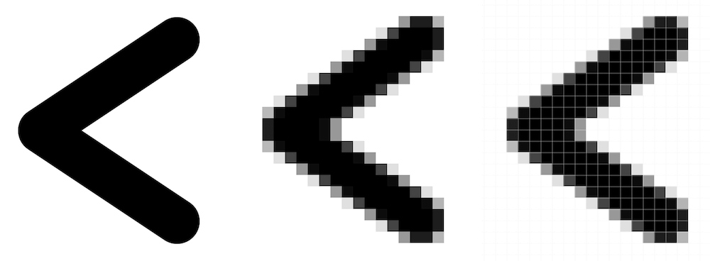
Fig. 3.53: The arrow icon, zoomed in. Left: Original vector display. Middle: Pixel mode from Show Pixels. Right: Pixel grid switched on additionally.
To prevent half-pixels being created in the first place, you should always switch on Pixel Fitting in the General tab of the Preferences. There is also a related option you should consider when you are in the vector point mode of a layer: make sure that Round to full pixel edges is selected in the drop-down in the inspector (below the Corners slider, see Fig. 3.54, top).
But that doesn’t mean that you always need to force yourself to the pixel grid — some elements can or should not be aligned pixel-perfectly; for example, when you work on a complex object like a logo, full pixels would hinder more than help. For more freedom with the placement and movement of vector points you can always choose Round to half pixels (Fig. 3.54, middle) or Don’t round to nearest pixels (Fig. 3.54, bottom). Even if you created a fractional number by mistake, in either its X or Y position or the width or height, you can always go back to full pixels with Layer → Round to Pixel from the menu bar.
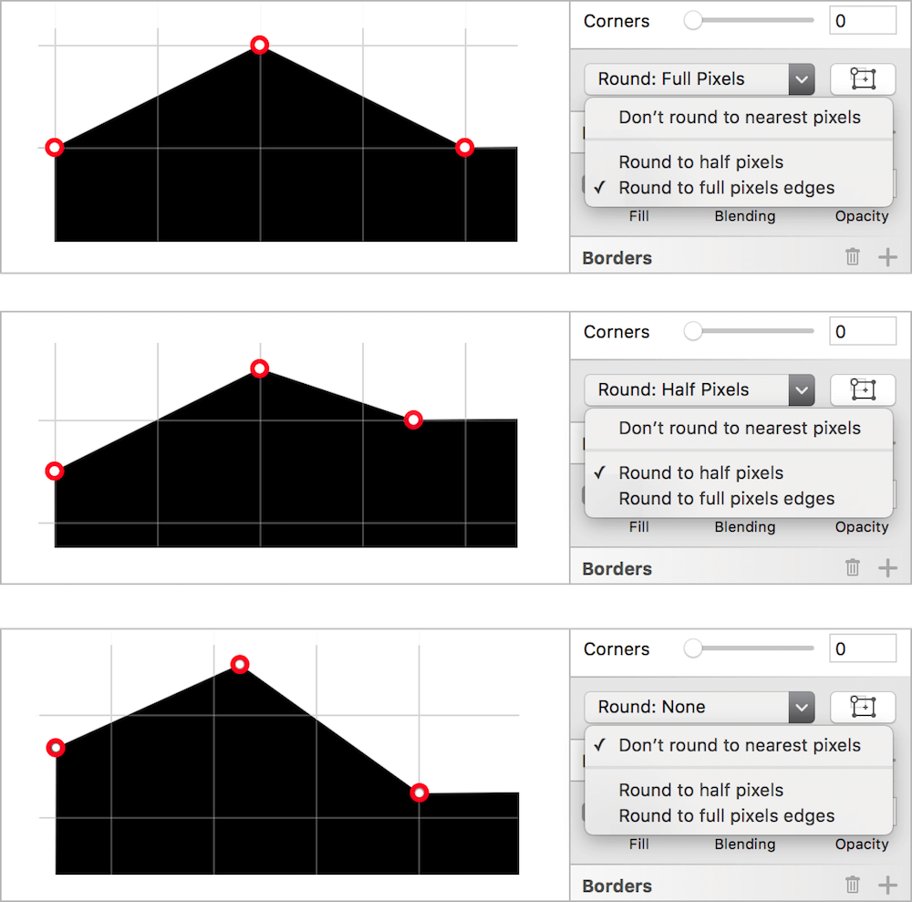
Fig. 3.54: Top: Vector points snap to full pixels. Middle: Vector points snap to half pixels. Bottom: Vector points don’t snap at all (free placement).
Especially when you work on mobile designs, a good place to start is at 1x, because if you want to go up to 2x or 3x you just have to double or triple your assets, whereas 2x as a starting point would always force you to use a factor of 1.5 if you go to 3x, thereby producing fractions of pixels. Read more about this topic in the info box Designing at 1x in chapter 2.
Lastly, when you resize an element it’s always a good idea to use the Scale… option from Edit in the menu bar, as it gives you a clean dialog and a predictable outcome with full pixels. Read more about scaling elements in the info box Scale vs. Scale vs. Scale in chapter 4.
The icon is ready to use in our design now. If you’d like, you can copy it there to replace the old one. But don’t forget to switch off the pixel preview again to avoid confusion. With this newly acquired knowledge we can move on to the logo of our project.