• KEY VIII •
C'MON IN, THE WATER IS FINE
Watercolor is fun. Watercolor is frightening.
Watercolor is also the ideal medium for painting on location. It’s portable, quick to dry, and yields an infinite range of luscious colors. That said, it is intimidating because of the number of variables to figure out—which paints, which brushes, how will the paper react, how fast or slow will the paint dry in the weather, and so on. And there are no do-overs. Once the paint is down, it’s pretty much there.
I like to call watercolor “planned spontaneity.” While you have to be strategic about how to apply it, it has to look fresh, like you just splashed it into existence. There are piles of books written about watercolor materials and technique, so here are just a few top tips and concepts. Don’t be deterred by thinking you can’t paint! There are lots of simple ways to use watercolor. And the joy of dipping your toe in the water can’t be beat.
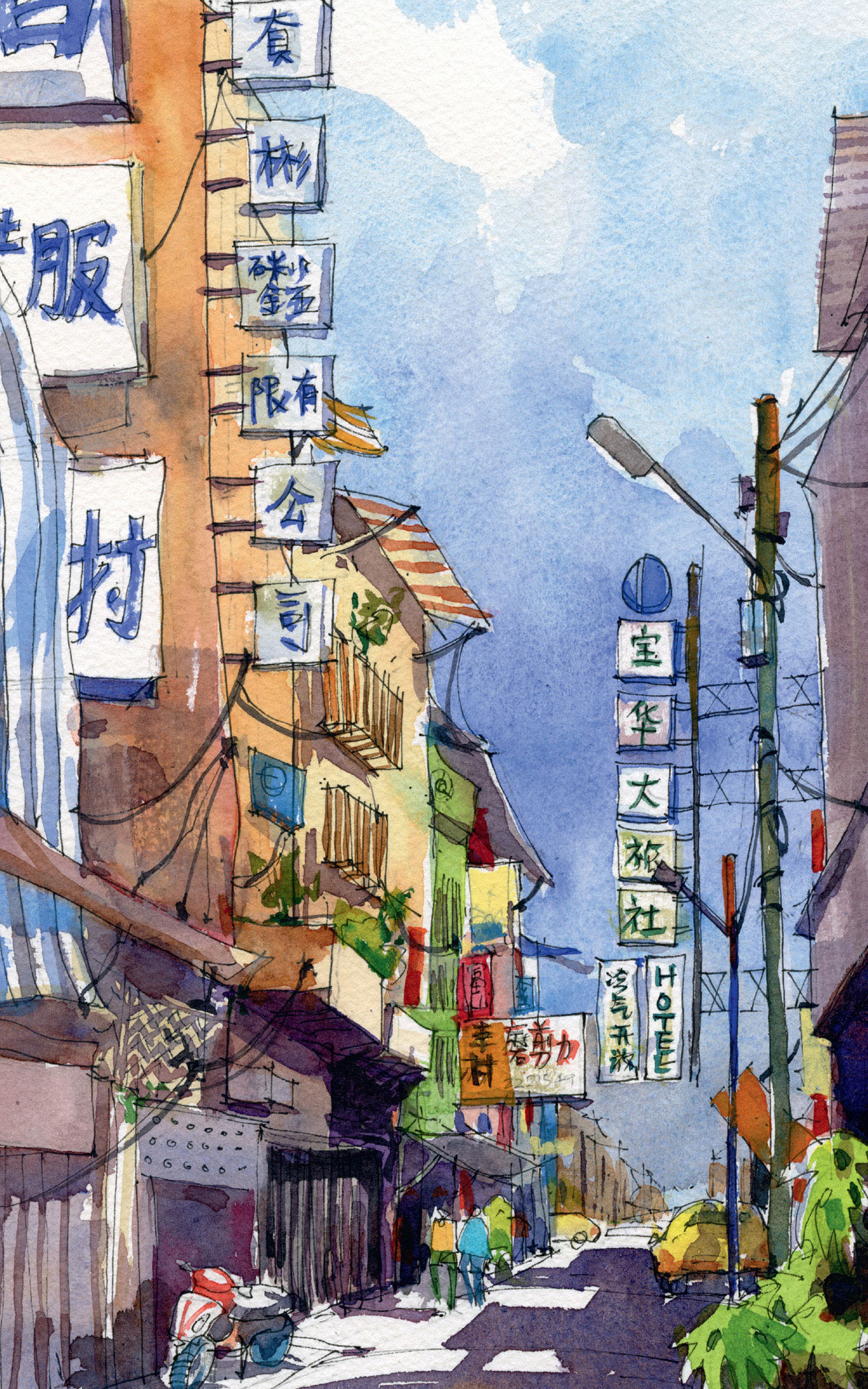
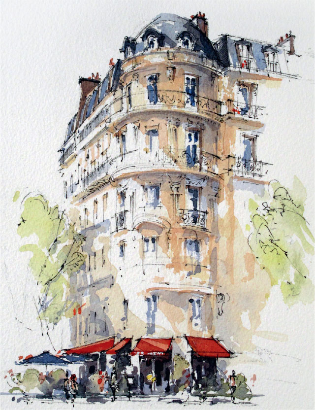
ROOI PING LIM, Australia
Back alley Taiwan Boulevard Sec. 1, Tai Chung City
11” × 7.9” | 28 × 20 cm; Pencil, Platinum Carbon pen with black ink and watercolor on Fabriano Cold Press paper 300 gsm; 2+ hours
 82. Get the feel for it.
Watercolor is all about getting the feel for the paints, brush, water, paper, and air. You can read or think about it forever, but ultimately, you have to put brush to paper. A lot. Practice, practice, practice until you know how all these elements interact. Watch people paint in person, up close. Splash, have fun!
83. Watercolor works light to dark.
Opaque media, such as oil or acrylic, work dark to light. You start with the dark hues/values, and you end with the spots of light colors or white paint to create a sense of light.
Watercolor, however, is the opposite. Because it is a transparent medium, the whites are provided by the white of the paper. You start with light values and build up darks. While some sketchers paint successfully in only one pass, watercolor is perfect for painting in layers.
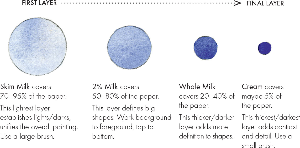
84. For paint consistency, think of dairy products.
Watercolor is like stained glass. It has to be transparent enough that light can pass through it, hit the white of the paper, and bounce back to your eye for that glorious glow. For this reason, too much pigment in your mix will block the bouncing of light, and too little pigment will leave you with an unsatisfying literally washed-out lack of color. Getting a good ratio of paint-to-water is key.
Try thinking of paint consistency as familiar dairy products, ranging from watery skim milk to heavy cream. You’ll start with lots of skim milk that covers most of your paper, and you’ll end with little bits of thickest cream that provide contrast and pop in your painting.
85. Paint in layers.
Painting in layers requires a bit of strategy. Starting with white paper, your first layers will be light and diluted, with each additional layer getting both darker and thicker with more pigment.
Called underpainting, these first diluted skim-milk layers of color cover most of your paper and establish lights and darks, warm versus cool, and what areas advance or recede. Paint right through most of the shapes. Be sure to plan where you will leave white spots for sunlight and sparkle.
More layers with thicker paint start to add definition to the forms. Paint in shade and shadow to the underside and backside of objects.
There is not a lot of contrast yet, so sometimes this stage is fondly referred to as the “awkward teenage phase.” It’s a sketch not yet fully formed, but it’s well on its way! Push through!
It’s the small bits of the darkest and thickest cream paint at the end that make the sketch pop and come alive. A few spots of a bright color such as orange help to enliven the sketch, too.
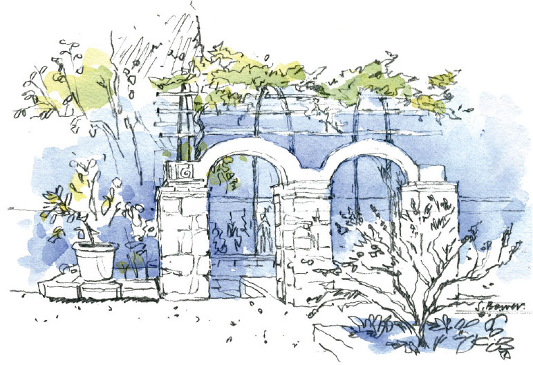
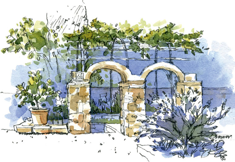
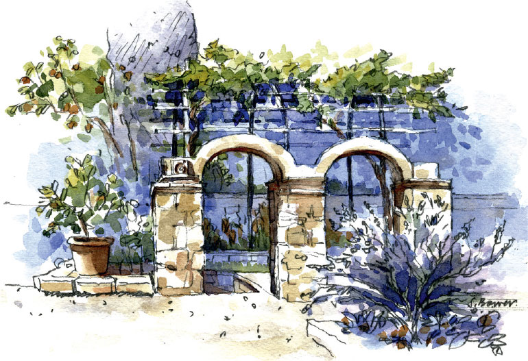
STEPHANIE BOWER, USA
Tony’s Garden in Civita
5” × 8” | 12.7 × 20.3 cm; Mechanical pencil, Winsor & Newton watercolors on Arches 140-lb Cold Press watercolor paper; 1 hour
86. Use a limited color palette.
If you are new to watercolor, try painting with only one or two colors until you get the feel for it. You can do almost any painting with just three colors, usually some form of the three primary colors of yellow, red, and blue. Using a limited color palette ensures a harmoniously colored painting.
A neutral gray, together with bits of blue and orange, complete this color palette. Notice how only a few dots of orange and blue can balance with lots of gray.
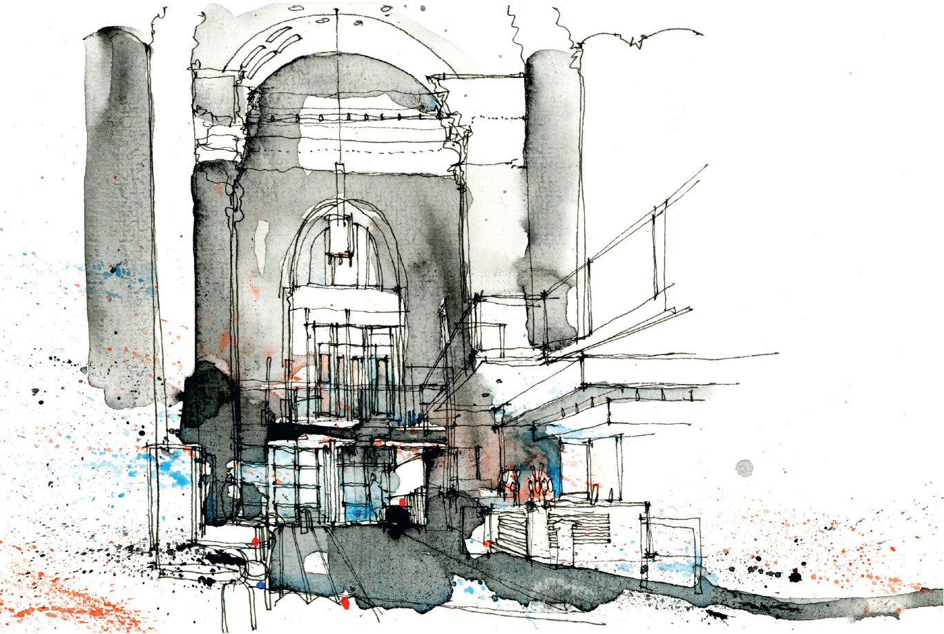
SIMONE RIDYARD, UK
Interior, Royal Exchange Theatre, Manchester
6” × 9.8” | 15 × 25 cm; Fine-liner and watercolor on Seawhite watercolor paper; About 30 minutes
What is your favorite gray to mix?
You can make a gray by combining opposites on the color wheel such as red + green or blue + orange. But for lots of artists, the go-to gray starts with Ultramarine Blue.
For a gorgeous gray, try a combination of Ultramarine Blue + Burnt Sienna + a tiny spot of Permanent Alizarin Crimson. Add more blue to make it a cool gray and more Burnt Sienna to have it lean toward a warm brown.
87. Use one color to make a strong statement.
A single, strong color used strategically can have a powerful, eye-catching impact.
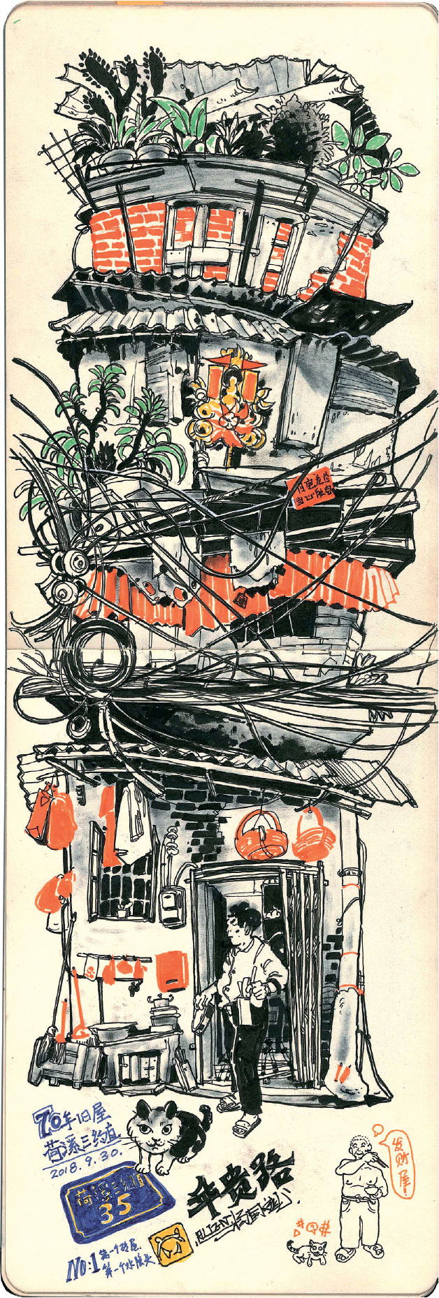
ALIENBINBIN, China
Sketch of Old Street in Guangzhou
16.5” × 8.3” | 42 × 21 cm; Moleskine sketchbook; 3 to 4 hours
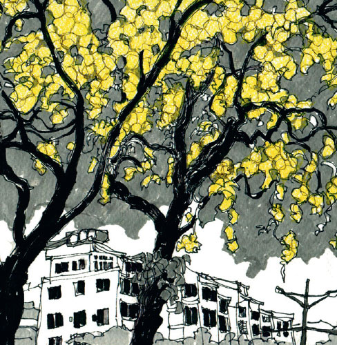
CHIH-WEI LIN, Taiwan
Golden Shower Tree
8.3” × 8.3” | 21 × 21 cm; Crayon, pen, pencil, marker; 25 minutes
88. Vary color.
Varying color breathes life, depth, and visual interest into watercolor paintings. Try changing the consistency of the paint (use more or less water) and/or changing the hue (the actual color of the pigment). Mix on your palette or mix on your paper.
Here are five methods for varying your watercolor:
To vary color, let different colors blend on your paper.
Instead of mixing all the colors on your palette, let different colors mix on your paper. While the paint is wet, drop other colors into the puddle and watch them interact. This is called working wet-on-wet.
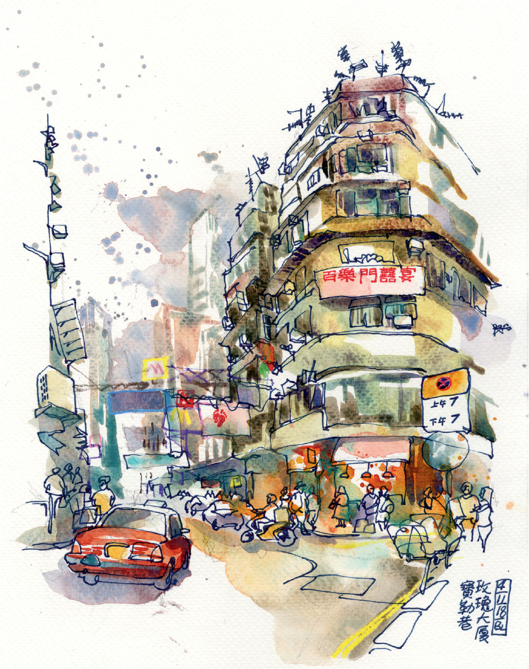
BEN LUK, Hong Kong
Rose Mansion
12” × 9” | 30.5 × 22.9 cm; Pen, wax pencils, watercolor; 1.5 hours
To vary color, pick up different colors from your palette.
Every time you go back to your palette to pick up more paint, change the color a bit. Try picking up random colors and see what happens!
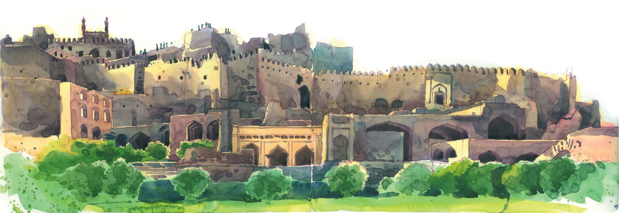
Instead of painting a flat, yellow wall, look at all the colors Zainab layers into her sketch to add depth and richness.
ZAINAB TAMBAWALLA, India
Golconda Fort, Hyderabad, India
7” × 20” | 17.5 × 50 cm; Lamy Safari, sketchINK, watercolors in Pentalic sketchbook; 1.5 hours
To vary color, tilt your paper.
Let gravity do the work. As your paint drifts downwards on your paper, the colors will deepen, separate, and settle in beautiful ways, revealing the watery nature of watercolor even when dry.
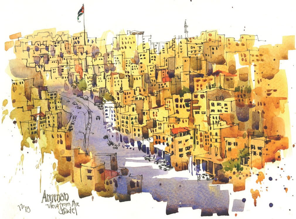
MONALI HALDIPUR, India
Amman, Jordan—View from the Citadel
9.4” × 12.6” | 24 × 32 cm; Watercolors, Uni Pin Fineline pen 0.4, Fabriano Cold Press watercolor paper 300 gsm; About 2 hours
To vary color, change color as you work top to bottom and left to right.
Think about the sky. Its deepest color is right above you, and it gradually gets lighter and more yellow toward the horizon. Also think about varying color left to right with the side closest to the Sun or light source appearing lighter. Now combine these two for a great sky!
Showing these variations in color adds visual interest and depth to your sketch. Not only is this true for painting skies, it’s a great approach to painting most surfaces anywhere in your painting.
In this sketch, the sky varies in two directions: a deeper blue on the left and lighter on the right; and a deeper blue at the top of the page and lighter closer to the horizon.
Notice all the color variation in the shadows! Quinacridone Burnt Orange dropped in to the gray/purple shadow, while wet, creates a glorious glow of bounced light.
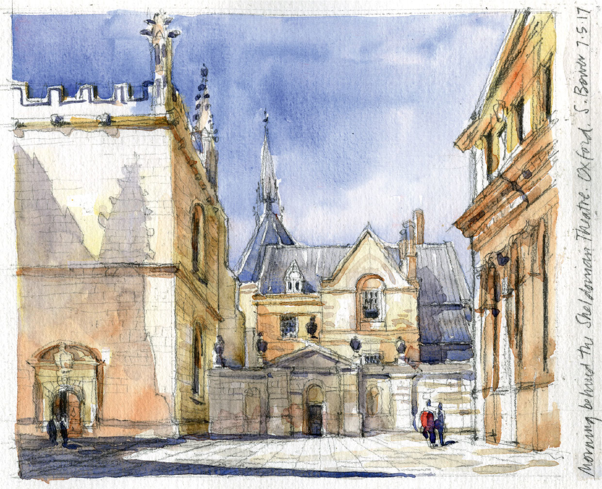
STEPHANIE BOWER, USA
Behind the Sheldonian Theatre, Oxford
6” × 8” | 15.2 × 20.3 cm; Mechanical pencil and watercolor in Pentalic Aqua Journal; 1 hour
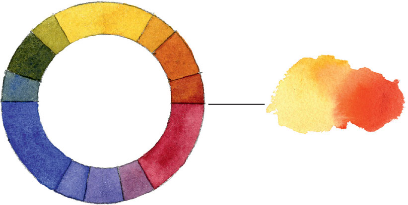
To vary color, refer to the color wheel.
Reference the color wheel by incorporating color families, that is, the color on either side of any given hue. This is called using analogous colors. For example, if you are painting an orange, add yellow to brighten and red to deepen the hue.
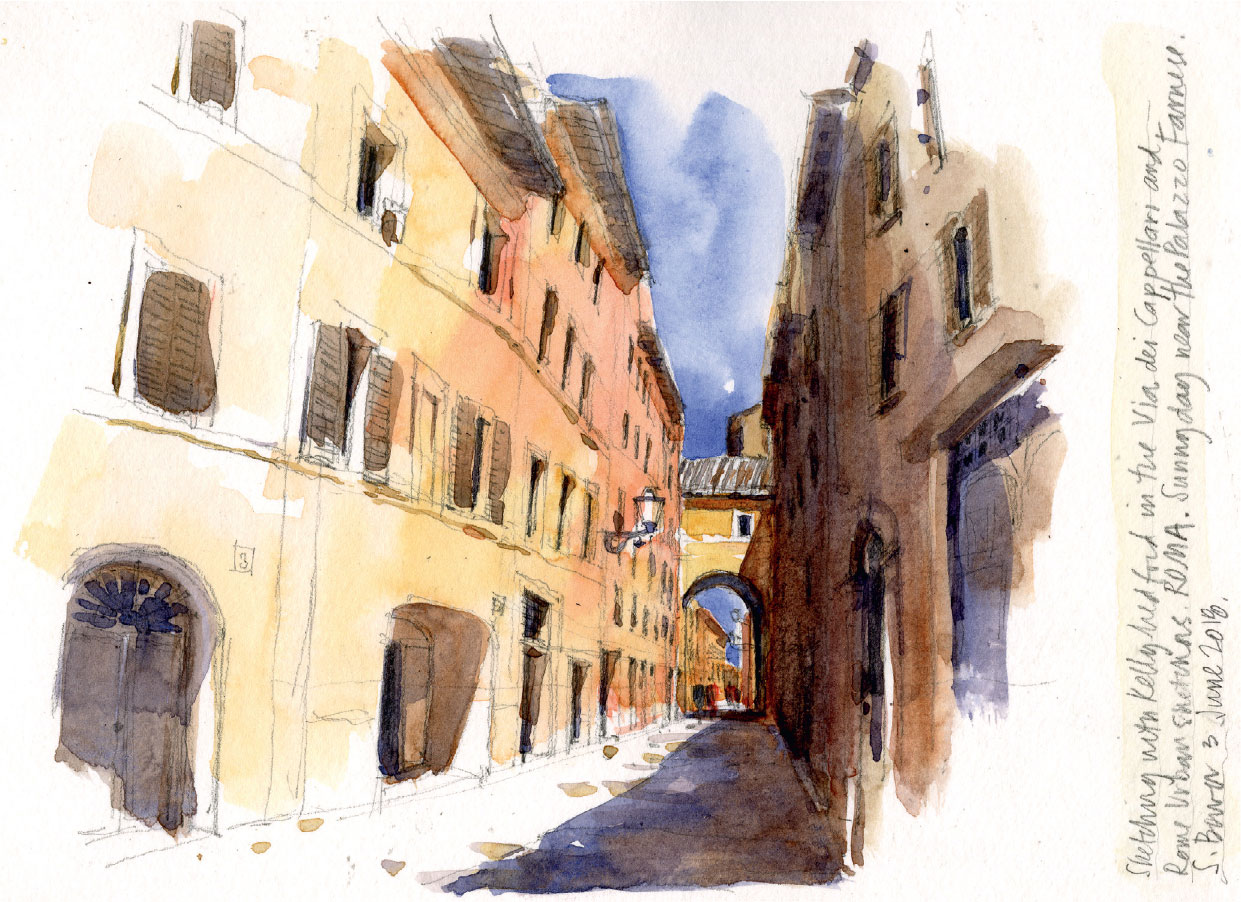
STEPHANIE BOWER, USA
Via dei Cappellari, Rome, Italy
7” × 10” | 17.8 × 25.4 cm; Mechanical pencil and watercolor in Pentalic Aqua Journal; 1 hour
To paint this range of analogous colors, start with Yellow Ochre. While it’s wet, drop in Pyrrole Orange and Burnt Sienna and let them blend on the paper.
89. Buy the biggest brush you can afford.
Those tiny brushes that come with watercolor kits—they are only good for painting postage stamps! Instead get a big, round brush, say size 8-10-12. You want one that will hold a lot of paint and also has a sharp point at the tip. A good, large brush will allow you to make both broad and fine strokes without having to constantly dip back into your palette for more paint.
90. Splatter, dribble, and run.
These fun marks add movement and spontaneity to your sketch. Try flicking your paintbrush or using the bristles of a toothbrush. Place your hand or a spare piece of paper over the parts of the sketch you don’t want splattered!

SIMONE RIDYARD, UK
Kuala Lumpur Skyline (from the 25th floor of the Pullman KLCC Hotel)
11” × 6” | 28 × 15 cm; Fine-liner and watercolor on Seawhite watercolor paper; About 45 minutes
91. Embrace “accidents.”
Pick up the wrong color? Go with it. Get a bloom or backwash as your watercolor dries? Use it. Quite often what first seems like a mistake ends up being the best part of your sketch.
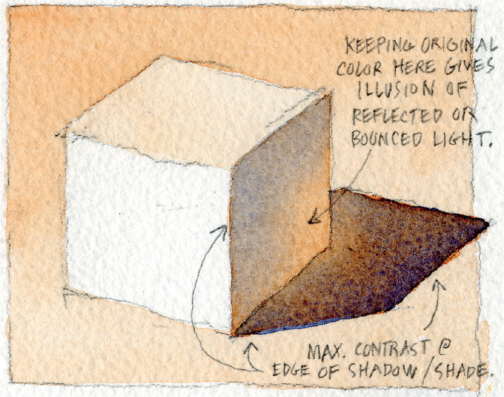
92. Shade vs. Shadow in color.
As we saw with values of gray, shade and shadow vary when using color, too. In general, shadow is dark and cool, leaning toward gray-blue-purple hues. Shade is lighter and warmer in color temperature. Just look at the glow you can get by modulating values and dropping in warmer hues while the paint is wet!
JAMES AKERS, USA
Shady Ideas
3” × 3” | 7.6 × 7.6 cm; Water, paint, brush, paper; 20 minutes
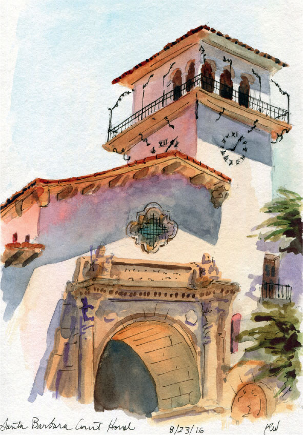
Jamie paints a perfect explanation of light, shade, and shadow in color. Decide a direction for the light, and be sure to preserve the whites until the end of your painting.
KATIE WOODWARD, USA
Santa Barbara Courthouse
9” × 6” | 22.9 × 15.2 cm; Mechanical pencil, watercolors, Pigma Micron pens; About 45 minutes
93. Use different hues to show depth.
In terms of reading spatial depth in your sketch, warm hues such as yellows and reds tend to appear closer to us. Cool hues such as blues and purples tend to recede from us.
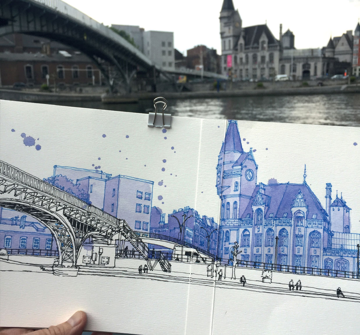
NINA JOHANSSON, Sweden
View across river Meuse in Liège, Belgium
7” × 19” | 18 × 48 cm; Ink and watercolor; 2 hours
The blue hues of the background buildings help them to recede into the background.
94. Consider big contrasts for impact.
Creating a strong contrast between buildings and their background is important for your overall painting. Consider these two approaches:
Dark building against a light sky.
Light building against a dark sky.
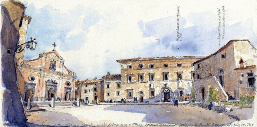
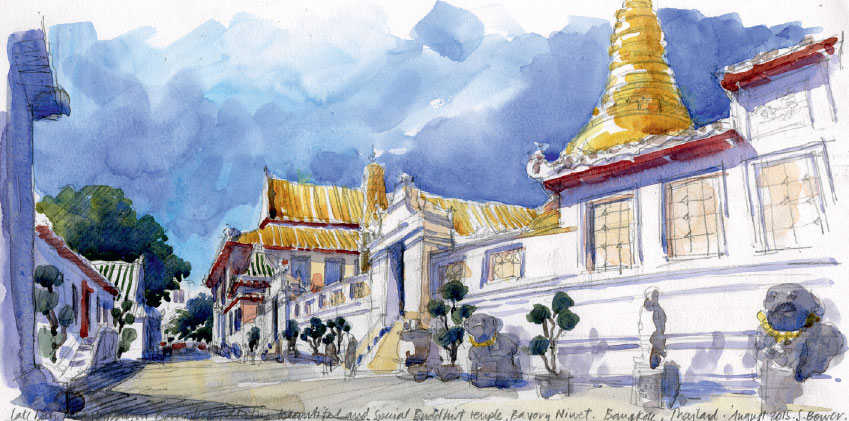
STEPHANIE BOWER, USA
Piazza San Donato (top)
Temple, Bangkok, Thailand
8” × 16” | 20.3 × 40.6 cm; Pencil and watercolor on Fluid watercolor block; 1 hour
95. Use bright colors to show a lot of activity.
Along your eye-level line, drop in eye-catching colors such as oranges, reds, and bright blues to suggest lots of people and activity. Even random spots of color work like magic to indicate a busy market or street.
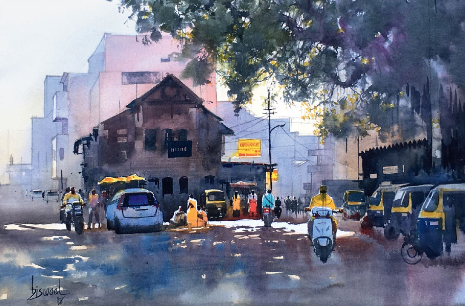
BIJAY BISWAAL, India
Nagpur Orange
14” × 22” | 35.5 × 56 cm; Pencil and watercolor; 1.5 hours
Midst mostly neutral colors in Bijay’s plein air painting, the bright yellows, reds, and blues painted along the eye-level line glow and draw your eye into the sketch.
96. Show a sense of light, even on a cloudy day.
A diagonal streak of light across a building surface brightens your sketch. Even on a gray day, pick a direction for the light and preserve the white of the paper as you paint.
Alex paints in Paris, a city famed for its overcast skies. The diagonal streak of white paper suggests the angle of the sunlight hitting the building and keeps the sketch lively.
ALEX HILLKURTZ, France
Café Français
11.8” × 7.9” | 30 × 20 cm; Ink and watercolor; 1.5 hours
97. Skies have perspective, too!
Clouds closer to us appear larger, while clouds in the distance appear smaller and narrower. Instead of painting with flat horizontal strokes, try angled strokes to add movement and perspective. Modulate the color from the foreground to the background in the distance.
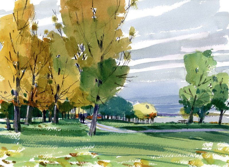
SHARI BLAUKOPF, Canada
Footpath
11” × 14” | 28 × 35.5 cm; Pencil and watercolor; 1.5 hours
98. Add reflections for drama and light.
Water, shiny floors, and glass are but a few opportunities to add a dramatic sense of light to your sketch. In general, dark forms reflect as dark areas, light reflects as light, and those bits of white sparkle have never been more important!
Reflections, however, are not necessarily perfect mirror images. Depending on the quality of the reflective surface, we often see reflected shapes as elongated and stretched, or with irregular edges.
Consider the nature of the reflective surface. Smooth stone floors reflect light and dark, more or less, straight down. On a rippled surface, like water, the reflection is more irregular.
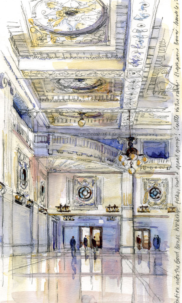
STEPHANIE BOWER, USA
King Street Station, Seattle
16” × 8” | 40.6 × 20.3 cm; Mechanical pencil and watercolor on Fluid watercolor block; 1 hour
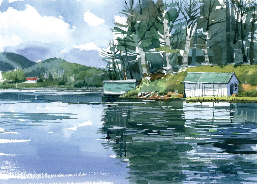
SHARI BLAUKOPF, Canada
Lake Afternoon
11” × 15” | 28 × 38 cm; Pencil and watercolor; 1.5 hours
99. Push colors a little …
A gray wall doesn’t have to be gray! To enliven your sketch, try pushing the actual colors a little bit—or to extremes.
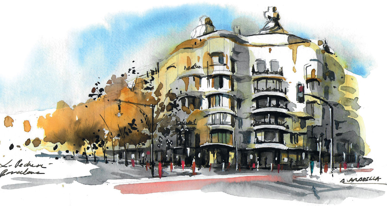
ALICIA ARADILLA, Spain
La Pedrera, Barcelona
10.2” × 6” | 26 × 15 cm; Pencil, watercolor, marker, and ink; 50 minutes
Gaudí’s La Pedrera is really a warm beige, but Alicia has pushed the colors to whites, brighter yellows, and dark grays.
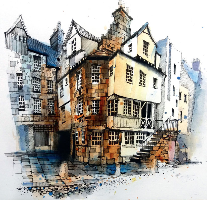
IAN FENNELLY, UK
John Knox House in Edinburgh
11.8” × 15.7” | 30 × 40 cm; Pen and watercolor; 3 hours
Ian blushes his amazing line drawings with color. Here he pushes warm yellows that advance next to cool blues that recede.
… or push colors a lot!
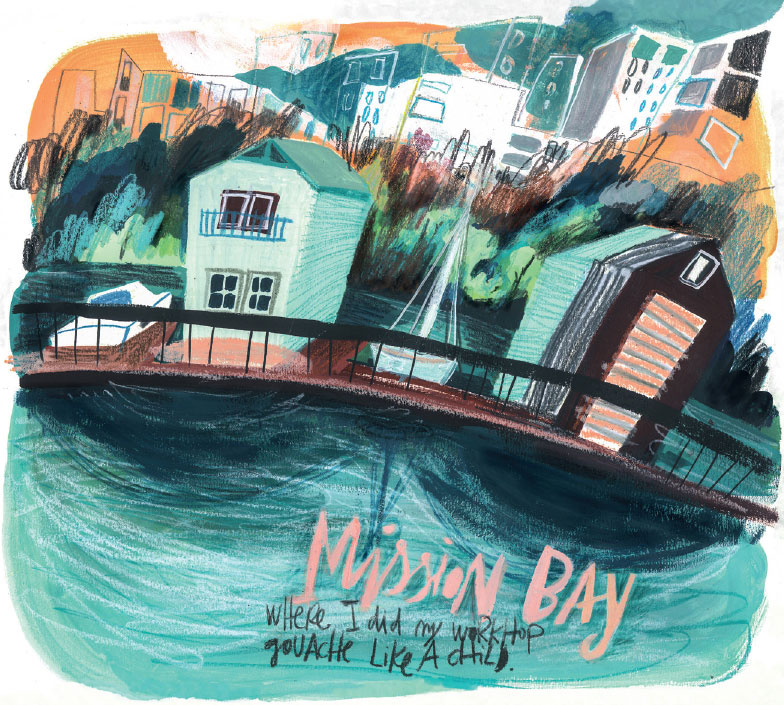
MARU GODÀS, Spain
Mission Bay (San Francisco) After “Gouache Like a Child” Workshop
13.1” × 13” | 33.4 × 33.2 cm; Gouache, color pencil, and Neocolor in handmade sketchbook with Shöller Hammer matte paper; 45+ minutes
Maru’s quick strokes, tilt, and of course, vibrant colors infuse her sketches with loads of energy.
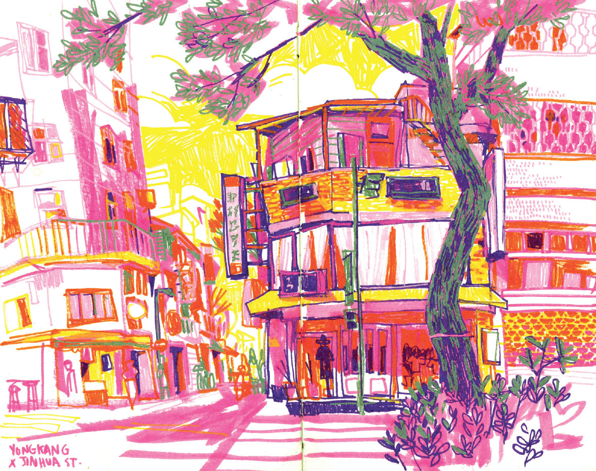
ELEANOR DOUGHTY, USA
Yongkang Street, Da’an District, Taipei
9” × 12” | 22.9 × 30.5 cm; Posca acrylic paint markers on 120-lb Cold Press paper in handmade sketchbook; 1.5 hours
Why make a blue sky or a green tree? Ellie pushes the colors to extremes for an extraordinary and whimsical visual effect.
100. The most important part of your painting is where you don't paint.
Ironic, isn’t it? But it’s so true! Reserved spots of white paper set off all the other rich and beautiful colors in your sketch. Plan what areas you will leave white before you start. As you paint, try picking up your brush a lot to leave bits of white paper between your brush strokes. Make your sketch sparkle!
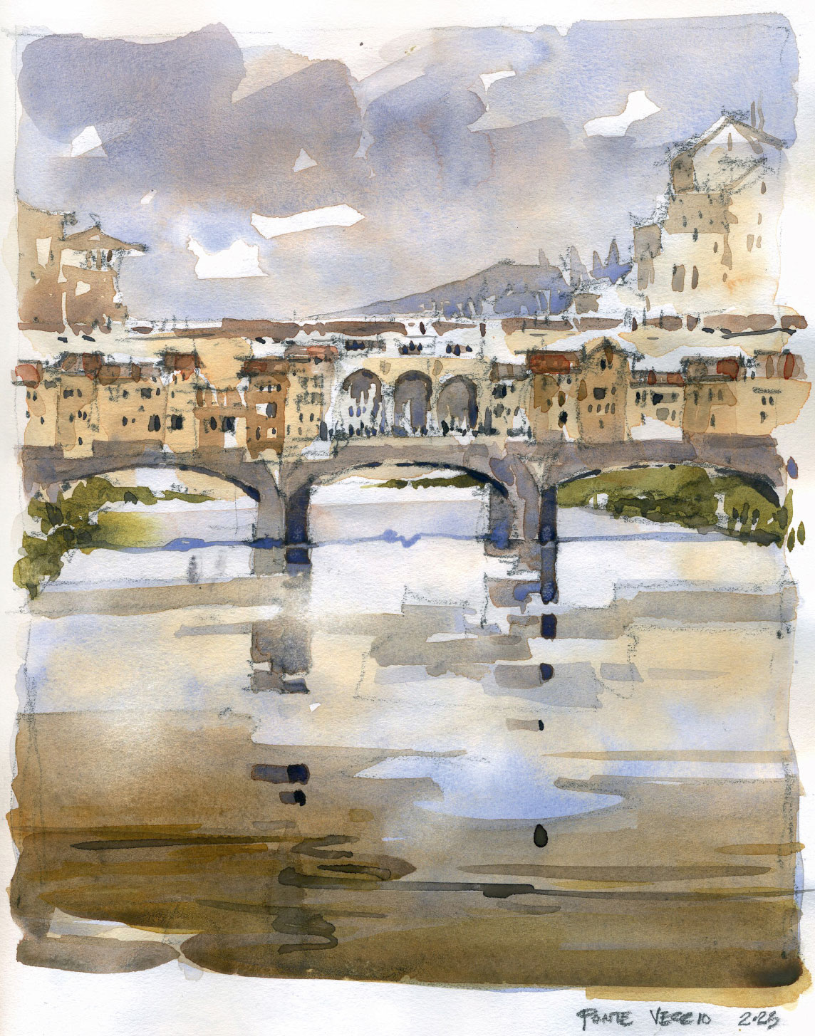
IAIN STEWART, USA & Scotland
Ponte Vecchio, Florence, Italy
11” × 9” | 28 × 23 cm; Graphite and watercolor; About 1 hour
101. Enjoy the journey.
It’s remarkable how powerful sketching can be. The day that beautiful Notre-Dame cathedral caught fire, those of us fortunate enough to have been there and sketched, pulled out and posted our drawings. This tragedy stirred up emotions for so many people. Why were we in tears?
What we sketch becomes part of our DNA and is forever a part of us. We look so closely, feel the air and hear the sounds around us, and more. We learn about what we see. We are so focused and in the flow that we lose all track of time. We drink it all in and pour it into our sketch. Sketching is truly some kind of magic power, and capturing a moment of our life in a sketch is something remarkable.
So, whether you draw or paint, work at home or on the road, the final tip of this book is to enjoy your amazing sketching journey. It will change how you experience the world in so many ways. Push through the bad days, as good ones will follow. Accept the struggles as part of the process because that means you are learning and growing. The more you sketch, the more rewarding it becomes, especially if you share the experience with others. It’s not about the destination, it really is about enjoying how you get there.
See your world better, one sketch at a time.
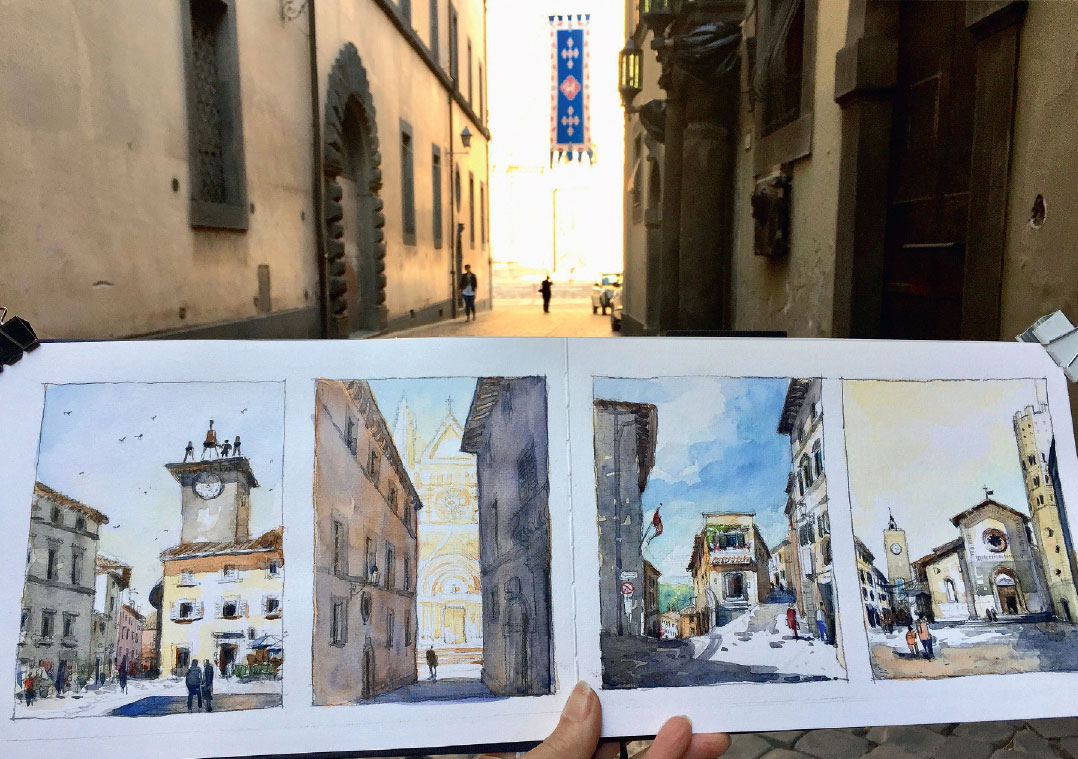
STEPHANIE BOWER, USA
Streets of Orvieto, Italy
7” × 20” | 17.8 × 50.8 cm; Pencil, watercolor in Pentalic Aqua Journal; 3 hour