
Ditch the Dashboard
Having sat through my share of boring presentations showing all the data and analysis done, I am constantly helping and sharing my knowledge of how to present data better. Start with knowing your audience. Do not use the same visual for executive, managers, and technical teams. Level of detail should be different as well, based on audience and purpose (summary, operational/troubleshooting). This chapter will share many other tips to master the art of storytelling with data.
Ditch the dashboard does not mean you should never create a dashboard. Dashboards have their place, but use a dashboard along with a story, infographics, and other interactive methods, like a wall display or even a huge colorful printout of a visual to engage cross-functional teams for different kinds of data problems. When it comes to effective data storytelling, never stick with one type of visualization to showcase data. It’s not just about your data, either: the kind of data visualization you use should be based on your audience as well—a consideration that is often ignored. And use comments or similar available features to discuss and interact about the reports you produce.
Recent research shows that our attention span is dropping and sits currently at eight seconds.75 We should aim to utilize that attention span wisely to demonstrate data. Visual rhetoric is often more persuasive than words alone, and regardless of your dashboard, story, or infographics, your focus should be to enhance the aesthetic experience of the audience. Data visualization is poised in an ideal space to allow consumers to evaluate the risk and benefits of data.
In order to persuade an audience, data is a necessary starting point, but is not enough by itself. Have you ever attended a presentation where data dashboards are met with absolute silence? The audience has no questions to ask and looks more confused than anything else. Owing to picture superiority effect (which describes how visuals are remembered better than words), visualization is widely used in organizations to communicate the findings of data analysis.76 But too often, little attention is paid to using visualizations to influence users. There is no organizationwide system to track the influence and impacts of visualization on users to make informed decisions. There is a disconnect between what the creator of the visualization hopes to share and how the user interprets the visualization.
Tactical Tech, an international NGO organization that focuses on exploring and mitigating the impact of technologies on society, released the book Visualizing Information for Advocacy in 2013.77 It highlights the importance of data quality in accurately determining the value of information, and argues that information is only as useful as our ability to communicate it well. Data analysis techniques like qualitative and quantitative analysis help us analyze and derive the value of data from enormous data organizations are collecting. But what good will it do if data teams struggle to communicate and persuade consumers to use the valuable data findings in their visualization? It’s even worse if communication leads to more confusion than clarity. That’s why, in current data ecosystem, organizations need to place utmost importance on the art of communication and persuasion with data.
• What exactly is persuasion?
• Why is persuasion so powerful?
• What are the steps needed to persuade?
• Why do people fail on persuasion skills?
Let us start with a real-world example of persuasion. RealCare Baby (formerly known as Baby Think It Over) produces a baby simulator, and the organization’s aim is to reduce rates of teen pregnancy.78 It is not enough to say that we need to reduce teen pregnancy and people will follow it. To truly persuade the idea of reducing teen pregnancy, the Baby Think It Over campaign gave simulated babies to students in school to demonstrate the time and effort required to take care of another life. Data visualization is no different. It is not enough to show the numbers on a report and assume everyone will listen. Visualizations, accompanied by effective communication, will more effectively persuade people to see how something matters to their department or to the individual.
Defining Persuasion
Persuasion is a psychological concept that describes the act of influencing a person’s beliefs, attitudes, intentions, motivations, or behaviors.79 With the growing volume of data and digital transformation, methods of persuasion are even built into technology, giving rise to the phenomenon of persuasive technology.80 Since data is the superstar of organizations, applying principles of persuasion to visualization is a crucial talent.
Have you shopped for a visualization tool recently? If so, you probably learned very quickly that the options are almost endless. The visualization market has exploded in the past decade—which might make you wonder why so many tools do similar things. One of the reasons there are so many visualization tools is because visualization is a top priority for most organizations. Another reason that helping people understand data is a challenging task. Unlike a purely technical task, the task of helping people understand data is not straightforward. We don’t have access to everyone’s minds to see how they interpret data. Hence there are many choices of tools trying to handle the presentation of data in more engaging ways. There may be many tools for visualizations but if your team only uses the same set of features regardless of tool, what is the reason to add another tool to the mix?
The Power and History of Persuasion
Ancient people were using cave drawings as a means of communication long before the creation of any data visualization tool or language. We have always used pictures and imagery to communicate. We have evolved to using modern ideogram called emojis ![]() Humans have lived through a digital transformation with its own sophisticated language and literature, but still the power of visualization is irreplaceable. Communicating complex concepts and data to stakeholders requires a certain level of persuasion to accomplish the task of delivering easy to digest information.
Humans have lived through a digital transformation with its own sophisticated language and literature, but still the power of visualization is irreplaceable. Communicating complex concepts and data to stakeholders requires a certain level of persuasion to accomplish the task of delivering easy to digest information.
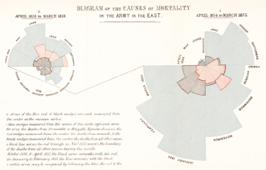
Victorian icon Florence Nightingale, known as “The Lady With the Lamp,” is the founder of modern nursing. Very few people are aware that she was also one of the first to use visualizations to persuade people to improve nursing facilities. The following diagram is a very old visualization created by Nightingale that uses the data she and her medical staff collected while caring for English soldiers in army hospitals and camps. It is a variation of a pie chart called a rose or polar area chart. She used this chart to convince and show that poor sanitation, and not battle wounds, was the reason for most English soldiers’ deaths during the Crimean War in the 1850s. If she had used printed tables of data and writing, no one would have read or noticed the issue. She used a visualization instead of just words to move forward with her agenda to persuade better sanitary hygiene, a subject that was not well understood in the 1850s.
First Data Visualization in the history
Notes: Nightingale’s famous data visualization shows how many more English soldiers were dying of cholera and other preventable diseases (gray areas—blue in online version) than from battle wounds (lighter gray areas—red in online version) during the Crimean War. (darker gray areas—Black in online version denote all other causes of death.) Wellcome Collection (CC BY 4.0).
According to William G. Allyn, a professor of medical optics, more than 50 percent of the cortex, the surface of the brain, is devoted to processing visual information.81 That is a lot of brain capacity reserved to process visuals making our visual system a powerful tool of human understanding. A visual that captures attention and that can be interpreted has a far higher chance of being memorable. In other words, using persuasion with visualization to deliver your data analysis will make it more impactful and actionable.
Applying the Principles of Persuasion
According to Robert B. Cialdini, PhD, an award-winning behavioral scientist and author, the six principles of persuasion are as follows:82
Reciprocity |
| Scarcity |
| Authority |
• People want to repay favors |
| • People want more if there is less of something |
| • People who are authoritative, credible, and knowledgeable experts in their fields are more influential and persuasive than those who are not |
Consistency |
| Liking |
| Social Proof |
• People like to be consistent with their identity or sense of self image |
| • People like to listen to people they like |
| • People follow others |
Principle of Persuasion
Applying these principles of persuasion to data visualization results in the following steps:
• Data should match the argument or support the message you are communicating. People do not like ambiguity and prefer clear, consistent communication.
• If you can convince some people to try data, and show measurable benefits of data for decision making, others will follow.
• Body language and gestures matter when you are communicating with data.
• People need to trust the quality of the data used and then only persuasion is effective.
• Less is more when it comes to data. Use only the data you need to persuade your audience, and do not review every aspect of your analysis related to that data finding.
Why People Fail to Persuade
Although there are several reasons, I want to highlight two important reasons why people fail to persuade with data. Some fail because they themselves doubt, or are confused by, the data they are using to make the case. Being good in analysis data is more of a technical and analytical skill and does not warrant complete understanding of the data findings. Another cause of persuasive failure is discomfort to be in front of people to demonstrate what they found with the data and their potential impact on the organization. This discomfort may reduce confidence make the speaker worry that they don’t have the charisma to convince people.
The Power of Storytelling
Visualizations can be used to disseminate information to a wide range of audiences, but visualizations do not speak for themselves. Most of the interpretation is left to the audience, and it is important to remind ourselves that others do not see what you see. Story does not reside in data. And we remember childhood stories like “The Lion and the Mouse,” Beauty and the Beast, “The Goose that Laid the Golden Eggs,” and many more. We still remember them as compared to any particular math problem we studied. That is because stories are memorable and data is not. We can connect to stories more easily than we can to numbers and tables. So the goal of data storytelling is to bring the complexity of data to a human level.
Stories engage the audience. They make people think and follow along. However, data is not absolute—it doesn’t encompass just one story about it. Different metrics can be applied to data to spin a lot of stories. So a good visualization needs to accompany an associated story and highlight the aspects of the data you want to share. A good story is one that satisfies necessary and sufficient conditions and always connect a cause to an effect.83 And a good story, like a good movie, will contain an introduction, facts, a climax, suspense or humor, and a conclusion. Think of data storytelling with a serialized approach as in a television show. In a television serial, there is a continuing plot that unfolds episode by episode in a sequential manner. Comparably, data storytelling should have a similar flow, connecting different pieces of data and revealing hidden pieces progressively.
In short, Visual Storytelling = Data + Visual + Story
All these elements need to be in sync to communicate an impactful message that people will act on.
Purpose of good data storytelling is as follows (visualization or data by itself can never achieve it):
• Know your audience and build an emotional connection with them.
• Guide your audience.
• Put people in the center of it.
• Challenge people (but not too much).
• Make the experience enjoyable and memorable.
• Provide context.
• Convey enthusiasm and engage your audience.
• Pose a question or create suspense to stimulate curiosity about what comes next.
Storytelling is increasingly used for effective communication, and not just by organizational data teams but also journalism for effective communication. Popular and reputed venues such as The New York Times regularly use visualization and storytelling to communicate powerful messages. One such example from recent times is when COVID vaccine was rolled out last year, The New York Times did not put a bar chart showing how vaccine availability varied by zip code. That would have been boring, and most people would have ignored it. Instead, they used an interactive visualization: you could fill in your zip code and a few additional details, and it would display a visualization of where you stood in the line and how many people were ahead of you. Visualization and storytelling are not just about reporting the facts of the data. They also answer the important question “What is in it for me?” (or, in the COVID vaccine example, “Where am I in the line?”).
Visual language is a language of the mind and eye. It does not necessarily come naturally to people, and learning the language takes practice. Here are some visual attributes to consider when communicating in visual terms:
• Color: Some colors symbolize certain things at a global level, and others have distinctive meanings at the regional, cultural, or organizational level. Also be mindful to create visual-impairment-friendly visualizations.
• Data–ink ratio: To achieve clarity, maximize your data-to-ink ratio. Using excessive decoration in visual displays reduces the clarity of the message.84
• Size: You can use size to denote scaled values.
• Ethical considerations for visuals.
• Words: The same word can mean different things depending on the context.
• Font: Font speaks to your theme and mood.
• Visual-impairment-friendly visualizations: 217 million people worldwide have some form of vision impairment85 and it is essential to make color and design choices to cater to people with disability.
Like photography, there is concept of focus in data as well. What ideas or themes do you most want to highlight in your story? Create a story title describing what immediately comes to mind when you look at the following pictures.
If you presented Example 1 and hoped the audience will notice the leaves first and foremost, it is completely wrong. The same principle applies to data, just creating any data visualization will not necessarily lead to the understanding you hope for.

Example 1: Detergent to wash the vase

Example 2: A potted plant

Example 3: Various shapes and colors of leaves
Applying Design Thinking to Visualization
You are tasked with creating a visualization to help a group of business stakeholders. You meet with users and ask, “What do you want in this dashboard?” Their answer is “Give me all the data or everything in my reports.” As a result, you are not sure where to start with data questioning. You do what they asked for, bringing in all the possible data and metrics available into your visualization and handing it off to business stakeholders to test. Three months later, leadership wants to run metrics on the usage of your reports. You are surprised to find that hardly anyone has used your visualization in the past three months.
If this sounds familiar, you’re not alone. This is the all-too-common story of the visualization that is built quickly but with no clarity with regard to the problem it is solving. The key to building good visualizations is to master the art of questioning and meaningful conversations. Design thinking (DT) can help with this.
DT is an emerging creative problem-solving method that is based on user needs.86 DT focuses on both what is desired by the user and what is feasible from a technological and economic standpoint.
Let us apply the five steps of DT to the creation of impactful visualizations:
1. Empathize—research user needs.
2. Define—identify the user’s needs and goals.
3. Ideate—create ideas and sketches for various solutions, retaining roughness and creativity.
4. Prototype—draw your visual on paper.
5. Test—try out your solution.
DT is so fundamental that you can apply it to almost any life events. If you are making a wedding cake, for instance, how will you start the design process?
• Learn what flavor of cake your customer wants (vanilla, chocolate, etc.).
• Learn how many people it must feed, and use that information to decide how many tiers the cake will have.
• Learn what kind of cake filling your customer wants.
• Determine the best shape for the cake.
• Learn what cake toppers and decorations your customer will like best.
You will most likely ask these questions before you start baking. The same theory applies to data visualization. You don’t automatically know which tables to pull data from and which charts to start building. There are lots of design questions that need to be addressed before building any visualization.
Exercise: Create a recipe visual of Four Spices as Salt, Pepper, Chili, and Turmeric
The following visuals depict four spices—salt, pepper, chili, and turmeric—in the portions recommended by a particular recipe. If we apply DT, we can start by asking the question “Who needs it?” Once we learn that the visual will be added to a restaurant menu, we can brainstorm what will look better in a menu.
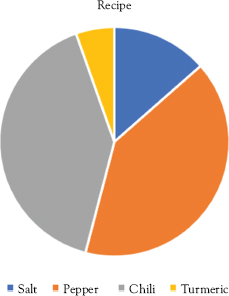
Spices in a recipe pie chart

Spices in a recipe visualization
A sketch of spices in the menu can be made to look pretty and will be better suited than a pie chart to a restaurant menu. Pie chart is more formal for a restaurant menu and knowing your audience is important to determine the style or type of visualization.
Our brain has a left side and a right side, with the left side being analytical and the right side being creative. A good visual story should trigger both sides of the brain. There are two kinds of brain processing: preattentive (subconscious) and attentive (conscious).87 Preattentive processing is fast, and a good visual like a chart will effectively convey the essence of the story. Attentive processing is slower, and drill-down on data is processed in that fashion. A good visual should activate both kinds of brain processing.
Avoid the Dashboard Factory
Does your organization handle every data problem by producing a so-called easy-to-use dashboard, sometimes on a weekly or even daily basis? Are you now stuck with a large number of dashboards no one is using? When no one knows which dashboard to use for a given business problem, they won’t use any of them, and will likely fall back on the old method of asking for ad hoc reports. In my experience, I have seen organizations not only building too many dashboards but also building them with multiple tools, which only adds to the confusion among users. With the acquisition and integration of new teams as part of organizational growth, having multiple visualization tools is sometimes unavoidable. The problem occurs when there is no unified, ongoing visualization “housekeeping” activity to take stock of the available dashboards. Many organizations do not use report usage metrics proactively in order to monitor or sunset reports that have not been used in years. The “dashboard factory” is a state of producing more dashboards than necessary on a regular basis, without a system to check if people use them and to retire them when they aren’t being used. Avoid this kind of dashboard factory, which adds no value to your data or your business decision making.
Conclusion
While there is a wide range of data visualization tools on the market, how effectively your team communicates data depends more on your approach than the tool. Many tools offer similar functionalities with only slightly different ways of achieving them, and most tools are constantly adding new features, thereby shrinking the differences between visualization tools. Data analysis (of high-quality data, of course) is one side of the coin; visualization, persuasion, storytelling, and DT are the other side. There is no scarcity of people learning new visualization tools and mastering the technical side of it. Mastering the communication and people side of visualization is the key to enabling more people to act on data. Only when people understand and act on data, an organization can see value of their data initiatives regardless of the visualization tool used. Although data communication can be entertaining, its main purpose is to create impact and spur action, telling a story that is worth supporting or selling an idea worth backing.