
4 Modeling a moving average process
- Defining a moving average process
- Using the ACF to identify the order of a moving average process
- Forecasting a time series using the moving average model
In the previous chapter, you learned how to identify and forecast a random walk process. We defined a random walk process as a series whose first difference is stationary with no autocorrelation. This means that plotting its ACF will show no significant coefficients after lag 0. However, it is possible that a stationary process may still exhibit autocorrelation. In this case, we have a time series that can be approximated by a moving average model MA(q)), an autoregressive model AR(p)), or an autoregressive moving average model ARMA(p,q). In this chapter, we will focus on identifying and modeling using the moving average model.
Suppose that you want to forecast the volume of widget sales from the XYZ Widget Company. By predicting futures sales, the company will be able to better manage its production of widgets and avoid producing too many or too few. If not enough widgets are produced, the company will not be able to meet their clients’ demands, leaving customers unhappy. On the other hand, producing too many widgets will increase inventory. The widgets might become obsolete or lose their value, which will increase the business’s liabilities, ultimately making shareholders unhappy.
In this example, we will study the sales of widgets over 500 days starting in 2019. The recorded sales over time are shown in figure 4.1. Note that the volume of sales is expressed in thousands of US dollars.

Figure 4.1 Volume of widget sales for the XYZ Widget Company over 500 days, starting on January 1, 2019. This is fictional data, but it will be useful for learning how to identify and model a moving average process.
Figure 4.1 shows a long-term trend with peaks and troughs along the way. We can intuitively say that this time series is not a stationary process, since we can observe a trend over time. Furthermore, there is no apparent cyclical pattern in the data, so we can rule out any seasonal effects for now.
In order to forecast the volume of widget sales, we need to identify the underlying process. To do so, we will apply the same steps that we covered in chapter 3 when working with a random walk process, shown again in figure 4.2.

Once the data is gathered, we will test for stationarity. If it is not stationary, we will apply a transformation to make it stationary. Then, once the series is a stationary process, we will plot the autocorrelation function (ACF). In our example of forecasting widget sales, our process will show significant coefficients in the ACF plot, meaning that it cannot be approximated by the random walk model.
In this chapter, we will discover that the volume of widget sales from the XYZ Widget Company can be approximated as a moving average process, and we will look at the definition of the moving average model. Then you’ll learn how to identify the order of the moving average process using the ACF plot. The order of this process determines the number of parameters for the model. Finally, we will apply the moving average model to forecast the next 50 days of widget sales.
4.1 Defining a moving average process
A moving average process, or the moving average (MA) model, states that the current value is linearly dependent on the current and past error terms. The error terms are assumed to be mutually independent and normally distributed, just like white noise.
A moving average model is denoted as MA(q), where q is the order. The model expresses the present value as a linear combination of the mean of the series μ, the present error term ϵt, and past error terms ϵt–q. The magnitude of the impact of past errors on the present value is quantified using a coefficient denoted as θq. Mathematically, we express a general moving average process of order q as in equation 4.1.
yt = μ + ϵt + θ1ϵt–1 + θ2ϵt–2 +⋅⋅⋅+ θqϵt–q
The order q of the moving average model determines the number of past error terms that affect the present value. For example, if it is of order 1, meaning that we have an MA(1) process, the model is expressed as in equation 4.2. Here we can see that the present value yt is dependent on the mean μ, the present error term ϵt, and the error term at the previous timestep θ1ϵt–1.
If we have a moving average process of order 2, or MA(2), then yt is dependent on the mean of the series μ, the present error term ϵt, the error term at the previous timestep θ1ϵt–1, and the error term two timesteps prior θ2ϵt–2, resulting in equation 4.3.
Hence, we can see how the order q of the MA(q) process affects the number of past error terms that must be included in the model. The larger q is, the more past error terms affect the present value. Therefore, it is important to determine the order of the moving average process in order to fit the appropriate model—if we have a second-order moving average process, then a second-order moving average model will be used for forecasting.
4.1.1 Identifying the order of a moving average process
To identify the order of a moving average process, we can extend the steps needed to identify a random walk, as shown in figure 4.3.

As usual, the first step is to gather the data. Then we test for stationarity. If our series is not stationary, we apply transformations, such as differencing, until the series is stationary. Then we plot the ACF and look for significant autocorrelation coefficients. In the case of a random walk, we will not see significant coefficients after lag 0. On the other hand, if we see significant coefficients, we must check whether they become abruptly non-significant after some lag q. If that is the case, then we know that we have a moving average process of order q. Otherwise, we must follow a different set of steps to discover the underlying process of our time series.
Let’s put this in action using our data for the volume of widget sales for the XYZ Widget Company. The dataset contains 500 days of sales volume data starting on January 1, 2019. We will follow the steps outlined in figure 4.3 and determine the order of the underlying moving average process.
The first step is to gather the data. This step has already been done for you, so this is a great time to load the data into a DataFrame using pandas and display the first five rows of data. At any point, you can refer to the source code for this chapter on GitHub: https://github.com/marcopeix/TimeSeriesForecastingInPython/tree/master/CH04.
❶ Read the CSV file into a DataFrame.
❷ Display the first five rows of data.
You’ll see that the volume of sales is in the widget_sales column. Note that the volume of sales is in units of thousands of US dollars.
We can plot our data using matplotlib. Our values of interest are in the widget_ sales columns, so that is what we pass into ax.plot(). Then we give the x-axis the label of “Time” and y-axis the label of “Widget sales (k$).” Next, we specify that the labels for the ticks on the x-axis should display the month of the year. Finally, we tilt the x-axis tick labels and remove extra whitespace around the figure using plt.tight_layout(). The result is figure 4.4.
import matplotlib.pyplot as plt

fig, ax = plt.subplots()

ax.plot(df['widget_sales'])                                       ❶
ax.set_xlabel('Time')                                             ❷
ax.set_ylabel('Widget sales (k$)')                                ❸

plt.xticks(
    [0, 30, 57, 87, 116, 145, 175, 204, 234, 264, 293, 323, 352, 382, 409,
➥ 439, 468, 498],
    ['Jan', 'Feb', 'Mar', 'Apr', 'May', 'Jun', 'Jul', 'Aug', 'Sep', 'Oct',
➥ 'Nov', 'Dec', '2020', 'Feb', 'Mar', 'Apr', 'May', 'Jun'])      ❹

fig.autofmt_xdate()                                               ❺
plt.tight_layout()                                                ❻
❶ Plot the volume of widget sales.
❹ Label the ticks on the x-axis.
❺ Tilt the labels on the x-axis ticks so that they display nicely.
❻ Remove extra whitespace around the figure.
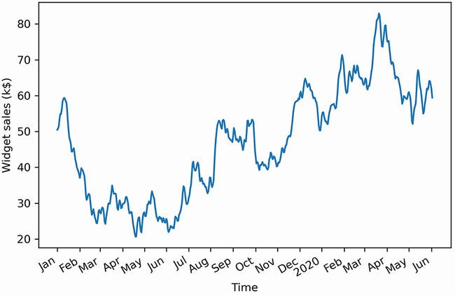
Figure 4.4 Volume of widget sales for the XYZ Widget Company over 500 days, starting on January 1, 2019
The next step is to test for stationarity. We intuitively know that the series is not stationary, since there is an observable trend in figure 4.4. Still, we will use the ADF test to make sure. Again, we’ll use the adfuller function from the statsmodels library and extract the ADF statistic and p-value. If the ADF statistic is a large negative number and the p-value is smaller than 0.05, our series is stationary. Otherwise, we must apply transformations.
from statsmodels.tsa.stattools import adfuller

ADF_result = adfuller(df['widget_sales'])   ❶

print(f'ADF Statistic: {ADF_result[0]}')    ❷
print(f'p-value: {ADF_result[1]}')          ❸
❶ Run the ADF test on the volume of widget sales, which is stored in the widget_sales column.
This results in an ADF statistic of –1.51 and a p-value of 0.53. Here, the ADF statistic is not a large negative number, and the p-value is greater than 0.05. Therefore, our time series is not stationary, and we must apply transformations to make it stationary.
In order to make our series stationary, we will try to stabilize the trend by applying a first-order differencing. We can do so by using the diff method from the numpy library. Remember that this method takes in a parameter n that specifies the order of differencing. In this case, because it is a first-order differencing, n will be equal to 1.
❶ Apply first-order differencing on our data and store the result in widget_sales_diff.
We can optionally plot the differenced series to see if we have stabilized the trend. Figure 4.5 shows the differenced series. We can see that we successfully removed the long-term trend component of our series, as values are hovering around 0 over the entire period.

Figure 4.5 Differenced volume of widget sales. The trend component has been stabilized, since values are hovering around 0 over our entire sample.
Now that a transformation has been applied to our series, we can test for stationarity again using the ADF test. This time, make sure to run the test on the differenced data stored in the widget_sales_diff variable.
ADF_result = adfuller(widget_sales_diff)    ❶

print(f'ADF Statistic: {ADF_result[0]}')
print(f'p-value: {ADF_result[1]}')
❶ Run the ADF test on the differenced time series.
This gives an ADF statistic of –10.6 and a p-value of 7 × 10–19. Therefore, with a large negative ADF statistic and a p-value much smaller than 0.05, we can say that our series is stationary.
Our next step is to plot the autocorrelation function. The statsmodels library conveniently includes the plot_acf function. We simply pass in our differenced series and specify the number of lags in the lags parameter. Remember that the number of lags determines the range of values on the x-axis.
from statsmodels.graphics.tsaplots import plot_acf

plot_acf(widget_sales_diff, lags=30);    ❶

plt.tight_layout()
❶ Plot the ACF of the differenced series.
The resulting ACF plot is shown in figure 4.6. You’ll notice that there are significant coefficients up until lag 2. Then they abruptly become non-significant, as they remain in the shaded area of the plot. This means that we have a stationary moving average process of order 2. We can use a second-order moving average model, or MA(2) model, to forecast our stationary time series.

Figure 4.6 ACF plot of the differenced series. Notice how the coefficients are significant up until lag 2, and then they fall abruptly into the non-significance zone (shaded area) of the plot. There are some significant coefficients around lag 20, but this is likely due to chance, since they are non-significant between lags 3 and 20 and after lag 20.
You can see how the ACF plot helps us determine the order of a moving average process. The ACF plot will show significant autocorrelation coefficients up until lag q, after which all coefficients will be non-significant. We can then conclude that we have a moving average process of order q, or an MA(q) process.
4.2 Forecasting a moving average process
Once the order qof the moving average process is identified, we can fit the model to our training data and start forecasting. In our case, we discovered that the differenced volume of widget sales is a moving average process of order 2, or an MA(2) process.
The moving average model assumes stationarity, meaning that our forecasts must be done on a stationary time series. Therefore, we will train and test our model on the differenced volume of widget sales. We will try two naive forecasting techniques and fit a second-order moving average model. The naive forecasts will serve as baselines to evaluate the performance of the moving average model, which we expect to be better than the baselines, since we previously identified our process to be a moving average process of order 2. Once we obtain our forecasts for the stationary process, we will have to inverse-transform the forecasts, meaning that we must undo the process of differencing to bring the forecasts back to their original scale.
In this scenario, we will allocate 90% of the data to the train set and reserve the other 10% for the test set, meaning that we must forecast 50 timesteps into the future. We will assign our differenced data to a DataFrame and then split the data.
df_diff = pd.DataFrame({'widget_sales_diff': widget_sales_diff})   ❶

train = df_diff[:int(0.9*len(df_diff))]                            ❷
test = df_diff[int(0.9*len(df_diff)):]                             ❸
print(len(train))
print(len(test))
❶ Place the differenced data in a DataFrame.
❷ The first 90% of the data goes in the training set.
❸ The last 10% of the data goes in the test set for prediction.
We’ve printed out the size of the train and test sets to remind you of the data point that we lose when we difference. The original dataset contained 500 data points, while the differenced series contains a total of 499 data points, since we differenced once.
Now we can visualize the forecasting period for the differenced and original series. Here we will make two subplots in the same figure. The result is shown in figure 4.7.
fig, (ax1, ax2) = plt.subplots(nrows=2, ncols=1, sharex=True)    ❶

ax1.plot(df['widget_sales'])
ax1.set_xlabel('Time')
ax1.set_ylabel('Widget sales (k$)')
ax1.axvspan(450, 500, color='#808080', alpha=0.2)

ax2.plot(df_diff['widget_sales_diff'])
ax2.set_xlabel('Time')
ax2.set_ylabel('Widget sales - diff (k$)')
ax2.axvspan(449, 498, color='#808080', alpha=0.2)

plt.xticks(
    [0, 30, 57, 87, 116, 145, 175, 204, 234, 264, 293, 323, 352, 382, 409, 439, 468, 498],
    ['Jan', 'Feb', 'Mar', 'Apr', 'May', 'Jun', 'Jul', 'Aug', 'Sep', 'Oct', 'Nov', 'Dec', '2020', 'Feb', 'Mar', 'Apr', 'May', 'Jun'])

fig.autofmt_xdate()
plt.tight_layout()
❶ Make two subplots inside the same figure.

Figure 4.7 Forecasting period for the original and differenced series. Remember that our differenced series has one less data point than in its original state.
For the forecast horizon, the moving average model brings in a particularity. The MA(q) model does not allow us to forecast 50 steps into the future in one shot. Remember that the moving average model is linearly dependent on past error terms, and those terms are not observed in the dataset—they must therefore be recursively estimated. This means that for an MA(q) model, we can only forecast q steps into the future. Any prediction made beyond that point will not have past error terms, and the model will only predict the mean. Therefore, there is no added value in forecasting beyond q steps into the future, because the predictions will fall flat, as only the mean is returned, which is equivalent to a baseline model.
To avoid simply predicting the mean beyond two timesteps into the future, we need to develop a function that will predict two timesteps or less at a time, until 50 predictions are made, so that we can compare our predictions against the observed values of the test set. This method is called rolling forecasts. On the first pass, we will train on the first 449 timesteps and predict timesteps 450 and 451. Then, on the second pass, we will train on the first 451 timesteps, and predict timesteps 452 and 453. This is repeated until we finally predict the values at timesteps 498 and 499.
We will compare our fitted MA(2) model to two baselines: the historical mean and the last value. That way, we can make sure that an MA(2) model will yield better predictions than naive forecasts, which should be the case, since we know the stationary process is an MA(2) process.
Note You do not have to forecast twosteps ahead when you perform rolling forecasts with an MA(2) model. You can forecast either one or two steps ahead repeatedly in order to avoid predicting only the mean. Similarly, with an MA(3) model, you could perform rolling forecasts with one-, two-, or three-step-ahead rolling forecasts.
To create these forecasts, we need a function that will repeatedly fit a model and generate forecasts over a certain window of time, until forecasts for the entire test set are obtained. This function is shown in listing 4.1.
First, we import the SARIMAX function from the statsmodels library. This function will allow us to fit an MA(2) model to our differenced series. Note that SARIMAX is a complex model that allows us to consider seasonal effects, autoregressive processes, non-stationary time series, moving average processes, and exogenous variables all in a single model. For now, we will disregard all factors except the moving average portion. We will gradually build on the moving average model and eventually reach the SARIMAX model in later chapters:
-
Next, we define our
rolling_forecastfunction. It will take in aDataFrame, the length of the training set, the forecast horizon, a window size, and a method. TheDataFramecontains the entire time series. -
The
train_lenparameter initializes the number of data points that can be used to fit a model. As predictions are done, we can update this to simulate the observation of new values and then use them to make the next sequence of forecasts. -
The
horizonparameter is equal to the length of the test set and represents how many values must be predicted. -
The
windowparameter specifies how many timesteps are predicted at a time. In our case, because we have an MA(2) process, the window will be equal to 2. -
The
methodparameter specifies what model to use. The same function allows us to generate forecasts from the naive methods and the MA(2) model.
Note the use of type hinting in the function declaration. This will help us avoid passing parameters of an unexpected type, which might cause our function to fail.
Then, each forecasting method is run in a loop. The loop starts at the end of the training set and continues until total_len, exclusive, with steps of window (total_len is the sum of train_len and horizon). This loop generates a list of 25 values, [450,451,452,...,497], but each pass generates two forecasts, thus returning a list of 50 forecasts for the entire test set.
Listing 4.1 A function for rolling forecasts on a horizon
from statsmodels.tsa.statespace.sarimax import SARIMAX

def rolling_forecast(df: pd.DataFrame, train_len: int, horizon: int,
➥ window: int, method: str) -> list:                               ❶

    total_len = train_len + horizon

    if method == 'mean':
        pred_mean = []

        for i in range(train_len, total_len, window):
            mean = np.mean(df[:i].values)
            pred_mean.extend(mean for _ in range(window))

        return pred_mean

    elif method == 'last':
        pred_last_value = []

        for i in range(train_len, total_len, window):
            last_value = df[:i].iloc[-1].values[0]
            pred_last_value.extend(last_value for _ in range(window))
        return pred_last_value

    elif method == 'MA':
        pred_MA = []

        for i in range(train_len, total_len, window):
            model = SARIMAX(df[:i], order=(0,0,2))                  ❷
            res = model.fit(disp=False)
            predictions = res.get_prediction(0, i + window - 1)
            oos_pred = predictions.predicted_mean.iloc[-window:]    ❸
            pred_MA.extend(oos_pred)

        return pred_MA
❶ The function takes in a DataFrame containing the full simulated moving average process. We also pass in the length of the training set (800 in this case) and the horizon of the forecast (200). The next parameter specifies how many steps at a time we wish to forecast (2). Finally, we specify the method to use to make forecasts.
❷ The MA(q) model is part of the more complex SARIMAX model.
❸ The predicted_mean method allows us to retrieve the actual value of the forecast as defined by the statsmodels library.
Once it’s defined, we can use our function and forecast using three methods: the historical mean, the last value, and the fitted MA(2) model.
First, we’ll first create a DataFrame to hold our predictions and name it pred_df. We can copy the test set, to include the actual values in pred_df, making it easier to evaluate the performance of our models.
Then, we’ll specify some constants. In Python, it is a good practice to name constants in capital letters. TRAIN_LEN is simply the length of our training set, HORIZON is the length of the test set, which is 50 days, and WINDOW can be 1 or 2 because we are using an MA(2) model. In this case we will use a value of 2.
Next, we’ll use our rolling_forecast function to generate a list of predictions for each method. Each list of predictions is then stored in its own column in pred_df.
pred_df = test.copy()

TRAIN_LEN = len(train)
HORIZON = len(test)
WINDOW = 2

pred_mean = rolling_forecast(df_diff, TRAIN_LEN, HORIZON, WINDOW, 'mean')
pred_last_value = rolling_forecast(df_diff, TRAIN_LEN, HORIZON, WINDOW,
➥ 'last')
pred_MA = rolling_forecast(df_diff, TRAIN_LEN, HORIZON, WINDOW, 'MA')

pred_df['pred_mean'] = pred_mean
pred_df['pred_last_value'] = pred_last_value
pred_df['pred_MA'] = pred_MA

pred_df.head()
Now we can visualize our predictions against the observed values in the test set. Keep in mind that we are still working with the differenced dataset, so our predictions are also differenced values.
For this figure, we will plot part of the training data to see the transition between the train and test sets. Our observed values will be a solid line, and we will label this curve as “actual.” Then we’ll plot the forecasts from the historical mean, those from the last observed value, and those from the MA(2) model. They will respectively be a dotted line, a dotted and dashed line, and a dashed line, with labels of “mean,” “last,” and “MA(2).” The result is shown in figure 4.8.

Figure 4.8 Forecasts of the differenced volume of widget sales. In a professional setting, it does not make sense to report differenced predictions. Therefore, we will undo the transformation later on.
In figure 4.8 you’ll notice that the prediction coming from the historical mean, shown as a dotted line, is almost a straight line. This is expected; the process is stationary, so the historical mean should be stable over time.
The next step is to measure the performance of our models. To do so, we will calculate the mean squared error (MSE). Here we will use the mean_squared_error function from the sklearn package. We simply need to pass the observed values and the predicted values into the function.
from sklearn.metrics import mean_squared_error

mse_mean = mean_squared_error(pred_df['widget_sales_diff'],
➥ pred_df['pred_mean'])
mse_last = mean_squared_error(pred_df['widget_sales_diff'],
➥ pred_df['pred_last_value'])
mse_MA = mean_squared_error(pred_df['widget_sales_diff'],
➥ pred_df['pred_MA'])

print(mse_mean, mse_last, mse_MA)
This prints out an MSE of 2.56 for the historical mean method, 3.25 for the last value method, and 1.95 for the MA(2) model. Here our MA(2) model is the best-performing forecasting method, since its MSE is the lowest of the three methods. This is expected, because we previously identified a second-order moving average process for the differenced volume of widget sales, thus resulting in a smaller MSE compared to the naive forecasting methods. We can visualize the MSE for all forecasting techniques in figure 4.9.
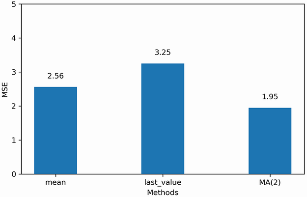
Figure 4.9 MSE for each forecasting method on the differenced volume of widget sales. Here the MA(2) model is the champion, since its MSE is the lowest.
Now that we have our champion model on the stationary series, we need to inverse-transform our predictions to bring them back to the original scale of the untransformed dataset. Recall that differencing is the result of the difference between a value at time t and its previous value, as shown in figure 4.10.

In order to reverse our first-order difference, we need to add an initial value y0 to the first differenced value y'1. That way, we can recover y1 in its original scale. This is what is demonstrated in equation 4.4:
y1 = y0 + y'1 = y0 + y1– y0 = y1
Then y2 can be obtained using a cumulative sum of the differenced values, as shown in equation 4.5.
y2 = y0 + y'1 + y'2 = y0 + y1– y0 + y2– y1 = (y0– y0) + (y1– y1) + y2 = y2
Applying the cumulative sum once will undo a first-order differencing. In the case where the series was differenced twice to become stationary, we would need to repeat this process.
Thus, to obtain our predictions in the original scale of our dataset, we need to use the first value of the test as our initial value. Then we can perform a cumulative sum to obtain a series of 50 predictions in the original scale of the dataset. We will assign these predictions to the pred_widget_sales column.
df['pred_widget_sales'] = pd.Series()          ❶
df['pred_widget_sales'][450:] = df['widget_sales'].iloc[450] +
➥ pred_df['pred_MA'].cumsum()                 ❷
❶ Initialize an empty column to hold our predictions.
❷ Inverse-transform the predictions to bring them back to the original scale of the dataset.
Let’s visualize our untransformed predictions against the recorded data. Remember that we are now using the original dataset stored in df.
fig, ax = plt.subplots()

ax.plot(df['widget_sales'], 'b-', label='actual')        ❶
ax.plot(df['pred_widget_sales'], 'k--', label='MA(2)')   ❷

ax.legend(loc=2)

ax.set_xlabel('Time')
ax.set_ylabel('Widget sales (K$)')
ax.axvspan(450, 500, color='#808080', alpha=0.2)
ax.set_xlim(400, 500)

plt.xticks(
    [409, 439, 468, 498],
    ['Mar', 'Apr', 'May', 'Jun'])

fig.autofmt_xdate()
plt.tight_layout()
❷ Plot the inverse-transformed predictions.
You can see in figure 4.11 that our forecast curve, shown with a dashed line, follows the general trend of the observed values, although it does not predict bigger troughs and peaks.

The final step is to report the MSE on the original dataset. In a professional setting, we would not report the differenced predictions, because they do not make sense from a business perspective; we must report values and errors in the original scale of the data.
We can measure the mean absolute error (MAE) using the mean_absolute_error function from sklearn. We’ll use this metric because it is easy to interpret, as it returns the average of the absolute difference between the predicted and actual values, instead of a squared difference like the MSE.
from sklearn.metrics import mean_absolute_error

mae_MA_undiff = mean_absolute_error(df['widget_sales'].iloc[450:],
➥ df['pred_widget_sales'].iloc[450:])

print(mae_MA_undiff)
This prints out an MAE of 2.32. Therefore, our predictions are, on average, off by $2,320, either above or below the actual value. Remember that our data has units of thousands of dollars, so we multiply the MAE by 1,000 to express the average absolute difference.
4.3 Next steps
In this chapter, we covered the moving average process and how it can be modeled by an MA(q) model, where q is the order. You learned that to identify a moving average process, you must study the ACF plot once it is stationary. The ACF plot will show significant peaks all the way to lag q, and the rest will not be significantly different from 0.
However, it is possible that when studying the ACF plot of a stationary process, you’ll see a sinusoidal pattern, with negative coefficients and significant autocorrelation at large lags. For now you can simply accept that this is not a moving average process (see figure 4.12).

When we see a sinusoidal pattern in the ACF plot of a stationary process, this is a hint that an autoregressive process is at play, and we must use an AR(p) model to produce our forecast. Just like the MA(q) model, the AR(p) model will require us to identify its order. This time we will have to plot the partial autocorrelation function and see at which lag the coefficients suddenly become non-significant. The next chapter will focus entirely on the autoregressive process, how to identify its order, and how to forecast such a process.
4.4 Exercises
Take some time to test your knowledge and mastery of the MA(q) model with these exercises. The full solutions are available on GitHub: https://github.com/marcopeix/TimeSeriesForecastingInPython/tree/master/CH04.
4.4.1 Simulate an MA(2) process and make forecasts
Simulate a stationary MA(2) process. To do so, use the ArmaProcess function from the statsmodels library and simulate the following process:
-
For this exercise, generate 1,000 samples.
from statsmodels.tsa.arima_process import ArmaProcess
import numpy as np

np.random.seed(42)     ❶

ma2 = np.array([1, 0.9, 0.3])
ar2 = np.array([1, 0, 0])

MA2_process = ArmaProcess(ar2, ma2).generate_sample(nsample=1000)
❶ Set the seed for reproducibility. Change the seed if you want to experiment with different values.
-
Plot the ACF, and see if there are significant coefficients after lag 2.
-
Separate your simulated series into train and test sets. Take the first 800 timesteps for the train set, and assign the rest to the test set.
-
Make forecasts over the test set. Use the mean, last value, and an MA(2) model. Make sure you repeatedly forecast 2 timesteps at a time using the
recursive_ forecastfunction we defined.
4.4.2 Simulate an MA(q) process and make forecasts
Recreate the previous exercise, but simulate a moving average process of your choice. Try simulating a third-order or fourth-order moving average process. I recommend generating 10,000 samples. Be especially attentive to the ACF, and see if your coefficients become non-significant after lag q.
Summary
-
A moving average process states that the present value is linearly dependent on the mean, present error term, and past error terms. The error terms are normally distributed.
-
You can identify the order q of a stationary moving average process by studying the ACF plot. The coefficients are significant up until lag q only.
-
You can predict up to q steps into the future because the error terms are not observed in the data and must be recursively estimated.
-
Predicting beyond q steps into the future will simply return the mean of the series. To avoid that, you can apply rolling forecasts.
-
If you apply a transformation to the data, you must undo it to bring your predictions back to the original scale of the data.
-
The moving average model assumes the data is stationary. Therefore, you can only use this model on stationary data.