
2
Digital Image Characteristics
IN THIS CHAPTER, YOU’LL FAMILIARIZE yourself with the unique characteristics of digital imagery so you can make the most of your images. First, you’ll learn how the digital color palette is quantified and when it has a visual impact, which you’ll need to know in order to understand bit depth. Then you’ll explore how digital camera sensors convert light and color into discrete pixels.
The last two sections of this chapter cover how to interpret image histograms for more predictable exposures, as well as the different types of image noise and ways to minimize it.
UNDERSTANDING BIT DEPTH
Bit depth quantifies the number of unique colors in an image’s color palette in terms of the zeros and ones, or bits, we use to specify each color. This doesn’t mean that an image necessarily uses all of these colors, but it does mean that the palette can specify colors with a high level of precision.
In a grayscale image, for example, the bit depth quantifies how many unique shades of gray are available. In other words, a higher bit depth means that more colors or shades can be encoded because more combinations of zeros and ones are available to represent the intensity of each color. We use a grayscale example here because the way we perceive intensity in color images is much more complex.
TERMINOLOGY
Every color pixel in a digital image is created through some combination of the three primary colors: red, green, and blue. Each primary color is often referred to as a color channel and can have any range of intensity values specified by its bit depth. The bit depth for each primary color is called the bits per channel. The bits per pixel (bpp) refers to the sum of the bits in all three color channels and represents the total colors available at each pixel.
Confusion arises frequently regarding color images because it may be unclear whether a posted number refers to the bits per pixel or bits per channel. Therefore, using bpp to specify the unit of measurement helps distinguish these two terms.
For example, most color images you take with digital cameras have 8 bits per channel, which means that they can use a total of eight 0s and 1s. This allows for 28 (or 256) different combinations, which translate to 256 different intensity values for each primary color. When all three primary colors are combined at each pixel, this allows for as many as 28*3 (or 16,777,216) different colors, or true color. Combining red, green, and blue at each pixel in this way is referred to as 24 bits per pixel because each pixel is composed of three 8-bit color channels. We can generalize the number of colors available for any x-bit image with the expression 2x, where x refers to the bits per pixel, or 23x, where x refers to the bits per channel.
TABLE 2-1 illustrates different image types in terms of bit depth, total colors available, and common names. Many of the lower bit depths were only important with early computers; nowadays, most images are 24 bpp or higher.
TABLE 2-1 Comparing the Bit Depth of Different Image Types
BITS PER PIXEL |
NUMBER OF COLORS AVAILABLE |
COMMON NAME(S) |
1 |
2 |
Monochrome |
2 |
4 |
CGA |
4 |
16 |
EGA |
8 |
256 |
VGA |
16 |
65,536 |
XGA, high color |
24 |
16,777,216 |
SVGA, true color |
32 |
16,777,216 + transparency |
|
48 |
281 trillion |
VISUALIZING BIT DEPTH
Note how FIGURE 2-1 changes when the bit depth is reduced. The difference between 24 bpp and 16 bpp may look subtle, but will be clearly visible on a monitor if you have it set to true color or higher (24 or 32 bpp).
DIGITAL PHOTO TIPS
Although the concept of bit depth may at first seem needlessly technical, understanding when to use high- versus low-bit depth images has important practical applications. Key tips include:
![]() The human eye can discern only about 10 million different colors, so saving an image in any more than 24 bpp is excessive if the intended purpose is for viewing only. On the other hand, images with more than 24 bpp are still quite useful because they hold up better under post-processing.
The human eye can discern only about 10 million different colors, so saving an image in any more than 24 bpp is excessive if the intended purpose is for viewing only. On the other hand, images with more than 24 bpp are still quite useful because they hold up better under post-processing.
![]() You can get undesirable color gradations in images with fewer than 8 bits per color channel, as shown in FIGURE 2-2. This effect is commonly referred to as posterization.
You can get undesirable color gradations in images with fewer than 8 bits per color channel, as shown in FIGURE 2-2. This effect is commonly referred to as posterization.
![]() The available bit depth settings depend on the file type. Standard JPEG and TIFF files can use only 8 and 16 bits per channel, respectively.
The available bit depth settings depend on the file type. Standard JPEG and TIFF files can use only 8 and 16 bits per channel, respectively.
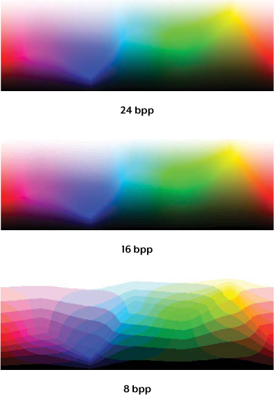
FIGURE 2-1 Visual depiction of 8 bpp, 16 bpp, and 24 bpp using rainbow color gradients

FIGURE 2-2 A limited palette of 256 colors results in a banded appearance called posterization.
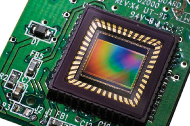
FIGURE 2-3 A digital sensor with millions of imperceptible color filters
DIGITAL CAMERA SENSORS
A digital camera uses a sensor array of millions of tiny pixels (see FIGURE 2-3) to produce the final image. When you press your camera’s shutter button and the exposure begins, each of these pixels has a cavity called a photosite that is uncovered to collect and store photons.
After the exposure finishes, the camera closes each of these photosites and then tries to assess how many photons fell into each. The relative quantity of photons in each cavity is then sorted into various intensity levels, whose precision is determined by bit depth (0–255 levels for an 8-bit image). FIGURE 2-4 illustrates how these cavities collect photons.

FIGURE 2-4 Using cavities to collect photons
The grid on the left represents the array of light-gathering photosites on your sensor, whereas the reservoirs shown on the right depict a zoomed in cross section of those same photosites. In FIGURE 2-4, each cavity is unable to distinguish how much of each color has fallen in, so the grid diagram illustrated here would only be able to create grayscale images.
BAYER ARRAY
To capture color images, each cavity has to have a filter placed over it that allows penetration of only a particular color of light. Virtually all current digital cameras can capture only one of the three primary colors in each cavity, so they discard roughly two-thirds of the incoming light. As a result, the camera has to approximate the other two primary colors to have information about all three colors at every pixel. The most common type of color filter array, called a Bayer array, is shown in FIGURE 2-5.
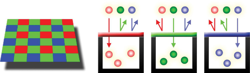
FIGURE 2-5 A Bayer array
As you can see, a Bayer array consists of alternating rows of red-green and green-blue filters (as shown in FIGURES 2-5 and 2-6). Notice that the Bayer array contains twice as many green as red or blue sensors. In fact, each primary color doesn’t receive an equal fraction of the total area because the human eye is more sensitive to green light than both red and blue light. Creating redundancy with green photosites in this way produces an image that appears less noisy and has finer detail than if each color were treated equally. This also explains why noise in the green channel is much less than for the other two primary colors, as you’ll learn later in the chapter in the discussion of image noise.
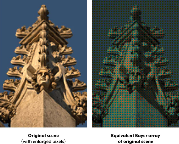
FIGURE 2-6 Full color versus Bayer array representations of an image
Not all digital cameras use a Bayer array. For example, the Foveon sensor is one example of a sensor type that captures all three colors at each pixel location. Other cameras may capture four colors in a similar array: red, green, blue, and emerald green. But a Bayer array remains by far the most common setup in digital camera sensors.
BAYER DEMOSAICING
Bayer demosaicing is the process of translating a Bayer array of primary colors into a final image that contains full-color information at each pixel. How is this possible when the camera is unable to directly measure full color? One way of understanding this is to instead think of each 2×2 array of red, green, and blue as a single full-color cavity, as shown in FIGURE 2-7.
Although this 2×2 approach is sufficient for simple demosaicing, most cameras take additional steps to extract even more image detail. If the camera treated all the colors in each 2×2 array as having landed in the same place, then it would only be able to achieve half the resolution in both the horizontal and vertical directions.
On the other hand, if a camera computes the color using several overlapping 2×2 arrays, then it can achieve a higher resolution than would be possible with a single set of 2×2 arrays. FIGURE 2-8 shows how the camera combines overlapping 2×2 arrays to extract more image information.

FIGURE 2-7 Bayer demosaicing using 2×2 arrays
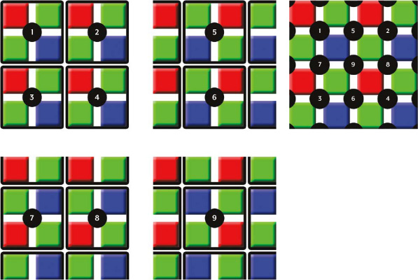
FIGURE 2-8 Combining overlapping 2×2 arrays to get more image information
Note that we do not calculate image information at the very edges of the array because we assume the image continues in each direction. If these were actually the edges of the cavity array, then demosaicing calculations here would be less accurate, because there are no longer pixels on all sides. This effect is typically negligible, because we can easily crop out information at the very edges of an image.
Other demosaicing algorithms exist that can extract slightly more resolution, produce images that are less noisy, or adapt to best approximate the image at each location.
DEMOSAICING ARTIFACTS
Images with pixel-scale detail can sometimes trick the demosaicing algorithm, producing an unrealistic-looking result. We refer to this as a digital artifact, which is any undesired or unintended alteration in data introduced in a digital process. The most common artifact in digital photography is moiré (pronounced “more-ay”), which appears as repeating patterns, color artifacts, or pixels arranged in an unrealistic maze-like pattern, as shown in FIGURES 2-9 and 2-10.

FIGURE 2-9 Image with pixel-scale details captured at 100 percent

FIGURE 2-10 Captured at 65 percent of the size as in Figure 2-9, resulting in more moiré
You can see moiré in all four squares in FIGURE 2-10 and also in the third square of FIGURE 2-9, where it is more subtle. Both maze-like and color artifacts can be seen in the third square of the downsized version. These artifacts depend on both the type of texture you’re trying to capture and the software you’re using to develop the digital camera’s files.
However, even if you use a theoretically perfect sensor that could capture and distinguish all colors at each photosite, moiré and other artifacts could still appear. This is an unavoidable consequence of any system that samples an otherwise continuous signal at discrete intervals or locations. For this reason, virtually every photographic digital sensor incorporates something called an optical low-pass filter (OLPF) or an anti-aliasing (AA) filter. This is typically a thin layer directly in front of the sensor, and it works by effectively blurring any potentially problematic details that are finer than the resolution of the sensor. However, an effective OLPF also marginally softens details coarser than the resolution of the sensor, thus slightly reducing the camera’s maximum resolving power. For this reason, cameras that are designed for astronomical or landscape photography may exclude the OLPF because for these applications, the slightly higher resolution is often deemed more important than a reduction of aliasing.
MICROLENS ARRAYS
You might wonder why FIGURES 2-4 and 2-5 do not show the cavities placed directly next to each other. Real-world camera sensors do not have photosites that cover the entire surface of the sensor in order to accommodate other electronics. Digital cameras instead contain microlenses above each photosite to enhance their light-gathering ability. These lenses are analogous to funnels that direct photons into the photosite, as shown in FIGURE 2-11.
Without microlenses, the photons would go unused, as shown in FIGURE 2-12.
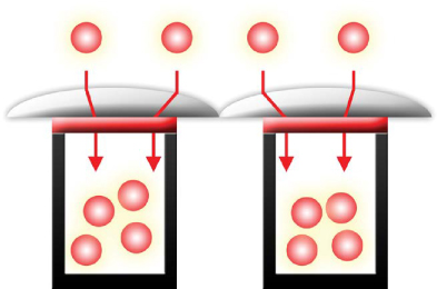
FIGURE 2-11 Microlenses direct photons into the photosites.

FIGURE 2-12 Without microlenses, some photons go unused.
Well-designed microlenses can improve the photon signal at each photosite and subsequently create images that have less noise for the same exposure time. Camera manufacturers have been able to use improvements in microlens design to reduce or maintain noise in the latest high-resolution cameras, despite the fact that these cameras have smaller photosites that squeeze more megapixels into the same sensor area.
IMAGE HISTOGRAMS
Image histogram is probably the single most important concept you’ll need to understand when working with pictures from a digital camera. A histogram can tell you whether your image has been properly exposed, whether the lighting is harsh or flat, and what adjustments will work best. It will improve your skills not only on the computer during post-processing but also as a photographer.
Recall that each pixel in an image has a color produced by some combination of the primary colors red, green, and blue (RGB). Each of these colors can have a brightness value ranging from 0 to 255 for a digital image with a bit depth of 8 bits. An RGB histogram results when the computer scans through each of these RGB brightness values and counts how many are at each level, from 0 through 255. Although other types of histograms exist, all have the same basic layout as the example shown in FIGURE 2-13.
In this histogram, the horizontal axis represents an increasing tonal level from 0 to 255, whereas the vertical axis represents the relative count of pixels at each of those tonal levels. Shadows, midtones, and highlights represent tones in the darkest, middle, and brightest regions of the image, respectively.
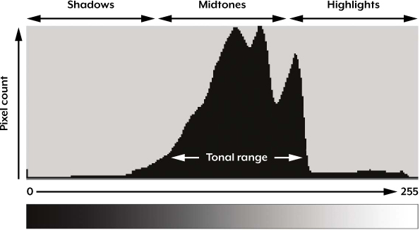
FIGURE 2-13 An example of a histogram
TONAL RANGE
The tonal range is the region where most of the brightness values are present. Tonal range can vary drastically from image to image, so developing an intuition for how numbers map to actual brightness values is often critical—both before and after the photo has been taken. Note that there is not a single ideal histogram that all images should mimic. Histograms merely represent the tonal range in the scene and what the photographer wishes to convey.
For example, the staircase image in FIGURE 2-14 contains a broad tonal range with markers to illustrate which regions in the image map to brightness levels on the histogram.
Highlights are within the window in the upper center, midtones are on the steps being hit by light, and shadows are toward the end of the staircase and where steps are not directly illuminated. Due to the relatively high fraction of shadows in the image, the histogram is higher toward the left than the right.

FIGURE 2-14 An image with broad tonal range
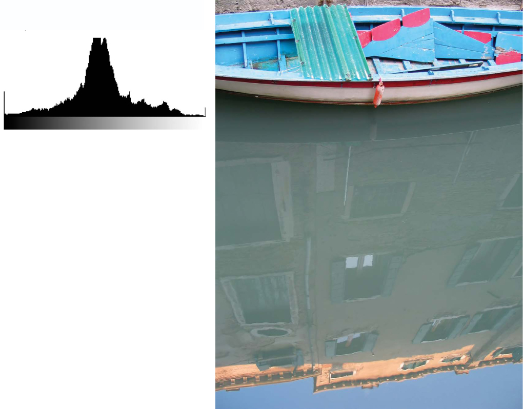
FIGURE 2-15 Example of a standard histogram composed primarily of midtones
But lighting is often not as varied as with FIGURE 2-14. Conditions of ordinary and even lighting, when combined with a properly exposed subject, usually produce a histogram that peaks in the center, gradually tapering off into the shadows and highlights, as in FIGURE 2-15.
With the exception of the direct sunlight reflecting off the top of the building and some windows, the boat scene is quite evenly lit. Most cameras will have no trouble automatically reproducing an image that has a histogram similar to the one shown here.
HIGH- AND LOW-KEY IMAGES
Although most cameras produce midtone-centric histograms when in automatic exposure mode, the distribution of brightness levels within a histogram also depends on the tonal range of the subject matter. Images where most of the tones occur in the shadows are called low key, whereas images where most of the tones are in the highlights are called high key. FIGURES 2-16 and 2-17 show examples of high-key and low-key images, respectively.
Before you take a photo, it’s useful to assess whether your subject matter qualifies as high or low key. Recall that because cameras measure reflected light, not incident light, they can only estimate subject illumination. These estimates frequently result in an image with average brightness whose histogram primarily features midtones.
Although this is usually acceptable, it isn’t always ideal. In fact, high- and low-key scenes frequently require the photographer to manually adjust the exposure relative to what the camera would do automatically. A good rule of thumb is to manually adjust the exposure whenever you want the average brightness in your image to appear brighter or darker than the midtones.
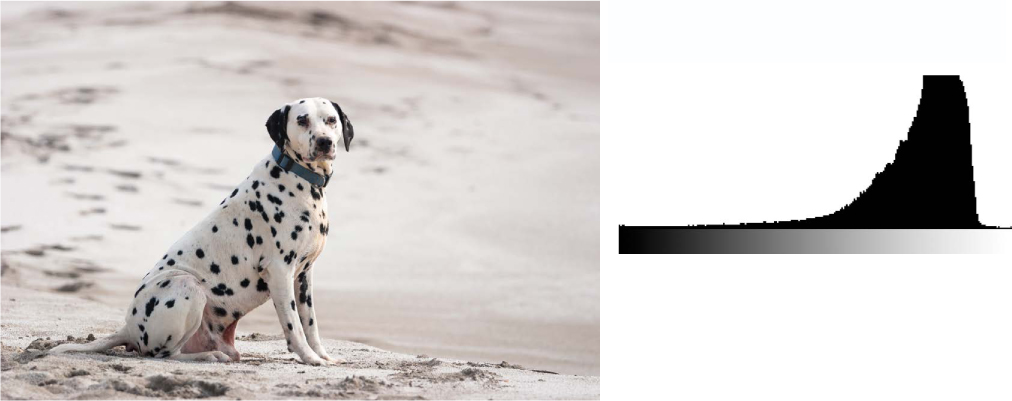
FIGURE 2-16 High-key histogram of an image with mostly highlights

FIGURE 2-17 Low-key histogram of an image with mostly shadow tones
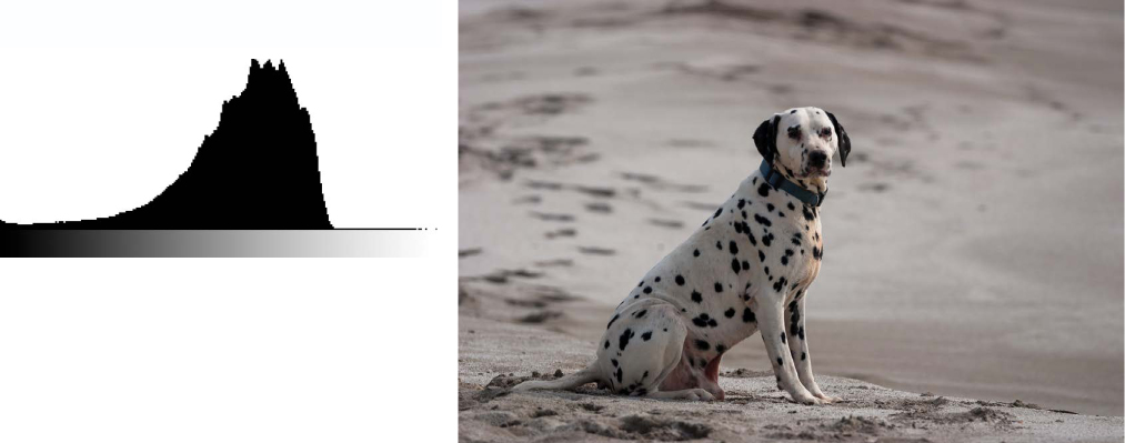
FIGURE 2-18 Underexposed despite a central histogram

FIGURE 2-19 Overexposed despite a central histogram
In general, a camera will have trouble with auto-exposure whenever you want the average brightness in an image to appear brighter or darker than a central histogram. The dog and gate images shown in FIGURES 2-18 and 2-19, respectively, are common sources of auto-exposure error. Note that the central peak histogram is brought closer to the midtones in both cases of mistaken exposure.
As you can see here, the camera gets tricked into creating a central histogram, which renders the average brightness of an image in the midtones, even though the content of the image is primarily composed of brighter highlight tones. This creates an image that is muted and gray instead of bright and white, as it would appear in person.
Most digital cameras are better at reproducing low-key scenes accurately because they try to prevent any region from becoming so bright that it turns into solid white, regardless of how dark the rest of the image might become as a result. As long as your low-key image has a few bright highlights, the camera is less likely to be tricked into overexposing the image, as you can see in FIGURE 2-19. High-key scenes, on the other hand, often produce images that are significantly underexposed because the camera is still trying to avoid clipped highlights but has no reference for what should appear black.
Fortunately, underexposure is usually more forgiving than overexposure. For example, you can’t recover detail from a region that is so overexposed it becomes solid white. When this occurs, the overly exposed highlights are said to be clipped or blown. FIGURE 2-20 shows an example contrasting clipped highlights with unclipped highlights.

FIGURE 2-20 Clipped (left) versus unclipped detail (right)
As you can see, the clipped highlights on the floor in the left image lose detail from overexposure, whereas the unclipped highlights in the right image preserve more detail.
You can use the histogram to figure out whether clipping has occurred. For example, you’ll know that clipping has occurred if the highlights are pushed to the edge of the chart, as shown in FIGURE 2-21.
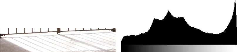
FIGURE 2-21 Substantially clipped highlights showing overexposure
Some clipping is usually acceptable in regions such as specular reflections on water or metal, when the sun is included in the frame, or when other bright sources of light are present. This is because our iris doesn’t adjust to concentrated regions of brightness in an image. In such cases, we don’t expect to see as many details in real life as in the image. But this would be less acceptable when we’re looking at broader regions of brightness, where our eyes can adjust to the level of brightness and perceive more details.
Ultimately, the amount of clipping present is up to the photographer and what they wish to convey in the image.
CONTRAST
A histogram can also describe the amount of contrast, which measures the difference in brightness between light and dark areas in a scene. Both subject matter and lighting conditions can affect the level of contrast in your image. For example, photos taken in the fog will have low contrast, whereas those taken under strong daylight will have higher contrast. Broad histograms reflect a scene with significant contrast (see FIGURE 2-22), whereas narrow histograms reflect less contrast and images may appear flat or dull (see FIGURE 2-23). Contrast can have a significant visual impact on an image by emphasizing texture.
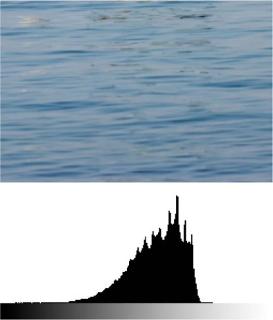
FIGURE 2-22 Wider histogram (higher contrast)
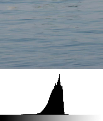
FIGURE 2-23 Narrower histogram (lower contrast)
The higher-contrast image of the water has deeper shadows and more pronounced highlights, thus creating a texture that pops out at the viewer. FIGURE 2-24 shows another high-contrast image.

FIGURE 2-24 Example of a scene with very high contrast
Contrast can also vary for different regions within the same image depending on both subject matter and lighting. For example, we can partition the earlier image of a boat into three separate regions, each with its own distinct histogram, as shown in FIGURE 2-25.

FIGURE 2-25 Histograms showing varying contrast for each region of the image
The upper region contains the most contrast of all three because the image is created from light that hasn’t been reflected off the surface of water. This produces deeper shadows underneath the boat and its ledges and stronger highlights in the upward-facing and directly exposed areas. The result is a very wide histogram.
The middle and bottom regions are produced entirely from diffuse, reflected light and thus have lower contrast, similar to what you would get when taking photographs in the fog. The bottom region has more contrast than the middle despite the smooth and monotonic blue sky because it contains a combination of shade and more intense sunlight. Conditions in the bottom region create more pronounced highlights but still lack the deep shadows of the top region. The sum of the histograms in all three regions creates the overall histogram shown previously in FIGURE 2-15.
IMAGE NOISE
Image noise is the digital equivalent of film grain that occurs with analog cameras. You can think of it as the subtle background hiss you may hear from your audio system at full volume. In digital images, noise is most apparent as random speckles on an otherwise smooth surface, and it can significantly degrade image quality.
However, you can use noise to impart an old-fashioned, grainy look that is reminiscent of early films, and you can also use it to improve perceived sharpness. Noise level changes depending on the sensitivity setting in the camera, the length of the exposure, the temperature, and even the camera model.
SIGNAL-TO-NOISE RATIO
Some degree of noise is always present in any electronic device that transmits or receives a signal. With traditional televisions, this signal is broadcast and received at the antenna; with digital cameras, the signal is the light that hits the camera sensor.
Although noise is unavoidable, it can appear so small relative to the signal that it becomes effectively nonexistent. The signal-to-noise ratio (SNR) is therefore a useful and universal way of comparing the relative amounts of signal and noise for any electronic system. High and low SNR examples are illustrated in FIGURES 2-26 and 2-27, respectively.
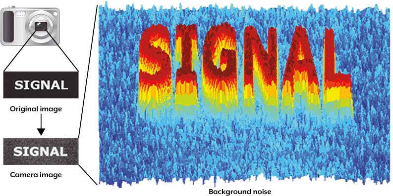
FIGURE 2-26 High SNR example, where the camera produces a picture of the word SIGNAL against an otherwise smooth background
Even though FIGURE 2-26 is still quite noisy, the SNR is high enough to clearly distinguish the word SIGNAL from the background noise. FIGURE 2-27, on the other hand, has barely discernible letters because of its lower SNR.

FIGURE 2-27 Low SNR example, where the camera barely has enough SNR to distinguish SIGNAL against the background noise
ISO SPEED
The ISO speed is perhaps the most important camera setting influencing the SNR of your image. Recall that a camera’s ISO speed is a standard we use to describe its absolute sensitivity to light. ISO settings are usually listed as successive doublings, such as ISO 50, ISO 100, and ISO 200, where higher numbers represent greater sensitivity. You learned in the previous chapter that higher ISO speed increases image noise.
The ratio of two ISO numbers represents their relative sensitivity, meaning a photo at ISO 200 will take half as long to reach the same level of exposure as one taken at ISO 100 (all other factors being equal). ISO speed is the same concept and has the same units as ASA speed in film photography, where some film stocks are formulated with higher light sensitivity than others. You can amplify the image signal in the camera by using higher ISO speeds, resulting in progressively more noise.
TYPES OF NOISE
Digital cameras produce three common types of noise: random noise, fixed-pattern noise, and banding noise. The three qualitative examples shown in FIGURE 2-28 display pronounced and isolating cases for each type of noise against an ordinarily smooth gray background.

FIGURE 2-28 Comparison of the three main types of image noise in isolation against an other-wise smooth gray background.
Random noise results primarily from photon arrival statistics and thermal noise. There will always be some random noise, and this is most influenced by ISO speed. The pattern of random noise changes even if the exposure settings are identical. FIGURE 2-29 shows an image that has substantial random noise in the darkest regions because it was captured at a high ISO speed.
Fixed-pattern noise includes what are called “hot,” “stuck,” or “dim” pixels. Fixed-pattern noise is exacerbated by long exposures and high temperatures. Fixed-pattern noise is also unique in that it has almost the same distribution with different images if taken under the same conditions (temperature, length of exposure, and ISO speed).
Banding noise is highly dependent on the camera and is introduced by camera electronics when reading data from the digital sensor. Banding noise is most visible at high ISO speeds and in the shadows, or when an image has been excessively brightened.
Although fixed-pattern noise appears more objectionable in FIGURE 2-28, it is usually easier to remove because of its pattern. For example, if a camera’s internal electronics know the pattern, this can be used to identify and subtract the noise to reveal the true image. Fixed-pattern noise is therefore much less prevalent than random noise in the latest generation of digital cameras; however, if even the slightest amount remains, it is still more visually distracting than random noise.
The less objectionable random noise is usually much more difficult to remove without degrading the image. Noise-reduction software has a difficult time discerning random noise from fine texture patterns, so when you remove the random noise, you often end up adversely affecting these textures as well.
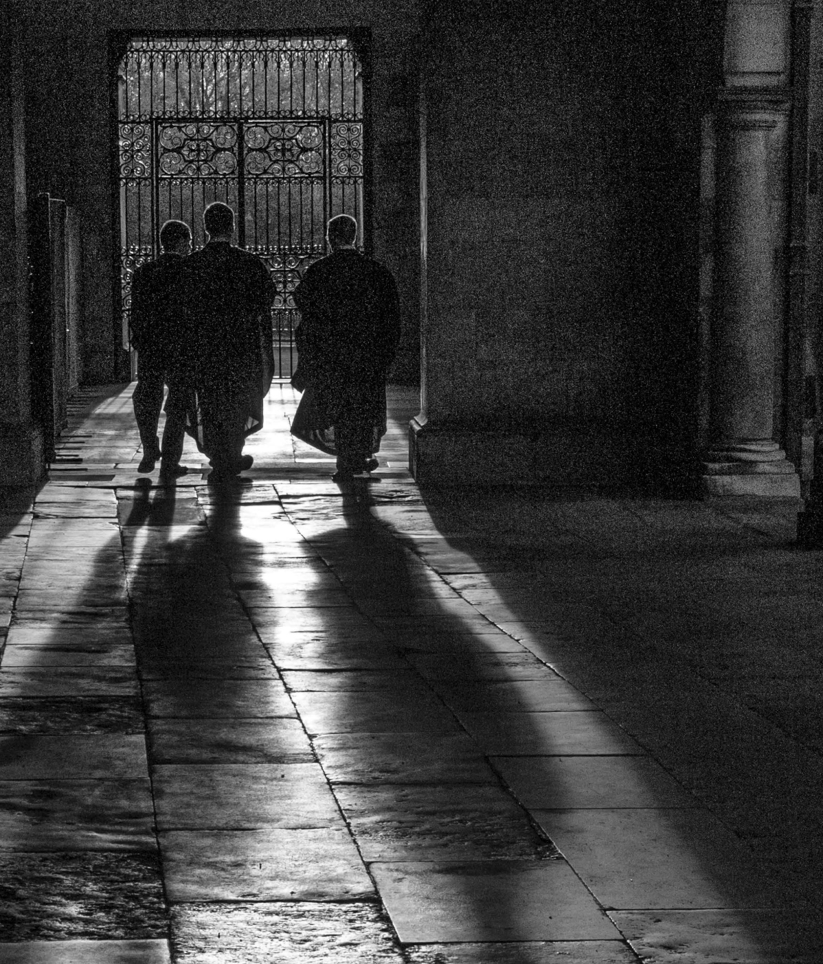
FIGURE 2-29 Sample image with visible noise and a wide range of tonal levels.
HOW BRIGHTNESS AFFECTS NOISE
The noise level in your images not only changes depending on the exposure setting and camera model but can also vary within an individual image, similar to the way contrast can vary for different regions within the same image. With digital cameras, darker regions contain more noise than brighter regions, but the opposite is true with film.
FIGURE 2-30 shows how noise becomes less pronounced as the tones become brighter (the original image used to create the patches is shown in FIGURE 2-31.
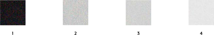
FIGURE 2-30 Noise is less visible in brighter tones
FIGURE 2-31 The original image used to create the four tonal patches in Figure 2-30
Brighter regions have a stronger signal because they receive more light, resulting in a higher overall SNR. This means that images that are underexposed will have more visible noise, even if you brighten them afterward. Similarly, overexposed images have less noise and can actually be advantageous, assuming that you can darken them later and that no highlight texture has become clipped to solid white.
CHROMA AND LUMA NOISE
Noise fluctuations can be separated into two components: color and luminance. Color noise, also called chroma noise, usually appears more unnatural and can render images unusable if not kept under control. Luminance noise, or luma noise, is usually the more tolerable component of noise. FIGURE 2-32 shows what chroma and luma noise look like on what was originally a neutral gray patch.

FIGURE 2-32 Chroma and luma noise
The relative amounts of chroma and luma noise can vary significantly depending on the camera model. You can use noise-reduction software to selectively reduce either type of noise, but complete elimination of luminance noise can cause unnatural or plastic-looking images.
Noise is typically quantified by the intensity of its fluctuations, where lower intensity means less noise, but its spatial frequency is also important. The term fine-grained noise was used frequently with film to describe noise with fluctuations occurring over short distances, resulting in a high spatial frequency. These two properties of noise often go hand in hand; an image with more intense noise fluctuations will often also have more noise at lower frequencies (which appears in larger patches).
Let’s take a look at FIGURE 2-33 to see why it’s important to keep spatial frequency in mind when assessing noise level.
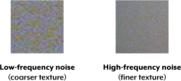
FIGURE 2-33 Similar intensities, but one seems more noisy than the other
The patches in this example have different spatial frequencies, but the noise fluctuates with a very similar intensity. If the “low versus high frequency” noise patches were compared based solely on the intensity of their fluctuations (as you’ll see in most camera reviews), then the patches would be measured as having similar noise. However, this could be misleading because the patch on the right actually appears to be much less noisy.
The intensity of noise fluctuations still remains important, though. The example in FIGURE 2-34 shows two patches that have different intensities but the same spatial frequency.
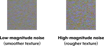
FIGURE 2-34 Different intensities but same spatial frequency
Note that the patch on the left appears much smoother than the patch on the right because low-magnitude noise results in a smoother texture. On the other hand, high-magnitude noise can overpower fine textures, such as fabric and foliage, and can be more difficult to remove without destroying detail.
NOISE LEVEL UNDER DIFFERENT ISO SETTINGS
Now let’s experiment with actual cameras so you can get a feel for how much noise is produced at a given ISO setting. The examples in FIGURE 2-35 show the noise characteristics for three different cameras against an otherwise smooth gray patch.

FIGURE 2-35 Noise levels shown using best JPEG quality, daylight white balance, and default sharpening
You can see how increasing the ISO speed always produces higher noise for a given camera, but that the amount of noise varies across cameras. The greater the area of a pixel in the camera sensor, the more light-gathering ability it has, thus producing a stronger signal. As a result, cameras with physically larger pixels generally appear less noisy because the signal is larger relative to the noise. This is why cameras with more megapixels packed into the same-sized camera sensor don’t necessarily produce a better-looking image.
On the other hand, larger pixels alone don’t necessarily lead to lower noise. For example, even though the older entry-level camera has much larger pixels than the newer entry-level camera, it has visibly more noise, especially at ISO 400. This is because the older entry-level camera has higher internal or “readout” noise levels caused by less-sophisticated electronics.
Also note that noise is not unique to digital photography, and it doesn’t always look the same. Older devices, such as this CRT television image, often suffered from noise caused by a poor antenna signal (as shown in FIGURE 2-36).

FIGURE 2-36 Example of how noise could appear in a CRT television image
SUMMARY
In this chapter, you learned about several unique characteristics of digital images: bit depth, sensors, image histograms, and image noise. As you’ve seen, understanding how the camera processes light into a digital image lets you evaluate the quality of the image. It also lets you know what to adjust depending on what kind of noise is present. You also learned how to take advantage of certain types of image noise to achieve a particular effect.
In the next chapter, you’ll build on your knowledge of exposure from Chapter 1 and learn how to use lenses to control the appearance of your images.
