5 THORNBERG & FORESTER
STUDIO PHILOSOPHY
Thornberg & Forester is a creative agency based in New York City. T&F specializes in advertising, design, branding, interactive, animation, live action, and content. T&F’s core belief is that all projects must start with a powerful message and be coupled with the right medium to communicate it. T&F prides itself on bringing together innovative people who deliver bold ideas by generating compelling creative solutions with a strategic backbone. T&F’s roster of talent includes directors, animators, 3D artists, digital programmers, mixed media artists, illustrators, and photographers. Consequently, T&F’s portfolio is quite diverse, with an emphasis on distinctive ideas that achieve our clients’ goals.
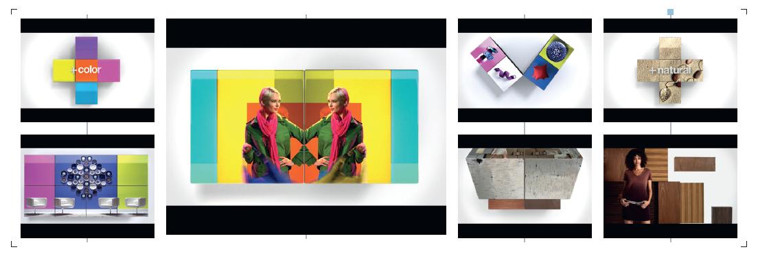
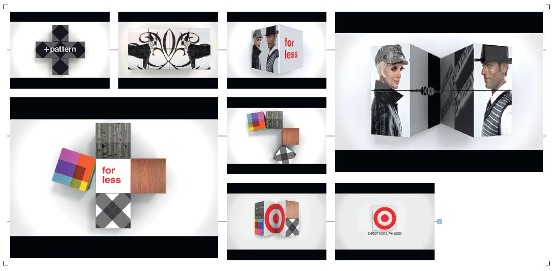
TARGET: “FALL FOR LESS”
Creative and Production Process We were honored to take part in one of the most recognizable marketing campaigns of today—the Target commercial. This spot offers a fun and playful 3D device for celebrating fall fashion Target style. This project was a tough one for us, as we were up against a tight timeline and a tight budget. While the initial pitch was more 2D, it quickly evolved into a much more elaborate plan. We made our initial style frames in Modo and Photoshop, and then took those boards to our 3D team to interpret the look into Maya. We came across a number of obstacles while working on this job, especially in working with the footage itself. Dealing with the motion of the cubes and picking footage that fit into the cubes without making the scene feel overcomplicated was quite tough. There were also changes made to the edit as we were animating the cubes, which was challenging because the length of each clip dictated the motion of the cube.
One of the hardest things about this project was that it required a lot of compositing, so once the footage was locked there was a ramp-up time to get the footage on the 3D cubes. It was a slow process because putting the footage in Maya as a texture was the only realistic way to make this look high-end. To beat the problem, we ended up making over 150 Photoshop frames that looked close to the final 3D cubes to get a much more accurate feel for the edit.
Another very important factor was that we had to do quite a bit of compositing of the actual shot footage. We mixed shots together and created interesting compositions to give it a much more graphic feel. We ended up making our own system of timecode to place the footage inside these cubes.
Once we had a good grasp of the edit to put inside Maya, we took all of the passes rendered from Maya and began to composite them in After Effects. It was a series of rendered passes that were all put together to give a final look. Once we had the composite finished, we rendered the movie.
However, we were not done. We then took the final composite and added a stop motion effect to the final render. We did this manually with hold key frames in After Effects because there was no filter that could achieve this look we needed. We ended up going with what we ended up calling a “hyper real stop motion look.” It was complicated and time consuming, but turned out great in the end.
Tools Modo, Maya, Photoshop, After Effects
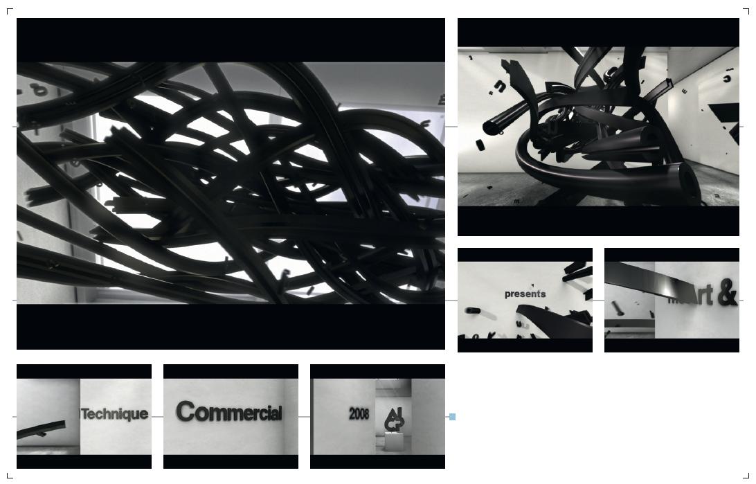
AICP 2008 SHOW OPEN
T&F was honored to design the opening titles, interstitials, and end credits for the Association of Independent Commercial Producers 2008 awards show. There was quite a bit of pressure to make this look amazing and timeless, as it was showcased at awards ceremonies across the country and is now preserved in the permanent archives of the Museum of Modern Art’s Department of Film and Media. The piece was first showcased at the New York ceremony, which was held at the MoMA. We started out with a two-week-long concept phase. After visiting the MoMA and taking pictures of the space, we decided it would be really cool to do something with the typography of museum installations. We sketched a lot, and made Photoshop frames to get the green light to move ahead with this idea from AICP. We took the Photoshop frames and sketches and made a boardamatic with an editor, which helped us to determine the scene amount and priority of work. Once we got a grasp of what needed to be done, we started the task of building all of the pieces to make this a reality.
Something we were very proud of in working on this project was remaking the Helvetica typeface in 3D. This was important to get a beautiful extrusion of the type and not have weird artifacts and tessellation occur. Once we had the typeface recreated, we built the rooms in 3D and passed these elements off to the animators who started animating the letters. We paid a lot of attention to the velocity and speed of the letters animating. We wanted them to feel very heavy and powerful. It took four artists three and a half weeks to map out all of the animation. We then really focused on perfecting the lighting and texturing of each shot, and passed the playblast edit back to the editor for final tweaks. Finally, we began the task of rendering out each scene. We composited these in After Effects, using Frischluft, Composite Suite, Trapcode, and some other little tricks. We also used Qube for our renderfarm software on eight core Mac Pros, which saved us a lot of time. We thoroughly enjoyed working on this and are extremely pleased with the final product.
Tools Photoshop, After Effects, Qube